
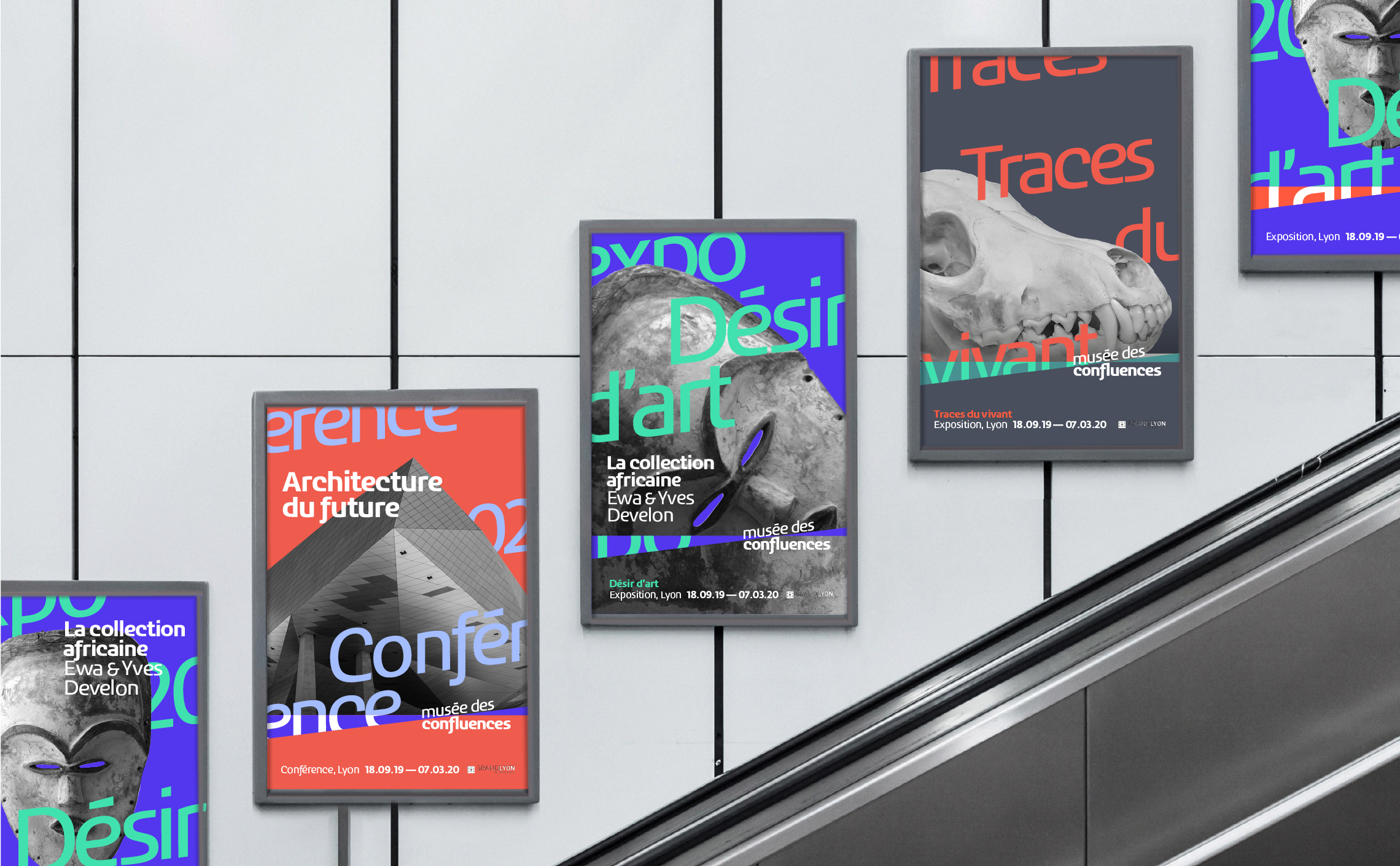
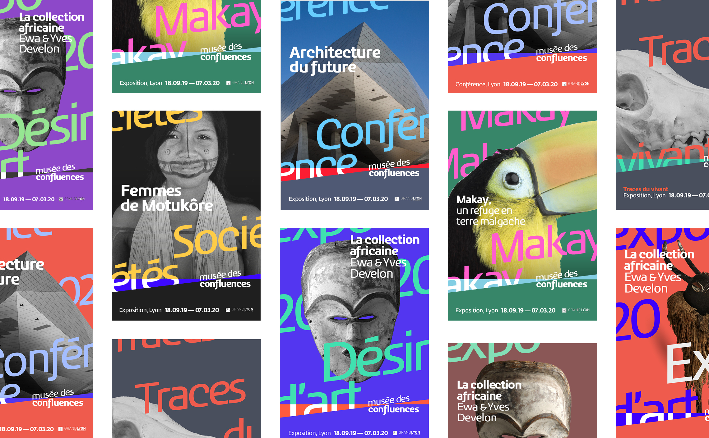
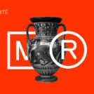
While putting away our work files, we came across one of our biggest regrets. It was a project for a graphic charter for the Musée des Confluences in Lyon that was not selected. We tell you at the end of the article the "why" of this particular regret. We are still biting our fingers.
How to re-enchant a graphic charter?
In this call for tenders, we had to reinvent and reenchant the museum's graphic charter. Our ambition was to bring boldness and innovation, freshness and youthfulness. The challenge was also to imagine it in motion and in a responsive way to meet the digital challenges.
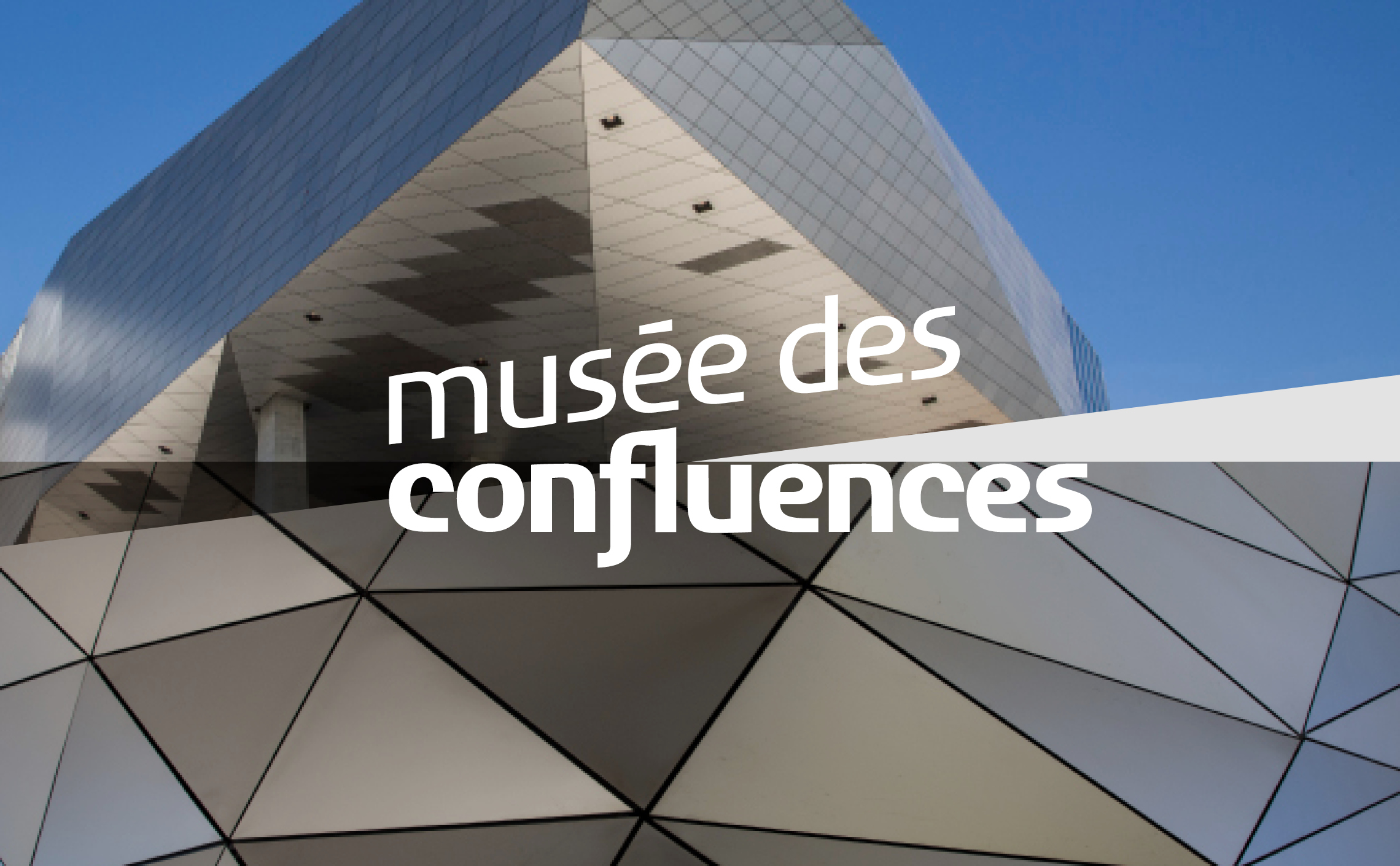
This museum is located at the confluence of the Rhône and Saône rivers. The logotype was designed by Ruedi Baur and his teams about ten years ago. The initial graphic principle is based on a meeting and superimposition of two images whose intersection reveals two shapes pointing towards each other. It is a promise of meeting, of crossing, an invitation to see the world from another angle, to finally take the height. Our proposal is in line with this concept.
Visual concept
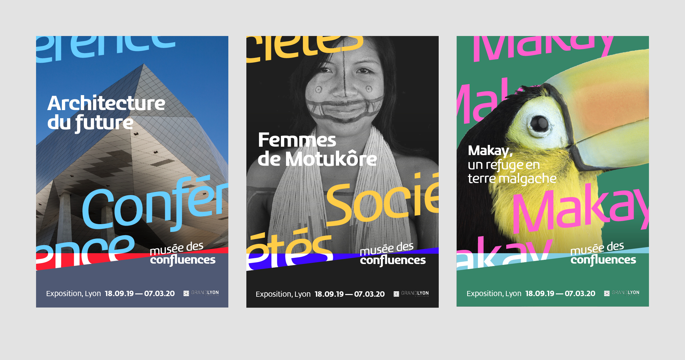
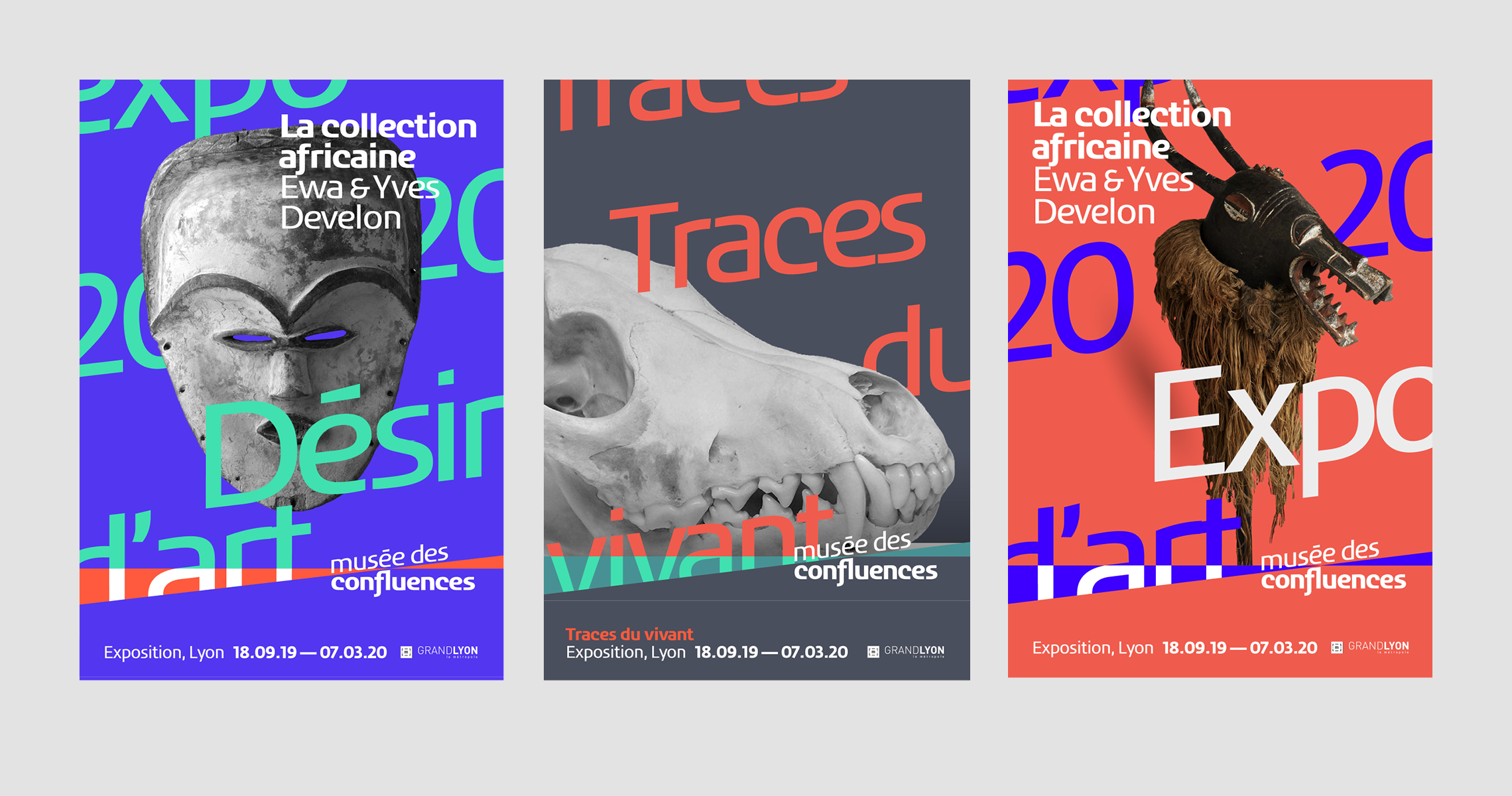
Our project is organized around three axes, namely the original principle of the encounter, but also two new ideas, radiation and revelation.
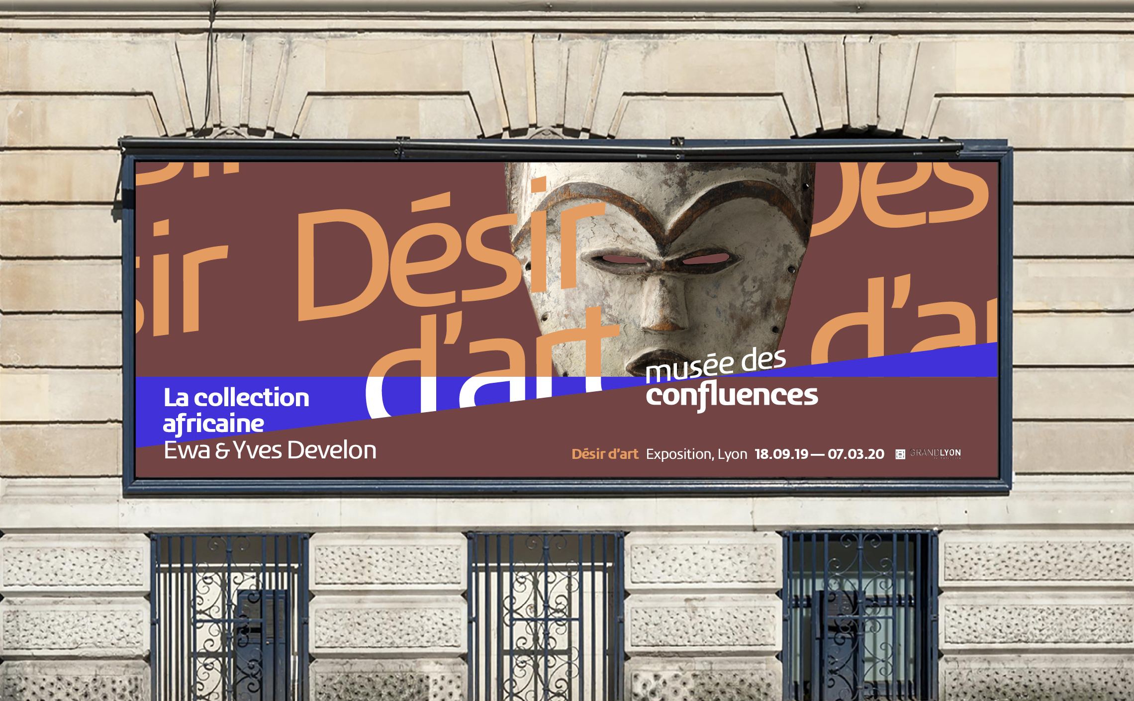
The notion of encounter is illustrated by two triangles whose vertices attract each other and meet at a single point. When they meet, the two triangles become one shape, a spectrum of light whose beams illuminate the cultures of our world. This is
Our project is organized around three axes, namely the original principle of the encounter, but also two new ideas, radiation and revelation.
The notion of encounter is illustrated by two triangles whose vertices attract each other and meet at a single point. When they meet, the two triangles become one shape, a spectrum of light whose beams illuminate the cultures of our world. This is radiation. Finally, for the idea of revelation, we have imagined the principle of a curtain or veil rising, allowing a glimpse of an opening onto the world that amplifies our field of vision without limit.
 San Serriffe typographic Island
 Design, creativity and oblique strategies!
 Tote bag, a new social totem?
 Sister Corita Kent, the Pop Art nun
 Donald Trump, the martyr who makes history
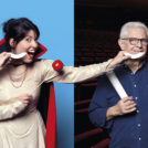 Saint-Étienne Opera House – 2017/18 Season
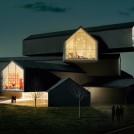
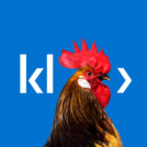 Klee Digital – Brand identity
 Aube en Champagne, Departmental Council – visual identity
 The utopia of representing futuristic cities
 Shepard Fairey, “the worm that shone with the stars”
 Behind Behance…
 The story of the big bad Jurassic Park logosaurus
 Saint-Étienne Opera house: Emotion in the foreground!
Leave a Reply