Karel Martens: the impression that matters
Karel Martens: the impression that matters
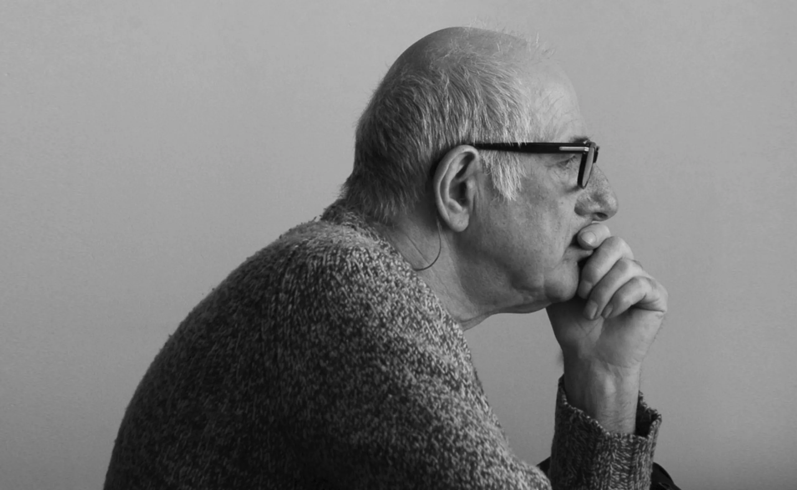
Karel Martens is a dutch graphic designer and typographer born in 1939. It is not an easy task to transcribe in a few straight lines the meanders of a man still alive. Wanting to depict the work of a half-designer, half artist either. And when the man in question is both, then you have to choose an angle of attack to make a good impression.
This article is part of our series of portraits “the great names of graphic design“.
Preamble
I would like, in writing this paper on Karel Martens, to seize not words but forms, on paper. I would like to look at the material of his work, extract some raw elementary symbols at random, and superimpose them in his way by pressing them on a sheet of paper. Each facet of his work would then be arranged, printed then shifted, superimposing the colours in new shades. By ignoring the man, it would be a question of transforming his emotional motives into a general, artistic motive.
The paragraphs would be different from one content to another, on a grid always new and always moving. One should write in the margins, wonder about the drying time of a colour or on which paper to use, marvel at the appearance of new shapes. We should search, ask ourselves questions, think about a meaning. Solve a problem. Design.
I would like to imagine this article in the way of his work, never really finished, always potentially open.
I would therefore approach Karel Martens’ work here as a series of motifs, superimposed one on the other to better depict the character.
Portrait
Before going deeper into the motifs that make him this artist-designer, here is a brief portrait to identify the man in question.
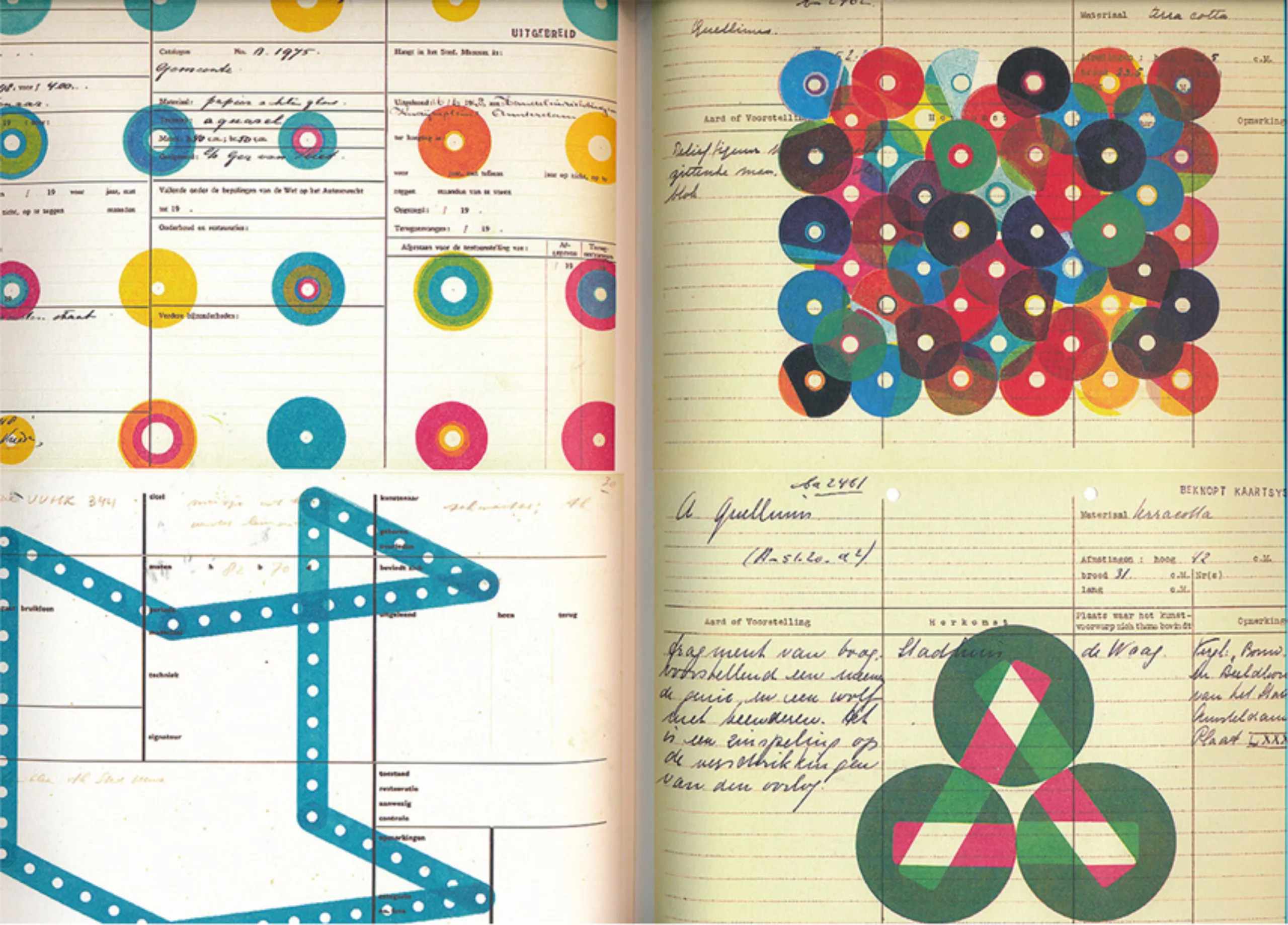
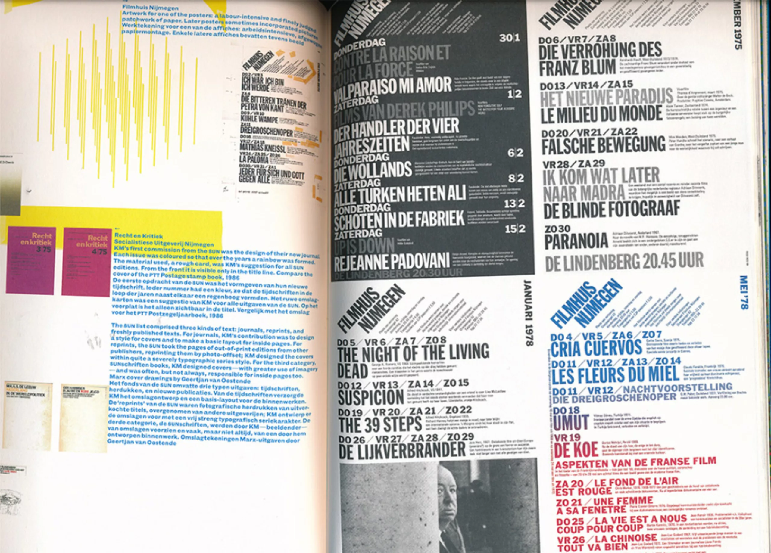
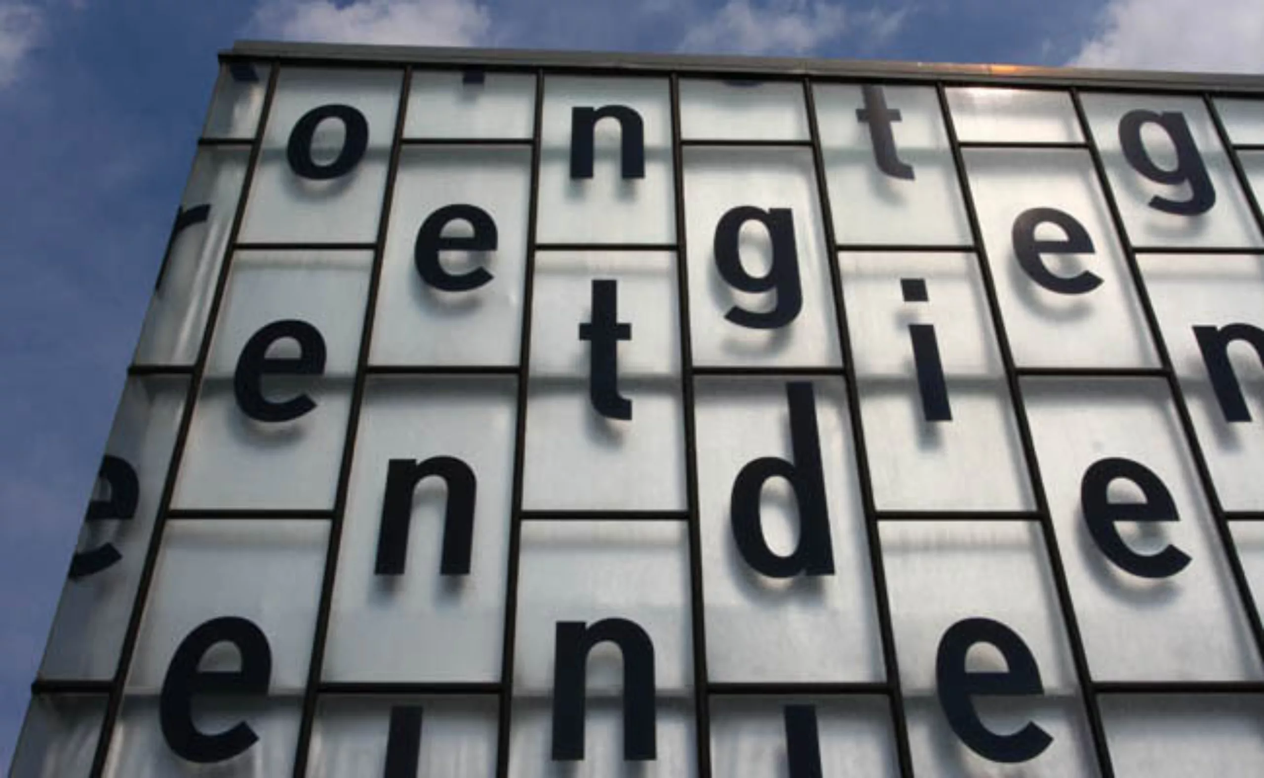
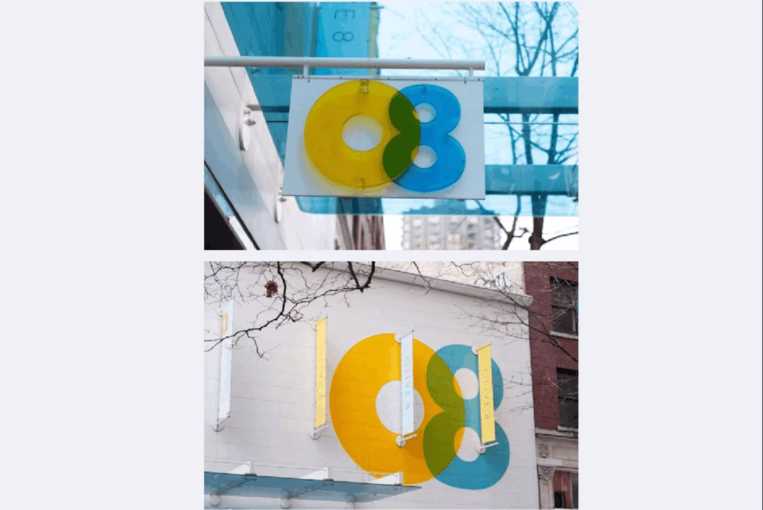
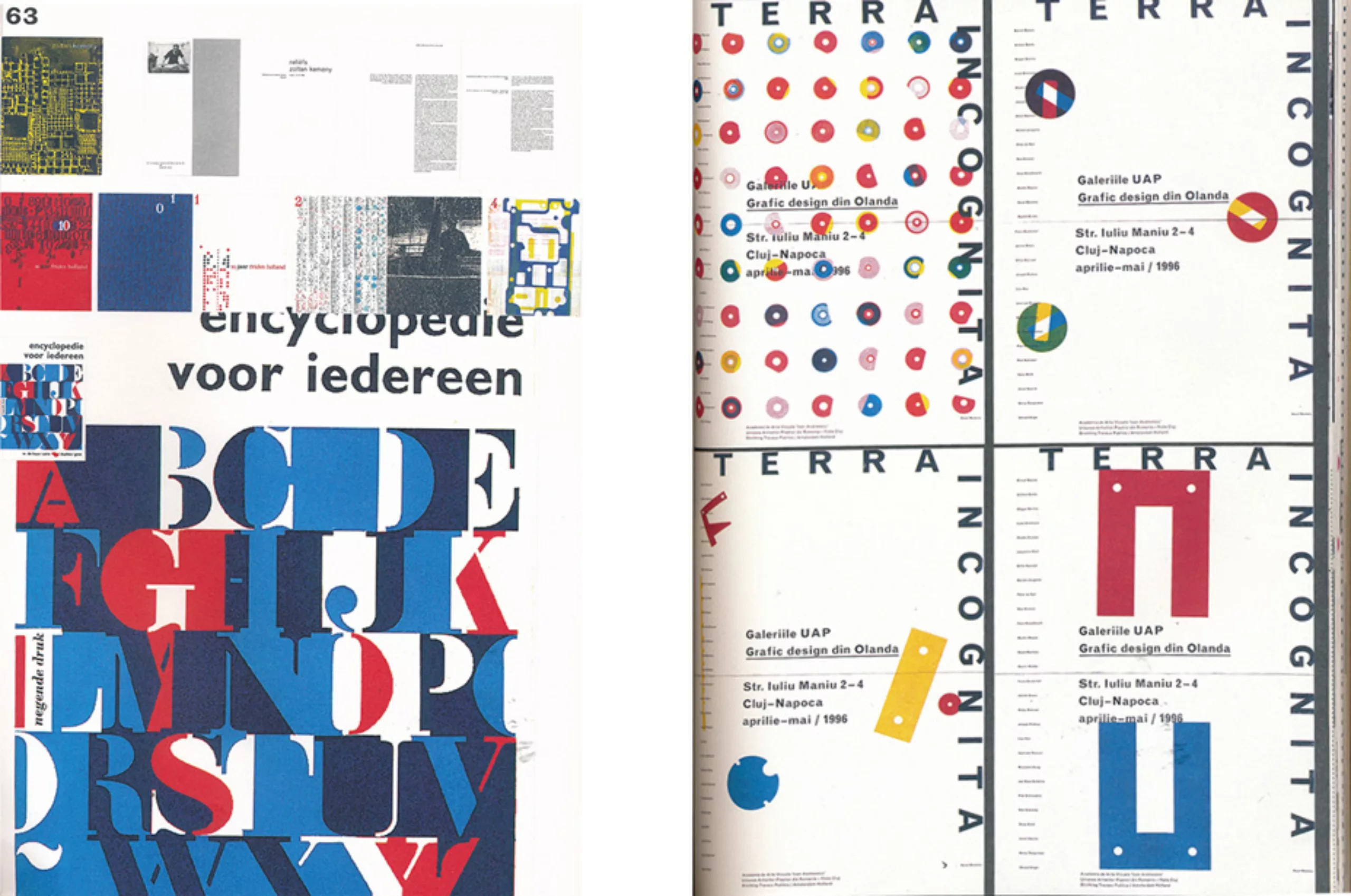
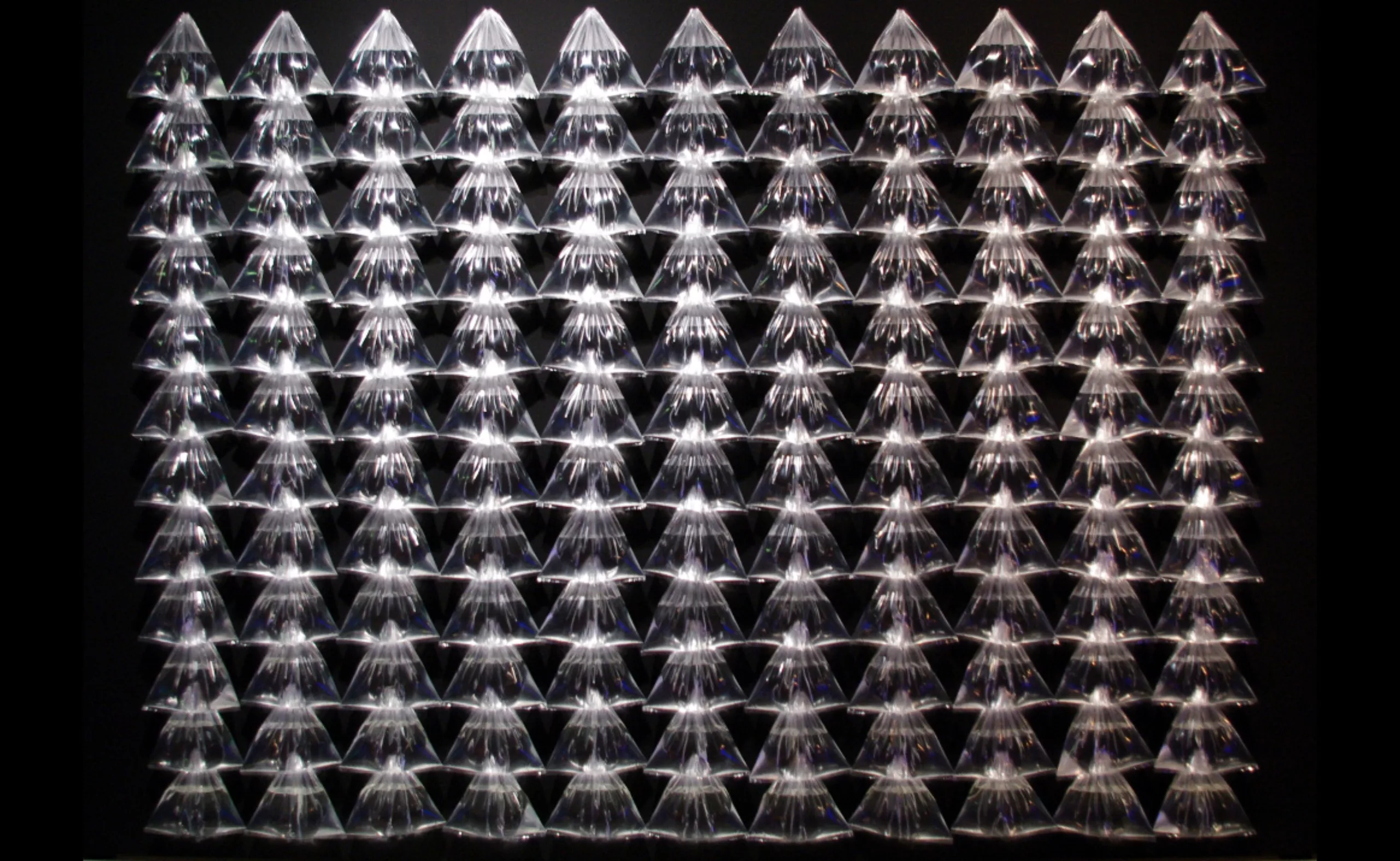
Karel Martens is Dutch, he has been teaching graphic design since 1977. He has worked on various supports such as books, building signs, coins, stamps… (photos below). Not being attached to an agency, he is still freelance today, sometimes working with other designers or his students.
At the same time, he never stopped his plastic research work. In the manner of a printer, he draws from his collection of abstract shapes hand-pressed printing characters that he mixes with colours. Martens has thus created both a graphic grammar and a colourful vocabulary that is constantly evolving.
A rare and special thing for a living artist, his work is today recognized as a reference in the world of graphic design and plastic research. When he started his studies, there were no graphic design courses in the program. Fifty years later, it is the emblem of Dutch modernist design.
Motive 1: Constraint
Solutions
In his work as a designer, typographer or artist, the notion of constraint comes up very often. On the other hand, this constraint is not imposed: on the contrary, it is added to creation to become a source of new design solutions. He even says: “Limitations are an important thing in design in general because they offer solutions.” Constraints are important in design in the broad sense because they raise solutions. The obstacle becomes challenge.
Surprises
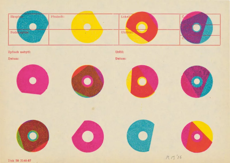
Martens thus favours a certain surprise effect; he is constantly striving to renew his constraints, and thus never to stop on a fixed form. You can see it in his impressions. Every morning, he looks at the shapes he prints, moving them between each layer. Martens sometimes allows several days or even months or years to pass before reaching a pattern, because he works on several prints simultaneously. Using inks, he works under the constraint of the drying time between each coat of paint, and likes to be surprised by the results.
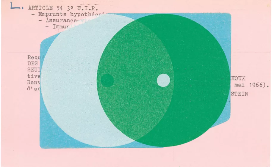
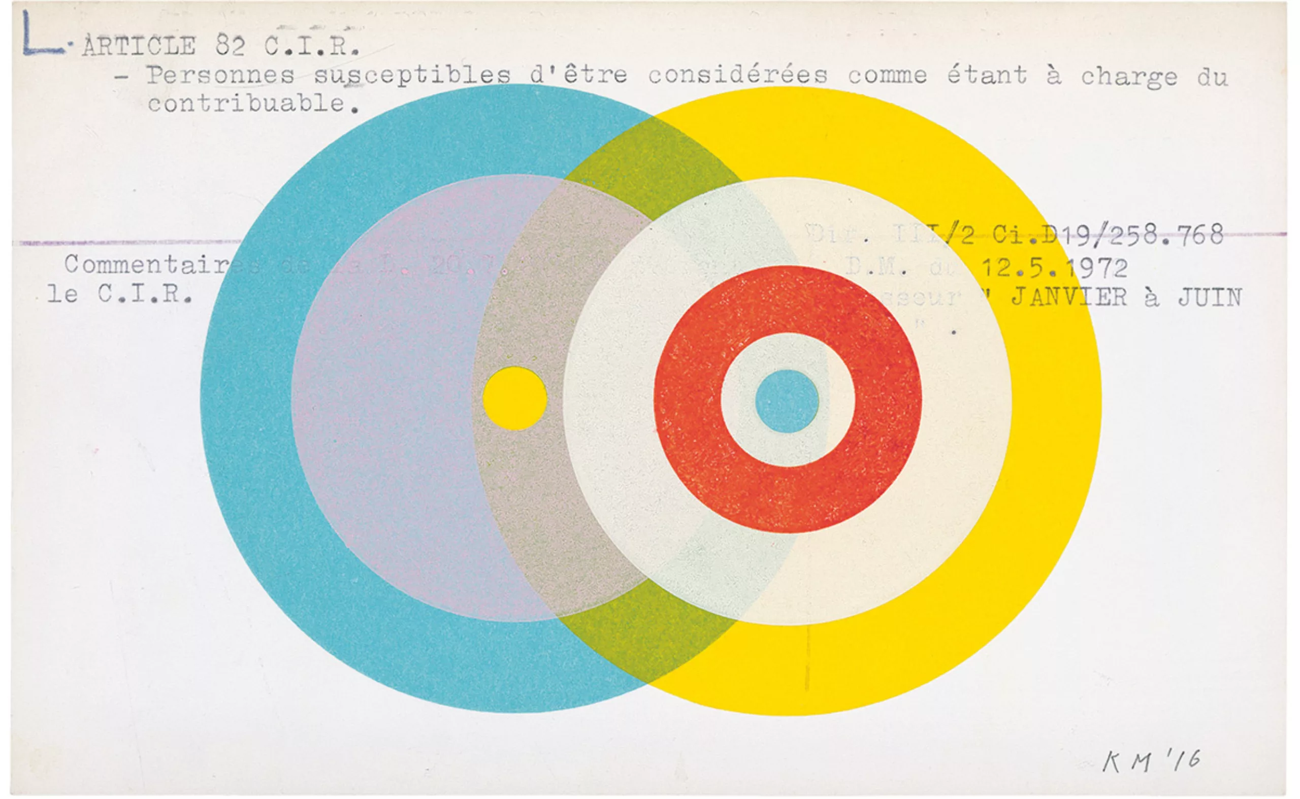
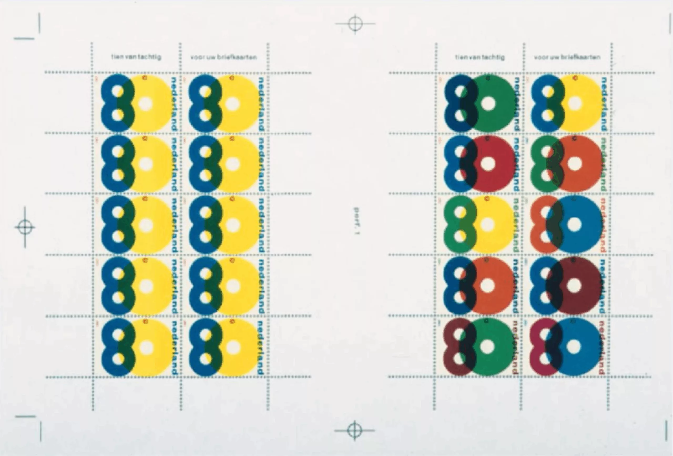
On this second visual, he explains for the New York Times that “the white of the right circle is printed about 7 times before it really becomes white. And blue is printed on white but appears grey, because there are only two layers. In offset printing, this effect would be practically impossible, but in letterpress printing this is possible by repeating the press several times with opaque ink. I intended to breach this closed yellow circle. By superimposing the white ink inside, I obtain the colour temperature that corresponds to the background paper. And then the yellow dot comes out suddenly, unpredictable surprise. This is surely what motivates me the most in my work.
Budget
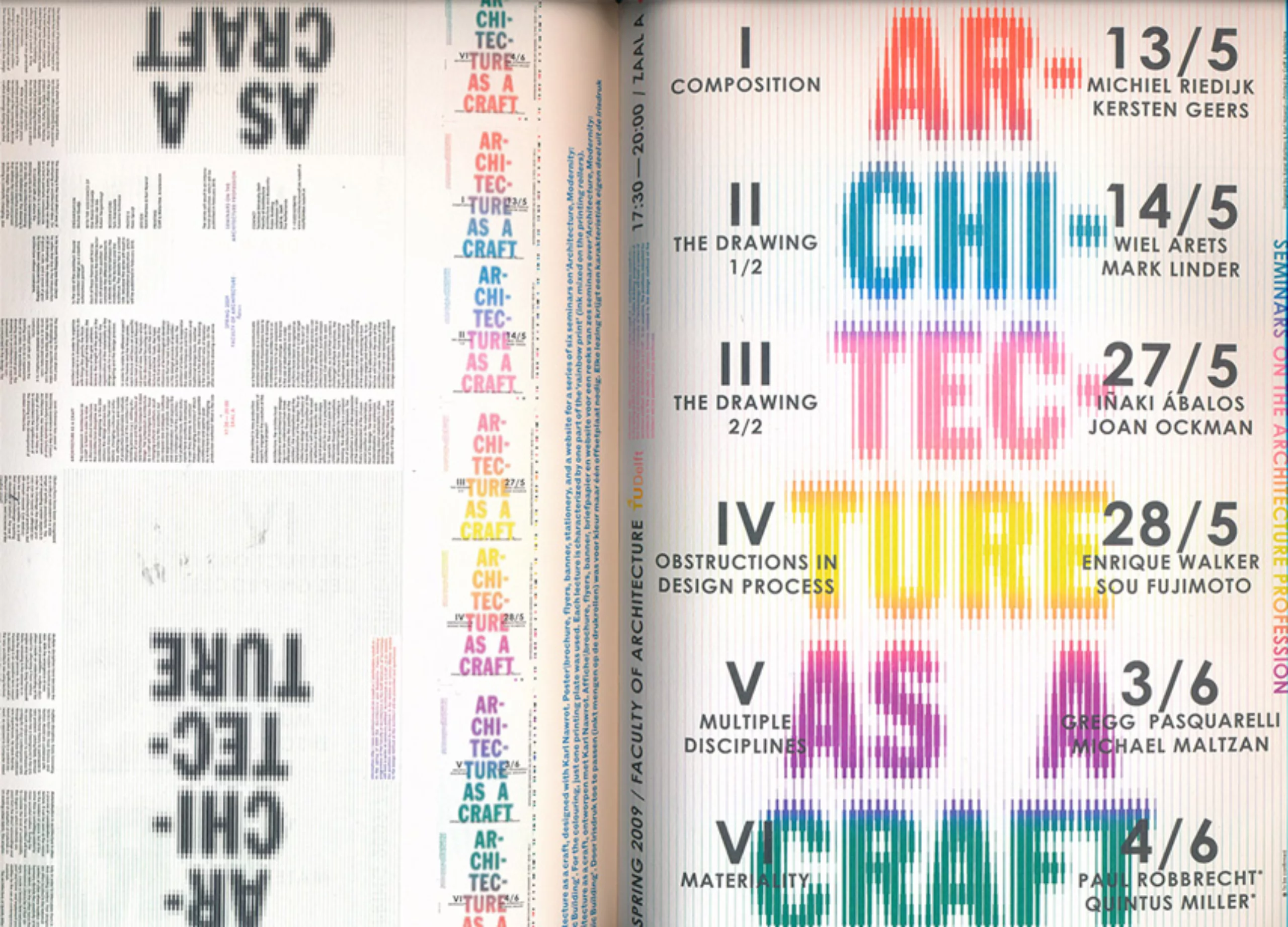
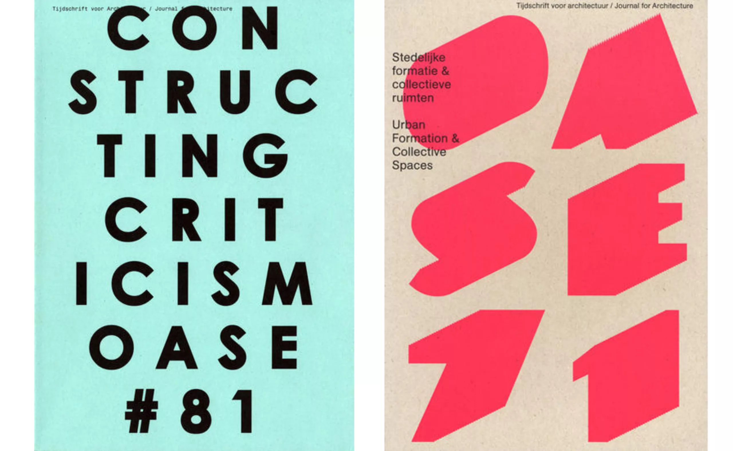
His work for OASE illustrates well this acceptance of the constraint that he turns in creation. Since 1981 this architectural book-magazine published 3 times a year has evolved graphically with each issue.
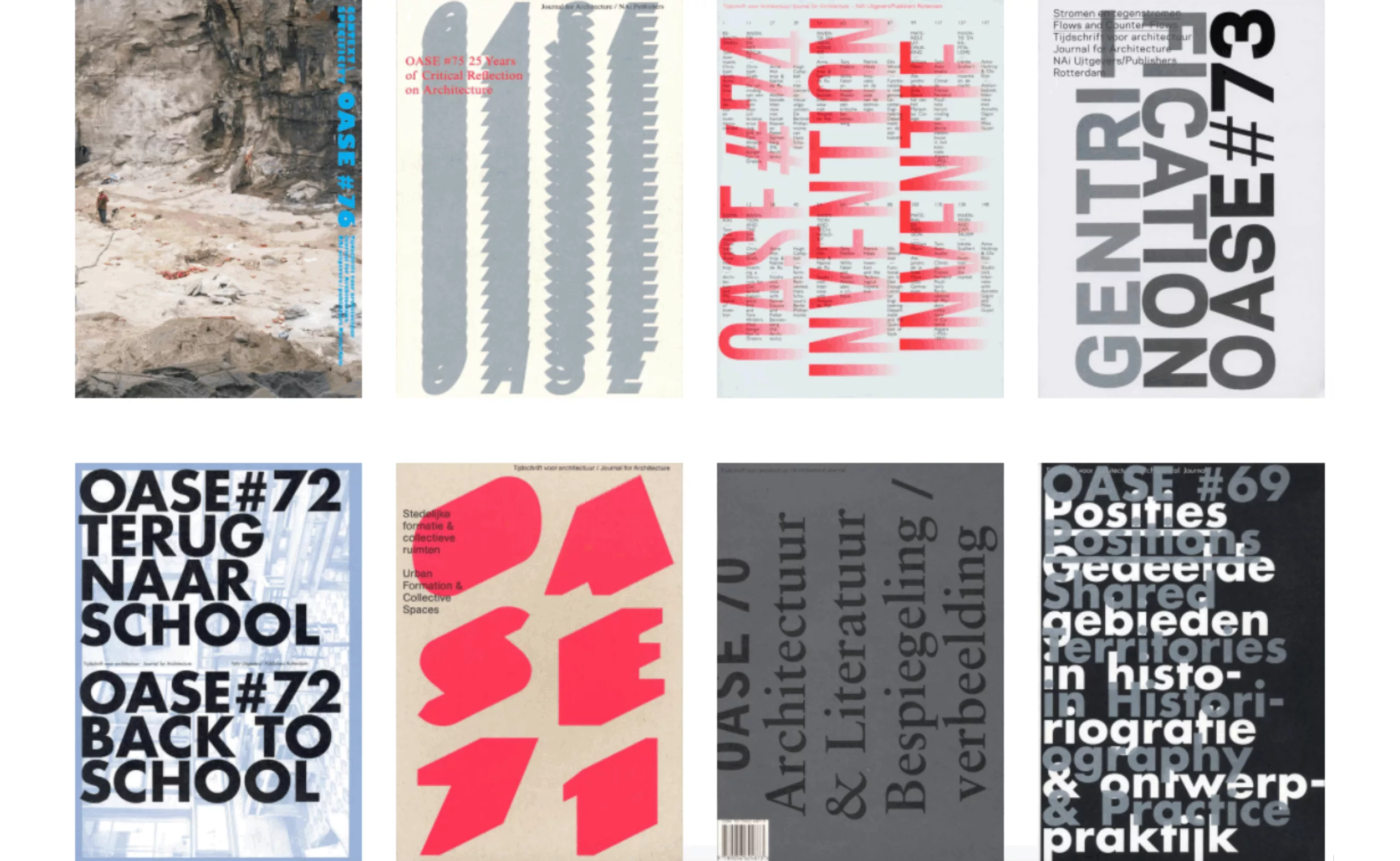
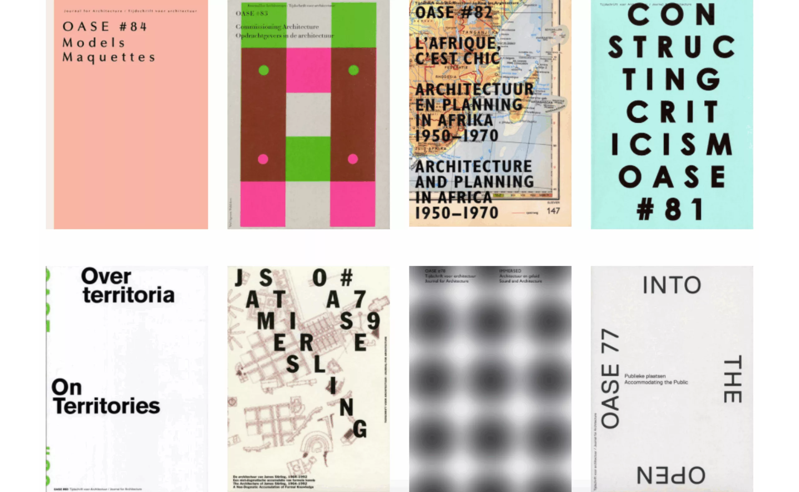
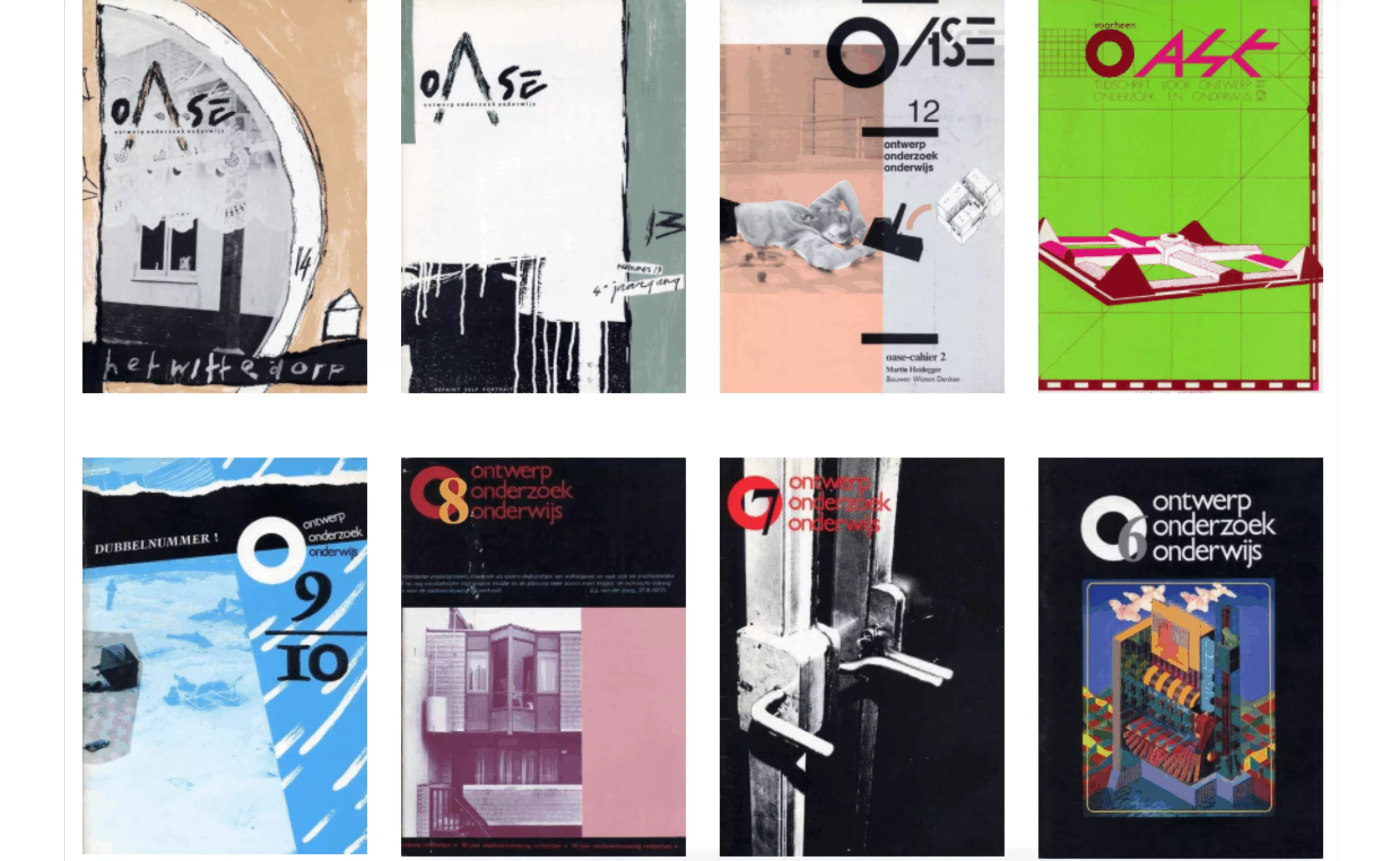
With a very tight budget, Martens and his students rethink each time the grid and content. If he wants to add a color to the cover, he must change his paper, or reduce the size of his pages. This millimetre adaptation game goes from the screen to the logo via the content. For example, how to insert the English translation of the Dutch text when you cannot add pages to the number? He then compares his work in OASE magazine to a dinner between friends: each new invitation-parution must be an opportunity to surprise his guests-readers with a new menu-design.
If work under duress is for him a driving force, his plastic research leads him to advance ever more towards a universal artistic language: printing.
Motive 2: printing
Matter
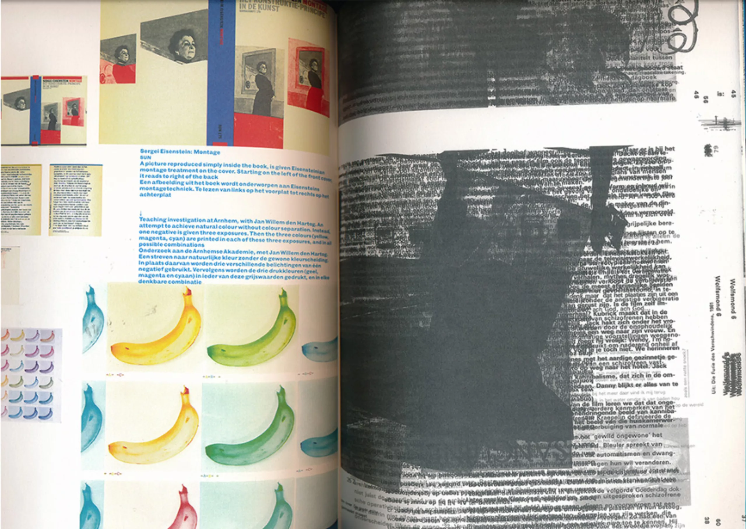
In 1996 Karel Martens was awarded the Dr. Schmidt Art Prize. A.H. Heineken which gives rise to the publication of his work in the book “Printed Matter“, or Printing Matter (cover below). The advantage in French is that’matter’ means both matter, count (import to someone) and problem. This simple title with the word’matter’, difficult to translate, encompasses the multiple facets of the designer.
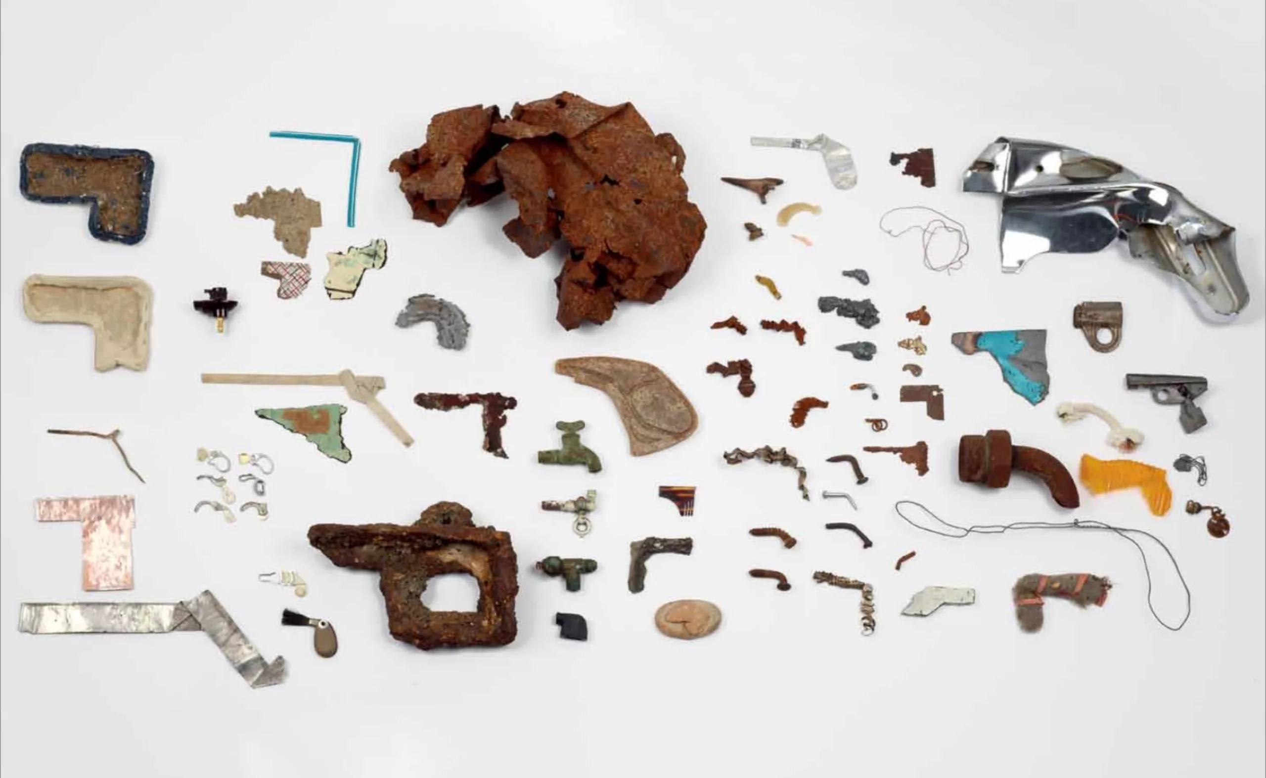
One can guess a fascination for matter through the objects, textures or colours he creates under the weight of his press. His relationship to colour is such that he is still fascinated today by the appearance of green by mixing blue with yellow. Martens has a collection of scrap metal of all kinds removed from carpenters’ shops or old machines, which he recycles into printed characters. The majority of these objects are made of metal, for the industrial texture they transmit and to be able to remove the parts without burr, with a magnet.
Mentors
If he mixes industrial materials and printing it is largely thanks to his two teachers and mentors Henk Peeters and Adam Roskan. Peeters (pictured below) was a founding member of the NUL movement of the 1960s, following the Dada or Duchamp ready-made movement. The artist erases himself in favour of an object projected on the artistic scene which becomes neutral by losing its primary meaning. The members of NUL (to be taken under the meaning of nothingness, let us hear well) create repetitive and reproducible works in series, and do not hesitate to call upon raw materials or elements, such as fire or water, in the manner of Klein.
Rossant, for his part, offered Martens his first press.
Language
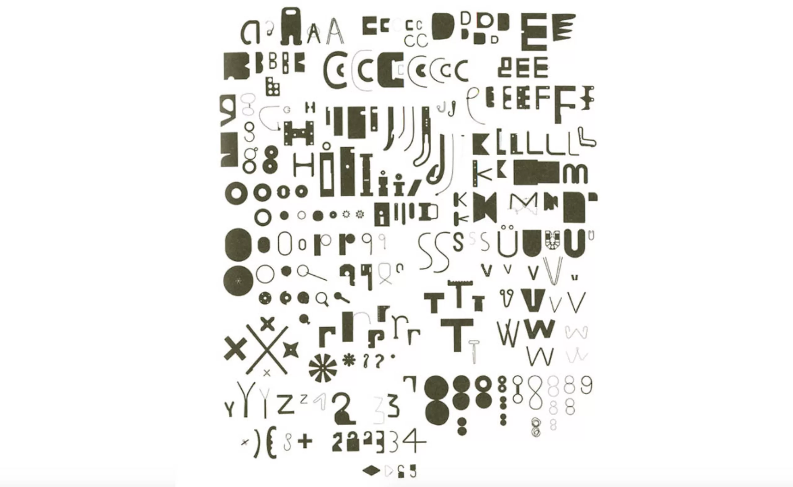
A beautiful article by Paul Elliman allows us to illuminate Martens’ work, through this title “The world as a printing surface”. So around him, in his office, the artist assembled cut-out images and pieces of colors, letters or other visuals that inspire him. This graphic microcosm added to his collection of metal pieces recomposes his vision of the world, created from a cluster of singular things.
Like artist Claes Oldenburg (photo 1 below) who collected shapes reminiscent of laser guns, or Paul Elliman who collected letter-like objects (photo 2 below), Martens compiles raw shapes. Each piece grouped with the others in a systematic way recreates a language, a new alphabet without letters – or universal letters. We understand better why his work is never closed but always potentially evolutionary.
As Martens likes to say, “I like working with the same language I speak, and thinking in the language I see”.
Language is thus detached from meaning, like the object that slips towards nonsense in the literal sense of the term. The small or large printable characters of Karel Martens no longer have their primary use. It is their sensitive form that interests the artist, the trace they will leave on paper, not what they represent. Moreover, by moving these forms, his work resembles that of a designer who would modify a letter. Designer or artist? that is the question, but it does not matter, as long as there is matter.
Additional sources:
On constraint and OASE:
On printing and its plastic work:
- www.nytimes.com/2016/09/07/t-magazine/art/karel-martens-graphic-design-p.html
- https://fr.wikipedia.org/wiki/Groupe_NUL
- http://indexgrafik.fr/the-world-as-a-printing-surface-paul-elliman/
- https://collectingseminar.wordpress.com/2008/11/02/claes-oldenburgs-the-ray-gun-wing/
- https://monoskop.org/images/0/0e/Baudrillard_Jean_Le_syteme_des_objets_1968.pdf
Text: Tiphaine Guillermou
On the subject
-
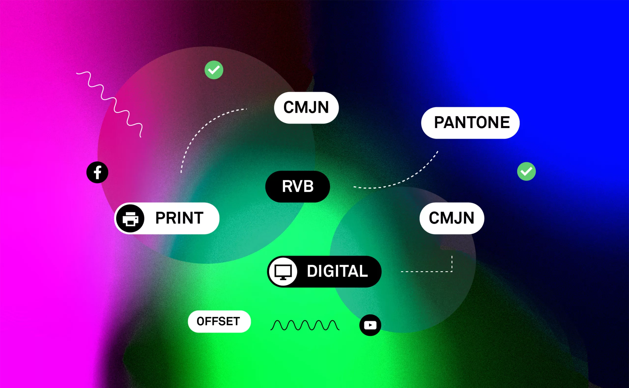
Branding and colorimetry: The “RGB First” strategy
The strategy of “RGB-First”: Reflection on the colorimetric chain RGB / CMYK in print and digital communication.
-
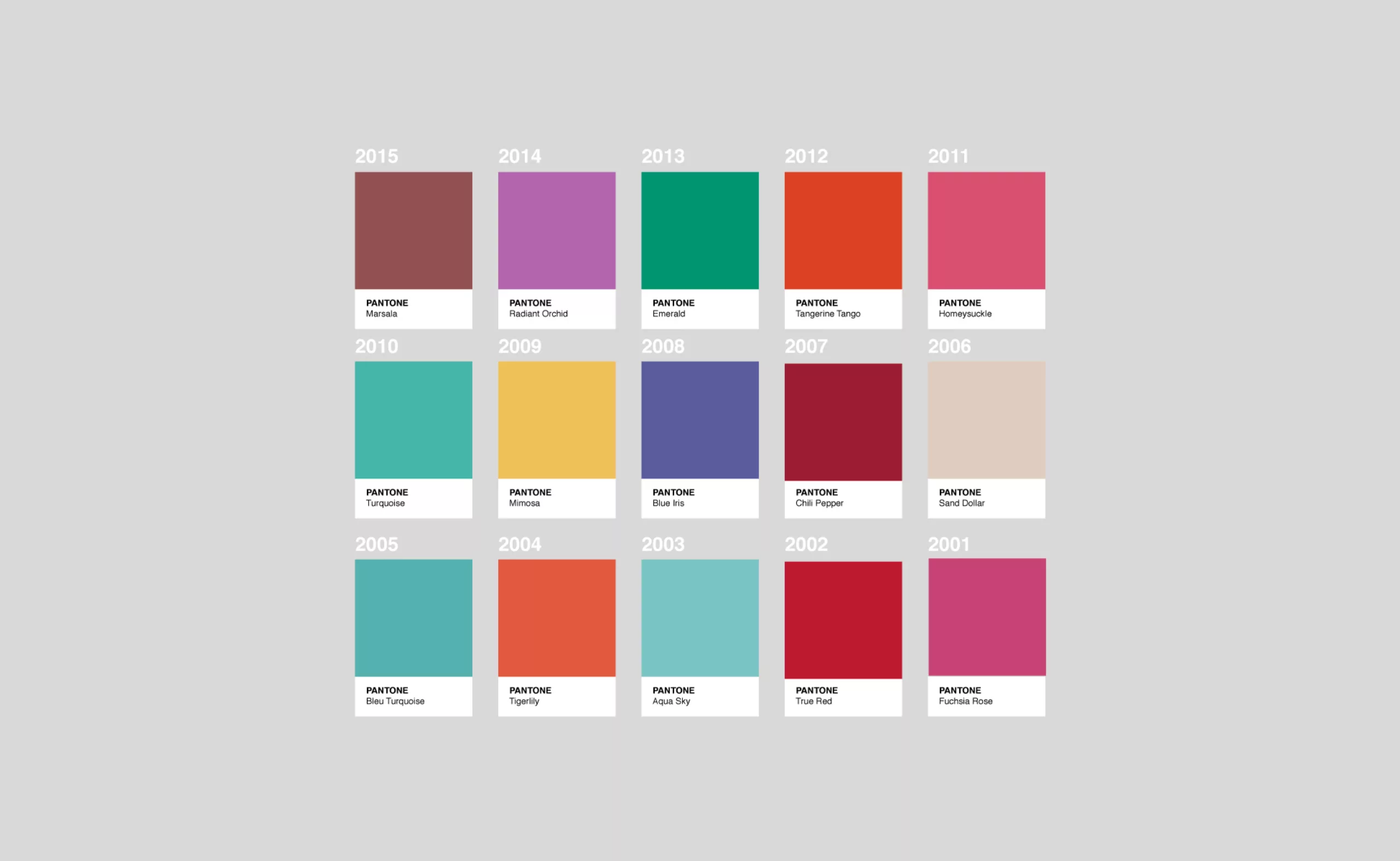
How Pantone colors the world !
Twice a year Pantone proposes ten seasonal colours… a little technicolour deciphering from the big man of colour!
-
A visit to Basel’s printing museum
A short visit to the Basel ( Switzerland ) printing museum.
A unique opportunity to discover a little treasure: the Helvetica protocol !