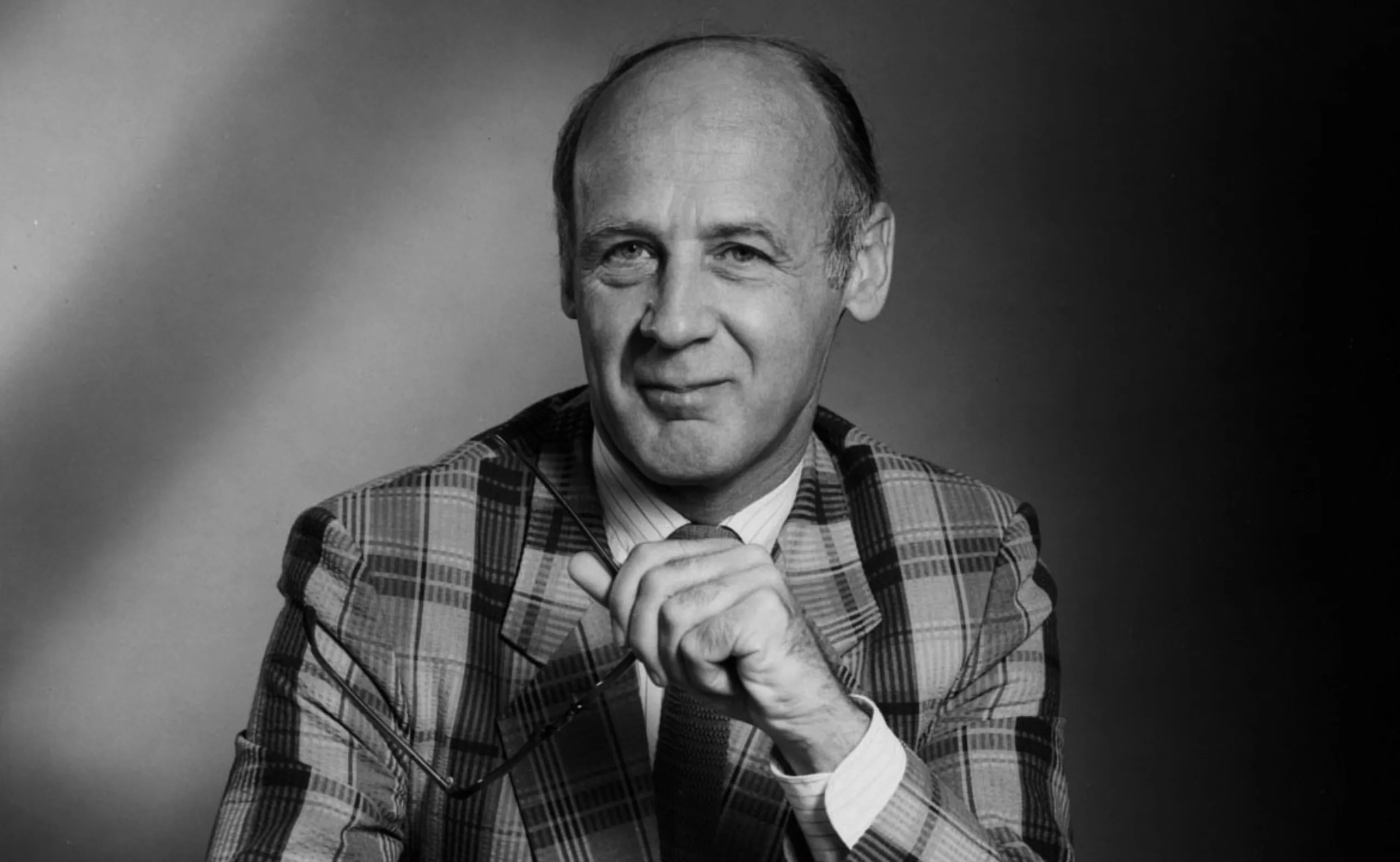
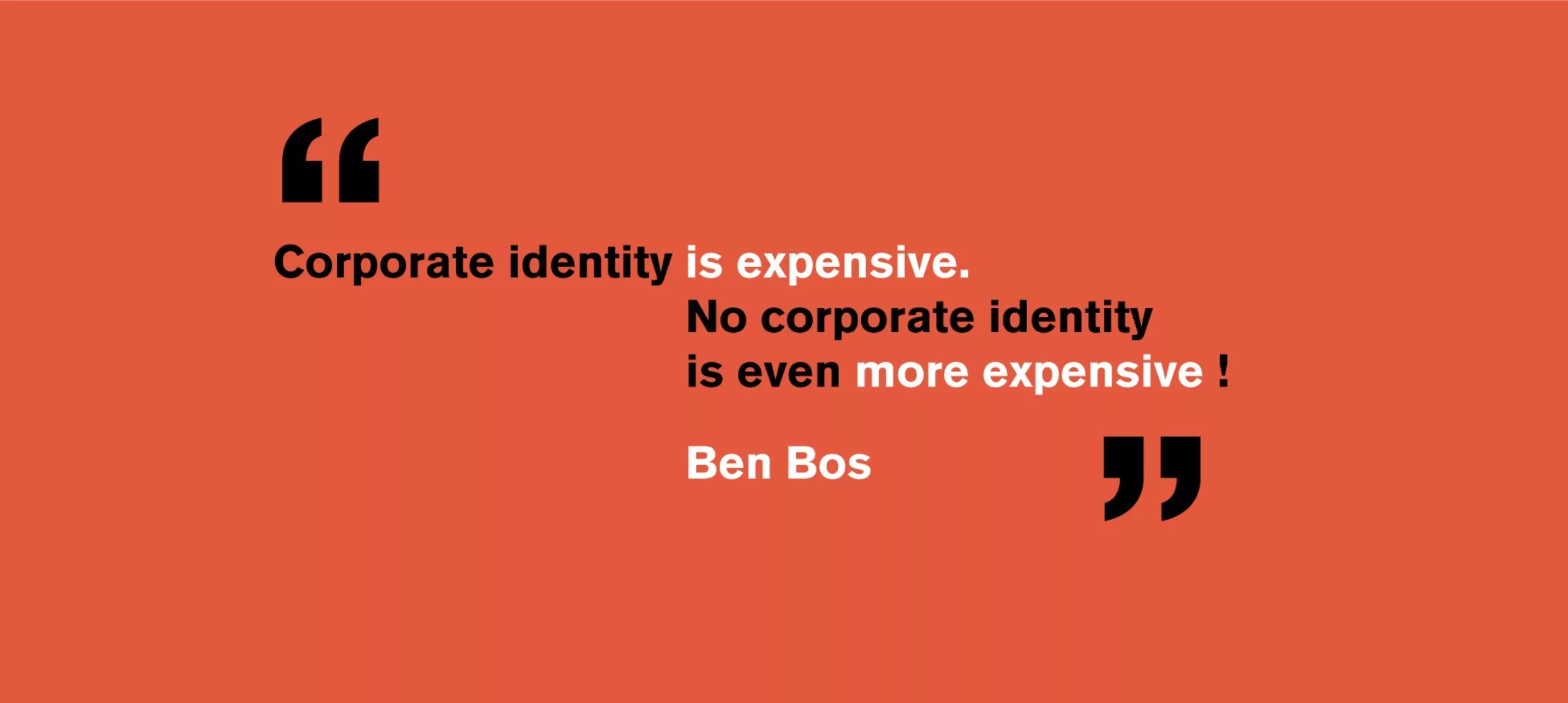
Ben Bos, the big “Bos” of dutch graphic design!
We continue the series of the great names of Graphic Design, this time dedicating ourselves to a legend of dutch design still in activity…
A few days ago the Brand Niewe Conference was held in Amsterdam, a reference among design conferences, which was attended by the full Graphéine team.
Among the speakers: Ben Bos. A real discovery! How could we not know his work existed?! Shame on us!
Ben (the) Bos!
Ben Bos, a dutch designer born in 1930, began redefining Dutch graphic design in the early 1960s. He studied at Graphic College Amsterdam and Rietvield Academy from 1955 to 1962. In his section, he fraternizes with Wim Crouwel, and from then on, their paths will never separate.
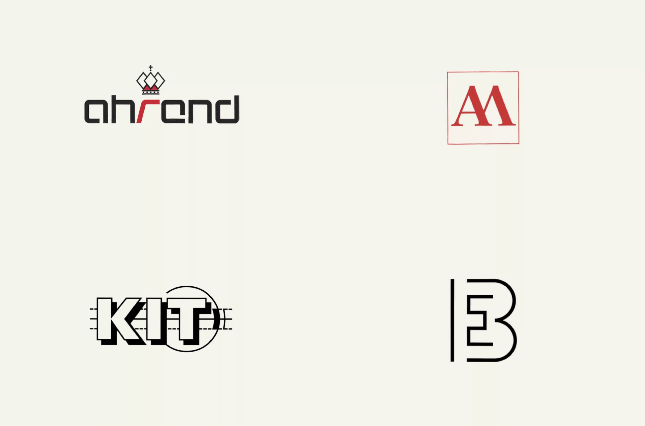
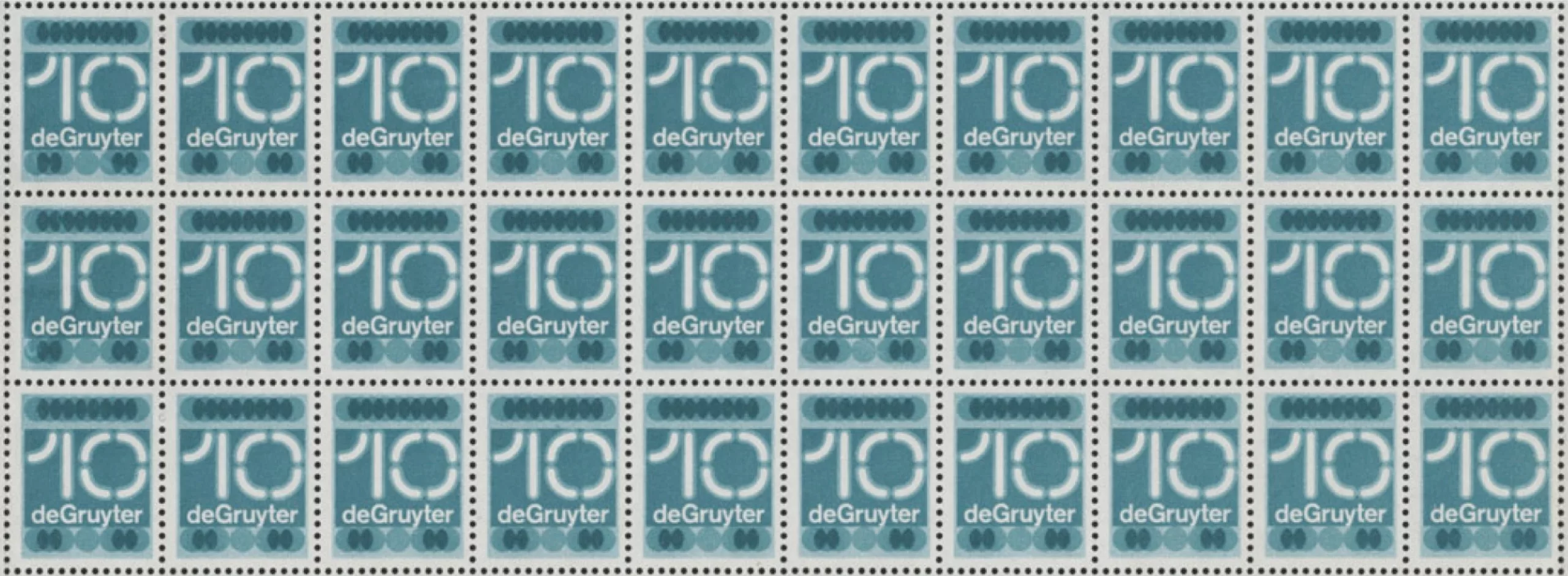
Before becoming the brilliant designer we know today, he started as a copywriter and then as art director at Ahrend, an office supplies company. Although he changed employers a few years later, he remained their favourite consultant for almost 50 years.
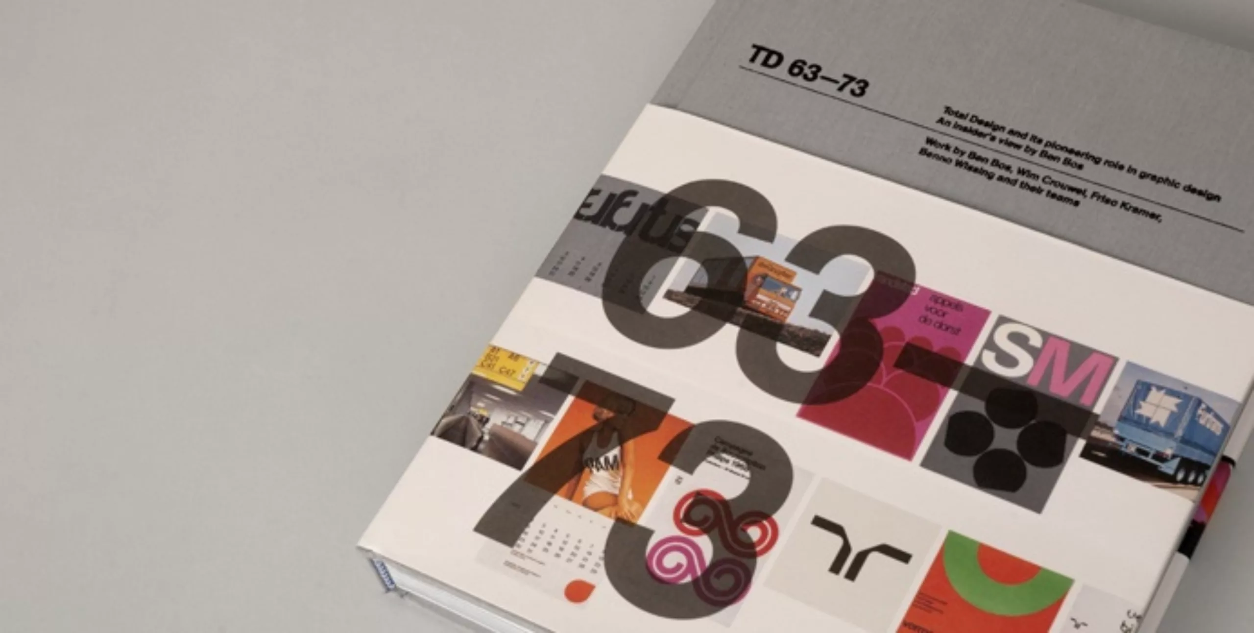
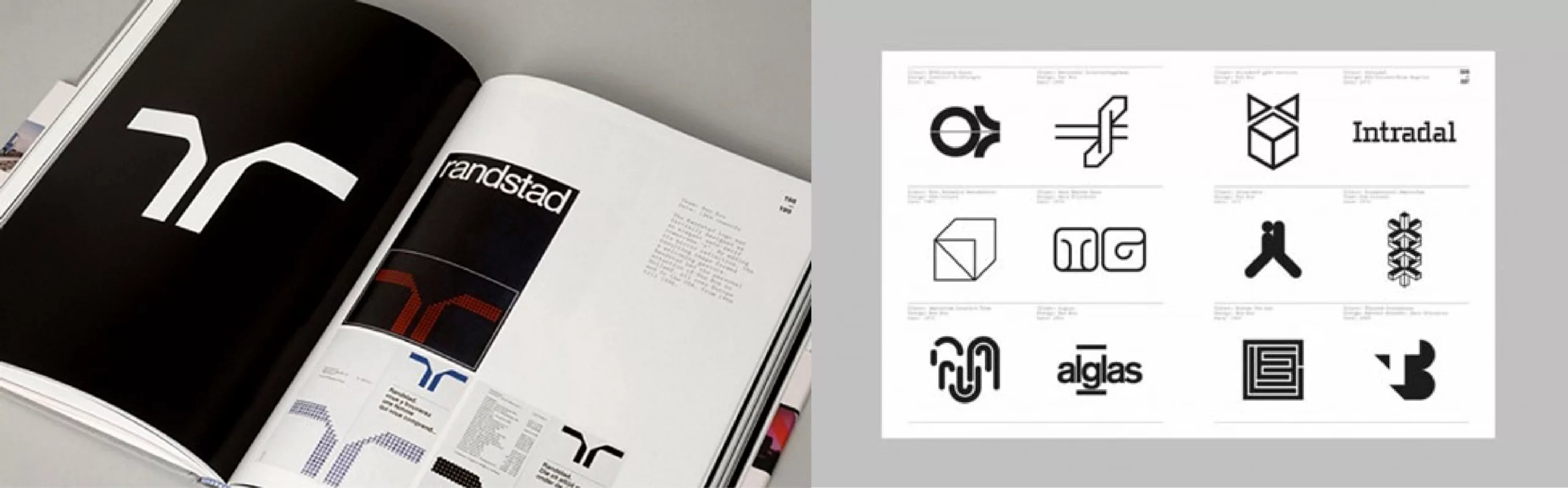
1963. He was the first employee of what was to become the largest Dutch design agency: Total Design. He spent 28 years in this agency before finally becoming independent. He is the employee who will have stayed the longest in this prestigious agency. In 2011 Ben wrote a book about all the work he has done at Total Design, a must have if you appreciate Mr Bos’ work.
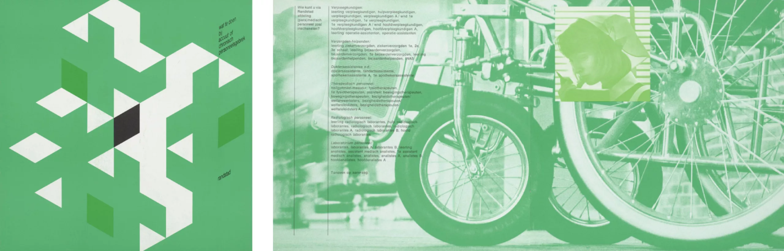
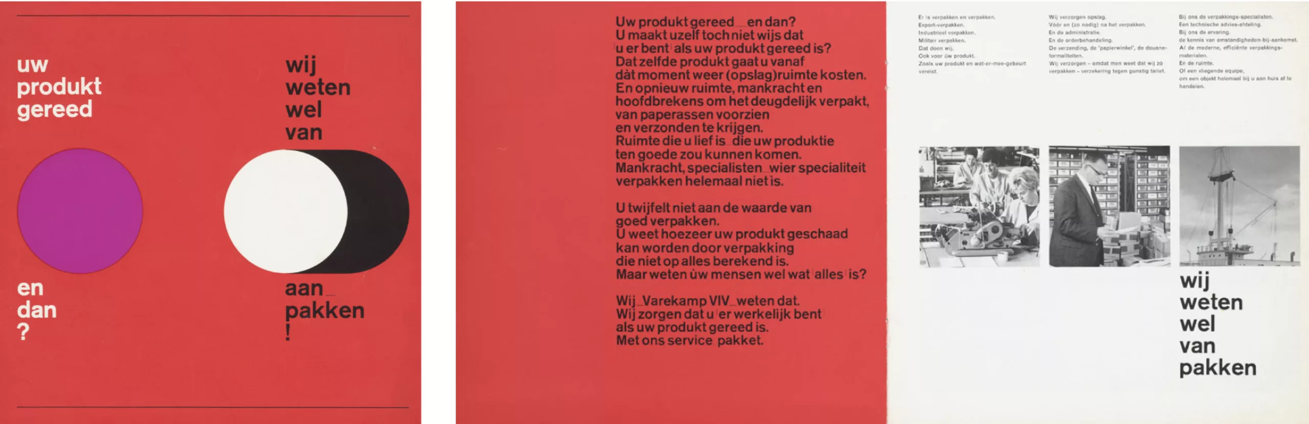
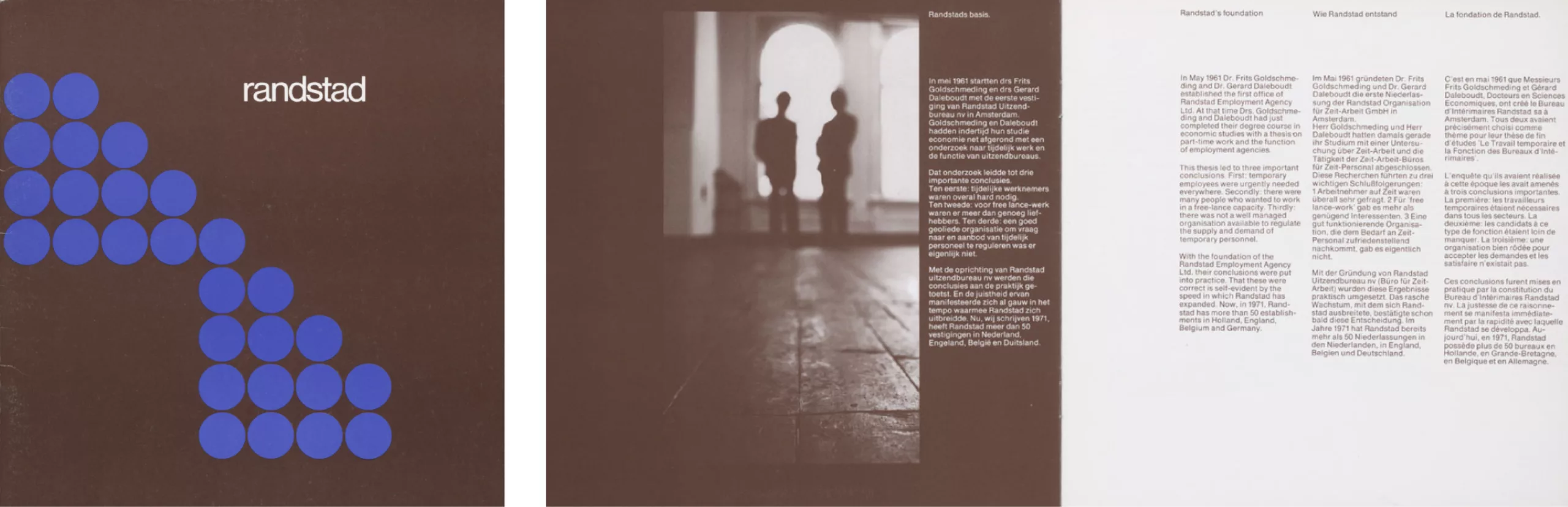
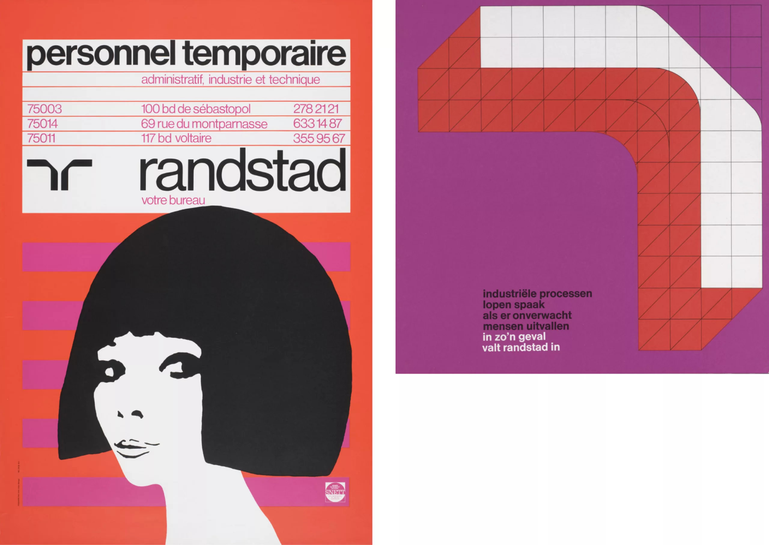
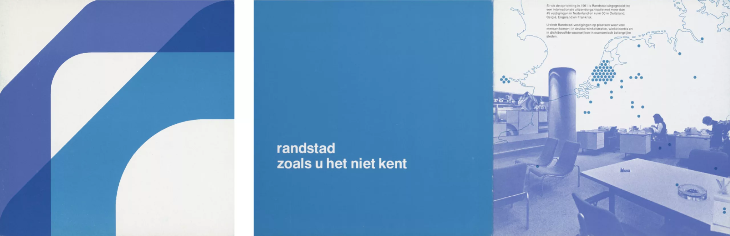
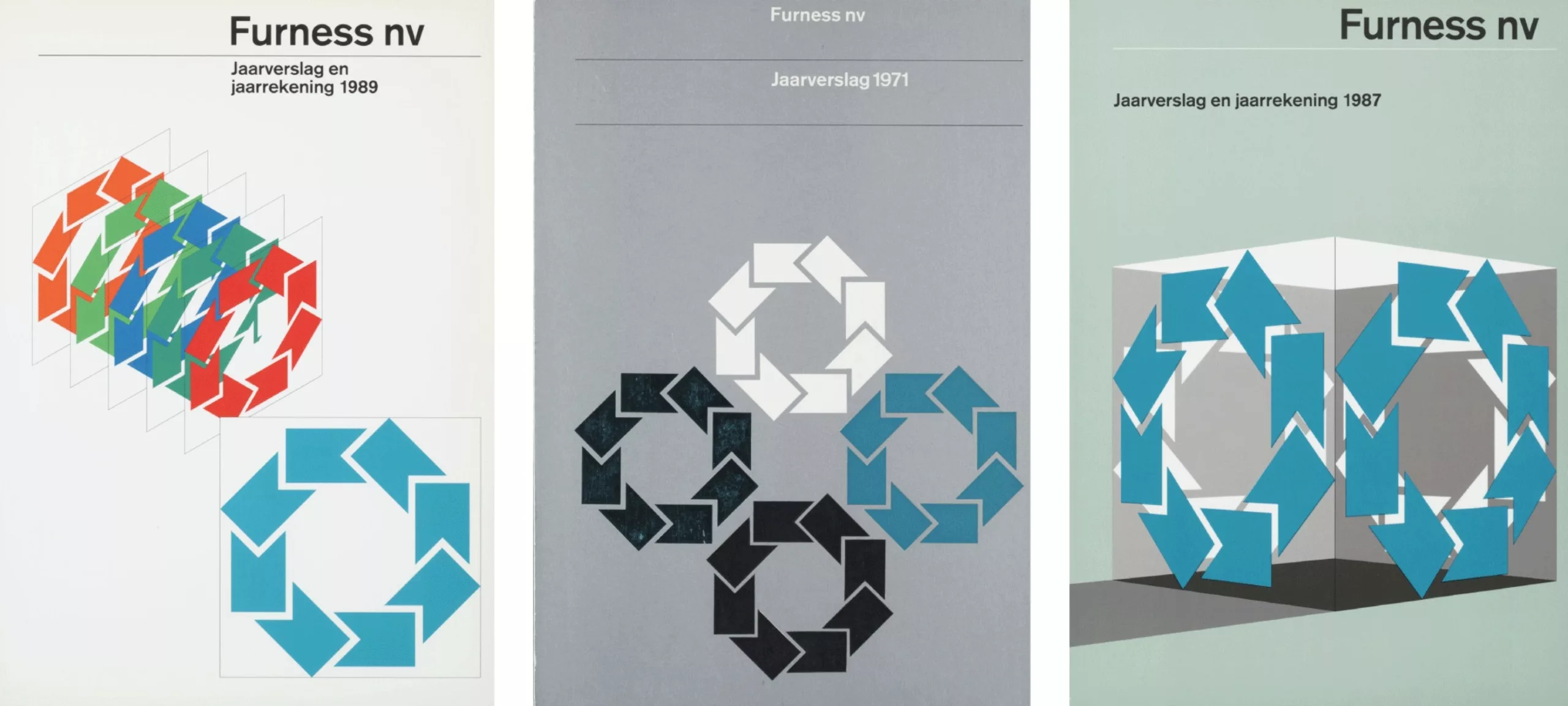
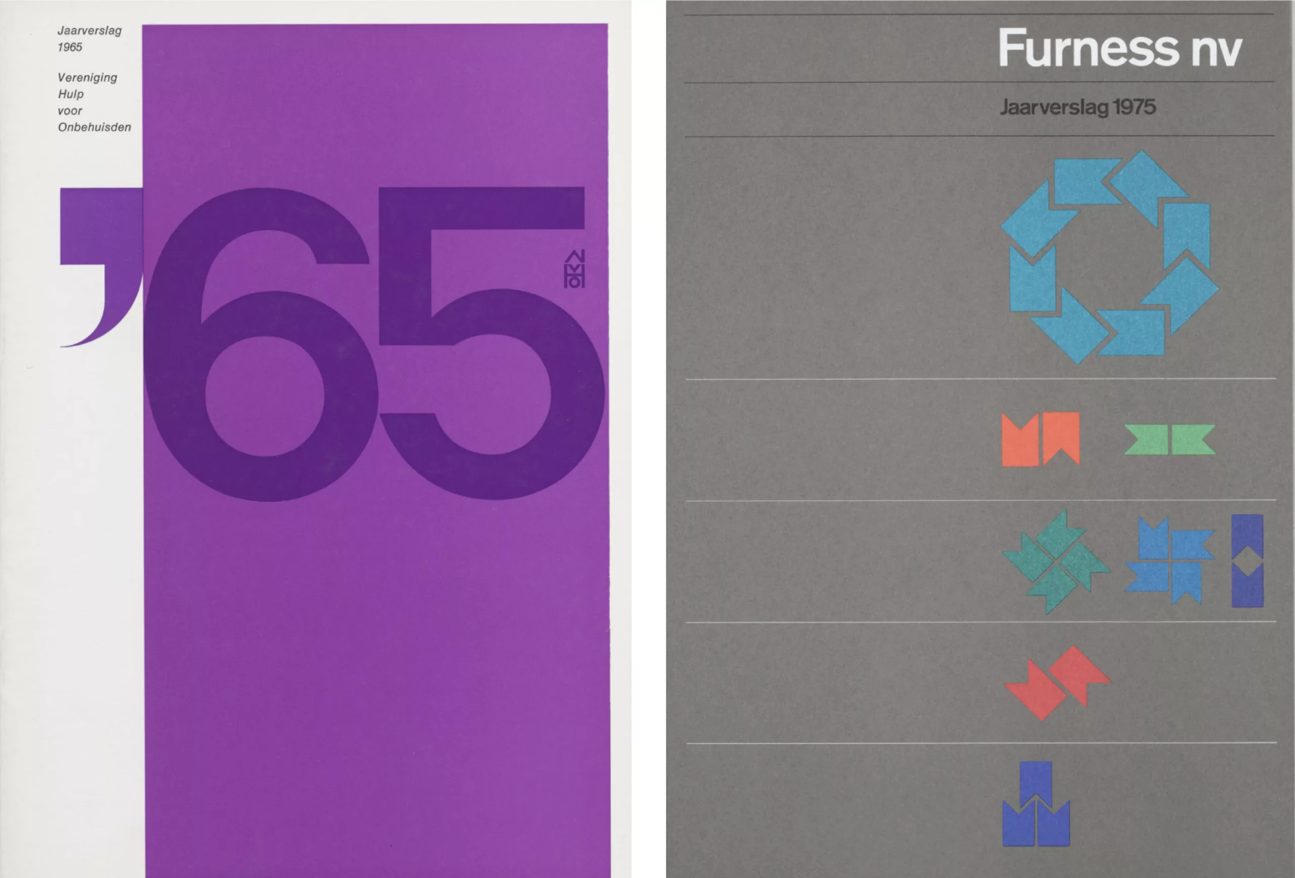
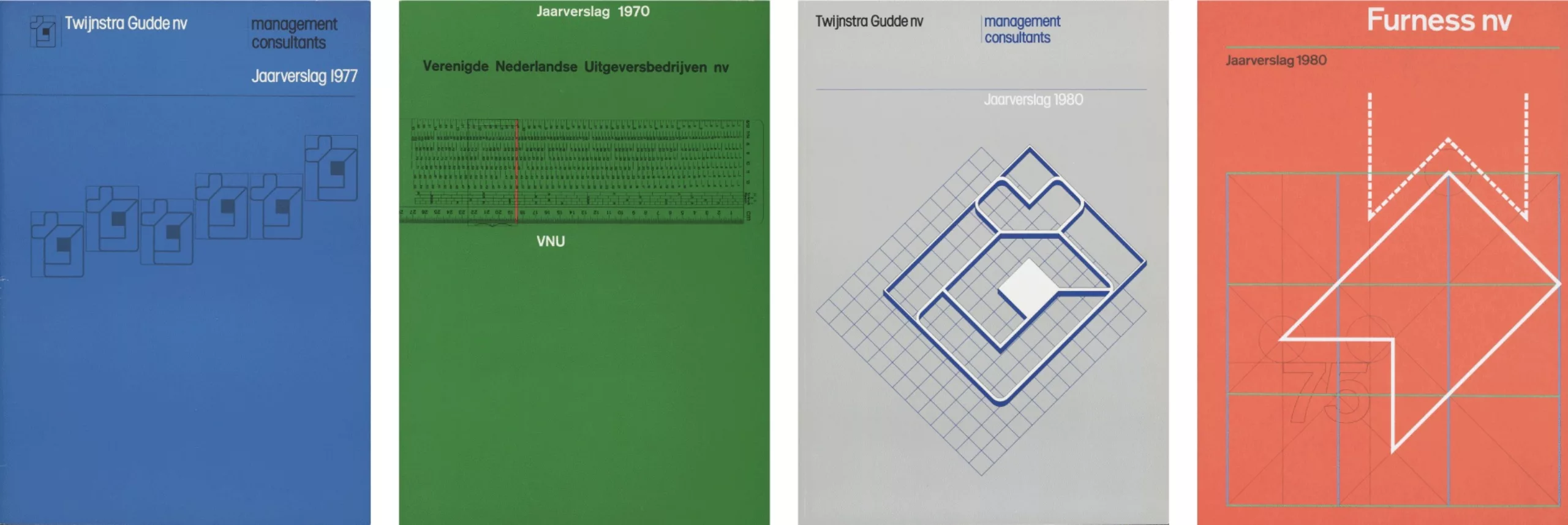
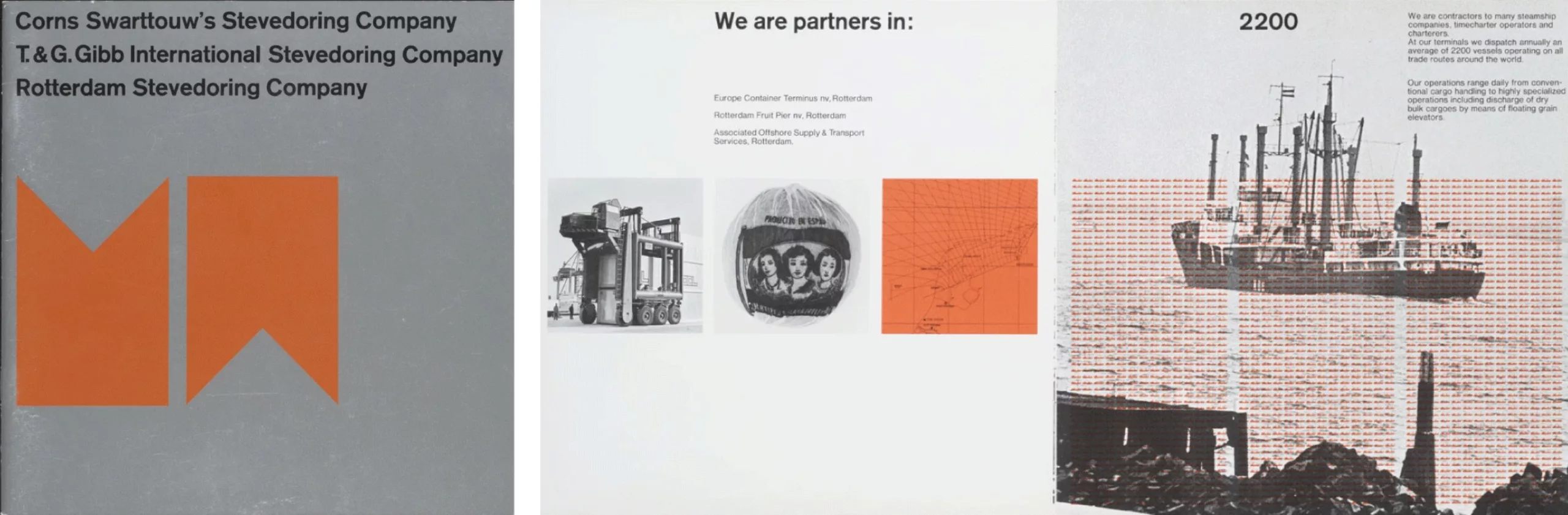
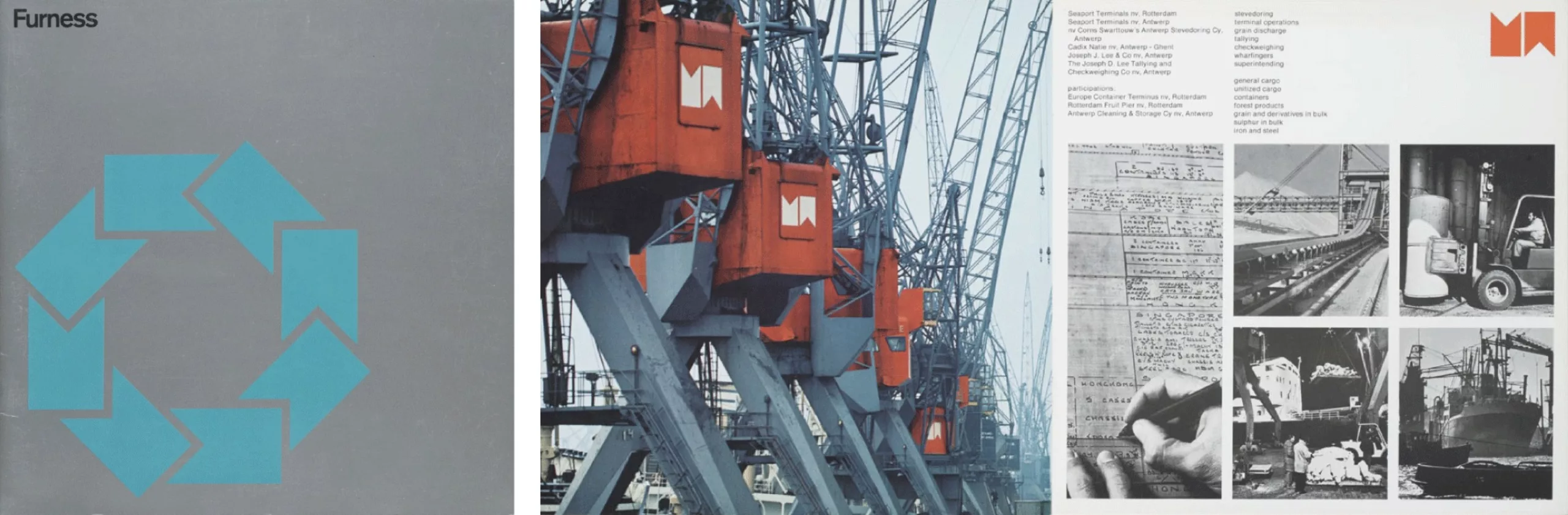
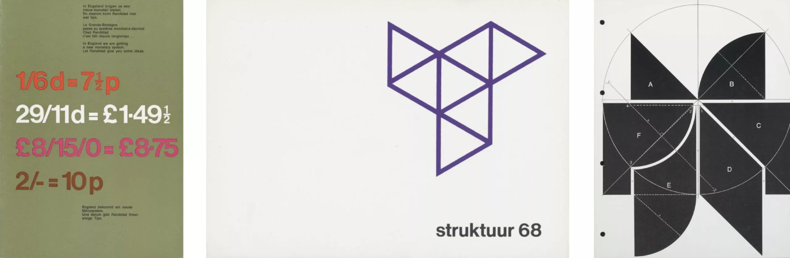
Ben Bos specialized in corporate identity. He has had the opportunity to work for the largest companies, such as Randstad, Furness Logistic Group or Belgian General Bank.
He can boast of having won numerous international awards including the World Logotype Award in 1998. He is also a member of the Dutch Designers Association (BNO) and the International Graphic Alliance (IGA).
Thanks to his experience, Ben Bos is now teaching in Europe, the United States, Israel and even Japan.
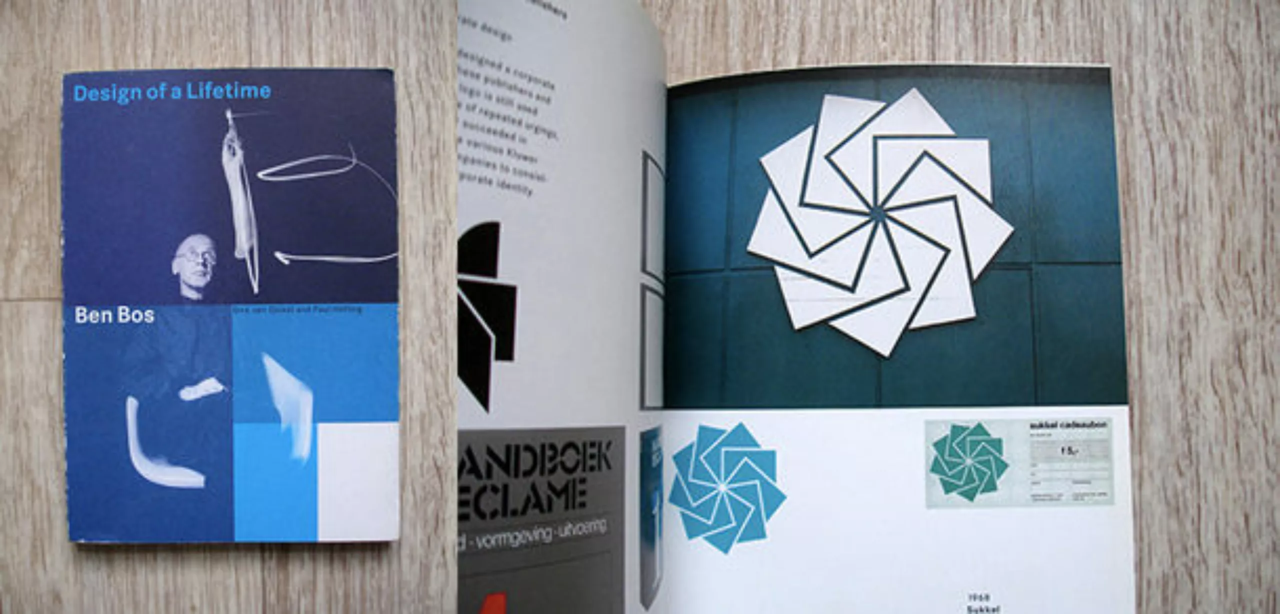
In 2000 an exhibition was organized in Breda: “Ben Bos, Design of a lifetime” (which later gave its name to the book), which was intended to make known to as many people as possible all of his work, namely hundreds of logos.
Today he works independently, and continues to animate conferences on graphics and design; from the top of his 85 years, the man is always in action and does not stop working, writing, and also painting.
The Total Design years
It is important to make a small detour to Total Design, a mythical dutch agency that has democratized design in the Netherlands.
In the 1960s, a new generation of graphic designers appeared, precursors of “Dutch design”, who contributed to modernising Dutch graphic design.Jurriaan Schrofer, Jan van Toorn (very attached to the political consciousness of the spectator), Jan Bons (painter, sculptor and resistance fighter during the war), Ben Bos and Wim Crouwel can be mentioned.
Total Design was founded in 1963. Until then, almost all Dutch design projects were entrusted to foreign companies… There was no major design agency in the Netherlands, so Total Design was created to fill this gap.
The founders were Win Crouwel (designer), Friso Kramer (industrial designer), Benno Wissing (graphic designer and space designer), as well as Paul and Dick Scharwz (finance and organization directors); Ben Bos was added to this team as a copywriter and designer.
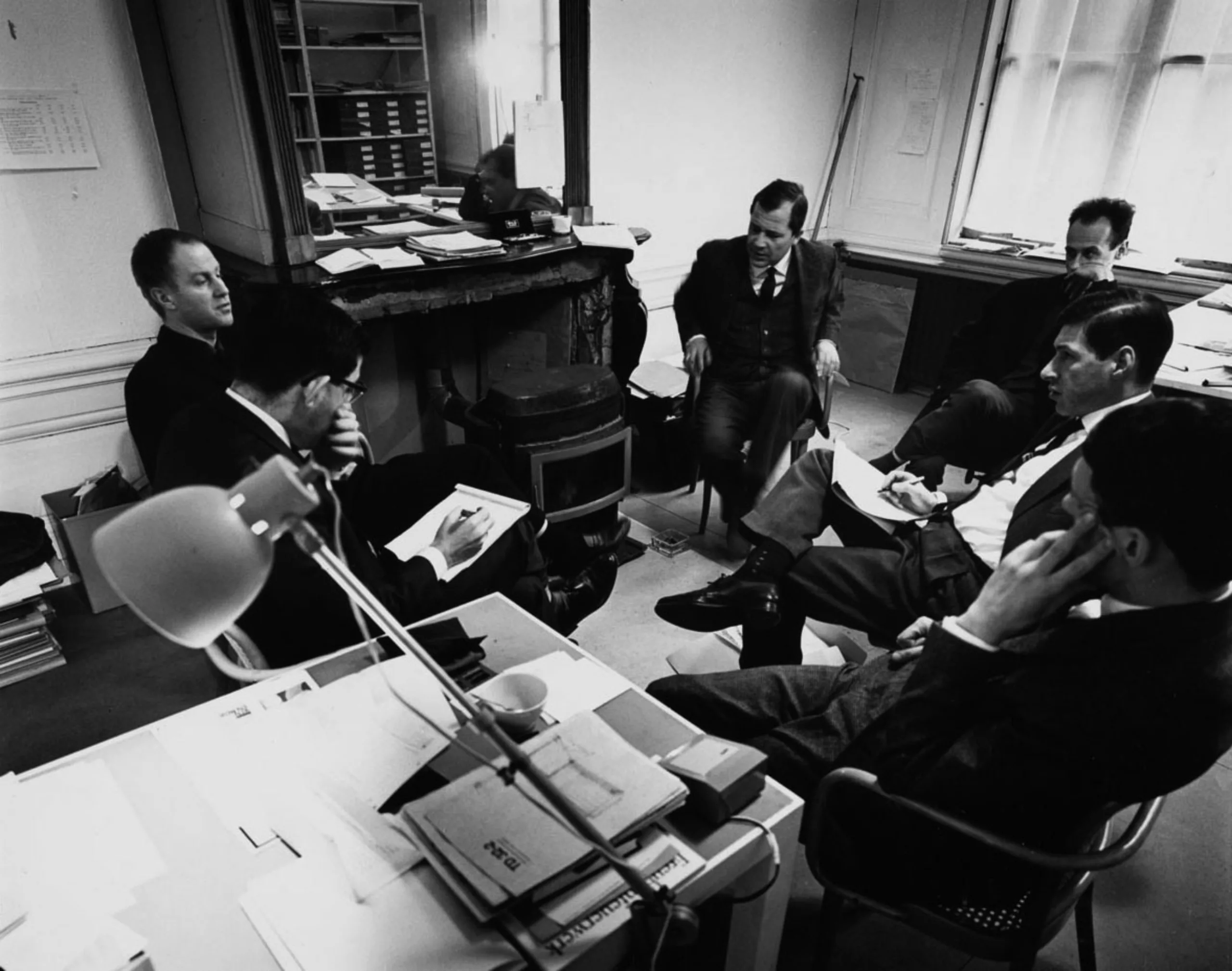
This group had such experience that it was able to carry out all the tasks required of them, however complex they might be. They have proven this time and again for a wide variety of clients in industry, commerce, transportation, government and cultural sectors.
The agency was a huge success during the 1960s, the number of employees only grew, and it was able to retain its loyal customers, such as Randstad and the Amsterdam Stedelijk Museum. In the 1960s and 1970s, the signage for Amsterdam airport, the identity of the oil company PAM, and the Dutch pavilion for the 1970 Osaka International Exhibition, among others, were produced.
Total Design has had a profound impact on the Dutch graphic environment for several decades, while at the same time playing a training role with a generation of graphic designers, both Dutch and European, who are making their first steps within its teams.
The staff evolved little by little, until the departure of Win Crouwel in 1985, and that of Ben Bos five years later. Following these departures, many design agencies were born in the Netherlands over the years.
In the 1990s, Total Design went from a staggered agency to a classic design agency and finally became an organization focusing on identity development, corporate image and reputation management, in other words a much more strategic approach. In 2000, Total Design changed its name to Total Identity in order to affirm this new positioning and to ensure a sustainable future.
Between creation and inspiration
During his career, Ben Bos has had his share of important clients. We mainly focus on his achievements for the temporary employment giant Randstad and the Belgian General Bank.
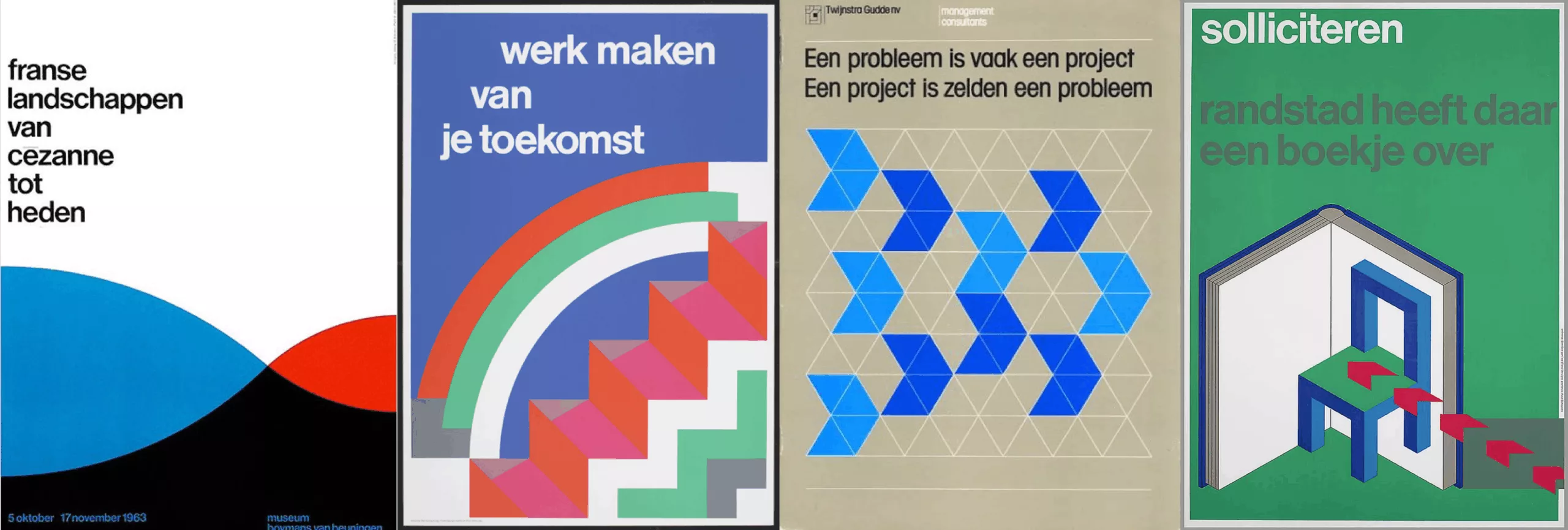
Ben Bos manages to convey important values, through minimalist and geometric logos… A sort of feat!
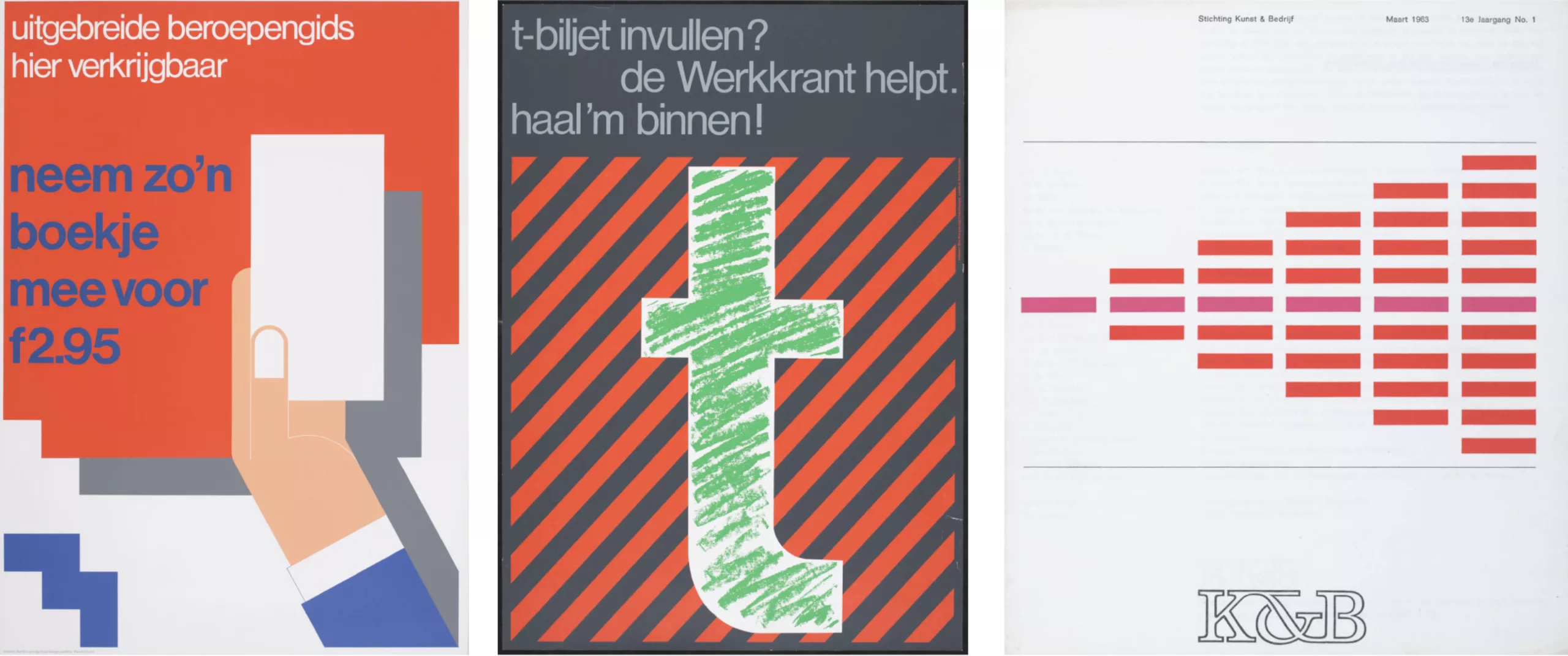
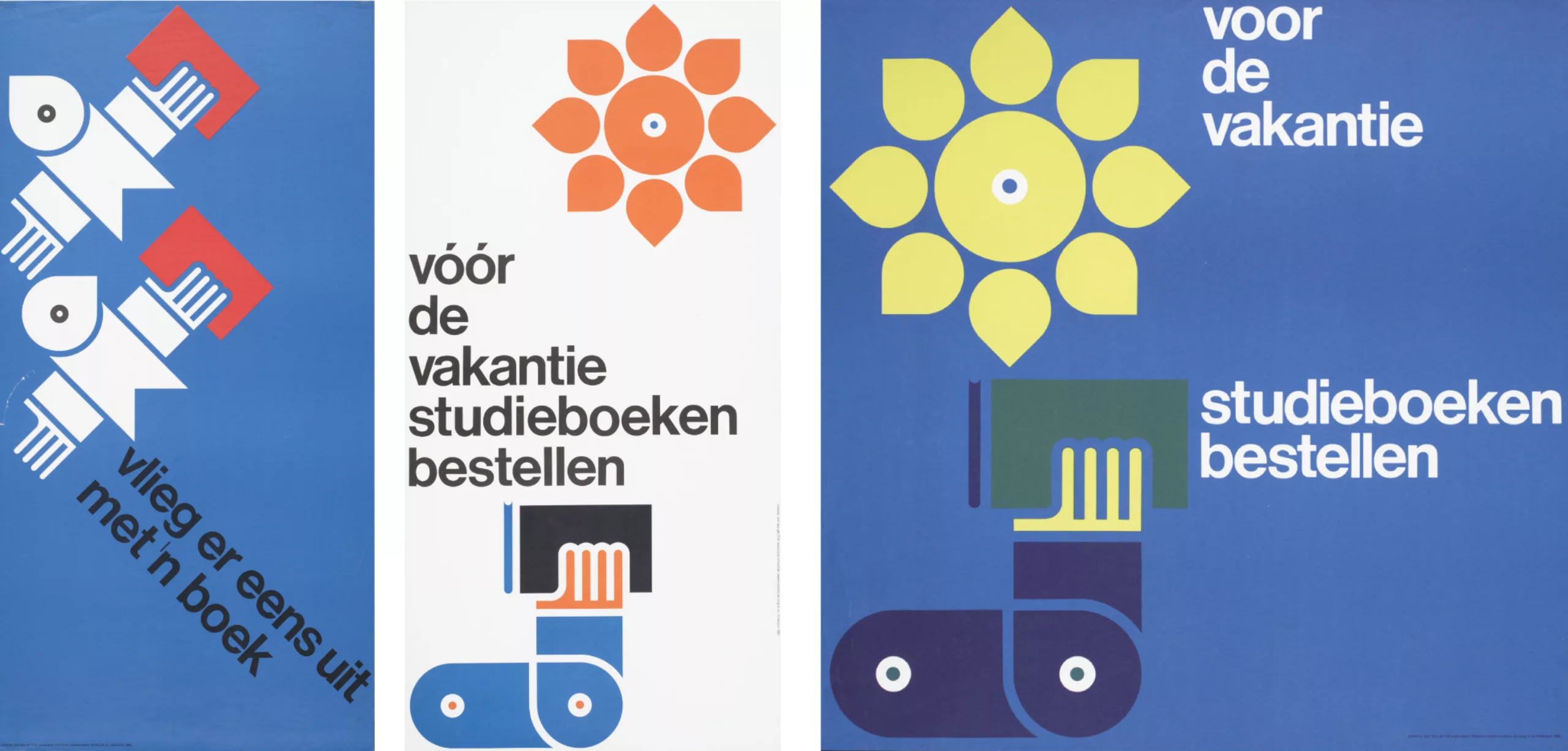
All of his work is centred around one key word: simplicity. The important thing is to create something perfectly understandable by all, with a sobriety of the most impacting. This talent earned him the title of “Renaissance man: designer, journalist, copywriter, photographer, studio manager, initiator and chairman of the Nederlands Archief Grafisch Ontwerpers” in issue 59 of Eye magazine.
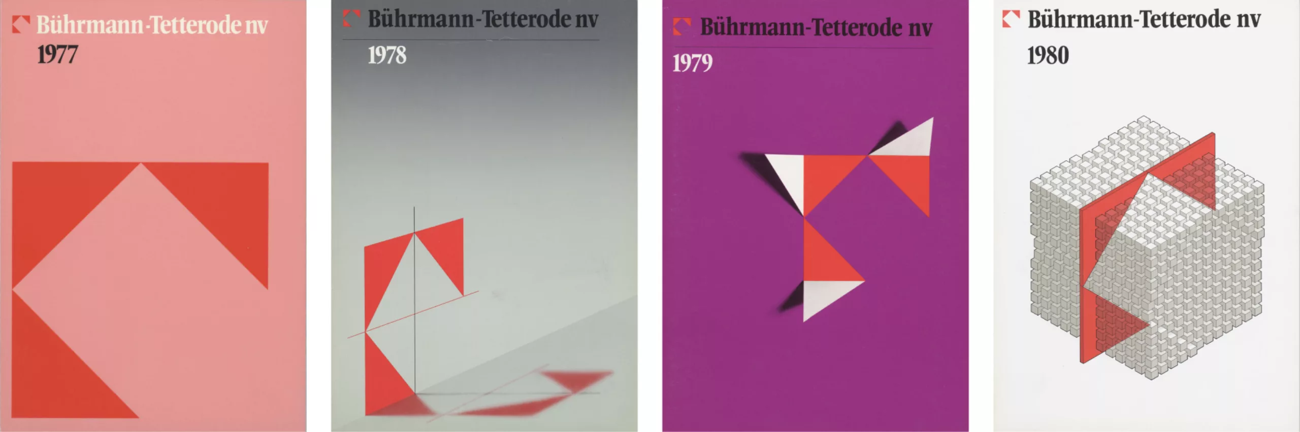
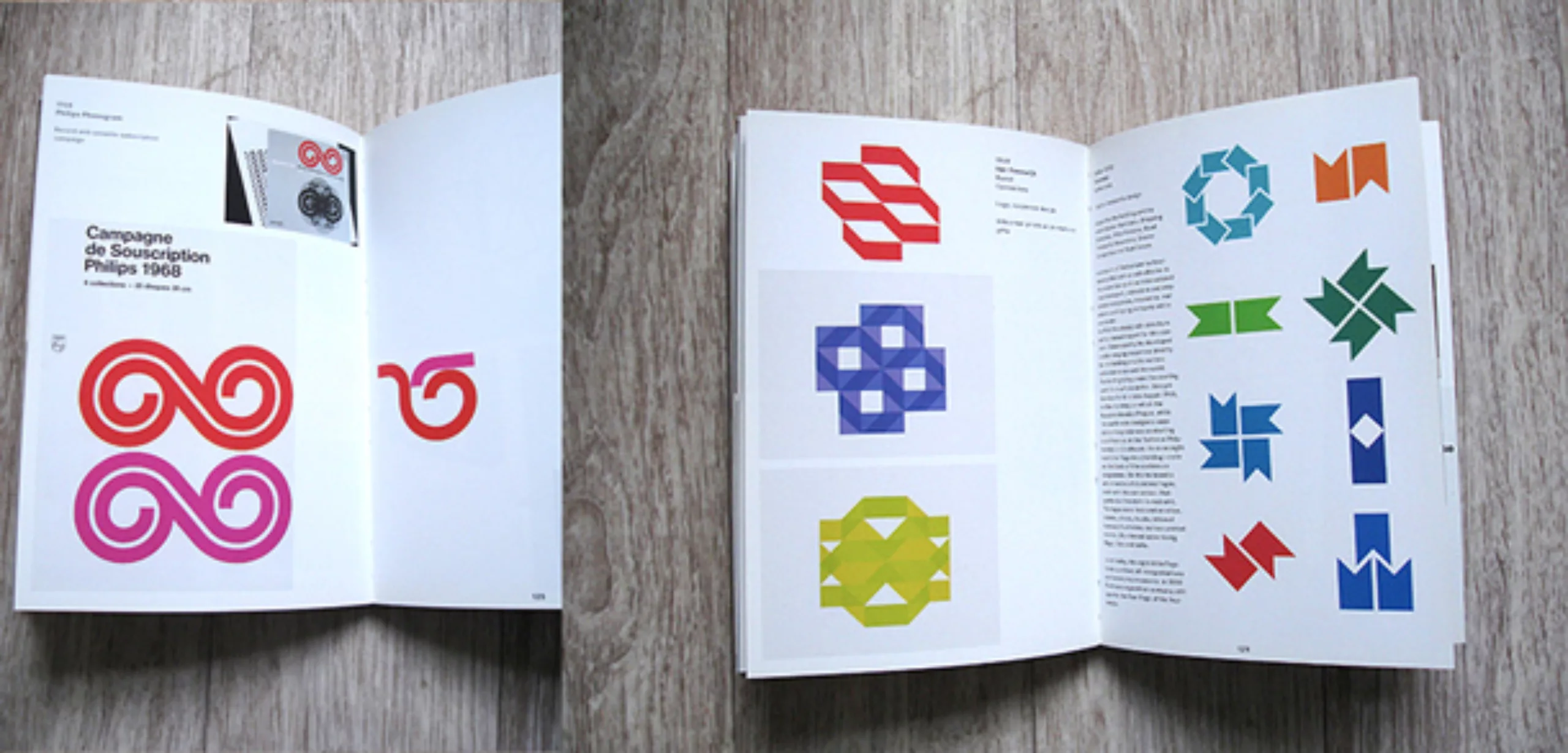
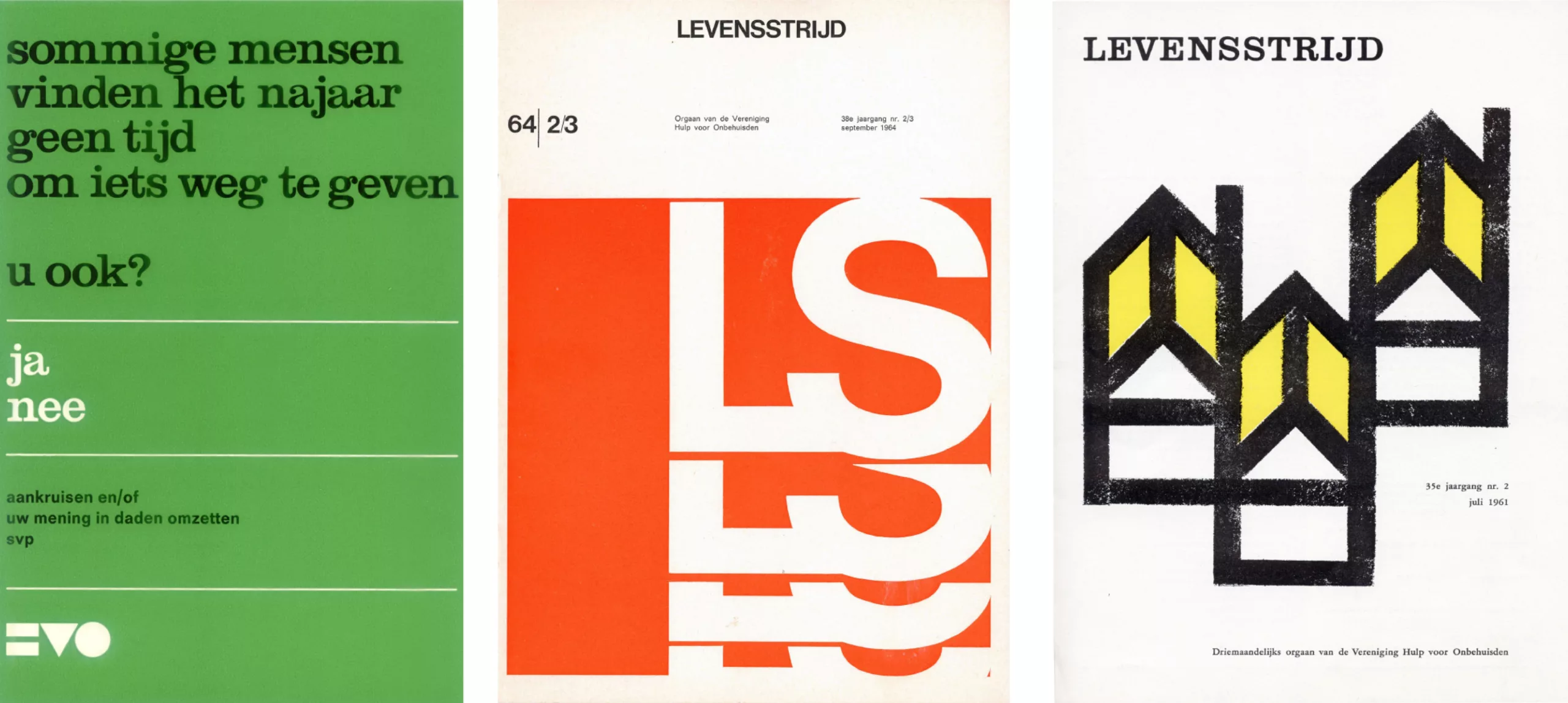
In most of his works, we find a rich and sparkling colorimetric universe, large flat colors, geometric shapes… One could see something almost childish, a young boy’s sensitivity almost palpable. Like the identity he imagined for the municipality of Dronten in 1975, which is still used today.
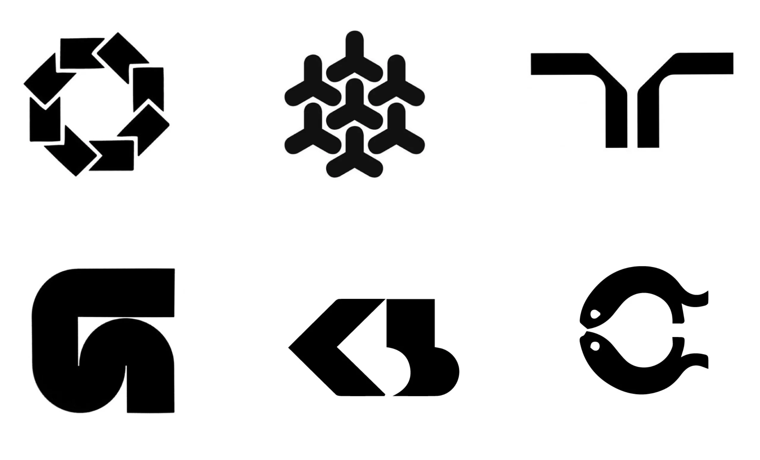
We also owe him the famous Randstad logo, you know, this double R in mirror telling the link between temporary workers and companies. This composition brings balance and evidence to the logo. Everyone goes from his interpretation, some tend to think that it would be a person with both arms in the air, as a sign of welcome.
The work he has provided forces respect in the sense that the identity imagined decades ago is still used. A relentless work, the search for perfection and consistency in simplicity. Ben Bos needed no more to design identities that “age” well, and that remain deeply contemporary after half a century of use. You will have understood, this great gentleman inspires graphic designers all over the world, and we too; a person and a job that we can only salute and respect.
We let you make your opinion, and tell us what you think in the comments.
The orange from the Netherlands would come from France!
In the Netherlands orange is found everywhere, in the streets, in clothes, flowers, cheeses, and therefore naturally in Ben Bos’s work! But why so much orange? Isn’t their flag tricolor, Blue-white-red? Well the answer might be in France!
Let’s go back to 35 B.C.
Retired Roman legionaries found a town on the territory of the Gallic tribe of the Tricastinis. This is the Colonia Julia Secundanorum Arausio. Arausio will become Orange in everyday language. The Romans planted vines which still today give the identity of this region.
Passing centuries, Orange will be the property of Charlemagne who reigns in Aachen, then of Barberousse who makes the city a principality. From legacy to conquests in Northern Europe, the principality of Orange, city of princes, lands in the dowry of the Nassau family. William I says the taciturn is therefore William of Orange-Nassau. He settles at the head of United Provinces which are today the Netherlands.
In the 17th century, religious wars divided Europe. Guillaume d’Orange-Nassau took the head of the Protestants and those who followed him were called Orangists. They arrange themselves under a common banner that they dye logically in orange color. Catholic France waged a long war against Protestants in the Netherlands. In Provence, Orange thus became an enemy city of the King of France. It was besieged by Count de Grignan who took control in the name of Louis XIV.
Since then, Protestants have kept the orange as their standard. In Northern Ireland, the Protestants faithful to the attachment to Great Britain are always called Orangists and march every year under the orange banners In Amsterdam the balcony of the royal palace was decorated with sweet oranges… All this because of some Roman legionaries who found so well this Provence which resembled their native Italy !
But then why is the national flag blue-white-red??
According to one hypothesis, orange not being visible enough for a flag at sea, orange would have been replaced by red in the seventeenth century !
To go further:
- Presentation by Ben Bos at OFFSET 2013.
- An interview given during the same conference.
- His work presented on the site of the Wim Crowel Institute
On the subject
-
A history of mascots
Mascots, those soft, slightly silly characters, are nothing new. Here’s a look at their origins, from Antiquity to Japan.
-
Herb Lubalin, the letter as an image
Herb Lubalin’s biography in pictures. In his 40-year career, Lubalin has revolutionized the landscape of American graphic design by composing images with text.
-
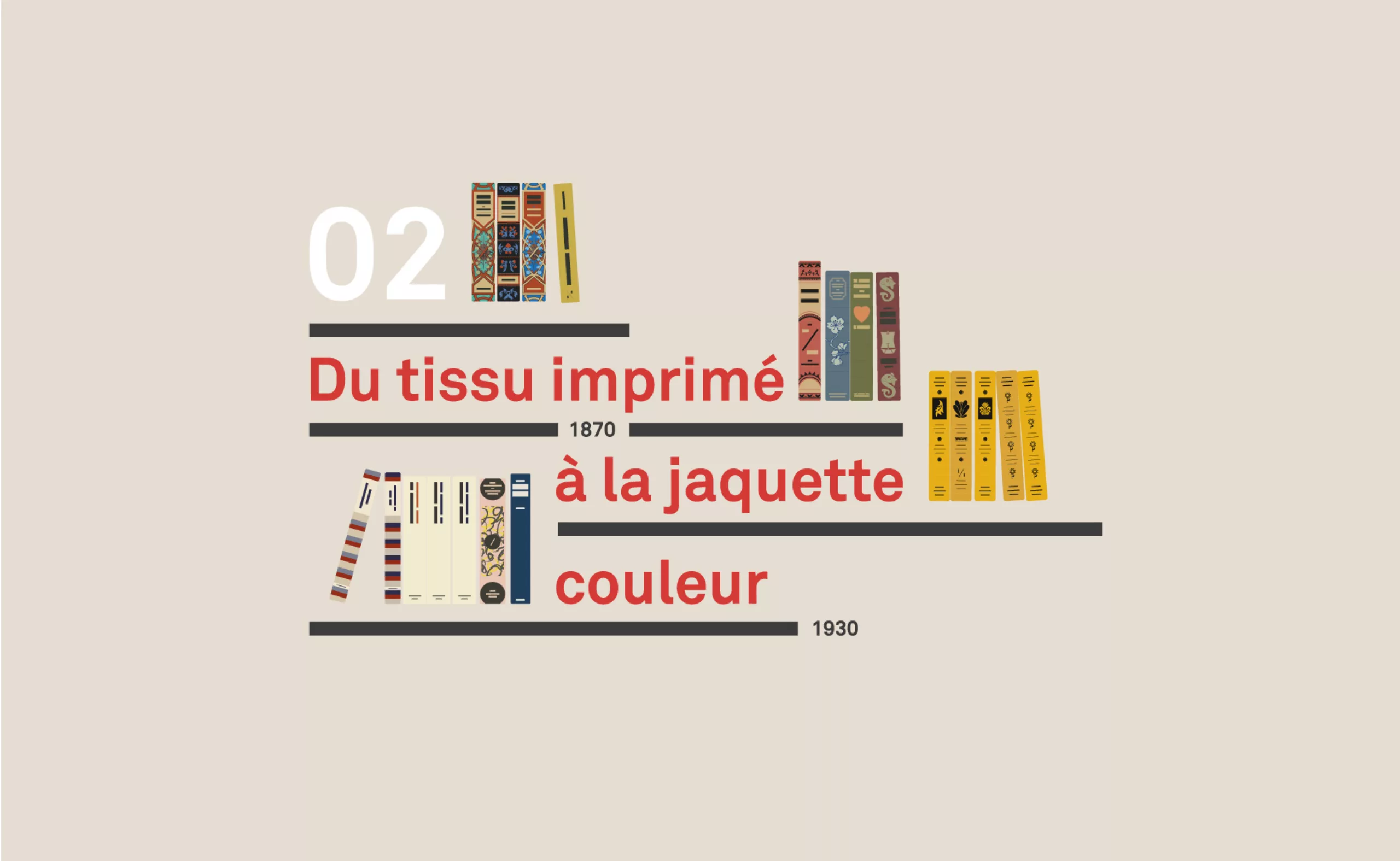
A short history of book cover design – 2/4
Under the influence of Japan, France or Russia, book covers are constantly evolving with technical progress and crises.