Étienne Robial: “Decoded!”
A few months ago, we met “Mr. Canal+” to discuss his creative years and listen to his anecdotes.
Every day, millions of french people see his work, which have an exceptional audience. And for good reason: Robial has designed – among other things – the visual identities and the packaging of Canal+ and M6. Deciphering, in plain language, a long career in graphic design. This article is part of our series of articles on the great names in graphic design.
Santa Robial
What’s the common point between Canal+, Glamour and PSG?
If you think’women with big breasts’ you’re not there at all.
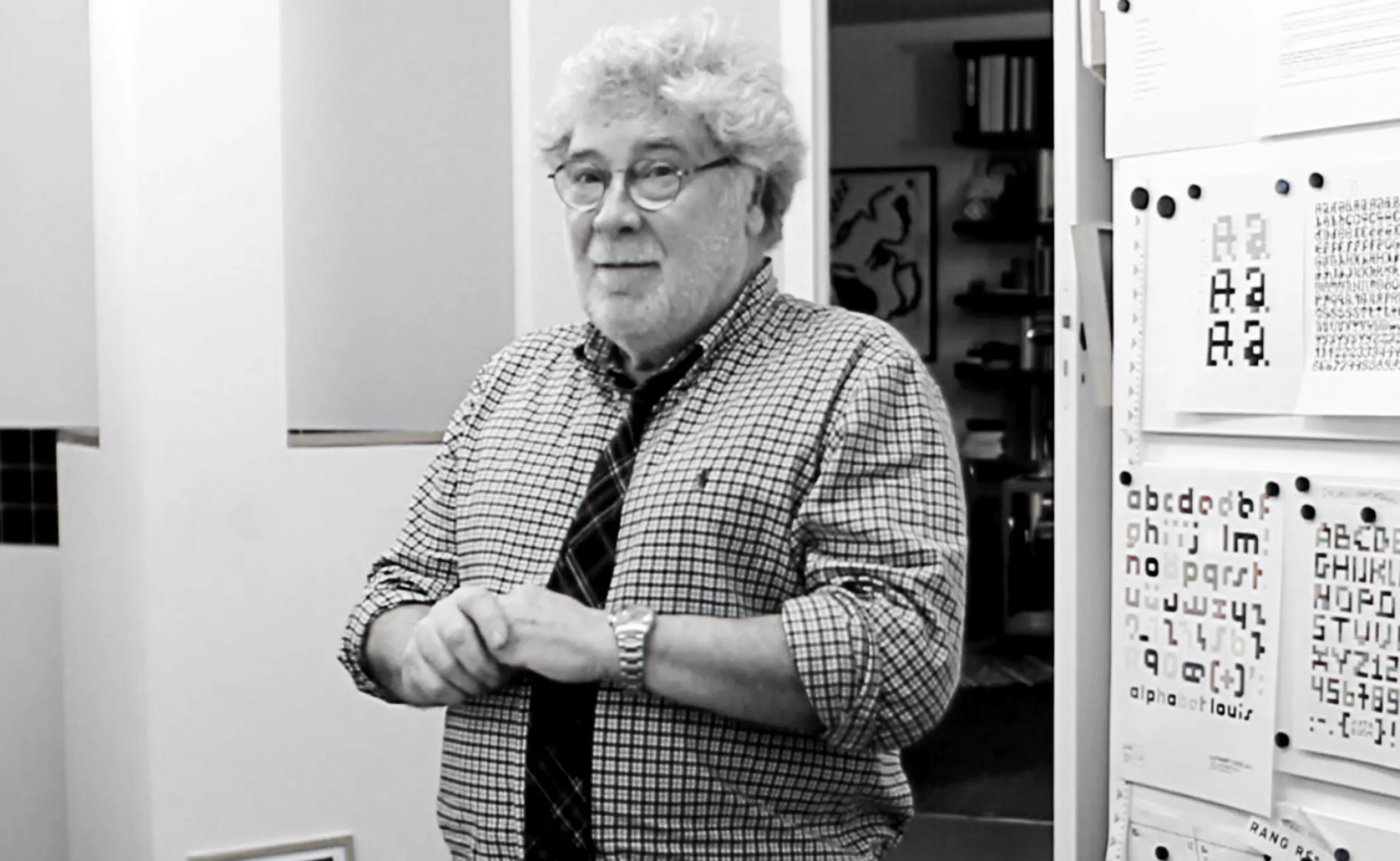
The common point is Robial, Étienne Robial. This jovial man with the physique of Santa Claus who counts in hippos (we will explain below) is the graphic designer / letter painter / artistic director at the origin of a multitude of logos having built the french graphic and audiovisual landscape. You can say thank you.
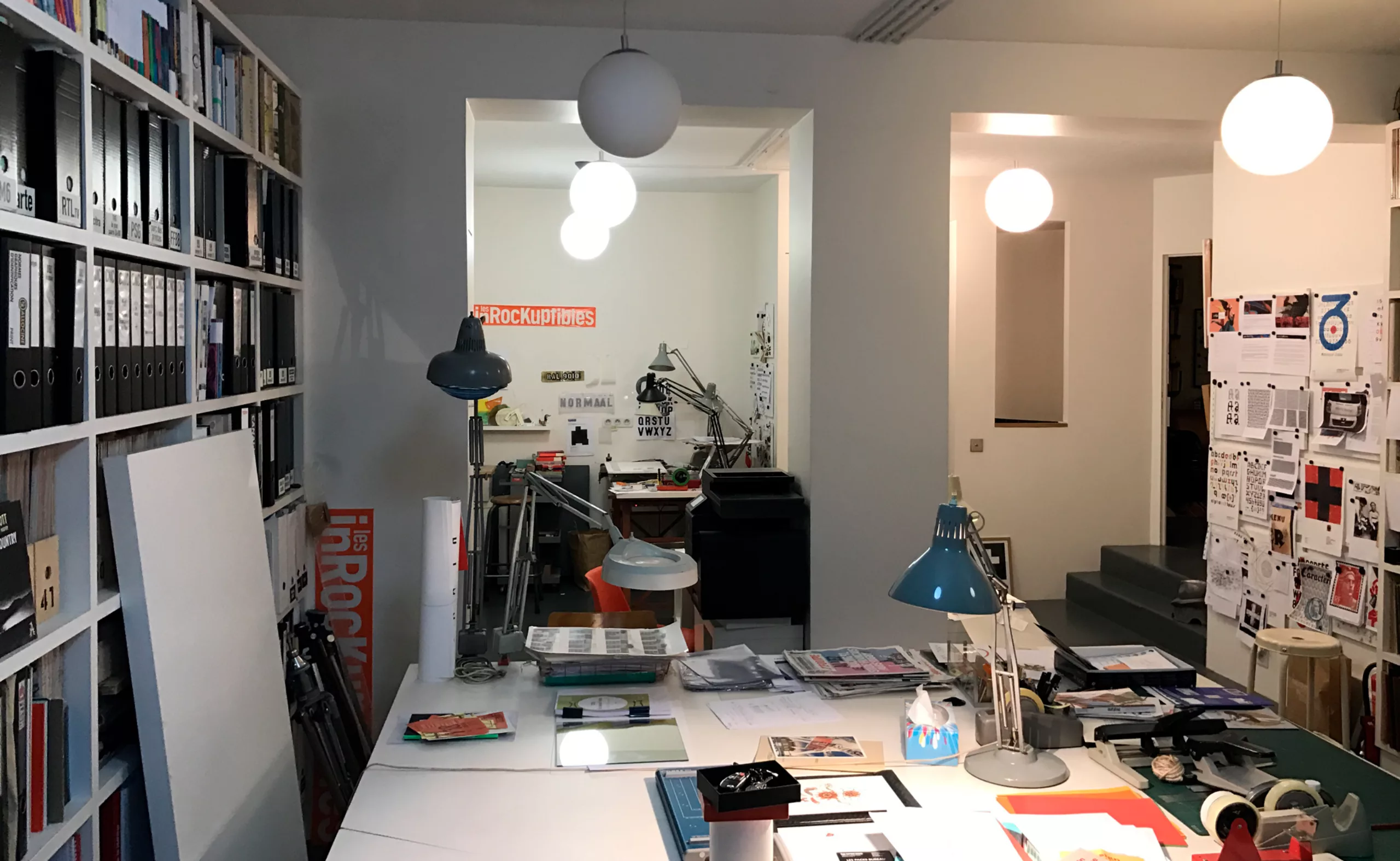
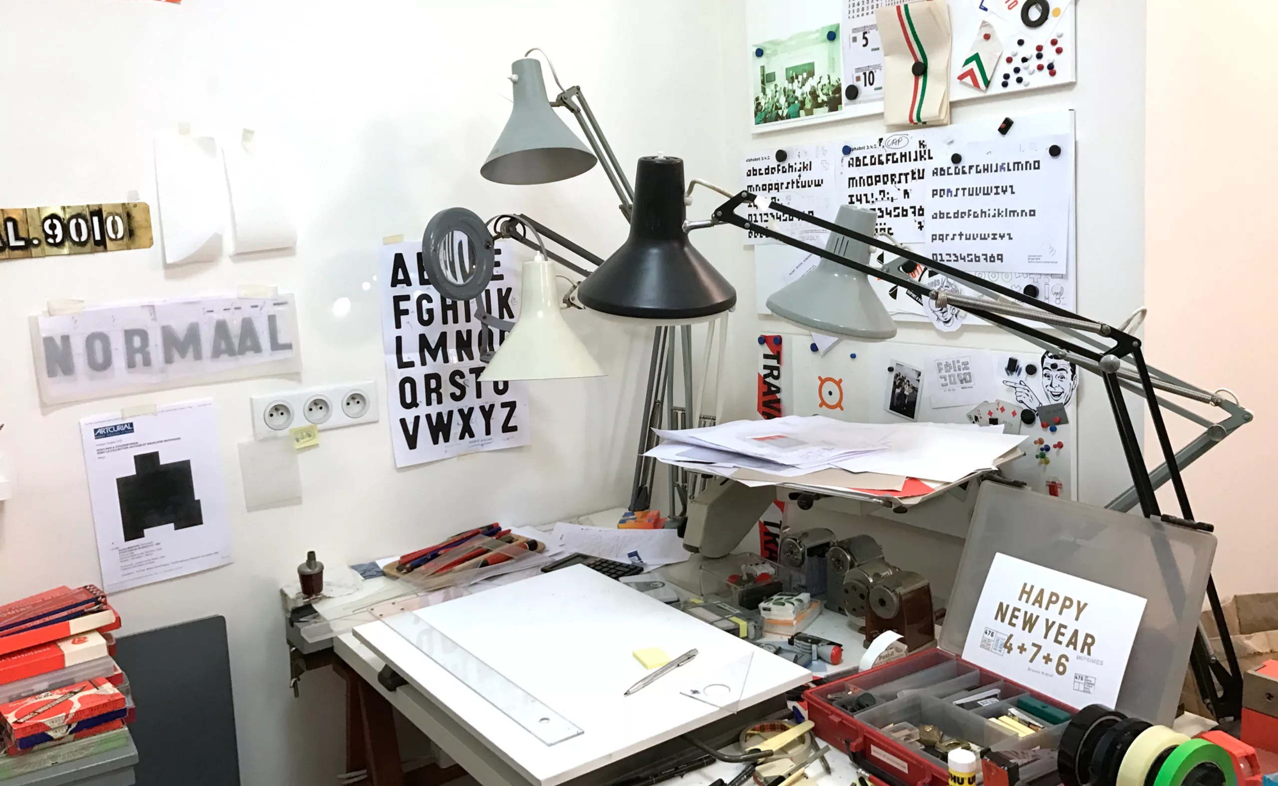
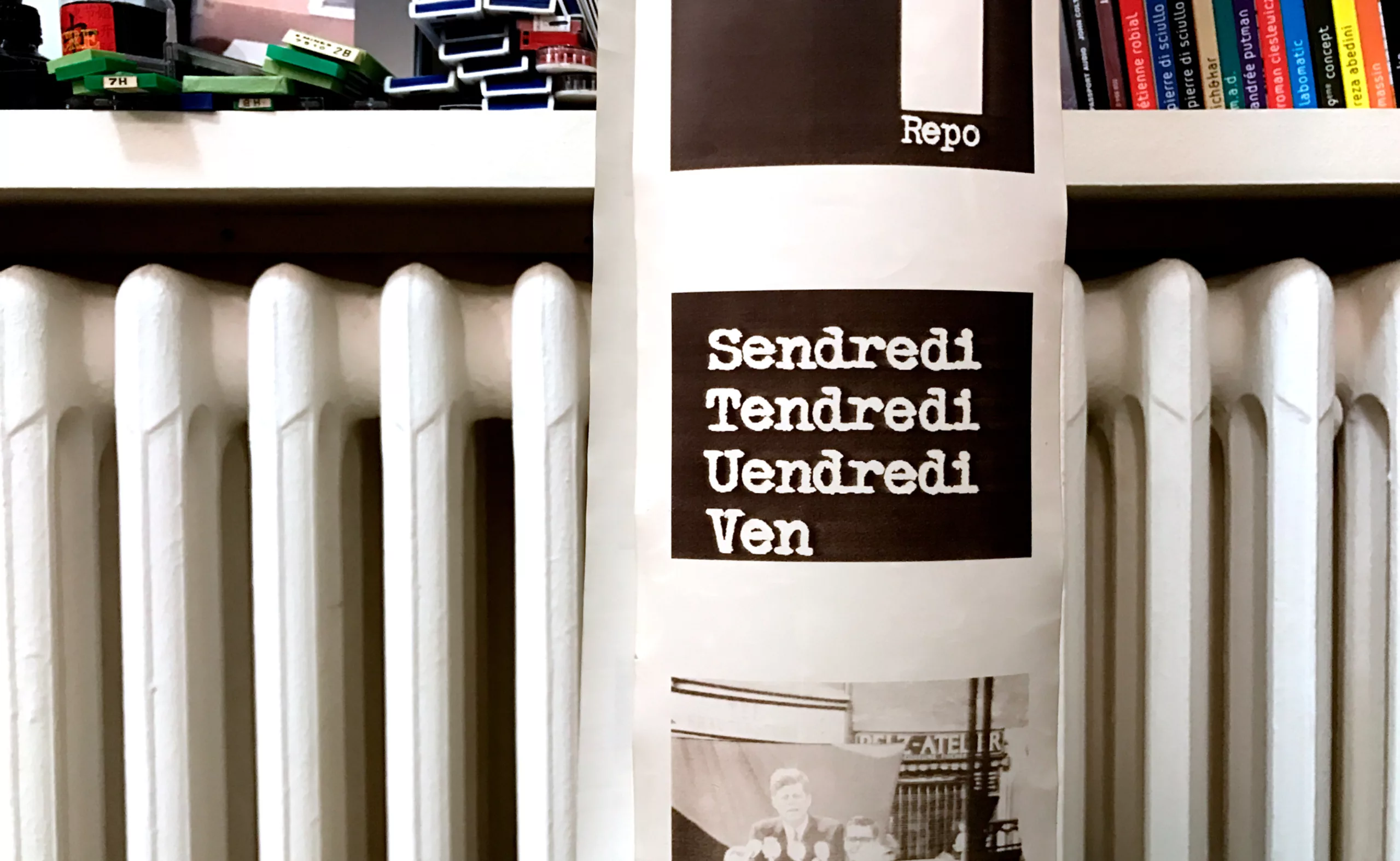
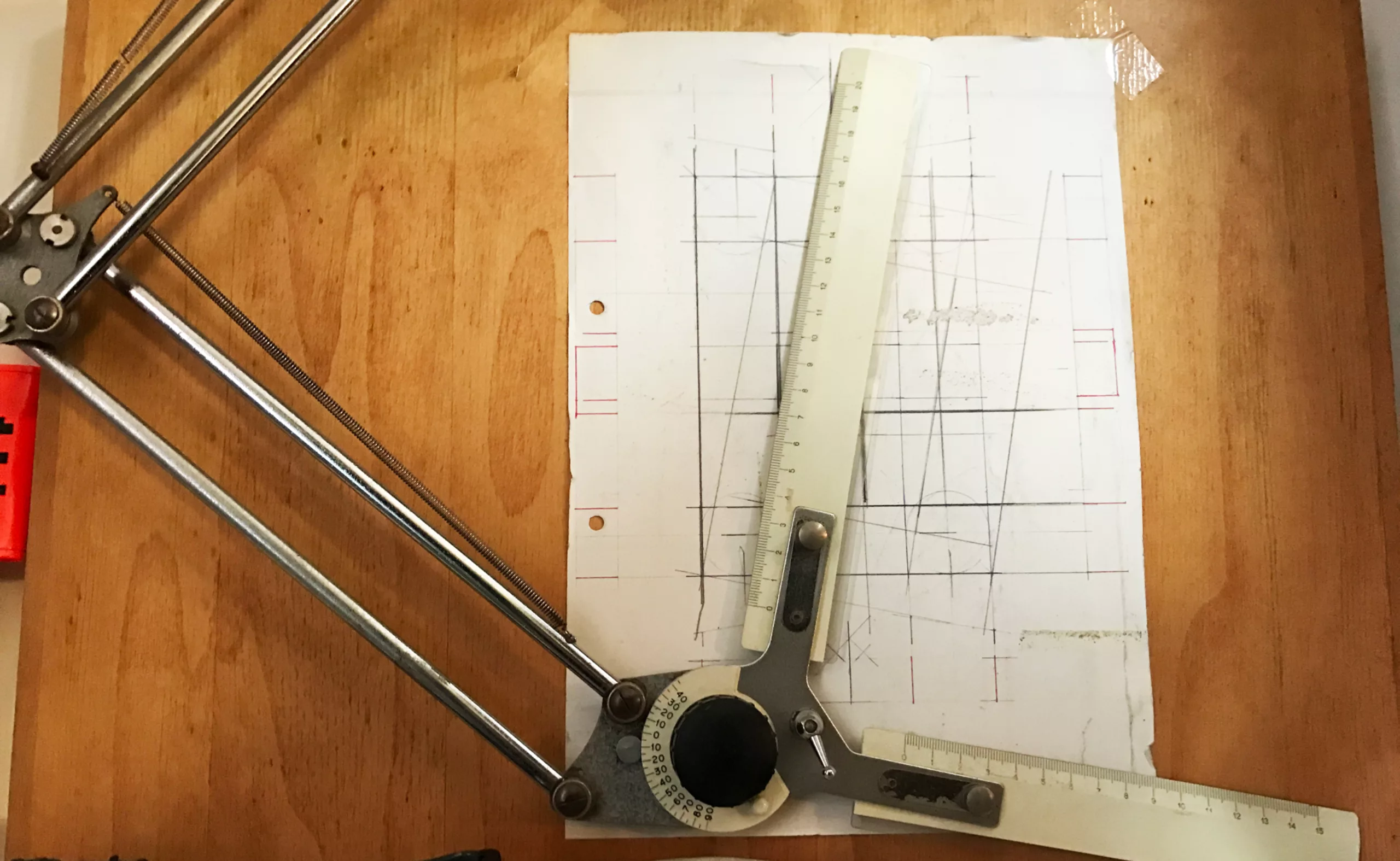
A few images from his office… a brilliant capernaum filled with books, images, archives, sketches and multicoloured pencils…
Opening credits
Étienne Étienne Étienne, was not born in Saint-Étienne, but in Rouen the 25th second of November 20, 1945. Between 1945 and 1962… we skip.
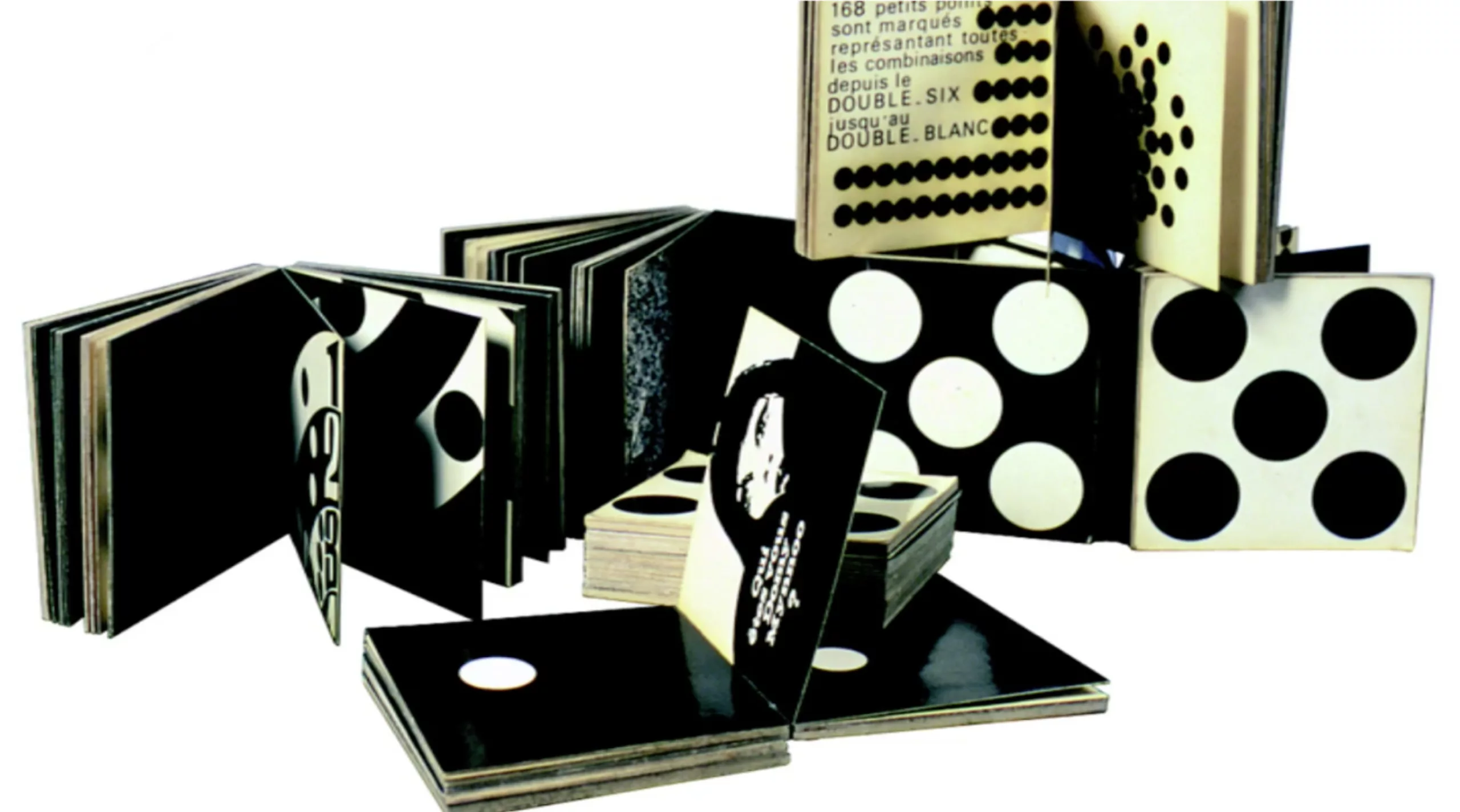
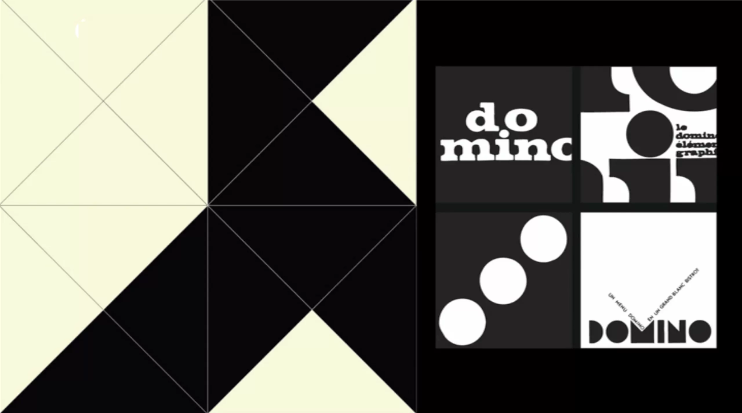
1962. He graduated from the Beaux-Arts de Rouen and then went to study in Switzerland at the Arts et Métiers in Vevey. Already at the time he had a passion for graphic systems. His thesis will be devoted to dominoes. How to fit white circles into black squares!
He started in 1970 as a DA for Barclay and Filipacchi Editions. He will take care of many zero issues of magazines, like “Mademoiselle âge tendre“… but very quickly he realizes that he has entered the system, and that he begins to repeat his “recipes”.
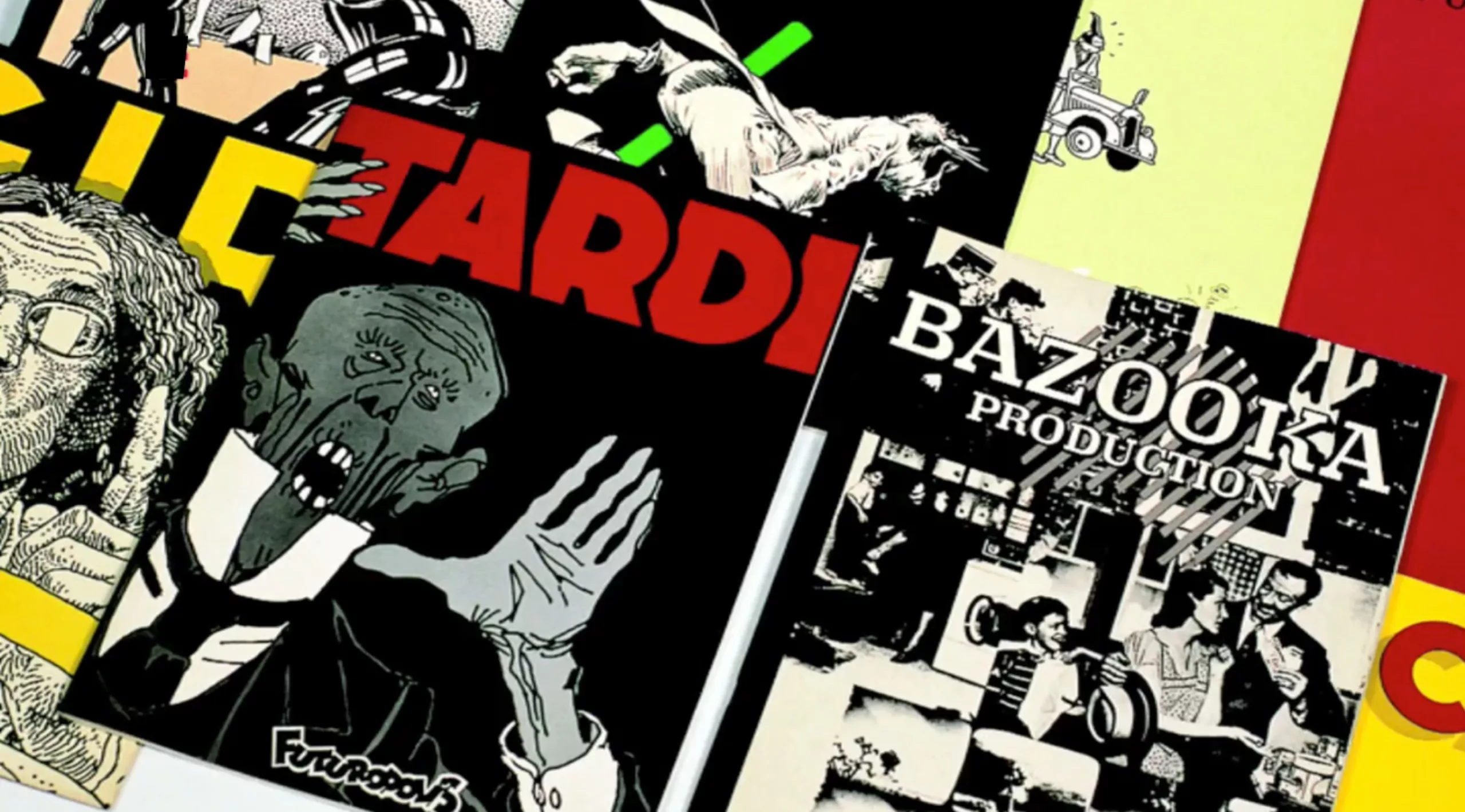
In 1972 he co-founded Futuropolis with Florence Cestac, a publishing house of comics and picture books. Initially, they buy a bookstore specializing in comics. It is named Futuropolis in homage to the science fiction comic strip created by Pellos. This bookshop allows them to finance their publications. One thing leading to another, they started publishing Tardi, Mœbius and many authors who would become giants.
He doesn’t like the term “BD” (short for “comic strip” in French)… for him you have to say “Bande-dessinée” (“comic strip”)… “BD” is like fast food… and he publishes gastronomy!
For the record, when their first comic strips are put on the shelves in other bookstores, usually in 1 or 2 copies to test, they will send friends to buy these copies, in order to convince booksellers to order even more copies the following times…
10 years after Futuropolis, he founded the ON/OFF studio and developed evolutive identities for numerous brands.
In French, we owe him the concept of “dressing” (“habillage”), a word he coined; “The “dressing” is not just a story of aesthetics and graphic charter, but of identity: when one’s on air, one must know exactly where one is. (…) Dressing, basically, is signage. The aim is, once again, above all to identify and inform about a programme rather than to “look pretty”. And as he likes to repeat, not to do anything anecdotal.
Étienne Robial made his first audiovisual experience with Les enfants du Rock, for which he created the credits in 1982, after several years in the publishing world. We then owe him the logos / identities and or credits of La Sept (1986), M6 (1987), arte (which is not retained) in 1993, iTele (1993), RTL9 (1994) and of course Canal+. He remained artistic director for 24 years for the cable channel, since its creation in 1984.
It’s quite funny to think that he owes his greatest success to a channel for which he first works for free. At the time, Canal+’s identity was “made for the free, because we didn’t know if it would work”, Lescure (co-founder of Canal+ then CEO from 1994 to 2002) hadn’t paid for it; it was the first time we had done something global“.
Then, in a rather obvious way, it was to him and his partner Mathias Ledoux that were asked to create TV channels identities: “Every time a new TV channel was launched, the guy would give us a call, and I had to ask Lescure“. One thing leading to another, he found himself at the origin of the majority of the french TV landscape.
But some identities do not see the light of day. In 2013, he created a response to “graphic and visual exploration for the strategic framing of the TF1 brand”, by proposing to reverse the colors of their logo… blue-white-red becoming red-white-blue. The answer is that it is not ambitious enough. However, the idea is a genius, to reverse the french flag for the first TV channel of France… but the latter will not dare the iconoclasm! The agency Naked wins the project by integrating 3D and a gradient of color. “It screwed up,” as he says.
Étienne the graphic magician…
Not very stingy, very talkative, he likes to pass on his knowledge. He teaches at the École supérieure d’arts graphiques Penninghen in Paris, and at the École supérieure des arts visuels de Marrakech. Look at the little magic trick below… you can do it again Monday morning at the office to show off in front of your colleagues!
Among his “great masters” he names Lou Dorfsman and Herb Lubalin for the creation and typography around the CBS logo, Erberto Carboni (La Rai, italian radio) forerunner who brought a graphic identity to italian TV, and the agency Lambie-Nairn (Channel 4, TF1).
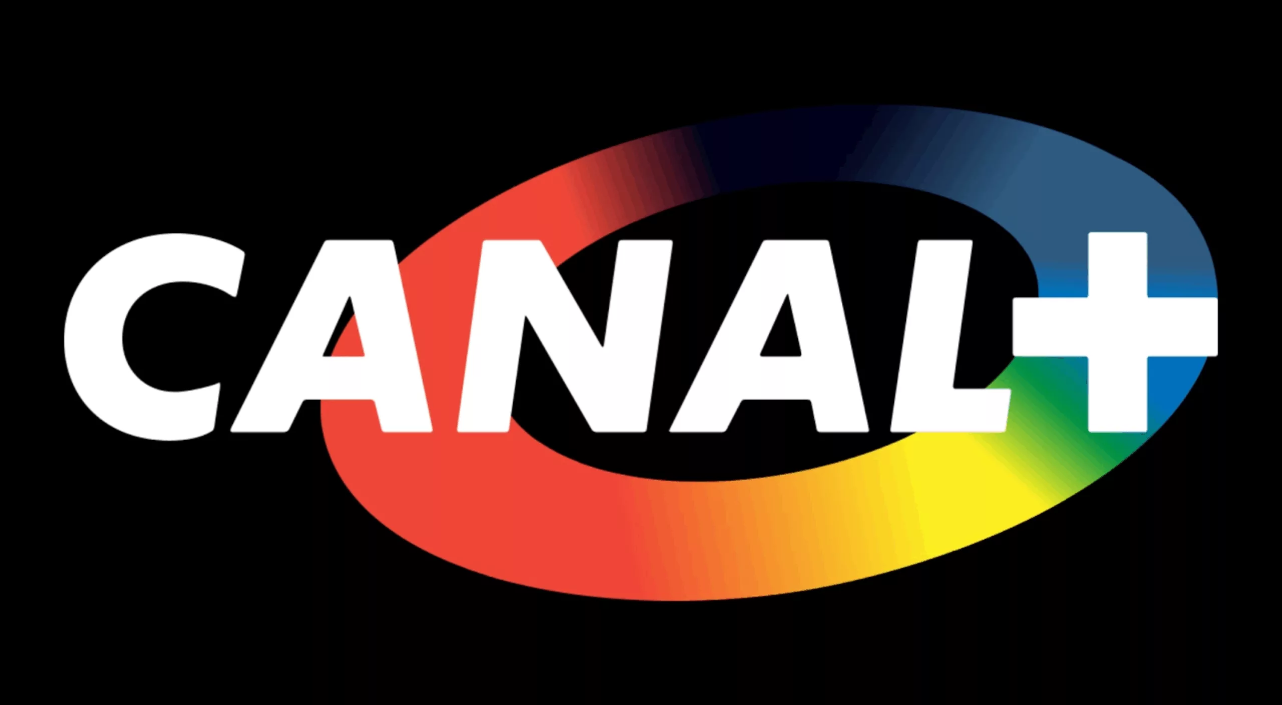
Canal+
Inaugurated on November 4, 1984, CANAL+ wants to revolutionize the french television landscape. In this logic, it is the first channel to recruit an artistic director dedicated to its graphic image. It is said that during an interview with Pierre Lescure, CEO of the channel, Étienne Robial used for the first time the expression TV “dressing”: “I’m going to make you 3 jackets, 3 trousers, 3 shirts, 3 ties, and with that you’ll be able to dress in 81 different ways…”: with trousers 1 – jacket 1, trousers 1 – jacket 2, trousers 1 – jacket 3 and so on […] always in the same spirit […], but with different associations“.
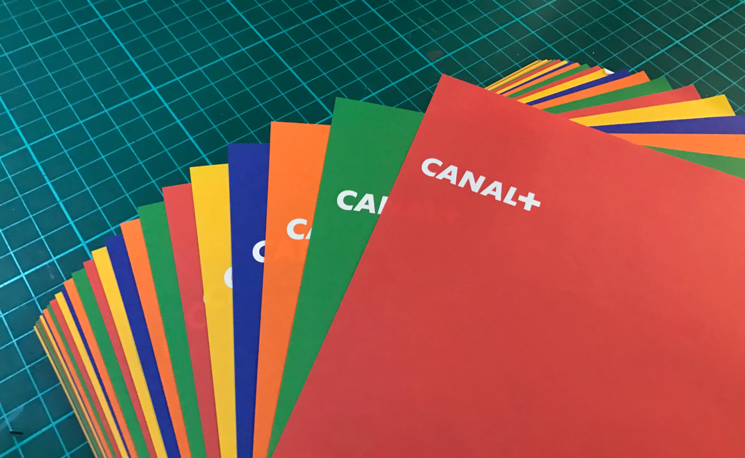
During nearly 20 years, Robial will create many costumes for Canal+. His principles are simple, his role is to create signage. He is there to identify, inform, prioritise and promote. Forms, colours, typography and music are its ingredients. 4 variables, 1 grid, and thousands of possibilities!
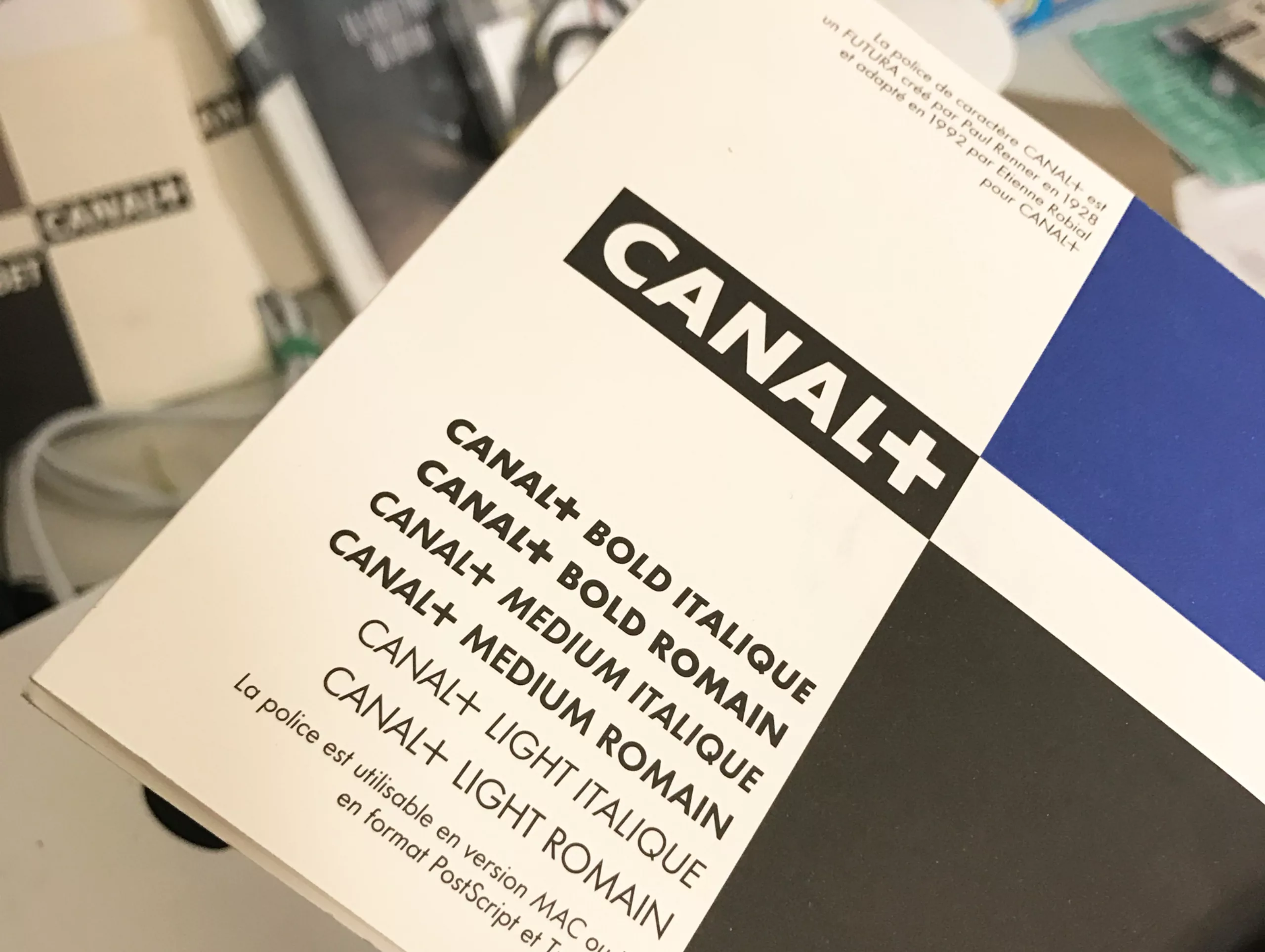
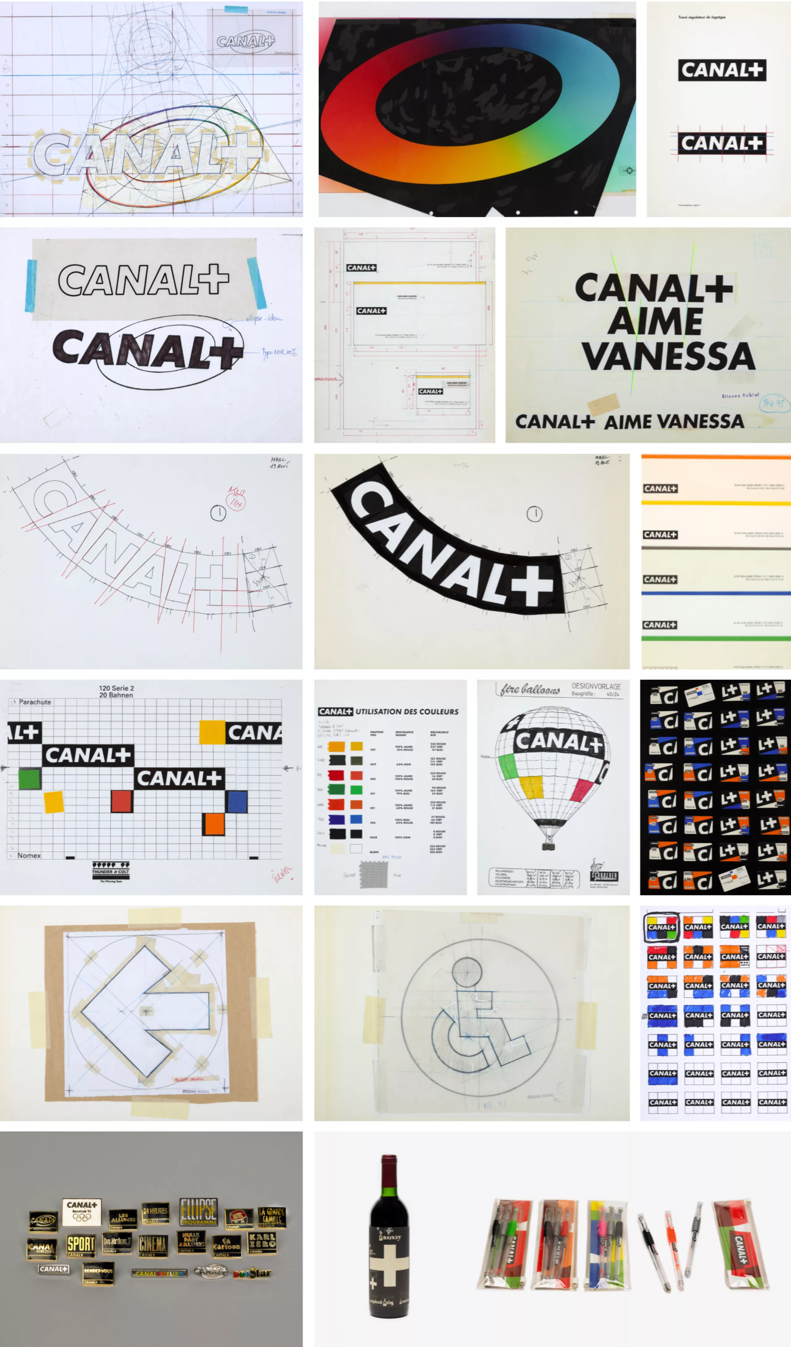
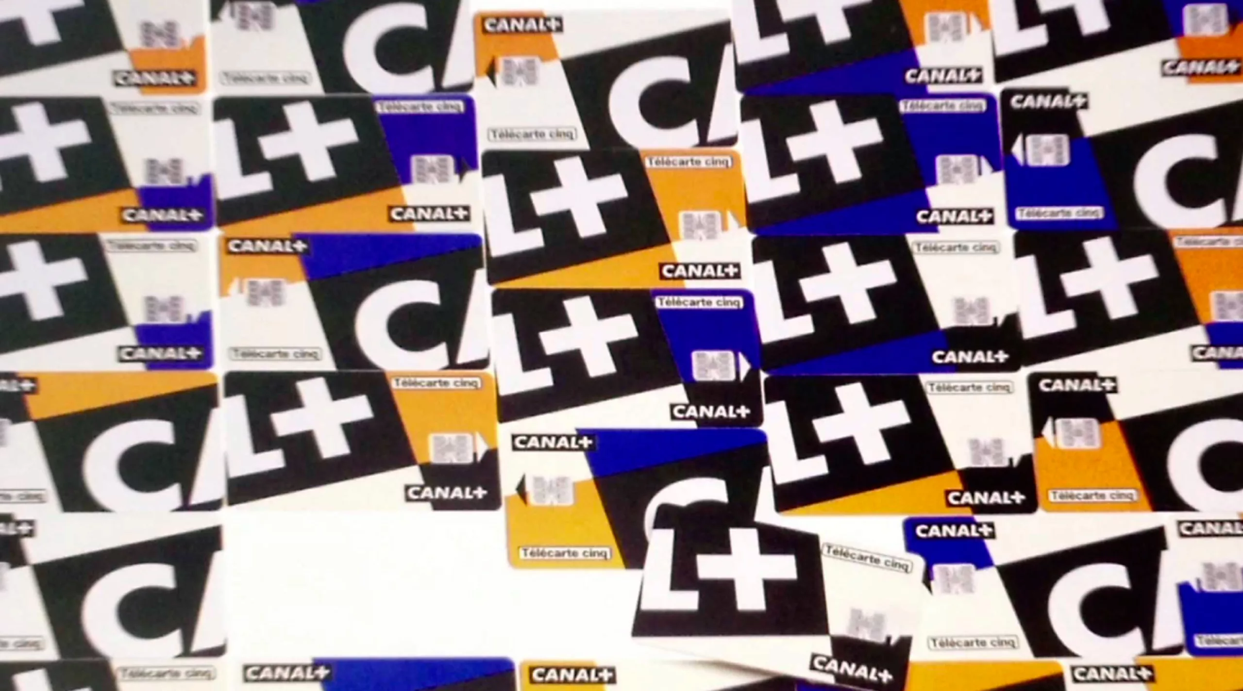
To begin with, the logo is based on a mathematical system made of 4 juxtaposed squares that define a ratio of 4 to 1. A simple and harmonious proportion, guaranteeing the logo an extremely simple use. Originally the channel’s name was “Canal Plus”, but Robial, a miser of letters, proposes replacing the “Plus” with the “+” sign. Small graphic gesture, but big vision. The word becomes a sign. The logo is there!
In this global visual identity, each program has its own singularity. Typography plays this role. The Futura specially adapted for Canal+ (a licence acquired for the modest sum of 1 million francs at the time) is used for the overall identity of the channel. But each program has its own typography created by Étienne and his teams.
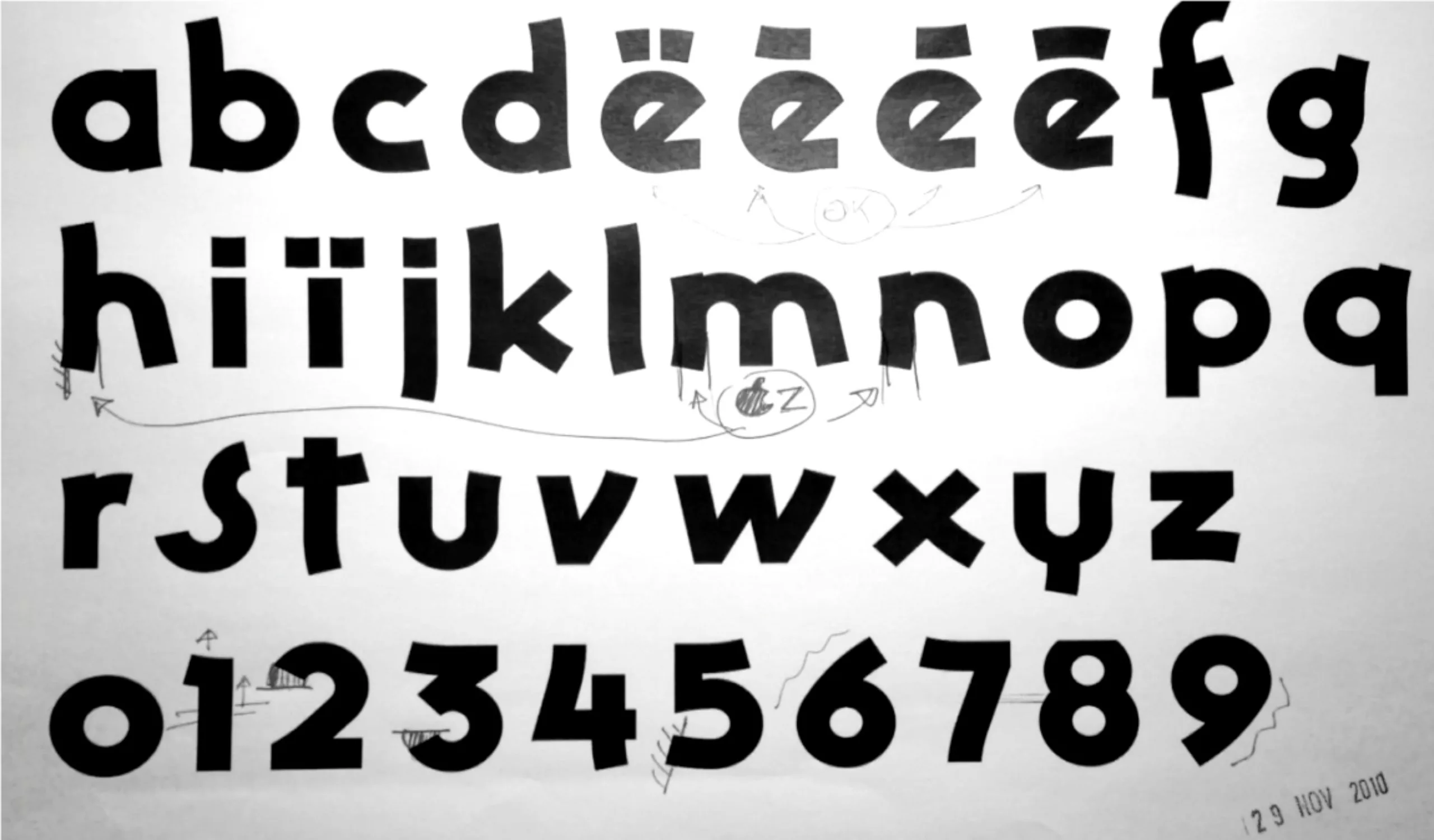
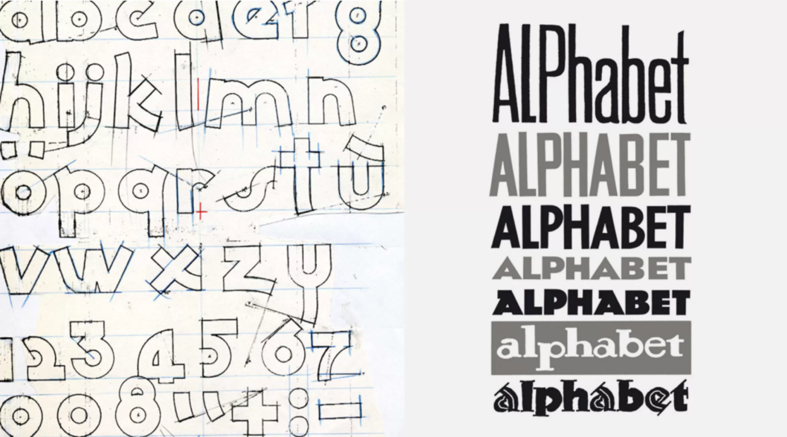
For that, his taste for bargain and his collections of old catalogues of painted letters are gold mines. Generally dating from before the war, these works fell into the public domain and provided him with an incomparable raw material. He scans, vectorizes, reworks, then composes his program titles.
The Nulle Part Ailleurs alphabet comes from the Gothic Display, taken from one of its old catalogues… Labels of jams from the early twentieth century will inspire the logo of La nuit gay...
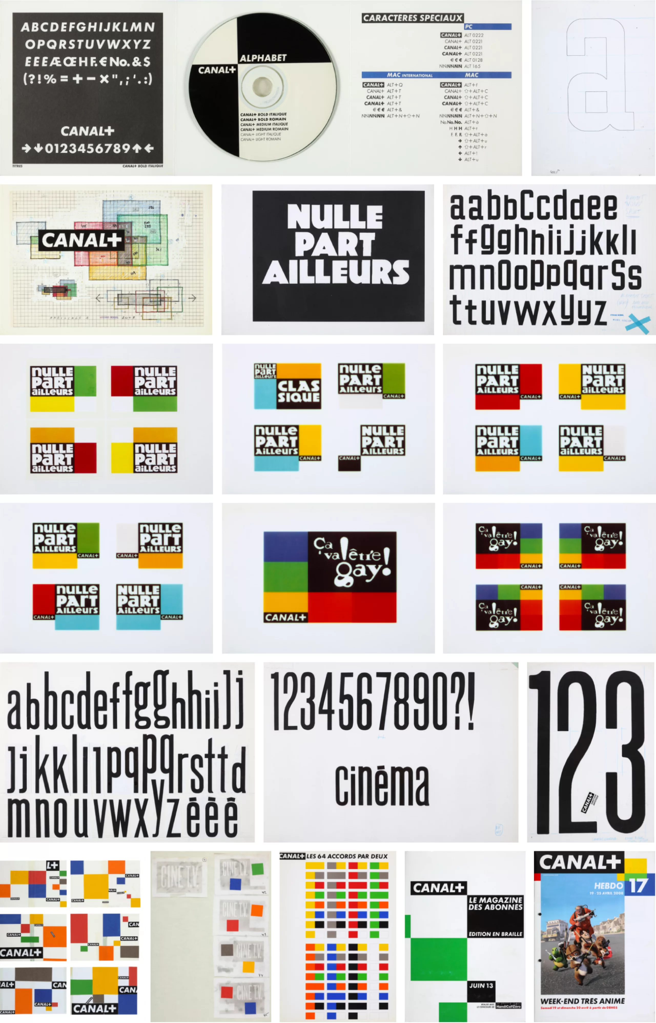
Robial doesn’t like repetitions. Its objective is to fight against memorization. Indeed, when you see the same show every day, and visual habits come, you don’t even see your work anymore… “it’s like your wife wears the same clothes every day!” All of its trim is polymorphic, the letters change slightly, the colours are reversed, and the accident enters its rational system.
For the anecdote, when Vincent Bolloré arrived at the head of Canal+, he decided to review the group’s visual identity. According to him, this “all black” logo is too “austere“, and he imagines that it is possible to change the logo into “yellow, red, green… ” ! What a heresy for Étienne. Vincent obviously didn’t understand the architecture of the brand. Changing the Canal+ logo to red or yellow would considerably reduce the impact of your brand. So Étienne refuses. “Just change your logo… but my design won’t be altered without my permission.” Thanks for the copyright!
Graphic designer advice to graphic designers
Why make it complicated when you can make it simple and effective?
For him, the creative process is a game, a “one shot”. When asked if we will ever see his other proposals for the M6 logo, he replies that “no, there is none“. He even adds, with aplomb: “coming up with two proposals is professional misconduct. When you go to the doctor, you don’t call for tenders.” As a graphic designer and specialist, he therefore provides an answer to the question asked, and it is the only one he will present to his client.
Very often, it works. And if the client doesn’t like it, “bye, and we stay good friends”. “I lost time, but with experience you lose less and less. You have to stay a good player“. It’s a game; “I‘m over the age of flirting, but… I like you, I don’t like you, hello, goodbye, we don’t owe each other anything, but as I’m well brought up, I’m going to pay the bill.”
We wish we could play this game more often!
While waiting to see your next client, here are Robial’s tips to fully assume yourself as a graphic designer:
“I hate the anecdotal”
Because he likes to make his life easier, Robial explains the gymnastics of directing a credits, very different from cinema. Intended to be seen several times a day, it is essential to vary the melodies and characters, not to annoy the viewer. The musical compositions of his credits are based on a 5×5 rhythm, so that all his music is compatible with any animation.
Besides, “we counts with hippopotamus on TV“. He explains to us by unrolling his fingers, tac-a-tac-a-tac, hip-po-po-ta-mus, the speed of images, and sounds. A “hippopotamus” is equivalent to 15 images. TV projects 25 frames per second, compared to 24 in movies (and sometimes 48), “which is why movies on TV are much shorter than in movies, 1/25th times shorter.”
Below, video extracts of our meeting, in which he tells us everything about TV credits:
And to illustrate this work of credits, small leap in the past with the second identity of Canal+ in 1994. We see the simplicity of the forms and the graphic system, which allows to be declined on a grid thanks to its geometric rigour. It’s quite funny to see the speed of deployment of generics, which seems endless today compared to the current generics.
Shapes and colours
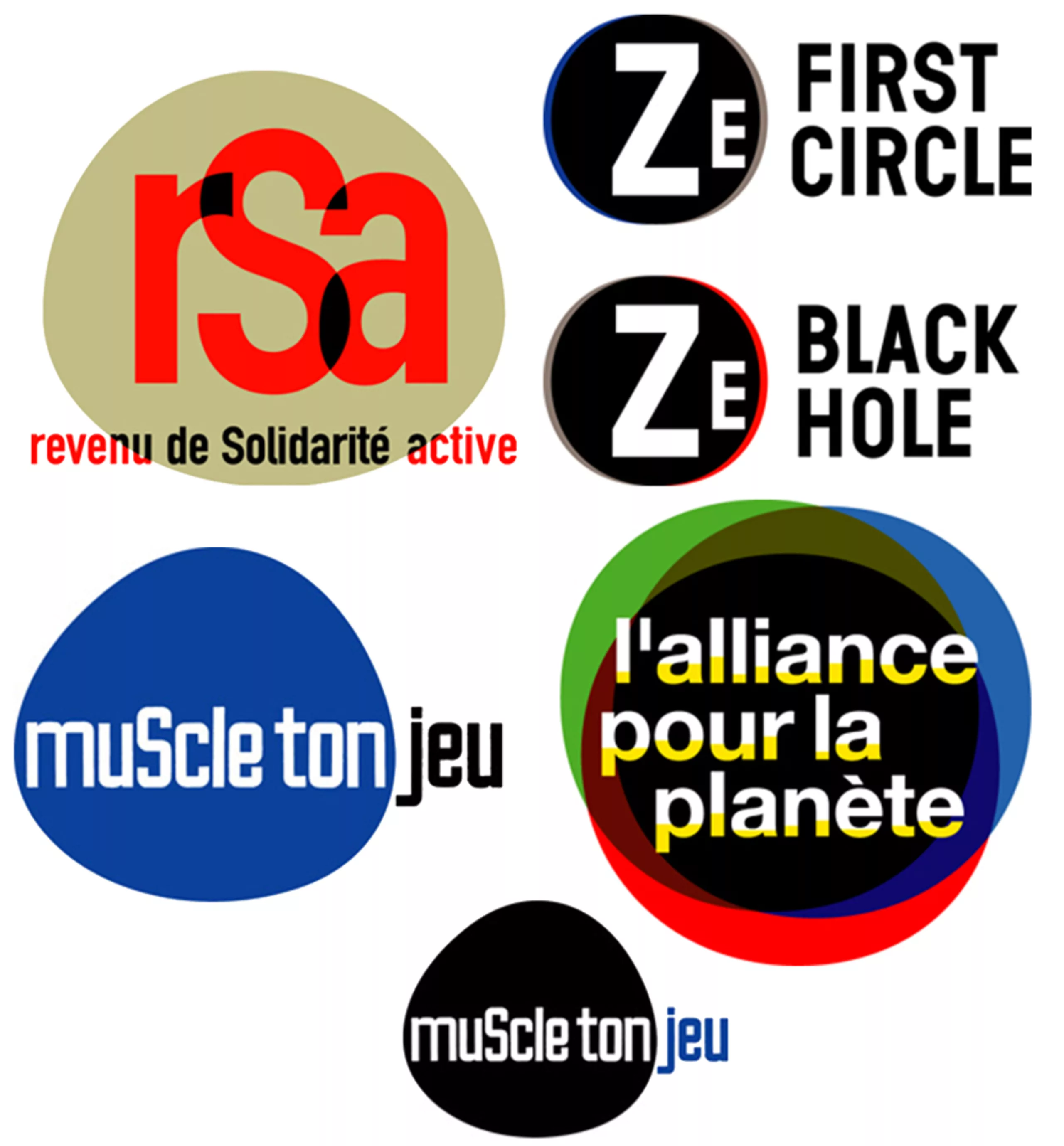
Robial’s taste for geometric shapes and a simple typographical system is omnipresent, to the point of becoming his personal signature. He thus creates an almost constructivist (and repetitive) creative system with large strokes of primary colours, rectangles, triangles and circles accompanied by variations of the Futura typeface. A system that he applies to everything goes by creating logos sometimes very similar (Planet Bank, fair relationship, Films…).

Even if we can have fun as we did classifying logos by redundant shapes, it seems that the magic formula is effective, especially when we see that its logos remain unchanged more than 30 years later.
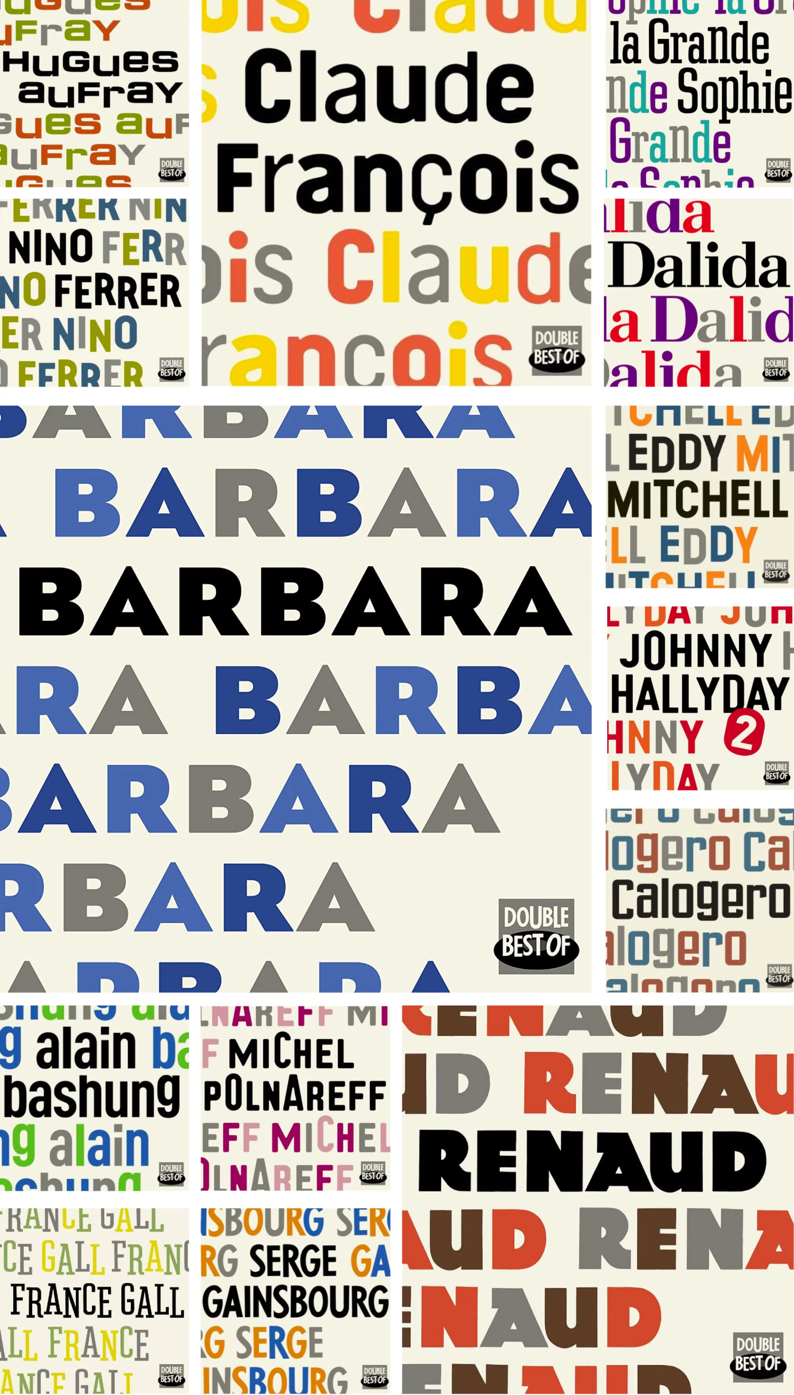
Robial makes the letters dance by playing with shapes and geometry, as if to break the monotony inherent in the alphabet. For the PSG, Nulle Part Ailleurs or the Universal vinyl collection, he explains that his letters are cut out and placed at an angle so that the compositions are balanced to the eye, and not to the millimetre. Under an apparent simplicity, like the Futura alphabet used for Canal+, he then adds a vibrant and human touch to his compositions.
The touch that makes the difference.
Here is the extract of our discussion in which he talks about this question of alphabets and dancing letters:
Robial even had his puppet in the famous “Guignols de l’info” show. Here’s an extract of the episode created for the launch of Canal’s new identity, in which Robial takes the channel’s new image at heart…
On the subject
-

Groupama’s new visual identity, a logo in the open countryside
Groupama has just unveiled a new logo that updates its graphic design by abandoning its campaign in favor of a “startup” aesthetic.
-
From surnames to acronyms: creating a brand name from letters
From founders’ surnames to initials and acronyms, brand names have always oscillated between abstraction and familiarity.
-

The UN logo takes on water during COP28
For COP28, two designers have come up with a new UN logo showing the rising sea levels and the future disappearance of much land and coastline.