Brand New Conference, brand new every year!
In 2015 and 2016, Graphéine had taken tickets to attend the Brand New Conference. If you are a regular blogger, you may have already read our impressions on the first day of conferences in New York in 2015?
The Brand New Conference (or BNC for intimates) is an annual 2-day event that brings together the crème de la crème of influential graphic designers and during which we talk about identities, logos and brand (and party at night). In short, an American-style must-have with sharp presentations that deposit, exciting speakers and goodies more-design-tu-meurs.
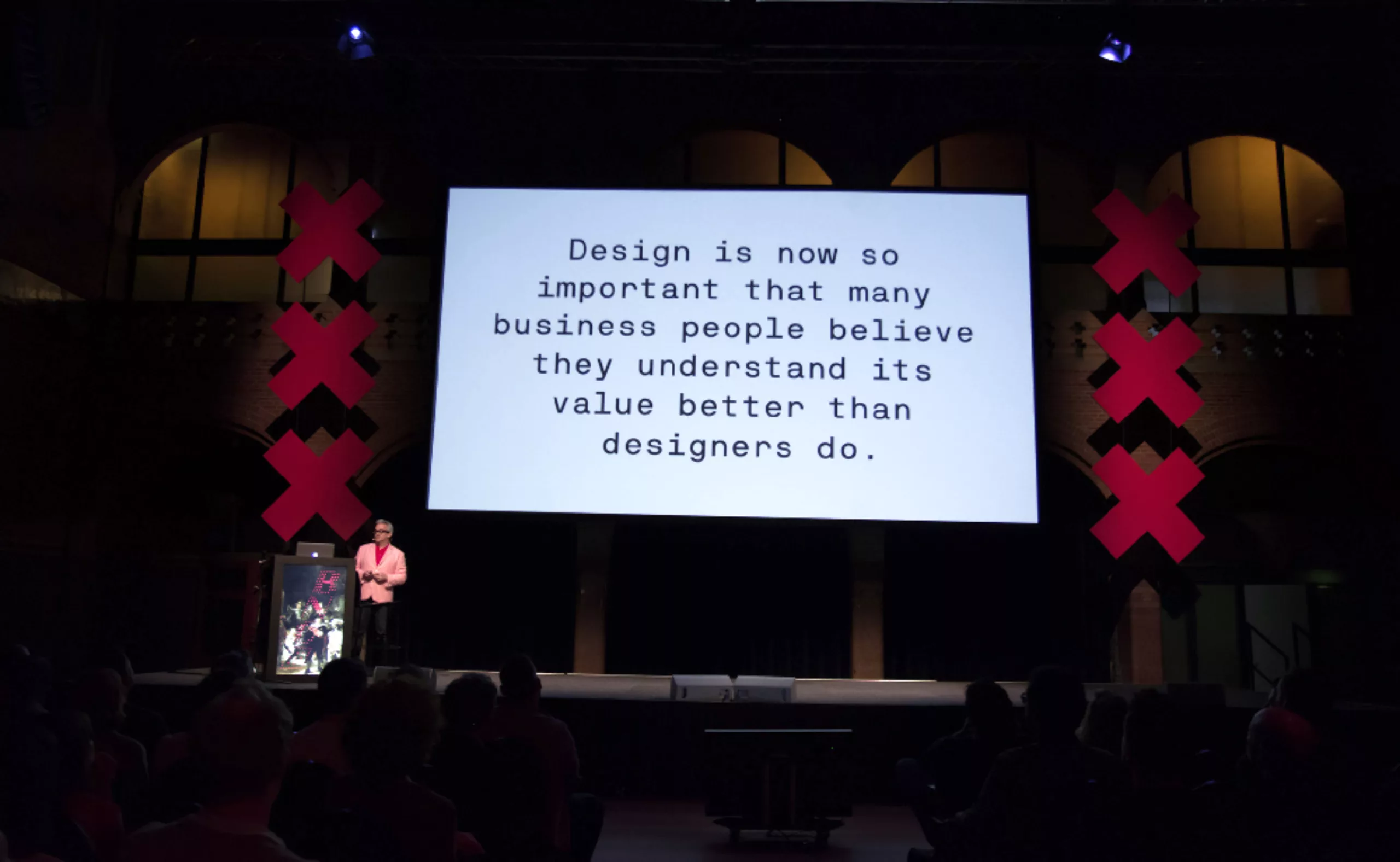
The kind of event where you hear inspiring phrases like: “It’s often very easy to design something complex, and very hard to simplify an idea, to make it minimal“. Philippe Apeloig.
It is especially the occasion to listen and meet stars, to discover creative studios, and to immerse into graphic design culture during 48 hours…
Identities to talk about identities
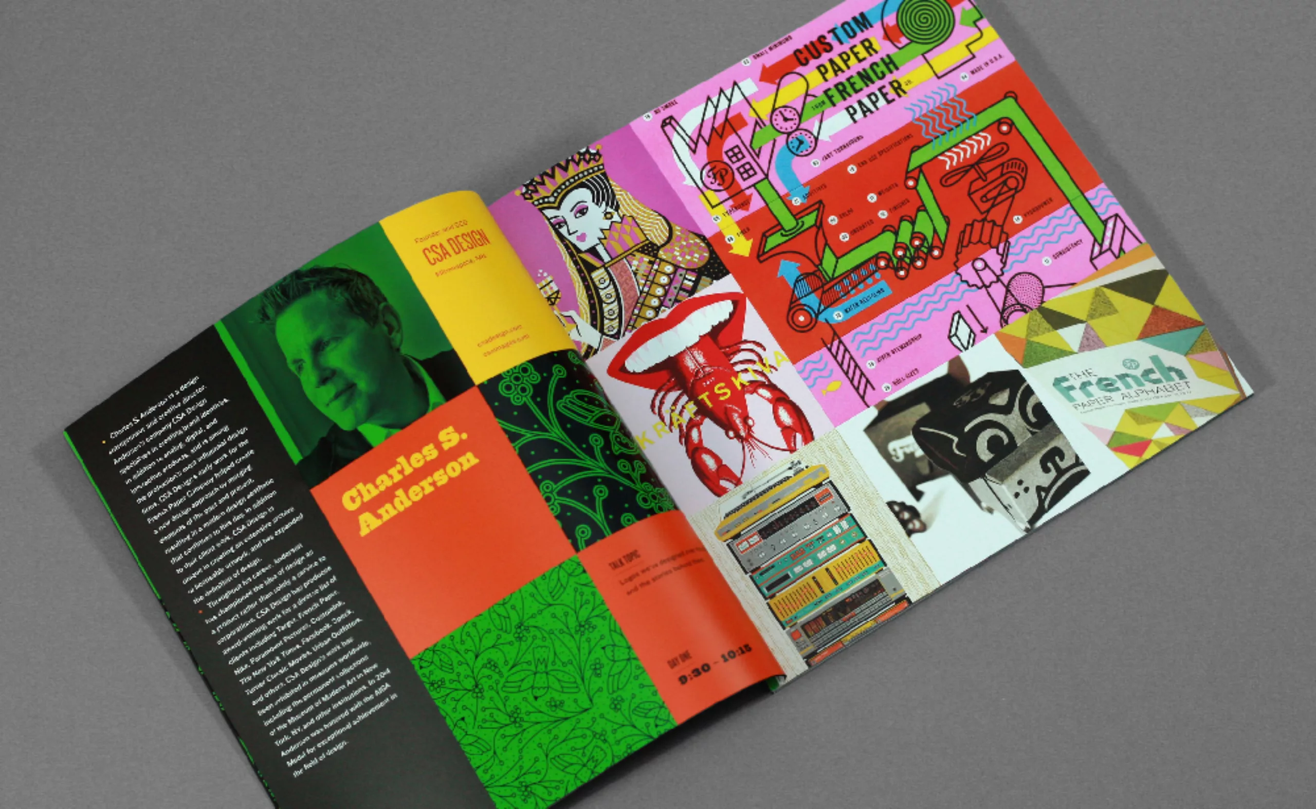
For this branding and graphic design festival, it would be far too easy to bring out the same identity from one year to the next, even if it would be simpler. As a result, each edition of the Brand New Conference has a new identity and a new logo. Behind this project, two designers: Armin Vit et Bryony Gomez-Palacio. The couple is at the origin of the blog under consideration, the Brand New conferences, and a publishing house which they manage everything, alone, from A to Z !
We are impressed by the amount of work that each element represents (invitations, badges, program, goodies…), and by the fact that many accessories are handmade. In addition to developing a new concept, the BNC duo is researching new materials, facing printing constraints, cutting boards with a circular saw, and spending hours threading cords into badges. A work of titans which is worth to be put forward! Especially when you know they only work with four hands.
We’re not going to retrace everything since 2010, but rather look at the last 3 years, which are really worth the detour.
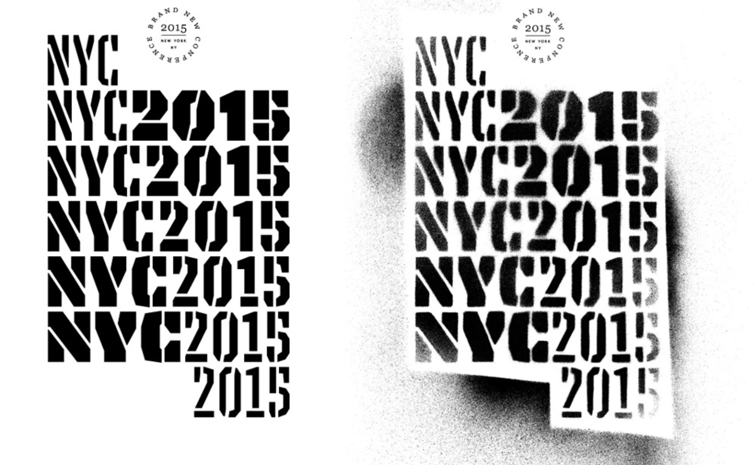
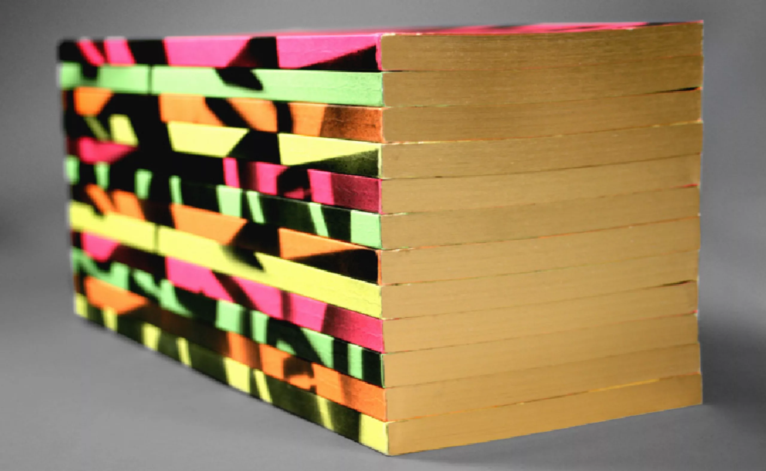
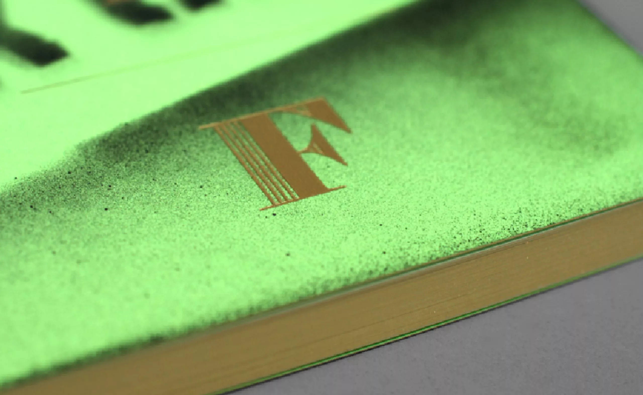
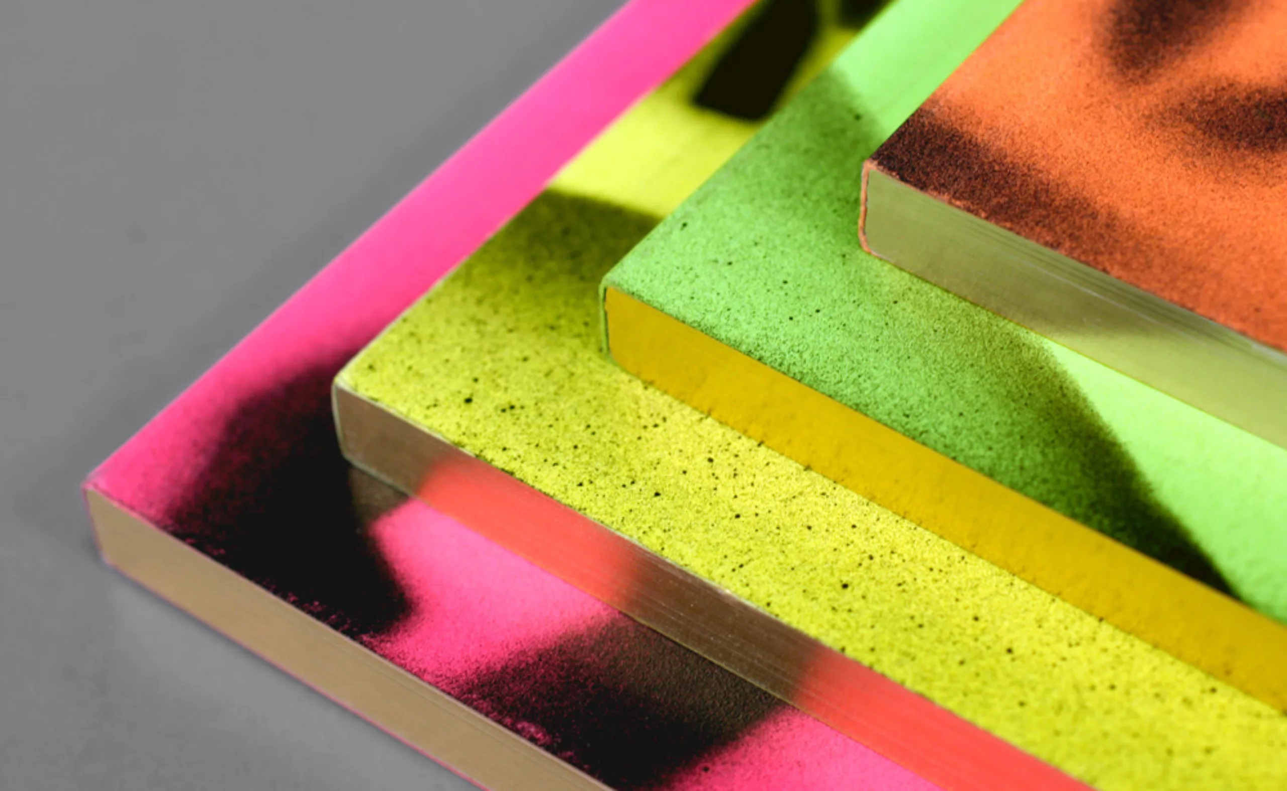
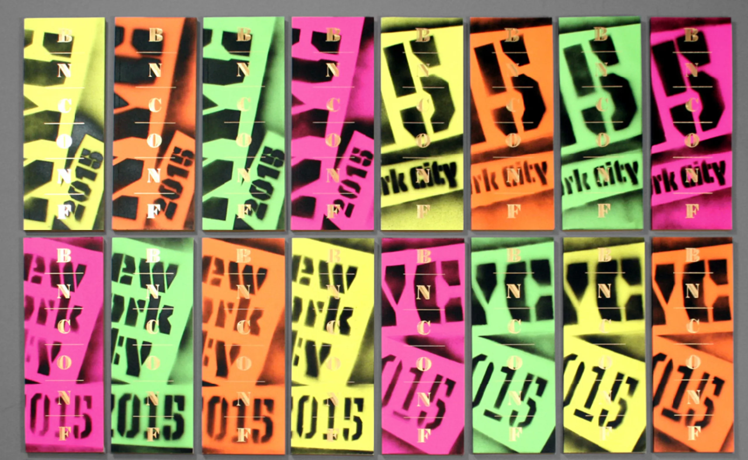
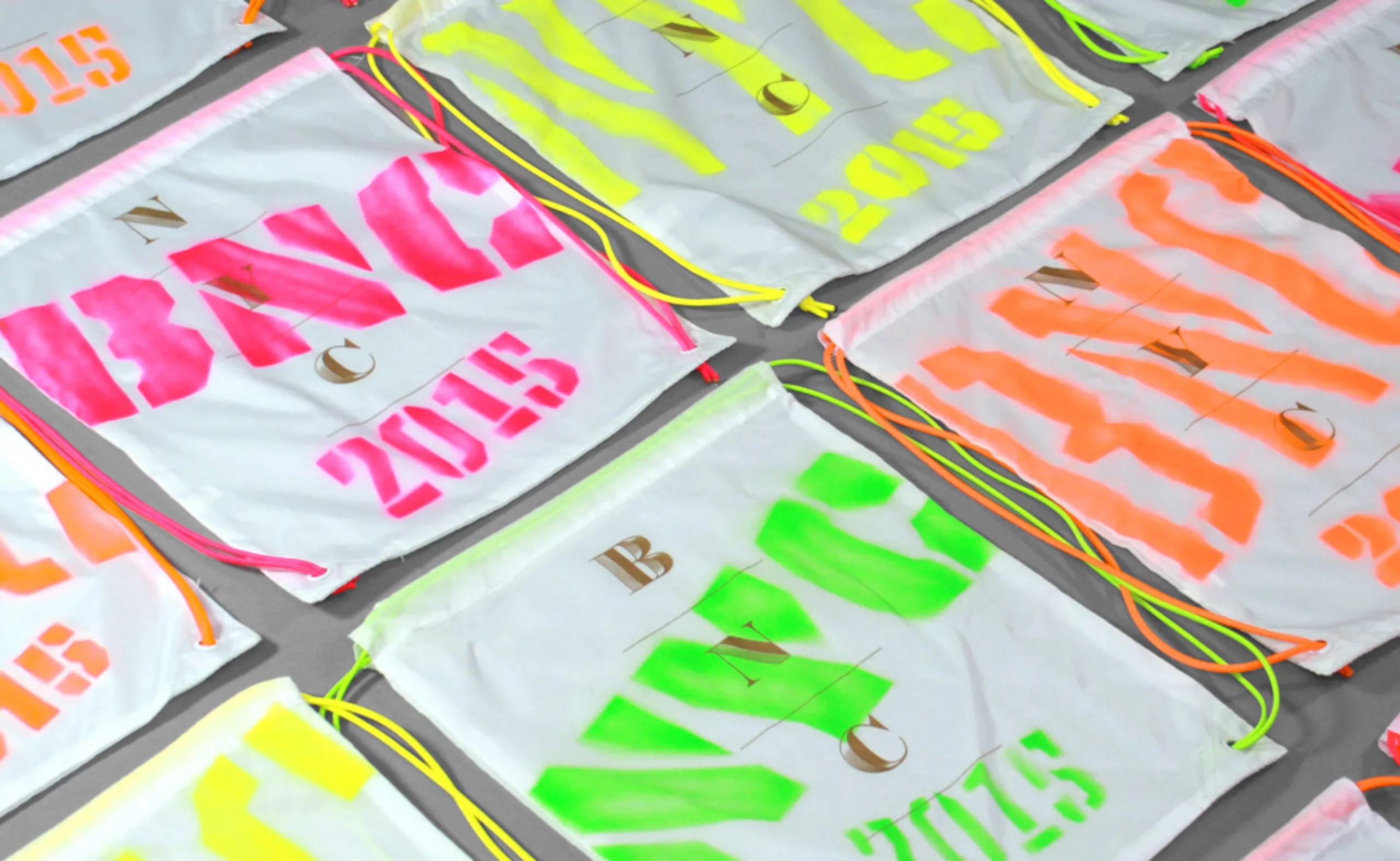
2015: BNC New York – city bling
In 2015, the Brand New Conference is held in New York. The idea starts from a stencil typography that the organizers like for its ugliness; the Tripper Pro. Stencils are coloured bombs, graffiti, and NY from the 70s and 80s. In contrast with the raw and urban rendering, golden letters in the Gatsby style, for the luxury and extravagance of the city.
And since using stencils and gold letters seems too simple, Armin and Bryony set the bar higher and aim for the “handmade”. Yes, because offset stencils are less ghetto.
Then follow a series of manual and well timed steps, which are worth all the gold in the world:
- spray the stencils for the invited brands.
- to realize the 1700 covers of the programs with 6 stencils, 4 colors of fluorescent paper, and several arms. Each cover is then marked with gold BNC letters, and the edges are golden.
- the backpacks are disassembled one by one by hand to remove the braces, then tagged, silkscreened, and reassembled with fluorescent laces. Easy.
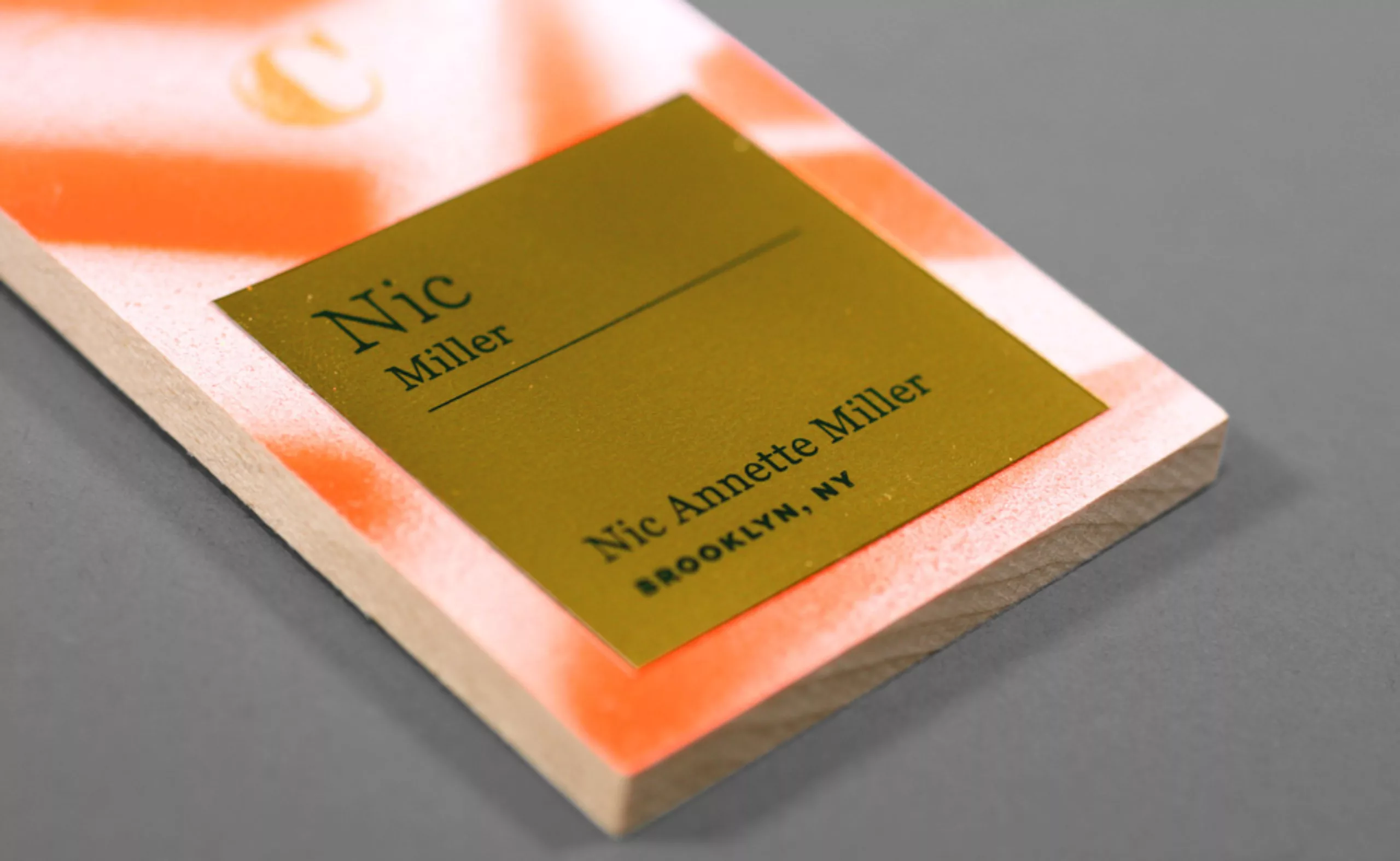
- the bagdes for the participants are sprayed on wooden boards, cut, silkscreened, assembled with a golden cord (what else) and marked with a label in the name of each one. Small work to the effective chain.
- T-shirts are “fortunately” (we quote them) made industrially. With the rest of the bombs and large stencils, the team tags the decoration of the room.
Here’s a video that summarizes the whole process:
2016: BNC Nashville – rock & folk
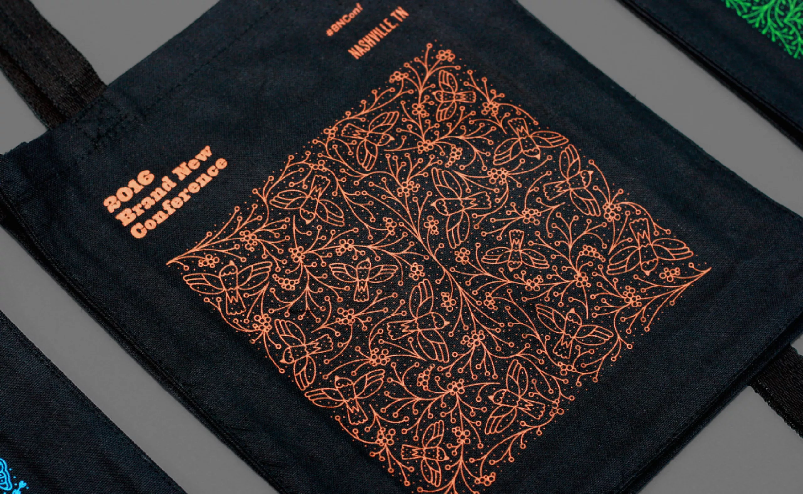
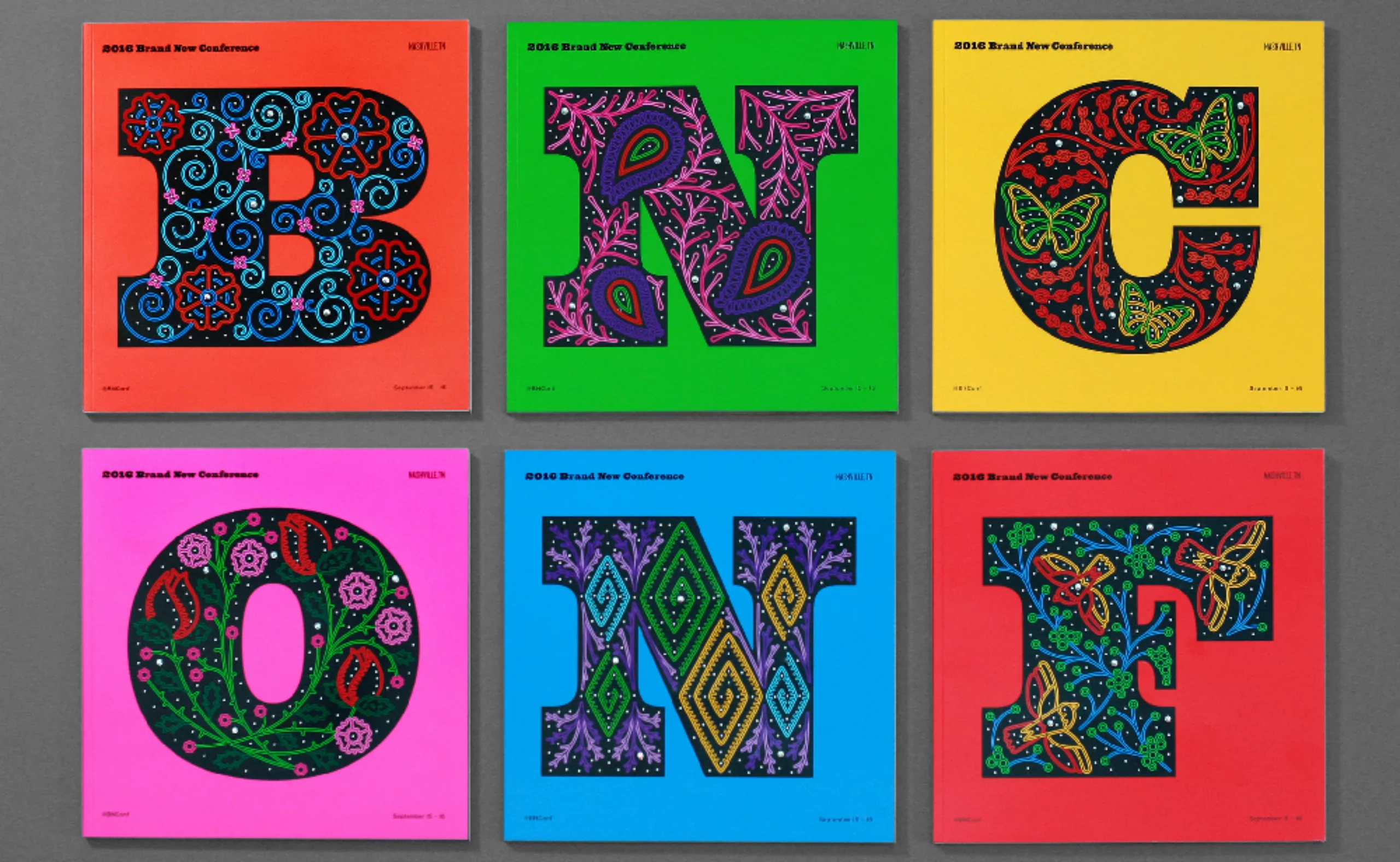
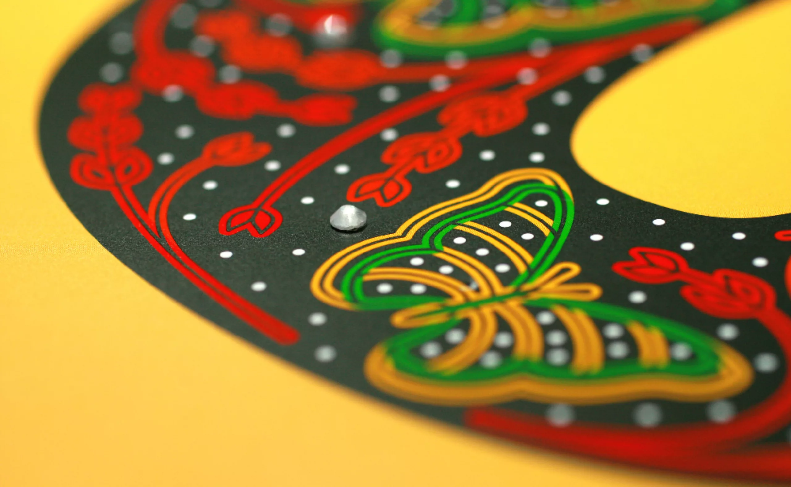
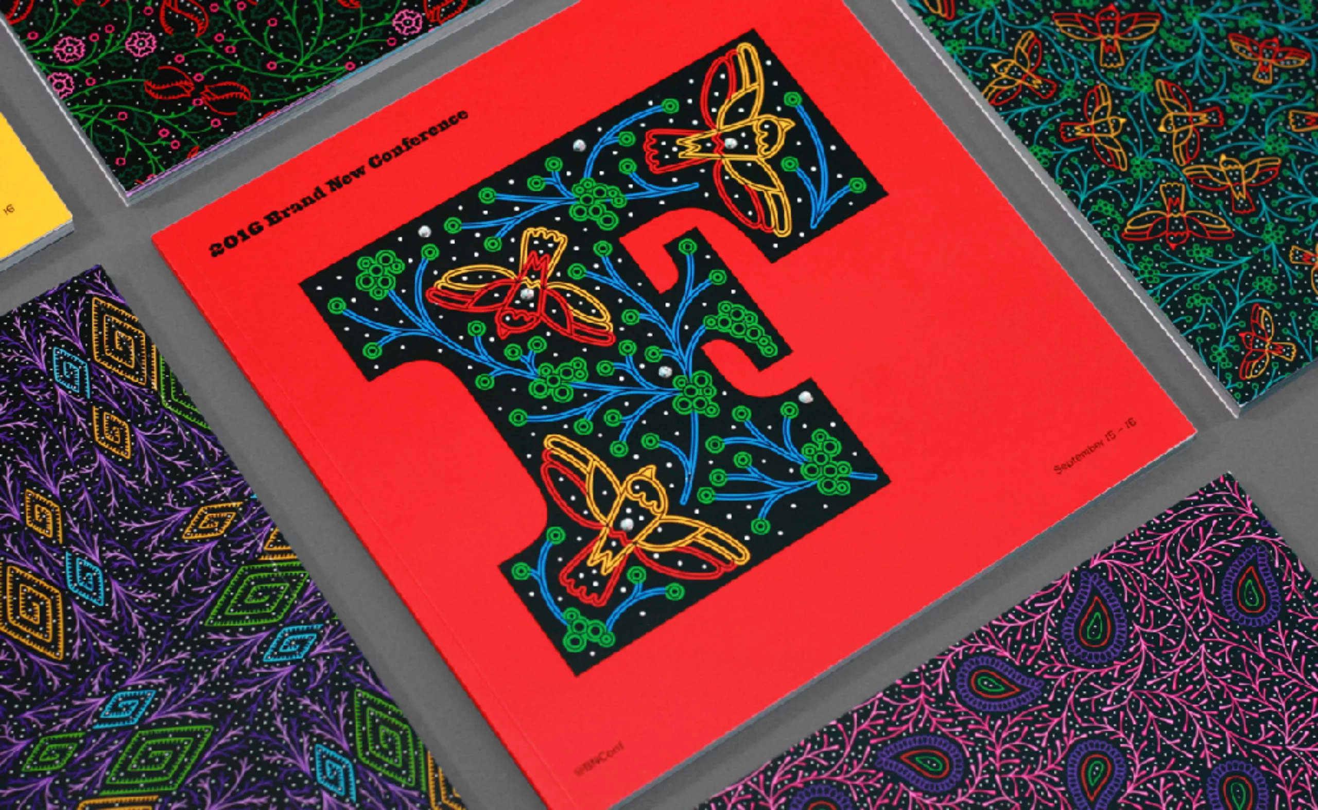
In 2016, the 8th edition of the conference takes place in the birthplace of country music, in the name that sounds on a guitar tune: Nashville. We saw Elvis, Johnny Cash, The Black Keys, Bob Dylan and Lana del Rey, among others. And Nashville means embroidered costumes, rhinestones, and posters with wooden letters.
The Nashville BNC had to pay homage to this floral and kitsch style, mixed with the style of the mythical Hatch Show Print to whom we owe hundreds of concert posters from the 1920s to the 1950s.
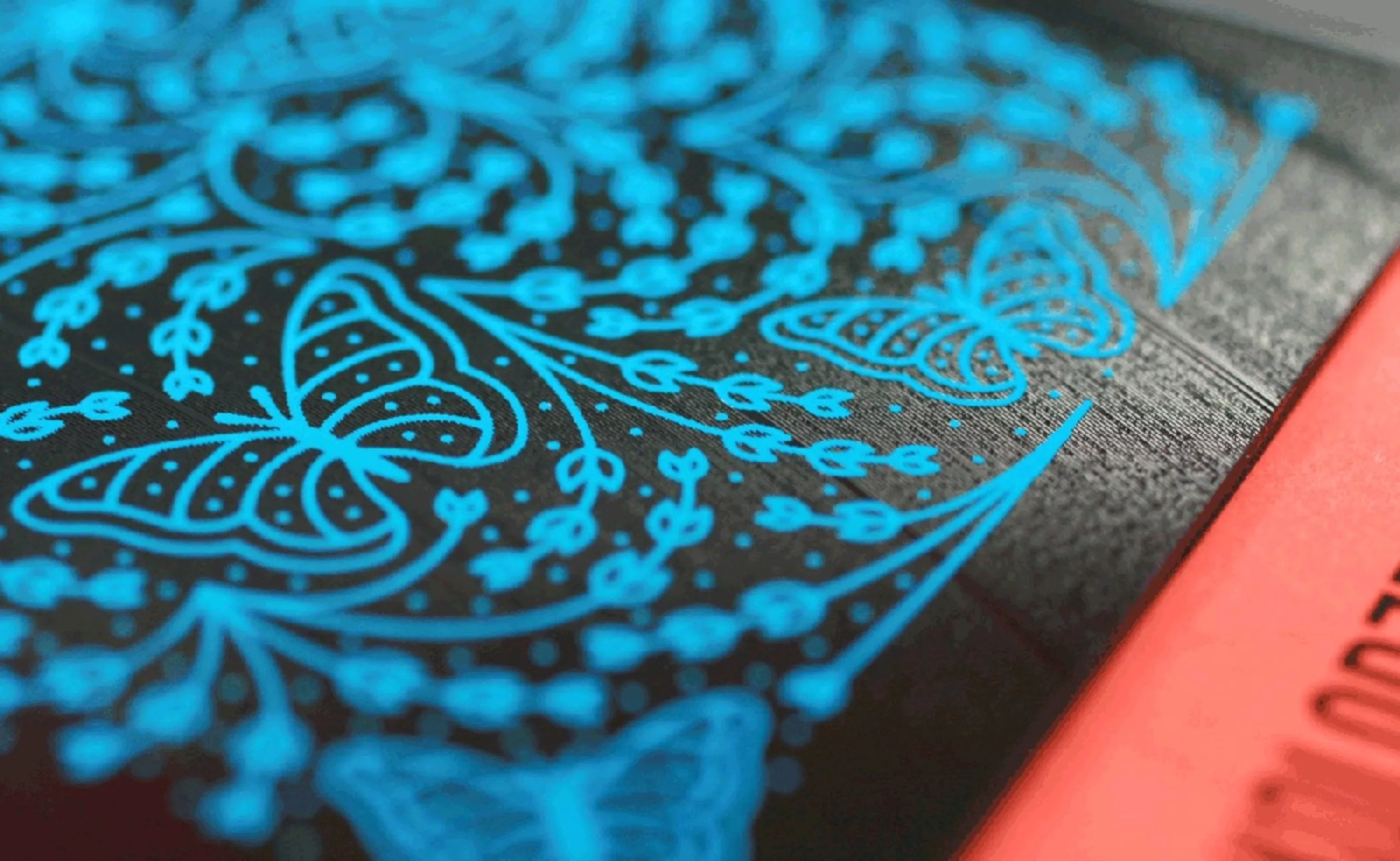
Without playing the wooden letter card (too easy and not original enough), Armin and Bryony put on their costume and choose to attack with embroidery and a cowboy type, in 100% digital.
Floral motifs, butterflies and sequins with bandana inspiration are embroidered on illustrator, then hollowed out to give the impression of a passing thread, and finally coloured. At printing, on the program, 7 rhinestones are glued on each cover. It will take 8 hours for several hands to give the bling effect to these 1000 programs.
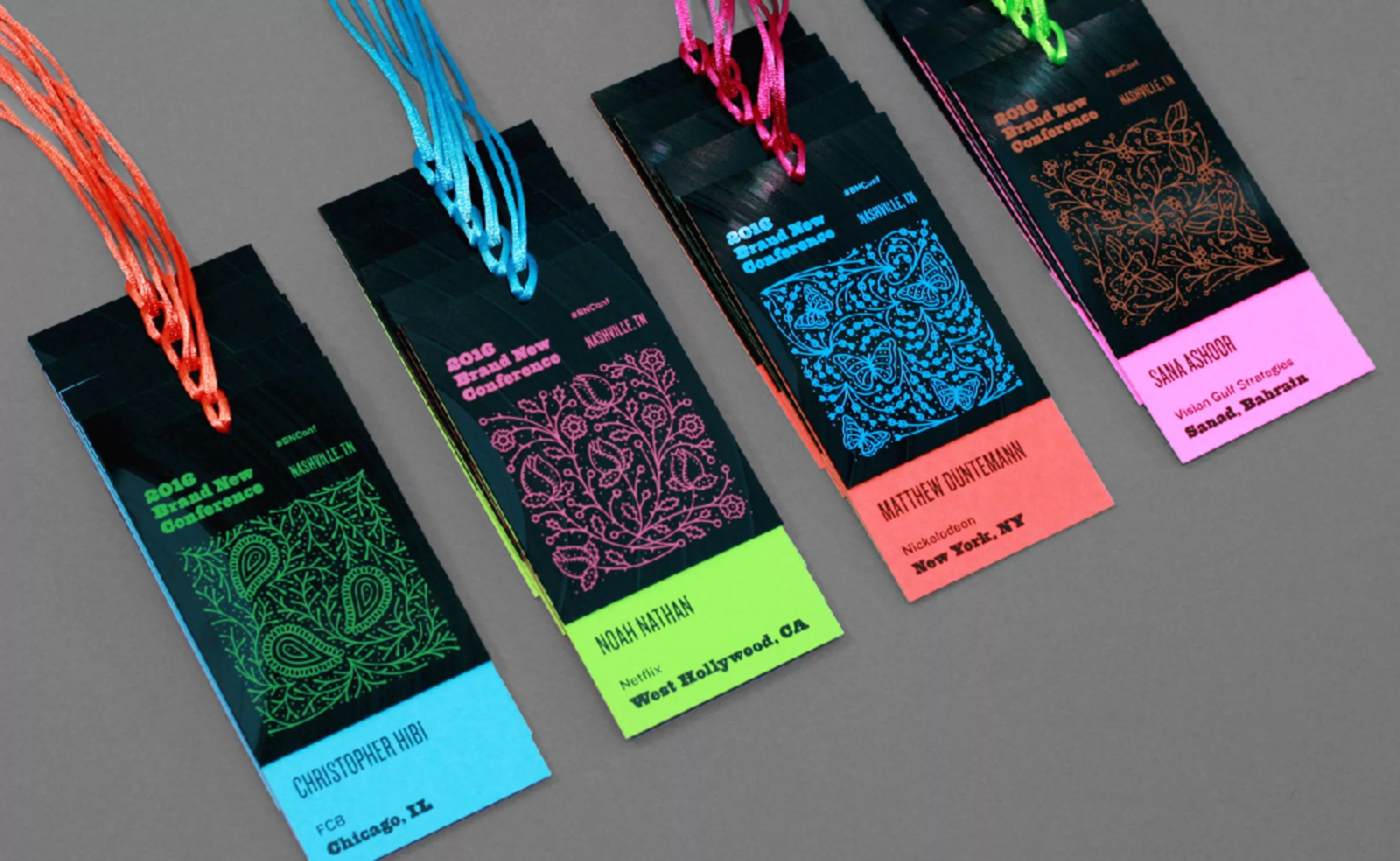
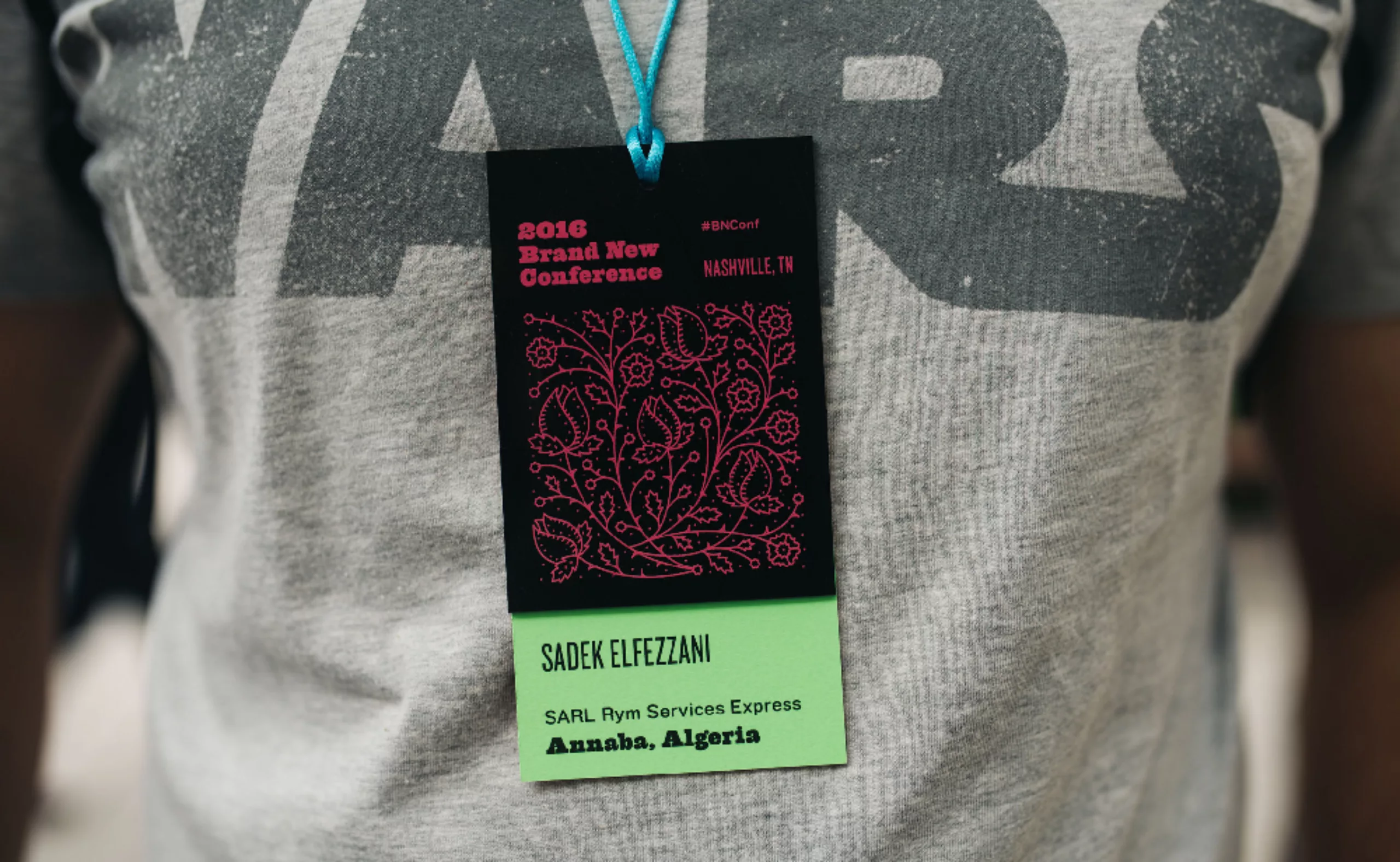
To avoid making a false note, the badges are silkscreened and then cut out in… vinyl! Each disc can produce 4 badges, which are then glued on neon coloured paper.
2016: BNC Amsterdam – xxx at the Rijks
In 2016, the conference is being exported to Europe for the first time. As a result, the creative fever of previous years became less virulent and the concept simpler.
This time, the identity is built around 2 essential elements of Amsterdam the famous xxx and the classic paintings of the Rijksmusem (pronounce “reyksmiousséum”…).
To avoid the cross stitch effect in this typeface made with red x’s, the whole is shifted by an angle of about twenty degrees, to inject a dynamic momentum. Kind of like putting the logo on a Dutch bike, actually.
And not to make it simple, as is customary at the BNC, all variations will follow this angle. The programs are printed in parallelepipeds, just like the guest badges. On the covers, the crosses are hollowed out on iconic paintings of the Rijksmuseum, and reveal a red background. On the badges are pinned 3 enamel pins. To give more allure to the whole, the embossing of the used paper gives the effect of a true master painting.
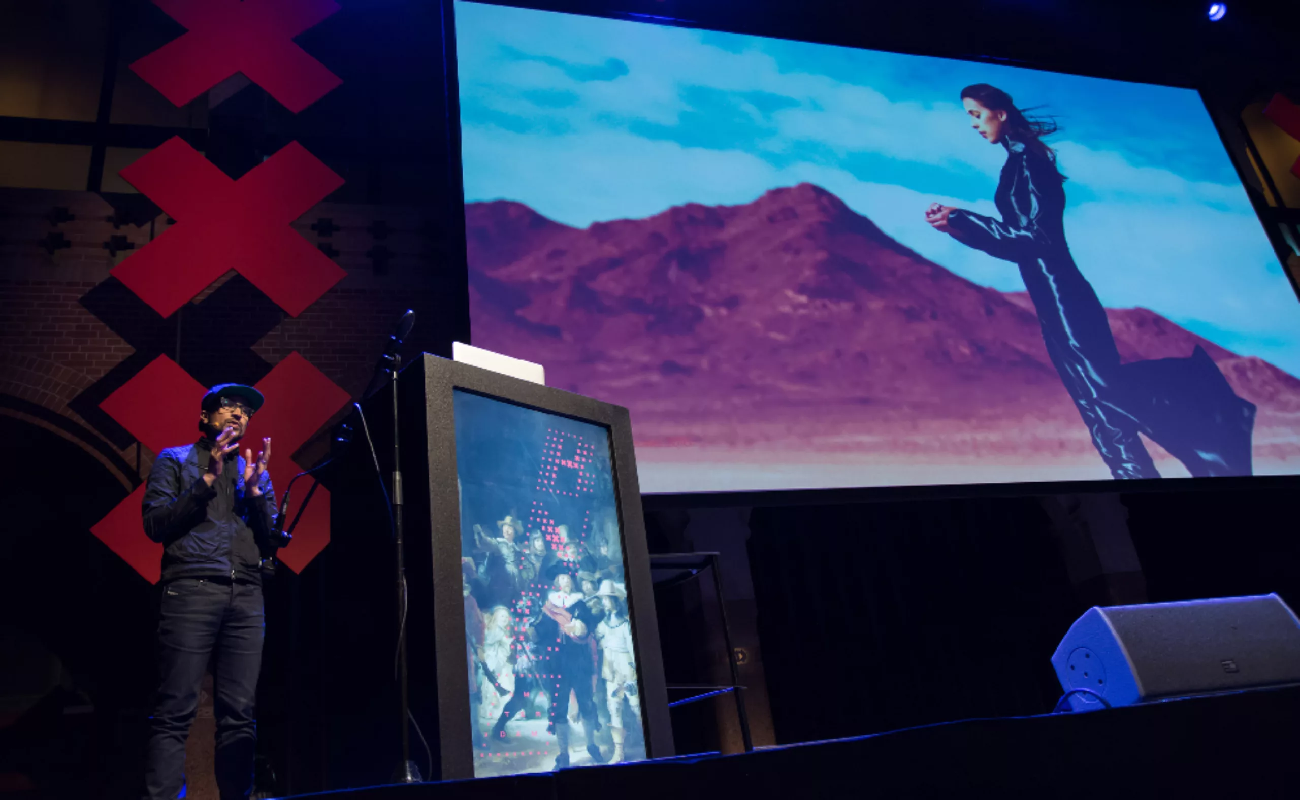
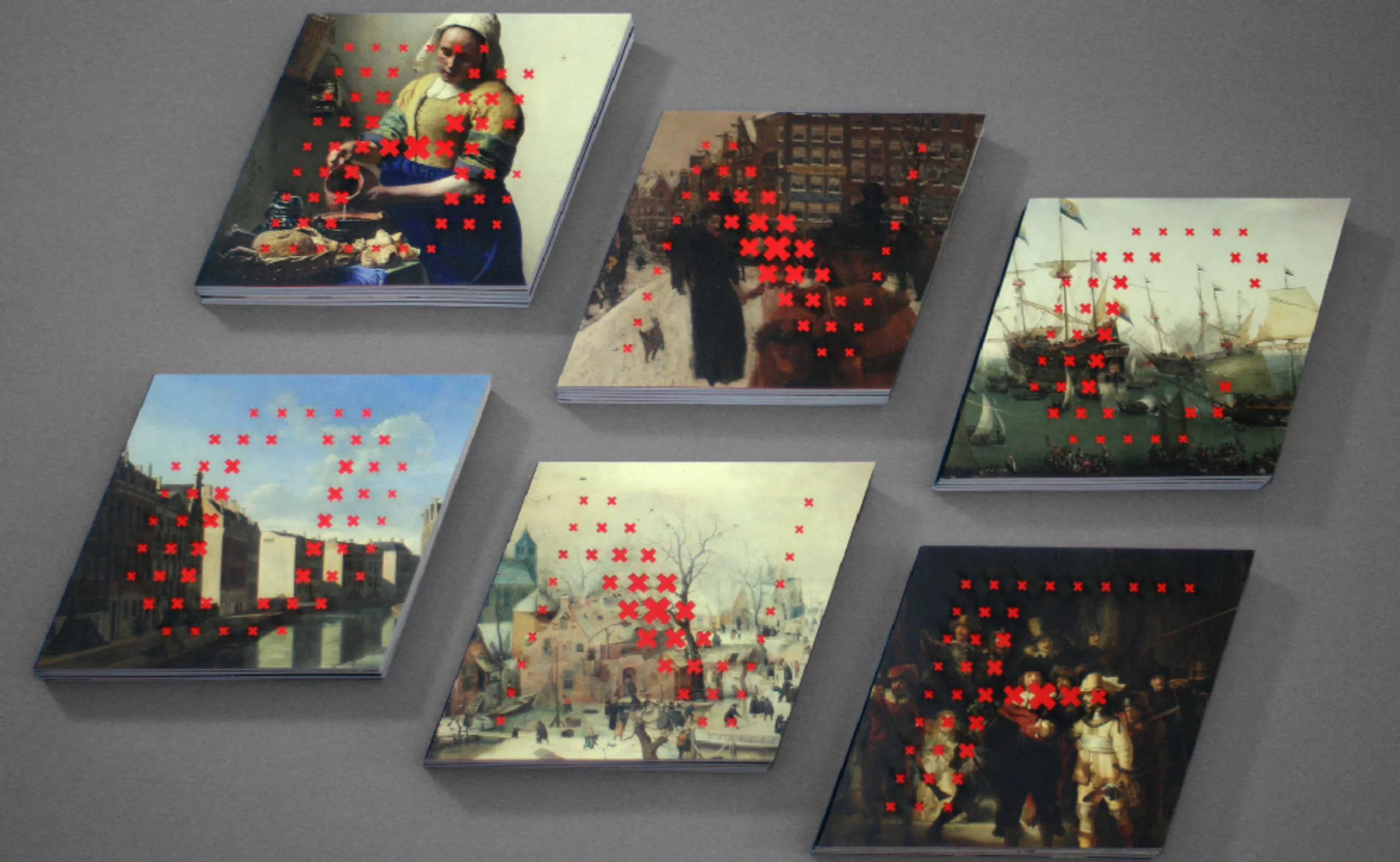
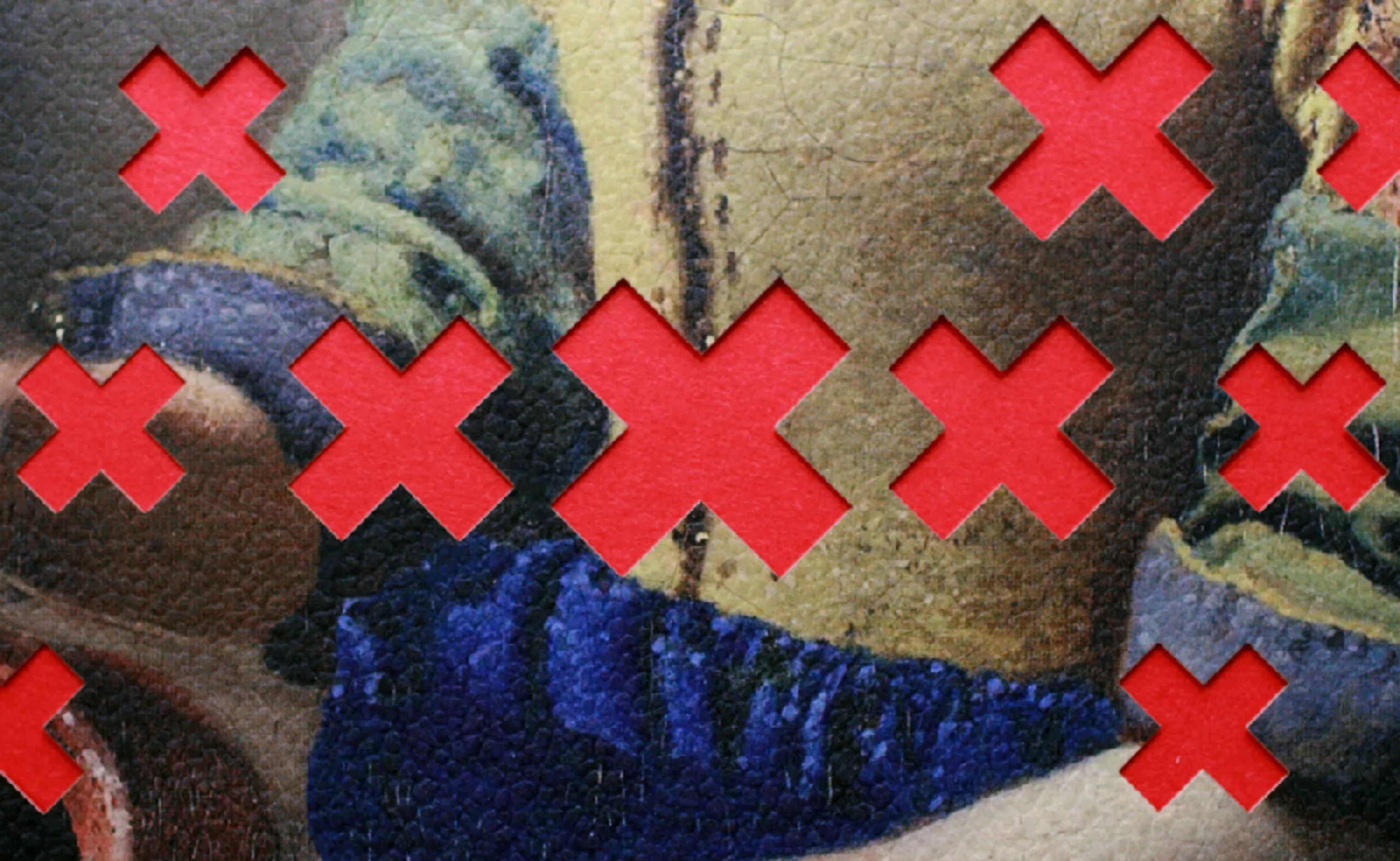
By playing with the fats on a canvas background, the logo comes to life. You can see more pictures on Brand New’s flickr account.
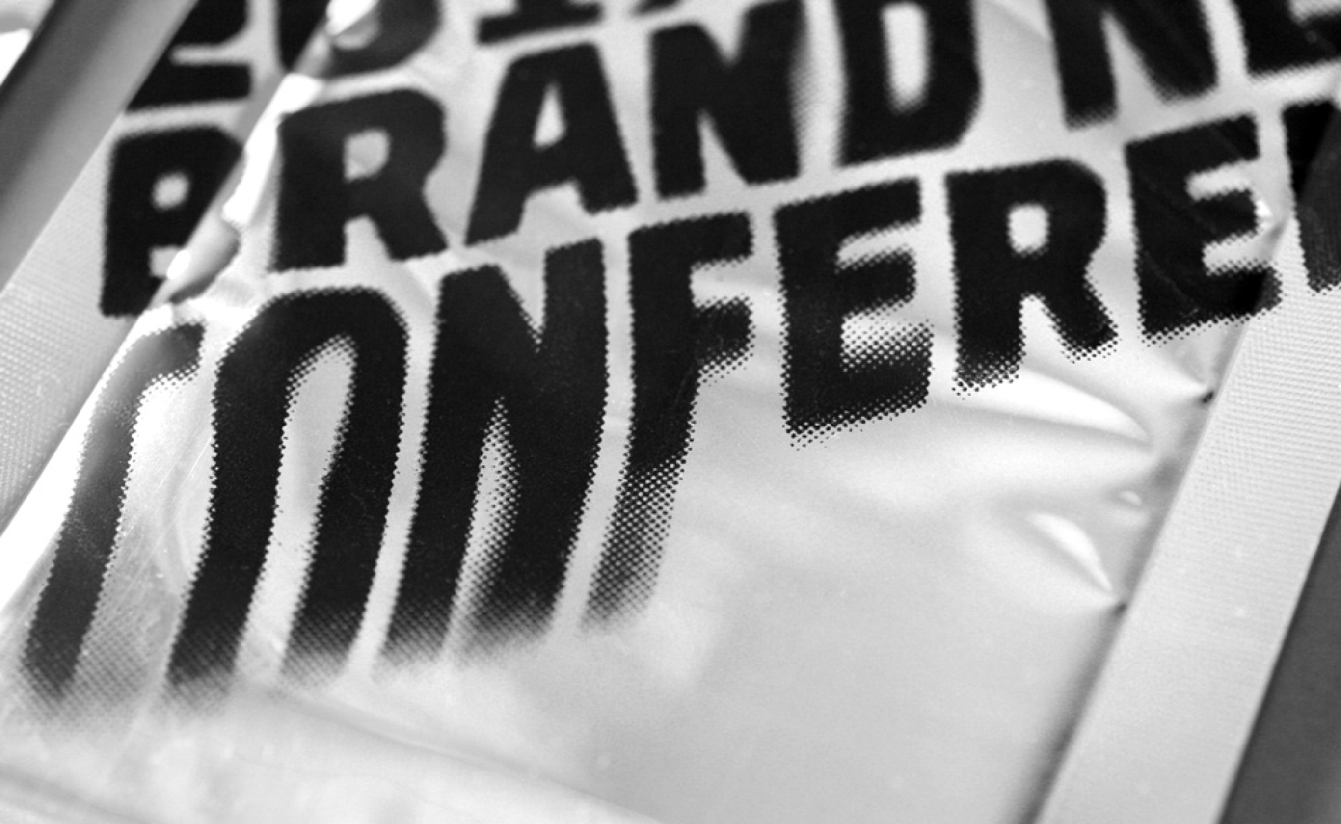
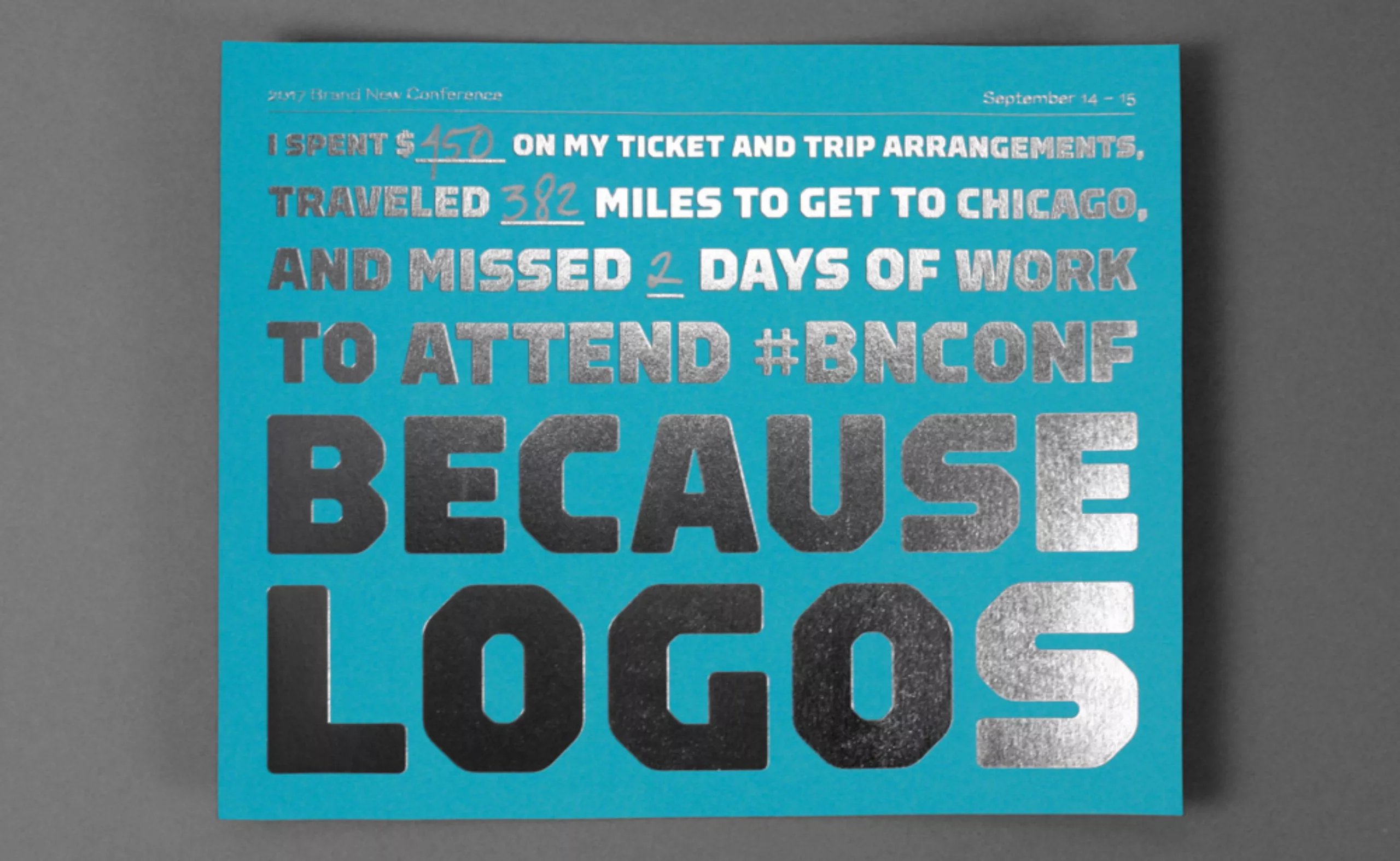
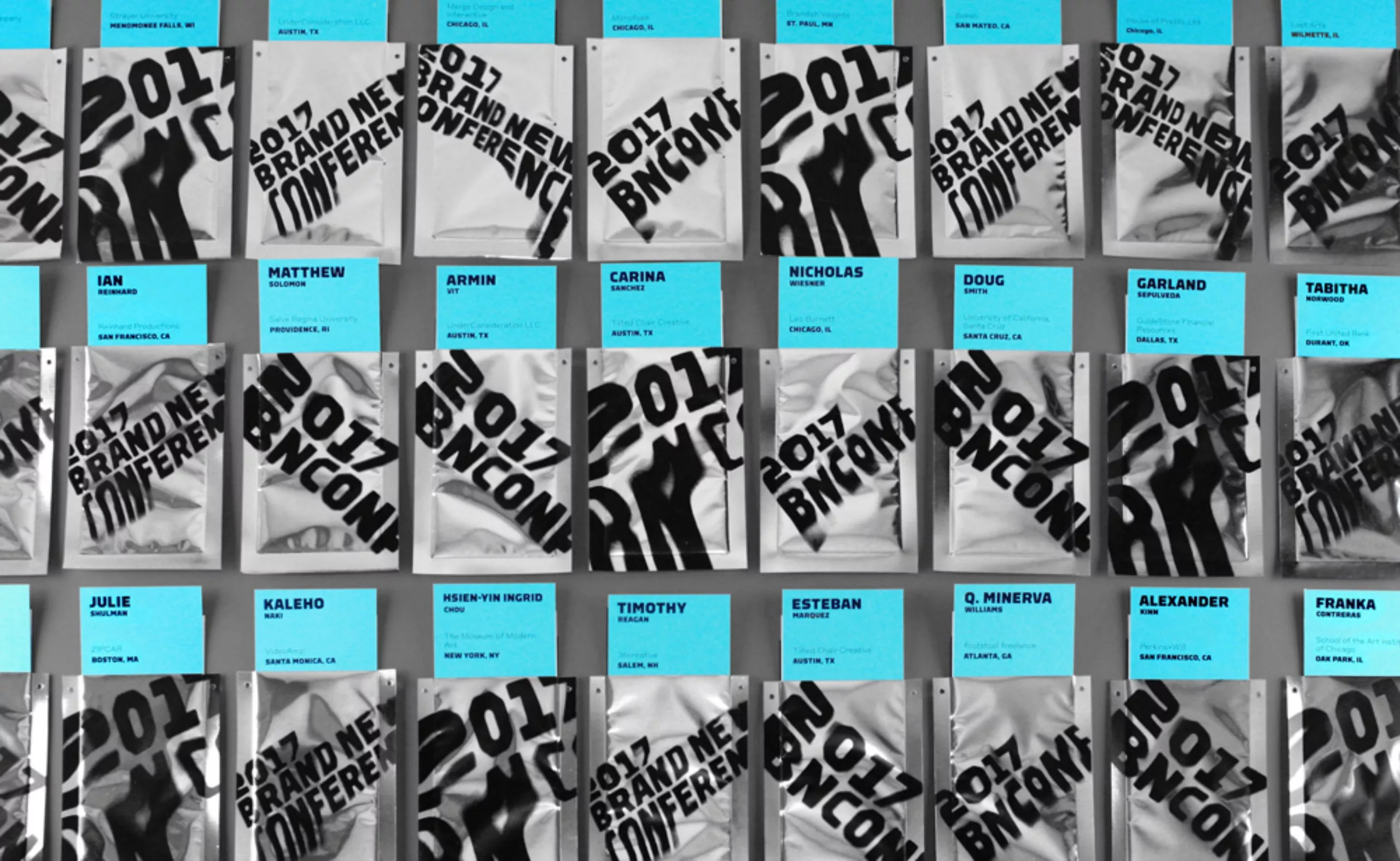
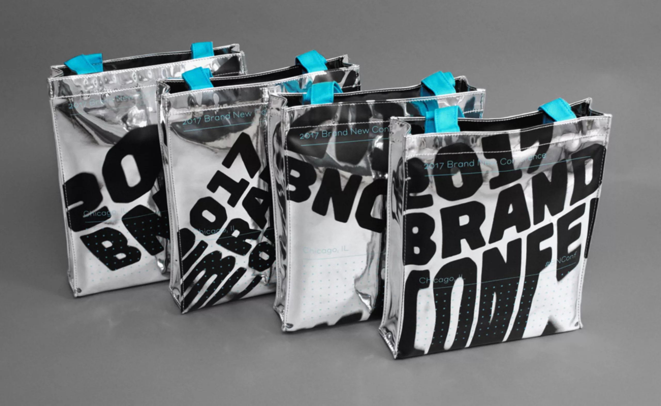
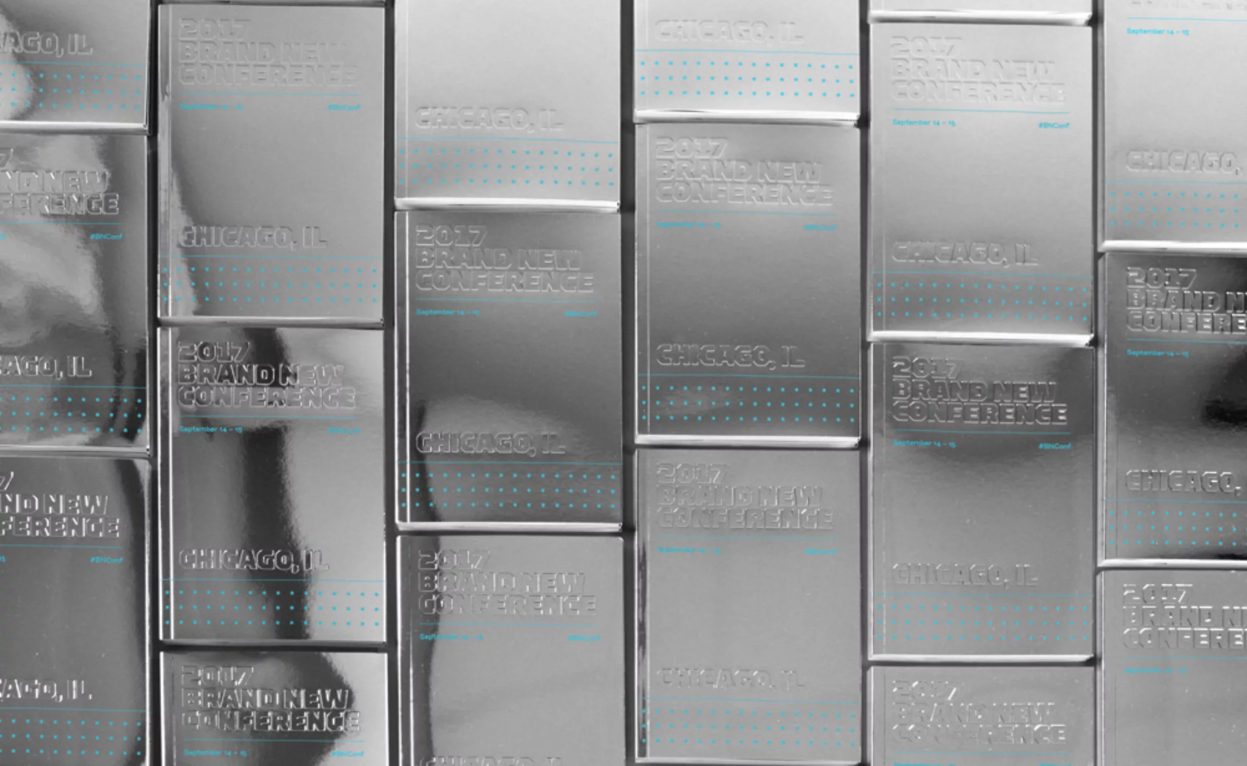
2017: BNC Chicago – bean reflections
Last year’s conference was held in Chicago, home of the famous Cloud Gate, Anish Kapoor’s metal bean. Armin and Bryony jumped at the opportunity to distort Brand New’s identity and make it echo the sculpture.
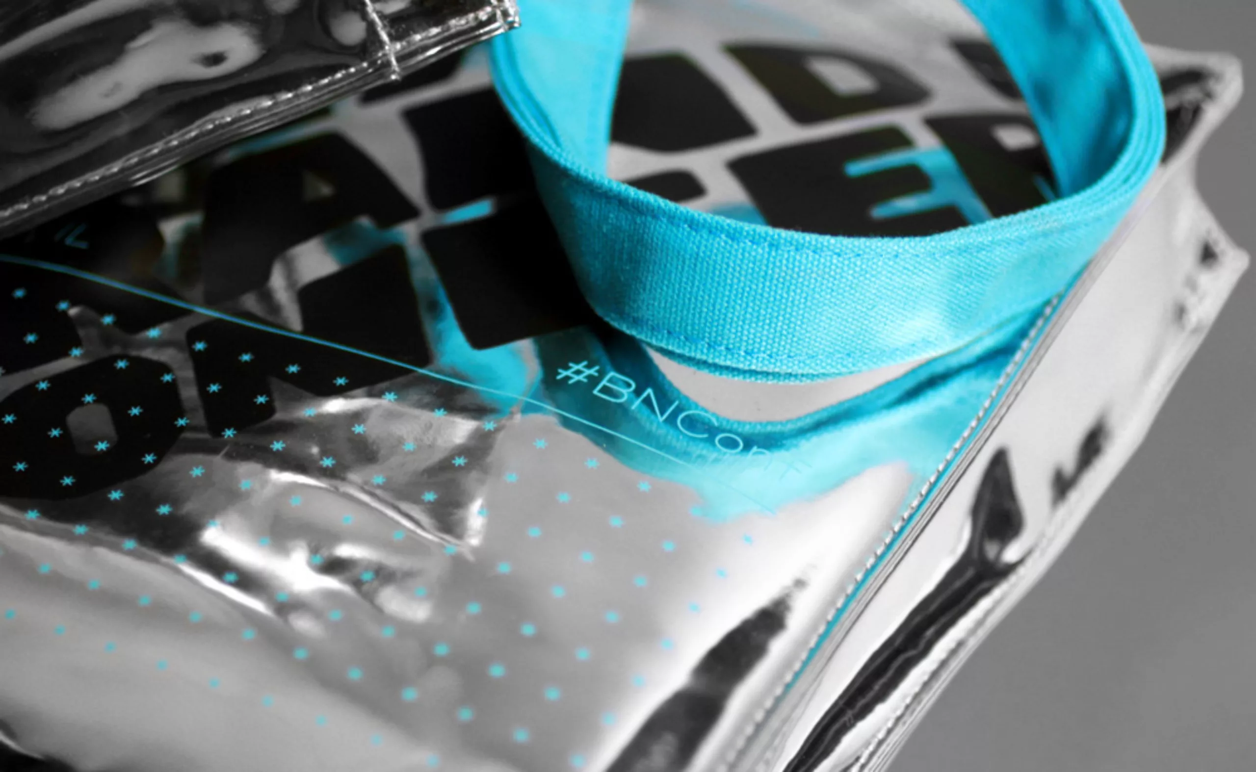
The entire identity has been declined on silver and reflective materials, from bags to invitations and badges. The logo was first distorted by projecting it in front of the surface of a silver roller, to try to do things by hand. It was finally edited on the computer via 3D software with the help of another specialized studio, because the rendering was more aquatic than curled. The logo search process alone is explained here.
The bags were silkscreened on a mirror canvas imported from China, using four distorted logo designs, printed without margins. The invitation sleeves gave me more trouble. The material used is not compatible with printers, and Armin and Bryony decide to screen print everything themselves, with the means of the edge (they find the equipment on Craigslist). 65% of the first screen prints are missed, and the duo prints 1000 more pockets the weekend before the event.
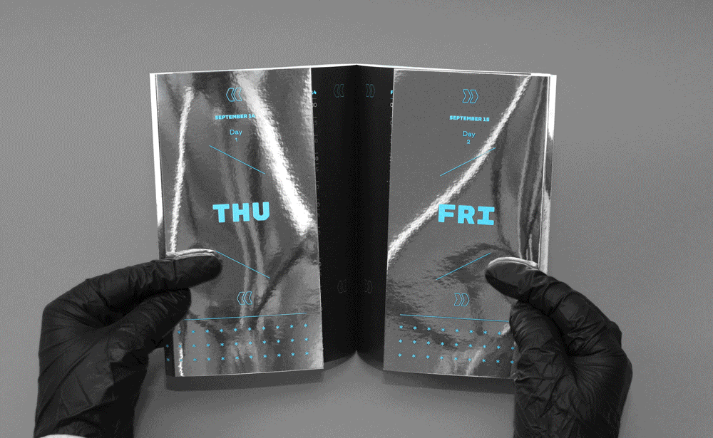
For the catalogue, it opens with two sections, each containing the programme for the two days of conferences. We’re a little sorry we missed this edition and its goodies from space.

The 2018 edition will once again be held in New York and we can’t wait to see what this amazing duo will concoct for the occasion…
In the meantime, if you would like to register, please visit the Brand New Conference 2018 boutique.
And if you’re curious, or New York is too far away, you can review videos from previous years’ conferences!
On the subject
-

Groupama’s new visual identity, a logo in the open countryside
Groupama has just unveiled a new logo that updates its graphic design by abandoning its campaign in favor of a “startup” aesthetic.
-
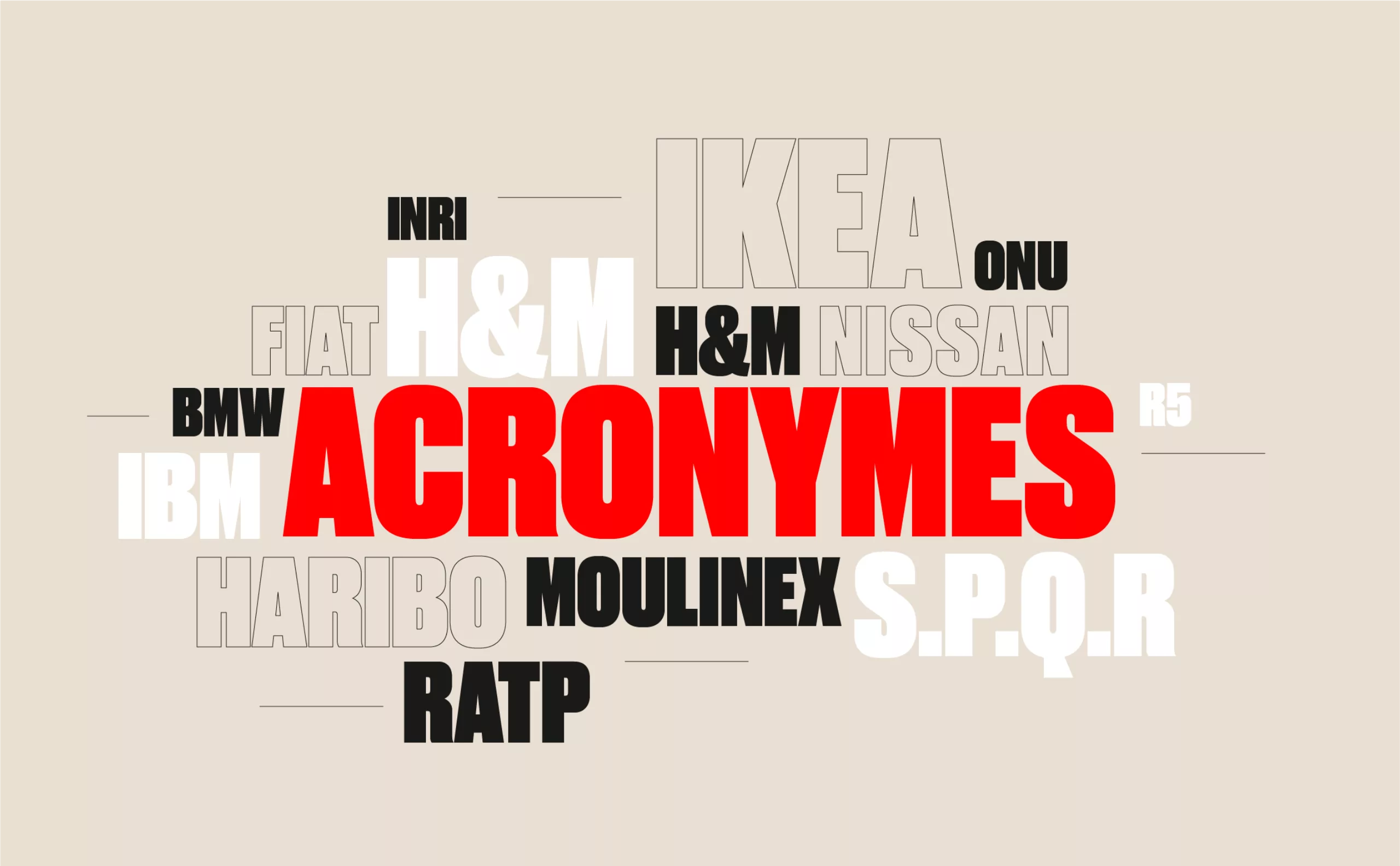
From surnames to acronyms: creating a brand name from letters
From founders’ surnames to initials and acronyms, brand names have always oscillated between abstraction and familiarity.
-

The UN logo takes on water during COP28
For COP28, two designers have come up with a new UN logo showing the rising sea levels and the future disappearance of much land and coastline.