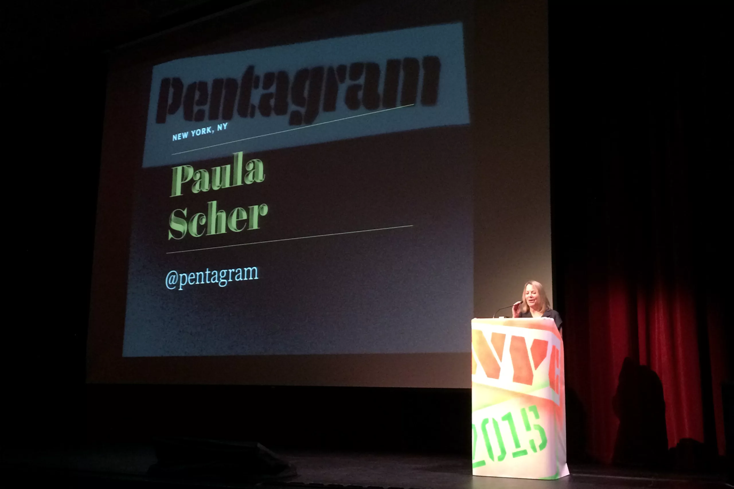
2015 Brand New Conference in New York – Day 1

25 September 2015  |   0 Comments   |    |  

grapheine-love-new-york

Big apple a day, brand's doctors far away !

Graphéine moves to New York for the 2015 Brand New Conference. An event we used to watch in a webcast. This year, we wanted to share a "big apple" with the whole team. We'll try to share it with you a little bit.

giphy

7:30am: First of all, like Newton, we discover gravity by taking a blow of "Big Apple" on the head. None of us had had a chance to visit New York before this trip. Getting out of the subway in the Tribeca district to go to the conferences, we play the good tourists, looking up at the sky cut out in parallelograms between 2 buildings. Besides, it's indian summer.

New york

IMGP5249

badge-bnconf

8:30am: We collect our pretty handmade badges, accompanied by a bag filled with a batch of sponsored goodies.

sac-bnconf

Let's go for two intense days of conferences, meetings and torticollis (looking at skyscrapers!).

Hofler

Jonathan Hoefler, without fuss.

9:30am: Jonathan Hoefler, font designer since 1989. His company Hoefler & Co. is at the origin of one of the most famous font libraries. We can quote Knockout, Gotham, Mercury, and Archer. H & Co also produces custom corporate typefaces.

Hoefler received the Charles Peignot Prize in 2002 for his outstanding contribution to type design. By the way we can mention two french winners among the 9 winners of this prestigious prize, Claude Mediavilla in 1982, and Jean-François Porchez in 1998!

Jonathan Hoefler's presentation was very serious, effective and promotional. He unrolled a methodical plan to choose the right typography for a branding project, and especially how to sell it to his clients! However, everyone had in mind the famous eviction of Tobias Frere-Jones the former partner... but the thorny subject was not addressed.

apeloig-bnconf

Philippe Apeloig, french touch

10:30am: Philippe Apeloig, former student of the ESAA Duperré (Hey ! Graphéine was also born there !), began his career at the Musée d'Orsay in 1985. With a grant from the Department of Foreign Affairs, he moved to Los Angeles to work withApril Greiman. A small tour through the Villa Medici in Rome where he draws his "Octobre" font. Since then he has created a series of visual identities for numerous cultural institutions (Musées de France, Petit palais, Théâtre du Châtelet...).

His work made a big impression on the American public, the minimalism of his work taking a childish posture at the turn of an animation. In the portrait drawn by the organizers, Philippe Apeloig would be "like a kid entering a candy store, and who would take 15 minutes to choose the only candy that would suit her !"


Andrew Schapiro, A for Airbnb

11:30am: Andrew Schapiro, head of Brand Creative at Airbnb, looks back at the genesis of Airbnb's brand identity. He did not lack humour, starting directly his lecture on all the scabrous misuses of which this logo was victim. Despite the quantity of parodies launched on the net after its launch, we must admit that this rebranding is a success! It is a true iconic symbol, easily reappropriated by the Airbnb community.

Geismar-Chermayeff&Haviv-bnconf

Geismar, Chermayeff & Haviv, Amen.

12:30pm: I heard the Pope's in New York. Actually, there are three of them. Real living icons of branding,Ivan Chermayeff, Tom Geismar and Sagi Haviv, must cumulate not far from two centuries to them three. Their agency, founded in the 1950s, has seen such prestigious North American clients as Chase Bank, Mobil Oil, National Geographic, Showtime, PBS, Barneys New York, NBC, and more recently, the Library of Congress, Conservation International, Armani Exchange, Avery, Harvard University Press, and many others. Sagi Haviv joined the agency in 2006. He is the new kid of the trio, whose youth is gently mocked by Geismar when he tells that it takes Haviv 2 weeks to create a logo, while he never takes more than 2 days. The conference also looks back at the designer-sponsor relationship, and how the client will always seek to make things complex, hence the need to design the simplest things from the start. They also come back as the need not to do anything that is not "fashionable". Time taking care to forget what was fashionable. Needless to say, the man who speaks is 80 years old.

Geismar-jeremie-grapheine

Lunch break: While heading to a small Thai sandwich shop, Jérémie (Graphéine) philosophizes with Tom Geismar that the most difficult thing is not to create minimalist visual identities, but to convince his client of their relevance!

paula-scher-bnconf

Dear Paula Scher...

2:00pm:...you didn't even give us time to digest our sandwich until math class started. Identity = (Form+application) x ( Hearing+time). The secret formula of a good visual identity.In fact, it's all about explaining that you have to give time to an identity to mature and grow in the public mind. That the emotional perception that the public will have will remain the unquantifiable part, and it is there that it is necessary to know how to leave time to time, before throwing everything in the dustbin. Then, between two presentations of projects (Windows, Parsons School of Design, The New School) she returns on the necessary benevolence that the designers must have between them. She takes as an example the art of murderous commentary on design blogs. "We are one profession and the whole goal is to make things better. We can't do that by attacking each other." The tone, though moralizing, remains deeply sincere, and a cloud of benevolence seems to evaporate in the conquered room.

[ Cut scenes ]

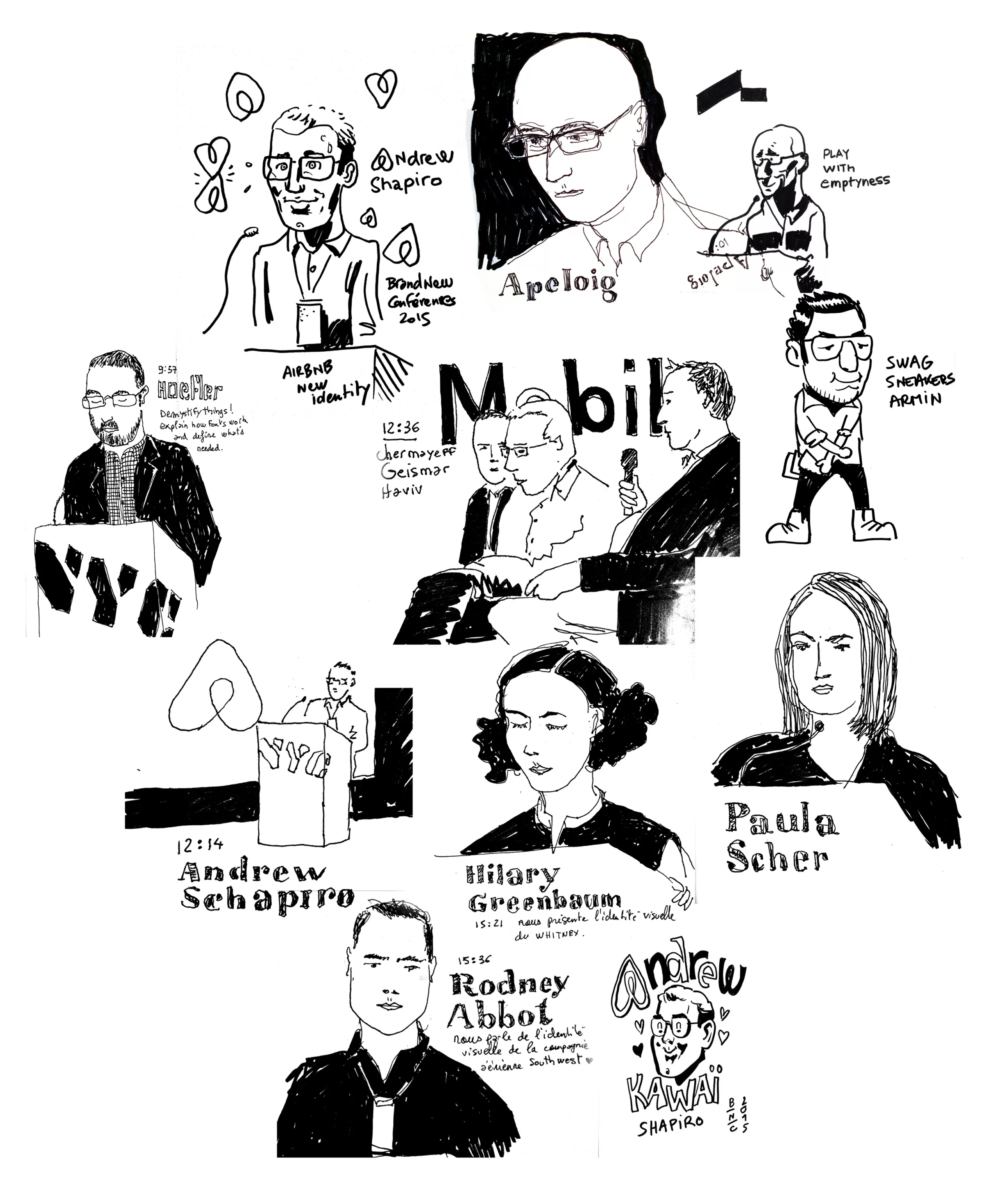
We spare ourselves summarizing the speeches of "Hilary Greenbaum" presenting the variations of the visual identity of the "Whitney Museum" (designed byExperimental Jetset), followed by Rodney Abbot of the Lippincott agency presenting the rebranding of the airline Southwest, as well as the band of Grand Army whose visual identity project for the US Postal nevertheless deserves the detour.

Snask, the "Abba" of graphic design

5:15pm: The day ends with a conference show by two Swedish troublemakers not devoid of self-mockery at 7° of alcohol.  It's the Snask agency duo. Their lecture begins with a fake rap clip. The tone is set. To capture the rest, I invite you to discover their site.

Sketches...

Sitting for 8 hours listening to teachers reminds us of the time when we were drawing in notebooks margins... Here are some sketches made during our modest live tweet.


bnconf-day-1-sketches


Share this post:


Leave a Reply


Newsletter
Leave us your email and receive your monthly dose of Graphéine in your mailbox.