
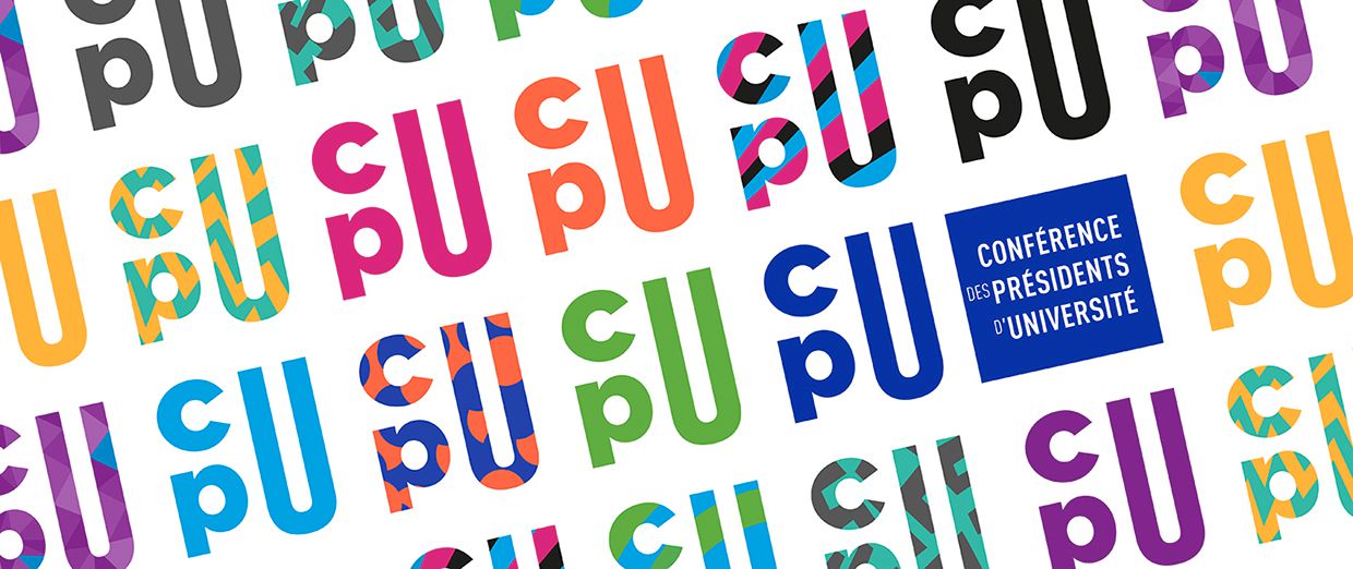
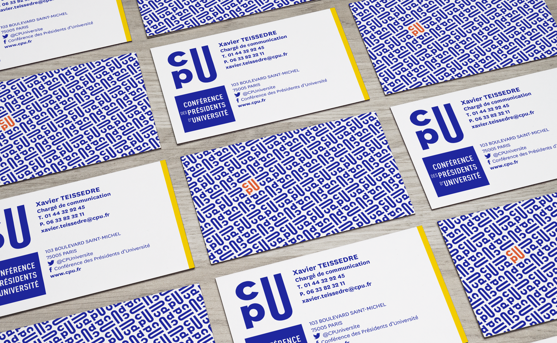
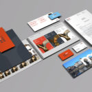
CPU with a capital "U" !
The Conférence des Présidents d'Université ("Conference of University Presidents" in English and CPU for short) has chosen to make its three letters the heart of its new visual identity. The design and composition of these letters are intended to create an impacting symbol and adapted to today's communication tools.
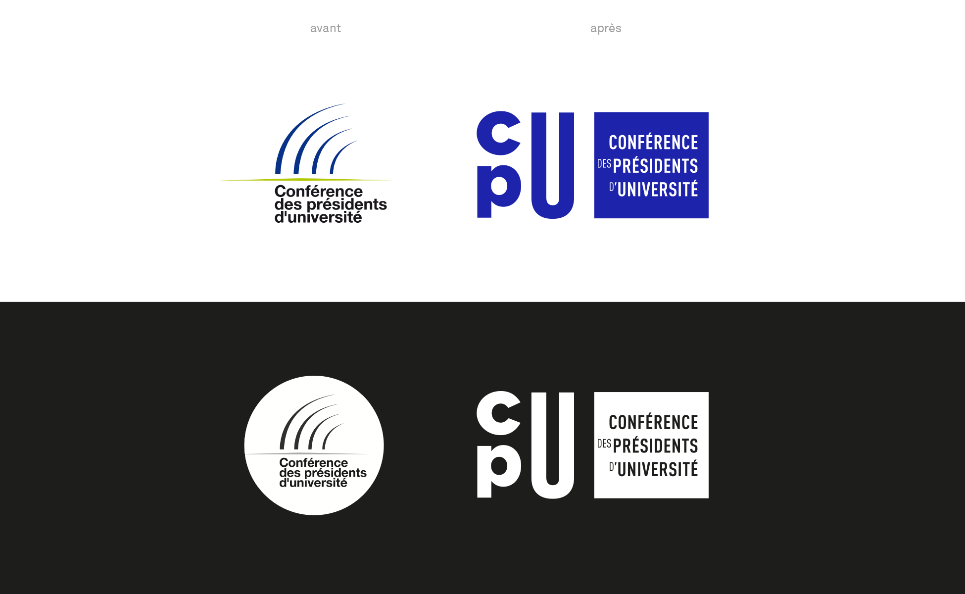
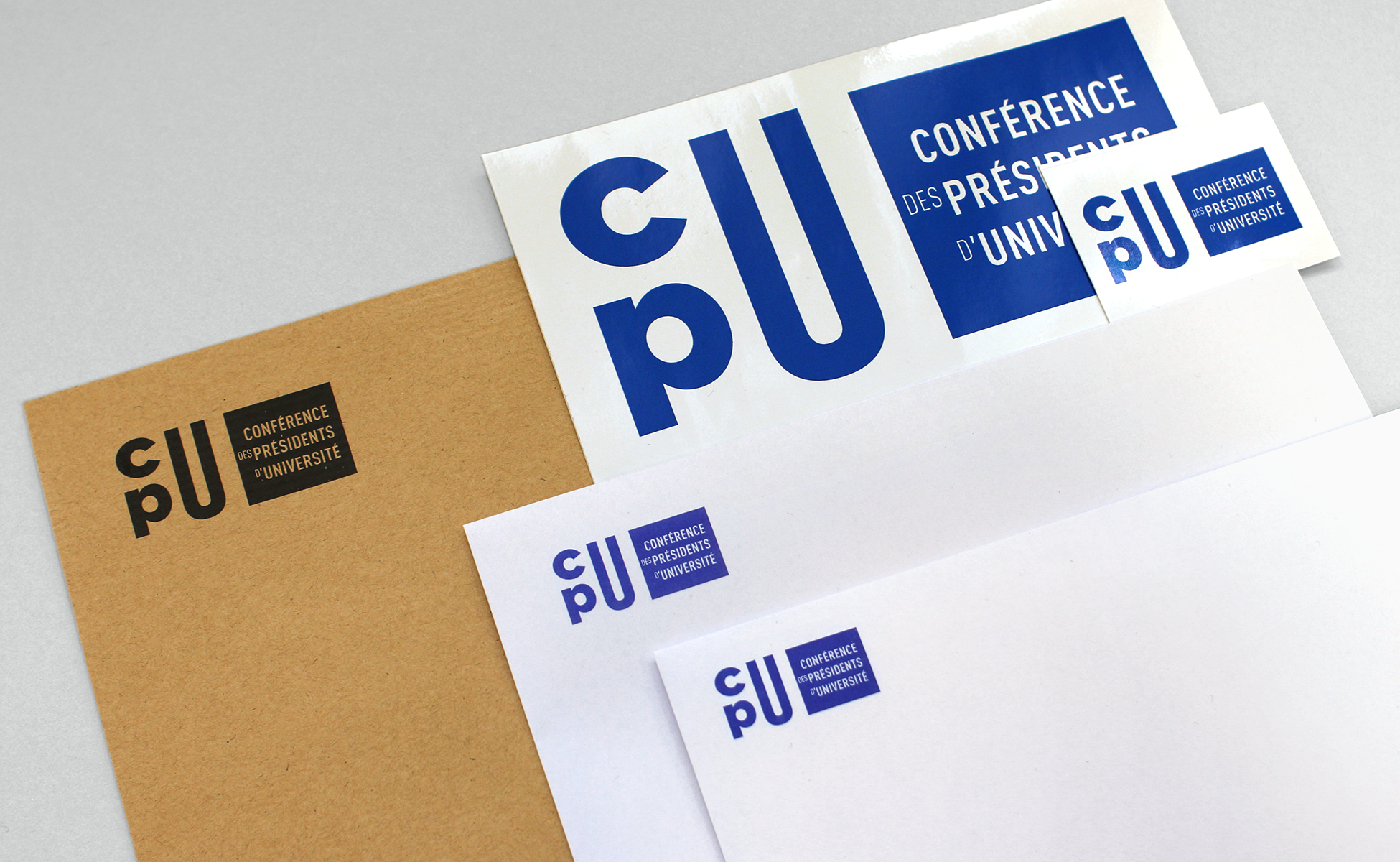
Why the need for a new identity? The old logo illustrated an amphitheater, symbol entirely justified, but its execution made the difficult readability small. More commonly known as "the claw" in-house, with fine features the logo face faded logos partners. It was therefore imperative to address this concern for visibility!
![]()
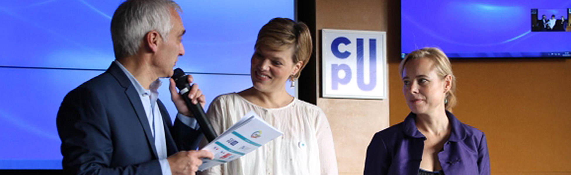
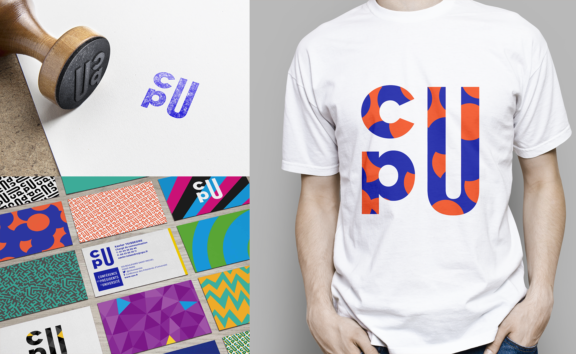
In the new logo, the "c" overlooks the "p". To their right, the "U" in capital letter, has voluntarily stretched design that puts it forward. The visibility given to the "U" underlines the importance of the role of the University in our society and obviously the close link between the CPU and universities.
The result is a CPU acronym blue, chromatic nod to the old logo created in 1995. Graphically very rhythmic, this logo should mark the spirits and thus facilitate its memorization. This original emblem reflects the will of the CPU to innovate and reinvent itself.
![]()
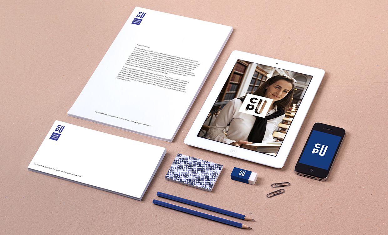
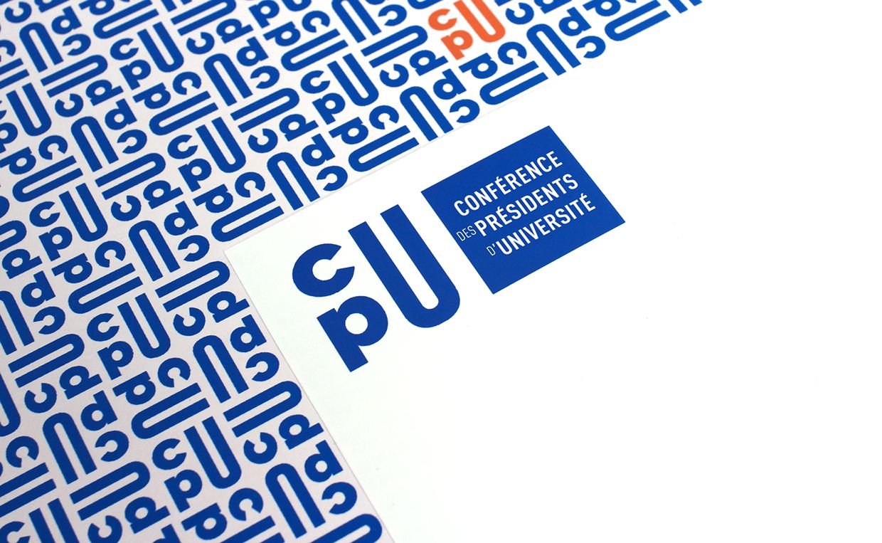
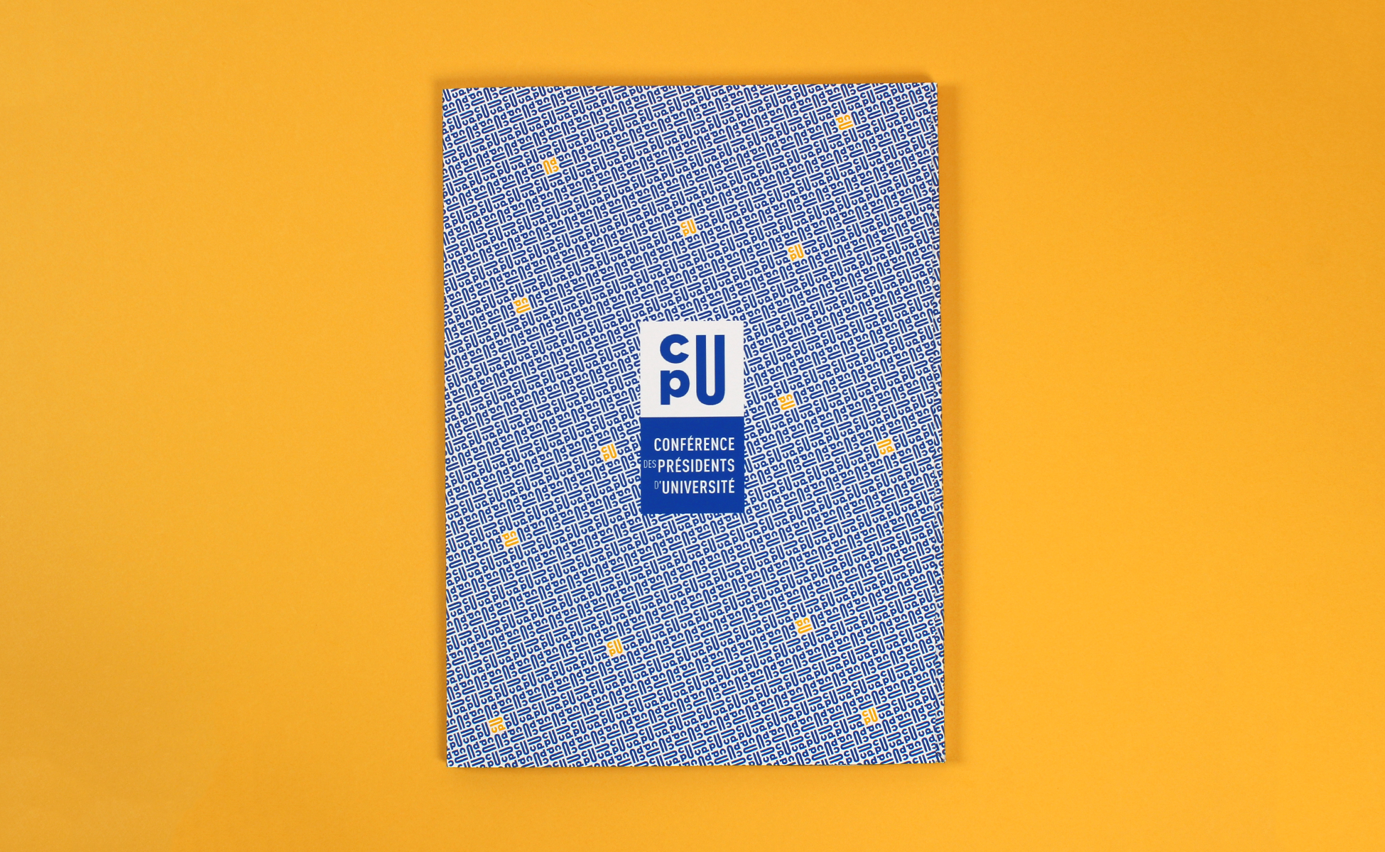
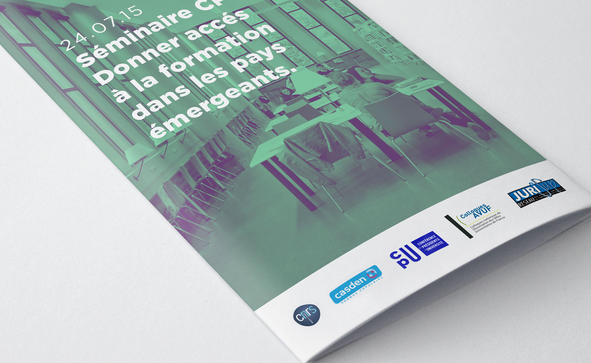
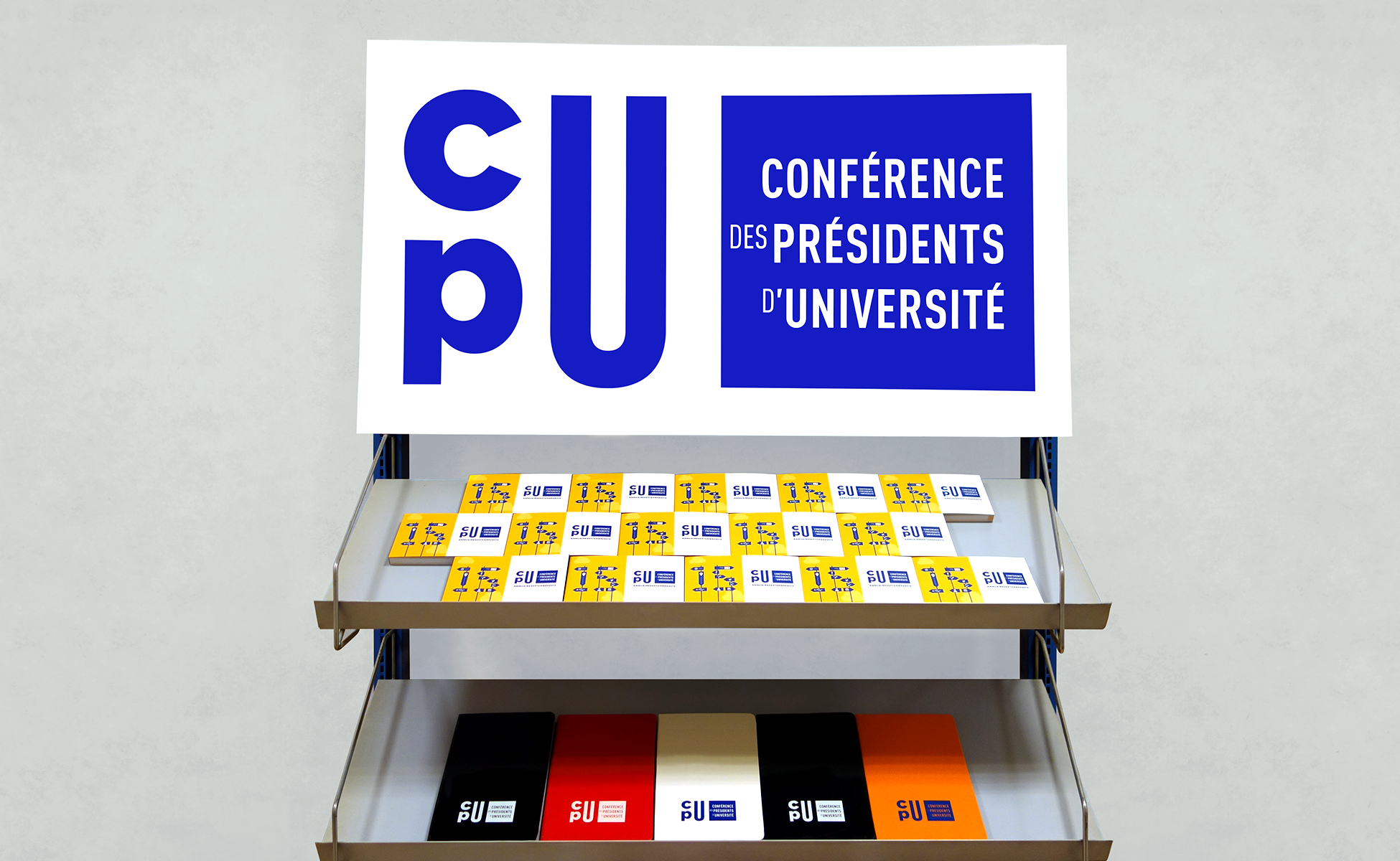
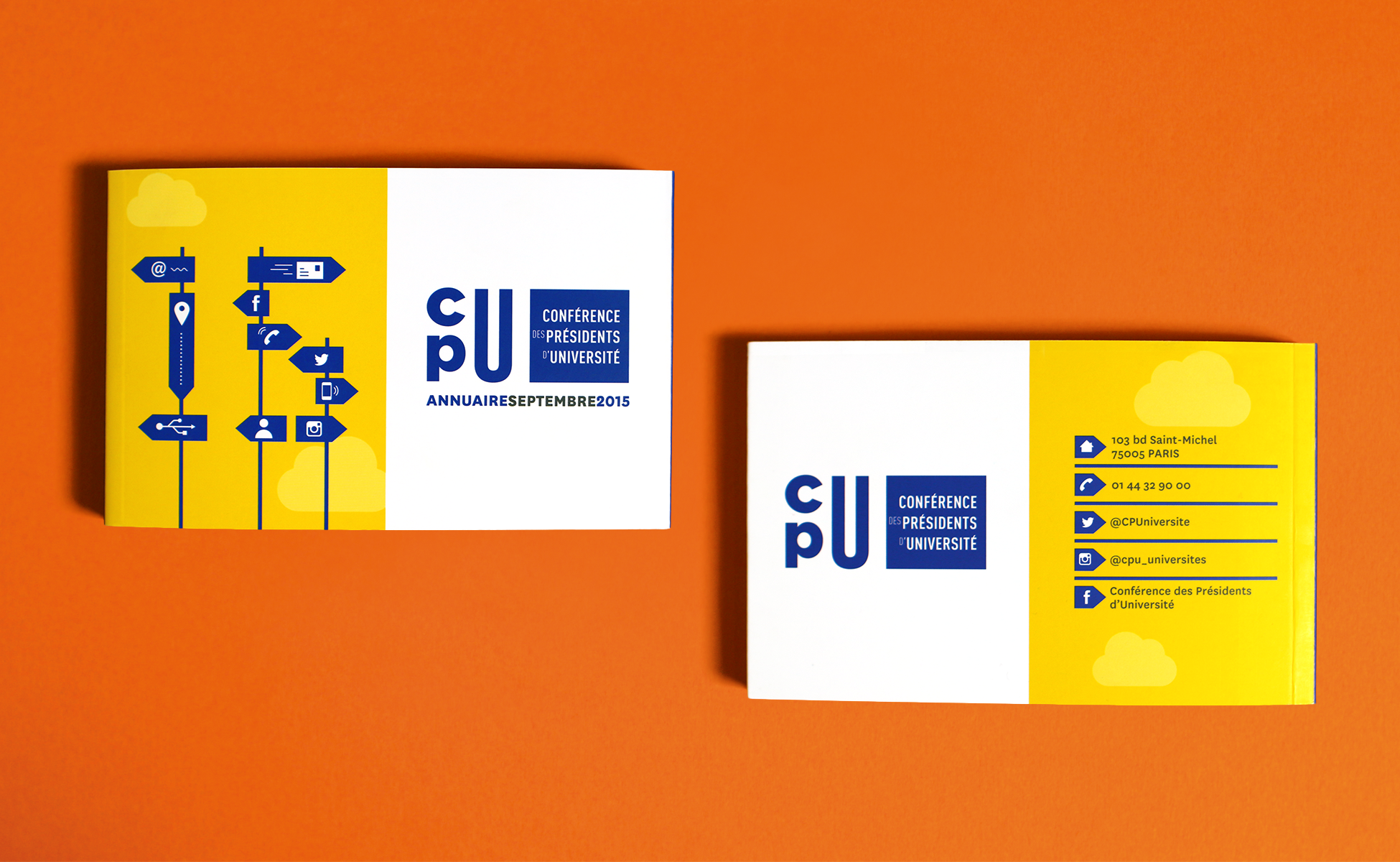
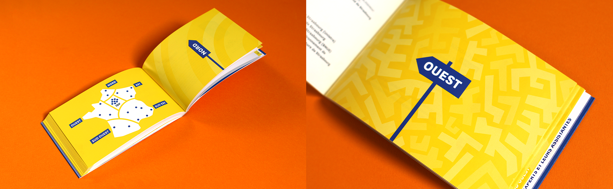
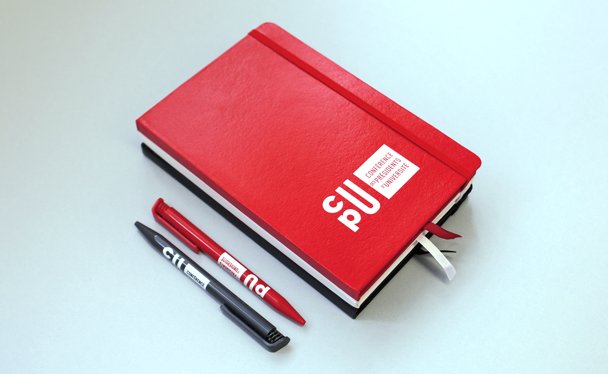
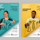
Variations : Events communication
Background animated logos :
 San Serriffe typographic Island
 Design, creativity and oblique strategies!
 Tote bag, a new social totem?
 Sister Corita Kent, the Pop Art nun
 Donald Trump, the martyr who makes history
 Conférence des Présidents d’Université – Visual identity
 Museum-Memorial of Terrorism – Visual identity
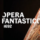 Opéra Fantastico – Visual identity
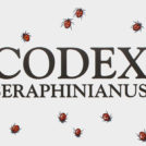 Codex Seraphinianus: the most peculiar book in the world
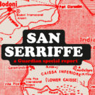 San Serriffe typographic Island
 Wally Olins, father of territory branding
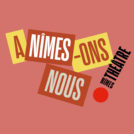 Visual identity project for the theater of Nîmes
 The secrets of the “Rencontres de Lure”
Leave a Reply