The Annemasse music conservatory is the result of the merger of 6 music schools. Through this new facility, the elected representatives of Annemasse Agglo want to make musical education accessible to all, while offering a more complete and coherent range of music throughout the agglomeration. The strategy will initially consist of accompanying the merger of the various schools in order to unite the teachers and create a new corporate culture, of which the new identity will be a foundation. In a second phase, the strategy will be geared towards winning over new audiences (teenagers, low family income, etc.). Here is the visual identity and the communication campaign that we have designed to meet these different challenges.
Conservatory of Music Annemasse
Conservatory of Music Annemasse, eclectic & musical
Michel Butor
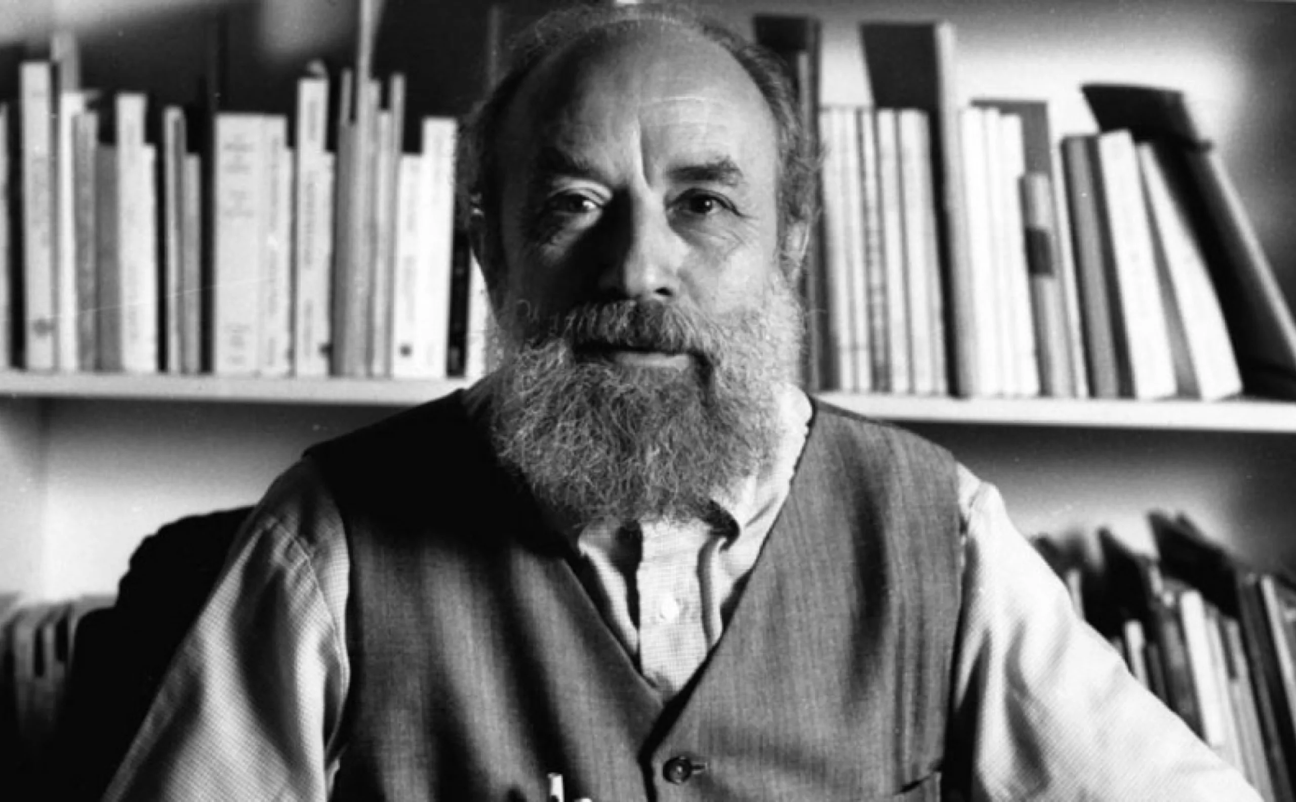
This visual identity project can be seen as an echo of the work of Michel Butor (1926-2016), a major figure in Annemasse, a multi-faceted artist (poet, novelist, art critic, etc.) who bequeathed his incredible artistic collection to the town, which is now open to the public via the Archipel Butor. “When I write, I want to do painting and music at the same time, and this gives literature”, Michel Butor.
A music lesson given to words
“Music has greatly influenced the writing of Michel Butor, whose works often translate musical structures into literary art, such as those of counterpoint (fugue, theme and variations), serial music or jazz. This musical practice of writing disrupts conventional literary structures, thus associating itself with the innovations characteristic of the New Novel and also proposing new constraints that lead writing to new forms: concert-conferences, mobile forms, radio works. It also transforms our perception of time, no longer linear but cyclical, as well as our reading habits by involving us in the construction of the work.” – Extract from a music lesson given to the words of Marion Coste.
Together under the sign of music
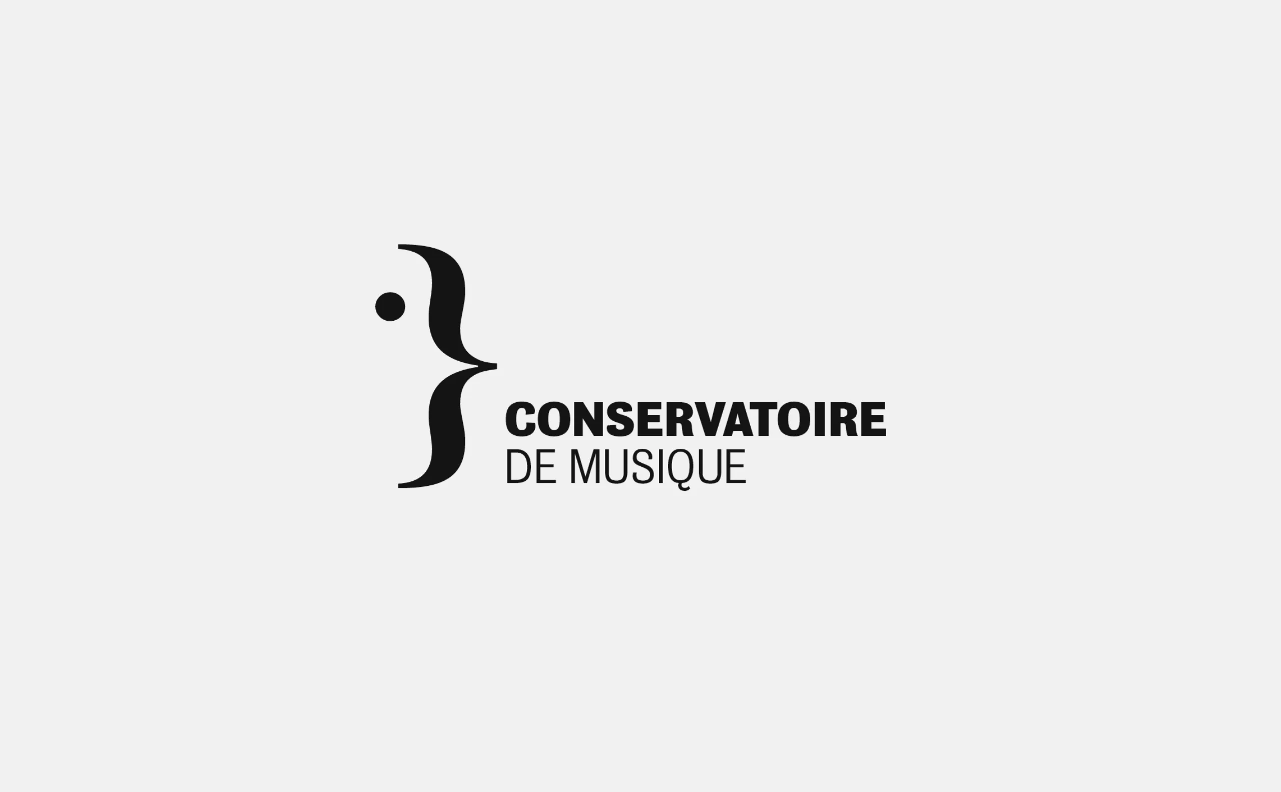
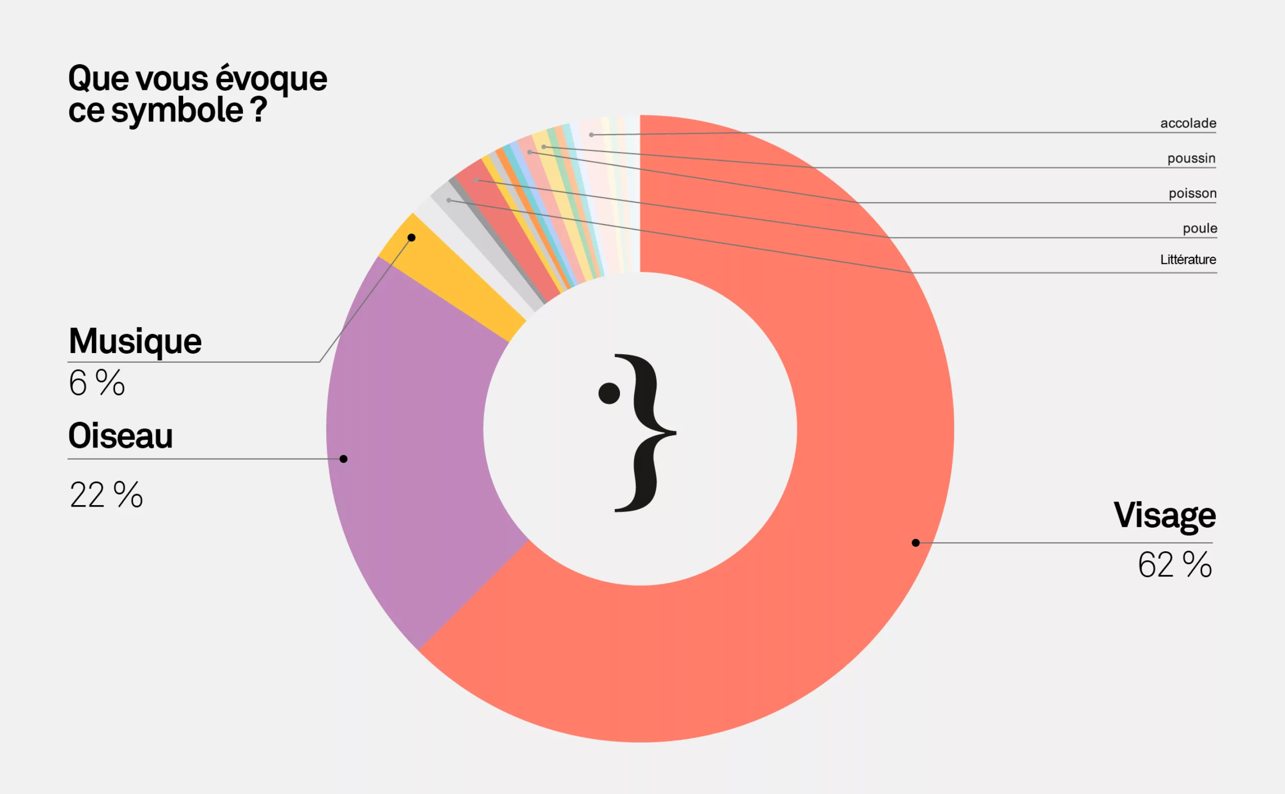
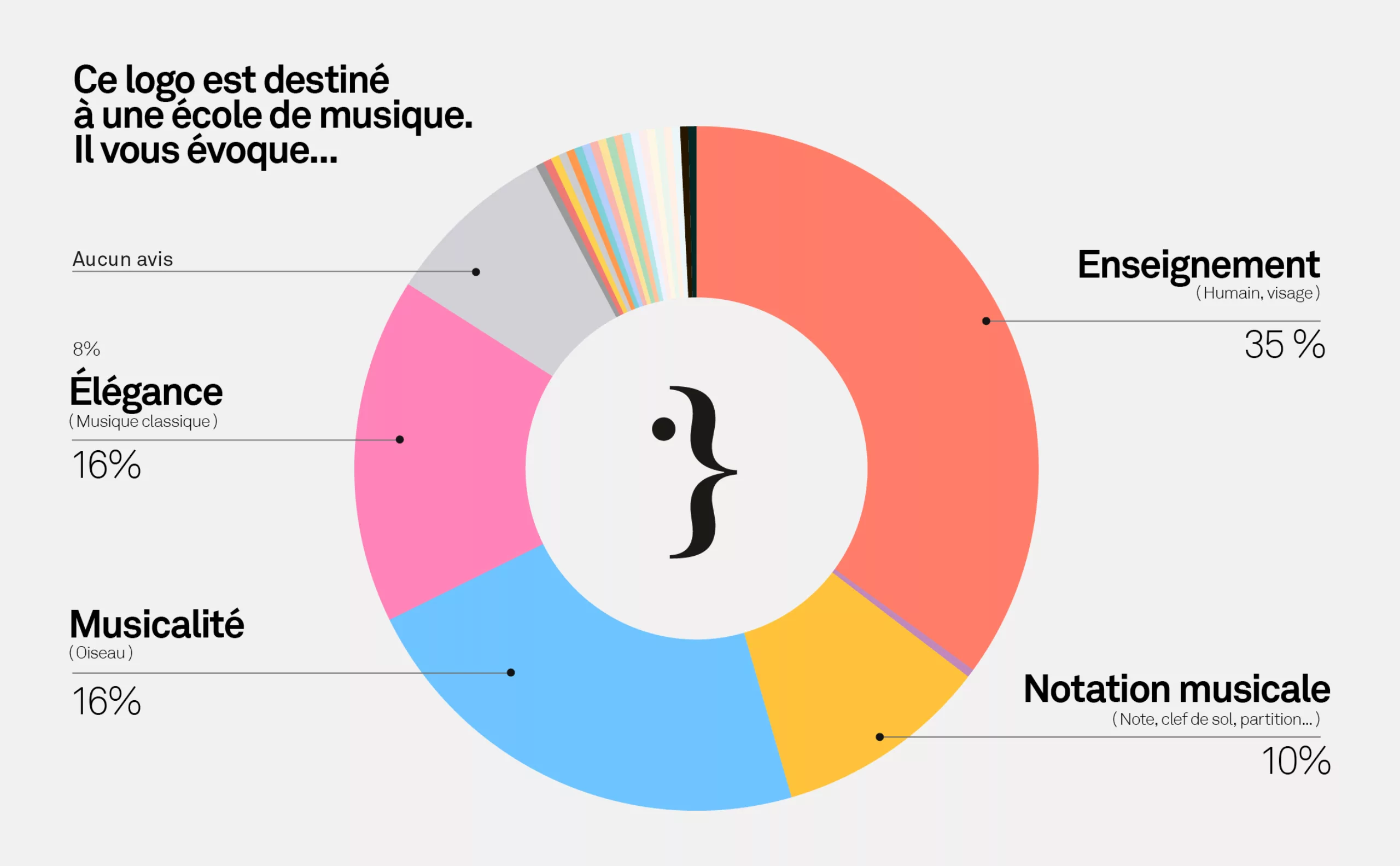
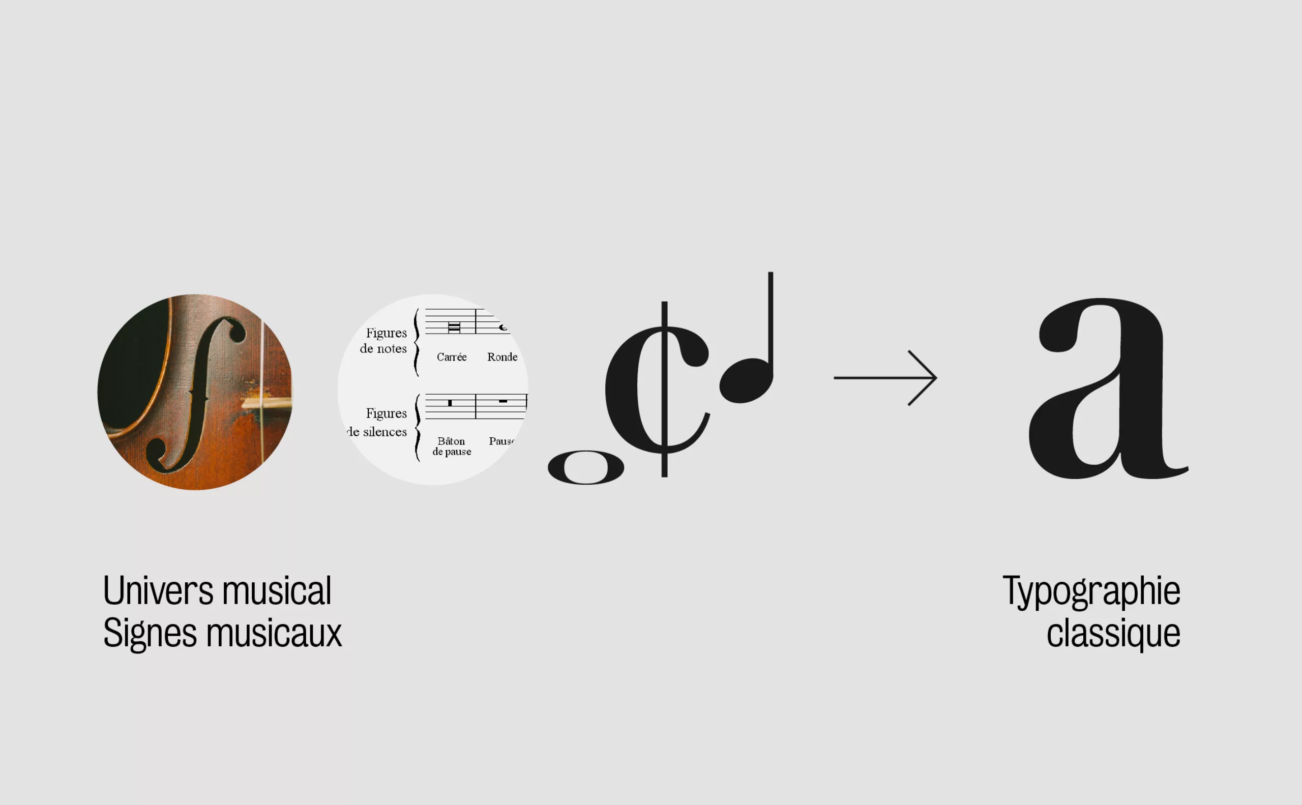
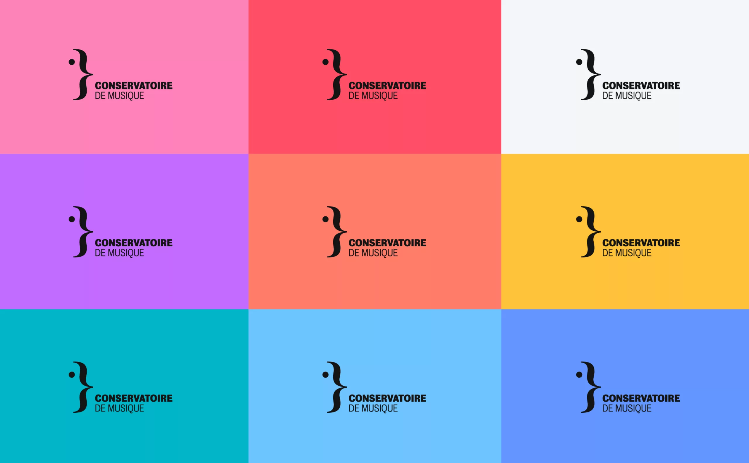
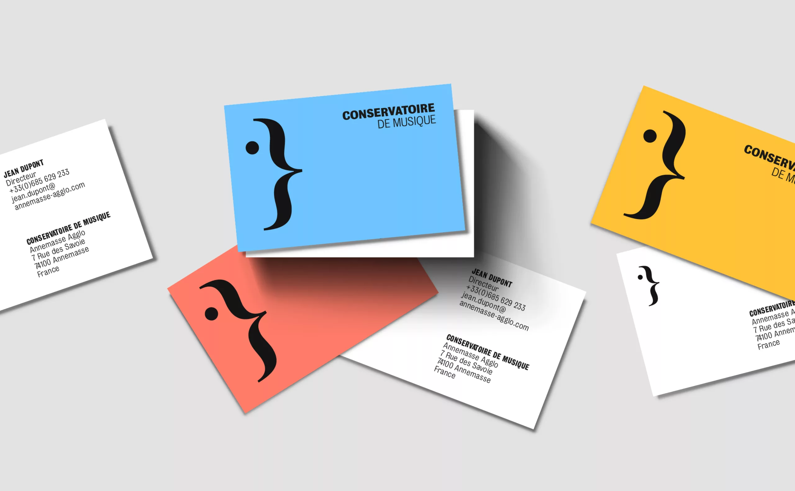
Inspired by the relationship between music and words, language and notes, and all of Michel Butor’s reflections, we sought to find the most appropriate sign to express the values of the Conservatory: openness, sharing and pleasure. The typographic sign of the brace allows us to express all these notions. It is an open sign and serves to bring people together. In music, the staves corresponding to the various parts of the instruments that play together are joined by a brace. By adding a dot, we transform this sign into a face, the human appears. Others will imagine a bird, a musical animal par excellence. If the meaning is not fixed, it is because the multiple interpretations converge towards a coherent semantic focus, around the notions of human, culture, music and teaching.
Survey and semantic study
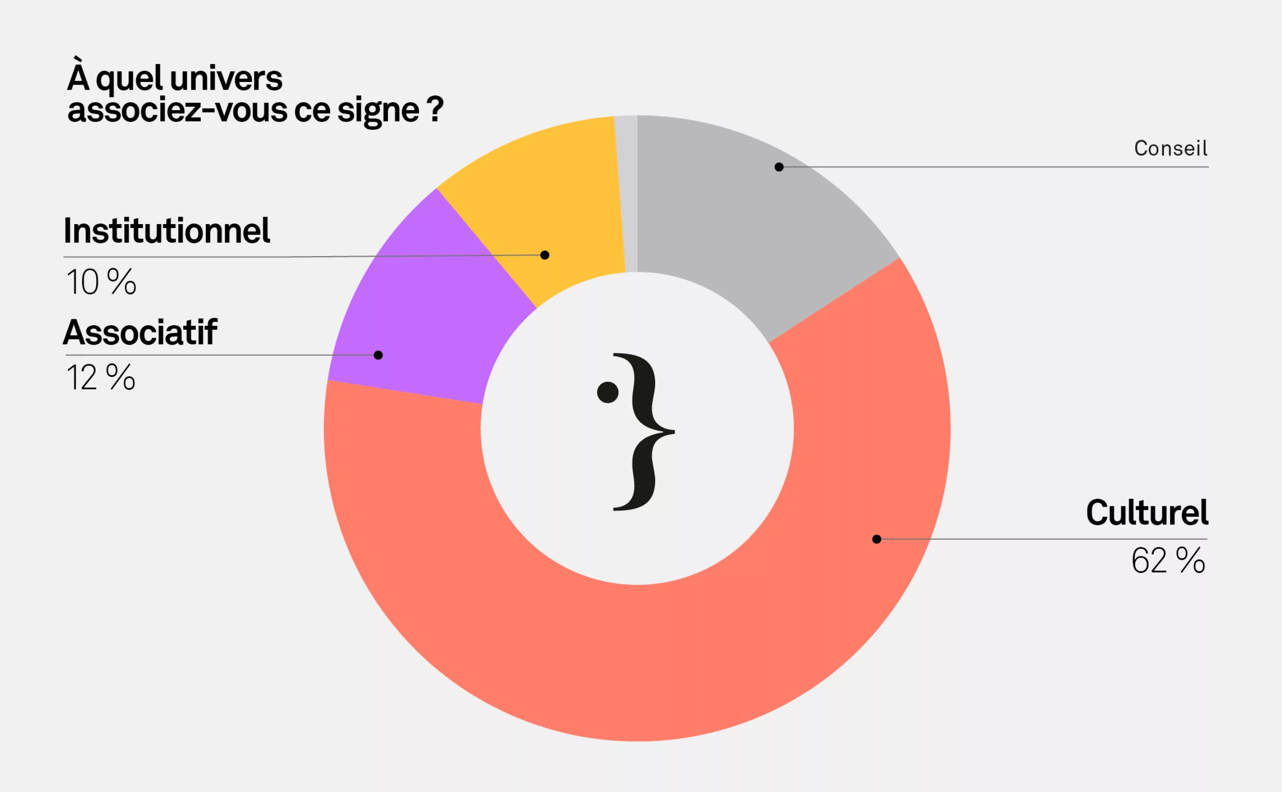
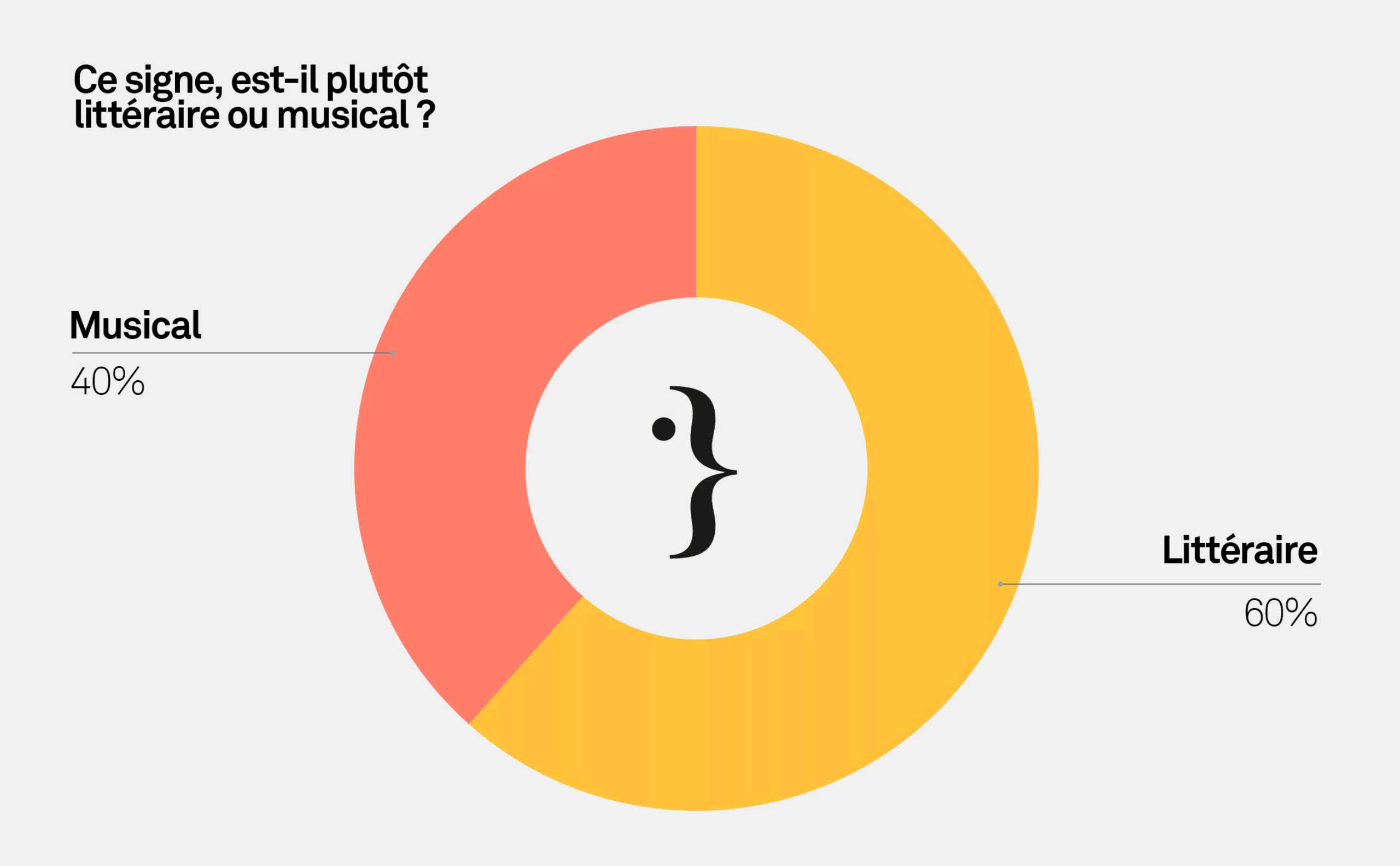
In order to remove some of our client’s doubts about the relevance of this sign (not musical enough, too abstract…) we launched a survey of 250 people, in order to understand whether the multi-interpretability of this sign was a handicap. We wanted to check in which directions the different interpretations of this sign were going. We are convinced that a perfectly descriptive sign would lack poetry and soul, whereas a polysemous sign has a greater inner richness. But these multiple interpretations must be coherent. This is what we have been able to verify through this survey.
Graphic universe
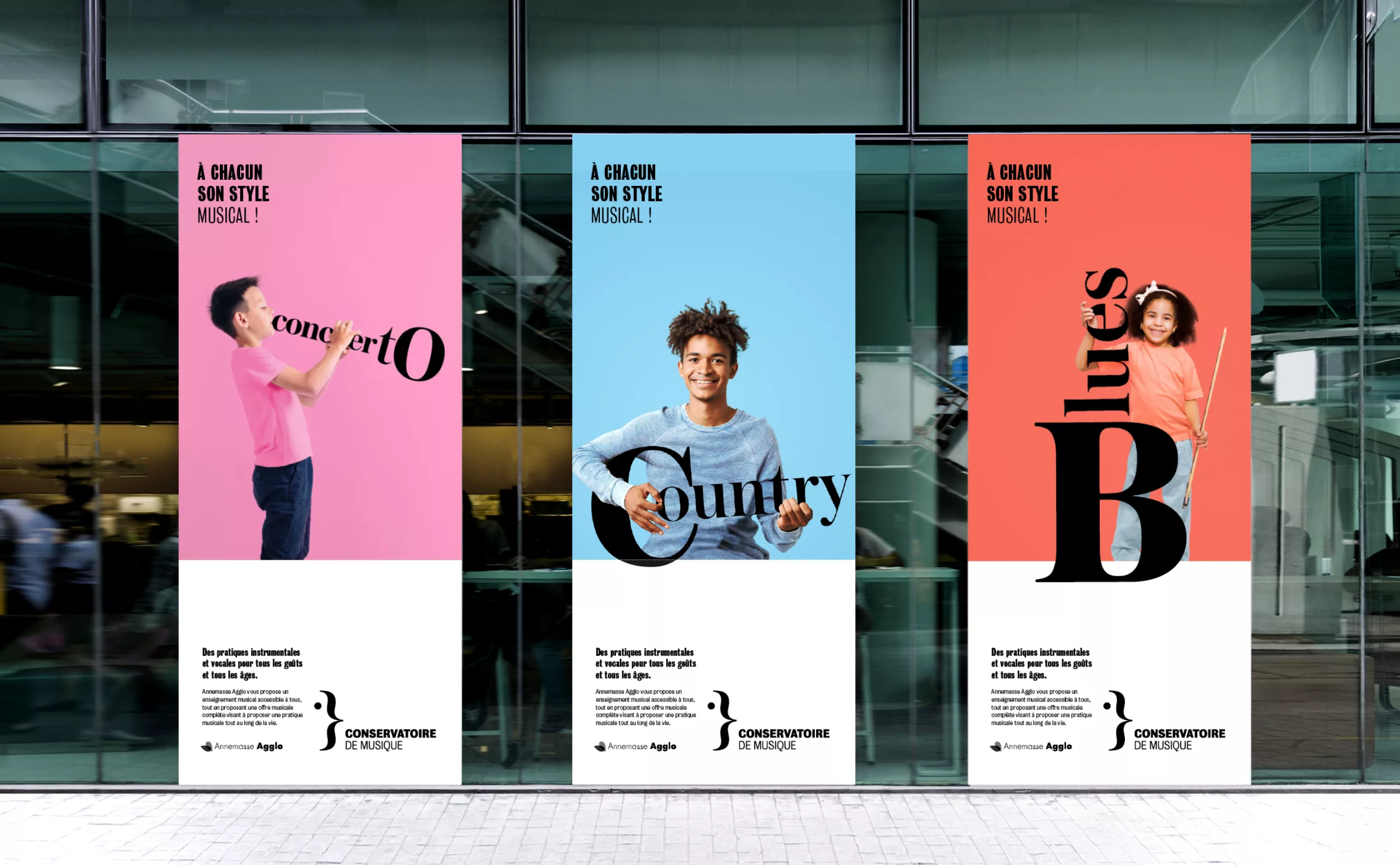
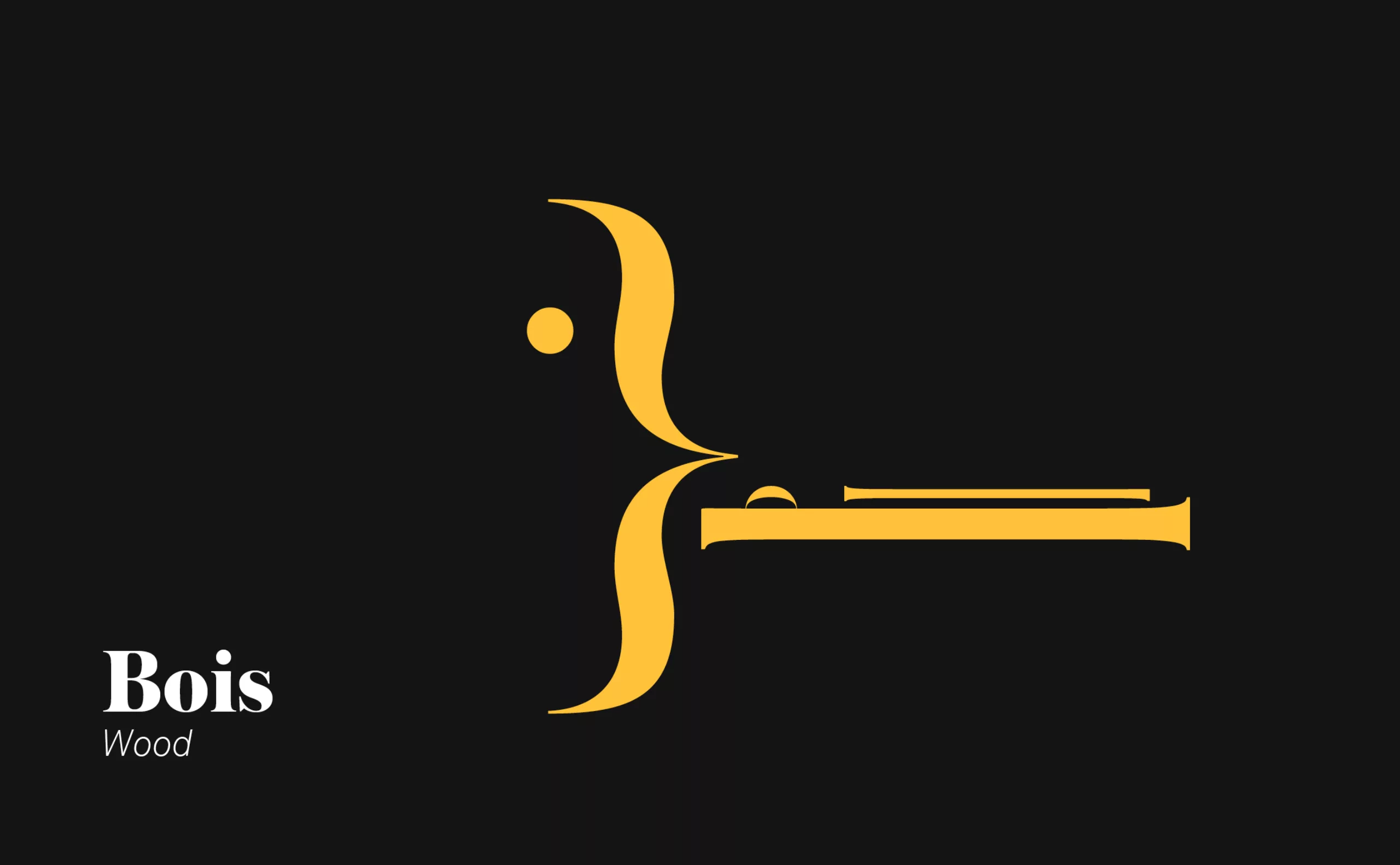
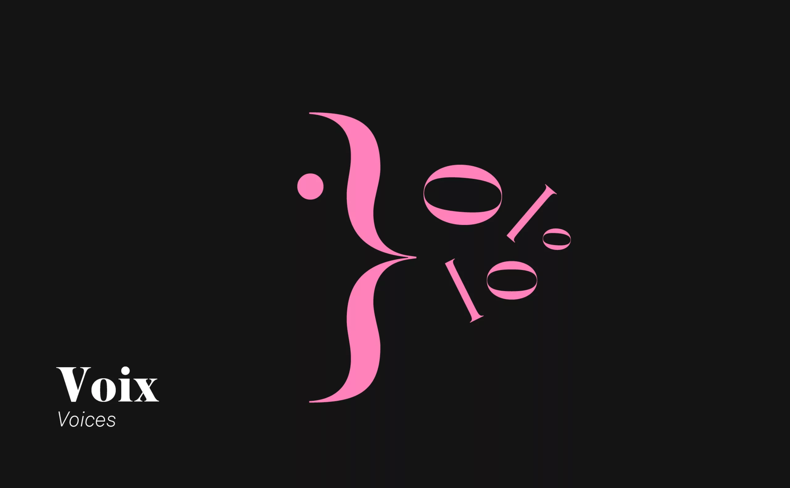
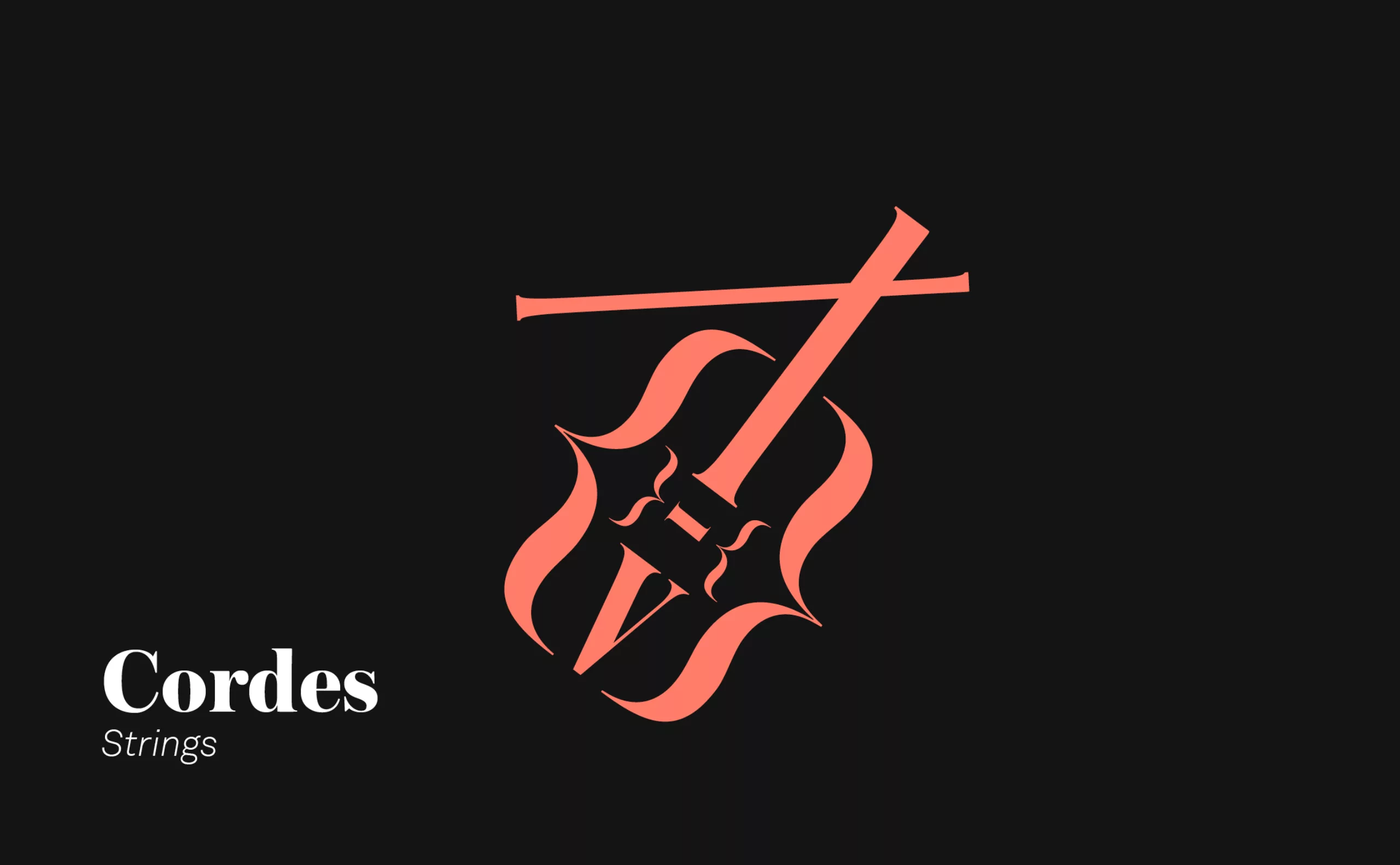
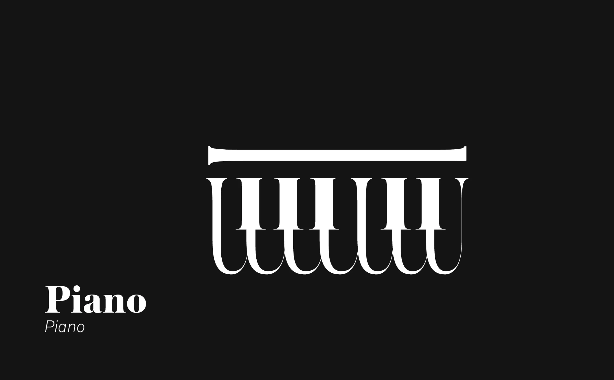
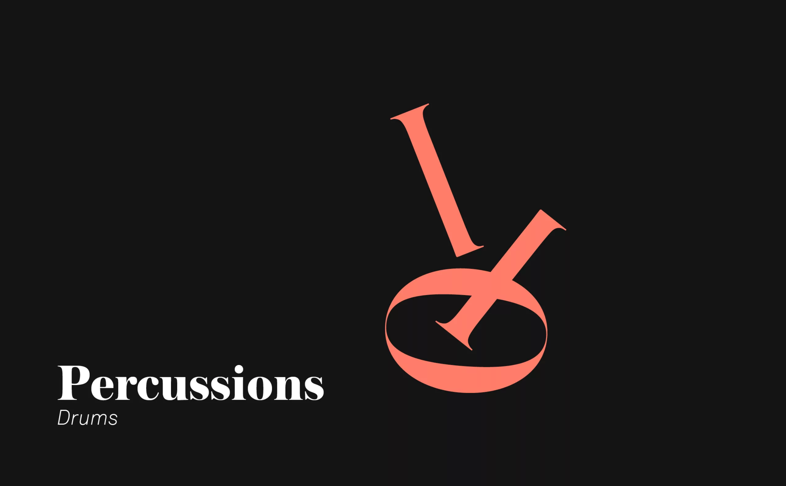
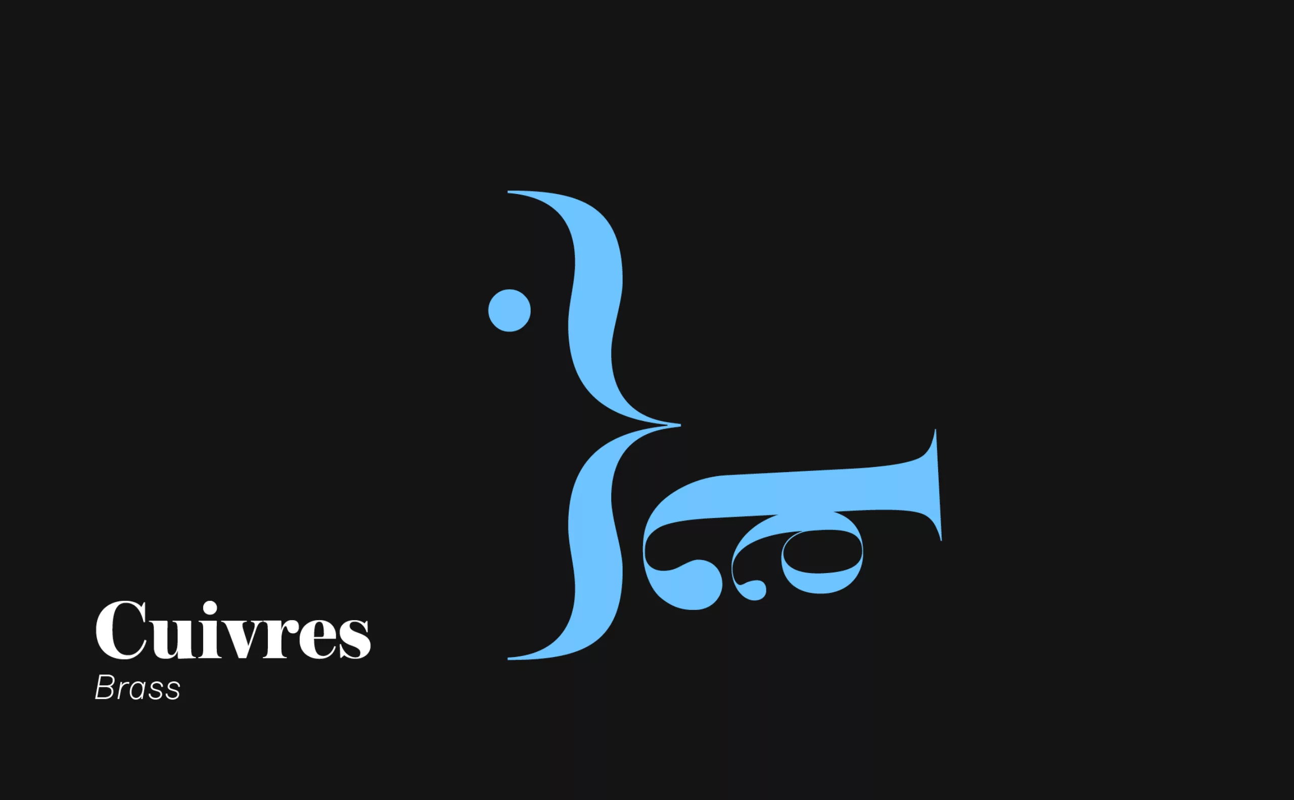
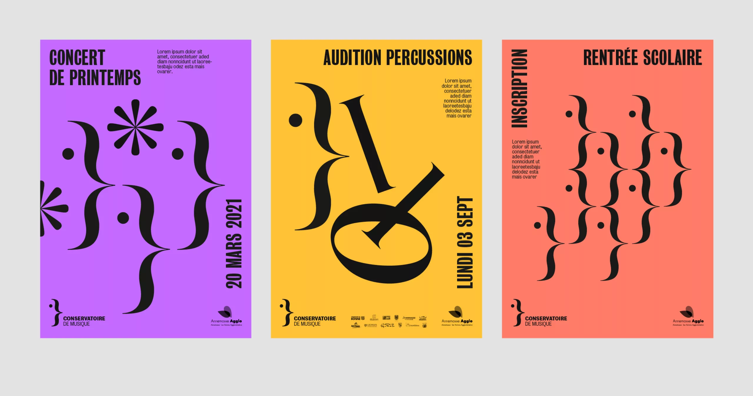
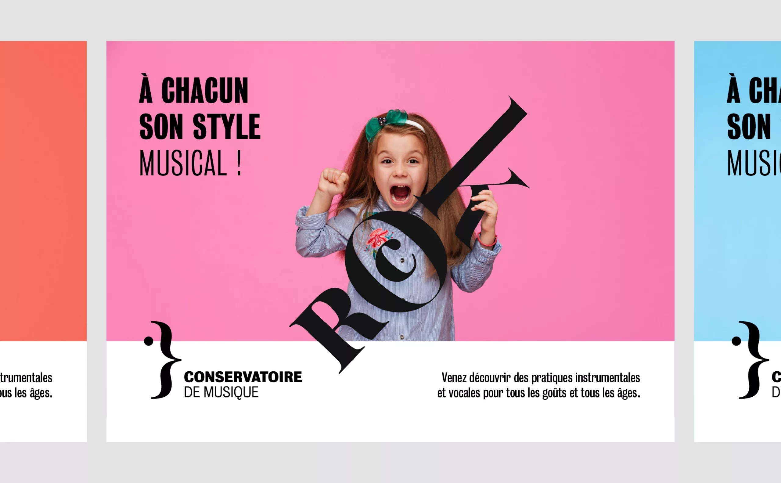
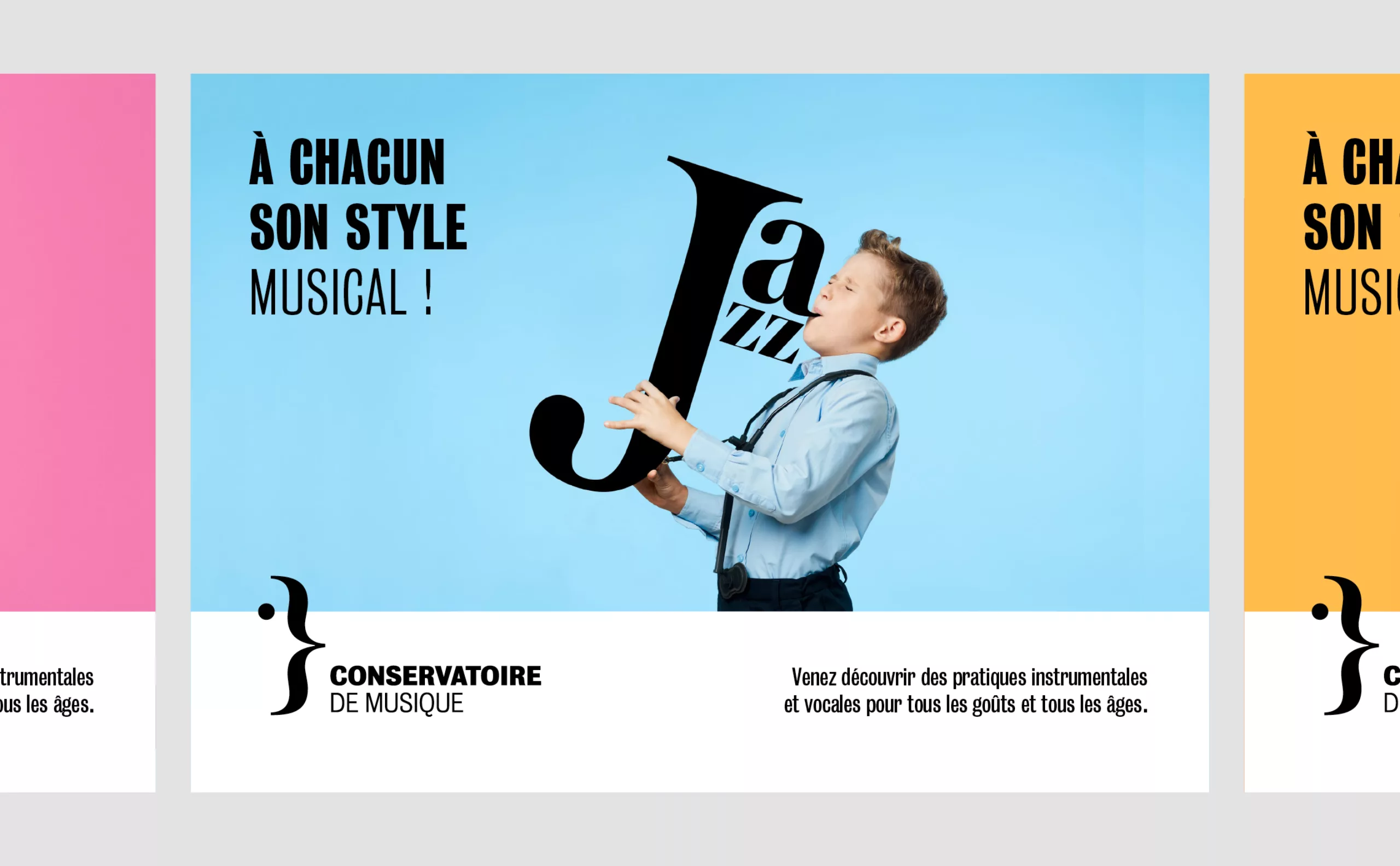
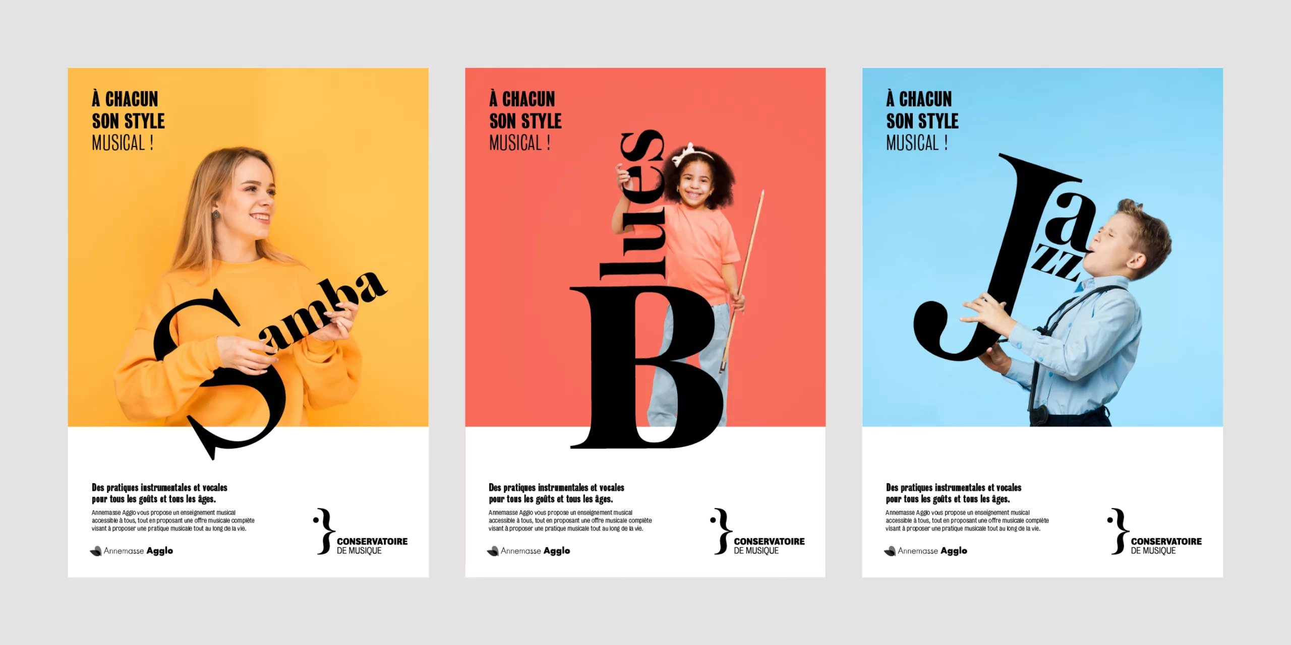
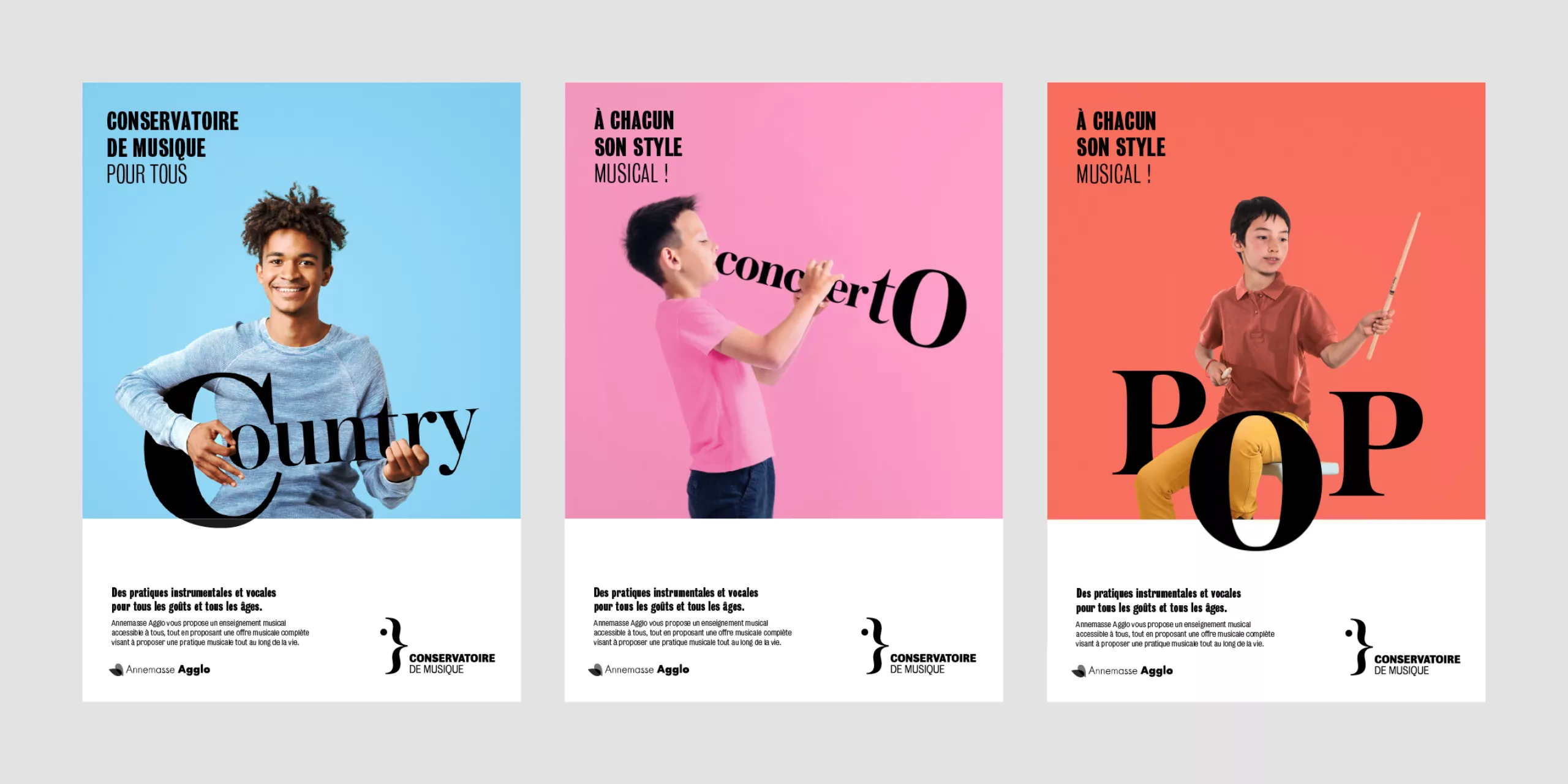
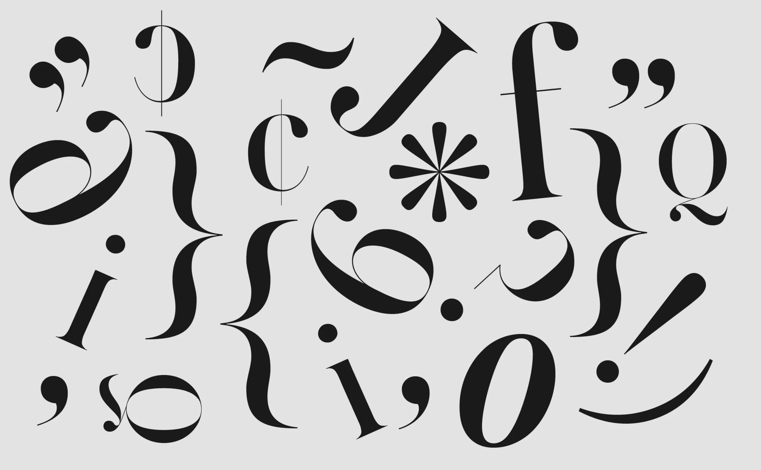
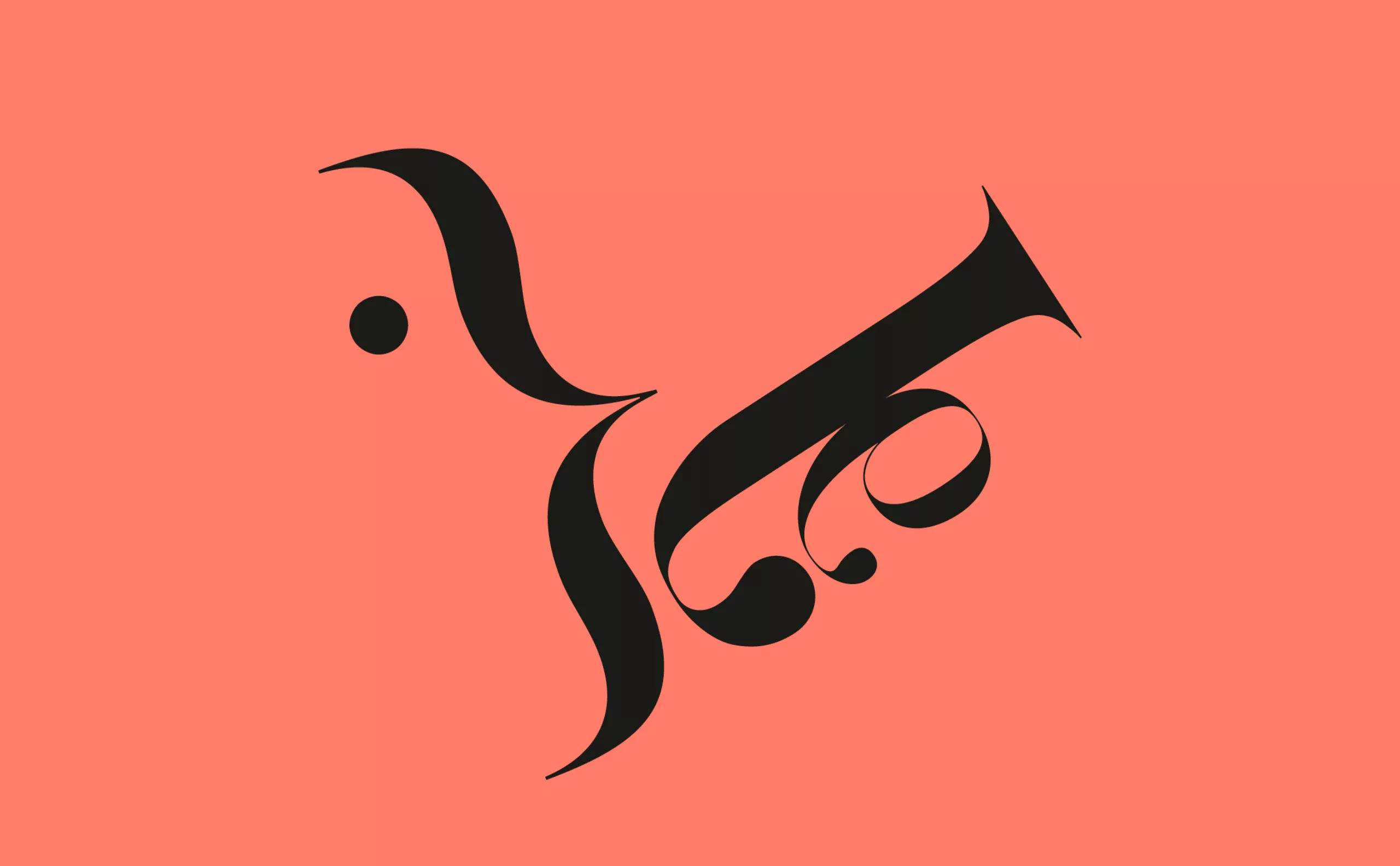
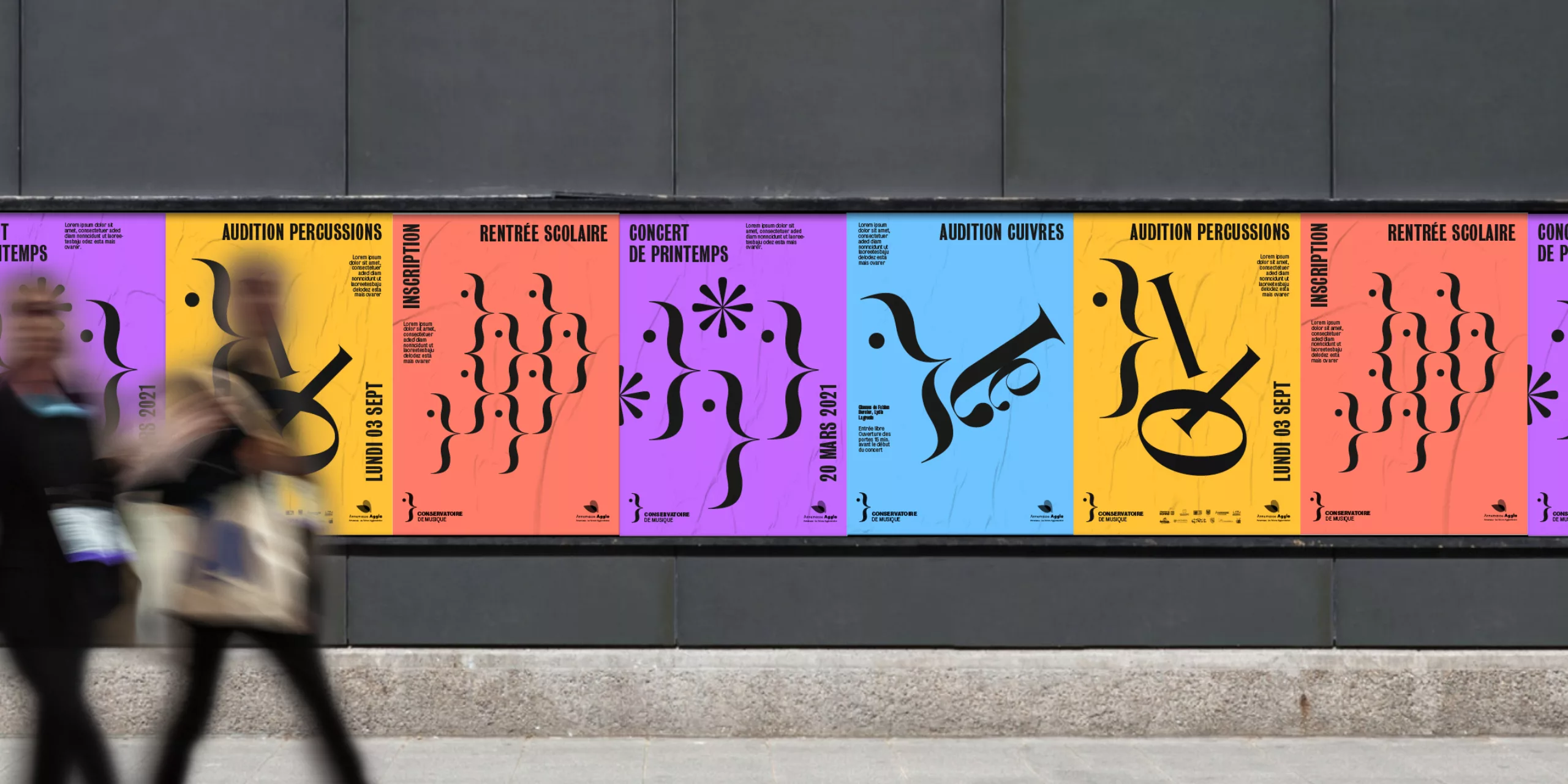
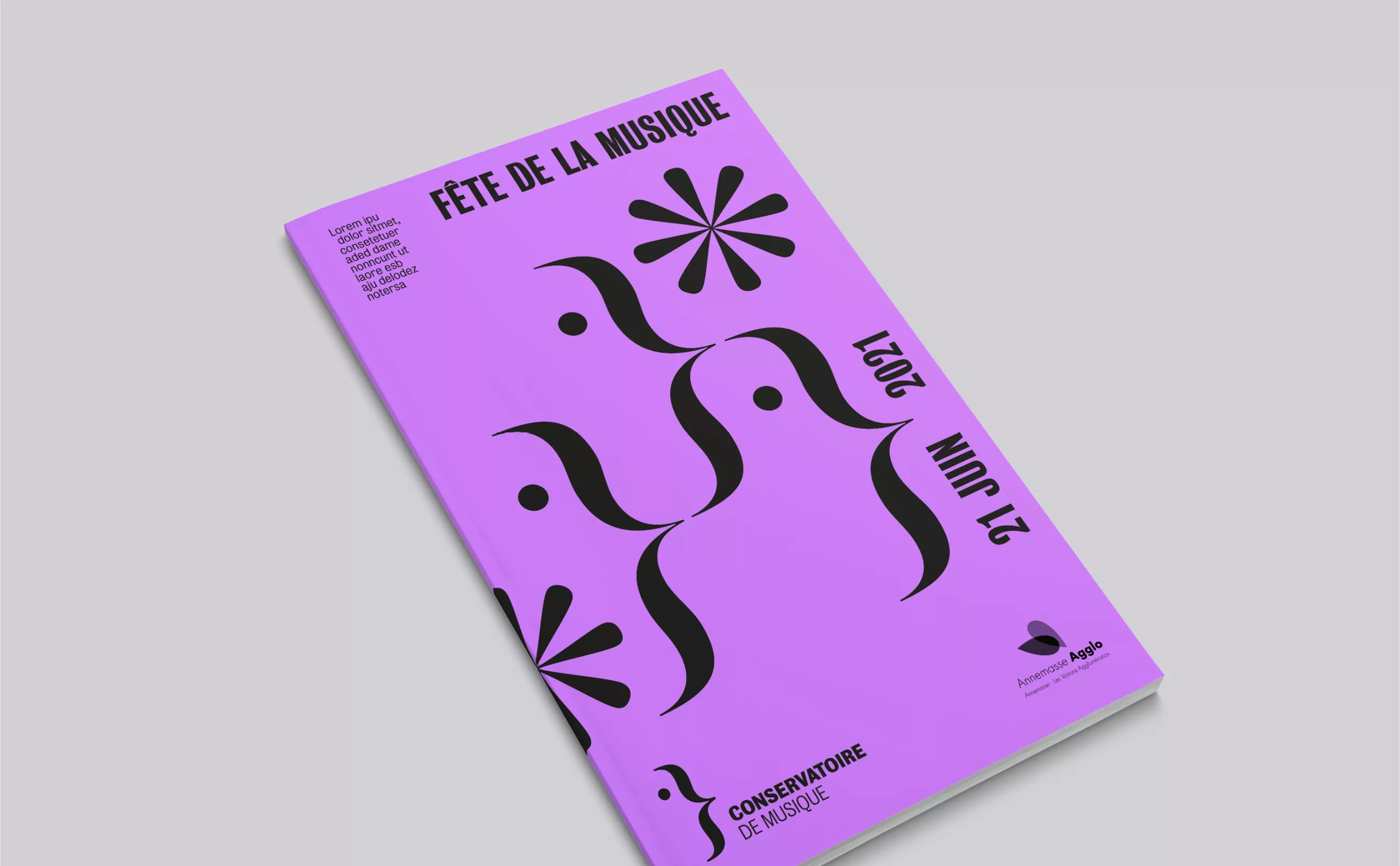
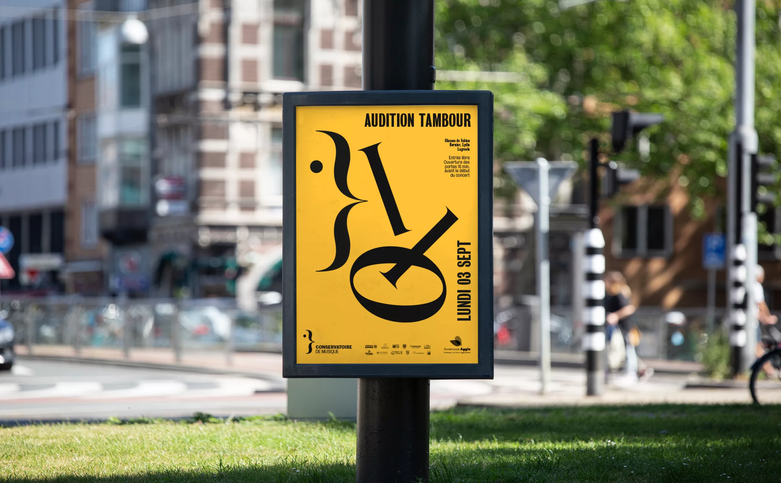
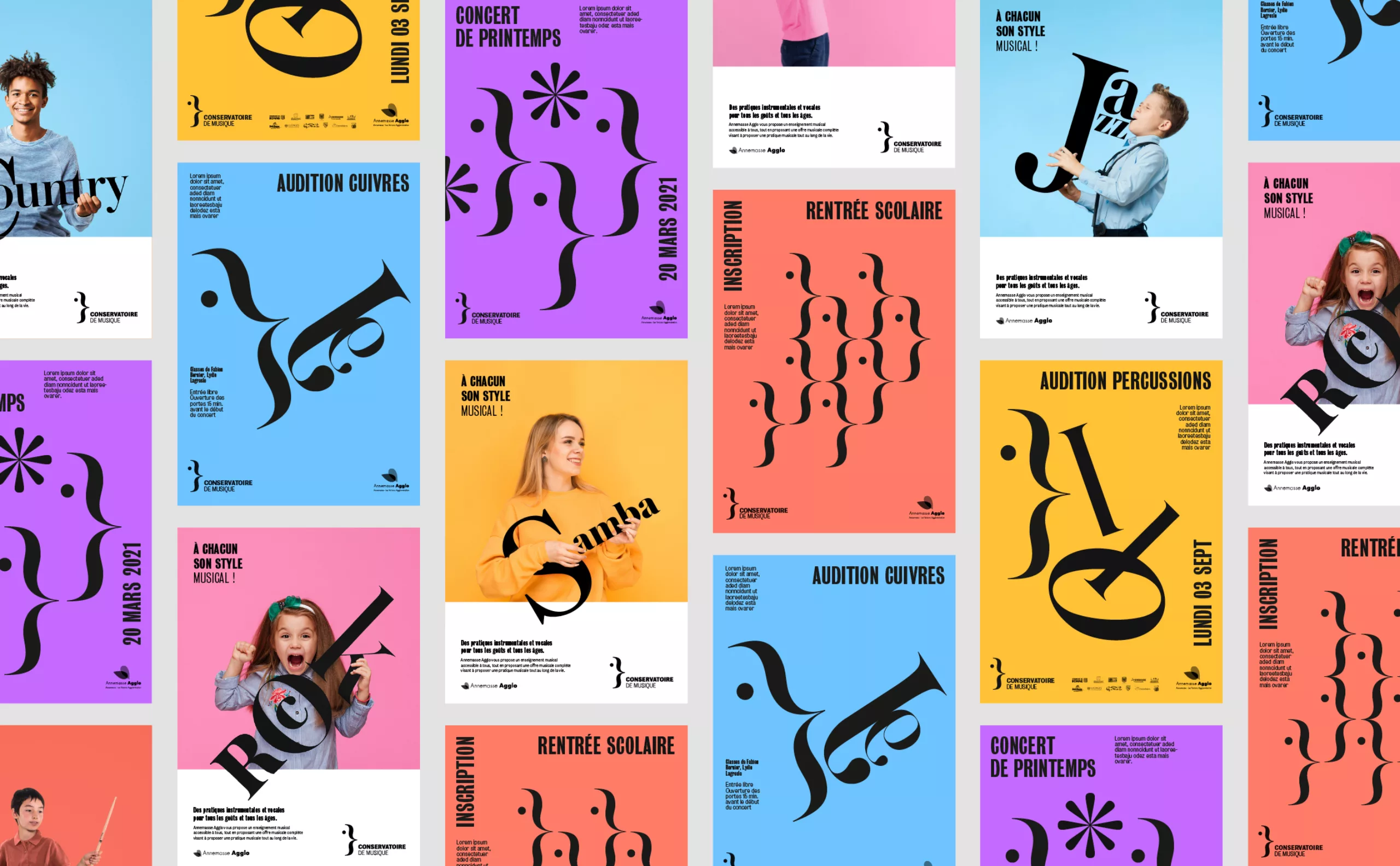
In the same spirit as the logo, we propose to play with typography to create a musical visual universe. The different types of instruments come to life in the form of typographic compositions. Games of movements and shifts bring a fresh and playful effect, while desacralizing the image of classical music.

Communication campaign
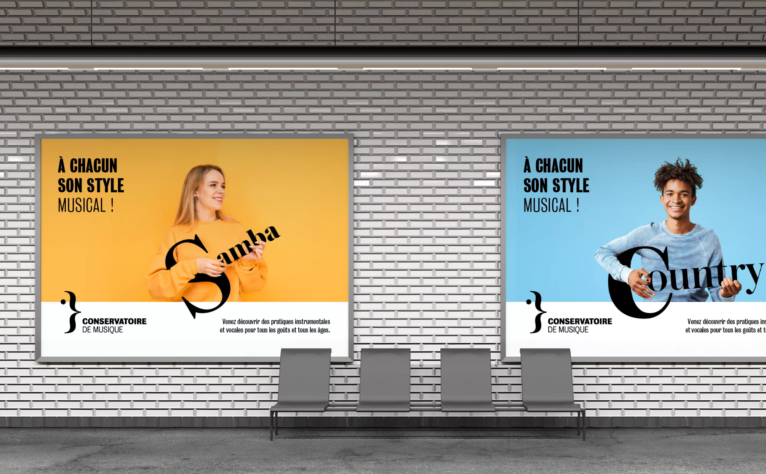
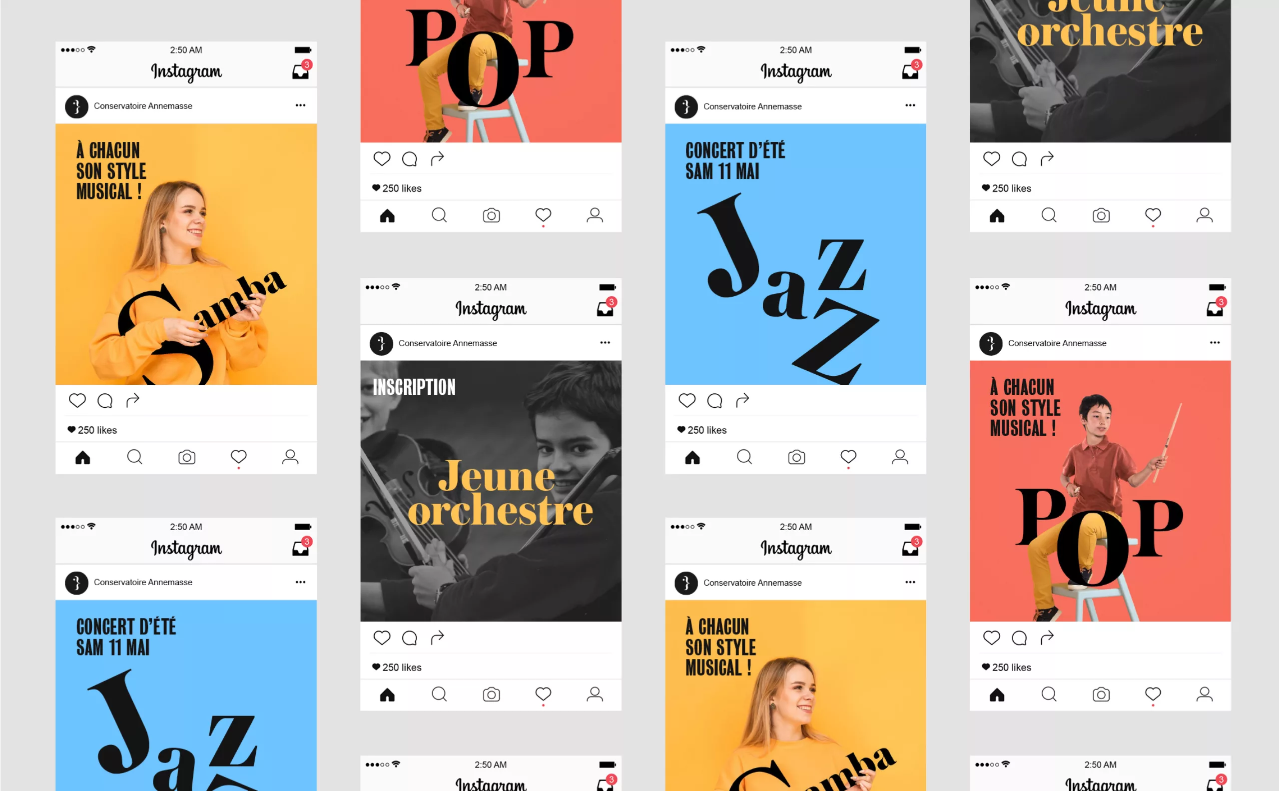
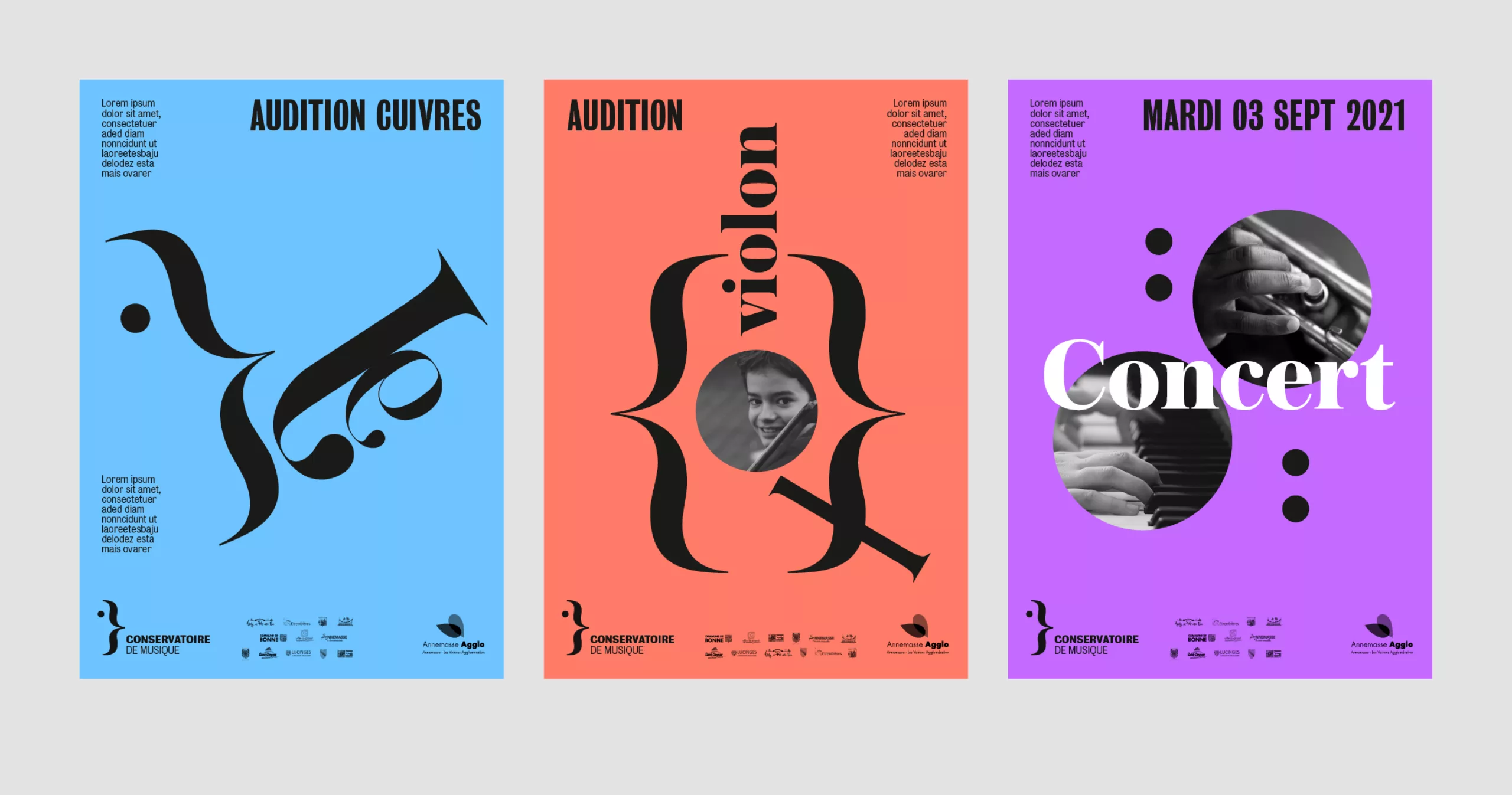
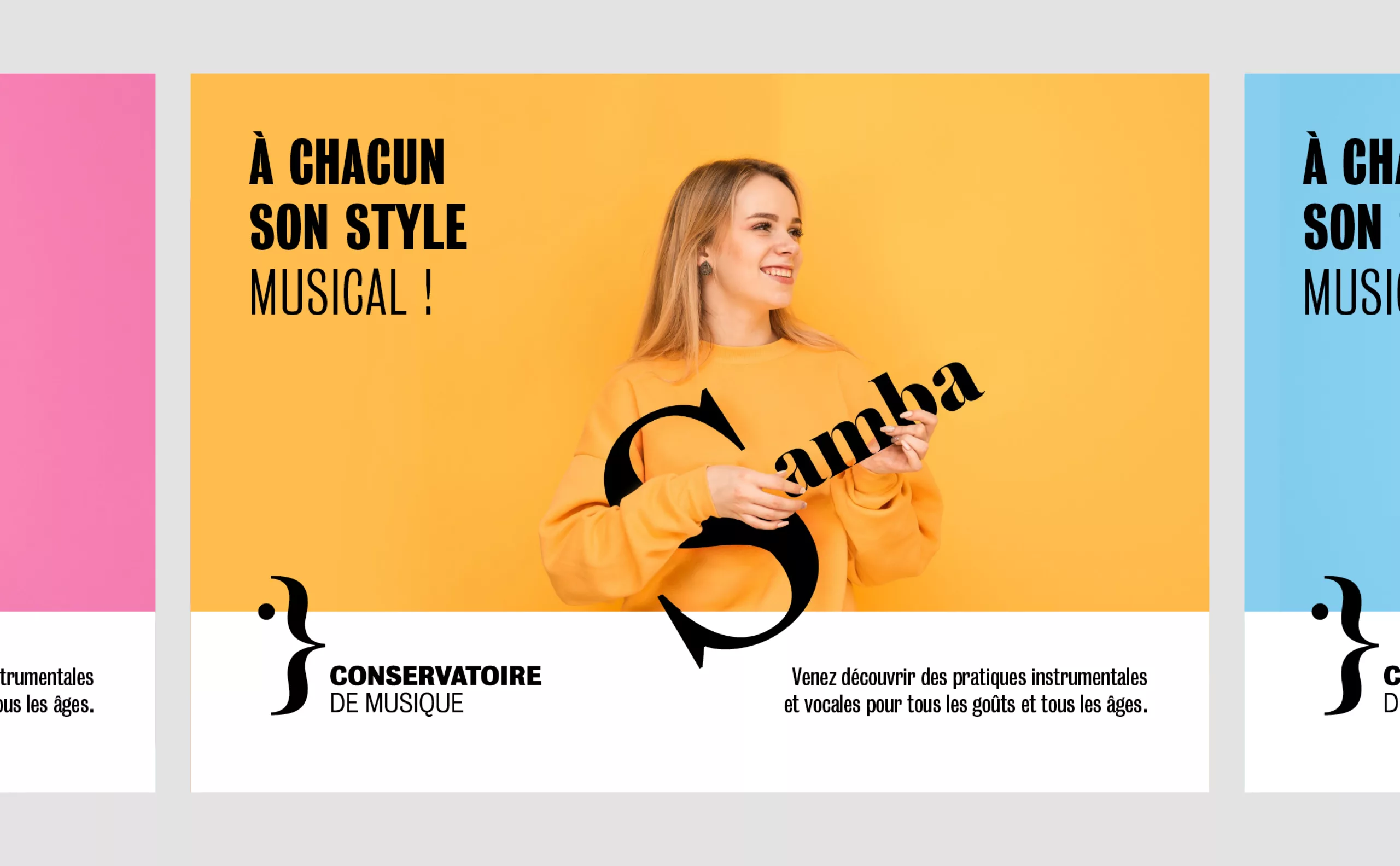
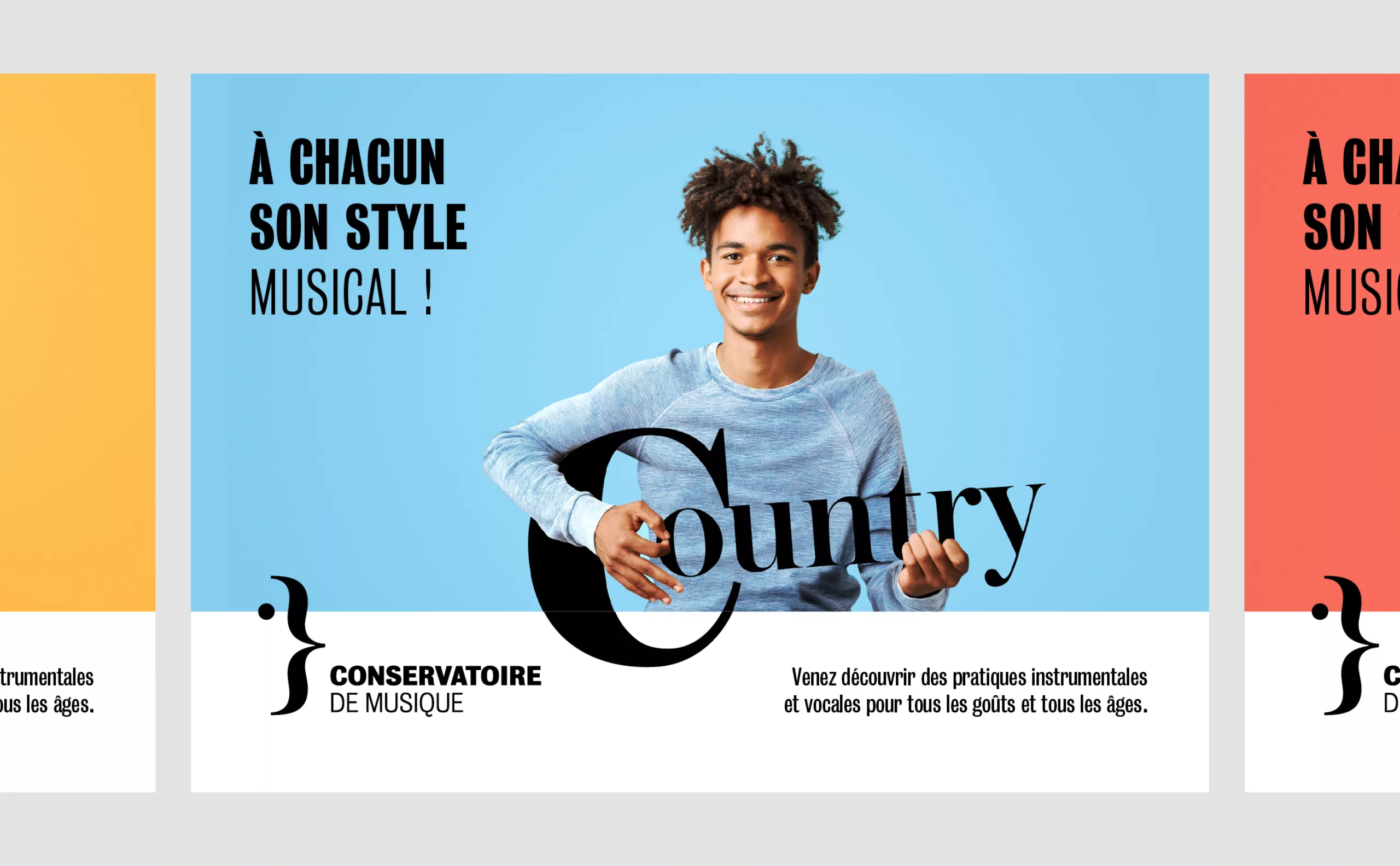
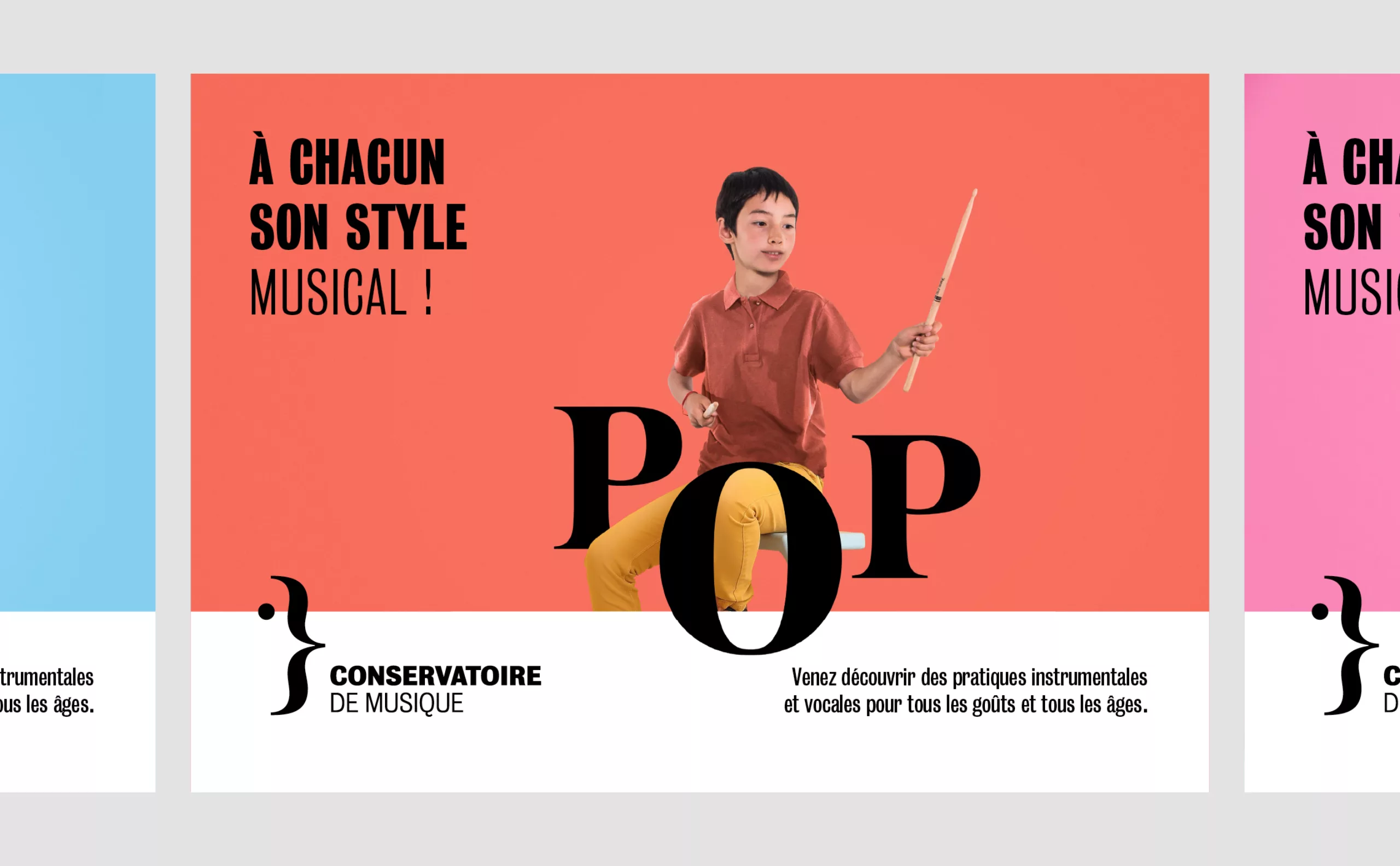
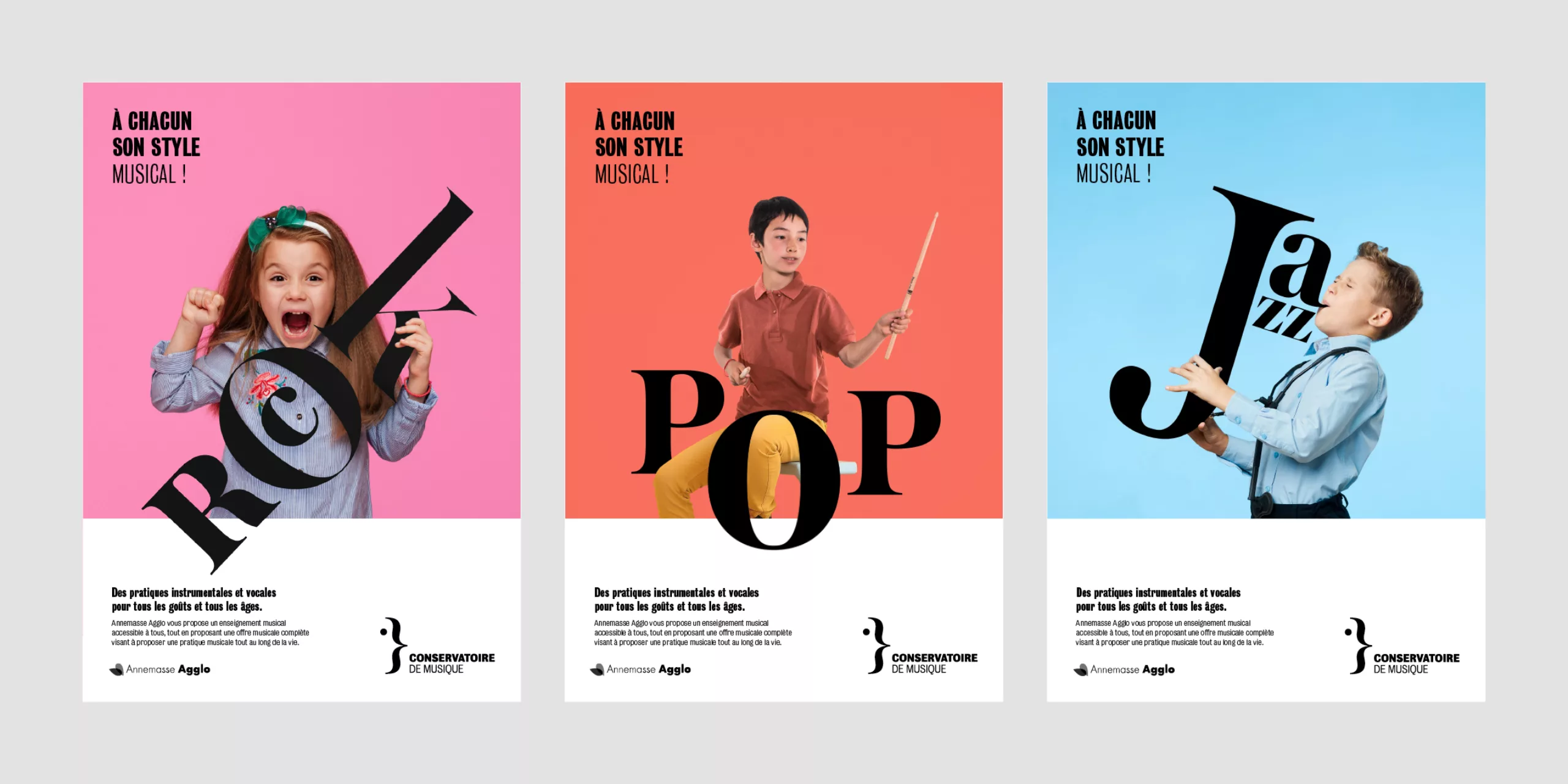
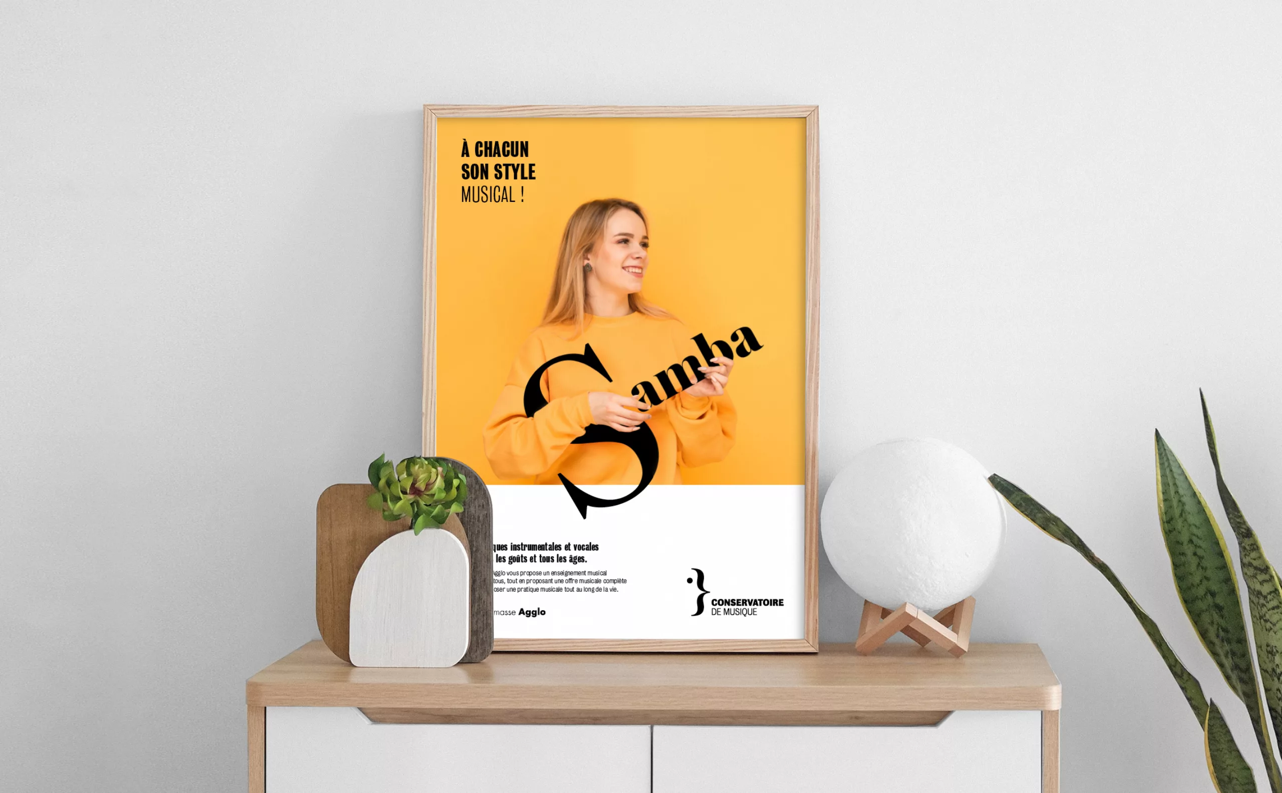
To each his own musical style! To accompany the communication, we designed a family of visuals illustrating musical eclecticism. The first aim was to combat the idea that a conservatory only teaches classical music. Samba, rock, pop, jazz… all musical aesthetics have their place.
The other dimension of this campaign concerns the widening of audiences. Indeed, this conservatory has the particularity of being located in the heart of the priority district of Perrier. The vocation of this establishment is therefore to be open to a wide diversity of people.
All sociological studies attest to the fact that musical education is strongly socially marked. To caricature, young girls from well-to-do backgrounds will study the violin, while the working class, a less numerous public, will send their boys to learn the brass or rhythm sections.
With these observations in mind, it seemed important to us, right from the conception of the communication, to consider fighting against the perpetuation of these stereotypes. A boy can play the violin, a girl can play rock.
