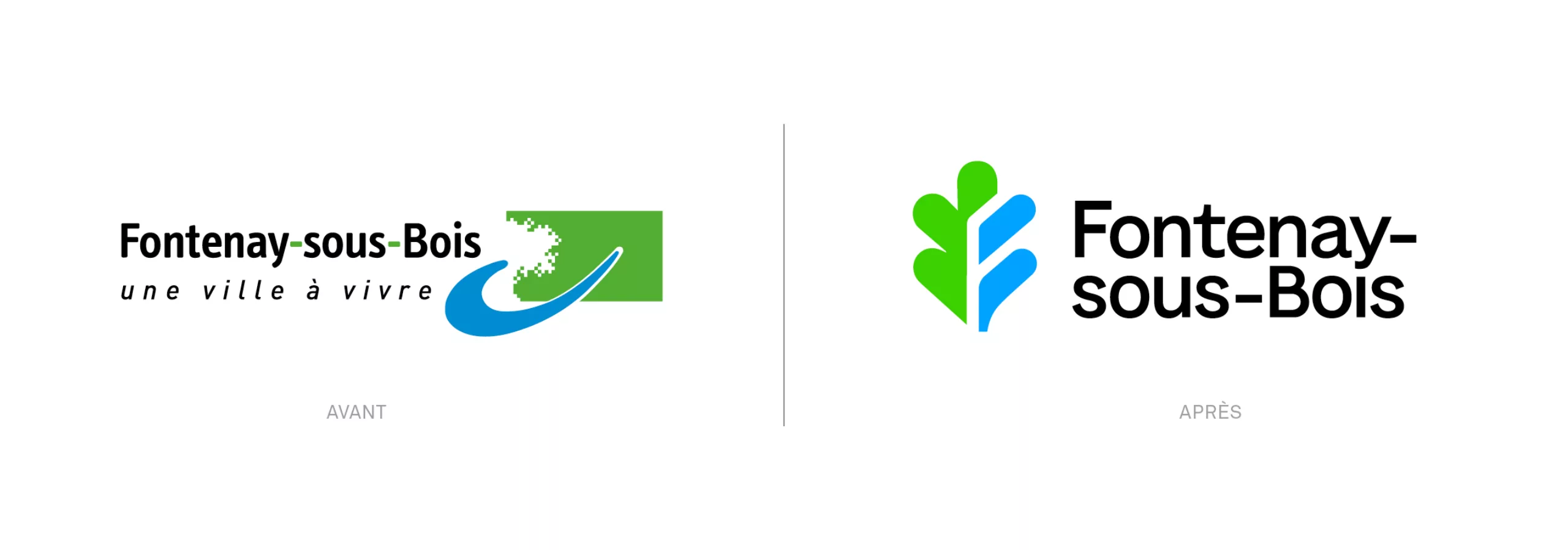
Fontenay_sous_Bois_visual_identity_header_logo

2022

Fontenay-sous-Bois - Visual identity
A new logo that modernises the city century-old symbolism

Located in the Val-de-Marne, Fontenay-sous-Bois is a town 3 km away from Paris. It has a population of just over 53,000 and is characterised by its pleasant living environment, particularly thanks to its proximity to the Bois de Vincennes. A long history of social and environmental mobilisation has also shaped its present-day face.

Graphéine redesigned the visual identity of Fontenay-sous-Bois with two objectives in mind: to infuse dynamism and modernity while preserving its historical representations inscribed in its century-old motto: "Querno sub tegmine fontes", which translates as "the fountains under the oak foliage".

A new logo that honours the legacy of Fontenay-sous-Bois

To evolve the Fontenay-sous-bois logotype, we first analysed the design of the current logotype. It appeared that the pixelated style of the oak tree silhouette was a problem. The figure of the oak tree is not legible and the "pixel" treatment, once synonymous with computer modernity, now reflects a dated image. The "fountain" dimension, materialized by a "blue wave", gives the feeling of being a parody of the famous Nike "swoosh" logo.

In order to keep the symbolic codes of the city alive, we went back in time to study the city's archives and the different incarnations of its coat of arms.

A new logo revitalises the city's century-old features

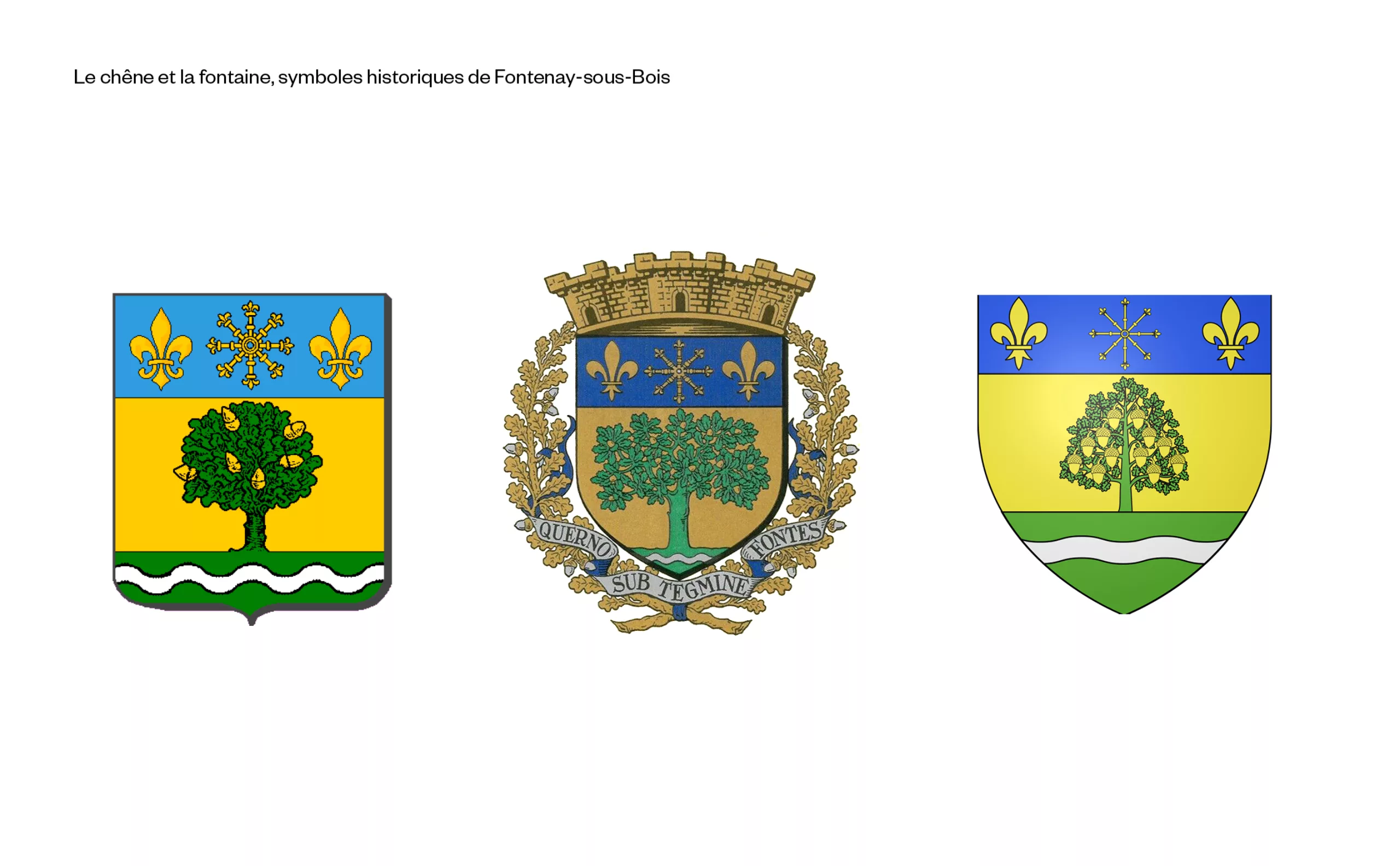
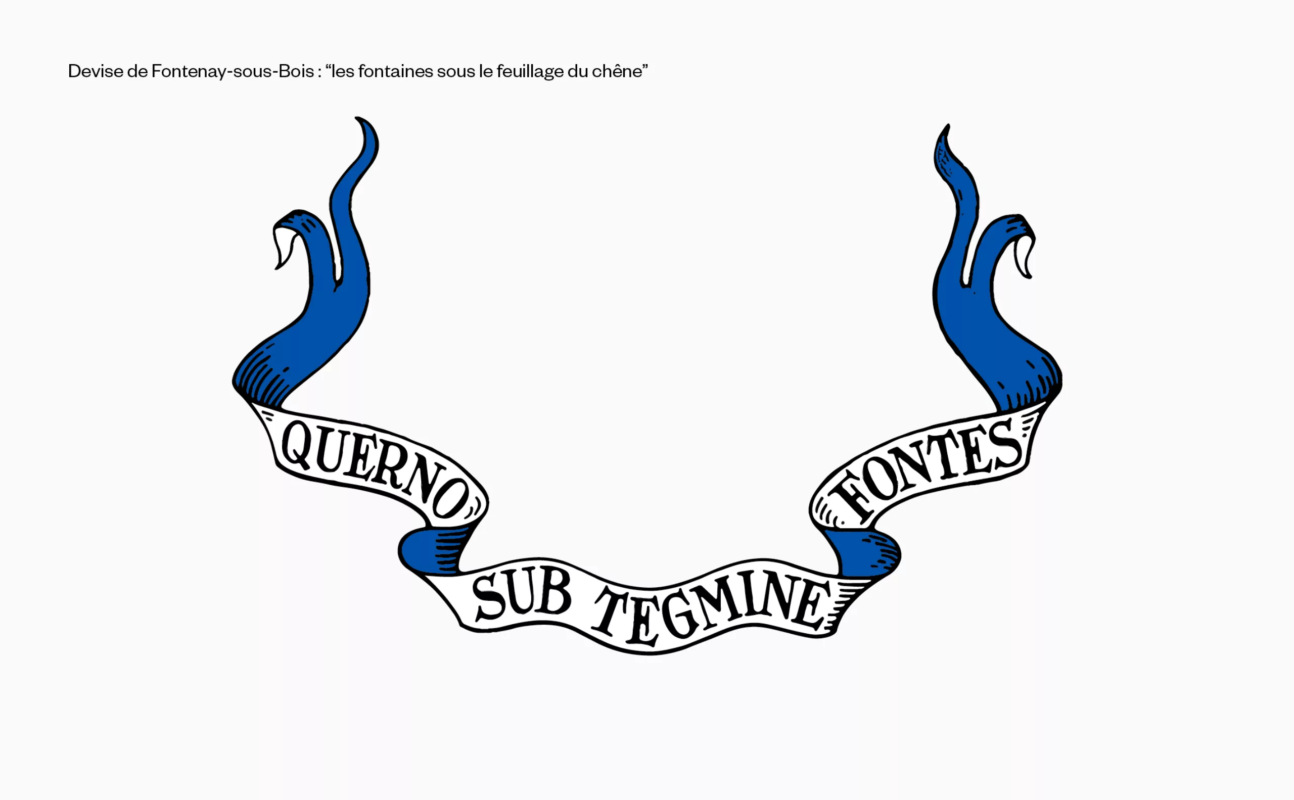
The oak tree has been present in the coat of arms of Fontenay-sous-Bois since the 20th century. It represents the Bois de Vincennes. The fountain at its foot evokes the many streams that once flowed. The oak is the tree of strength and tradition. The fountain represents the source of life. From its gush springs dynamism. In order to create a new 'iconic' emblem, we had to bring these two elements together in a clever way to create an emblem that was original, easily memorable, distinctive (identifiable among other municipal logos) and appropriate (it is indeed elements seen in the motto).

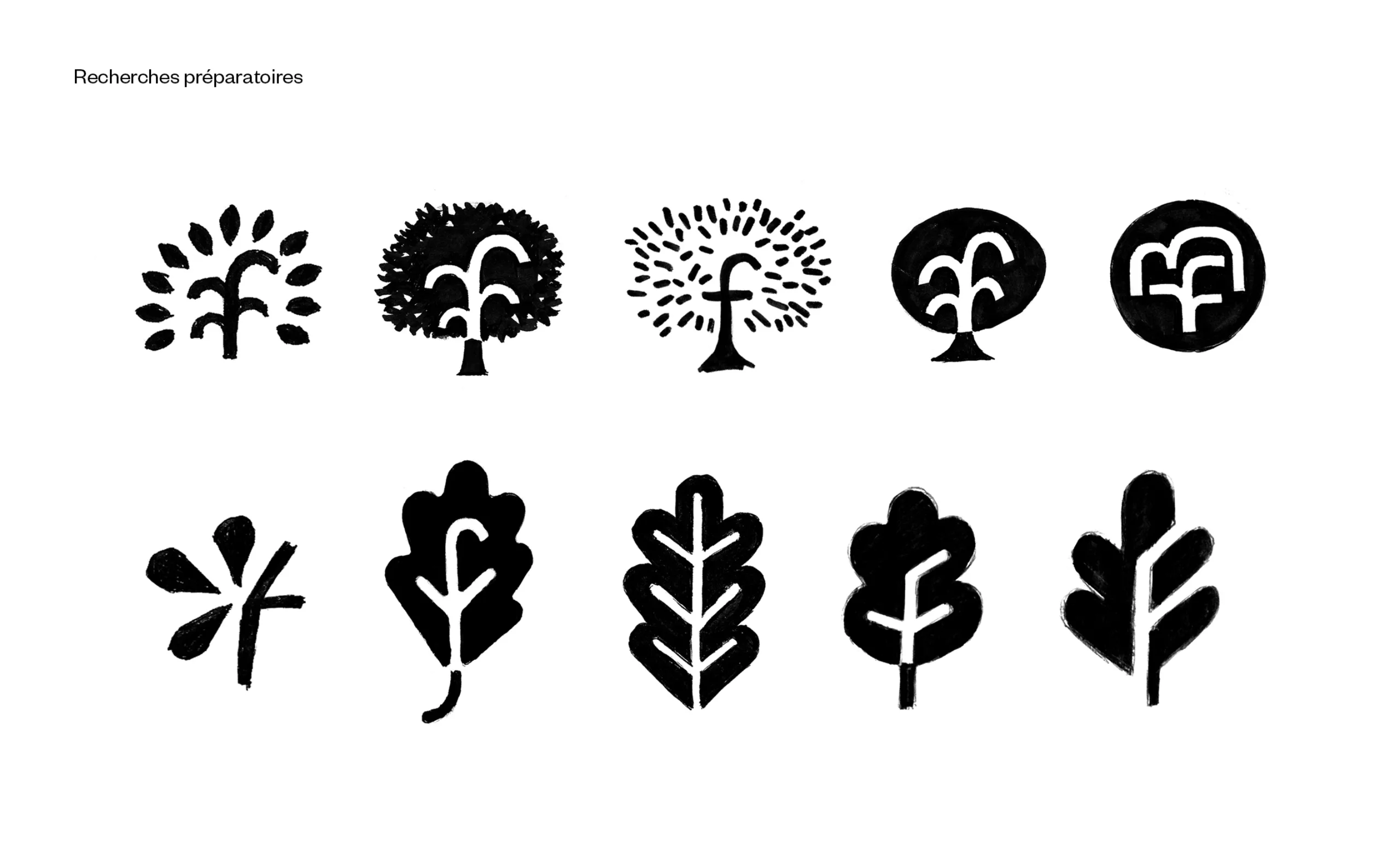
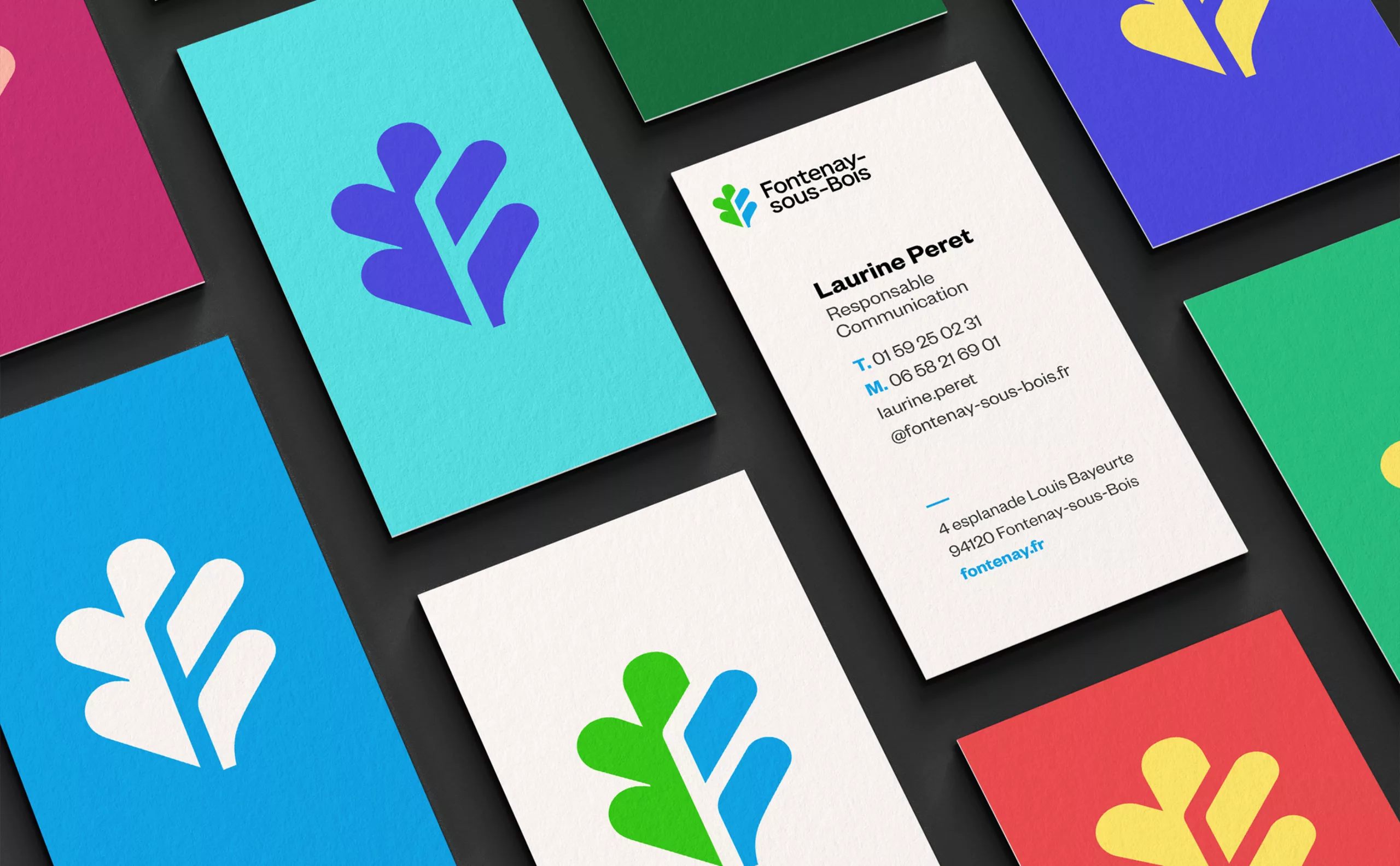
The oak leaf has a shape that is perhaps the most characteristic and identifiable of all tree leaves in France. On the other hand, and even more so as a pictogram, it is less obvious to determine the nature of a tree by its overall shape.
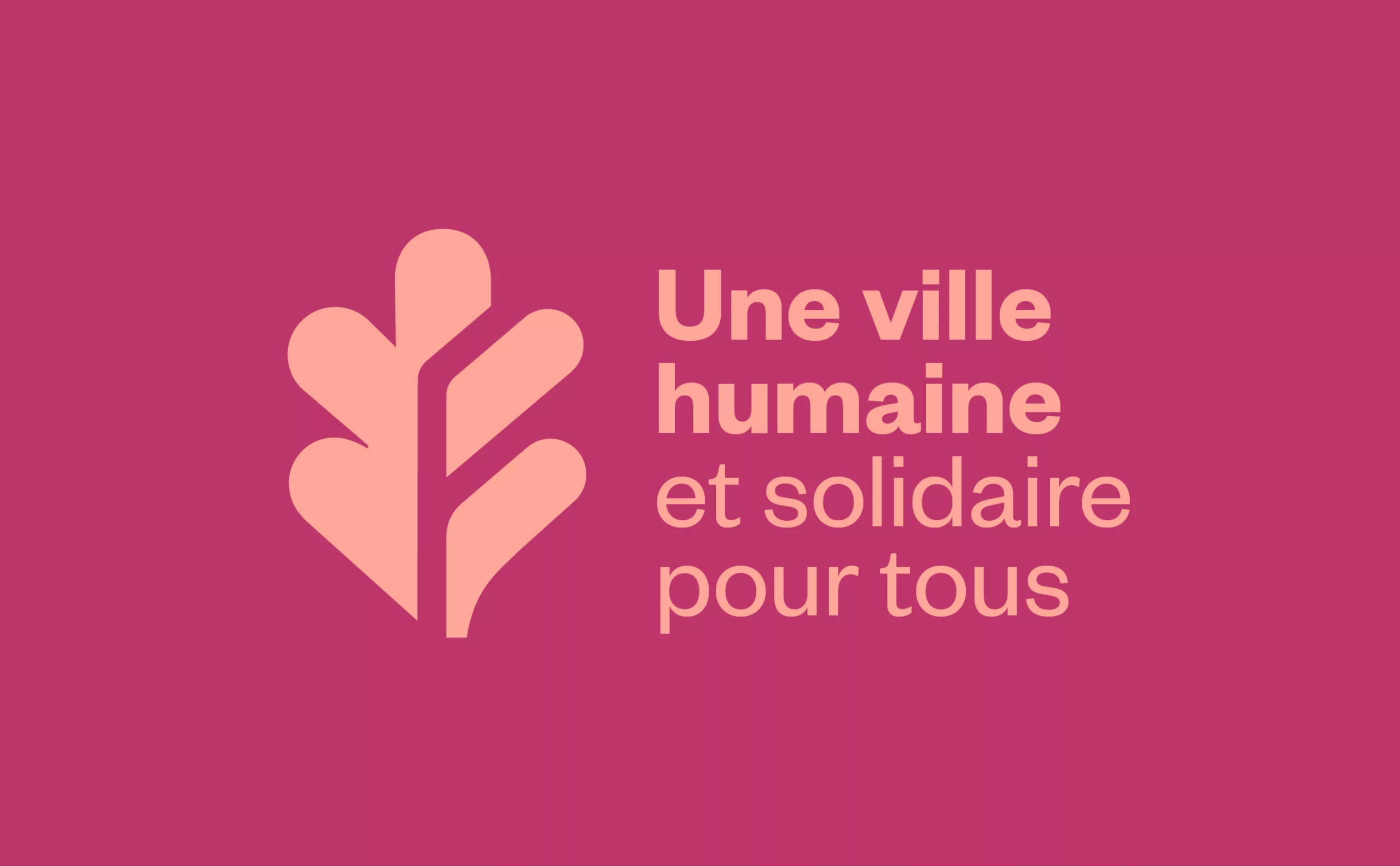
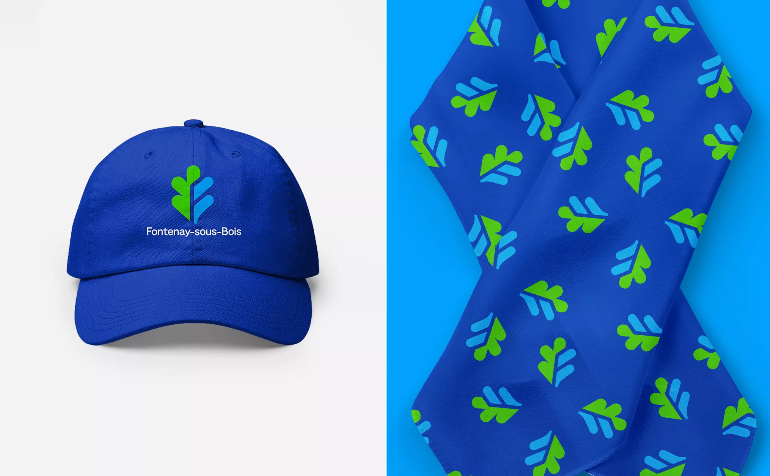
By synecdoche (a figure of speech that consists in taking the part for the whole), we have therefore chosen the oak leaf as the starting point for the new logotype. Here it becomes unique as it intertwines with the gushing figure of the fountain. This design is also special in that the letters F, S and B, the initials of the city, appear in its gaps, which are also the veins of the leaf, thus creating an osmosis between the symbol and the written word.

A new graphic guidelines for the city and its inhabitants

To complete the expression of this new brand, we have redesigned the city's entire graphic guidelines, starting with a new main colour palette consisting of Oak Green, Fountain Blue and Citizen Blue.

Fontenay-sous-Bois now has the Founders Grotesk typographic family distributed by KlimType foundry. This typeface was chosen for its simplicity and legibility on any communication medium, both in upper and lower case. The graphic system was designed to be easily adapted and used internally or in a poster campaign. The composition grid ensures consistency across all media and that each element is easy to read. The Fontenay-sous-Bois emblem in wire frame dresses up the graphic composition without overloading it. A secondary colour palette entitled "Palette de couleurs des saisons" will be used to enhance event-based communications.

The new visual identity of Fontenay-sous-Bois reinforces the values of the municipality through a dynamic, warm and welcoming design for a city that is human and supportive.

Context

The city adopted its first logo in 1991 after a competition won by the Achard-Sauvage agency. It was successively modernised in 2005, then in 2015 by the teams of the communication department in order to reorganise its construction and integrate a signature.
During the last municipal elections in 2020, Fontenay-sous-Bois saw a new, younger municipal team take on municipal responsibilities. This team has determined its municipal project around 3 axes: solidarity, ecology and citizenship. Since then, the elected officials and the city's services have sought to modernise the city's visual identity.

Objectives

The city's logo and graphic charter must evolve to better adapt to the various communication media, including digital, and be identifiable by the priority target on the city's various communication media. Through this mission, the city has set itself the following objectives
- Modernise the city's visual identity, in particular the logo, with a new version that is highly effective in signage situations and can be easily adapted to a wide range of communication media: print, digital, street furniture, etc.
- Retain the historical representations and references, inscribed in a century-old history
- Embodying modernity with a logo that can be used both in monochrome and with its historical colours: green and azure, historical colours that may be subject to change.


Share this project:
Project expertise:
Logo creation, visual identity and graphic guidelines.
Type of client:

Related projects: