Branding-education-Artline-logo-identité-graphisme-ecole

2021

Artline Institute
The reference school for digital creation!

The Artline Institute has been a worldwide reference in the learning of digital creation since 2013. Its particularity, a 100% online teaching, supervised by a team of professionals. The student is at the center of all the concerns, whether it is for learning, but also an accompaniment and a listening on its well being within the school course.

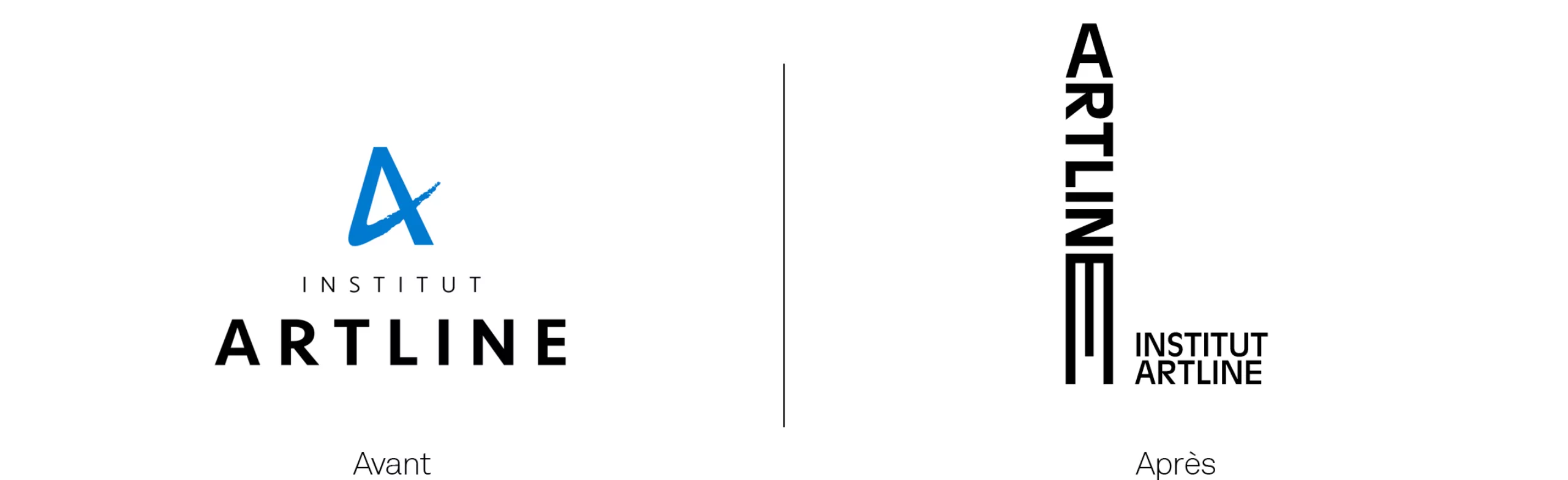
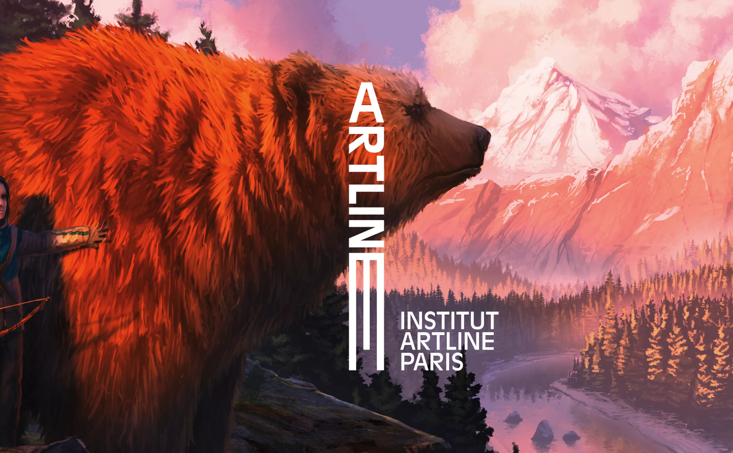
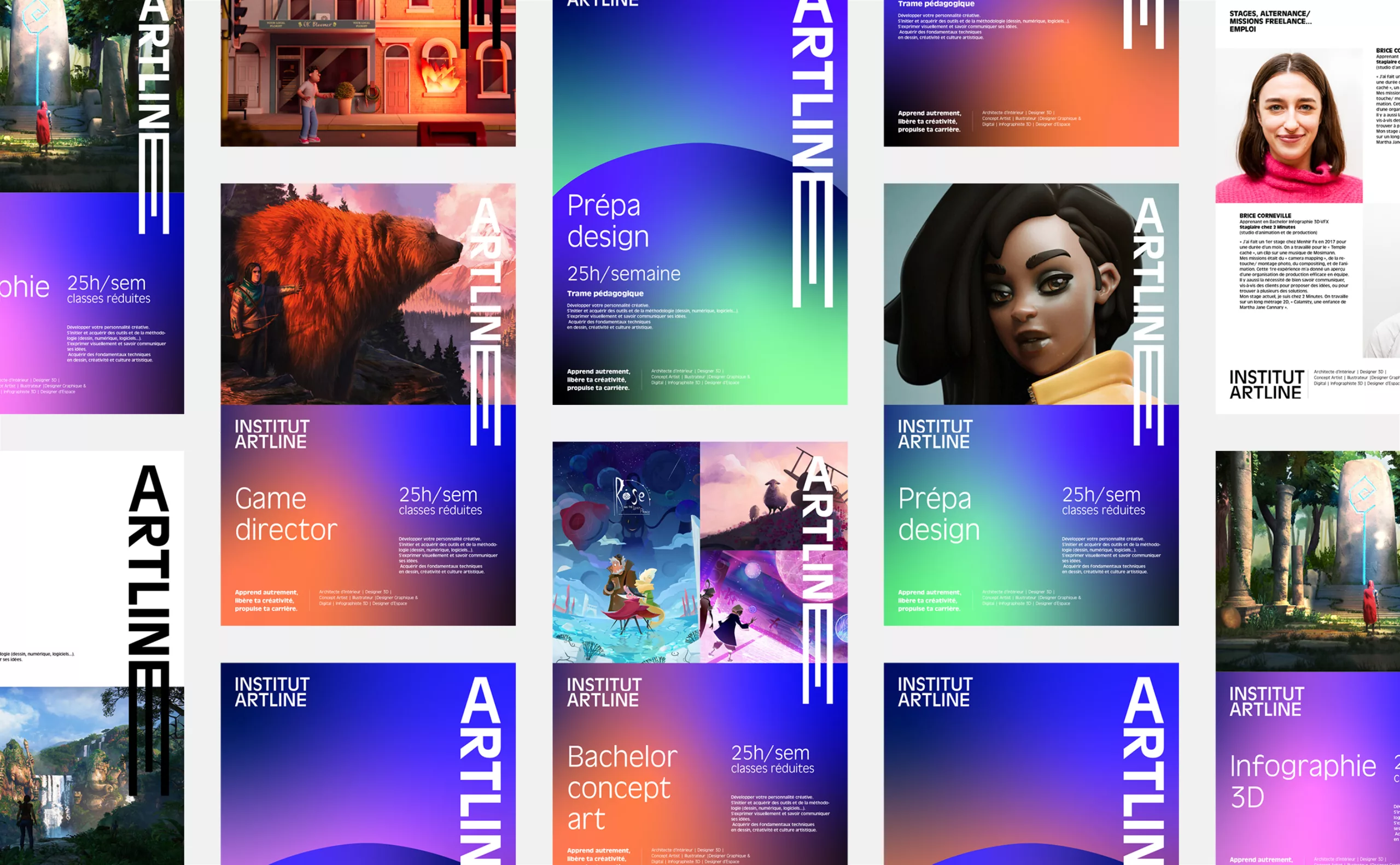
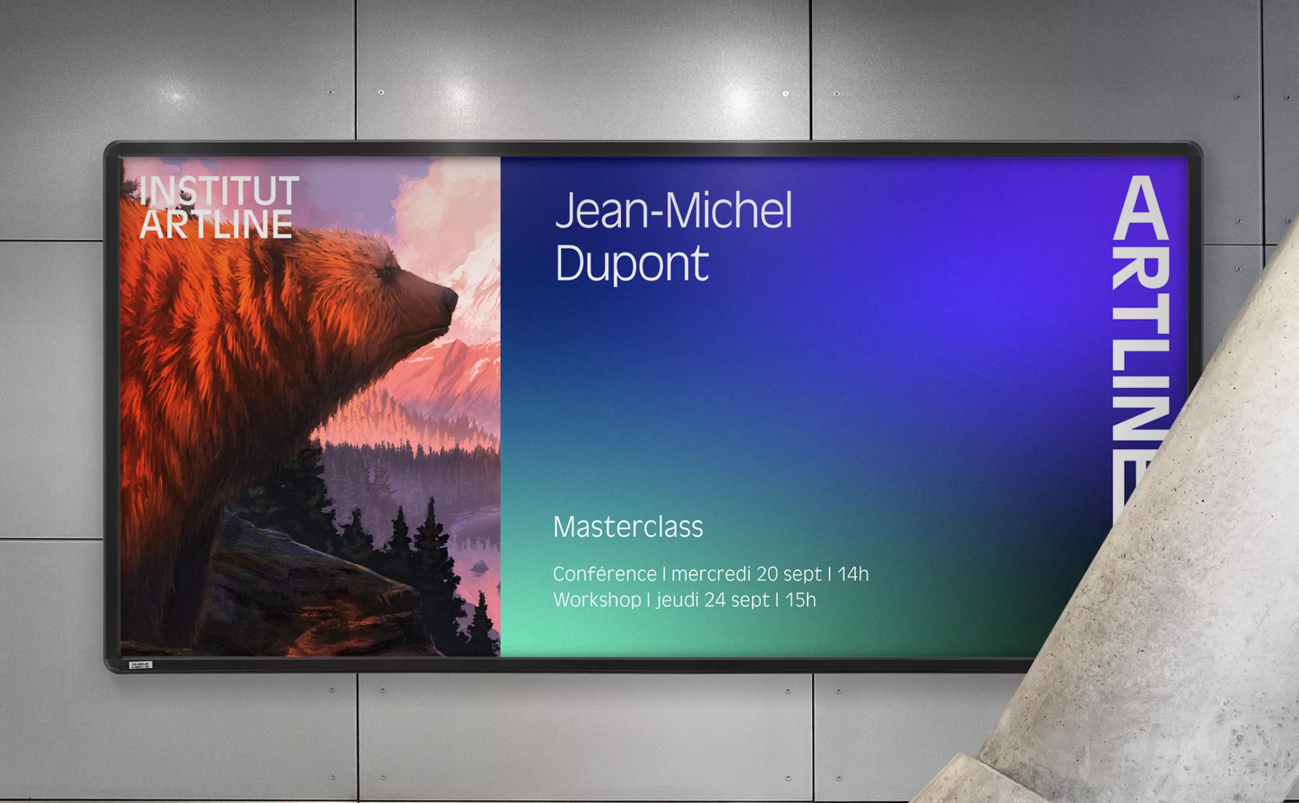
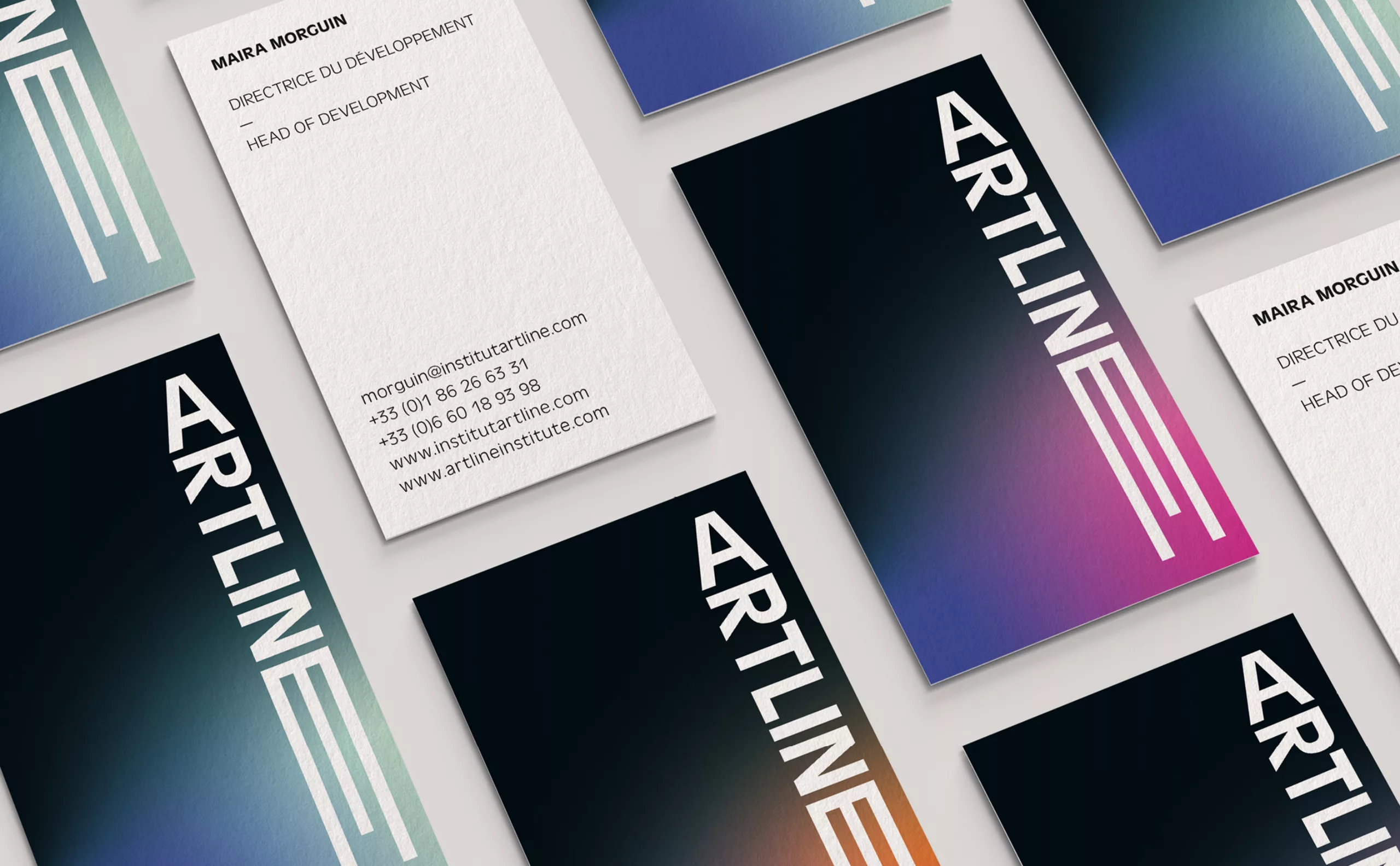
The main challenge was to rethink the history and visual universe of the school through an identity with an international dimension.

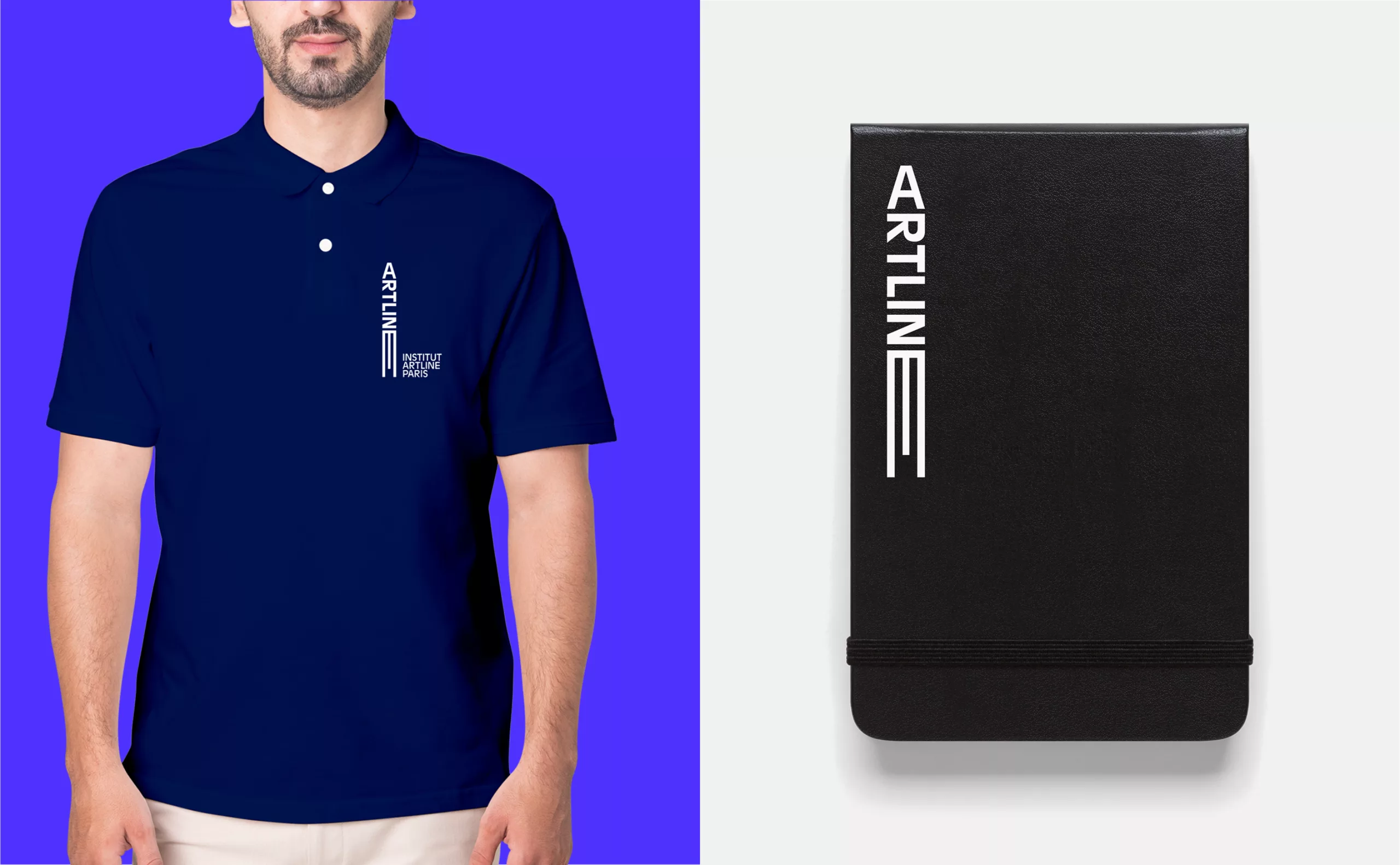
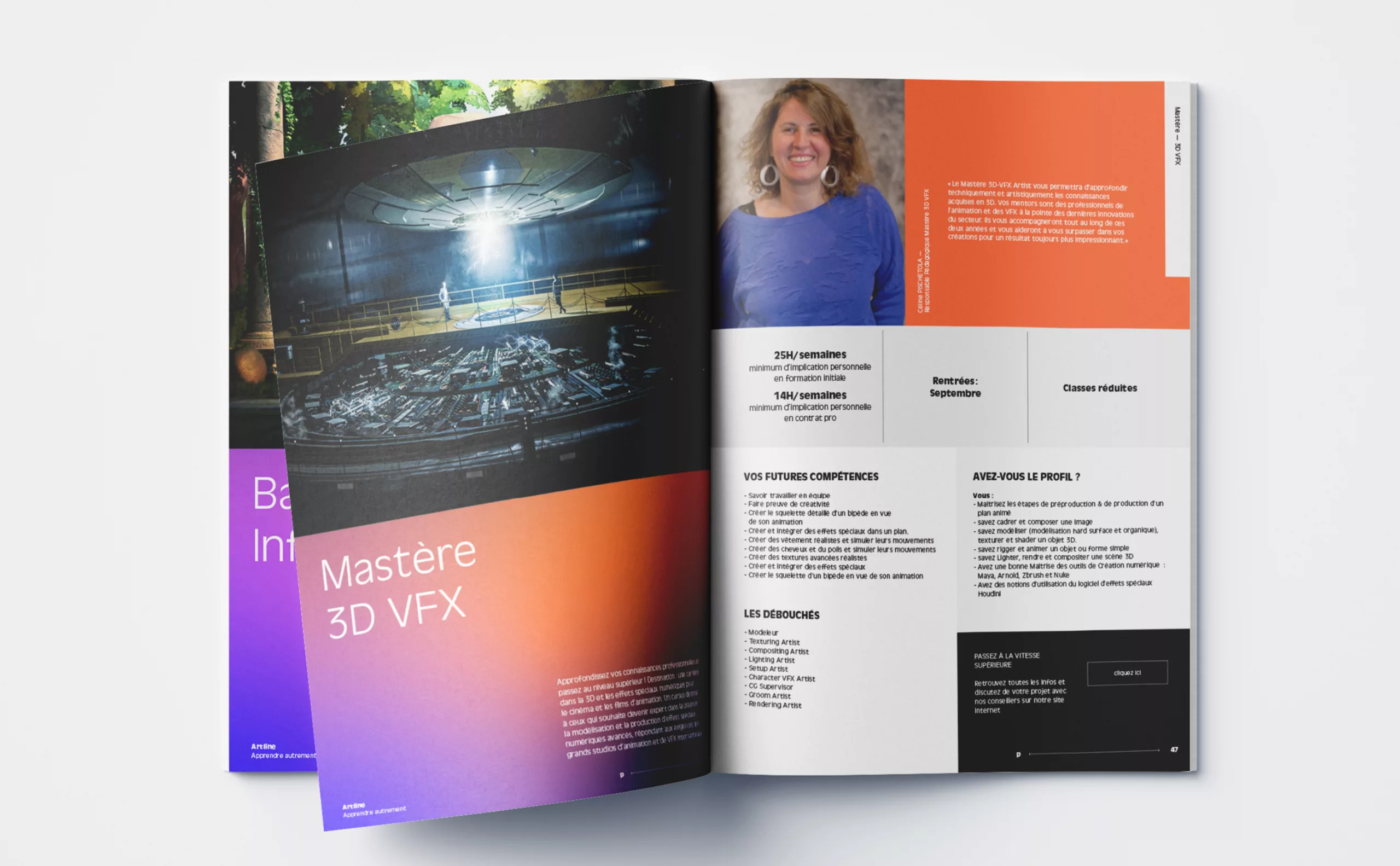
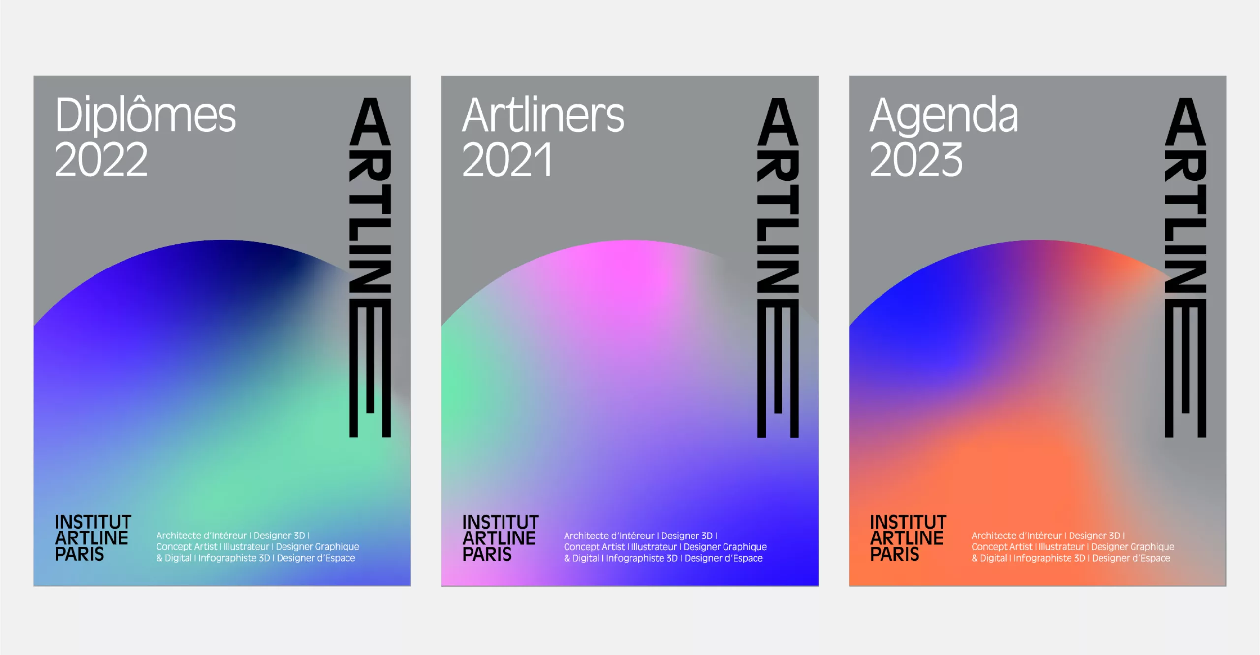
As this work was aimed at different actors, school, parents, students, partners, it was important to build a strong but accessible image, so that each one appropriates the values of the establishment.

Branding-education-Artline-logotype-identité-graphisme-ecole-design
Branding-education-Artline-logotype-typographie-typeface-ecole-design

Welcome aboard

This visual identity refers to space, by registering at the Artline Institute you are part of a crew that takes off and flies along a trajectory, that of knowledge and creativity.

The logo is built like a rocket, the "E" evolves according to the media giving this logo a responsive, adaptive scope, essential to an institution using a 360° communication. The letter "A", inherited from the former identity, symbolizes the tip of the pencil that will allow each student to trace his or her project, his or her path within the school.

Branding-education-Artline-logotype-color-gradient-design-logo-Paris
Branding-education-Artline-logotype-identité-poster-ecole-design

A colorful universe

In addition to an evocative and clever acronym, the brand's universe unfolds and takes on even more meaning thanks to color. The identity combines both deep colors evocative of the immensity of space and others much brighter, which energize the spatial landscape of Artline with softness, merging together to recreate spaces of composition, a rich and evolving universe depending on the media.

The chromatic range also finds another importance but nevertheless complementary, that of structuring each of the learning sections offered by the school (Preparatory, Bachelor, Master ...).

Branding-education-Artline-logo-identité-pictogram-ecole-Paris

The singularity of the logo, with its very vertical composition, forces us to invent new ways of using the logo. For example, on the website (designed by the agency Make the grade) the scroll of the page will make the logo take off while composing a "minimized" version of the logo in the header of the page.

Branding-education-Artline-logo-identité-instagram-ecole-Paris
Branding-education-Artline-logo-identity-creation-school-Paris
Branding-education-Artline-logotype-identity-graphisme-ecole-design
Branding-education-Artline-logo-creation-graphisme-school-Paris
Branding-education-Artline-Poster-logo-graphisme-ecole-design
Branding-education-Artline-logotype-identité-design-ecole-Paris
Branding-education-Artline-logotype-business_card--ecole-design

Artline's coaching

At Artline you learn differently, you free your creativity to learn the job of your dream while being supervised by professionals recognized in their respective fields. It is a framework that allows each student to bring out their talent, and that will adapt to the needs of the student.

A clever visual identity

This visual identity reflects the adventure, the student's journey, as well as the values of this unique school. The logo, the brochure, the motion design as well as the print communication cohabit in a playful graphic system giving Artline a coherent image.


Share this project:
Project expertise:
Logo creation, visual identity and graphic guidelines.
Type of client:
Communication in the education, higher education and health sector. An indispensable partner in the transformation of the health and wellness industry through the alchemy of creativity and technology.

Related projects: