Wally Olins, father of territory branding
Born in 1930, Wally Olins is a British designer who created the concept of territory branding. Through his branding consulting work, he brought to Britain and the world the idea that brand identity is of paramount importance, and that it shapes everything that organizations do and say about themselves. He worked with Renault, Orange, Tate Modern, Volkswagen, 3i, Tata, Q8 and many other companies. Since his death in 2014, his agency Wolff Olins has produced, among other things, the new uber and Met Museum logos in New York.
In 2011, we had the opportunity to interview him and ask him questions about territorial branding. This exclusive post-mortem interview is revealed at the end of the article.
The birth of territorial identities
Wallace -Wally- Olins, English by birth, grew up in the capital before studying history at St Peter’s College of Oxford. He none the less began his career at the Ogilvy and Mather advertising agency in Mumbai, India, as a director, where he spent 5 years. He quickly became interested in brand image even before the term existed and developed a taste for this advertising branch, consisting in building a lasting reputation for a brand or a company. Wally Olins soon made a name in this field and interested more and more companies and NGOs, for which he worked hand in hand with the directors.
Olins was convinced that companies must be involved in this search for identity, and not just relayed to the level of observer. A keen traveller, he worked in Northern Ireland, Mauritius, Poland, Lithuania and Bengal. He thereby helped regions, communities and states to find their image.
A pioneer genius in territorial identity and brand image, he co-founded Wolff Olins with Michael Wolff in 1965 on his return to London, and Saffron Brand Consultants in 2001. He could thus make his mark in territory design. He worked for instance on the Polish identity campaign or the visual identity of Øresund, the bridge and tunnel linking Denmark to Sweden. But his job as a business consultant mainly involved working for increasingly large companies, with many subsidiaries no longer linked to their parent company. By creating meaning and connection between these subsidiaries and their headquarters, Wolff Olins created what would later be called “brand architecture“. No matter if you call it brand design, brand identity or reputation, Olins points out that it all comes down to the same thing, that “it’s the way companies present themselves. »
Inspiration
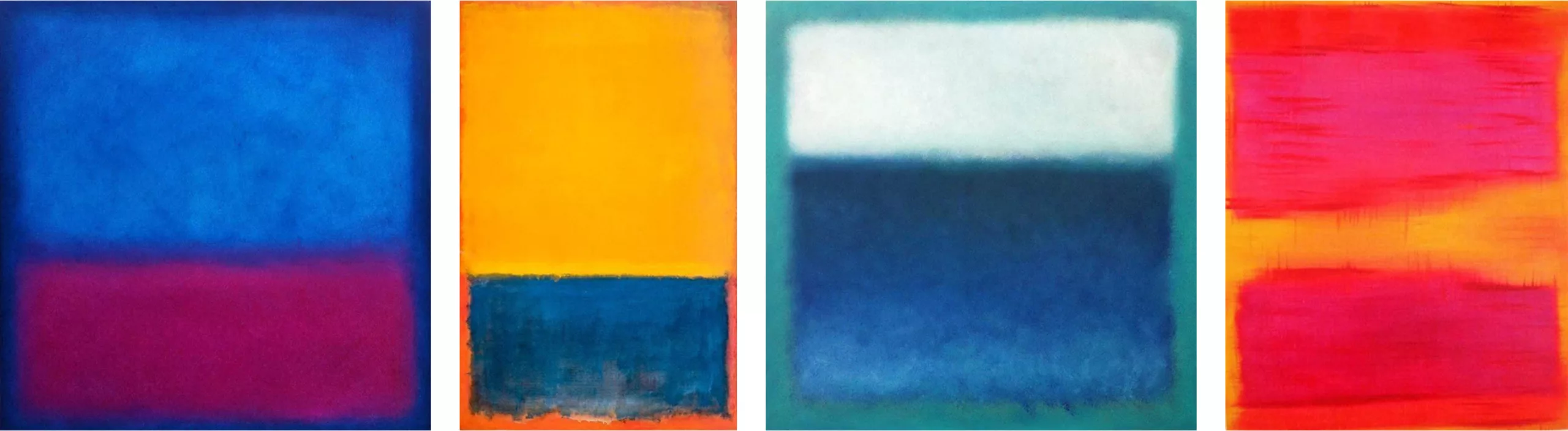
He is said to have found a great source of inspiration in the New York school’s abstract expressionist art movements of the 1940s and 1950s, especially the Colour Field (worn by Rothko) with its large canvases covered in full-colour tints. In these paintings, colour brings out its pure qualities in the canvas as a flat field of view, with no subject or central point. The absence of relief and the central importance given to colour contrast with the figurative movements of the beginning of the century.
As years go by, Olins wrote books to address his torments about the future of the world. He is concerned about globalization and the belief that gradually everything in the world, everywhere, will be the same; the planet will turn into a huge airport. Olins, on the other hand, thinks that “a country, a region, a city, will be in competition with other countries, regions, cities, to attract foreign investors, builders, tourists, students… Competition between cities and regions will mean that more and more singularity will emerge in response to homogenization, or apparent homogenization. In a rather curious way, one of the most common reactions to this homogenization is that everywhere around the globe, more and more people are looking for authenticity, for an origin. Because in a world where no one knows the origin of anything anymore, we need to hold on to something, to know where it comes from. Big companies are buying more and more local brands, and can no longer understand what people around them want. These are dramatic changes. That’s what I’m talking about in my book “Brand New. The shape of brands to come” which is aimed at anyone interested in how the world is changing. »
Connecting people with colours and bridges
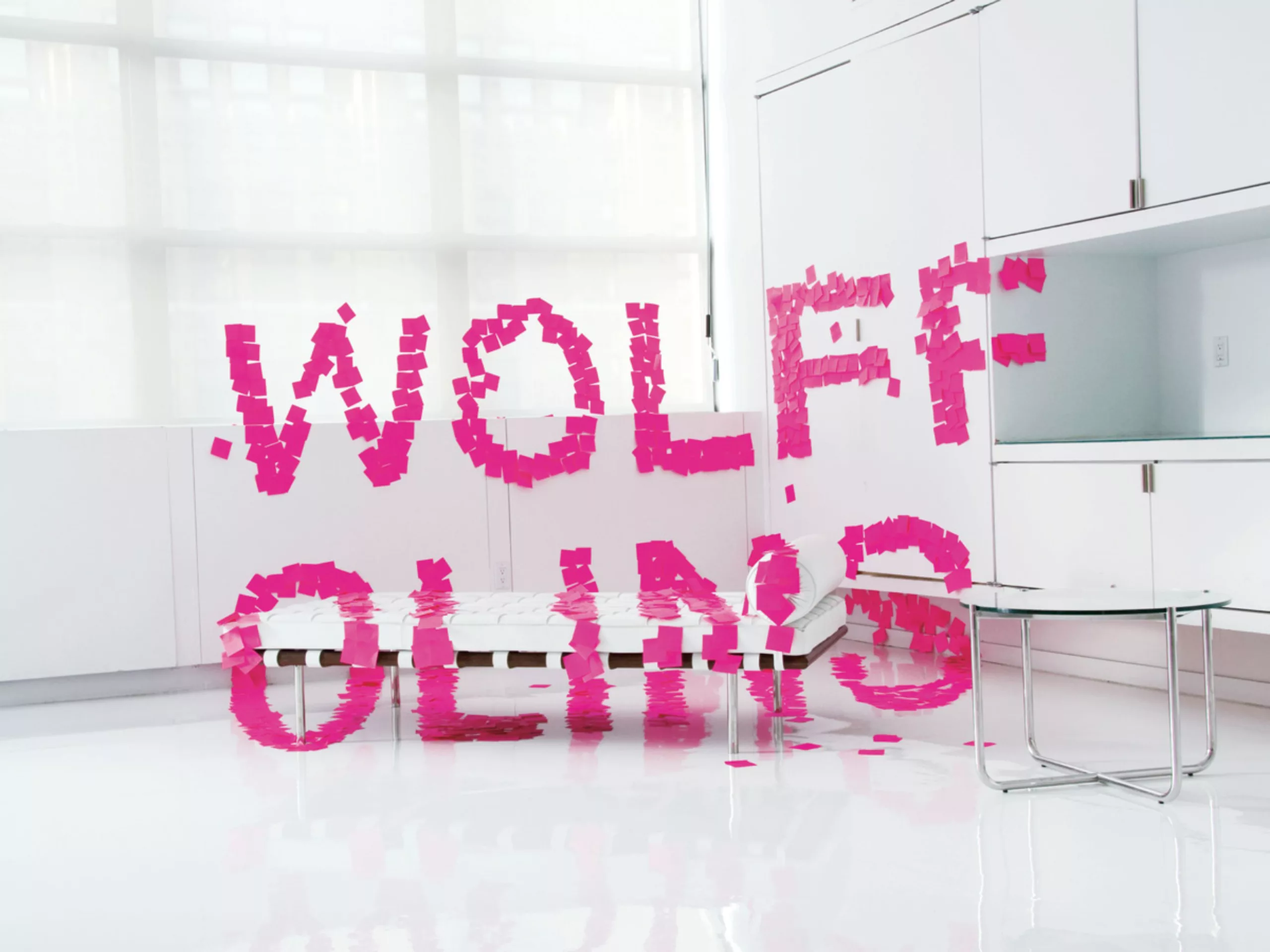
It is difficult to discern Olins’ work as a solo designer. All projects are always signed with the name of the agency and its two founders, Wolff and Olins. Without knowing exactly who did what and assuming it is a team effort, let’s look at some of their most famous logos to scan successes and failures, in brand and territory branding.
In an interview, Olins explained that a good logo should do 4 things. First, it must be moving and rational at the same time; it must address both the hearts and minds of people. Secondly, it must be relevant for all stakeholders. Thirdly, it must be distinct. The purpose of a graphic identity is to distinguish itself from competitors. And fourthly, it must be true; it must come from the heart of the brand, avoid clichés and highlight a concept that must be recognized as realistic and inspiring for all targets. In theory it seems to make sense, but in reality… nothing is that easy!
orange, the color box
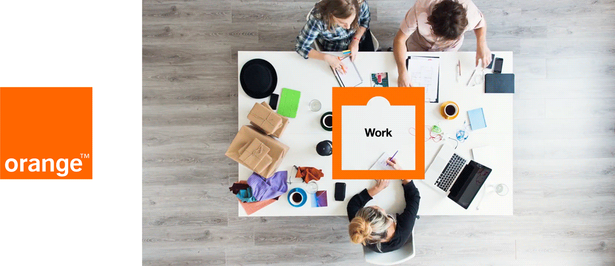
In 1990, the Chinese telecommunications giant Hutchison Whampoa limited decided to set up the 4th largest telephone network in Great Britain. The company called on Wolff Olins to develop a brand that would not be technological but would make simplicity, openness and optimism its watchwords. As the brand strategy consulting firm explains, “we gave the network the name of a colour, not a telecom-related name like Vodaphone or Cellnet. We have created a warm and humane style of communication that has quickly become internationally recognized. “orange was born.
Since then, the company has been acquired by France Telecom in 2000, and its image updated in 2010 (see animation above). At the heart of this new communication, the rectangle – hence the brand – opens up to its customers and the world, adapting to each particular need. This rather simple and effective campaign seems to be quite consistent with the brand’s initial communication and the current era.
Øresund, connected and connecting territory
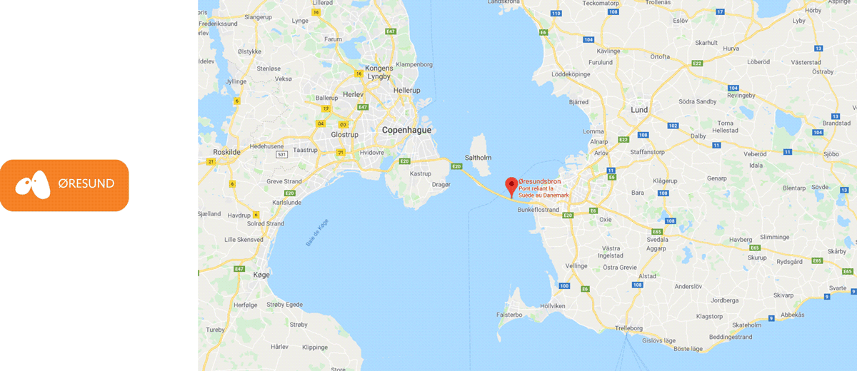
Øresund is the tunnel bridge that connects Sweden to Denmark from Malmö to Copenhagen. Olins was responsible for this major project, which was carried out in the 2000s. Unfortunately, it is very difficult to find any graphic elements on this subject today, apart from the logo, with difficulties (see photo above). We therefore conclude that the project was not sustainable…. The logo that was found presented the two cities as distinct points within a large territory. It also looked like the eyes of a comic book character, but the intention may not have been deliberate.
However, the territorial identity exercice is exciting. Two cultures, two countries, two languages, two elements: air and sea. The explicit political intention behind this project was to help residents identify not with a country but with a region on either side of the bridge. On the Swedish side, in the east, the Skåne region is known as Scandinavian California. The whole challenge of the logo was therefore to highlight this dynamism and to bring about a change in the perception of the territory, both in its delimitation and in its content. Olins explains that territory branding is complicated because it must establish a link and connect the perception of this space to reality. “the difficulty of cross-border brands is the need to unite people from different cultures but also to get the right message to the rest of the world.”
Today, it seems that the project has evolved into “the greater copenhagen“. We have gone from the neutral name of a bridge linking two countries, to a Danish “invasion” (neutral, though) renaming this part of Swedish territory as a suburb of its capital. It probably took water passing under the bridge to get from one name to another! A sensitive subject with a very local name that may not have touched the hearts of all these people back then.
Tate, artistic blur
Introduced in 1999, the logo of the Tate Art Galleries (in England) was designed to unify 4 diverse artistic experiences and embrace nearly 500 years of British and international art. The Tate’s wish was to combine their four galleries under the same philosophy. The agency invites its visitors to “look again, think again” and proposes this tagline as a leitmotif for this new logo. The result is a variation of blurs and bold, recognizable as a unit, but in perpetual movement. Wolff Olins reinvented the gallery concept for Tate, moving from a unique and institutional perspective to a collection of brand experiences with a similar attitude. The 4 points mentioned by Olins seem to have been respected here, being moving but rational, relevant, distinct, and authentic.
In 2016, North agency took over the project proposing a blurred but woven logo, which can be easily animated.
Transparent branding with aol.
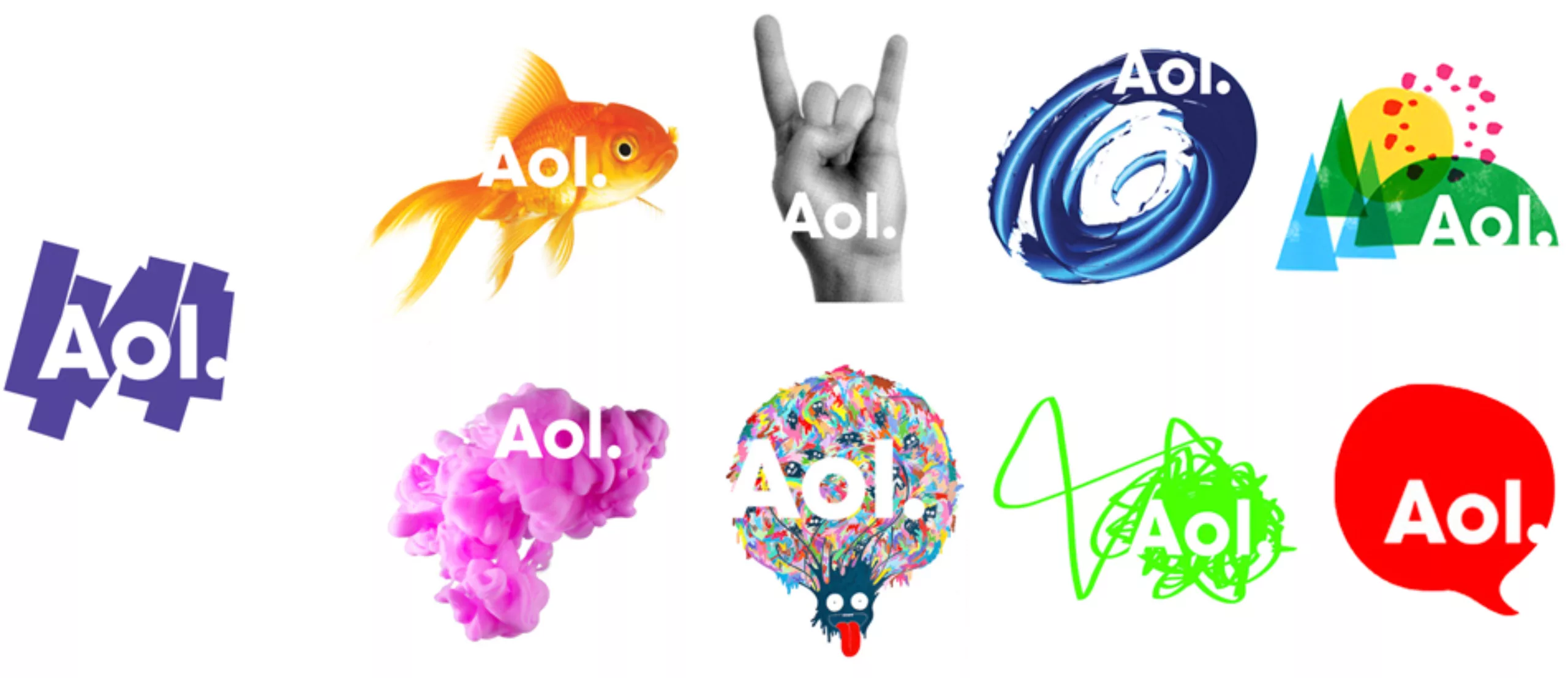
In the 90s, Aol. (American Online) was one of the only web surfing platforms in the United States. But with the rapid technological evolution, Aol. lagged behind, without managing to catch up, dropping from 27 million users in 2001 to 6 million in 2009. It was precisely at this time that the company left the Time Warner group and tried to fly on its own by becoming an independent public company. It then asked Wolff Olins to design its new visual identity, in order to position it as a “21st century media company“.
The three capital letters change in lower case to visually shape a word, which can still be read as an acronym, thanks to the period. Unlike other brands, the new Aol. logo only exists thanks to its background. This logo is like the Internet: dynamic, changing, and invisible without content. The agency asked several artists around the world to customize the logo to bring it to life; it unfolds on ink spots, a goldfish, scribbles, birds, flowers or leaves, drawn characters, a jumping cat, or paint flows. The purpose of this collaboration was to work with artists, journalists and musicians to create “experiences with extraordinary content” according to the agency.
It was rather to make users forget the brand by focussing all the attention on the background! A name change being non-negotiable, the company had to find a way to get rid of a bad reputation linked to a poor web experience. However, Aol.’s reputation should have evolved along with its image. And it didn’t.
Unfortunately, 10 years later Aol. is still not getting any better. As Paul Rand said, “the trademark is created by the graphic designer, but it is the company that makes it”. The worm was in the apple, and this new gloss didn’t change its taste.
London 2012 Olympic Games, a logo that makes everyone agree
The logo for the London 2012 Olympic and Paralympic Games, launched in 2007 for £400,000, quickly became the subject of much criticism, unpredictable and fierce. The 2012 Olympic Games logo was originally designed by Wolff Olins agency to include everyone in a common experience. There was a need for a logo that would appeal to young people, “a logo that was bold, energetic and dissonant like the city of London”. The agency therefore designed it without signs referring to a particular monument or sport, inserting the Olympic rings (a rarity for a logo of this type) and leaving some flexibility on the content. Brands, sponsors, or countries could therefore play with it by inserting their colors, or even removing the rings in case of prohibition of use. For the first time, the logo of the Olympic Games and the Paralympic Games were designed identically, with only a variation in the text but not in the shape.
Designed to reach an audience as large as the United Kingdom, it was difficult to get everyone to agree. And yet the brand identity of the London Olympics did succeed in creating consensus: the logo was unanimously considered very ugly. On BBC News, Internet users were invited to vote by giving it a trophy of a silver or wooden spoon: 83% of voters, the overwhelming majority, gave a wooden spoon, signifying their deep disgust for the logo. Far from pleasing the public, it also provoked Iran’s anger. The country declared that it could read the letters Z-I-O-N (not 2012), a term referring to the city of Jerusalem.. problem: Iran does not recognize the existence of the state of Israel. “The use of the word Zion to create the logo for the 2012 Olympic Games (…) is a totally outrageous act,” said Iranian Olympic Committee President Mohammad Aliabadi in a letter to IOC President Jacques Rogge. They threatened the UK to withdraw from the Games and take other muslim countries along.
As for the advertising campaign, the first spot caused several epileptic seizures among viewers.
With hindsight, however, these games have recorded very strong commitments from spectators, and the “bad buzz” of its debut nevertheless succeeded in getting people to talk about it and make it known throughout the world. Without touching the hearts of the audience, it managed to be relevant and distinct. We wish the same luck to the new Paris 2024 Games logo…
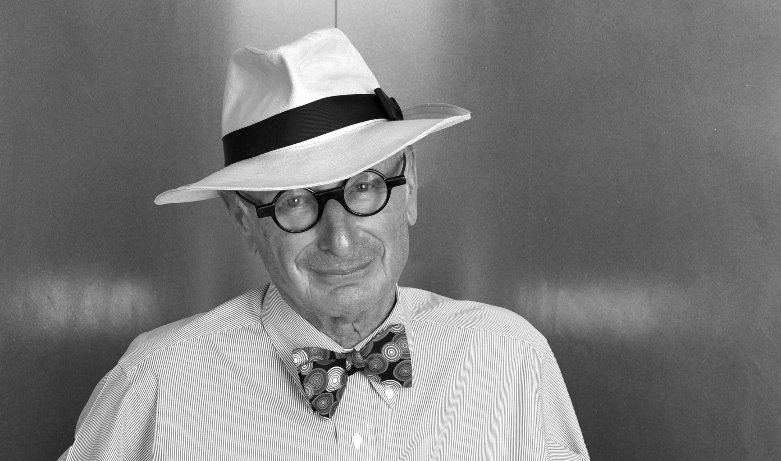
Although he passed away in 2014, Wally Olins continues to be a reference, an icon with a bow tie and round glasses, as he “self-branded” himself.
Our exclusive interview with Wally Olins
Aurélien from Actulogo had the opportunity to gather Wally Olins’ opinion on territorial branding during an interview conducted in 2011, which we have never published until now.
- You’re particularly involved in territories and region branding. How do you explain that so many territories and regions crave to have their own brand?
There are several reasons for it. First of all over the last 50 and certainly over the last 25 years there is a much stronger movement amongst smaller countries to assert themselves. There are far more countries now than there have ever been before, and within countries regions (the Basque Country, Catalonia in Spain, Scotland in GB, and so on) are all trying to assert some kind of feeling of -not necessarily total independence- but a feeling of self confidence about who they are. And then you have all these countries that were formerly part of what we used to call the Soviet Block, they are all coming back under these circumstances. That’s one reason.
The second reason is that now if you do not have a national brand that is recognisable and which people can respect, then you don’t get so much tourism, you don’t get so much foreign direct investment, and your brands when you export them don’t have the same value as other people’s brands. I’ll give you a particular example of this: Slovakia manufactures more cars than any other countries in the world, but you will never see a sign on any Toyota, on any Peugeot or on any Citroen that says ‘made in Slovakia’. What happens is that these countries are labelled as cheap manufacturer facilities and all the value added goes to the other countries. What you’ve got then are a series of situations where countries that you might call ‘great legacy nations’ like France, Germany, Italy, or Britain where the nation is known, where the products and services of certain kind is respected, the art, culture and history are known, so they have a very particular place and if you take your country -France- it’s perfectly possible to exploit that situation you’re interested in.
Take L’oréal Paris for example. Classically developing an idea around its city of origin which gives it more value. A Polish cosmetic company -there are several which are quite good- they can’t say they are from Krakow because that doesn’t mean anything. In fact if it did mean anything to anybody at all it would mean I’m not going to buy it, I’d rather buy L’oréal.
There are huge incentives here, commercial incentives, appart from the political incentives, there are genuine commercial imperatives to do that. And because the world is becoming more and more competitive, organisations in branding cities, regions, nations, are getting more and more concerned to do this. But there are huge problems associated with it.
- I see two kinds of regional branding: the corporate one (that attracts companies) and the touristic one. Do you think it’s crucial to split them?
I think there are not two, there are three. There is the issue of foreign direct investment, which can be investments in all kind of things. It can be investments in research, in a R&D center, in manufacturing, but also in universities, in all sorts of things… The crossover between tourism and foreign direct investment is not as straight forward as you might think.
For example, I may decide as a tourist to buy a house in Slovenia. Is that tourism or foreign direct investment? Where do you draw the line?
So you have to be very clear about the way the nation projects itself, that you’re talking about a series of issues which are addressed sometimes to overlapping audiences.
But the key to it is that you have an idea: an idea of France, an idea of Spain an idea of Italy… An idea which you can interpret for different audiences in different ways. And you won’t use the same words nor the same images but the idea behind the brand, wherever it manifests itself, has to be the same.
- From a business point of view, is there any risk for these regions to be related to a simple product and loose the culture of the region?
That happens. Germany is associated with very high quality engineering. But it is not associated with smart clothes. So Hugo Boss doesn’t make a big noise about being German. Because it doesn’t help. You make a big noise if you’re in making cars, in engineering. And the same thing applies to a lot of countries.
There are some countries where the associations are very very strong. In some countries you’re going to have a very very broad range of ideas which are related to the country. In other countries you don’t get such a broad range of ideas. So one has to accept that what people look at are stereotypes.
I think the classic example is probably the United States. Well there are 3 or 4 quite clear stereotypes. One of them is opportunity. There is nowhere in the world where you get more opportunity than in the United States. The American Dream, all that stuff; that’s one idea. Another idea is technology: Steve Jobs, Microsoft, Silicon Valley and all that. It’s a completely different idea but a very powerful one. The third idea is the high stream: MacDonalds, Disney, all that junk. And there are more than three ideas. Now these ideas are separate but in different times you will think different things about America.
For example I read a very interesting research a couple of years ago when Bush was President. In Egypt, in Cairo, they asked a few questions. Question number 1: which country in the world do you hate most? America. Question number 25, if you wanted to emigrate, where would you move to? America. So that gives you a feeling of how people’s perception are confused: they are contradictory, but they are powerful. And you get that about most countries -no that’s not correct- you get that about some countries.
There are other countries where there aren’t any perceptions at all. I was working in Lithuania, and people said: what does the world think about Lithuania? The answer is they don’t even think about Lithuania, they don’t know it’s there. There’s that set of perceptions, too.
- In France these last two years we’ve seen dozen of towns, regions, departments or territories trying to become brands. Have you noticed one in particular?
A couple of years ago, I think I noticed Lyon. It was very clever and very funny. It was a little boy who was a bit naughty and a bit charming and a bit -not exactly rough but a bit wild, and it was very clever and I thought it was extremely amusing and individual idea. It was a few years ago that I noticed it, I don’t know wether they kept it, and they did a lot of things around this little boy. I really liked it I though it was good, very clever and very self confident in a relaxed kind of way.
- Do you think these local brandings are something just trendy, or we’ll have to expect more these years to come?
I think it’s both.
- Do you think it’s something that will last for centuries?
I think that what I explained earlier, the imperative to promote your area derives on one hand from a local patriotism, a very strong feeling to describe who you are, particularly in the areas which are changing. Lyon is an example, it’s an area which used to be very industrial. On the other hand it’s a desire to attract a growing economy, a desire to attract people so the economy can grow. There is a real commercial imperative to this. It’s a requirement: if I’m competing with somebody else but this somebody is promoting themselves more heavily than me then they will get the investments and they will become richer and I’ll stay poor!
- Is it crisis related?
No.
- Let’s talk about graphism. Your work involves design but you’re not a designer yourself?
I’m very involved and interested in it. I think I have a feeling for it. I didn’t study design, my academic background is history.
- What makes a good territory logo?
One of the main characteristics is that you see it very often. If you see anything enough, however good or bad it is, if you see it again and again and again you can’t avoid it, it’s just there. It doesn’t matter wether the “stars and stripes” is a good or bad logo, you see it. The flag is so ubiquitous you see it everywhere that you can’t really avoid it.
- Even if it’s something really ugly?
You get used to it. The national symbols, their continuous presence is very important. Of course the American flag is fortunate because there’s nothing quite like it, the UK flag is also quite fortunate. The French flag is also very very distinctive but that’s not because the flag is distinctive it’s because France is distinctive. The Italian flag is an imitation or an emulation of the French flag.
- But for me flags are not logos.
I understand that but I’m mentioning that as a context. I think, one of the world’s almost perhaps greatest logotypes is the red cross. Because what it says quite clearly and unequivocally without any doubt in anybody’s mind is this is total vulnerability. “We have no weapons, no nothing, we are completely neutral and if you want to kill us you can kill us”. But the vulnerability is so great the feeling that you have about the red cross idea is so strong that if you actually attack the red cross you are committing such a hideous crime, much worse than any other crime.
- That was my next question actually. What’s the best region brand logo that you’ve ever seen?
I can’t tell you immediately in my head which logo or brand region that I have ever seen ever strikes me. But I think that one of the most distinctive is Japan. And that isn’t just the flag. It’s the way the Japanese create an idea of themselves of what they do. So Japanese logotype and things around Japan tend to have that rather dramatic simplicity which I find very unusual and quite striking.
- And what’s the brand you made that you’re the most proud of?
People ask me that all the time and I always say “it’s the one I’m working on now”. Whatever the one I’m working on happens to be. But there are two that stand out a lot which I’ve been involved in a bit. One of them is Orange, now it belongs to cross telecom, and the other is first direct the online bank. I think we’ve done some fairly dramatic things in this company. Have you seen A1 the new mobile phone company for Australia? It’s worth looking at. Times change, fashions change, some of the stuff that I was involved in the sixties and the seventies even has lasted very well. P&O, the flag for P&O, I did it in 1970 or something. I think it’s still incredibly strong. So I find it difficult quite to say this is my favorite or this is not my favorite, some of them I don’t like so much and some of them I like a bit more!
- Okay, so which one do you like… less?
I think the ones I like less are the ones where we have not been able to make changes, because the nature of what the organisation is doing has to stay the same. What happens is that a huge organisation, like let’s say Renault, or someone like that they have to stay in the same place in the world. But -they have to keep changing because the world keeps changing. So I can’t stay and not change what I look like, but I’ll change what I look like in such a way that people don’t notice I’ve changed. In other words, I have to stay where I am, I have to change a bit. And a lot of the work that we do, inevitably with very large companies, we make gradual changes over a long period of time in order to stay in the same place, in order to stay in the position they were before.
Do I like it visually? Not always, but I think sometimes the results are very satisfactory, that they work very well. I think they’re very effective very often. But a lot of the work that any organisation does is to do with helping the organisation to compete in a market place that is getting more and more competitive – where you have online sales, where you have competition absolutely everywhere in the world, and where what you’re doing becomes more and more and more intensely focused on certain areas.
So you can’t always make the dramatic changes that you want, you’re gonna make changes digital and small… make the thing work online or whatever maybe. Occasionally you get the opportunity to do something really dramatically new, but not that often. Most of the time you have to modulate, I mean… we are not in business to win awards, we’re in business to help our clients to success.
- Is there a brand that you didn’t work on but you would have loved to?
I would like, one day, if it ever happens, to work on Europe. I would like that. I mean, the European idea is such a mess and there’s so no lead issue, and there are so many problems associated with it because it’s work in progress, and the fiscal structure as we all know is not working properly, and there are lots of small countries that are making lots of trouble and they’re pretty sure you’re all skeptical we know about that.
But I think it is a great idea, and it is an idea that most Europeans simply do not understand and have not been educate to understand what it means. To becoming European does not mean to say you stop being French or you stop being Parisian or you stop coming from Manchester. What it means is that you have another dimension to what you are. And I think that that is a programme, if you can work on that, that would take two generations before there is an European idea. But I would love to be involved in thinking the implications of that truth.
- Two final questions now. Is there a recent logo change that you’ve especially noticed?
Well everybody noticed Gap. Not a big deal. Everybody’s noticed McDonalds, it’s not such a logo change but it’s a changing. I mean, these are what I’m talking about, they’ve changed because they feel (24’20) McDonalds clearly feel, it’s gotta look more warm, it’s gotta look more friendly, not to be so agressive, it’s got to be interested in all the stuff with sustainability, it changes its appearance a bit, yeah those kind of things. But I’m not obsessed with them, I think that’s nature of the commercial world.
- Well I’m obsessed with the logotypes as part of my job! Last question that I ask to every person I interview: do you have a piece of advice for branding beginners?
I think that it’s very very important that you understand the new technologies that you are managing. I think it’s very important to get hold of digital because increasingly, logos are moving. They’re not static. And if you looked at what my old company did on the 2012 Olympics three or four years ago, I think it was a very clever anticipation of the way in which that world is moving now.
Everything is digital, everything is moving, everything’s gonna work with everything else, everything’s gonna change color, everything’s gonna change shape, nothing’s gonna be static. Everything’s gonna be moving. And you have to remember when you design this, when you do this design work, that that’s what it’s about. If you don’t remember that, then you will be stuck. And a lot of the work that I was involved in, some years ago, is not usable anymore. Because that technology is so key, a young designer has to understand digital and think in three dimensions and think in movement.
Aurélien, Actulogo
Alright. Thank you very much mister Olins.
On the subject
-

Groupama’s new visual identity, a logo in the open countryside
Groupama has just unveiled a new logo that updates its graphic design by abandoning its campaign in favor of a “startup” aesthetic.
-
From surnames to acronyms: creating a brand name from letters
From founders’ surnames to initials and acronyms, brand names have always oscillated between abstraction and familiarity.
-

The UN logo takes on water during COP28
For COP28, two designers have come up with a new UN logo showing the rising sea levels and the future disappearance of much land and coastline.