Minimalism: aesthetics of sobriety

The application of minimalism in almost all areas of life has turned it into a portmanteau word in which we store almost everything (in boxes), and whose original meaning has been diluted… At once a visual discipline (in art, graphics, design, architecture…) and a life discipline (religious asceticism, sobriety), each of which has now become a trend- minimalism consists in simplifying to the purest form, in emptying out by following the rules of order and the doctrine of “less is more”, in order to keep only the crux of the matter. Minimalism brings a certain rest to the senses; by leaving room for emptiness one leaves room for the wandering of thought, for movement. In the field of communication, it allows to convey a more readable message, more quickly, and more universal because less culturally connoted.
Ascetic sobriety and the philosophy of emptiness: the Japanese roots of minimalism
The idea or desire to simplify everything is not new, and minimalism as a way of life as we understand it today has its roots in the Zen Buddhist philosophy that promotes a simple life in the present moment, through the practice of meditation. Japanese minimalism gave birth to Danshari 断捨離 (dan 断 refuse, sha 捨 throw away, ri 離 separate), a questioning and detachment from our relationship to objects in this ultra-consumerist society. Danshari allows an appreciation of emptiness, of the very little, of the impermanence of things and of the living, by surrounding ourselves only with useful and beautiful objects. This aestheticism comes from wabi-sabi, an aesthetic and spiritual concept that celebrates imperfection, the irregularity of nature and the cyclical impermanence of time passing. This complete way of life proposes to exist fully, in contrast to a superfluous consumerist world.

Minimalist sobriety thus allows us to appreciate Ma, “distance” in Japanese: the void that links two elements or two sounds to create harmony. The void, or white space, is particularly emphasized by the minimalists, not as an absence but as “an element in its own right, participating in the unity of the composition, ensuring concordance between its parts and determining harmony by their magnitude and rhythm” as Mallarmé wrote in 1897 in his poem Un coup de dés jamais n’abolira le hasard. “Emptiness is all-powerful because it can contain everything,” wrote Kakuso Okakura in his Book of Tea.
It is doubly interesting to look at Japan when talking about minimalism because it is also the first non-Western nation to industrialize after the war in the 1950s, following its contact with the Americans, paving the way for technological and cultural exchanges. If the term industrial design appears in 1919 in the USA, it already existed since 1880 in Japan, to express the idea of aestheticism added to industrial objects (kôgyô-zuan: industry + design). Exchanges with Japan, which had fascinated Europe and its artists since the 19th century, clearly influenced Western visual disciplines and architecture, particularly with this taste for the less. Walter Gropius, founder of the Bauhaus, was in admiration of Japanese architecture; he said that “in the Japanese house, the spiritual links between man and his home have been made perceptible thanks to a humanized technique, linked to the two needs, mental and emotional, of man” emphasizing the essential role of minimalism as both a visual and spiritual discipline.

Sobriety, utility and beauty
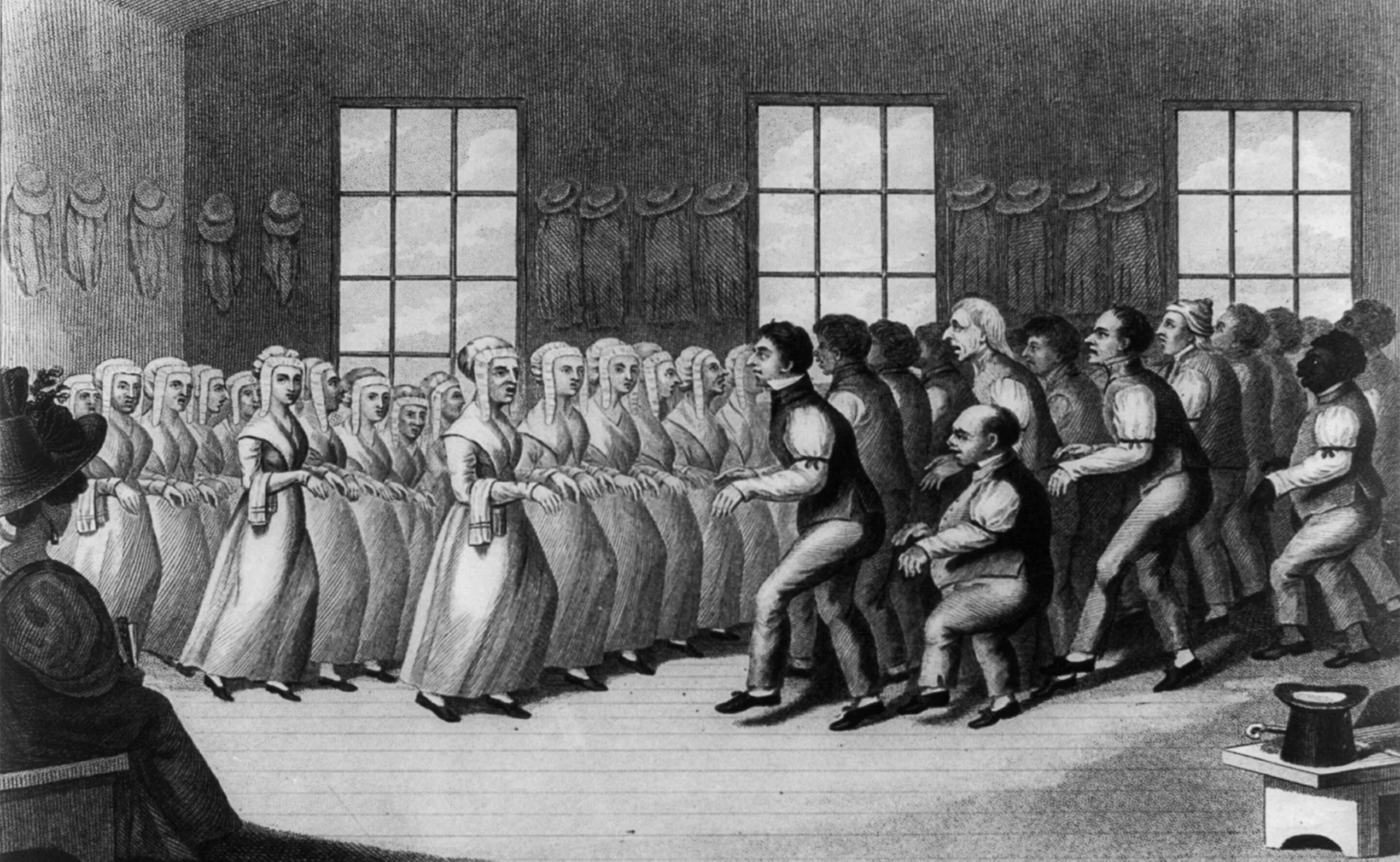
This same sobriety, both religious and existential, can be found among the Irish Shakers, a marginal society of Protestants who already practiced a certain form of asceticism in England in the 18th century. Present on American territory and more precisely in New York since its migration in 1774, this self-sufficient religious community gathered around a simple and austere life, where utility and simplicity were paramount. Each object of daily life had to be necessary, useful and beautiful. Their manufacturing, obviously handmade, was made like a prayer. Their mantra “beauty lies in utility” allows them to manufacture -without taking personnal credit for it- objects and furniture of a very high quality, sober, solid… “minimalist“. Ornaments were judged futile and as a distraction from the right path.

Here’s what the Shakers’ interiors looked like, and below is an engraving of the community performing one of their “shaking dances” which reminds us strangely of the Thriller video… (but not sure they were having that much fun).
End of the choregraphy digression.
Linking form and function
These avant-garde minimalist precepts will influence Adolf Loos (the father of modernism, that we write about in our second article about modernism) and feed reflections on form and function. The architect L. H. Sullivan in his 1896 Aesthetic Considerations on the Height of Buildings wrote that “it is the law of all things (…) that life should be recognizable in its expression, that form should always follow function,” making one the living manifestation of the other. Loos will write around 1910 that “the form of a manufactured object is satisfactory if it is as long bearable for us as the object can serve us” adding to the form functionality, durability and aestheticism. Ludwig Mies van der Rohe transformed this idea into his famous “less is more” in the 1920s at the Bauhaus school, encouraging artist-craftsmen to free themselves from the unnecessary. The graphic designer Müller-Brockmann, founder of the International Modern Style (more commonly known as the Swiss International Style), said in the 1960s that “when the problem of information is solved on a practical, objective and aesthetic level, the language of form will break through its traditional understanding, to become a universal language.” Universality being achieved through a simplified form that is at once beautiful, useful and understandable by all. It is this near-mystical quest for pure form and universalism that gives birth to minimalism.
Minimalism is above all an artistic movement
The interactions and migrations between Europe and the United States from the 1920s, particularly in Germany, and then in the 1950s, gave rise to a need for rationalization, standardization and a quest for universalism (this is what we will discuss in greater depth in our third article on modernism). The geometrical form quickly becomes a support of expression (in art, graphics, typography…) vector of universality. At that time, we don’t talk about “minimalism” but about “modernism”, even if the two terms quickly merge.
The term “minimalism” really appears for the first time in New York, in the mid sixties. Many artists and designers had fled Europe to settle in the United States after the war, and New York was the new art capital, having dethroned Paris. Minimalism in art characterized by then the astonishing production of artists such as Frank Stella, Donald Judd, or Robert Morris who exhibited their geometric works for the first time… leaving the spectators perplexed.
Minimalism is the term used to define this form of abstract art devoid of affect that rejects figurative art forms and classical themes. The artist disappears to make room for a form and a concept that can be reproduced in series, an industrializable art-object, built through a precise and calculable system. Minimalism thus does not come from religious ascetics or graphic designers, but from the Art world.
Questioning and the sublime of pure form
The minimalist work is insignificant, conveying neither subjectivity nor symbolism, and reveals a form such as it is in order to arouse questioning from the viewer. For these artists, the sensation of calm and order provoked by minimalist forms is the same as that provided by great monuments like Stonehenge or Zen Buddhist gardens. It is a temporal experience of space where lies the notion of sublime.
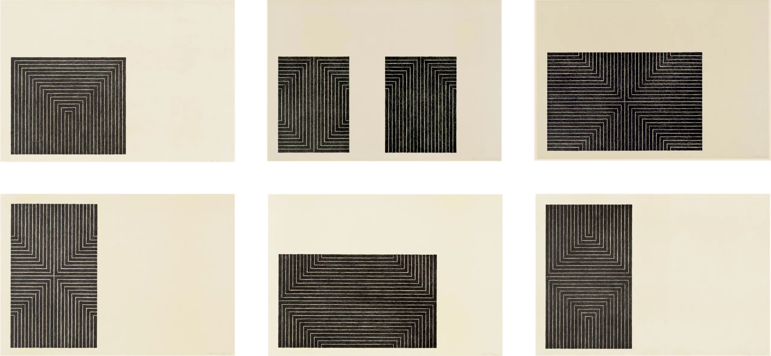
Franck Stella (above), a major figure of minimalist art, said that “what you see is what you see“, preventing the viewer from analyzing what they see, and inviting them to see only the efficiency of the form as it is, without superfluous. Heir to the Bauhaus, itself stemming from the de Stijl movement and Russian Suprematism, Minimalism is above all a visual language that symbolizes faith in pure form.
Whereas art used to push one to feel an emotion by grasping some kind of symbolism, minimalist art serves “to raise the viewer’s pre-existing thoughts and emotions, through the question ‘what does it mean?'” as Darby Bannard writes in Recentness of sculpture. One can think of the famous black monolith in 2001: A Space Odyssey, which fascinates the apes and then the humans, without ever offering any answers.
The common language of minimalist art and graphic design
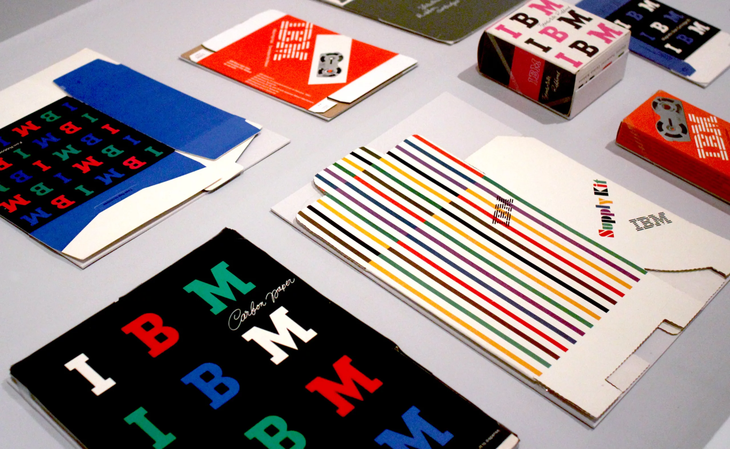
It is interesting to note that in Chicago at the same time, in 1964, the TRADEMARKS/USA exhibition took place, which for the first time honored 20 years of graphic corporate identity of large American companies and their geometrical logos. After the war, the means of production and distribution were centralized by federal agencies that managed several companies whose mergers gave birth to the first very large American companies.
Their image being confused with the general public, it was necessary to create an identity for them: the great graphic designers such as Paul Rand (below), Saul Bass, or Lester Beall designed the new face of these corporations. The logotypes, geometrical, became analogous to the functioning of these new large companies according to first style guides. Systematic and modular, they followed a standardized system directly inspired by contemporary art forms such as Minimalism or the Swiss Style.

The synchronicity of the emergence of minimalism and this graphic exhibition allows us to draw an obvious line between these two forms of expression. The first, artistic, produces a form of mathematical art, without affect or subjectivity, standardized by precise measurements. The TRADEMARKS/USA exhibition echoes the graphic layout system, with the logotype and the charter that frame and standardize the creation.
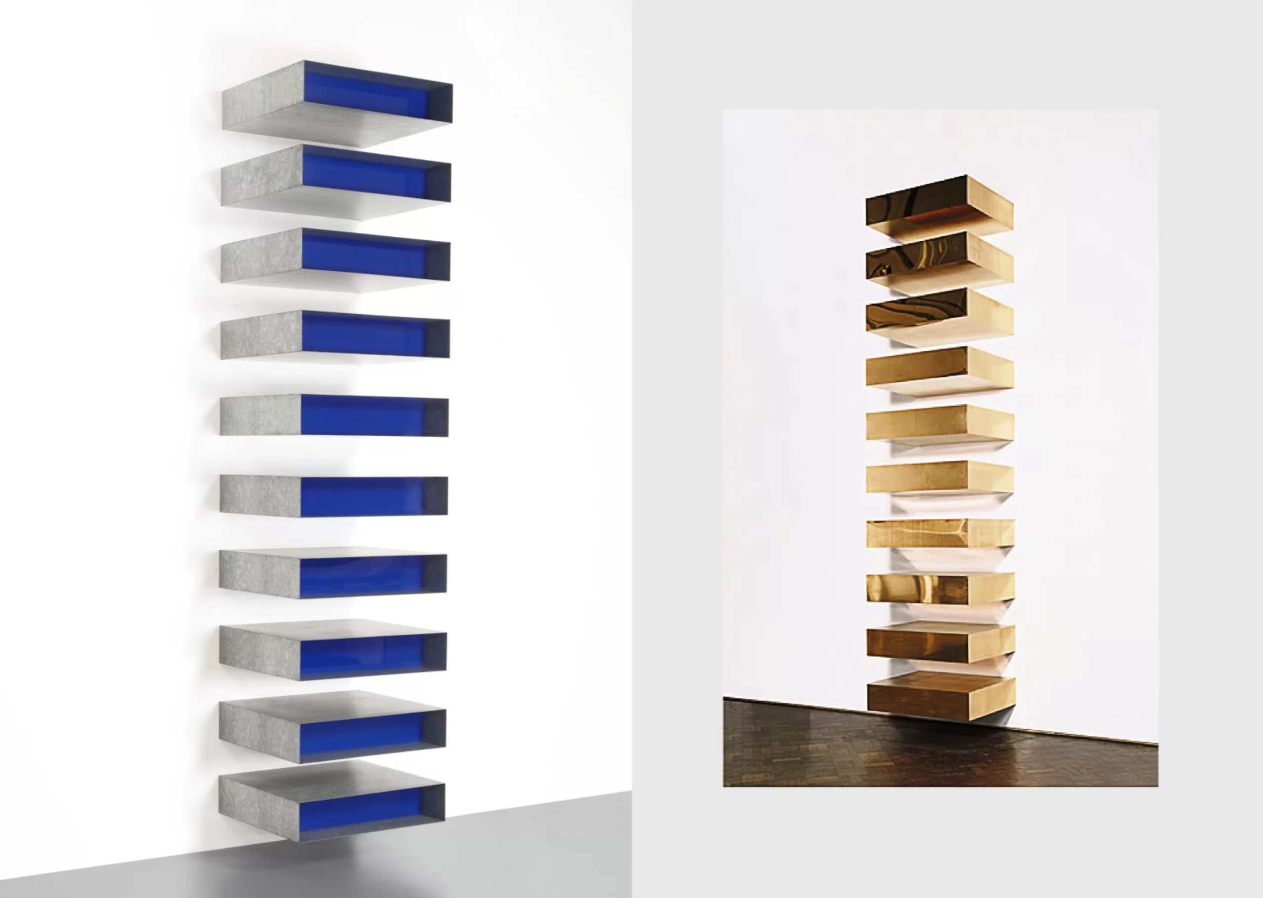
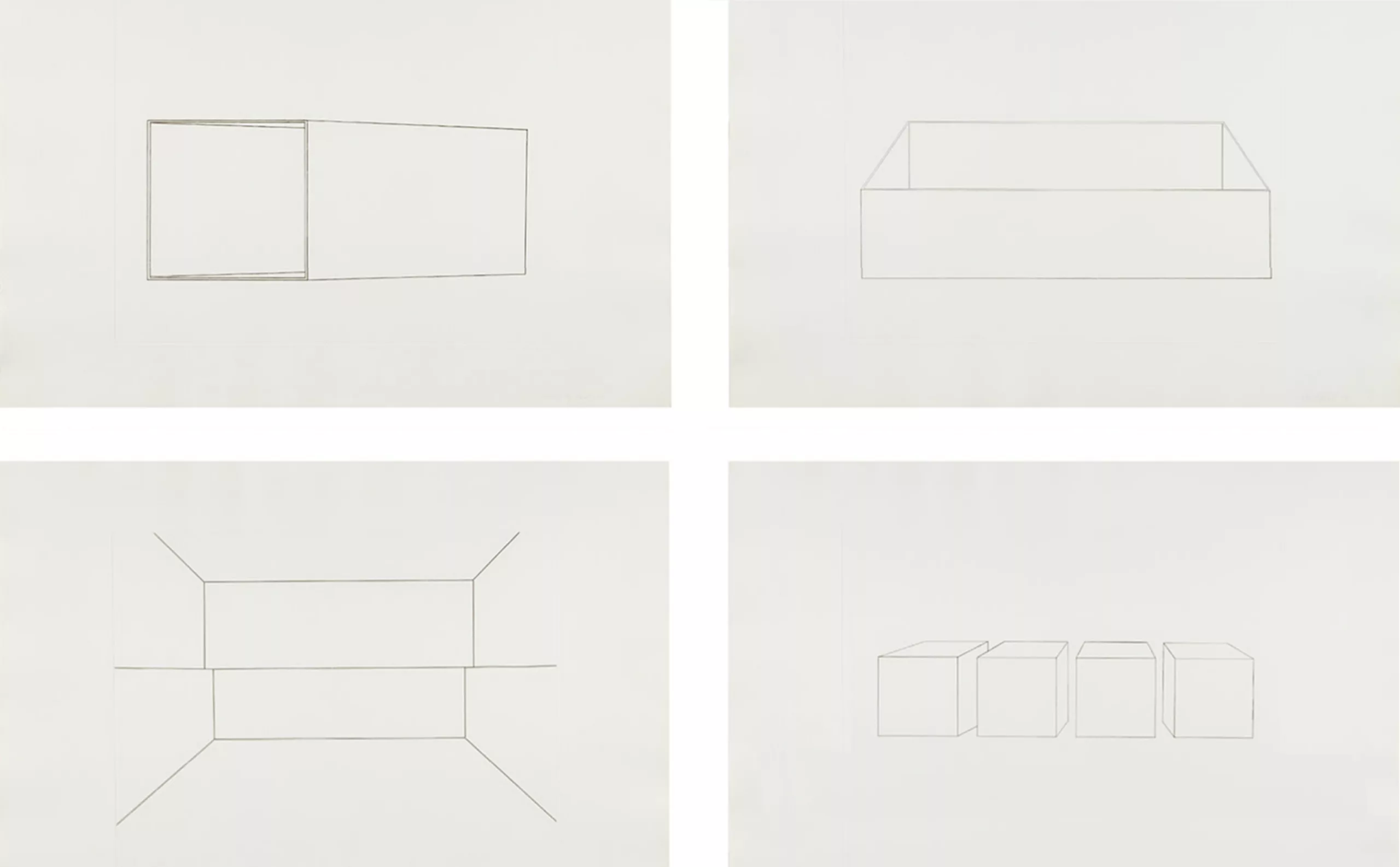
Both are similar in one way: the respect of what Lester Beall calls a “system of use”. For the graphic designer, it is the objective measurement between several elements such as the space or void between letters and lines, page edges, grids and curves… that allow for the creation of “a mark that is the sign of individuality, and at the same time has the qualities for widespread use.” At Donald Judd‘s (below), artistic leader of the minimalist movement, measurements indicate precisely the size of each installed box, the spacing between each one, and the distance from the walls, allowing the work to be reproduced identically from independent elements arranged in this precise order.
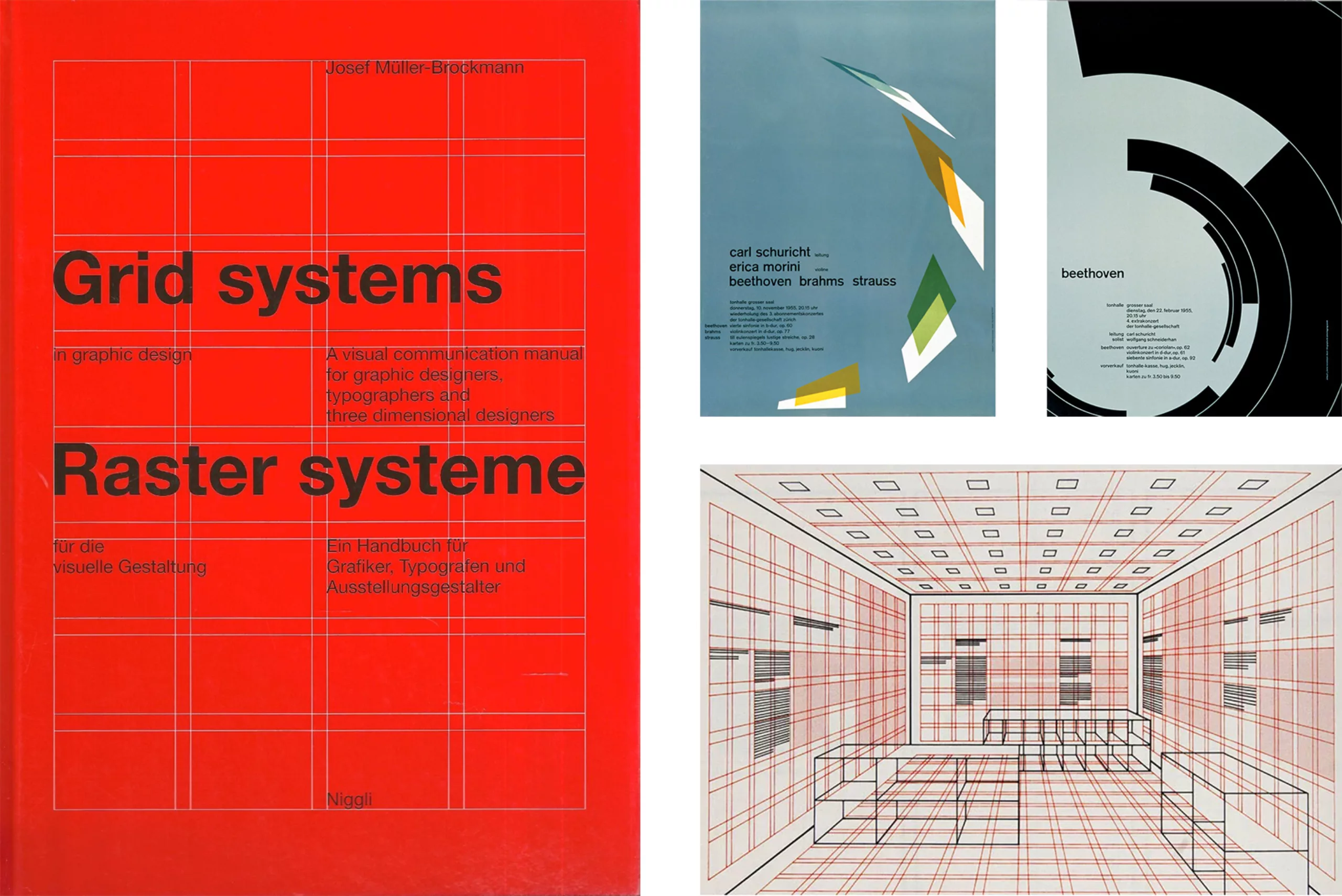
This is what Walter Gropius calls the “gestalt”, the feeling of the whole. Each element, be it in arts of in graphic design, is both autonomous and part of a whole: it is their relationship together that creates something. This is where the term minimalism links to modernist graphics, the construction of both hinging on the same system of measurements with geometry as a pure universal language.
However, we can observe some differences between the purposes of Minimalist art and Modernist graphic design. The Minimalist art uses standardization to go beyond the condition of the man through a perfectly industrializable and mathematical art, while the graphic design uses norms and grids as a framework to structure and let the creativity express itself. The universalism of the first seeks an absolute that surpasses the human, while the second has a sociopolitical vocation of universality, which on the contrary is very human.
The minimalist trend
Applied to graphic design, we see today and since a few years a trend of flat logos (flat, without effects), with geometrical lineal without serif (future, helvetica, proxima nova), in monochrome colors. And we must believe that it is popular, because this homogenization of brand identities in all fields is now a comfortably installed reality that can be seen all over the world. This “minimalist style” (or “neutral”) was propelled by the Silicon Valley giants (Facebook, Uber, Google and Spotify) in 2010 when they abandoned the 3D and textural effects of their former identities, in parallel with technological evolutions, opening the digital era. And all agencies are playing along… including us.
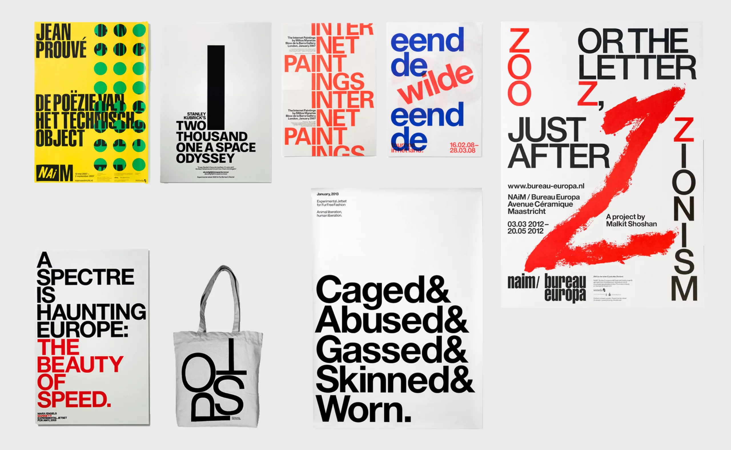
Experimental Jetset (above) or Spassky Fischer (below) Dutch and French studios apply to all their creations aesthetic constraints of graphic construction from a grid, with only one or two families of typographic characters, in a very Swiss style. If their work remains very creative despite these constraints, the graphic signature of these studios seems to take over the identity of the projects. In the image above we see the typographic poster of 2001 a Space Odyssey with the gigantic letter I in Futura (of which Kubrick was an absolute fan because it was linear, “clean and elegant”), which draws the monolith of the film. This poster realizes visually and in the most minimalist way possible the link between Kubrick’s universe and his cult film.
The risk is that brands all look the same and offer the same thing, from credit cards to transportation services to hamburgers, luxury or cars, translating the same service: a smooth and frictionless user experience, accessible online and easy to use, through an all-digital design that no longer has much of a human touch. Today’s graphic minimalism has become a marketing image and is asserted as an end in itself, where the brand no longer needs to shout to be heard. Its name is enough for it to exist or to proclaim itself as such, like a monument, a minimalist work of art: a monolith? But will it touch humans?
Can anyone do a minimalist poster?
Pushed to the extreme in this simplicity and reproducibility, minimalism can lead the viewer to think that “anyone can do that”. The “brick scandal” in the art world resonates particularly today with some of these minimalist graphic identities that seem to require minimal work, if not the use of tools subject to systematic rules: in 1972 the artist Carl Andre, who assembled raw standardized materials, provoked a scandal in the press and public opinion by placing 120 bricks of equivalent dimensions on the floor, which were bought for several thousand dollars by the Tate in London. Beatrice Warde affirms however that “vulgar ostentation is twice as easy as discipline”: simplifying thus requires a certain form of discipline, an asceticism, and a capacity of deconstructing what has been acquired, which paradoxically induces an additional work of conceptual research, however invisible!
In her book The Longing for Less: Living with Minimalism, Kyle Chayka explains that underneath the apparent simplicity of “less is more” lies a luring complexity. Companies with a smooth and easy-to-use interface or identity often hide behind these nice tools complex and pernicious ways to collect our data or consumption habits without our knowledge no consent, to dehumanize the work, and replace humans by robots. We see it with Uber, the companies that deliver groceries in less than 15 minutes, or on social networks.
The goal of these dematerialized or “uberized” services is to make humans work as machines to accumulate data on human users, before replacing this workforce by machines, if it is not already done (after-sales service chat, content creation or moderating…). Recently, Adobe has even launched a “smart” logo generator that allows you to “start without thinking” from preconceived creative models (they ironically used one of our logos as an illustration in their communication campaign on the networks). What about replacing graphic designers with the advent of AI? Today, we can question the relevance of this oversimplification and the limits of the application of a standardized model in an increasingly standardized world, where everything is more and more similar.
Recently, moreover, the gradient and handwritten typography or 70s are making a comeback – probably to bring the opposite: the shift and curves, in response to this overdose sometimes too smooth and systematic … We can see this with Félicité Landrivon for example (below), or Bad Studio. The realizations are less systematic and more unique, with a more artistic unique style.

Minimalism in reaction to the overwhelming modern world
Minimalism or its variations illustrate at their origins a need for sobriety springing up for several reasons, but always confronted with a very particular and often chaotic context, which has nothing to do with a short term trend. The first sans serif typefaces were born, for example, in an overloaded visual universe, to bring visibility and simplicity to advertising messages. Egyptian and grotesque typefaces appeared around 1820 to de-saturate advertising posters, which were then filled with ornamental handwritten typography that was often difficult to decipher. This is what we talk about in our first article of our series on modernism. Indeed, this desire to simplify is born in reaction to an overflow. The more the context is chaotic, the more the need is made to simplify, and conversely the more the universe is pure and simple, the more the communication must be noisy to stand out: it is the visual distinction which creates the visibility. This perpetual need for legibility leads to an inevitable alternation between simplicity and overload.
The need for sobriety can also arise because of social unrest, in an impulse of social and cultural emancipation to allow the liberation of workers and spread a widest possible message. It is the case for example the school of the Bauhaus in the years 1920 – 1930 which freed itself from the bourgeois ornaments following the suprematist theories of Adolf Loos. The Bauhaus promoted art and then industrial design in which form follows function; that is to say that objects are conceived to be useful first, with a simplified design at the service of this use, and not imagined first for their aestheticism (as was the case with Art Nouveau for example). One can also think of the pictographic system of universal statistics by image, the Isotype, which allowed as early as 1925 the very simple and efficient sharing of economic, political and social data to the working class populations, in a context of social struggle against the all-powerful bourgeoisie. These values are no longer relevant today; the social movements’ branding style uses more the codes of manifestos, with large hand-painted letters, than of modernism.
Finally, minimalism can appear in a context of creative impoverishment, in a standardized world that has exhausted the question of simplification and applies methods by mimicry without necessarily questioning their origin or their real usefulness; this is partly the case for today’s graphic design. The International Swiss graphic system, questioned with the psychedelism of the 60s-70s, persists today in our ultra-consumerist society because it allows to reveal and give life to a visual identity while being invisible. This idea comes from Beatrice Warde who stipulates in 1956 in The Crystal Goblet, Sixteen Essays on Typography that the text characters must be like a crystal glass for wine; fading away to better let it reveal itself. This model of graphic standardization, still studied today in schools and applied to graphic design or sometimes as a simple marketing style, seems nevertheless to have reached its limits, especially when we question, as we do now, its origins, at a time when universality meant “white western countries”, challenging the validity of its supposed “universalism”.
It seems that the original power of minimalism has been diverted, impoverished, reused by this consumerist society that seeks more to please than to question. Capitalism recovers and assimilates almost systematically all the systems of practices which are opposed to it, to make something profitable of it… In this visually crowded world, minimalism has however perfectly its place to continue to leave space to wandering thoughts: it is up to us to make good use of it and to restore meaning to it. Is minimalism dead? Long live minimalism!
On the subject
-

Picture stones, fascinating natural wonders
The stones of the French Museum of Natural History design patterns and natural landscapes, fascinating mineral creations of millions of years.
-
Black and blue: registered and exclusive colors?
When artists are the users of an exclusive color, one may wonder if it is the color or its symbolism that unleashes the passions.
-

Barbara Kruger/Supreme: who’s hijacking whom?
Barbara Kruger denounces the over-consumption since the 70s. The Supreme brand has appropriated her graphic codes. But who is hijacking whom?