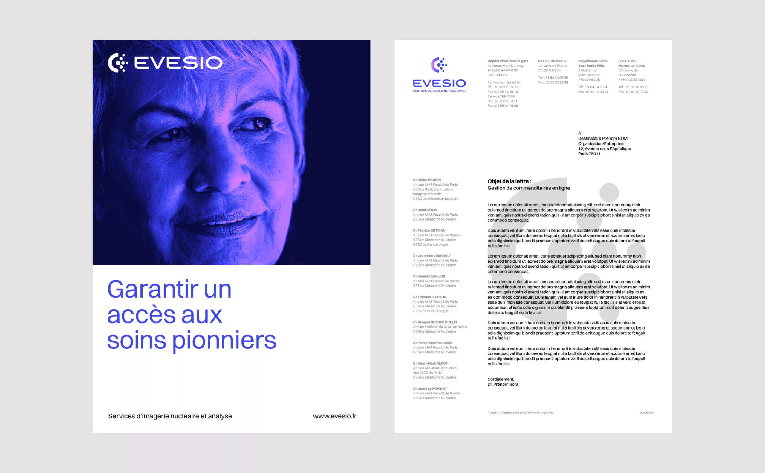
The Centre de Médecine Nucléaire is a nuclear imaging network located in the Paris region. These centres carry out a wide range of nuclear examinations, including scintigraphy, PET scans and SPECT scans. These centres have a two-fold mission: to expand the network nationwide and to defend nuclear medicine for public health. To support this growth, Graphéine guided the centre in the creation of a new name and brand identity.
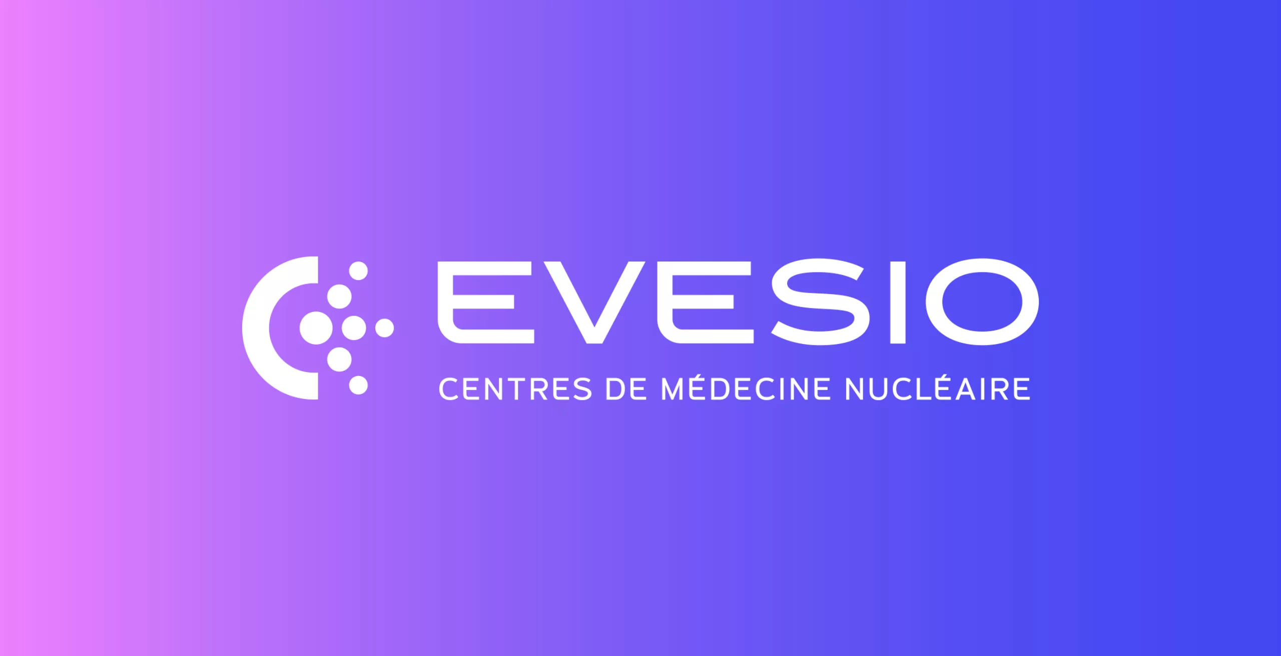
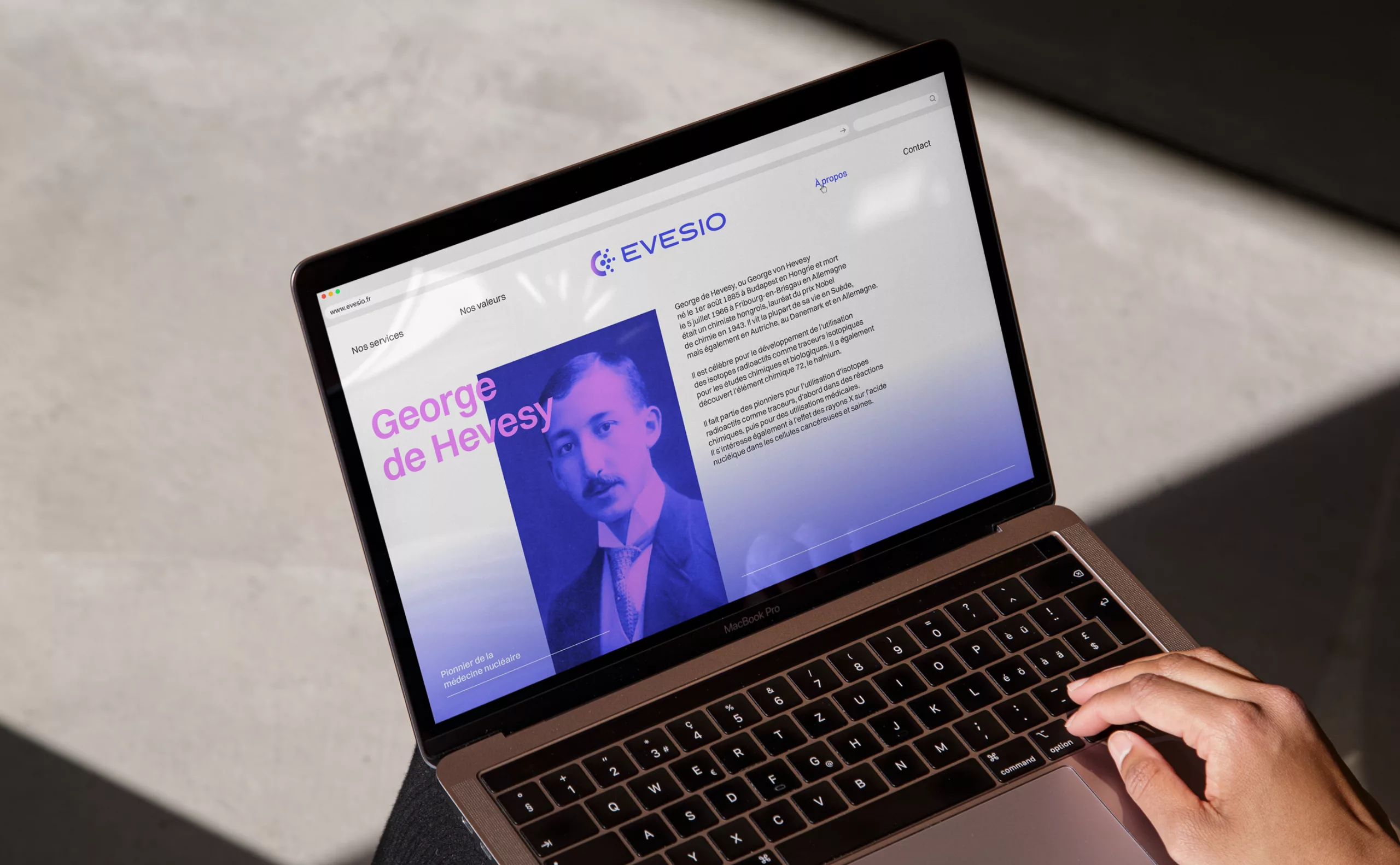
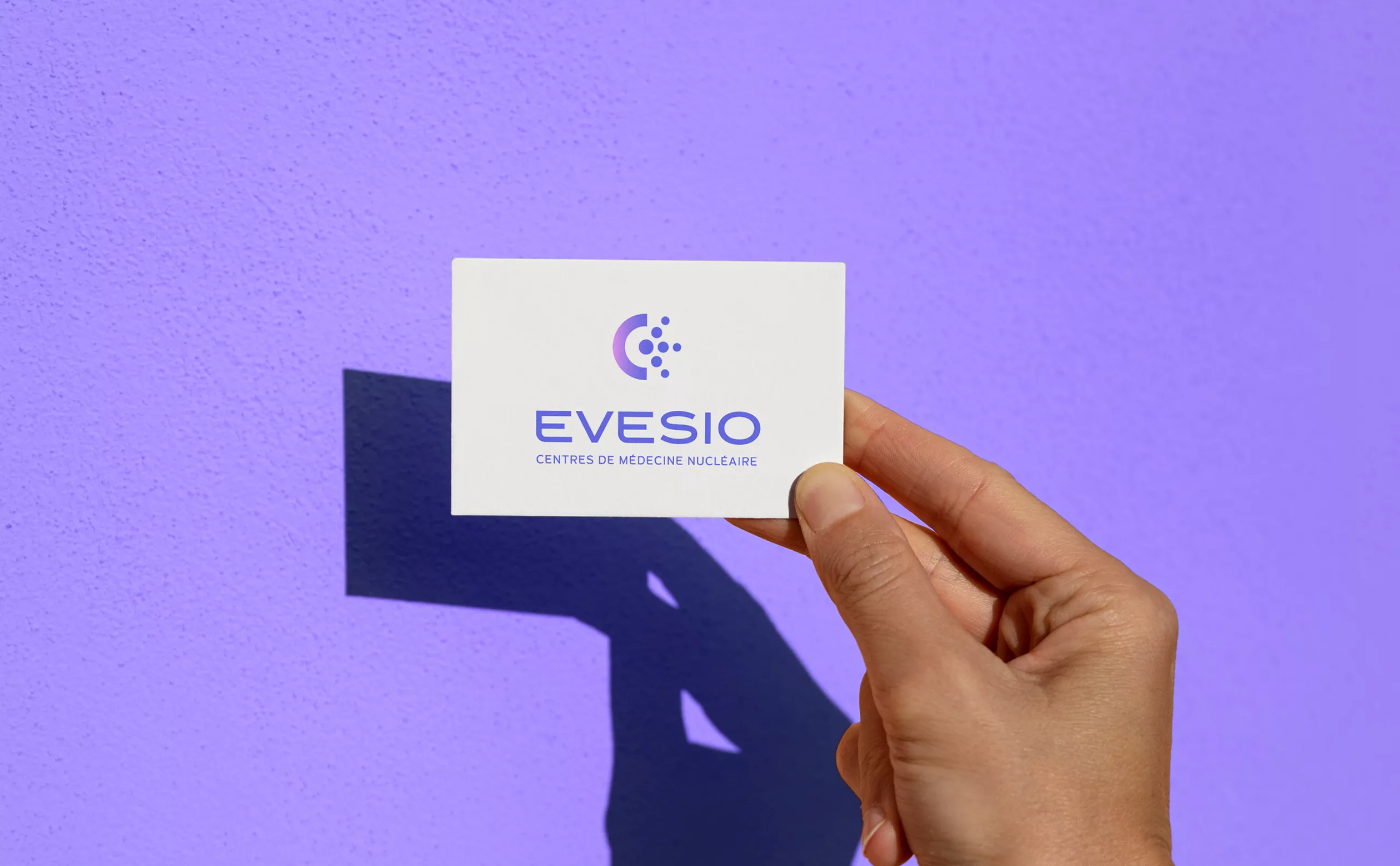
Evesio, Nuclear Medicine Centre
A new name and logo to embody the CMN group's commitment, adaptability and innovation
Communicating nuclear medicine in a reassuring way
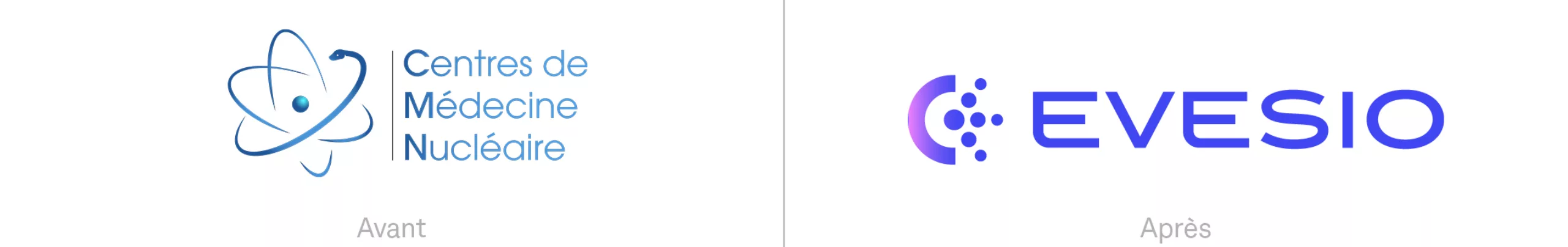
The previous name and logo caused instinctive apprehension because of the presence of the word “Nuclear”. This term dominated the whole name and, reinforced by the “atomic” design of the emblem, brought to mind nuclear energy and other negative associations. The notion of medical care had to be put back at the heart of the identity, and the negative associations associated with nuclear power had to be erased. One of the main challenges of the project was therefore to communicate the nuclear medicine sector in a reassuring way.

An evocative and reassuring name
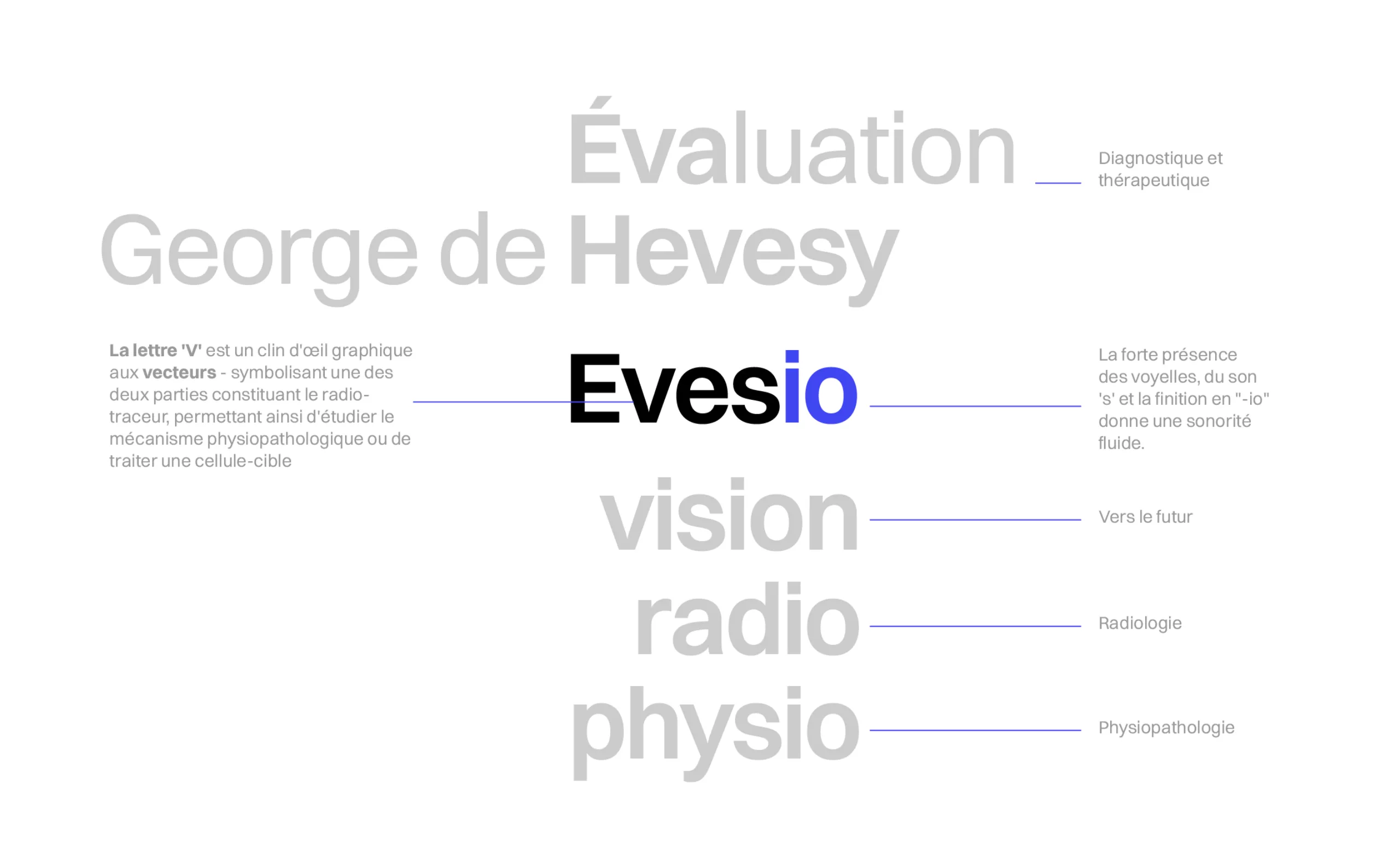
With the aim of communicating nuclear medicine while eliminating anxiety-provoking associations, we came up with an evocative and effective name. The name “Evesio” is a tribute to the scientist George de Hevesy, a pioneer in the development of radiotracers. By paying tribute to Hevesy’s fundamental work in the field, the brand has a name that communicates its mission of innovation and service in nuclear medicine.
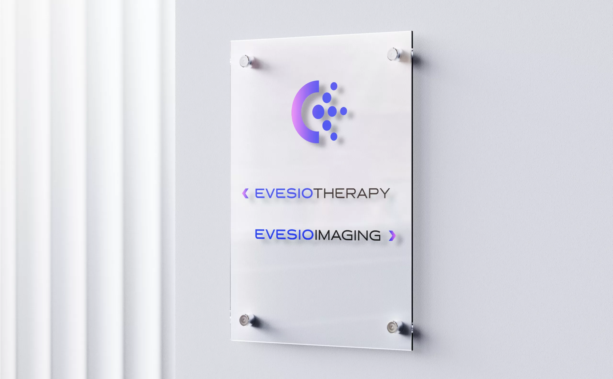
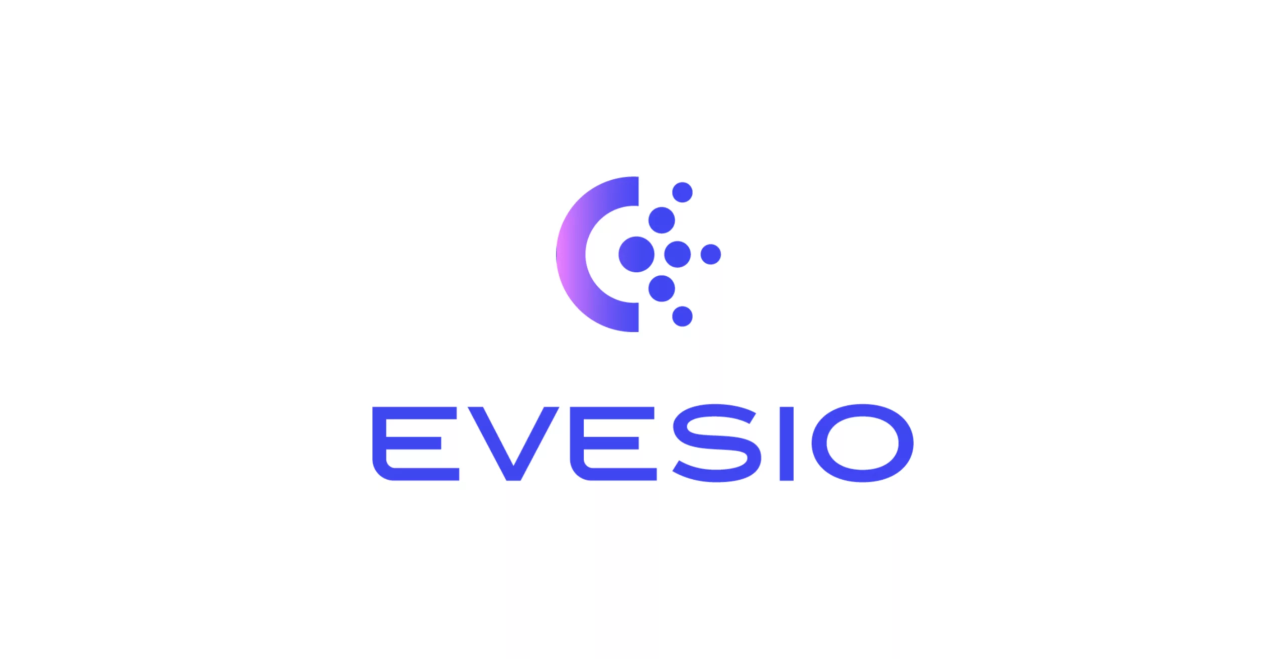
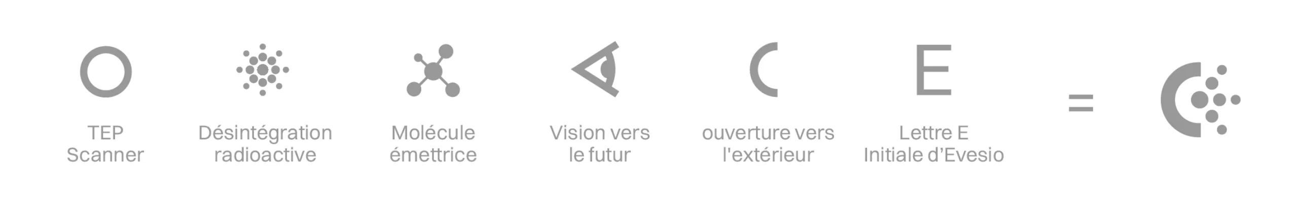
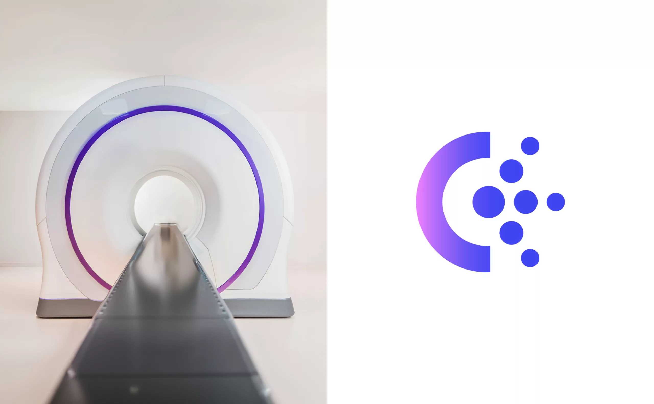
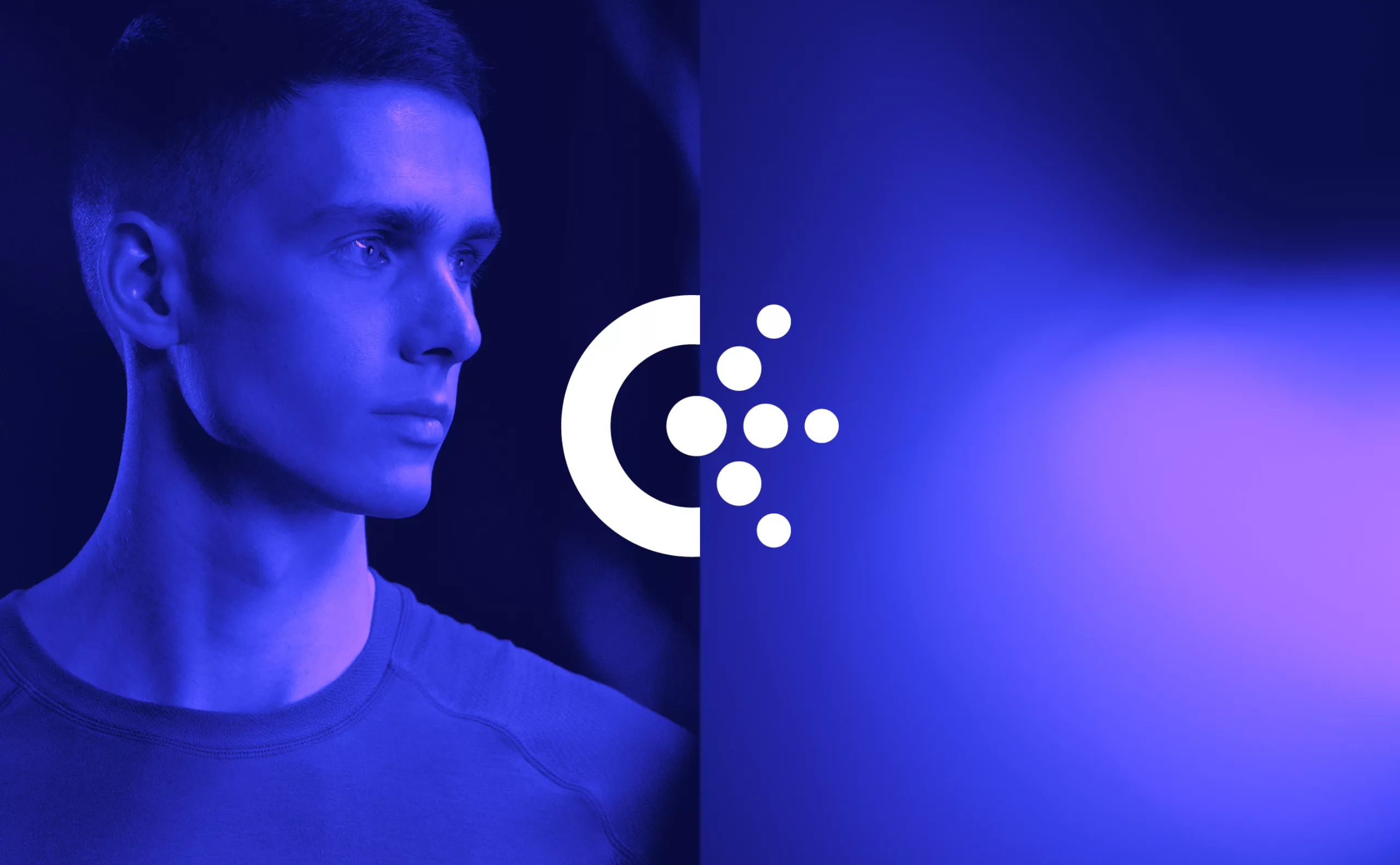
Emblem – Radiant ‘E’
The radiant “E” emblem is the main element of the Evesio identity. This emblem represents the round shape of a PET scanner, while radioactive decay is embodied by the letter E. The 3 emitting branches of the logo symbolise the 3 core professions within Evesio centres: nuclear physician, electro-radiology technician and medical secretary. The geometric semi-circle on the left encompasses the particles that make up the letter “E”, like the scanner that receives the patient. These two parts of the emblem also represent the idea of patient care. In this way, the new emblem communicates the technical precision and reliability of the human care offered by Evesio.
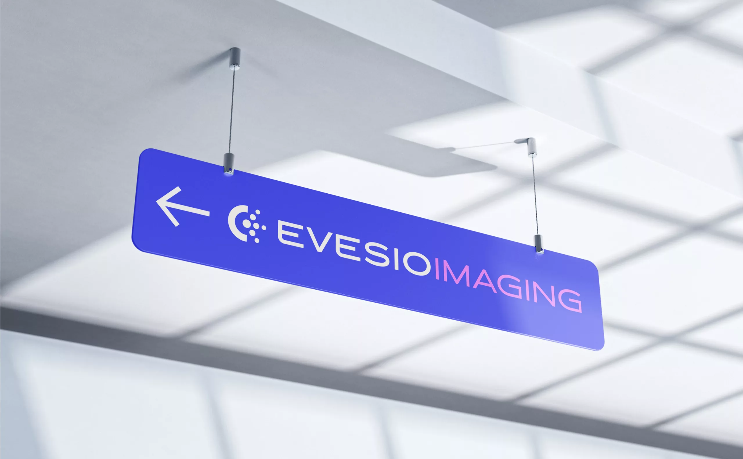
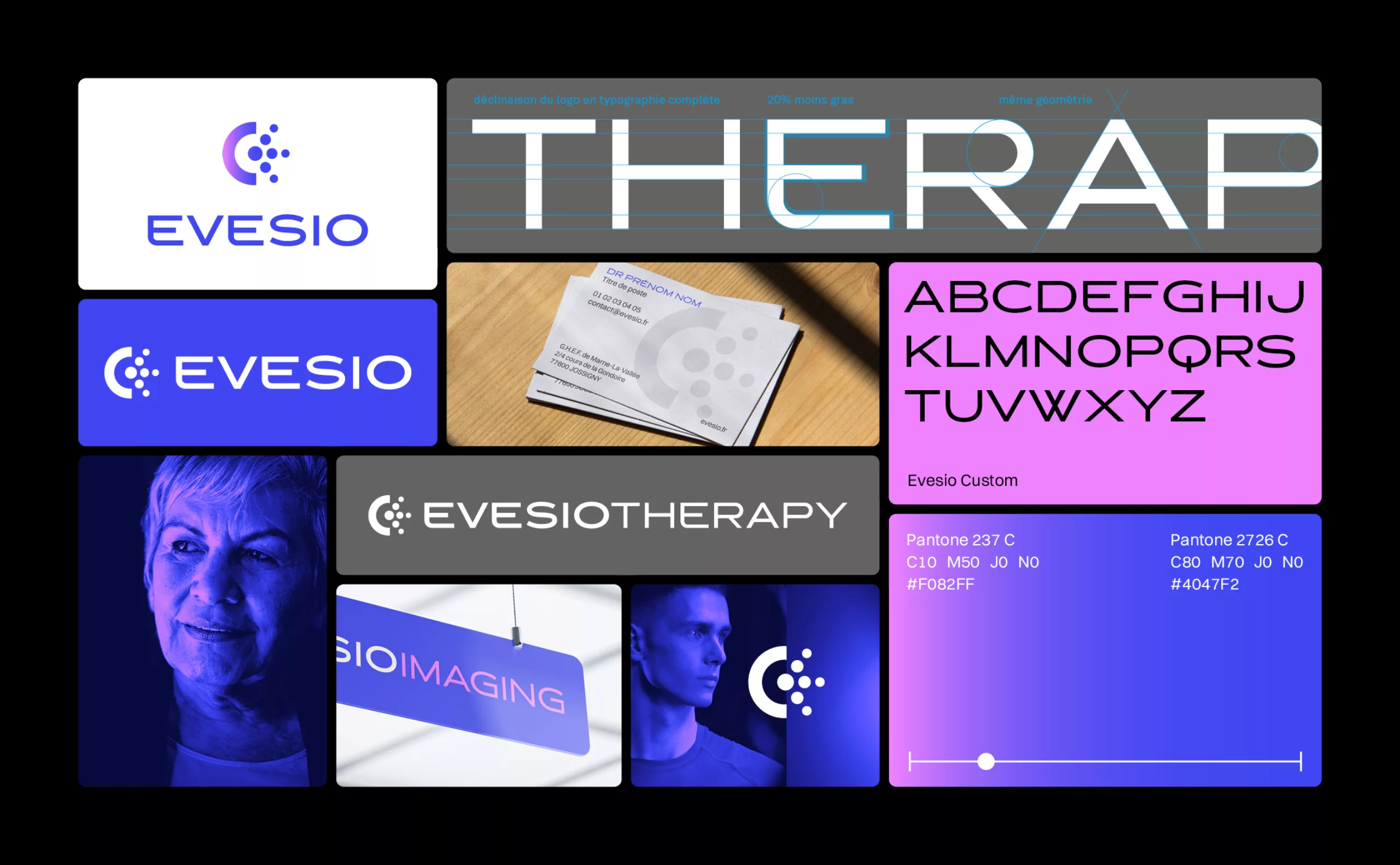
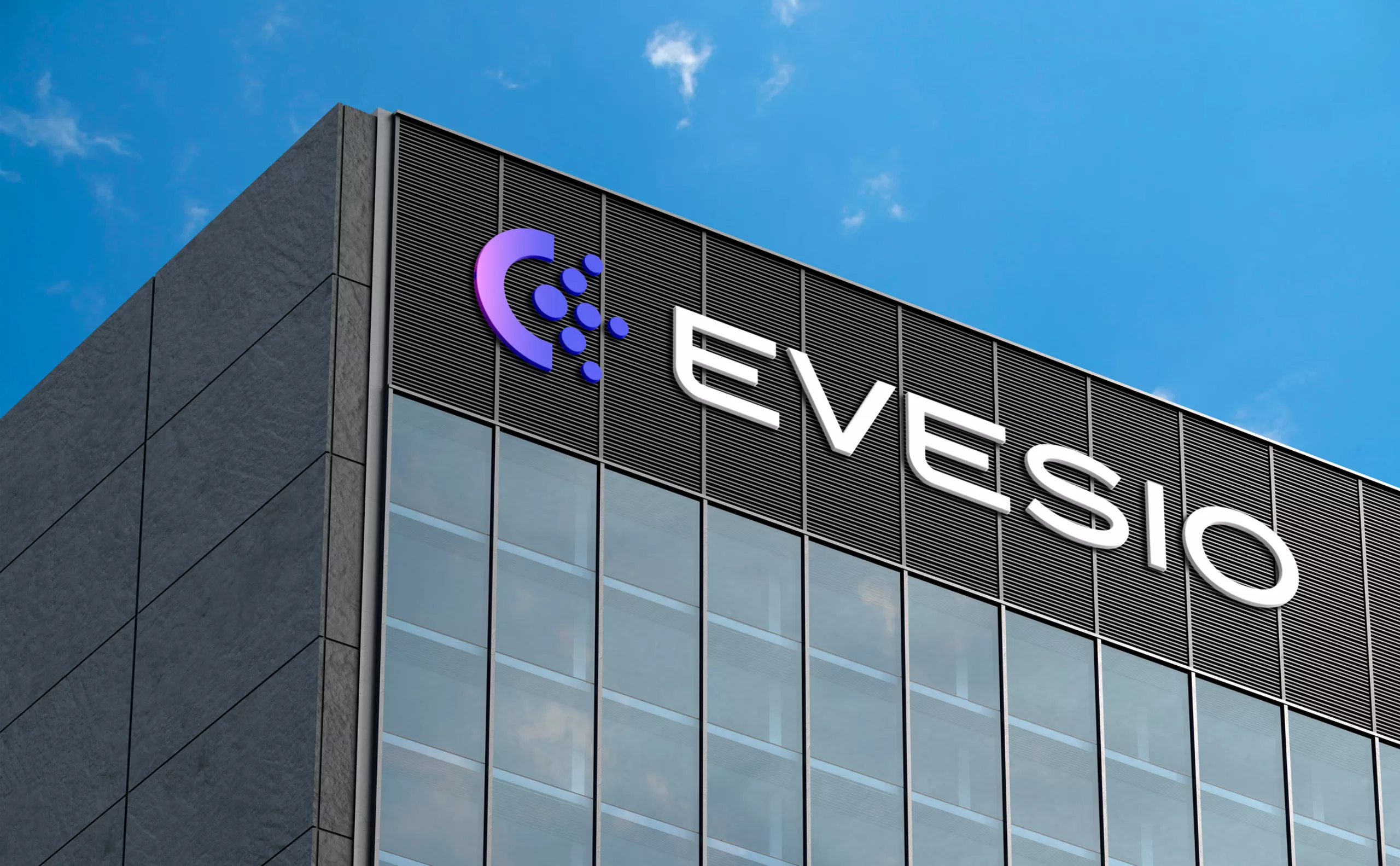
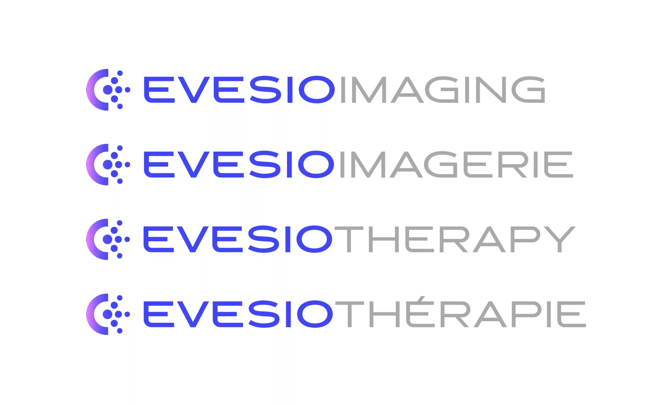
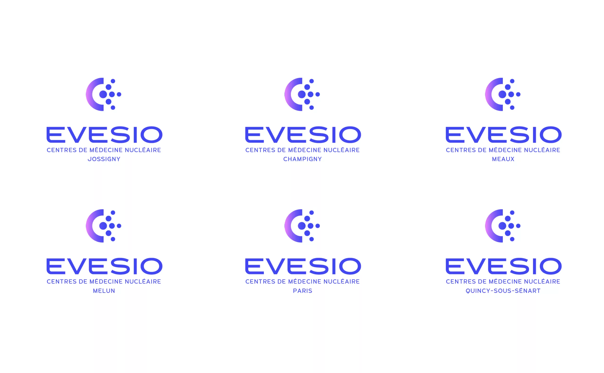
An identity designed for the brand’s evolution
The Evesio identity and name have been designed to support the company as it evolves over time. The identity can be easily adapted to create regional variations or logos for the different services offered by Evesio. The evocative quality of the name Evesio combined with the modernity of the emblem ensure that the identity remains relevant as Evesio evolves.
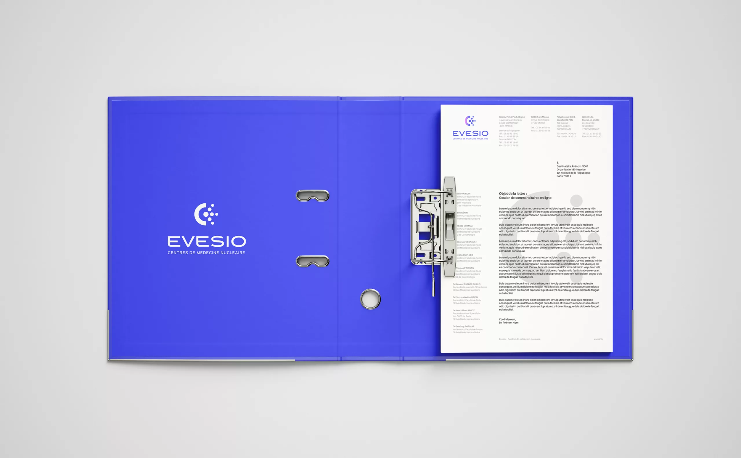
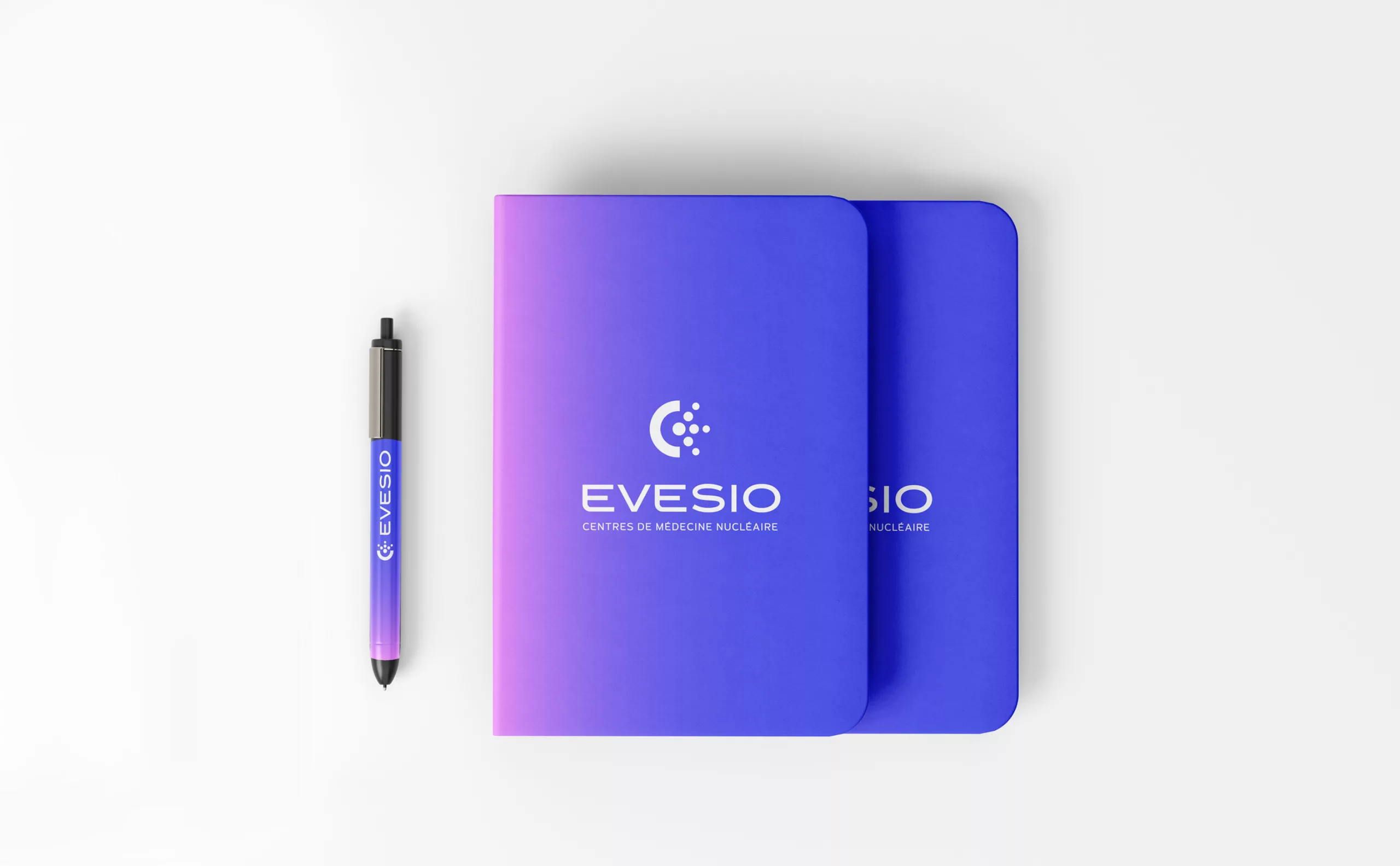
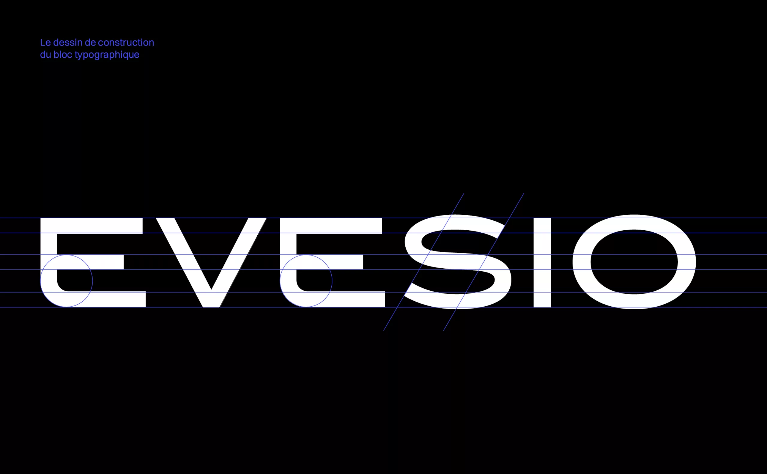
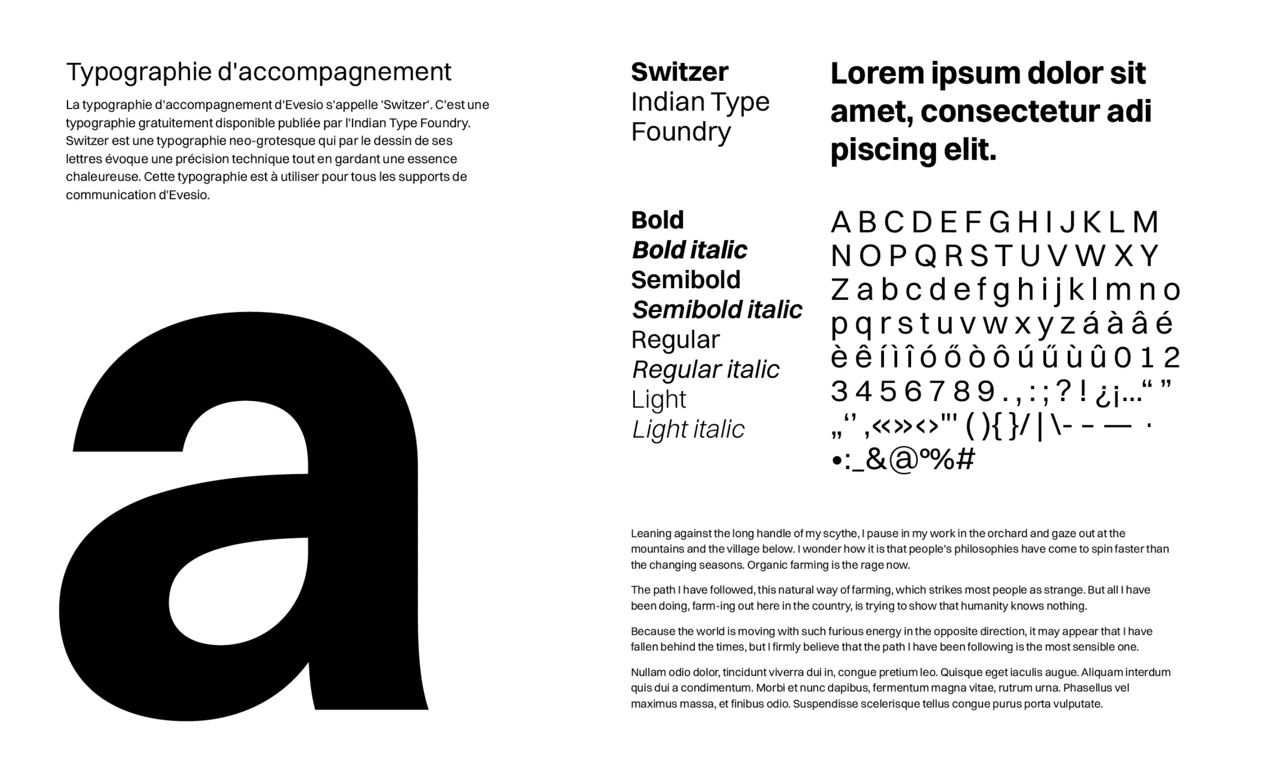
Custom typography
The Evesio typographic block is a custom-designed lettering. The design of its letters evokes technology, innovation and reliability. Based on the details of this design, we have created a custom typeface that is used for the baseline and the various variations of the brand.
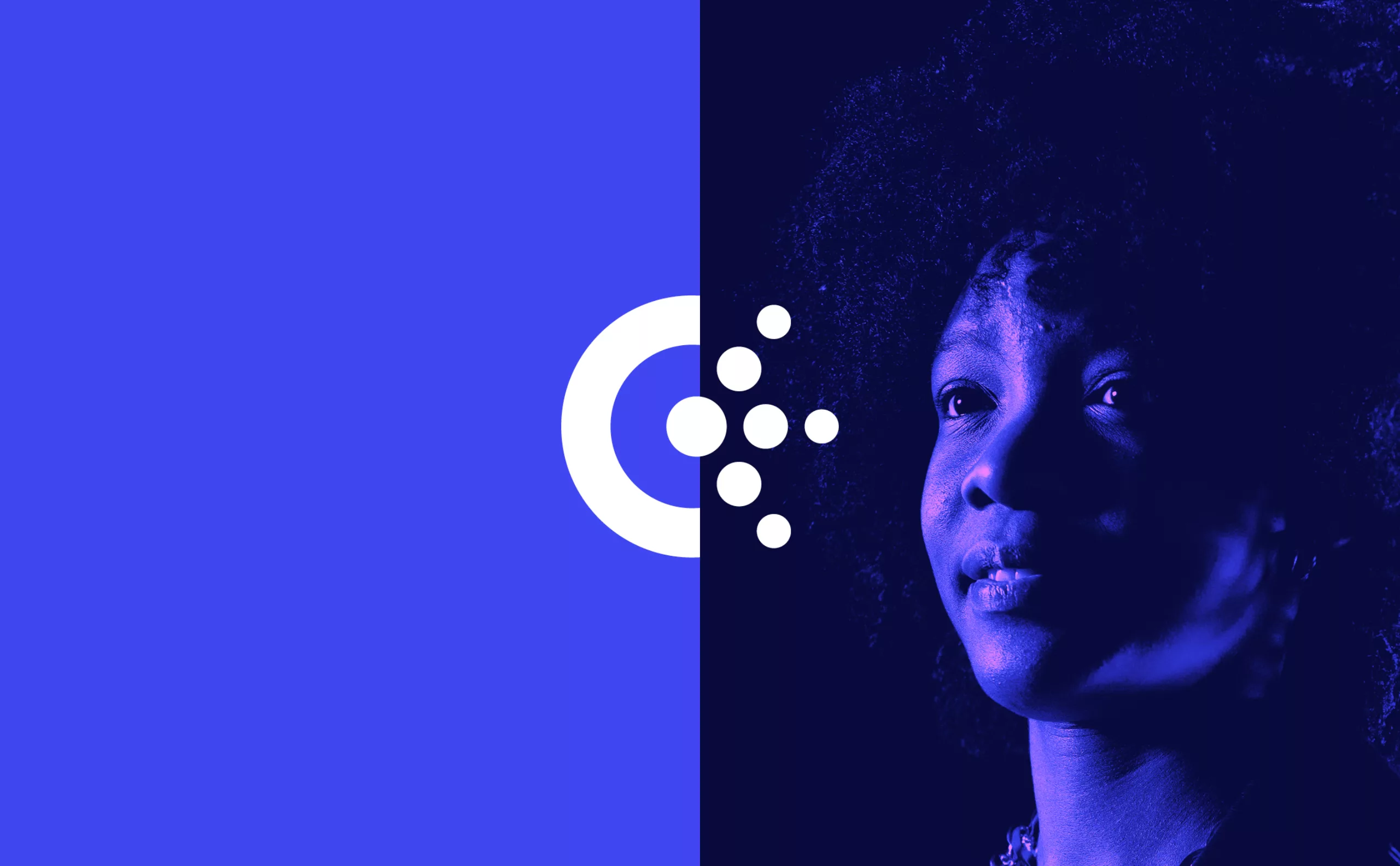
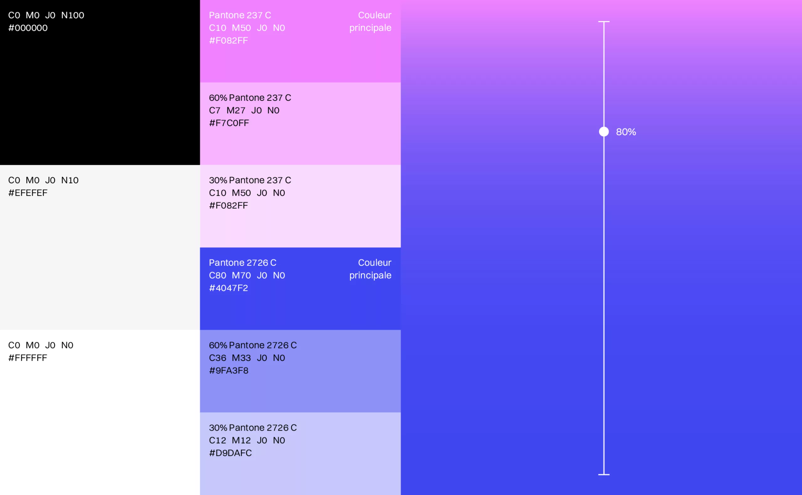
Colours
The Evesio colour range communicates innovation, technology, the idea of radius and precision; but also warm, human care. Violet is a colour synonymous with erudition, knowledge and expertise. Blue represents the medical world and professional service. Pink represents human warmth and care. This range is applied systematically in photographic processing and for the brand’s communication media.