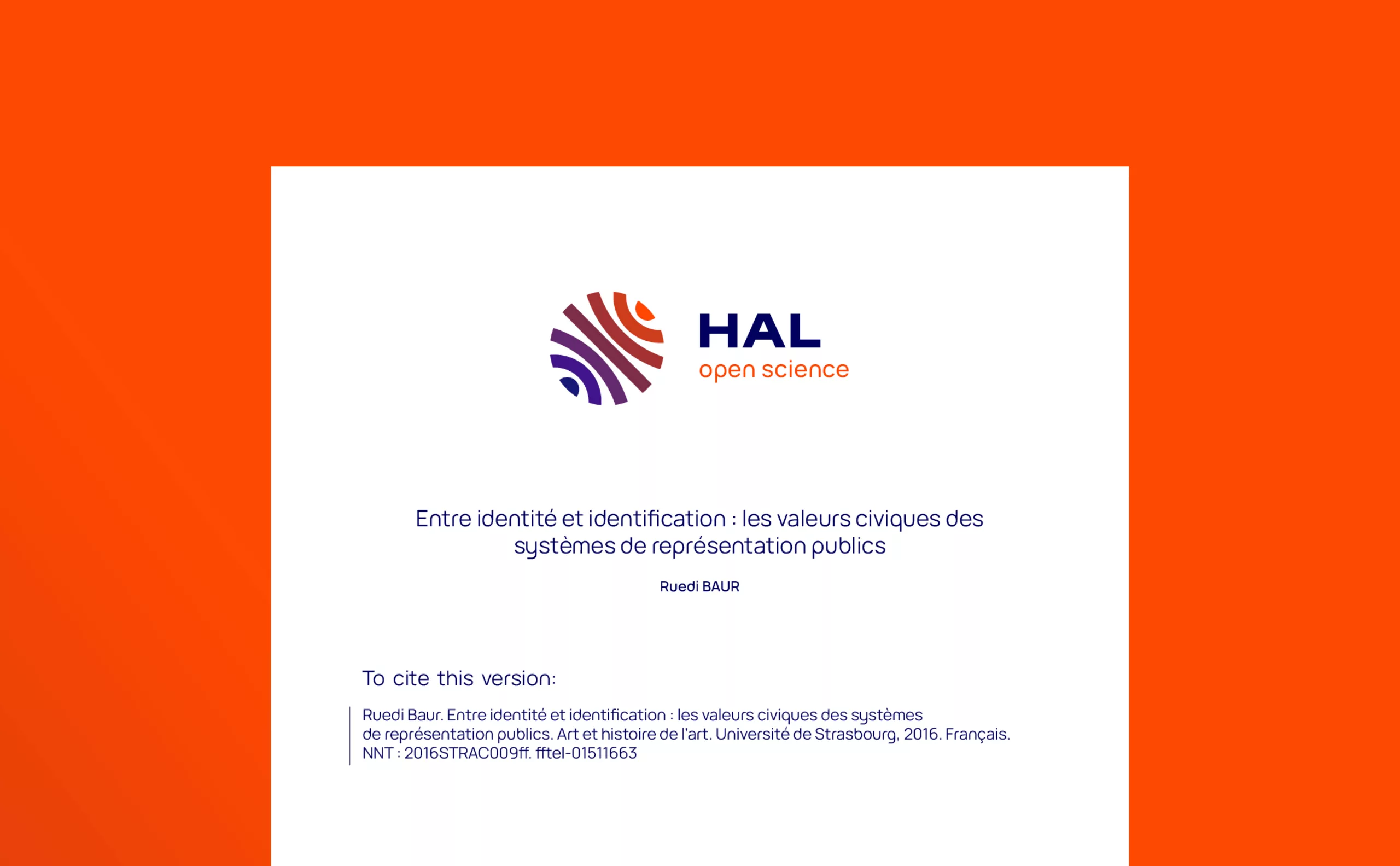
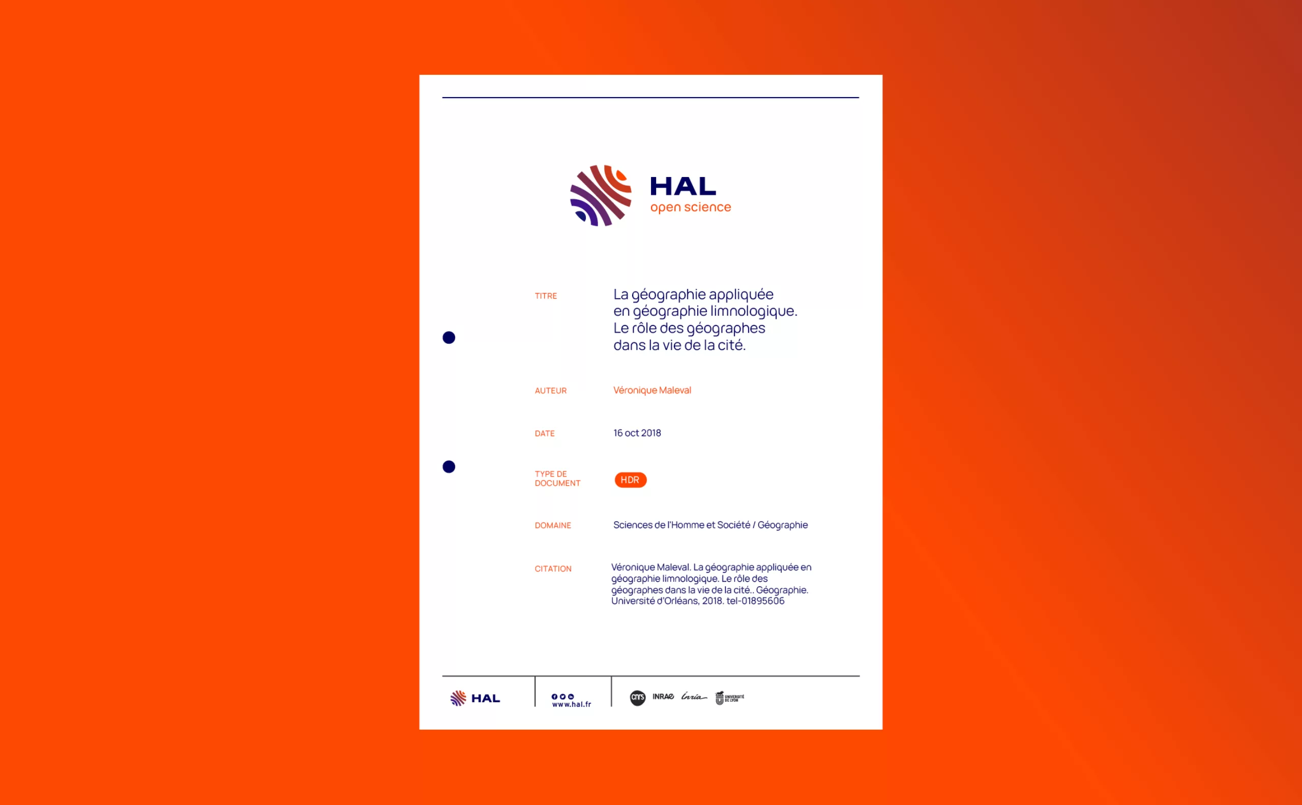
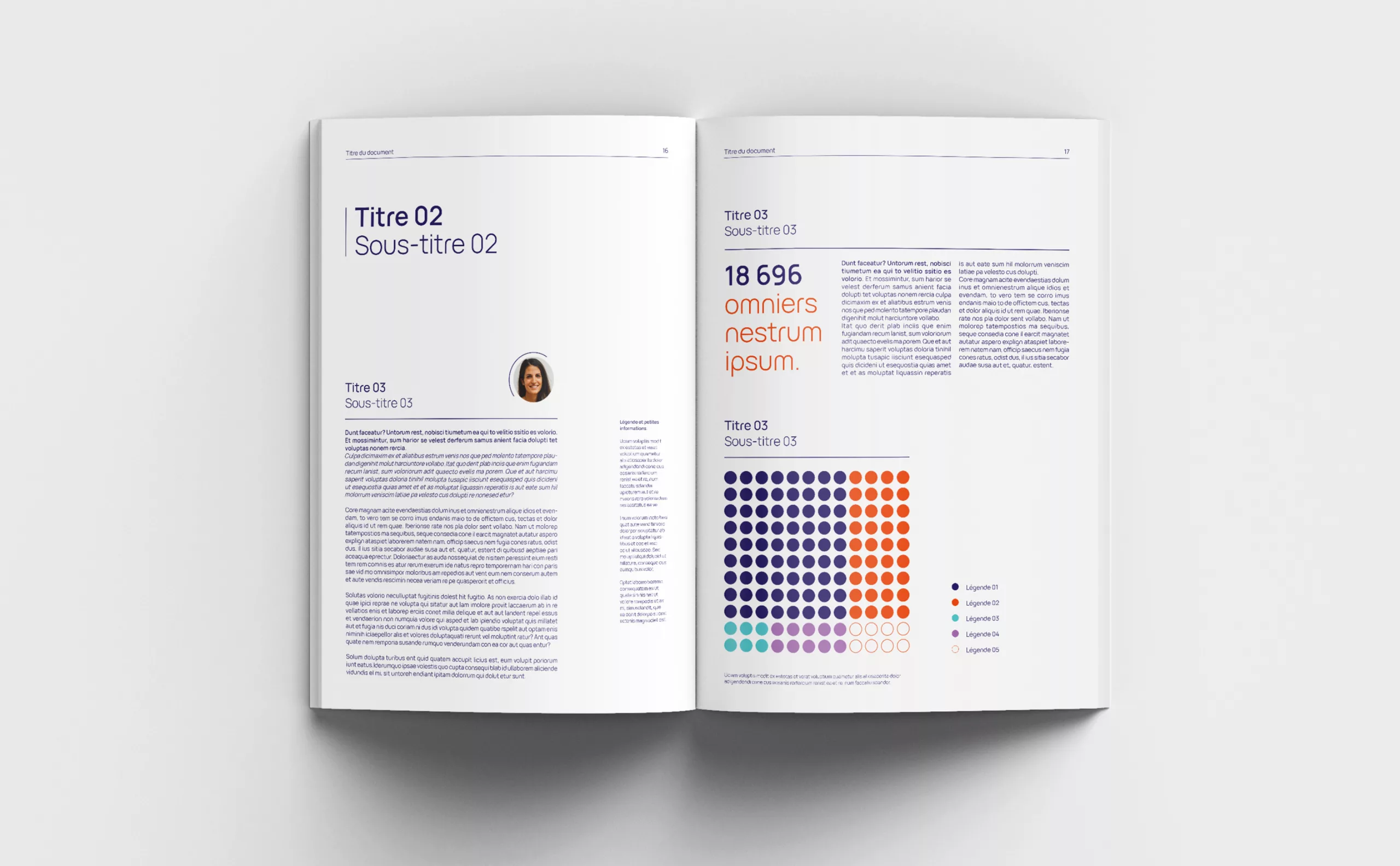
Identité visuelle Centre communication scientifique directe

2022

HAL & CCSD - Center for
Direct Scientific Communication
Serving open science

"Science is a common good that we must share as widely as possible", were the words of Frédérique Vidal, Minister of Higher Education, introducing the National Plan for Open Science in 2018.

Created by the CNRS in 2000, the CCSD - Centre pour la Communication Scientifique Directe serves the research community. Its mission is to archive and disseminate knowledge for the advancement of science.  It creates, develops and administers the HAL open archive, the SciencesConf conference management platform and the Episciences open-access journal management platform.

The CCSD has its origins in the culture of teaching, research and science in the broadest sense. Its history is closely linked to the emergence of the Internet and the culture of open science. HAL can be considered to be to the web what the encyclopedia is to the printing press: a first-rate vehicle for scientific progress.

It is a gateway for knowledge, following in the footsteps of the great library of Alexandria, the first medieval universities where the liberal arts were taught, and the emergence of the printing press, which enabled the dissemination of knowledge and led to the Renaissance. The center is part of this great history, and today contributes its stone to the formidable edifice that is Science, always with the same goal in mind: to advance it, to better understand and improve the world around us.

Graphéine brought our expertise to the project, helping the CCSD to redesign its brand architecture. While sharing, openness and accessibility are at the heart of the CSSD's missions, its previous identity did not reflect this. We needed to work on a coherent and meaningful architecture, to affirm today's values and showcase those of tomorrow.

logotype avant après CCSD science ouverte
07-CCSD-communication-open-science-presentation

CCSD at the service of its 3 brands

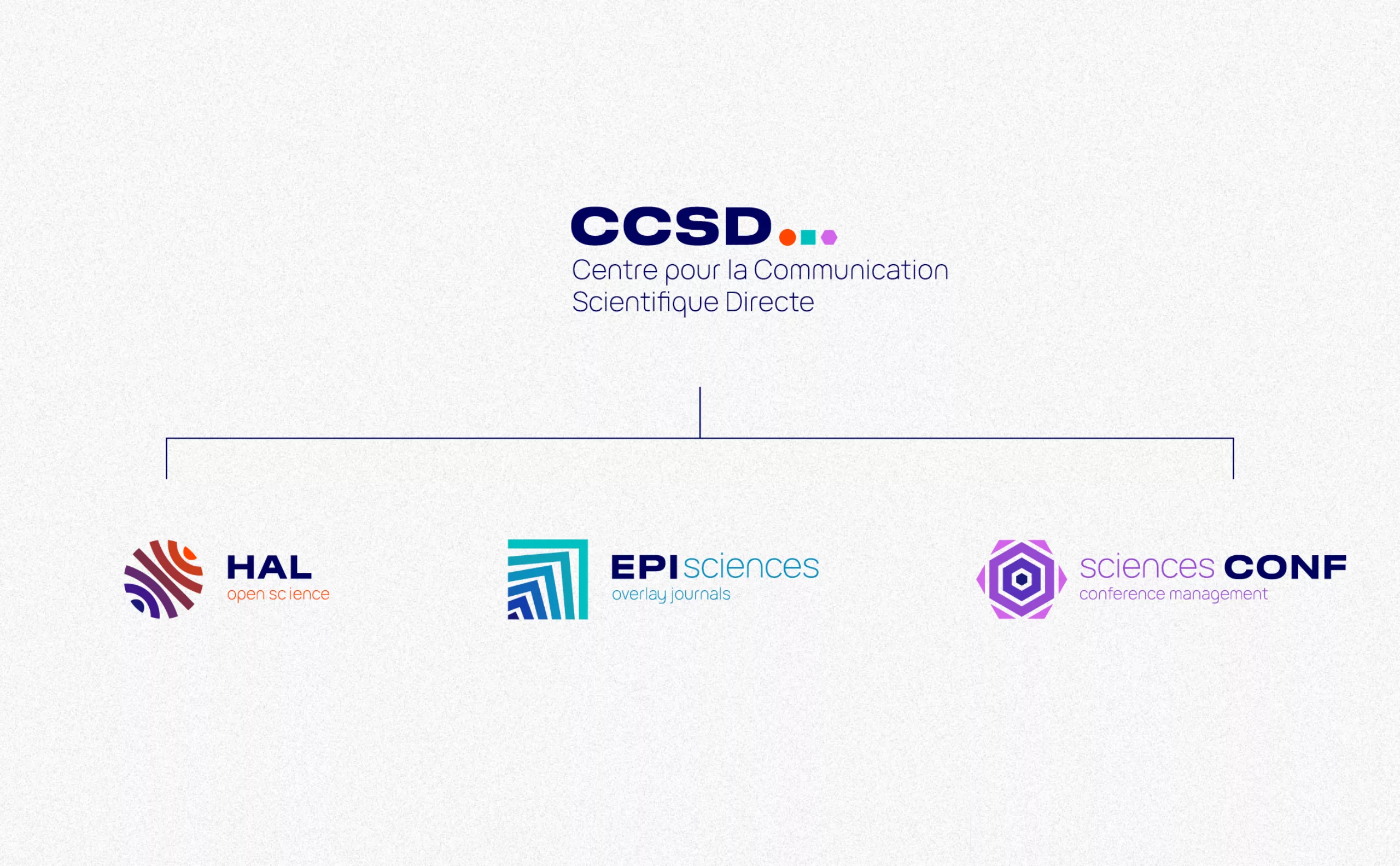
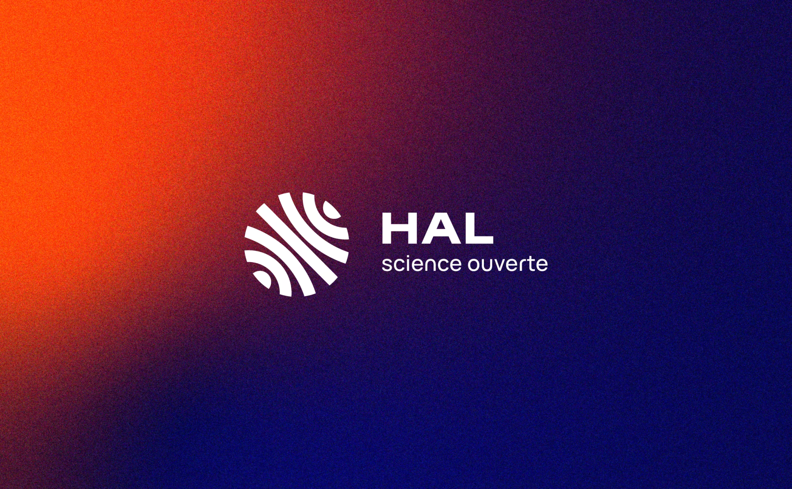
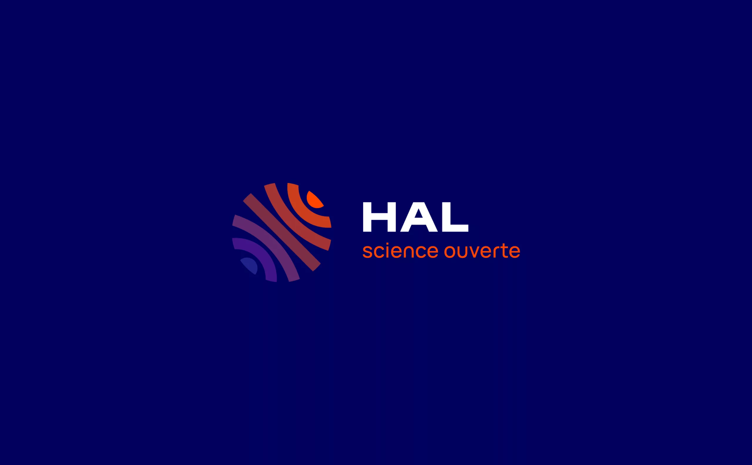
The CCSD logotype plays its role as "mother brand". It gives rise to three geometric signs, symbols of universality and accessibility, which characterize the three "daughter brands".
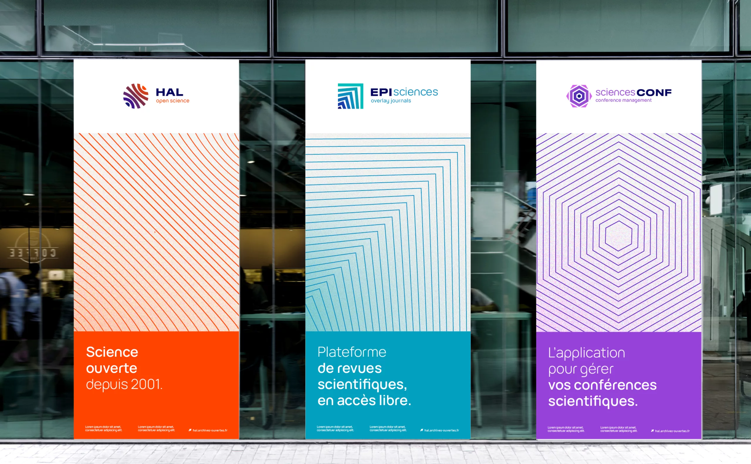
HAL's sharing of international knowledge is represented by a circle, a universal and planetary shape. In the same way, EPISciences is represented by a clear-cut geometry, representing the validated article: the square. SciencesCONF is represented by the polygon of the conference, space, meeting and sharing.

12-CCSD-architecture-marque-design-strategy-creative
11a-CCSD-logotype-concept-architecture-signe-design-strategy

The idea of diffusion

Each sign is created and designed with movement in mind, representing the different stages and missions of the brands.

12a-HAL-signe-concept

HAL

01. Dépôt de la connaissance. 

02. Centralisateur de la connaissance internationale. 

03. Diffuseur de connaissances. 

12b-EPI-science-signe-concept

EPI Sciences

01. Dépôt de la revue.

02. "Sur-couche" apportée par les relecteurs. 

03. Revue publiée et accessible. 

12c-science-CONF-signe-concept

Sciences CONF

01. Diffusion et partage de la connaissance.

02. Aide à l'organisation d'une conférence.

04d-CCSD-communication-scientific-online-identity-design

Unlimited knowledge

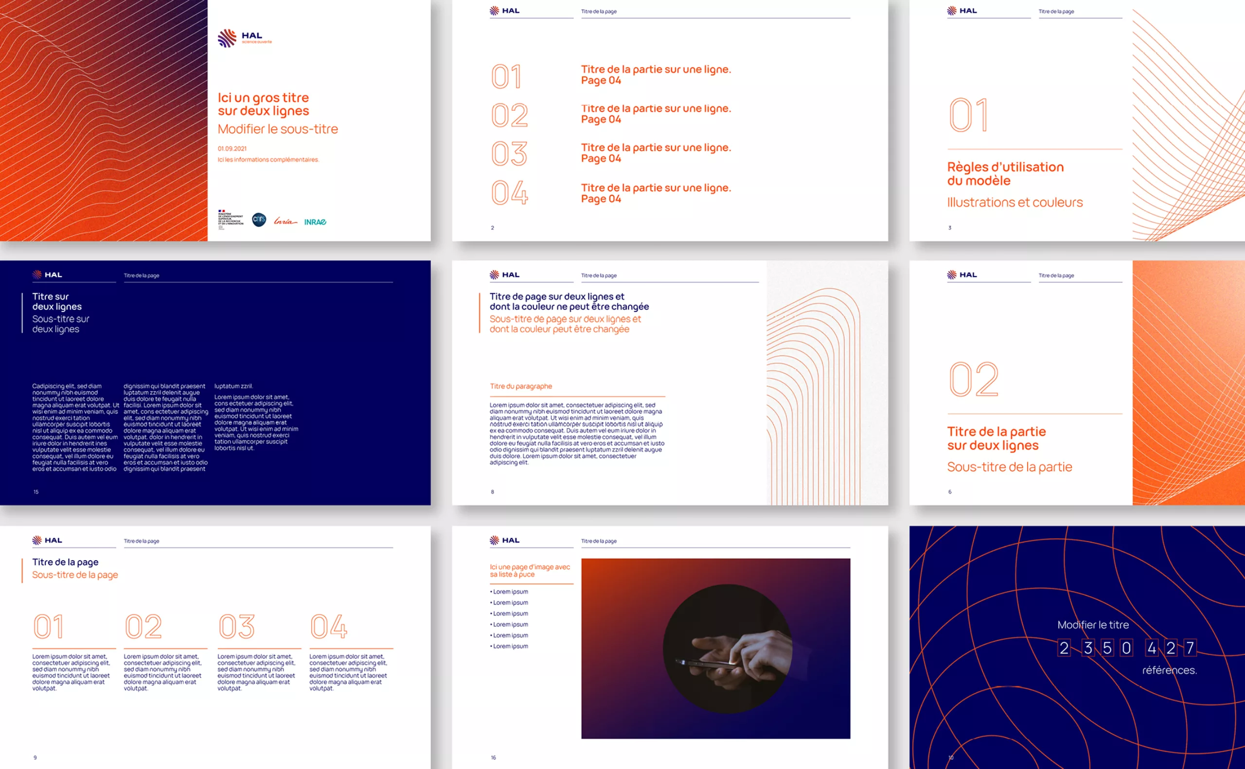
The graphic universe takes up the logic of moving lines, with the notion of dissemination always at the heart of the message. Science (from the Latin scientia, "knowledge") is in its original sense "the sum of knowledge", as a systematic undertaking to construct and organize knowledge in the form of testable explanations and predictions.

Here, the graphic choice evokes the technical and ideological universe of science as a whole: inclusive and in perpetual motion. While the theses and other research documents on the platform are highly specialized, the graphic universe echoes scientific technicality and precision. Like multiple sources gathered together within a research document, the fine lines come together to draw a shape more or less evocative of a particular scientific sector. Thanks to the creation of a library of shapes, the system becomes common to all CCSD brands, with brand architecture using color as a distinctive element.

17-CCSD-HAL-EPI-CONF-science-color-concept-identity

Color architecture

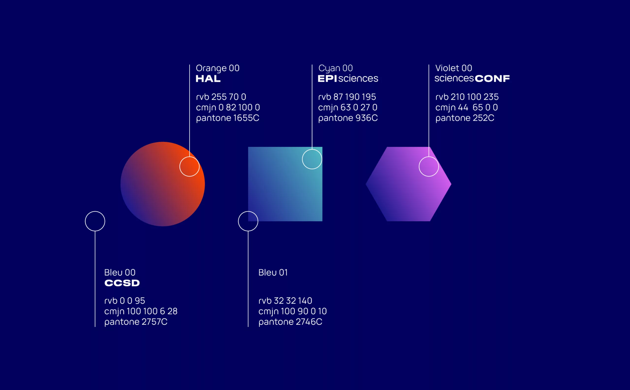
With a view to disseminating knowledge and distinguishing the three platforms, we have devised the following color scheme. CSSD blue is the common color, ensuring consistency. Following the concept used in the logotypes, this blue gradates towards the identity color of each platform.

Each step of the gradient is proportionately located between the arrival and departure colors. The signs thus represent the journey and effervescence between the blue (CCSD) and the colors of each daughter brand.

04c-CCSD-communication-scientific-online-identity-design
35-HAL-science-ouverte-presentation-powerpower-gabarit
34-HAL-open-science-identity-bag
33-HAL-open-science-identity-badge
48-CCSD-architecture-de-marque-design-kakemono

Share this project:
Project expertise:
Publishing design, creation of magazine and brochure layouts. Logo creation, visual identity and graphic guidelines. Motion design and video creation.
Type of client:
Communication in science and research. Communication agency in the start-up, digital and technology sector. High tech & IT, IT BtoB, IT BtoC: software publishers, digital services companies.

Related projects: