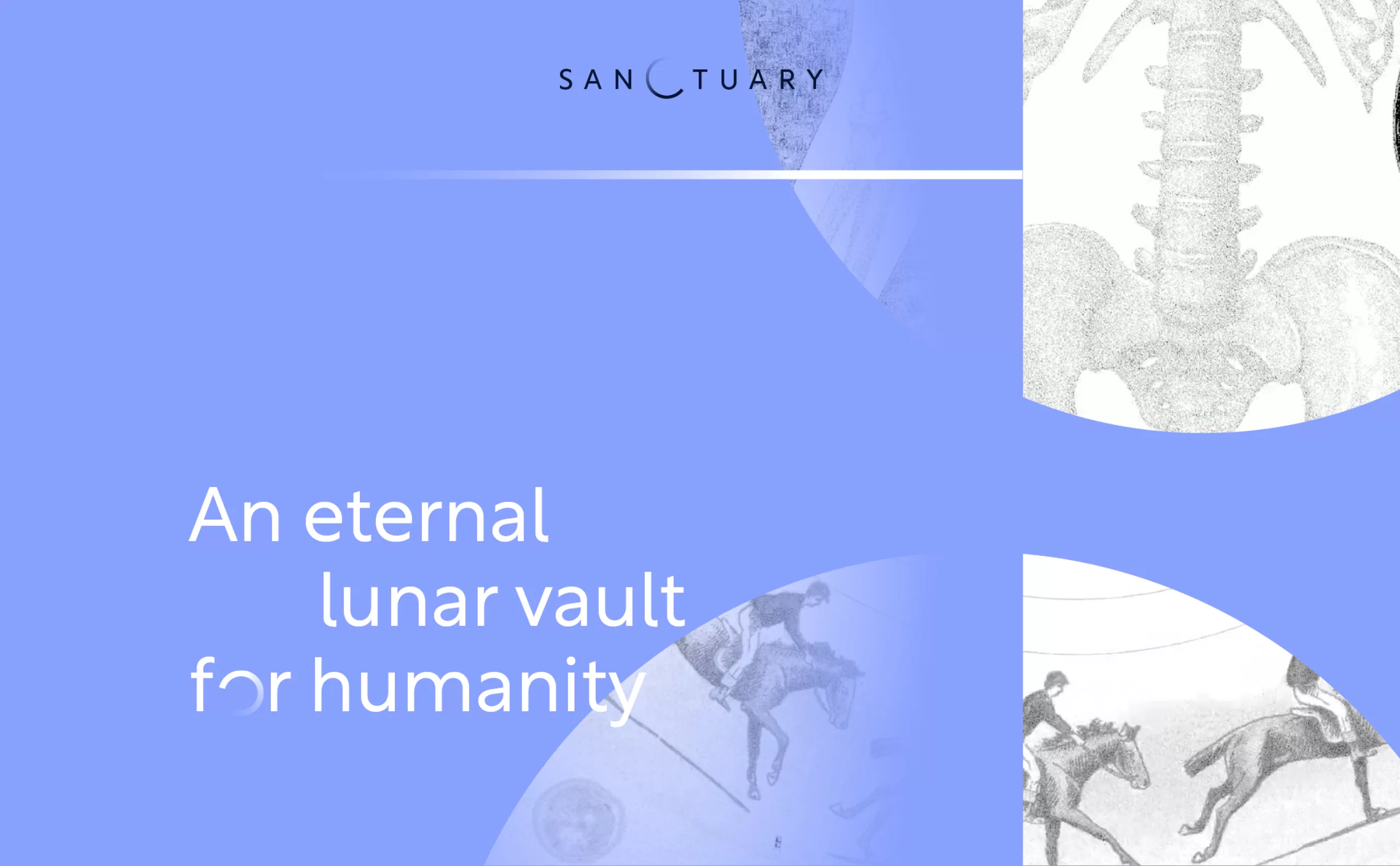
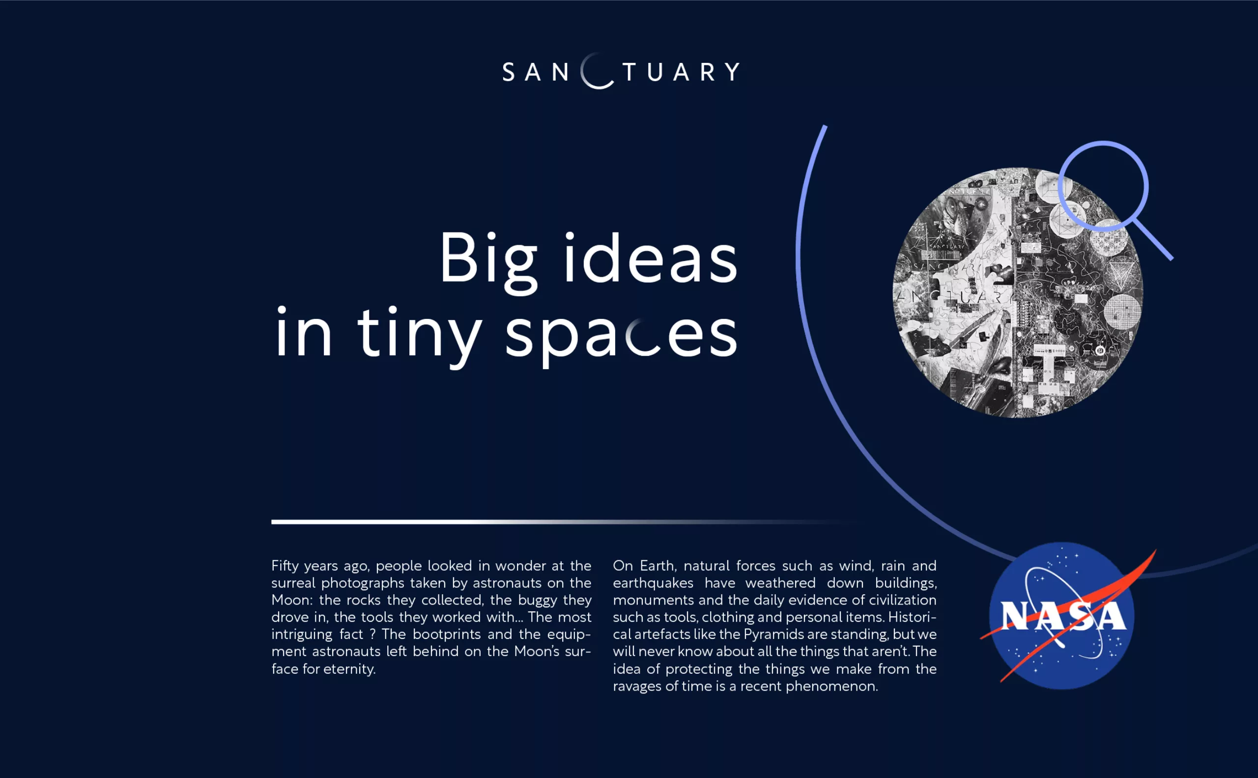
Sanctuary is a time capsule that will contain and preserve a collection of ultra-hard sapphire disks engraved with billions of pixels. Together, they will carry through time a precious cargo of human knowledge from the arts and sciences. Sanctuary’s mission is to describe who we are, what we know and what we do.
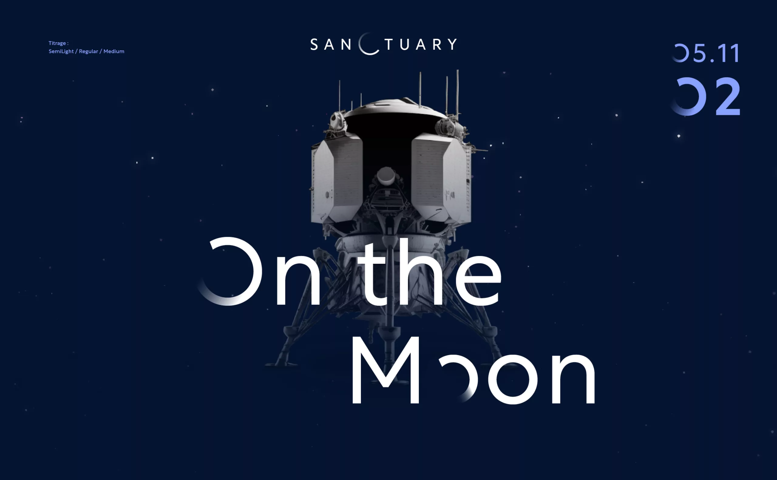
This time capsule will be placed on the lunar surface as part of Nasa’s Artemis program. It will remain there for millions of years to come. A unique philosophical and anthropological journey into eternity, an unprecedented opportunity to protect and pass on our intangible heritage to future generations.
“Sanctuary” is the realization of the dream of Benoit Faiveley, creator of the project, who took on board an entire team of experts for this extraordinary mission, going so far as to convince NASA to transport the capsule to the moon.
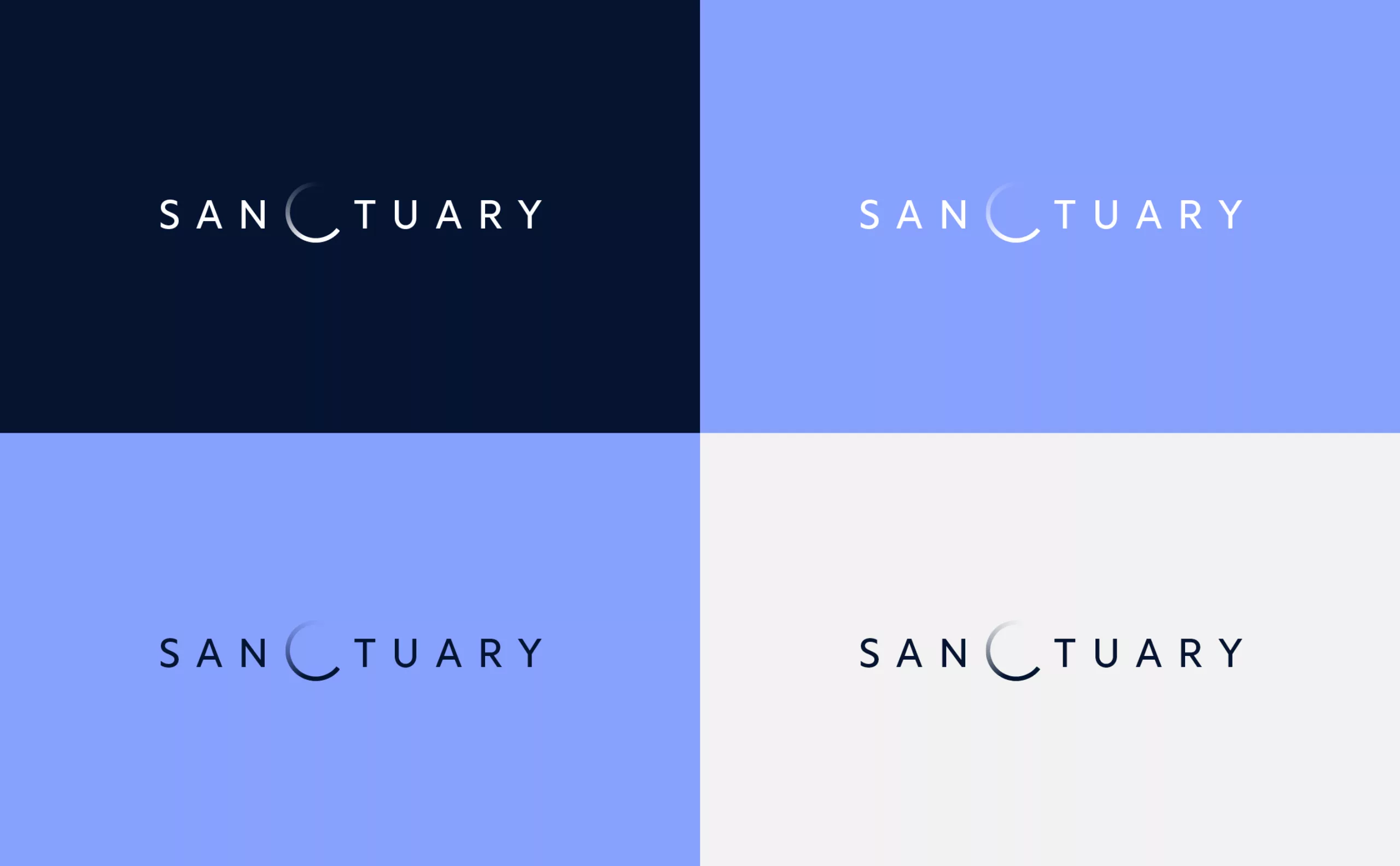
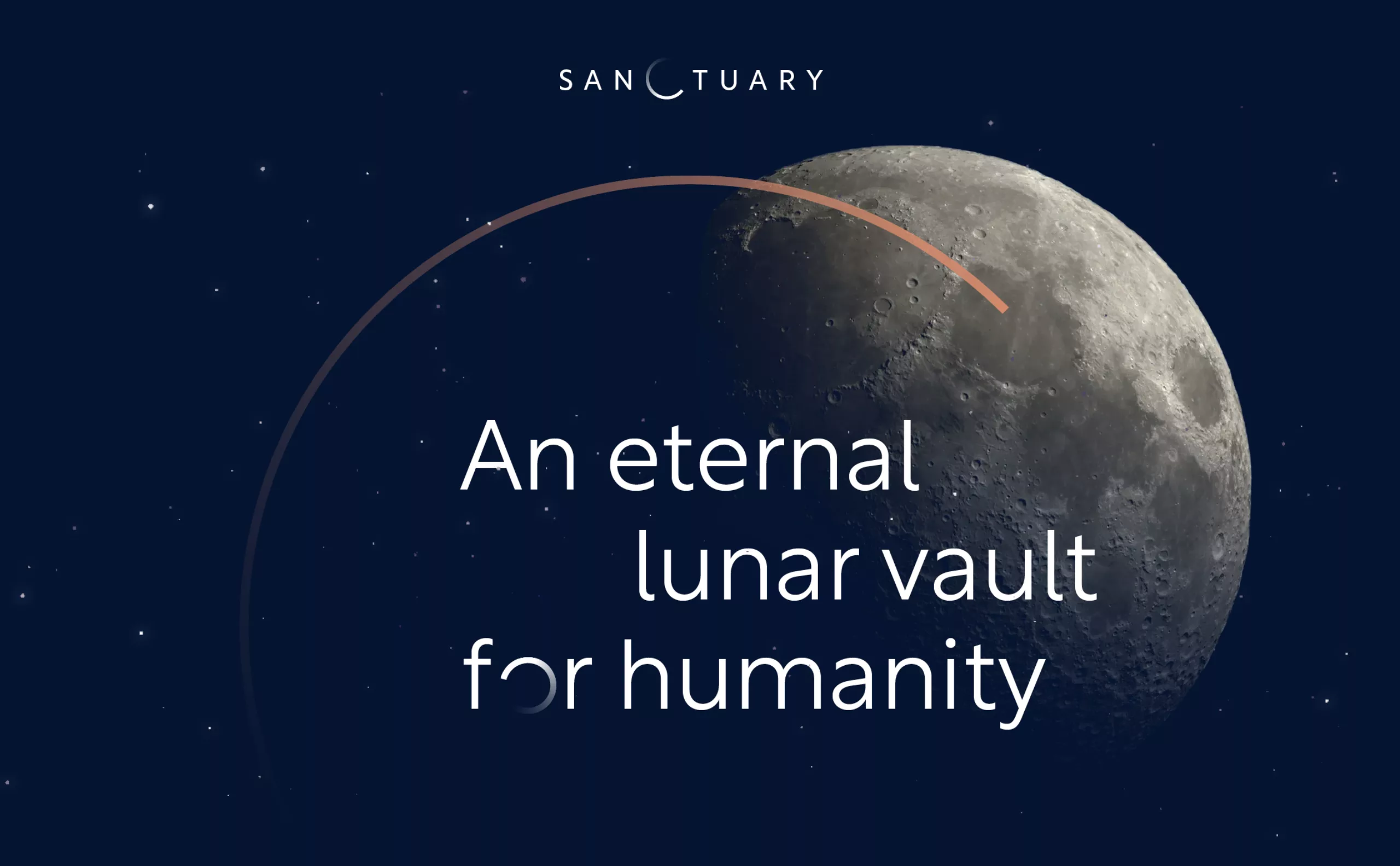
Graphéine was called in to develop the project’s logo. The previous, very futuristic version was not sufficiently legible. We opted for a minimalist logo, taking advantage of the central position of the letter C, which becomes a lunar eclipse. The circular shape also evokes the passing of time, reflecting the project’s philosophical and memorial dimensions.
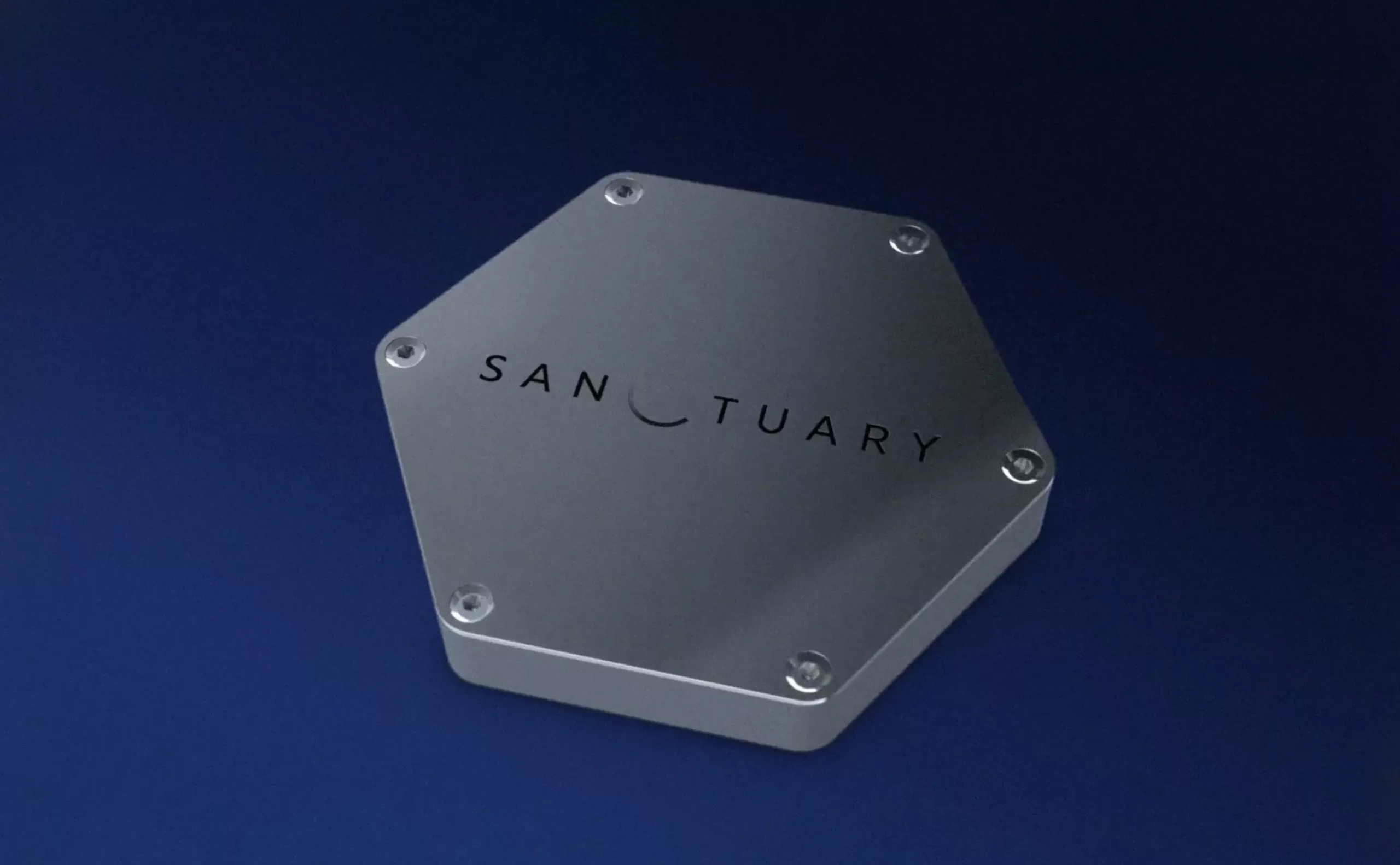
The logo will be engraved on the time capsule that is due to be placed on the moon as part of NASA’s Artemis space program, whose aim is to bring the Earth’s past to life.
