Group iliad identité visuelle logotype

2021

Groupe Iliad
Visual and graphic principles

Founded in 1999, iliad, the parent company of Free Telecom, is a major player in the telecommunications industry. An innovative operator, inventor of triple-play and the first box in France, the Group now has 25 million subscribers and 11,000 employees in France and Italy.

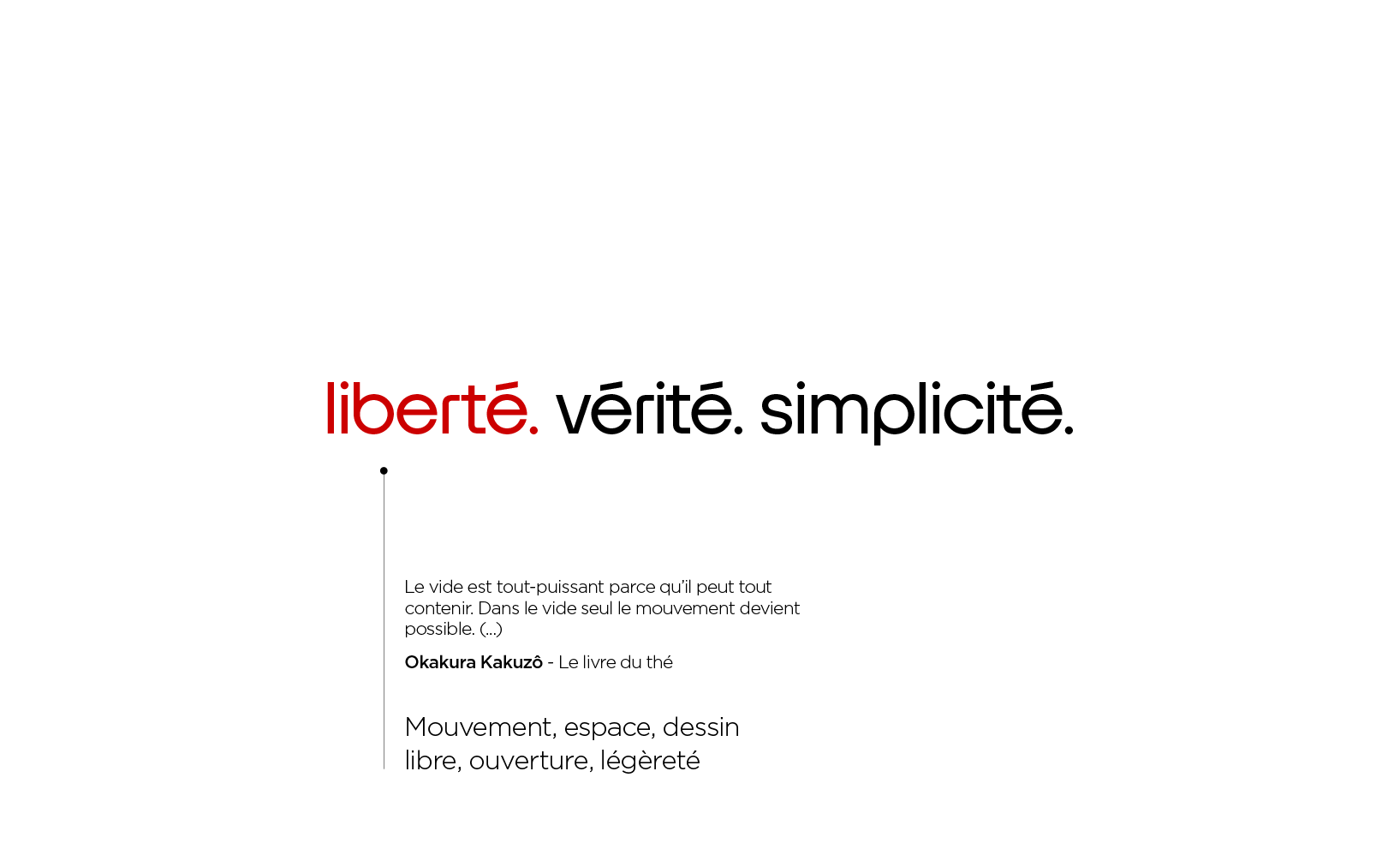
In 20 years, the group has evolved considerably, while retaining that inimitable spirit that has always pushed it to do things differently, in its own way: the Free spirit.

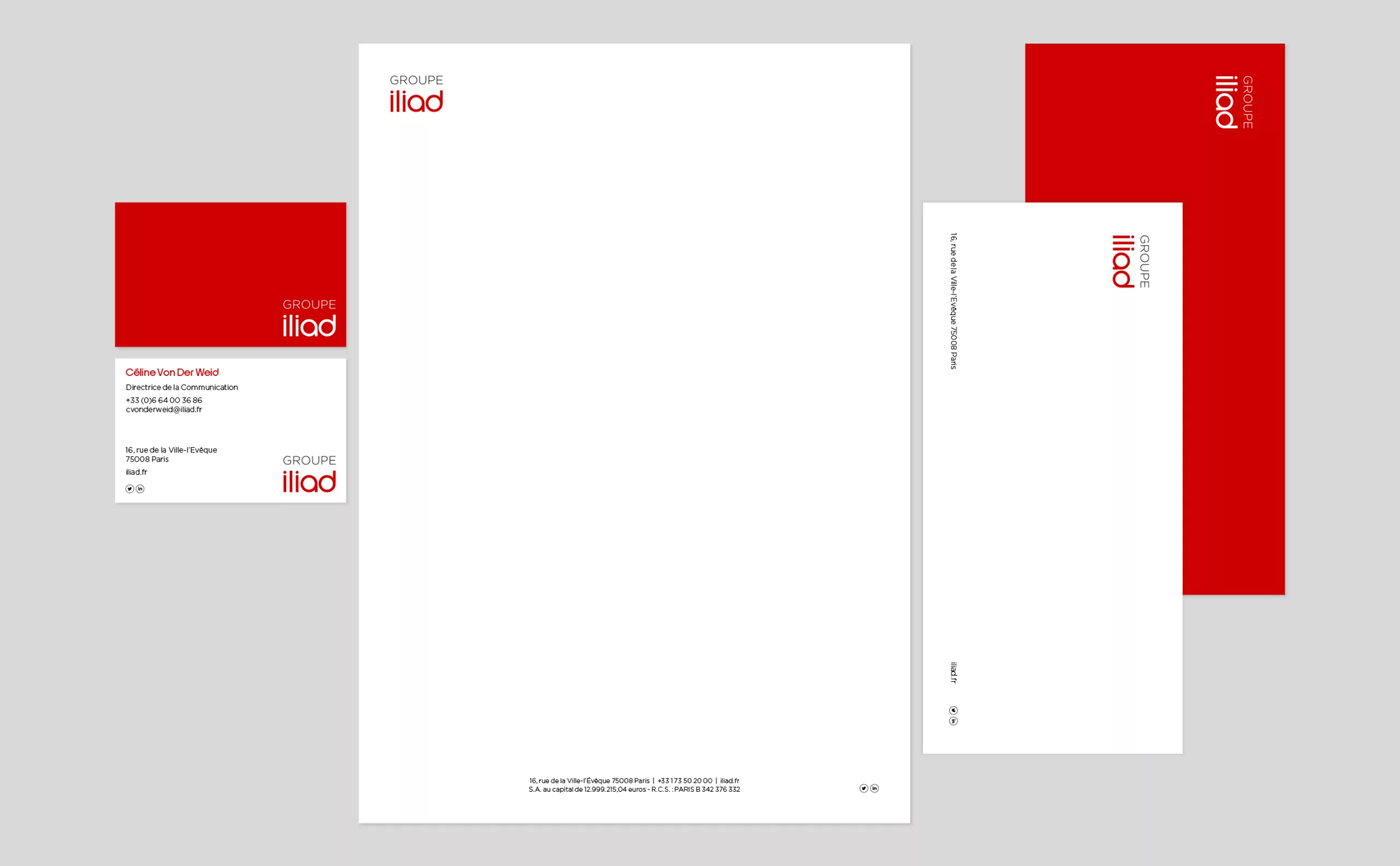
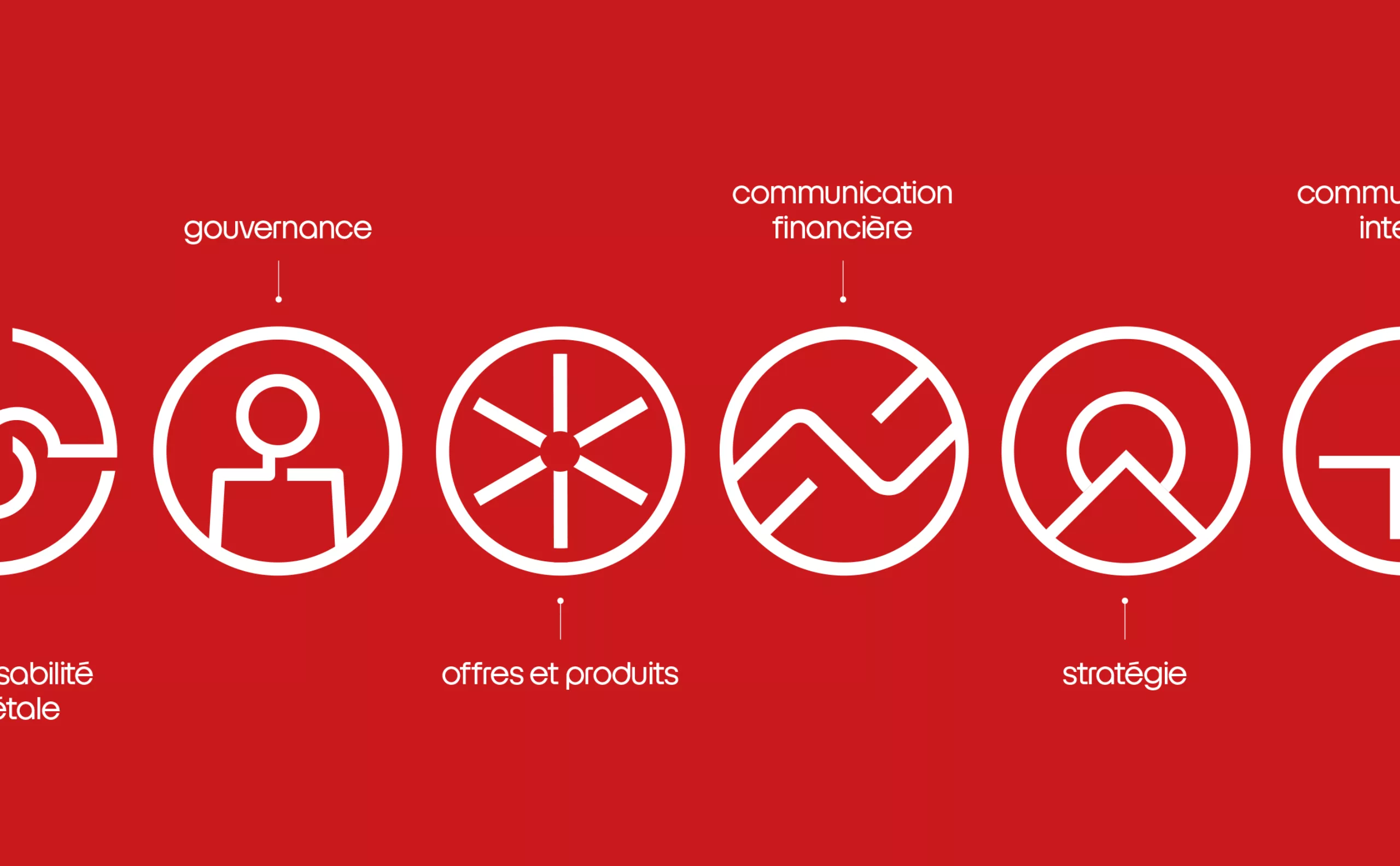
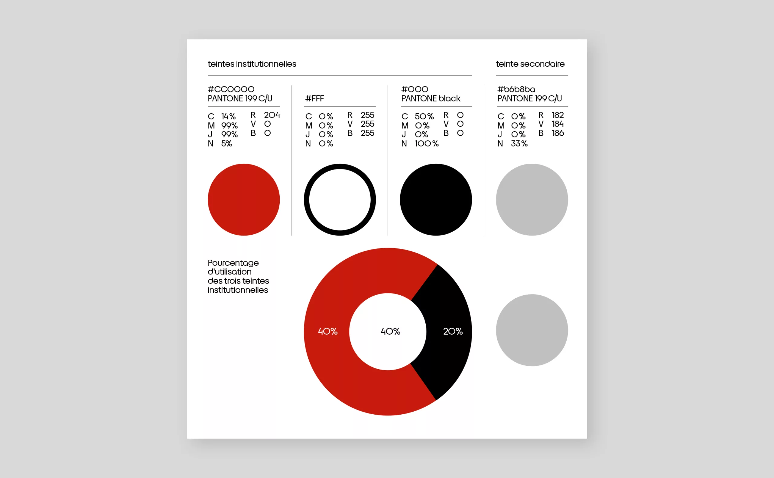
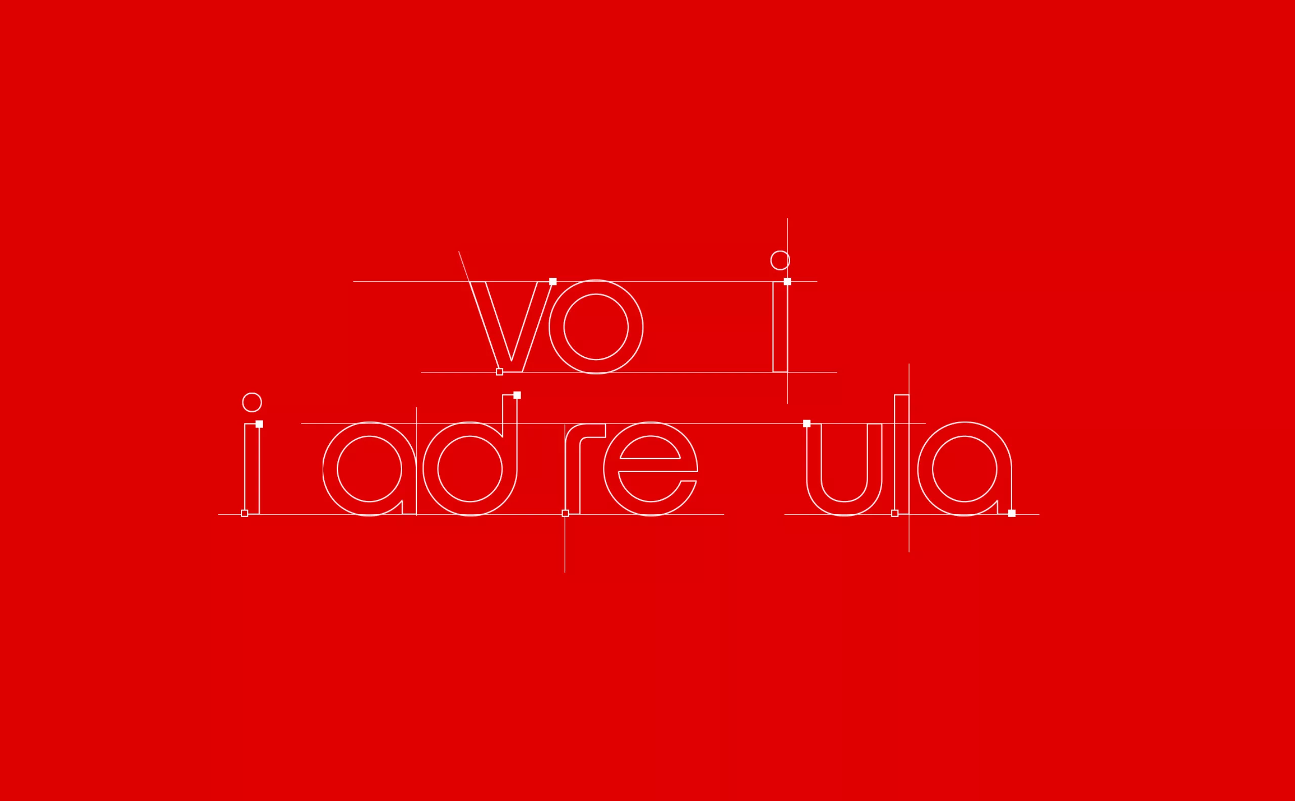
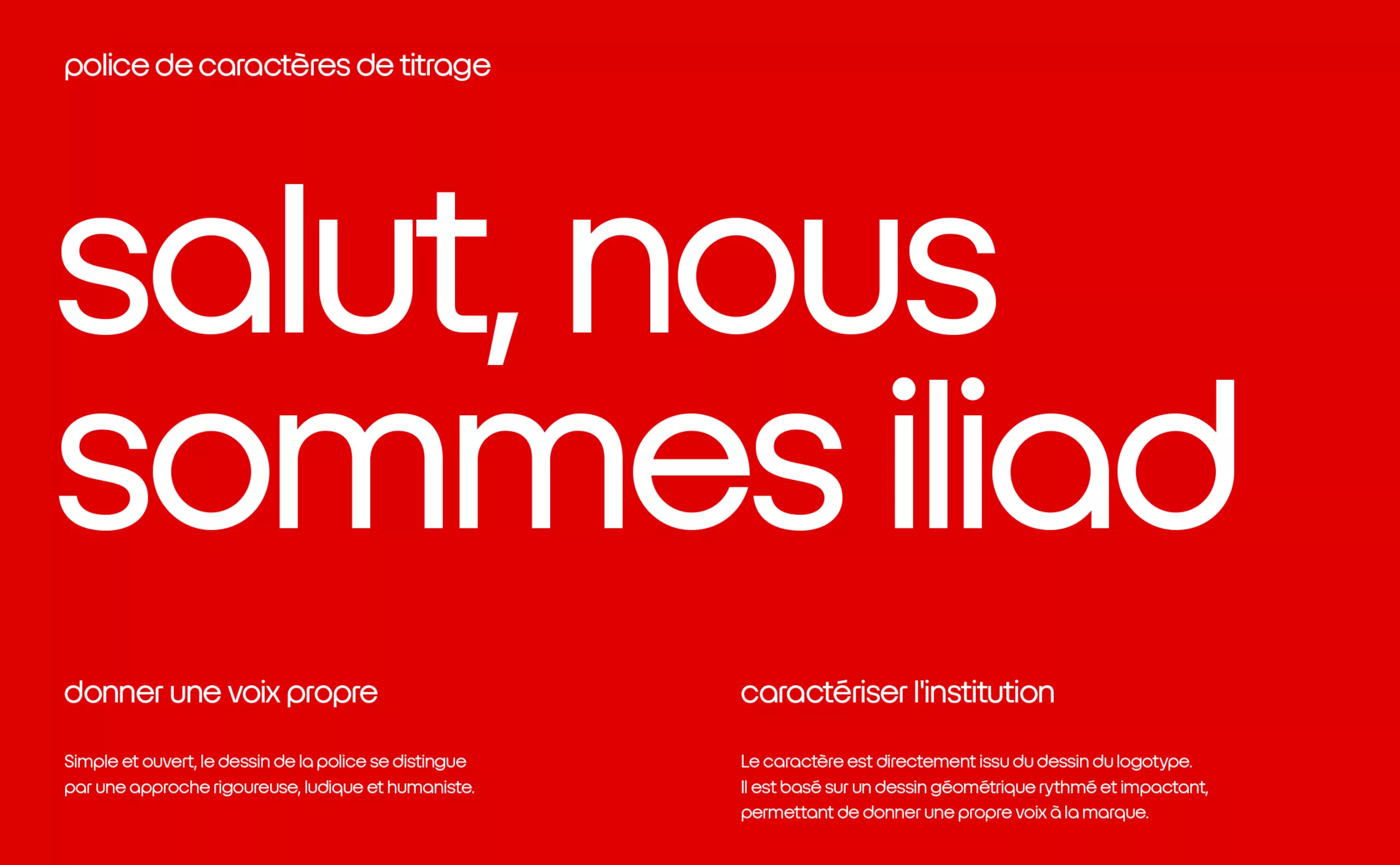
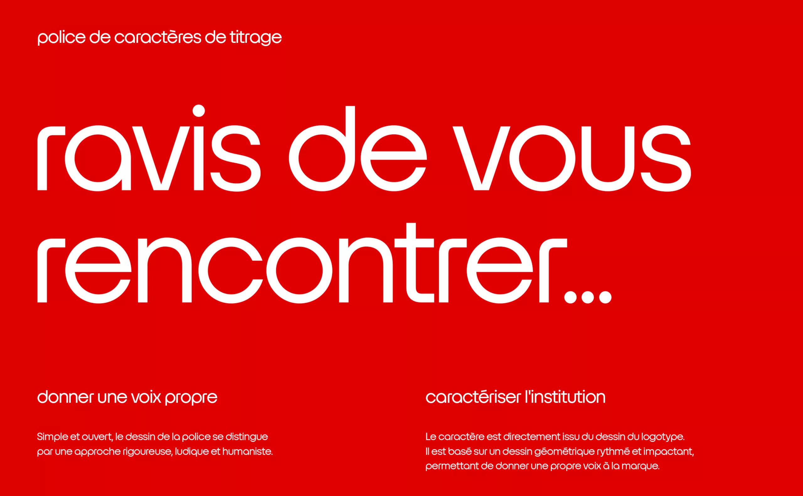
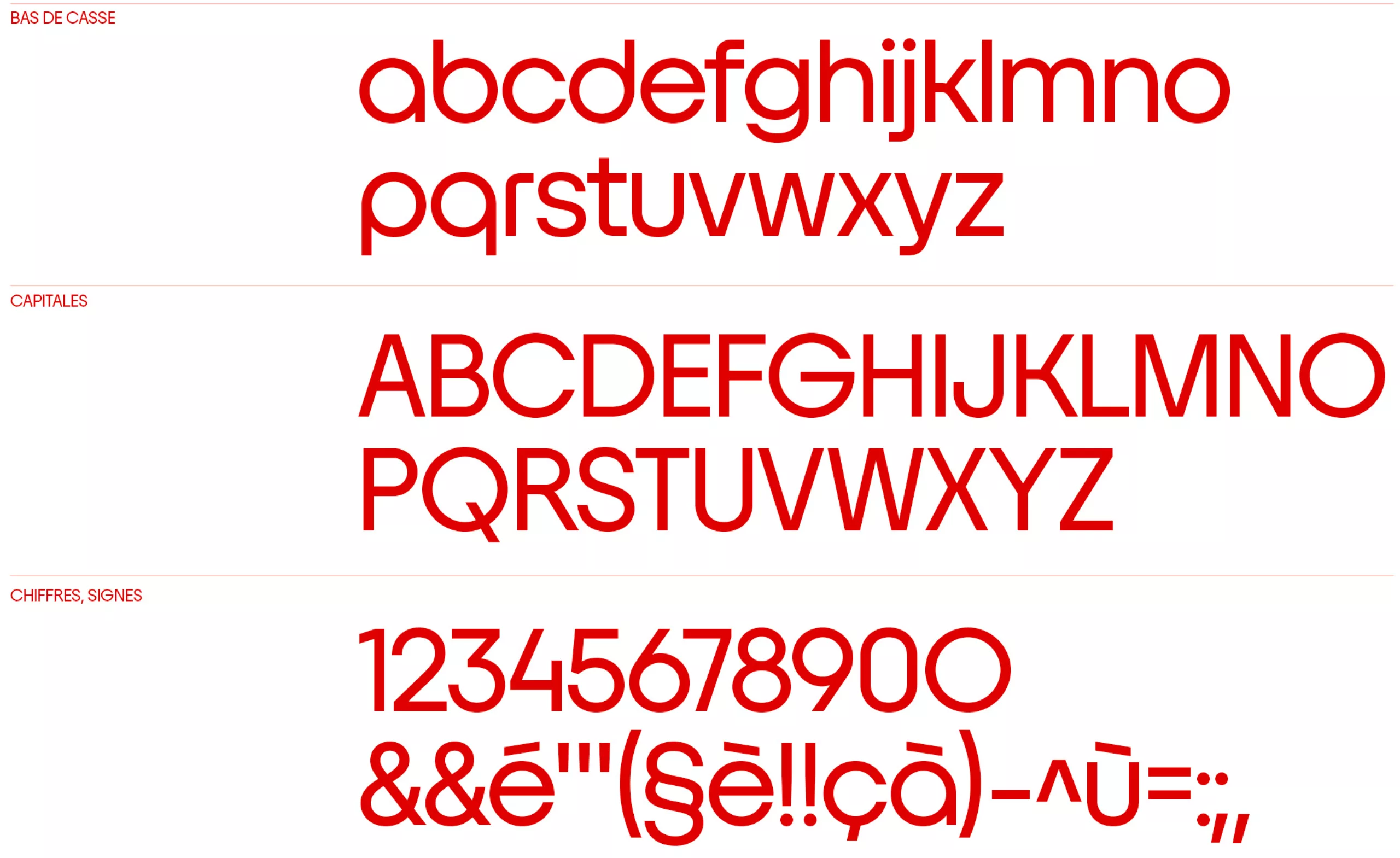
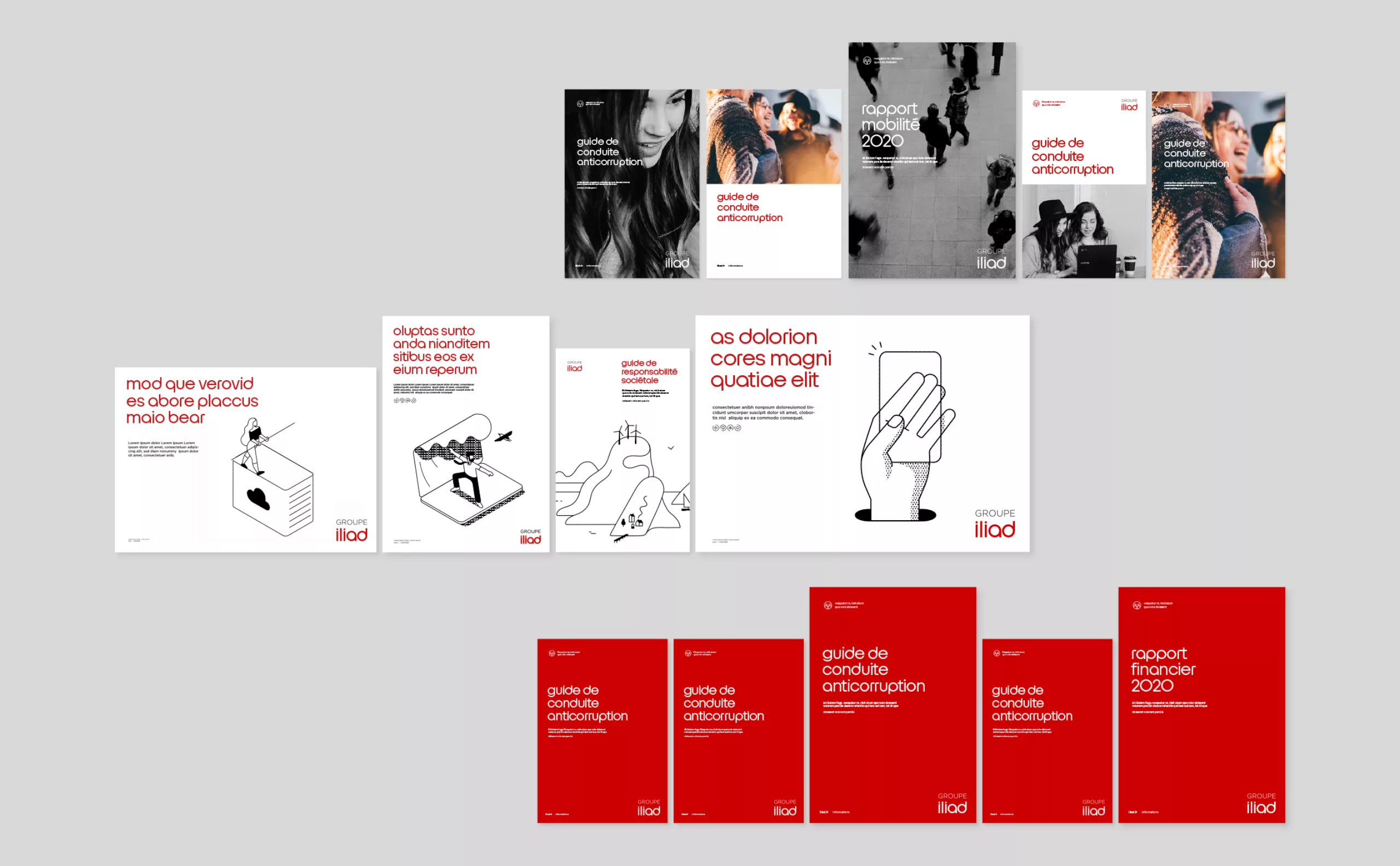
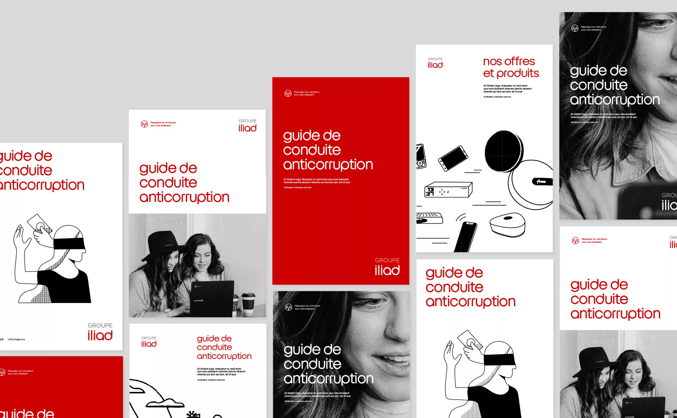
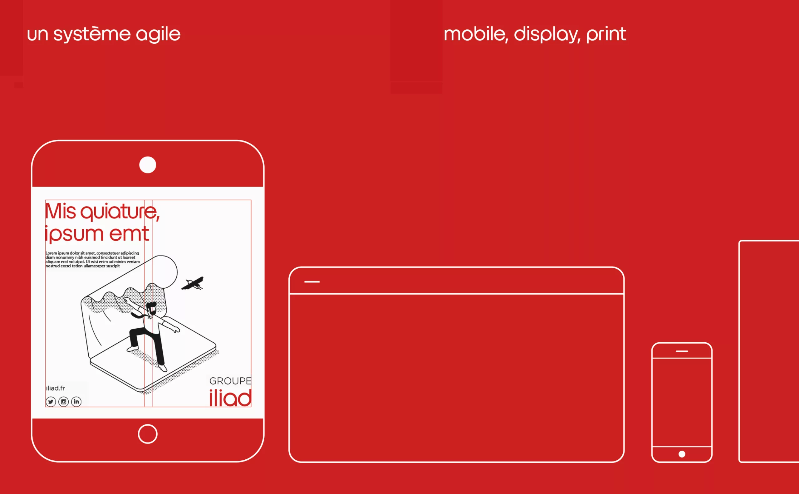
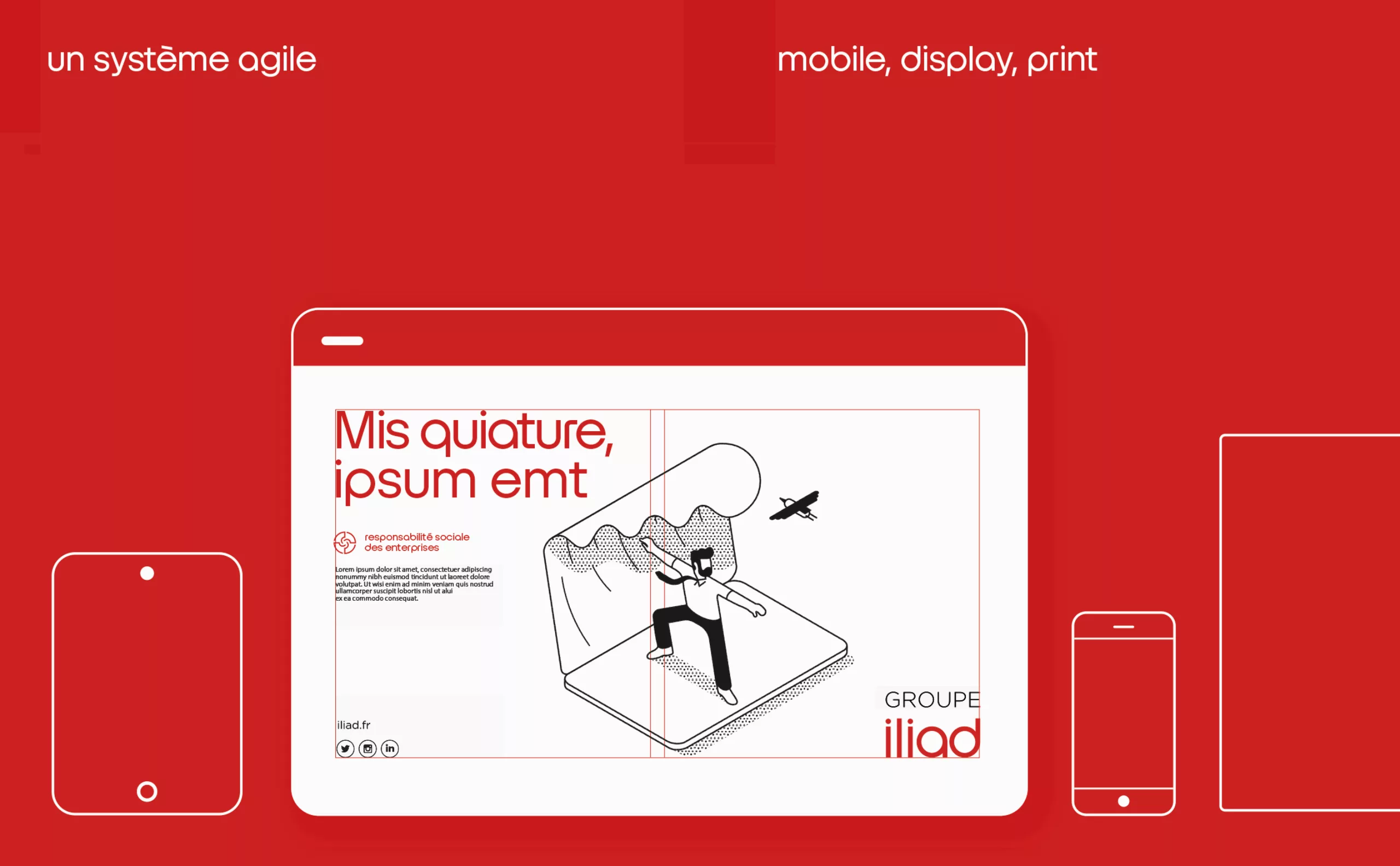
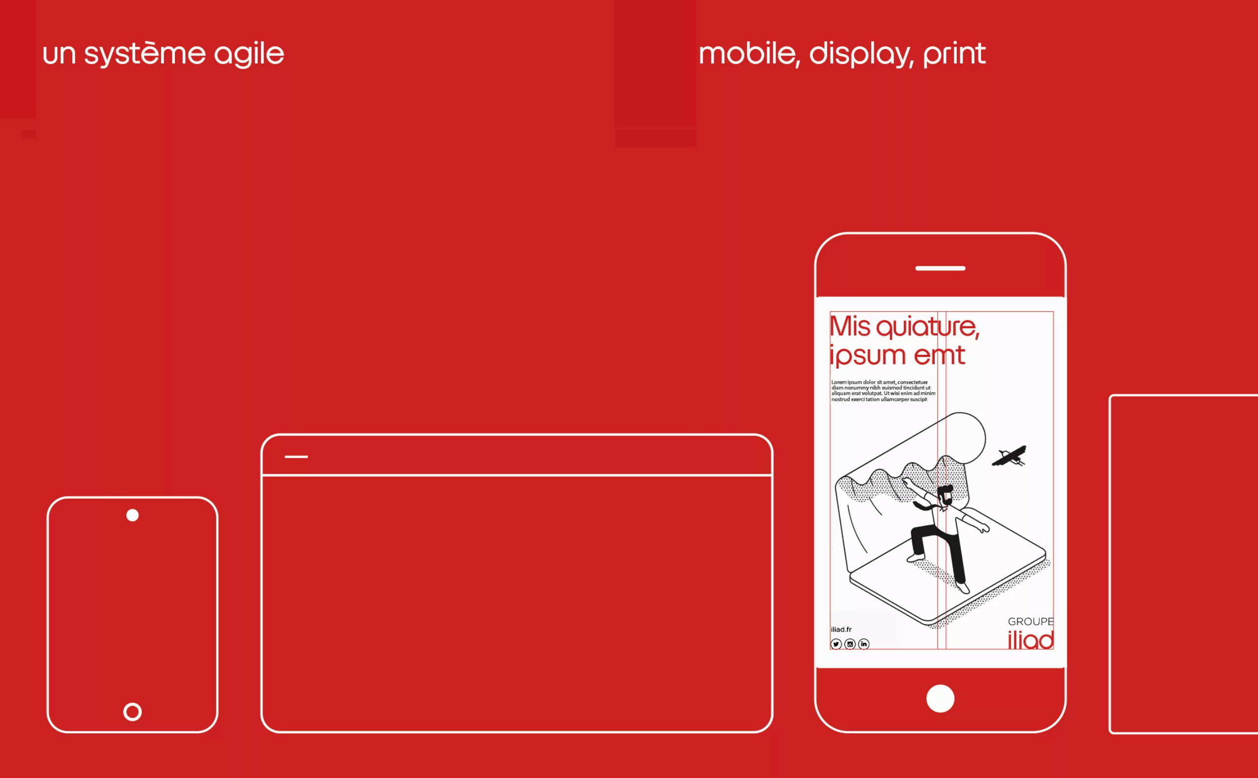
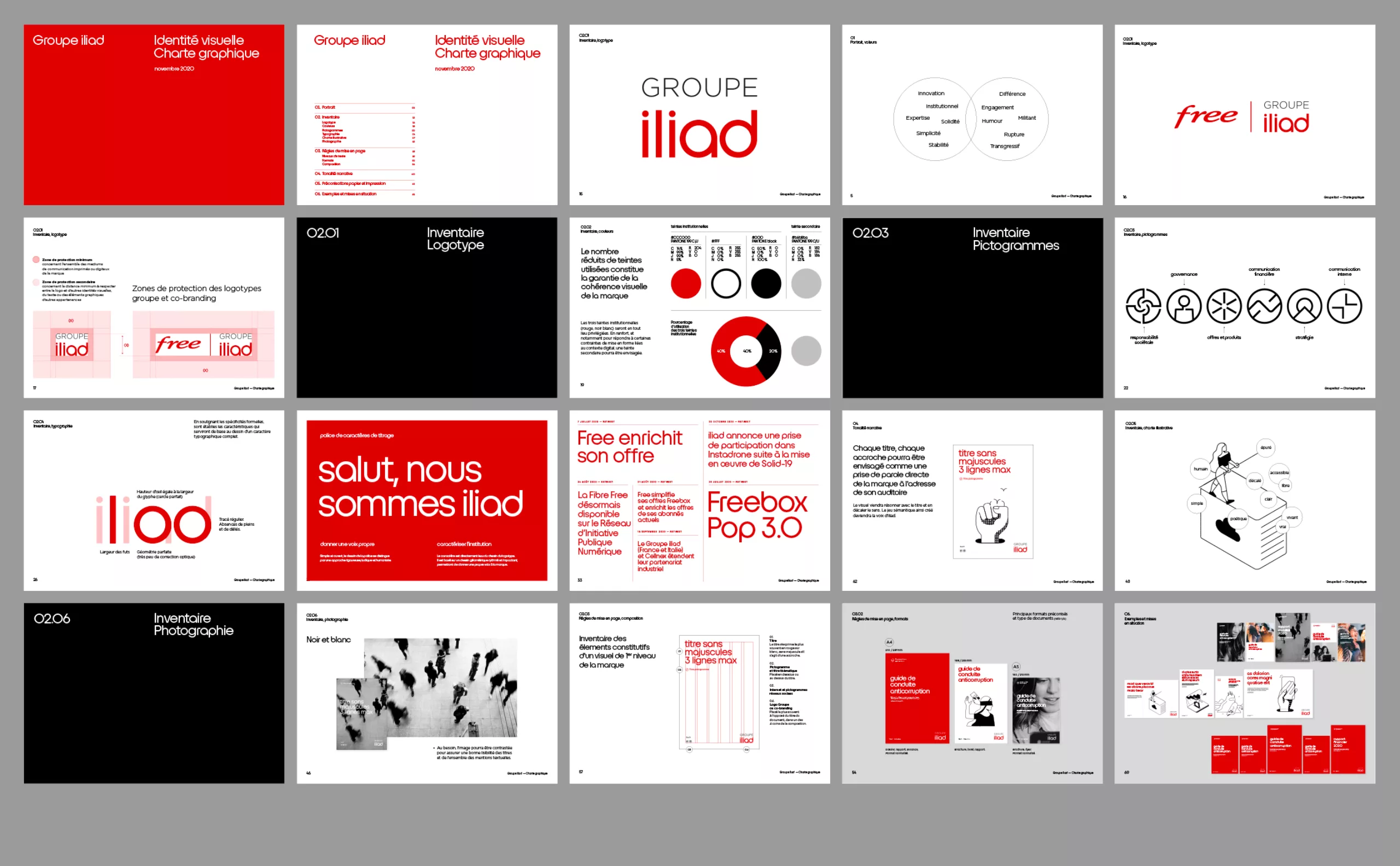
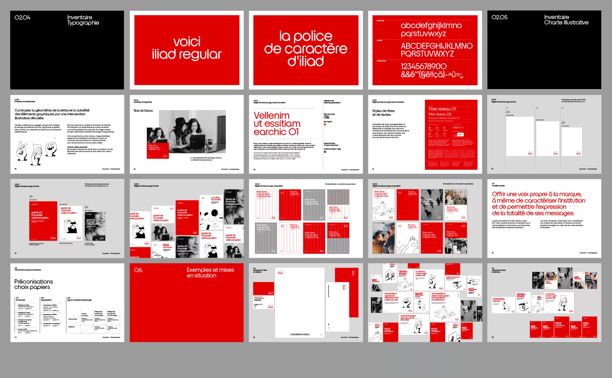
In 2020, iliad mandated Graphéine to redefine all of the brand's visual identity principles. A complete analysis of the needs and exchanges with the teams were necessary to allow us to design a global and functional system, and thus characterize a brand that was previously confidential.

1. Define

Liberty, truth, simplicity.
The first step was to understand the brand in order to determine the constituent elements of its image. How is its graphic identity formalized? What is its audience, what are its modes of communication? Logotype, colors, typography, composition. Each element is analyzed and will be redefined if necessary. Then, based on the three pillars of the brand, the work of defining this new visual identity can begin.

Colors, pictogramss

A precise colorimetric system is established, defining the degrees of use of the different shades constituting the visual universe of the brand. Thematic pictograms are designed to clarify the internal architecture.

2. Characterize

Until then, the brand suffered from a lack of personality. A typographic typeface was specially designed and created with the objective of facilitating and characterizing the speech. It will be derived from the formal rules of the logotype in order to preserve a concise and recognizable graphic grammar. Initially designed in a single font, iliad's typography will soon be adapted to light and bold formats. Its use will also be extended to Free's communication.

The iliad typeface is specially designed for headlines and taglines. It is available in three weights and has an extensive character set, making it possible to use it in all the languages of the brand.

3. Illustrate

In order to maintain the coherence and impact of the institution's identity throughout its communications, an illustrative charter is proposed.

The objective is to contrast the geometry of the letter and the sobriety of the graphic elements with an offbeat, poetic and/or committed illustrative intervention. Pared down in its design and offbeat in its narrative, the recommended illustrative style is designed to directly echo the core values: liberty, truth and simplicity.

The image underlines the message delivered by the words. Rigorous and pure in its form, the composition acquires an additional dimension.

Social responsibility, commercial action, internal information, illustrations are proposed for each theme, with the objective of delivering a second level of reading to the message.

4. Compose

Once the entire graphic vocabulary has been designed, the various components are brought together in the same medium, as part of a coherent whole. Rules of use are established according to the types of documents, in order to make the internal communication architecture clear and intuitive. Each element finds its place in the visual universe of iliad.

The specificities of each type of document will be respected, while clearly fitting into a global visual whole.

The composition structure is designed to easily adapt to the various current formats and ratios.

5. Structure

All the visual components and rules of use are gathered in a graphic charter file. This document will serve as a reference and synthesizes in an exhaustive way the ways of visually considering the brand.

6. Reveal

An animation is designed to present the evolution of the brand internally. Each point is addressed in a synthetic and playful way. The teams can thus easily appropriate these changes.


Share this project:
Project expertise:
Logo creation, visual identity and graphic guidelines. Creation of illustrations. Motion design and video creation. Graphic design of posters, flyers, letterhead and business cards. Typographic design.
Type of client:
Communication agency in the start-up, digital and technology sector. High tech & IT, IT BtoB, IT BtoC: software publishers, digital services companies.

Related projects: