Universite-Lille-identite-visuelle-tetiere-ok

2022

New visual identity for Université de Lille,
A university at the heart of global transitions, a major force in higher education

In January 2022, 5 institutions located in Lille joined forces to create one of the largest European universities: Université de Lille. With more than 80,000 students, Université de Lille aims to develop new ways of reinventing progress, creating new training courses and innovating through research, while developing its links with the metropolitan, regional and international ecosystem.
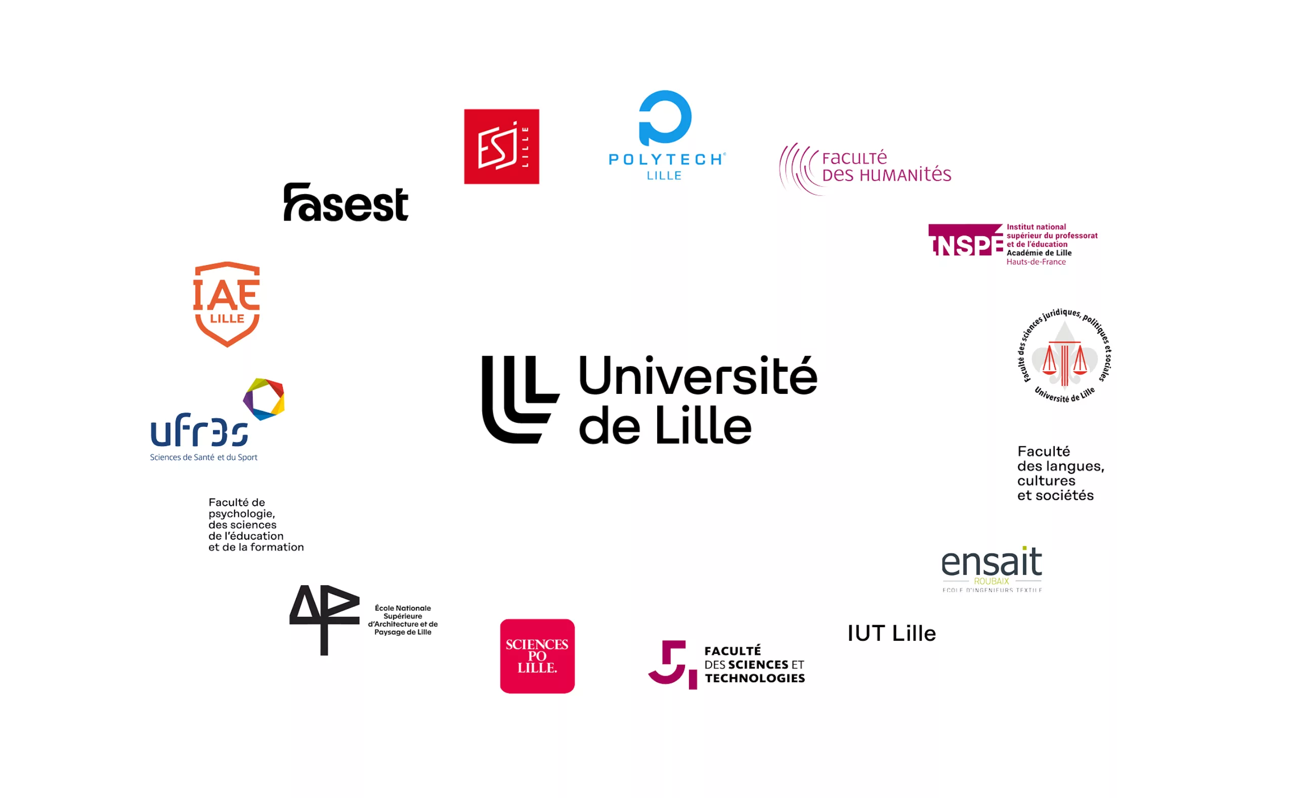
Université de Lille is a new "EPE" (experimental public institution), now including the students of the former Université de Lille, Lille School of Journalism (ESJ Lille), Lille National School of Architecture and Landscape (ENSAPL), National School of Textile Arts and Industries (ENSAIT) and Sciences Po Lille. Université de Lille is the university of social, economic and environmental transition. It's a project that brings the completeness of French knowledge to the doors of Northern Europe.

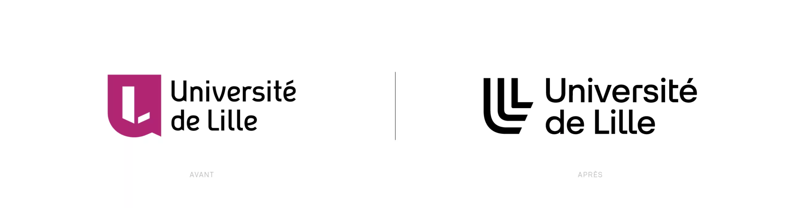
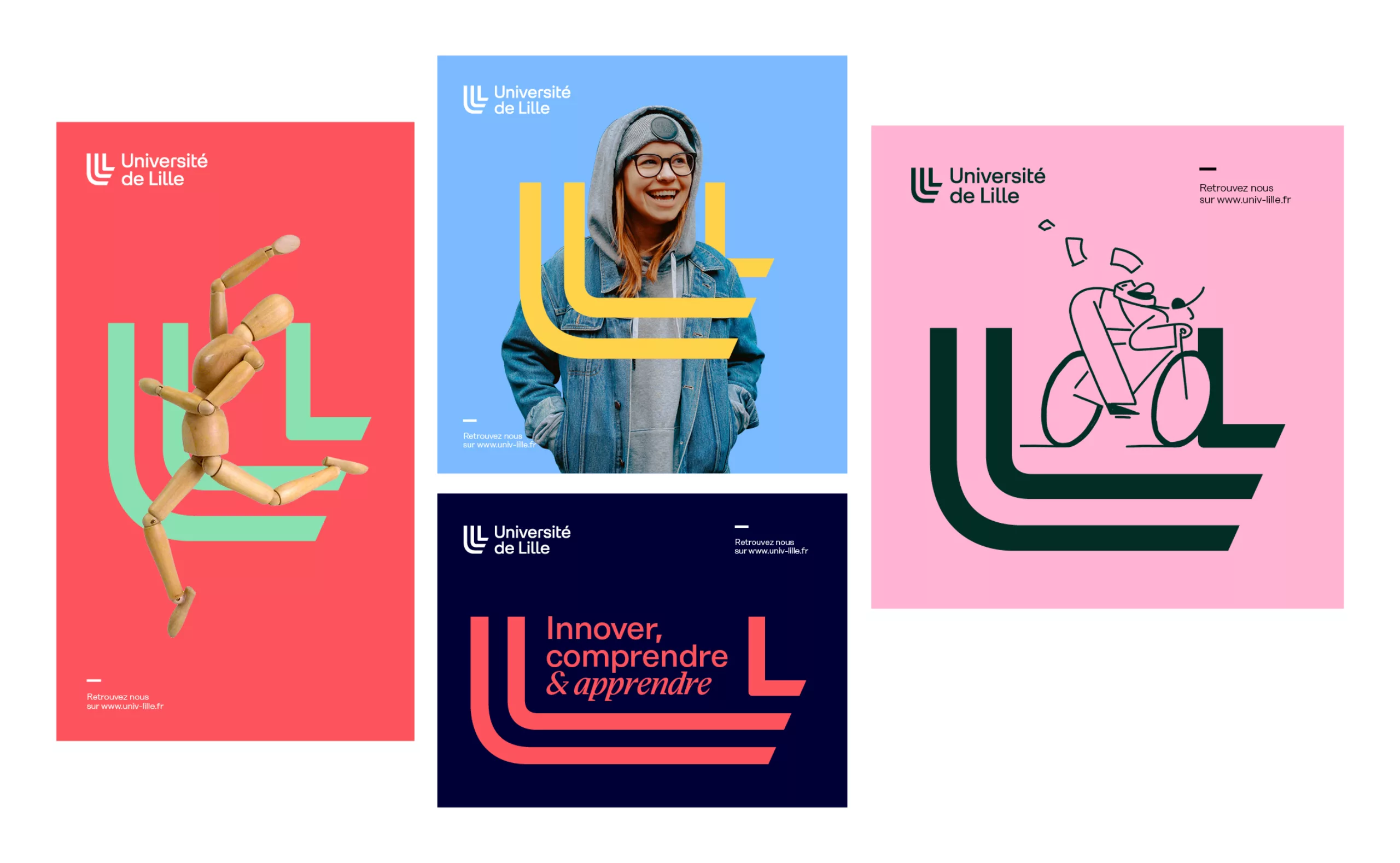
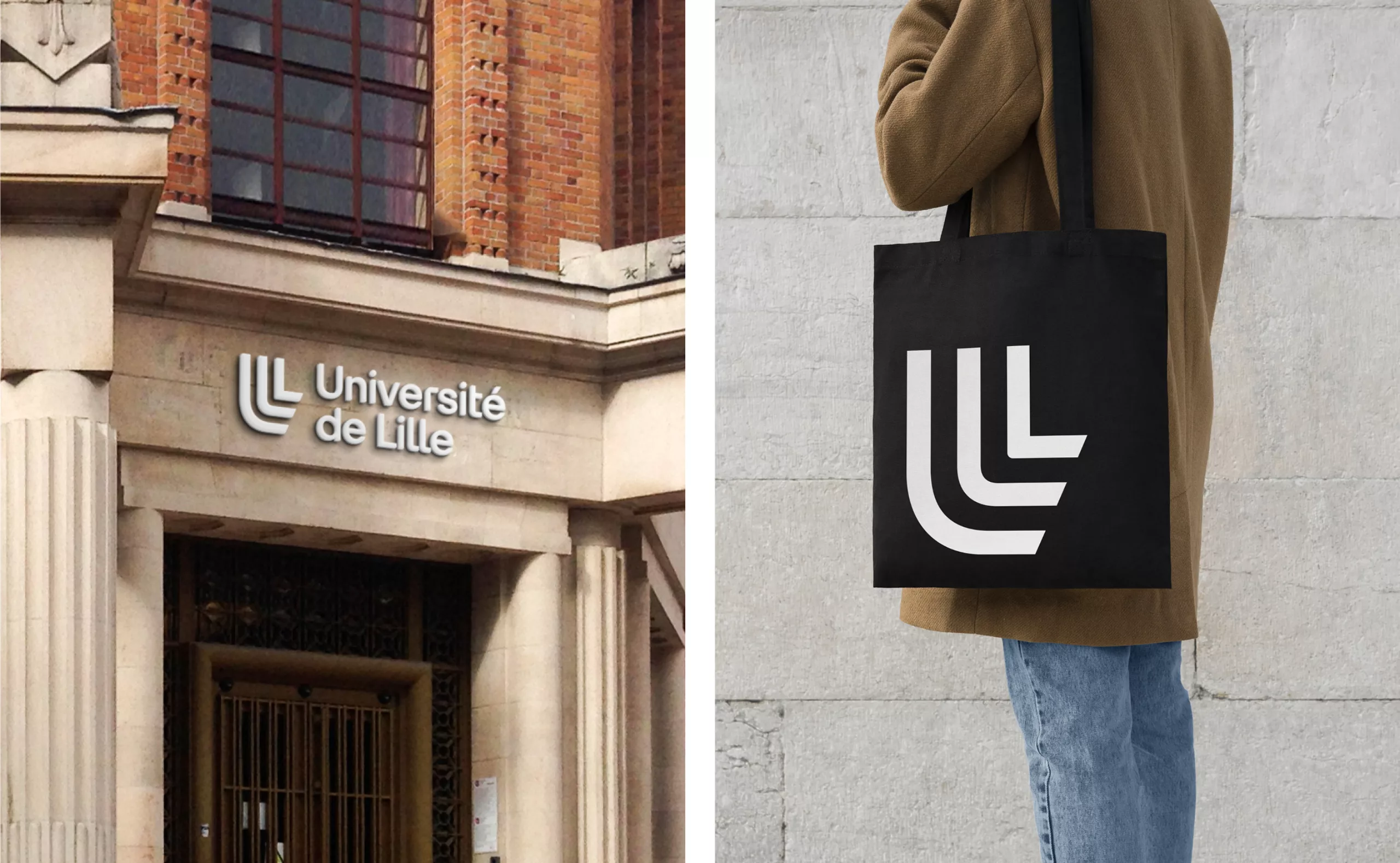
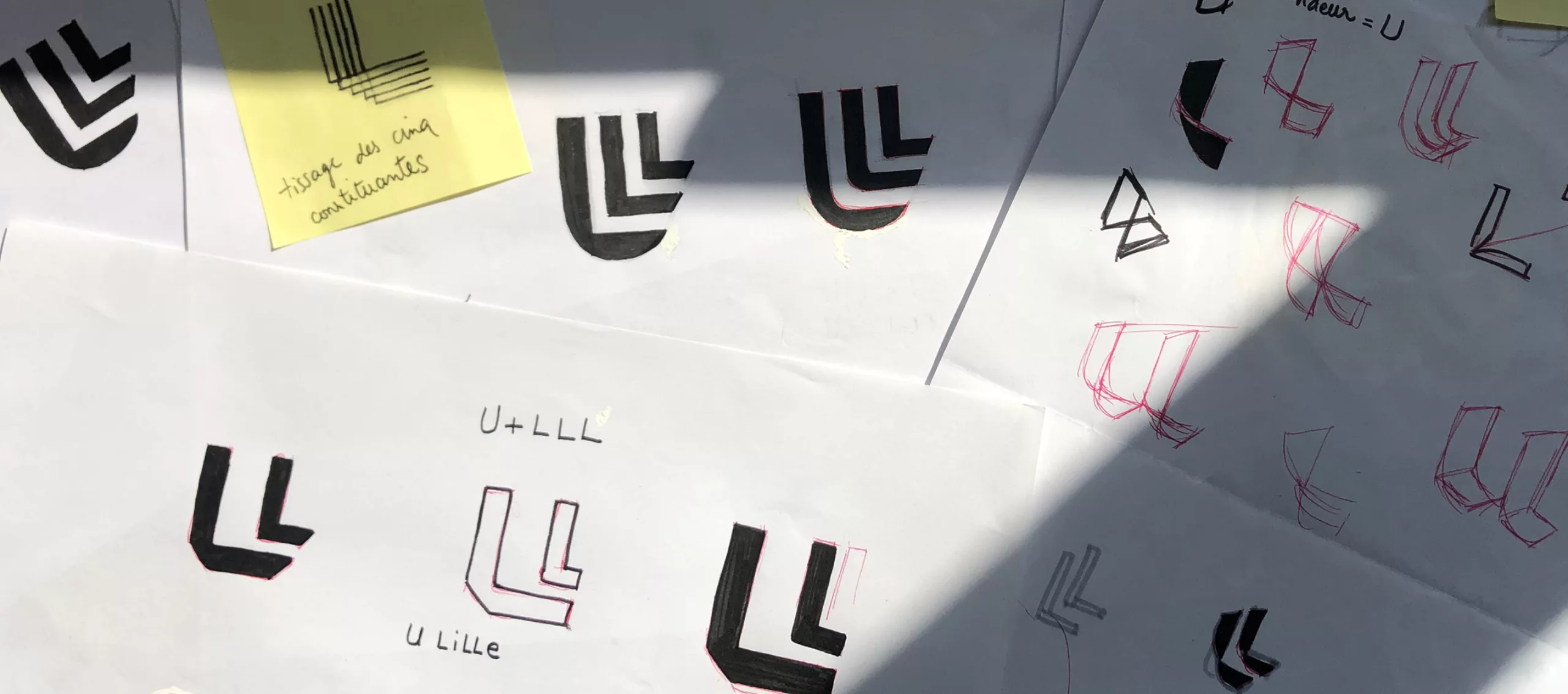
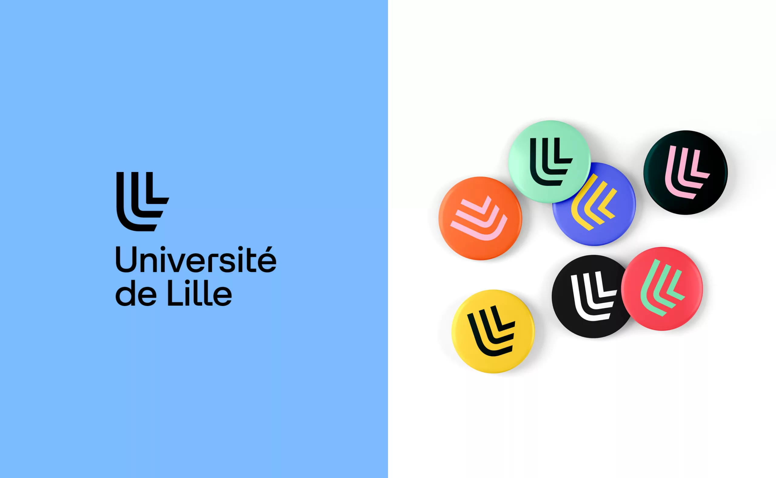
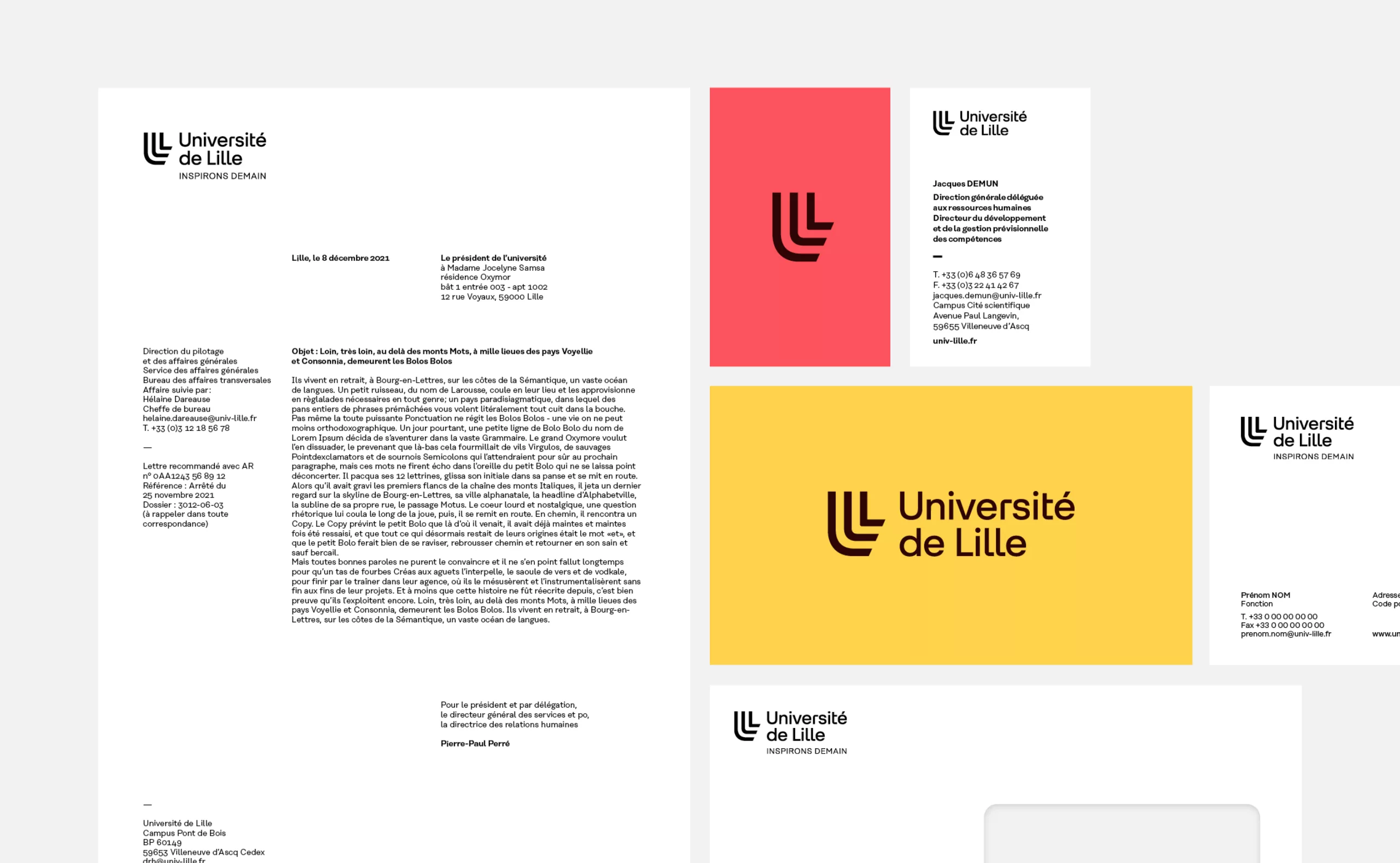
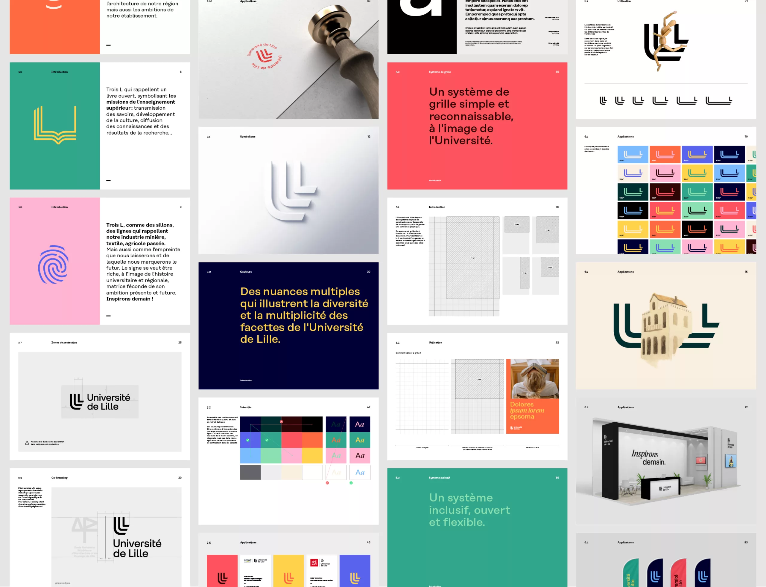
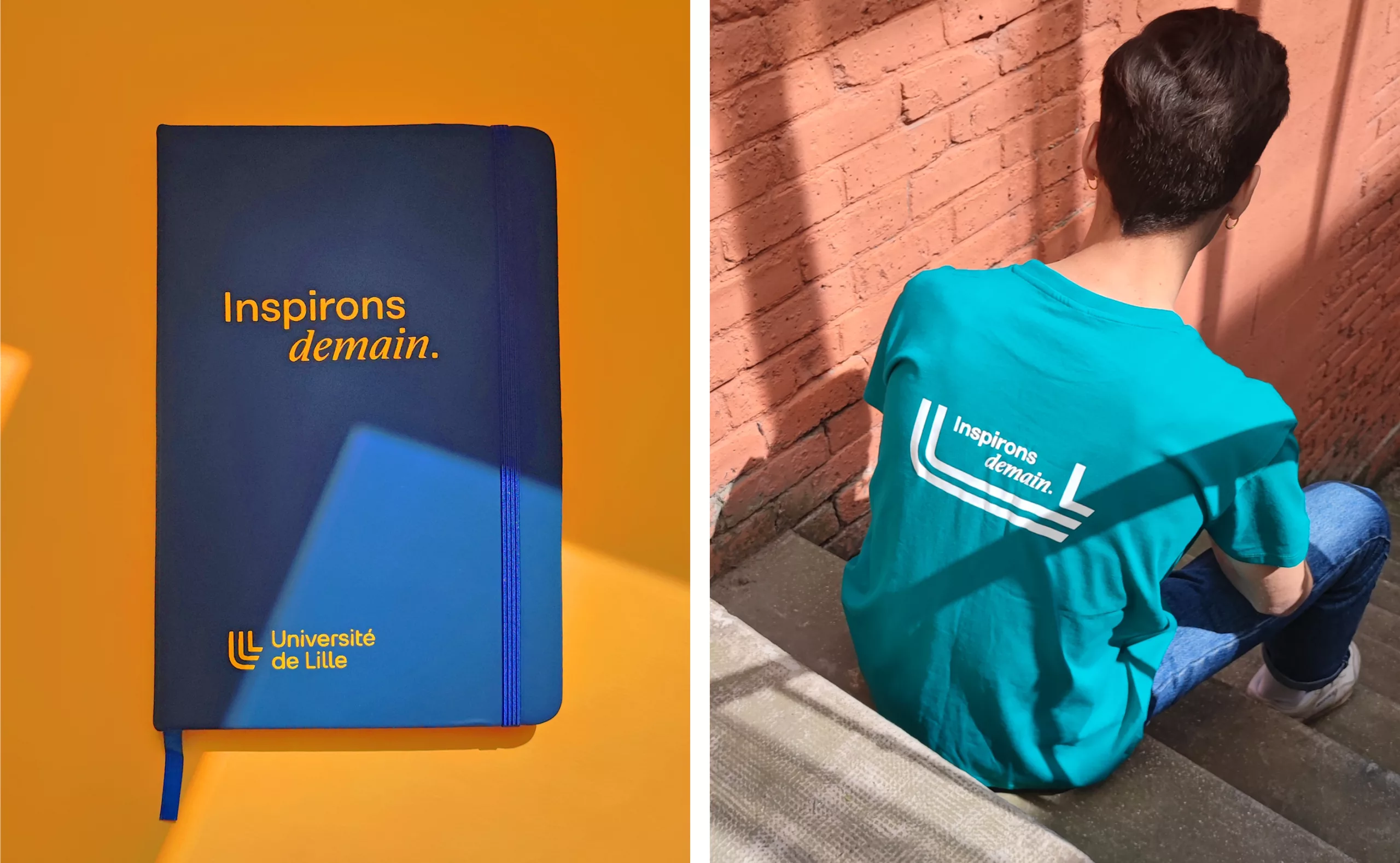
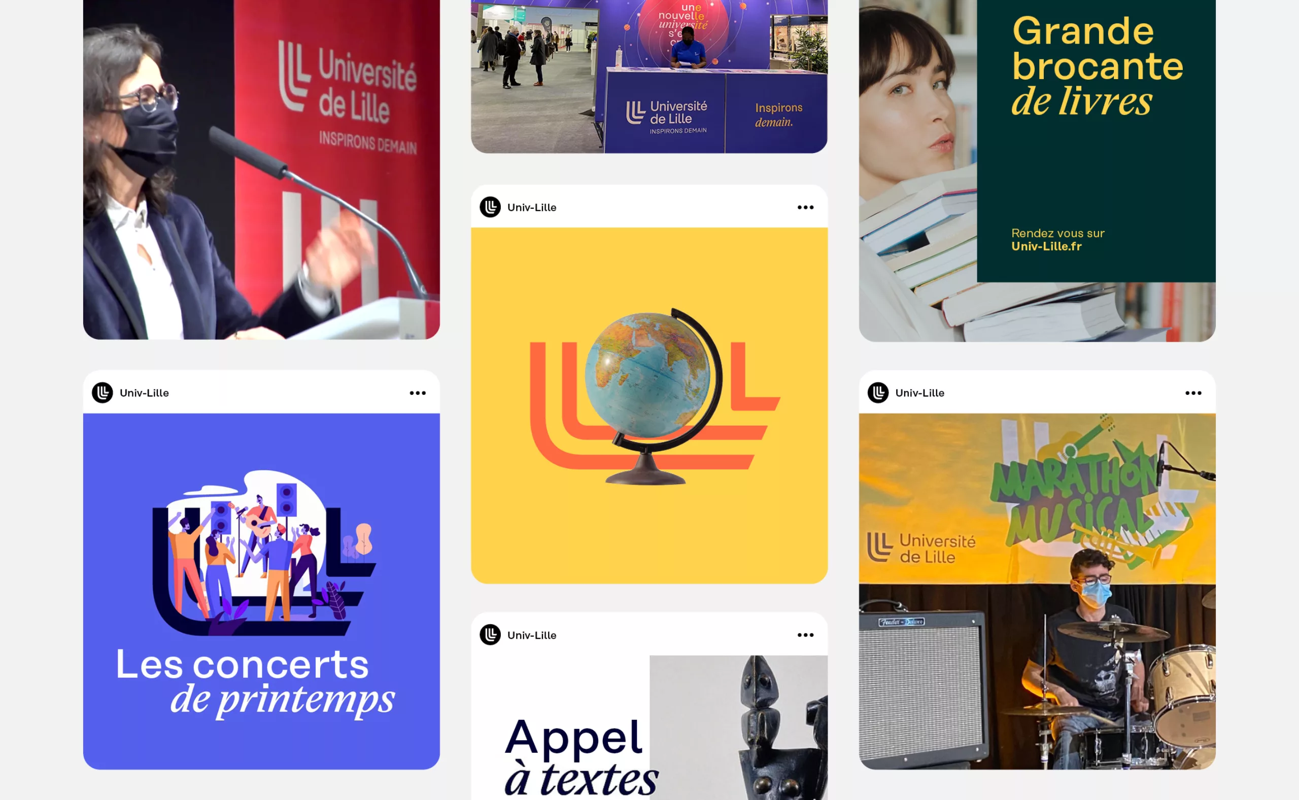
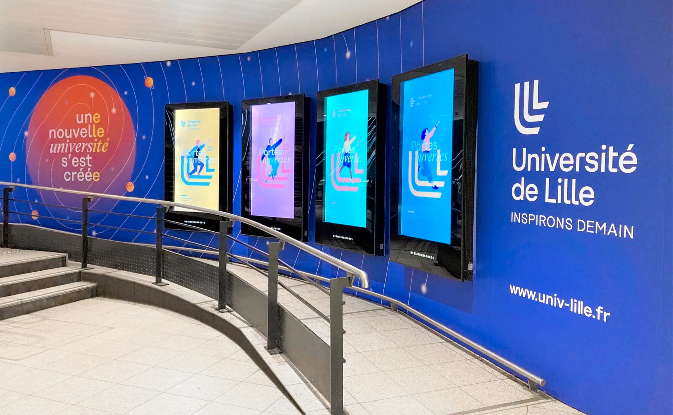
Graphéine accompanied Université de Lille in the definition of its visual identity, its brand architecture and its graphic guidelines in a co-construction process. Several workshops were conducted between June and July 2021. These co-creative workshops led the participants to question the values of the project, the symbolic vision of the university and the image of Lille territory.

An inclusive and flexible logo that reflects the university and territorial history

Accompanying the creation of the new institution, the University of Lille has adopted a logo to illustrate the transition it is making and to which it intends to contribute.

Three "Ls" for Lille form the "U" of University. Their interlocking shape evokes the leaves of an open book, symbolizing the mission of higher education to transmit knowledge. We can also see the furrows of the mining industry, those of agricultural crops and the lines of the looms of Lille's economic past. The curved emblem speaks to us of the warm hospitality of Northern France. Finally, a mark is emerging, one that marks the future and initiates the signature "Let's inspire tomorrow".

The slanted U is resolutely turned towards the future. The result is an open, dynamic and welcoming symbol that embodies all the facets of the University of Lille. With a very vertical design, the logo refers to the architecture of the territory and the heritage of Lille Metropole.

The wordmark, designed to measure, was thought in harmony with the emblem. There are many formal similarities such as the simplification of the barrels and the definition of square counter shapes that recall the cups of the emblem. This institutional logotype allows a wide variety of actions within the visual system. The creation of this new identity was achieved in co-construction with the teams of the University of Lille during various workshops. Valuable exchanges that allowed the emergence and the adhesion around this visual identity project.

A graphic identity that makes it easy to integrate the components and adapt them to a wide variety of materials

The logo adapts to the physiognomy of the component logos, in horizontal and vertical versions. This principle of support preserves the integrity and plurality of existing logos.
 A grid system has been put in place to allow the University's communication to be framed, when it speaks in its name or when it is the expression of one of its components. The margin system follows the angle of the emblem and gives great flexibility to the image and text.

Within its graphic guidelines, the University of Lille has a vast colorimetric palette. This wide range of shades aims to illustrate the diversity and multiplicity of its facets. In practice, this palette allows a great adaptability to the various supports and a harmony with the chromy of the various iconographies.

Two typefaces are used within the layout. Rational by René Bieder and Eliza, by Camelot Typefaces. Their association transcribes the perfect agreement between French tradition and European modernity. This duo gives relief to the titles and its italic directly echoes the emblem.

This new unifying identity, gives birth to a new version of the University of Lille and translates its openness, interdisciplinarity and excellence. A joyful and flexible identity to which students, staff, researchers and teachers are already united!

Context

The players in higher education and research in the Lille metropolitan area are committed to better articulating their strengths and to putting forward a coherent proposal for education and research that will enable the region to become home to one of Europe's leading universities within the next 10 years. An experimental public institution (EPE) that is attractive, internationally visible, agile, that expands the field of possibilities, more efficient collectively and that will be able to count in the ecosystem will be created on 1 January 2022. This institution, a public university, will be called "Université de Lille".

Objectives

- Creation of a brand platform, which defines the way of being, acting and communicating. The platform must be the reference document, the guideline for the actions carried out and the messages developed. It also enables the brand identity to be shared internally so that everyone can
identity internally so that everyone can make it their own and adhere to it.
- Development of the brand architecture. Visualisation of the existing system to make all the components of the University of Lille accessible, visible and understandable.
- Creation and provision of a graphic system comprising the University of Lille logo and the accompanying visual universe. The graphic system must be rich, in the image of the regional university history, fertile matrix of its present and future ambition. The identity must be differentiating, to make the University of Lille a reference university.


Share this project:
Project expertise:
Logo creation, visual identity and graphic guidelines.
Type of client:
Communication in the education, higher education and health sector. An indispensable partner in the transformation of the health and wellness industry through the alchemy of creativity and technology. Communication in science and research.

Related projects: