identite_visuelle_IPGP-CaseStudy_logo

2022

New visual identity for Institut de Physique du Globe de Paris
Science for the planet

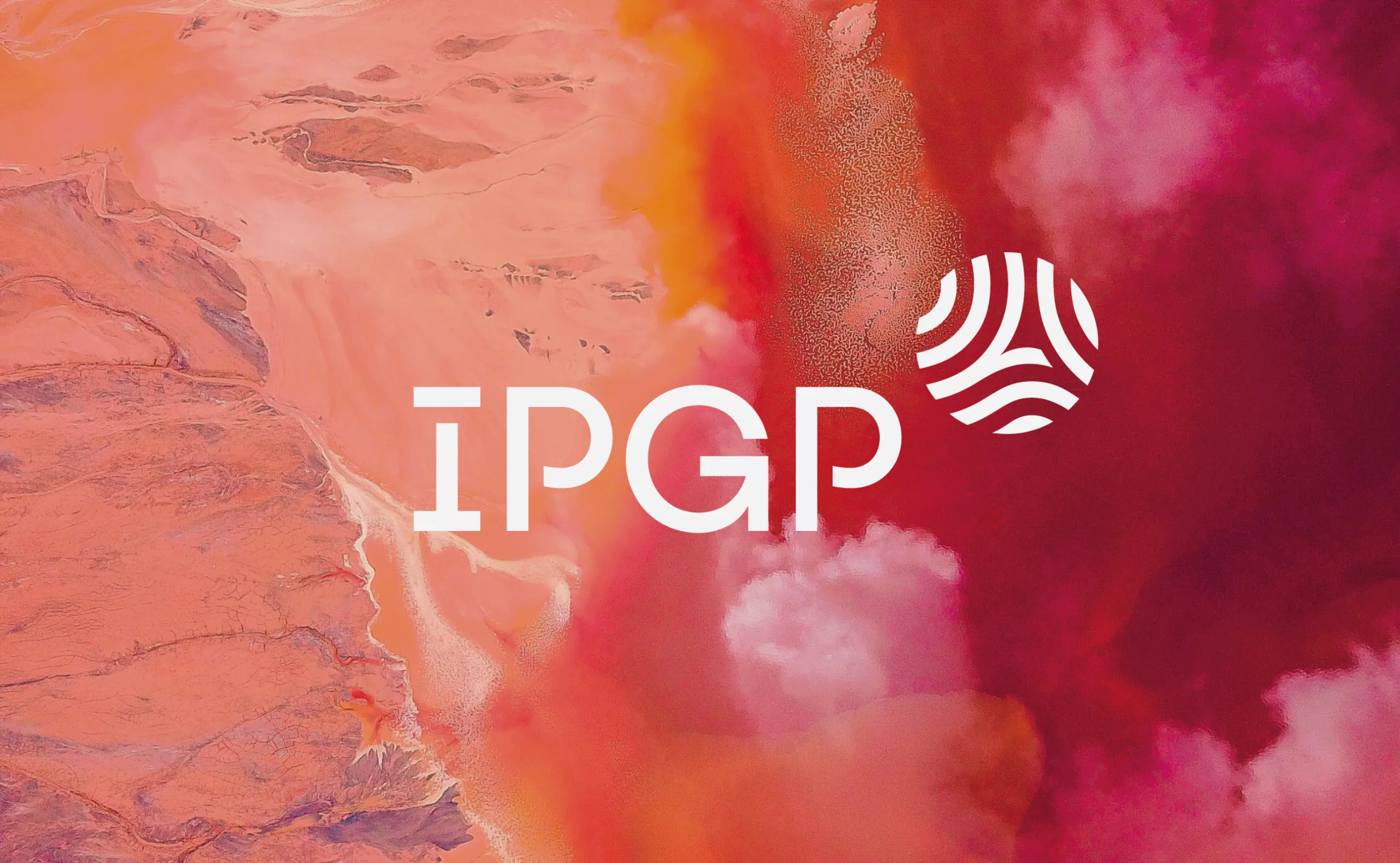
Institut de Physique du Globe de Paris is a major higher education and research establishment and a component of the Université Paris Cité. A world-renowned geosciences research organisation, the "IPGP" studies the Earth and planets from the core to the most superficial fluid layers.
It brings together around 500 people: researchers recruited from all over the world, engineers, technicians, administrative staff, post-doctoral and doctoral students from all countries who share the same passion for the Earth, planetary and environmental sciences.

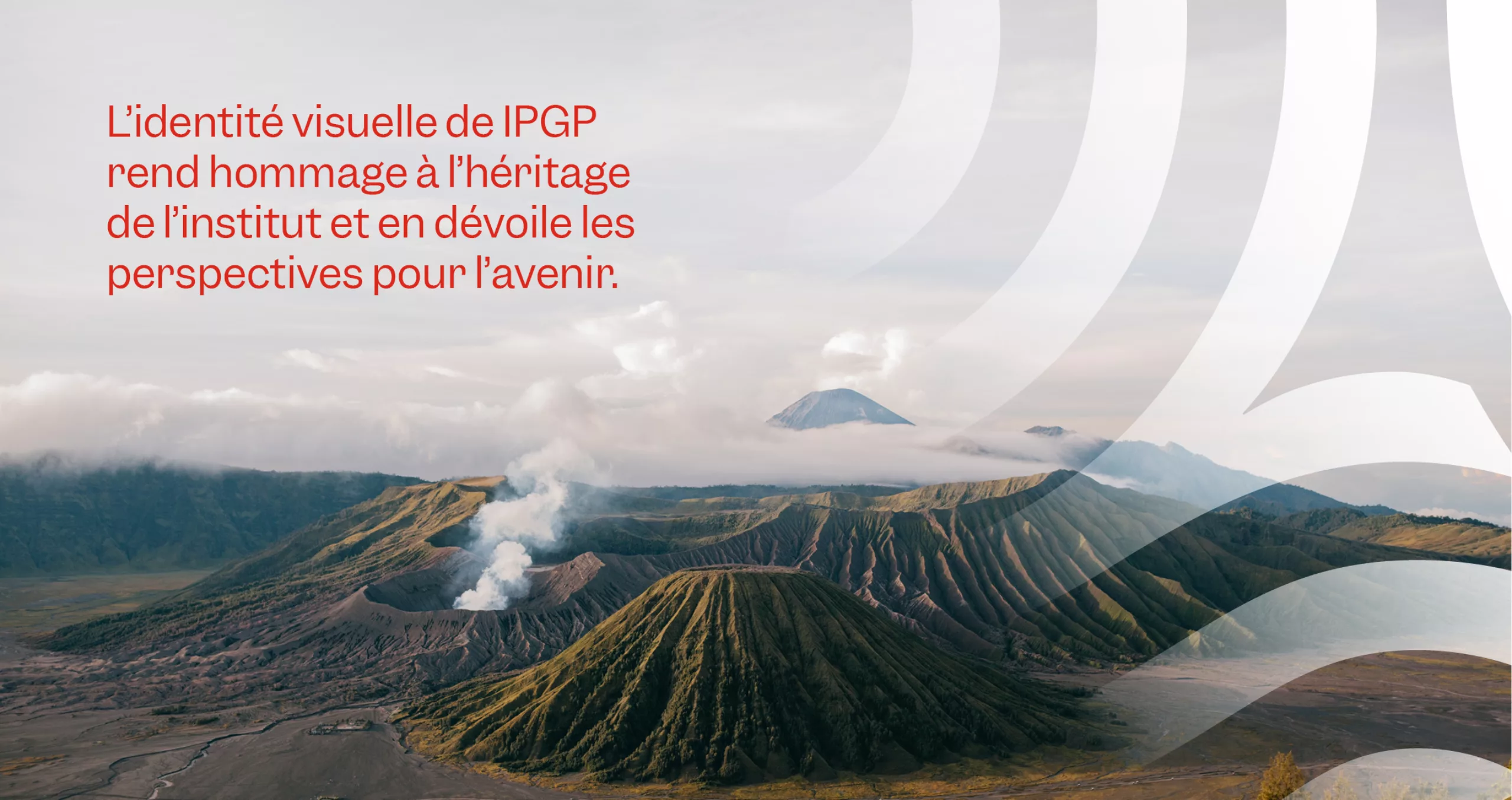
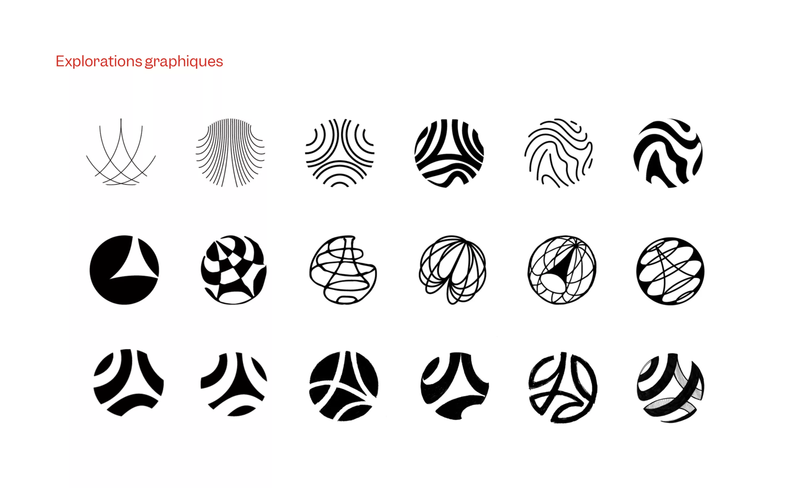
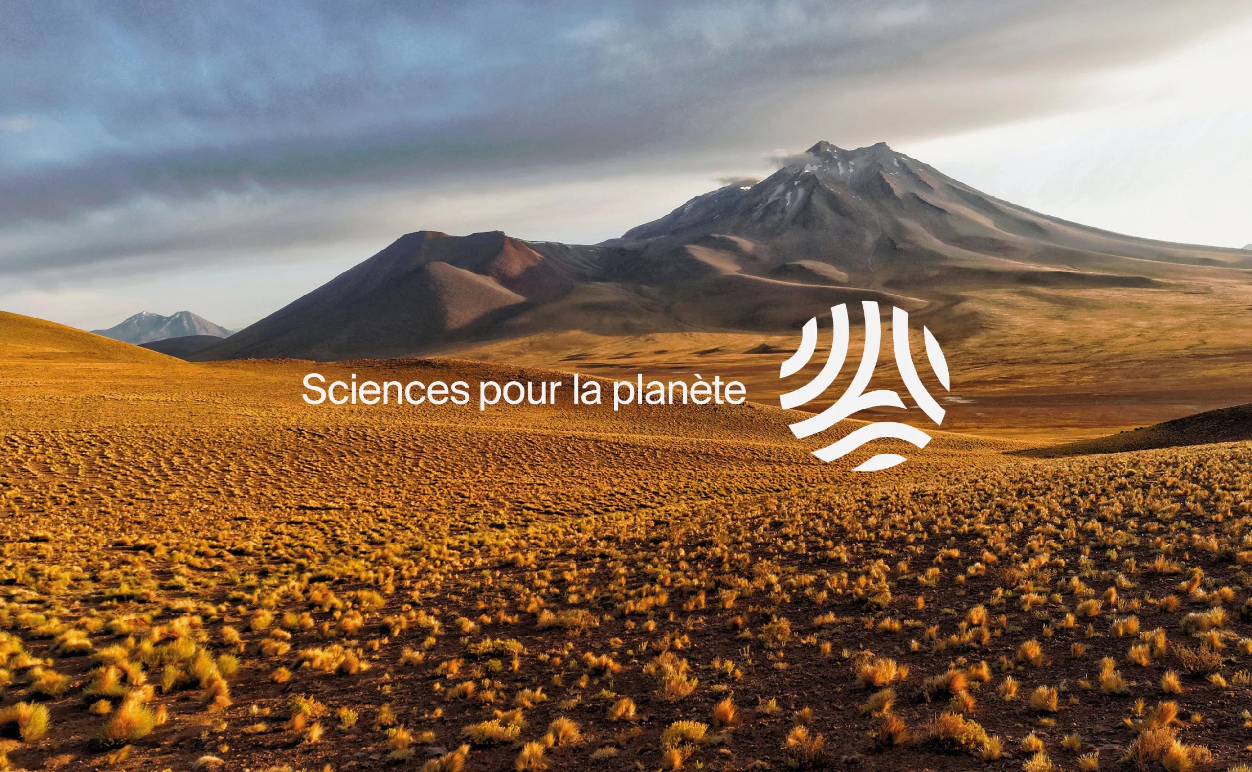
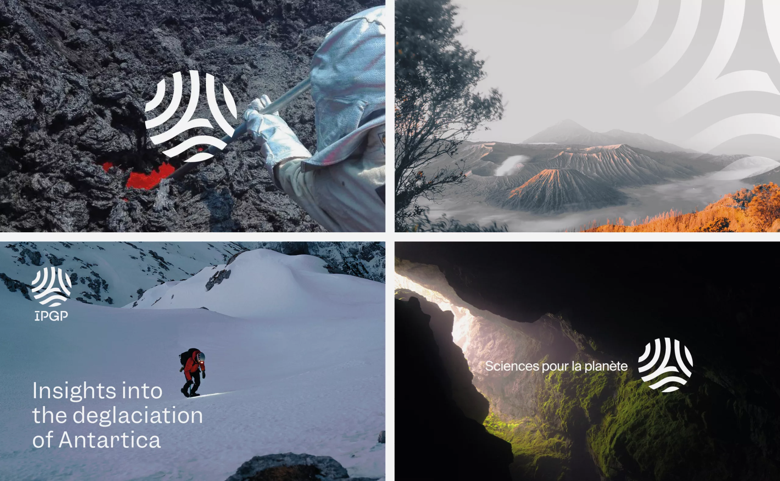
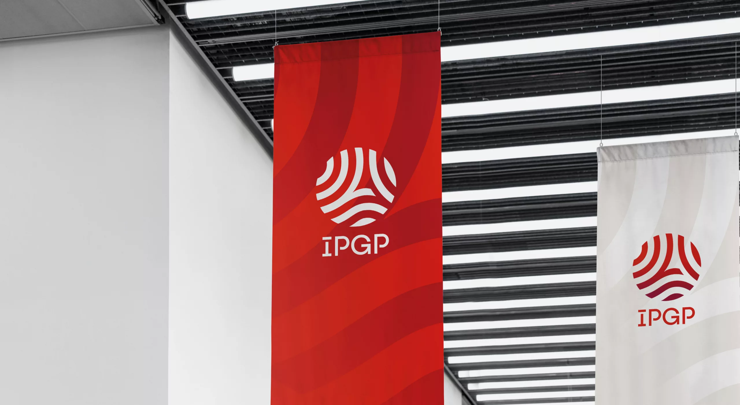
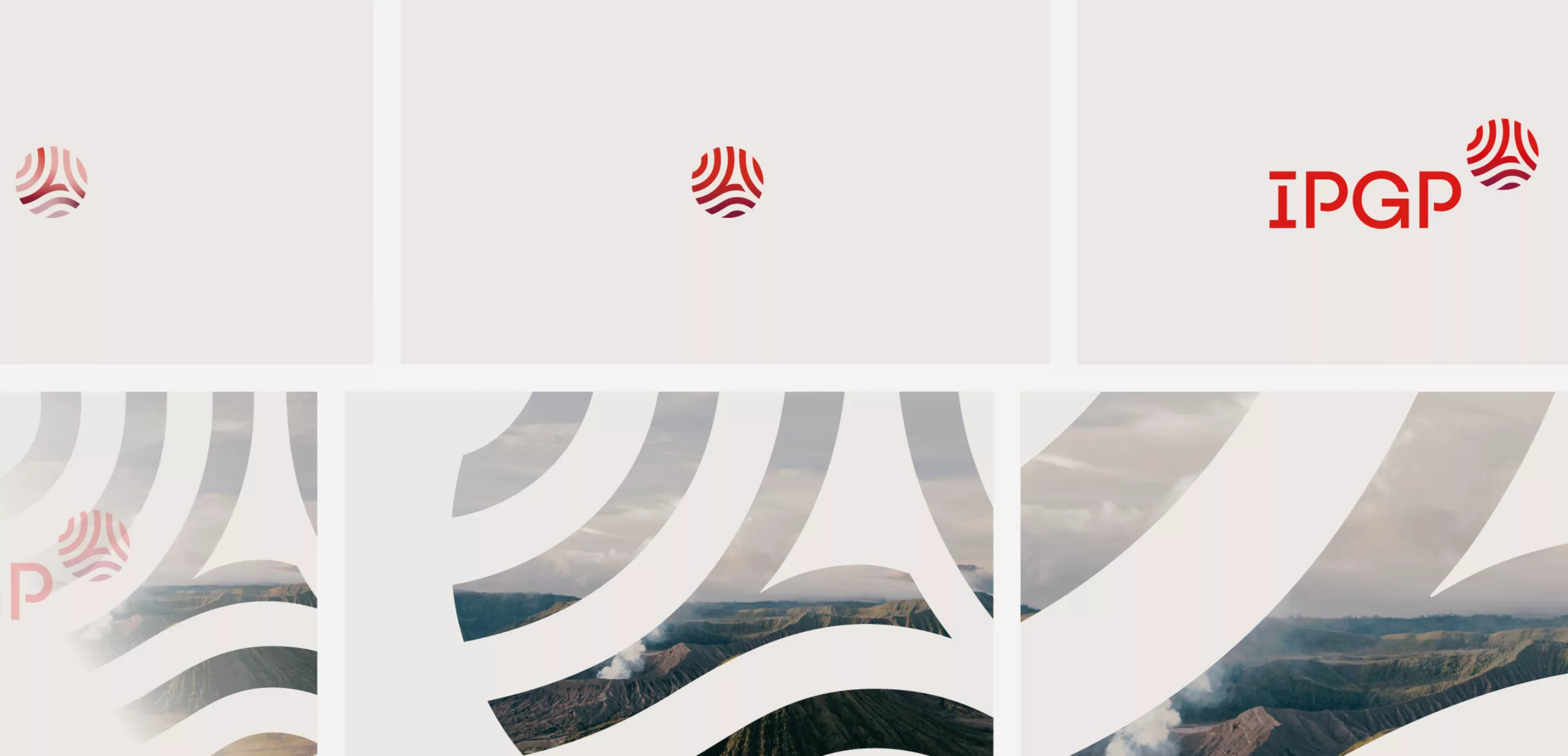
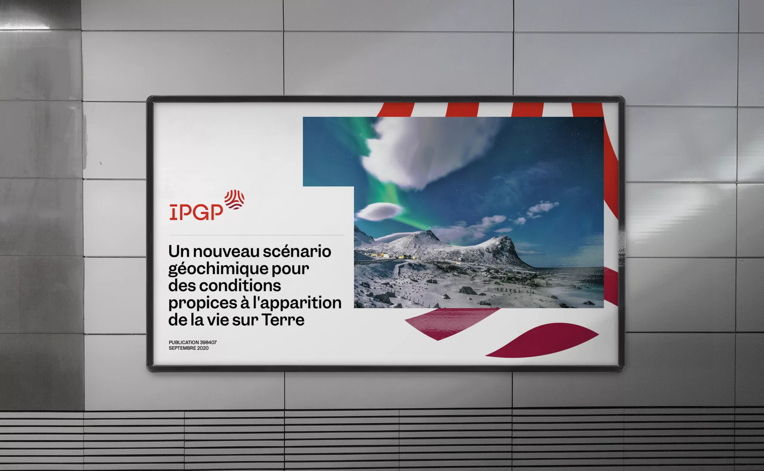
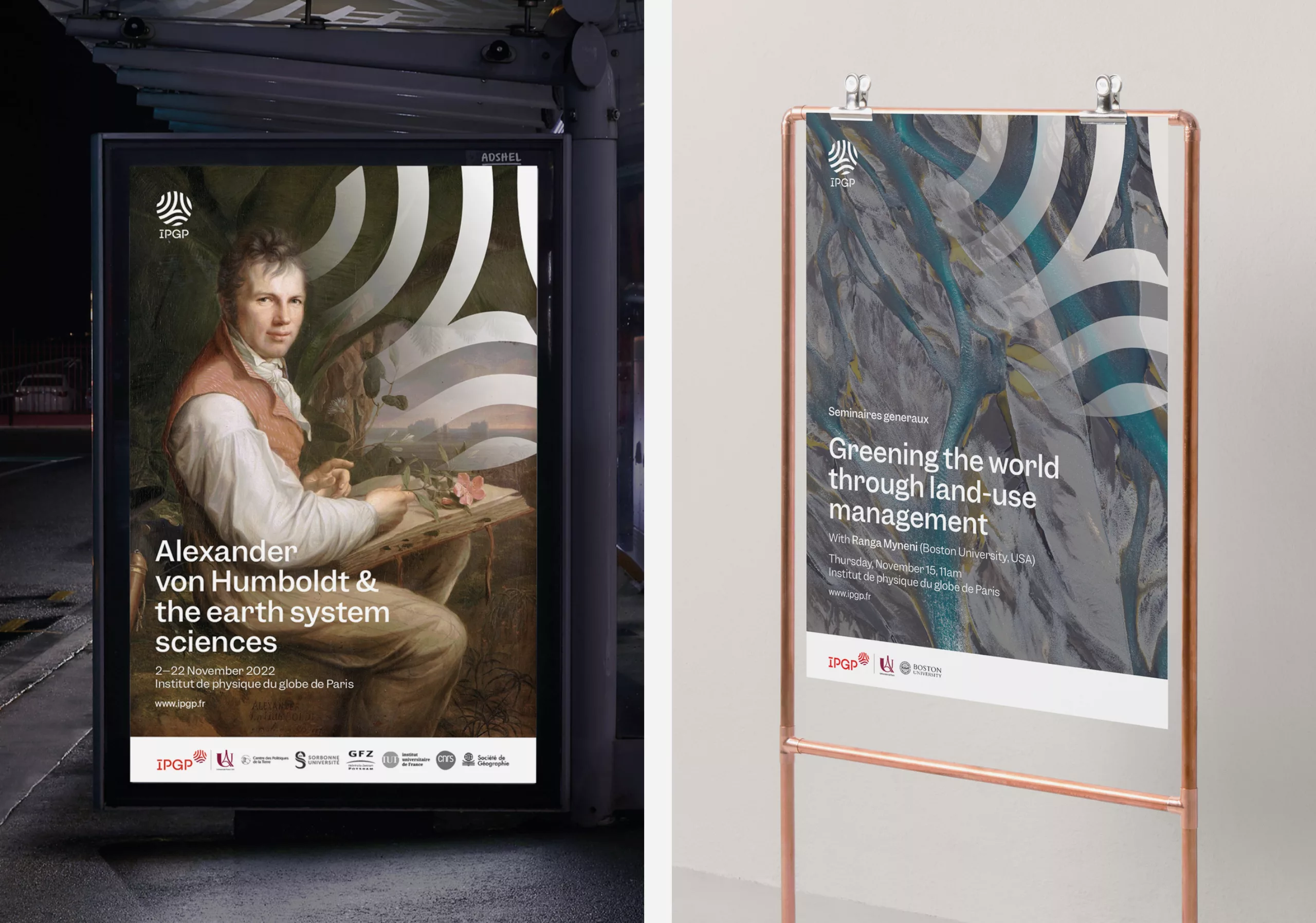
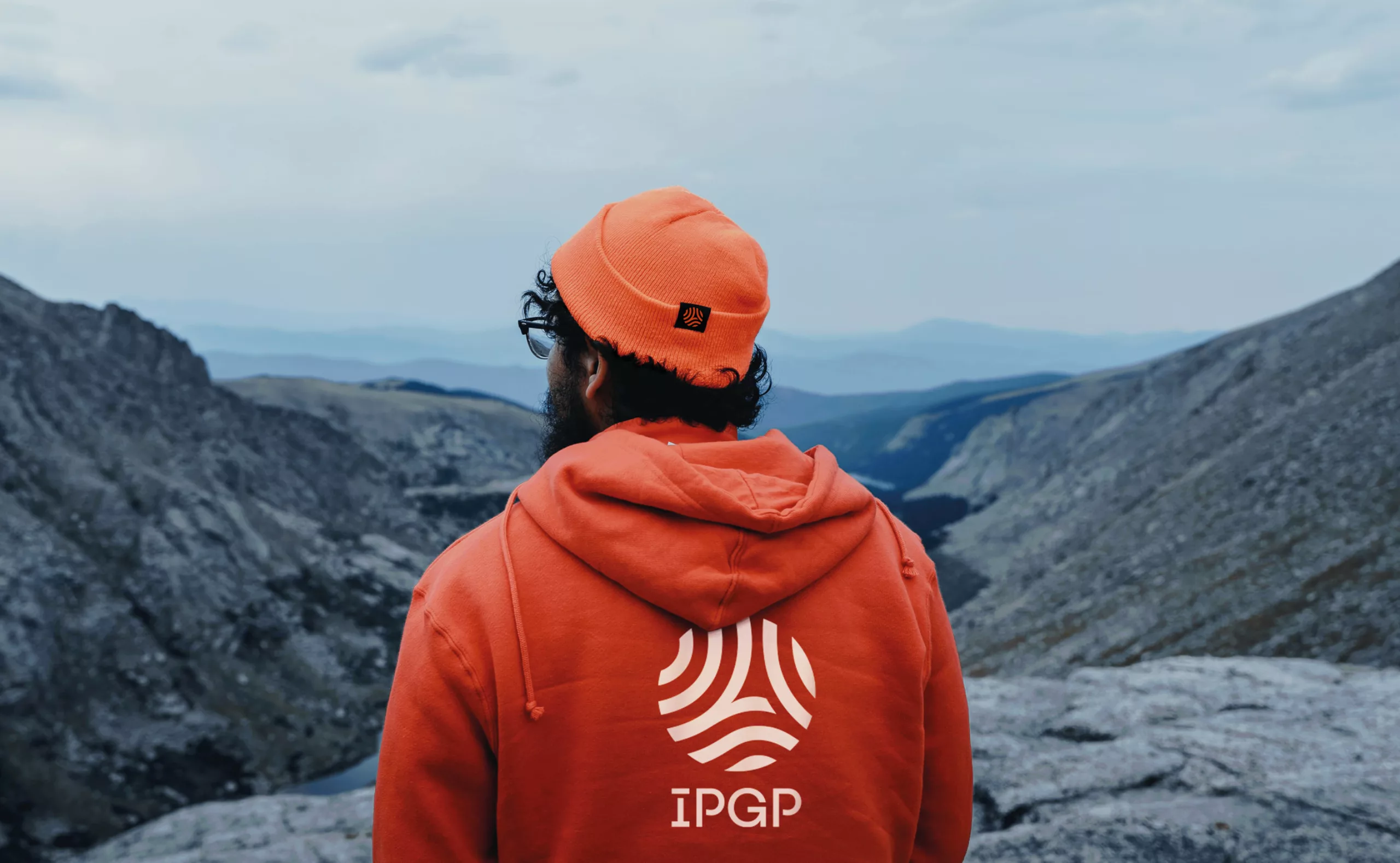
For the 100th anniversary of its creation, IPGP wanted to redesign its logo and more generally its visual identity. The previous logo was 30 years old and the objective was to make it more legible, more visible and timeless to gain credibility.

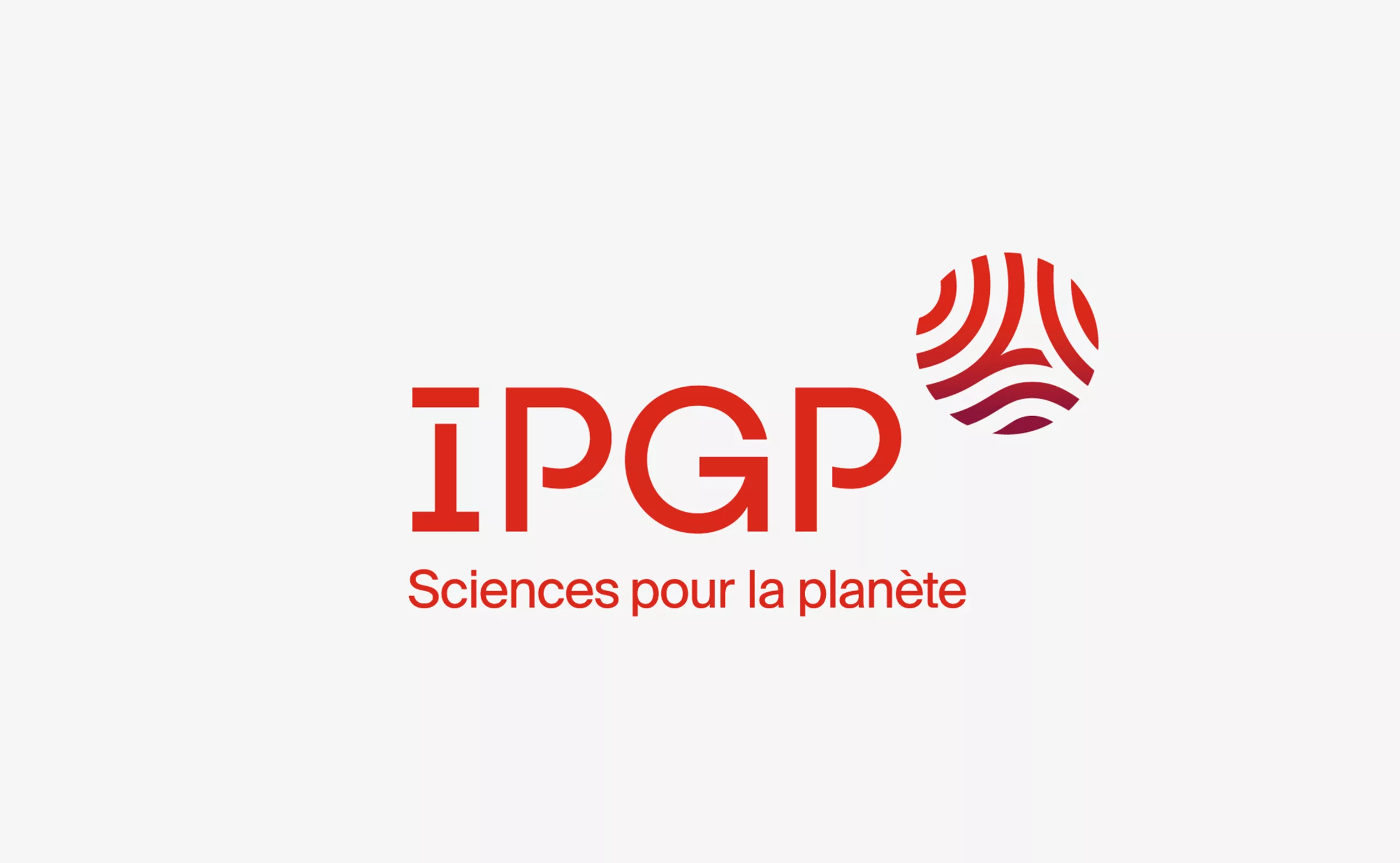
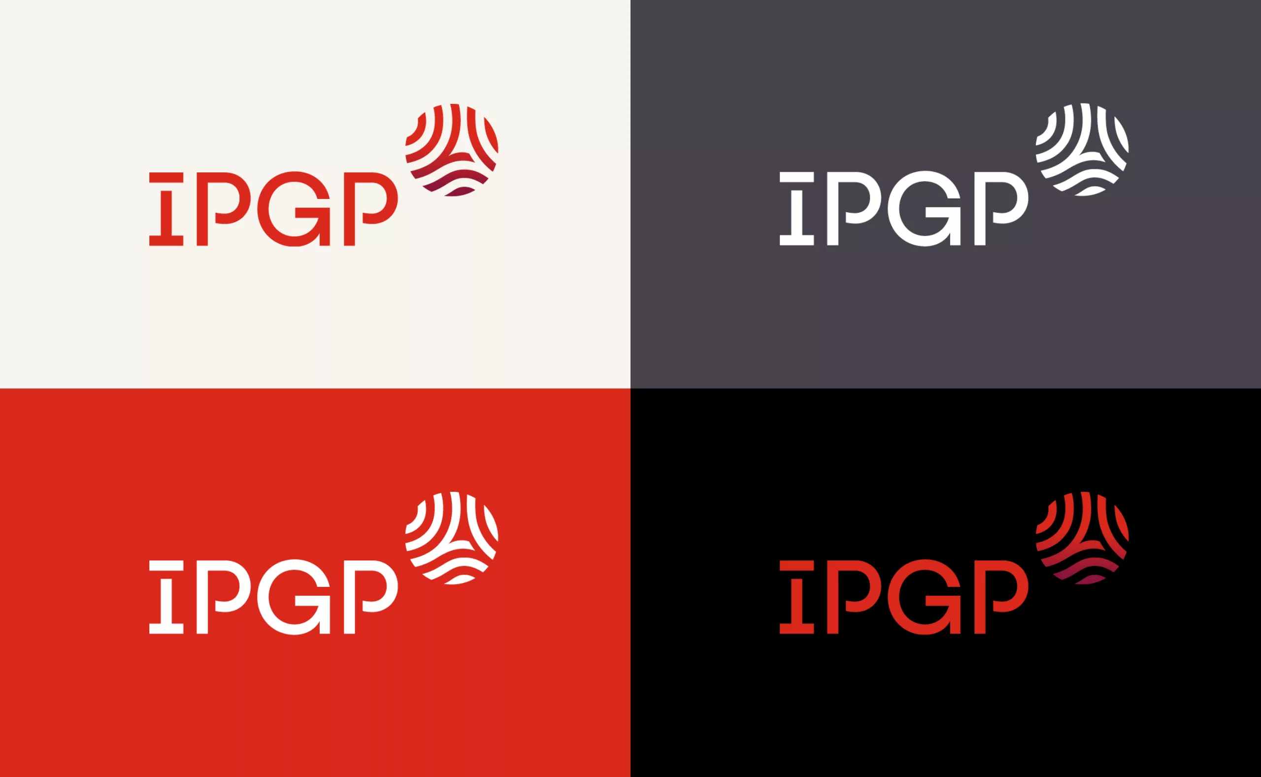
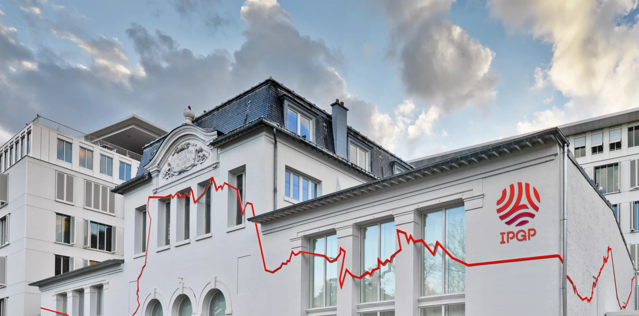
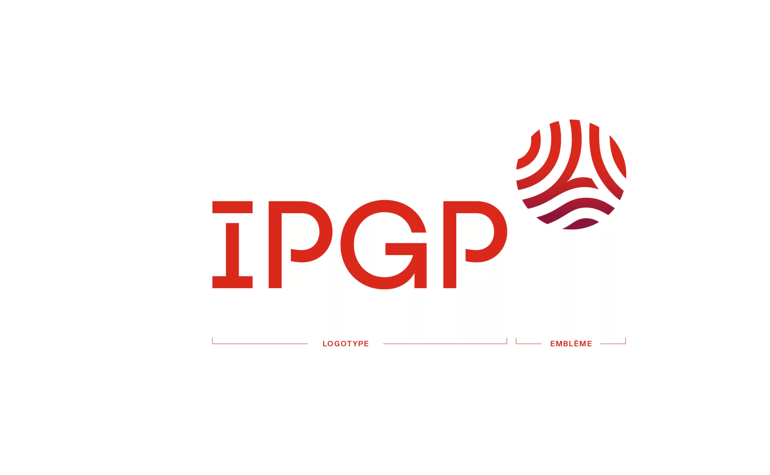
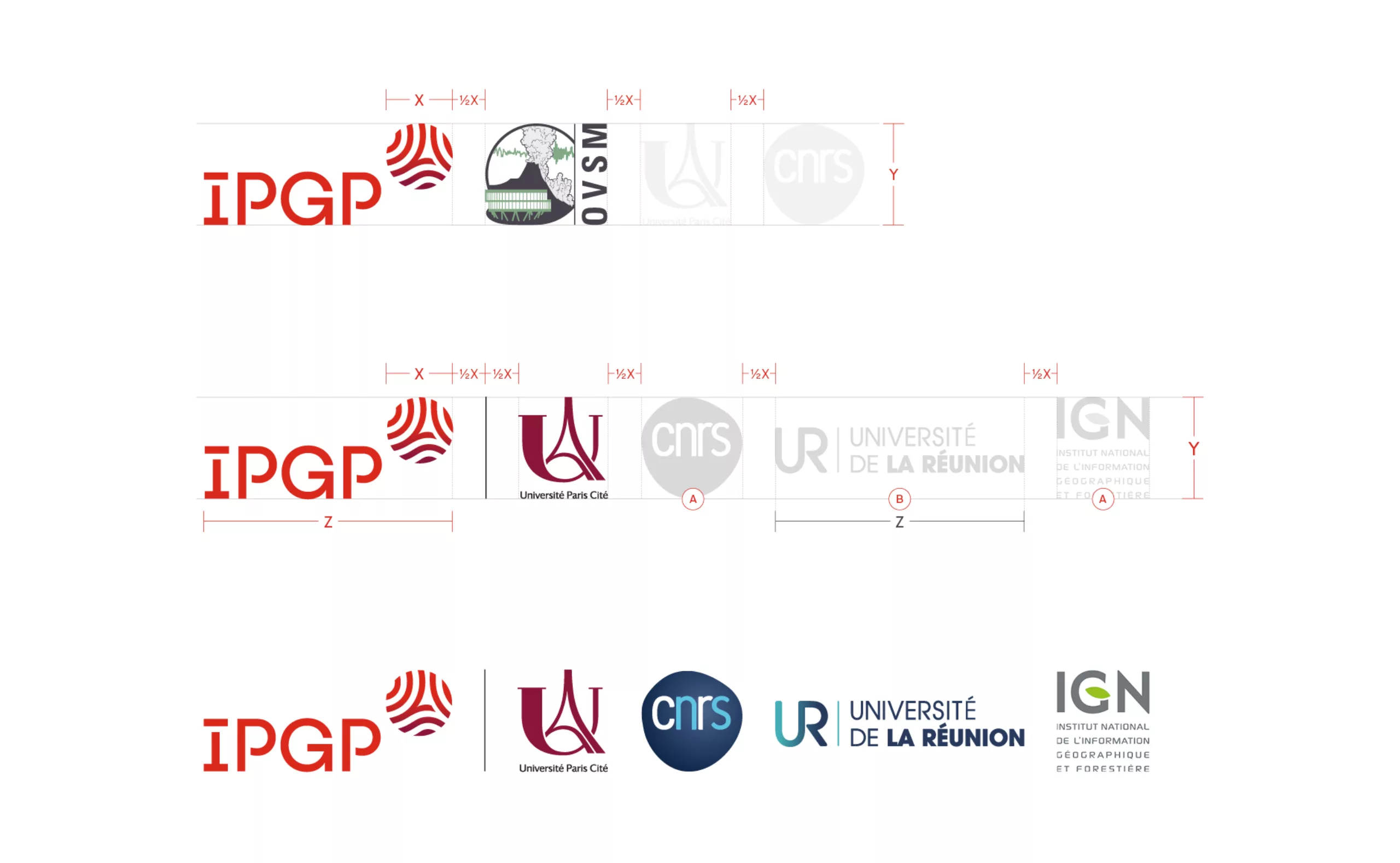
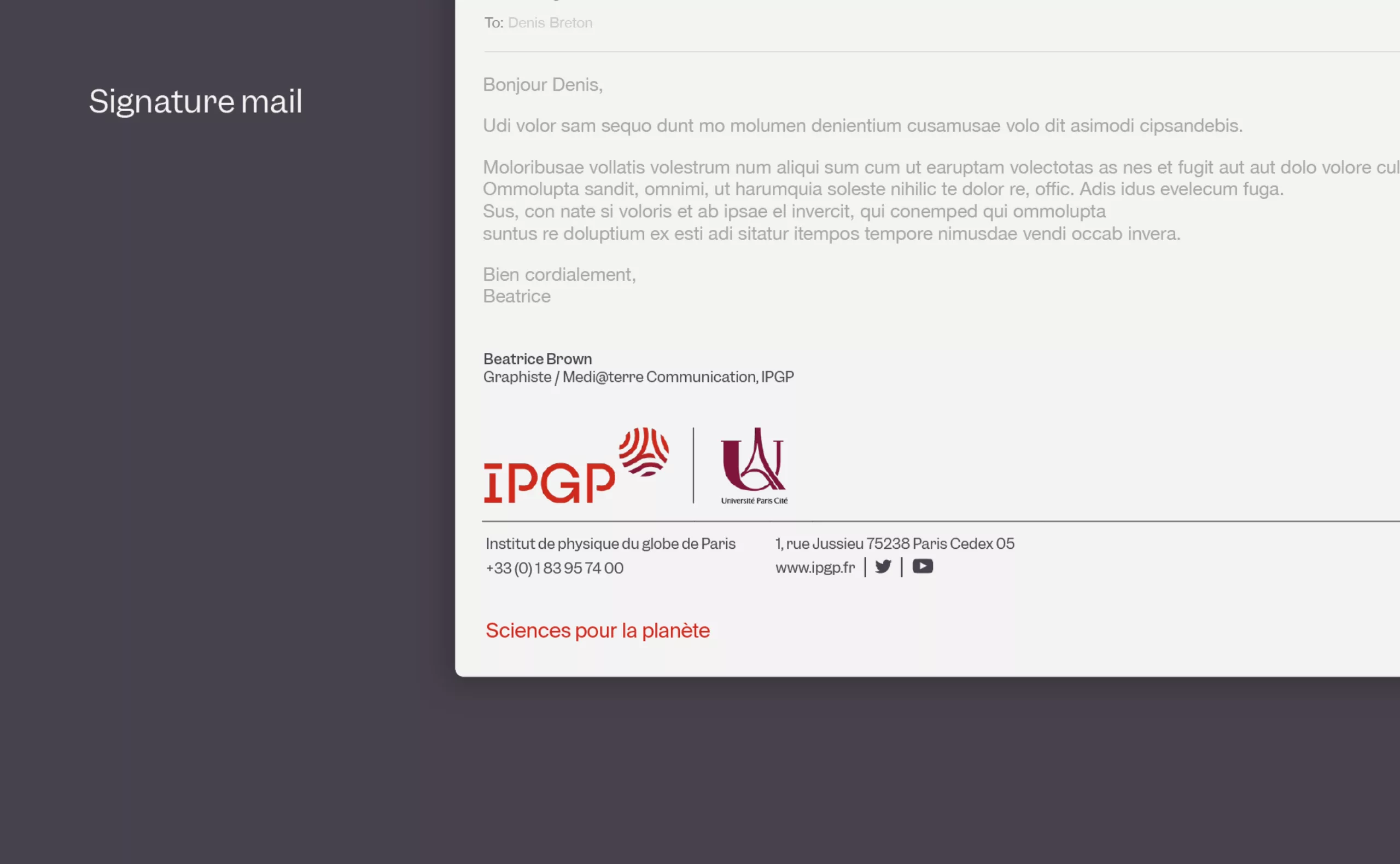
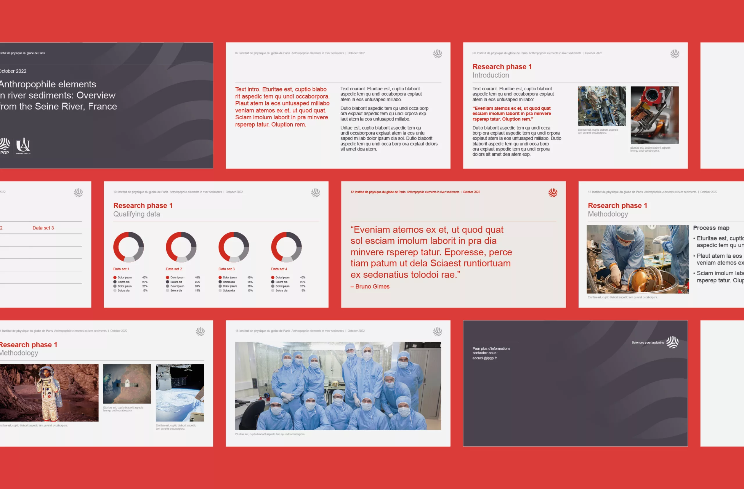
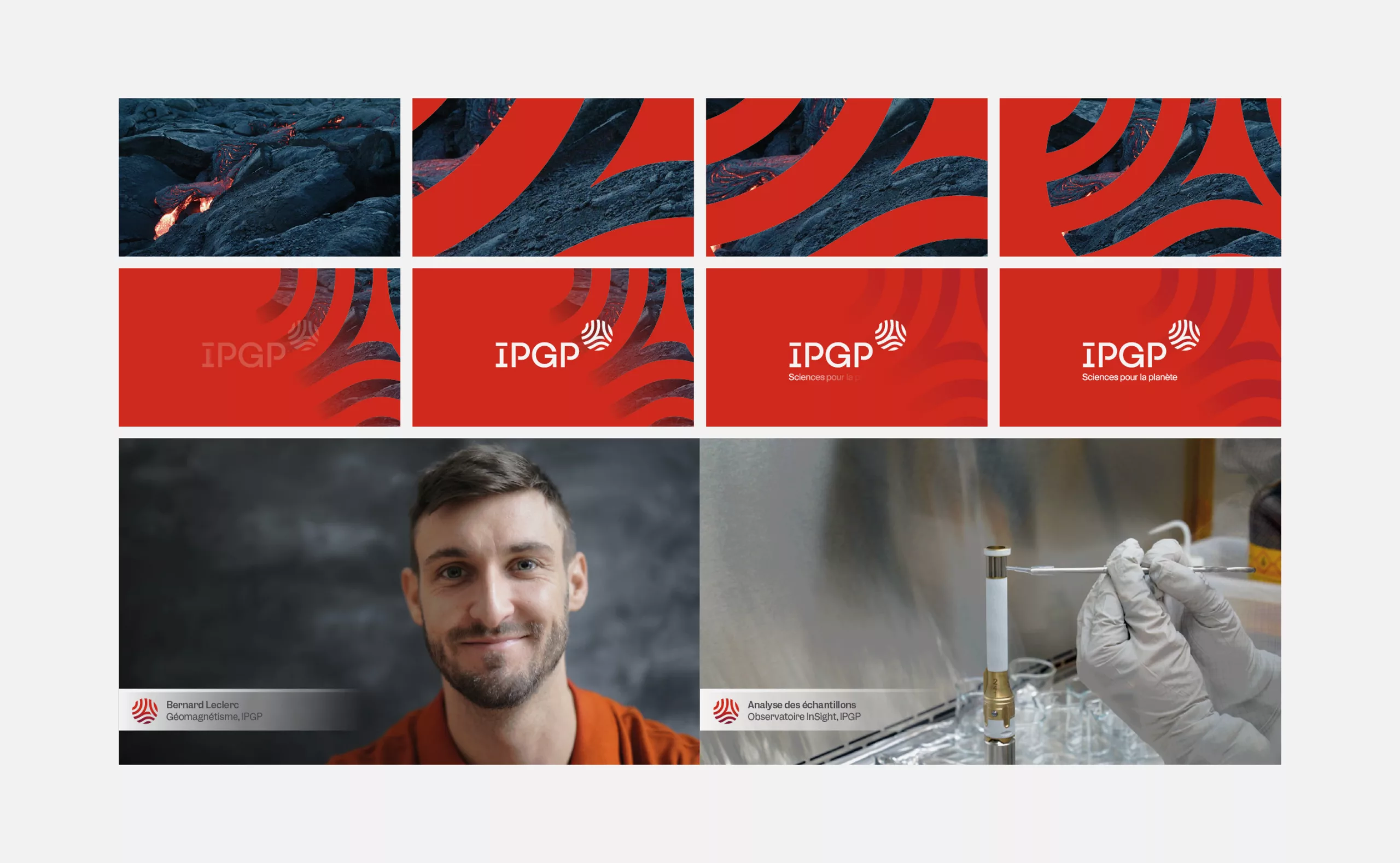
Graphéine worked with IPGP in the creation of its new visual identity and the implementation of its graphic guidelines. The new logotype modernizes the previous identity by giving it more impact and flexibility, while respecting the DNA that has built its reputation. This work of coherence has been pushed to the point of harmonising the logos of its volcanological and seismological observatories.

A new IPGP logo that merges the pre-existing graphic elements

To celebrate its centenary, Institut de Physique du Globe de Paris is evolving its image. Since 20 April 2022, the institute has had a new logo and signature, confirming its position as a reference institution in the field of Earth and planetary sciences.

The old IPGP logo had problems of legibility and was no longer adapted to current communication media. A study of its graphic design revealed that it was too complex, too illustrative in nature and too "generic" in design. Its acronym "welded" to the emblem prohibited any flexibility in the use and variations of the logotype. The presence of the title "Institut de Physique du Globe de Paris" clarifies the acronym but remained illegible in small size.

To preserve the symbolism of the existing logo, we decided to merge the globe and the Eiffel Tower to create a real emblem rather than a simple juxtaposition of two symbols
. Drawn in the form of waves, the Eiffel Tower becomes the "seismic" heart of the new "IPGP" globe.
This new logo, more modern and more understandable, keeps a globe and an Eiffel Tower, founding elements of the IPGP's image. By evoking the waves, the reliefs, the dynamics and the internal structures of the planets, it represents the various missions and scientific themes of the institute. The choice of colours, evocative of the earth, also acknowledges its integration, as a component institution, within the Université Paris Cité. It is accompanied by a complete, clear and coherent visual identity, with a harmonisation of the logos of its volcanological and seismological observatories. The new logo is also characterised by its new warm glowing colour, which refers to molten magma and volcanic lava.

A global brand territory that identifies IPGP communications

In addition to a new logotype, the IPGP's visual identity has a brand new universe. This is embodied by graphic codes combining chromatic ranges and typographic styles designed to create unique information environments that signal, communicate boldly and energetically IPGP. The IPGP primary colour range is distinguished by its base colour, a "Magma" red, complemented by three other colours: ruby, sand and graphite.

The primary colour palette includes four accent colours which are designed as complements to the base colours Magma, Ruby, Sand and Graphite. The IPGP secondary colour range is designed as a functional and complementary suite of shades. These colours are also used to identify the three volcanic observatories of the IPGP.

Garnett becomes the primary typeface of the IPGP graphic guidelines. It is a robust contemporary Grotesk designed by Connor Davenport and distributed by the Sharptype foundry. It has the affable personality of 19th century metal type. Garnett's role is to draw attention to the most important messages communicated by IPGP and it is therefore used carefully and sparingly for headlines and short texts. The typography for the text is Swiss Int'l, a simple and effective sans serif.

With this new visual identity, the IPGP is now more visible and more timeless; it gains credibility. From now on, its visual identity associated with that of its peers truly reflects the innovative character of the institution. Its communication deploys a flexible and recognizable graphic language for a better identification on the international scene.

Context

The IPGP, a major international teaching and technology institution, became part of Université Paris Cité on March 20, 2019, as a component institution, while retaining its moral and legal personality.

Objectives

- Redesign of the logo and creation of graphic principles constituting the visual identity
- Development of the graphic charter and delivery of ready-to-use templates (letterhead, kakemonos, presentation brochures, social networks, video packaging and promotional items)


Share this project:
Project expertise:
Logo creation, visual identity and graphic guidelines.
Type of client:
Communication in the education, higher education and health sector. An indispensable partner in the transformation of the health and wellness industry through the alchemy of creativity and technology. Communication in science and research.

Related projects: