2019

Université Paris Cité
French academic excellence
Université Paris Cité is a public university born on March 20, 2019 from the assembly of the universités de Paris Descartes, Paris Diderot and the integration of Institut de Physique du Globe de Paris. These universities are merging around the same scientific, cultural and experimental professional project. This new university aims to meet the challenges of society, both in training and research, by pooling high-level skills and promoting French excellence internationally. Three key values define the IdEX labelled project: innovation, international openness and attention to excellence.
Université Paris Cité has chosen Graphéine to define its brand identity and graphic charter in a co-construction process. Four workshops were conducted between June and July 2018. These co-creative interactions led the participants to question the values of the project, the symbolic vision of the university and the image of the Parisian territory. It was the perfect opportunity to exchange collectively about qualities that define a relevant visual identity and the added value of design.


Tradition versus Innovation ?
Heritage at the heart of the transmission of knowledge
Three strategic directions of visual identity have emerged following the consultation and workshop sessions with the university's teams. Some seek to reinvent the Parisian imagery through a technological aesthetic designed to communicate the idea of innovation. Others, on the other hand, draw on the panorama of Parisian cultural signs to anchor the project both historically and territorially. The opposition between tradition and innovation was the occasion for passionate and fascinating debates between the members of the pilot committee and Graphéine. The "heritage" orientation was finally preferred. It is the most effective way to bring the gathering up to the level of the largest Anglo-Saxon and world university campuses.
This choice is sufficiently fertile to give legitimacy and natural authority to the project among the richness of the Parisian university offer. It makes it possible to create a common historical ground without which it would have been difficult to bring together the various actors involved in the project. The logo of the University Paris Cité aims to establish an emotional link between people and the institution. It must be a vehicle for a sense of belonging and community through its use at graduation ceremonies, and alumni associations, etc.
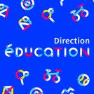
The icon has been designed to provide an understanding that goes beyond the language barrier and thus promote international brand awareness. We concretized this ambition by creating an emblem with a strong and obvious symbolism. The objective being to quickly emancipate this design from the presence of the title "Université Paris Cité" as an explanation of its meaning.


A typical Parisian monogram
An emblem with a strong symbolic that aims for international visibility
The logomark has been designed to convey the idea of boldness, prestige and elegance. Wearing the emblem of Université Paris Cité should be seen as a reward in the same way as the Varsity Letter awarded in the United States. It's a brand to wear with pride. Its identity is deeply rooted in the Parisian culture and intellectual spirit that inherited from the philosophers of the Lumières. Logo graphic style echoes the didone typefaces, which were widely used in France from 1810 to the 1950s for regulatory printed matter and school textbooks. His drawing also refers to the curves of the river La Seine, Paris historical vital axis.
The logomark is a monogram in the tradition of seals and stamps used by craftsmen and major fashion houses to sign the quality of their works. By combining the letter U and a stylized representation of the Eiffel Tower with the appropriate design, we create a symbol that gives the impression that it has always been around.
By taking inspiration from these traditions that the world envies us, Université Paris Cité is building a strong historical foundation. It's the claiming of this heritage that ensures international visibility and makes innovation possible. The claim to this heritage now makes it possible to unveil a timeless brand.


Crédits:
Creative direction: Jérémie Fesson
Art direction: Céline Chenu, Maxime Saint-Etienne, Jean-Albert Heckel, Ajitesh Lokhande
Project management: Leslie Darné
Acknowledgements:
Thanks to the entire project management team: Virginie His, Gaëlle Heron, Emmelyne Mitard, Aurore Tixier. Thanks to Christine Clérici, President of Paris-Diderot University, Frédéric Dardel, President of Paris-Descartes University and Marc Chaussidon, Director of the Globe Physics institute of Paris for their accessibility. Thanks to the administrative teams, researchers and students for their participation and enthusiasm during the course of the different co-construction workshops of the Université de Paris brand.
Project expertise:
Consulting in communication and brand strategy. Organization and animation of participative workshops for brand co-construction. Lead change management. Logo creation, visual identity and graphic guidelines. Creation of layouts for brochures, leaflets. Graphic design of posters, flyers, letterhead and business cards. Creation of derivative products and goodies.
Domains:
Education. Sciences & Resarch. Health. Litterature & Arts. Human sciences. Law, Economy & Management. Culture and Innovation.
Project expertise:
Logo creation, visual identity and graphic guidelines.
Logo creation, visual identity and graphic guidelines.
Type of client:
Communication in the education, higher education and health sector. An indispensable partner in the transformation of the health and wellness industry through the alchemy of creativity and technology.
Communication in the education, higher education and health sector. An indispensable partner in the transformation of the health and wellness industry through the alchemy of creativity and technology.
Related projects: