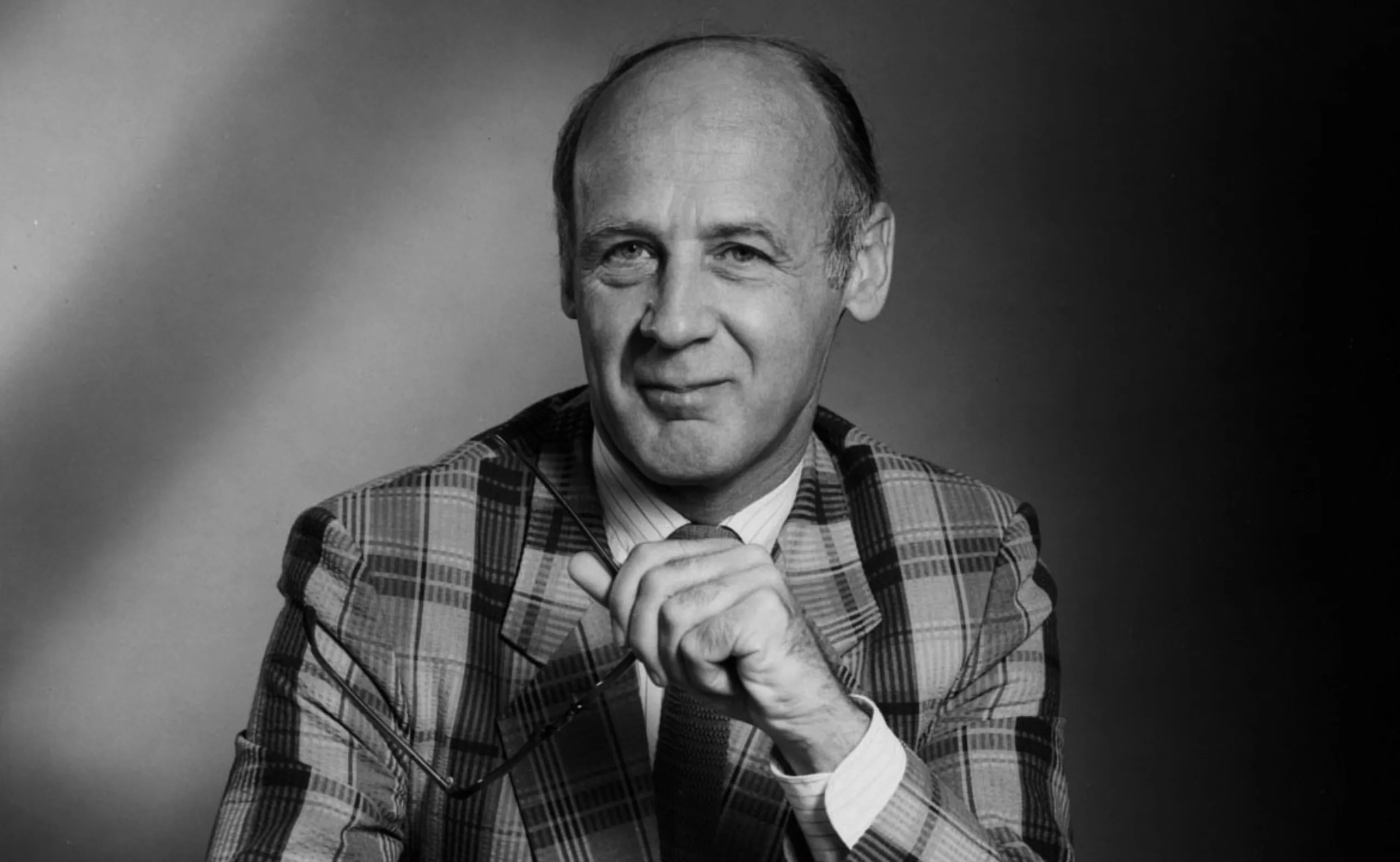
Herb Lubalin, the letter as an image
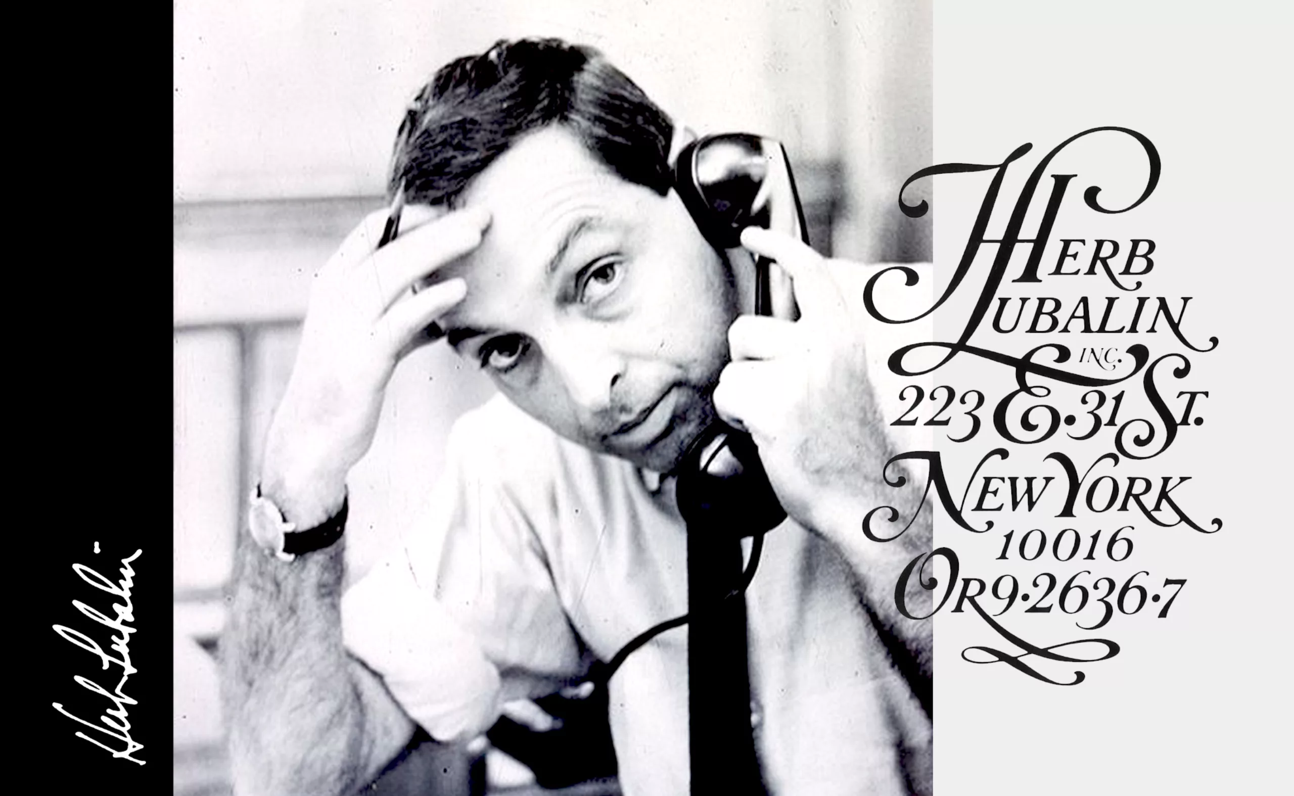
In his 40-year career, from 1939 to 1980, Herb Lubalin (father son of Russian immigrants and mother daughter of German immigrants, 1918 – 1981) revolutionized the American editorial and advertising style. His ideas led designers to change their approach to typography, through what he called “graphic expressionism”: “the use of typography or lettering as a creative means of expressing an idea, to elicit an emotional response from the viewer… and not just a mechanism for assembling letters on a page”.
At the time, no one deigned to have fun with letter drawings, as had been done at the beginning of the 20th century. His way of considering words as images shook up the orderly and regulated vision of modern Swiss graphic design, which had been used until then and especially since after the First World War.
From lettering to graphic magazines
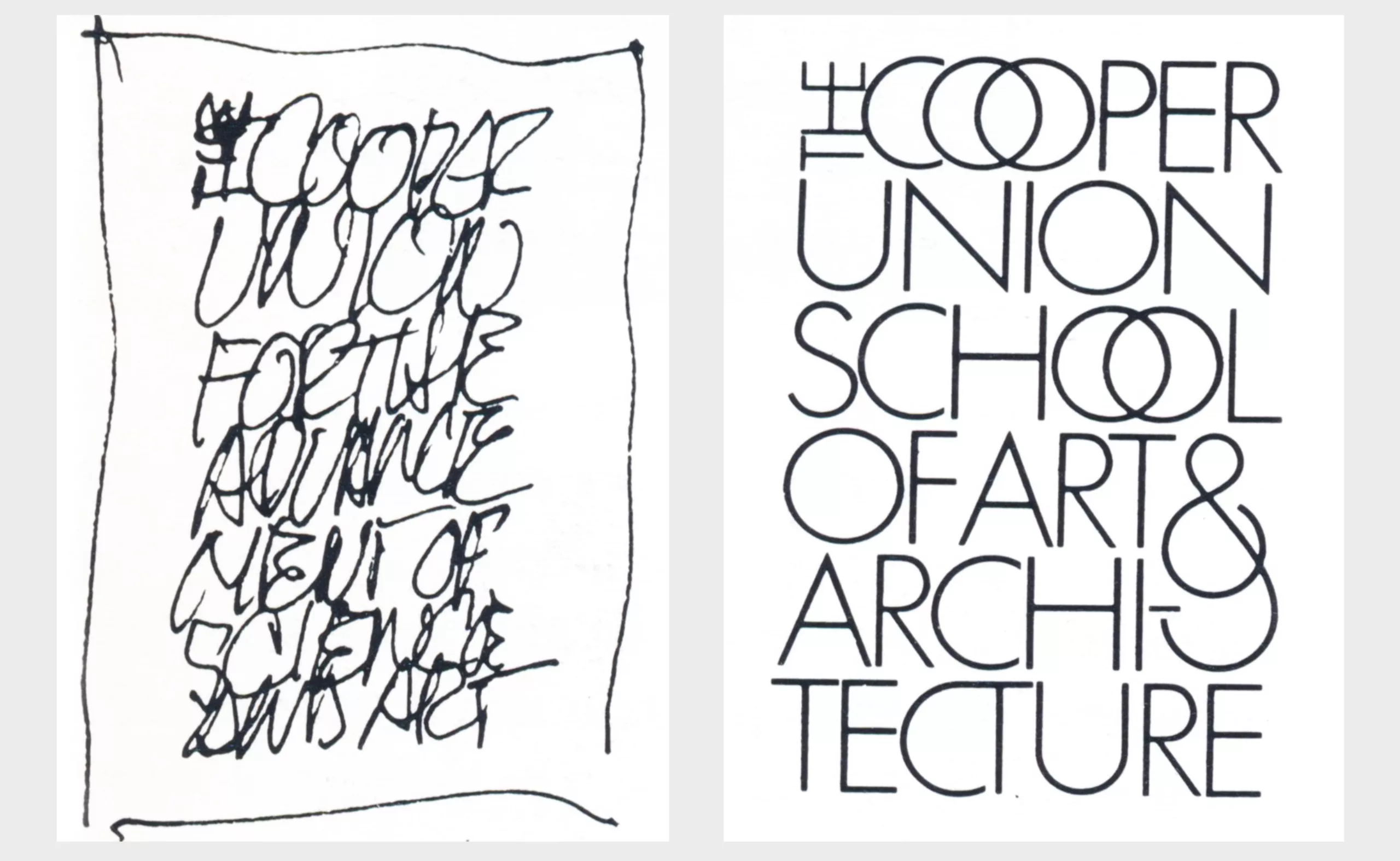
In high school, Herbert Frederick Lubalin (pronounced lou-ba-line) shows no signs of a penchant for art, except that he draws erotic portraits of Tarzan and Jane. This earned him the reputation of being a young pervert… Often expelled but just as inspired, he composed a few posters and won a few prizes. Aphasic and ambidextrous (no voice but two hands), he is necessarily more at ease in writing than in speaking and his bad grades prevent him from studying law or medicine as his parents would like. Because the competition is free, he joins by chance the university of art and architecture Cooper Union (of which he will draw the logo later) and discovers there a passion for the typography.
When he is given an assignment in calligraphy, his teacher is convinced that he is left-handed and that holding the pen with his right hand will be a real difficulty. As he is ambidextrous but did not bother to specify it… he completes the task rather easily and obtains the best mark, not because he is the best but because the teacher wishes to encourage him despite his “handicap”. This trick will give him the confidence to continue. He quickly becomes one of the best students and learns to think and implement graphic solutions. If his technique is not very advanced at the end of his studies, as he explains in an interview in 1969, he has the merit of being ahead of the game in terms of design and research of ideas.
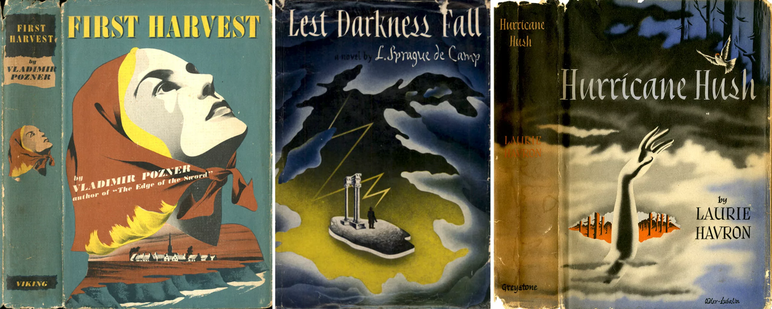
Upon graduation, he began his artistic career by designing, like many others, lettering for a sign company in New York for the 1939 World’s Fair. Fired for asking for a $2 raise (about $40 today), Lubalin freelanced for magazines and agencies or did art direction for book covers for Samuel Adler, who did the illustrations. These covers (1943) are the earliest surviving works by Lubalin. His style, far from the one for which he would become known, was inspired by the book cover work of George Salter, a professor at the Cooper Union who taught Milton Glaser, among others.
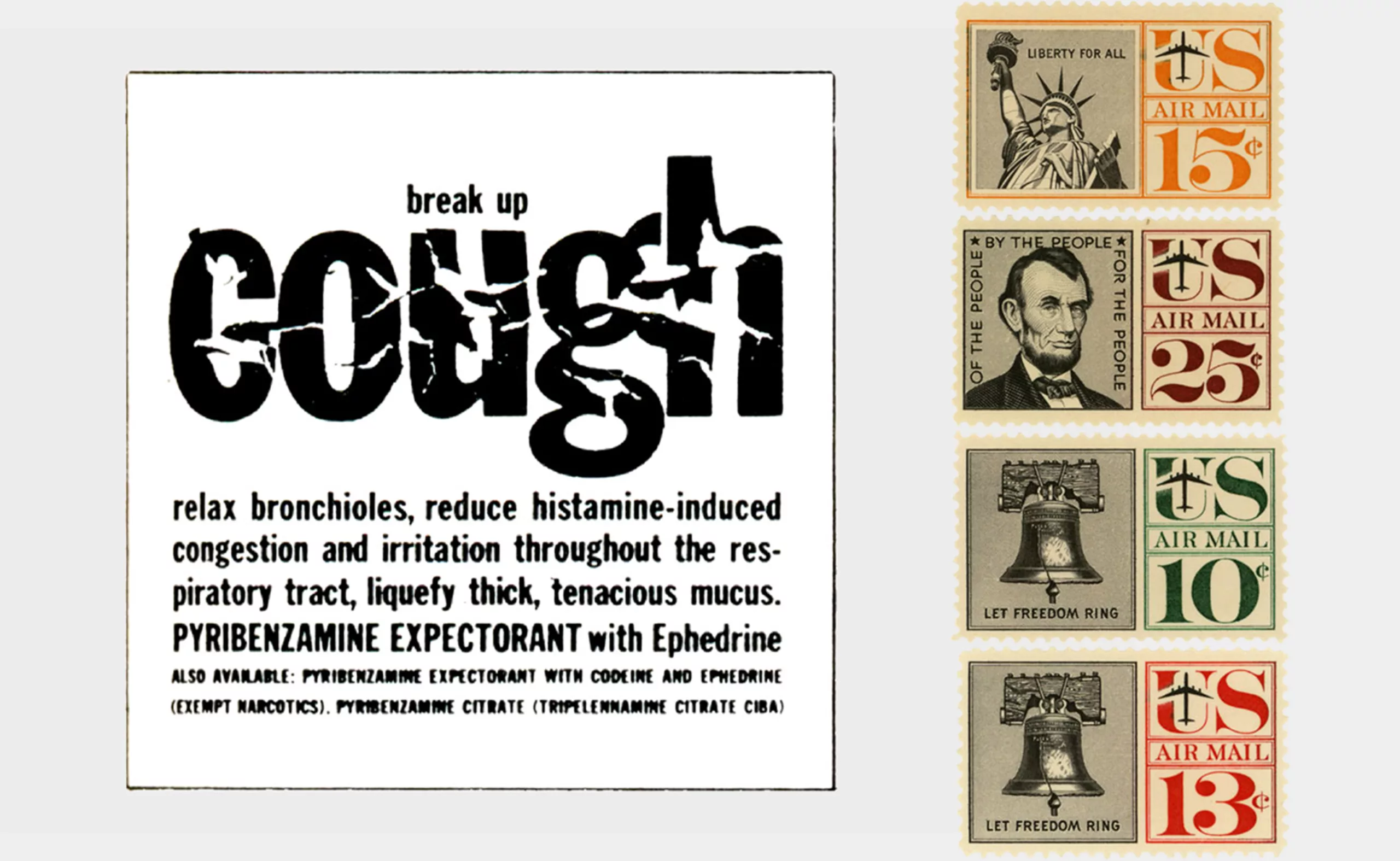
In 1945, Lubalin began his career at the Sudler & Henessey studio as an Art Director specializing in pharmaceutical advertising. He created, among other things, a packaging for a cockroach spray, cough syrups or suppositories… It was there that he began to use words as images, cutting out and playing with prints made from lead type assemblies. He stayed there for nineteen years and said he “didn’t do anything very interesting” until he won the New York Art Directors’ Gold Medal in 1952. During his career, Lubalin created postage stamps as well as posters, magazines or posters, and composed with the American social reality.
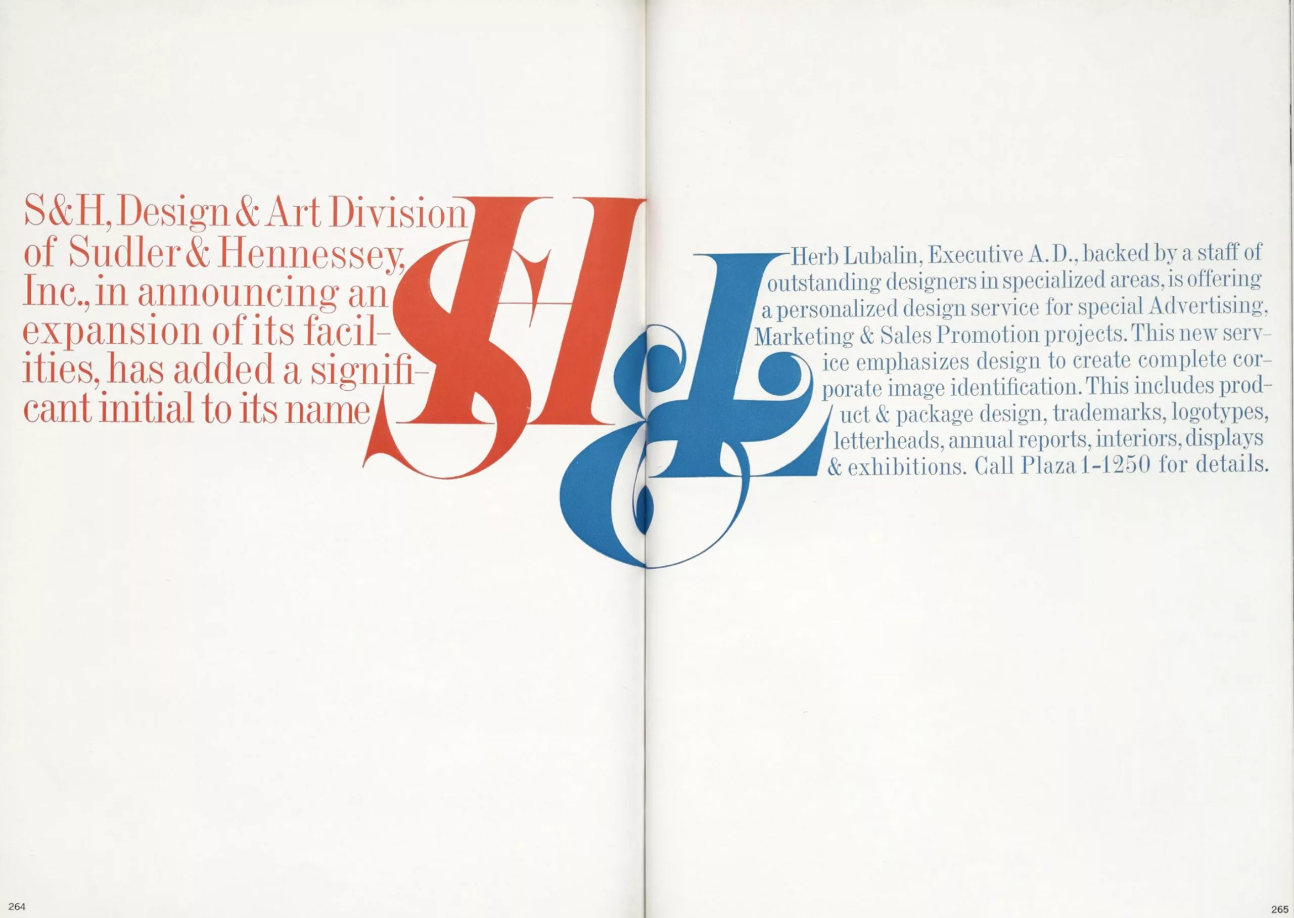
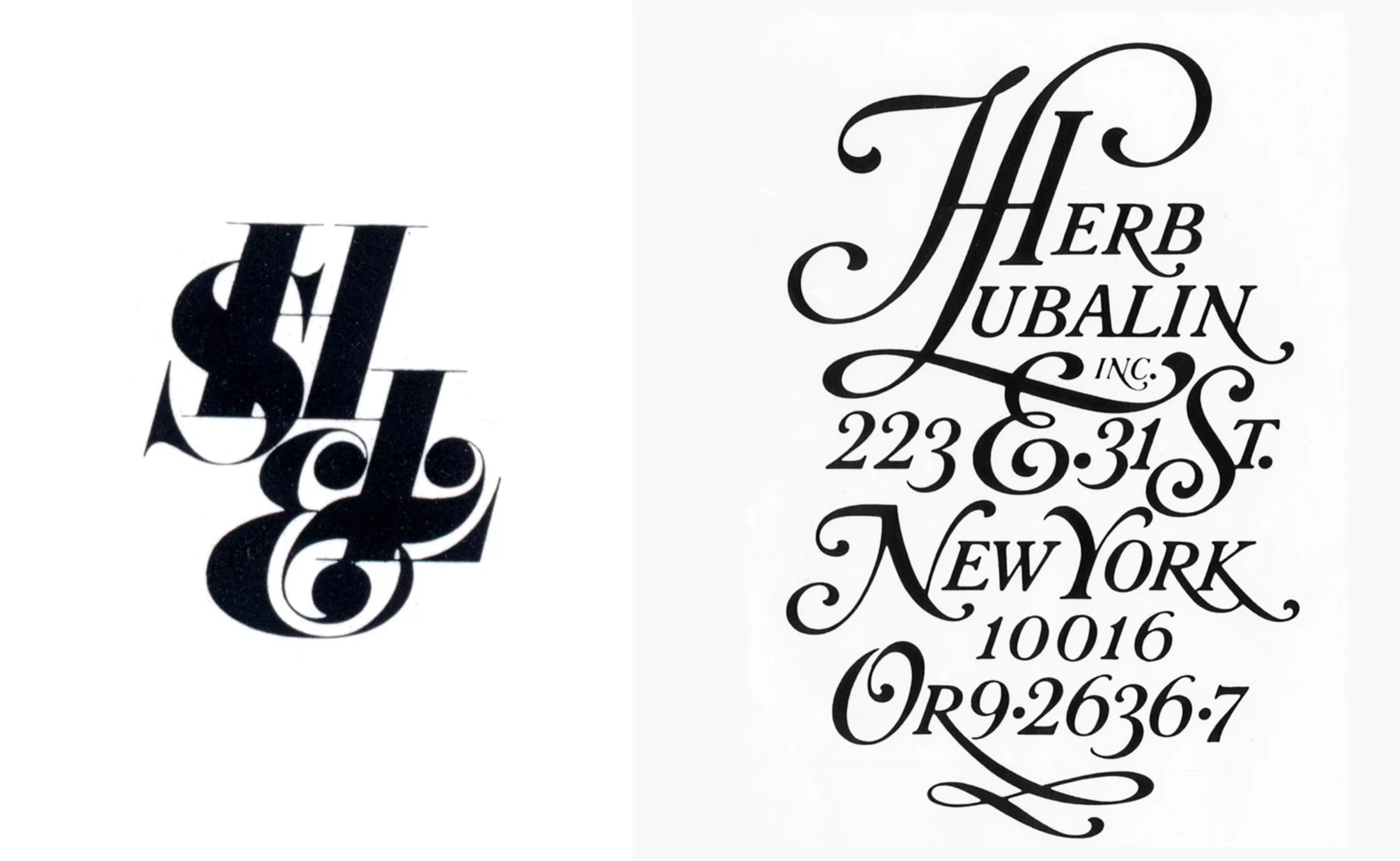
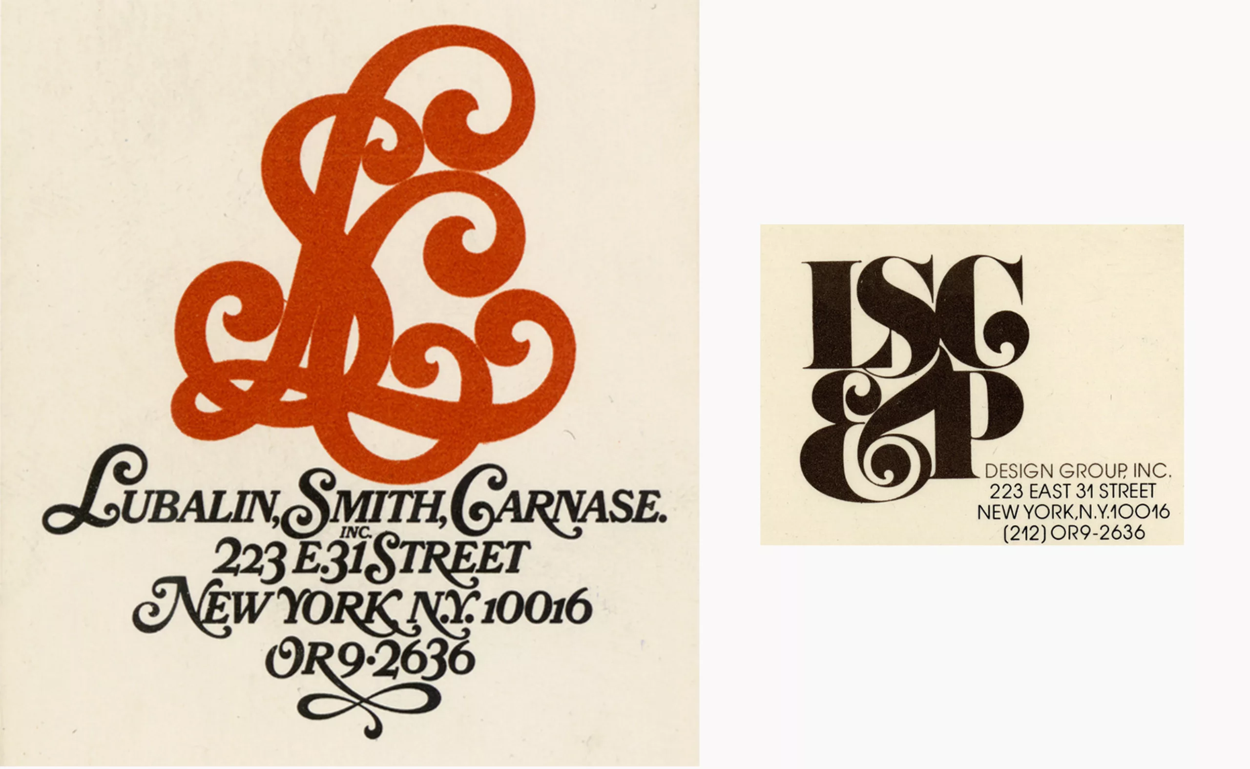
As his career progressed and his associates came and went, he recomposed the logo of his graphic design studio. Below in color and on the left, SH&L (Sudler, Henessey & Lubalin), used from 1955 to 1964, and on the right between 1964-1967.
The birth of a graphic designer and a consumer society
In the 1940’s when Herb started working, being a layout artist meant putting titles, text and images into the available space. The images were printed on glossy paper and collected in sheets in the middle of the books. The profession of graphic designer as we understand it today did not exist yet, we found then advertising designers, visual artists who collaborated with typographers and illustrators, retouchers and calligraphers… in a complementary but separate work, and without direct link with the customer. Poster artists, true artists since the golden age of the poster at the end of the 19th century, mastered several of these specialties at once.
The Second World War brought large migrations from Europe and Russia to the United States and the working methods evolved and mixed. After the Second World War, American society slowly embarked on what would become a few years later a frenetic consumer society, driven by marketing and advertising in full swing. Bill Bernbach, the B of DDB, decided to make art directors and copywriters work hand in hand for greater efficiency, and thus revolutionized the way agencies operated. To accompany this growing consumption and the economic boom, the first complete corporate images were also created in the United States in the 1950s, which were used on a variety of media, on television, in magazines or for in-house promotions. The profession of graphic designer was recognized as a profession in its own right. Herb is lucky, his passion for letters allows him to make visible objects that do not speak (like him).
Play with words
At Sudler & Henessey Herb Lubalin was inspired by the book Typography (1961) by Aaron Burns, a graphic designer and publisher whose collections exemplify modern American graphic design, supported by an industry that offers quality photography, typography and printing.
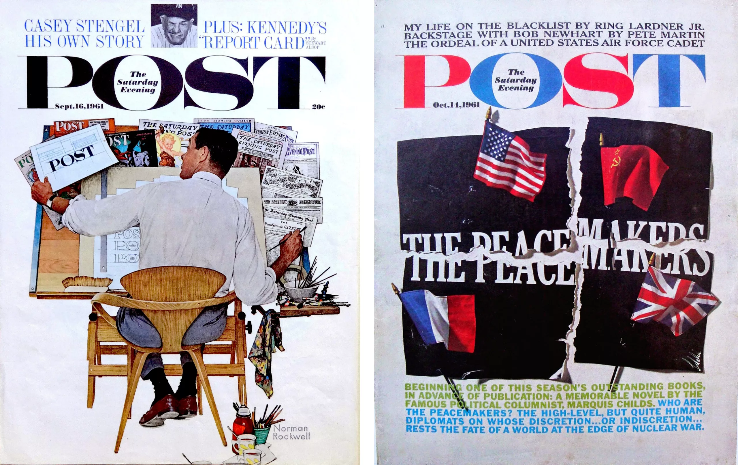
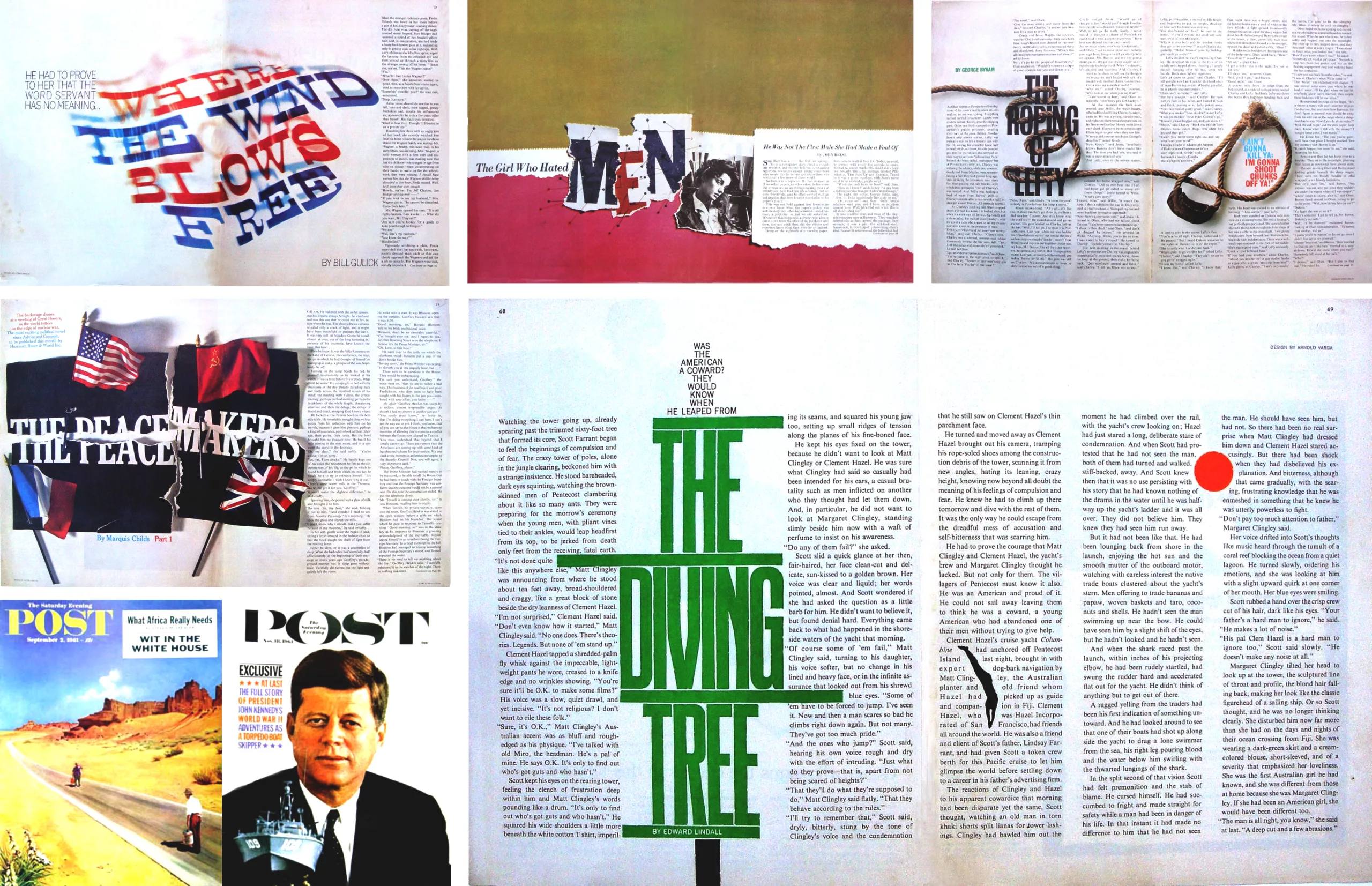
When given the layout of the Saturday Evening Post in 1961, Lubalin enlarged the word POST by writing The Saturday Evening inside the O. He also replaced the illustrations with photographs. He also replaced the illustrations with photographs, which was not without displeasure to the readers, and announced his bold and assertive graphic style. The magazine, with a more modern style and a more visible title, nevertheless takes back its old logo one year later…
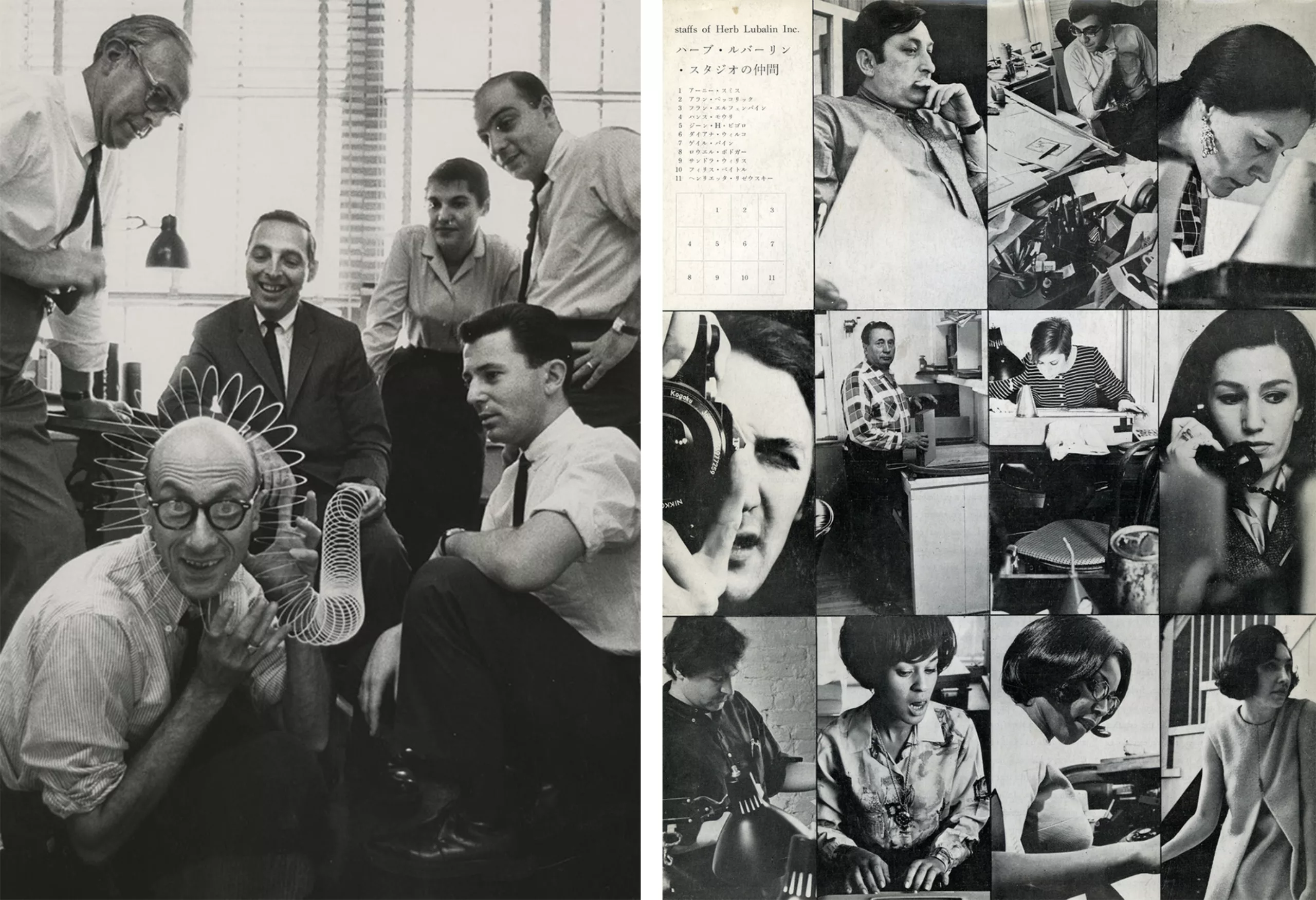
In 1964, then vice president, creative director and partner of Sudler & Henessey Lubalin said he was “tired of advertising” and opened his own graphic design firm. He still says he loves advertising but wants to work “in sufficient quantity with the right people” and not limit himself to advertising alone. It’s a liberation for him, marking a creative turning point in his work. Lubalin assembles elements with pen on tissue paper and layers them like layers until he gets the perfect effect. He thinks about slogans and layout to make the idea impactful. The art director attracts and surrounds himself with talented illustrators, photographers and typographers whom he identifies and collaborates with to design brand identities, directly with the client (below in 1958 and 1969).
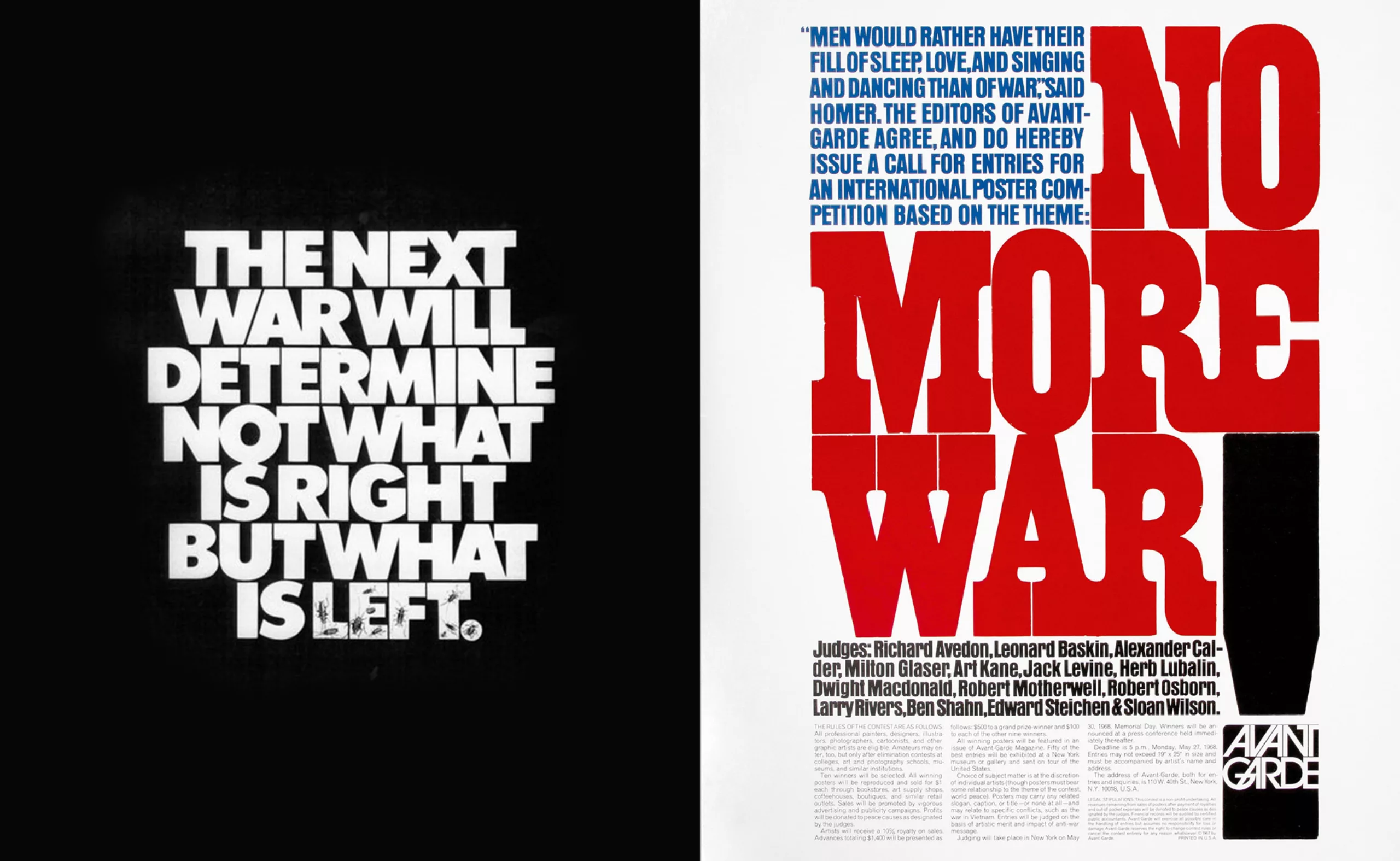
Herb Lubalin is thus graphically committed against the excesses of politics such as war, by creating for the magazine of black Americans Ebony, or for Jewish philanthropic works.
Quality before quantity
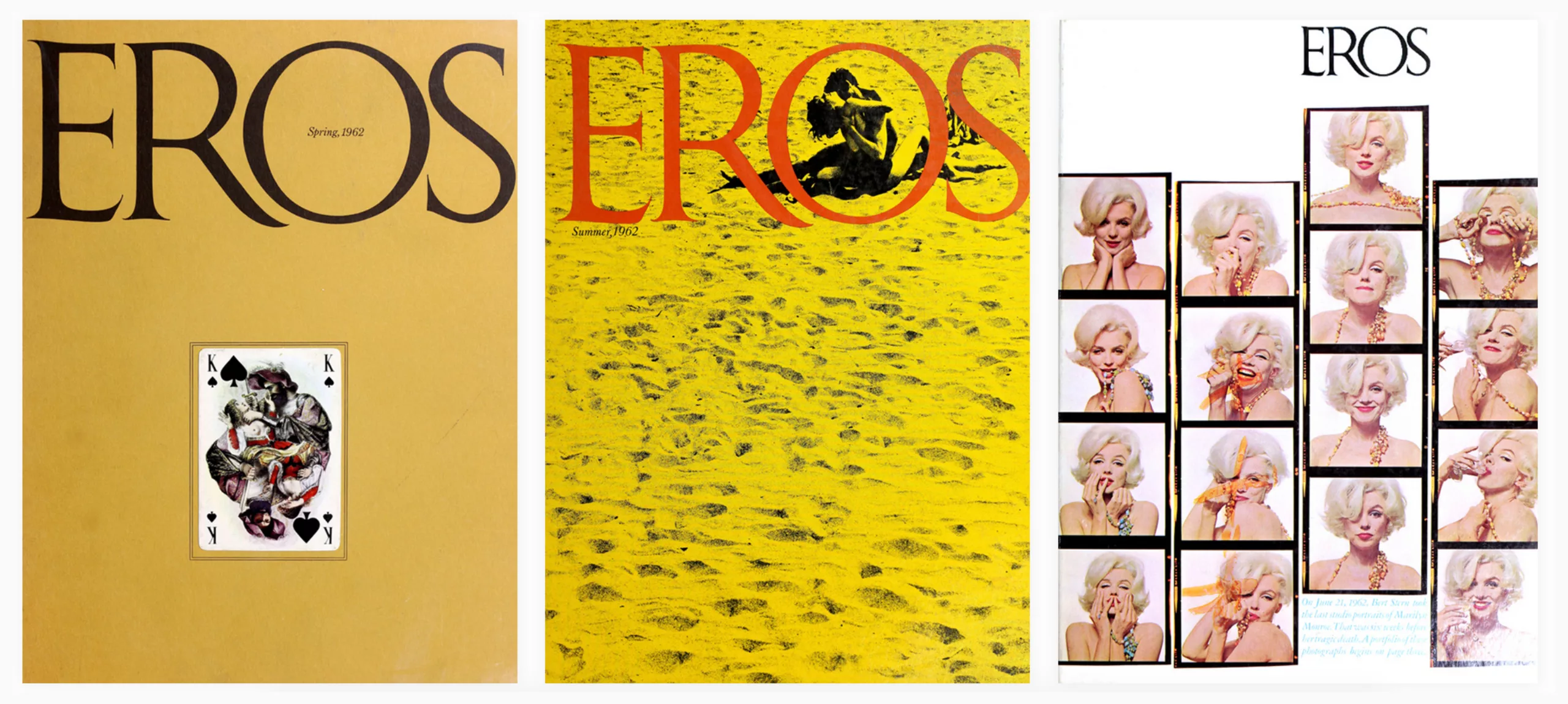
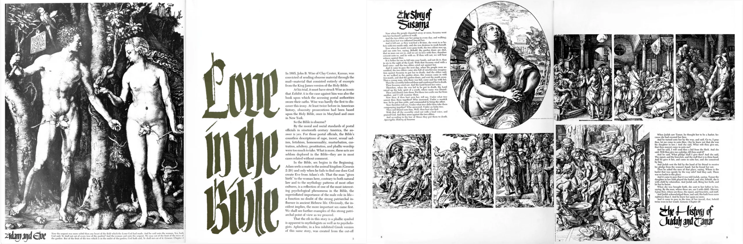
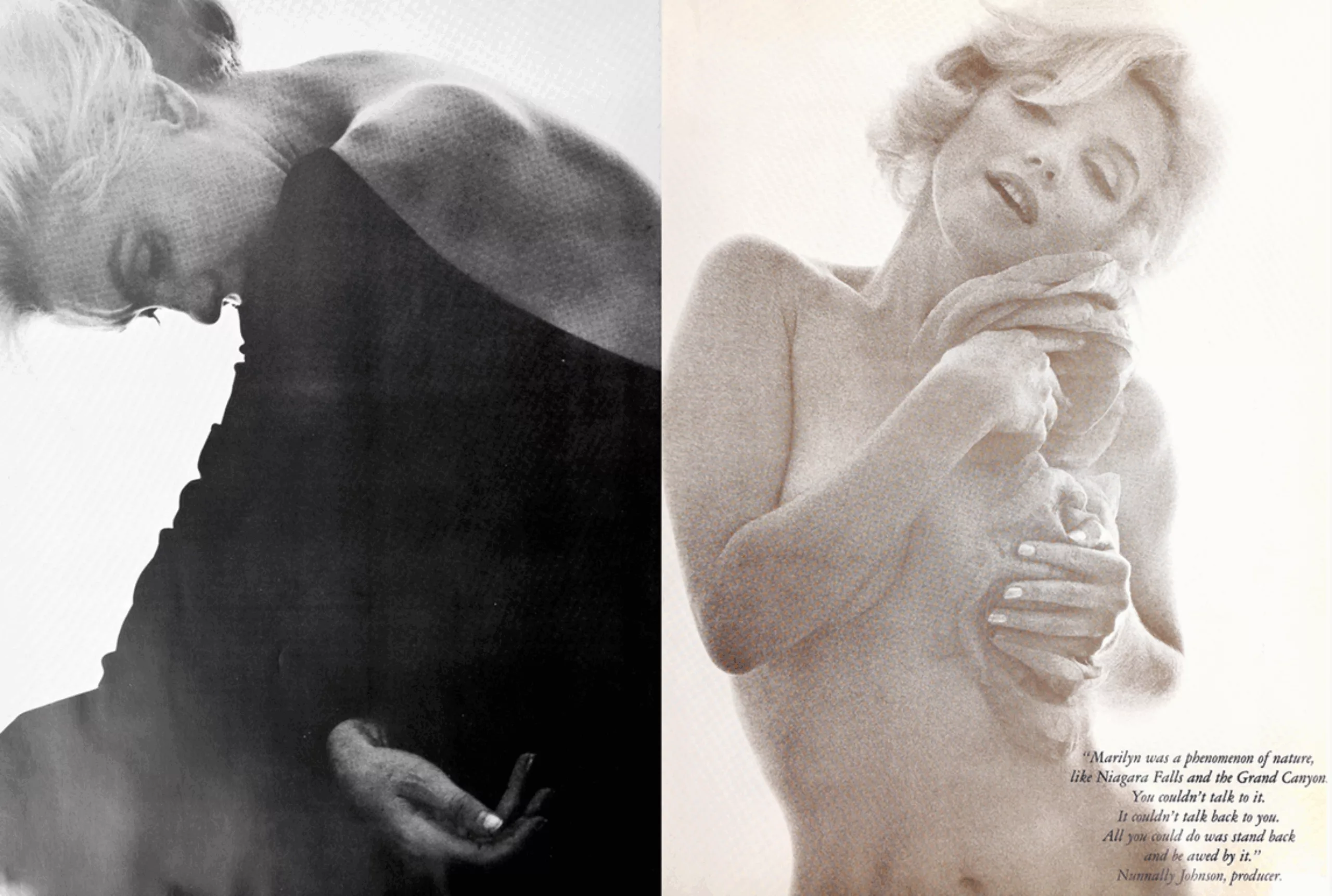
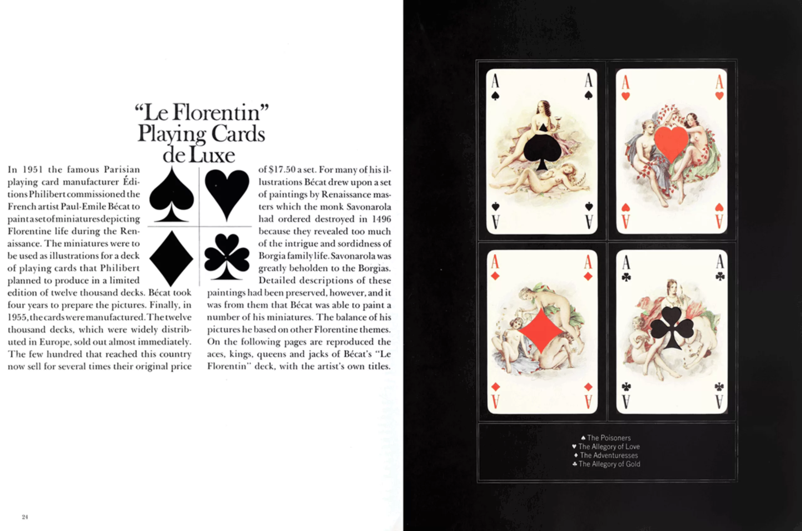
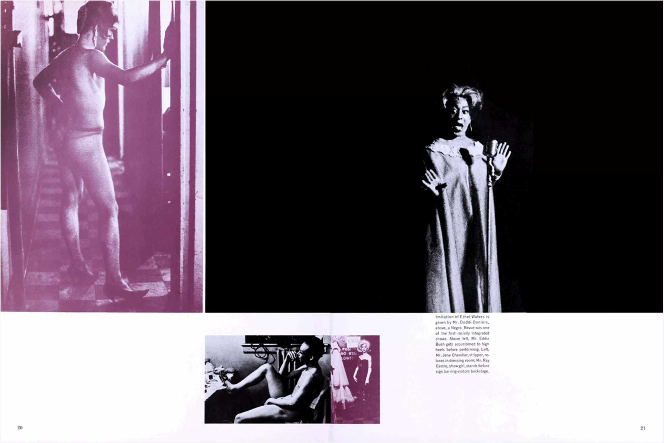
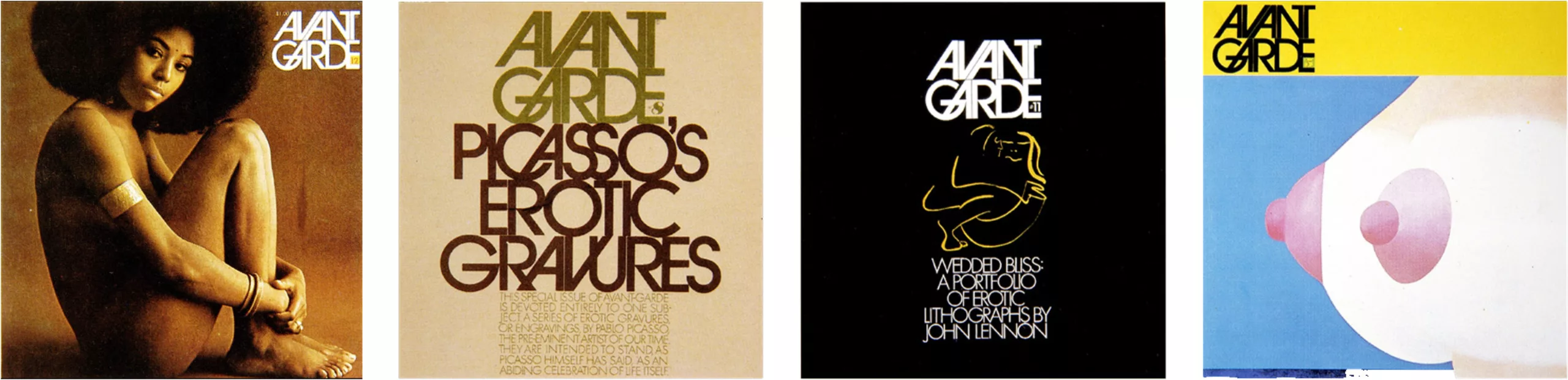
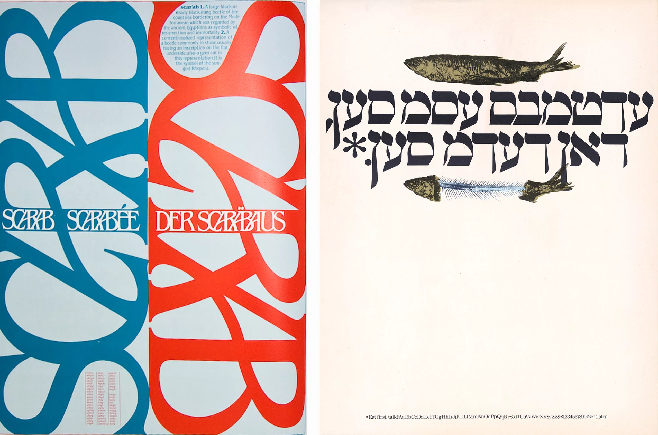
In the 1960s, he worked with the editor and publisher Ralph Ginzburg, with whom he collaborated “like Siamese twins” and designed the magazines Eros in 1962, Fact: from 1964 to 1967 and Avant Garde from 1968 to 1972. These magazines, although they were not published for long, nevertheless marked the history of graphic design. Eros, the “magazine of love” with erotic images and quality is unjustly controversial as “obscene material” after the publication of only 4 issues, and sends Ginzburg to prison, which Lubalin escapes. Appreciated for the quality of its layout and content, Eros won more awards in 1963 than any other American magazine! The interior, which can be viewed on this site and from which we have taken the visuals below, reveals a rich and varied layout, alternating photographs and illustrations.
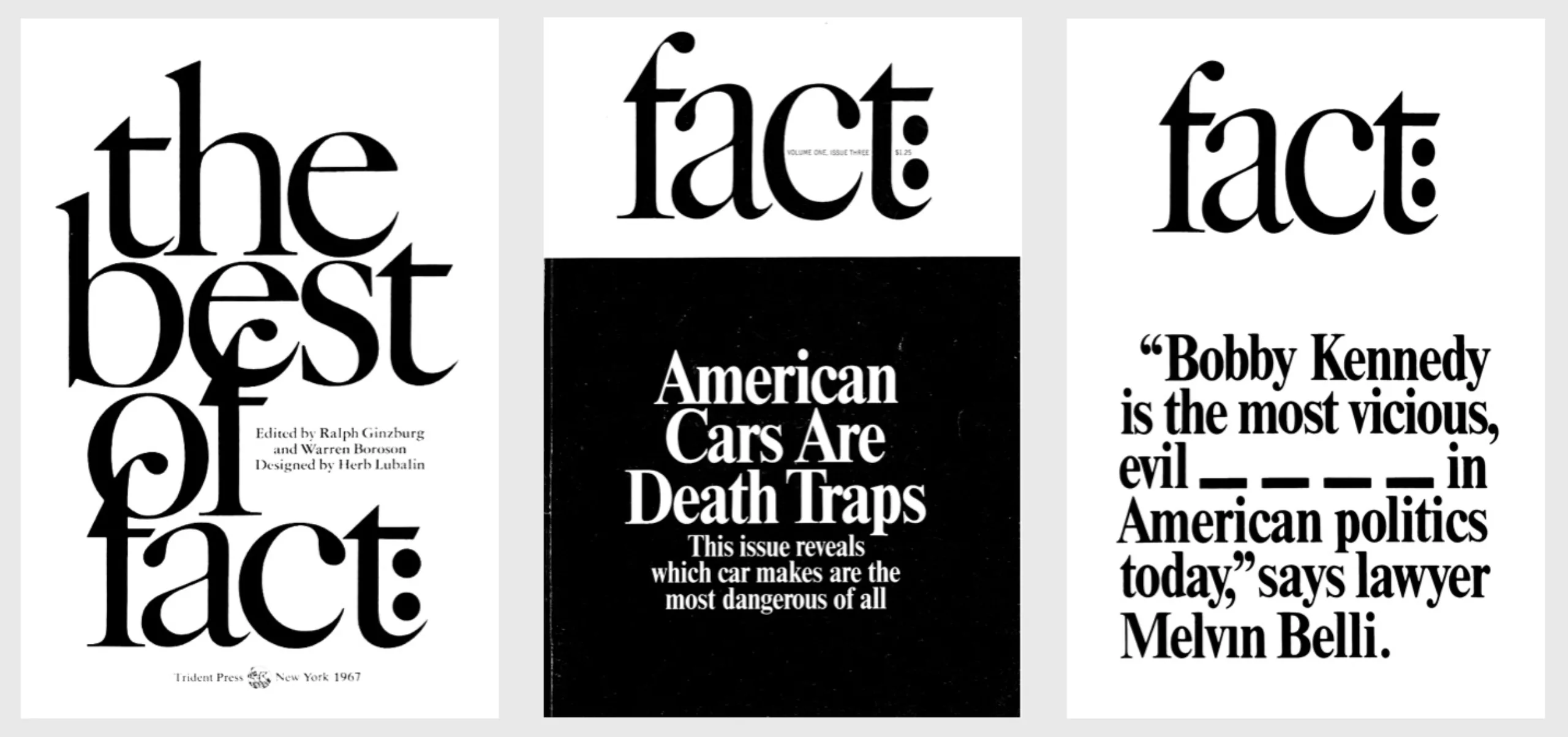
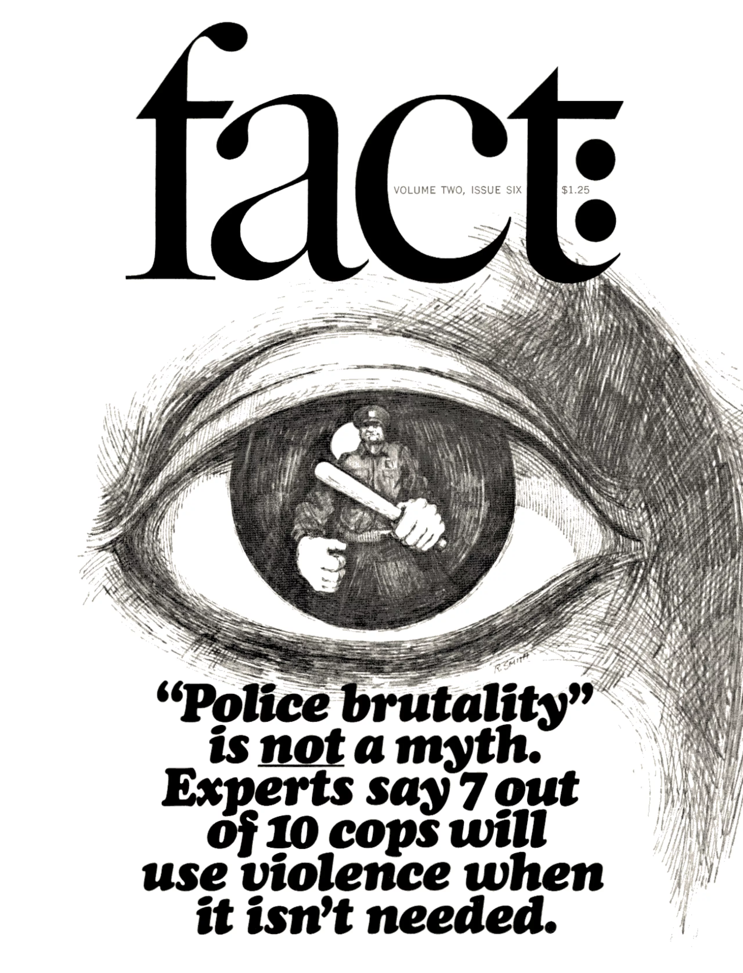
Upon his release from prison, Ginzburg publishes Fact, once again in partnership with Lubalin. Still the art director, he designed the logo and layout at a low cost and entirely in black and white, using Times Bold on the cover and Regular inside in two columns. Fact: is a politically engaged magazine that supports or denounces causes through investigative journalism. Its minimalism, its unique serif typeface, the facts stated on the cover and its unique illustrator make it a kind of statement, a manifesto, announced by the name, fact, in which the use of typography is a bold, innovative and visionary tool.
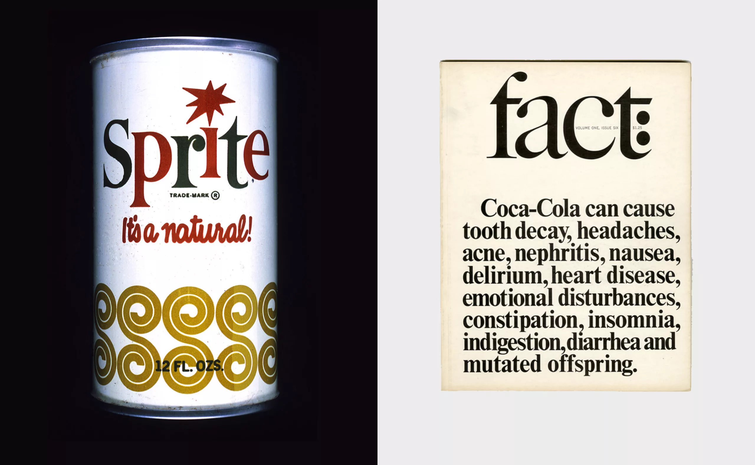
In 1964, Lubalin created the identity for Sprite, Coca-Cola’s new drink, in collaboration with the client’s teams. The identity is sparkling and fresh, inspired by pop art, but somewhat diluted compared to what he is used to doing. A few months later, Lubalin published a fact: sheet that denounced the client’s products. Strangely, or perhaps because he was one of the best ADs of the time, Coca-Cola continued to work with him.
The magazine Avant Garde, still created by the duo, deals with American society, politics, eroticism and photography. It will be the support of the most advanced graphic expression of the graphic designer-typographer, on square format.
The advent of a new typographic style
The design of the logo of this third magazine gives him a hard time but leads to a unique design that will make Avant Garde an immediately recognizable acronym, which he creates through the use of a technological innovation: photocomposition. Photocomposition allows the creation of models and lines of text by photographic principle using films cut and assembled on transparent supports. It offers a great creative flexibility and frees from the constraint of lead type used since the Linotype… in 1885. Lubalin can thus compose words with great freedom and as if they were images, whether they are headings, logos or magazine titles. He would say of this, “Now the blades, the clamps, are finished, finished. The new techniques allow me to break all the rules of all the typography manuals, easily, effictively, and legibly.” cit. Avant-garde typography in the U.S.A.
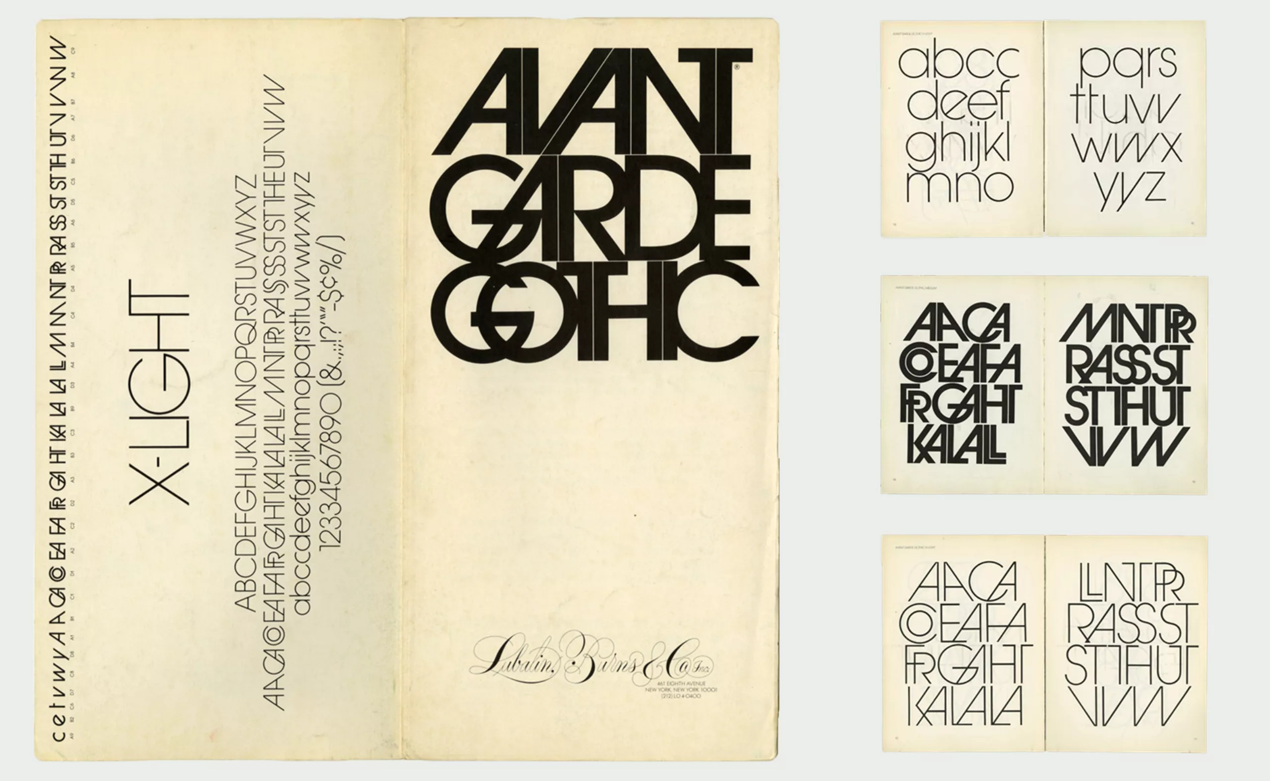
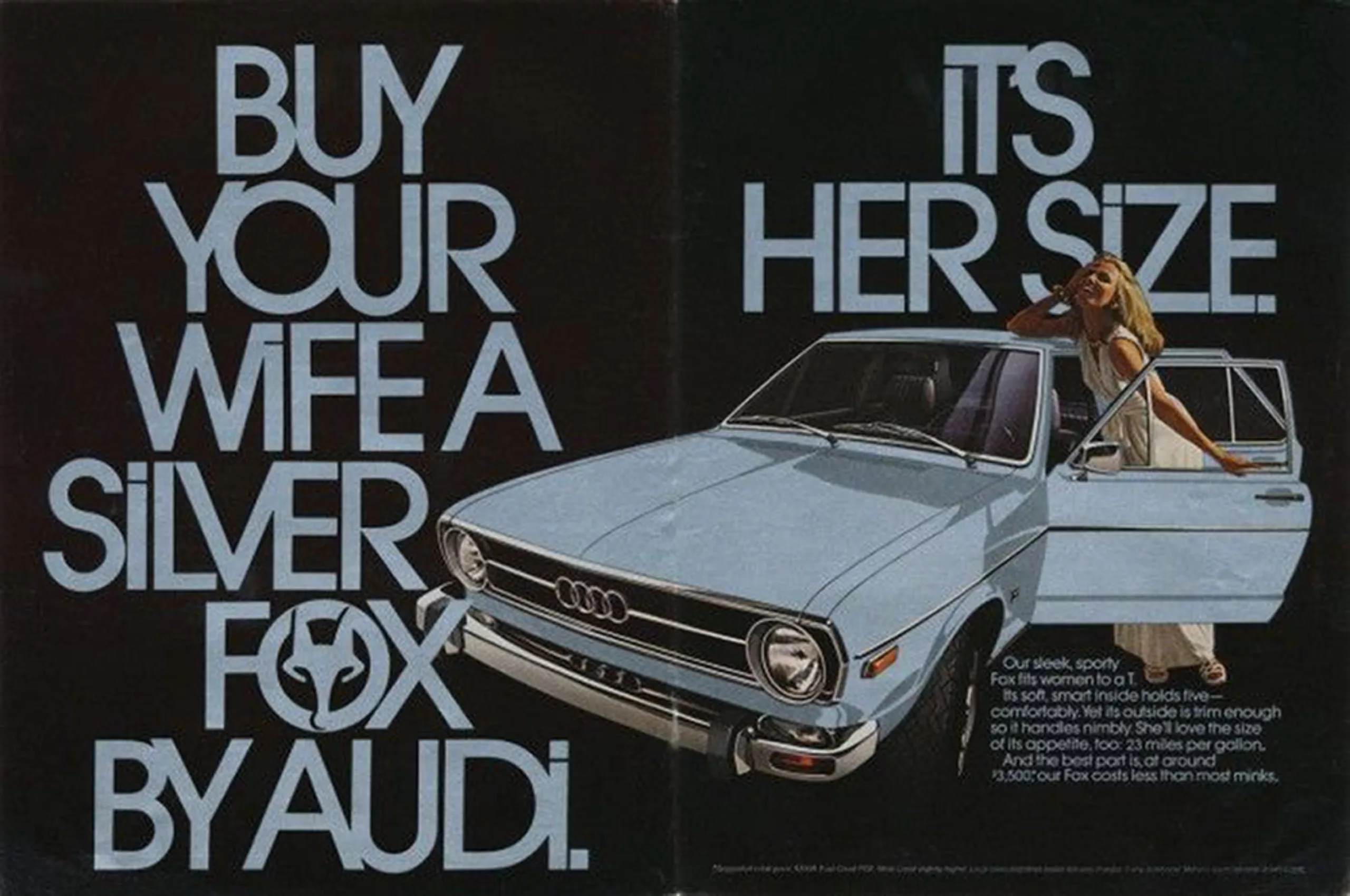
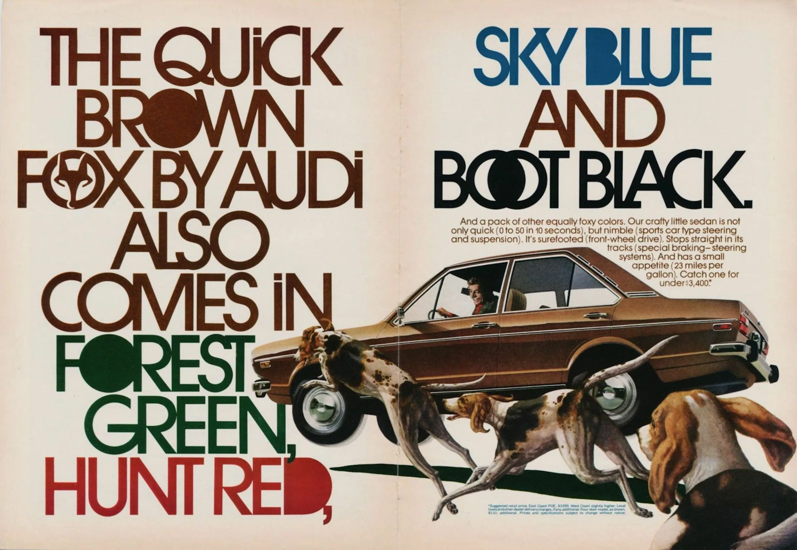
Eclectic and innovative, Lubalin broke away from the old typographic models and the International Suisse style to promote the emergence of a new graphic design through the use of photocomposition, which revolutionized graphic design in the 1960s. It allowed him to play with letters by reversing and superimposing the characters, to reuse Victorian or antique typography and to invent new ones. The Avant Garde logo is a good example, with the G and A becoming a ligature. Lubalin used geometric lineal typefaces, reducing the lettering as much as possible until the letters overlapped. He created the complete alphabet, the Avant Garde Gothic, which he declined in capital letters with numerous ligatures (designed by Tom Carnase) to allow for numerous typographic games. Ten years later he designed a lowercase version that he distributed through his ITC foundry. Lubalin was however dismayed by the use of the typeface by graphic designers, except for those of Adidas and Audi (see the 1970 advertisements below) whom he congratulated directly.
The return of gesture in typography
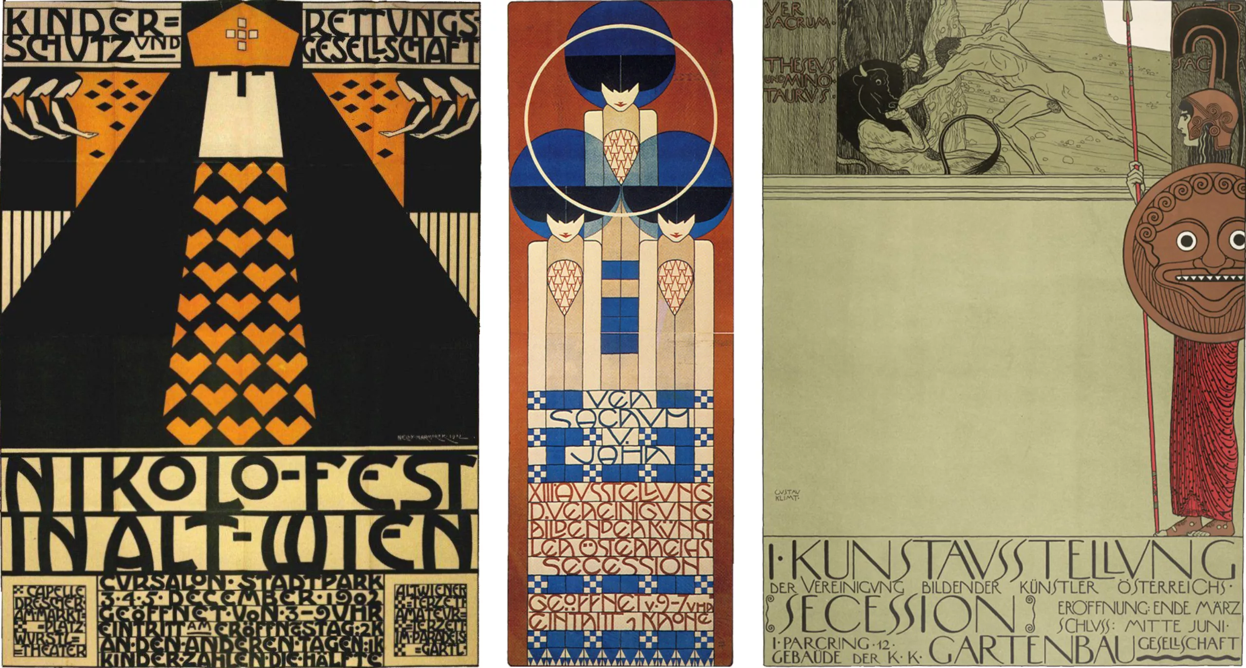
Lubalin reinjects into modern typography, which until then had been neutral and mechanized by the use of universal geometric typefaces, the trace of manual gesture that had disappeared with the New Typography of the modernists of the 1920s. The letter becomes image, as in the first pictographic writings, except that unlike the pictographs it is the letters assembled in words which form the drawing, and not just a sign alone. Freed from the constraints of lead as in the invention of lithography in the nineteenth century, he is in some ways similar to the ornamental explorations of William Morris (a leading figure in the Arts & Crafts movement which advocated the valorization of handicrafts) or the artists/graphic artists of the Viennese Secession such as Moser or Klimt (below, circa 1905), except that his work is done with machines.
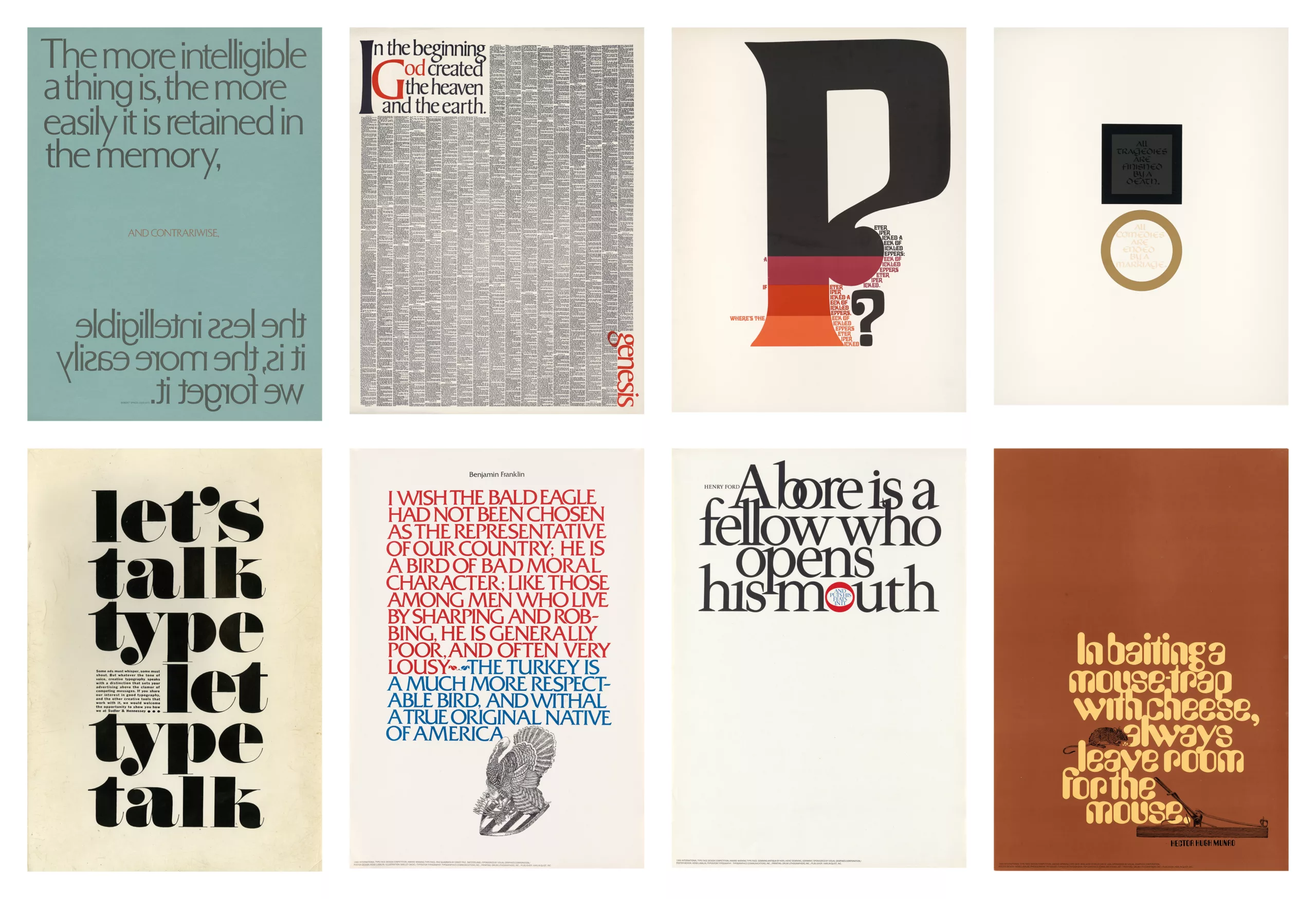
Here we see some posters made by Herbert Lubalin around 1965, which show the extent of his mastery of composition with letters.
The use of Letraset, typefaces on transfer paper that can be bought in sheets like stickers and arranged on the paper with a pen, allows a new typographic style to take flight of which Lubalin is the figurehead. He follows in the footsteps of László Moholy-Nagy (Hungarian professor at the Bauhaus, influenced by Russian constructivism), who insists on the integration of images to directly illustrate text in his book Vision in Motion, and of Paul Rand, who uses typography and page layout to convey an idea. His logos convey a visual message (you will find other examples in the book Herb Lubalin, Art Director, Graphic Designer and Typographer, visible in gallery on flickr).
The art of typographic logos
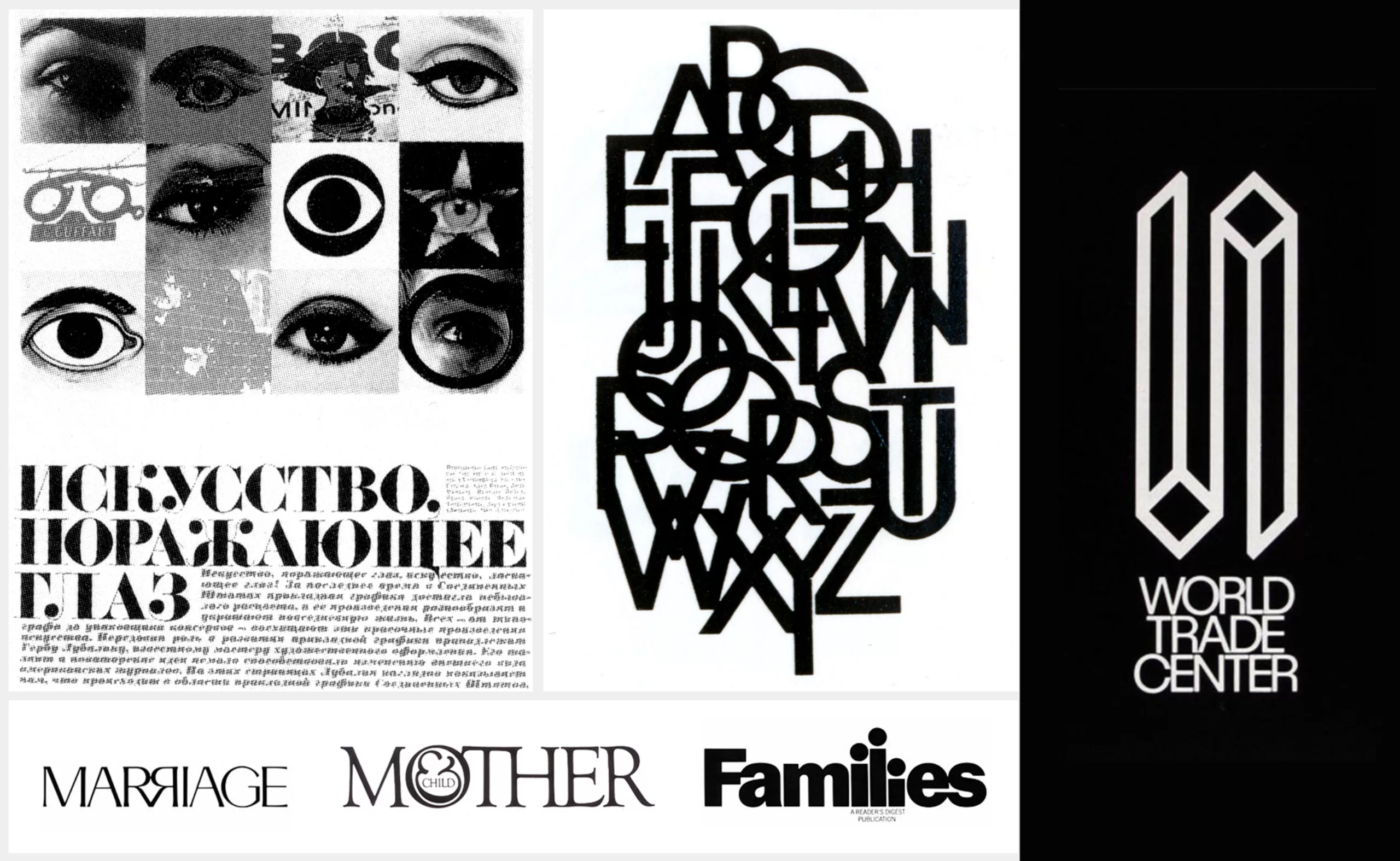
During his career, Herb will design hundreds of visual identities and as many logos. He perfected his art of playing with letters, transforming an ampersand into a fetus in the “Mother & Child” logo. A logo originally designed for a magazine that, unfortunately, was never published. This logo remained Lubalin’s favorite for years. He was finally able to reuse it several years after its creation for the cover of a book entitled “Mother & Son“.
In 1966, the City of New York invited the Lubalin studio to create a logo that could be used to identify the city. The logo was approved but apparently never used. Lubalin says he once saw it on a truck. The lettering was done by his son Robert Lubalin. It is reminiscent of the WGBH logo, created a few years later, and even the current New York City logo.
In 1979, Lubalin even worked in France, to do the visual identity of the 3 Suisses. This is a good example of where the studio used a more modernist approach. The shadow on the letters recalls the NY NY logo done almost a decade earlier.
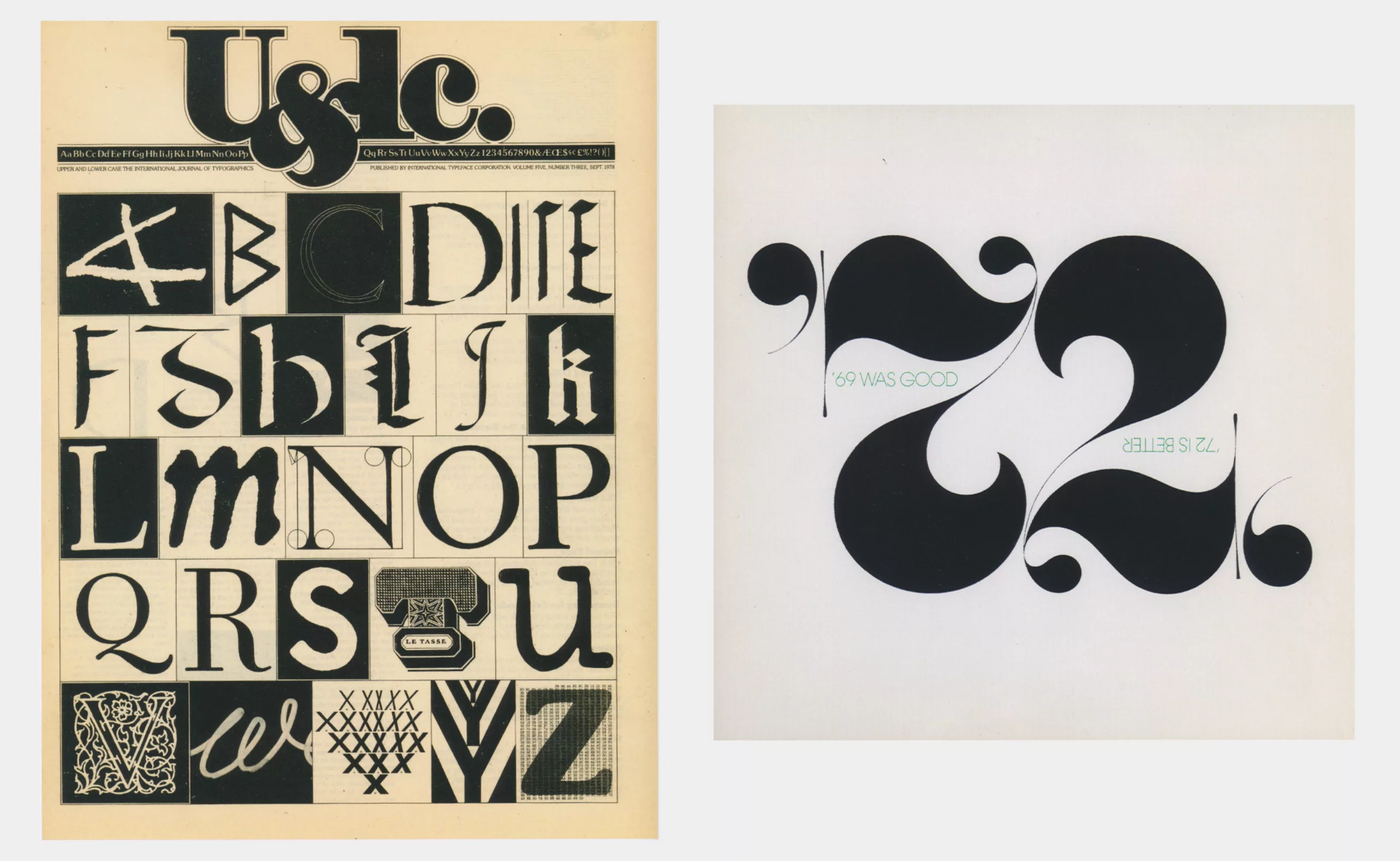
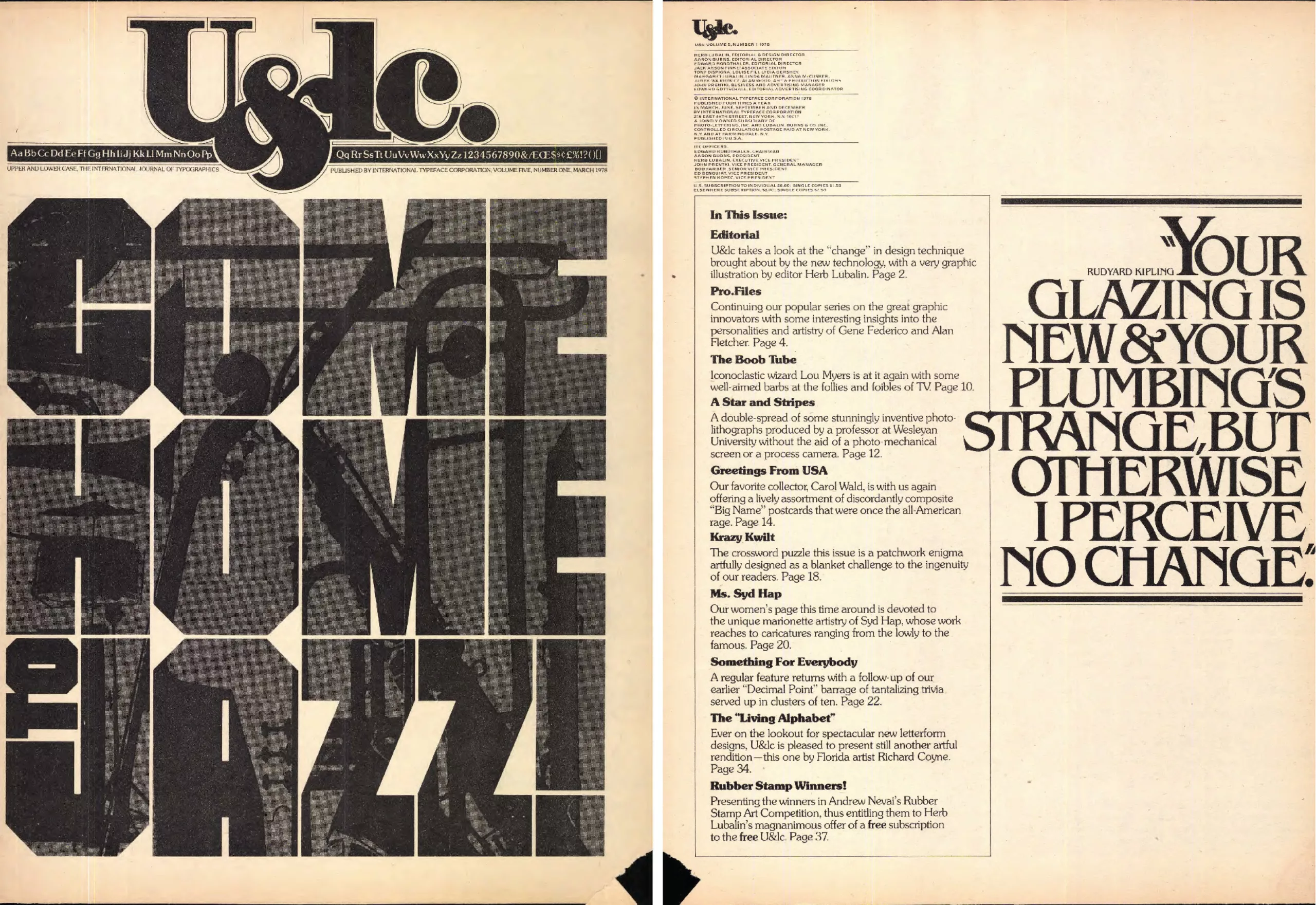
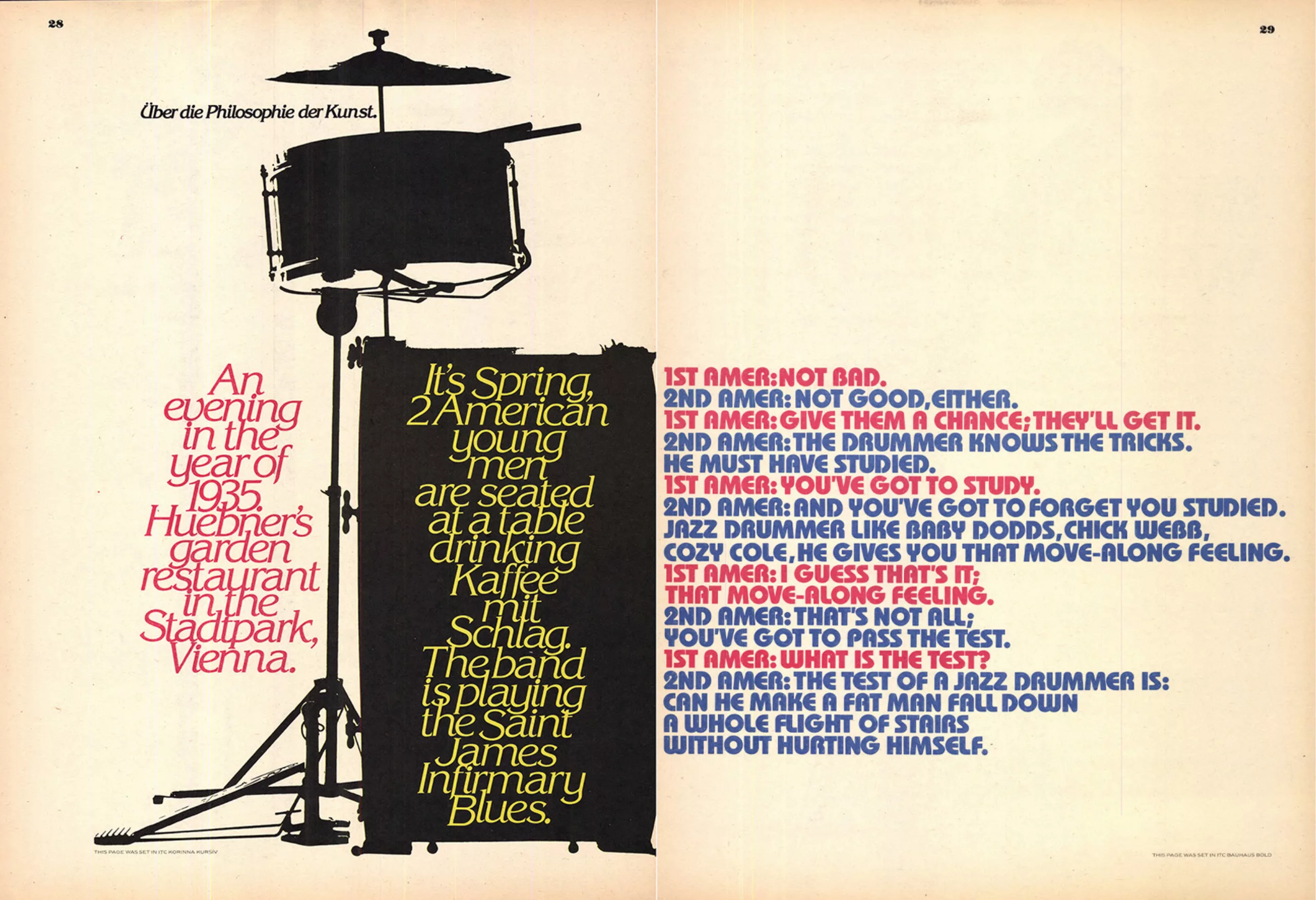
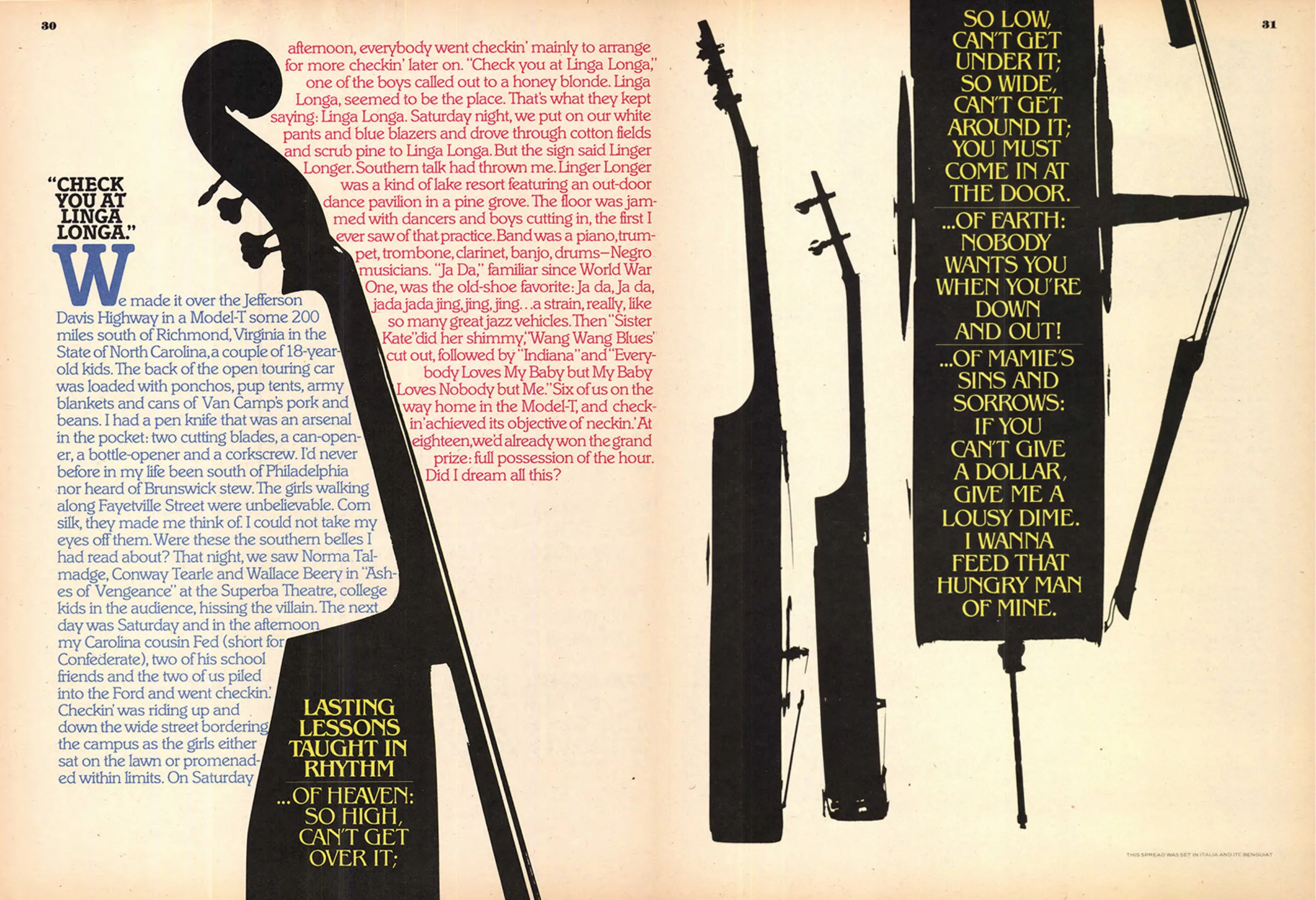
In 1970, 10 years before his death, Lubalin co-founded with Burns the International Typeface Corporation (ITC), the first virtual typographic library that also fought for fair pay for type designers, and the magazine U&lc (Up & lower case), which he illustrated and for which he was artistic director. The ITC offers 4x a year to the industrialists new typographic collections, and incidentally the typefaces of Lubalin, that they only have to photograph and manufacture. This is a considerable time saver. The new typefaces are distributed free of charge around the world to studios, agencies and designers in the magazine U&lc. Both set the tone for this new worldwide typographic impulse that breaks the codes of modernism, echoing the liberation and humanization of society in the face of rising criticism of mass consumption and standardization. Here are some pages of the number 5 on jazz, which can be consulted in full here.
The technological revolution liberates the graphic gesture
It is said that Herb Lubalin revolutionized the way typefaces are used as images, but it should not be forgotten that he is the heir to a long line of artists/graphic designers who played with letters before him. A parallel can be drawn between creative liberation and the technological revolution brought about by photo-composition, and the typographic experiments of the beginning of the 20th century which used text as a visual element, following the revolution of lithography, and later on collage. One thinks in particular of the words in freedom of Filippo Tommaso Marinetti or the work of El Lissitzky, Russian constructivist. Lubalin’s real strength was to draw sets of words as images, and to consider them as such in the layouts, allowing the elaboration of graphics composed only of texts, but as beautiful and exciting as images. They say a picture is worth a thousand words, but for Herb Lubalin, it’s the other way around!
Sources :
- lubalin100
- oneclub.org
- Les plus grands graphistes – Caroline Robert
- Le graphisme au XXe siècle – Richard Hollis
On the subject
-
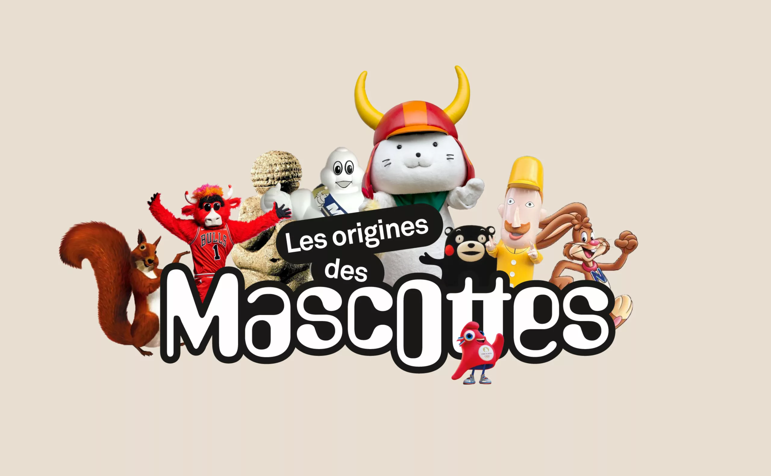
A history of mascots
Mascots, those soft, slightly silly characters, are nothing new. Here’s a look at their origins, from Antiquity to Japan.
-
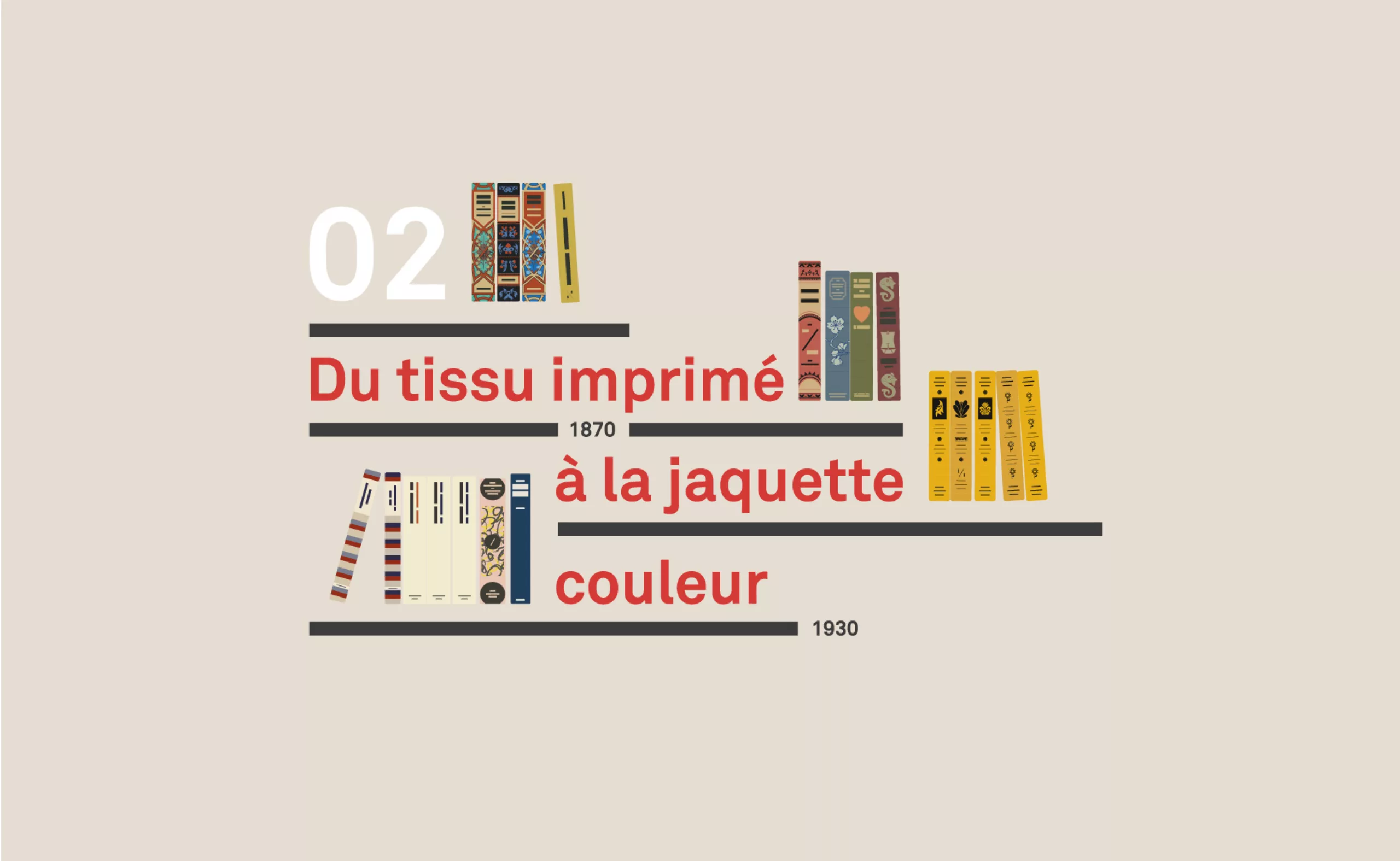
A short history of book cover design – 2/4
Under the influence of Japan, France or Russia, book covers are constantly evolving with technical progress and crises.
-
Ben Bos, the big “Bos” of dutch graphic design!
Ben Bos (1930-2017) The big Bos of Dutch design!
Portrait of a graphic design giant who worked for Total Design for 3 decades.