Where does modernism come from? 1 – Man propelled by Modernity
Modernism has become so much a part of our visual landscape that it now seems to be a matter of course, rather than a choice, for most designers. In the collective imagination, the modernist movement is now synonymous with a purification towards the greatest possible neutrality and universality. It is intimately linked, even confused, with minimalism, and the effectiveness of its style can be summed up in Mies van der Rohe’s famous maxim: “moins mais mieux”(less but better). But before going any further, we need to highlight the subtleties of modernism, and understand how it relates to modernity.
Modernity or modernism ?
Modernism’ or ‘modernity’ are two different but closely related concepts, and it is difficult to define one without the other. Modernity is both a historical era that began around the Renaissance and an ideology that emerged from rational thought in the West, “inextricably myth and reality” as defined by the 1985 Encyclopaedia Universalis. Modernism is a current that brings together artistic, cultural and social movements from the modern world, from the end of the 19th century until the post-war period, in reaction and sometimes opposition to modernity. Anne Faure, a doctoral student at the ENS in Lyon, writes that “modernism is varied, heterogeneous, even contradictory”, while Kolocotroni adds in 1998 that “modernism is not a movement. It is a term that masks conflicts, upheavals and any number of contradictory positions”. Yet we speak of modernism in graphic design or architecture as a “modern movement”. Be that as it may, what we lump together under the notion of “modern”, modernity or modernism, is driven by very specific contexts and upheavals, giving rise to a calling into question of the achievements of the past, in order to build the world of tomorrow. At the dawn of the 20th century, modernism, artistically and graphically speaking, was anything but neutral, minimalist and universal. The term “modernist movement” was used retrospectively in the 1950s and 1960s to describe the architectural, artistic and graphic trends that emerged in the early 20th century and into the post-war years.
To better understand the modernist movement and its origins, then, we obviously need to take a look at the century’s modernity, starting with a leap into the past, when it was both celebrated in boundless exaltation as a solution to breaking with the past, and a tested fatalism as Rimbaud wrote in 1873 in his poem Vers nouveaux (A Season in Hell): “It is necessary to be absolutely modern.” By zooming out to its origins, this series of articles sets a global context around art, typography, modern social revolutions… to create a panorama and better understand the whole:
1- In this first part, we will look at the origins of modernism, in which Man is propelled by Modernity, between the end of the 19th and the beginning of the 20th centuries.
2- We will then look at the two faces of modernism and its social ideologies. On the one hand, we have Arts & Craft, which revalorises the work of the craftsman around ornamentation, and on the other, we have ethnocentric man, who seeks to purify in order to reign better; both by consolidating his dominant position, by dispensing with ornamentation, and by breaking with the past thanks to machines.
3- Then we will look at the search for universality and neutrality through artistic and graphic experimentation around 1910 and the modernist revolution of the 1920s, such as the de Stijl, Bauhaus and New Typography movements, the founders of the graphic modernist movement as we know it today.
Enjoy your reading!
The history and origins of modernism: an ancient century turned towards modernity
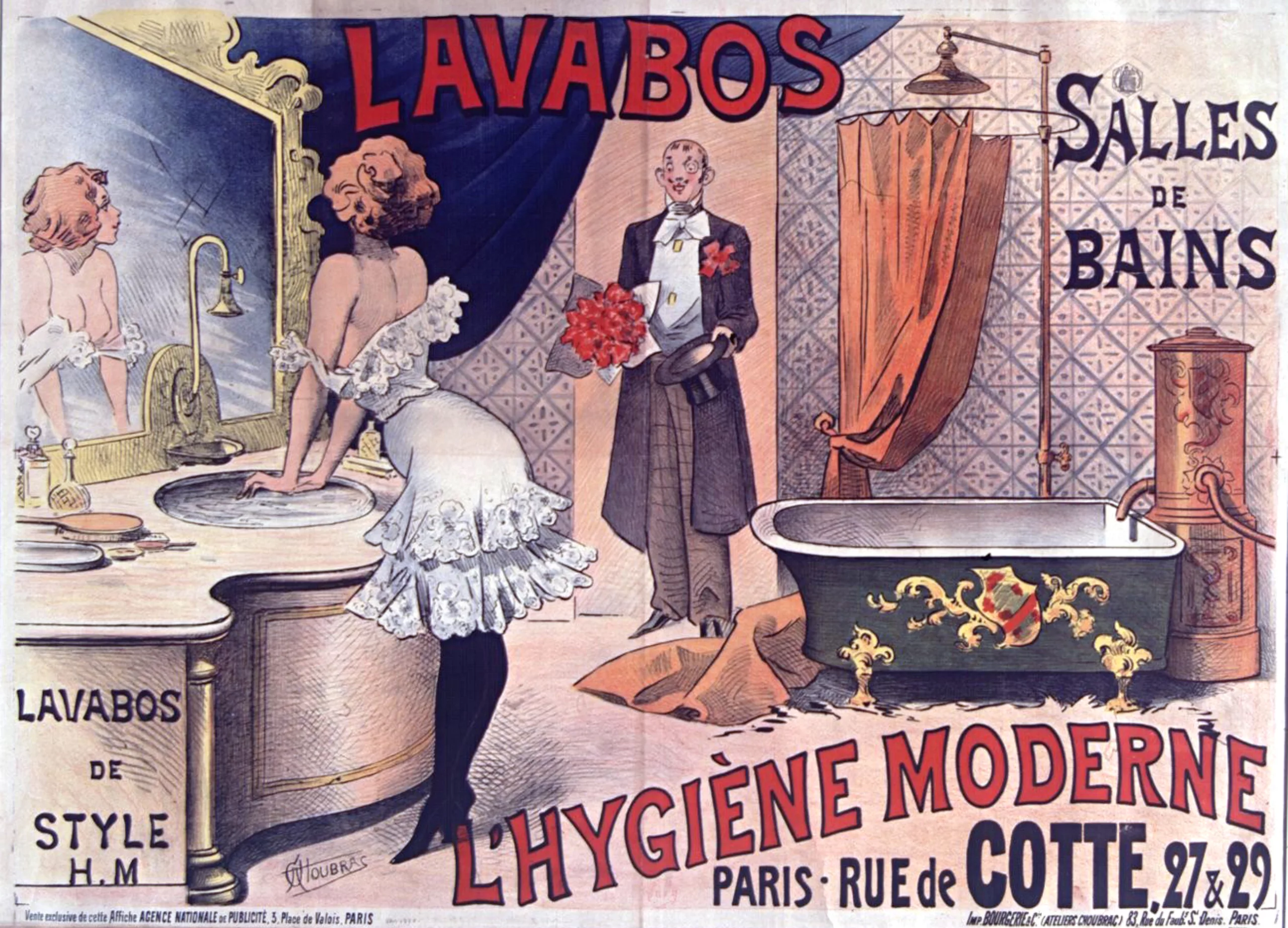
We are at the end of the 19th century, during the Victorian era of British colonialism and imperialism, in the midst of the Second Industrial Revolution. This prosperous and progress-oriented era brought its share of major technological and social revolutions that changed the world forever: modernity. High-speed transport developed, from trains to cars and ocean liners; the electricity fairy gradually lit up the three “capitals of light”, New York, Paris and London, at the same time as the new rules of hygiene were being introduced to clean up societies and advance medicine. Cities were transformed, and people’s lives changed as inventions and technological advances were made.
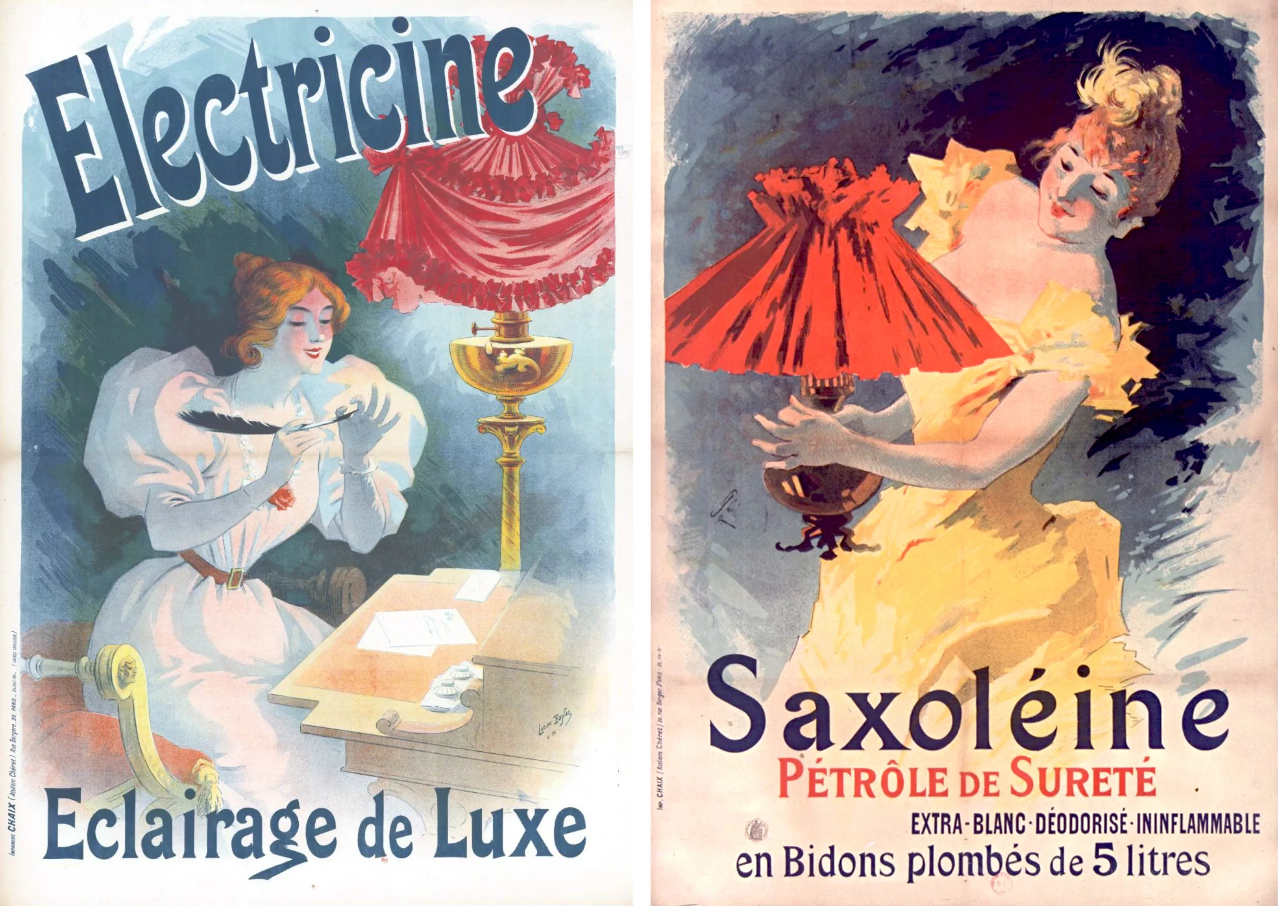
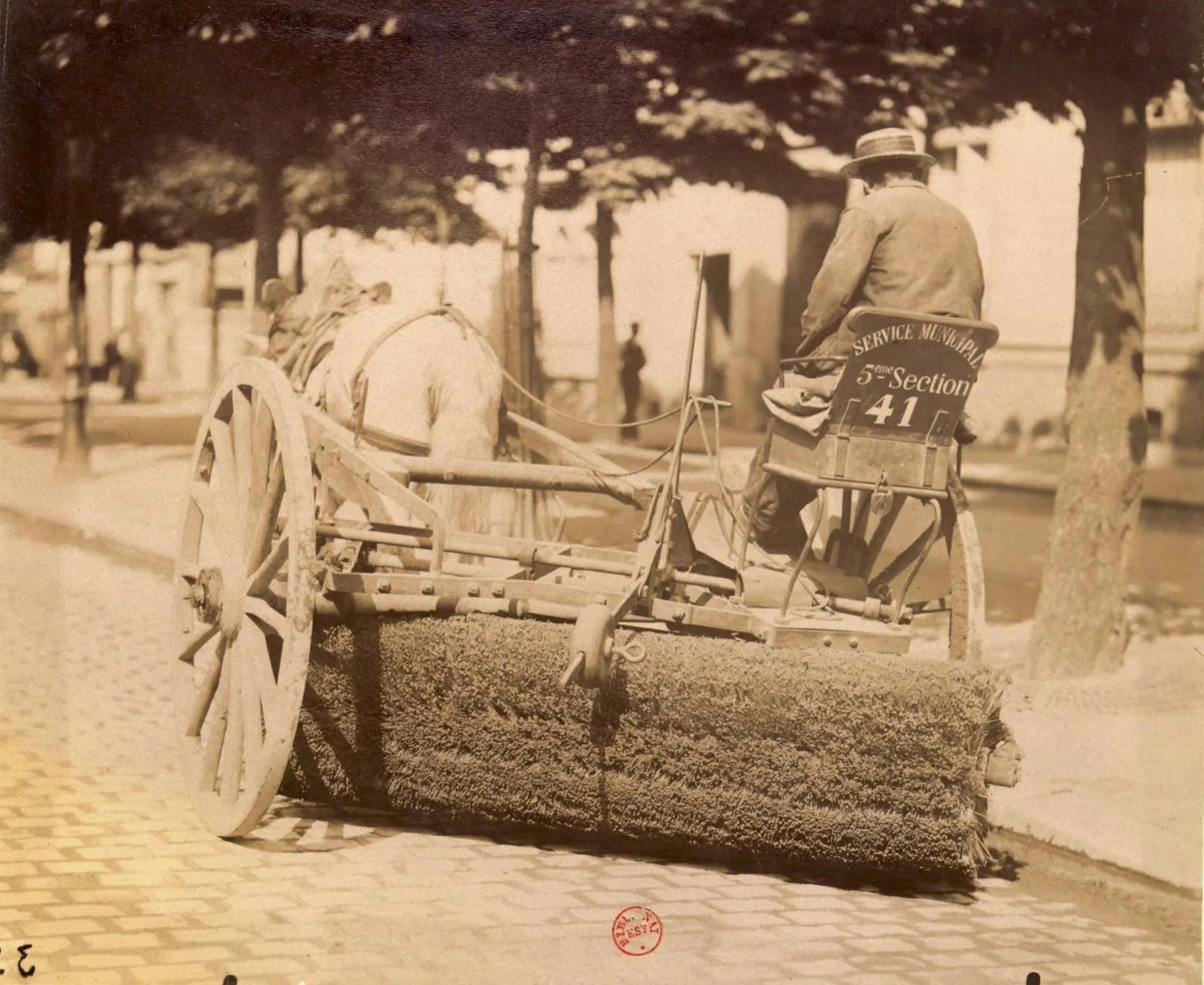
These advances towards modernity and the machine triggered a wave of industrialisation in Europe and as far afield as Russia, followed by a rural exodus where the new city-dwellers provided the manpower to drive the machines. Man had a new superpower: he could increase his capacities tenfold and save time, while tiring less. Little by little, industrial products flood the market at low prices, alienating the modern-day worker. And man is looking for his place.
Progress liberates typography and graphic design
At the same time, the increase in the number of goods created and technological progress stimulated demand for advertising in the West. The invention of lithography (a free-hand printing technique on porous stone) at the end of the 18th century had less than a century earlier freed the hand from the weight of the burin, which had previously been used to carve movable type into metal or stone. Until then, letters inspired by Roman capitals had been printed, rigorously designed and engraved according to construction grids, then set in a press and accompanied by ornaments, but now it was possible to free ourselves from the constraints of the past. Illustrators and typographers were free to create innovative serifs, and to draw on the same support, or to carve large, fanciful letters out of wood for hand-made advertisements. And the revolution wasn’t just about letters.
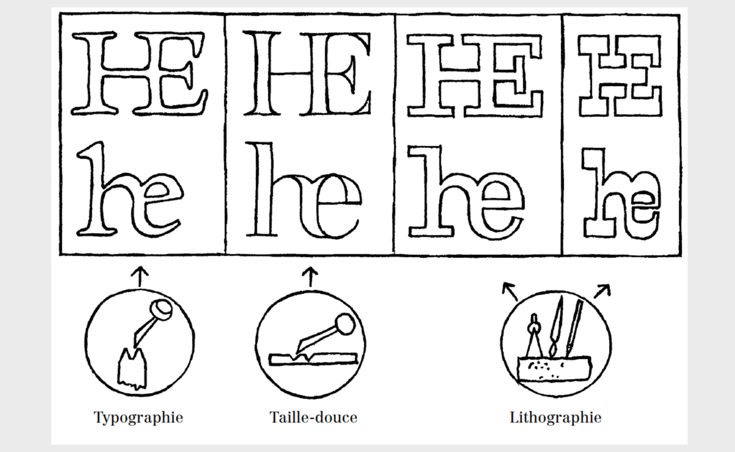
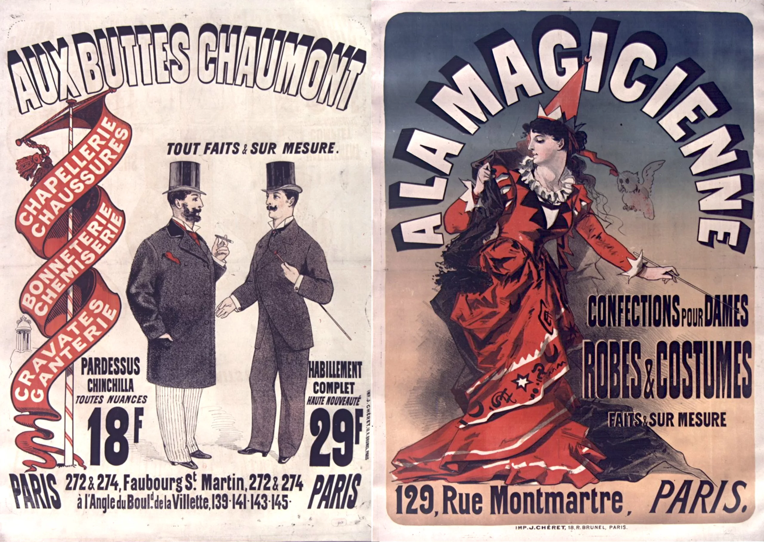
Thanks to the use of lithography and wood engraving around 1820, text and illustration were no longer printed separately, and over the years they spread to all visual media, from the press to posters and, of course, book covers, children’s games, souvenir cards and caricatures. Daring and creative, artists were now for the first time responsible for the entire graphic composition, drawing both the illustration and the letters by hand. This new mastery marked the birth of graphic design, and launched a community of illustrator-graphic artists of international renown, including Beardsley, Chéret and Toulouse-Lautrec.
The golden age of illustration
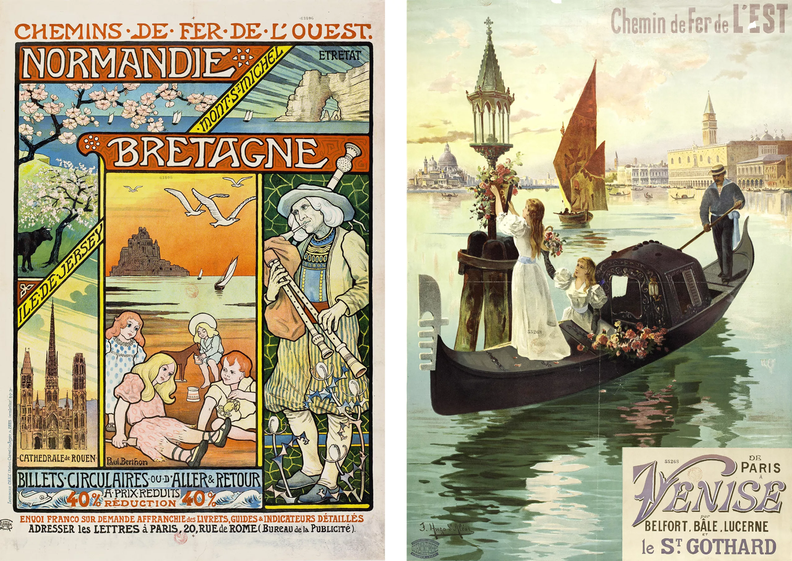
Around 1860, chromolithography was perfected and revolutionised printing by adding colours: it allowed hand-painting on the stone, colour after colour (it sometimes took more than 15 coloured stones to form a single image, in successive passes as a printer would) and was used until well after the Second World War. In France, the illustrator Jules Chéret put his art at the service of industry. He developed this technique of printing with 3 or 4 colours in successive passes after a trip to London in 1860 (see the posters below, red and orange, then dark blue) by painting a silhouette on a plain background with no perspective, accompanied by minimal text; this style became the benchmark in Europe and the United States.
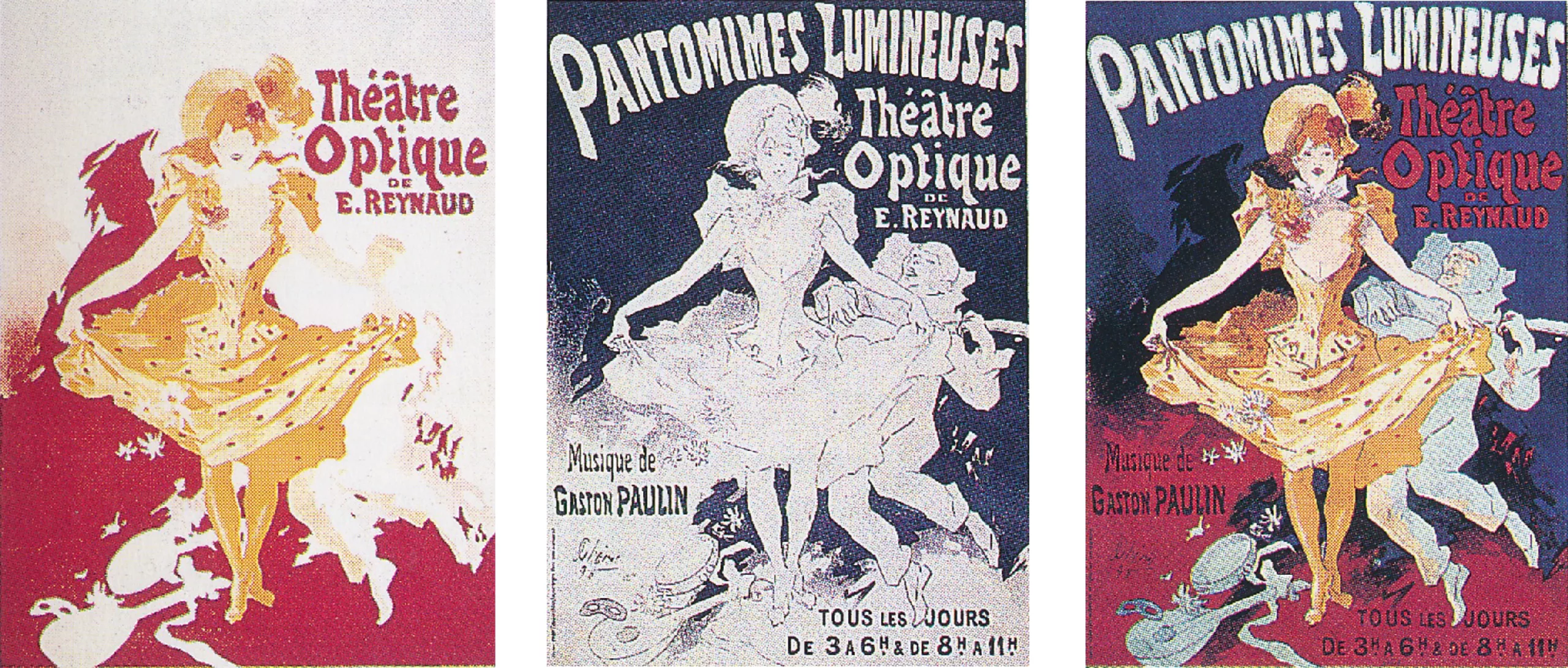
The invention of offset printing 40 years later marked the golden age of illustrators… and the explosion of advertising. The result of this modernity: a lot of fun and a lot of drawing! Around 1880, Paris was considered by Americans to be the capital of art and fashion.
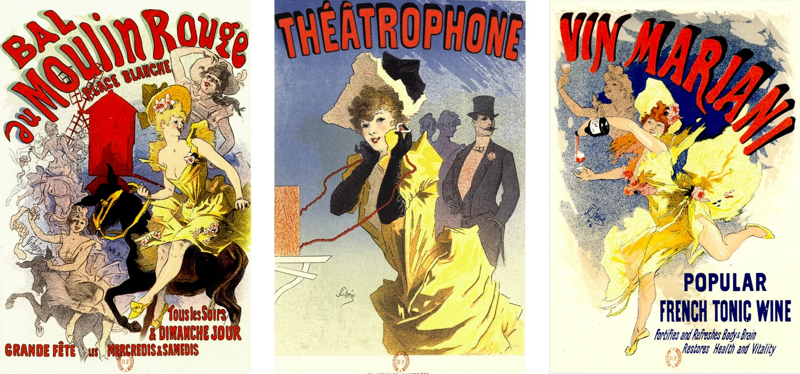
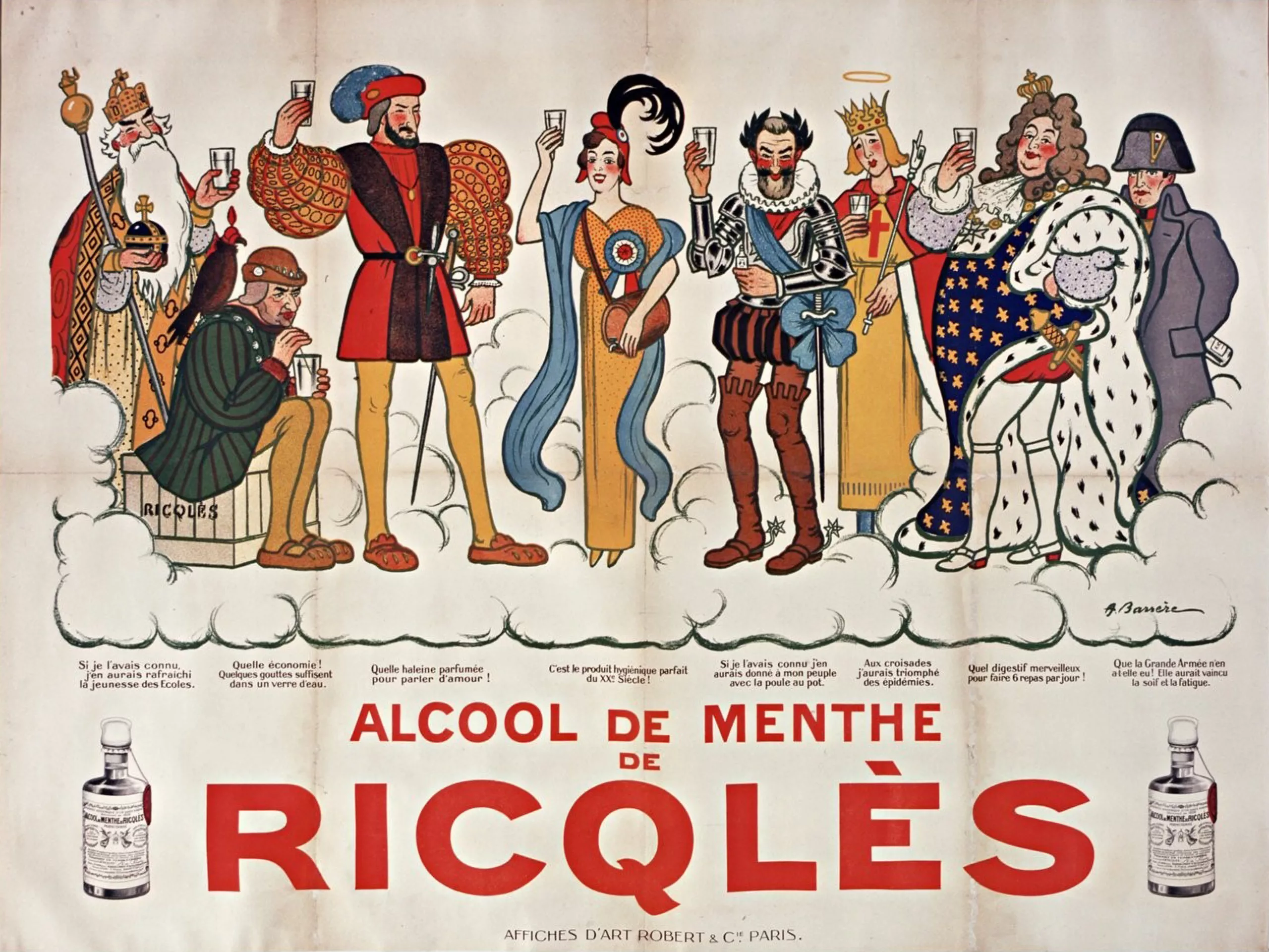
“The walls once left to banal or purely industrial advertising, the cold, bare palisades of our buildings under construction, have become veritable museums where the thinking mass, in love with art, can satisfy some of its aspirations. This mode of education was made to seduce them: (…) the street, which they love, has become more colourful, more singing than it has ever been. Ernest Maindron’s collection Les affiches illustrées (1886-1895), 1896. In each case, it was in a highly visually-charged context that the need for greater simplicity and legibility arose, or for a break with the past.
The first linear, a revolution not universally acclaimed
It’s worth noting that in 1816, England, which was ahead of its time in the modern world, invented the first sans-serif typefaces specifically for advertising and the press, which had the advantage of being more legible and simple in this graphic flow. The William Caslon foundry’s Two Lines English Egyptian in sans-serif and capitals saw the light of day; at the time, the word “Egyptian” was a category for new and different typefaces.
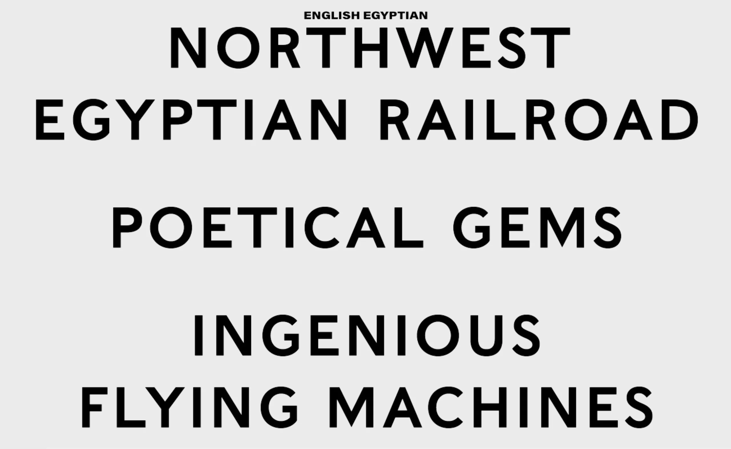
Later, Thorowgood‘s “Seven Line Grotesque” made its mark with the first stick and bold typefaces in lower case, in 1832. More neutral, with no ornamentation or cultural connotations, these monolinear typefaces made a complete break with the Gothic, Roman or Elzevir typefaces used until then in calligraphy and printing, and were therefore a graphic revolution… even if it probably went relatively unnoticed!
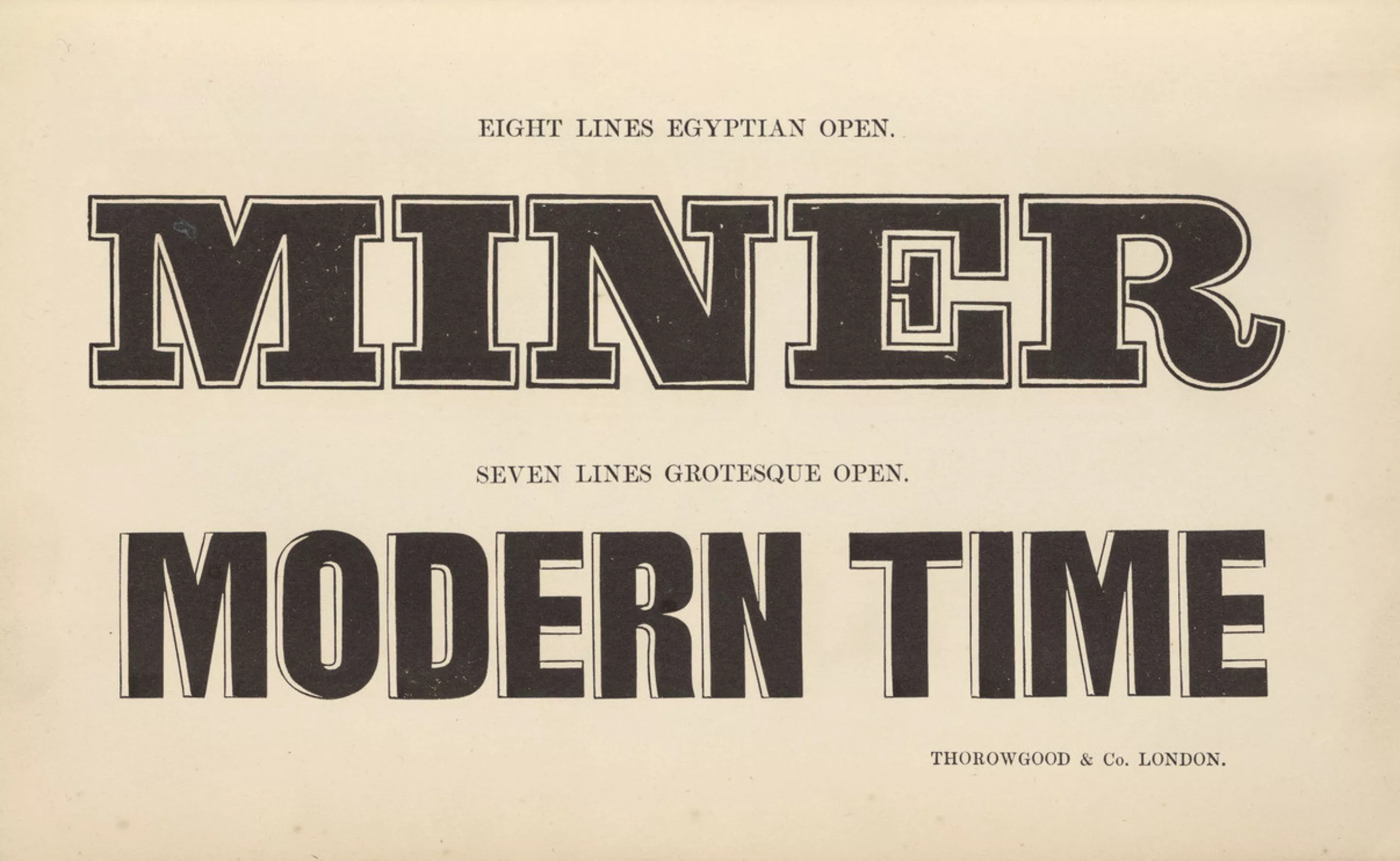
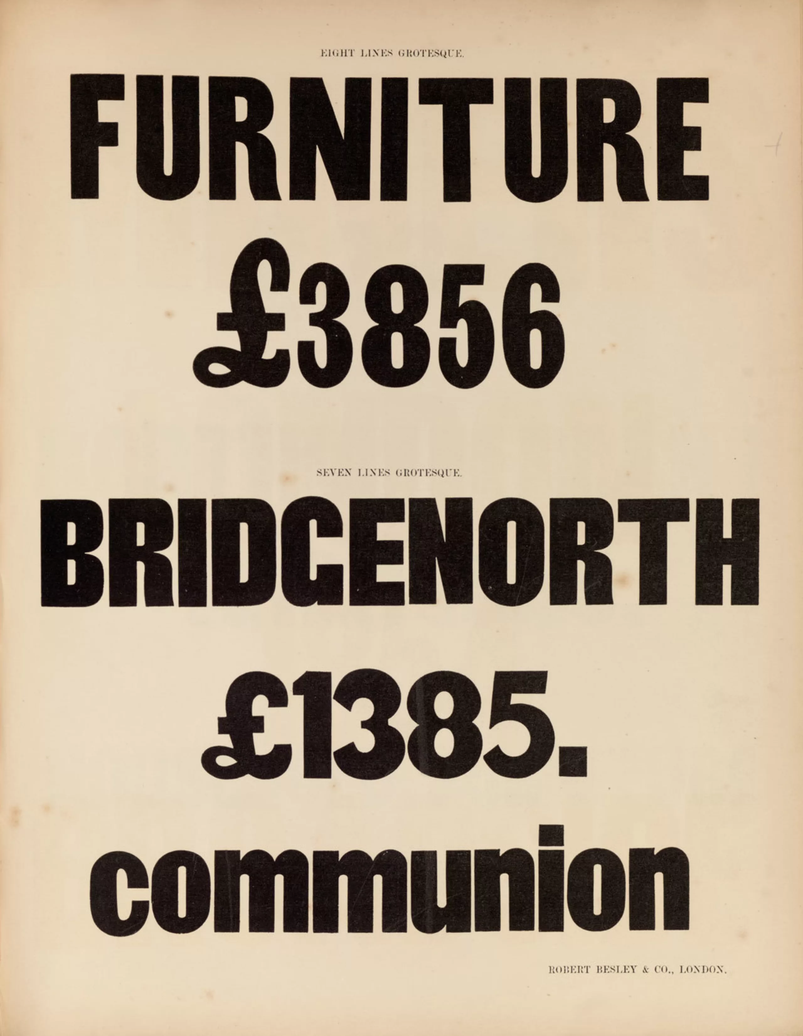
These first unadorned typefaces were created for legibility reasons and are generally only used in titles. The largest letters possible were drawn in the smallest space possible. These characters are called grotesque in comparison with the more sophisticated Roman letters… this name indicates their intrinsic value and the little value placed on them. Although they marked the beginning of linéales – which would revolutionise the modernist graphic landscape a century later as “universal” typefaces – they were still far from unanimously accepted.
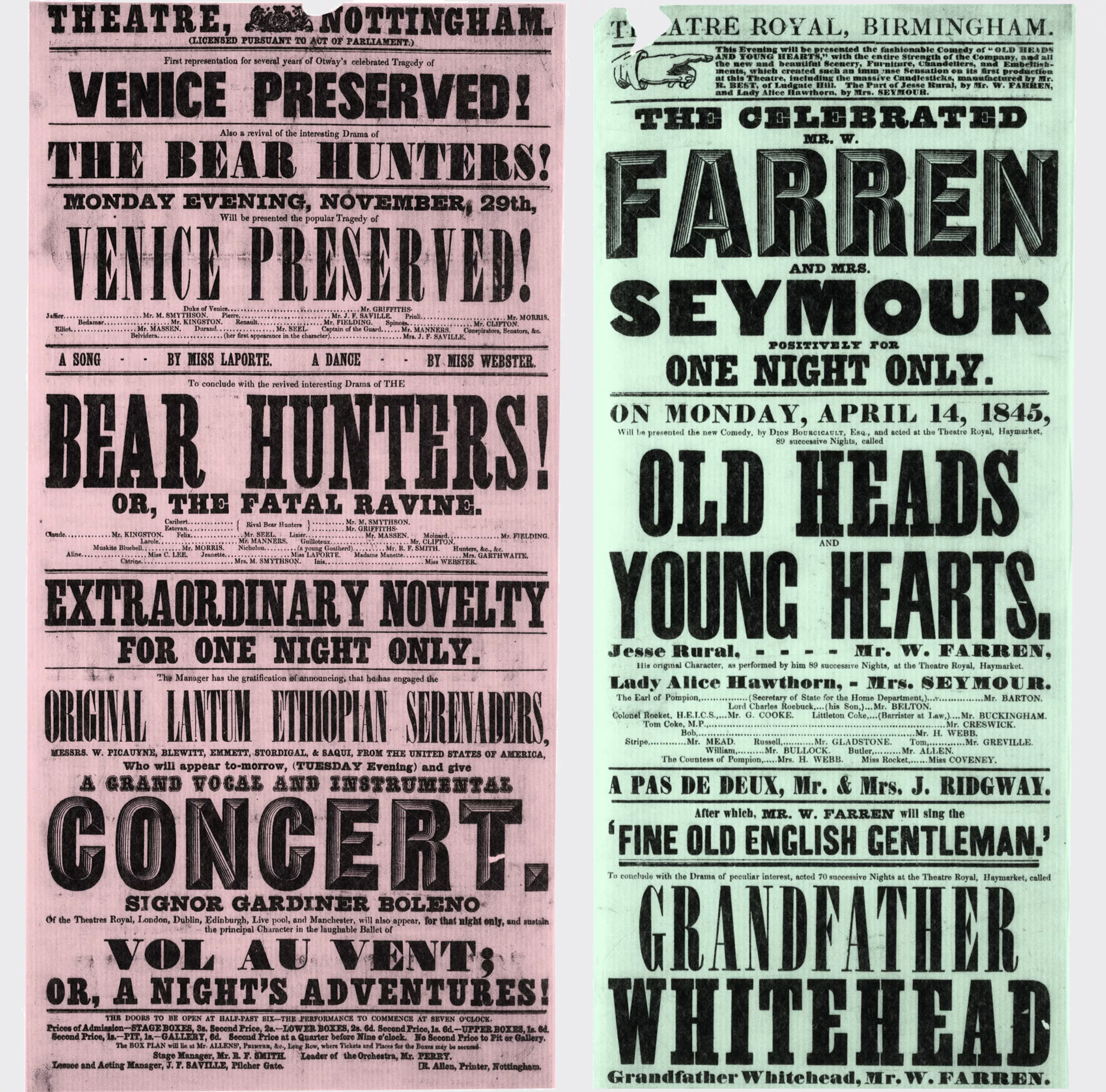
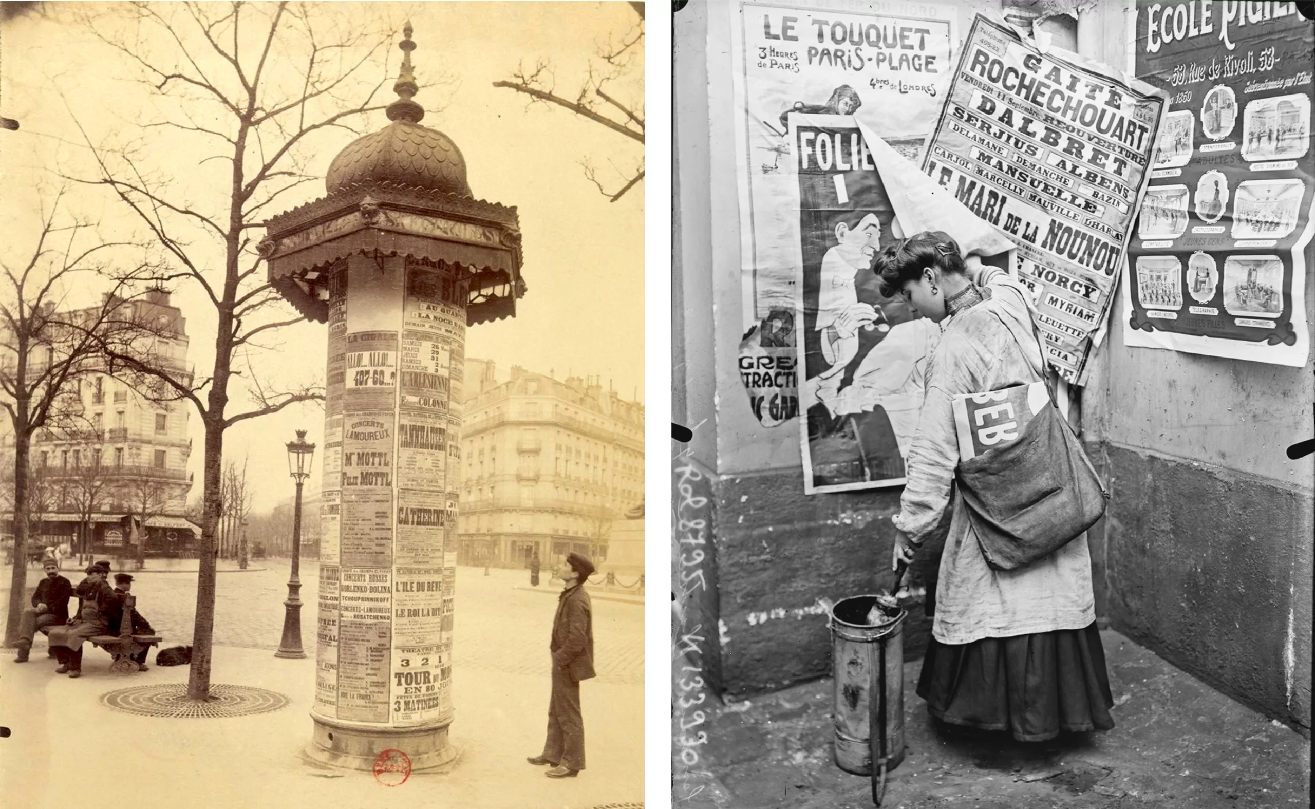
A century before the Bauhaus, the modernist school par excellence, the first typefaces with a constant thickness and no ornamentation were used for the first time, doing away with the full and loose strokes inherited from the pressure of the handwritten pen on paper, or from the engraving of Roman capitals. Writing, which until then had borne the mark of man, now became the visual translation of a purely mechanical, standardised process, which was completed around 1920 with the creation of geometric linéales (to be discussed in a later article).
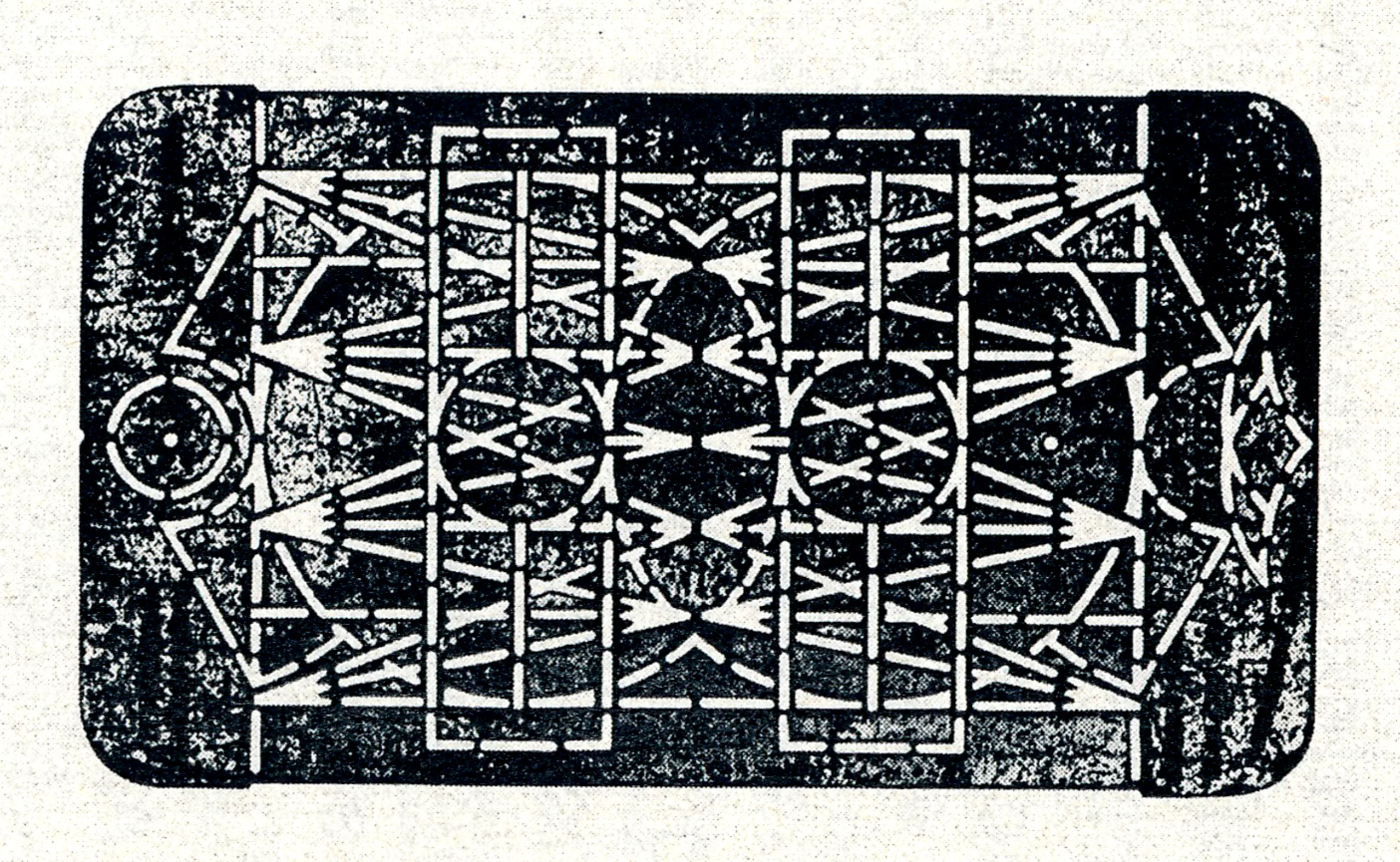
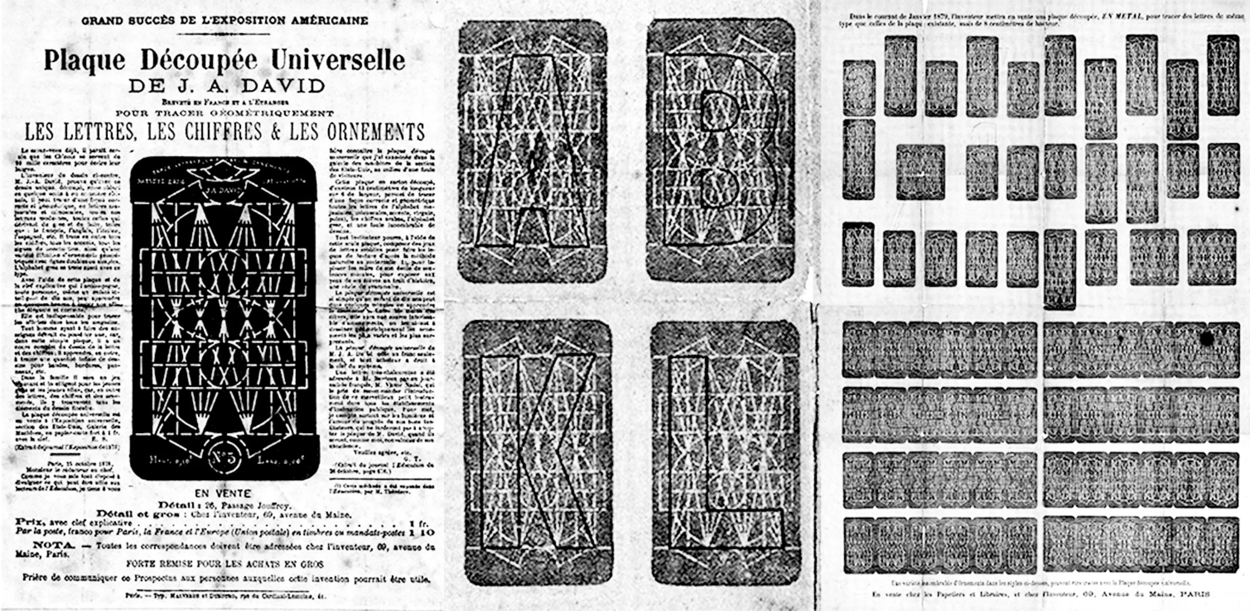
In 1876, Joseph A. David, an American engineer, took the process a step further by inventing the Plaque Découpée Universelle. This was a metal stencil plate with circular and linear geometric shapes that enabled geometric characters to be drawn without serifs, and was designed as a teaching aid for primary schools. This object brings together the rational and plastic thinking (artist / craftsman or engineer / typographer) that founded the modernist movement, which would later be used for the designs of the first Bauhaus geometric linéales.
These technological and social advances are changing the face of the civilisations they cross. In reaction to the meteoric rise of the role of the machine, which is progressively dehumanising the human being, artists are asking themselves what path to take: to redesign a new modern world by revalorising the genius of the craftsman, or to wipe the slate clean of the past and resolutely embrace modernity? That’s what we’ll be looking at in the next article in this series, The Two Faces of Modernism and its Social Ideologies, which you can read here!
Sources (books) :
- Des universelles contemporaines, memory of Corentin Noyer de DNSEP
- Simplicité et minimalisme dans le design graphique contemporain, Stuart Tolley
- Le graphisme au XXe siècle, Richard Hollis
- L’Homme et ses signes, A. Frutiger

