Typorama #06 : Futura by Paul Renner
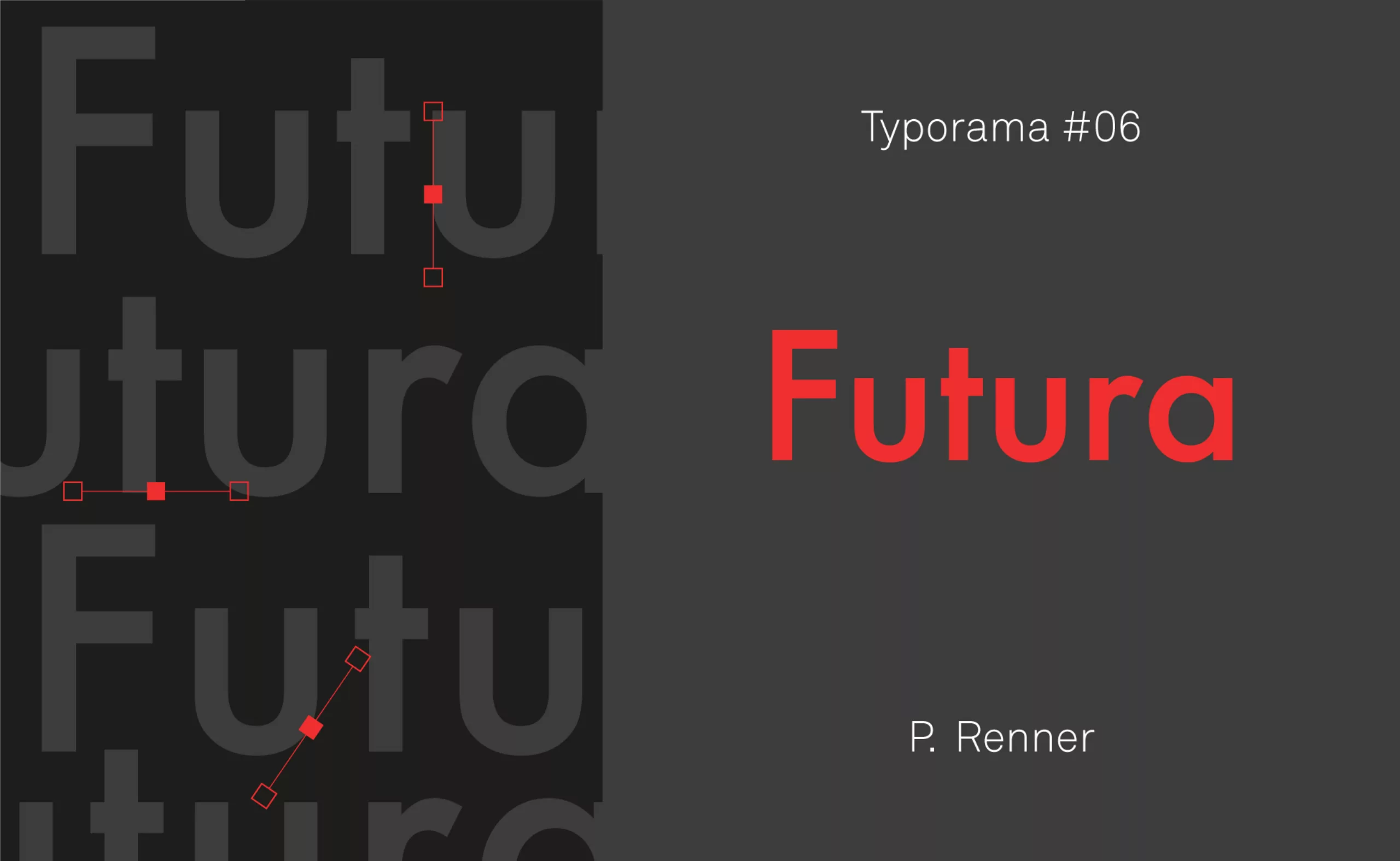
In the manner of portraits of great designers, we continue our series on the typefaces that have marked the world of graphic design. Here is Typorama #06, about Futura!
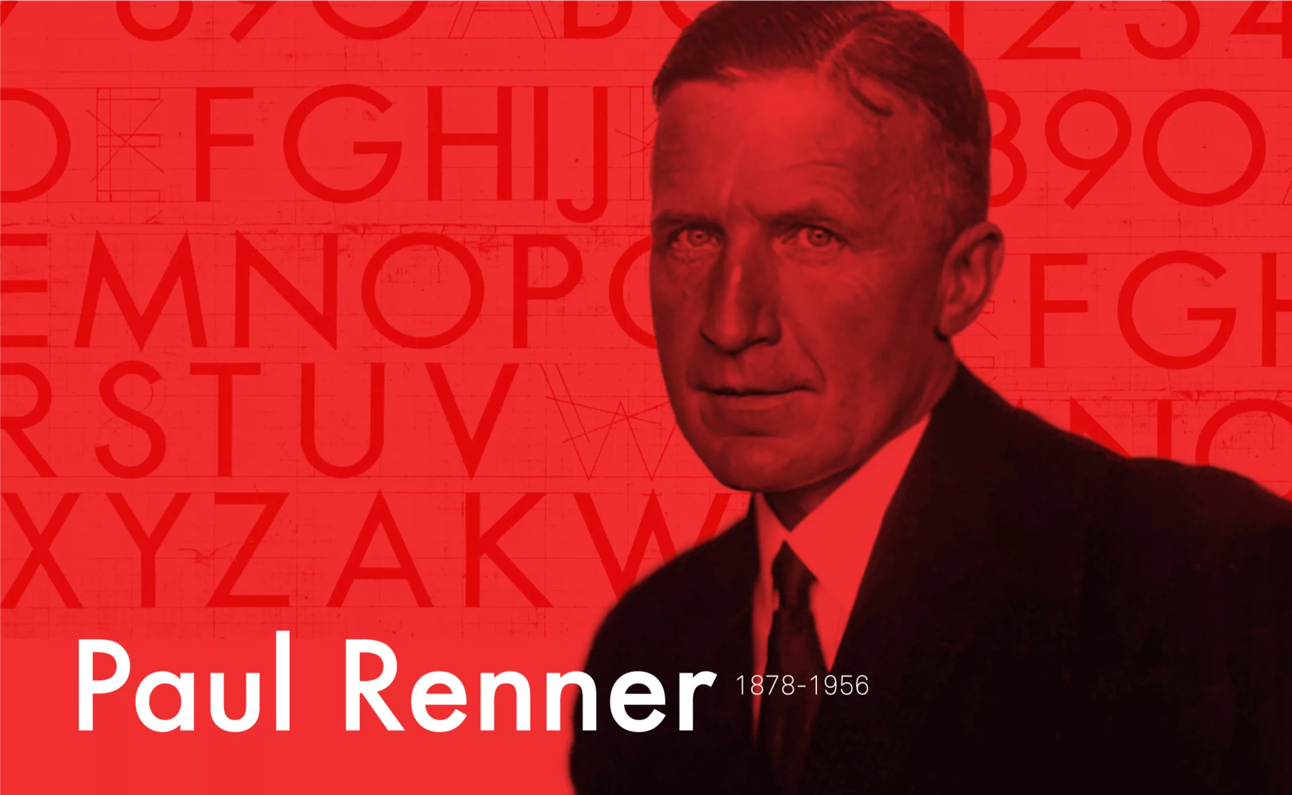
The year 1927 saw the birth of some of the great figures of this world. Among these illustrious names, we can mention Simone Veil, Juliette Gréco or Albert Uderzo. Typography was not left out because in 1927 Paul Renner gave birth to one of the most famous fonts in history: Futura.
1920 A Space Odyssey
In the 1920s, the German typographer Paul Renner wanted to modernize typography by moving away from the heritage of calligraphy. He banished the serif and introduced simplicity in his refined typefaces by using geometric figures. The Futura, designed between 1924 and 1927, is therefore innovative for its time, because it is imbued with the modernist ideals of the Bauhaus, even though its creator was not a member.
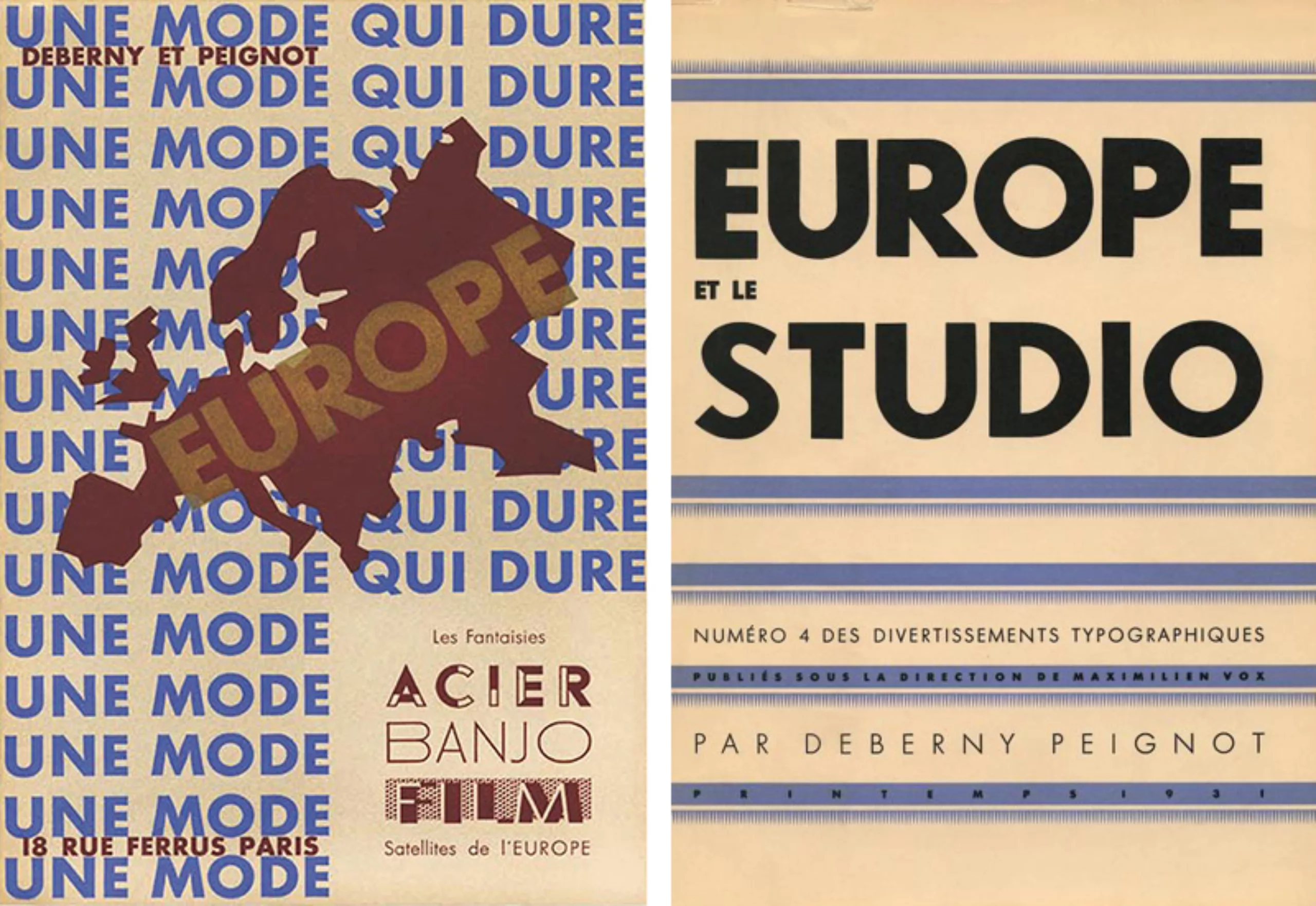
This boldness was quickly rewarded as it was a resounding success from the moment it was released. Three years later, France discovered the Futura, thanks to the Deberny & Peignot foundry, which decided to distribute it under the name Europe.
Maximilien Vox, artistic advisor of the famous Peignot foundry, is interested in the new European typefaces “of our time”: the Gill in Great Britain, the Kabel and the famous Futura in Germany. The Peignot foundry bought the Futura but renamed it Europe.
Typographic abstraction
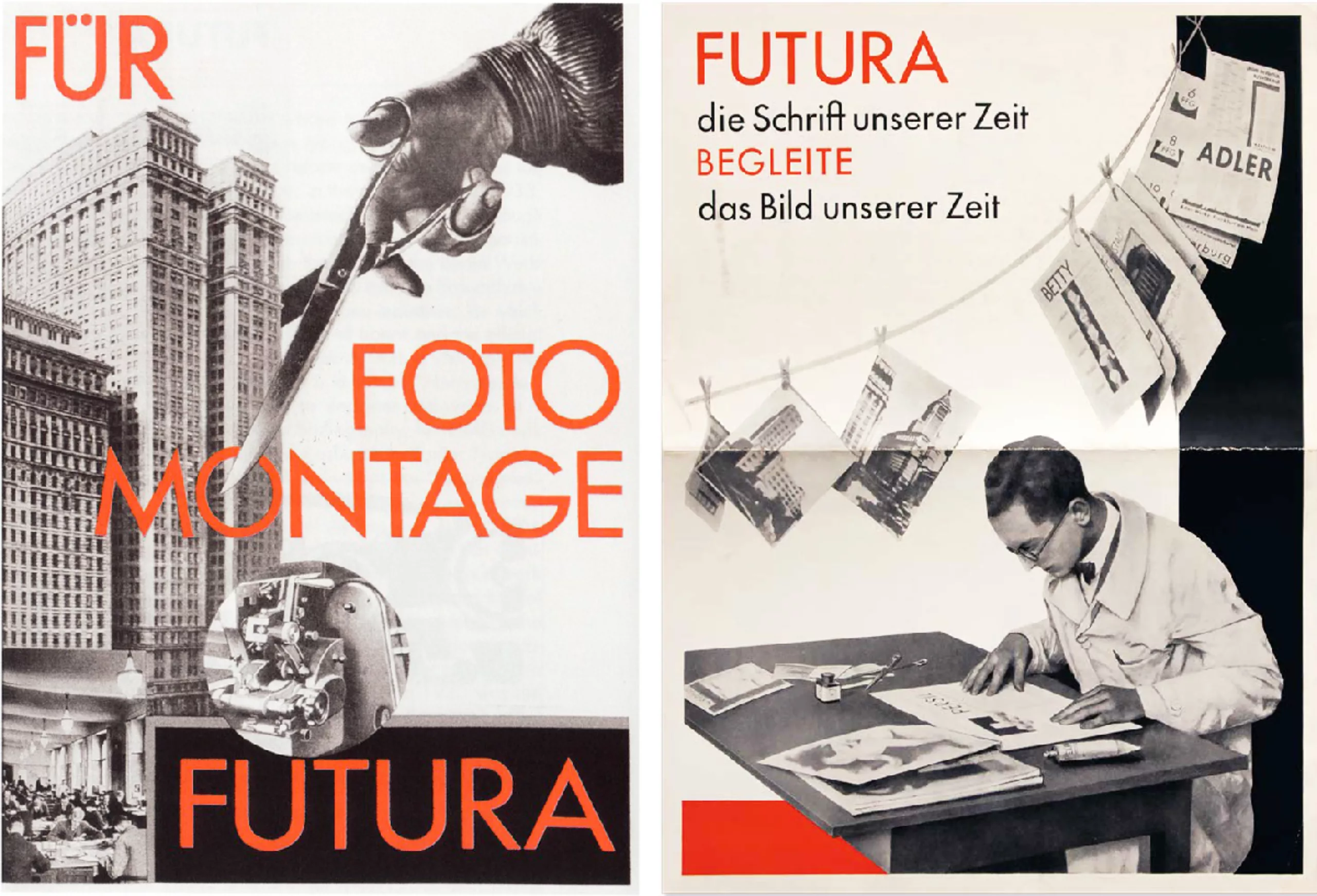
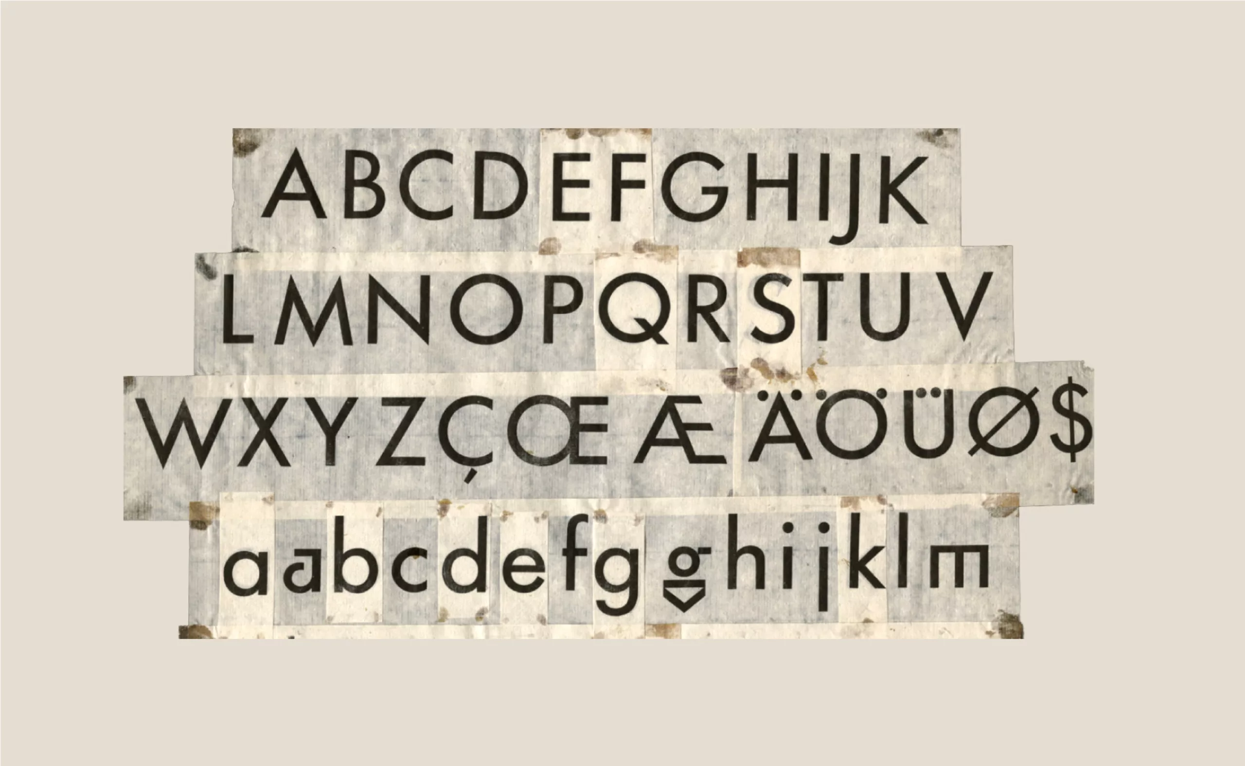
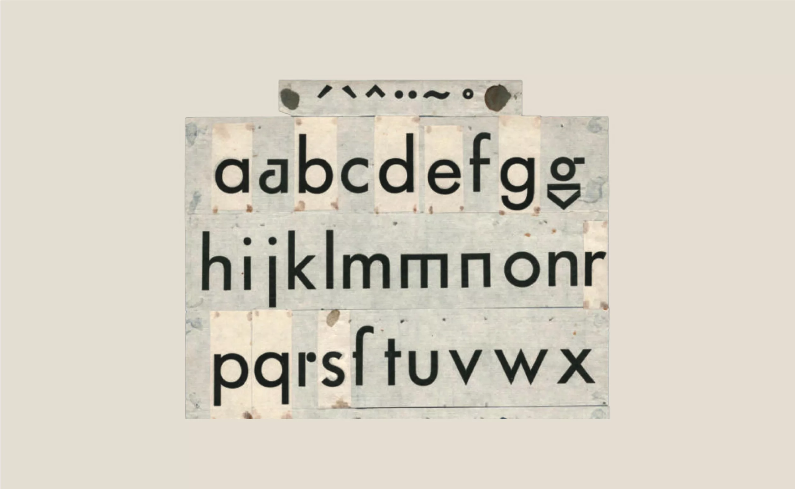
The development of this linear font required more than two years. The first version was based on strictly geometrical shapes. One could indeed find in each character isosceles triangles, squares or even perfect circles (see photo below). Its geometrical radicality took precedence over its legibility and it was thus reworked by taking into account optical phenomena, to arrive at its final version of 1927. However, the typefaces of this first version can be found in the Architype Renner, a font distributed by the British foundry Foundry.
Typographic confrontation at the top of the Third Reich
In the mid-1920s, the prevailing conservative and nationalist discourse attacked the new artistic currents. The criticism of abstract art and modernism is the subject of a chapter in Mein Kampf. The Nazis denounced these styles as “cultural Bolshevism”.
In 1926, Paul Renner became the director of the Munich printing school.
After seeing a colleague molested by Nazi sympathizers for praising modern art, Paul Renner published “Kulturbolschewismus” (“Cultural Bolshevism ?”), an essay resolutely opposed to the nazi aesthetic. The answer will not be long in coming, his apartment and office will be searched. Then he will be briefly incarcerated and removed from his position as director.
Before leaving his position, Renner will arrange for his friend and team member, George Trump, to take over the director’s position in order to avoid an unpredictable appointment by the Nazis. In passing, we can note another famous member of his team: Jan Tschichold.
In the midst of the fury, the Nazis imposed their conception of typography. From then on, everything had to be written in German Gothic (Fraktur), the typeface used to print Mein Kampf. This typeface refers to a folkloric vision of Germanness, imbued with a history that would be millennia old.
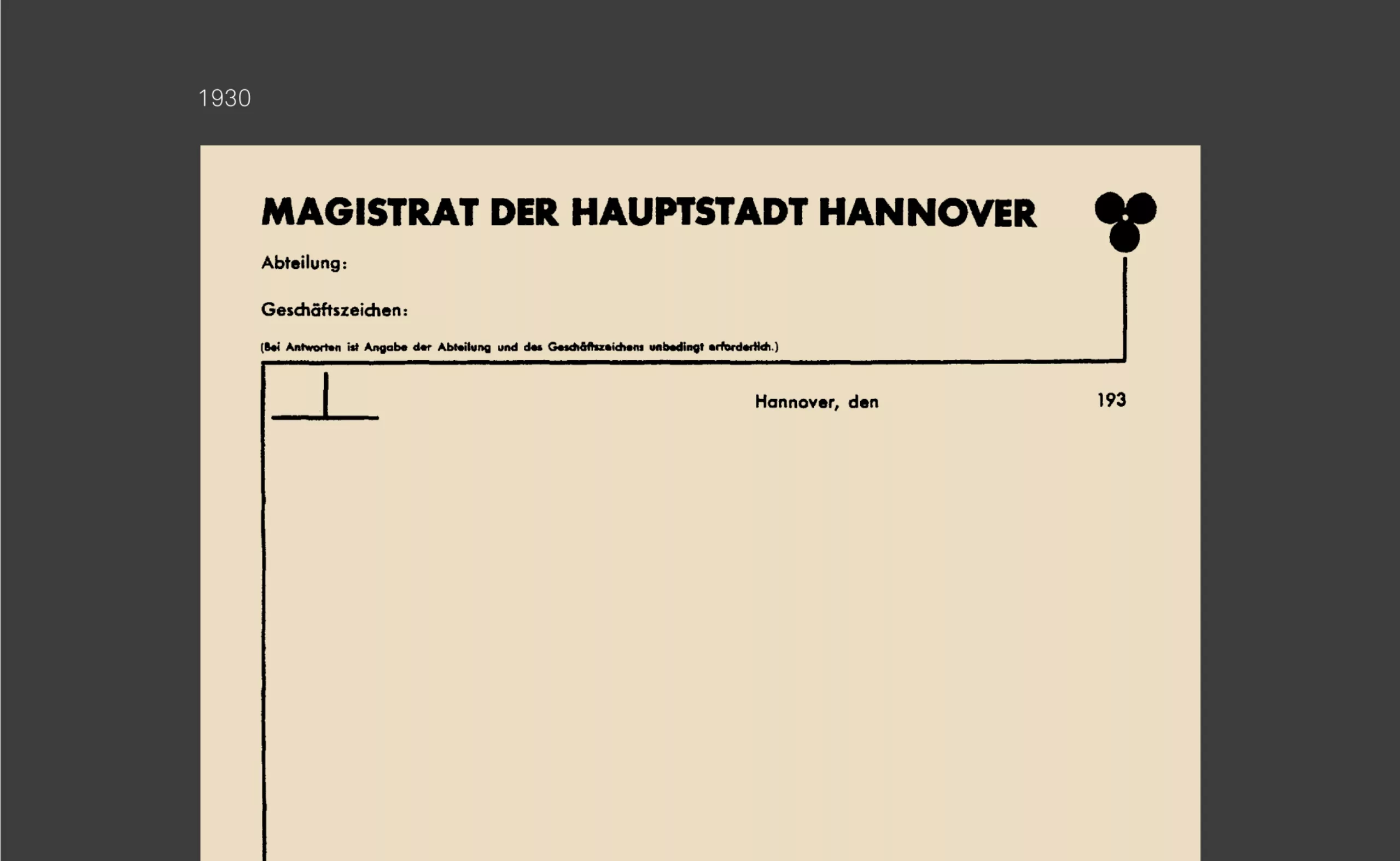
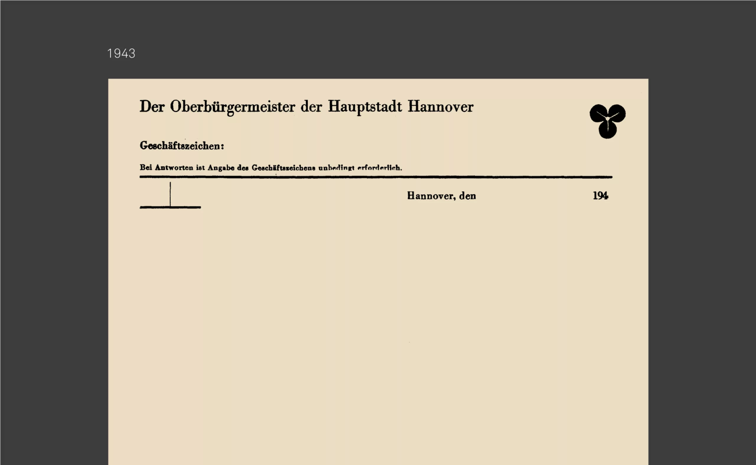
It is in the city of Hanover that this typographic conflict takes the most visible form. The designer Kurt Schwitters was in charge of rethinking the city’s visual identity as part of a major modernization program. He imposed the Futura in all the communication as in the examples of posters and leaflets below.
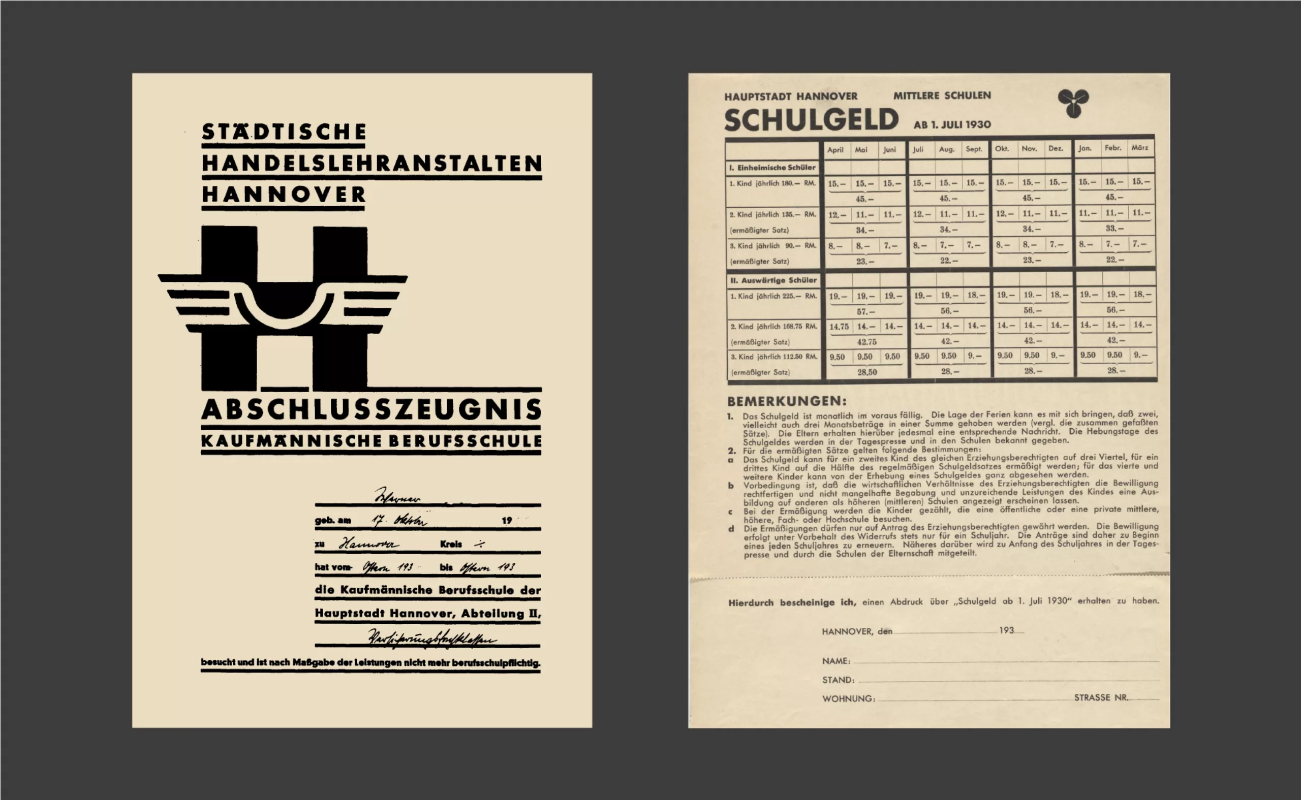
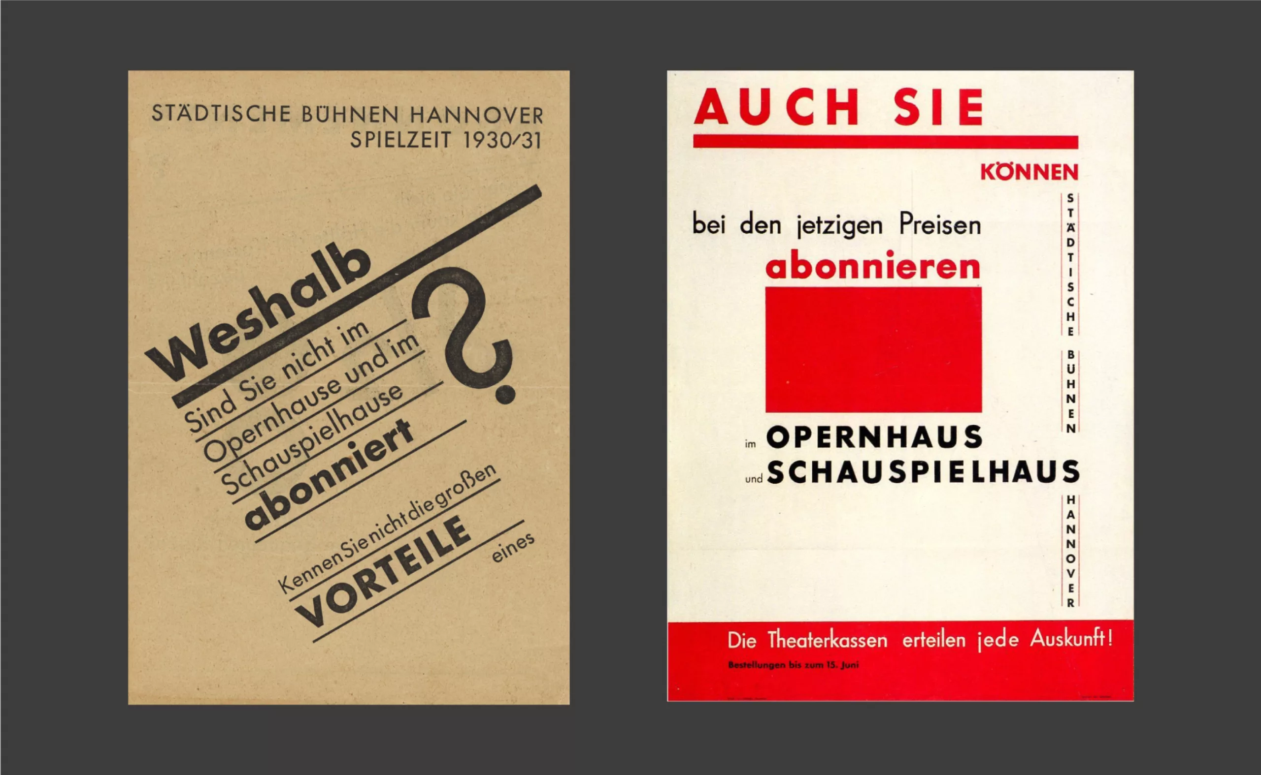
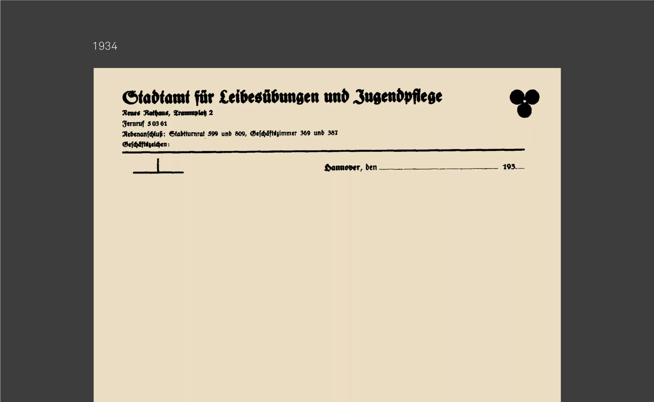
After the Nazis came to power, the city had to revise its entire identity and replace the Futura with Gothic characters. A rare archive of the city’s stationery was found before (1930) and after this Nazi makeover (1934). Everyone will judge the regression in legibility. In 1943, the municipality returned to a more legible antique typeface, without reusing the Futura.
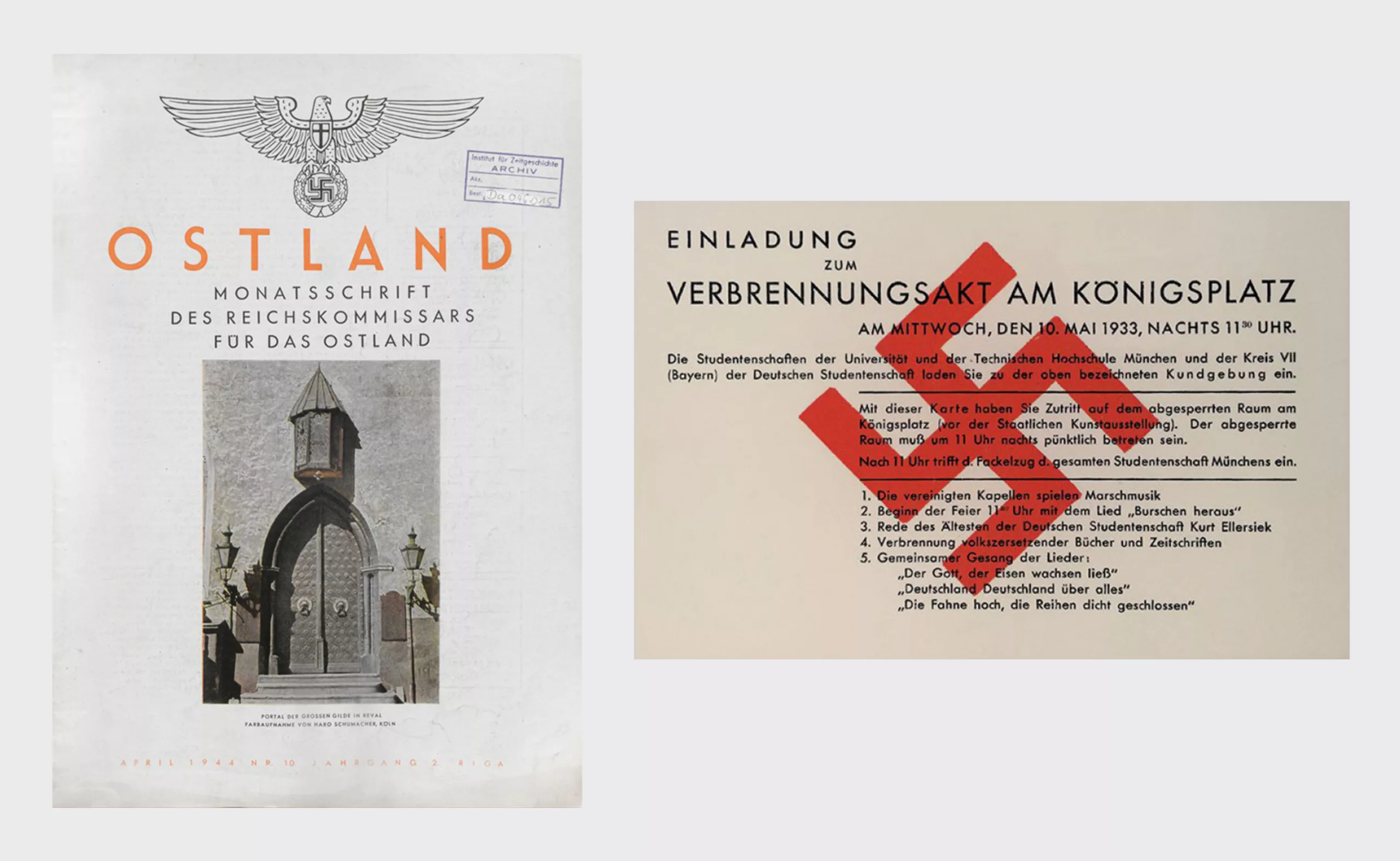
In 1941, Adolf Hitler abruptly changed his mind and finally banned the Gothic typography, which was declared a “Jewish typography”.
This change was much more pragmatic than ideological. The use of Gothic typography in the occupied countries made Nazi propaganda illegible. It was necessary to face the evidence and find a scapegoat to justify this reversal.
Paul Renner’s work was then promoted by the authorities and many Nazi communications began to use Futura. A paradoxical situation for this resolutely anti-Nazi creator.
However, after the war, the clean lines and versatility of the Futura typeface quickly put aside its totalitarian past to shape the identity of many diverse brands.
A classic above all
Although he was the apostle of modernity, and contrary to what one might have imagined, Paul Renner never called for a radical break with the past. His knowledge of the history of the discipline led him to regularly refer to antiquity. His work on capitals is directly inspired by the Roman capitals of the time of Emperor Trajan; simplicity and magnificence being the key words to remember.
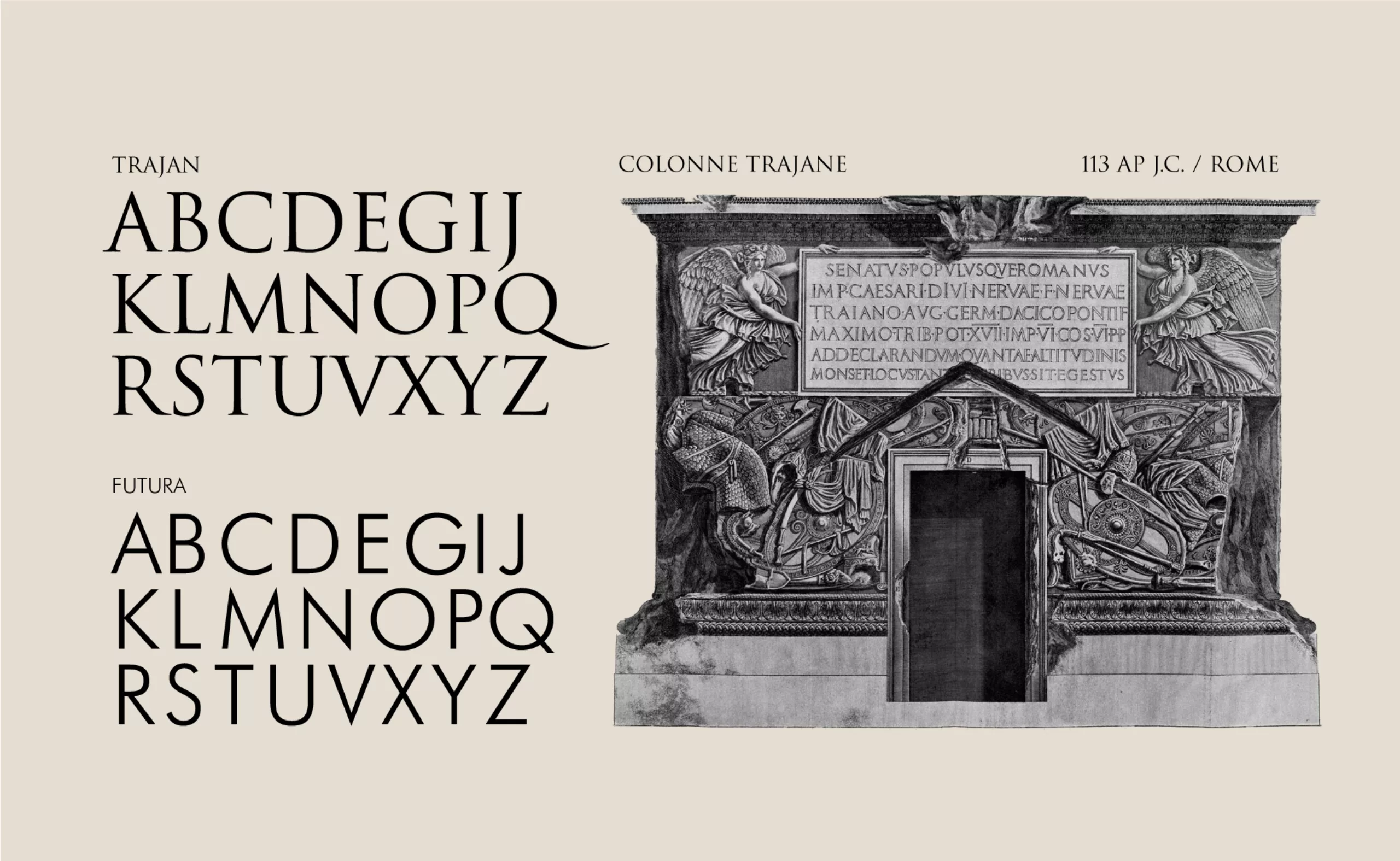
This link with Roman capitals, the writing of “power”, is not neutral. The geometry of Roman lapidary inscriptions is there to fix the messages in time. It is a static writing, contrary to the handwritten tradition, which could be described as dynamic and which leads to the invention of lower case letters.
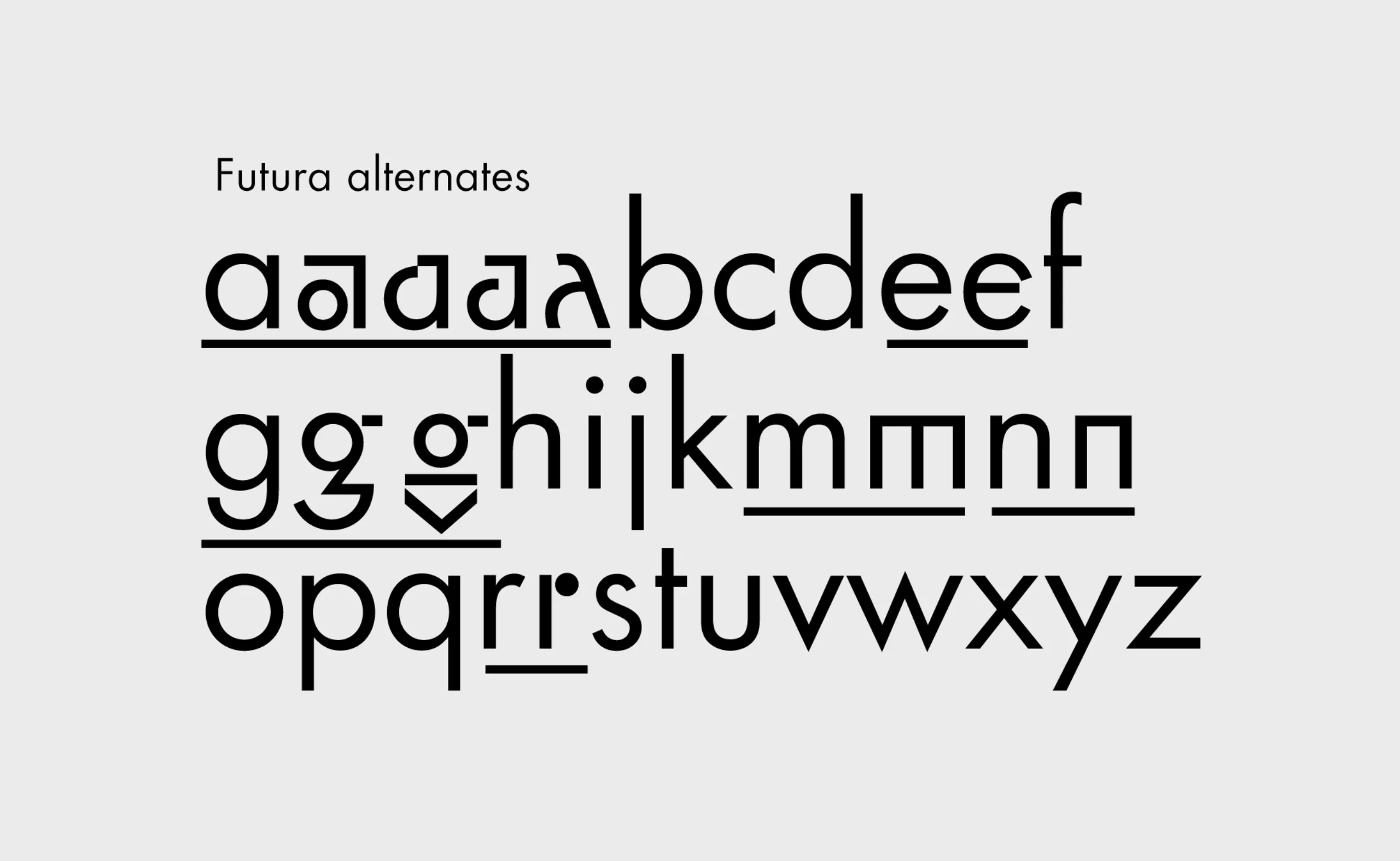
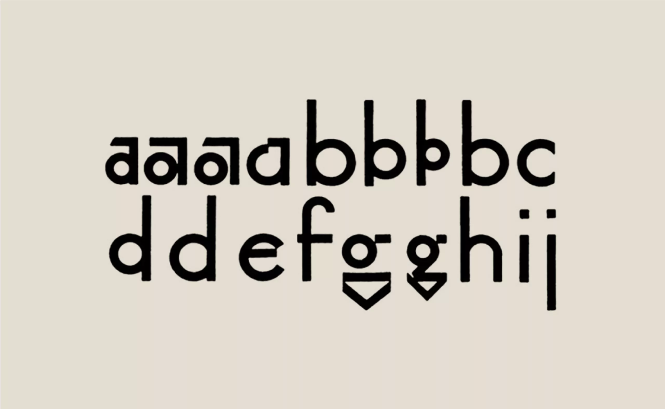
The observation of the lower case letters will also make it possible to go against the received idea that Futura would be the archetype of the geometrical lineal. In this specialist debate which opposes the supporters of a humanist typographic tradition to the apostles of the simplification of writing by geometry, Paul Renner answers by proposing a new solution. On the one hand, the design of the lower case letters is “geometrized”, erasing the imprint of the hand gesture (the humanist tradition), but on the other hand, he creates multiple alternative characters, taking up this idea of a moving and changing writing where one would find these slight variations of the writing of the same letter, as in handwriting.
In the end, Futura invents a certain political vision of “at the same time“. A very rigorous and powerful institutional character in the capitals and a certain form of play, of diversity, of humanity with these variants in the miniscule.
Somewhere, Paul Renner suggests a reunification of the Latin and Carolingian typographic traditions, in a form of alliance between Caesar and Charlemagne. One could almost detect the beginnings of a European reunification before its time.
Through this analysis, which we got from our former professor of typography Hervé Aracil, we better understand the subversive character of Paul Renner’s work.
The typography of logos that last
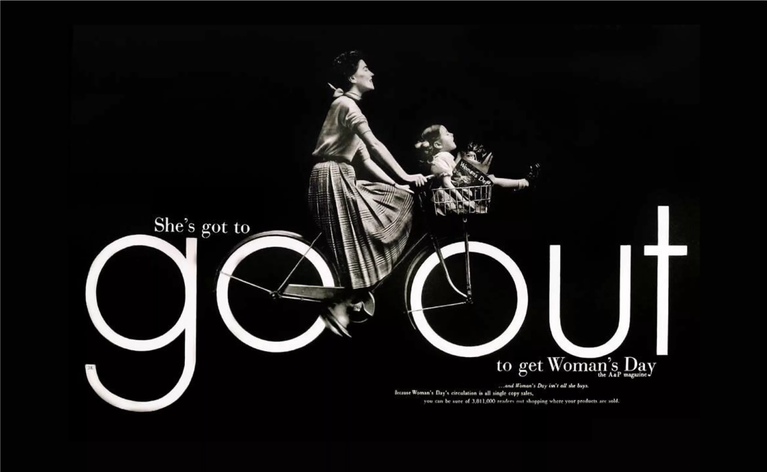
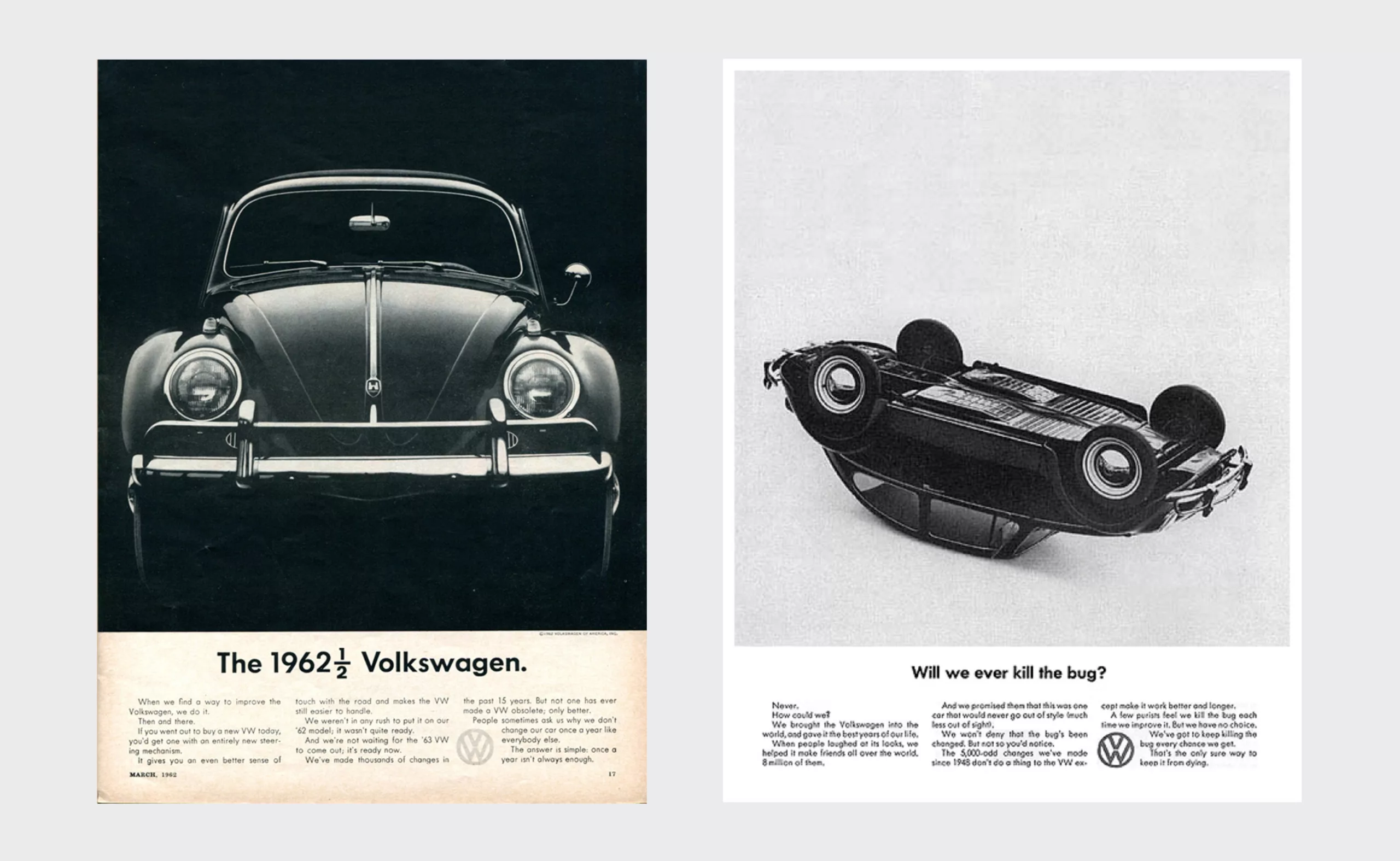
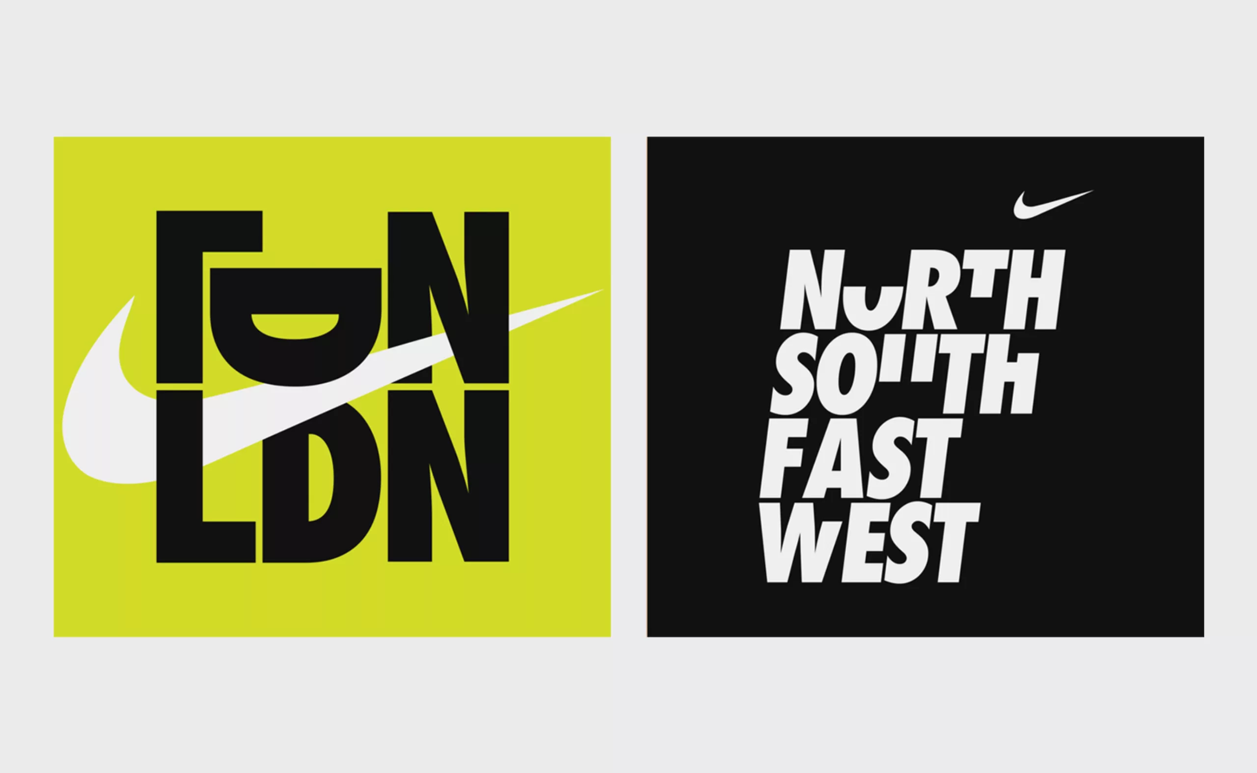
More than a font, Futura becomes a graphic element allowing graphic designers to create images that combine clarity and composition. Countless brands have also opted for Futura typography in their logo such as Dolce & Gabbana, FedEx, Red Bull, Volkswagen, Absolut Vodka, Gillette, Swissair or Nike.
The only common point between the conviviality conveyed by the logo of Domino’s Pizza (before 2012) and that of the luxurious house Louis Vuitton is surely the Futura…
There are many advertisements using the Futura. It begins just after the war with the Volkswagen company and continues until today with, for example, the posters and credits of Wes Anderson’s films.
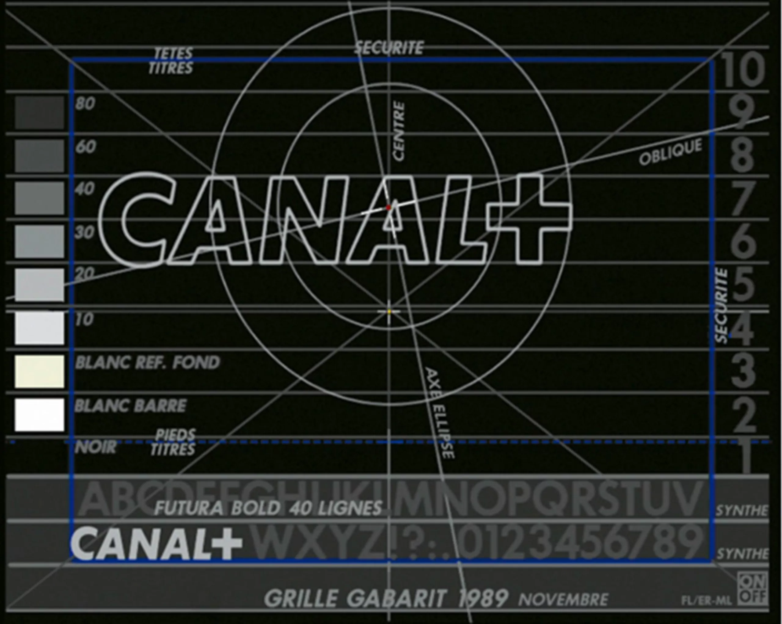
In France, it is the graphic designer Étienne Robial who played with this font for the famous visual identity of Canal+.
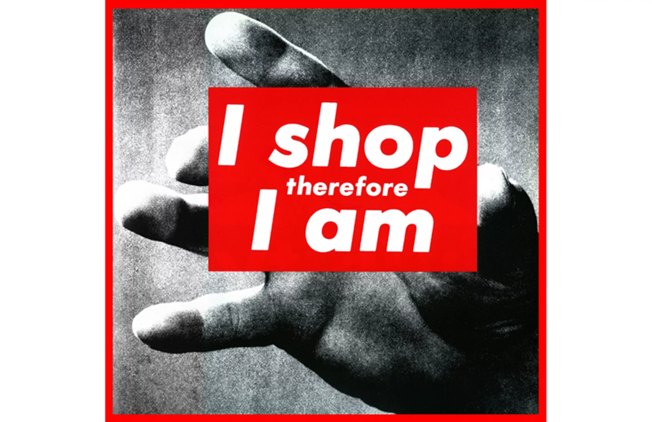
It is no coincidence that the artist Barbara Kruger also chose the Futura in 1987 for her work “I shop therefore I am“, which criticizes the consumerist society in which we live.
Futura star system
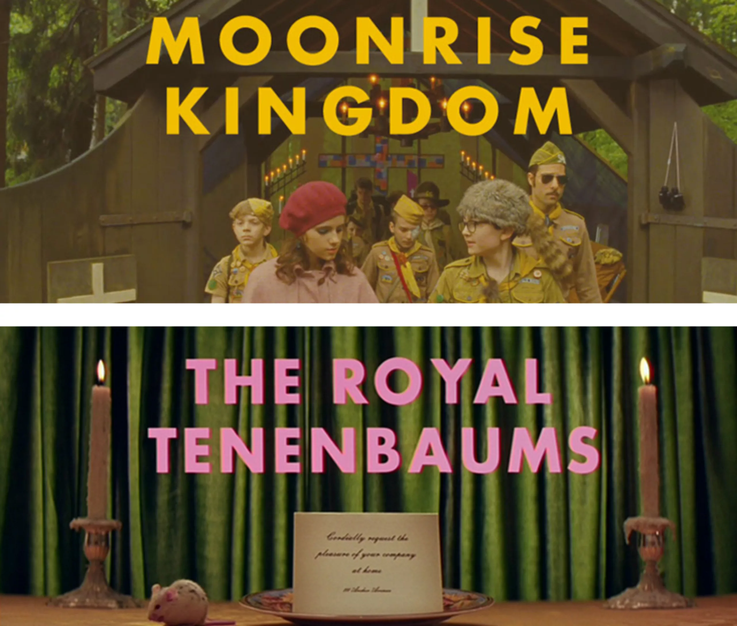
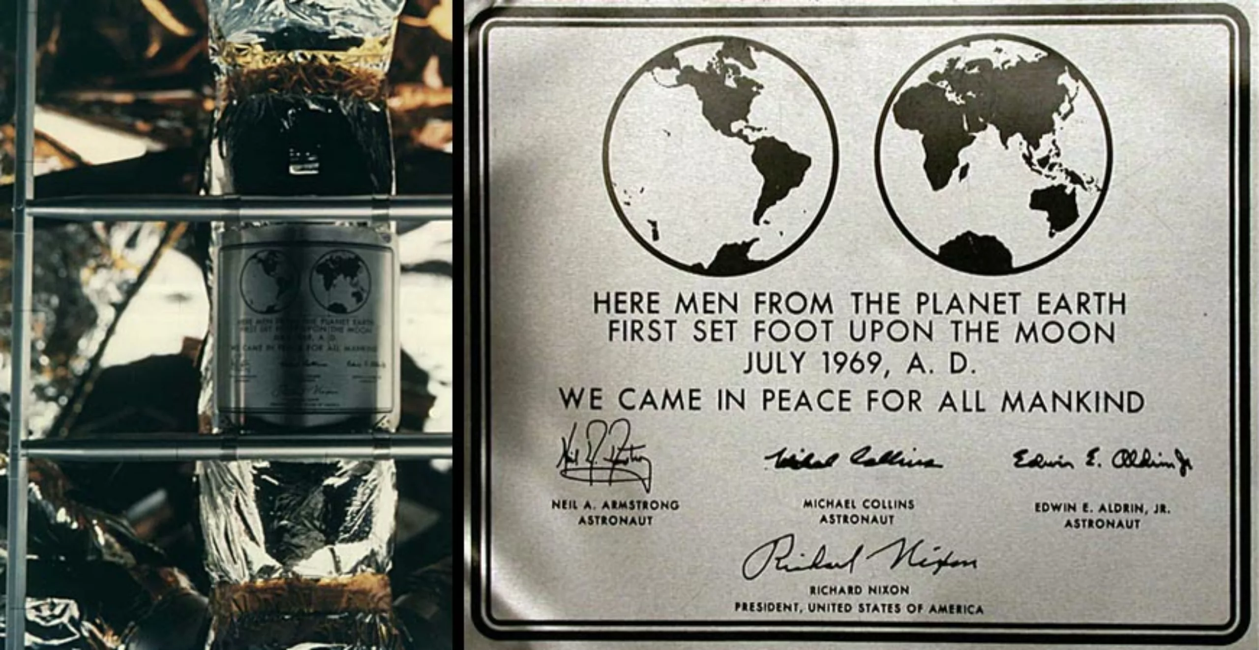
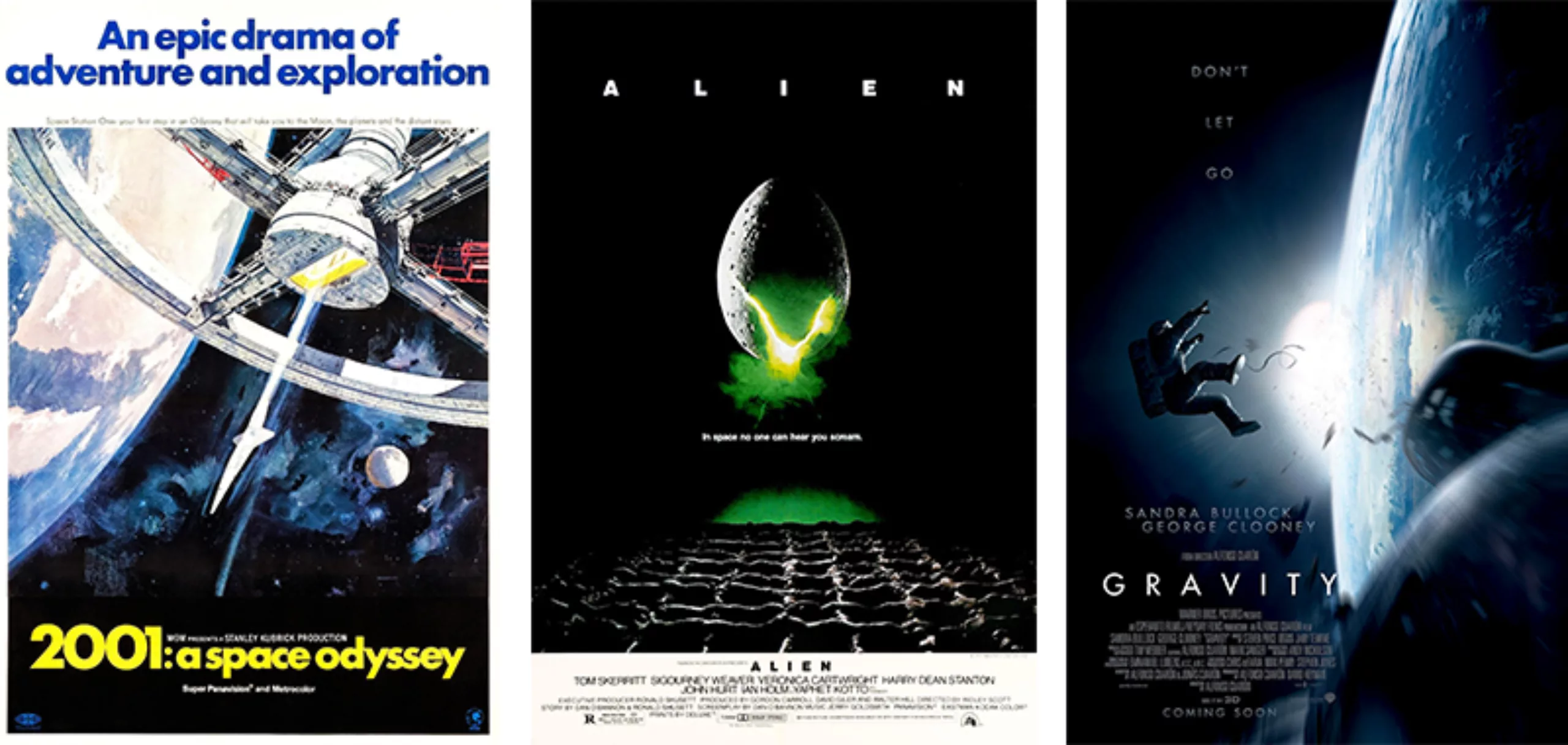
Futura was also approached by the biggest names in cinema. Wes Anderson made it one of his typographic trademarks that can be found in The Tenenbaum Family, Moonrise Kingdom or Fantastic Mr. Fox. Stanley Kubrick even sent it into orbit with his film “2001, A Space Odyssey“. And as usual, we also find her on the plaque placed on the moon during the Apollo 11 mission in July 1969, then on the poster of the frightening “Alien” by Ridley Scott and “Gravity” by Alfonso Cuarón.
Finally, we could mention “Iron Sky”, a dubious movie about Nazis plotting their return to earth from the dark side of the moon. But I checked, no trace of the Futura in this one.
The Futura is 92 years old this year and doesn’t seem to have aged a bit!
On the subject
-
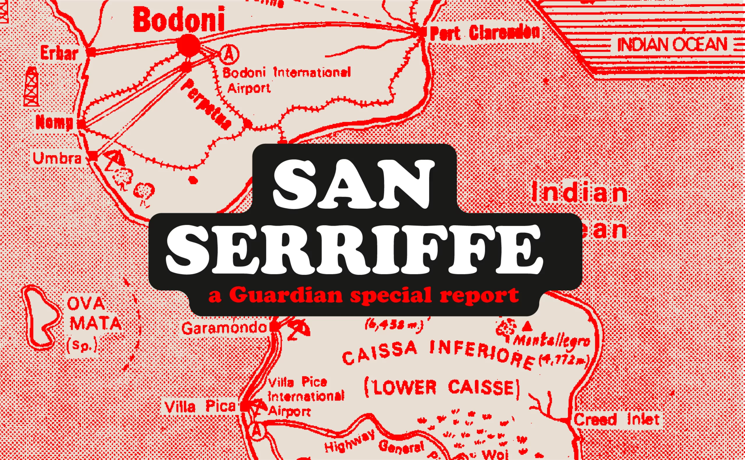
San Serriffe typographic Island
Discover how The Guardian tricked its readers into inventing the island of San Serriffe, a fictional republic born of a typographic April Fool’s joke that has become cult status. Between subtle satire and typographic wordplay, immerse yourself in one of the most brilliant journalistic hoaxes of the XXᵉ century.
-
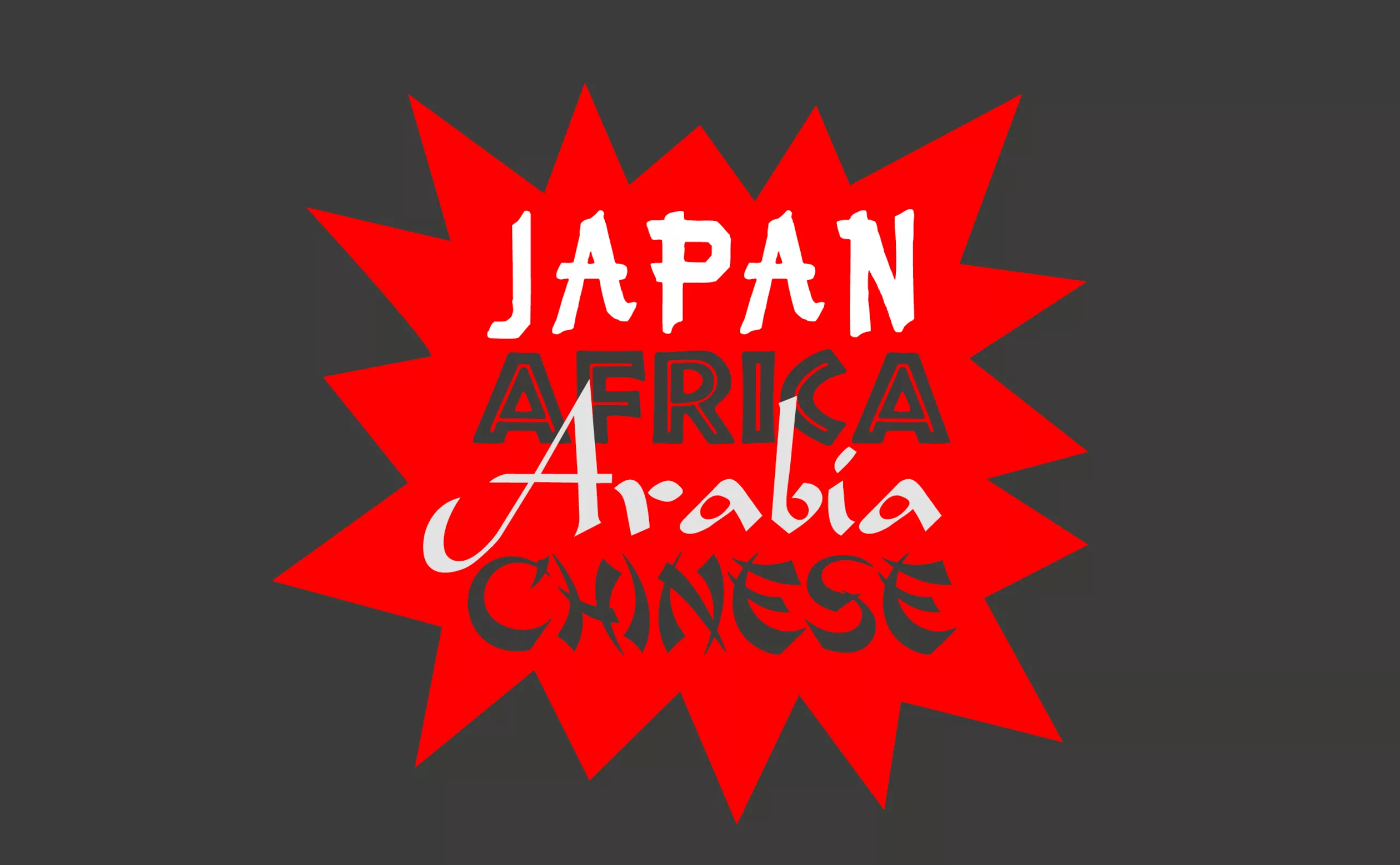
Stereotypography: typical, even racist, typefaces
Used mechanically and out of context, certain typographies convey cultural stereotypes. We call them “stereotypographies”.