Trump was a graphic designer!
From graphic designer to president
In a few days, Trump will be appointed « most powerful man in the world ». In order to know the man better, we went digging into his past. We actually found evidence that Trump was a graphic designer.
From Germany. Back in the beginning of the century. His name was Georg (no -e in the end).
Ok, nothing to do with Donald -true- but Trump he is and it’s enough to rule in our favor. Let’s have a look on how Georg Trump ruled the typographic world and what part he took in the IBM logo design.
Trump, typographer
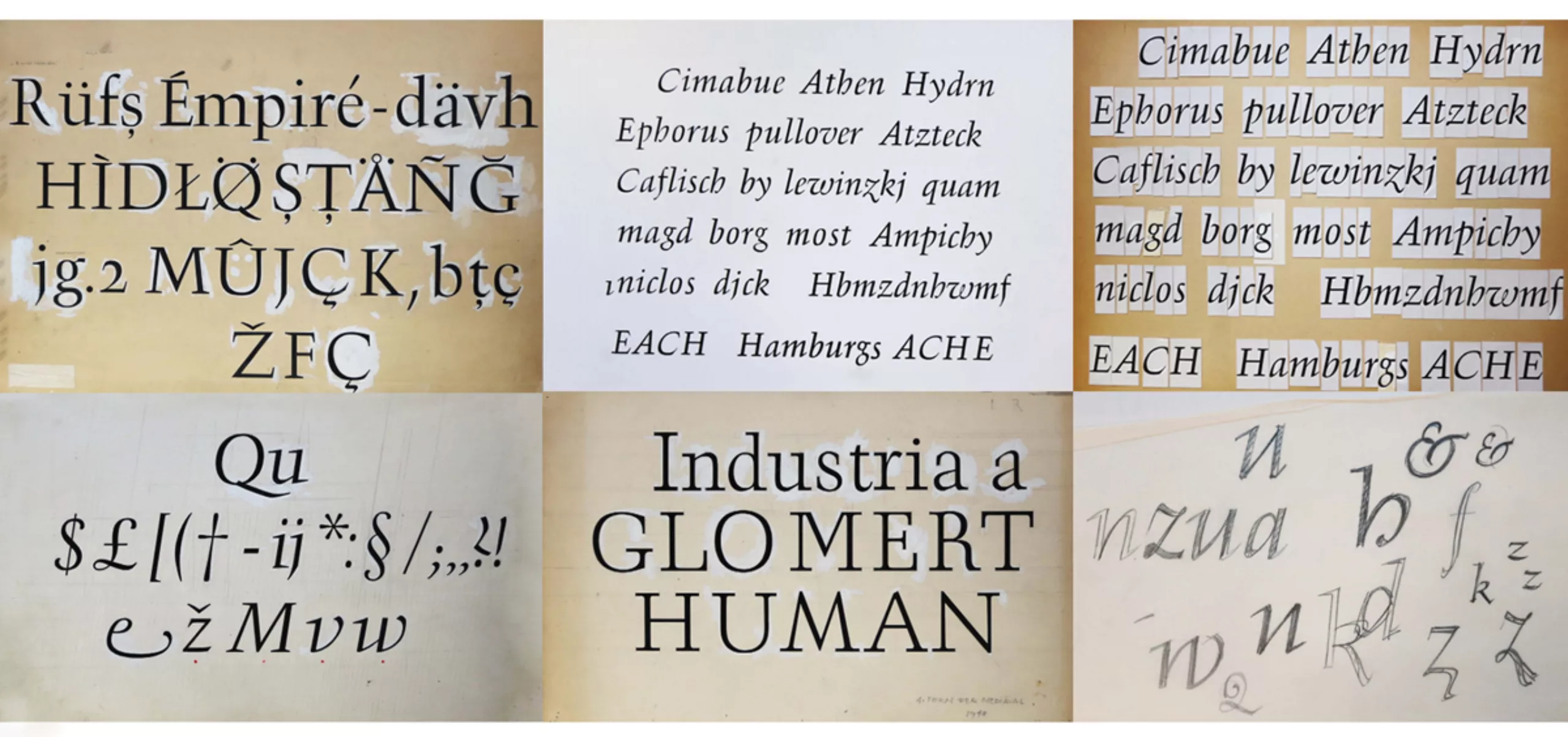
Georg Trump was born on July 10th of 1896 in Brettheim, Germany. He dies on December 21st 1985 in Munich, 89 years later. During these years, going through two World Wars and a Nazi invasion, he teaches or heads at Art and Typographic schools until 1953, and creates around 20 fonts. At this time, he’s considered as one of the most famous German typographer.
Along with his typographic fame, he’s also a photographer, ceramist, or painter. In 1982 he receives the Type Directors Club’s medal, as a reward for his excellency in typography.
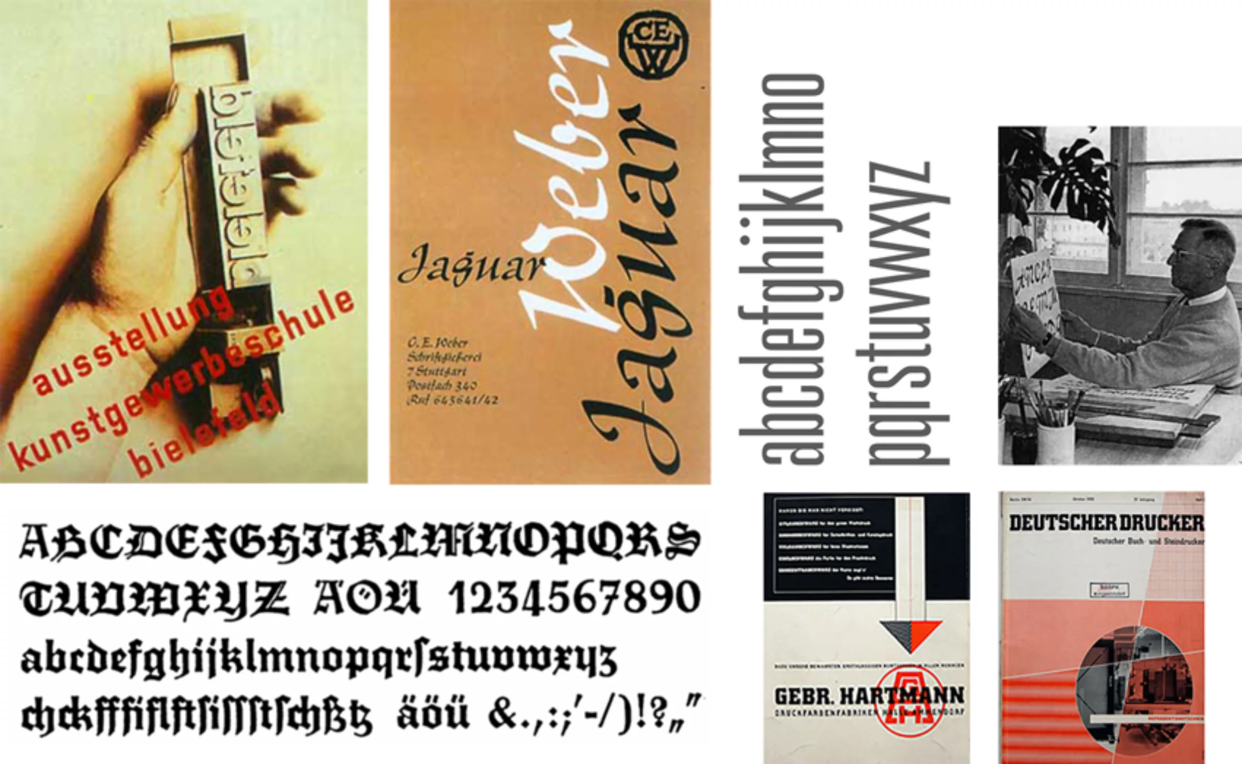
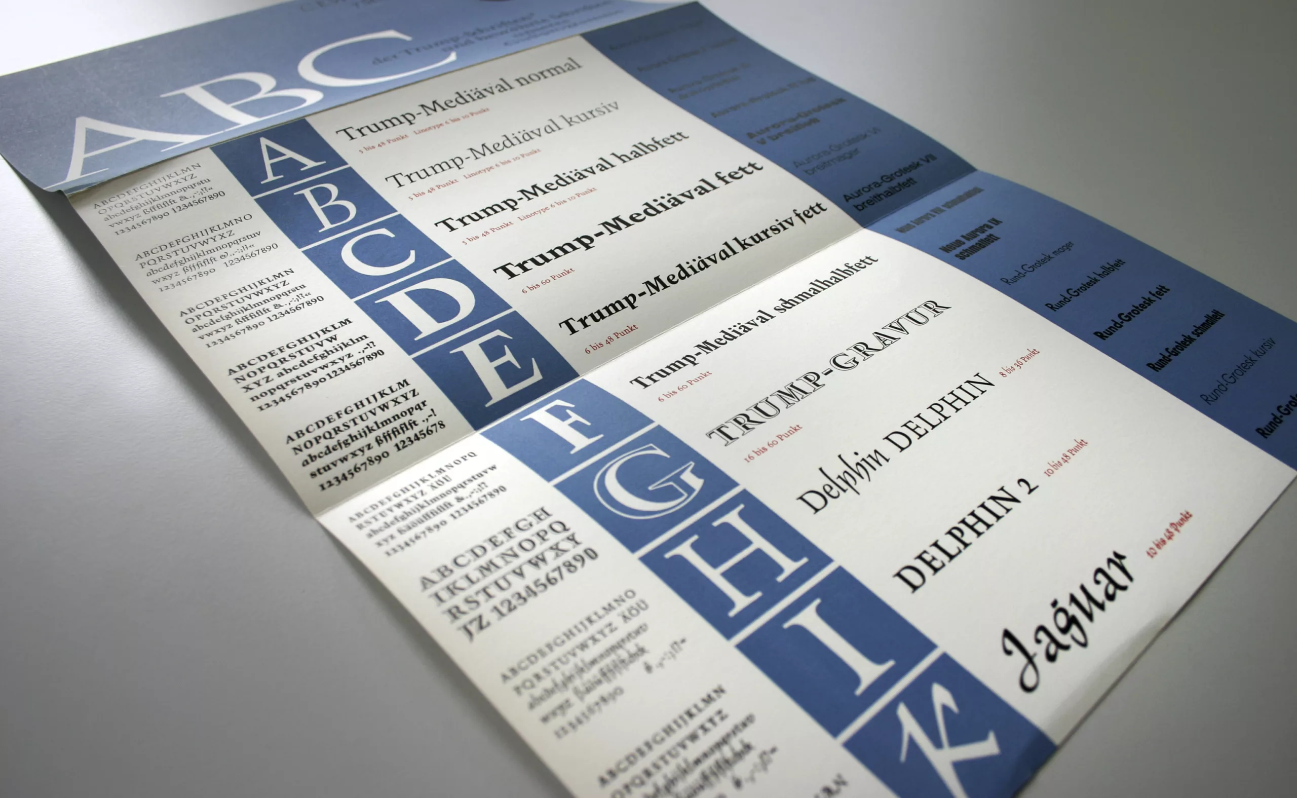
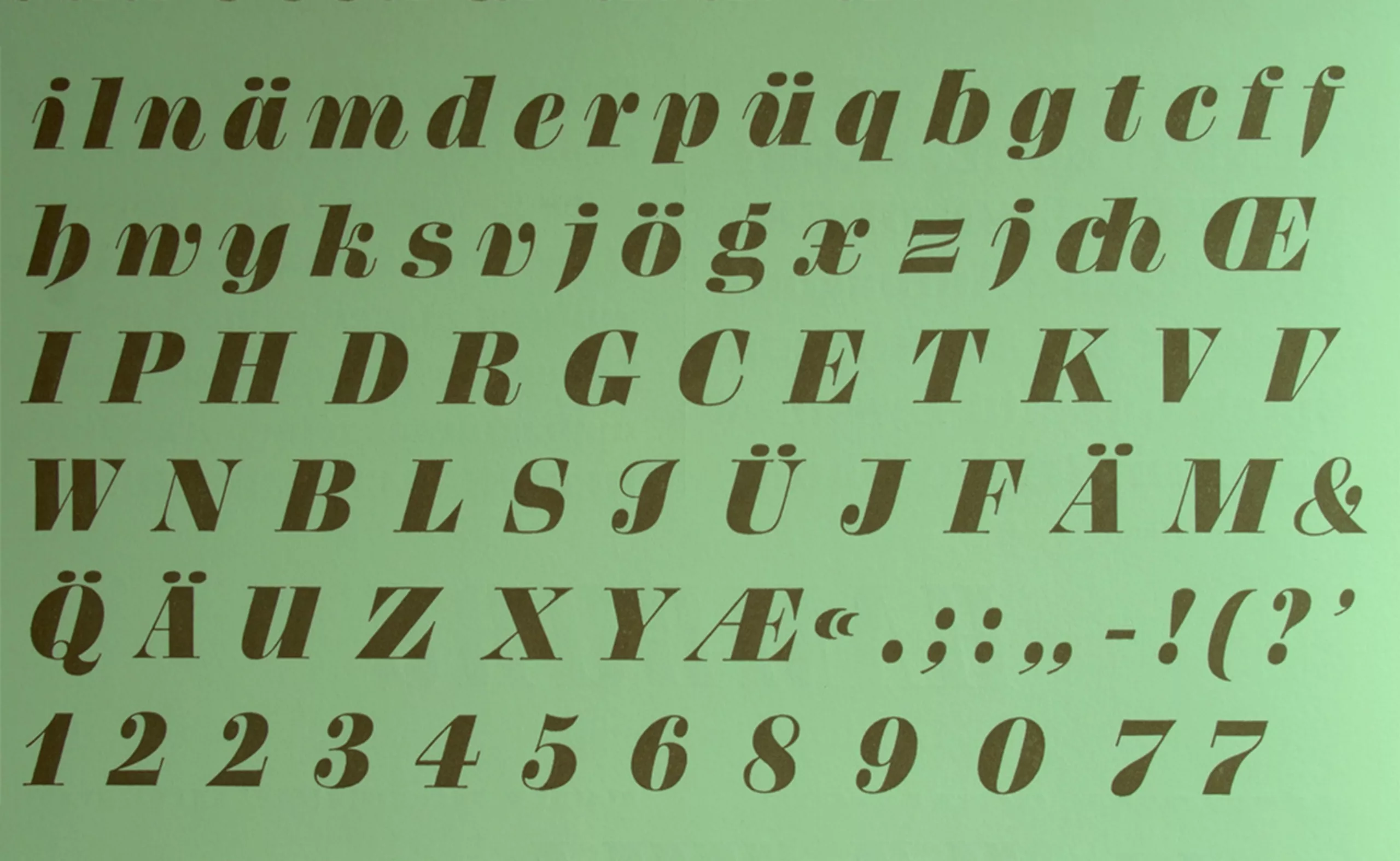
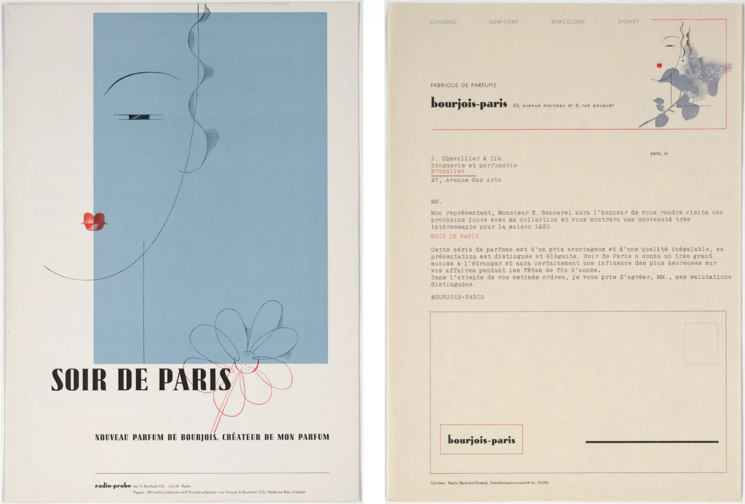
Trump is the father of fonts such as Berthold City® (1930), Trump Deutsch (1935), Schadow (1938–52), Forum I (1948), Delphin® 1 (1951), Forum II (1952), Amati (1953) Palomba (1954), Delphin® 2 (1955), Codex™ (1955), Signum (1955), Time Script™ (1956), Trump Mediaeval® (1958–60), Trump Gravur (1960), Jaguar™ (1964), Mauritius (1967)…
Trump, graphic designer
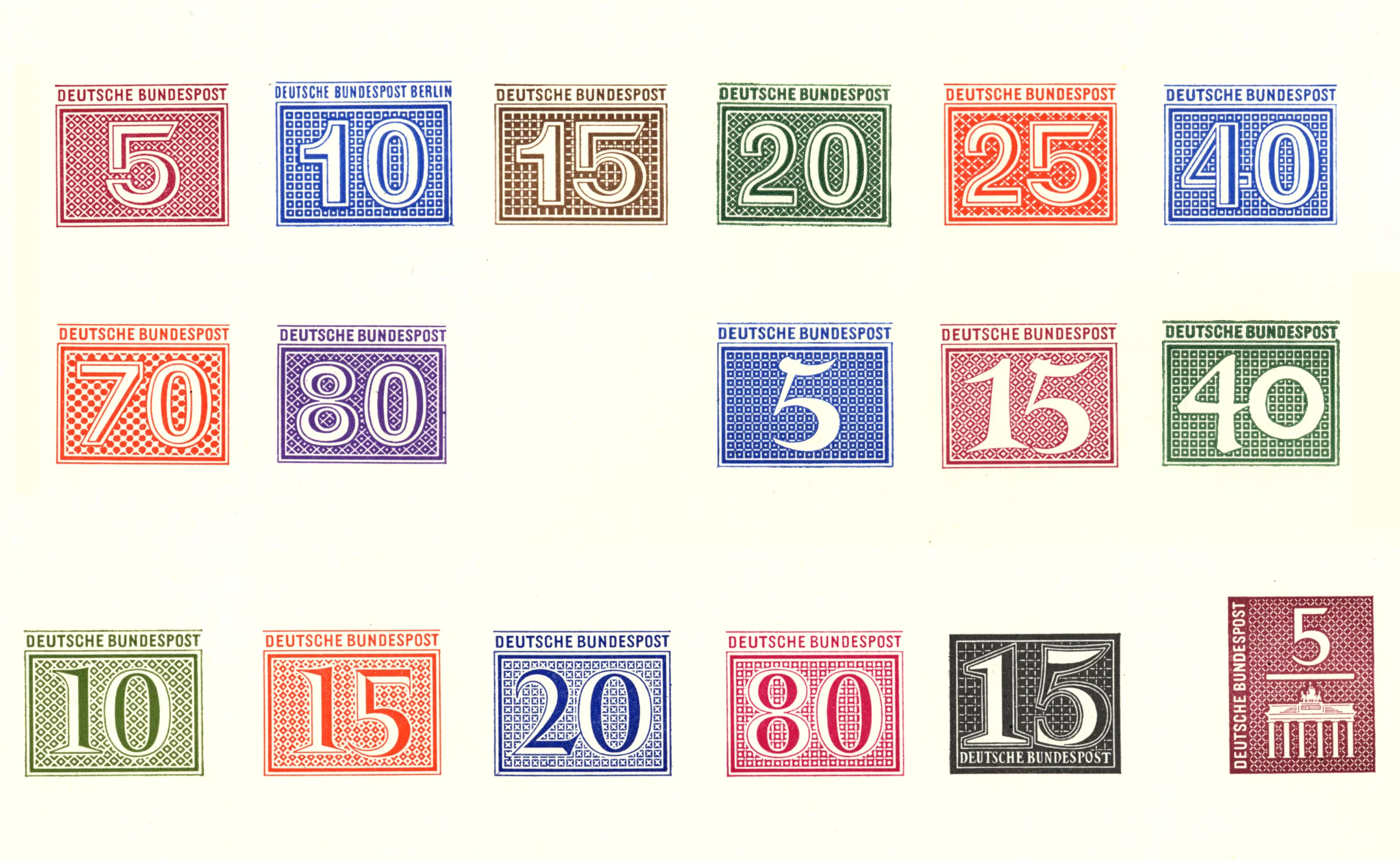
There are few images left of his work as a graphic designer. Below, an example of stamps he created in the 50s, quite modern for that time.
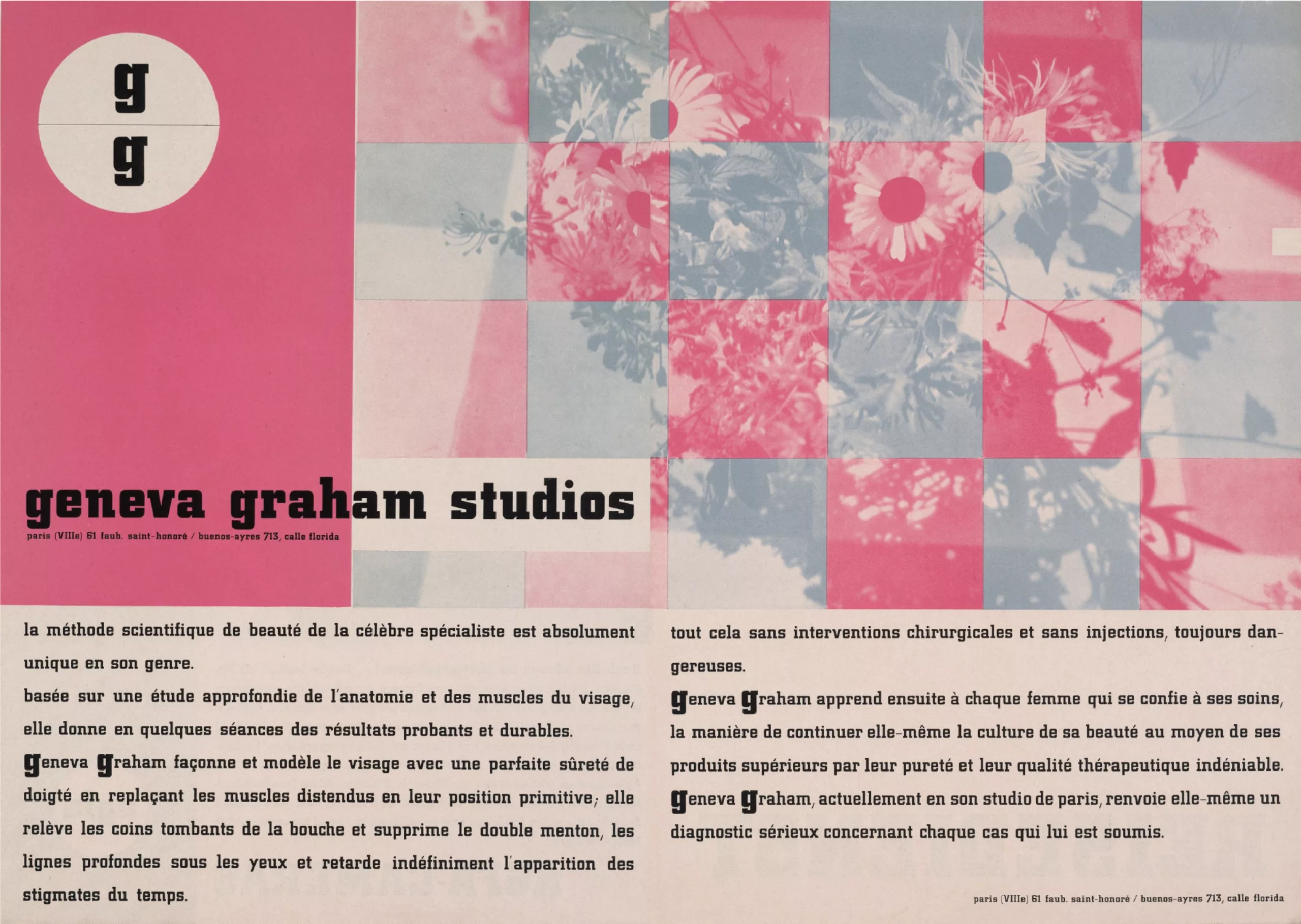
More work of his can be found on the Moma website. Here’s a small sample.
Once upon a letter : the tale of the Mediaeval font and typography
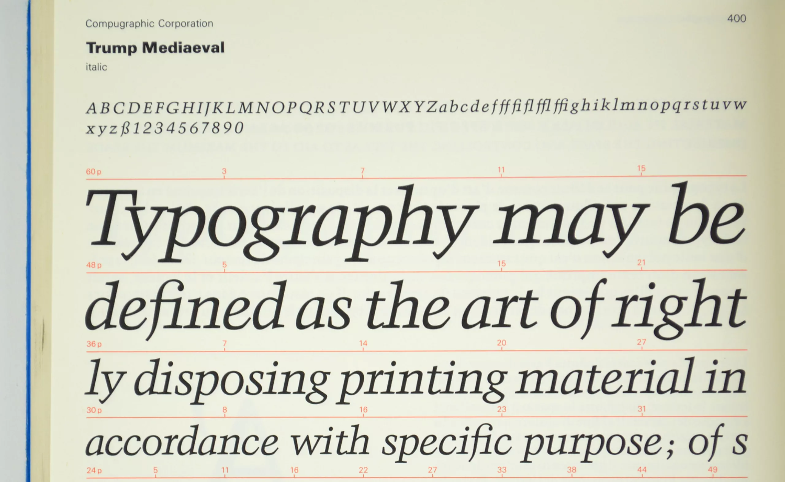
For more than 20 years, from “Aldine Roman”, “Drupa” or “Mauritius”, the “Trump Mediaeval” font changed names, survived wars, technological revolutions and market fluctuations. The story of this font is criss-crossed with the evolution of typography.
Trump Mediaeval is contemporary with the Palatino font. Even though it didn’t make such a breakthrough it remains nonetheless a real milestone in the evolution of Latin fonts.
Trump and Weber
During many years, Trump works hand in hand with Görwitz from the Weber foundry. He’s actually their exclusive typographer. This is where he will give light to all of his fonts, such as City, Shadow or Delphin.
(As a kind reminder, foundries were the place were typographies were created, for many centuries.)
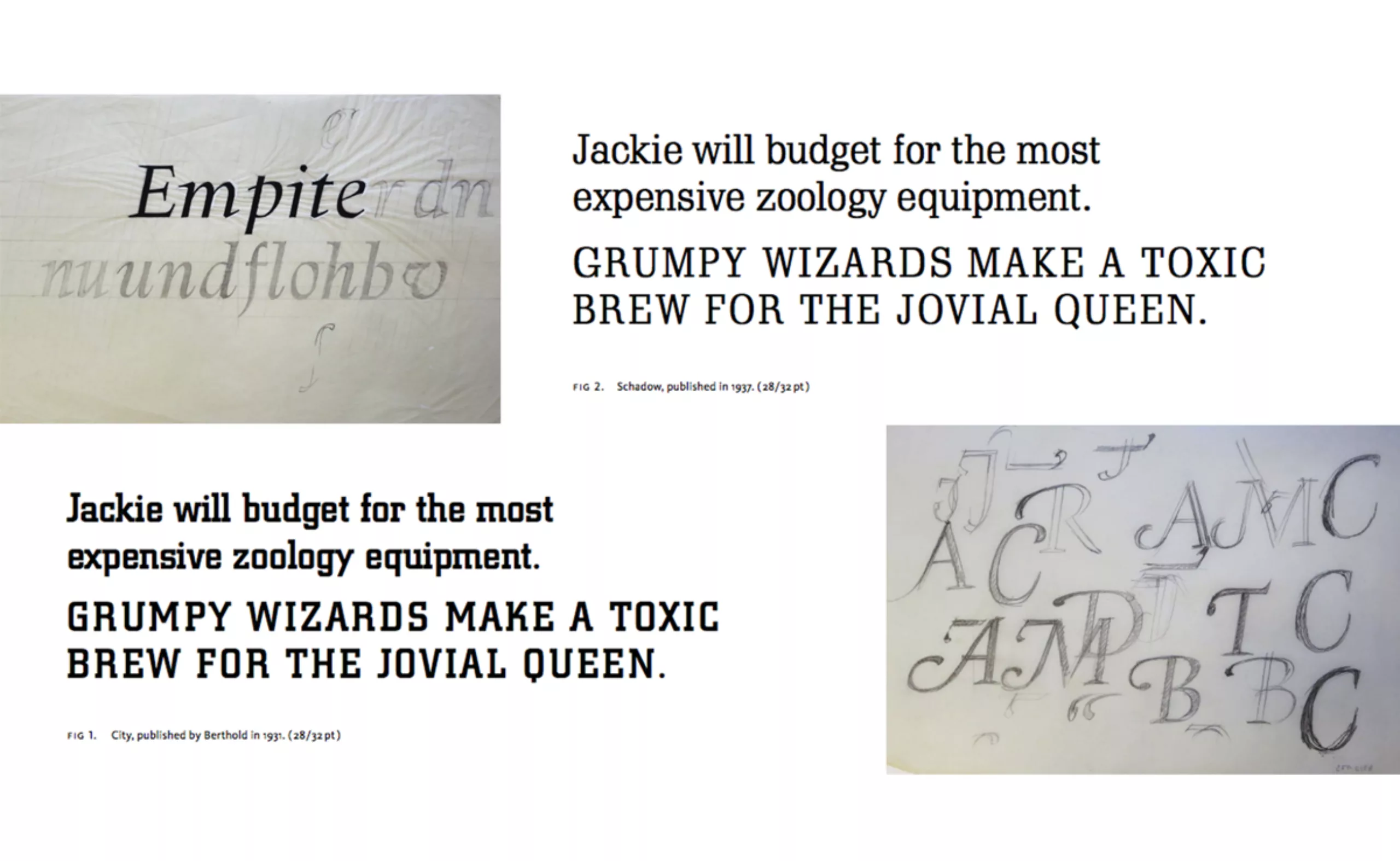
The foundry’s building is miraculously saved from destruction during World War II unlike many of its competitors. Reopened right after the end of the war, it still lacks of skilled labour force, especially of punchcutters, forcing Trump to delay his creations. His Shadow-Antiqua font, created in 19942, has to wait 5 more years before finally being cut!
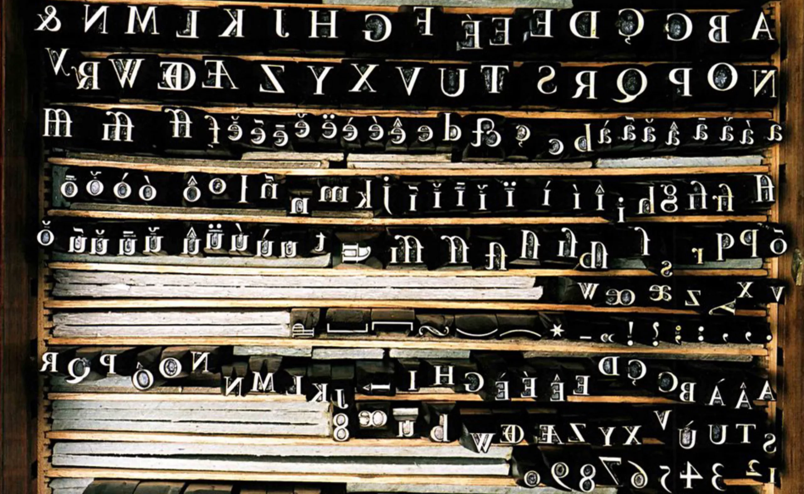
Punchcutters : hand designing letters
Back then, letter punches were cut and hand crafted in steel by punchcutters. Based on the drawn letters of the type designer, the punchcutter would transfer the letter outline on a steel piece and carve it by hand. This minute cutting method would require much skilled craft and patience, leading to variations in the original font design. The punchcutter would often add his touch -willingly or not- to the great displeasure of the designer.
The punch would then be used as a matrice to create a copper mold in which an ally of various metals would be cast to form the final letter block.
Mediaeval, the font from long long ago
In 1947, Trump starts setting the first blueprint for his Mediaeval font. He wishes to create a New Roman with a medieval touch, « contemporary as well as decent ».
His ambition is to make a book type out of it, to take the place of Walbaum, Garamond ou Janson. Just after the war in 47, this ultramodern design announces a future trend. The wind blows in this direction until 1951 when New Romans are considered super fashionable. A few years earlier Trump had released the Drupa, another Roman type which soon became a major success in 51 and that he’ll use as a base for his Mediaeval.
In 1952, printing techniques evolve and letters are not hand cut anymore, but machine laminated. Fonts become precise and exactly similar to the original drawing of the designer. Trump and his fellows have to adapt and create much more precise letters as their drawings now serve as direct forms and are not used as hand drawn models anymore. It’s a real revolution in the printing industry.
Hands vs machines
The thing is : Trump has absolutely no clue of how to deal with modern machinery. He takes more than a year to propose a 1st version of his italic and bold Mediaeval. New standards in letter sizes and composing systems make it almost impossible for him to adapt and he has to ask Stempel -a competitor- for help. We’re in 1954.
The italic type sees light one year later, after never ending adjustments. Literally never ending, as he actually quite never stops adapting his italic and bold Mediaeval versions, in order to adapt to Linotype machines. Big deal. We can’t stop thinking about def, def-def, ok-final, ok-final-def-1 versions that we create nowadays.
Trump even requires permission to design two italic versions : one for handmade and another for standardised Linotype… which will not be granted by his foundry.
The final (?) versions of his bold appear in 1956 and 57, but will be used in Linotype only in 1967 (after a few more updates). It has been more than 10 years since the first blueprints and 20 years since the appearance of the 1st Mediaeval.
This typographic adventure can directly relate to the decline of independent foundries. Depending more and more on big standardised organisations with Linotype machines, they were soon absorbed and couldn’t cope with production.
In 1970, Weber shuts down.
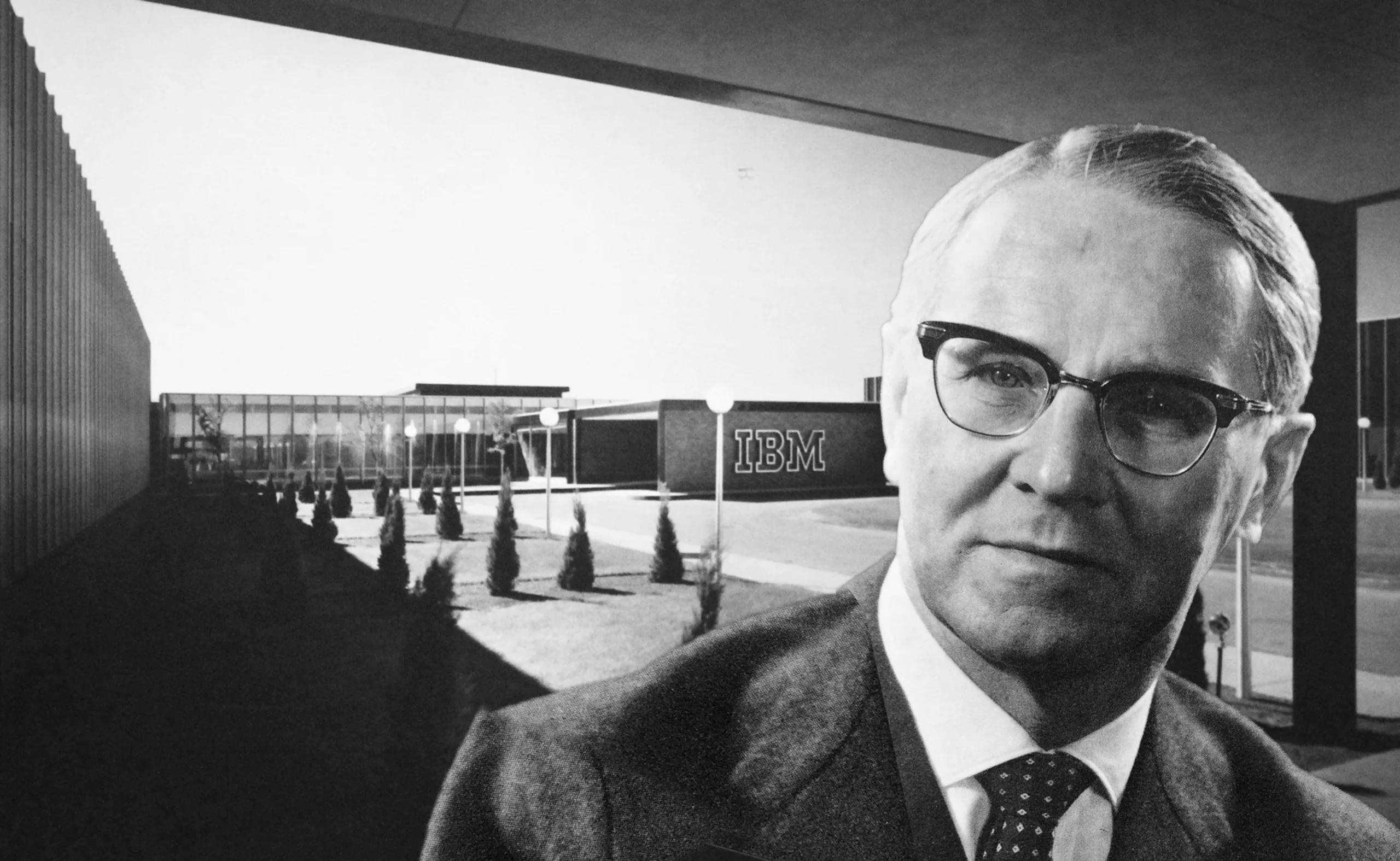
IBM in the City
In 1956 Paul Rand uses Trump’s City Medium font -designed in 1931- to update the IBM logo and give it a more « solid, anchored and balanced » aspect, before adding the famous stripes 12 years later.
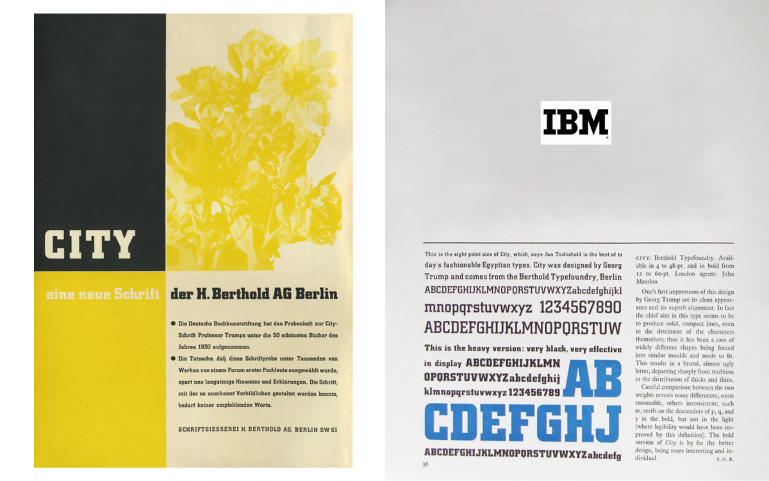
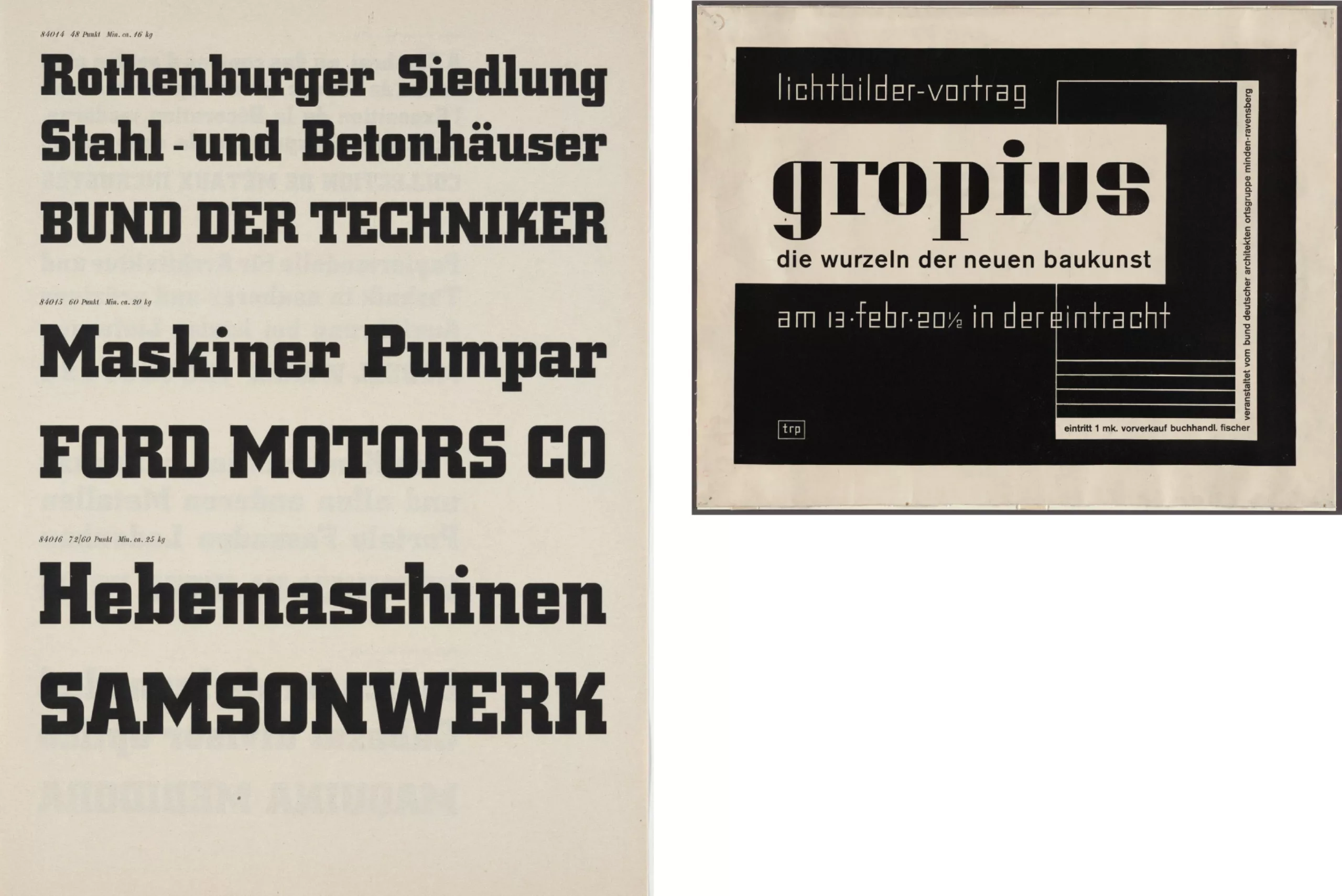
Below, a few images taken from an exhibition by Paul Rand. One can discover the creative response he would compose on Georg Trump’s font!
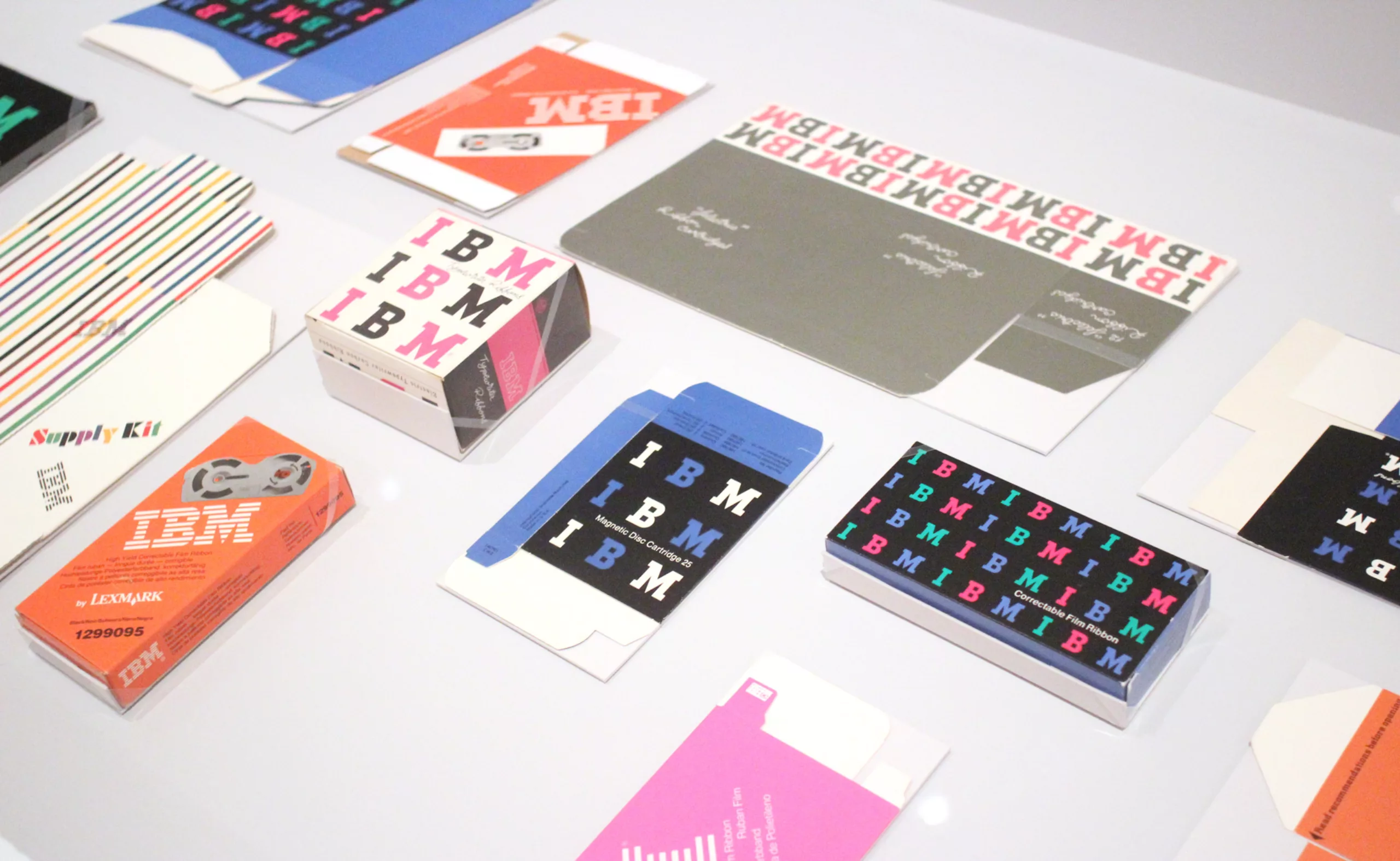
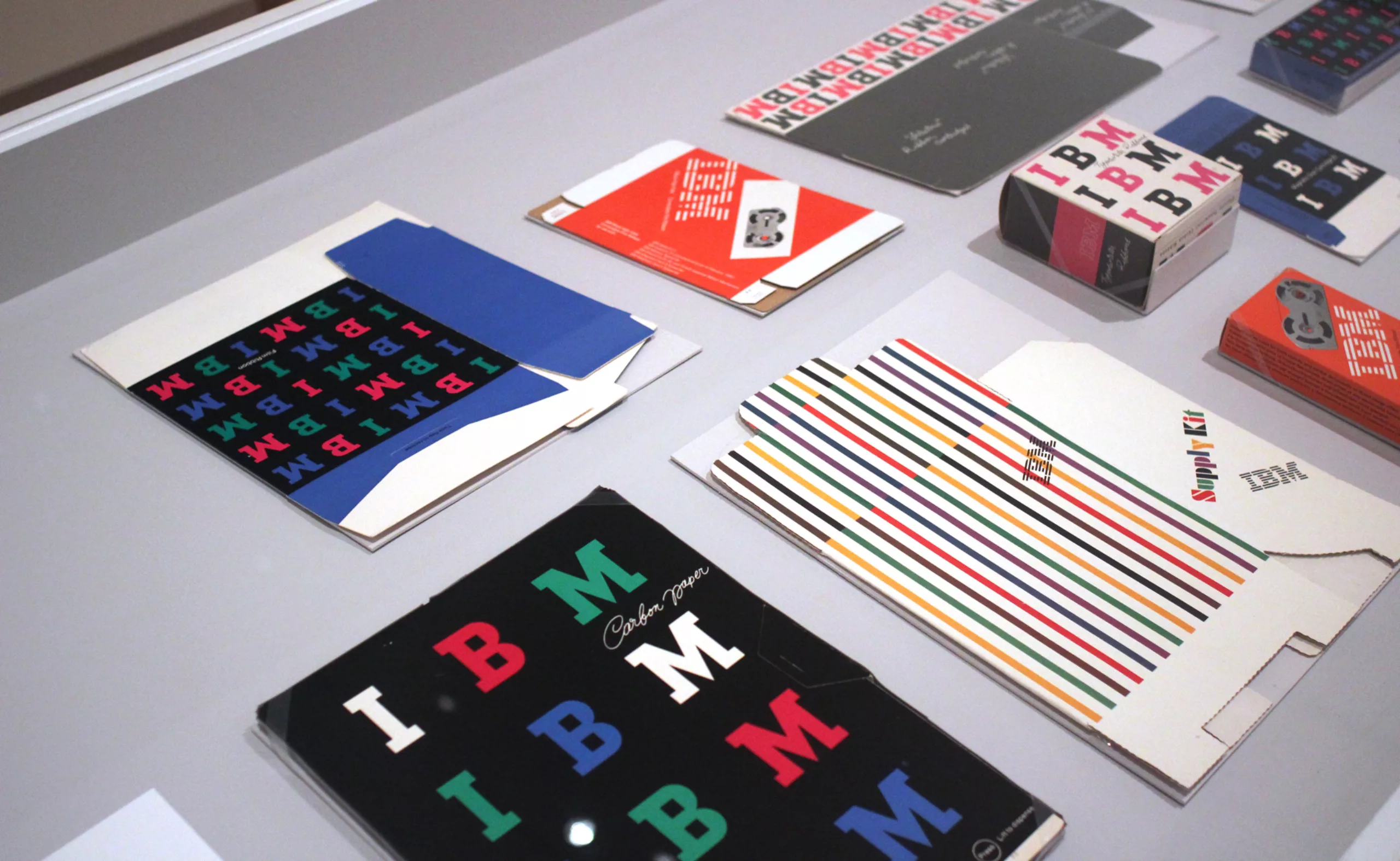
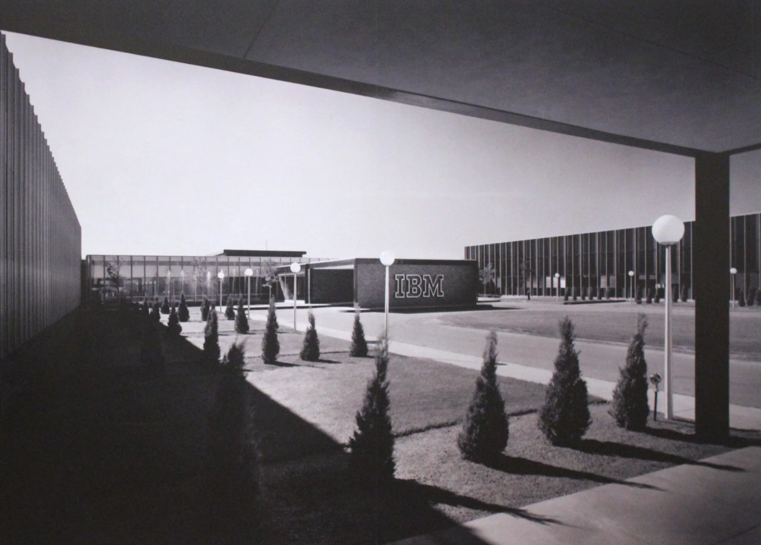
For the most curious out of you, have a look at Paul Rand’s IBM graphic chart.
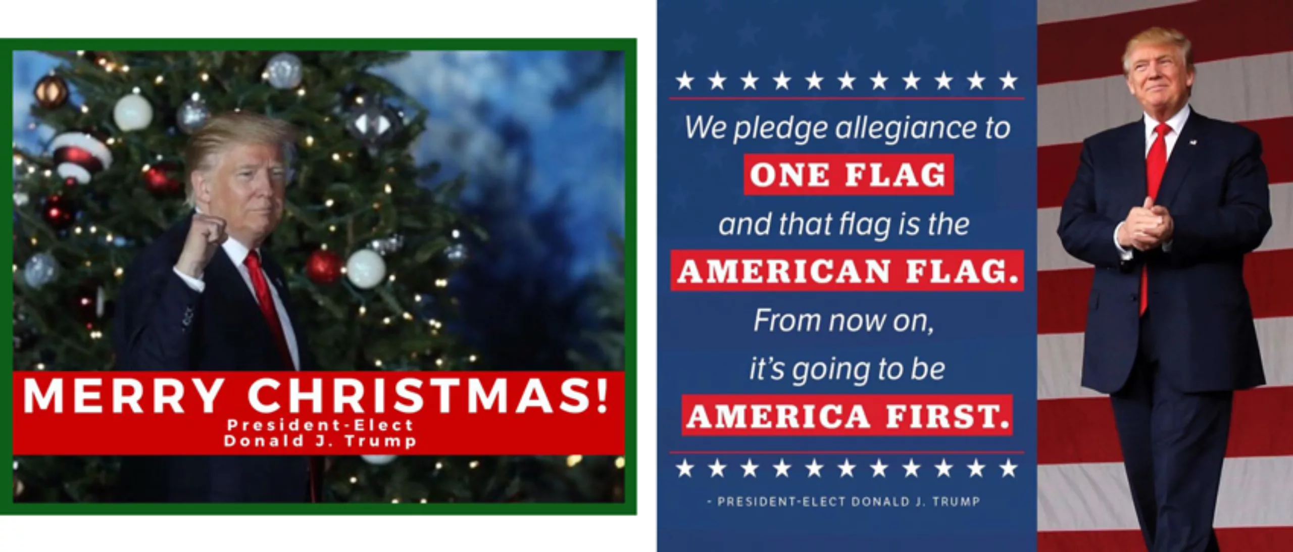
Trump’s Campaign
In 2016, Donald’s political campaign didn’t play their trump card with Georg’s types. Either they had no clue, either the perspective of having two Trumps on the table was too much to handle. The mystery will remain…
On the subject
-

Peace & Love ☮ the activist icon
How did the most politically charged and well-known symbol on earth become a commonplace fashion accessory?
-
Tote bag, a new social totem?
The tote bag has become an essential part of our everyday urban lives.
What does it say about our society, our times, our habits and our behaviour? -
Donald Trump, the martyr who makes history
Donald Trump, his face bloodied, raises his fist and seems to proclaim “I’m alive, fight!”.
Let’s decipher an image that has gone down in history at the speed of a shotgun blast.