History of record covers: the face of 50s jazz
The vinyl cover has marked not only an era, but the entire world of music. Seventy years after its creation and in the age of digital technology, it has been and still is a medium of choice for fans and collectors, and a preferred format of expression for artists and graphic designers.
The face of music and society on vinyl covers
Like book covers, vinyl sleeves are graphic media that evolve with social and technological changes and thus illustrate the upheavals in society. Tracing the history of vinyl sleeves allows us to admire the beauty of an object that gives a face to music, and also to better understand 70 years of culture.
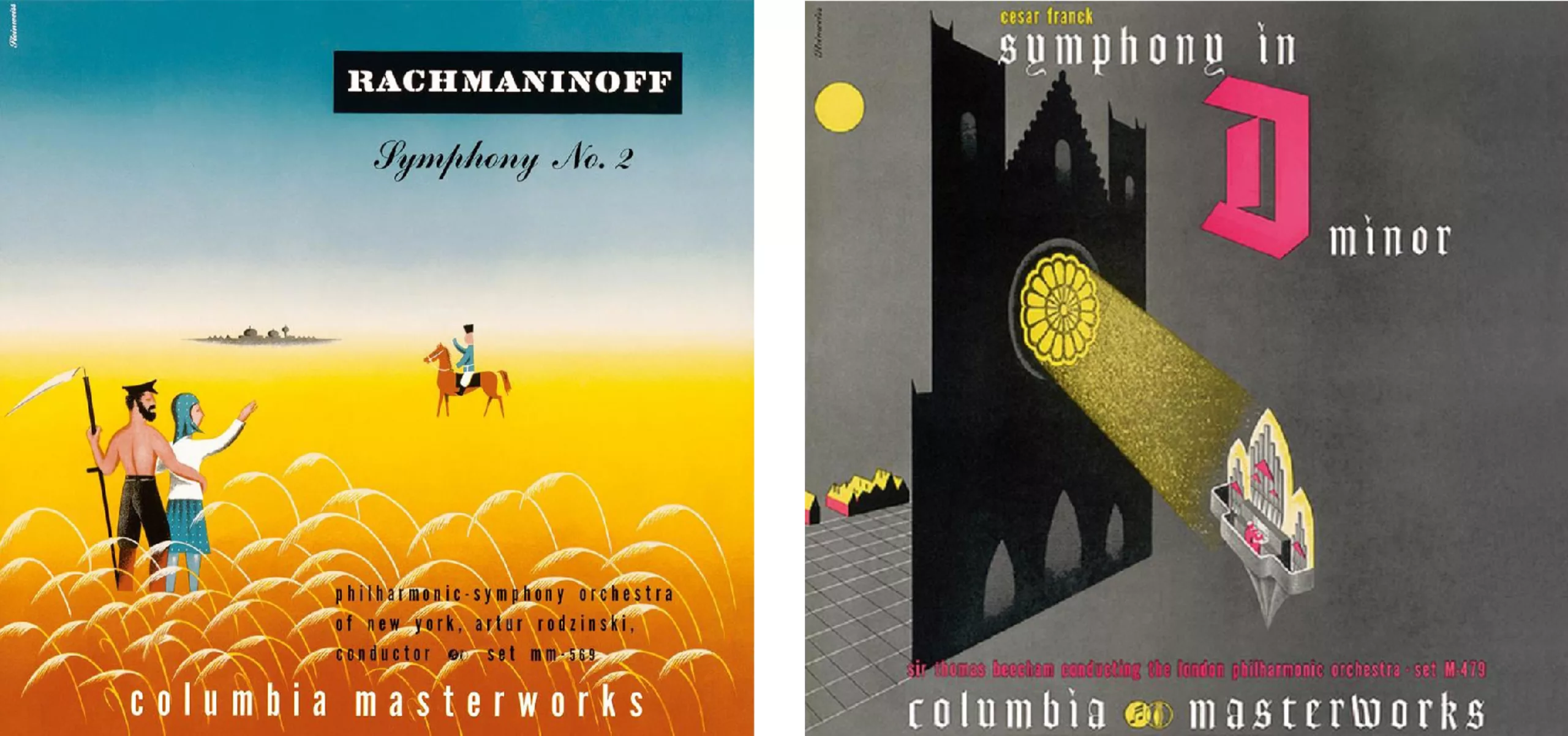
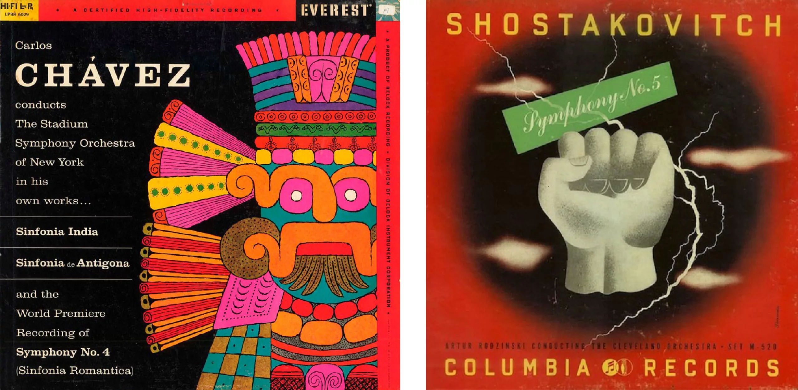
After bucolic landscapes and drawings to illustrate classical music, photography was used more and more from the 1950s onwards thanks to offset printing. Drawing and a certain unstructured graphic style will illustrate the exuberant energy of jazz, then psychedelia and the emerging rock of the 1960s, which will revive the handmade using photomontage and photocollage. Science fiction and space travel were in the spotlight in the 1970s with the birth of DTP and laser printing, before the disillusionment of the 1980s which heralded the commercialisation of a new technology, the CD, which signalled the decline of vinyl but not of the music sleeve! It is this history that we will trace in this series of articles. Enjoy your reading!
The inventor of the modern record sleeve
Alex Steinweiss (1917-2011) was responsible for the first modern vinyl record sleeves as we know them today. In 1940, at the age of 28, he was a DA at Columbia Records and suggested replacing the brown paper surrounding the records (which looked like photo albums, hence the name) with a colourful illustration, so that “people could look at the work and hear the music”. In the industry, these covers were called “tombstones”, in derision: that’s how dull they were!
The company gave Steinweiss a chance with these synaesthetic covers that tell the story of sound through images, and in a few months sales increased by 800%! Steinweiss’ illustrative style is colourful, generally without perspective and with flat colours as a background, like in the advertisements of the poster king Jules Chéret, with a hand-drawn typographic game that echoes the musical style of the album.
A gothic typeface for German music, a handwritten one for classical music, a dancing round typeface or big bold letters for Latin or African rhythmic music…
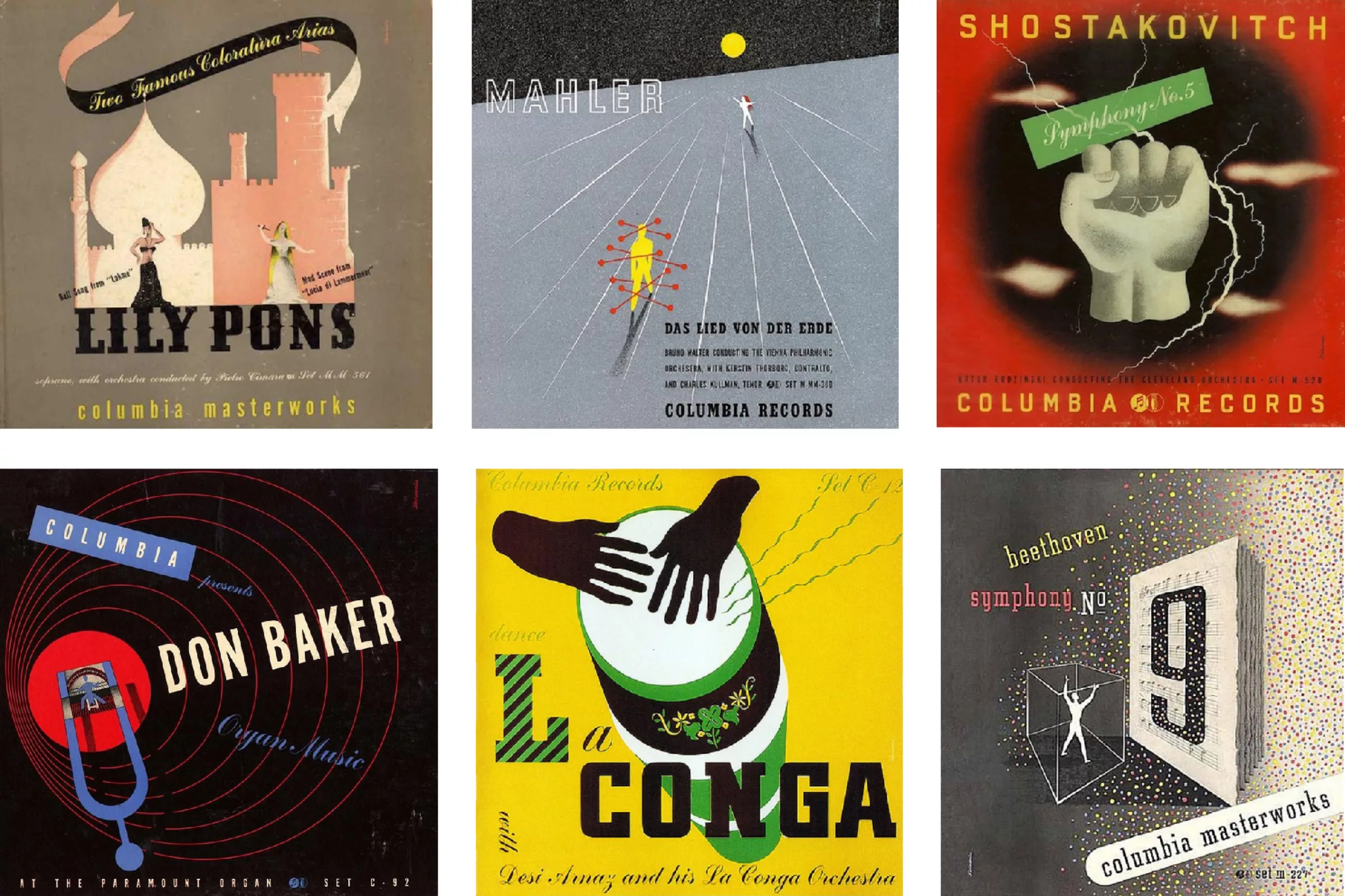
Over several decades Steinweiss created thousands of vinyl sleeves for all kinds of music, for labels such as Columbia, Decca, London, or Everest. He also designed logos, advertising materials and his own typeface, Steinweiss Scrawl. His bold graphics revolutionised the music industry.
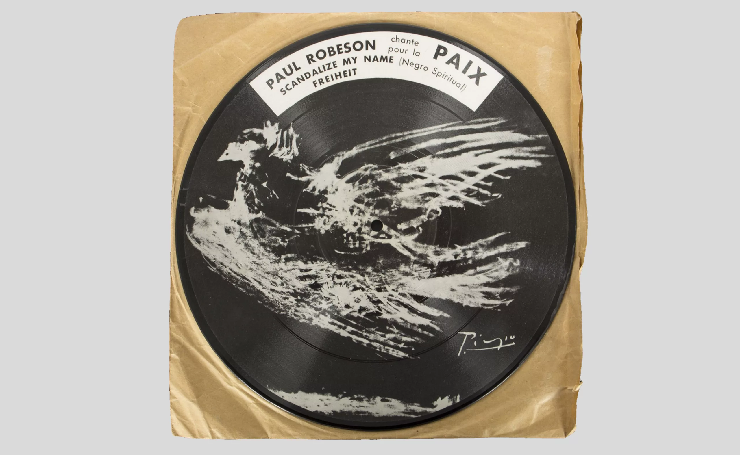
Soon enough, the labels also obtained licences to use the works of modern artists such as Picasso (whose dove is printed directly on the record, in 1949, below) to illustrate albums. We’ll come back to artistic collaborations later in the article. Let’s talk about jazz first!
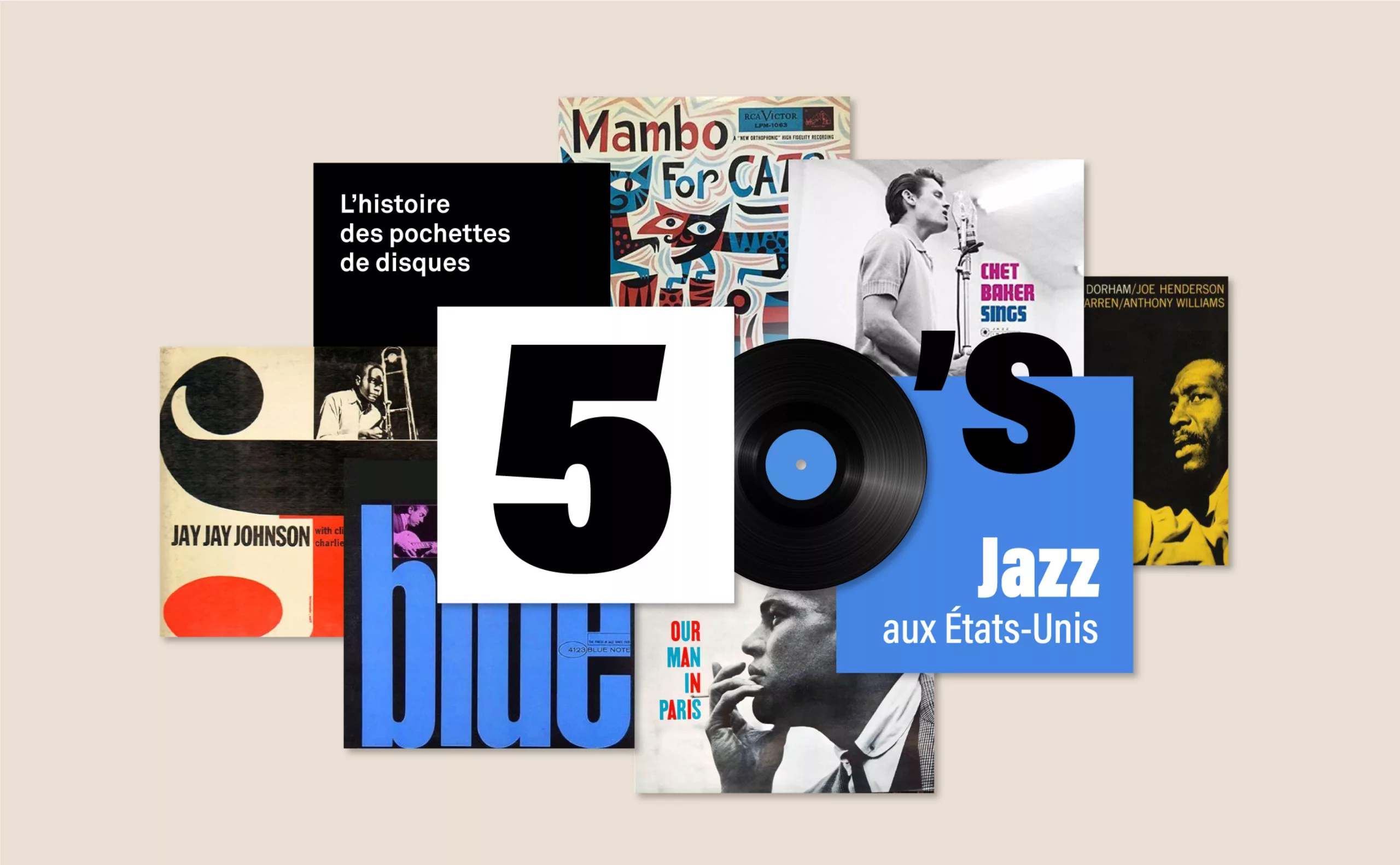
American Jazz Vinyl Covers
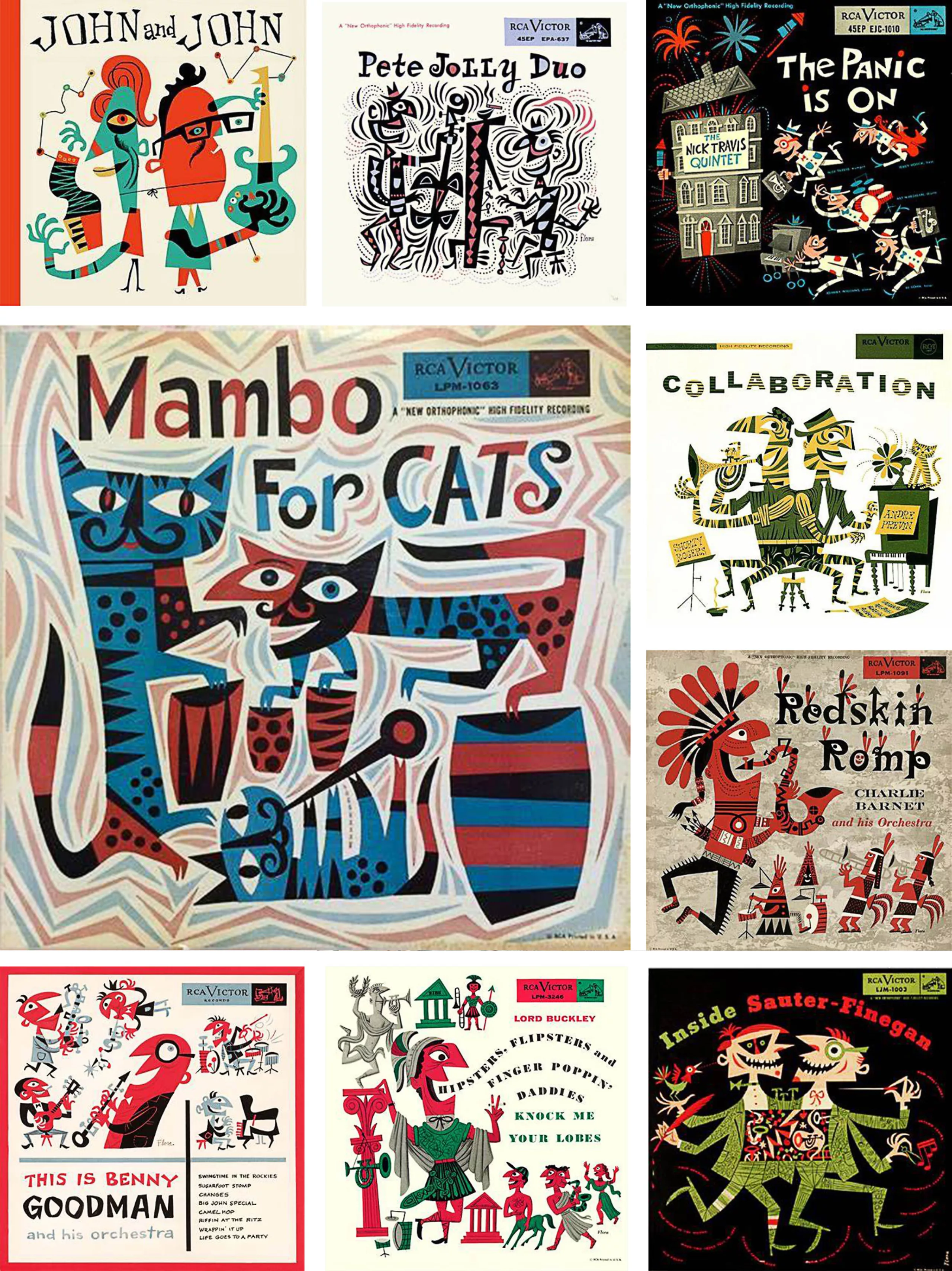
In 1942, Steinweiss hired illustrator James (Jim) Flora at Columbia, who composed crazy, childlike and truly joyful illustrations to enhance jazz records. His energetic, colourful and vibrant universe gives life to a crazy and zany world that escapes reality, illustrating the lively effusion of post-war jazz. He will surely inspire the Shadocks (1968) and the jazz-loving alley cats in the Aristochats (1970).
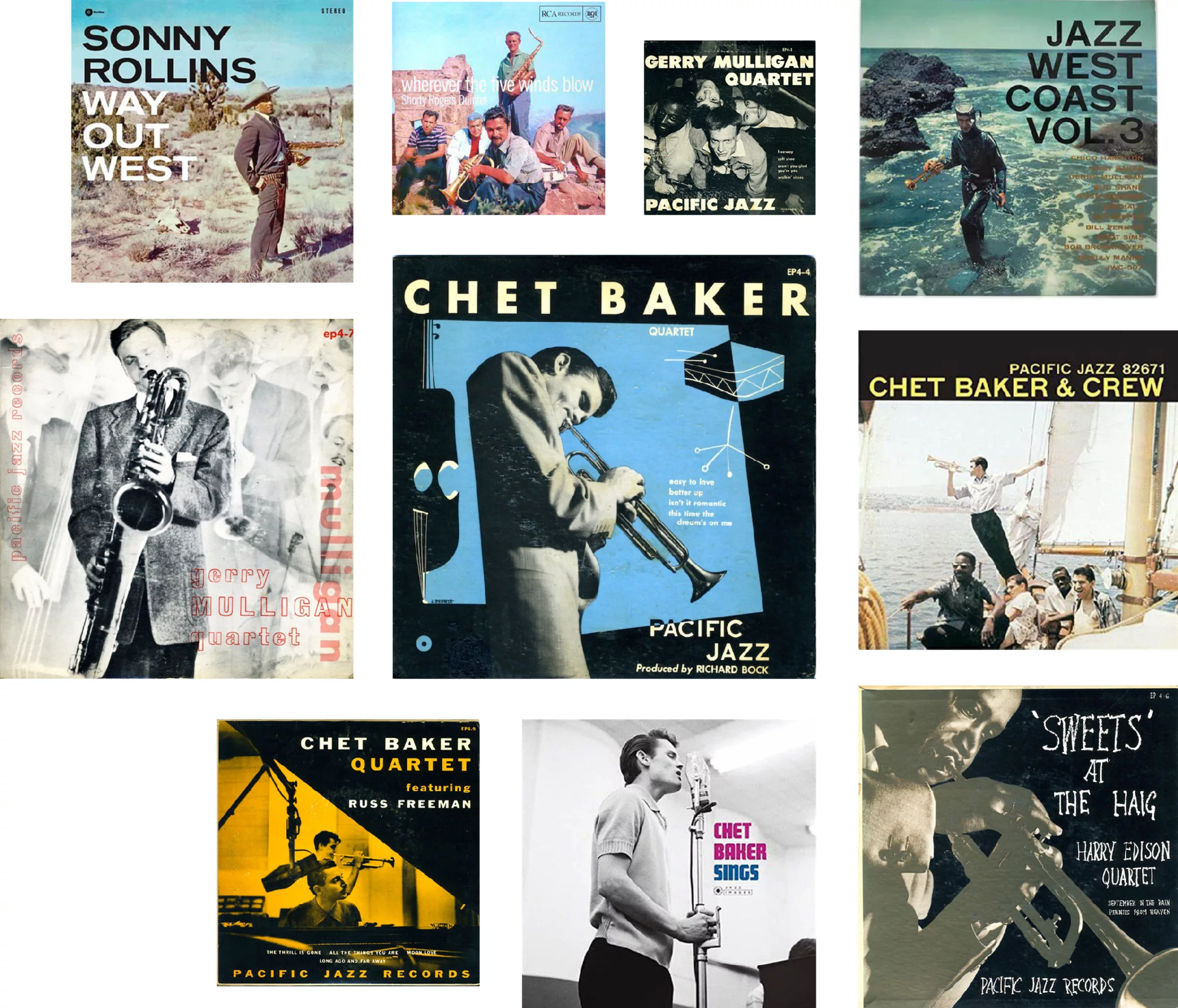
Ten years later, photography replaced the illustrations. In the 1950s there were two styles of jazz in the United States: the intense, soulful, avant-garde Eastern style in New York and a cooler, more finely arranged Western style. These two styles can be visually differentiated on vinyl covers: Eastern jazz plays with typography and photos, in two-colour process with a coloured tint or in black and white, as seen on the Blue Note, Prestige or Riverside labels. In the West, there is much more colour, with photos in warm tones, typical of the Pacific coast.
The sunshine of western jazz
It is William Claxton’s photographs and arrangements that shape the face of western jazz covers, in which the musicians are portrayed in the open air, far from the dark concert halls or recording rooms, echoing the cinema. Chet Baker, for example, is seen playing trumpet on a yacht, or Sonny Rollins as a cowboy drawing not a gun but a saxophone. These out-of-studio covers helped spread the use of photography to showcase music groups.
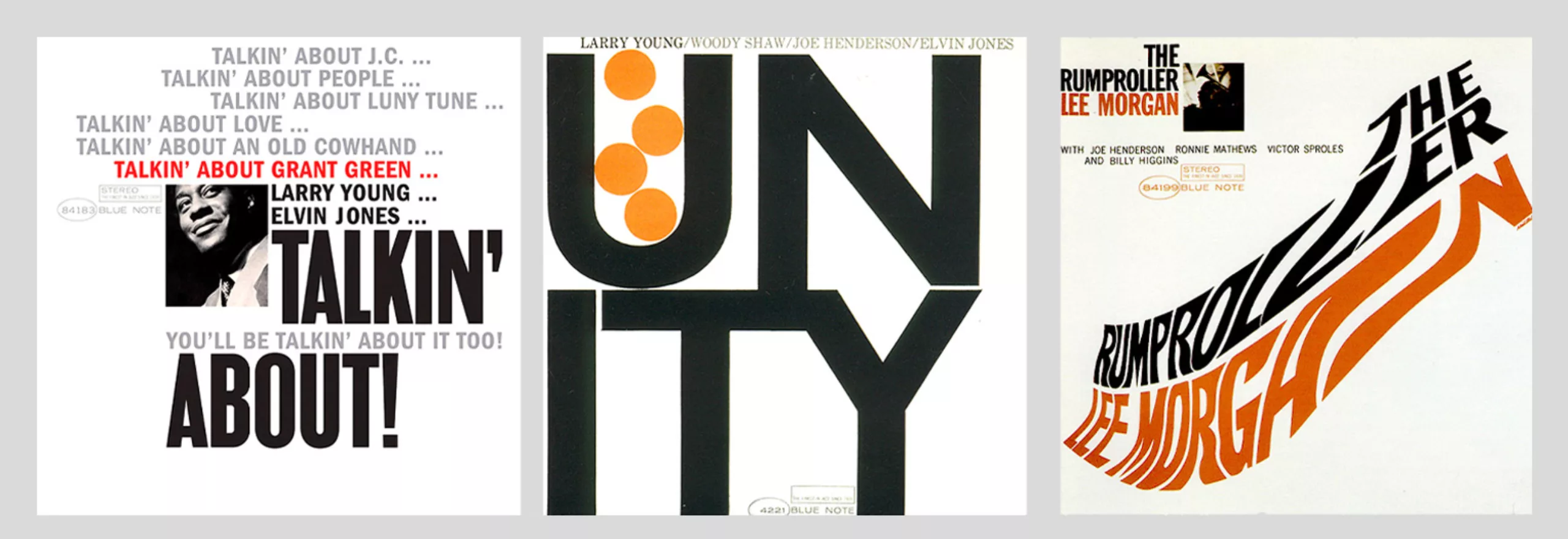
The blue note label and its mythical jazz covers, in the East
The blue note label is probably the best known label in the jazz world. It was founded in 1939 by two German-Jewish immigrants, Francis Wolff and Alfred Lion, who recorded the masters of hard bop, a genre of jazz mixed with gospel and rhythm & blues. The recording features trumpets and percussion, but it is the covers that catch the eye.
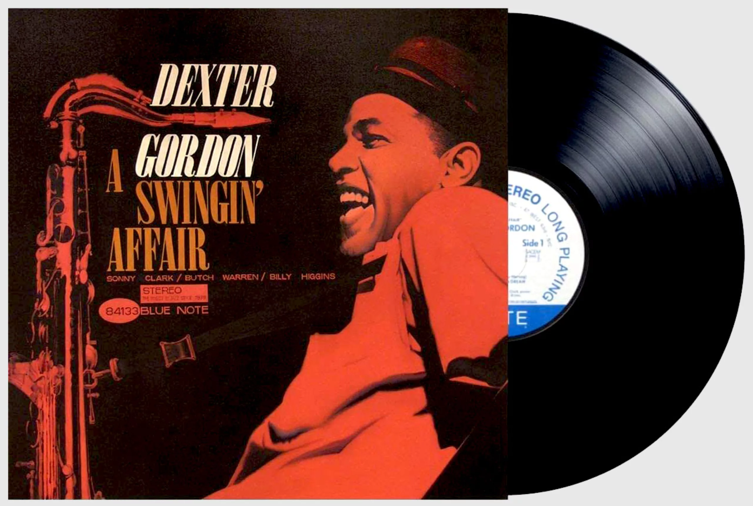
Their layout was designed by Reid Miles, who became THE reference for jazz vinyl covers when he lent his graphic design talent to the Blue Note label around 1955. Ironically, Miles was not a fan of jazz but of classical music, and it was surely his detachment from this style that gave him the distance to unravel its heart and echo it visually.
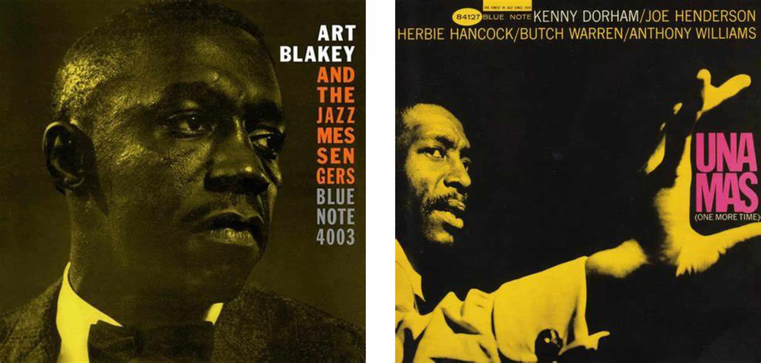
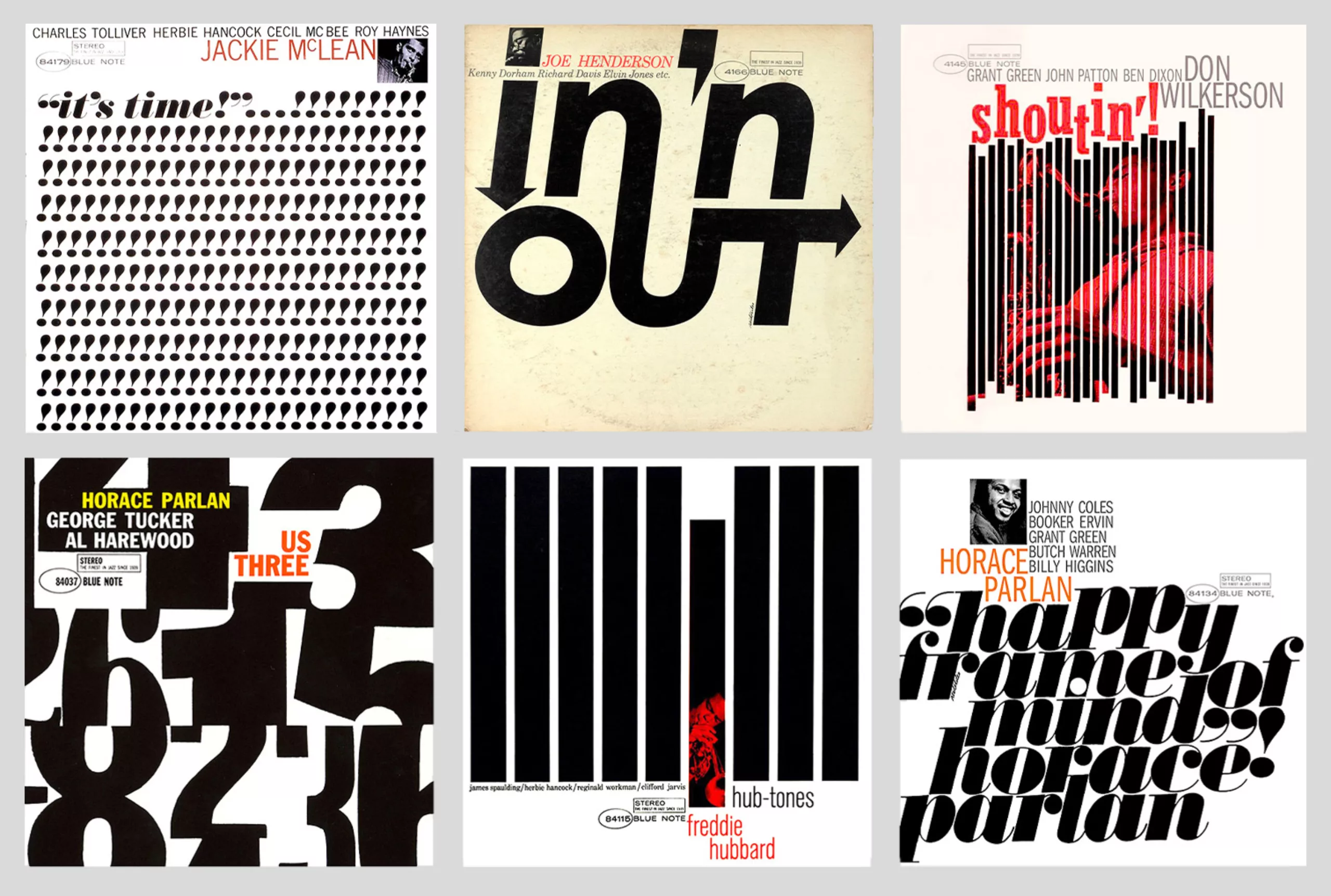
For 11 years Miles played with Francis Wolff’s intimate photographs, which Wolff captured during recording sessions and which the graphic artist framed by zooming in and playing with the shapes to insert his text or play graphically with the album title; the instrument or the hands sometimes take up more space than the musician’s head, and the text is linked to the visual. On the blue note vinyl sleeves we see heels clicking in a rhythm that we can hear immediately, the blur of a moving hand, or a photo judiciously placed between two letters.
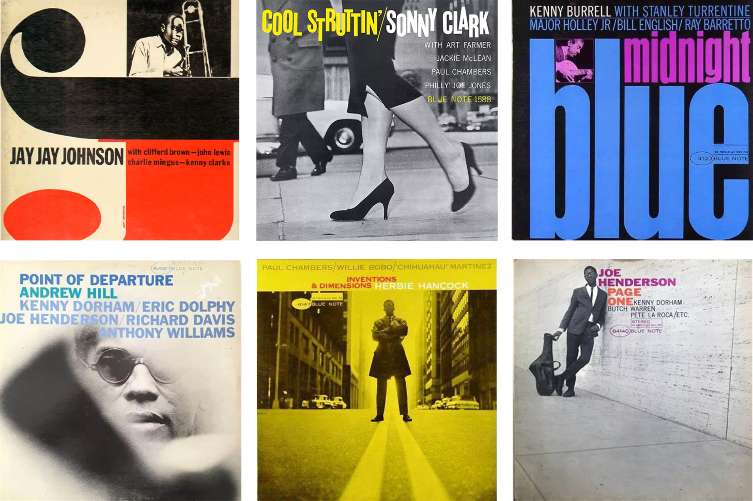
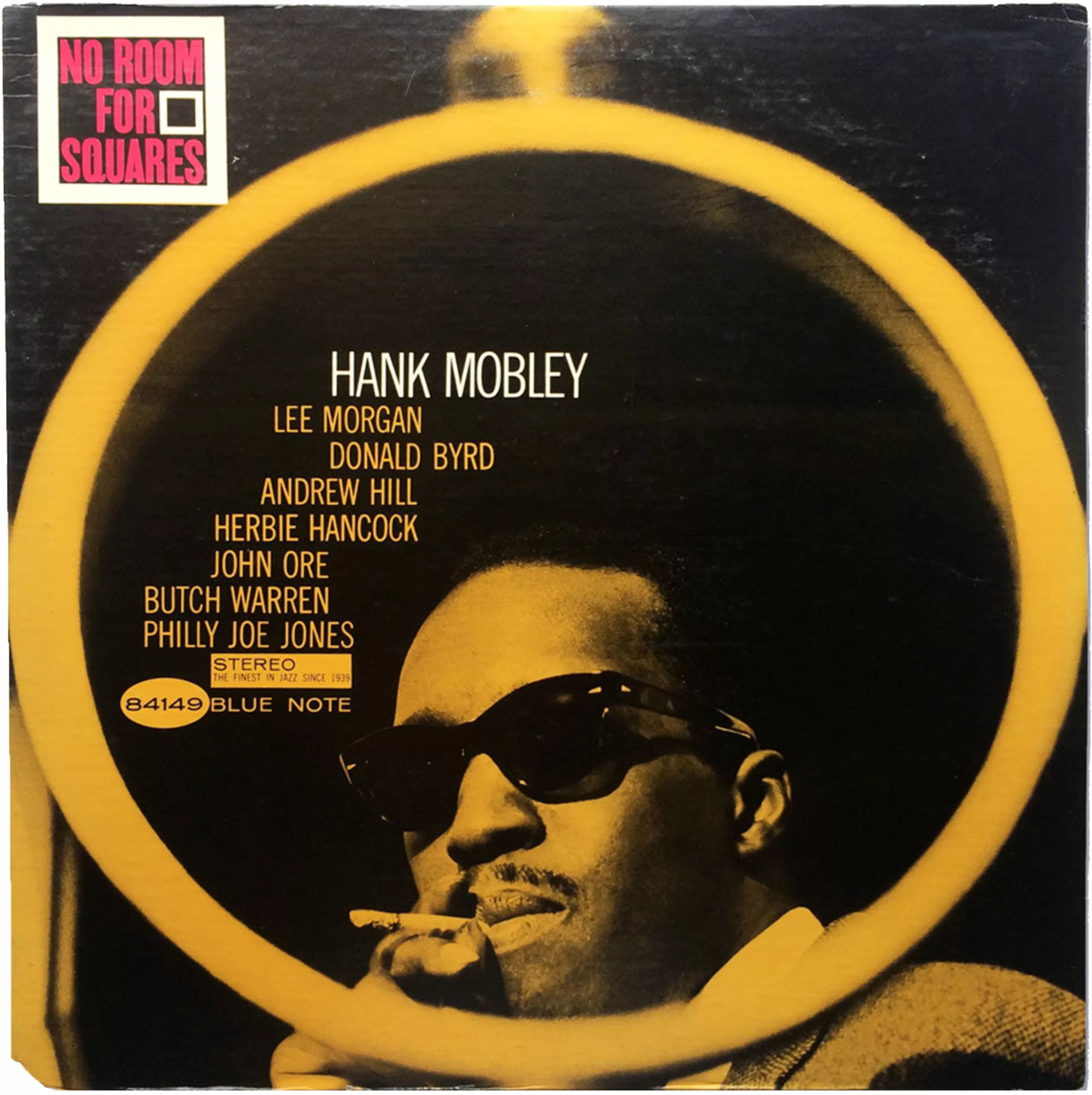
For example, Miles creates a shape of 1 to compose the title of Art Blakey’s album, uses the space between Kenny Dorham’s hand to insert the title of the album in una mas, or composes with the round of a grid as a visual element for the album “no room for squares“.
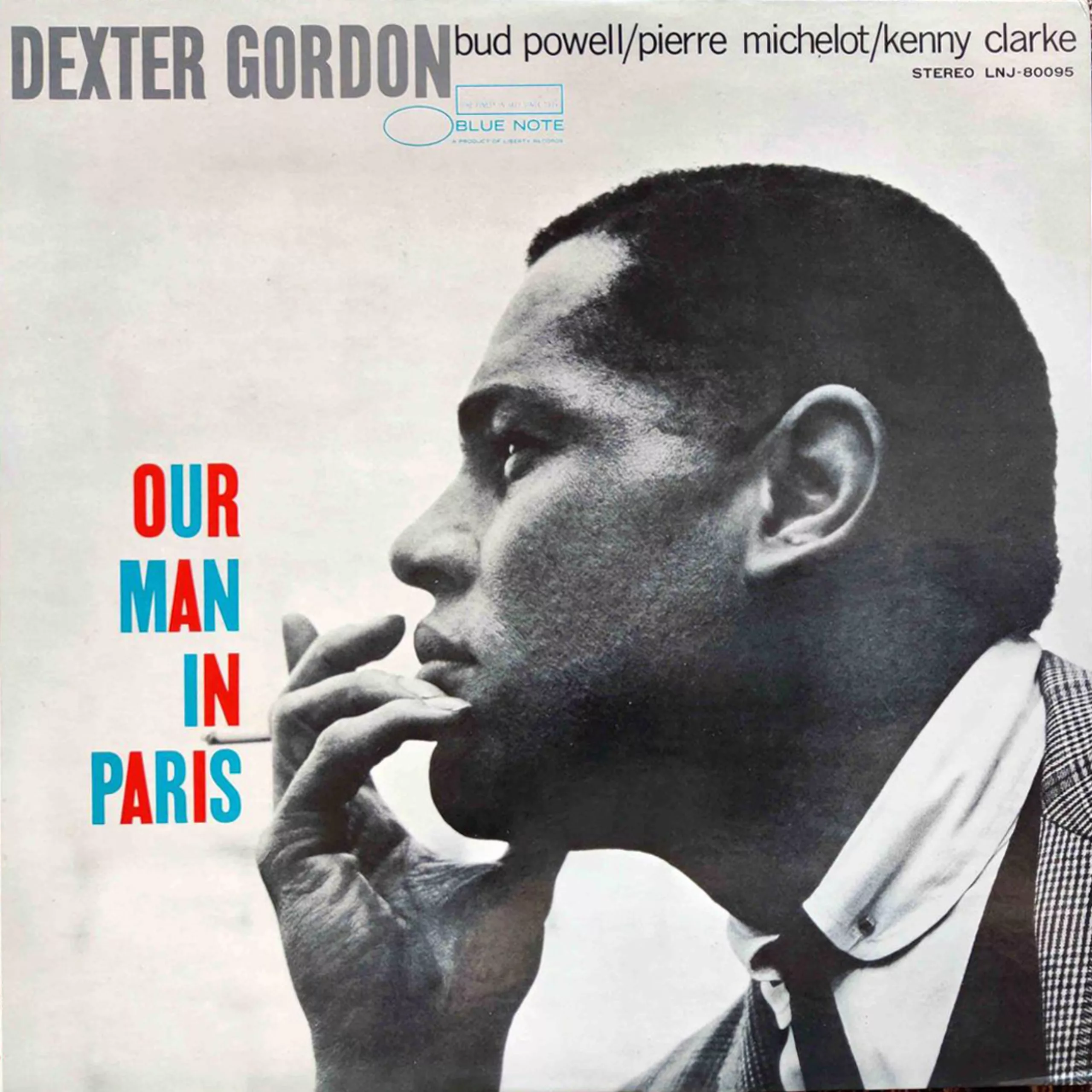
On Our Man in Paris, he uses the space between two words to slip in Dexter Gordon’s cigarette. He adds compact typography arranged in a meticulous manner, often repeated and undulating like the music, with creative shapes and full, bold colours, creating rhythmic, lively covers in the image of jazz.
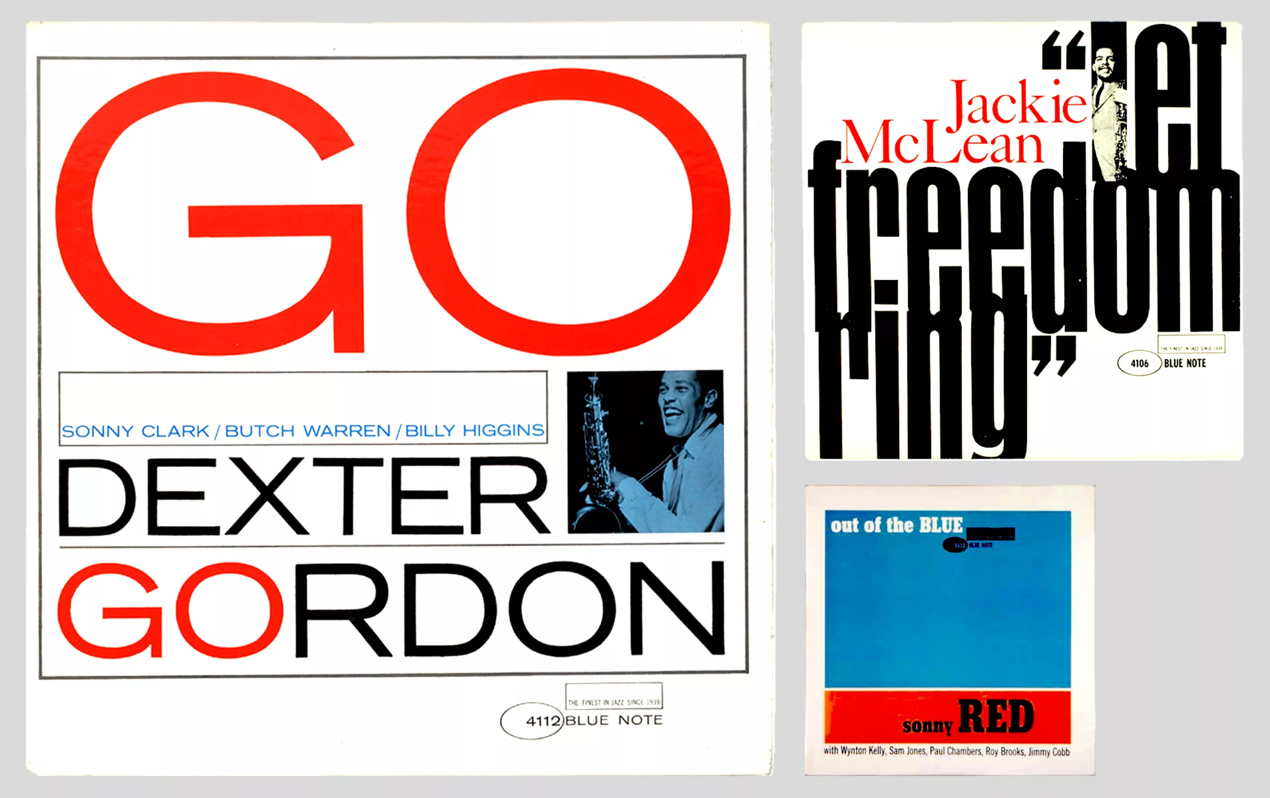
In the 1960s, Reid Miles played more and more with layout and typography, which spoke for themselves, with smaller, almost anecdotal photographs. Jackie Mc Lean’s it’s time! cover comes to mind, with its many !!!!! filling the whole space, or in’ n out with a typographic bridge linking the n to the u.
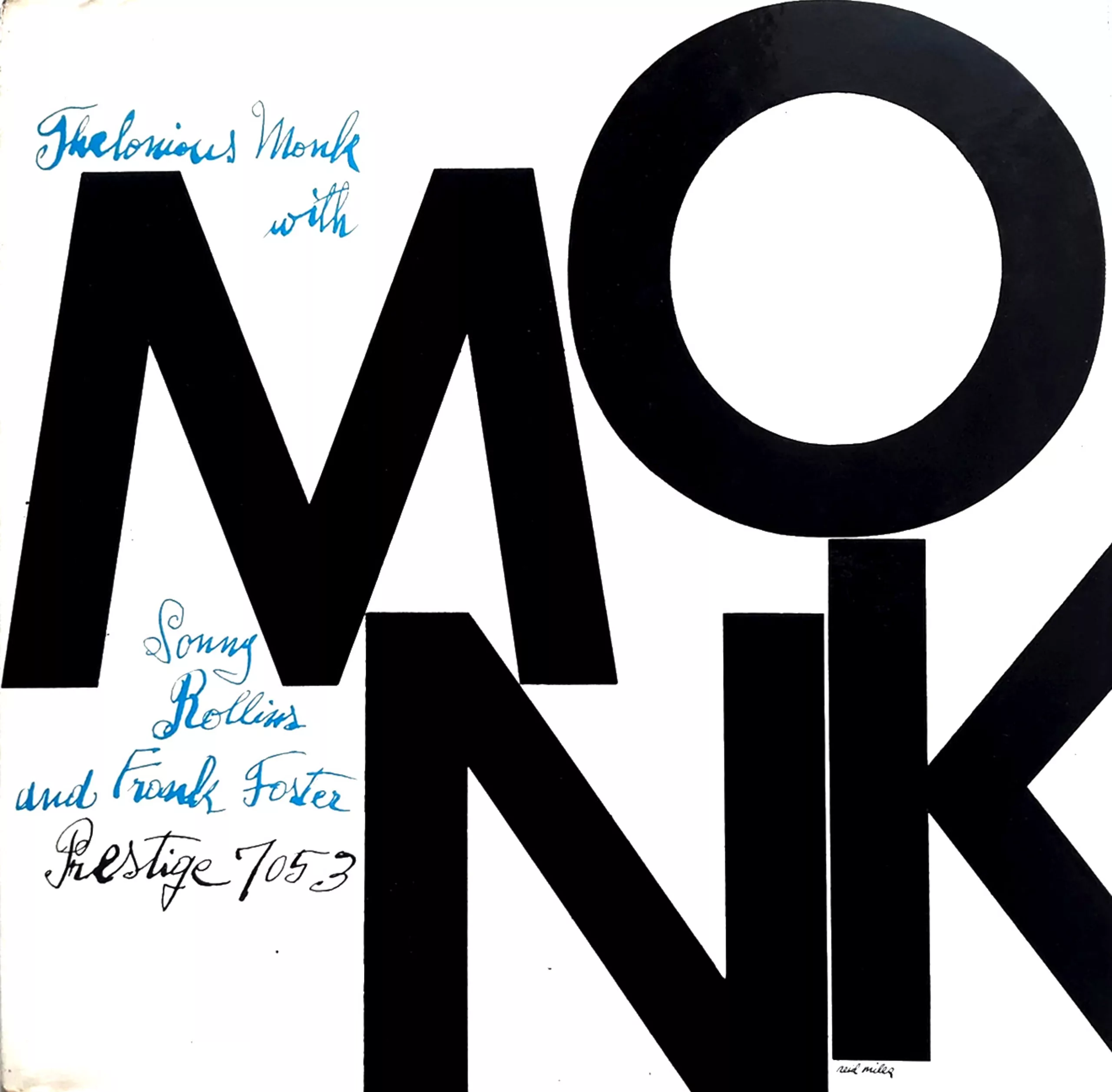
In 1958 Miles created a cover for Monk and Sonny Rollins under the Prestige label. He would say, despite all his years with blue note… that this is his favourite vinyl cover!
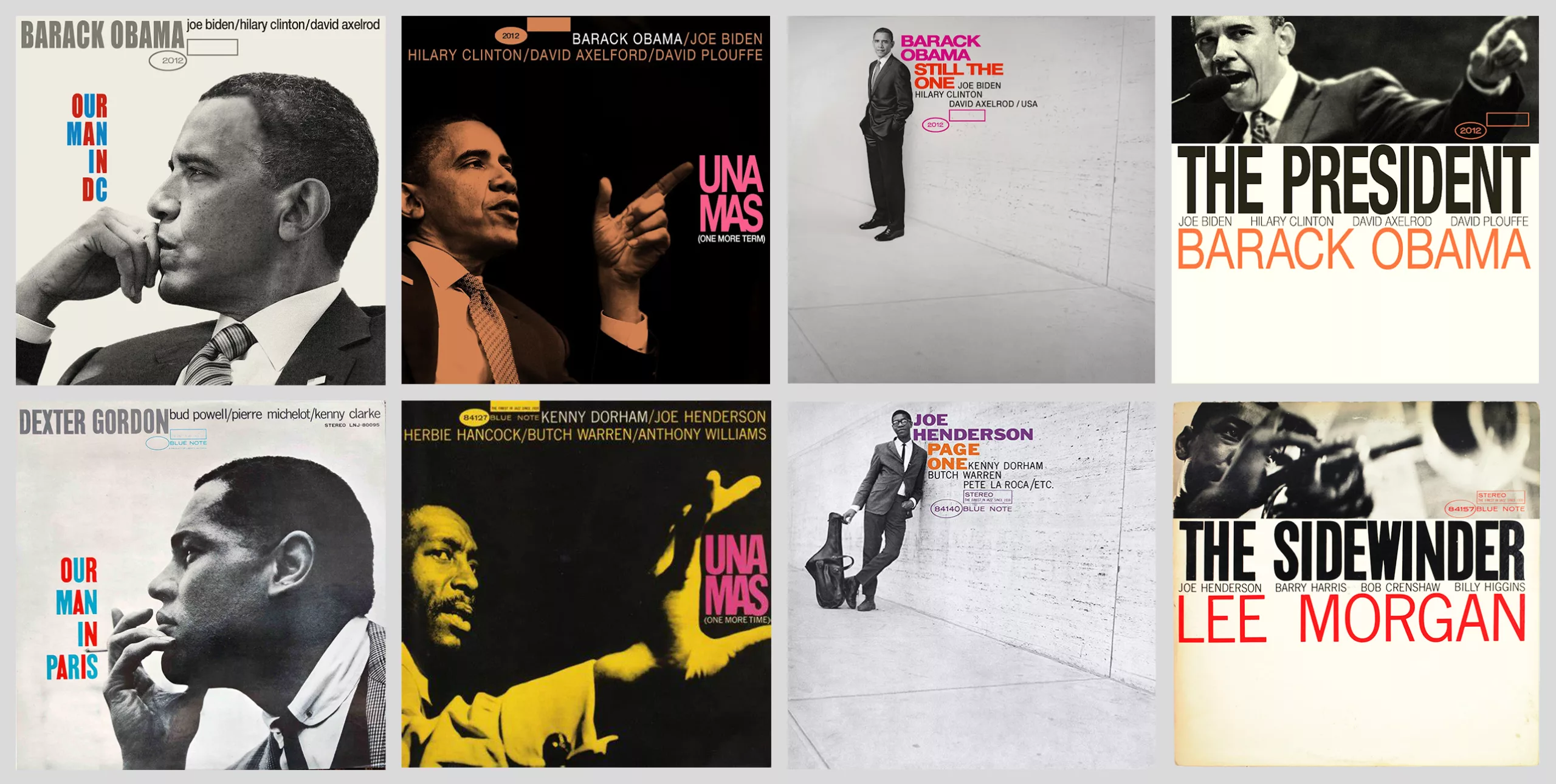
The iconic blue note collection still inspires designers today in music but also in diversion, like these Obama sleeves made in 2012 :
Andy Warhol designs jazz covers
If jazz really propelled the graphic experimentation of vinyl covers, the vinyl cover was also a favourite medium for artists who experimented with graphics that were both avant-garde and popular.
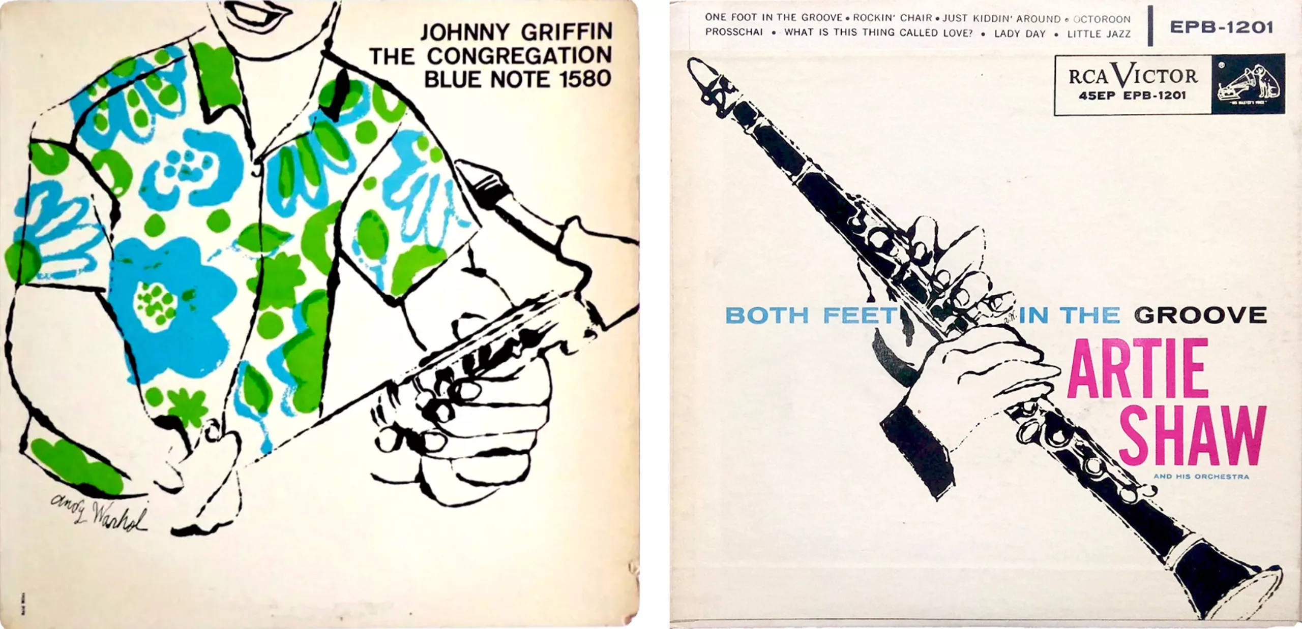
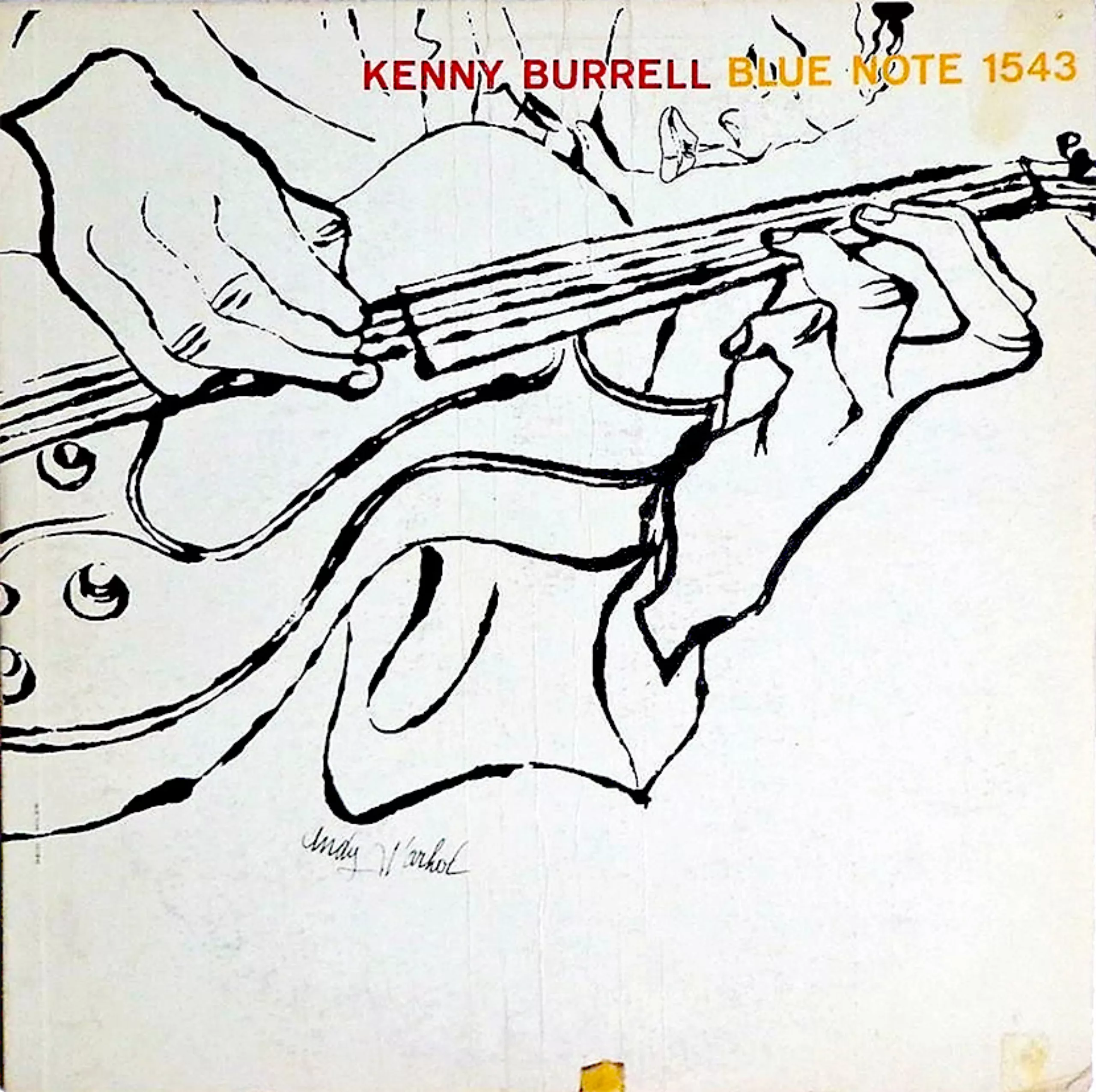
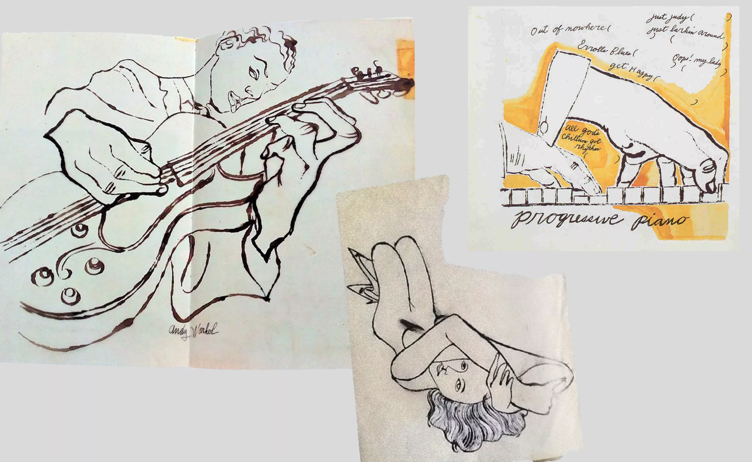
But before signing the covers with their already famous names, the artists of the 1950s illustrated vinyl covers to make ends meet. This was the case for Andy Warhol in his early days, who begged for the honour of collaborating with Reid Miles (who was better known than Warhol at the time) to design some covers for Blue Note, such as Kenny Burrell’s in 1957 and 1958. He also drew for the RCA Victor Progressive piano label in 1952 and Artie Show in 1956. His drawings with their vibrant and disproportionate clear line are still far from the style that will make him famous… he will come to it later!
In the next article in this series we’ll talk about Warhol’s most subversive covers, and psychedelic counter-culture vinyl. Feel free to share your favourite vinyl albums in the comments!
On the subject
-

Peace & Love ☮ the activist icon
How did the most politically charged and well-known symbol on earth become a commonplace fashion accessory?
-

Tote bag, a new social totem?
The tote bag has become an essential part of our everyday urban lives.
What does it say about our society, our times, our habits and our behaviour? -
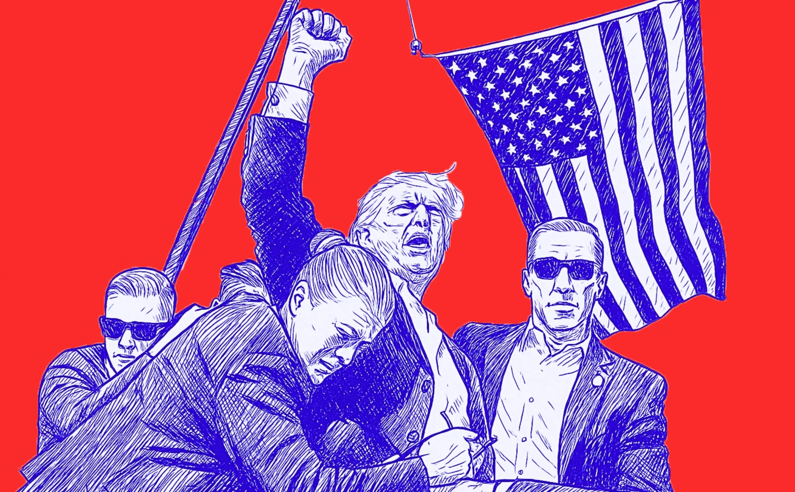
Donald Trump, the martyr who makes history
Donald Trump, his face bloodied, raises his fist and seems to proclaim “I’m alive, fight!”.
Let’s decipher an image that has gone down in history at the speed of a shotgun blast.