A short history of book cover design – 2/4
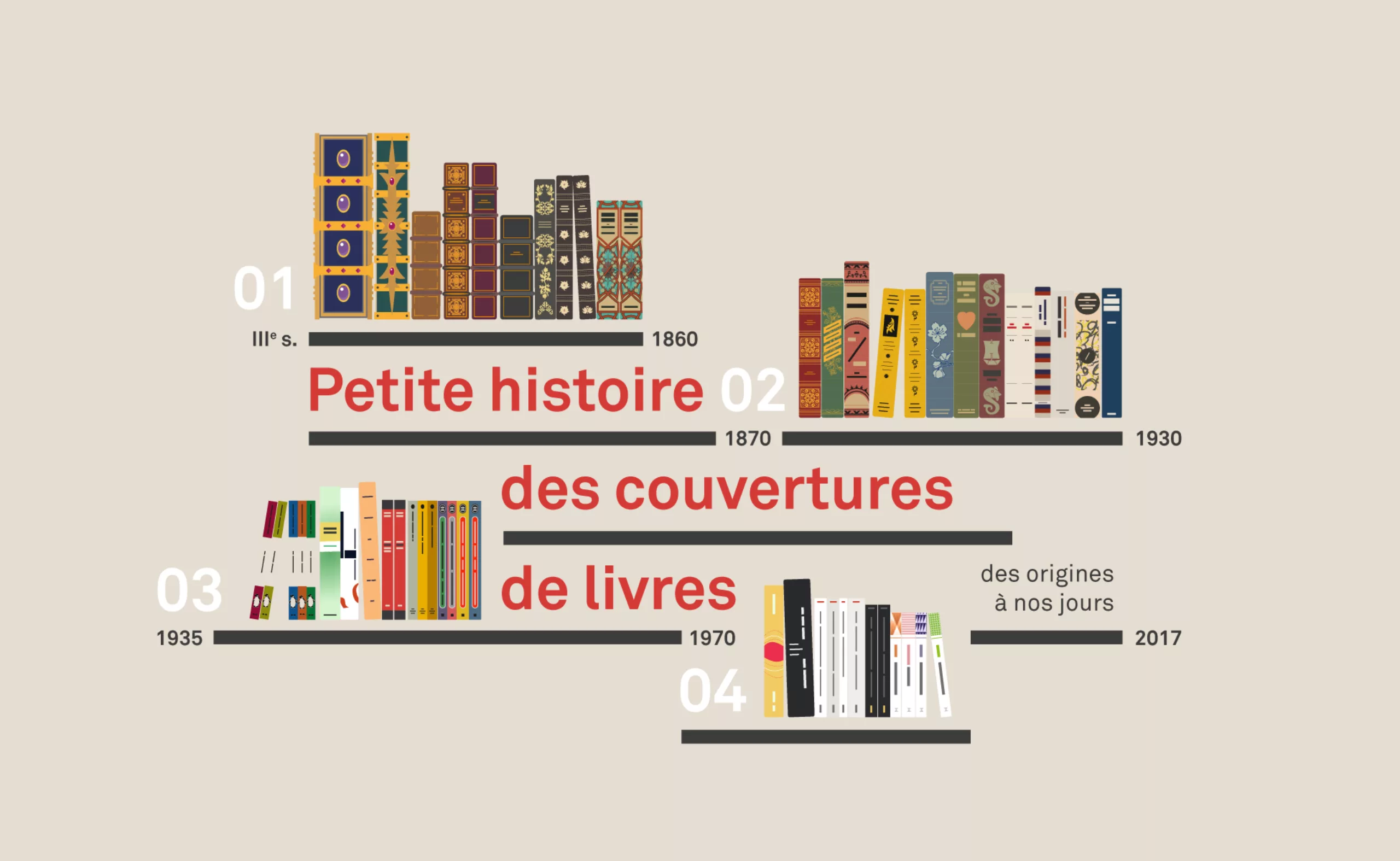
So here is the second article in our series scanning the graphic evolution of book covers to the present day, through its most striking revolutions. If you missed the first episode, we invite you to read it first!
Chatper 1: 3rd century to 1860
“From Codex to colour printing”
Chapter 2: 1860 to 1935
“From printed fabric to colour jacket”
Chapter 3: 1935 to 1970
“From paperback to abstraction”
Chapter 4: from 1960 to the present day
“French paperback, contemporary graphic design and covers”
Chapter 2: from printed fabric to paper jacket (from 1870 to 1930)
From the beginnings of colour around 1860 to the paper jacket less than a century later, under the influence of Japan, France or Russia, the covers of books did not cease to evolve with technical progress and crises. They alternately assume a purely aesthetic function before becoming a support reserved for the greatest artists.
This is the second article in our series scanning the graphic evolution of book covers to the present day, through its most striking revolutions.
The belle époque of illustrators (mid-19th ~ early 20th century)
Penny dreadful and Yellowback : the low-cost of the book (around 1840)
As early as the middle of the 19th century, illustrations were put forward in the press thanks to the wood engraving technique brought back from Japan or lithography. Photogravure is also used to reproduce drawings identically without having to engrave them by hand, or the halftone printing process. Above all, the invention of chromolitography made it possible to print in several colours since 1860.
These technical developments allowed the appearance of the famous “paperbacks“, “yellowbacks” or other “penny dreadfuls” (in Great Britain), printed without frills and at a lower cost. The industrial revolution allowed access to trains and education, creating a new type of readership less fortunate and eager for adventure. Printed entirely in paper, without a hard cover, and in a smaller format, the yellowbacks can be found in every station.
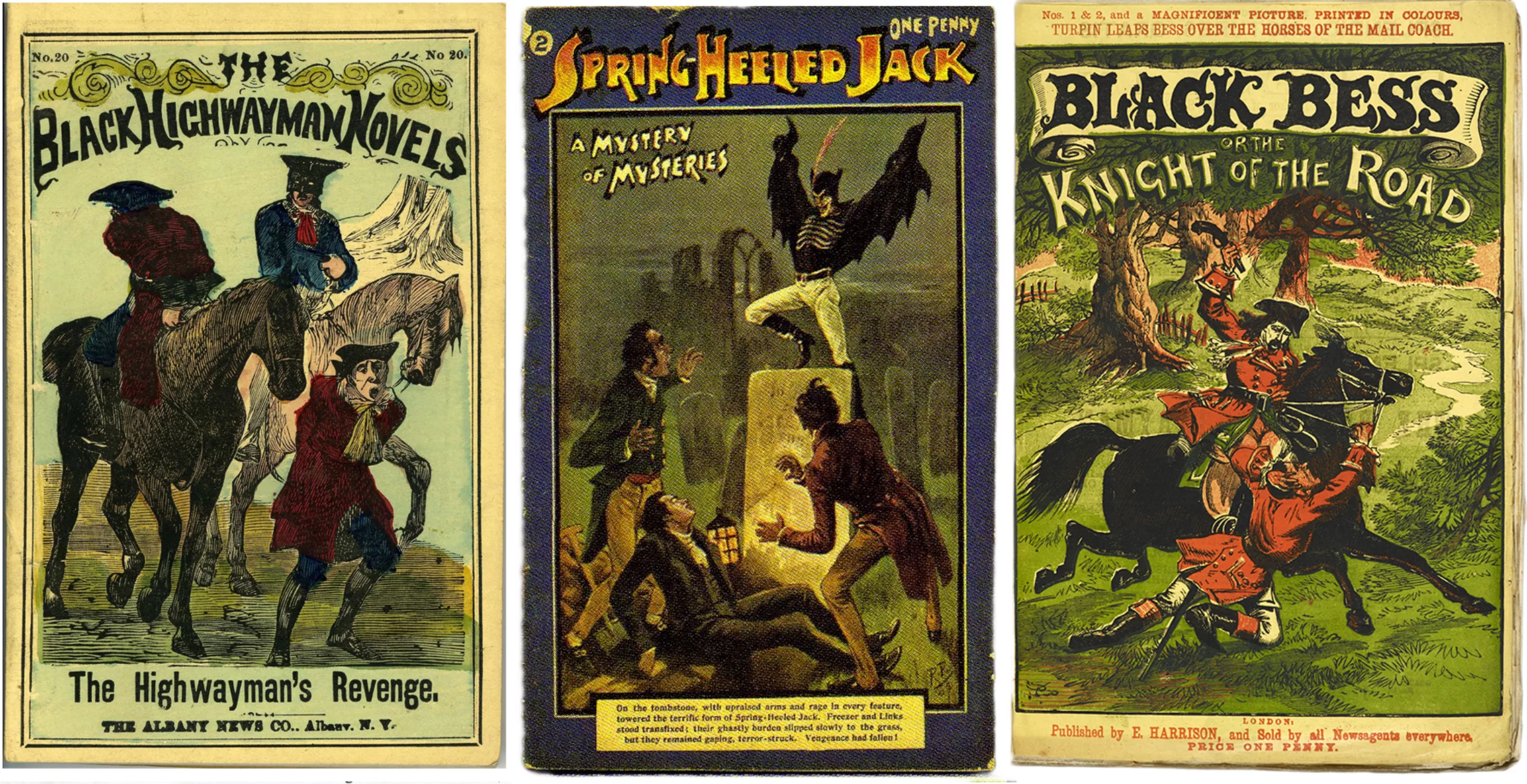
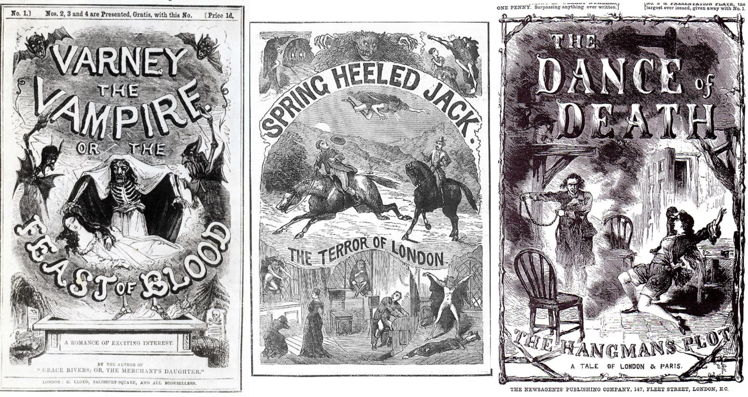
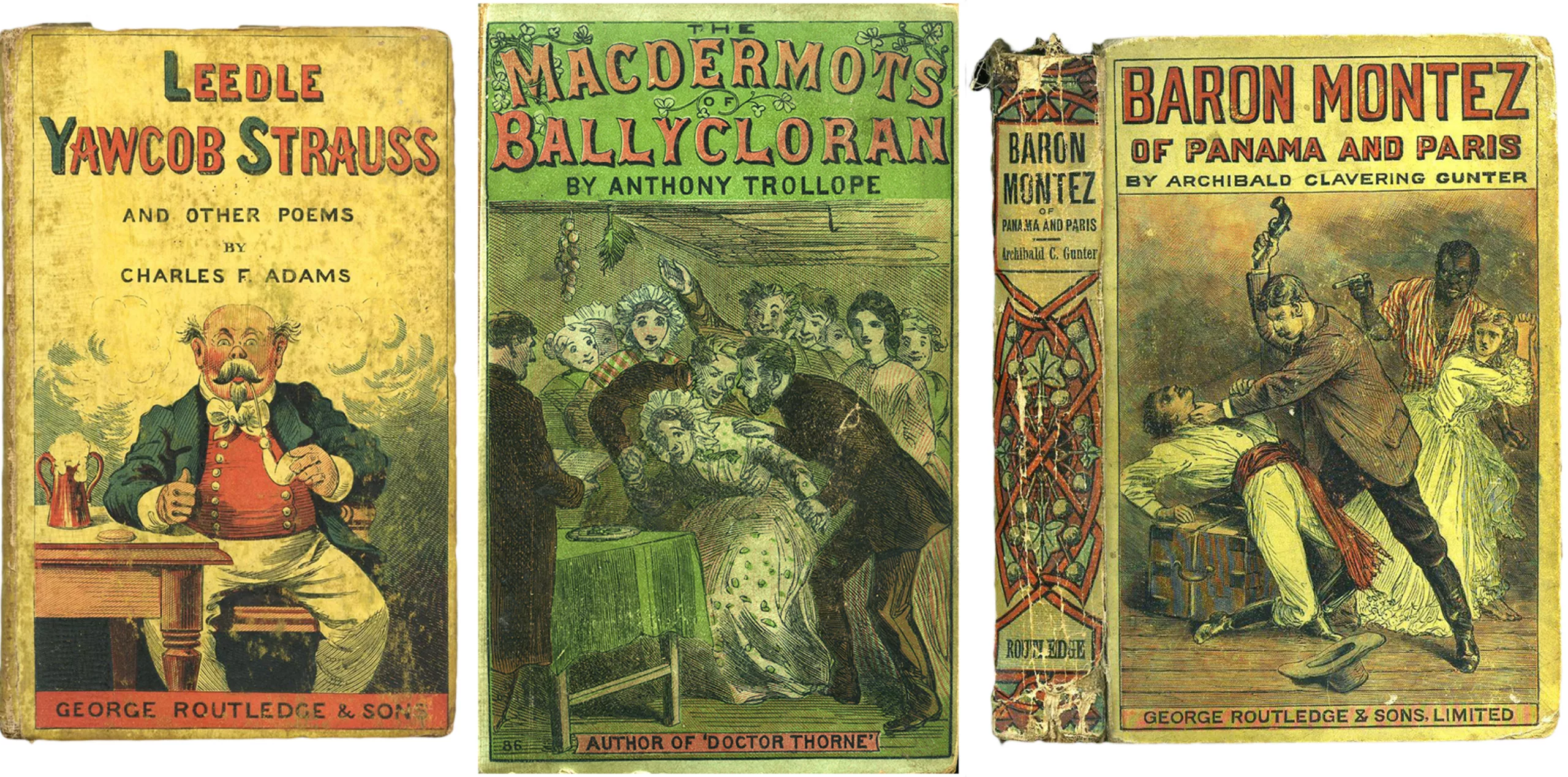
The yellowed covers that give yellowbacks their name are made of poor quality wood pulp, which gives them that yellow colour. Penny dreadful” are adventure series offered in episodes sold each week at 1 penny each. Pirates, ghosts, detectives and knights populate the pages. As for the adjectives “dreadful”, “horrible”, or “awful”, they say a lot about the quality of the content.
Despite their mediocre quality of substance and form, they mark the evolution of the book and its cover: they are the ancestors of our paperback book, and the low-cost of period books.
The colour cover
Alongside this craze for accessible books, artists are having a field day illustrating the covers of beautiful books.
In a few decades (between 1860 and 1880), one passes from a graphic design in golden and symmetrical monochrome to a true golden age of colour illustration, creative and innovative. We are late 1800, the book cover is now an artistic medium and vector of its content, with the dual function of making it stand out. As you were told in article 1, it is fashionable and quite popular to offer a book as a gift.
Illustrators and Japan: technique and influence
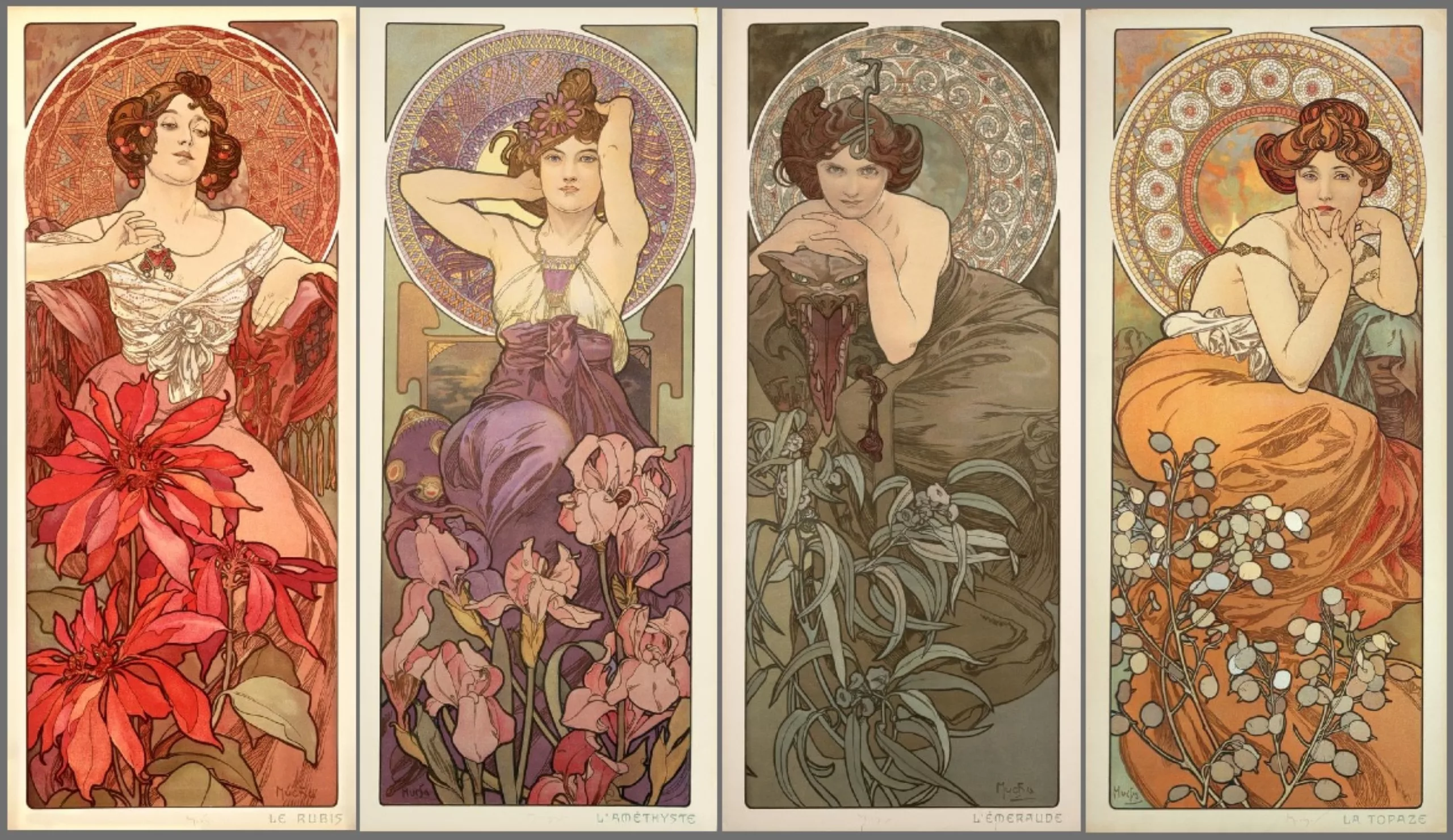
Late 1800, early 1900 is the golden age of illustrated magazines, and publishers have understood that images sell. Illustrators become real stars, like Alfons Mucha (1) or G. Wharton Edwards.
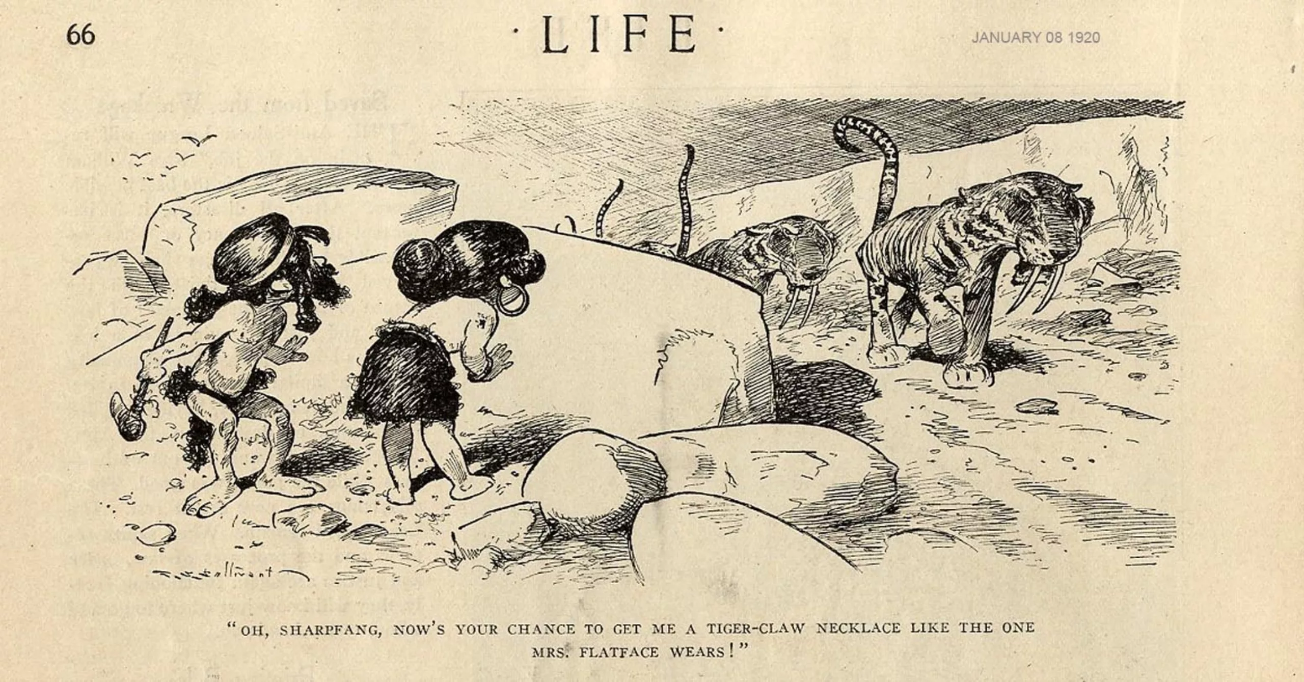
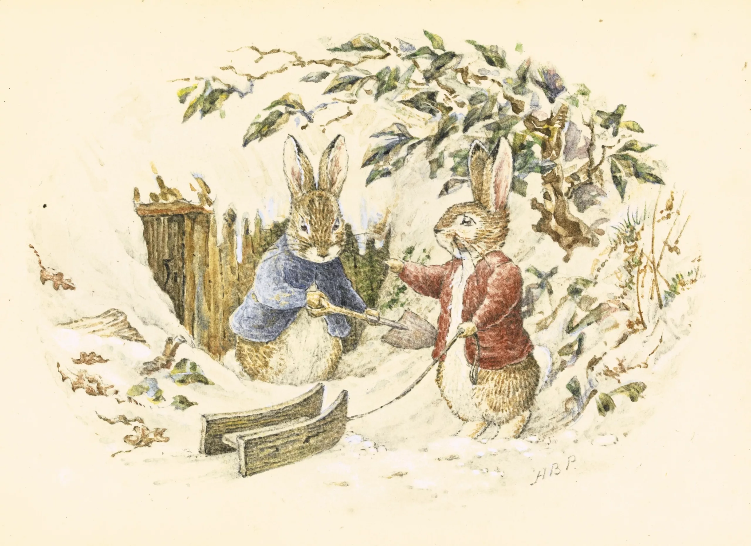
In book and comic illustrations, the famous Peter Rabbit (2) by Beatrix Potter, or the anthropomorphs by T.S. Sullivant (3) (who later inspired Walt Disney) were published in the satirical humorous magazines of the Puck, Judge and Life era in the United States.
As early as 1870 and for twenty years or so, the symmetry of the layout, which had hitherto been the norm, was abandoned in favour of motifs built around an aestheticism that was more graphic than systematic.
Then, around 1890, the notable influence of Japan, which can be felt just as well in the world of fashion or art (Monet, Gauguin, Bonnard or here Rivière), opens perspectives on new illustrations or more asymmetrical layout styles, with Japanese techniques such as polychrome wood engraving.
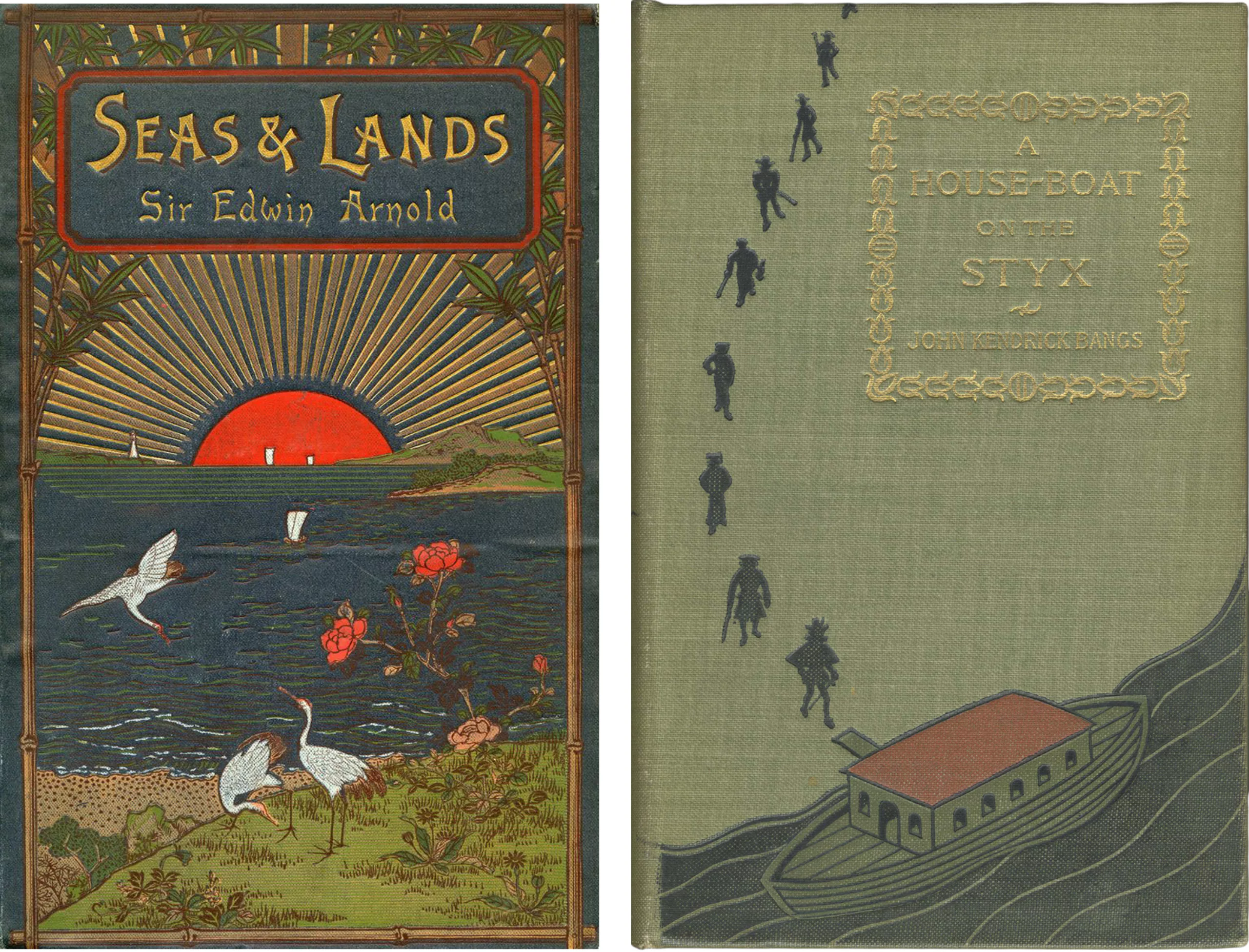
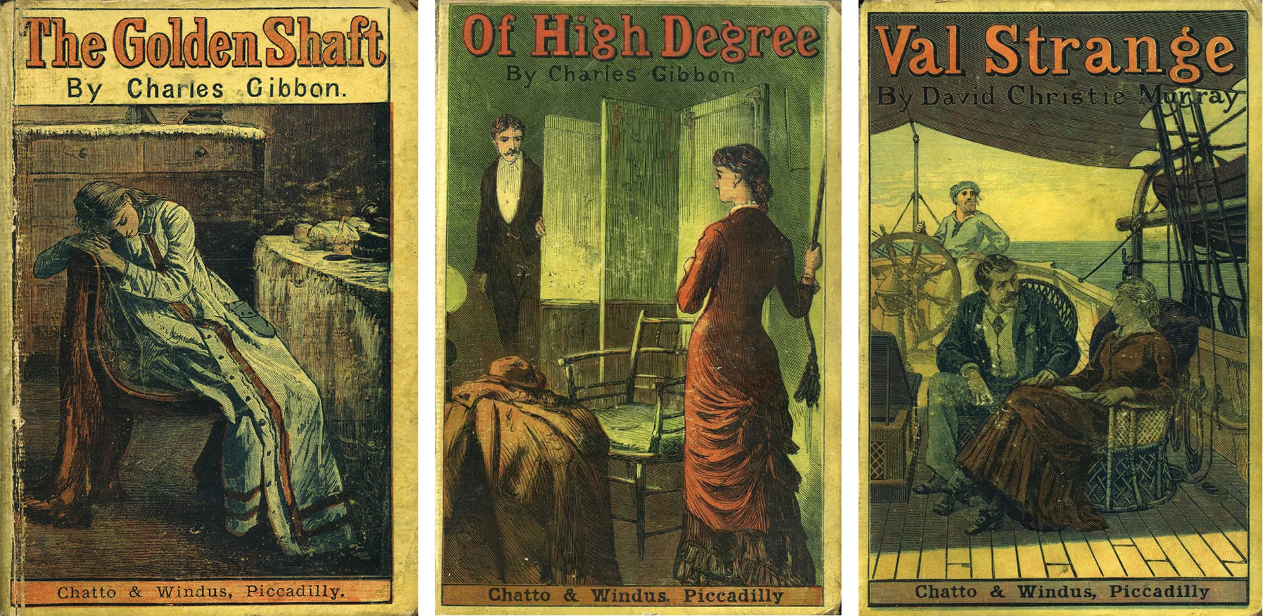
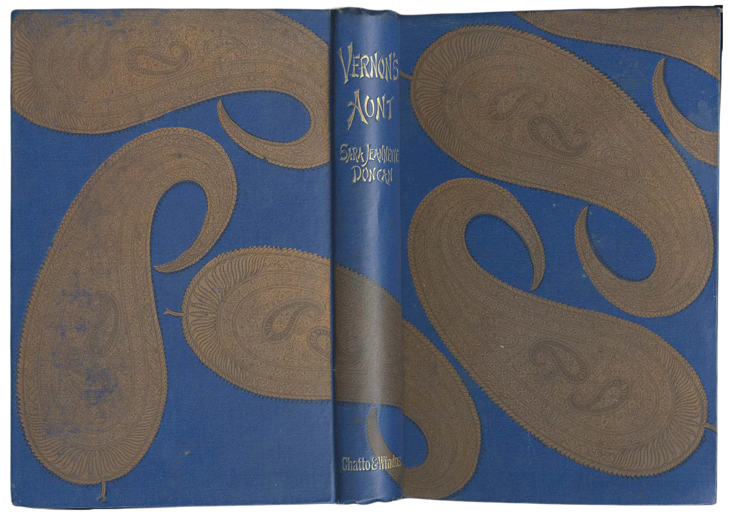
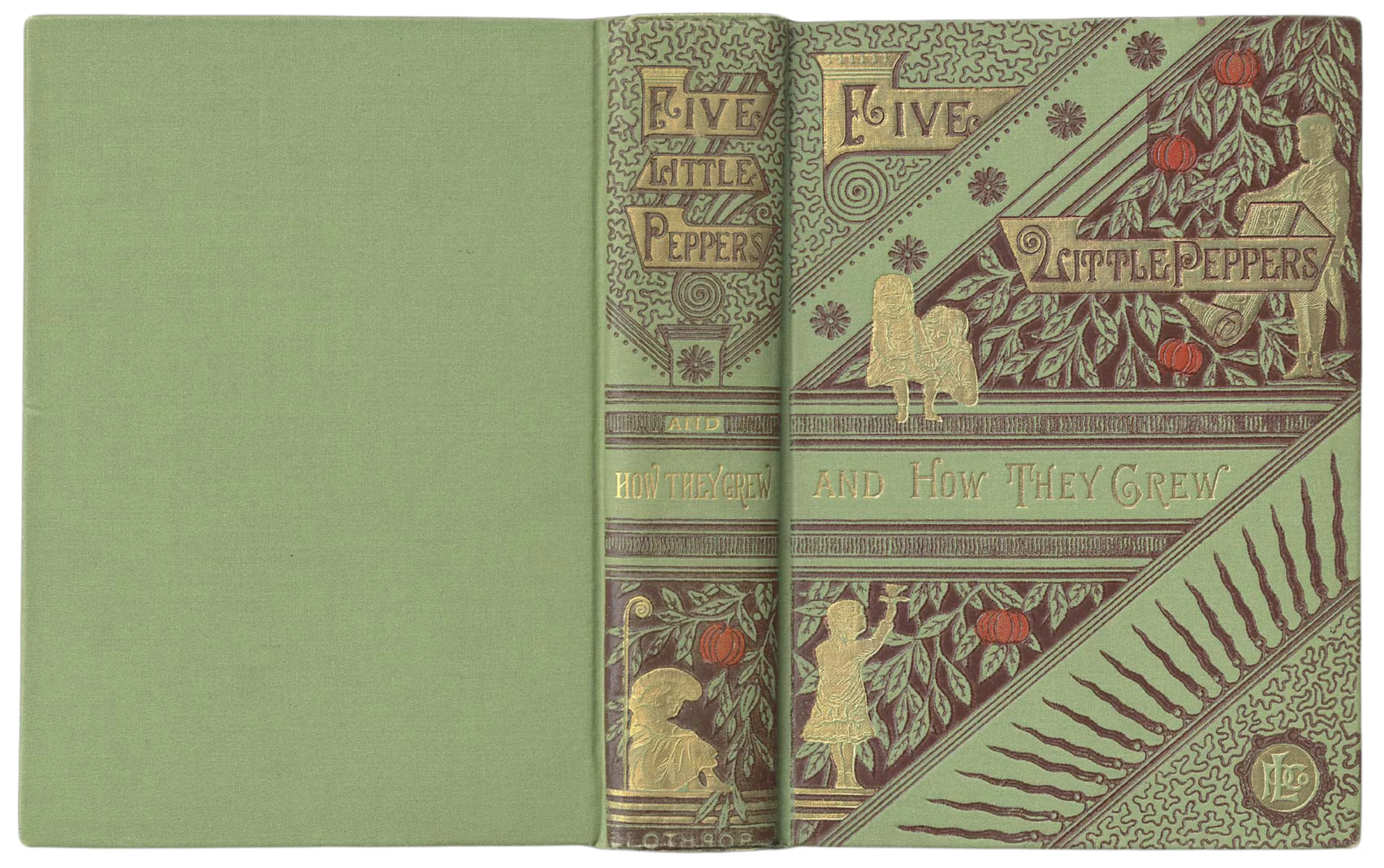
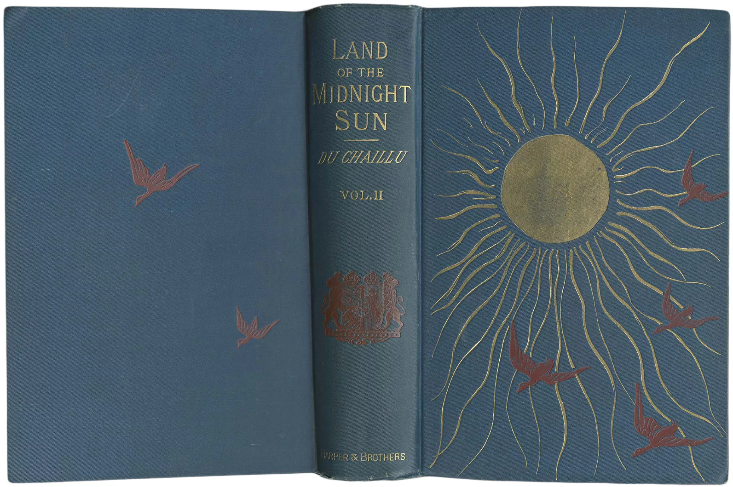
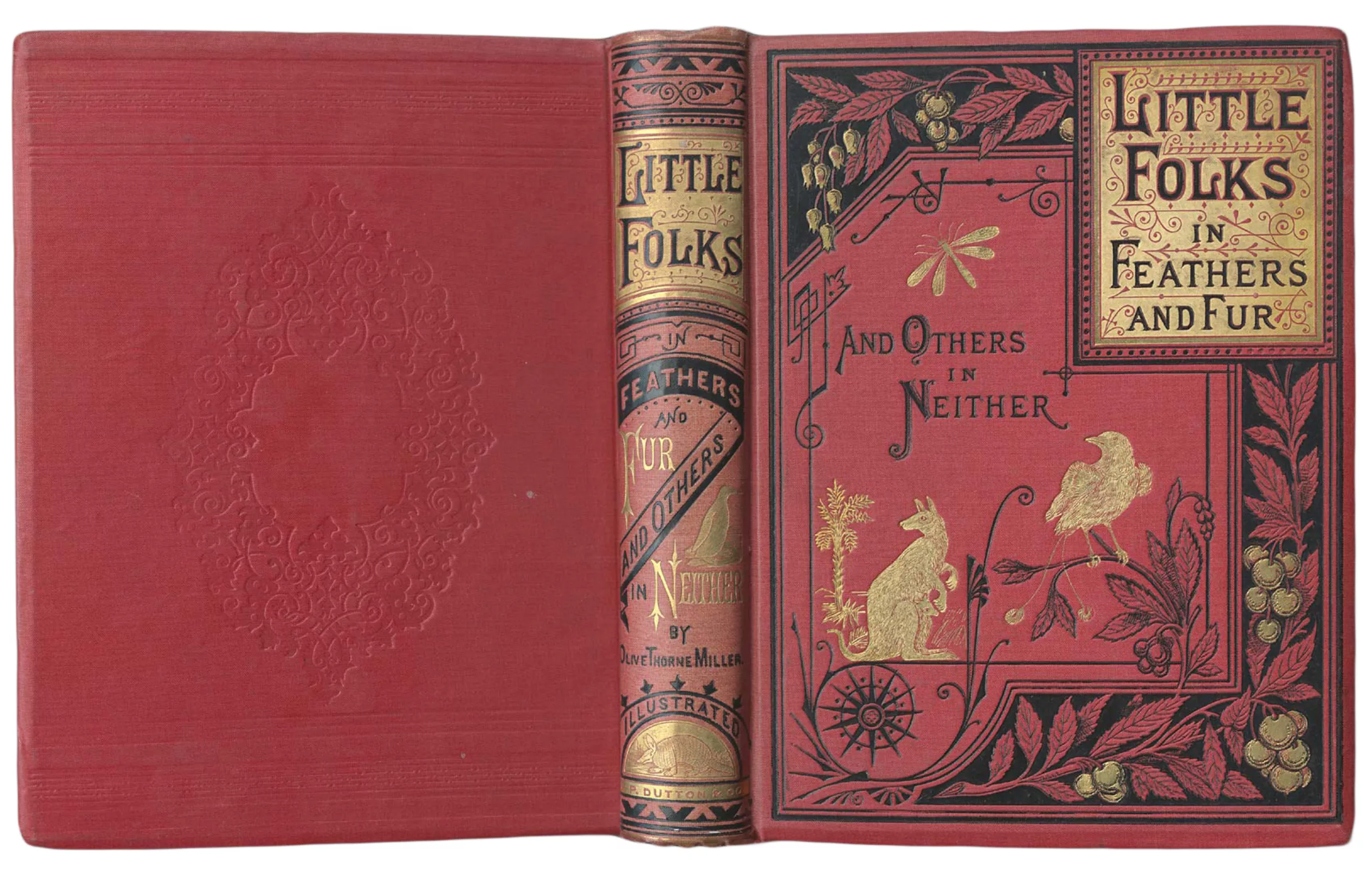
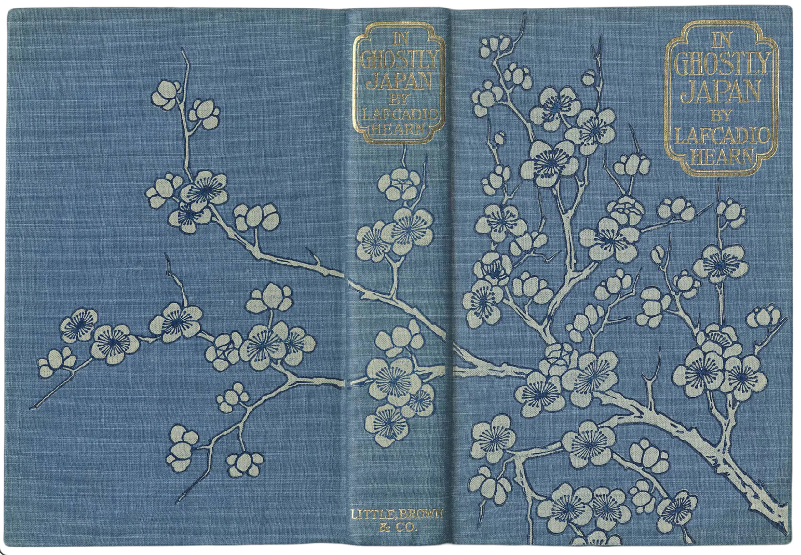
The majority of books are always protected by a paper cover which takes the visual of the hard cover, applied on fabric. This paper cover is generally not kept after the purchase of the book, although it is also illustrated, and it is rare to still have traces of it today. We see a nice one for the book below.
The Yellow Book fever
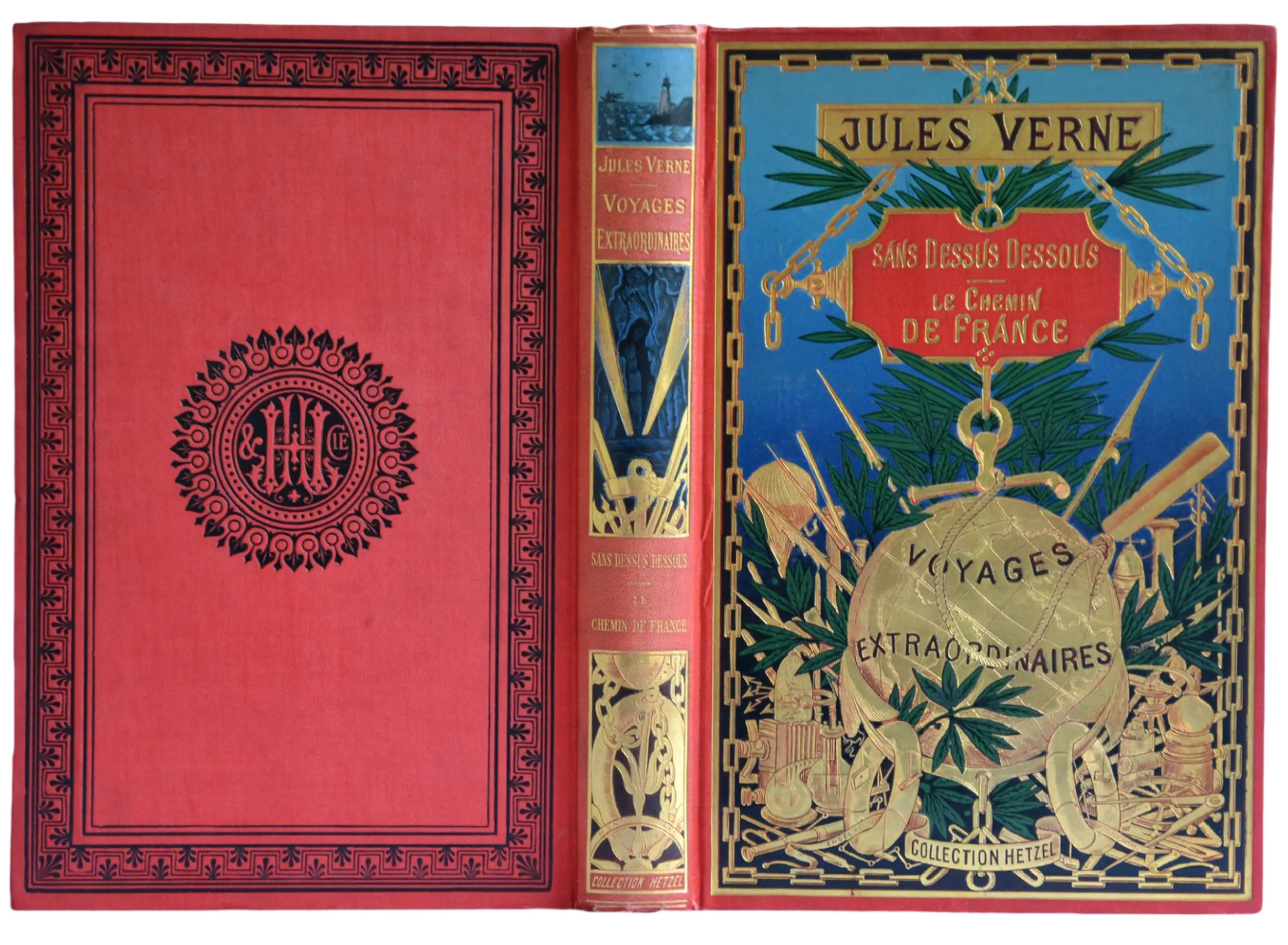
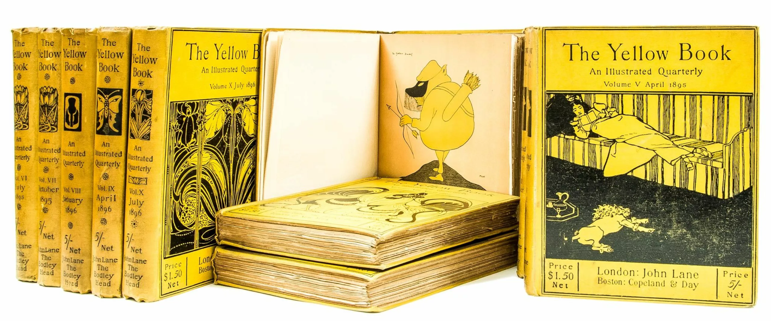
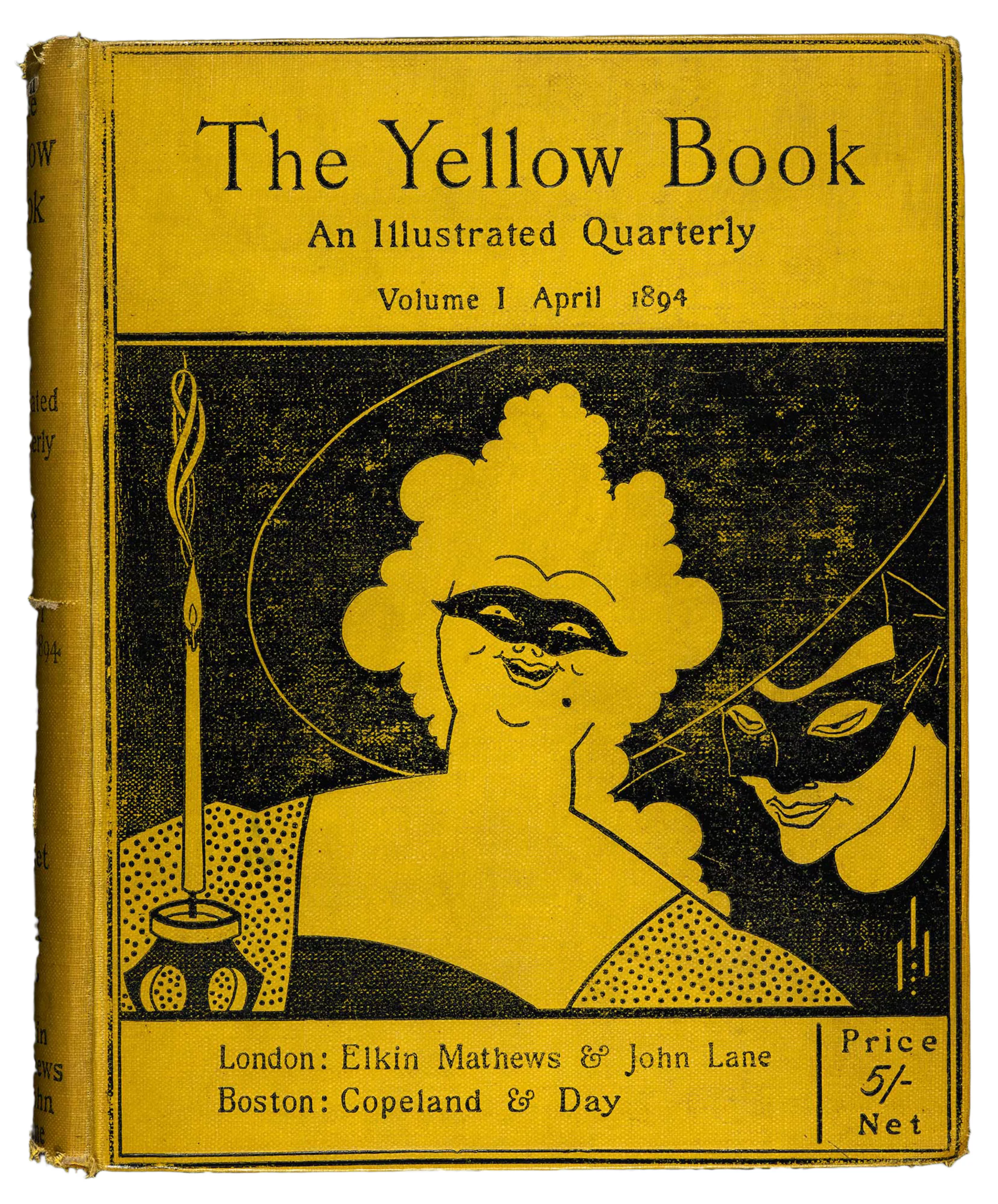
Between 1894 and 1897 (let’s be precise), the British quarterly magazine and avant-garde The Yellow Book marks the beginnings of the era of the cover of the modern book. In 4 years and 13 issues, the magazine with its yellow cover changed the graphic codes and customs of the period, then very Japanese, decorated with Art Nouveau embellishments (see below typical examples from the 1895 ~ 1900) or even precious and mythical like the Jules Verne like this cover from 1897, from Pierre-Jules Hetzel editions..:
It is that the yellow cover of The Yellow Book announces a disconcerting content.
Covered in cloth like a book -and not in paper as it is used- it is nevertheless a magazine. Without advertising, it highlights authors, poets or painters and distinguishes art and literature by giving each their importance, something rare at the time.
As for the yellow on the cover, which is so much talked about, it is originally a reference to the “yellow nineties“, the pre-Victorian dandy decade in which these publications are inscribed. But it is also and above all a reference – which does not go unnoticed – to the french subversive works packed in yellow paper of the time, such as Huysmans’ decadent À Rebours, whose covers were hidden. France is then an obligatory passage for any artist who respects himself, and his influence is great. This yellow is that of an artificial light, unhealthy and pale as in the novels of Zola, the color of candlelight.
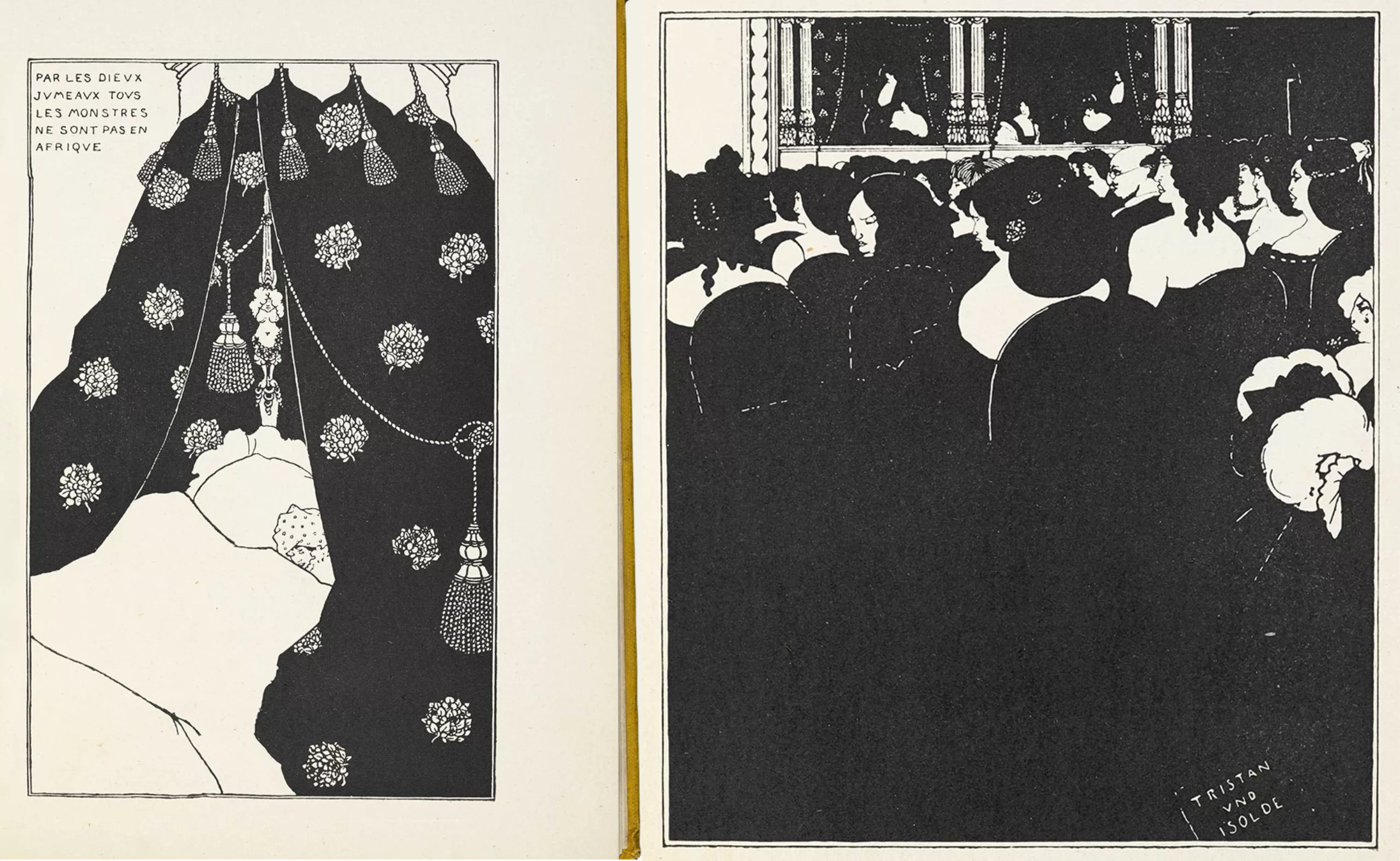
The magazine’s cover and articles are illustrated by Aubrey Beardsley, both artistic director and artist, who openly mocks the Victorian prude and thoughtful style of the time. It’s probably more his style than the real content that will cause a scandal. Friend and relative of Oscar Wilde for whom he made some illustrations, we find in Le Portrait de Dorian Gray (in 1891, a few years before the magazine’s launch) a reference to a certain corrupting “yellow book” (probably À Rebours, by the way), which Beardsley then probably covered for its title.
Don’t judge a book by its cover
The Yellow Book announces the color of the scandal and does not fail to make its small effect. In the first edition in 1894, the essay “The Defense of Cosmetics” is considered defamatory because it praises the decadent, and leads the journal in its wake. Max Beerbohm, the author, makes an ironic defence to the decadent movement – which opposes and promotes artifice to Nature and sophistication to simplicity – through a praise of make-up. He then claims that “the artifice, this delicious exile, has arrived in his kingdom“. Then it was impossible for the Yellow Book to get rid of this decadent magazine image.
What to make lie the expression “don’t judge a book by its cover”!
This time again, we find the great influence of french authors, since Baudelaire – symbolist and precursor of the decadent par excellence – had composed just the “praise of make-up” in 1885 in Le Peintre de la Vie Moderne: “We observed that artifice did not embellish ugliness and could only serve beauty. Who would dare assign to art the sterile function of imitating nature?“. We sometimes found poems in French in The Yellow Book, as below (you can find and read the issues 4 to 7 on the Gallica site of the BnF):
Condensed from artifices rising above Nature, the Yellow book will highlight all impressionism, feminism, naturalism, dandyism, symbolism and classicism of the time. Without really being as controversial as its cover let appear, it will serve above all as a starter for the kind of scandal literature.
End of the parenthesis on yellow fever, end of the 19th century: opening of the modern period.
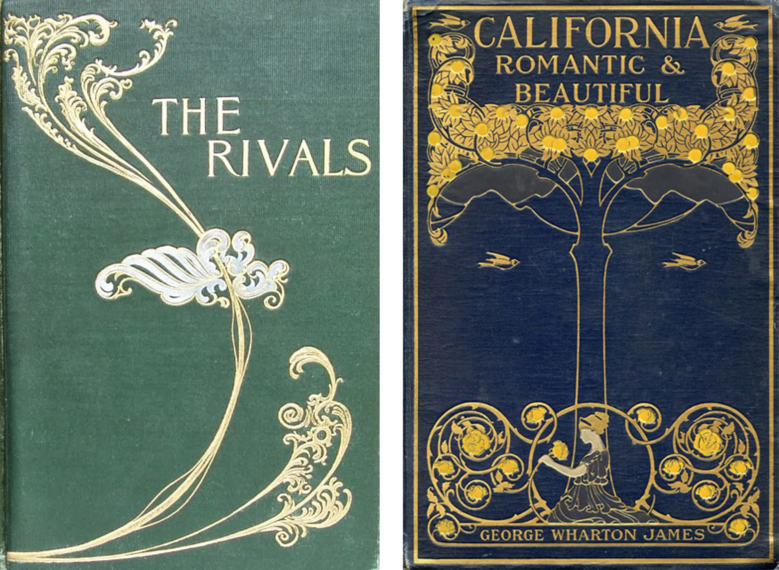
The advent of the “modern book”
In parallel to the beginning of the 20th century, books continued their graphic evolution, playing with typos and modern compositions. One could almost imagine the last three (1905, 1908, 1912) printed on paper they already look surprisingly similar to what will be done in the 1930s !
Propaganda
After the beautiful era of Art Nouveau, the Yellow Book, and all the wave of progress brought by the “electricity fairy”, the First World War breaks out dragging illustrators into his troops. The latter are called upon to produce propaganda works, to rally men and women to the great cause, as James Montgomery Flagg does in the USA.
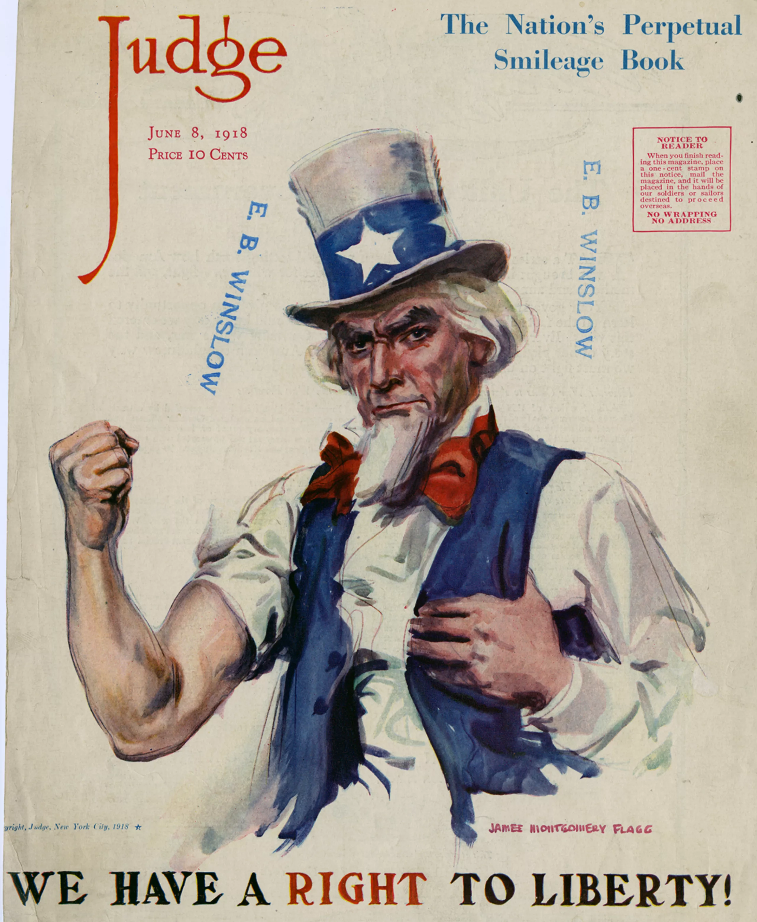
During this decade of the beginning of the century, between 1910 and 1920, it was the advent of comic books but also the golden age of illustrated magazines, which went hand in hand with the birth of mass advertising. Later, after the two World Wars, the book covers took on that advertising look similar to the movie posters of the time.
The impact of war: freedom and russian influence
The First World War marked a dark parenthesis at the beginning of this century. Its end breathes a real renewal of optimism that extends the frenzy of previous decades, those of the Belle Époque. It was the time of the flappers, the “roaring twenties”: a new generation of liberated people appeared that opposed everything to the prude and Victorian era of its progenitors. Dance, clothing, art, morality… the word freedom resonates.
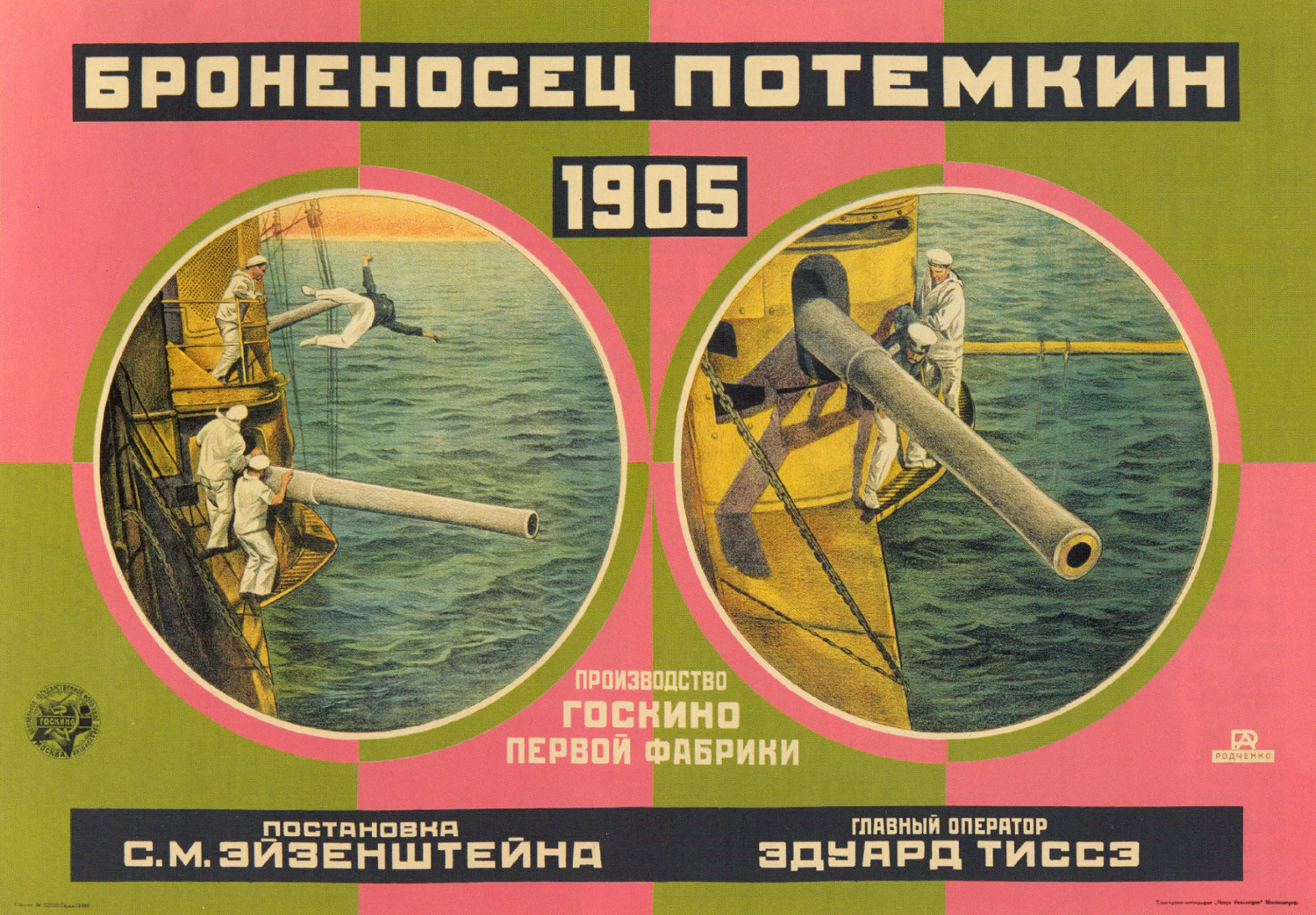
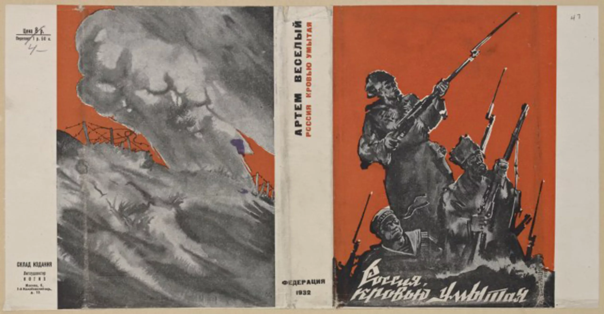
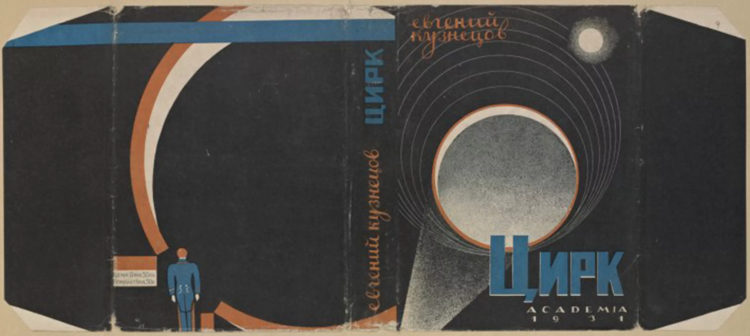
As for the book covers, we move from a Japanese or Art Nouveau influence -realist and contemplative- to strong graphic features with cubist and abstract accents inspired by Soviet (like Rodchenko, below) and German artists of the 1920s.
Symbolism and cubism then reign as masters. The full and assumed color makes its entry.
Draw me a cover
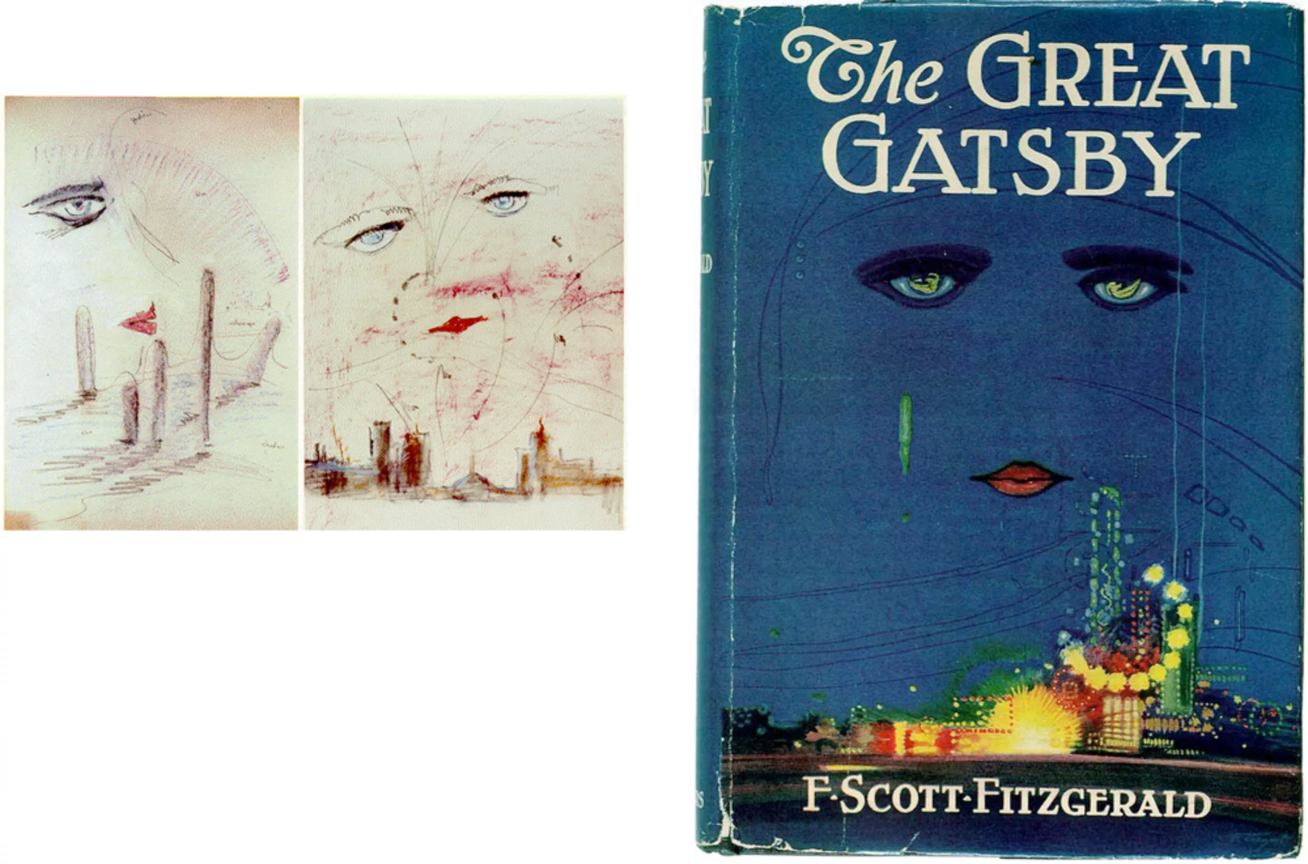
Artists are regularly called upon to illustrate book covers, including Francis Cugat, who gave a face to the novel The Great Gatsby in 1925. This cover on a paper jacket is one of the most memorable in the United States. There is a solid color in the Yellow Book, and a modern composition at the limit of abstraction.
With the dust jacket, the first edition of this book is now worth up to $30,000 (and “only” $1,000 without the jacket)!
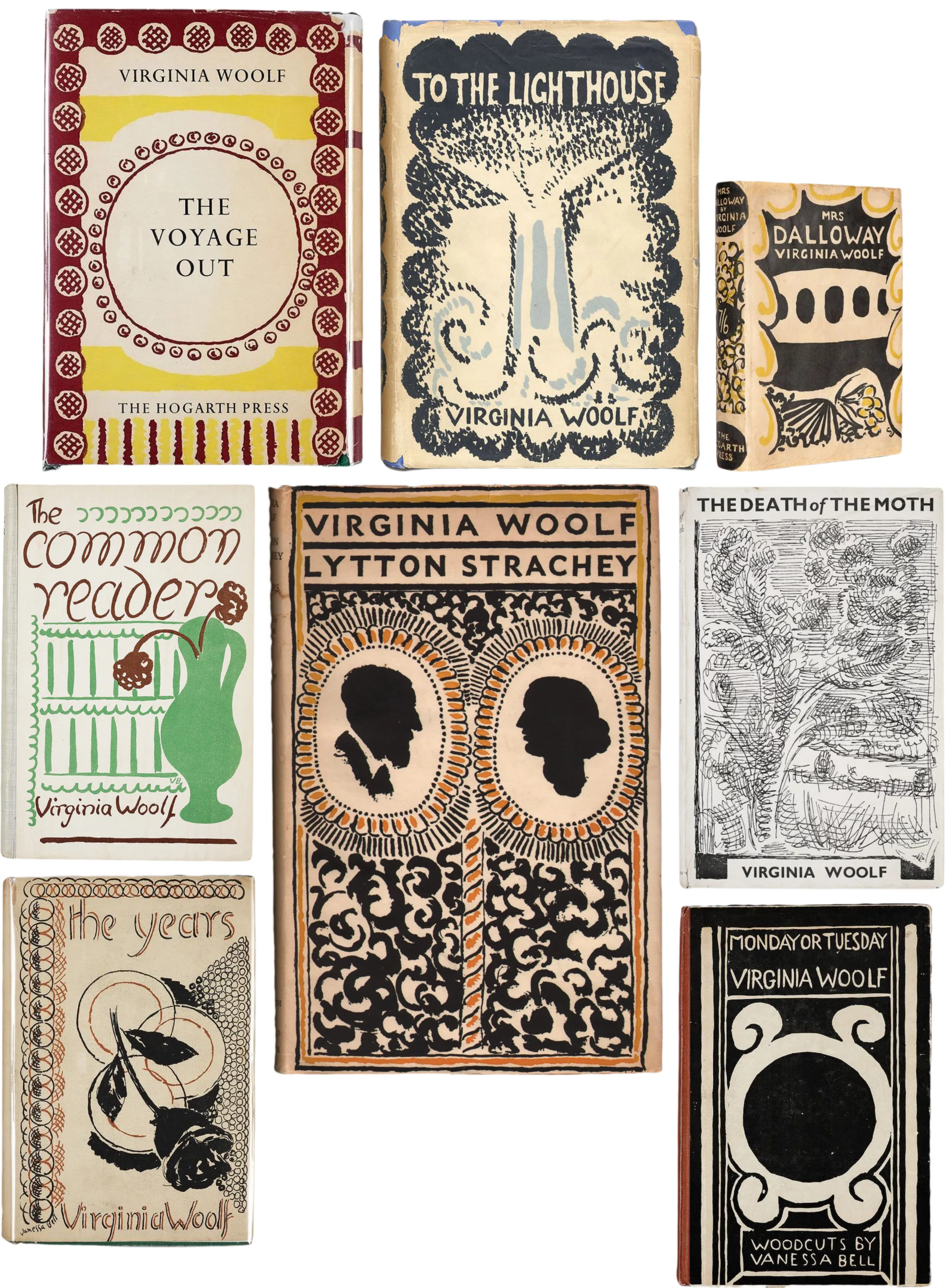
Vanessa Bell, an innovative abstract artist (at the origin of the Bloomsbury movement, a sort of gang of abstract artists in England) and sister of Virginia Woolf, illustrates for her most of her books, around the 1920s.
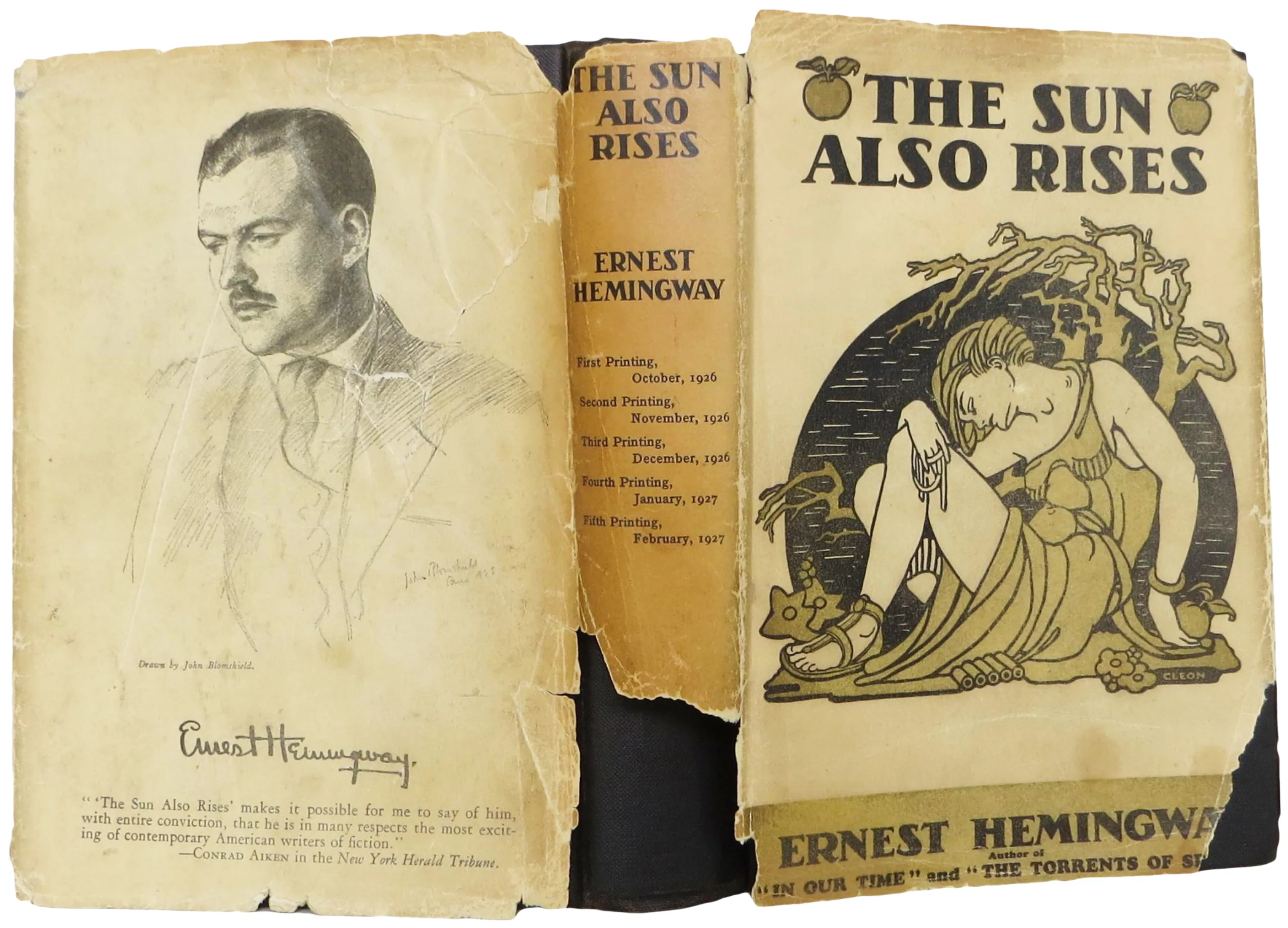
You will have noticed one thing on these last post-war images, it is the importance of the paper jacket, and for good reason…
Goodbye fabric, hello paper!
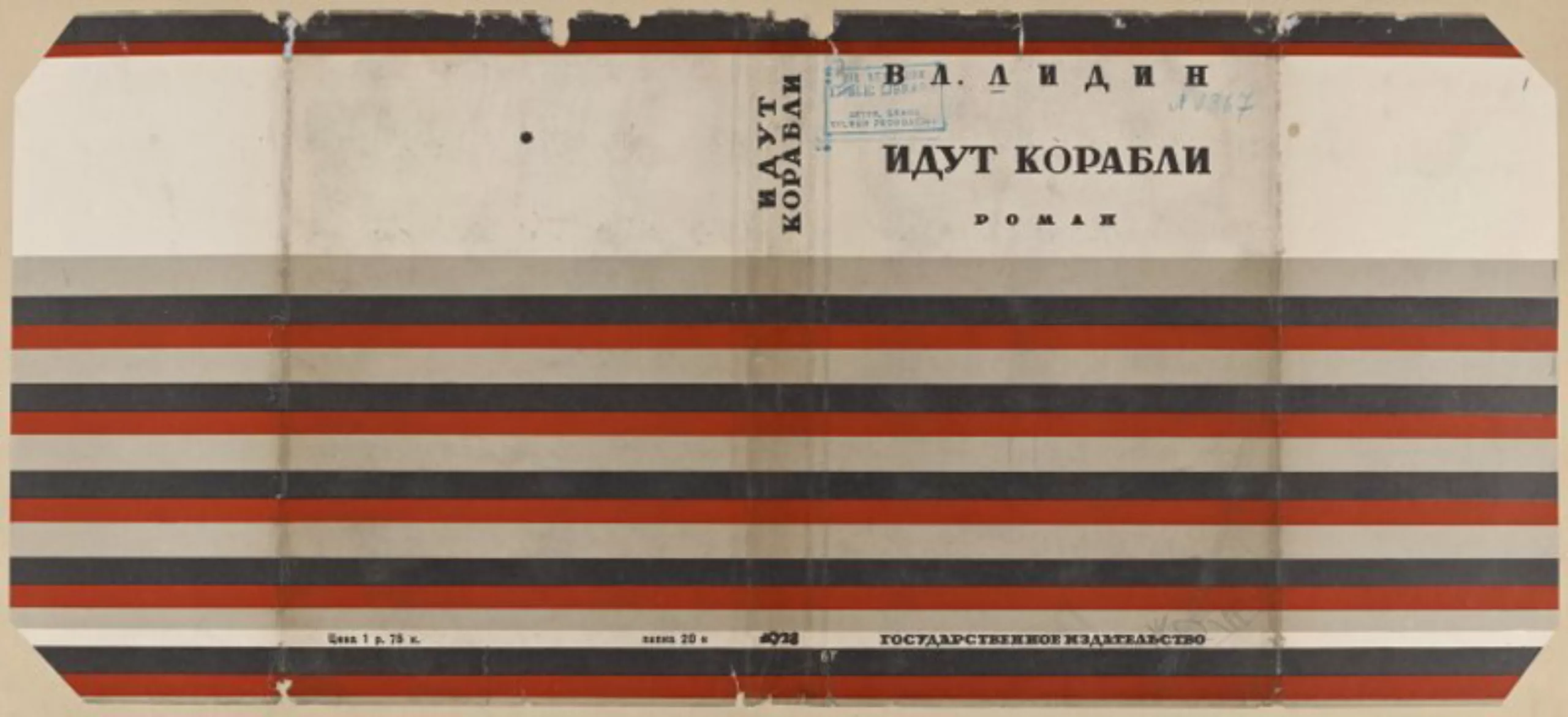
The 1920s and 1930s marked the end of the era of illustrated bindings. After the war – for economic reasons and with the evolution of fashions – the direct printing of fabric became too expensive to decorate books. The illustrations migrate from the fabric binding to the paper jacket.
In addition, the halftone technique is evolving and now allows printing in 4 colours; multi-coloured jackets are then machinally printed. These last ones, formerly used as simple protections (from 1830, you remember?), take little by little the upper hand on the rigid covers. As they are more beautiful than hard covers, we start to keep them and not to throw them away. The roles are reversing.
This is one of the major revolutions in the graphic evolution of book covers.
In the next episode of this series, we will look at the first paperback books, the place of women, and the characteristics of major french publishing houses.
To be continued!
Text: Tiphaine Guillermou
Sources / to go further:
- 1930-1910 : http://rbscp.lib.rochester.edu/3352
- XXth covers : www.pinterest.com/lovejoy58uk/decorative-book-covers/?lp=true
- History of the cover: www.histoirevisuelle.fr/cv/icones/1818 and www.lamaisondubourg.net/single-post/2016/03/04/Explorons-en-profondeur-Les-couvertures-de-livre
- Yellow Book: www.indexgrafik.fr/the-yellow-book/ content: www.gallica.bnf.fr/ark:/12148/cb32894092b/date18950101#resultat-id-3
On the subject
-

Peace & Love ☮ the activist icon
How did the most politically charged and well-known symbol on earth become a commonplace fashion accessory?
-

Tote bag, a new social totem?
The tote bag has become an essential part of our everyday urban lives.
What does it say about our society, our times, our habits and our behaviour? -

Donald Trump, the martyr who makes history
Donald Trump, his face bloodied, raises his fist and seems to proclaim “I’m alive, fight!”.
Let’s decipher an image that has gone down in history at the speed of a shotgun blast.