Flat design vs Skeumorphism : The game !

Flat design vs Skeumorphism : which side are you on ?
When it comes to graphic design, and particularly icon design, there are two major trends that have been the talk of the town for several months now: “Flat design” vs “Skeumorphism”!
This debate can be observed across the 3 major players: Apple, Google and Microsoft.
So let’s start this article with a quick question: Which of these icon series do you prefer? 1, 2, 3 or 4?
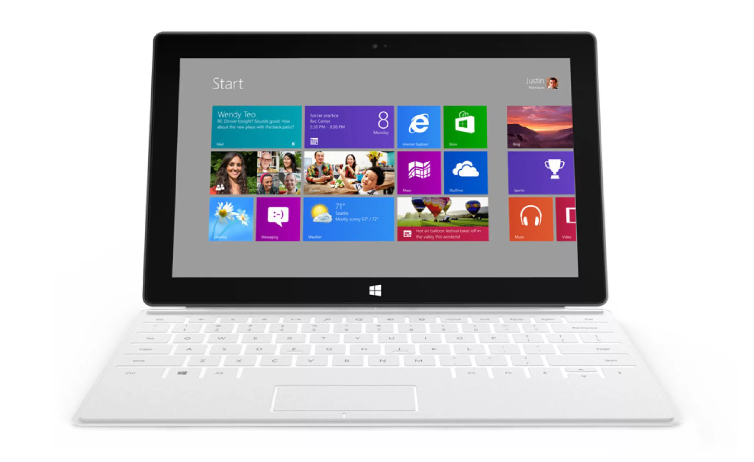
For your information, here’s where these icons come from…
- Micorsoft Windows 8.
- Apple iOS 7.
- Apple iOS 6
Skeumor-what ?
Skeuomorphism is a word formed from the Greek root skeuos, meaning military equipment, but also costume, ornament, decoration (Wikipedia). In design terms, it describes a visual element whose form is not directly related to function, but which reproduces in an ornamental way an element that was necessary in the original object, for example, interface elements reproducing physical objects (cf: textures of leather, paper, wood…). The best-known examples are the IOS 6 icons for the Game Center gaming platform, the Notes notepad and the Compass2.
Clearly, skeuomorphism responds to a need for continuity and familiarity. Even in our grandmothers’ day, most electrical appliances were shaped like their manual equivalents. This is affordance – the ability of a product to suggest its own use.
For the sake of simplicity, and assumed subjectivity, it’s my duty to inform you that “skeumorphism” is not my friend. It will happily be lumped in with the effects of Web 1.0, 2.0, 3.0…
Now, let’s try to understand why the arrival of Flat design is so exciting for all designers!
Flat design
Flat design, the opposite of Skeumorphism, takes a minimalist approach. Flat design excludes all effects of depth, cast shadows and reflections. It favors large, flat colors, with no borders, no fuss… Advocates of “design-flat” assert that graphic interfaces should not seek to “visually” imitate existing functionalities, but focus on the essentials, finding the shortest path to convey information in order to facilitate navigation and optimize legibility. Less is more takes on its full meaning with Flat design.
Before going any further in our analysis of these two trends, let’s take a look at our three case studies: Apple, Google and Mircosoft.
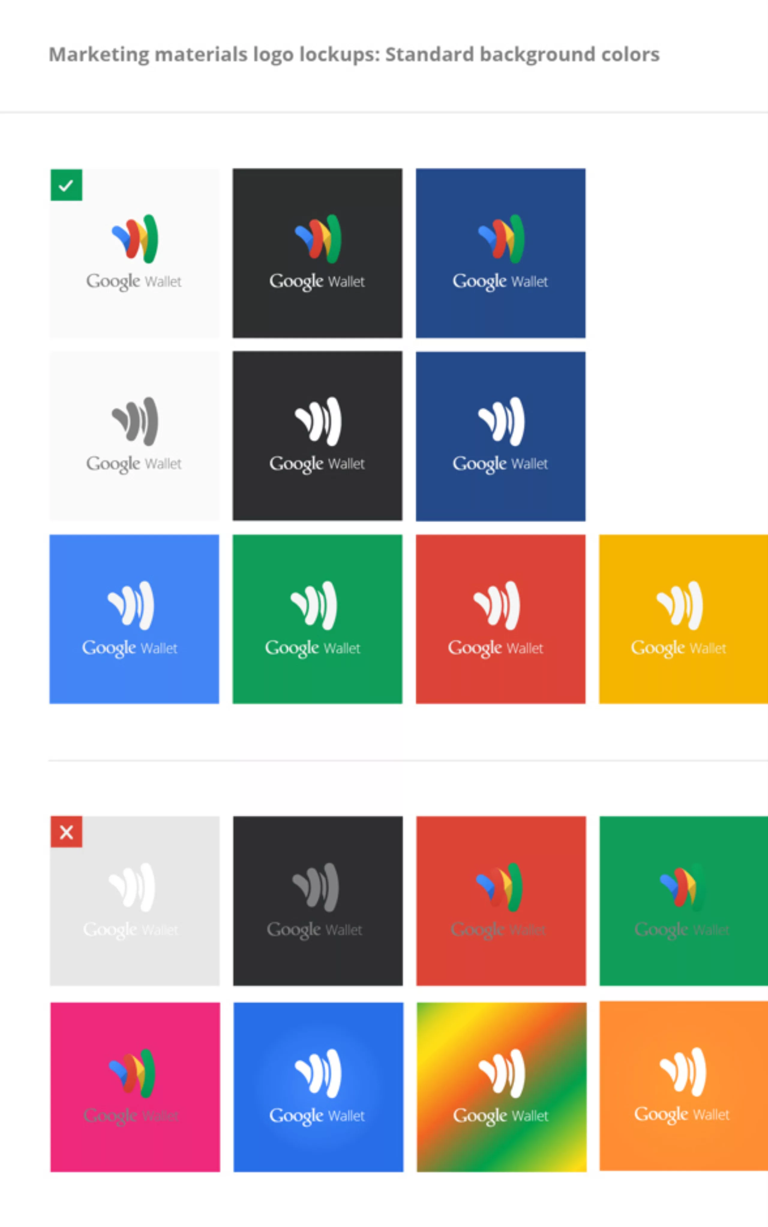
The Google case
In 2011, Google CEO Larry Page launched a project to overhaul the visual identity of the Mountain View company’s products and services. From early 2012, the first creations of Chris Wiggins, the creative director in charge of the redesign, began to appear. Chris Wiggins had begun to prove himself a few years earlier, working on the design of the famous black navigation bar that the company had begun to roll out at the same time as Google+.
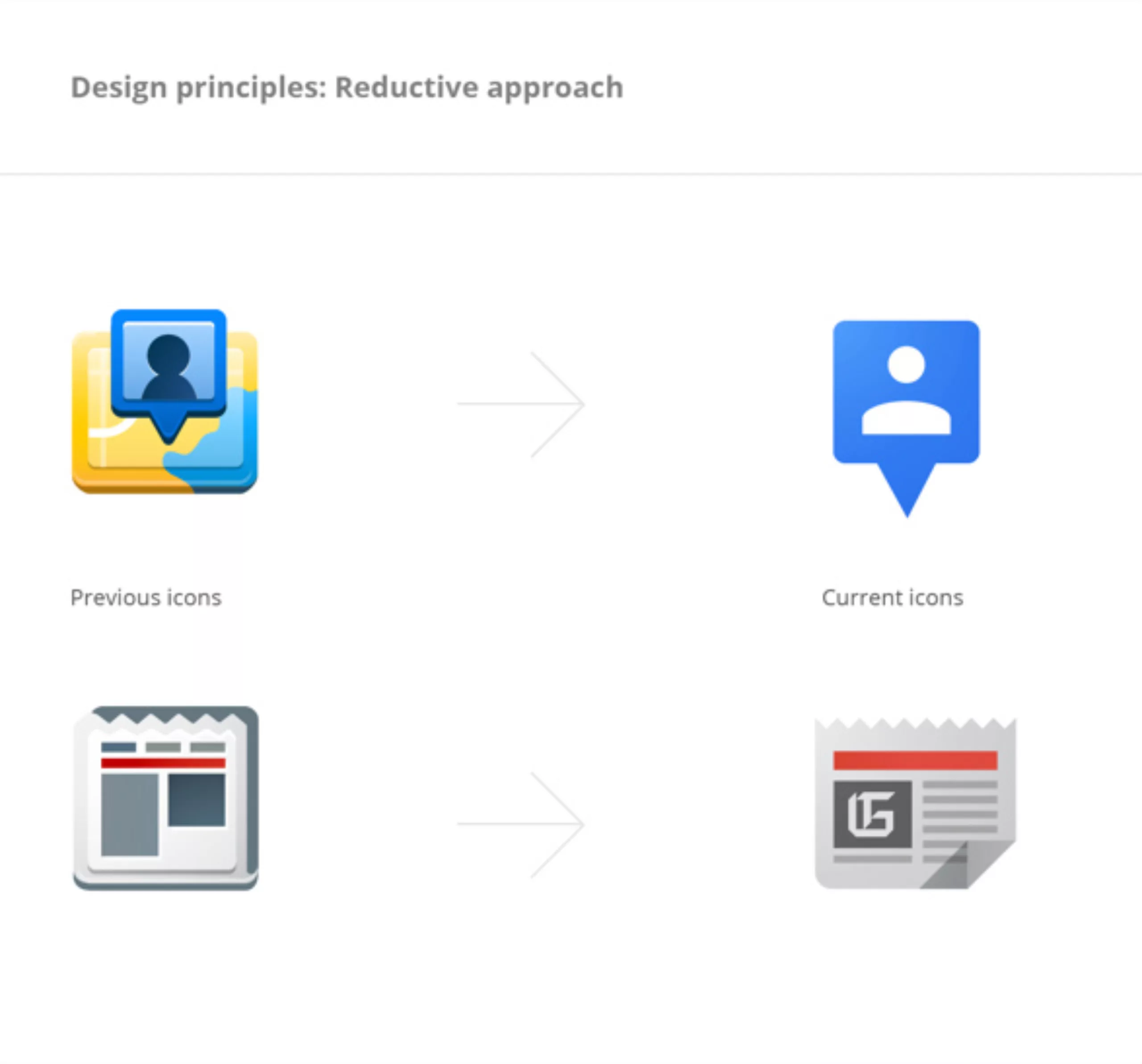
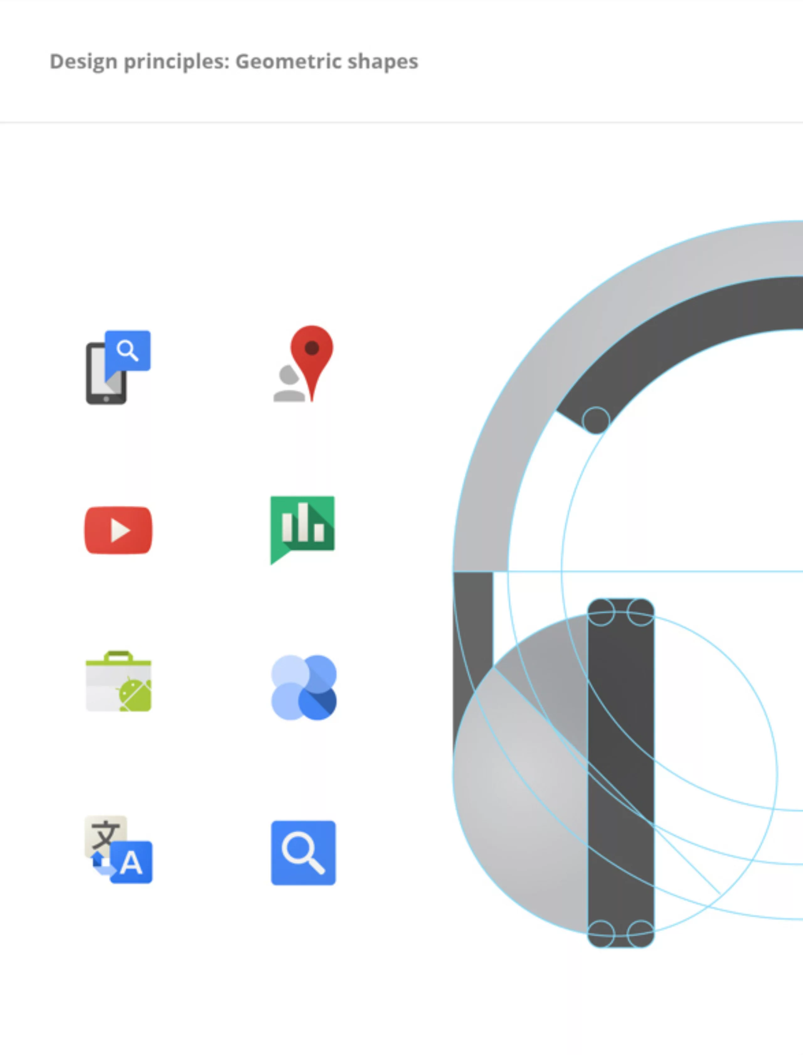
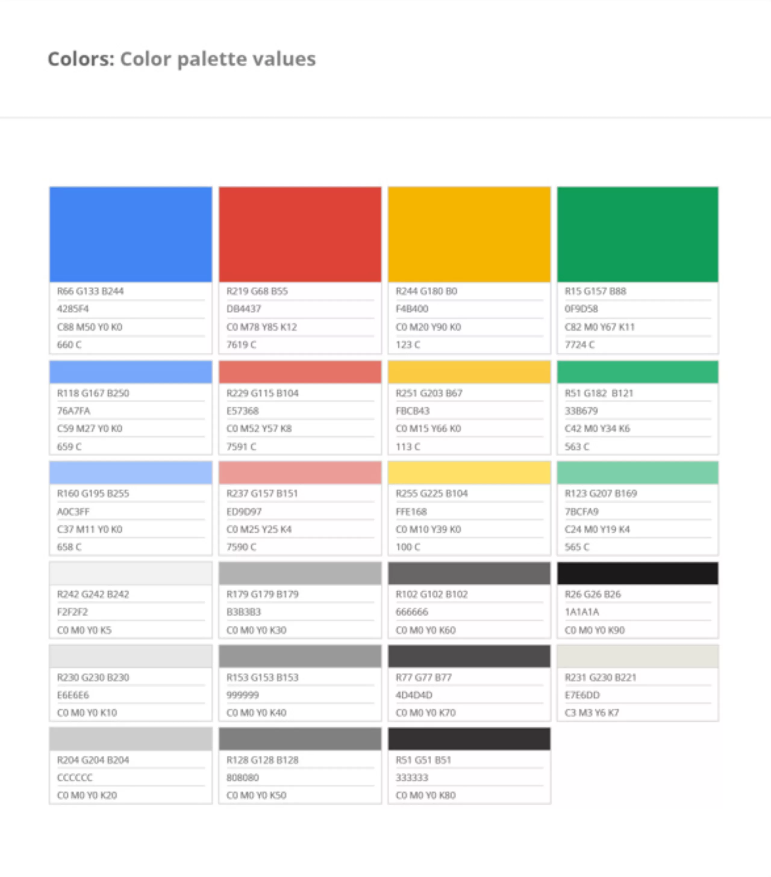
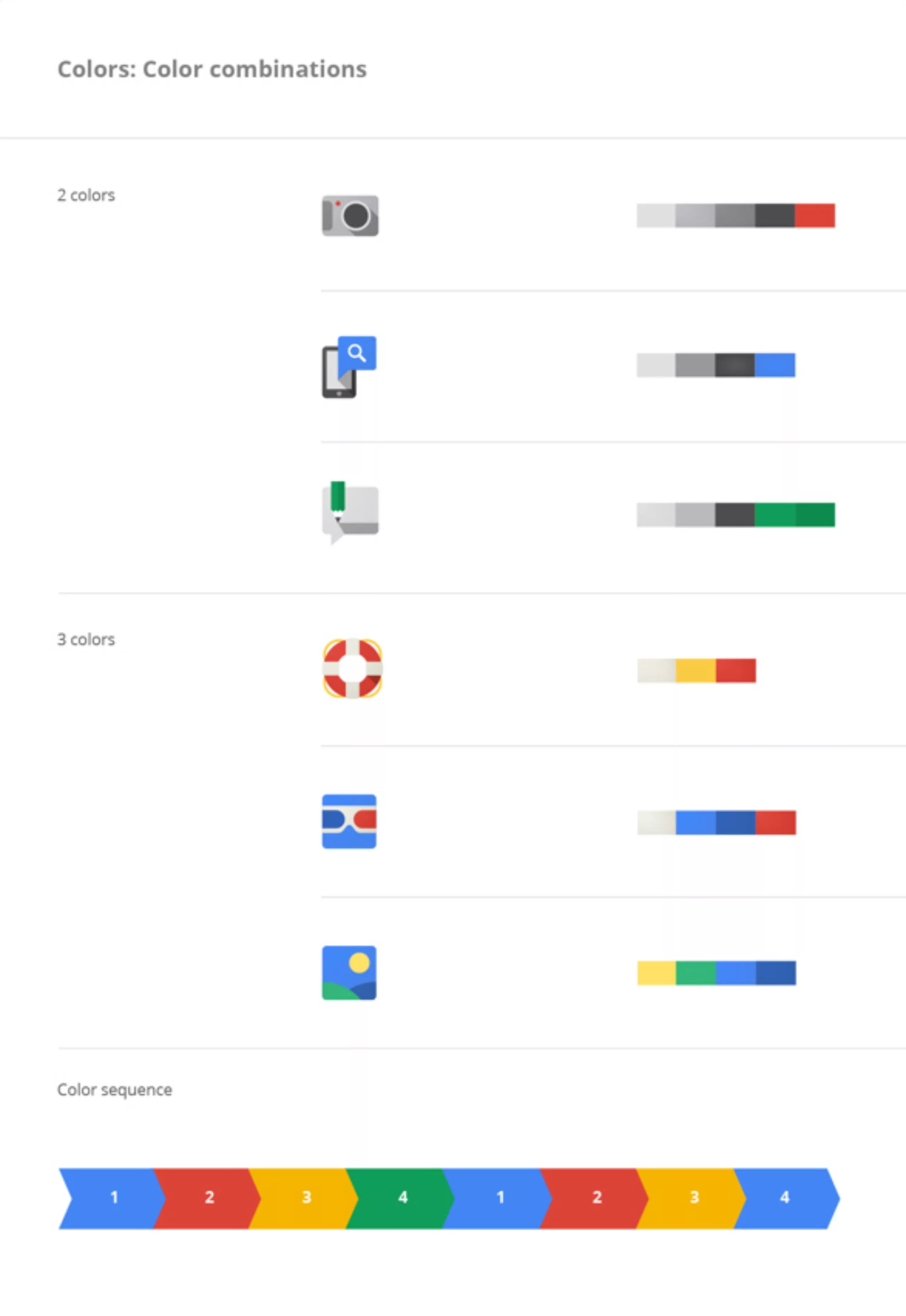
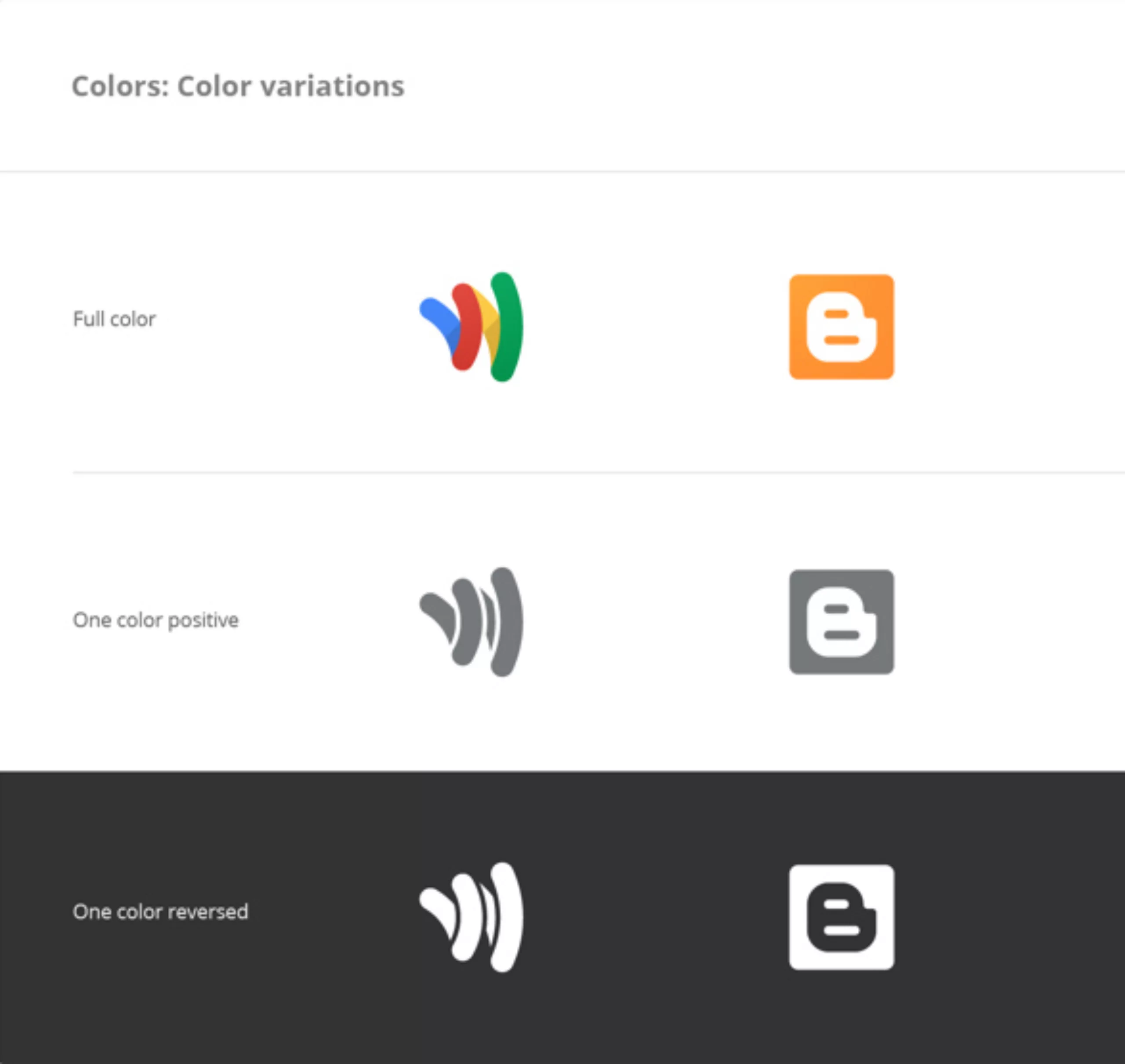
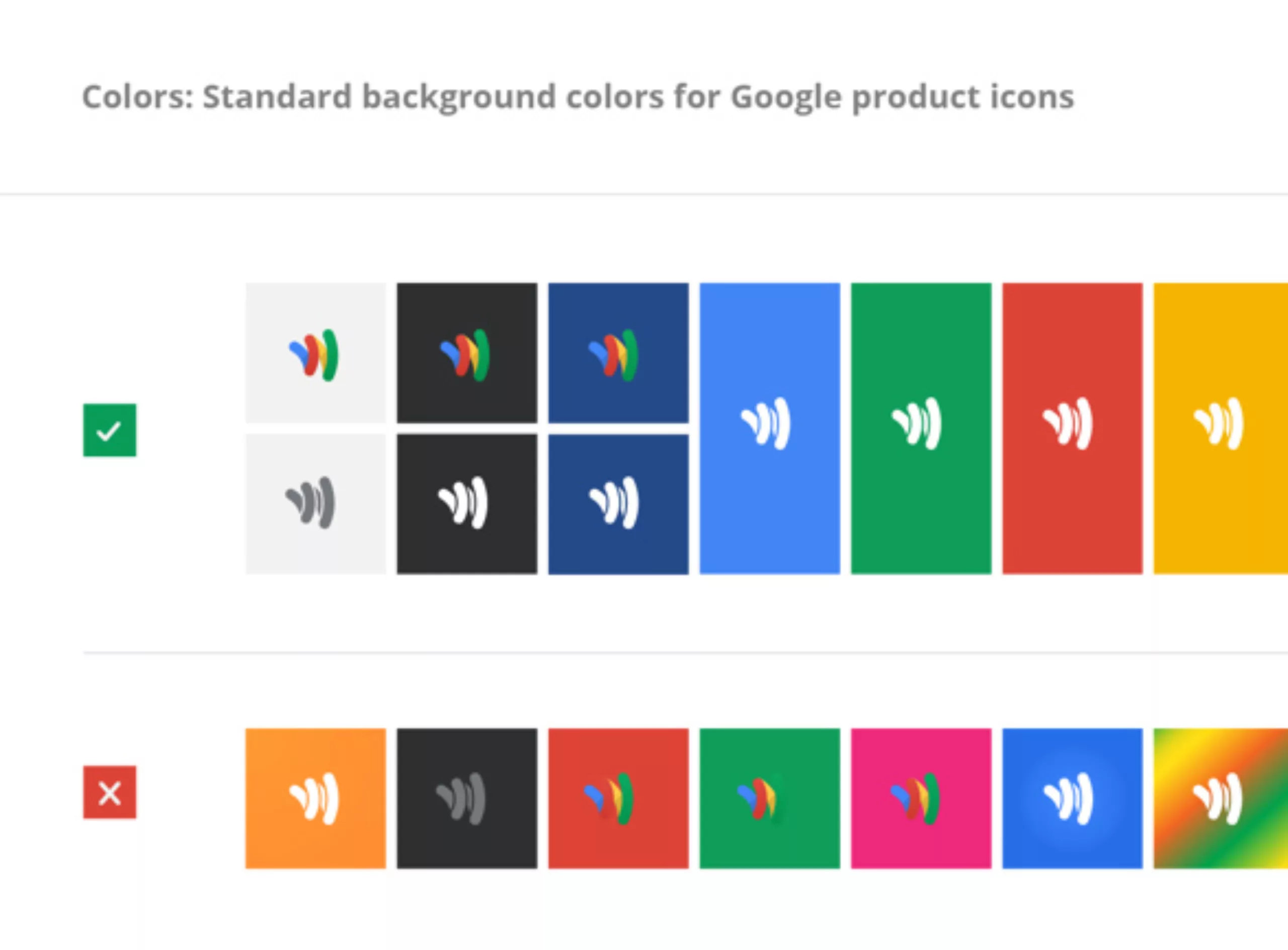
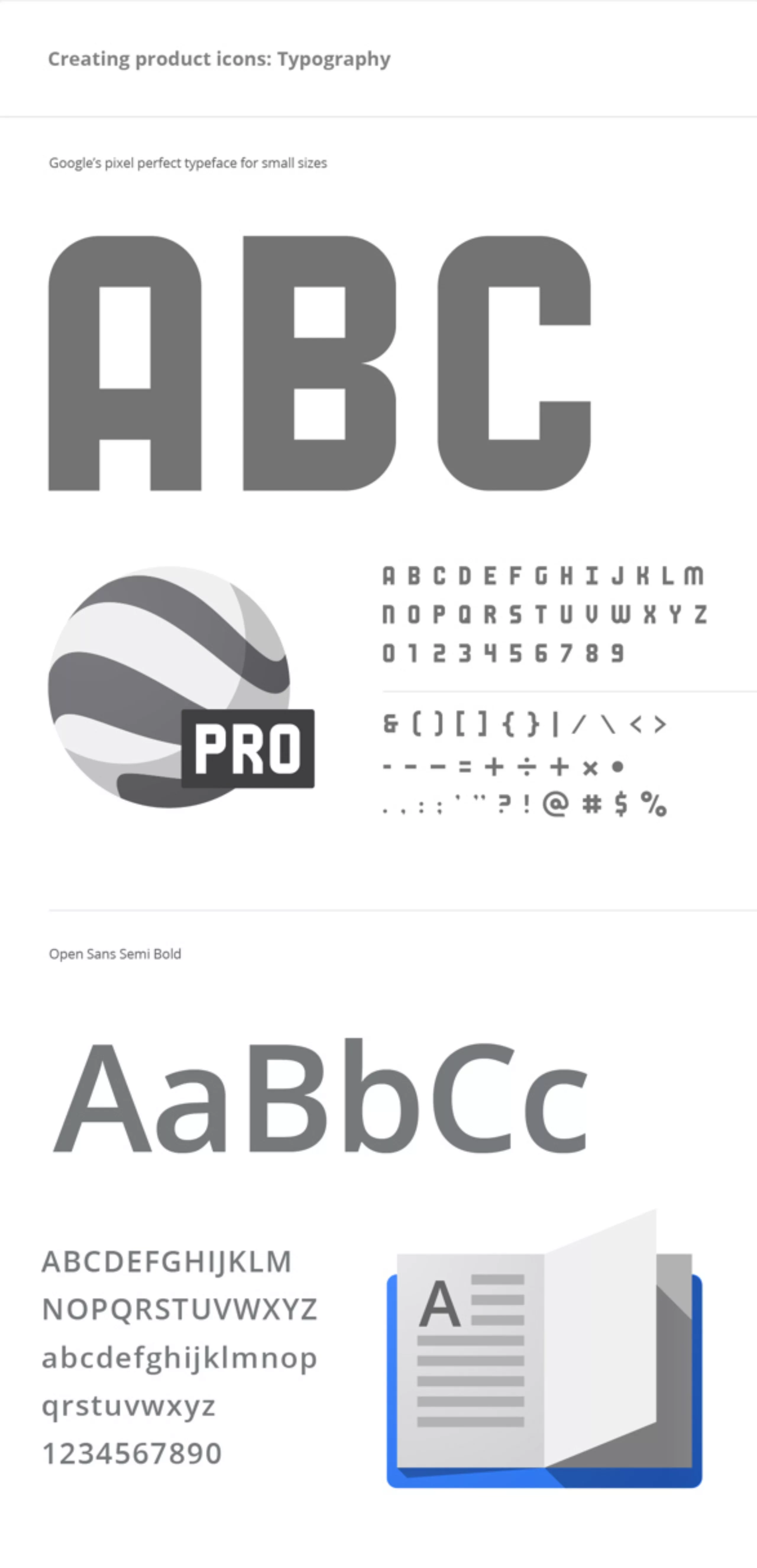
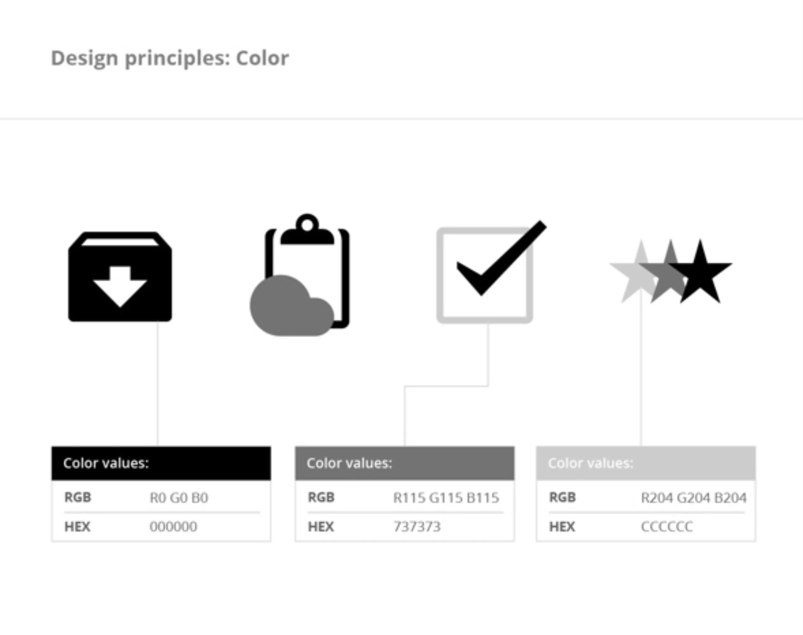
Recently, the graphic charter that brings this work together was published. It’s a real lesson in design, with not a single pixel considered lightly. When you know the history of Google, and how they were able to impose themselves thanks to an all-white (no-design) search page in the face of Yahoo’s chatty page, this minimalist graphic charter will come as no surprise. Here are the details:


The apple case
Apple has a long history with skeumorphism. Working on their first graphical interface in the early ’80s, and introducing the concept of the “desktop” with icons shaped like “folders and sheets of paper”, Steve Jobs and his sidekick had a lasting influence on interface design. In fact, it’s thanks in part to this skeumorphism that Apple has become one of the world leaders 30 years later. It’s worth remembering that in the early days of computing, the concept of the graphical interface was totally new, and these visual metaphors with old objects made life easier for millions of people!
Thirty years on, it’s clear that people need less and less visual reference to understand the function of an icon. Apple seems to realize this, and is initiating a timid transition with its new iOS 7 interface. They are probably right not to give up radically on “skeumorphism” at the risk of creating a rupture with their users… Microsoft (see below) went through!
The Microsoft case
While Microsoft’s interest in design seems fairly recent, we can give them credit for quickly catching up. For a long time, the Redmond firm favored technology over design. Interfaces became complex, and users were forgotten. By 2010, it was time for change. The redesign of Windows Phone was the first step. Today, Microsoft offers a harmonized user experience across its various products, from Windows 8 to the Xbox and the Office suite. Flat design has invaded Microsoft’s interfaces, and despite this apparent simplicity, they have been widely hailed as an exemplary design success.
The only downside, and not the least, is that in creating such a breakthrough, they seem to have made a strategic error. Indeed, almost 8 months after the launch with great fanfare, sales have failed to take off. One of the reasons given is that the new interface has put off many users. As a symptomatic example of this, the “start” button (which is actually used to turn off the power!) had rightfully disappeared from Windows 8. But, under pressure from users, it will be resurrected in the next update!
It’s likely that Microsoft has provided a fine example of failed disruptive innovation. Time will tell!
Breakthrough innovation
A brief digression on the notion of disruptive innovation. It’s a notion that’s contrasted with classic innovation, known as incremental innovation. Roughly speaking, when incremental innovation is deployed in a known context by improving an existing product or service (e.g. the invention of ABS in the automotive sector), disruptive innovation likes to venture into uncharted territory.
Apple’s adventure in telephony is a good illustration of the concept of disruptive innovation. Steve Jobs had developed the iPad, a project that would enable him to launch a new type of screen. But the first prototypes were disappointing. He entrusted his problem to an ergonomist, who suggested the scrolling function, enabling users to scroll vertically down a web page with their finger. Internet browsing on a small screen became possible. So much so that, instead of launching the iPad, Apple launched the iPhone, with the success we’ve come to know. The rupture created a new market for Apple. Where the “iPhone” object is a rupture, its interface is much less so visually. Skeumorphism fulfills its role as a visual comforter: it reassures the user!
A break with the past requires a reversal of habits, which can only be accepted if specific conditions are met.
We generally speak of three pillars of innovation: creativity (generating novelty), value (esteem, use, exchange) and socialization (mastering change management).
In the “Windows 8” example, change management seems to have been forgotten.
Flat design : reasons for success ?
Apart from the fact that screen users have become mature enough to no longer need a visual “doudou”, the current success of Flat design can probably be explained by a more technical aspect.
The multiplication of screen formats has given rise to Responsive Design. You know, when the same site automatically adapts to all screen formats. This means that visual elements must be flexible. Gone are the days of gradients and background textures!
The arrival of web-fonts has also changed the game. Until the early 2010s, we were limited to system fonts. Any other typographic choice required images. Today, images are out, and web-fonts are in!
Flat design is part of this trend.
The 3 influences of Flat design !
Here are three influences on flat design:
A modernist design
Although the term “flat design” has become increasingly popular in recent years, the origins of this concept can be traced back to the Bauhaus school of the 1930s. “Don’t add superfluous details, concentrate on the essence of the function” was the first of the modernist commandments.
Thank you HTML5, without which Le Corbusier ‘s influence would not be felt today !
An international design
International style (or “Swiss style”) is the second influence of Flat design. Particularly when it comes to typography, this style emphasizes legibility and objectivity. Space is divided into grids, color is used in solids, typography is geometrically influenced… Priority is given to content and information hierarchy. It’s a style that expresses itself wonderfully in airport signage around the world (information-dense environments). So, logically, it’s an approach that works very well with digital interfaces, which are information-dense by nature.
Thank you CSS3, without which Muller Brockmann ‘s influence would not be felt today !
The design of movement
In the 60s and 70s, motion designers like Saul Bass added a third dimension to the previous two design concepts (see Modernism and International Style). Don’t be fooled into thinking that this was just a vulgar volume effect!
By working with time and movement, Saul Bass animates the principles of modernist and international design. By animate, we mean “give life”! From a design that can be considered cold and neutral, animation introduces narration… and therefore emotion.
This third influence is the one that seems to be least used. It will undoubtedly be an important area of development for our future graphic interfaces.
Thanks to Jquery, without which Saul Bass‘ influence would not be felt today!
Flat design : fad ?
While the “Less is more” approach will obviously appeal to most of our design contemporaries, it does seem clear that it’s now partly a fad. In 2008, at the height of the “Web 2.0” effect, we wrote an article entitled “Laisse c’est mort” (“Leash is dead”), which dealt with fashion cycles in design. Here’s a quote that makes perfect sense:
“In graphic design, as in architecture, we’ve been oscillating for centuries between two paths… purism or overload (cf: Flat design or Skeumorphism!). While these paths may seem unpredictable, there’s one constant: the path of overload is long and progressive, while the “minimalist” path is much faster and more brutal!
Everything suggests that, as time goes by, things become “loaded” with memories, accumulating layers of make-up until they become pompous, just before abruptly reverting to minimalism.
Didn’t we go from primitive Gothic, to classical Gothic, then flamboyant Gothic, before abruptly moving on to Renaissance style, taking up the stripped-down canons of antiquity? … then the story continues, with the Renaissance style gradually turning to Baroque… and even worse, Rococo… before suddenly moving on to the Classical style (which, compared to Rococo, looks as naked as a worm!)… neoclassical architecture […] Victorian, Art Nouveau… then another break with the Modern movement in the 20s and 30s! …
In short, in typography the story must be much the same… Greek capitals, then Roman uncials, Carolinian minuscules, then illuminated Gothic… a sudden break with Italian humanists… Garamond… Baskerville… Didot… Walbaum… and a new break with P. Renner’s Futura around 1927…”
This may be a simplistic line of reasoning… but it has to be said that in the space of two years, all the major players converted to minimalism. A quick break is brutal (for Micorsoft!).
If we follow this analysis, we can be sure that, over the next decade, we’ll see the “drop shadows” tiptoeing back into the limelight!
What about you? How do you see the future?