Ox_case_study

2017

OX avocats
Law firm, leaders in intellectual property rights.

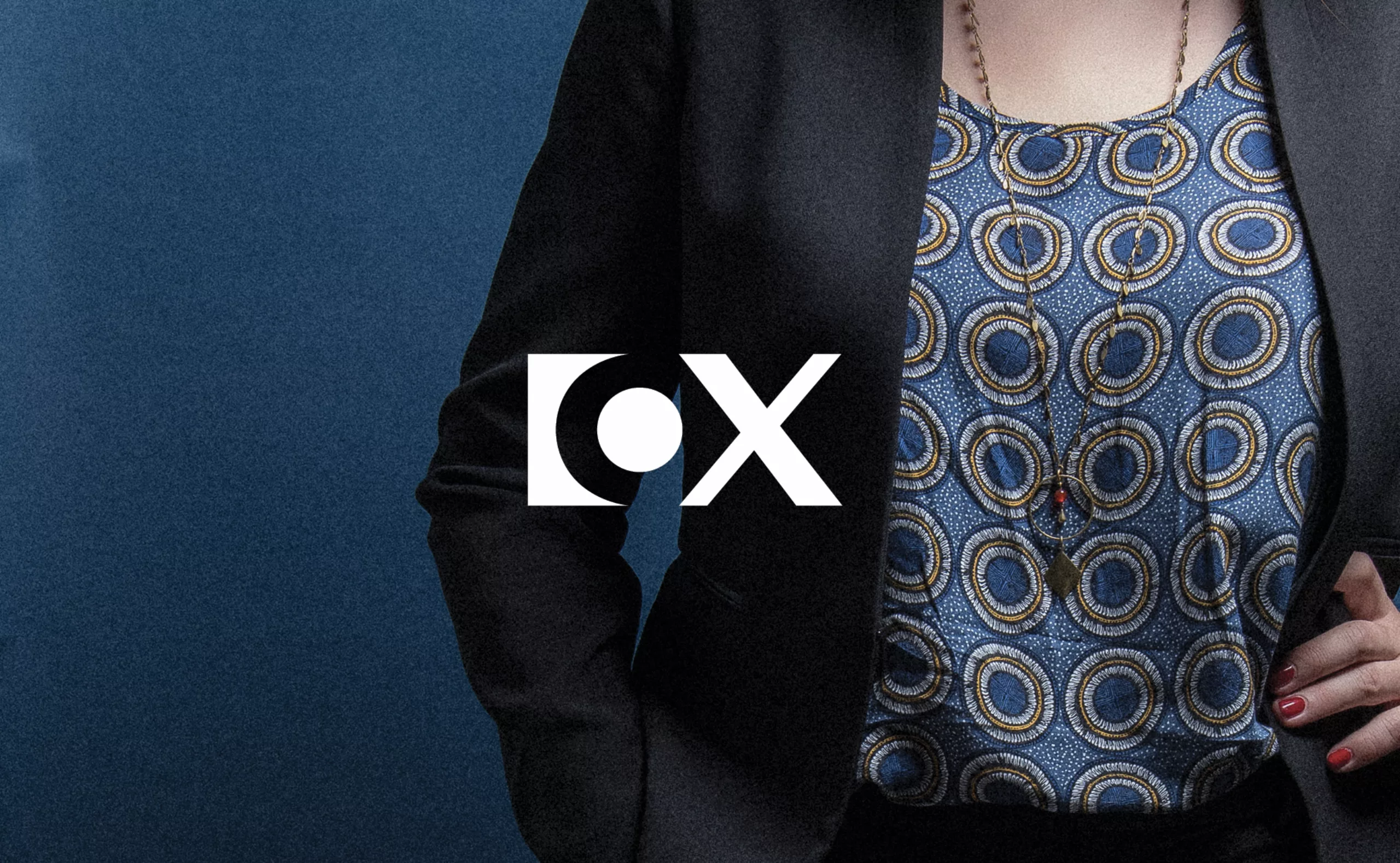
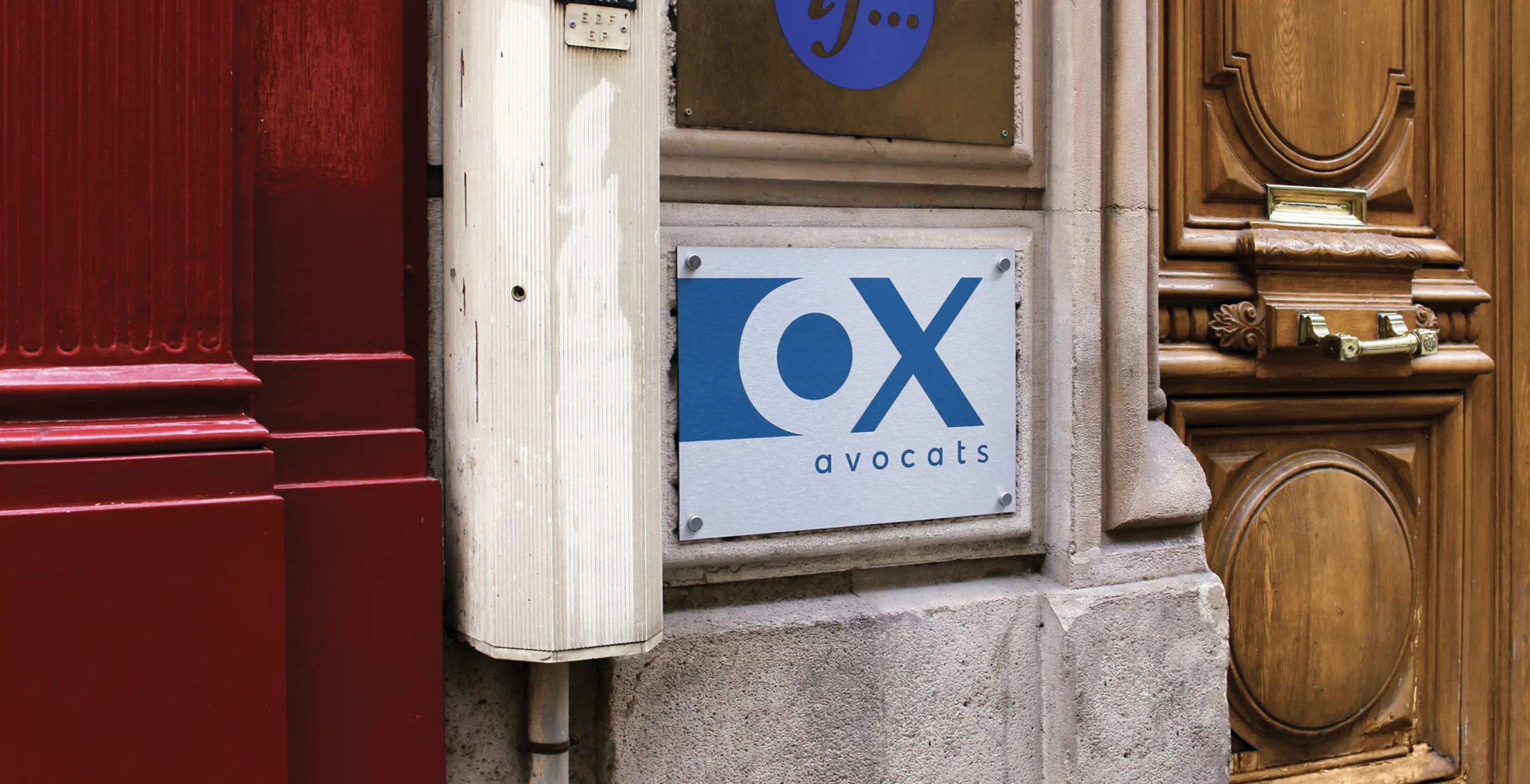
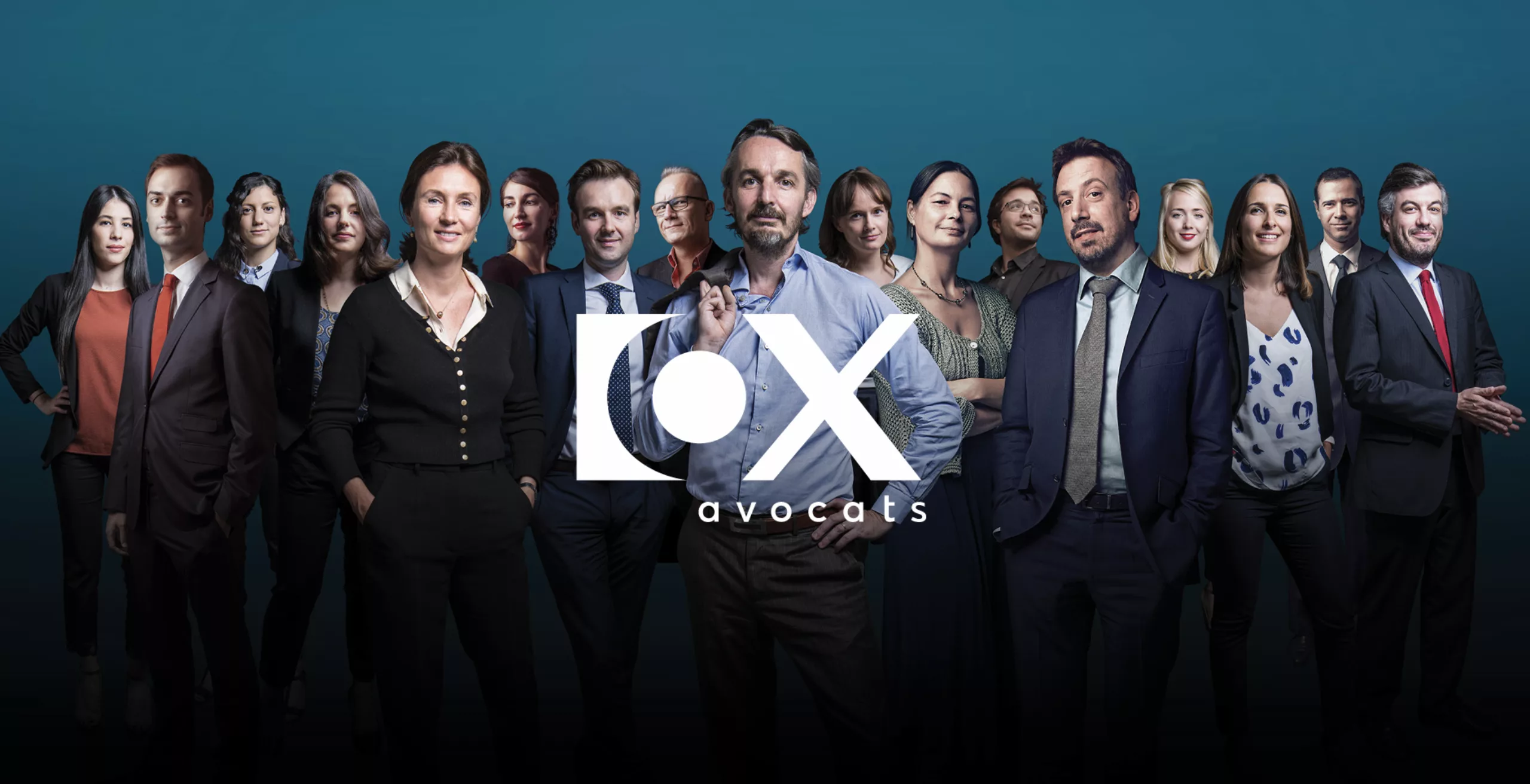
Ox avocats is one of the leading French consulting firms in the creative and media sectors. In 2017, Graphéine accompanied "Ox" in the goal to evolve its brand identity. Supported by a strong and original naming, a striking icon very uncommon for the legal field, our ambition has been to strengthen Ox's brand territory to give it an even more modern and effective symbol, while respecting it's initial concept.
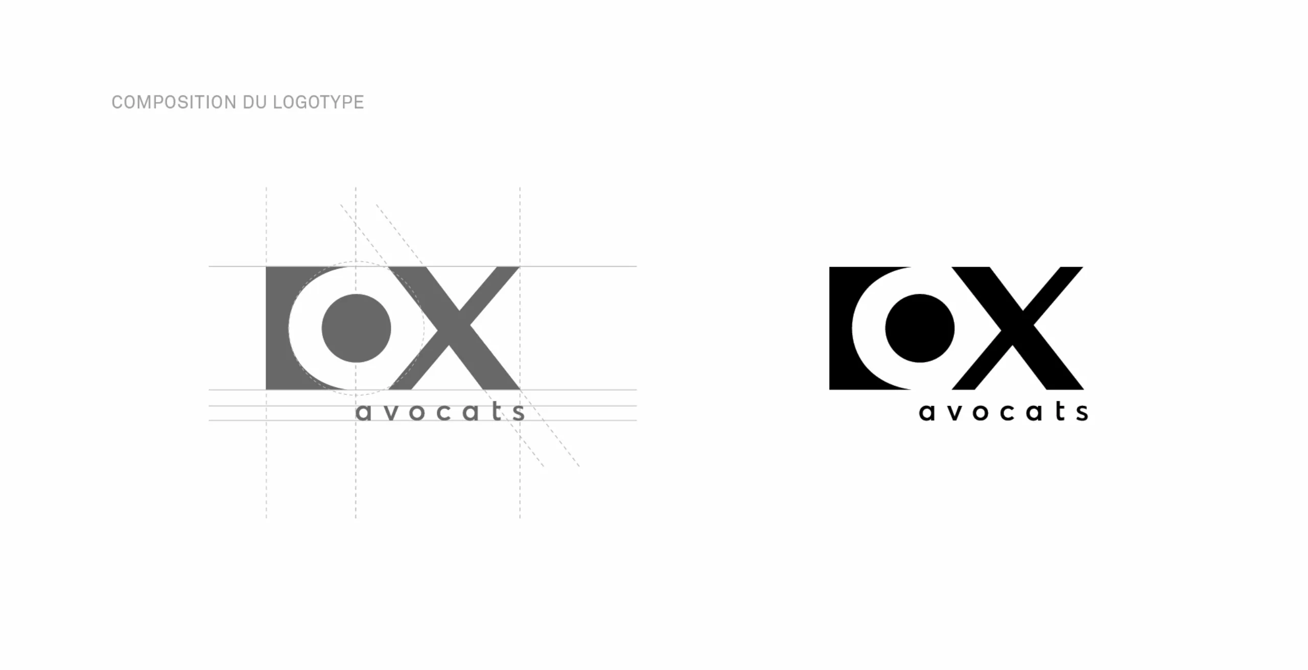
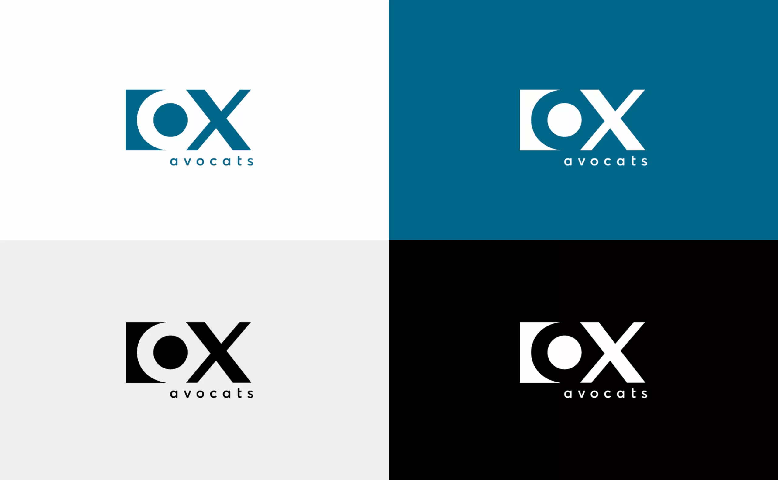
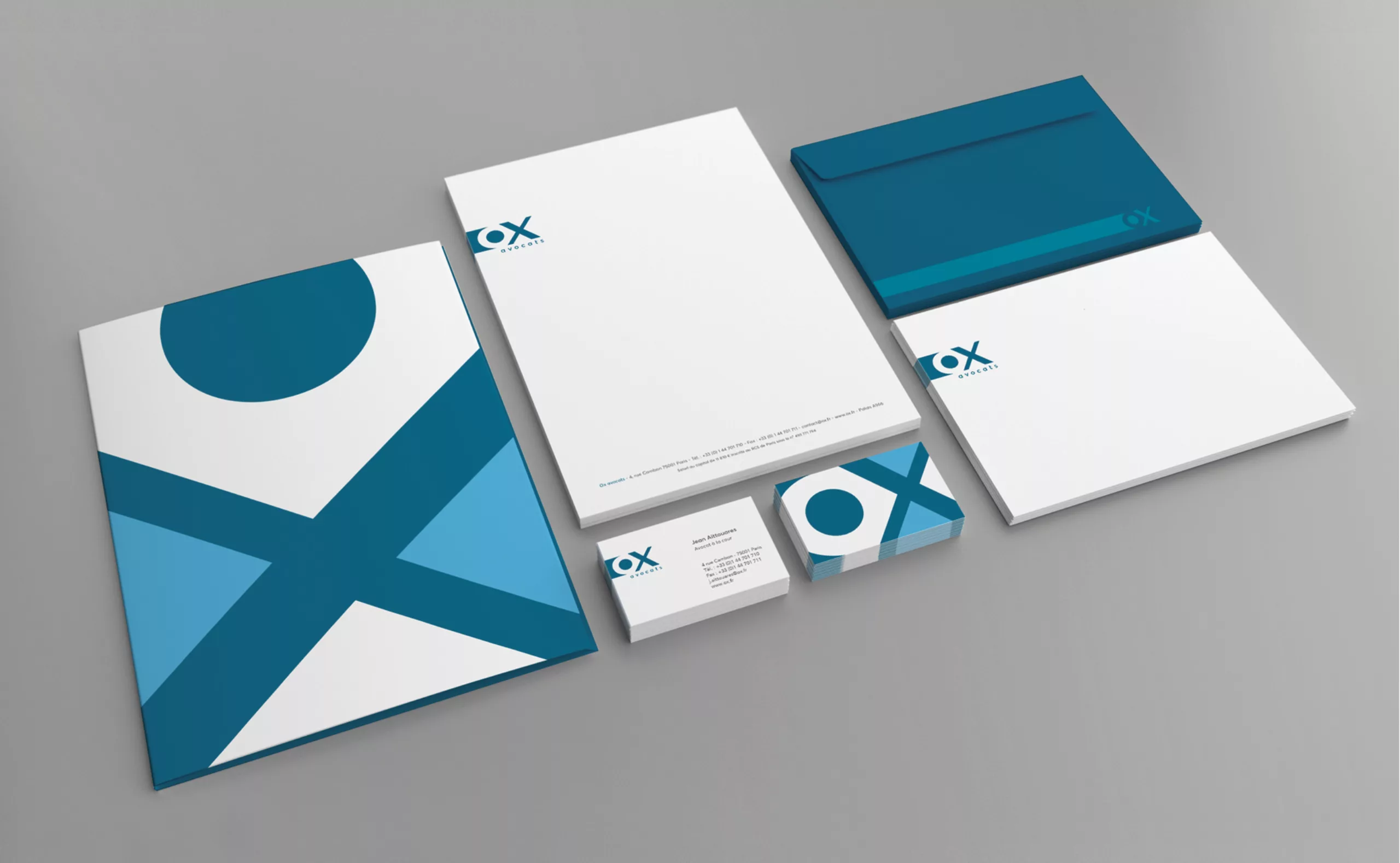
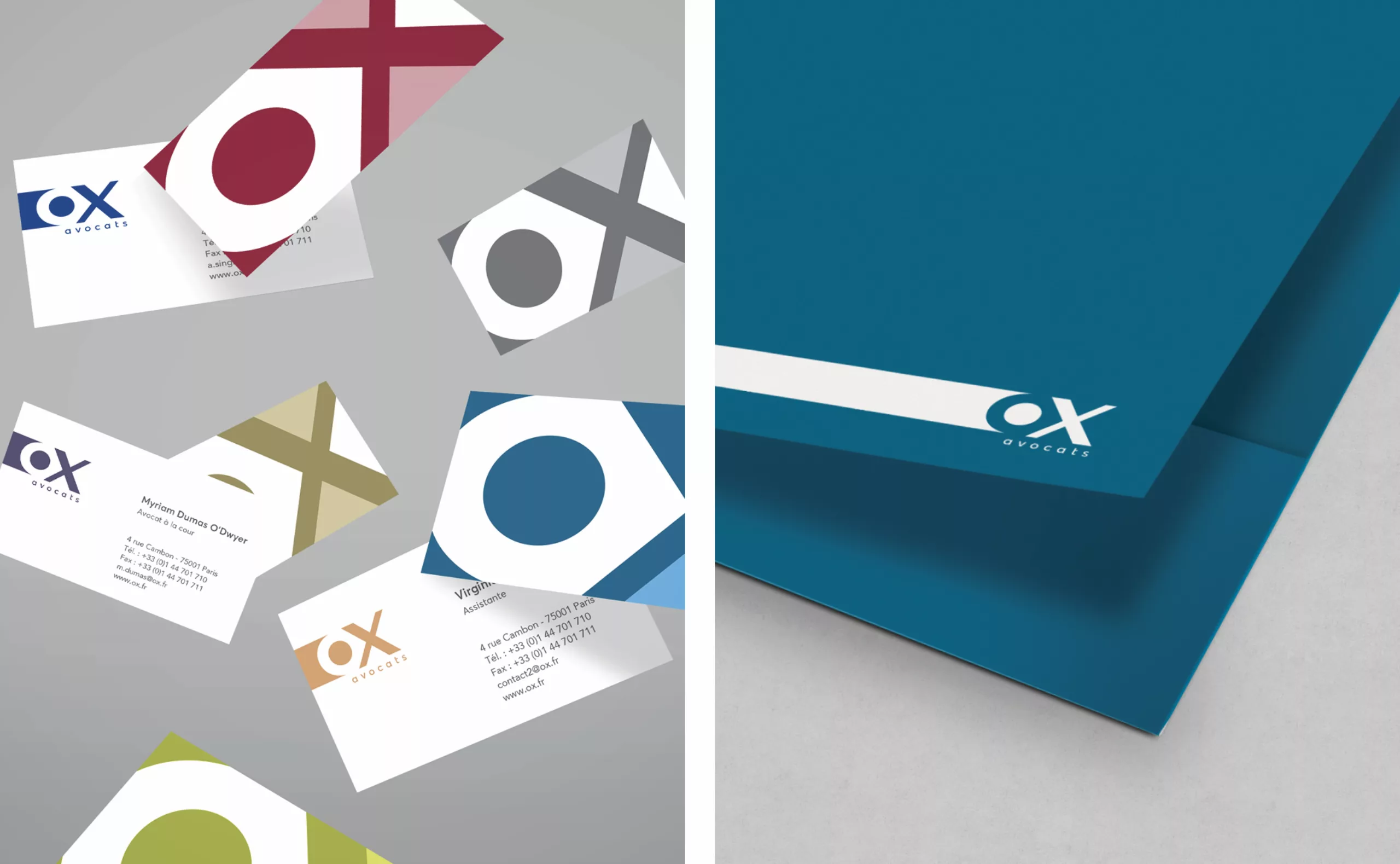
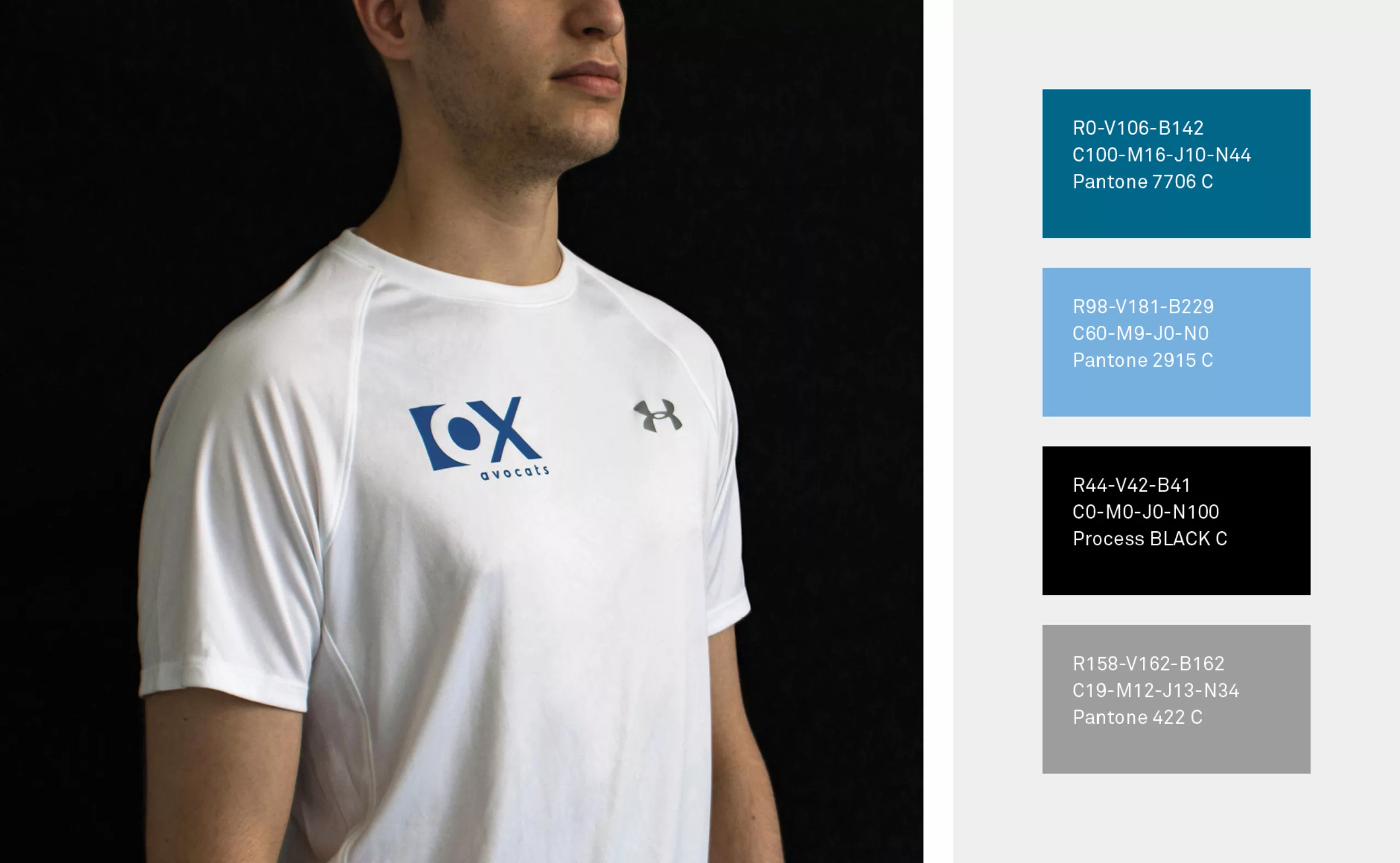
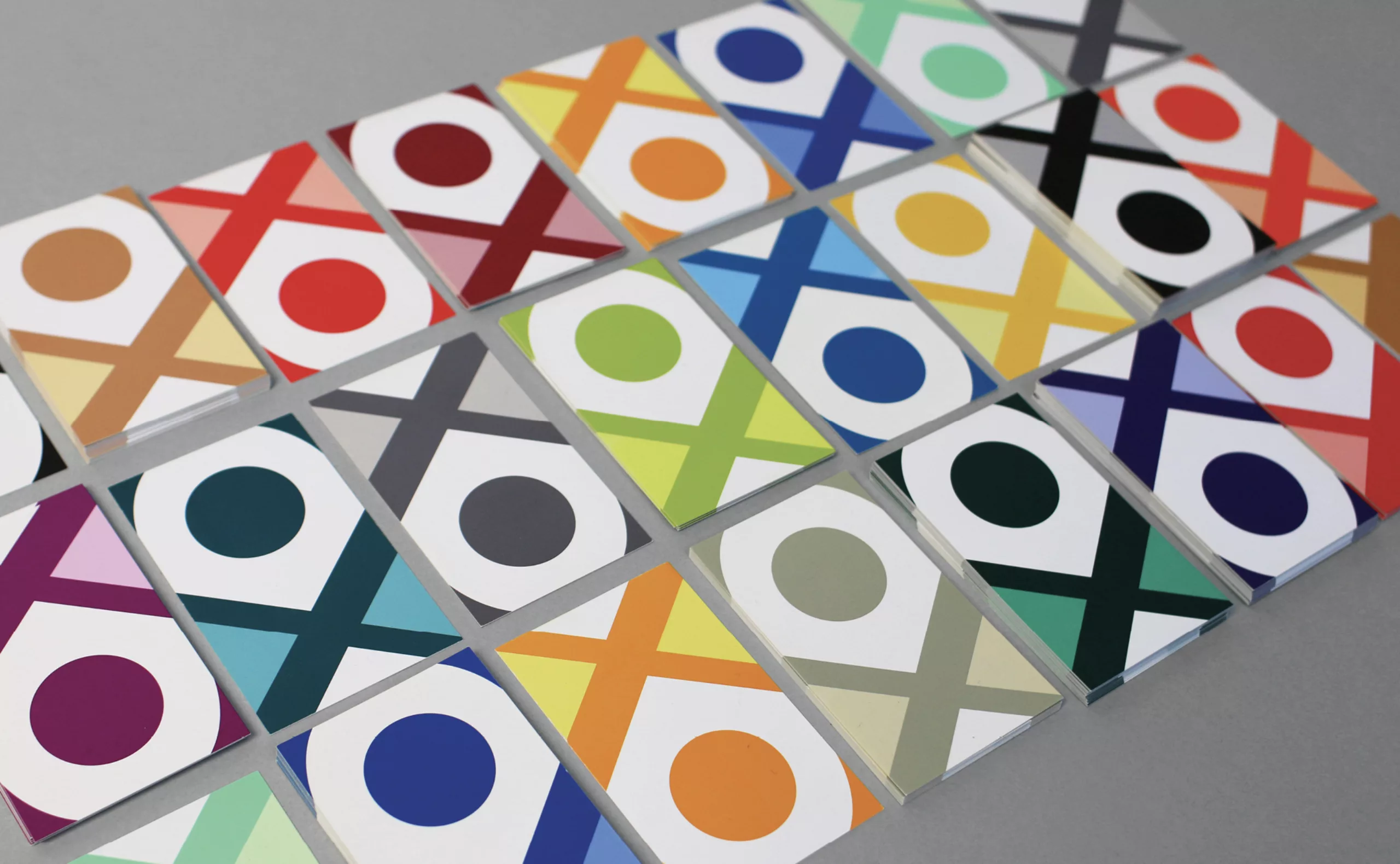
We reinforced the geometric design of the icon to facilitate the integration of the logotype in digital media. The color has been darkened to give it a more elegant and serious "voice" for corporate communications. And the other side, the color palette gets more playful with bright and vivid colors as each member of the team is associated with a tone on the business cards.
Project targets :

Evolve the brand's graphic codes to foster its adaptation to digital media. Modernize the logo without losing its original concept. Set up visual codes that make it possible to apply the brand to a wide variety of communication media, while maintaining a high level of overall consistency.

List of communication materials produced:

• Graphic guidelines
• Business cards
• Correspondence cards
• A4 flap folder
• Letterhead
• Email signature


Share this project:
Project expertise:
Logo creation, visual identity and graphic guidelines.
Type of client:
Communication agency in the consulting and services sector. Strategy or management consulting, operational consulting, digital services companies (ESN) formerly SSII or SS2I, but also all services to companies, or "B to B services" (for business to business).

Related projects: