adopte un mec: a new logo for the dating app
adopte un mec (“adopt a guy”), the dating site that “empowers women”, has recently released a new advertising campaign and, it seems, a new name-logo. “adopte un mec” becomes more simply “adopte”, and the famous logo with the pictogram of a woman putting a man in her shopping cart disappears. Is this a strategy to be more inclusive, or just a blindfold? Until now, adopte un mec has always surfed on sexist clichés…
Just a name…
The first thing that jumps out is the shortening of the name, which is more inclusive and to the point. Adopt a guy, adopt a girl, adopt whoever you want. We will come back later in the article on this aspect. At this point, let’s look at the verbal and visual branding.
This shortening of the name is typically an apocope, a figure of speech that consists of removing the end of a word, as in “auto” instead of “automobile”. The apocope allows to get closer to the common language. This results in a familiar feel, as with a diminutive (e.g., “Tom” instead of “Thomas”). In short, it sends the signal that it has entered our daily lives.
The logo, composed only of a linear typography (futura-black type), refers to the trend of blanding, a term that hijacks the word branding to evoke the idea of maximum purification of the visual codes of the brand. The message behind this phenomenon is to assert that the brand will seduce by the mere power of the product it sells and that it is sufficiently well known to no longer need to distinguish itself from the competition.
No more need to illustrate, no more need for pictograms or other words, only “adopte” would be enough to qualify the brand, as a will to affirm their notoriety and to say “look, we are also in the big league”. Whether this is legitimate or calculated remains to be seen: by suggesting that we are recognized, we become recognized.
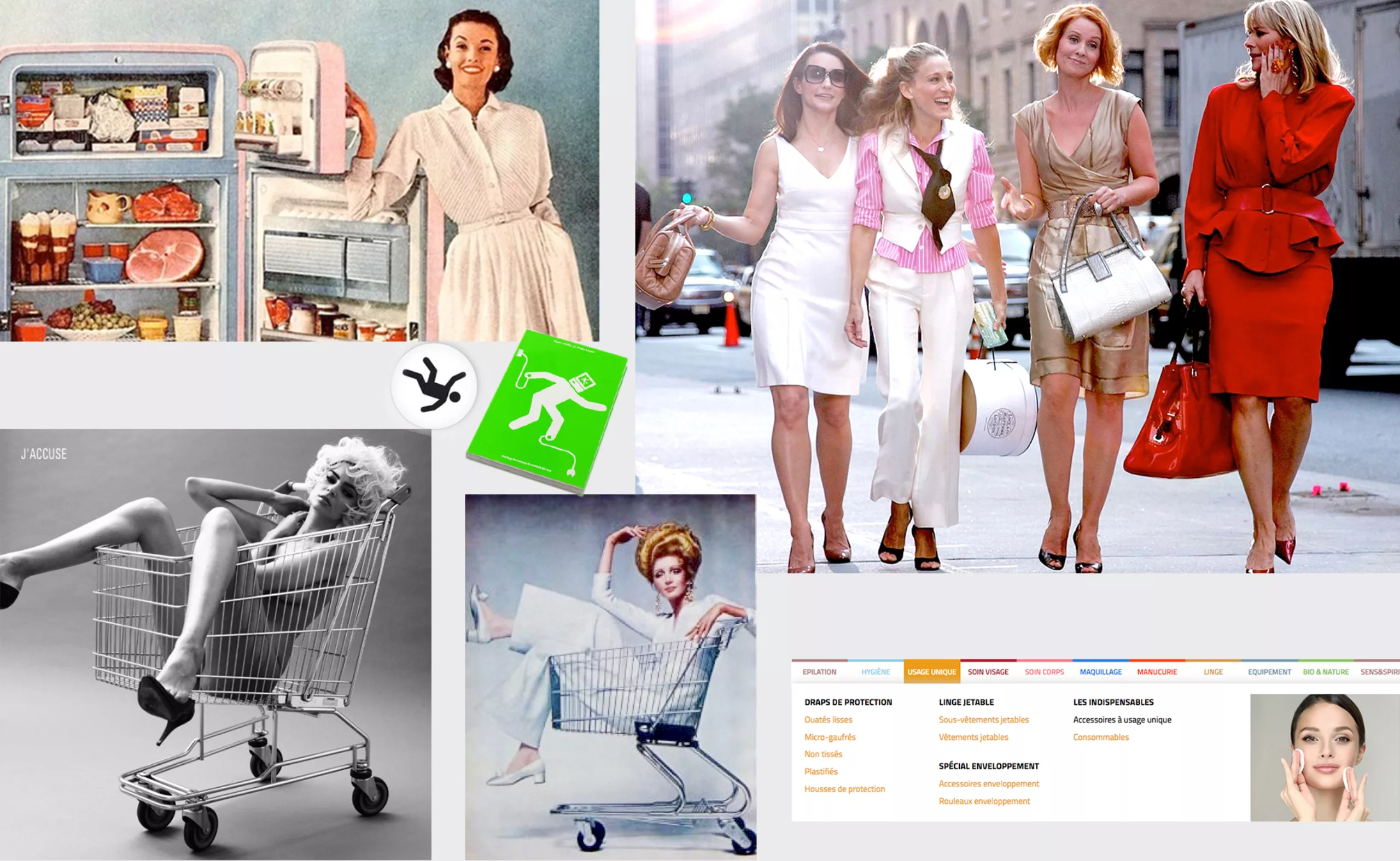
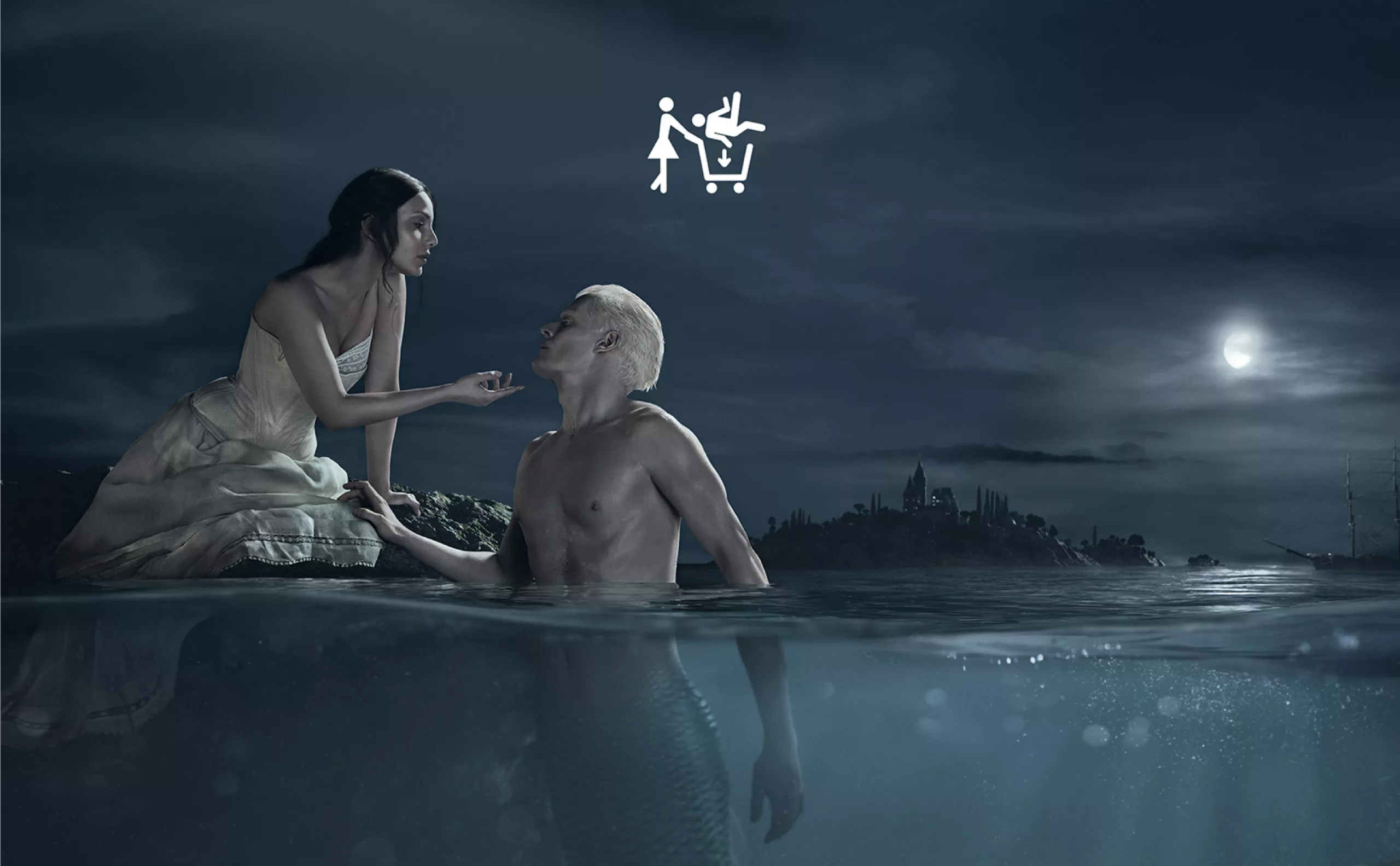
When it was launched, the website adopteunmec.com, imagined by two men in 2007, reversed the trend of dating sites where men were more numerous than women, by proposing a paid version for men and a free version for women, in order to re-establish parity and a more “secure” space for women. The principle limits the access to “opportunists”, skimming at the same time the “low-end products”, that is to say, those who can’t afford it. Everything is based on this system where women consume men in a giant digital supermarket. The choice is between redheads, bearded men, ninjas, shy or romantic, labelled and proposed in a catalog as “regional products” or “new collection”.
Women like shopping
The adopte un mec picto-logo speaks for itself: the woman consumes male and, as the shopping cart indicates, we are talking about mass consumption. The logo adopte un mec symbolizes the female madness of shopping (cliché), choice, instant pleasure, the financially independent woman who can spend without thinking and make her own choices (or rather get lost in the illusion of materialism, but we’ll come back to that later). We’re right in the middle of Sex and the City where Carrie and her friends roam the city in search of new outfits and conquests!
On the moodboard of the creative of adopte un mec in 2012, we could have found this:
Thomas Pawlowski, marketing director, says in 2012 that adopte un mec is a feminist site (in an interview streetpress):
Thomas Pawlowski“Not in the sense of ‘we have hair under our arms and we burn our bras’. No, it’s the woman who works, who is a careerist, who parties with her girlfriends and who can fuck a guy one night if she wants to, without being judged. The modern woman. Feminism is above all about equality between men and women. Here, guys pay to approach girls like princesses: it’s a bit of a “gentlemen” cliché…“
So: the equality on which adopte un mec’s communication is based is an equality between men and women, BUT without hair or violent behavior on the part of women (it’s not very cute and it doesn’t make you want to), with preferential treatment, because they don’t pay (although they earn their living), who are considered as princesses to be seduced with a seducer’s behavior (where the man, therefore, always has the power). Good! I think we don’t all have the same conception of the word feminist…
The idea could be good if it didn’t lack a sense of humour (although the site claims that it should be taken that way). Unfortunately, if the site is successful and at first sight wants to be committed to women, all its strategy, on the contrary, is well and truly based on sexist and binary clichés (woman vs. man) where the woman is an archetype: spendthrift, consumerist, and shopping fanatic. Men, on the other hand, are only consumer goods, men-objects. They all present themselves in their best light, with marketing strategies and photos to better sell themselves at the top of the shelves. Well, we already knew that.
Women like to play with dolls
The brand’s positioning has evolved over time, always surfing on clichés though. During the launch campaign, adopte un mec presents giant boxes of Ken, with real men inside, “man-objects to cuddle” (the slogan at the time). In 2012 and 2013, we see ads to “adopt a redhead and see life in orange”, a frozen food section where “the oldest go first” and finally muscular men with animals, mentioning the possibility of adopting an “animâle”.
If it can be funny to divert clichés, and that this kind of communication has the merit to go out of the codes and to surprise, these are all the more doubtful that they stigmatize physical characteristics and sustains the myth of the virility (which, we know, contributes to lock the man in a straitjacket of social representation)
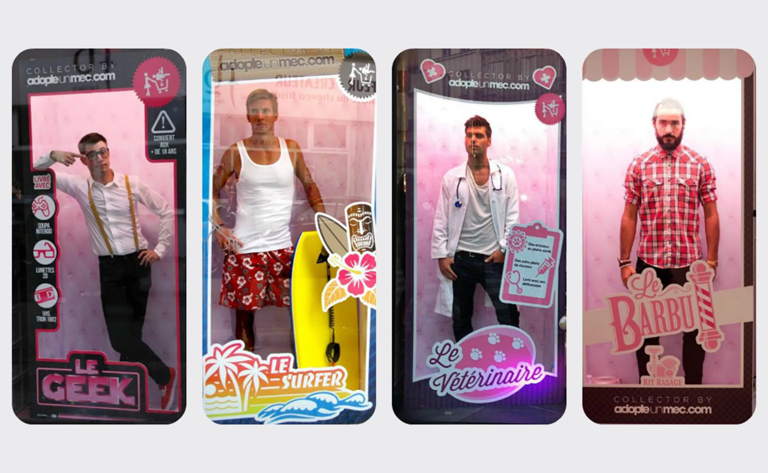
We understand then that the aim of the site is not to emancipate the female gender, but rather to maintain her (unconsciously) in her position, by pretending to reverse the roles. When she is invited to play dolls with a man to realize her fantasies, she is infantilized: the little girl continues her games as an adult and there is no equal relationship, just a dominant-dominated inversion.
Women are greedy
As for the 2016 campaign, it showed a woman (a fine hand with a perfect manicure) in a candy store choosing a sweet treat, between Lilliputian man and candy.
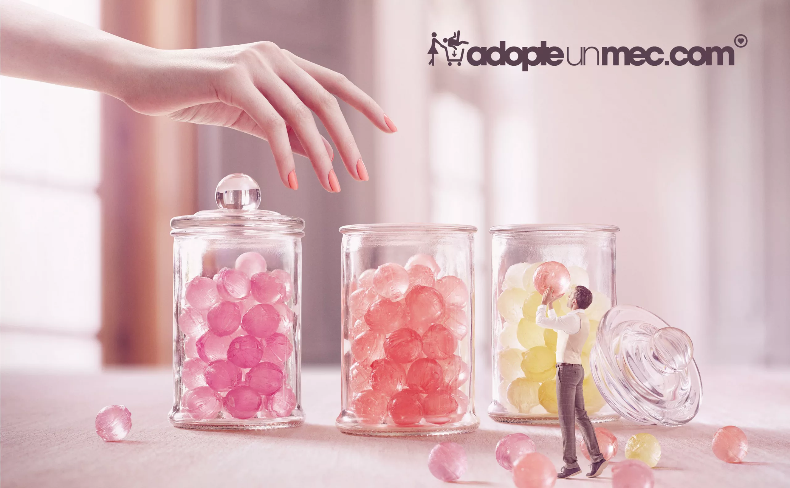
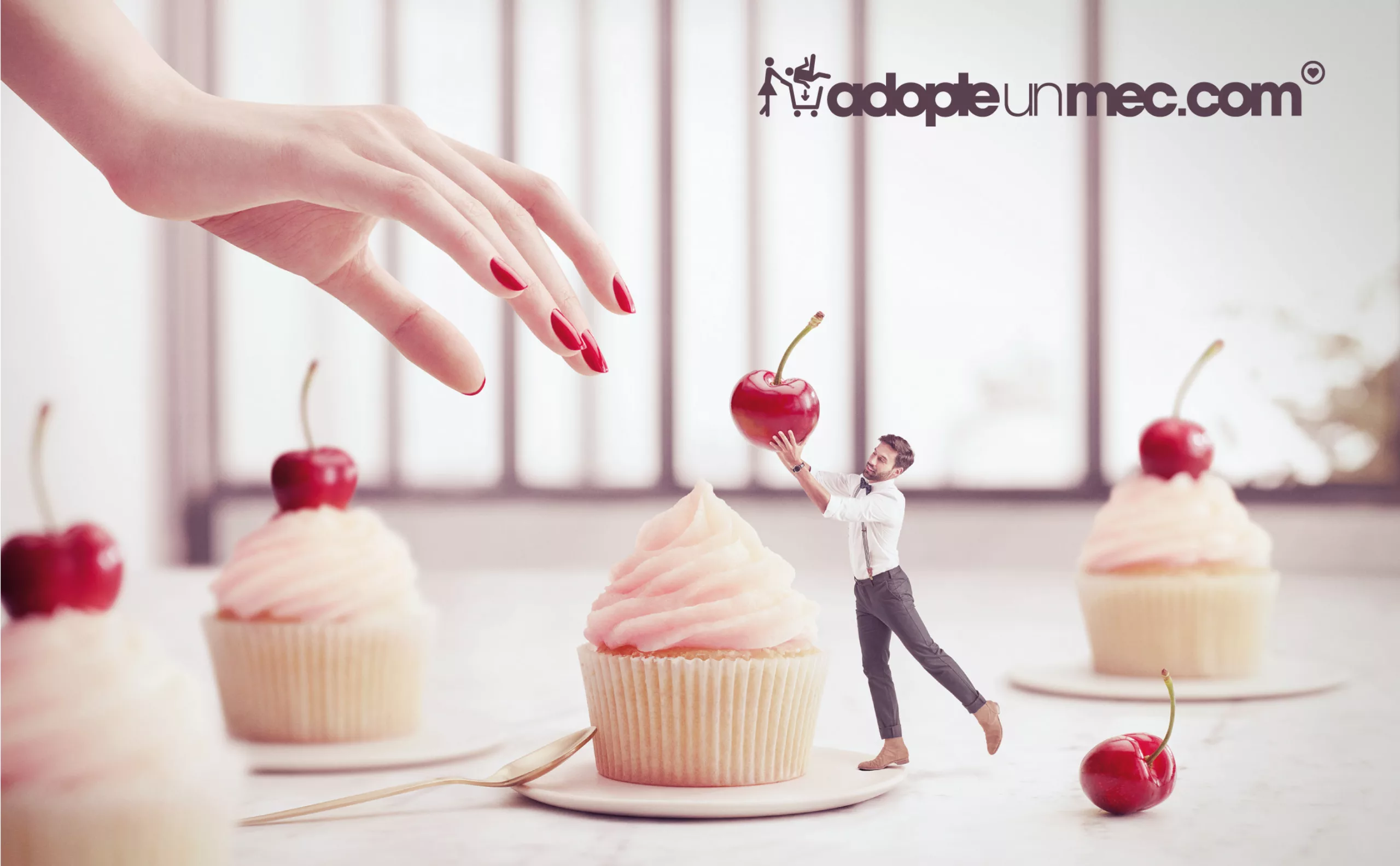
We continue on the clichés: the woman is vain and likes pink. The woman is greedy / a man-eater. The man gives her pleasure without her having to lift a finger. Far from empowering women, she is left to wallow in socially induced stereotypes. So yes, the woman here is not the object of desire as we are used to see in advertisements, but making her the predator on a poster is not enough to reverse the social reality!
Women are princesses
In 2018, the commercial shows a couple kissing in space, “a breath of fresh air and love” as the co-founder states. Goodbye frantic shopping, emotions are now at the heart of adopte-un-mec’s strategy: we no longer come here just for one-night stands, but also to create lasting relationships. Another campaign will take us into the chemical and epidermal reaction of a kiss.
More recently, it’s the female characters in fairy tales who have rewritten history “to their advantage”. As the Adopte-un-mec ad campaign page states, “Adopte Princesses break with the gender stereotypes that made them fragile and passive. Still dressed in their sumptuous gowns, they are now free to act and not hesitate to protect their sweet prince.” If protecting is mothering, you’d have to explain to me how that liberates the woman?
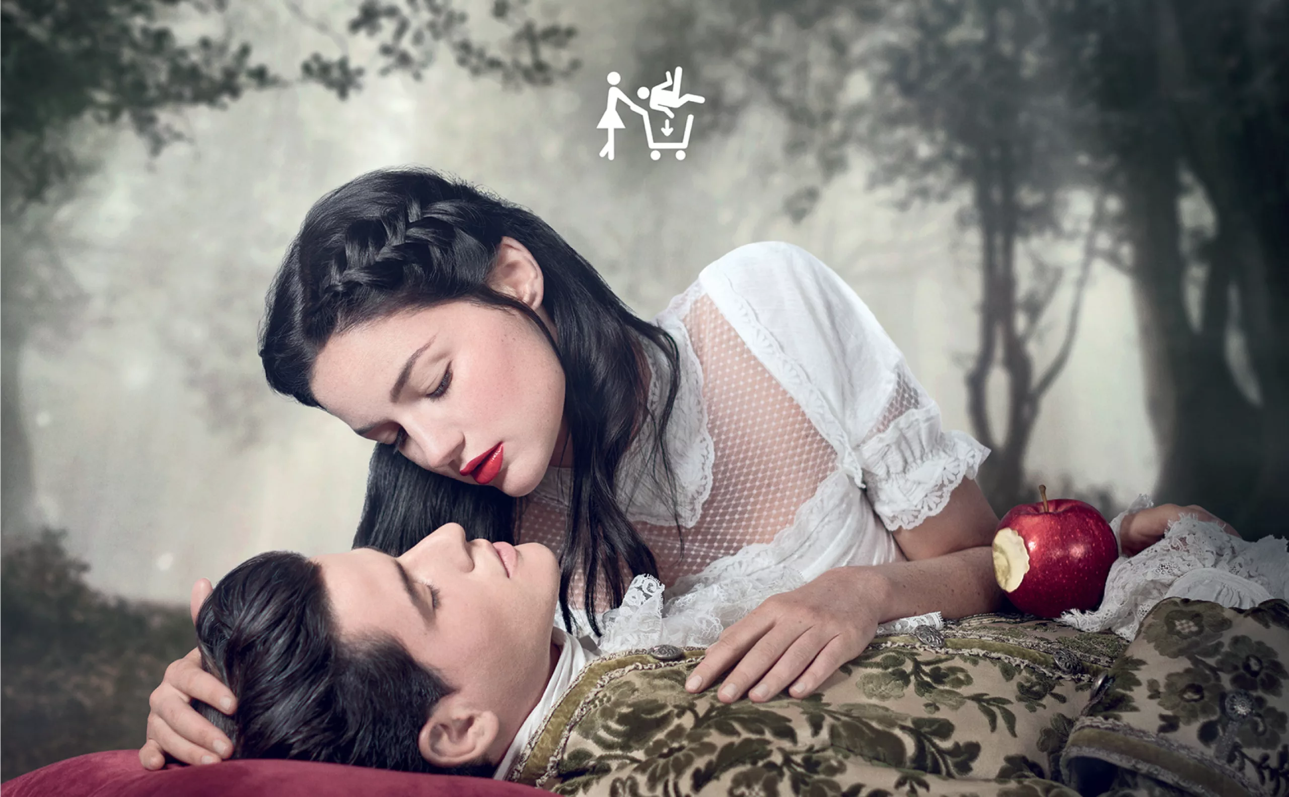
The woman is always dependent on the systemic male norm of society: she must remain beautiful in her “sumptuous dress”, her title of princess always makes her dependent on the prince, and, even if she is the one who chooses, she does not free herself from the rules of the game of seduction nor from the gender codes that society induces…
Love to the death: consume your flesh
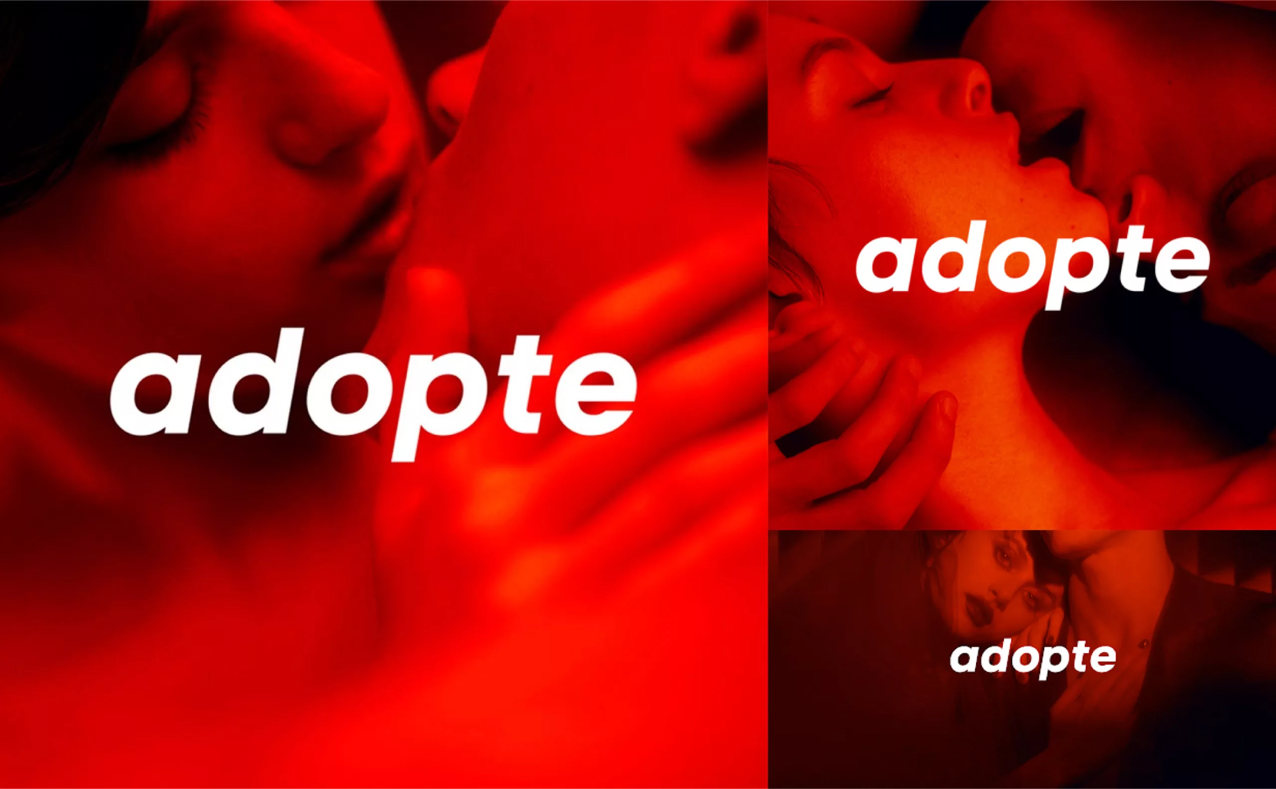
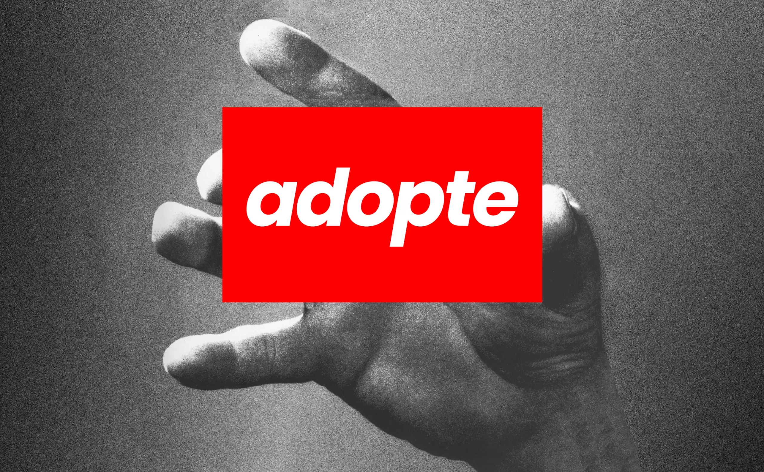
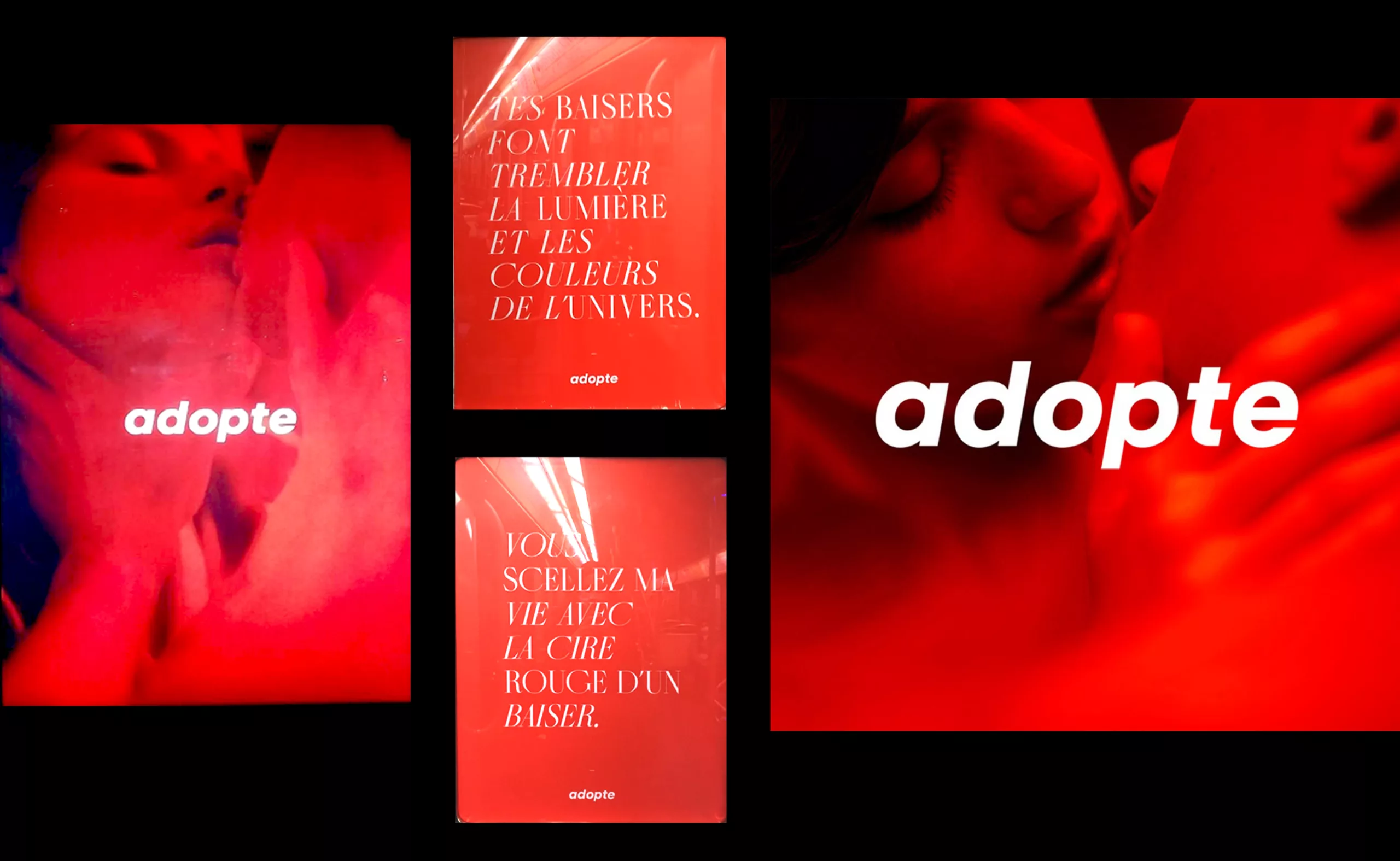
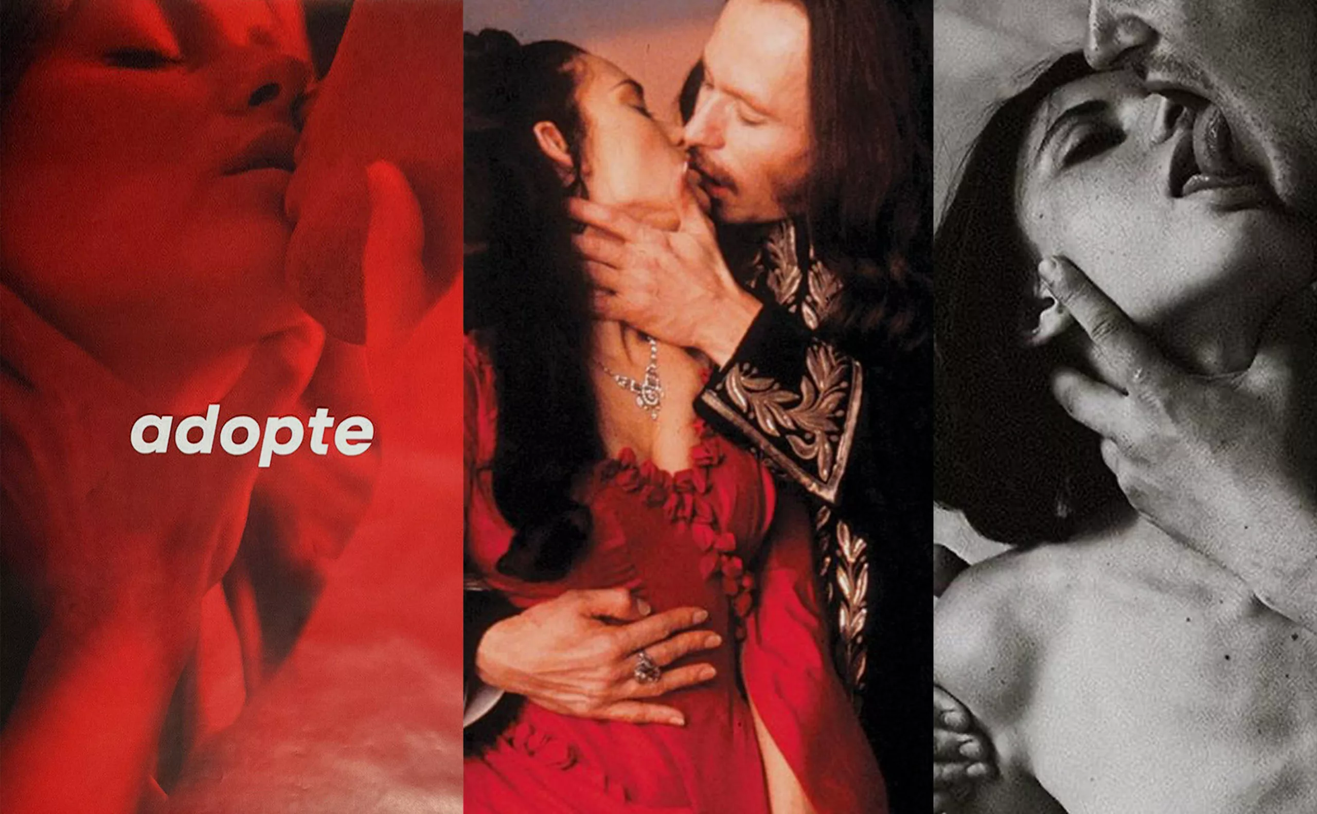
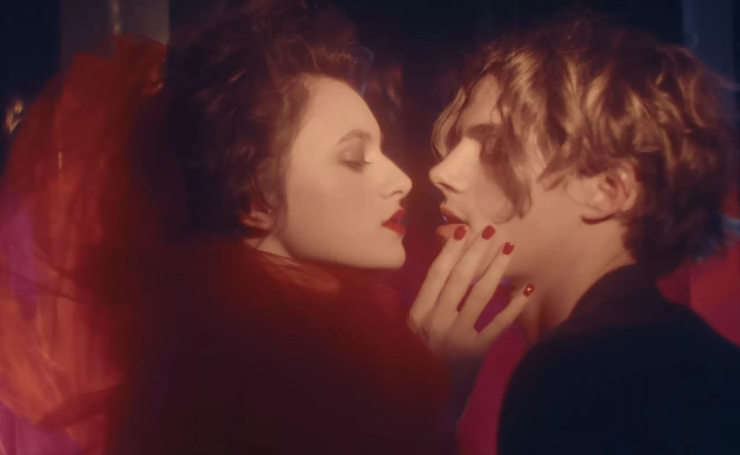
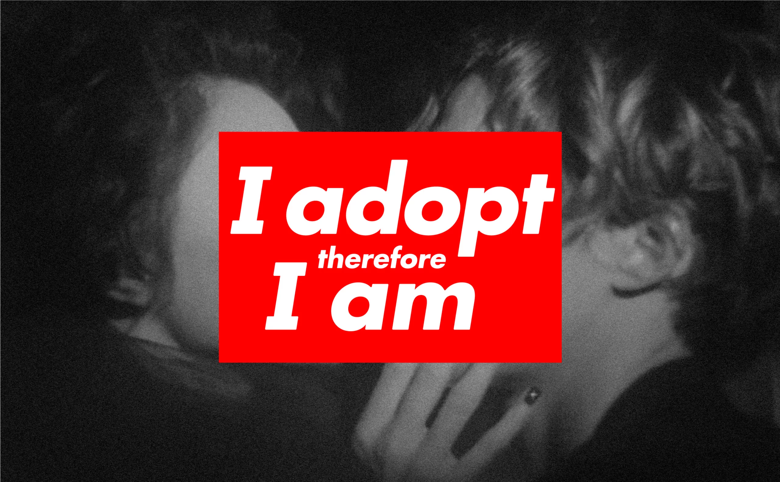
In 2021, adopte un mec unveils its latest campaign and new name-logo, showing a couple in close-up ready to kiss and sometimes holding each other by the throat, flanked by an italicized “adopte” in white on a red background. As with any change of name and logo, this in principle announces a significant change of strategy within the company. The turnaround we were expecting towards more equality?
The new advertising campaign seems to be double: on the one hand, there are images of couples under a red filter and the annotation “adopte”, on the other hand, text such as “you seal my life with the red wax of a kiss”, or “your kisses make the light and the colors of the universe tremble” without image and alternating italic and roman text, which remind us of love poems of the nineteenth century… written however with a little less panache than Baudelaire.
As if to unite the images and the text – which at first glance have little in common except for the color and the logo – we find on the site and probably on TV or in the cinema a sensual advertising film with a red desire filter, which reminds us of velvet boudoirs and courtesans… and the sensuality of a dangerous embrace.
This time, the creative mood board seems to have drawn from the codes of decadent eroticism, BDSM games, and, for the name, from the codes of the Supreme brands, with the same futura typography, bold, oblique, and OBEY. The woman no longer consumes in the first sense of the word, she now consumes the flesh of the man. The woman devourer of men holds them at her mercy.
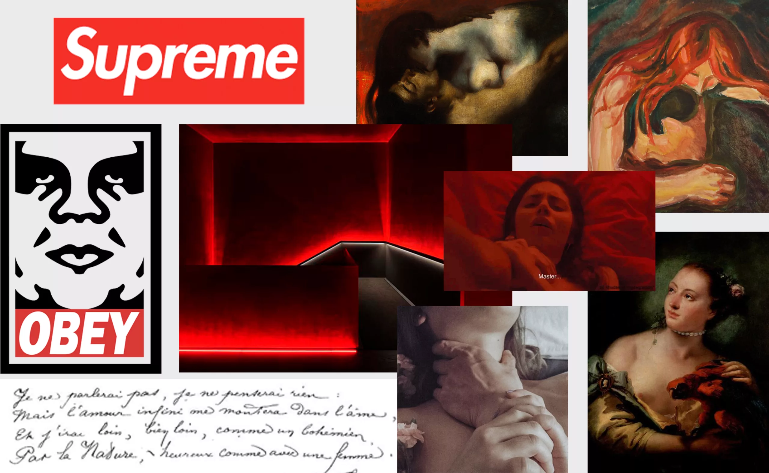
If we look at the position of the hands of the characters of the campaign, we see them holding their partner by the neck. This practice is reminiscent of “choking” (also called “erotic asphyxiation”), which originated in BDSM and has recently been accepted in pornos, and therefore in some homes. The campaign invites to carnal transgression, love taboos and wise sexual practices. As in decadent art, “the forbidden thus serves as a stimulus to a macabre eroticism, authorizing all the fantastical representations of sexual violence1.”
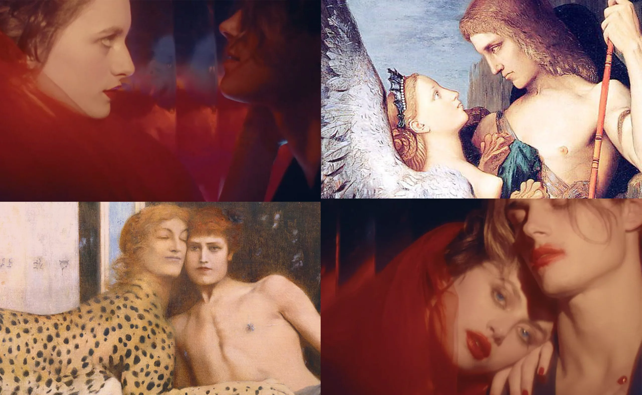
It is also interesting to make a parallel with the figure of the Greek Sphinx of the decadent art. Feline and enigmatic (fed by literature and sublimated at the time by Baudelaire), it makes rhyme desire and death, sexuality and sublime, suffering and pleasure. Moreover, “the verb sphiggein means “to embrace” in Greek” (and even to choke, to tighten), specifies Lise Revol-Marzouk to approach the woman Sphinx involves torments and small death (the other name given to the orgasm).
The play of hands on the neck also recalls the kiss of the vampire, who, like the Sphinx, takes away life. The woman is here a predator. Under the guise of a real power grab, the marketing team once again takes up a cliché about male-female relationships of dominant-dominated, and the other way around. Once the riddle is understood, the game is no longer worth the candle.
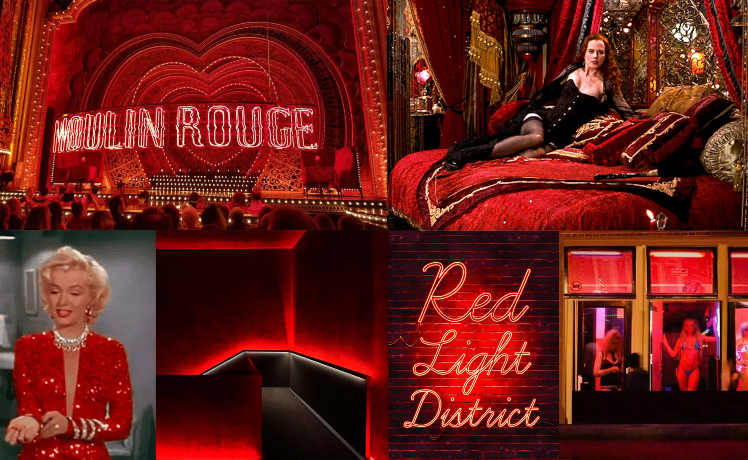
A red like Red Light District
Throughout the countryside, the atmosphere is night red. Let’s stop for a moment on this color.
There is the “good red”, that of power, victory, luxury and love. There is also the “bad red” associated with the devil, fire and blood. In fact, four of the seven deadly sins are associated with red: pride, anger, lust and gluttony. From lust to love, there is only one step…
Michel Pastoureau tells us that in the Middle Ages the great Protestant reformers moralized the colors. They distinguished between honest colors for good Christians – white, gray, black and blue – and colors that are not: yellow, green and especially red, which is too conspicuous, indecent, immoral, but especially papist. For this reason, some German and Italian cities forced prostitutes to wear red clothes to distinguish them from the ladies.
This is where we come to the red light districts (prostitution districts), the most famous of which is Amsterdam, but which can be found in many cities in Northern Europe. In Paris, we find this color in the name of the most famous cabaret: “Le Moulin Rouge“. Was the clip of adopte shot in a red district? The question arises …
The expensive flesh of courtesans
The campaign also refers to courtesans, such as Sarah Bernhardt, Mata Hari or Cora Pearl, also called demi-mondaines or Insoumises during the Second Empire. These independent and libertine women liberated women from the shackles of the time by eroticizing sex and moving it away from the simple reproductive function, by developing luxury and liberating bodies through less restrictive fashion, and by promoting access to hygiene. Often actresses, they adorned themselves with costumes and precious jewels and were maintained at great expense by several men of high society … while maintaining their independence. The theater in the 19th century is then “a sales table, a market of more or less adulterated human flesh. Let’s go! To the highest and last bidder? – Gentlemen, make your prices” said Marguerite Bellanger, an Insoumise, in her Confessions in 1882.
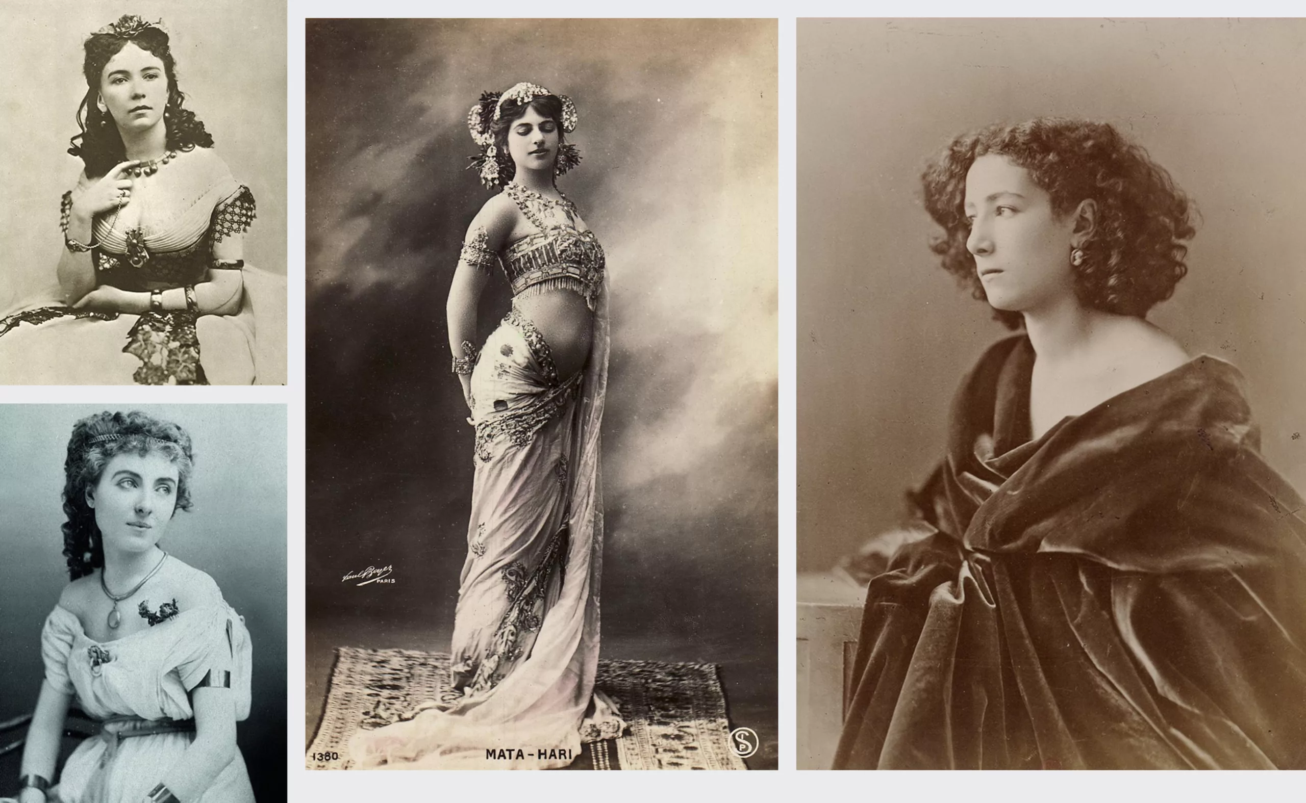
Far from a slave market (of sex) or a supermarket of women-objects, we come a little closer to the principle of “adopte”, where the person who pays is not the one who has the power. But at the time, on the contrary, it was the highest bidder who won the favors of these ladies… allowing them in exchange to live a luxurious and free life. To be paid for favors, okay, but to remain free at all costs! Cora Pearl will say in her Memoirs of 1886: “I have never cheated anyone, because I have never belonged to anyone. My independence was my whole fortune: I have known no other happiness.”
Pay for favors, right?
If adopte promotes a system of free choice for the woman, adorning itself with the image of a courtesan who would choose and devour her favorites, she remains here at the mercy of the man who pays for her favors while she gains nothing at the exchange, except to have the freedom to start again the next day… By taking a step back from the communication of the site and its functioning since its beginnings: the woman registered on adopte offers for free -if she wants- her favors to men who pay… other men (the founders of the brand). Strange system.
All the more so as the paid subscription for men always implies that, as in a restaurant or a bar, the one who pays is able to expect something from the woman in return... The woman who refuses a drink also often refuses an advance! In the current context and with the #balancetonbar movement, this kind of positioning -although most probably unconscious on the side of the marketing team- is far from being progressive nor rewarding. So yes, of course, the site has to be kept alive, and at the time of the launch, mobile applications did not exist; it was not yet possible to “swipe” to decide with whom you wanted to create affinities. If the subscription allowed to sort out in 2012, why not invent a new payment system in 2021 in the age of mobile applications, which would be truly fair and gender-neutral?
Adopt the human you want, or almost!
The picto of adopte un mec with the woman who does her shopping has disappeared, it was about time! It must be said that mass consumption in 2021 no longer rhymes with choice and pleasure, but rather with bad quality, non-respect of the planet and express solution to fill an emotional gap or a loss of meaning in a materialistic and illusory world (nothing else). If “adopte un mec” becomes “adopte”, we imagine that we can now adopt any human we want, male or female, and that’s just as well. Their Instagram account now also posts same-sex couples. A new name for the sake of inclusiveness? Surely, but for non-binary people, it will wait: there is still no dedicated box when registering, the fault of the paid subscription for men, which becomes problematic again… !
As for the new name, inspired by the brands Supreme and Obey, it is good to remember that if Obey is a streetwear brand truly committed against the excesses of mass consumption via Shepard Fairey, its founder, Supreme only aims at profit and holds its visual identity from the artist Barbara Kruger who really fights against consumerism and sexism.
A committed and popular approach often leads to its opposite (as for the memes), Supreme and adopte, by imitating Obey, operate a technique well known in the world of capitalism (and advertising in general): the recovery.
Brands appropriate a discourse that comes from a minority -feminism, anti-consumerism- and inject it into their majority and macho system, which contributes to neutralize it, to phagocytize it, and to better promote the initial system against which we were fighting. A bit like when h&m creates “there is no planet B” t-shirts produced in deplorable human and ecological conditions, or when the supreme brand takes the codes of the committed and anti-consumerist artist Barbara Kruger to make a consumerist brand for men.
We really hope that one day this system (the whole system) will change, for a truly liberated and non sexist communication.
On the subject
-
The symbolism of cut hair in Iranian protest posters
In Iran, Mahsa Amini died for a lock of hair poorly concealed behind her headscarf, giving rise to a massive protest movement against the mullahs’ regime. The gesture of a severed lock of hair becoming the symbol of this struggle gives us the opportunity to look back at the many symbolic of hair.
-
Color and brands are all about identity !
Many brands use colors as symbols to convey their identity. But can we really legally appropriate a color?