12 designers share their inspiring words

08 February 2016  |   0 Comments   |    |  

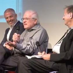
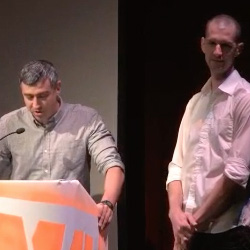
On the occasion of our visit to the Brand New Conference (BNC) in early October 2015, we had already sketched a first article from DAY 1 à New York, almost live from the conferences.

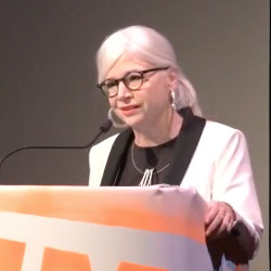
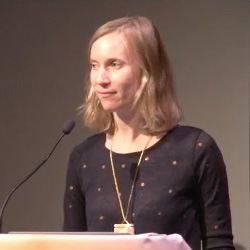
On the final evening, Adrienn suggests finding a way to keep an inspiring and more personal souvenir than an empty notebook or conference brochure... An autograph? Too classic. A phrase? Too long. A letter? Too short. Her final idea: ask the contributors to write down the one word they would take with them to the paradise of the blank page, or to a floating desert island.

Armed with courage, paper and a beautiful black pen, the adventure began

Here you will find a short bio, just to let you know who we were dealing with, a photo of the famous note, an overall impression of the person during the presentation, and a graphological analysis that we had fun doing. So as not to be influenced by the speakers' personalities, the graphological analysis was carried out by a person who had never seen the presentations.
The idea behind this analysis is to try and find out what these words say, apart from their pure definition. Following their writing style, we try to get to know a little better those who wrote them. We also try to see if our feelings match up with this analysis. And most of the time, it does!

CREATE 

Tom Geismar

geismarIvan Chermayeff and Tom Geismar founded Chermayeff & Geismar  (quite logically) in the late '50s. They were later joined by Sagi Haviv. Pioneers of interdisciplinary graphic design, their work includes logos for Mobil Oil, National Geographic, Showtime, PBS, Barneys New York, NBC and, more recently, Armani Exchange. The agency has received some of the most prestigious awards in graphic design, and in 2014 Chermayeff and Geismar received the Smithsonian Cooper-Hewitt National Design Award for lifetime achievement.

During the presentation, we had the impression of being face to face with a simple, straightforward person with a wealth of experience. A sort of perennial and impressive monument, whom we didn't dare approach too closely. Adrienn ran after him in the street, after having hesitated for a long time to approach him, the first on this list. He thought about it for a few moments, then suddenly decided to leave on "create"; as if he wanted to refocus on the essentials.

An analysis of his handwriting reveals strong, upward strokes, which would indicate dynamism, open-mindedness and self-confidence, synonymous with energy and the qualities needed to guide others. The composition of the word, occupying the space well, shows rigor in work and clear ideas.
His signature shows a powerful will, an ability to decide quickly, and a certain kind of concentration reflected in the way the letters are drawn together, and the strong, sure handwriting.

Consistency of feeling with graphological analysis: 8/10

FIGHT

Gabor Schreier

gaborGabor is a German multicultural chameleon, both passionate and rigorous. He started out as a signage, screen printing and restoration craftsman, then went on to study design. Trilingual in German, Spanish and English, he has lived in Madrid since 2001, from where he heads up the Artistic Direction of Saffron (a leading brand consulting agency) in several of the group's subsidiaries; London, Madrid, Vienna and İstanbul. Together with his team, they guide and advise clients such as Coca-Cola, Swiss Re, Belgacom, Rompetrol, Bankinter, and Vueling.

When we met Gabor and listened to his presentation, we got the impression we were dealing with a rigorous, structured, rational man. A true businessman, dynamic and stable, not very expansive and very professional. After a brief reflection, he wrote: FIGHT!

By analyzing his fast, slightly right-tilted handwriting, we're supposed to detect a lively, open mind, mental agility and a rapid flow of ideas, as well as evidence of self-confidence. Its pretty G in block letters translates its taste for beautiful things.
His rather complex signature is a sign of his desire to create a unique brand image.

Conformity of feeling with graphological analysis: 6.5/10

L O V E 

Ty Mattson

ty-mattson
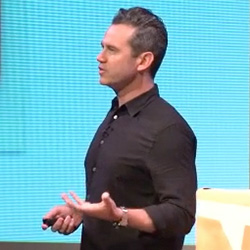
Ty Mattson is equally adept at conceiving a brand identity and executing it. His design studio, Mattson Creative, works with brands such as Apple, Billabong, Cartoon Network, CBS, Coca-Cola, Discovery Channel, DreamWorks, Hasbro, Mattel, Nickelodeon, Showtime, Universal...

How did we feel listening to Ty's presentation? We felt like we were growing wings. Ty has the soul of a passionate child. Attached to memories, he's all about emotion and passion. During his presentation, he talked endlessly about his childhood Superman comics, of which he has always been a great admirer. He showed an extract from Amélie Poulain, in which the man rediscovers his childhood treasure box, explaining that it's all about turning to these memories to create.

An analysis of her handwriting reveals this same feeling. Its light strokes show delicacy, a light spirit that lets itself be dominated by feelings. The neat, straight, orderly letters convey balance, clarity of mind and even kindness (!).
His simple signature shows a priori self-acceptance, as he writes his initials legibly. The upward slope of the last stroke is supposed to be proof of dynamism, but also of artistic tendencies.

Consistency of feeling with graphological analysis: 9/10

REFLECT ! 

Jonathan Hoefler

jonathanJonathan Hoefler has been the Pope of typefaces since... 1989. He's Mr Typography.com. He's behind Knockout, Mercury and Archer, some of the most distinguished and recognized typefaces in the world of graphic design. His agency Hoefler & Co. develops original typography for print, web and mobile, and has registered over 1,000 designs. Hoefler has been awarded the Prix Chalres Peignot for its outstanding contribution to typeface design, and the AIGA medal, the highest distinction in the world of design. The agency's work is exhibited in the permanent collections of the Smithsonian Institution and MOMA in New York.

A true computer graphics pro, Jonathan's presentation was extremely rigorous and organized, right down to the last detail. We sensed a great mastery of himself and his subject. He revealed to the audience a key point about typography: it reflects a character, a need. It's not chosen at random, but for its almost personal characteristics, which will suit this or that message perfectly. Almost without thinking, Hoefler wrote: Reflect!

His graphological portrait is based on the analysis of small, meticulously written letters, with beautiful characters and ligatures. These attributes illustrate meticulousness, a certain delicacy, and observational skills. His original, thoughtful handwriting reflects strong artistic tendencies, visual memory and non-conformism. The overall balance of the letters and their positioning on the sheet show self-mastery.
His small, nominative signature reflects an objective self-acceptance.

Consistency with feelings: 6/10

FORCE

Christine Taylor

christineChristine is a creative multitasker with a dual background in psychology and design. She is currently in charge of creative account management for the Licensing & Design department at Hallmark Cards. She develops product creation between her in-house team and external licensing studios such as Star Wars, Warner Bros., DC Comics, Star Trek, FOX, NBC/Universal, AMC & Lionsgate. It also ensures that licensed products fit well with the creative strategy and brand/character, and are compliant in every link of the distribution chains. A fan of pop culture and a bit of a geek around the edges, she shares her jargon and passion with her customers.

Christine passed on her enthusiasm in a very natural way. Very energetic, she was passionate about her work, rigorous and funny at the same time. She was wearing a t-shirt in the colors of the Star Wars rebels. Her word: FORCE. Logical.

Her original, strong handwriting with its variable slant reflects a powerful will, energy and vivacity, but also an assertive, non-conformist personality. She would want to control others, and be adaptable to her environment. The large letters would show a desire to be noticed, and an open mind.
Its ascending signature would be a sign of optimism, dynamism and self-acceptance, as its name is clearly legible.

Consistency of feeling with graphological analysis: 8/10

NERVOUS - INEVITABLEFRIENDS

Eric Collins, Larry Pipitone, Joey Ellis

grand-armyEric Collins, Larry Pipitone and Joey Ellis founded the creative studio Grand Army Grand Army, specializing in art direction and advertising strategy, graphic design, brand identity, film, illustration and poster design. In recent years, GrandArmy has launched an art magazine, written and directed several short films, worked in fashion, music and art, painted murals, launched a furniture brand, designed a skateboard line and blown up several car races. They work with clients of all sizes, from industry icons to fashion boutiques.

The 3 partners each signed a note that - it seems to us - speaks about them, their agency and how they felt about the day. Maybe they were nervous about something else, maybe the only thing inevitable was a good design, and maybe Joey was thinking about the friends he'd be seeing after tonight. Besides, maybe he's not named after the hero of Friends by any chance? Questionable idea.

Put together, and this is what best characterizes GrandArmy, we've decided to understand these three words with the following meaning: nervous before that inevitable presentation, but confronted between friends.

NERVOUS - Eric Collins

Nervous? Very nervous. Eric wrote this word mechanically, really translating the state he was in; not necessarily responding to the brief for an aspirational word - probably too nervous?

His strong features and somewhat original handwriting would be proof of his ability to decide quickly, a strong personality and the powerful will of an assertive, non-conformist personality. His slow handwriting would indicate poor health (super nervous?!), but also strength of character.
His beautiful, rounded signature seems to be the opposite of his word. Yet it's also a sign of non-conformism, a certain liveliness and an open, energetic spirit. All in all, her typefaces reveal her artistic tendencies and her desire to create a brand image.

Conformity of feeling with graphological analysis: 6/10

INEVITABLE - Larry Pipitone

It's hard to avoid the inevitable - all we get of Larry's personality is this word.

From his strong, energetic handwriting, we could translate an ability to decide quickly, a powerful will, to the letters slightly tilted to the left that would be the trace of an ounce of mistrust. The clear, spaced rhythm between each letter symbolizes loyalty, a clear and modest spirit; all in an overall balance.
Its simple, round, ascending signature demonstrates self-acceptance, a taste for beautiful things and an open, dynamic spirit.

Conformity of feeling with graphological analysis: 3/10 - because little feeling. Match with Grand Army: 8/10

FRIENDS  - Joey Ellis

Joey wrote FRIENDS. Perhaps he was pestered all his youth by the series, and is now obsessed with it? We think the word came naturally to him when he thought of Grand Army. It's the story of three friends who, driven by the desire to do something together, set up a communications agency. It was perhaps inevitable that this project would work. These three close-knit friends, hierarchically equal "partners" as they like to call them, operate and make decisions with three brains.

Once again, we had little insight into Joey himself, but we can still freely analyze his writing.

Its round, pretty and airy letters may reflect a gentle character, with artistic tendencies and clear, rigorous ideas. The variable inclination of the letters would show a desire for control, a certain caution in relations with others, and great adaptability.
His signature asserts his personality in its entirety; his entire name is handwritten. The airy words reveal his clarity of mind and rigor.

Conformity of feeling with graphological analysis: 3/10 - because little feeling. Match with Grand Army: 9/10

SERENDIPITY - EDIT 

Greg Hahn, Ryan Moore

gregGreg founded Gretel in 2005 with a simple desire to create impactful visuals in any medium. Today, Greg Hahn and Ryan Moore develop branding and visual identity for clients in the entertainment, cultural and advertising industries, including Netflix, Vanity Fair, Google and MoMA. Gretel's projects are clearly identifiable by their clean style, iconic imagery and sophistication, and have won numerous awards and publications.

SERENDIPITY - Greg Hahn

The founders of Gretel, like those of Grand Army, were very complementary. Greg conveyed the desire to do things well, and showed great consistency and stability. You could see his passion for his work, his balance and his experience. Her choice, Serendipity (like Susan Skarsgard).

For those whose definition of serendipity may be unfamiliar, serendipity is "finding something other than what you were looking for", a bit like Christopher Columbus looking for the Indies, and discovering America.

In his simple, orderly, quickly written letters, we can detect traces of sympathy and modesty, proof of a clear, lively, calm, balanced mind that assimilates things with ease.
His signature, or rather his name, reveals his true self. All in all, it reveals a harmonious personality.

Conformity of feeling with graphological analysis: 8/10

EDIT - Ryan Moore

Ryan complemented Greg in his more formal, restrained, calm demeanor. His word choice; edit.

His graphology portrait is based on dynamic letters with ascending strokes. We would detect optimism, self-confidence and enthusiasm - which doesn't really correspond to our impression, where on the contrary he seemed to be more restrained. Perhaps he is in real life, when he's not in front of a crowd of people.
His signature, like that of his partner, shows his personality in all transparency. These round, dynamic characters reveal his artistic tendencies, his mental agility and ability to assimilate, as well as an open, confident mind.

Conformity of feeling with graphological analysis: 4/10

SERRINDIPITY 

Susan Skarsgard

suzanSusan Skarsgard is an artiste / designer recognized worldwide for her work and books in art, design & calligraphy. She has worked at General Motors since 1994, creating acronyms and typefaces for the automotive industry, as well as corporate and brand identities. Today, she heads the GM Design Archives and Special Collections.

Susan is a true artist, with a world of her own. Expansive and genuine, she is playful and expresses herself with large hand movements. She spoke at length about personalities who have inspired her, whom she has met along the way. Before writing down her word "serendipity", she asked us to take some time to think. About thirty minutes later, she drew these pretty calligraphic letters. Perhaps the word has something to do with her journey of happy accidents that literally set her on the path to a profession she could never have imagined, thanks to these encounters.

His graphic, thoughtful, large and exuberant letters assert a non-conformist personality, with strong artistic tendencies, but also a need to be noticed, an open mind, full of energy and enthusiasm. The lightness of his features reveals a delicacy, a character that lets itself be dominated by feelings, a good humor. The orderly layout reflects a rigorous approach to work and clear ideas.
His signature, or rather his name, is all balance and control. The energy with which he writes his name shows a strong willful personality. The clarity of the letters and their order would indicate balance and kindness.

The small heart supports this last trait.Conformity of feeling with graphological analysis: 10/10

TRUST 

Julia Hoffman

juliaJulia Hoffman is Etsy's Global Artistic Director. Based in Berlin, she drives the brand worldwide through all points of contact with customers. Before joining Etsy, Julia was Art Director at MOMA in New York (Museum of Modern Art), and also ran the Advertising and Graphic Design department. She managed the scenography and all image-related aspects of all the museum's exhibitions and catalogs.

Julia seemed to us simple, true, transparent in her emotions. She spoke from the heart, gently, laughing, talking about others. Her naturalness touched us. Her word, trust, seemed obvious.

Her graphological portrait is more along the same lines. The clear, orderly and simple letters are a sign of a clear, calm mind, kindness, but also proof of sympathy, a gentle and modest spirit (she can say thank you to the graphologists). The well-occupied space and balanced distribution show a rigorous approach to work and clear ideas.
Her name-signature reveals her in all transparency, and the letters leaning to the right reveal self-confidence and an open mind, all about balance and self-control.

Conformity of feeling with graphological analysis: 10/10

Not really convinced before we started, it's quite astonishing to recognize that a graphological analysis can correspond quite precisely to a feeling.
Of course, this feeling and this analysis only reflect our brief impression following the conferences; it's possible that we're completely off the mark, and we'd have to ask their opinion to be sure.

For our part, we're delighted to have been able to detect all these nuances from a simple note. It's a real souvenir of our New York trip.

Texts : Tiphaine Guillermou


Share this post:


Leave a Reply


Newsletter
Leave us your email and receive your monthly dose of Graphéine in your mailbox.