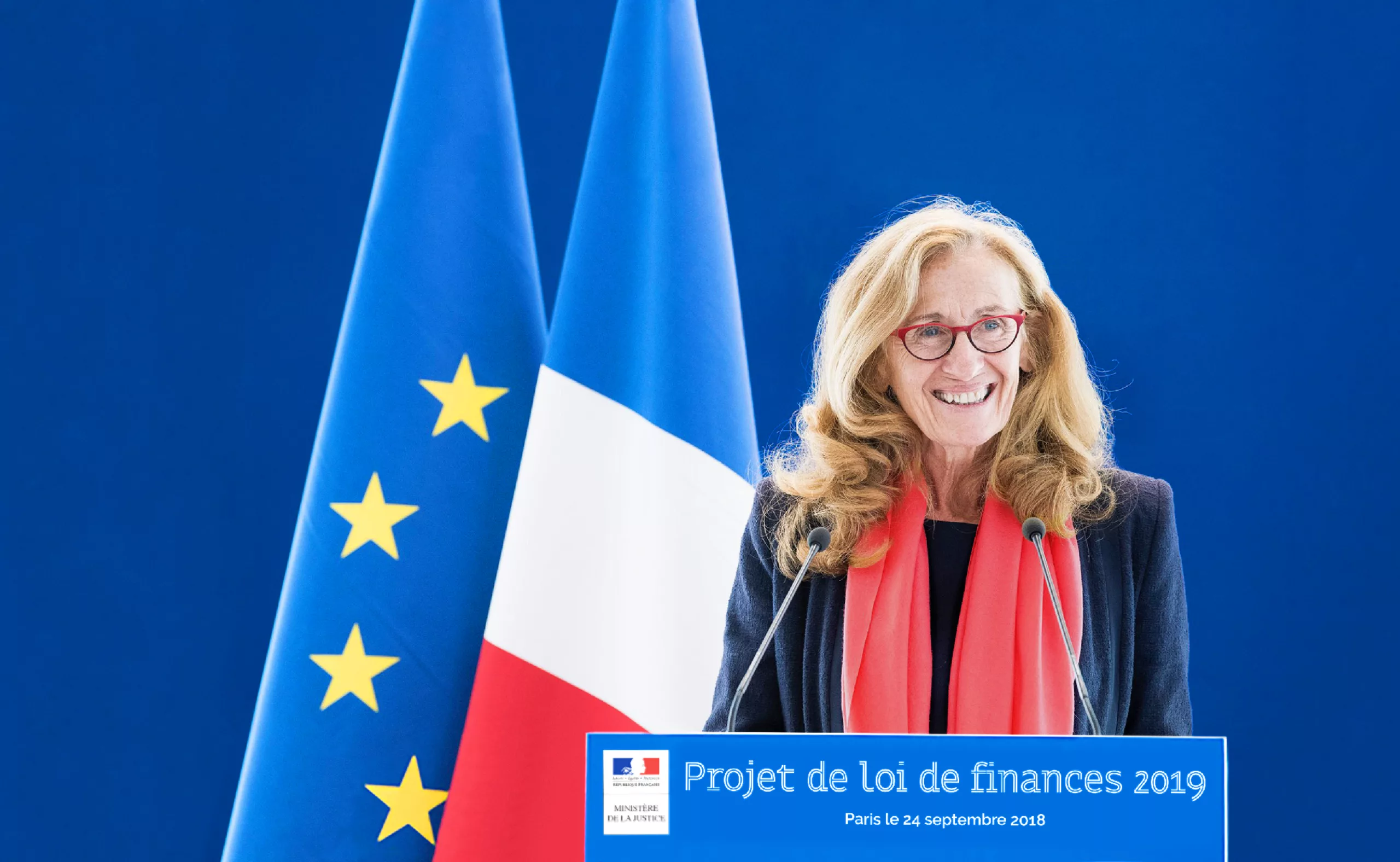
The communication team of the Ministry of Justice asked Graphéine to create its new visual identity. Like all Ministries, the Ministry of Justice irrevocably displays the system based on the logo of the French Republic. With this constraint of setting up a new graphic charter while keeping the institutional logo, the discussion quickly turned to the idea of basing the new visual identity on the creation of a custom-made typography, like the one we had previously created, in a completely different universe, for the Royal Abbey of Fontevraud.
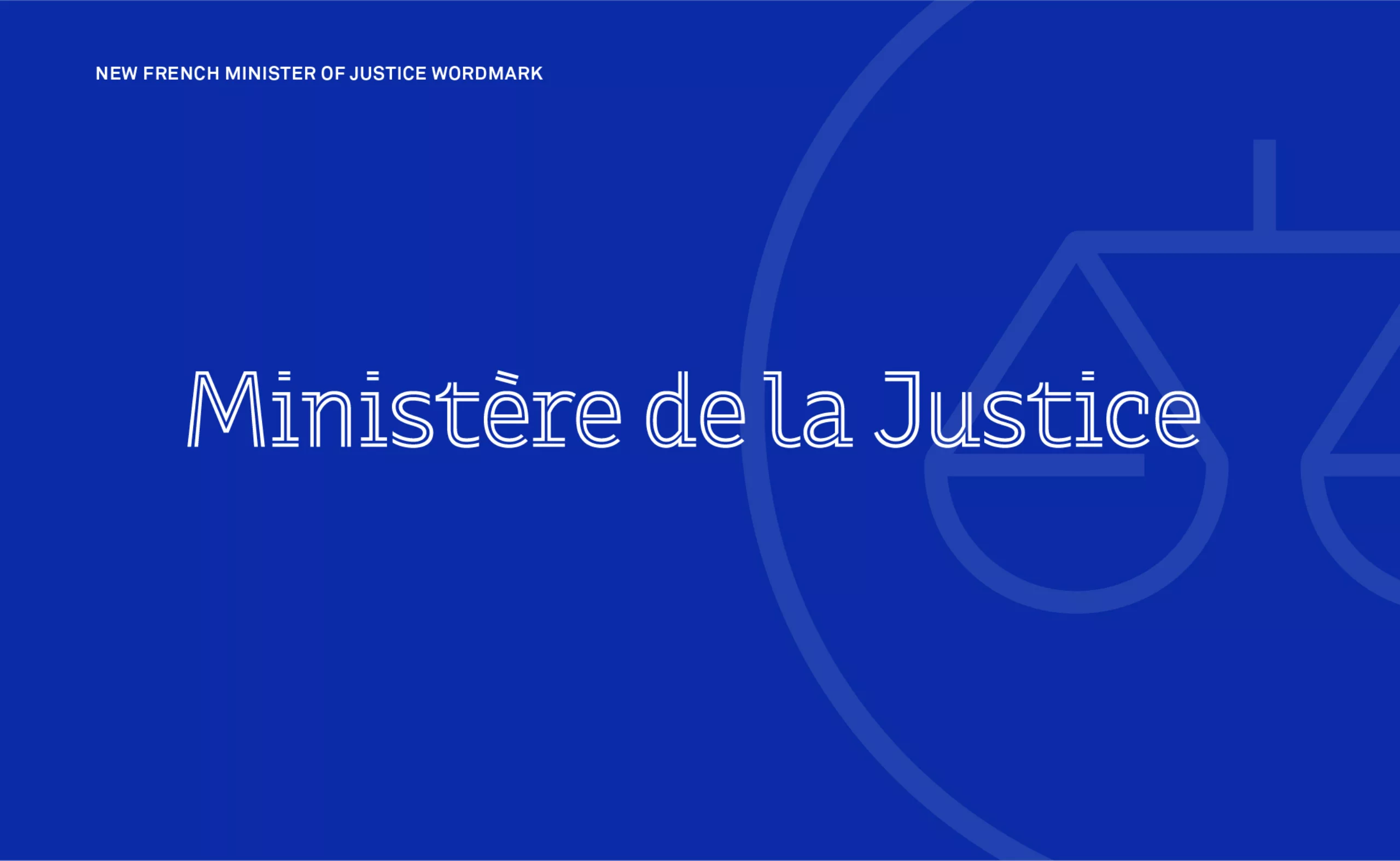
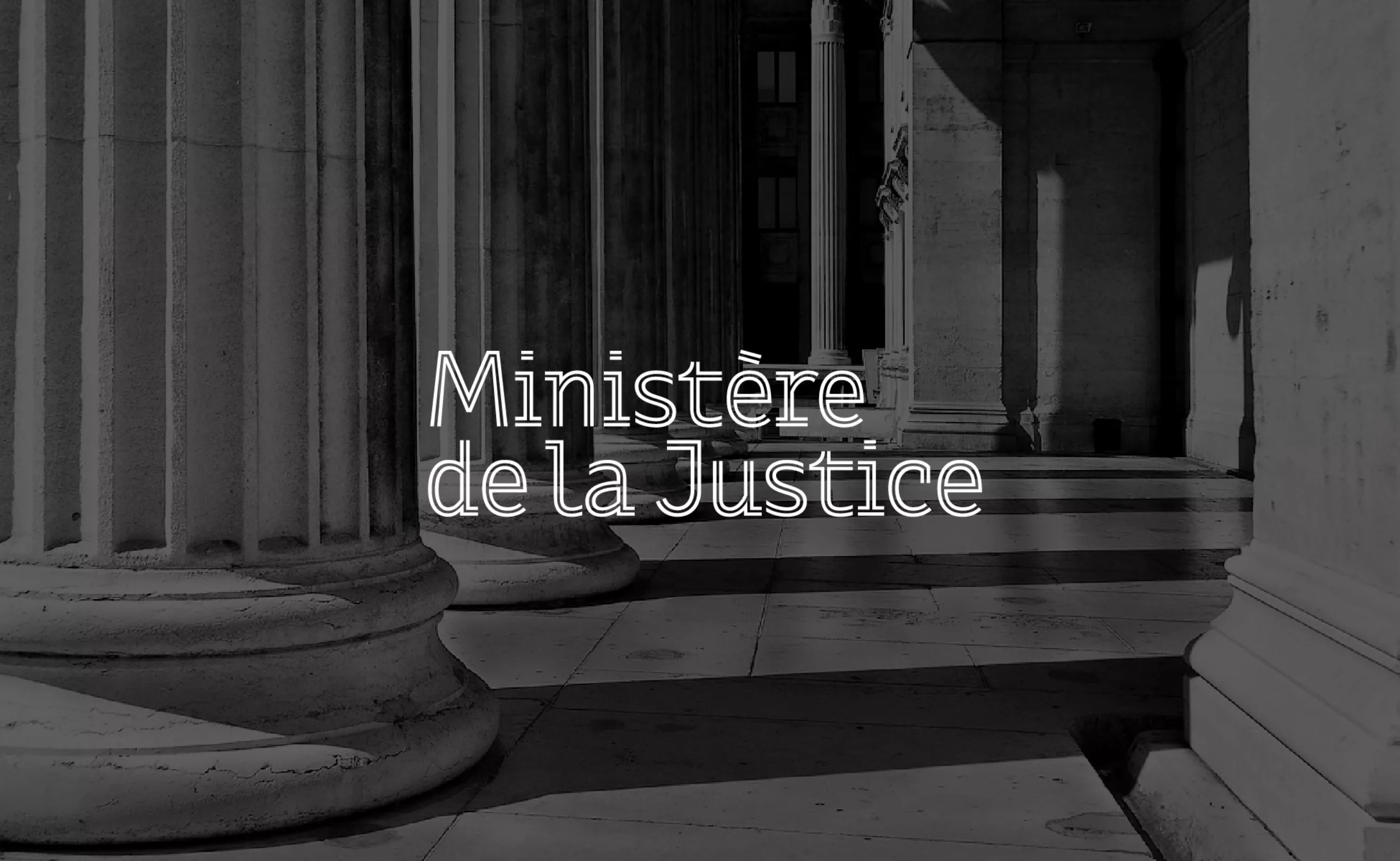
Ministry of Justice of the French Republic
New visual identity of the Ministry of Justice of the French Republic
The challenge was daunting, as it was necessary to strike a balance between the need for a typographic design that was original enough to be identifiable and recognizable as the new “voice” of the institution, and at the same time to be to some extent consensual enough to respect the seriousness of the mission of the Ministry of Justice. We were able to count on the driving force and the confidence of the Ministry’s communication team to federate the general secretariat and the 5 directorates in the soundness of this project.
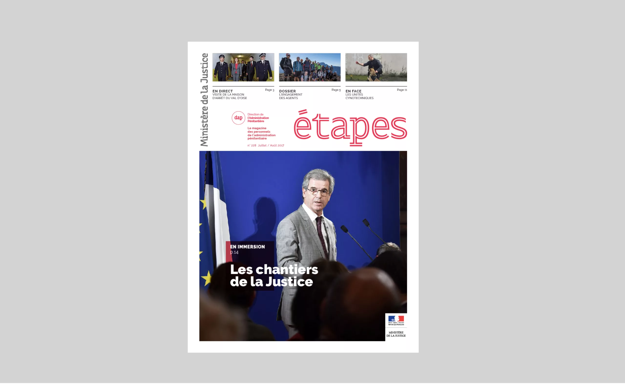
The stakes of practicality and legibility of character were at the heart of our reflection. The Ministry’s teams, whether in communication or in the administration, produce communication supports on a daily basis, and this, on a range of supports that can go from a simple press kit to a video clip broadcast online.
Based on these binding but proportionally stimulating specifications, we have deployed a graphic charter with a strong and flexible personality, making it possible to harmonize and clearly identify all of the institution’s communications.
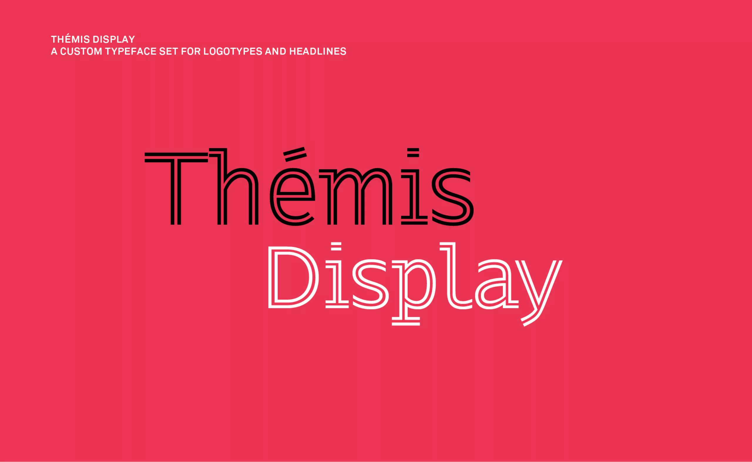
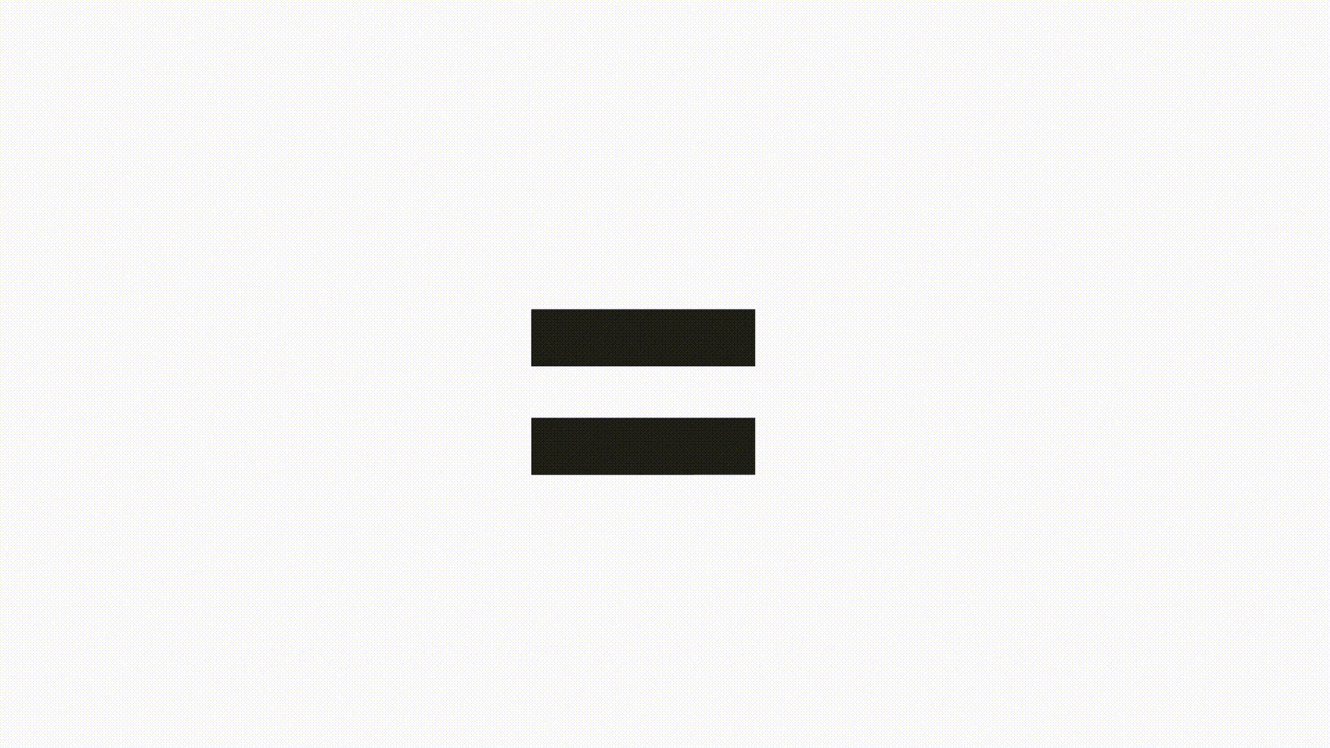
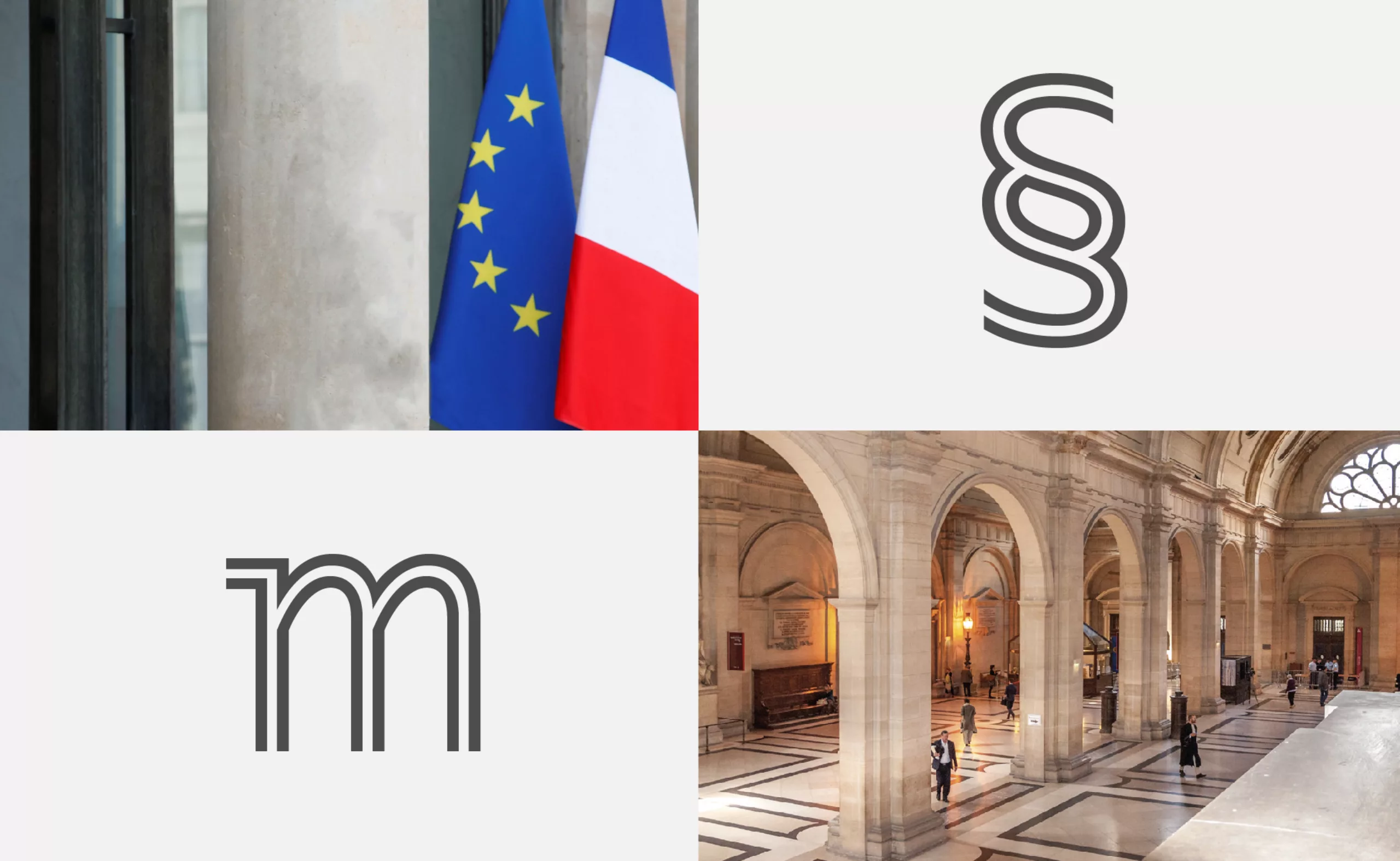
Themis, a typography that embodies equality before the law
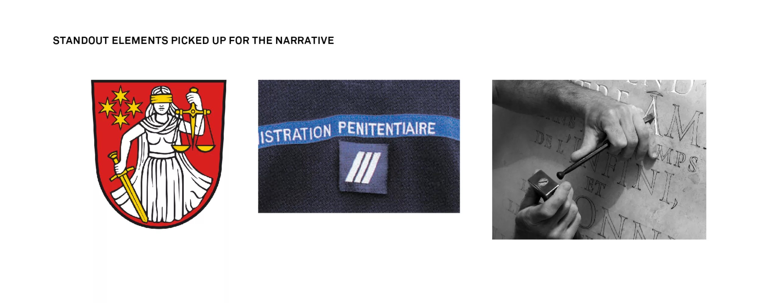
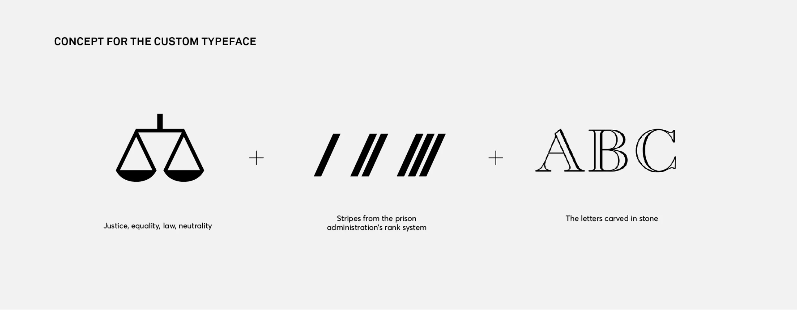
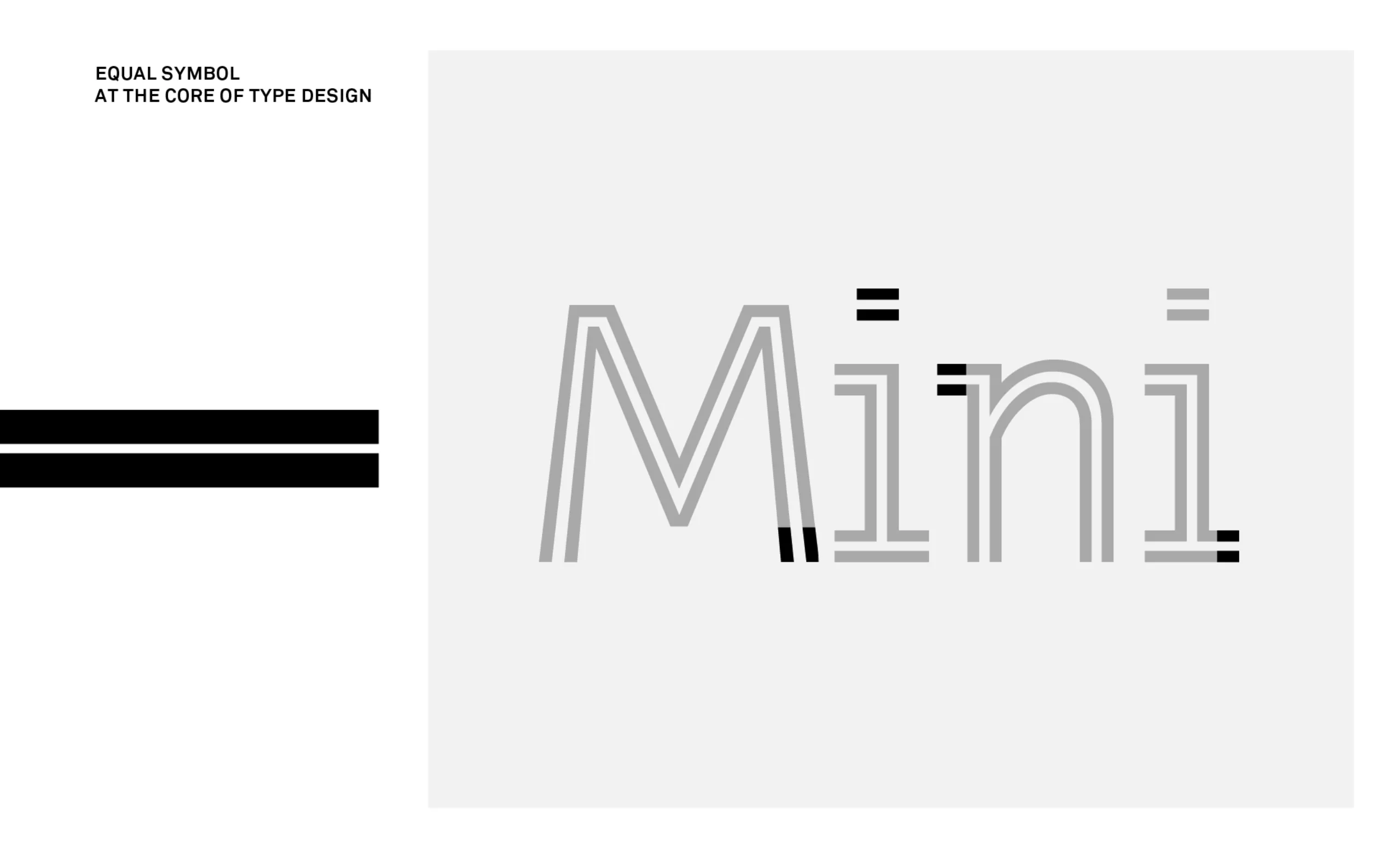
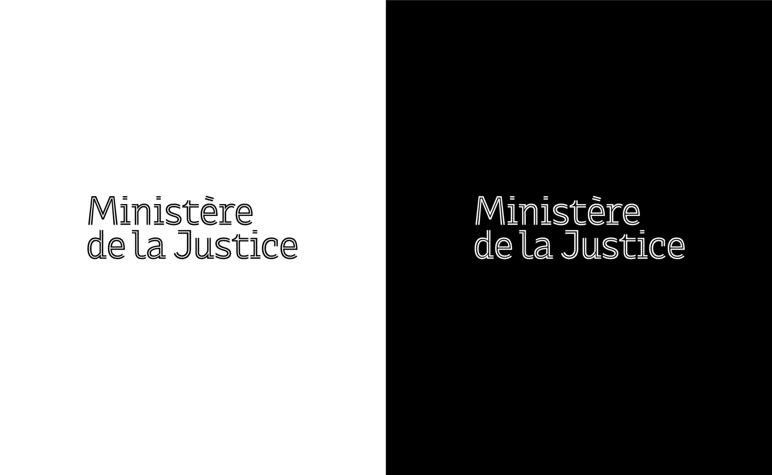
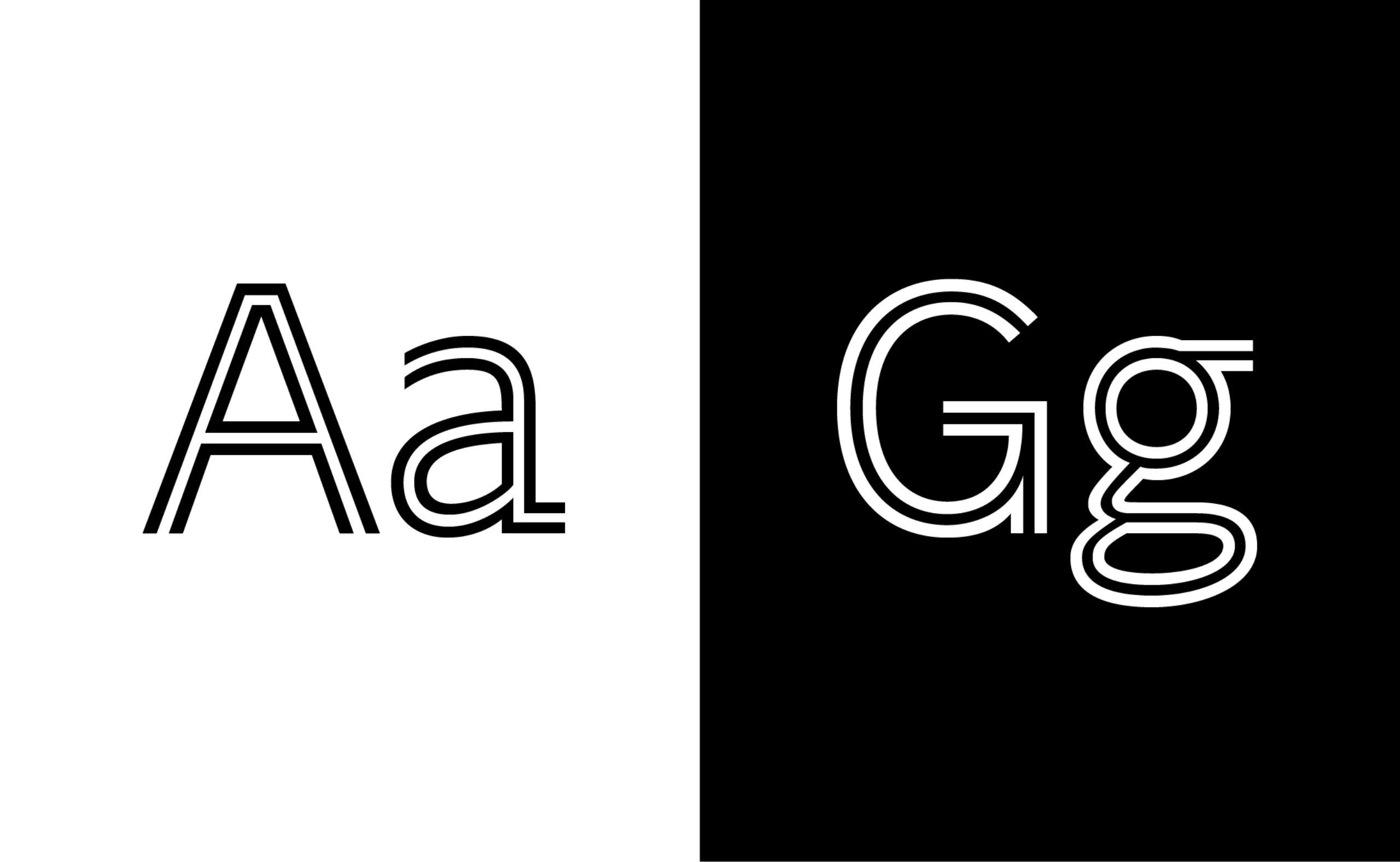
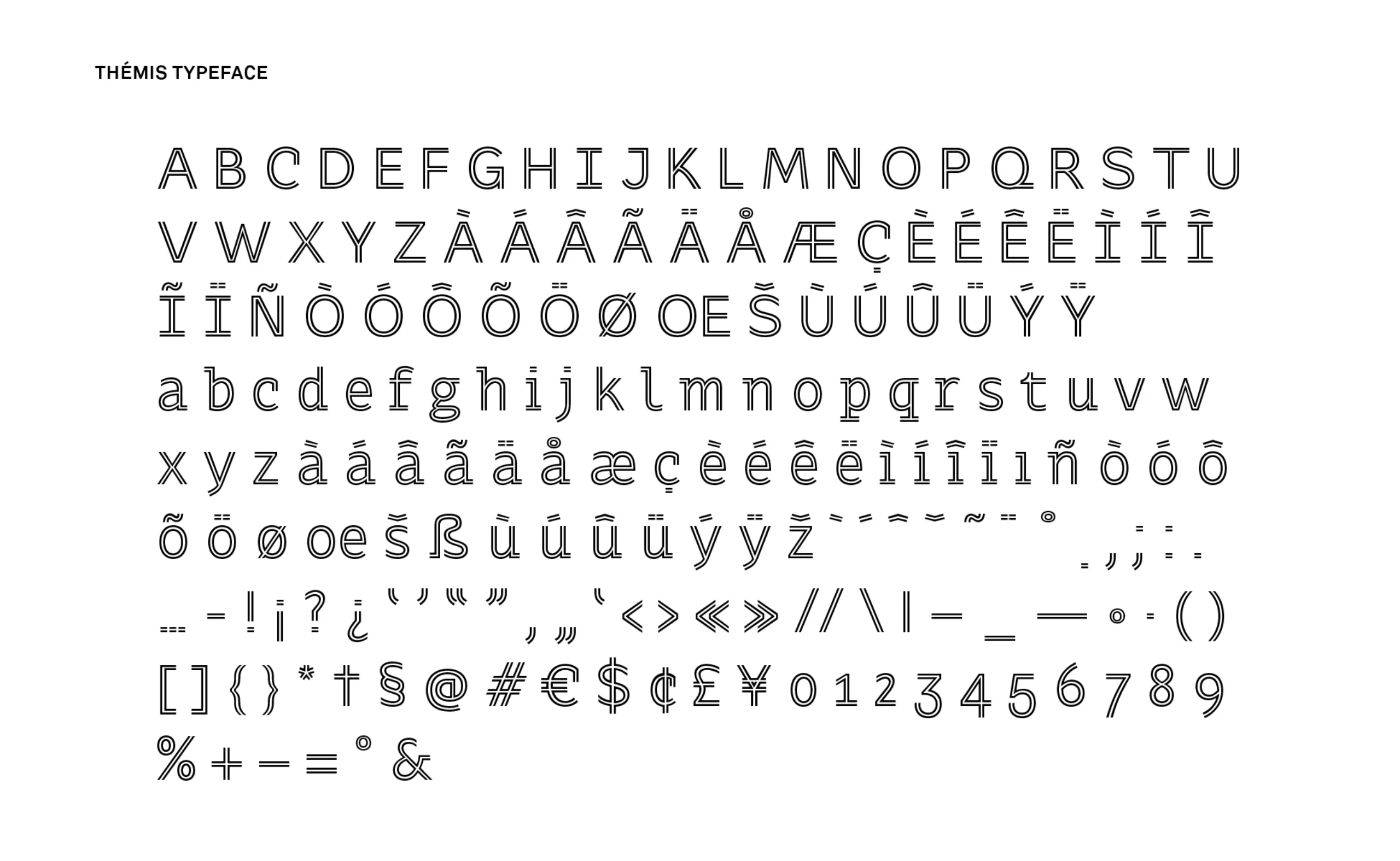
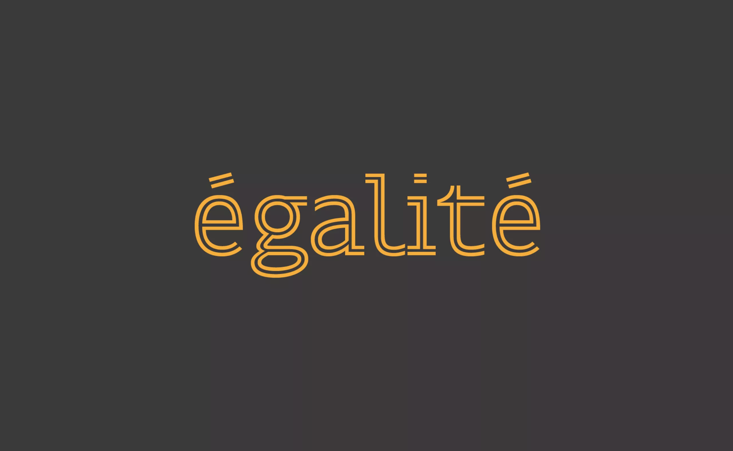
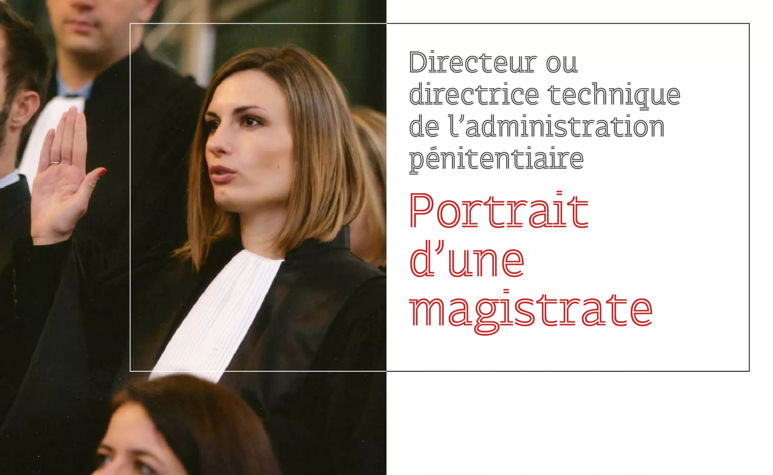
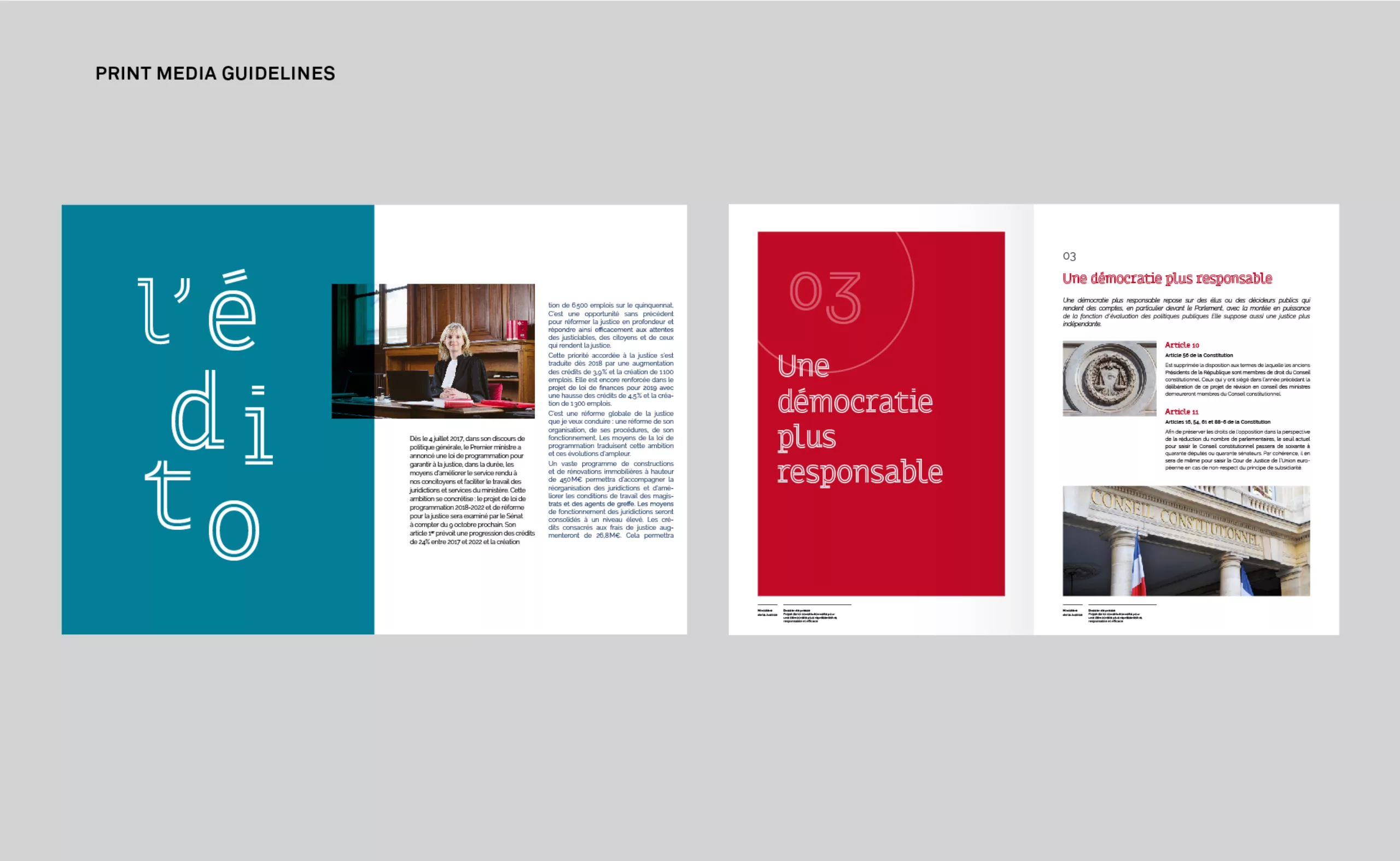
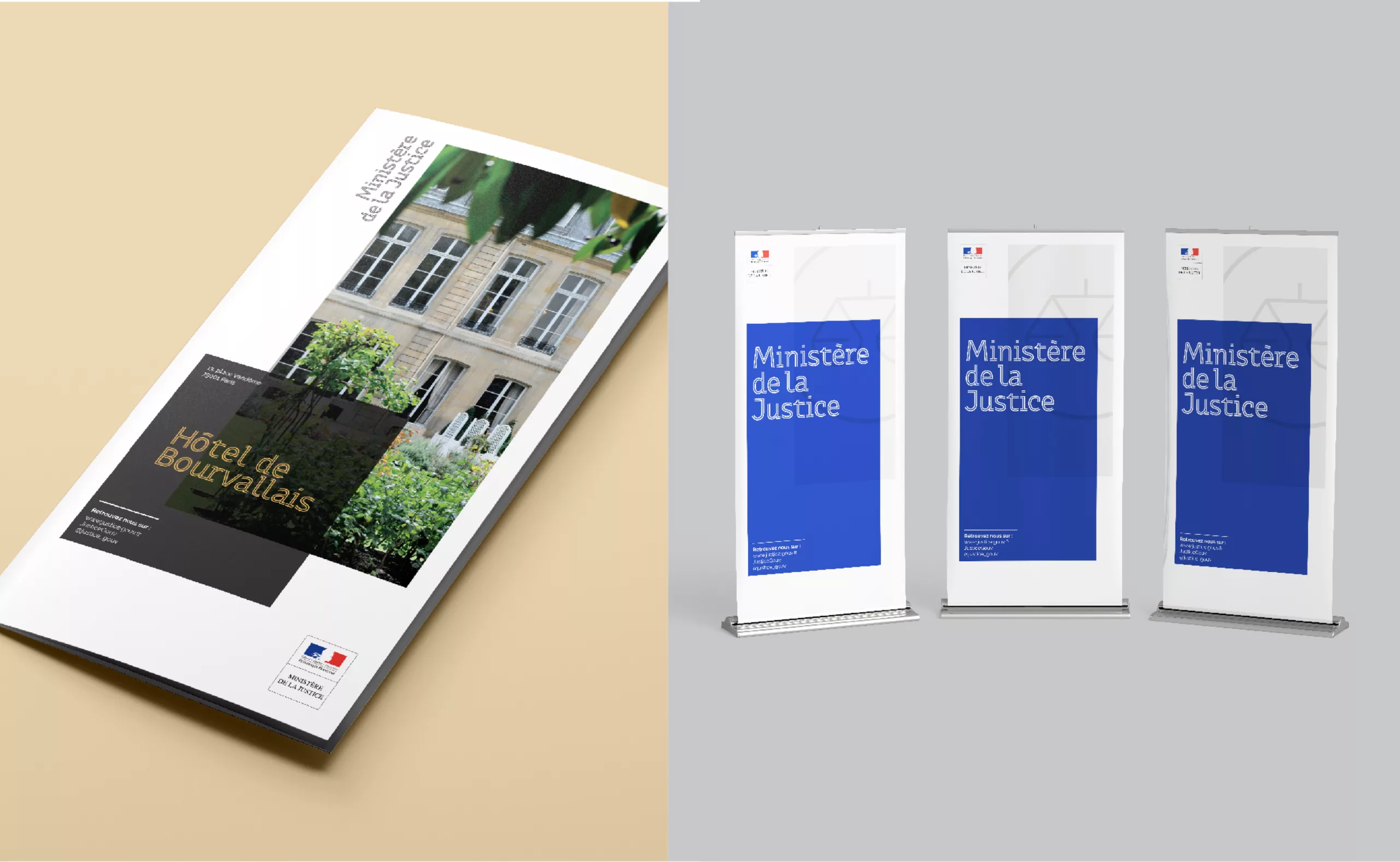
It is from the design of this exclusive typography that the entire new graphic charter of the Ministry of Justice was deployed. We named this typeface “Themis”, in reference to the Greek Goddess embodying Justice, who is often represented by a scale: symbol of balance and the necessary impartiality of justice. The design of the typeface was built on the balanced form of the equal sign. It also refers to the stripes on the uniforms indicating the ranks of the prison administration. The shape of the letters engraved on the stone refers to the first medium of representation of the law. The “Thémis” typography has a style that can be described as both “in line” and “semi-serrif”, which gives it a very strong personality.
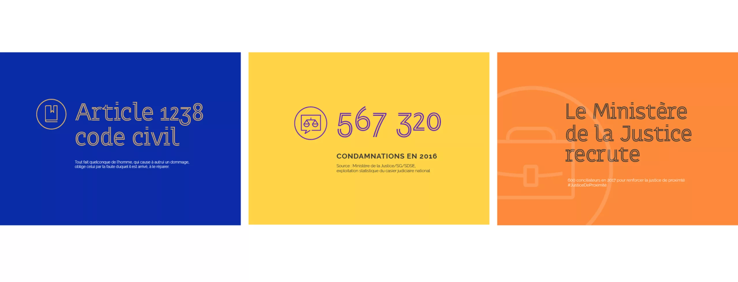
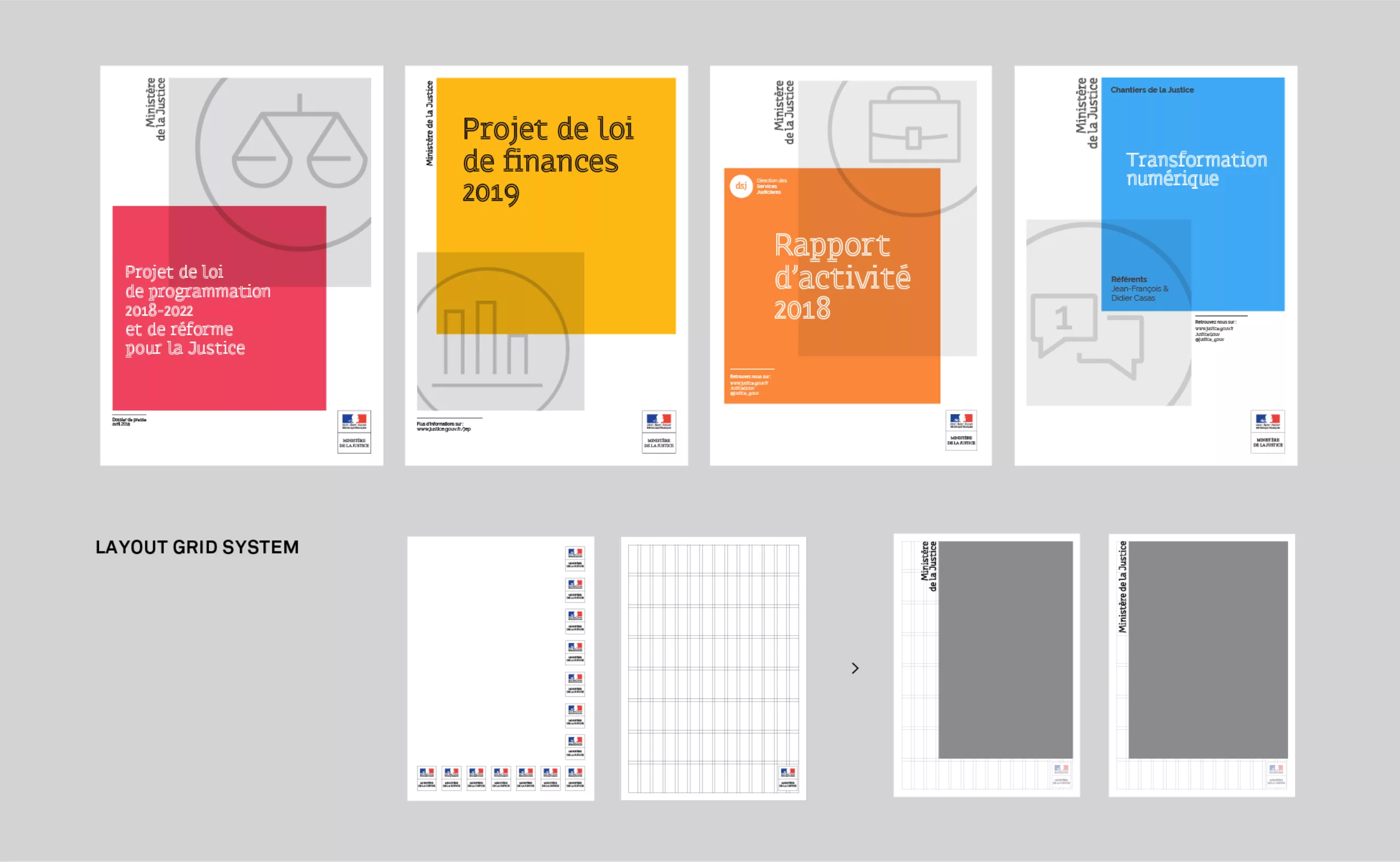
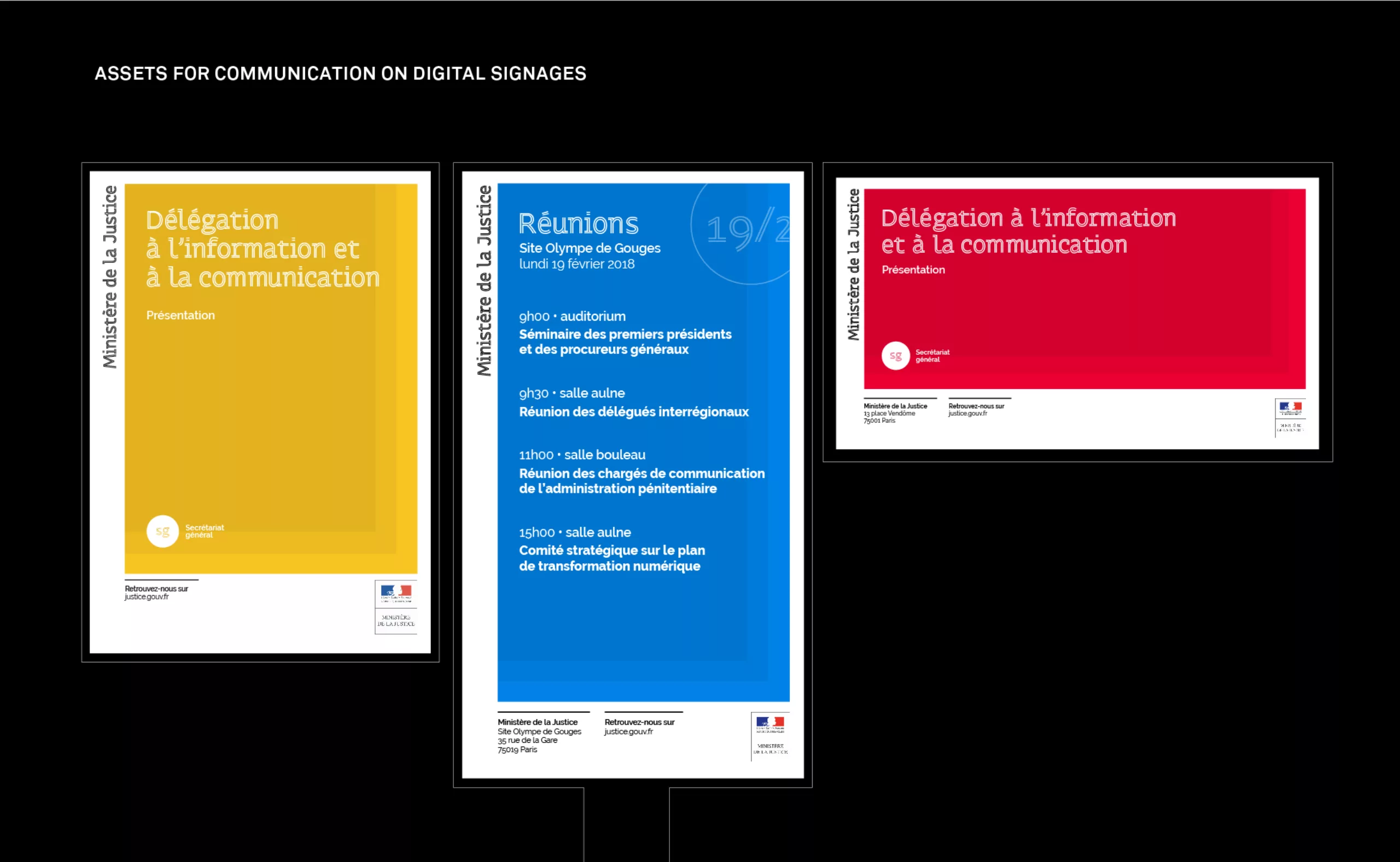
Defining a graphic charter for the Ministry of Justice required counting on a number of administrative constraints. In addition to the placement of the French Republic logo, the graphic charter had to take into account an internal printing process and in particular to work with a revolving white inherent to office printers. For the purpose of ecology, ink saving also had to be taken into account. To meet these requirements and to allow the Ministry’s teams to retain some of their creativity, we proposed a system based on a modular grid that could be adapted to all printed media.

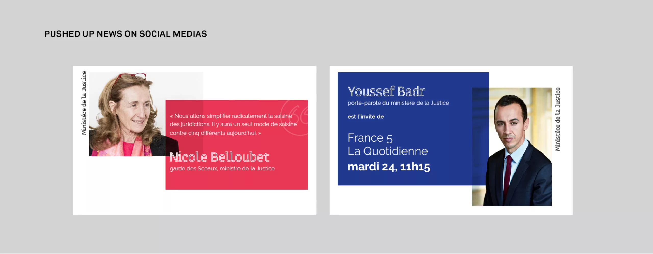
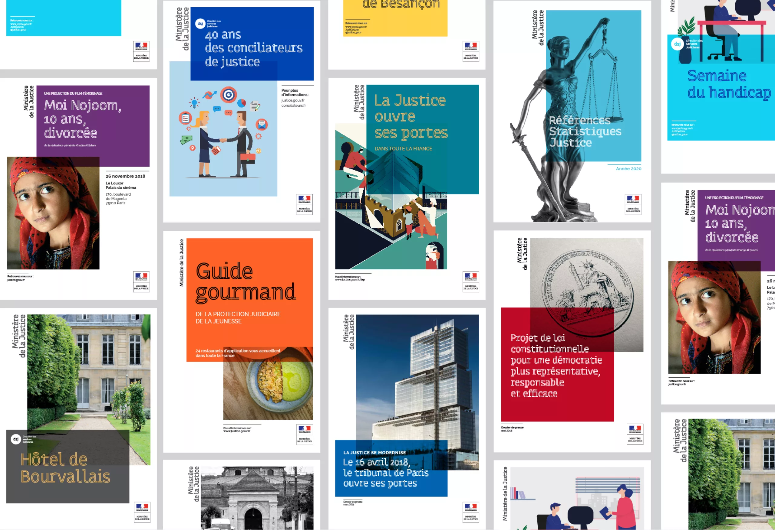
A flexible and inclusive corporate identity system
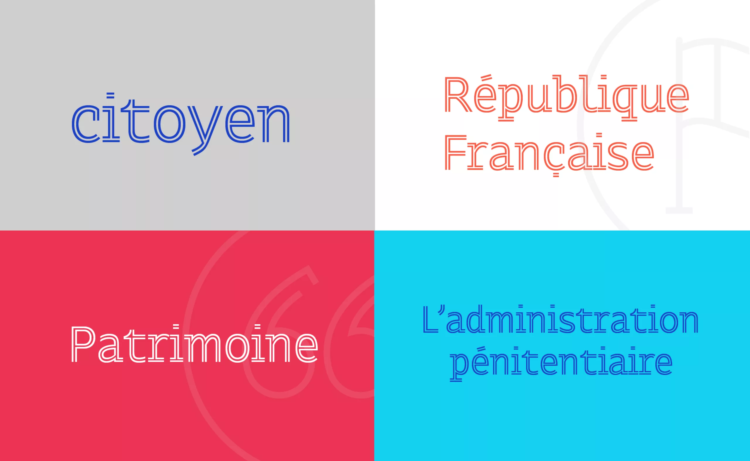
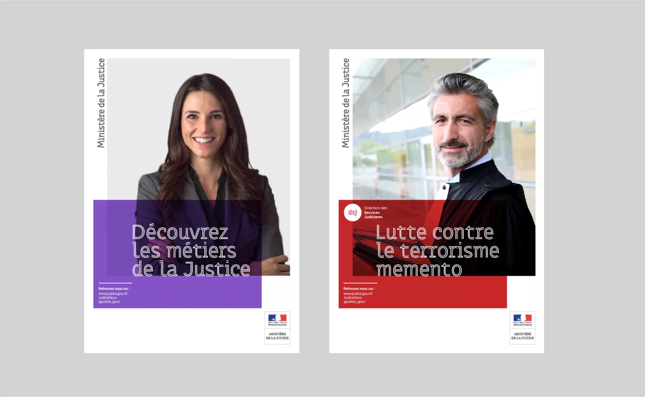
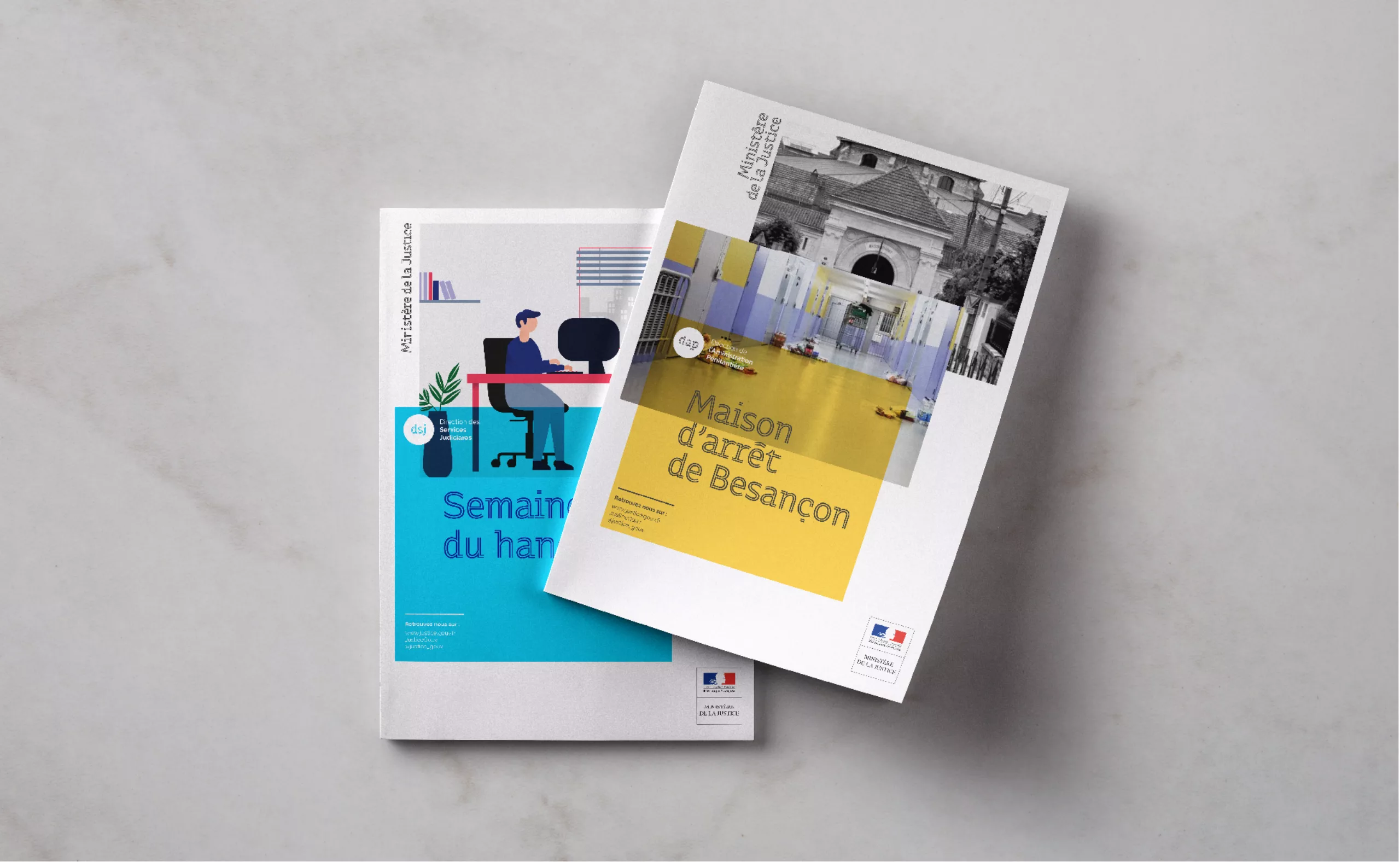
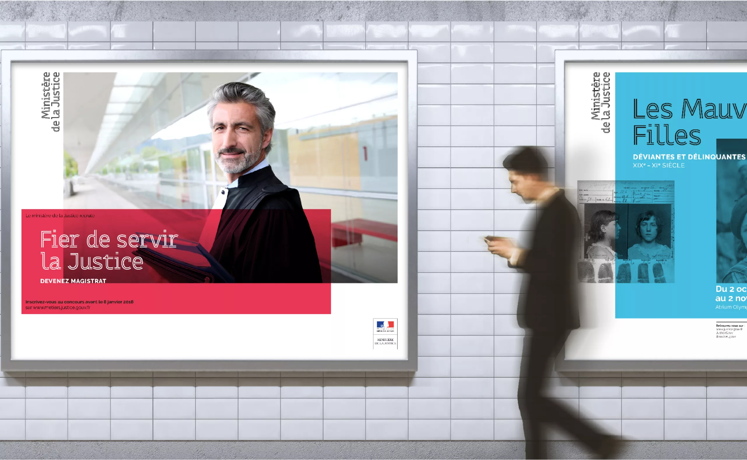
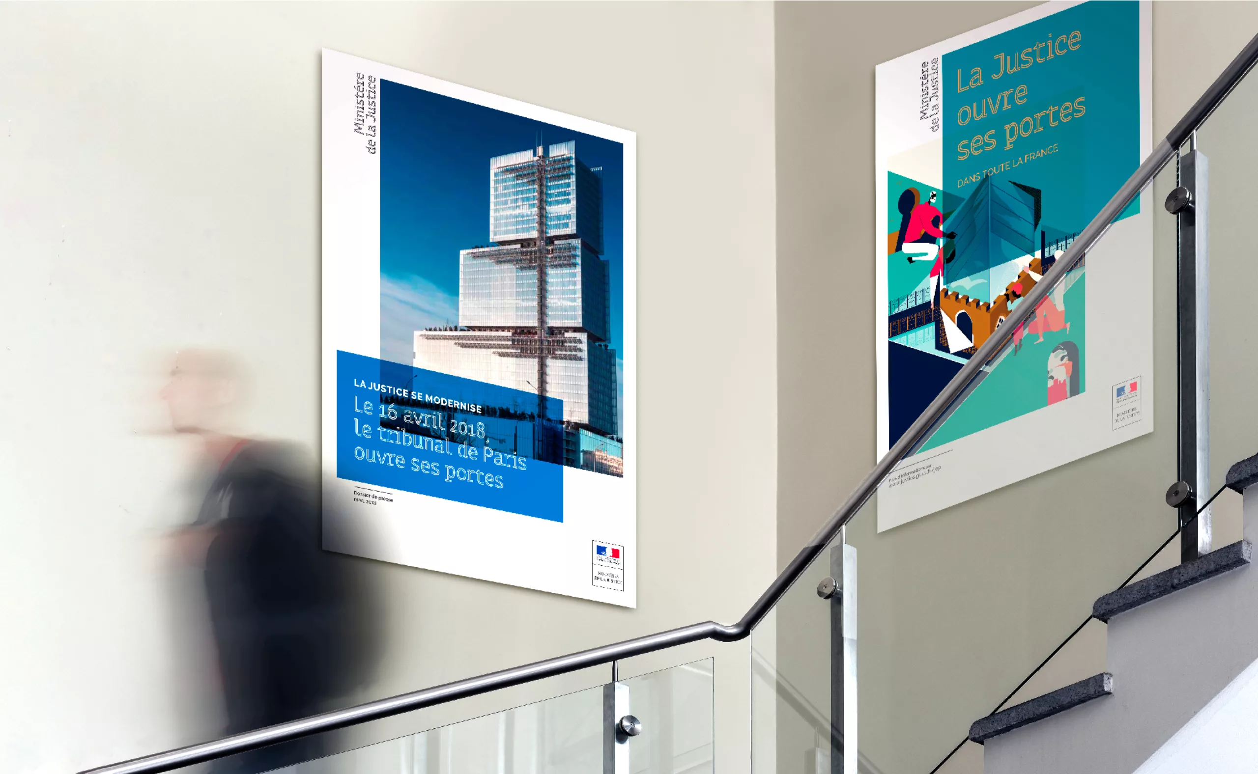
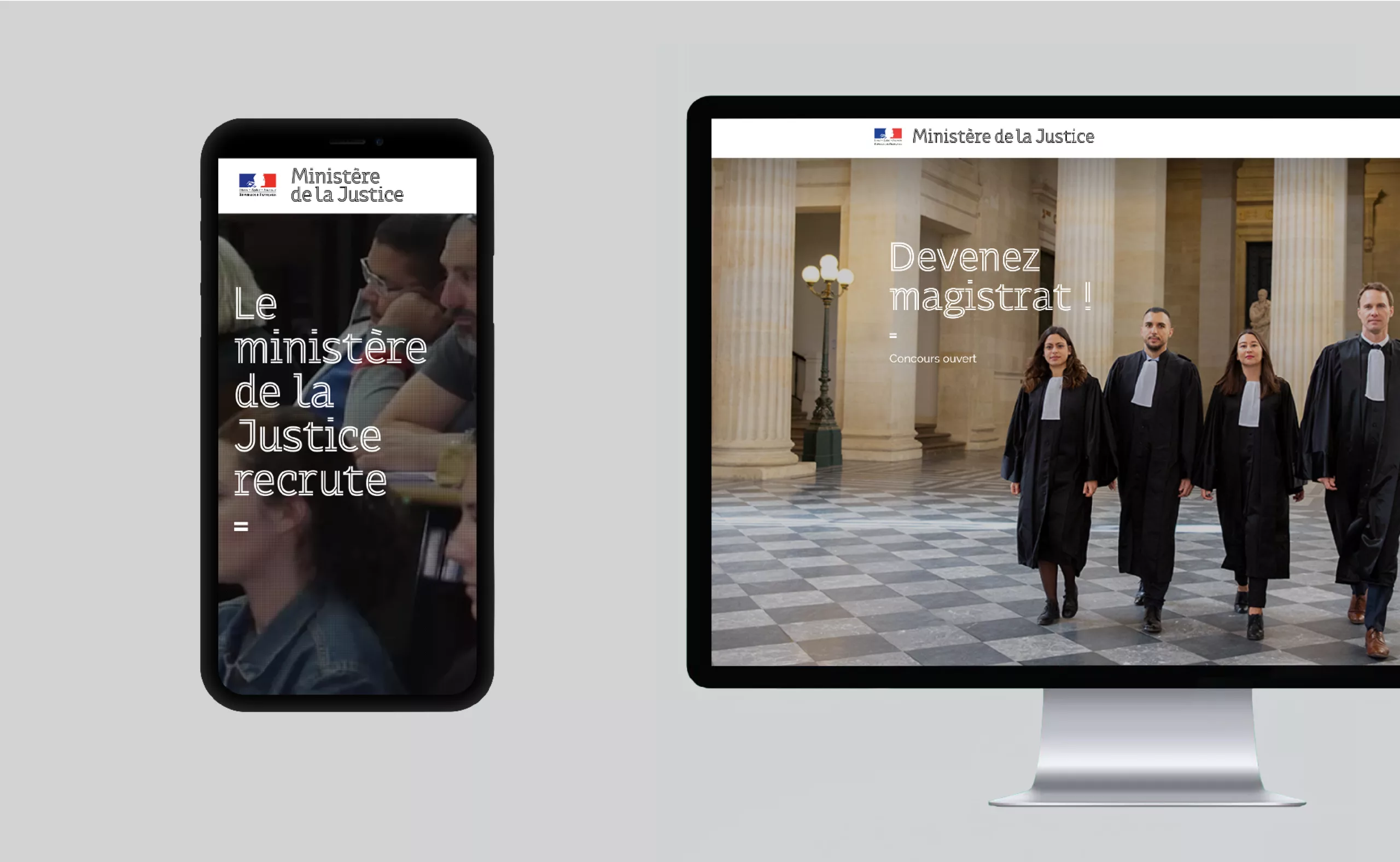
This grid comes in 3 levels. The first level is purely typographical. A zone dedicated to iconography is always present within the grid, but in this case it is simply materialized by a very light grey flat area. The second level provides for the superimposition of a pictogram on a flat area.
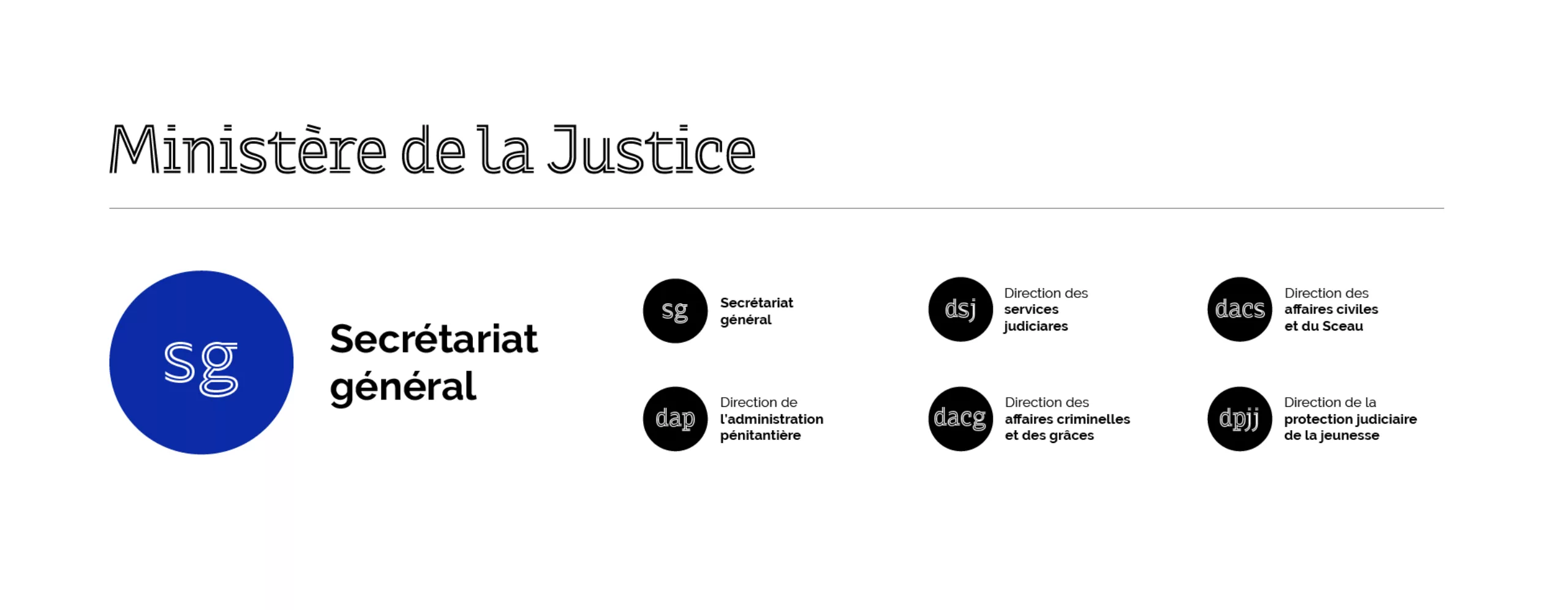
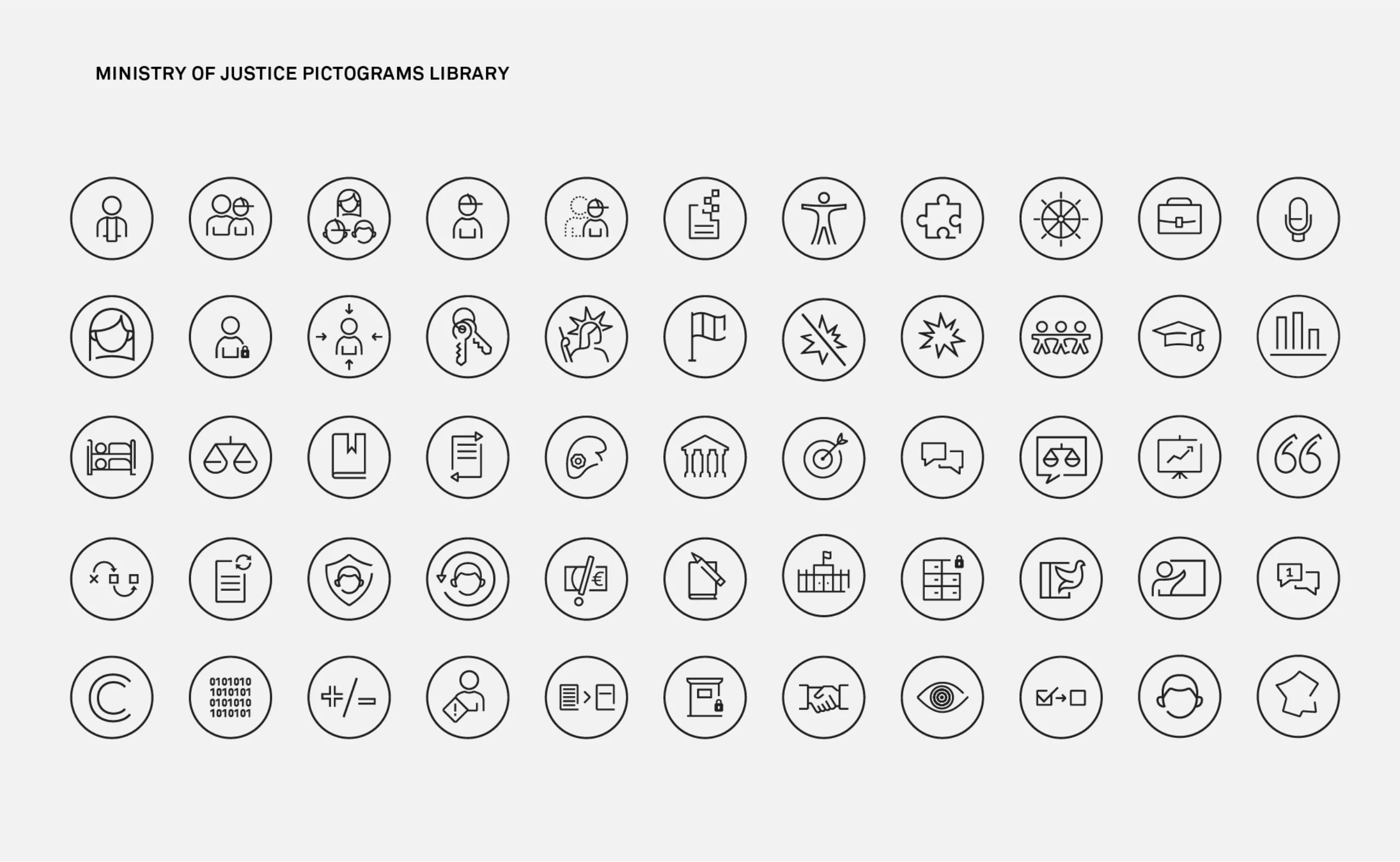
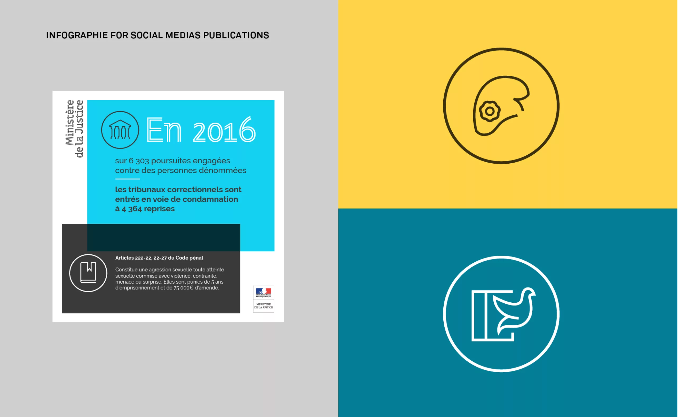
For the Department of Justice, we have designed a range of pictographs embodying the various functions and utilities of the institution. The pictographs follow the open-line typographic style. Finally, the third degree incorporates photographic and/or illustrated iconography. The superimposition of colourful solids and photographs brings rhythm and gives relief to the layouts. All of the models built on this modular grid allow great flexibility in composition for communication teams who are reappropriating the system internally.
With this new visual identity, the communications of the Ministry of Justice are easily identifiable. The proposed system, although eminently institutional and statutory, is modular in design and gives an attractive rhythm to communications. The Thémis typography is the keystone of this graphic charter. It alone embodies the idea of justice and is positioned as a striking graphic sign.
We would like to warmly thank Catherine Jorge, Emmanuelle Darcel, Clémentine Gautier, Nicolas Sanchez, Jonathan Debauve and the entire communications department of the Department of Justice for the trust they have placed in us throughout the completion of this project.
Thanks also to Pauline Fourest for her precious help in the development of the Thémis typeface.