The Great Cassandre 1901/1968
We continue the series of great names in graphic design with the portrait of a giant of graphic design in France.
Cassandre, the man who burned his wings on typography (1901-1968)
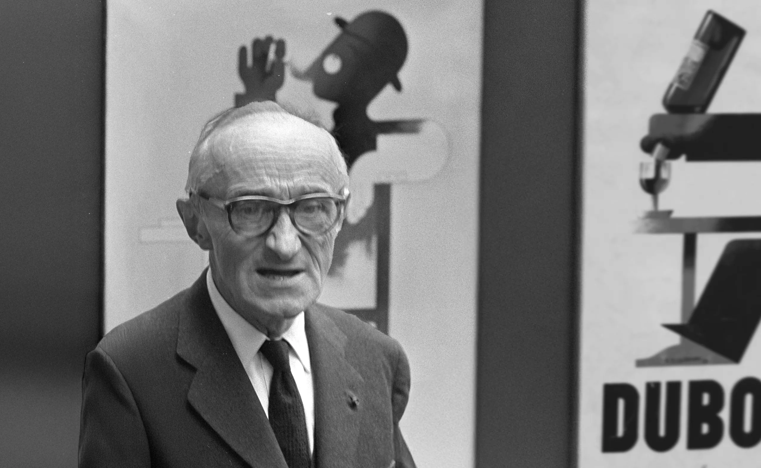
Adolphe Jean-Marie Mouron is a french graphic designer, typographer, poster designer, theatre designer, lithographer and painter from the interwar period. He was born in Kharkov in Ukraine at the beginning of the century, in 1901. His parents being of French origin, he comes to study in Paris where he will settle definitively in 1915. He committed suicide in June 1968. The story tells that we would have found a letter of refusal for his last typographic creation next to his body.
It all began at the Beaux-Arts in Paris, where he enrolled in free painting workshops. He then studied with Lucien Simon and at the Julian Academy.
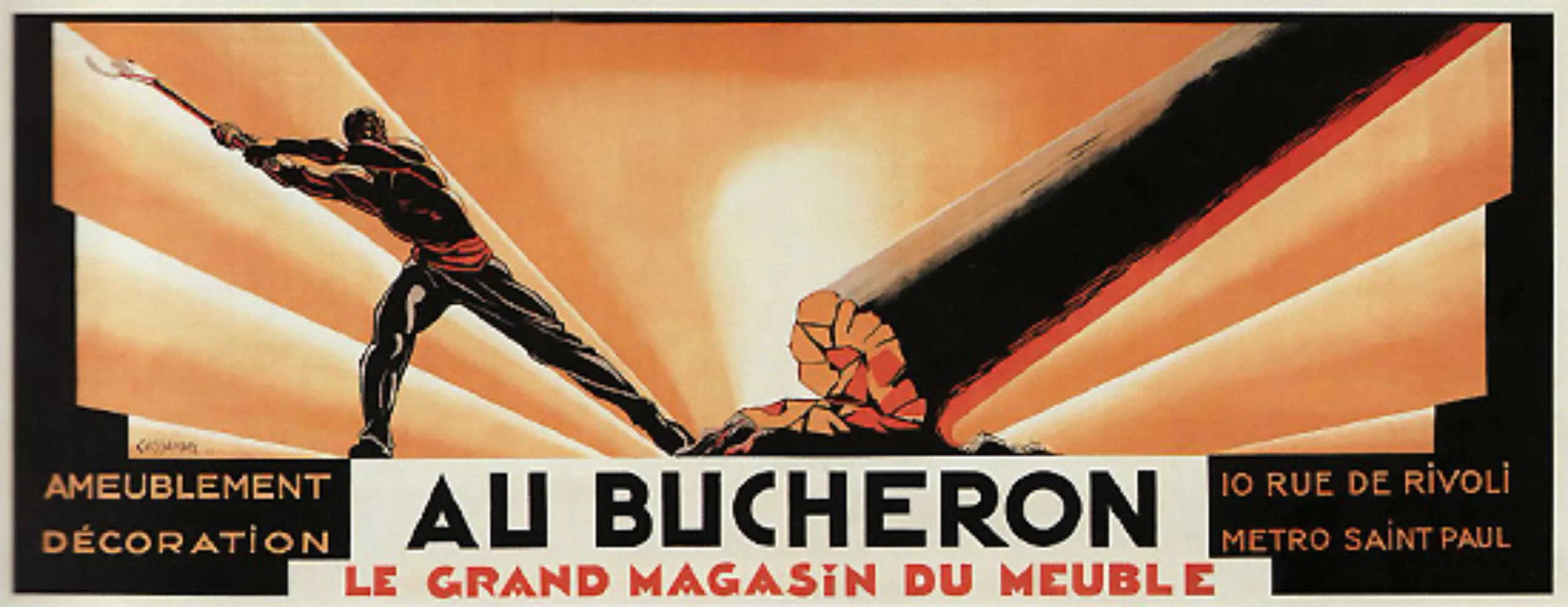
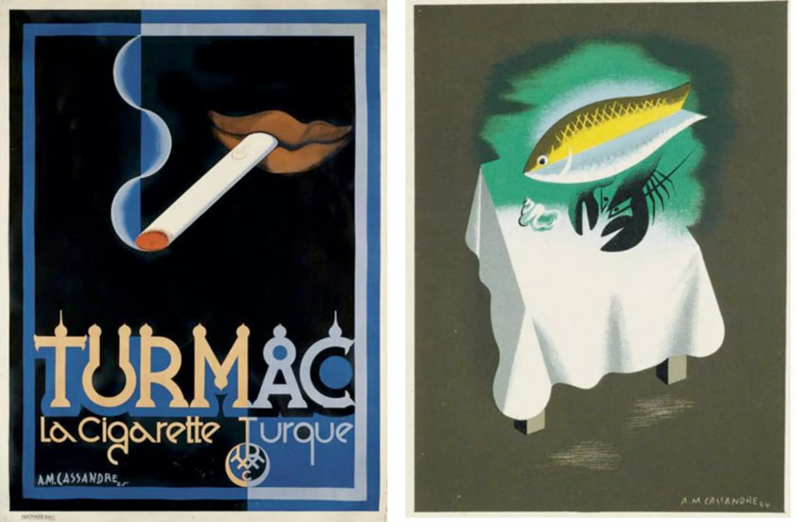
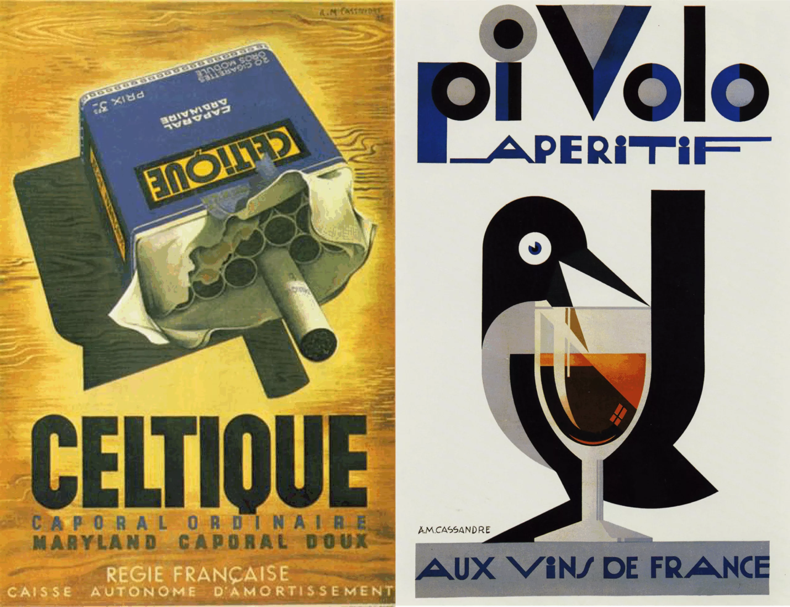
It is estimated that his first creations date back to 1921, but no traces remain. This desire to create comes to him when he participates in a poster competition for Michelin where he will win third place. In 1923 he officially presented his first great work AU BUCHERON, under the pseudonym Cassandre. This poster made him a famous man; in 1925 it earned him the grand prize at the International Exhibition of Decorative Arts, despite the violent criticism made of him in “L’esprit nouveau”, a magazine in which Le Corbusier defended his theses.
Fruit of chance or sign of fate, he will meet Charles Peignot during this exhibition. Son of Georges Peignot, at the origin of the foundry G.Peignot et Fils, jewel of the French typography of the time. It is there that he will imagine typographies such as Bifur or Acier, which we will return to below.
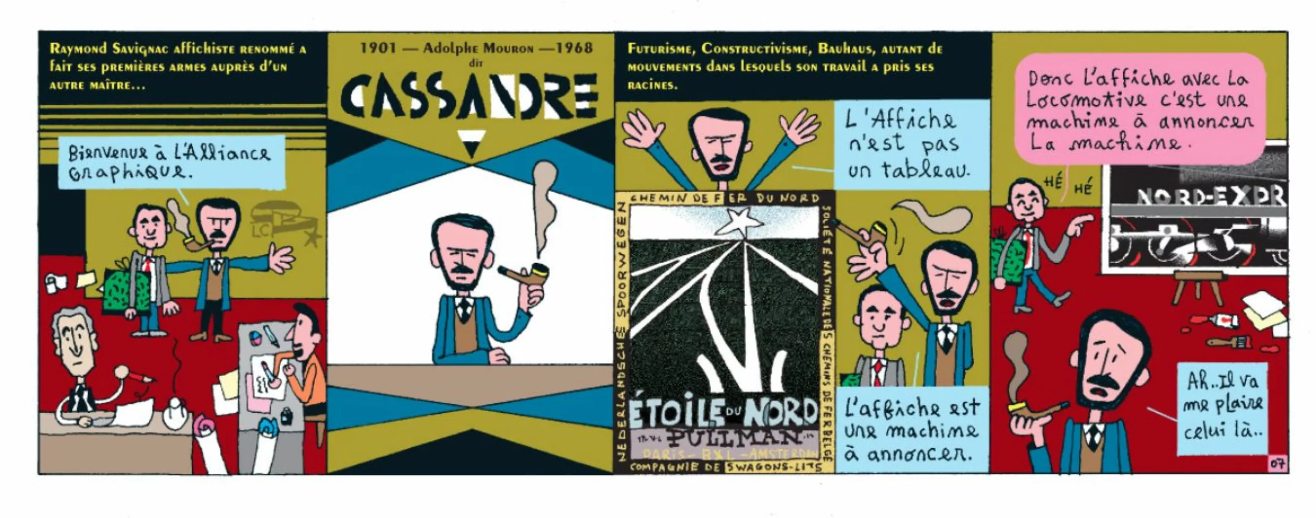
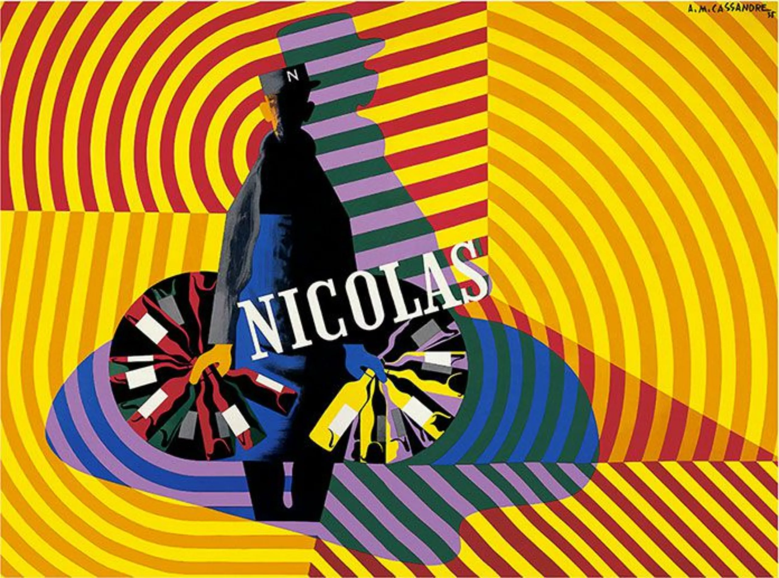
In 1931 he takes the direction of the Graphic Alliance, which will publish its own posters. At the same time he creates all the designs and layouts for NICOLAS stores.
In 1933 he began a new activity; that of theatre painter, at the same time that he worked as a teacher at the National School of Decorative Arts.
At that time he formed with Carlu, Colin, and Loupot those who were called the “Musketeers of graphic design”. They were emeritus members of the Union des Artistes Modernes (UMA), which brought together the end of late French creation in the 1920s and whose key words were order, colour and geometry.
Then followed posters, paintings, marriages, successes, failures, moves to finally end on a tragic suicide on June 17, 1968… Rumors say that Cassandre was a depressive man, and that he decided to end his days when his typography, “La Cassandre” was not published. To die for a character, what an idea!
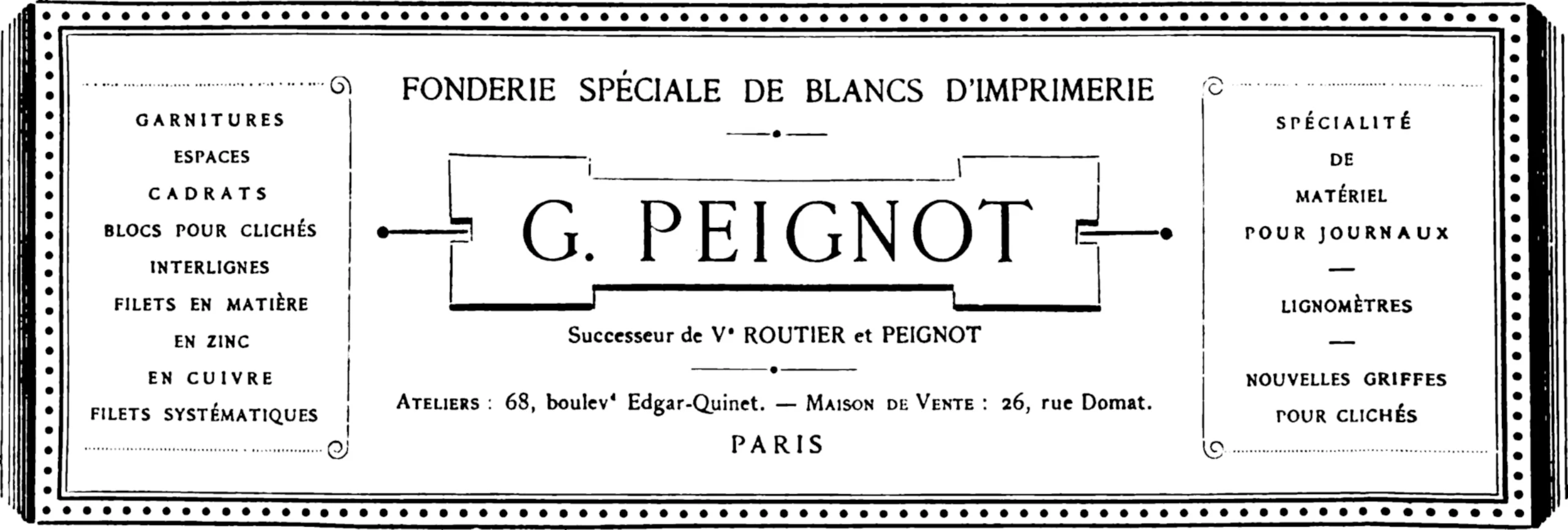
We always start with a “little white” at Peignot
Detour by the foundry G.Peignot et Fils, which is nothing less than one of the most illustrious French foundries of the last centuries, sometimes even qualified as legendary. The company took the name G.Peignot et Fils when in 1898 Gustave Peignot donated the company to his children, before dying a year later. His son Georges took things in hand by directing the white foundry towards character production; success was not long in coming and sales soared.
Now, normally, you’d wonder what a white foundry is. As much as the term foundry probably does not need an explanation, so much a foundry of whites can leave one wondering. I confess, I totally didn’t know that word. To enlighten you, these are the “whites” between the words and lines, in the margins, etc. Whites that require a high degree of precision (dials, line spacing, etc.).
In 1842, Pierre Leclerc, the founder of what was to become the Peignot foundry, invented a process that made it possible, instead of cutting whites, to pour them into moulds, which increased their precision. An innovation that doesn’t seem like much, but it’s a bit the equivalent of switching from Xpress 1.0 to Indesign 5.0.
It was not until two generations later that Georges Peignot successfully tried his hand at “blacks” by creating his first characters. The foundry’s reputation continues to grow. The Great War left only one “Peignot” on his feet, Charles, who met Cassandre in 1923.
A man’s work
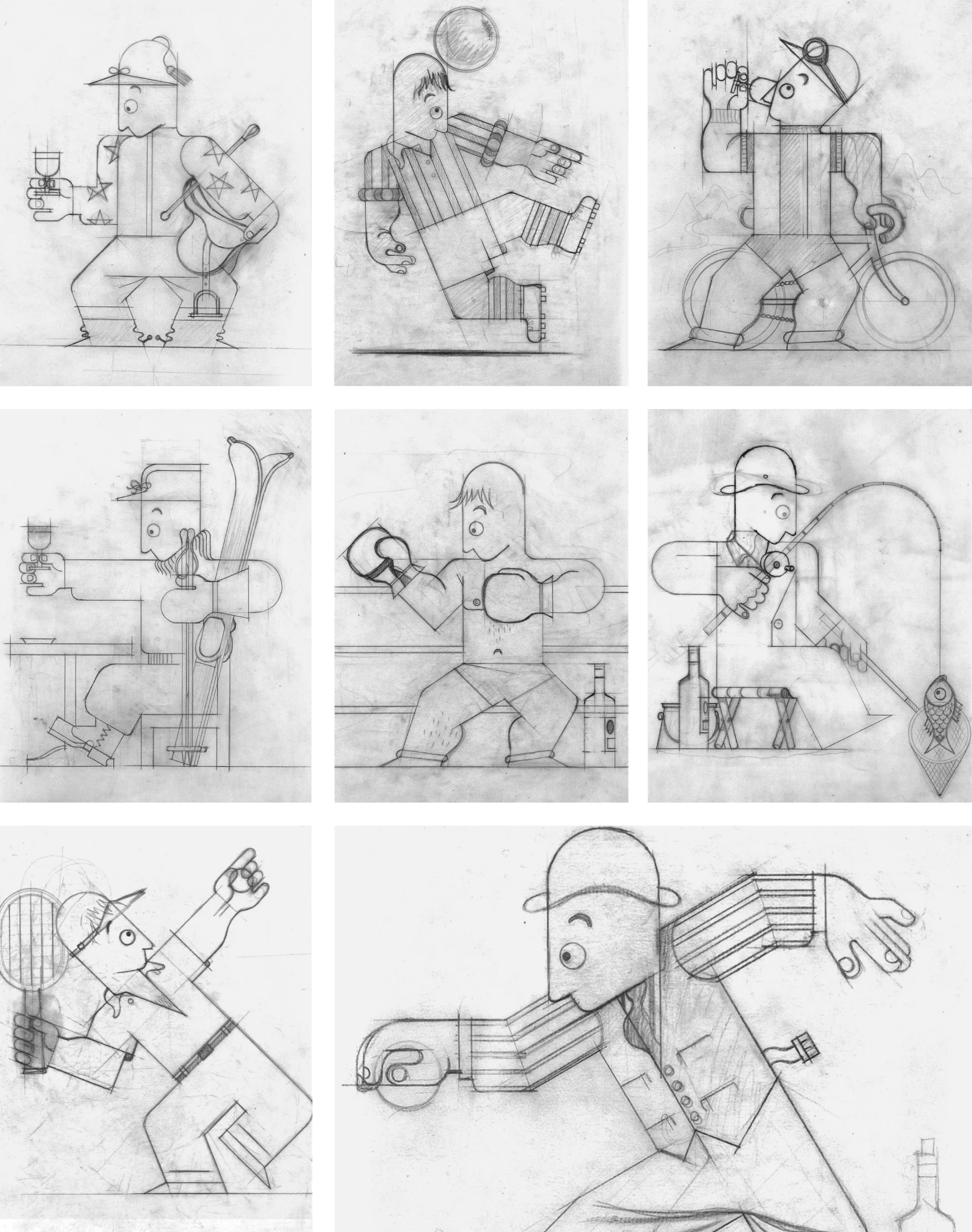
Cassandre produces a striking poster style that synthesizes futurism, post-cubism, surrealism and Art Nouveau. Typographies, monograms, posters… A limitless imagination.
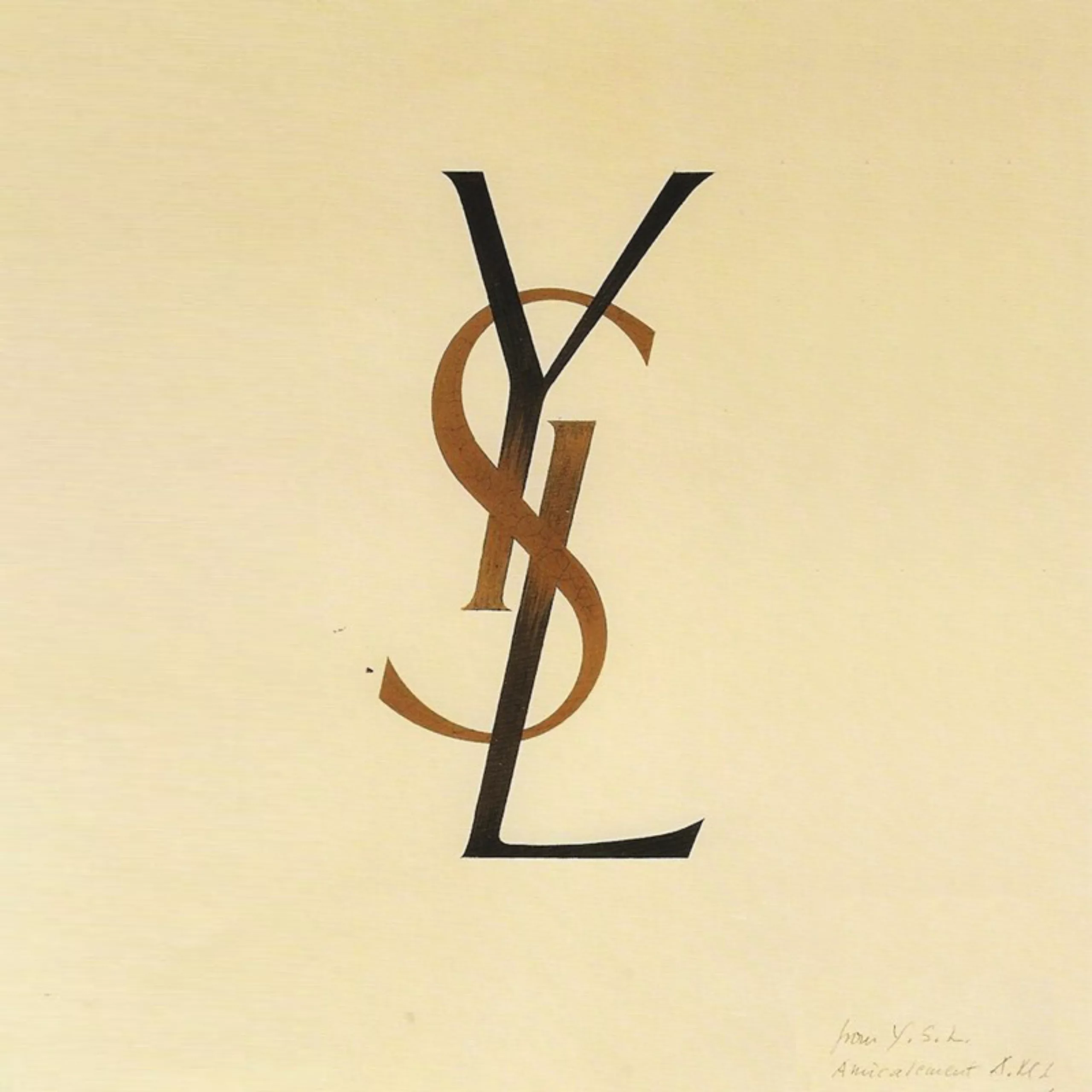
The monogram monomaniac!
Among the plethora of what he could imagine, the YSL monogram remains probably one of his most famous works even today.
Made in 1961 at the request of Saint Laurent, the three intertwined initials were the one and only proposal made by Cassandre to Yves Saint Laurent and Pierre Bergé during a meeting in a Parisian restaurant. A proposal immediately accepted because according to Pierre Bergé “Cassandre was the greatest, the best graphic designer of his time. He had drawn Christian Dior’s acronym, he was forgotten. ».
Let us not forget that for Cassandre the drawing must be based on the text and not the reverse. He himself says that this monogram “was designed to age at the same pace as the stones on Avenue Marceau” (the street where the Pierre Bergé – Yves Saint Laurent Foundation is located today). There is a very vertical, lively design, in which the elegance and modernity of Saint Laurent are perfectly combined.
Dubo, Dubon, Dubonnet?
In the form of a triptych, the mythical Dubo, Dubon, Dubonnet is a bit the ancestor of the animated gif ! A simple and poetic visual narration, coated with a humorous tone. We see a silhouette turning black as the sequence Dubo, Dubon, Dubonnet. Some tend to say that it is these gestures and traits that have given rise to the image we have of the aperitif in our region. Cheers, Cassandra!

The Evin law in France would prohibit this type of alcohol promotion today, but that did not prevent this poster from becoming a cult image, taken up and quoted by each generation of graphic designers. One can quote the spanish studio Atipo who had fun rephotographing the famous sequence for the promotion of their character “Cassannet” in homage to Cassandre.
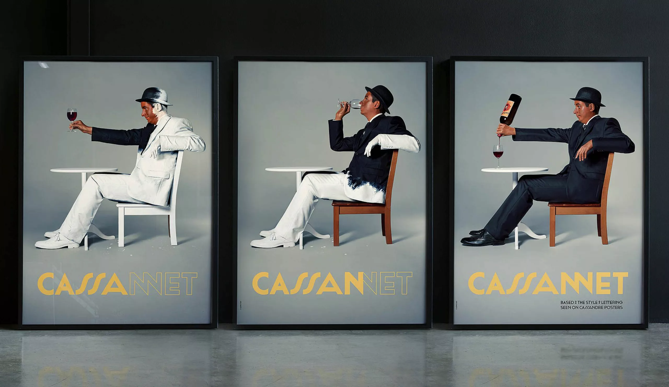
At Graphéine we also paid tribute to Cassandre through this re-interpretation in red and white…

Cassandre takes off
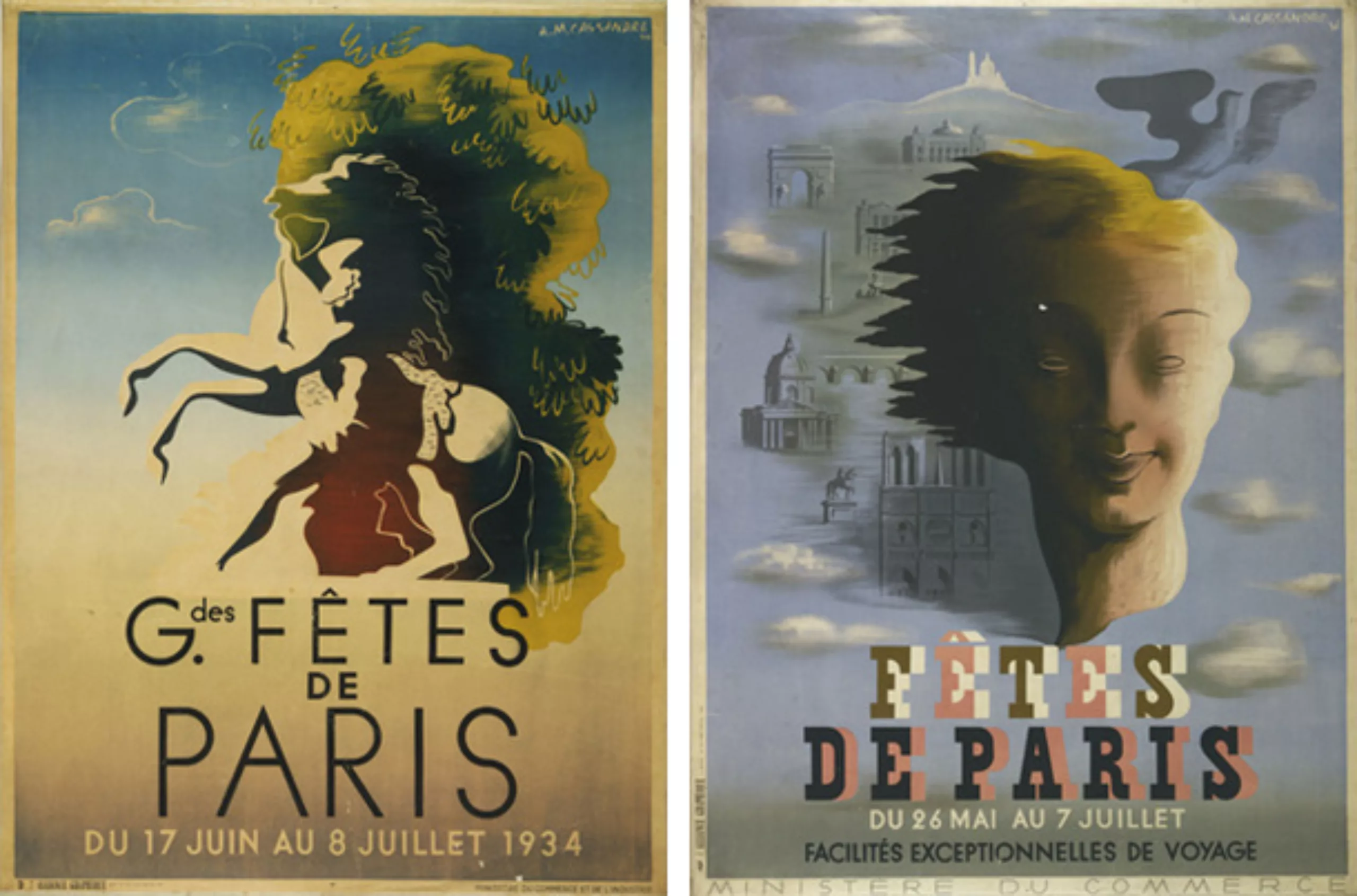
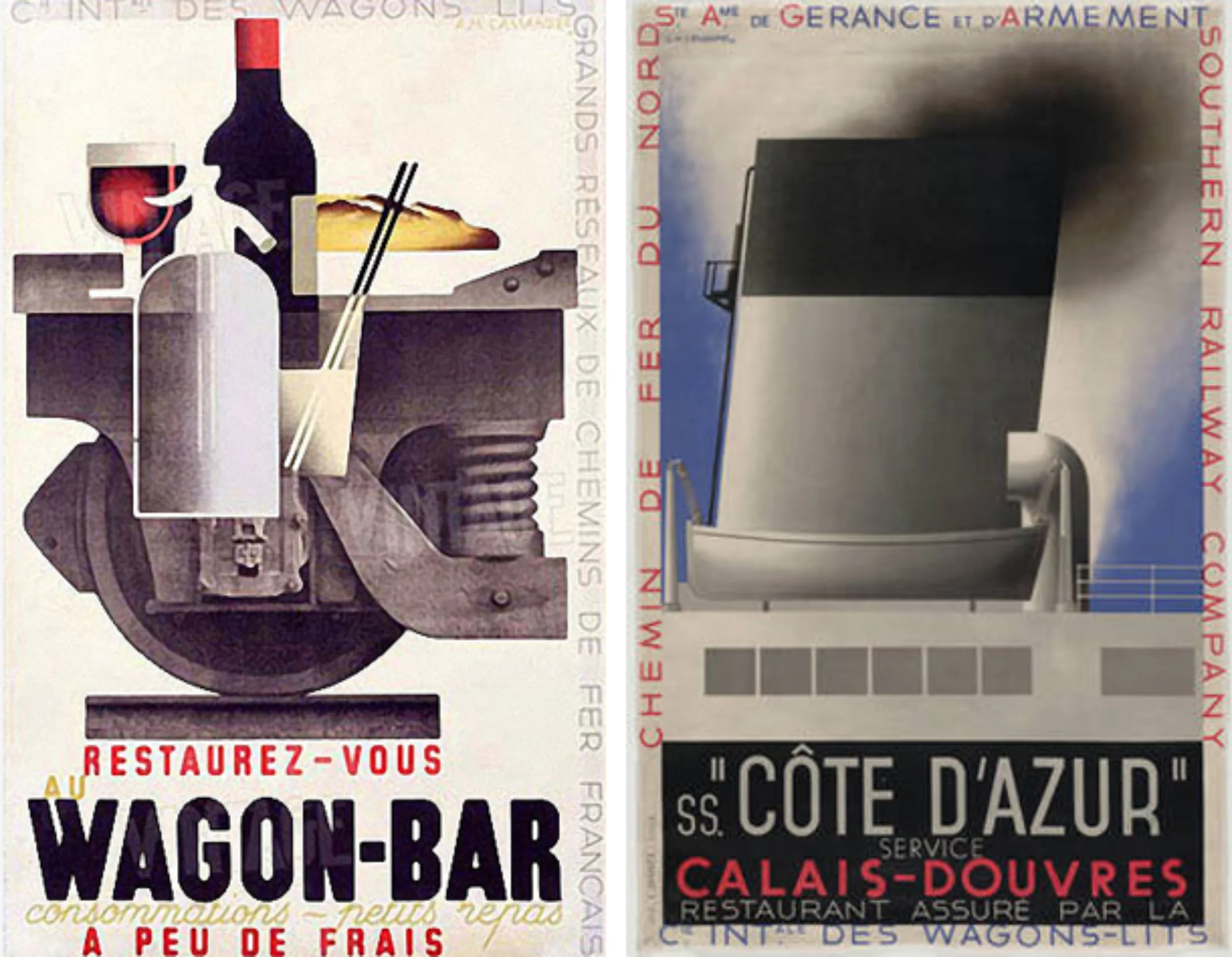
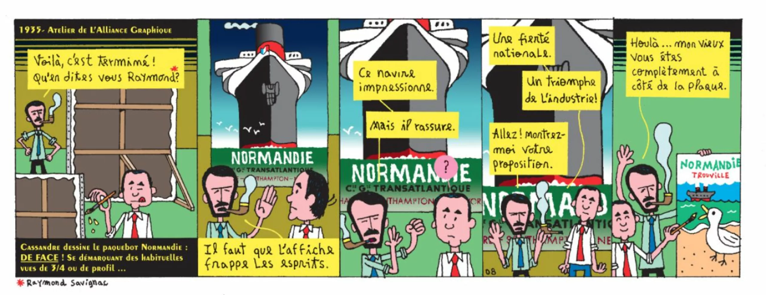
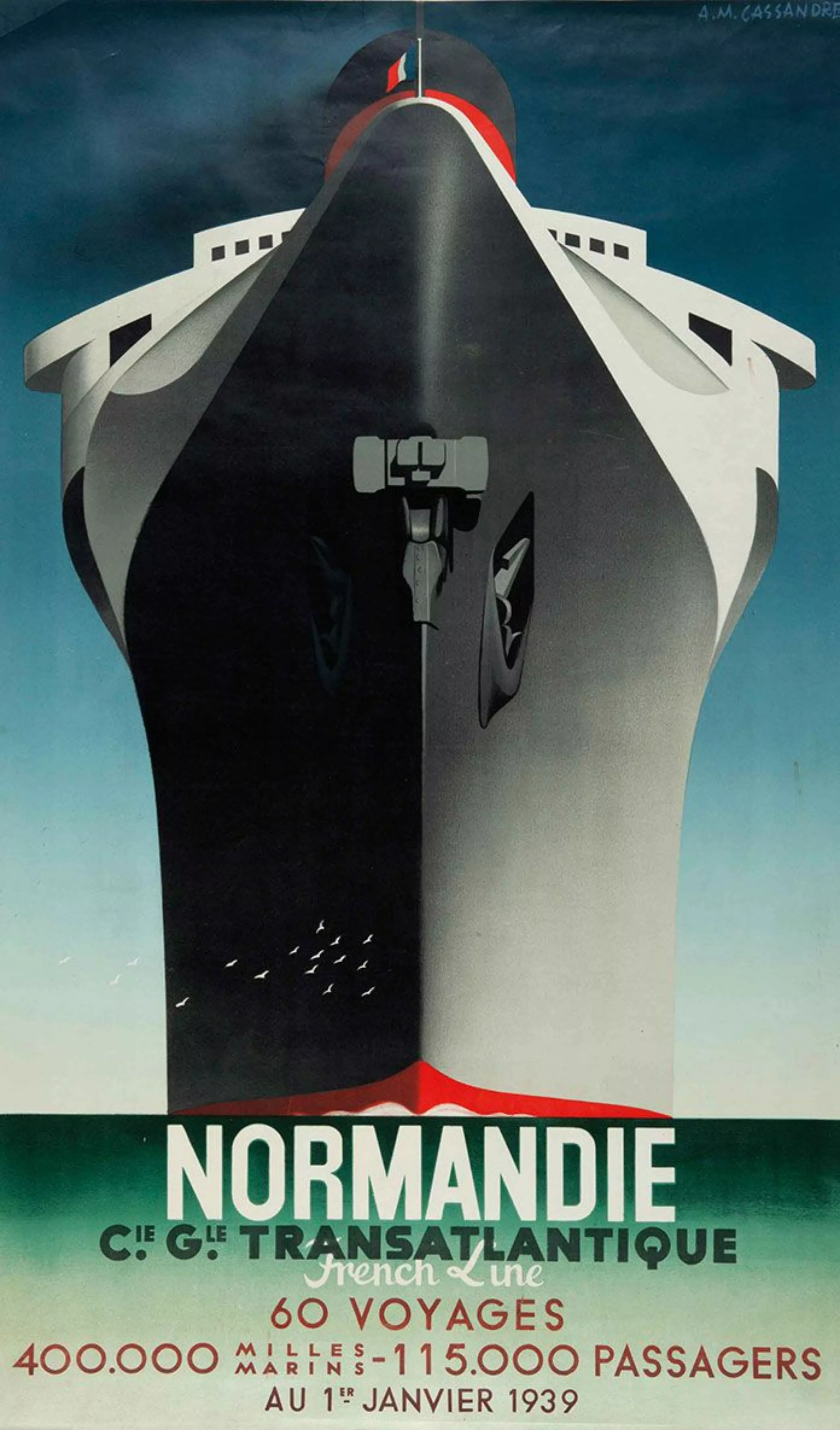
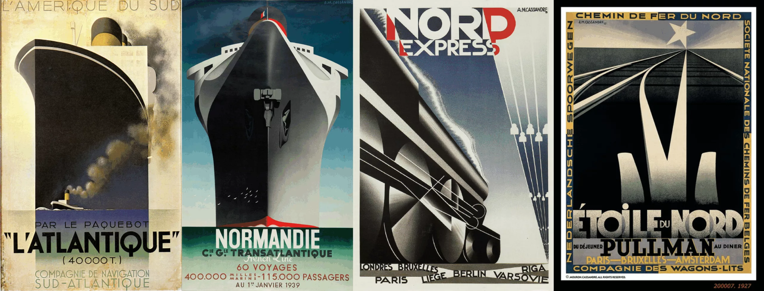
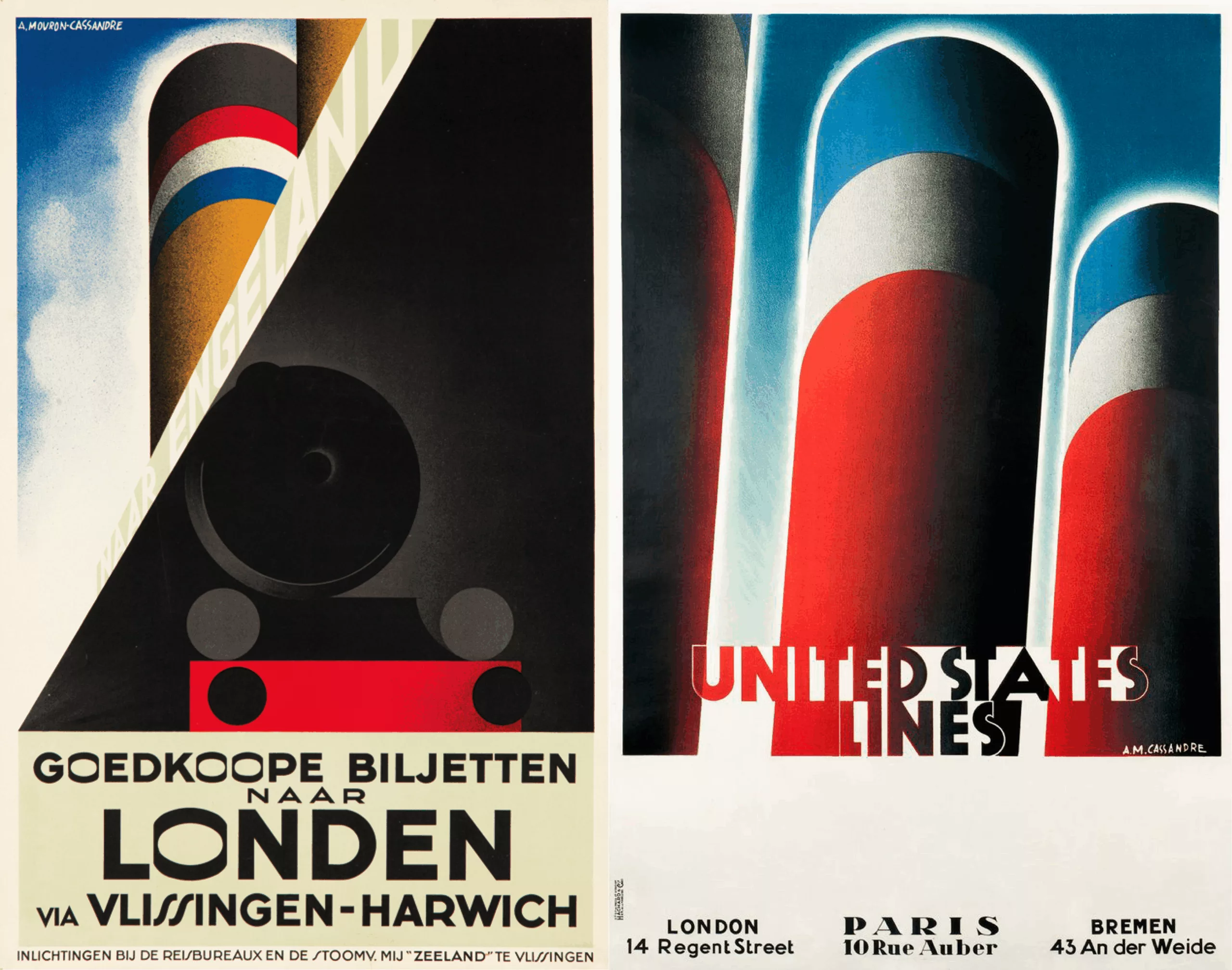
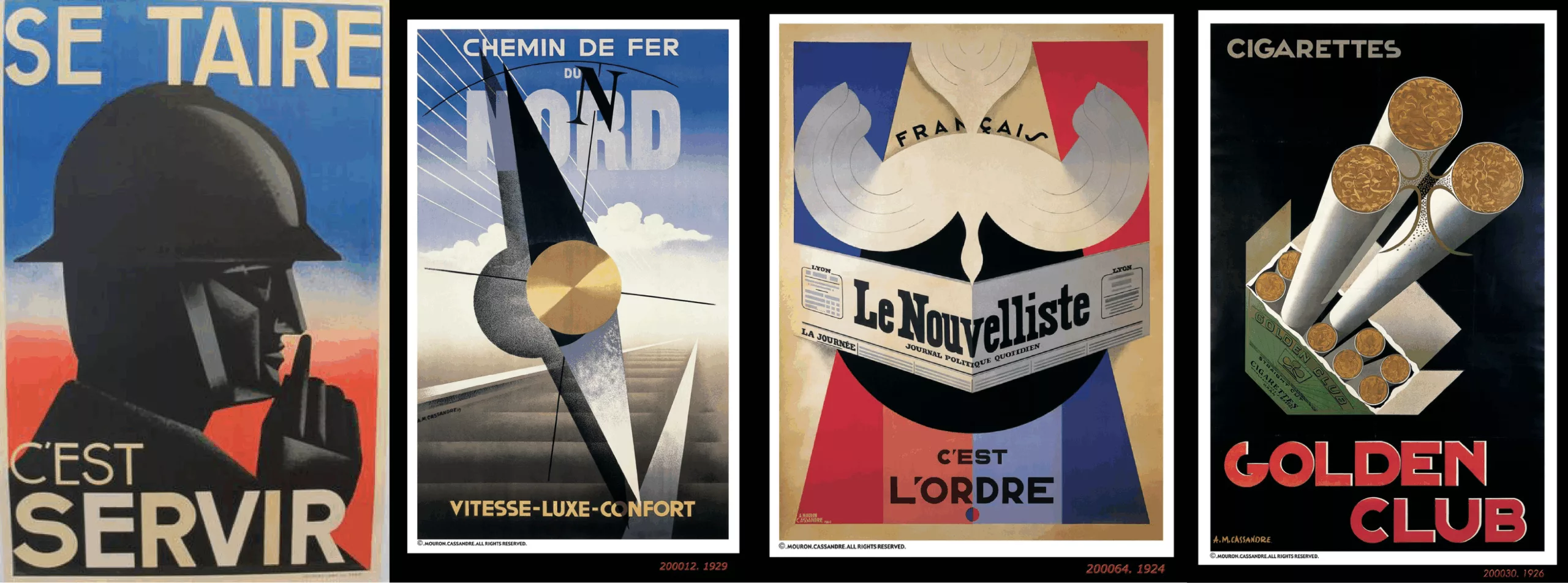
In the graphic icons, it is important to mention his posters for the Nord Express and Étoile du Nord trains, as well as those for the Normandy and Atlantic liners. It is from his alliance with Charles Loupot, the Graphic Alliance, that these posters will see the light of day. These last ones have as if exalted the modern world, the whole is magnified there in an extremely purified style. We talk about purism, even almost cubism.
We take the same ones and we start again with the transatlantic visuals: low angle, cubism, glorification of the machine and its power, flat colors and gradients without embellishments on big lines and perspectives. Effective.
One can easily read his passion for an almost standardized work where geometry, rules and mathematics prevail to erase the artist’s hand. An approach put in comic strip by Libération during his summer series “relaxed approach to graphic design” that we like a lot:
Cassandre, d’après Henri Mouron, L'art Vivant, novembre 1926.“On the one hand, the purely geometrical form makes it easier than any other to fit clearly in a given format all the given elements, on the other hand, thus traced with engineering processes, a model can be reproduced without danger, without one being able to distort its essential spirit, that is to say all that the creator has put into it of himself. The imponderables with which we usually have to rely so much no longer exist. A poster is “one” without possible alteration. Designed with plumb line and ruler, the same instruments are used to mathematically transfer to the stone, and the machine then finds itself in front of elements which, instead of faulting it, serve instead to show its perspectives.”
Cassandre, by Henri Mouron, L’art Vivant, November 1926.
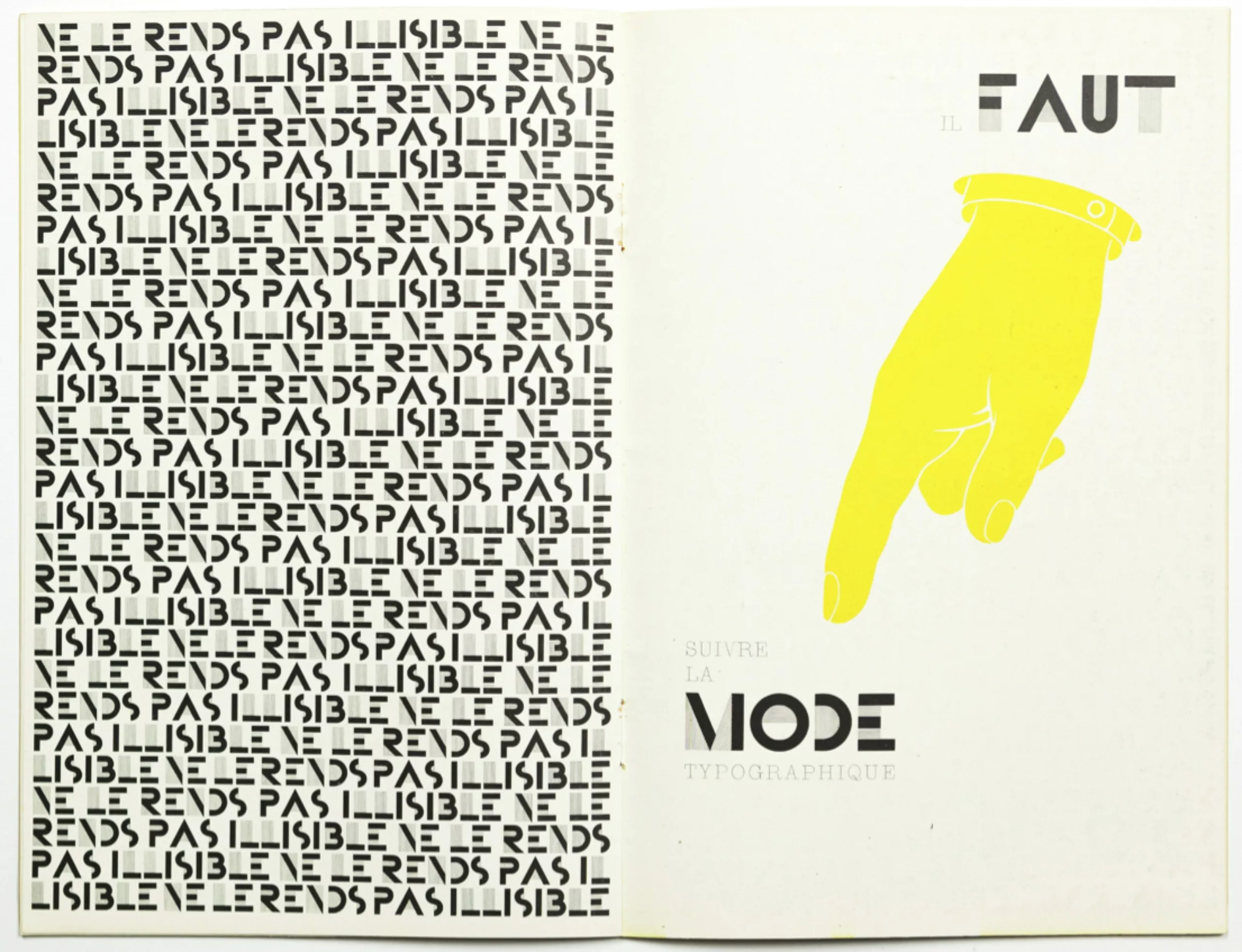
The Bifur dares!
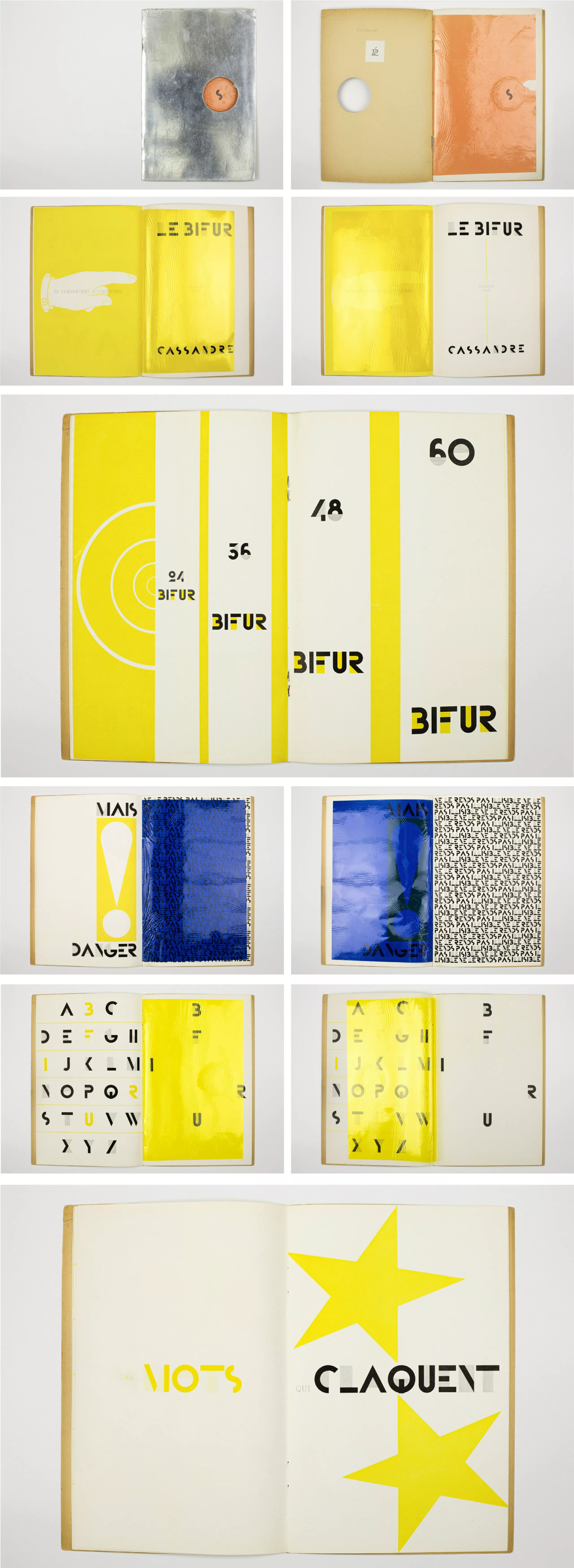
It was in 1929 that Cassandre’s most experimental typeface was born: The Bifur.
Originally designed for advertising use, “this typography is based on a search for the very essence of the letter. It should make it possible to organise large architectural masses” says Cassandre.
Bifur is composed exclusively of capital letters, two distinct compositions in two tone variations. One is tempted to think that this capital exclusivity could be at the origin of its commercial failure. Very well known today, it was however very badly welcomed at the time. In 1929, avant-gardism advocated lower-case letters, capital letters referring to domination. To defend this choice Cassandre sold Bifur as a writing attached to the past and concerned about grandeur, having for vocation to leave its imprint in the mind of the spectator. Despite a real desire for innovation and real advocacy, Bifur was not as successful as expected.
Below: an extract from the “Bifur” presentation catalogue. With a silver cover and a series of multicoloured smoothing gelatins appear all or part of the messages. A treat!
You can find all these documents in the book “Cassandre. Specimens.” by Pascal Béjan and Frank Adebiaye.
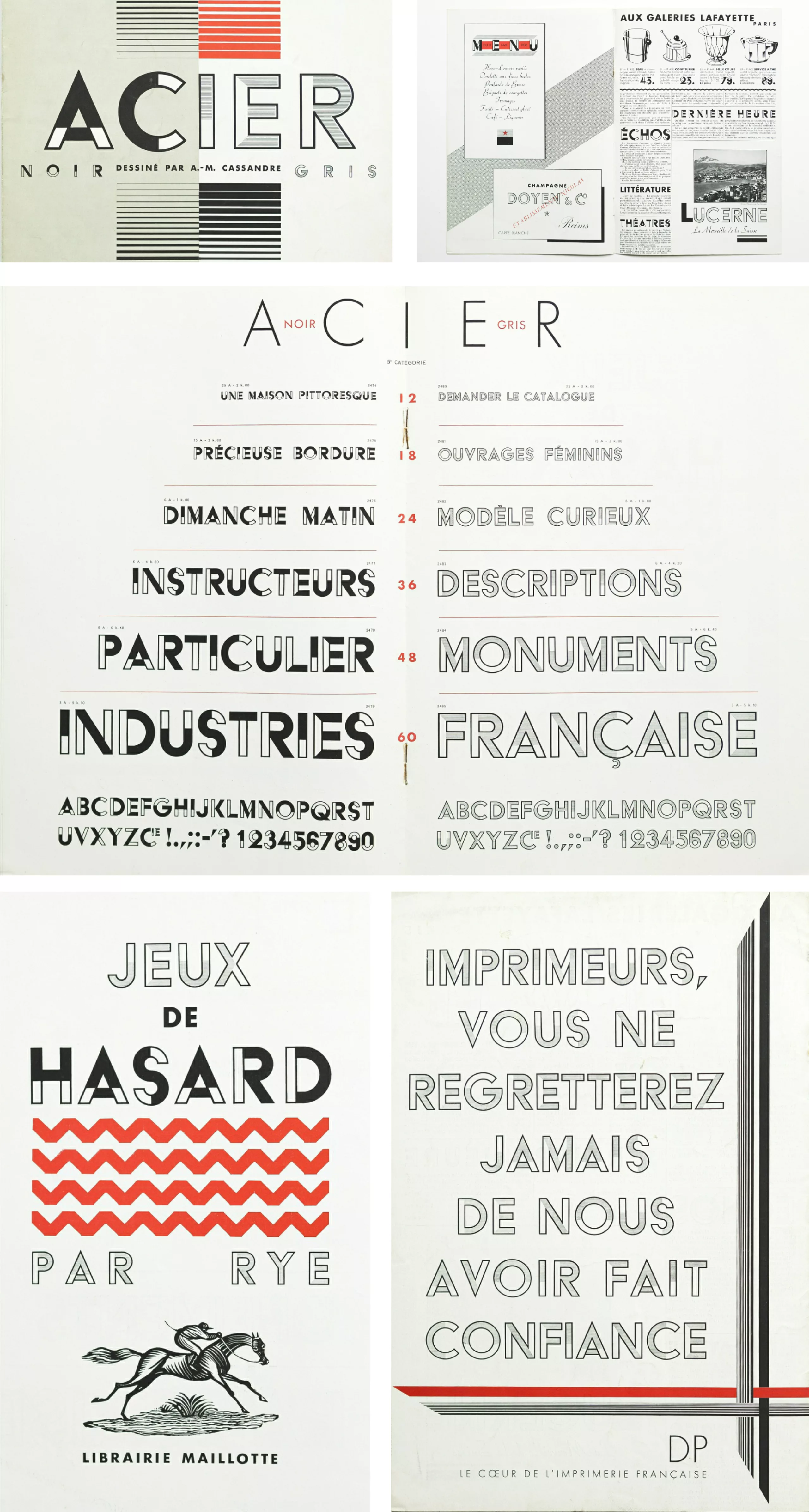
The Acier
As for Acier, Cassandre likes to say that it was an experiment between Bifur and Futura. This writing will be used mainly for the artistic direction of the magazine of the same name, as well as for certain advertisements and works of the city.
The technical composition exists in two versions,Acier Noir, and Acier Gris; Cassandre explains the latter: “The alphabet is usable in newspapers, it will be even more indispensable because it has been designed under a double aspect to accompany the range of shades of photogravure. With the black and white effects of zinc-treated, cooperates Acier Noir, with its bold contrast. Acier Gris, on the other hand, with its delicate hue, comes for the first time in typography to bring a harmonious complement to the greyish shades of imitation leather. All magazines and catalogues containing a photographic illustration will find in the Acier font a certain element of typographic elegance”.
Lack of luck, where can be lack of adequacy with its time, Acier will not know a greater success than its big sister Bifur. Today, you can buy this typeface online, on BAT Foundry.
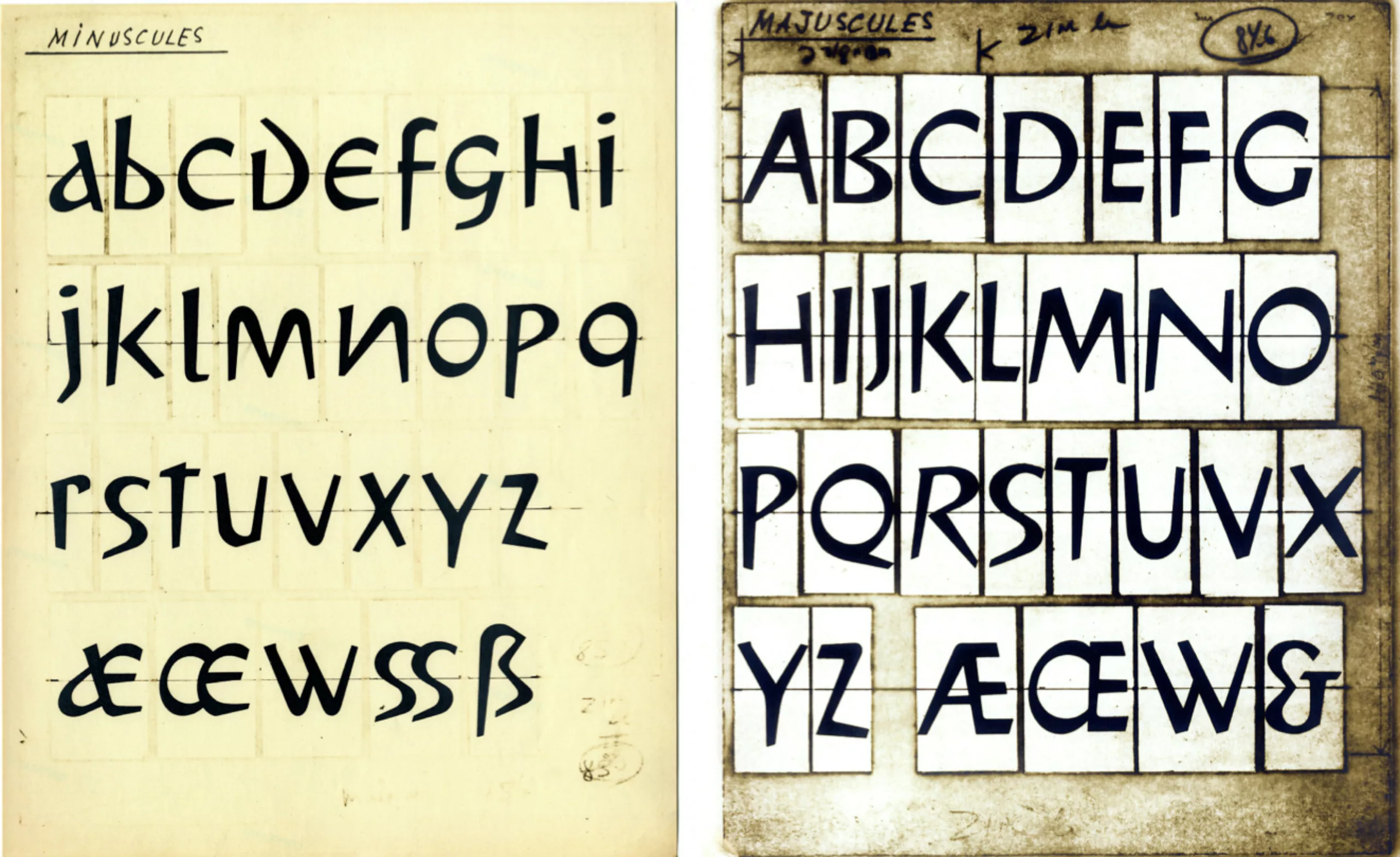
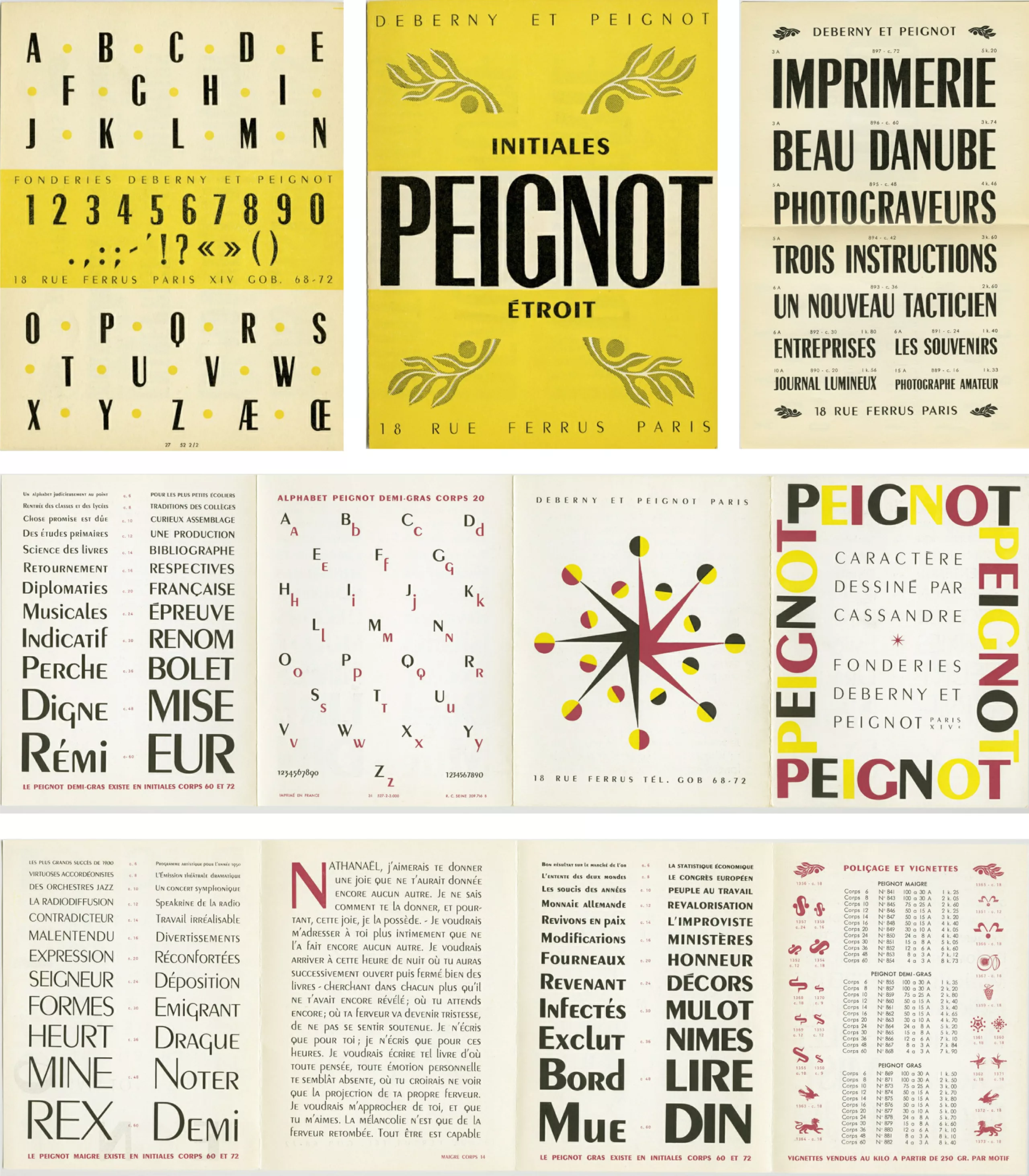
The Peignot
Designed and distributed in 1937, this font bears the name of the director of the foundry Deberny et Peignot, Charles Peignot.
As a great promoter of the use of capitals, however, Cassandra tried to associate, in this font, capitals and small letters. In typography, this assemblage is called “biform”. Difficult to read in small bodies, it is ideal for titles or large texts. It is with this character that Paul Valéry’s quotations are inscribed on the pediments of the Palais du Trocadéro.
His vision
To dive a little more into this character, here is one of his quotes to enlighten his work, taken from this site.
On the role of the artist in front of a poster:
“The poster is not, and must not be, like the painting, a work that at first glance is differentiated by its “way”, a unique copy intended to satisfy the shady love of a more or less enlightened amateur salt; it must be a serial object reproduced in thousands of copies, such as a pen or an automobile, and destined just like them to render certain material services, to fulfil a commercial function. The creation of a poster poses a technical and commercial problem where the particular sensitivity has no part. It is a question of addressing the mass in a language accessible to the vulgar (…); it is a question of telling a story to the crowd.
It is in this sense that the modern poster tends to replace the minor arts, the collective arts, the anonymous arts that saw flowering Antiquity and the Middle Ages. Many well-meaning people ask me for posters “in the BUCHERON genre”, as if I were free to pull galvanos indefinitely from a cliché once consecrated by public fervor! Such repetitions are impossible and would force the artist to a kind of suicide. Each poster is a new experience to try, or rather a new battle to fight, to win. Success does not wait for the one who gently cuddles the onlookers. Success is to the one who conquers the public “with the hussar” or rather, pass me this term soldier, who rapes him.“
“Painting is a goal in itself. qu’un is only a means of communication, a means of communication between the trader and the public, something like the telegraph […]. We do not ask him for his opinion, we ask him to establish a clear, powerful, precise communication. But if d’expression uses the means of the painter, they cease to be for him means of individual expression, to become anonymous language, a kind of international code, the Morse alphabet of the telegrapher.“
Cassandre and the poster art
Through these few quotations, we can undoubtedly understand Cassandre’s vision of poster art. A subtle mix between imagination and assiduity mixed in a striking creation, understandable instantaneously, but above all intended to force the gaze and interest of street people, distracted people.
The power of call must be out of the norm, in the sense that we are exposed daily to hundreds of advertisements, even if according to him the aesthetics can escape certain rules.
For him, the poster has a purely commercial purpose, no more and no less. Cassandra chose to be more sensitive to form than to colour, details and the order of things. For him, a poster must be able to blend into urban furniture, furnish facades etc.. This is why his work is described as cubist, a passion for architecture that taught him to dislike “distorting particularities”.
Loudly and clearly
One very important thing that comes up all the time in his posters is the use of capital letters. For Cassandre, lower case letters are only a manual distortion of monumental letters, a sort of abbreviation. Very attached to capital letters, the use of large letters makes it possible to convey a stronger message, a message which is sure of itself and which wishes to assert itself as such.
This is not all; in order for a poster to be perfectly successful, Cassandre advocates absolute freedom in the choice of means to respond to the problem. Each poster is a new battle, a real challenge.
If at the time he wanted to impose himself with a grandiloquent style and assertive letters, today he has undeniably left his mark in the world of graphic design.
To go further:
- The official site gathering all that you seek on Cassandre.
- Specimens ebook, about Cassandre’s work.
Images: www.cassandre.fr
On the subject
-
Debbie Millman: searching for the meaning of design
From consumer logos to social movements, Debbie Millman questions the meaning of design in society through her work.
-
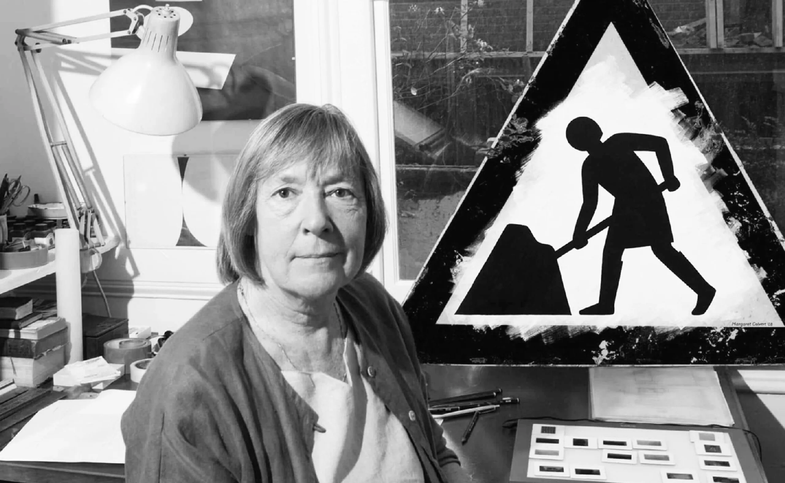
Margaret Calvert: woman at work! How design saved UK’s drivers.
By designing UK’s road signs, Margaret Calvert’s discreet work helped to save hundreds of thousands of lives in the United Kingdom.