Pierre Bernard & Grapus, “Graphic design of public utility”, 1942/2015
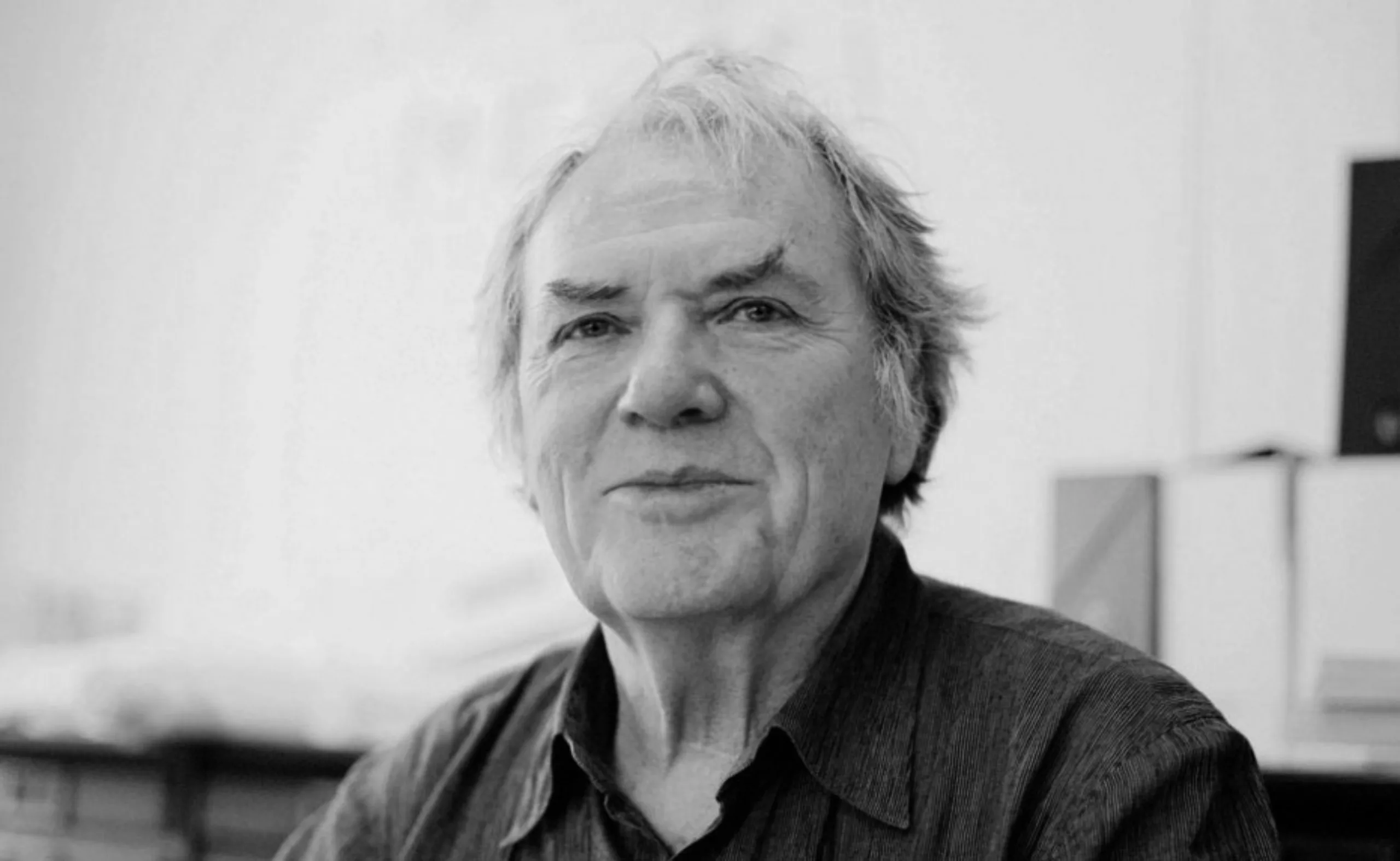
Last November, Pierre Bernard broke his pipe, his pen, his coloured pencil and his thousand other means of expression. He was born 73 years earlier in Paris. He inevitably left too early, leaving behind, via Grapus, one of the most interesting pages in the history of graphic design in France.
We will try to tell you (in part) this story, that of Grapus and Pierre Bernard. I specify in part, because it would seem very vain to precisely define Grapus’s “messy and protean” trajectory, and even more so Pierre Bernard’s place within this collective adventure. The second part of the article will deal more specifically with his individual journey through the Atelier de Création Graphique.
(This article is part of our series of portraits “Great names in graphic design“.)
The training years
Trained in Deco Arts, he co-founded the Grapus collective at the end of the 1960s with his friends François Miehe, Gérard Paris-Clavel, Jean-Paul Bachollet and Alex Jordan. This fine team has totally reinvented “public utility graphic design” in the space of twenty years, collectively creating thousands of images committed, enraged, funny, powerful, poetic…
Poland and Henryk Tomaszewski
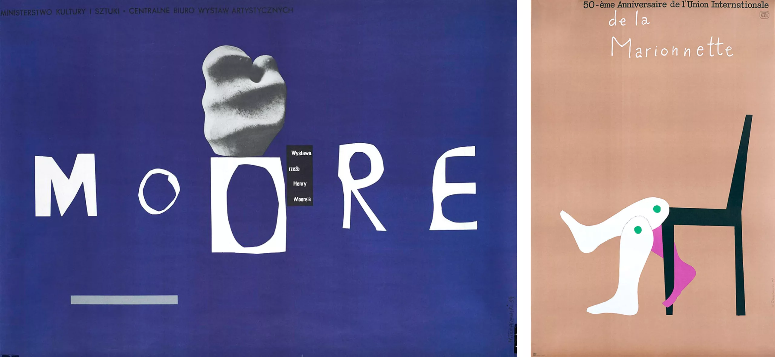
In 1964-65, Pierre Bernard and his acolyte Gérard Paris-Clavel – who became another founding member of Grapus with François Miehe – discovered Poland, then part of the Soviet bloc. Pierre is hired as an intern by Henryk Tomaszewski who teaches him cultural graphics and the art of the sense of the graphic message.
It was Michel Quarez who had left the previous year on an internship there who had brought the “Polish” virus back to the Arts Deco. It must be said that Tomaszewski’s work was impressively modern and energetic (see pictures below). His creations, very strong and colorful, fight for the independence of graphics and cultural message, at the time of Stalinism and Polish socialist realism. Pierre Bernard had just taken his first shot of CMYK.
He will then become aware, thanks to his Polish’Master’ that: “A poster is the taking possession of a public message by an individual (…). It is a public object that belongs to him intimately, since it is his creation. It is the individual investment in an act of collective exchange“.
Bauhaus in the Mai 68 country
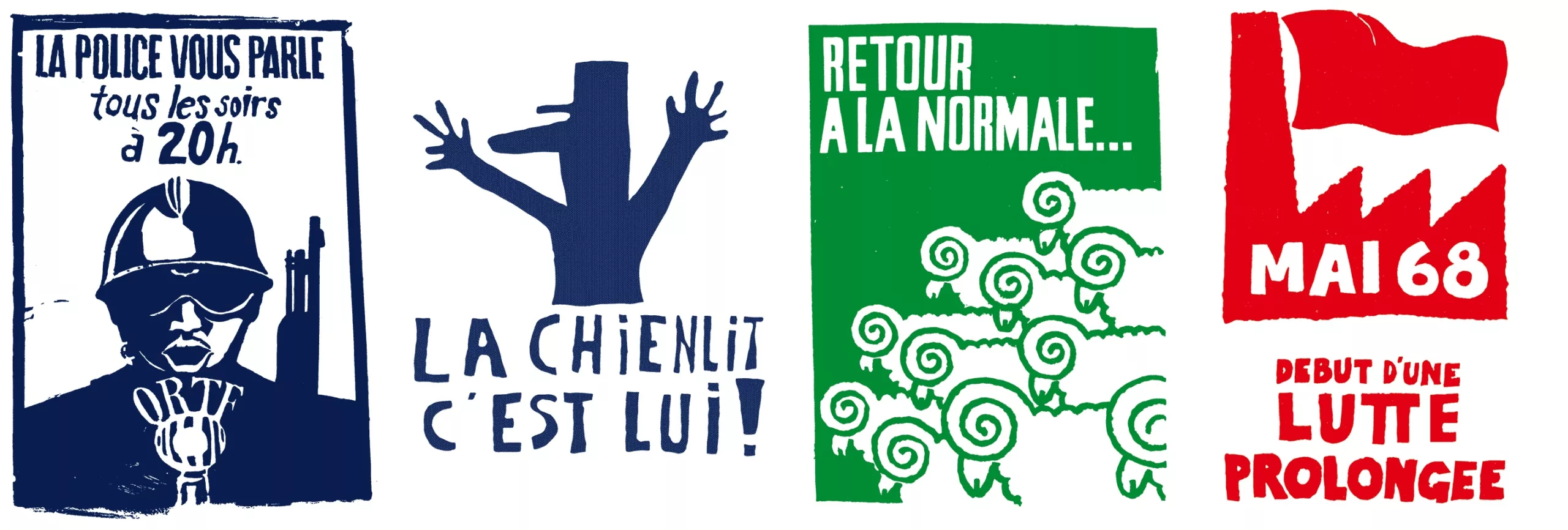
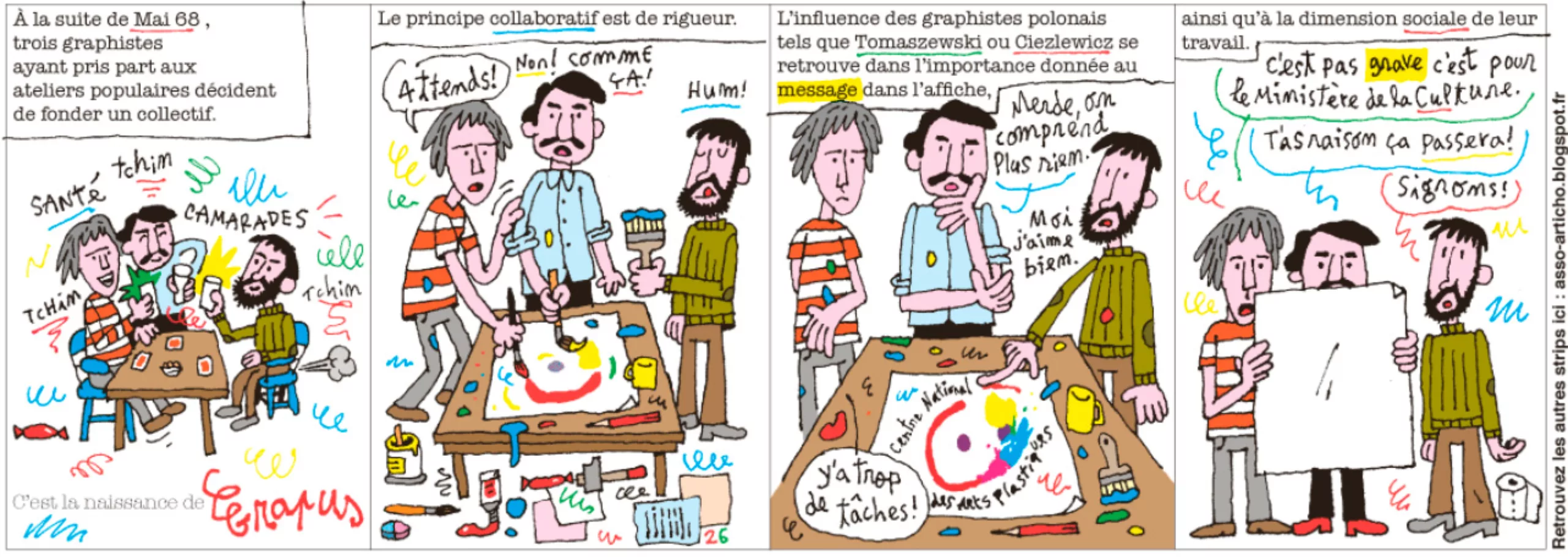
In 1967, Bernard was a student at Arts-Déco. There he met his two friends and future collaborators. With the events of May 68, the three men meet in the popular workshops, where the students of Fine Arts and Deco Arts create “visual contests” and produce every day thousands of posters for the popular struggle.
(NB: These posters are obviously collective creations. Pierre Bernard, and his friends from Grapus are therefore not the only/necessarily authors.)
Libération dedicates a strip in its “relaxed approach to graphic design“:
The Grapus years
In 68, the French government realized that the Bauhaus movement had fallen through the cracks in France, and decided to install the teaching members of the Bauhaus in Ulm Street (the German city) who found themselves at that time without subsidies. The Institut de l’Environnement was born, in which the three men found a place where they could continue to explore alternative forms of expression and question submission to the commission. If this type of place of collective creation has already been experimented since the 1950s by the Americans of Push Pin Studios, or in the 1960s by the Spanish antifrench painters of Equipo Crónica, then the Institute of the Environment proposes a new way to make coincide political commitment and graphic creation.
In this political and communist environment, described as’Stalinist’ by his opponents, Bernard, Paris-Clavel and Miehe founded Grapus, a contraction of’Stalinist Crapule’, crap-stal and’graphic artist’.
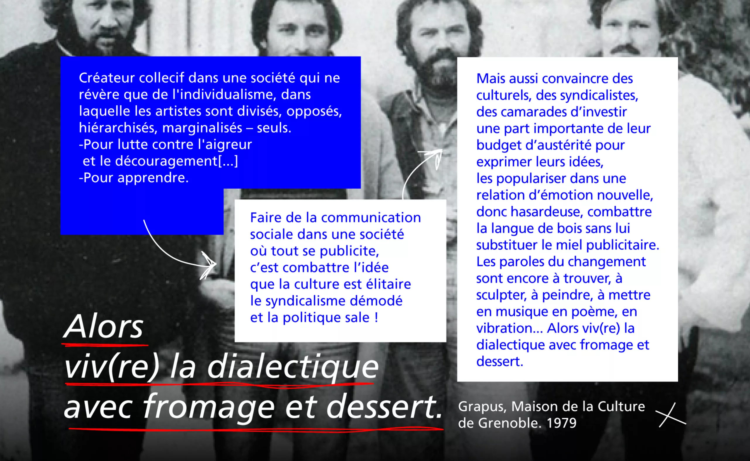
Below, the text presenting the collective during an exhibition at the Maison de la Culture in Grenoble in 1979.
From social to the advertising country
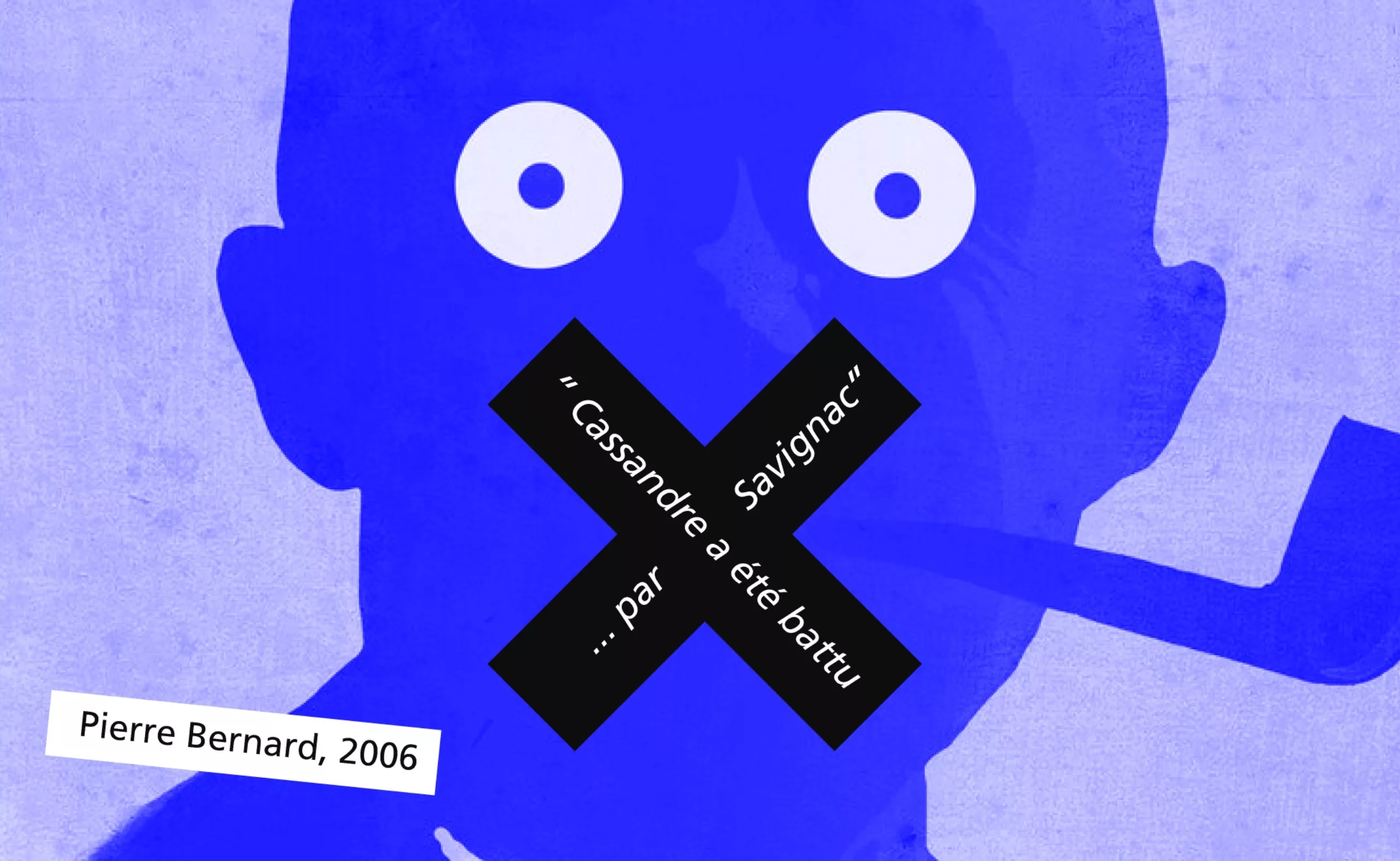
In the 1970s, advertising was king. Pierre Bernard summarizes well the history of this supremacy in the interview with Forme-Vive:
The Anglo-Saxon countries have had a much more harmonious evolution, much slower with graphics. It is much more deeply embedded in their societies than it is in ours. On our side, advertising became advertising through Savignac’s work essentially – who was a leader and a very funny guy, a kind of genius a little anarchist as we like them here in France. For me he put a stop to the development of graphics.” Cassandre was beaten by Savignac” and I think it’s a shame: it made us take a considerable delay.”
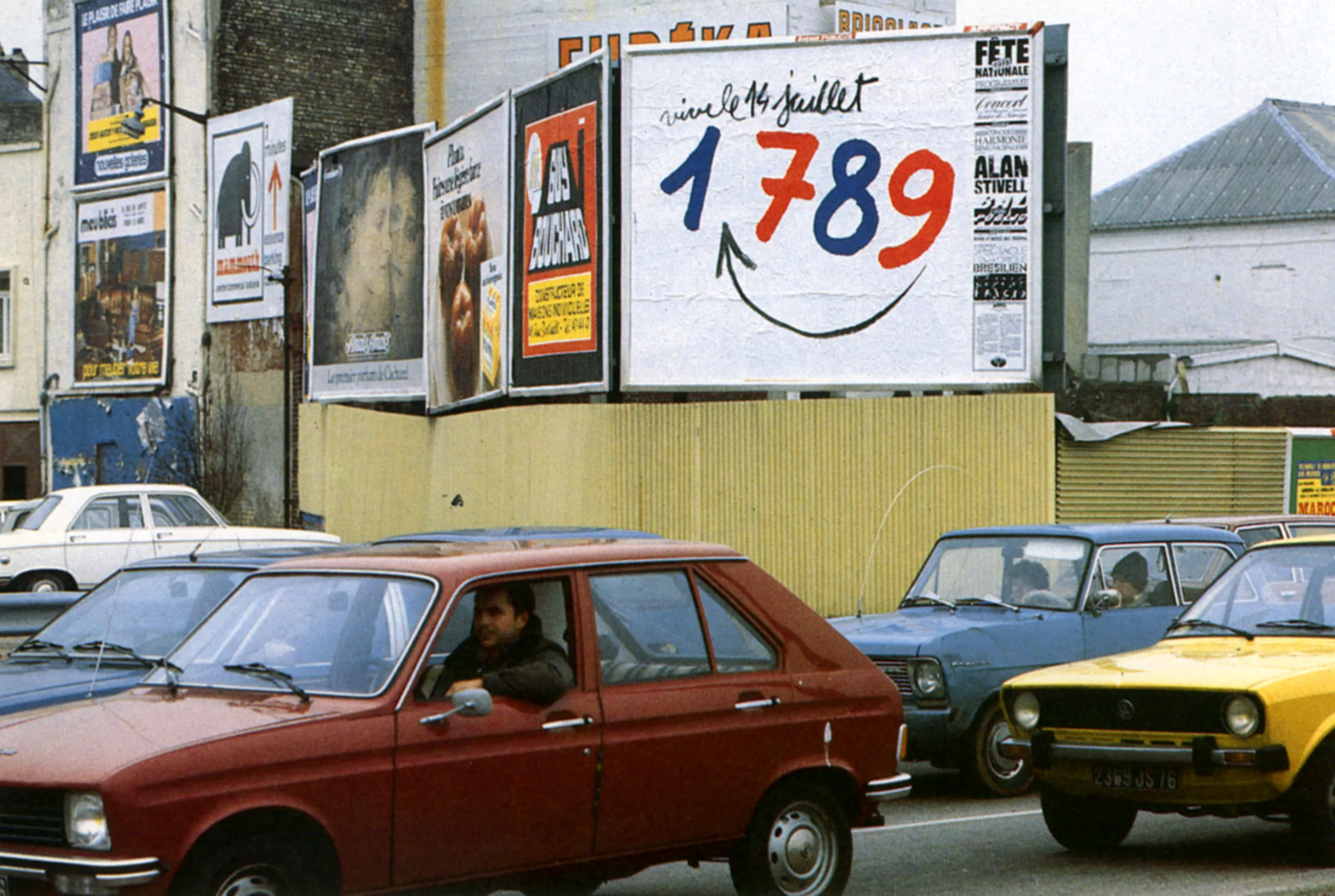
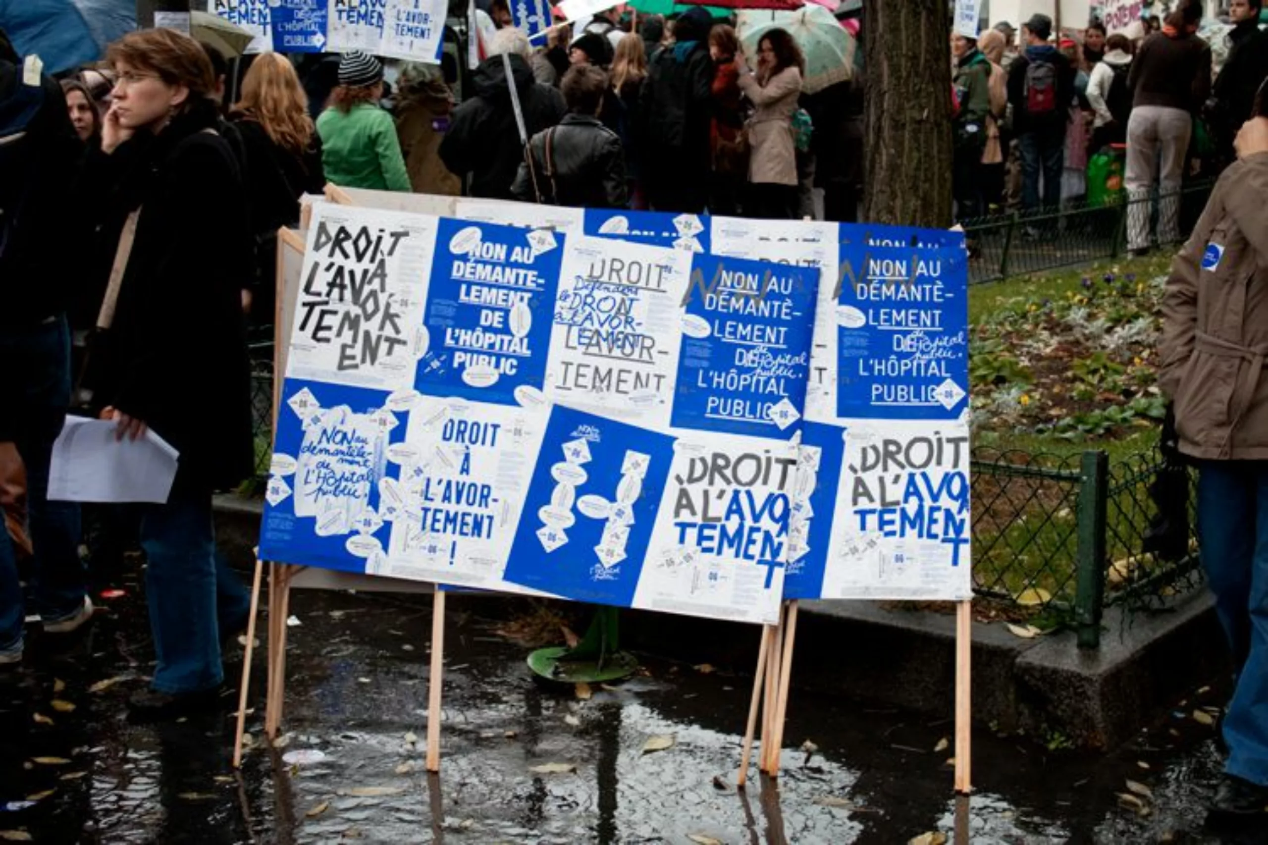
Bernard and his friends are committed to counter–current against the “sweet poison of advertising” by proposing posters in areas where the budget is scarce. Associations, cultural, social, communist commitment… Grapus defends small voices. At the same time, the three friends taught at Arts Deco. They come up against minimalist, strict and straight Swiss graphics, in the service of rules and Queen Advertising.
In opposition to this style and more generally to the pre-established rules, Grapus is committed to serving a cause which is dear to him, with this artistic desire of “gratuitous and impulsive act“, which is opposed to a paid graphics, serving advertising. Art versus graphics. The impulse against the rules. Social causes versus lucrative causes. The style of the collective resides in a united collaboration of the 3 and soon 10 members, intellectuals with childlike traits and a playful aspect. The texts are almost always written by hand, the trembling drawings resemble children’s drawings, offering an overall tone that almost denotes and swears with the photography used then in advertising, and of course with the Swiss movement. The artists play with textures, words, colours.
Once again, the Libération comic book sums up the creative and collaborative climate well.
Anti swiss graphic design
In an interview published by Téléréma, Pierre Bernard tells us the Grapus positioning, the opposite of Swiss graphics.
« In 1970, when we started teaching, we wanted to talk about everything, because we were carried by this energy of knowledge of images, of construction, of deconstruction. The Swiss don’t talk about anything. Jean Widmer, I had him as a teacher, and he was a good teacher. But Widmer, working with him was…. a few moves. Absolute silence and, simply, it took your gaze on the form where it was needed, but without a word. Or such banal words. The subjects were also banal. Advertising. So that was the breaking point between his teaching and us, Grapus. We said: there is not only the product in life, we can talk about theatre, cinema, emotions… And there, at Arts Deco, between the Swiss and us, it was a little tense. With Widmer, we learned a skill, and it was an excellent thing. It’s crafts and we don’t discuss the rules. While at Grapus, all we enjoyed was discussing the rules to see if they were valid. To see if they were serving a class interest that wasn’t ours. »
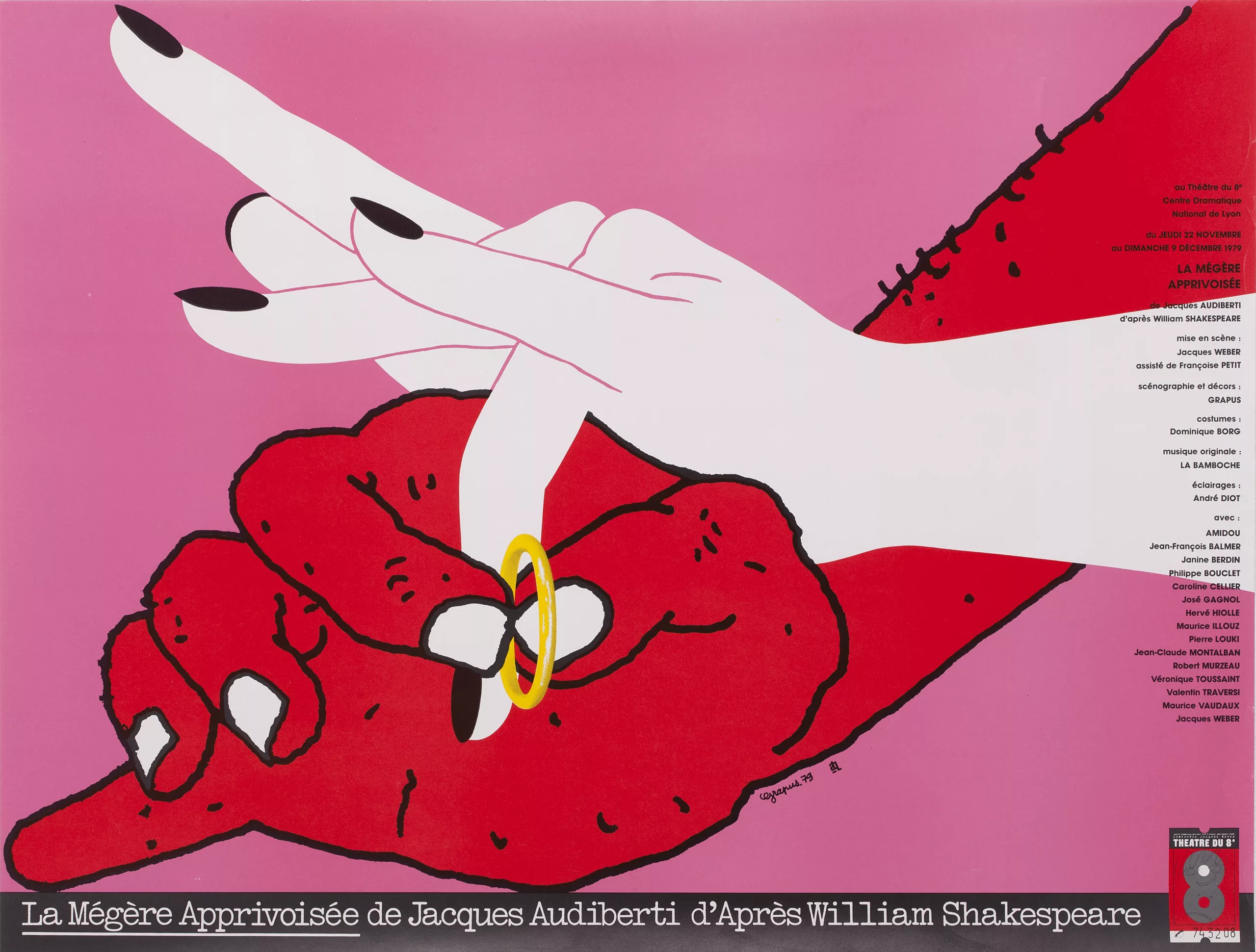
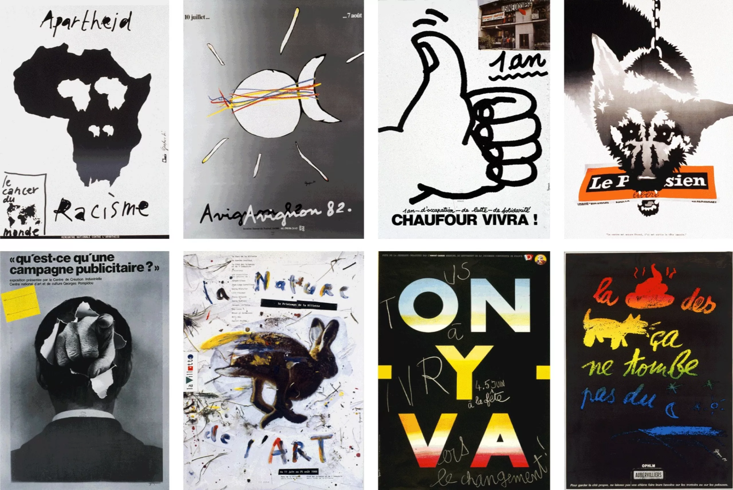
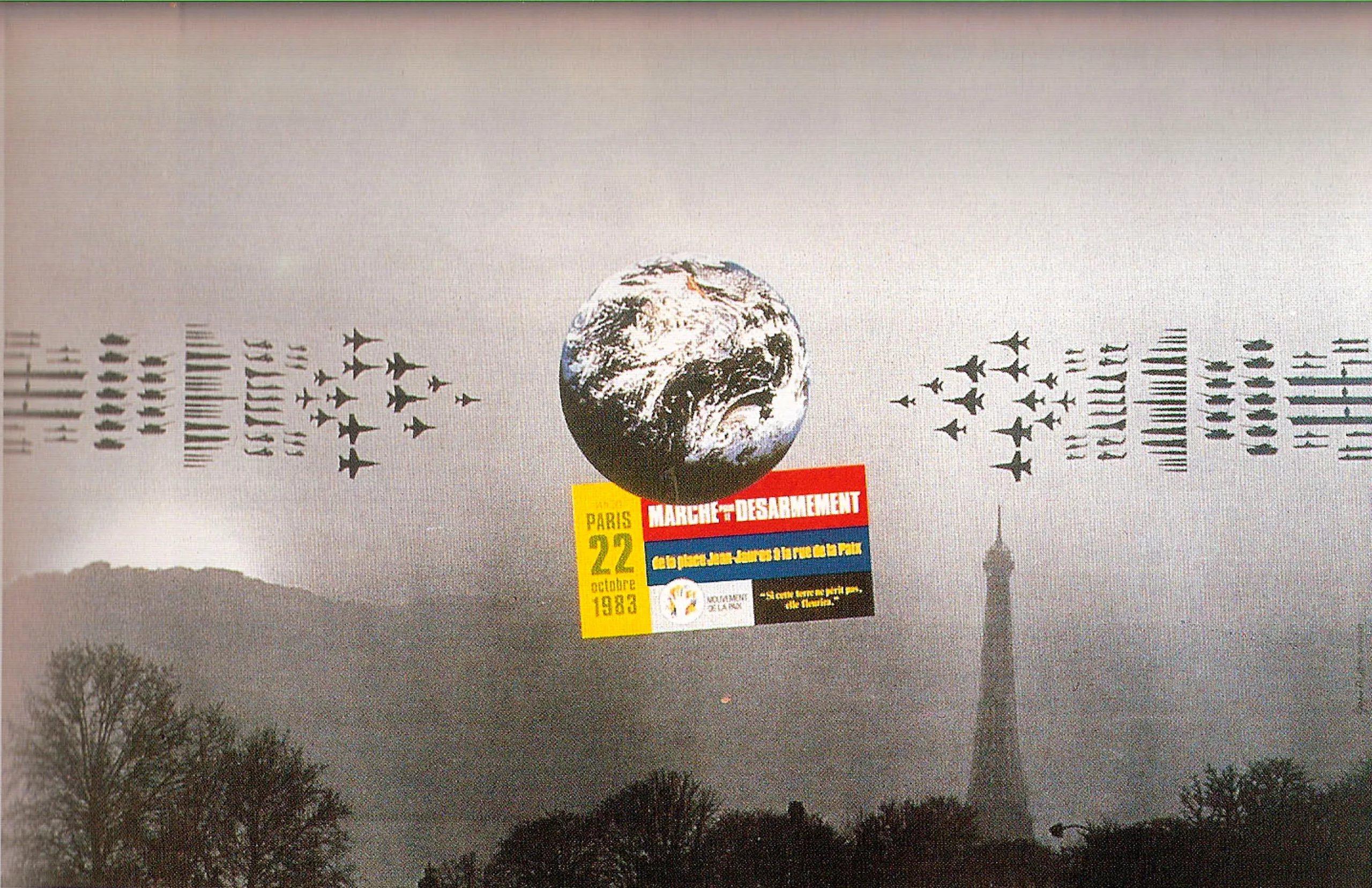
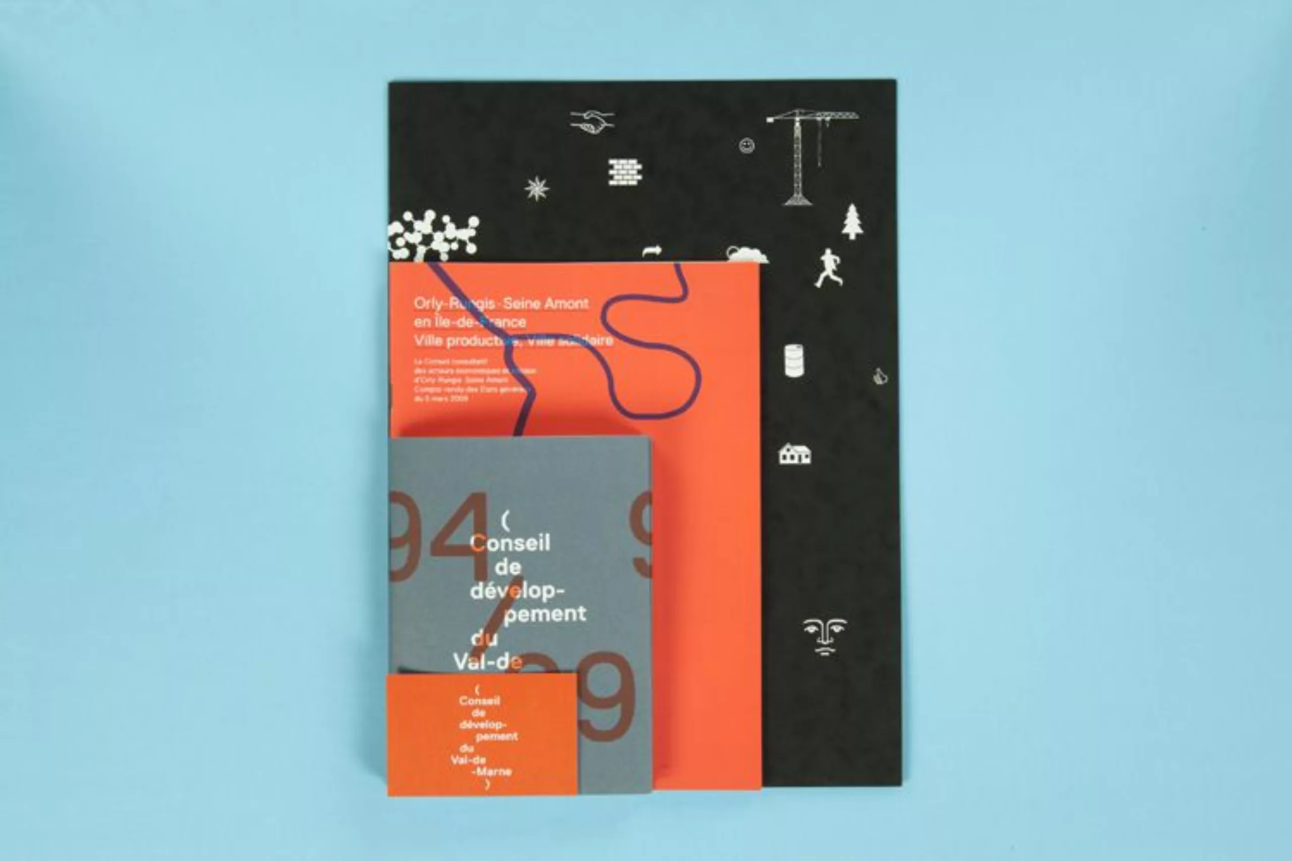
Here are some posters of their own.
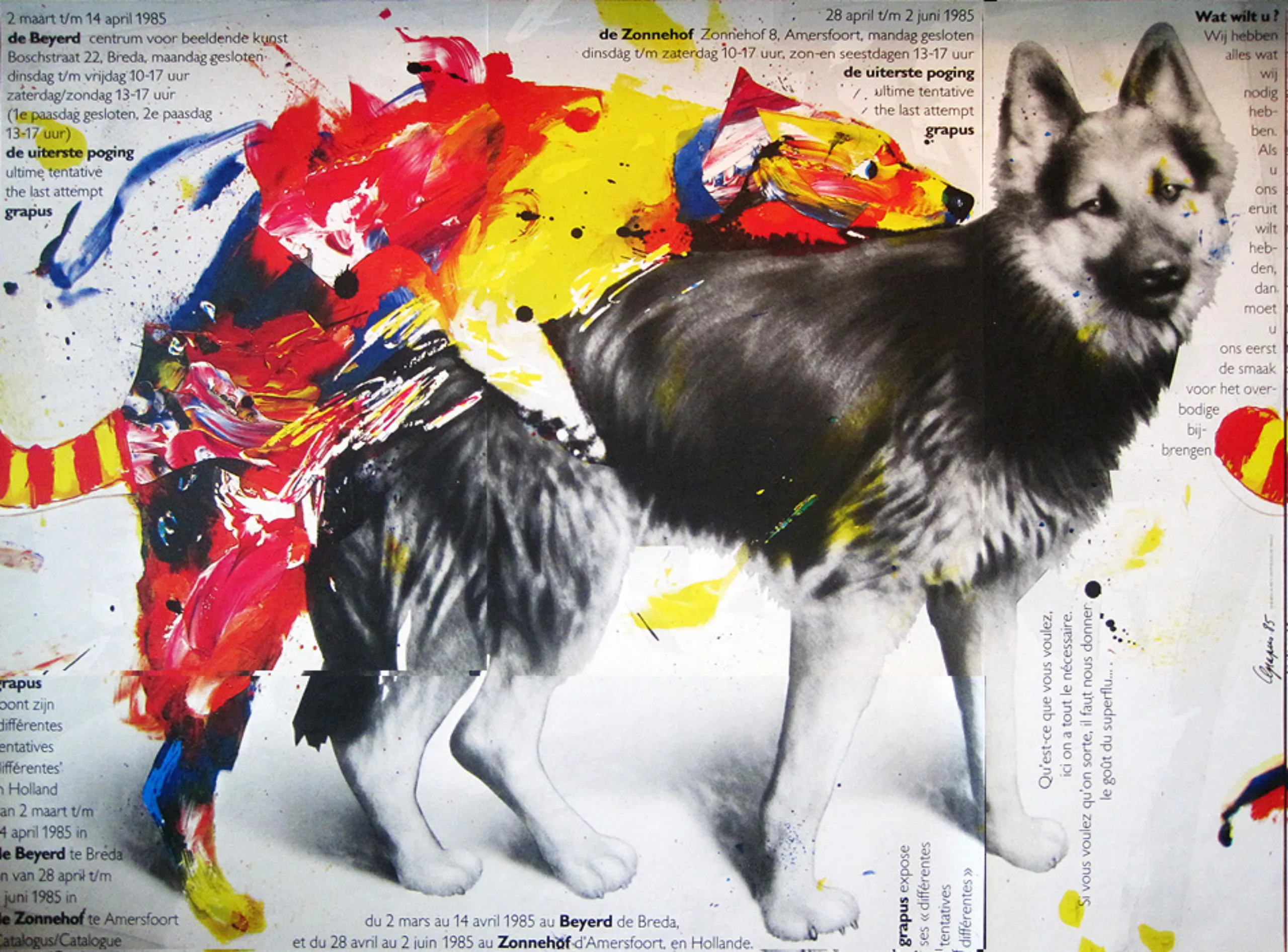
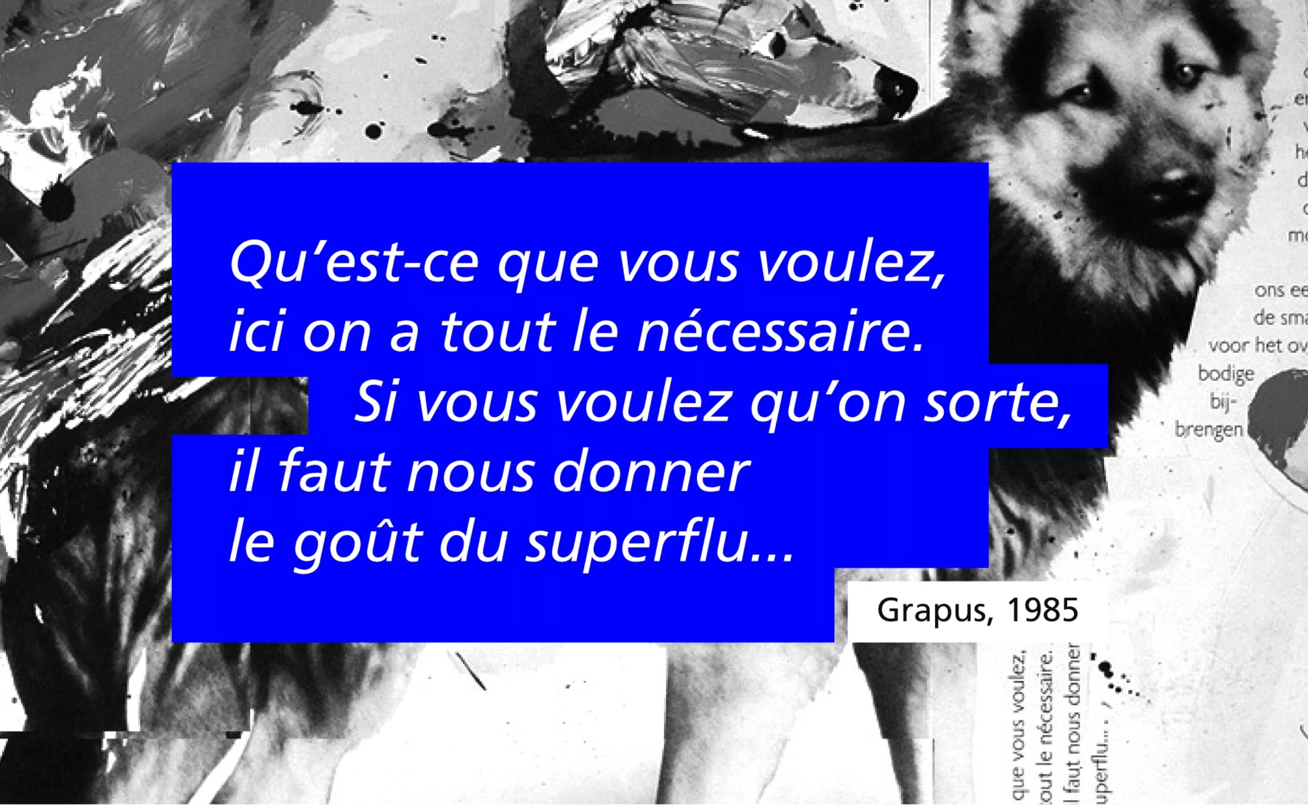
Ultimate attempt
On the blog 2avrile, Pierre Bernard tells us about the creation of this poster. Here is an excerpt:
“It is a poster that dates from 1985, created from the photo of two dogs procreating, taken on the occasion of a report for the book Zup de famille. It was to imagine a poster for Grapus, on the occasion of an exhibition […]. It started with discussions and it is somewhere a very emblematic, very voluntarist and very clownish figure of the engrossment of culture (laughs). The title of the poster was Ultimate Attempt. It was a bit of a desperate view of the situation. There was also a reflection on the daily necessity of luxury. That is to say that we thought that the social necessity of graphic design was to make life shine, to be related to happiness through signs. At best, it’s not his role all the time. Finally, there was a side revenge on the sponsor and the public asleep or the public who refuses any effort, with this clown who goes to a lot of trouble. Concerning the technique, it corresponded to a moment when one loved to make the pictorial “tattoo”. We often worked on transparent films to combine drawing and photography.“
Happy communists…
We see it, in the irregular trajectory of Grapus, there is a collective and communist adventure. Everyone wins the same thing (actually, very little… given the economic model) with the complexity of materializing this ideal when it comes to creation, authors and therefore egos. Pierre Bernard summarizes the situation well in the interview he gave to Formes Vives in 2006:
“We got together because we also had the idea that making political images meant thinking them through to the end together: talking about them together, criticizing them together, etc. and therefore doing them together. Doing so is one of today’s problems*: it was discussed together, conceived together, criticized together but, concretely, done by different people.”
*In 2006, following the award of the Erasmus Prize and the publication of a poster catalogue, a heated controversy broke out between Pierre Bernard and his former colleagues at Grapus. The dispute relates in particular to the attribution of the copyrights of the images.
Yet this collective approach will have lasted almost twenty years, with different phases, different periods. The entry and exit of many employees. The list is as long as it is impressive. Here’s a direct summary attempt made bitch to the indispensable book “Comment, tu ne connais pas Grapus ?” (Oh really, you don’t know Grapus?”) by Leo Favier.
To read this diagram: In grey it is “Grapus”, in blue the main founders, the other names are the different collaborators, positioned approximately according to their dates of arrival in the team, and also according to their proximity of work with such or such founder. The arrows sometimes indicate the trajectories. For example, Vincent Perrotet’s trajectory, he launches a collective time with Pierre Milville and Pierre-Laurent Thève, then another “courage! with Pierre Di Sciullo, to return to work in Grapus with Gerard Paris-Clavel before founding the Graphic Designers associated with the latter.
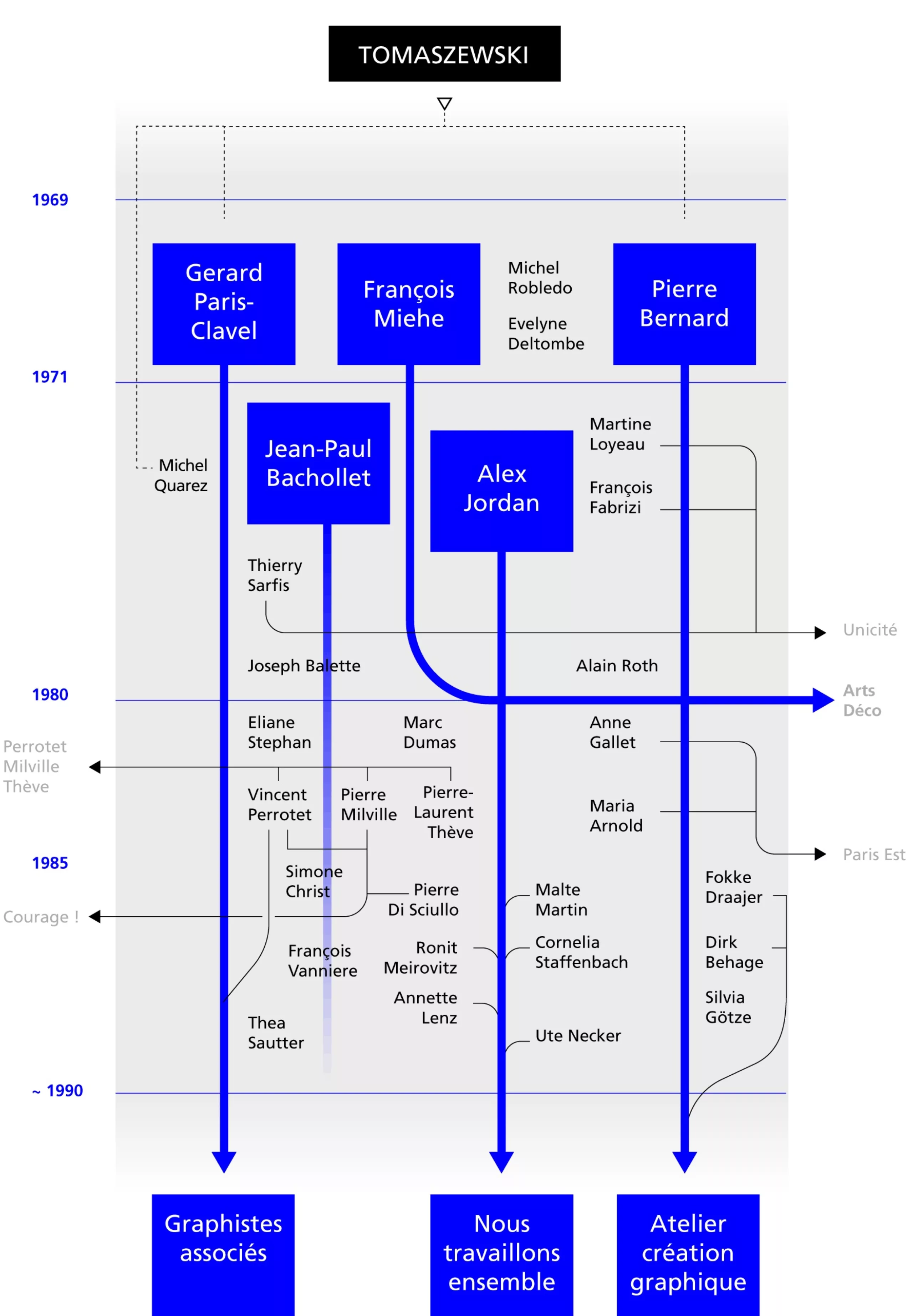
From 1985-86, Grapus took a dangerous turn, competing on large institutional visual identity programs (La Vilette, the Louvre…). The first tensions appear and the premises of a divorce are felt: the members of the collective begin their infidelities. Alexander Jordan launches the Bar Floréal, a place dedicated to photography; Gérard Paris-Clavel and Vincent Perrottet, launch the beginnings of what was to become Ne pas plier, an association “so that the signs of misery are not added to the misery of the signs”. So we meet again in 1989, with three teams within Grapus. The common signature is still effective, and the offices still shared, but a double signature system appears. Grapus/Graphistes associés around Gérard Paris-Clavel and Vincent Perrottet, Grapus/Atelier de Création Graphique around Pierre Bernard and Grapus/We work together around Alexander Jordan.
1990. New decade. The separation becomes effective. Grapus disappears.
Visual identities
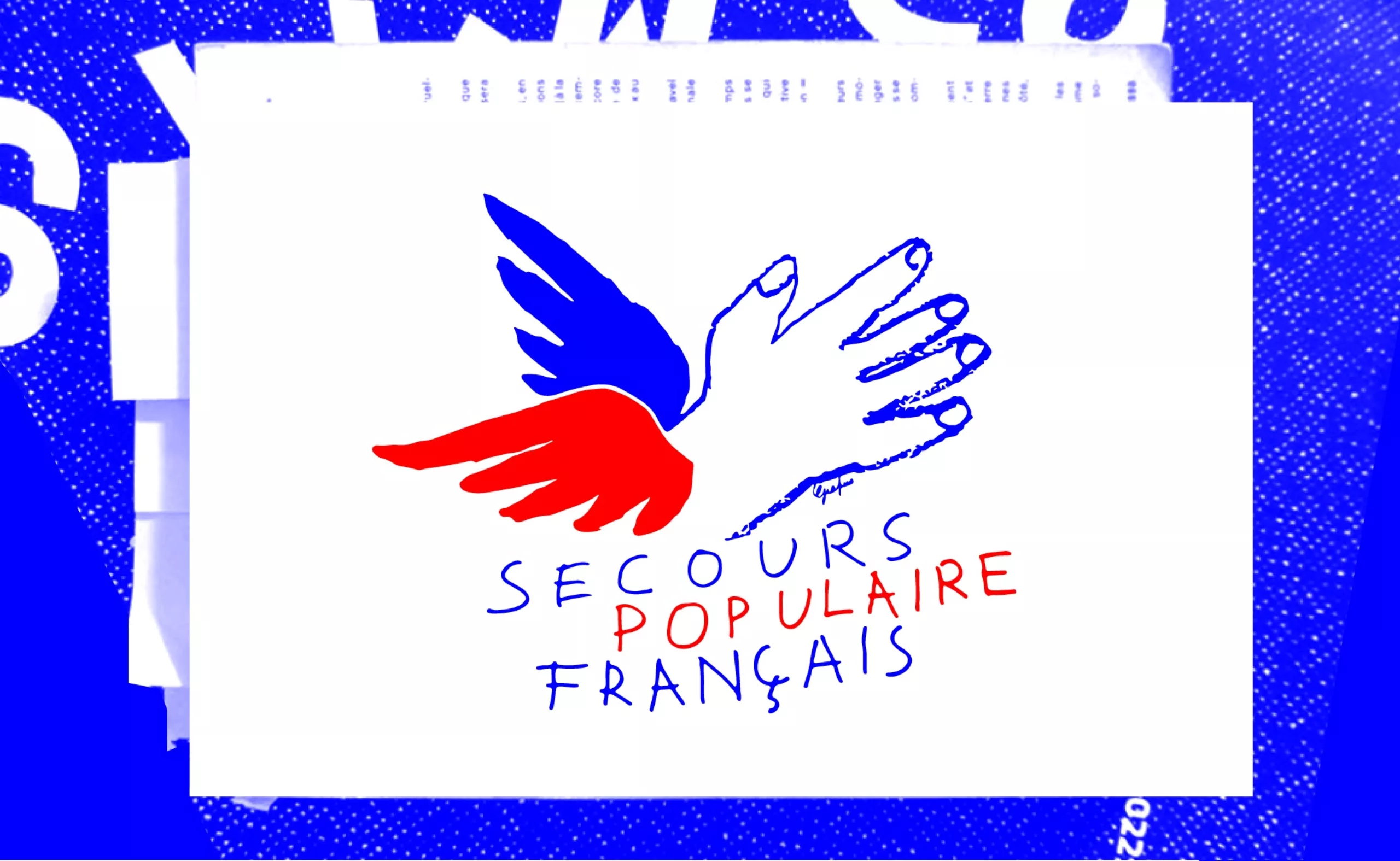
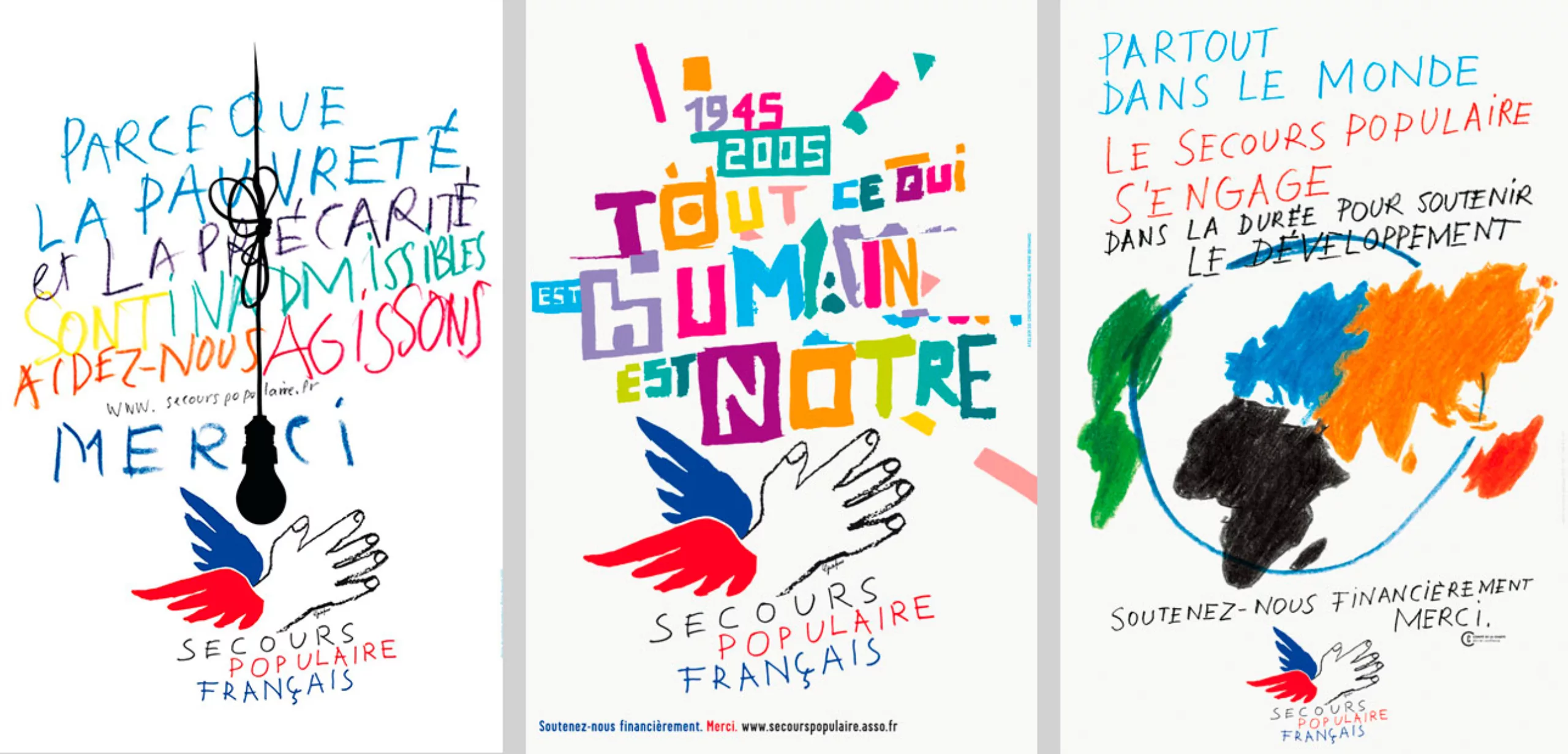
1981 – Secours populaire français
This work of graphic accompaniment of the Secours Populaire began in 1981, in Grapus, with the creation of the winged hand which became a logotype. In 1990, the workshop “Nous Travaillons Ensemble” continued the work and, from 2000, Pierre Bernard took over the torch within the Atelier de création graphique.
Personally, I don’t need to dig deep into my visual memory to find that logo. However, since it was one of the first logos I really looked at, this memory probably goes back to my adolescence. But he hasn’t aged. His strength, his message is as clear as ever. It’s the promise of humanity and solidarity summarized in three lines, the heritage of Cocteau and Picasso together, a slap in my little face as a future graphic designer. Thank you Grapus.
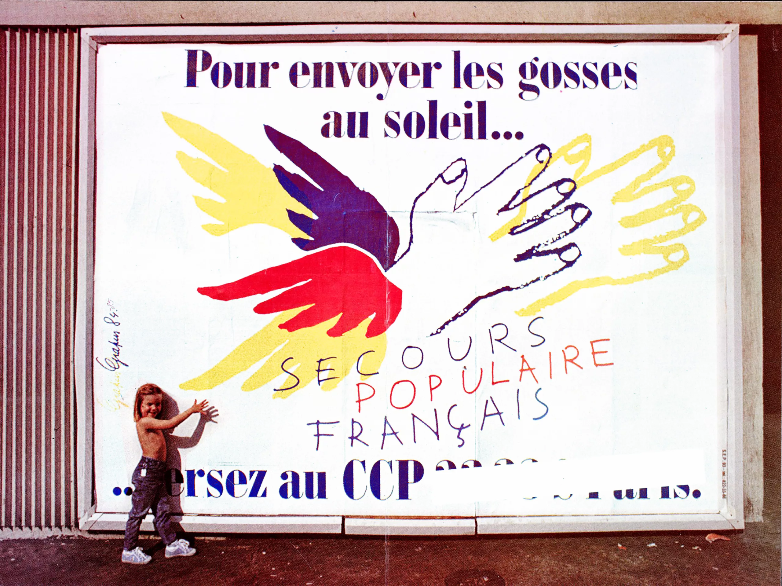
According to Pierre Bernard two objectives are essential to accompany the association. The first is to ensure the graphic coherence of its national identity, despite the large number and diversity of stakeholders and actions carried out. The second is to privilege the expression, the lively speech, the generous aesthetics as well as the richness of the forms to say the vitality of the solidarity action and its invigorating effects.
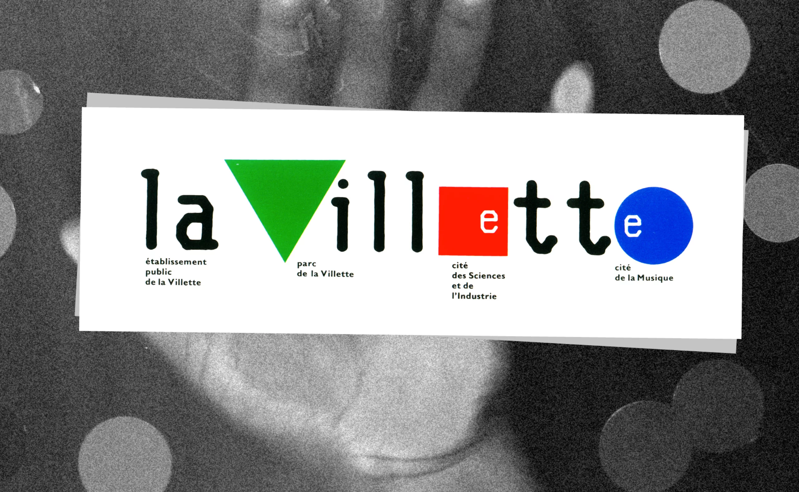
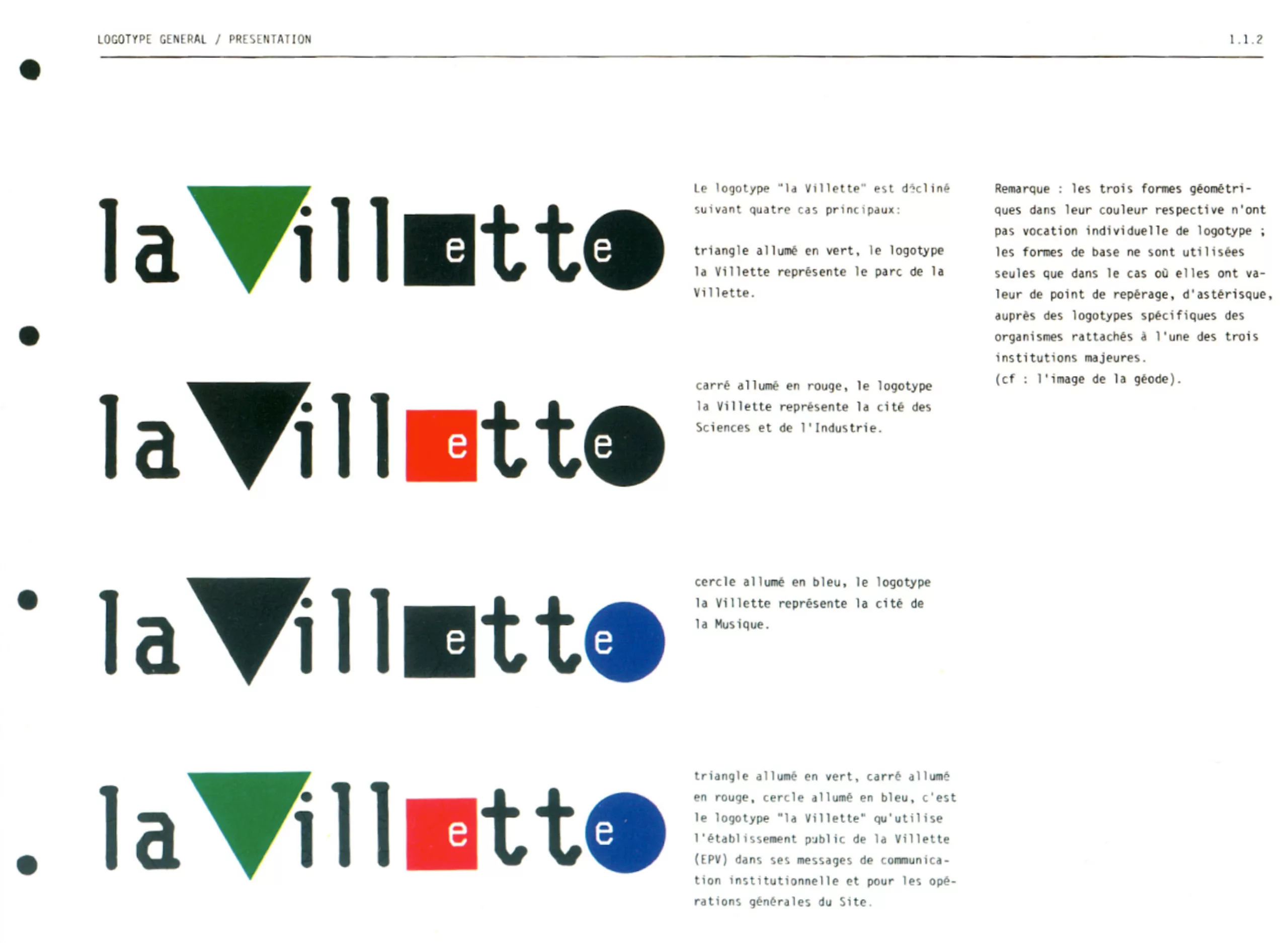
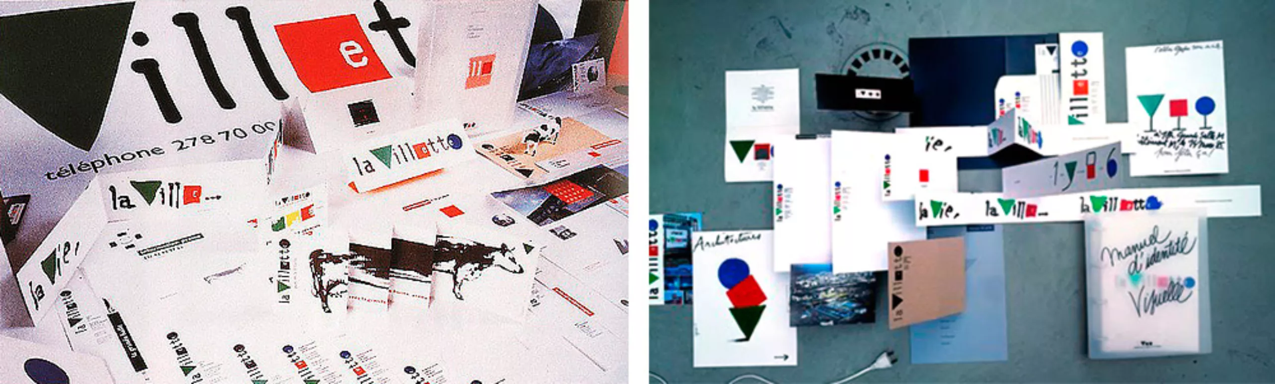
1985 – La Villette
The logo created from three geometric symbols directly evokes the functionalism of the Bauhaus. It is also a work created in echo to the architecture of Bernard Tschumi and Adrien Fainsilber. The logo with the three “active” colours presents the city as a whole, and with the association of a black, more than one colour, one place in particular: the Cité de la Musique was symbolised by a blue circle, the Cité des Sciences et de l’Industrie by a red square and the Parc de La Villette by a green triangle. The great success of the project is therefore due to the flexibility of an ever-changing sign, both unique and multiple.
With La Villette, Grapus had made a rather surprising contract. In fact, at that time, no customer really knew what to do with a logo once the stationery was delivered. In order to ensure after-creation service, they had the idea of signing an “annual” contract with La Villette, which in return could question them on any subject for a fixed amount.
1990 – National parks
In response to the original order – seven logos for seven parks – Pierre Bernard, then straddling Grapus and the Atelier de Création Graphique, had proposed an identity where the institutional representation, the signage, the design of the printed matter, the cards, or that of the objects formed a whole. One and the same emblem has been imagined and designed, a symbol common to all territories. Thus, each park in its singularity testifies to the concept of unity and the inexhaustible wealth that its label announces. (source)
1989 – Louvre Musuem
In 1989, the I.M. pyramid Pei symbolizes and majestically consecrates the reopening of the entrance of the Louvre Museum almost entirely transformed. In connection with the architectural project management, the internal signage of the spaces was entrusted to an American office, Carbone Smolan Associates, which made the decisive choice of the Granjon character as the main accompanying typography. To this end, they shall organise a consultation. The new identity will have to be born from the signage orientation put in place and, for the months and years to come, the new public existence of the “Musée du Louvre” will have to appear. The project presented by the Grapus workshop was selected. After several months of implementation, the decision is taken to abandon the prefix “Museum of” and to draw the new logo with the only word “Louvre”. The graphic line started under the signature Grapus will be developed by the Atelier de création graphique until 1993. (source)
This command is symbolic because it signs the end of Grapus. Gérard Paris-Clavel and Alex Jordan thought it was contrary to their political commitment, unlike Pierre Bernard and Jean-Paul Bachollet.
An entire article could be dedicated to this logo.
Uh, I mean “an entire article will be dedicated to this logo”.
So many things to tell, we’re saving this for another day.
1990 – Atelier de Création graphique
Pierre Bernard founded the Atelier de Création Graphique after Grapus. He embarked Dirk Behage and Fokke Draaijer with whom he has worked closely for several years. The operation of the new team is necessarily different from that of Grapus. It is difficult to work horizontally and equally with new, often younger, employees. The communist era is resolved.
The rest of the journey is more classical, the workshop team will fluctuate according to the periods, and will respond to many public commissions, always with the conviction that graphic design has a cultural function of public utility. The best thing is just to listen to him talk!
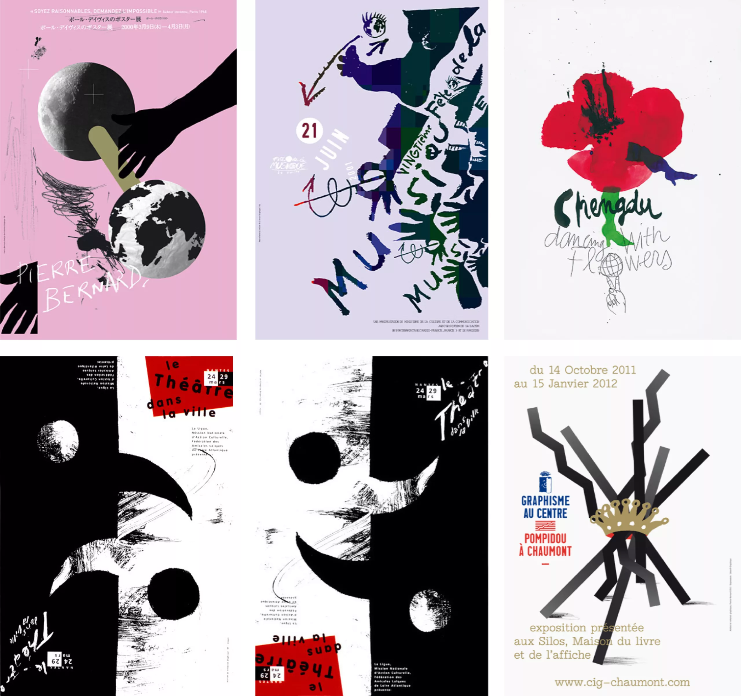
Here is a glimpse of the work done over the past 25 years.

Going further…
- Pierre Bernard’s interview with Formes Vives
- Telerama article: Pierre Bernard, conscience sociale du graphisme
- Pierre Bernard’s portrait by Indexgrafik
- Centre Pompidou’s video: Pierre Bernard / Prix Erasme 2006
- An interview in french by Addmagazine issue 7
- A video interview in english by Slanted Magazine #25
- About the visual identity of the Centre Pompidou
- Speech by Pierre Bernard, cofounder of l’atelier Grapus, at the 2006 Erasmus Prize ceremony
On the subject
-
C’est Noël ! Le Parti Communiste change de logo !
On the occasion of its annual congress, the French Communist Party (PCF) has just given itself a little present: “A new logo!”
This is an event, since the previous logo dated from 1990. Let’s decipher this logo.