Burberry regains prestige with a new antique logo
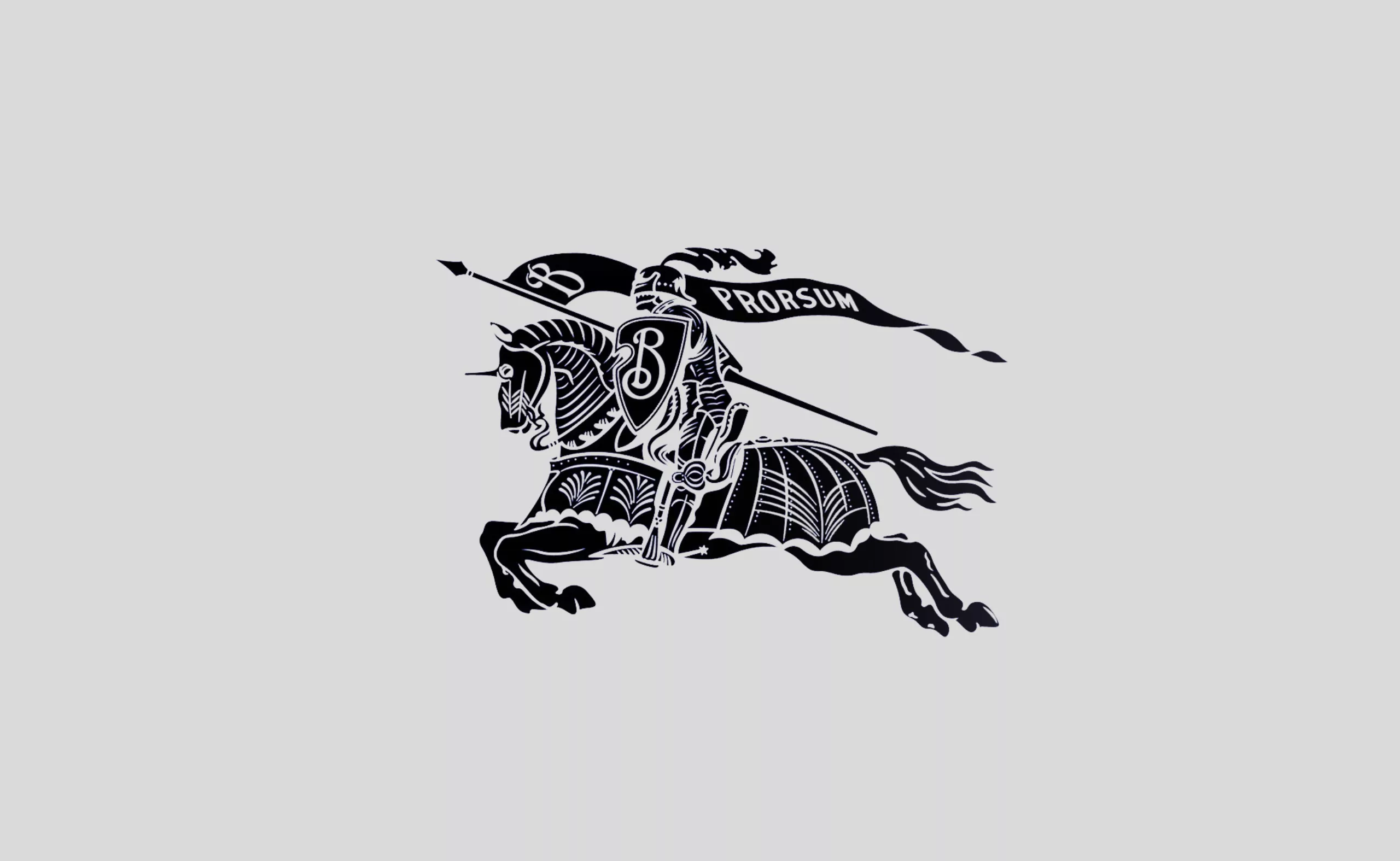
Early February, Burberry unveiled its new logo. The iconic trench coat brand created in 1856 turns back time with its old heraldic codes and restores its coat of arms!

Burberry: sans serif, but with a coat of arms!
Initiating the trend of flat design in the luxury industry, Burberry had given itself quite a facelift in 2018 with a name-logo in geometric lineals, imagined by Peter Saville. Burberry became the first house to imagine a logo without serif, using the codes of Chanel whose name is a reference since… 1925. Undoubtly one of the most enduring and well-known logos in the fashion industry!
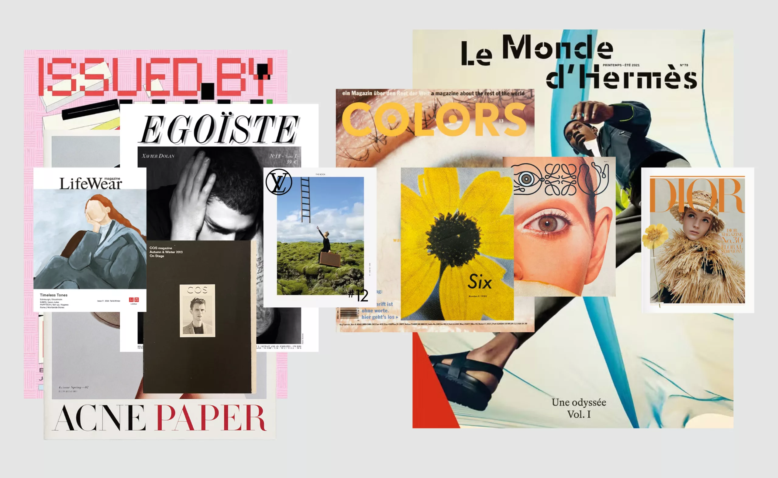
Burberry will be followed by other houses such as Balmain, Celine, Saint Laurent, Balenciaga etc.. All of them displayed then -and still do- the same minimalist identity, with a name like a monolith, a primal and timeless work, thus loudly asserting their existence, and requiring neither particularity nor ornamentation to be recognized as a monument in the world of luxury. A return to the essential, which, by dint of being seen and adopted by more and more brands, has eventually erased all their identities.
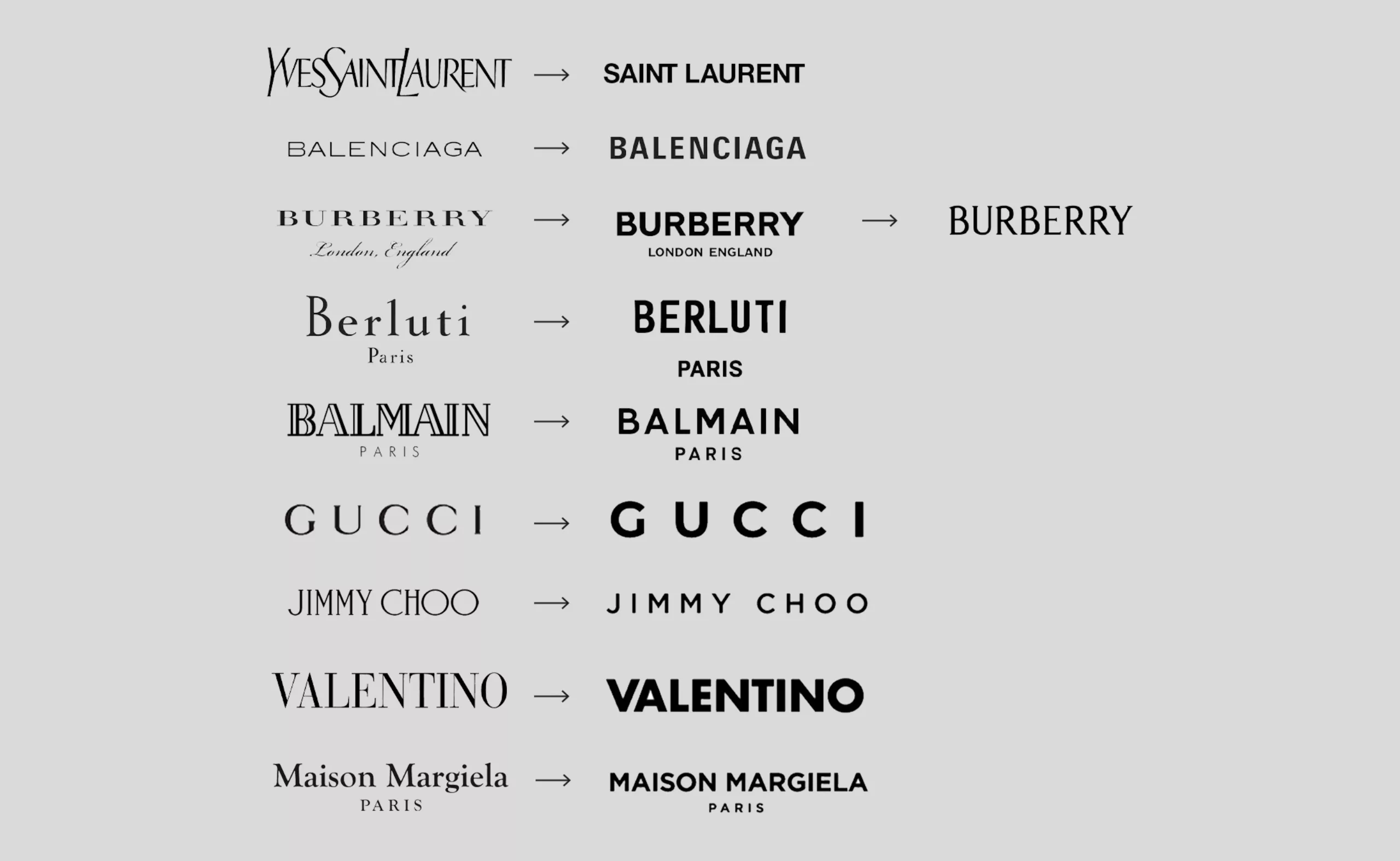
An antique typography
We are happy to see the return of the letters designed for Burberry, only 4 and a half years after the previous identity. Changing the logo every 4 years can be considered as a fashion caprice, whose collections imply a regular change, so we hope that this new logo will be more durable, especially when one knows the colossal investments that it implies, and the ecological impact of a change of sign for a globalized brand.
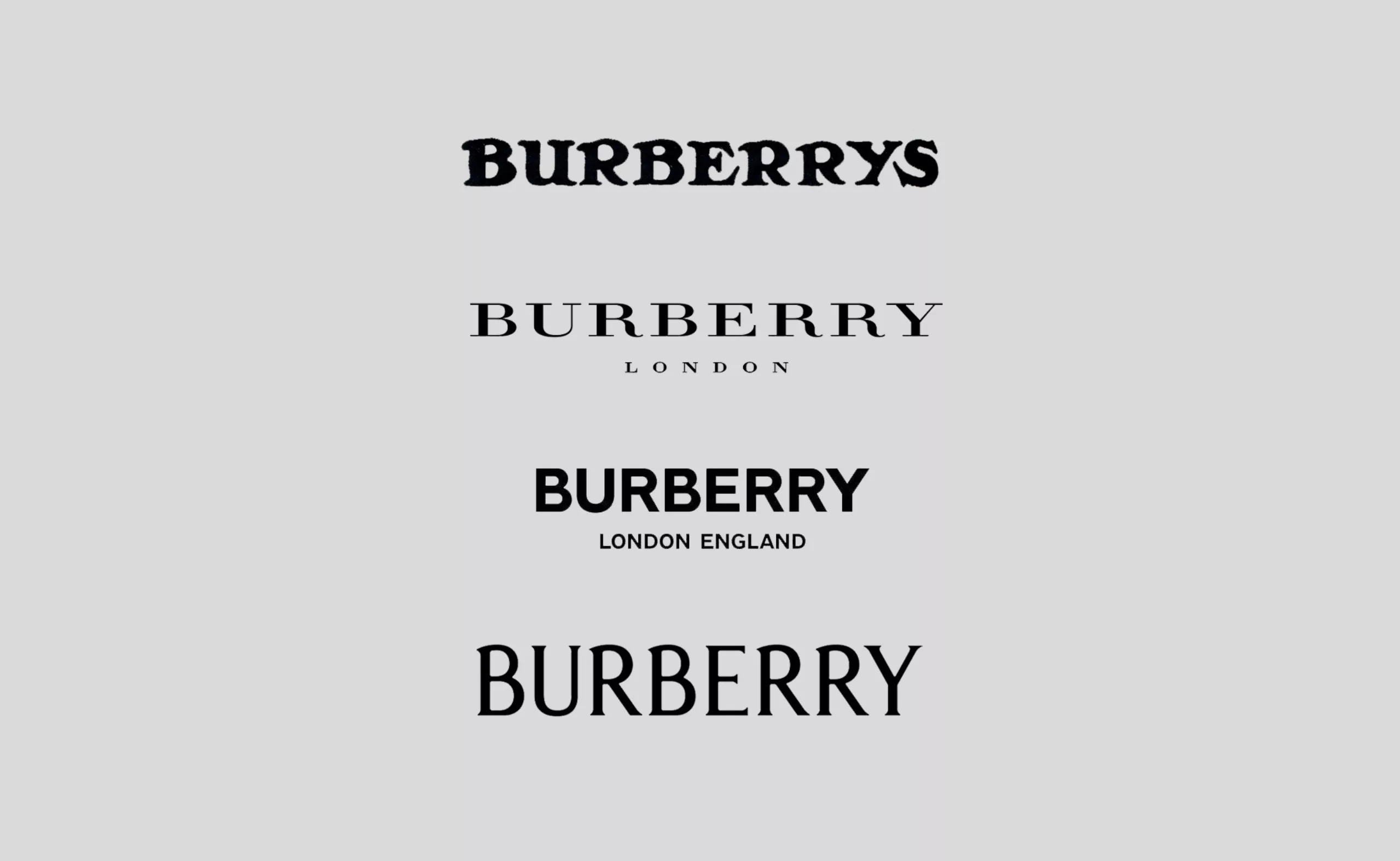
The new letters bear the traces of “handmade” inspired by the logo painted in 1901, while being more condensed than the original. The serifs and variable caster bring humanity to the letters as if they were hand drawn, a detail which was completely neutralized in the old logo. This new typographic identity, far from the minimalist geometric lineals, will probably open the door to the rebranding of other luxury brands as back in 2018. Citroën, Renault or Peugeot in the automotive sector have already made a return to their retro logos. Saint Laurent, which had detached itself from its “Yves”, has been using since January 2023 the YSL logo designed by Cassandre in 1961. We therefore expect a return to the origins in the coming months for the other luxury houses, with this need to distinguish themselves with a singularity, in a less streetwear and more classic identity.

A knight as a standard
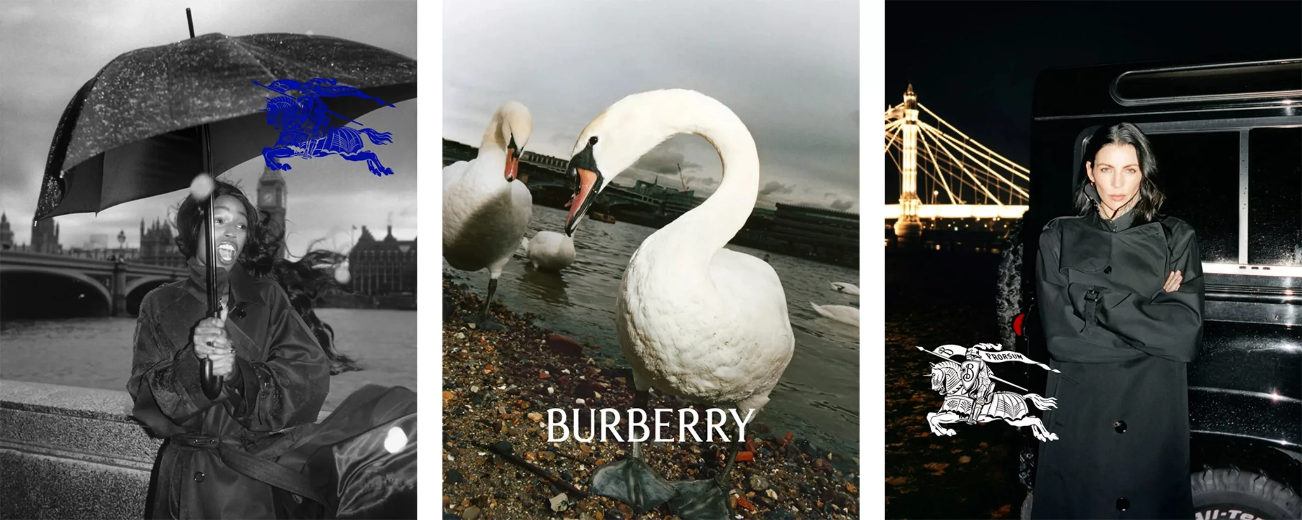
With this new logo, Burberry refers to heraldic coats of arms, these insignia with particular colors and combinations that allow to mark the allegiance, the territory, the kinship of knights on the battlefield. The word heraldic comes from the word “herald”, a messenger announcing the war carrying a uniform with the colors of his clan and thus easily recognized by the enemy camp. Here, the knight is the logo. It should be noted that the B of the shield is not used as a logo as such, but it is the knight as a whole that is highlighted, with two colors: white or blue. The brand’s motto, “prorsum”, which means “forward”, is again inscribed on the flag. Burberry announces a clear return to its origins, in a spirit of chevalrous (re)conquest.
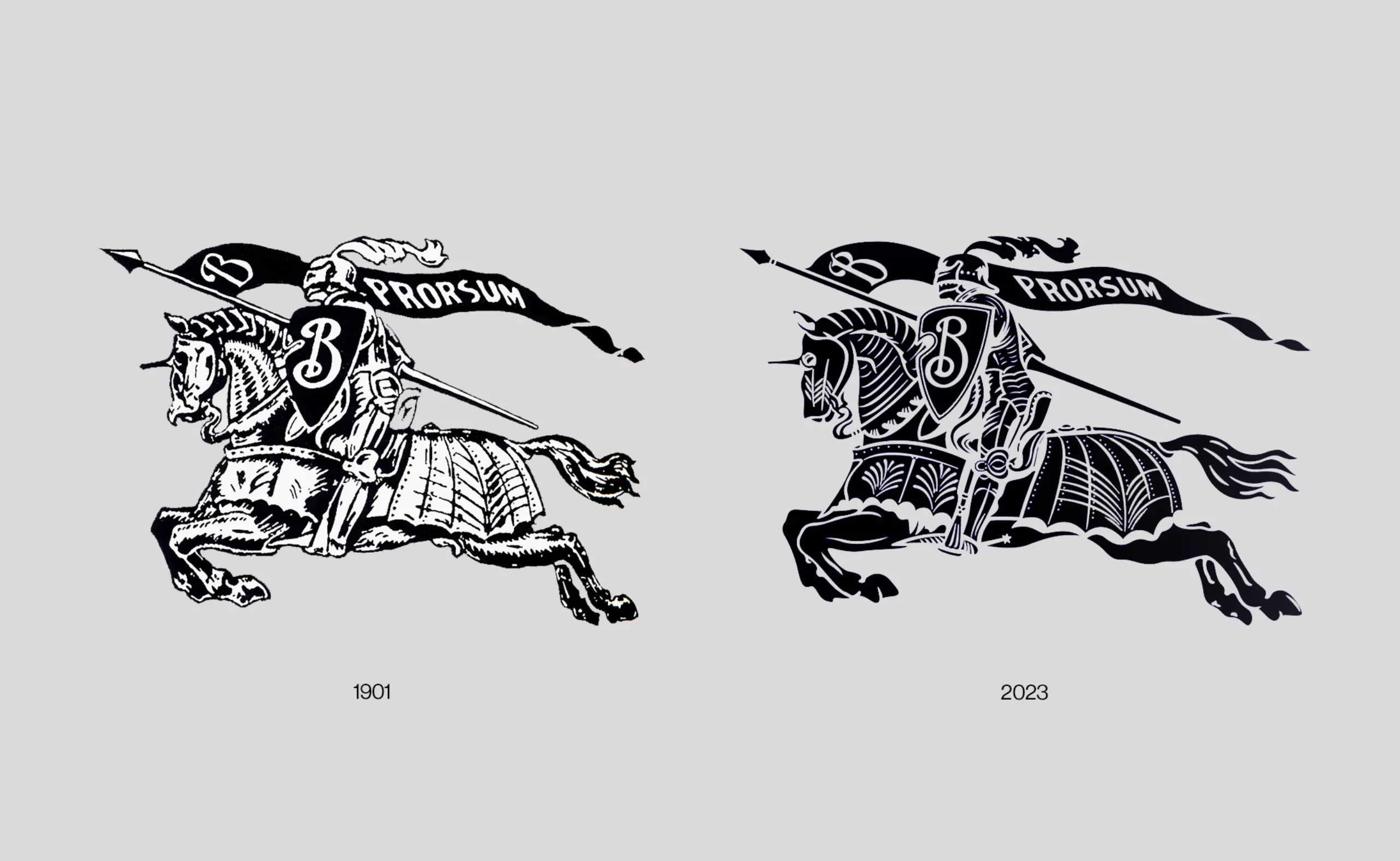
The complexity of this insignia from the past, often abandoned by modern brands that have chosen to simplify them over time, creates all the uniqueness of Burberry while creating a strong sense of belonging under the same banner. This feeling is further enhanced by the symbolism of the knight and the coat of arms: they evoke conquest, clan, initiation, under a common identity. A bit like the pictograms of the Olympic Games!
The knight icon was abandoned in 2018. Reworked with even more detail than originally, it now adds that touch of “handmade”: the original design dates back to 1901 when logos were drawn by hand in lithography. The new Burberry logo therefore uses two strong symbols separately, the typographic name and/or the knight icon.
To mark the arrival of this new identity, Burberry has decided to make a clean sweep of its past and delete all photos on its social networks. A likely and radical way for the new AD, Daniel Lee, to declare war on the previous Peter Saville, and announce the taking possession of a new brand… territory!
