Logo de la ville de Limonest - Métropole de Lyon

2018

City of Limonest
Visual identity and graphic charter

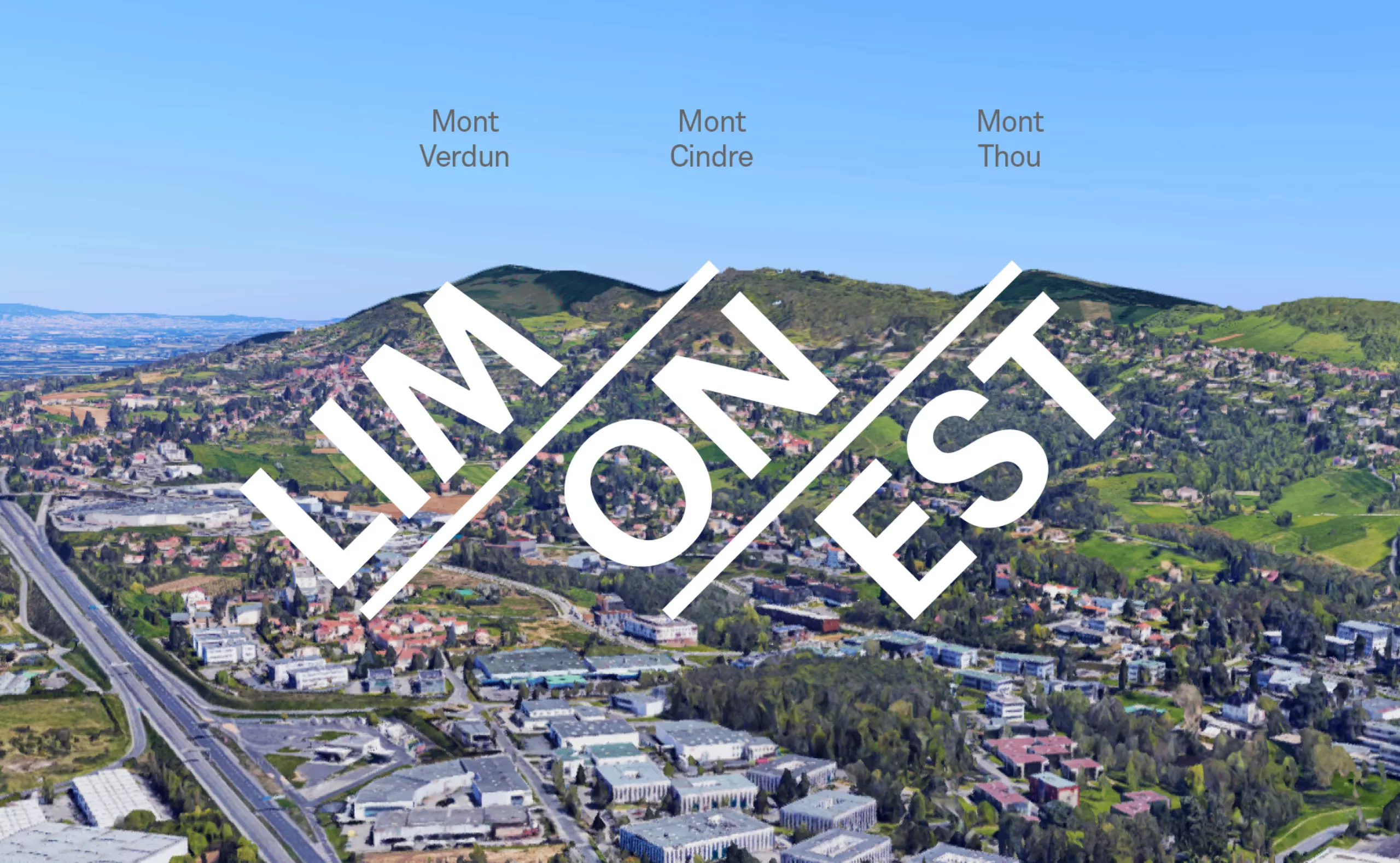
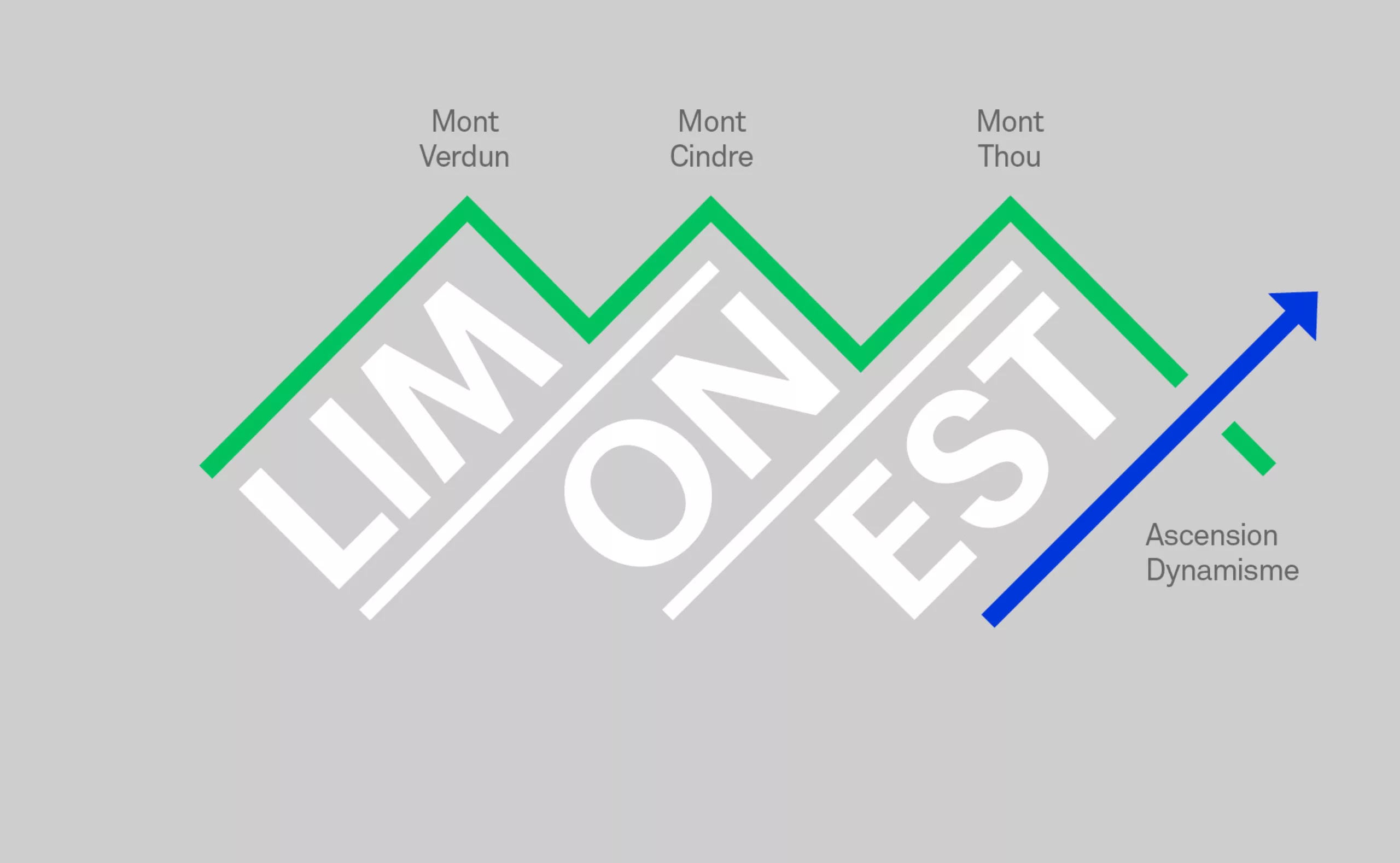
Limonest is a city located in the heart of the Monts d'Or, north of Lyon, France. Its location makes it a city divided between natural heritage and economic attractiveness.
Its territory is composed of green and agricultural spaces making Limonest an attractive city with controlled urbanization. Its "Techlid" economic centre is a dynamic employment area employing nearly 27,000 people.
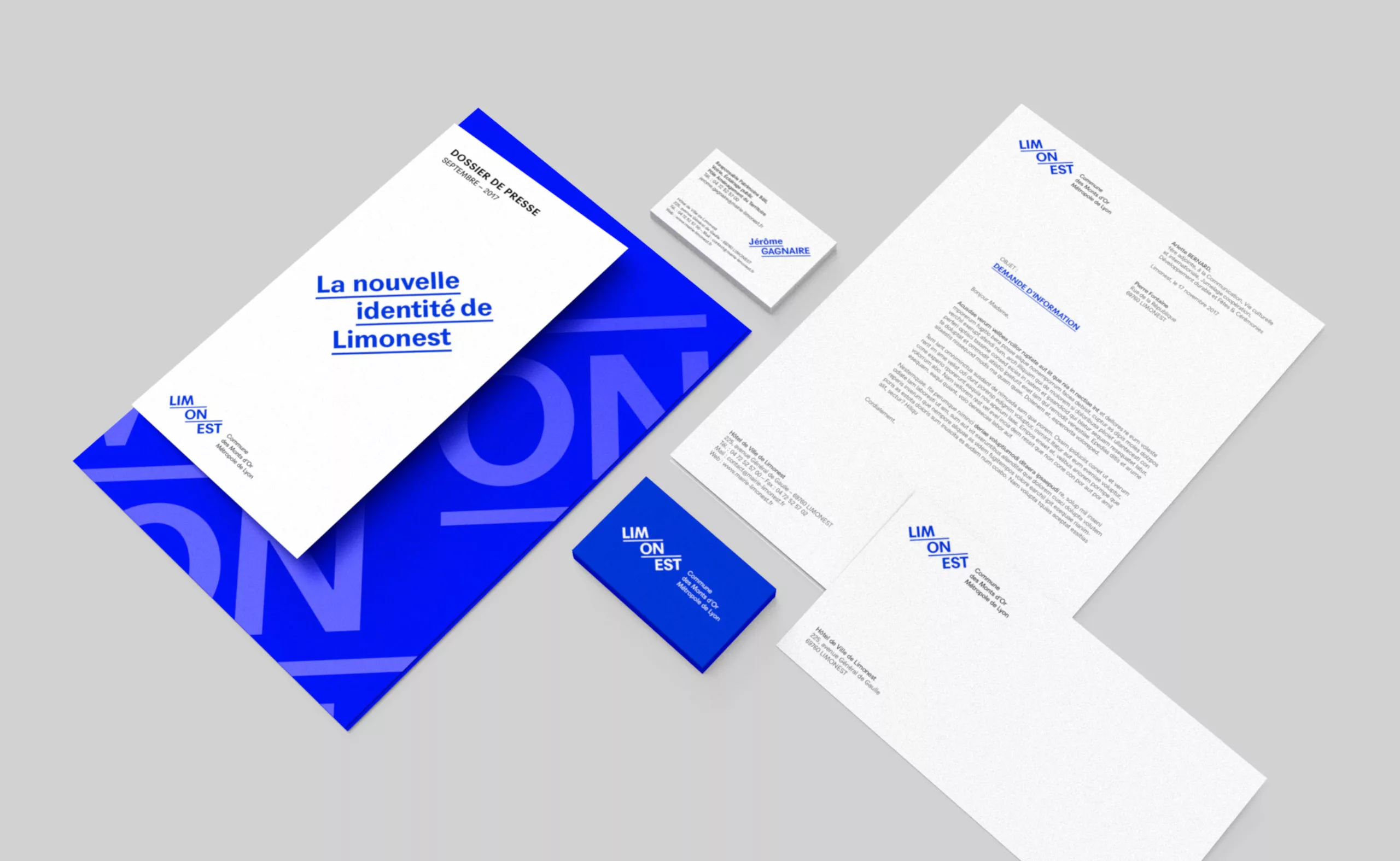
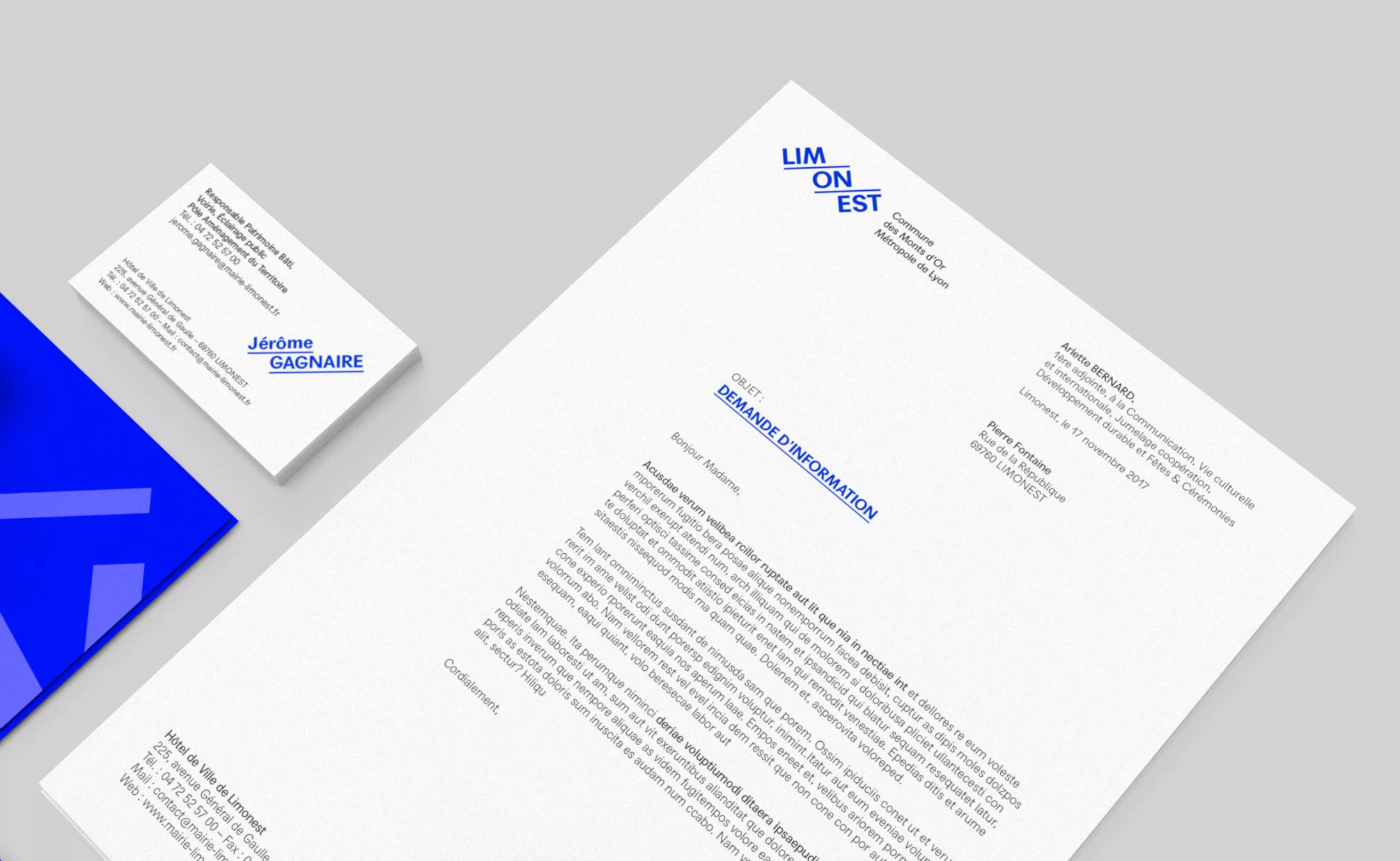
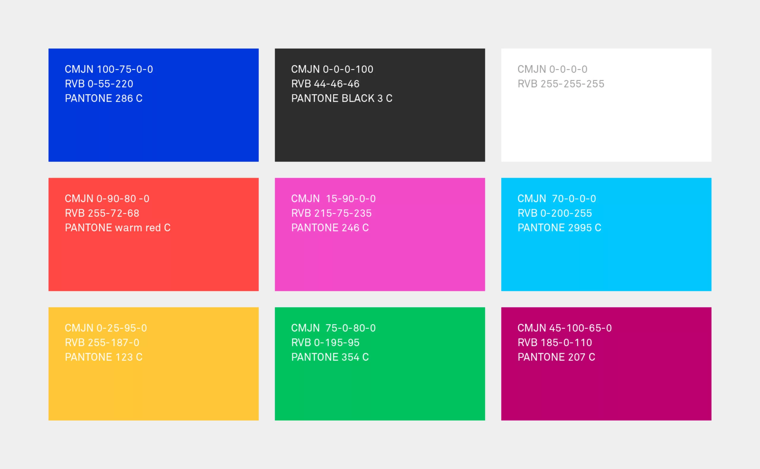
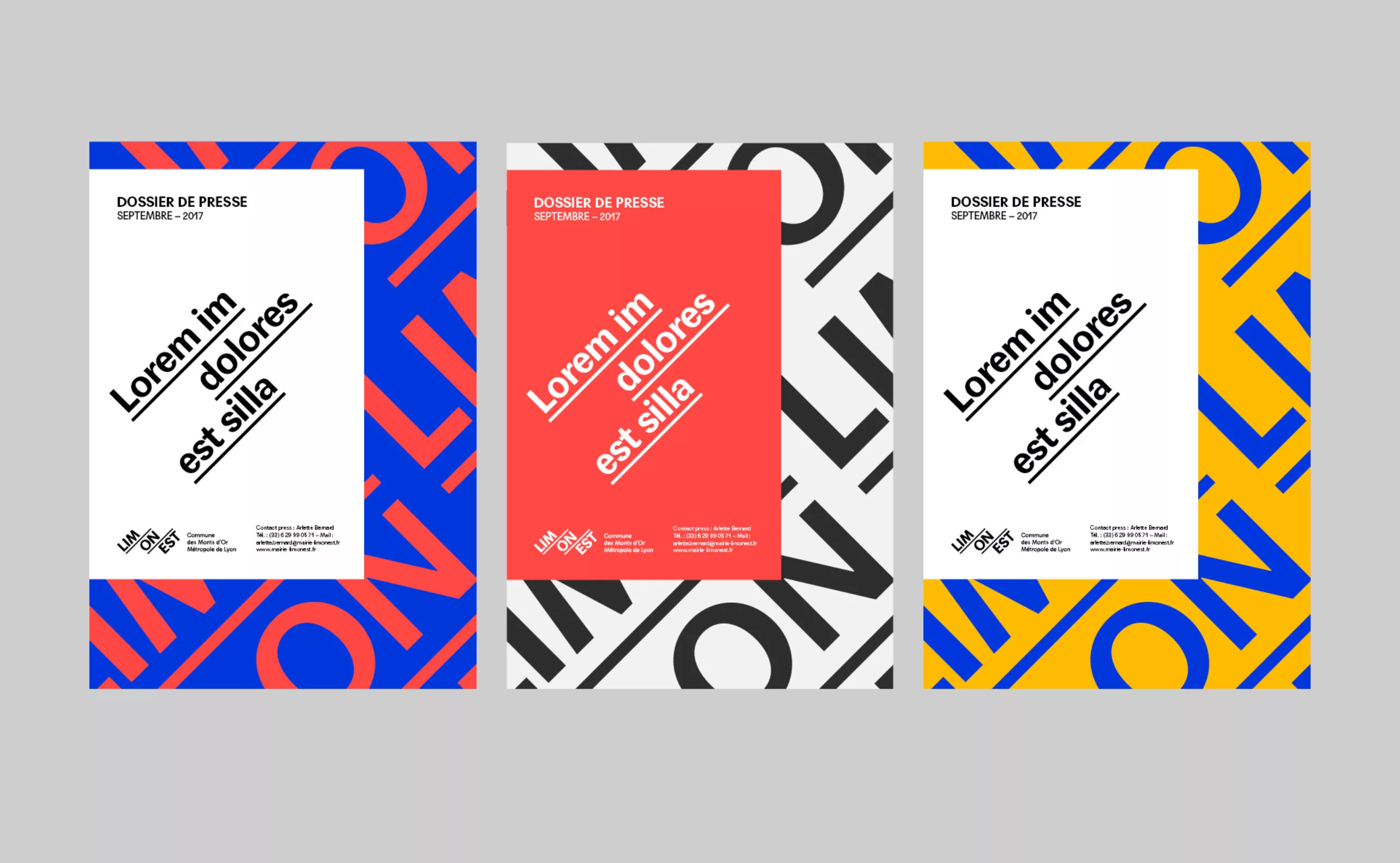
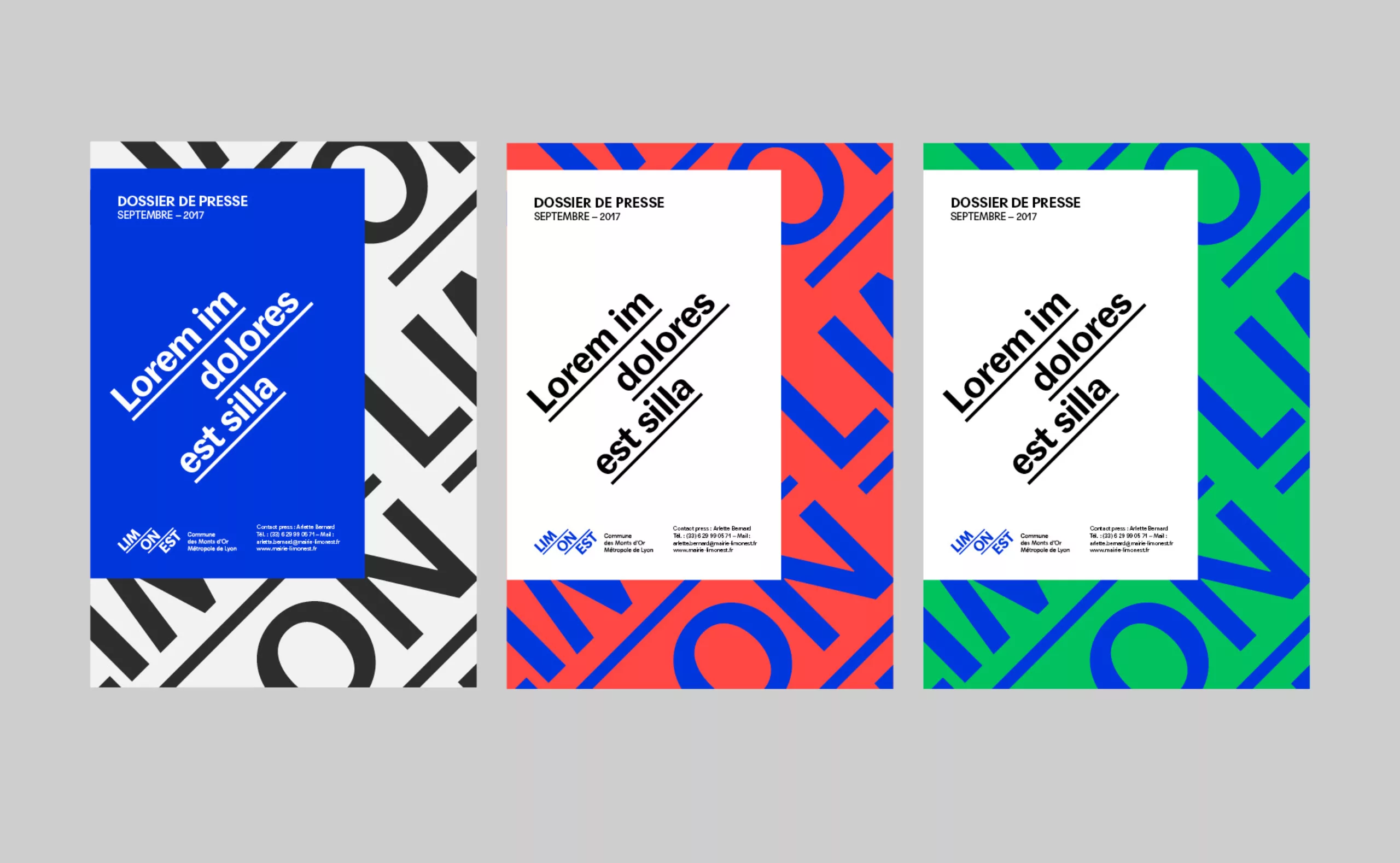
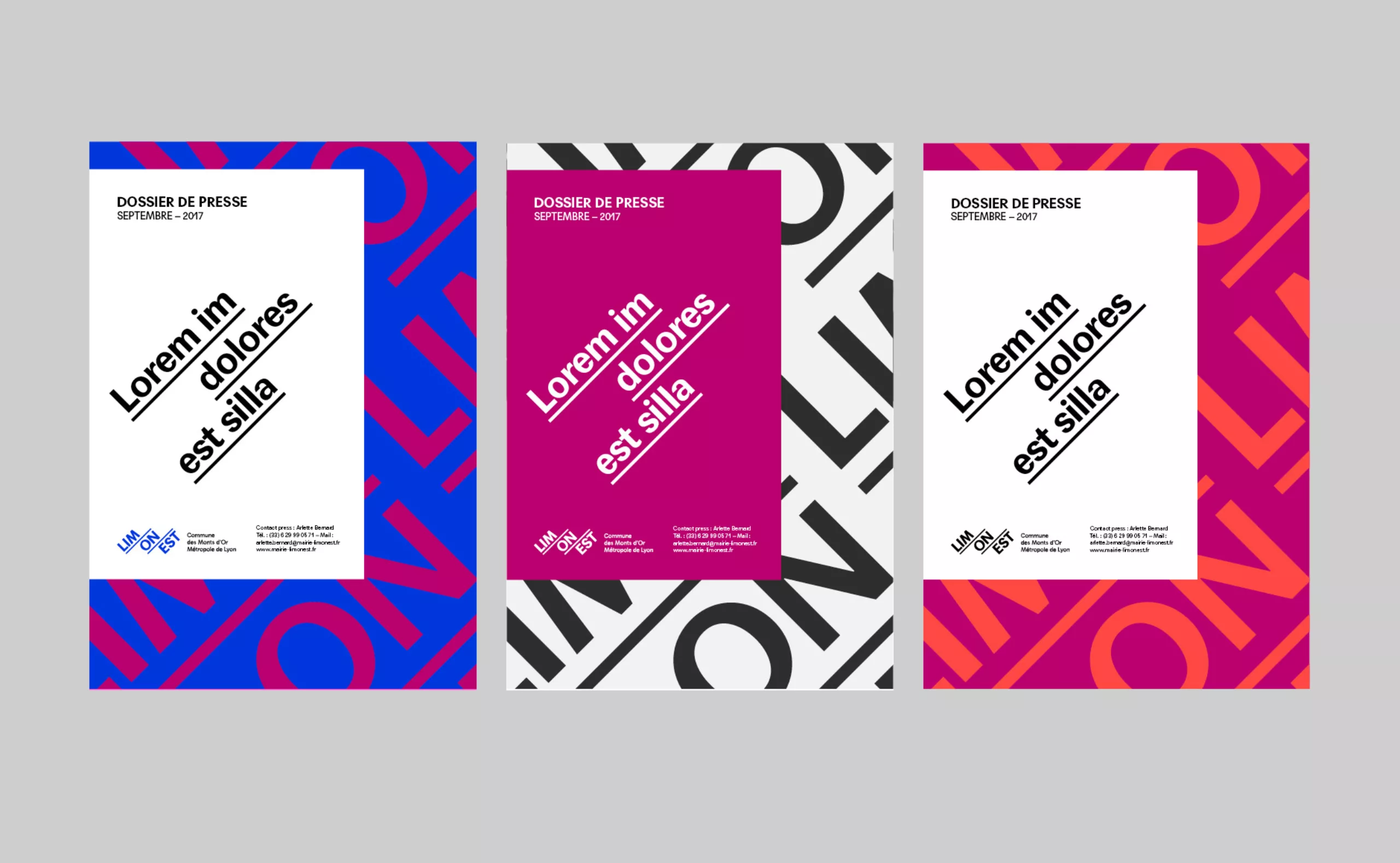
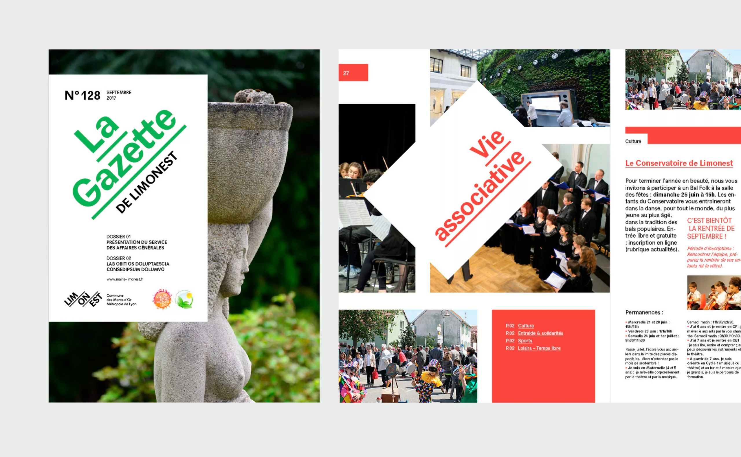
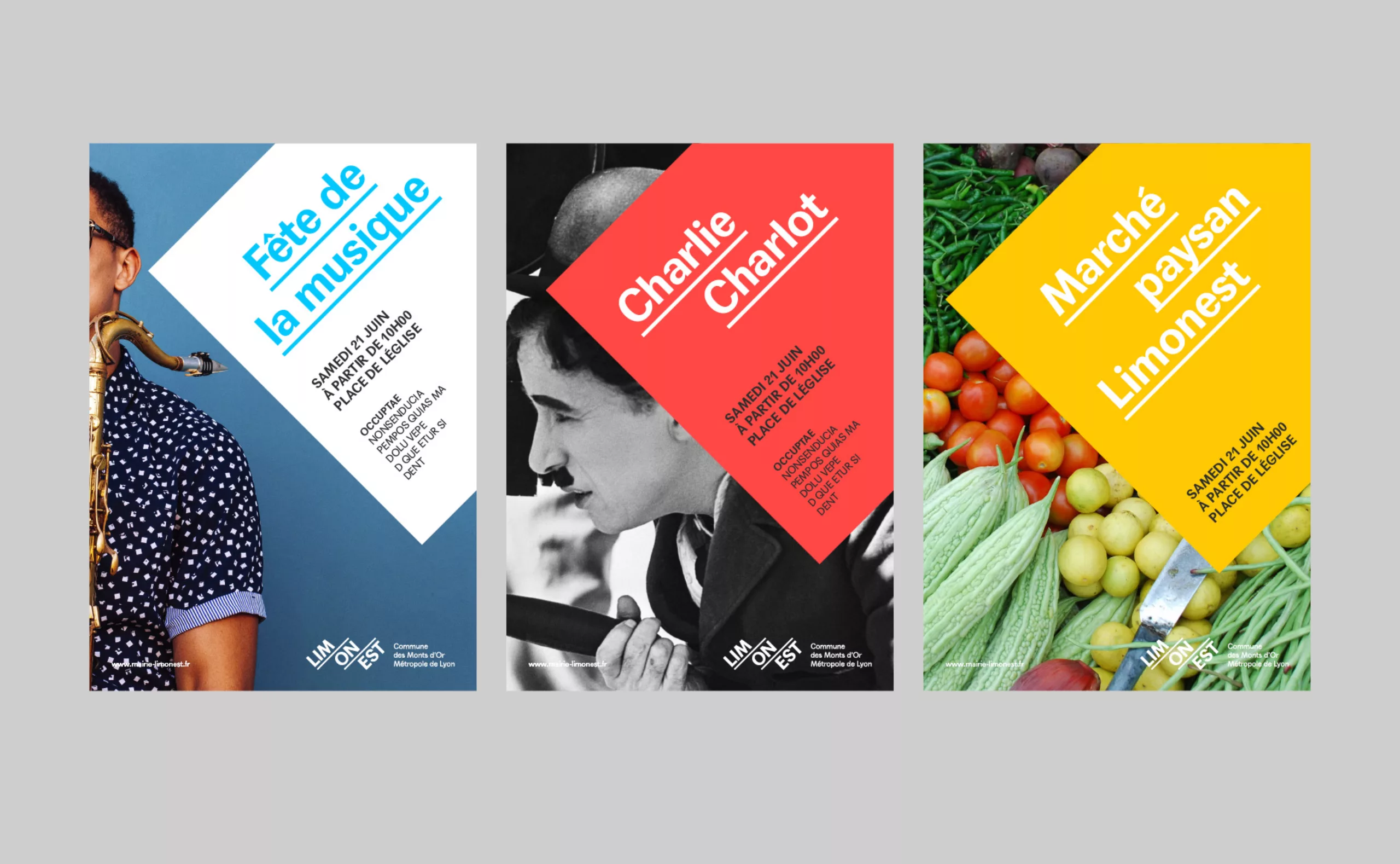
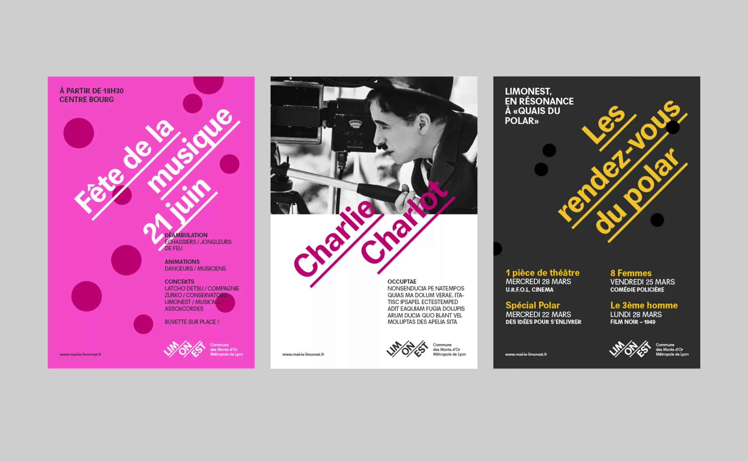
The challenge was to modernise the city's visual identity when the Agora, the city's new cultural centre, was built. We also designed the visual identity and signage for the Agora.
avant après logo

The concept

A typographical landscape:
By breaking the name into 3 parts, we symbolically recreate the three mountains that surround the city (Mount Thou, Mount Verdun and Mount Cindre).
This inclined composition embodies the topography of the commune.
.
A dynamic territory:
Symbolically, this rising typographic composition allows to display loud and clear the dynamism that animates the territory. This composition fits perfectly with the motto of the city "Excelsior, Excelsus, Excelsissimus" (High, higher, very high). These values of ascension and dynamism inscribed in the logo inspire the whole graphic charter.
gamme de couleurs Limonest design brand

The logotype

It is the unique composition of the name of the city that gives the logo its strength and originality.

The word "Limonest" becomes an memorable "sign", and totally original in the environment of the other logos of the territory. Its balanced geometric composition, its 45° angles and its typography in capital letters form an harmonious and unexpected whole, breaking with conventions and intrinsically carrying "tempo". This logo is intended to be deeply sustainable. It is not a logo anchored in a fashion trend. Its minimalism being its main guarantee of durability.

Magazine municipal ville de Limonest

Graphic universe

Behind its apparent simplicity, this logo inspires the whole graphic charter. Many ideas are inscribed in it. The idea of movement (ascensional), the idea of tempo (caesura of the name in three beats), the idea of underlining (to support a speech), the idea of disruption (45° angle unconventional)... So many ingredients that nourish the graphic charter and inspire multiple and contemporary expressions.

maquette magazine municipale ville de Limonest
Poster design / affiches limonest
Poster design
logo limonest et agora ensemble

The Agora

Discover the visual identity and signage of the Agora, the cultural centre of Limonest.

The objectives

This visual identity project aims to better reflect Limonest's values. It must bring together each speech of the city, identify and enhance its missions and actions. It must also be able to be declined for the new structures of the city such as the Agora cultural center.

  • Translating the values of the city
  • To inscribe the graphic identity of the city over time
  • Federating the institution's various departments
  • Communicating to all generations
  • Pursue the dematerialization of citizen initiatives

The graphic charter

The graphic charter envisages all the visual codes accompanying the communications of the city.

These codes are directly inspired by the spirit of the logo. They give a large place to typography, making it possible to enhance the expression of messages and information. We find again the principle of underlining, allowing the composition of titles in "the Limonest way".

Text and images are graphically isolated. The text takes precedence over the image, and superimposes itself as a label or a "pane". The image is not entirely revealed, leaving room for curiosity.

We also find the principle of inclination, allowing to play alternately between horizontality and inclination.
The text area can be fully tilted at 45°, while the text inside will be (theoretically) horizontal.

When the iconography is faulty, it is possible to use typography and colors to compose titles acting as images.


Share this project:
Project expertise:
Publishing design, creation of magazine and brochure layouts. Logo creation, visual identity and graphic guidelines. Graphic design of posters, flyers, letterhead and business cards.
Type of client:
Institutional communication agency, public communication for cities and territories, government institutions, social partners and public administrations.

Related projects: