The 2024 Olympic Games will not get a gold medal for their pictograms

The organizers have unveiled the graphic design of the buildings and the new pictograms of the Paris 2024 Olympic Games. Wishing “to create a rupture and revolutionize the forms”, the system seems to be so disruptive and not very readable that it ends up losing us completely. These new pictograms are not actually pictograms, and disturb a communication system that did not need to be disturbed.
Before we begin, we must remind you that we cannot claim to know all the arguments that led the Organising Committee of the Games to choose these pictograms. The designers of the committee and the agency that accompanies them must have worked for months. Their investment must have been total. They are experienced professionals. Each choice had to be the subject of bitter debates to reach a consensus with the sponsor. We felt it was important to start by recalling this. Our analysis is based solely on the final result of their work and on publicly available information.
A “revolutionary” identity for the Paris Olympic Games?
To begin with, there was the new logo of the Olympic Games, the woman-flame which came to shake up the classic codes with a female face looking like the Tinder logo and golden hair. Using a woman’s face, Marianne, for the Olympic Games, was the bet of the city of men’s rights. Well done. Especially when we know that the founder of the modern Games, Pierre de Coubertin, fought all his life to prevent the practice of sport to women! We wonder nevertheless if moving the subject -from the sport to the gender (by accentuating the codes of the feminine gender, with hair perfectly brushed and a well drawn mouth)- does not serve the founding identity of the Games, and also the equality between women and men, since the logo is based on gender stereotypes, precisely. But let’s move on.
Then, the mascot. Ha! the mascot of the Olympic Games. In theory, the Phrygian cap with the appearance of a clitoris seems to claim the French Revolutionary past, the abolition of privileges, and the female figure. One thinks of Delacroix’s Liberty Guiding the People, but more kawaii (cute, in Japanese). In practice, the Phrygians, whose first name is unpronounceable abroad – a choice of name that could really cause problems for visitors and that seems absurd in a context of international gathering – have blue-white-red cockade eyes and cartoon looks that will surely delight children. The plush toys and other derivatives are produced 80% in China and 20% in France, with recycled polyester (a small step to give oneself a good conscience)… because the real revolution will not take place in 2024!
Questioning the usefulness of the revolution
Unfortunately, the gold medal does not go to the pictograms of the Olympic Games of Paris 2024. To make the Revolution, Julie Matikhine, director of the brand Paris 2024, announced that “the pictograms are a bygone era”. Halt there! If making a revolution means making a radical change to overturn the established order because the institutions or services in place do not or no longer meet the needs, is it really a revolutionary act to simply do things differently? Before changing things for the sake of it, it is good to question the usefulness and efficiency of the tools or systems used. If a system justifies its efficiency, it should not be necessary to overthrow it.
Let’s go back to the pictograms of the Olympic Games used since the 60’s and the usefulness of such a system in an international context, before explaining why the new illustrated symbols of the Olympic Games (which are not pictograms) are likely to lead to chaos at best, and to a bad revolution.
What are the pictograms of the Olympic Games for?
When the first modern Olympic Games were created, there was a desire to bring nations together in peace, through the practice of sports, which would be used to confront each other on the field and not on a battlefield. The founding value of the Games lies in this very notion of pacifist gathering of nations, through sport. And who says gathering of the nations says several cultures and several languages, and thus harmonization with a common language. It was necessary to create a system of universal pictorial language and not verbal: this was done with the pictograms.
If pictograms are the very first signs of writing (composed of ideograms, drawings of ideas or concepts, and/or phonograms, drawings to represent a sound), the idea of a universal visual language common to all humans is not new, far from it, and sees its apogee in the 1920s in Germany. At that time, one sought to develop forms of “universal” language through geometry and mathematics, which perfectly translated the rational thought proper to humans. It was during this period that the Isotype was created, a series of pictograms used as visual statistics to illustrate and make world statistics accessible to as many people as possible, in a concern for the emancipation of workers and the democratization of knowledge for all. These pictograms and these codes and geometric rules will be used as a basis to create the road signs, and the pictograms of the Olympic Games.
The first pictograms of the Olympic Games: a universal language
Some pictograms were created for the first Olympic Games in 1896 in Germany, but it was in Japan in 1964 that graphic designers imagined the first pictograms of the Olympic Games in a set of coherent symbols, because no one spoke Japanese except the locals. These are intended to facilitate the movements and the understanding on the sports sites. It is for the 1964 Olympic Games that the gendered pictograms “toilets for women / toilets for men” were invented and that a symbol was drawn for each sport discipline. Each one must be easily understood by all, in a simple and fast way. To do this, graphic designers must ignore cultural or linguistic semiotics.
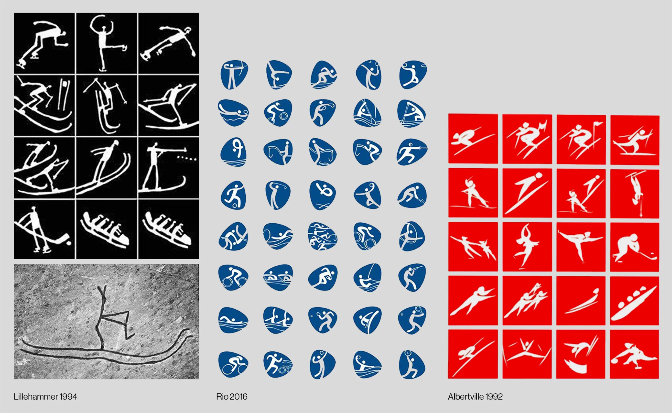
After Tokyo in 1964, each city adopted the pictograms and developed them further. Mexico City stood out by putting the sports equipment in the foreground rather than the sportsmen and women themselves. In the 90’s in Albertville and Barcelona, the first pictograms were created in brush painting and became an integral part of the visual identity of the Olympic Games. In 1994 in Lillehammer, the history of Norway was integrated into the pictograms based on the drawing of an engraving (from 4000 years ago) of a man on skis. The integration of cultural elements in the Olympic pictograms became a common approach for the countries. In the 2000s, we began to exhaust the mechanism without always having things to tell nor find a coherence; Sydney systematically used a boomerang as a pictographic element, Athens in 2004 made a nod to the Ancient Games with characters that resembled the engravings of Greek amphorae, and Sochi in 2014 resumed the codes of the Moscow Olympics in 1980.
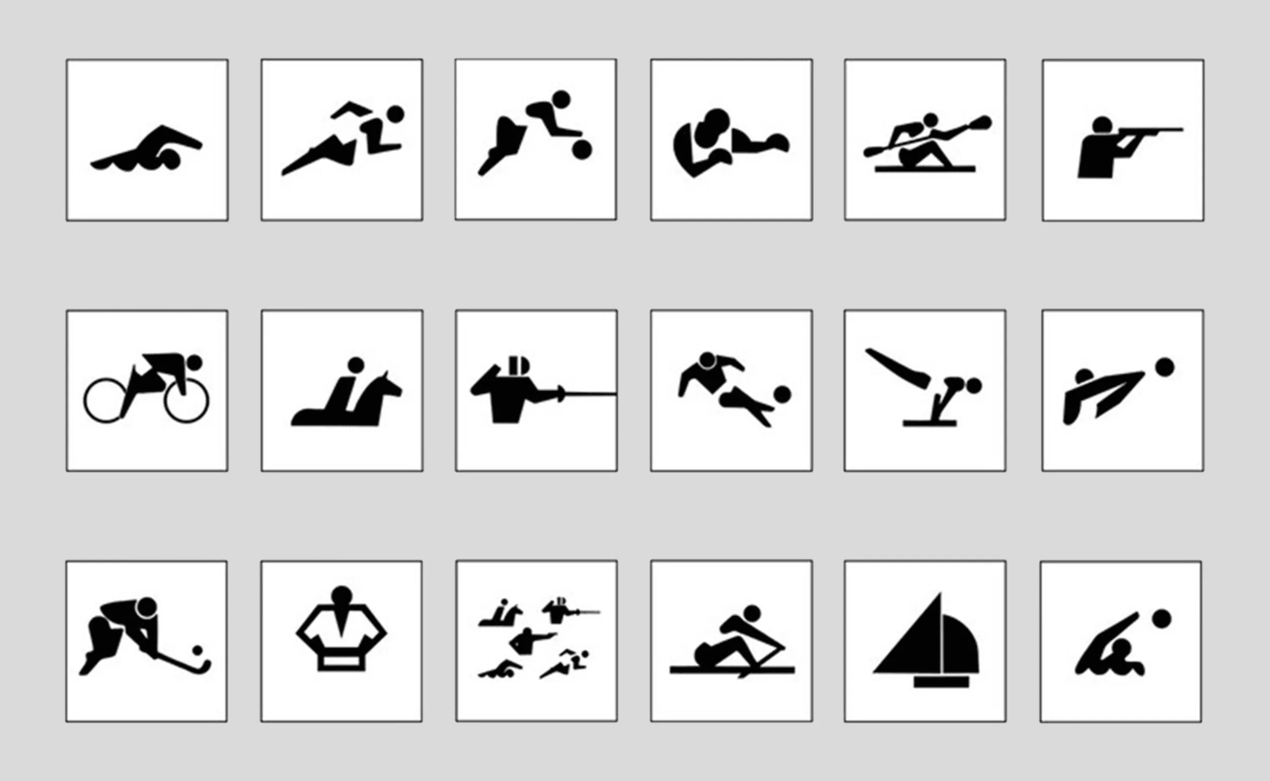
Nevertheless, the pictograms are effective: you can distinguish the symbolized sport in less than a second. Look for the odd one:

Even in 1968, when Roger Excoffon was having fun with optical art, the legibility of the pictograms was assured. Great art.
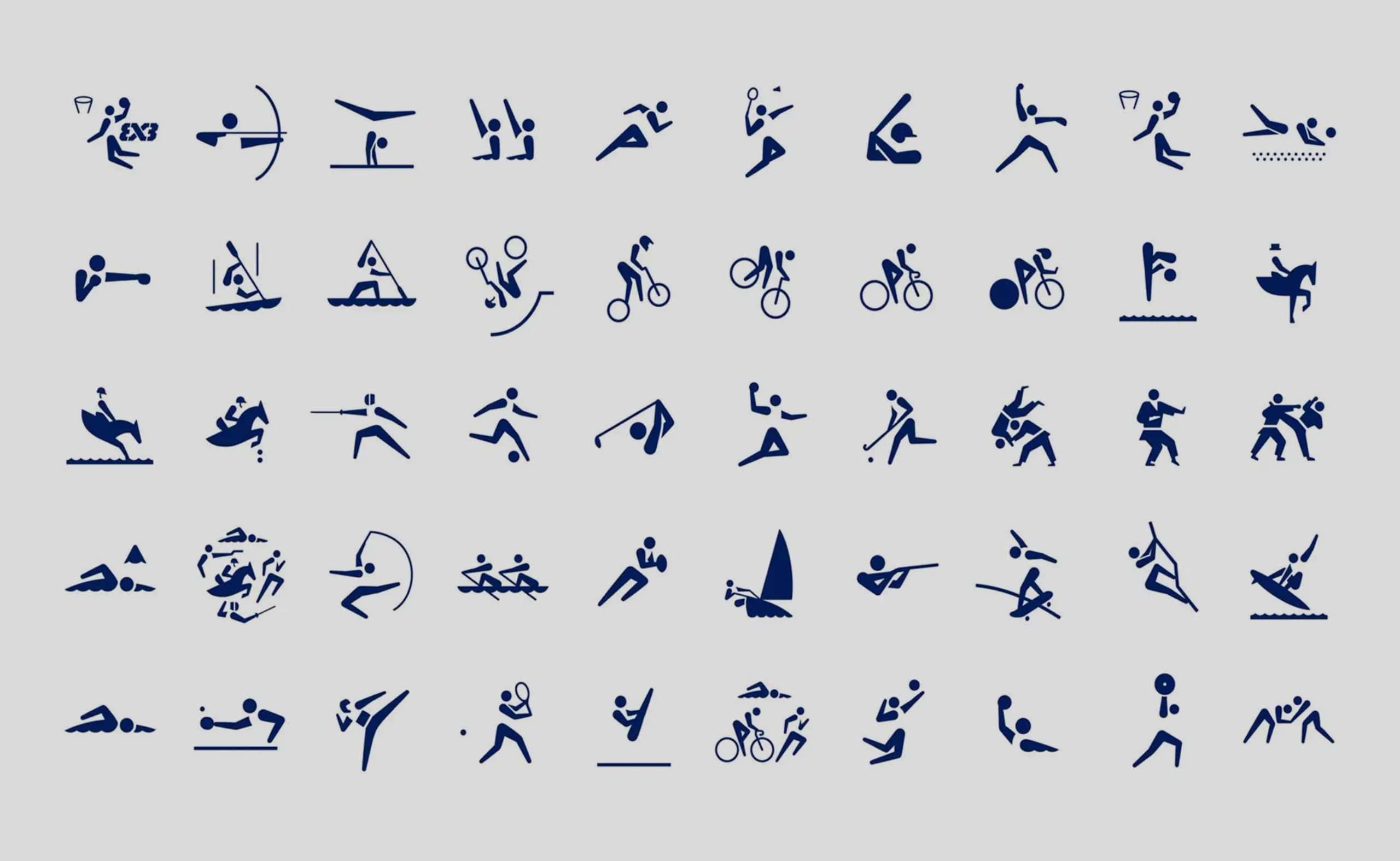
In 2020, Tokyo innovates and proposes the first animated pictograms for the Olympics, a sublime and inventive mixture of classic iconography with modern digital sauce with hollowed out parts following the law of closure, which works wonderfully:

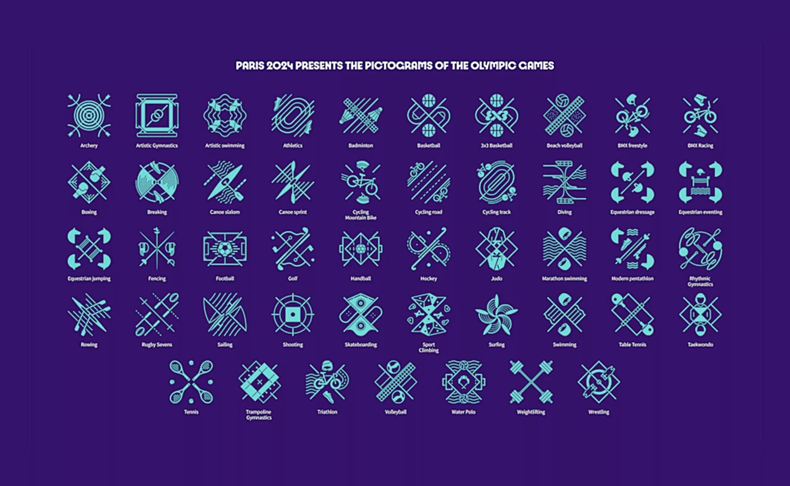
In 2024, Paris makes a disaster and abandons the traditional pictograms of the Olympic Games. The organization shakes up all this heritage and complexifies the pictograms of the Games by inventing symmetrical and complex basons, difficult to understand in the blink of an eye or for the novices of these sports. They are composed according to an axis of symmetry and take back an element of the ground and elements of the sports equipment:
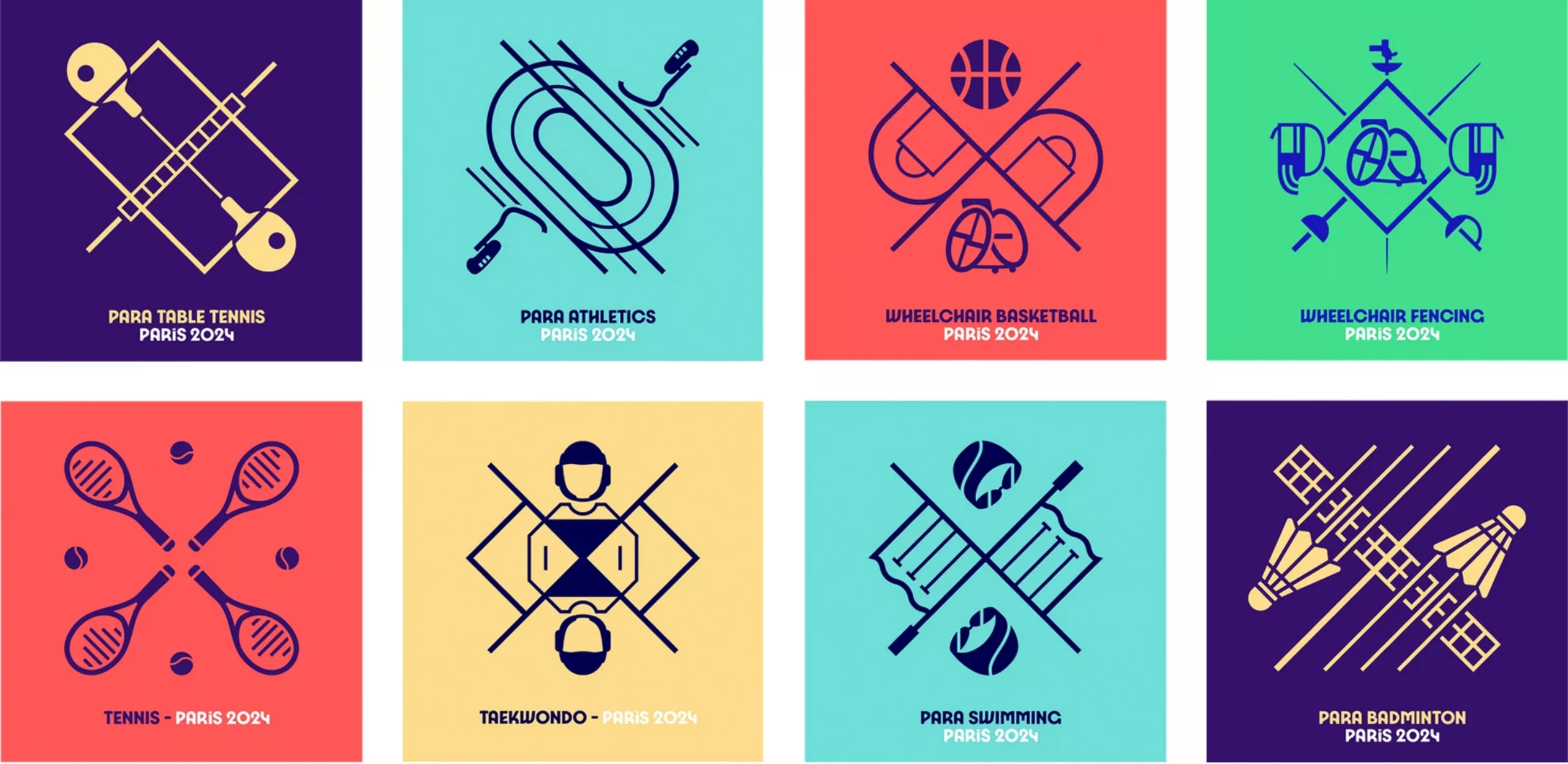
The problem of the pictograms of Paris 2024
The problem of the pictograms of the Paris 2024 Olympics is very simply that they are not pictograms! Paris proposes not a pictorial language but “a drawing, a pictorial work, which carries a powerful message, which does not represent the human in a sport situation, but which gives the framework of this sport and which invites to join it” through “coats of arms, which express this notion of family, of community, of a standard behind which one is invited to come and line up when one shares values, a lifestyle, attributes.”
The pictogram, from the Latin pictus (painted) and the Greek gramma (written sign) is a symbolic sign representative, and illustrative vehicle of an idea. Take away its family of reference, make it too abstract or draw it in too complex a manner, it becomes an icon or ideogram. The pictogram allows the simplified and clear representation of an idea, an action or an object, in the middle ground between the abstract and the figurative. It is part of a system, a context, and above all it allows to be quickly readable and understood by all, in all languages. Do you see the problem emerging by 2024? If they are graphically innovative and interesting, these symbols are unreadable because they are too illustrative, and do not respond to the problem of communication of the Olympic Games.
A low degree of iconicity
Every graphic designer knows empirically the notion of readability threshold, this borderline that will make an image readable or not. The work of simplifying a form or an idea reaches its paroxysm when it comes to pictograms.
Abraham Moles (1920-1992) worked on this notion of degree of legibility and defined in 1971 a scale of iconicity. This scale hierarchizes the different signs from the strongest degree of analogy to the most abstract. It makes it possible to classify the iconic signs according to their degree of stylization and simplification. This scale thus measures the gap between reality and representation. The higher the degree of iconicity, the more the sign is analogical, in other words the closer its representation is to its referent.
In this scale, to present a photographic image requires a lot of space (or detail) but its recognition will be very fast, while to pronounce the word cow it takes time (and no space). Note that the pictogram is located exactly in the middle, representing the optimum between time and space. It is a sign made to be seen from far away in small (=little space) in a short context (=little time). The example of road signs being the archetype of these situations.
If we apply this iconicity scale to the pictograms of the betting games, they fall between the diagram (60) and the illustration (70), far from the expected optimum of 50.
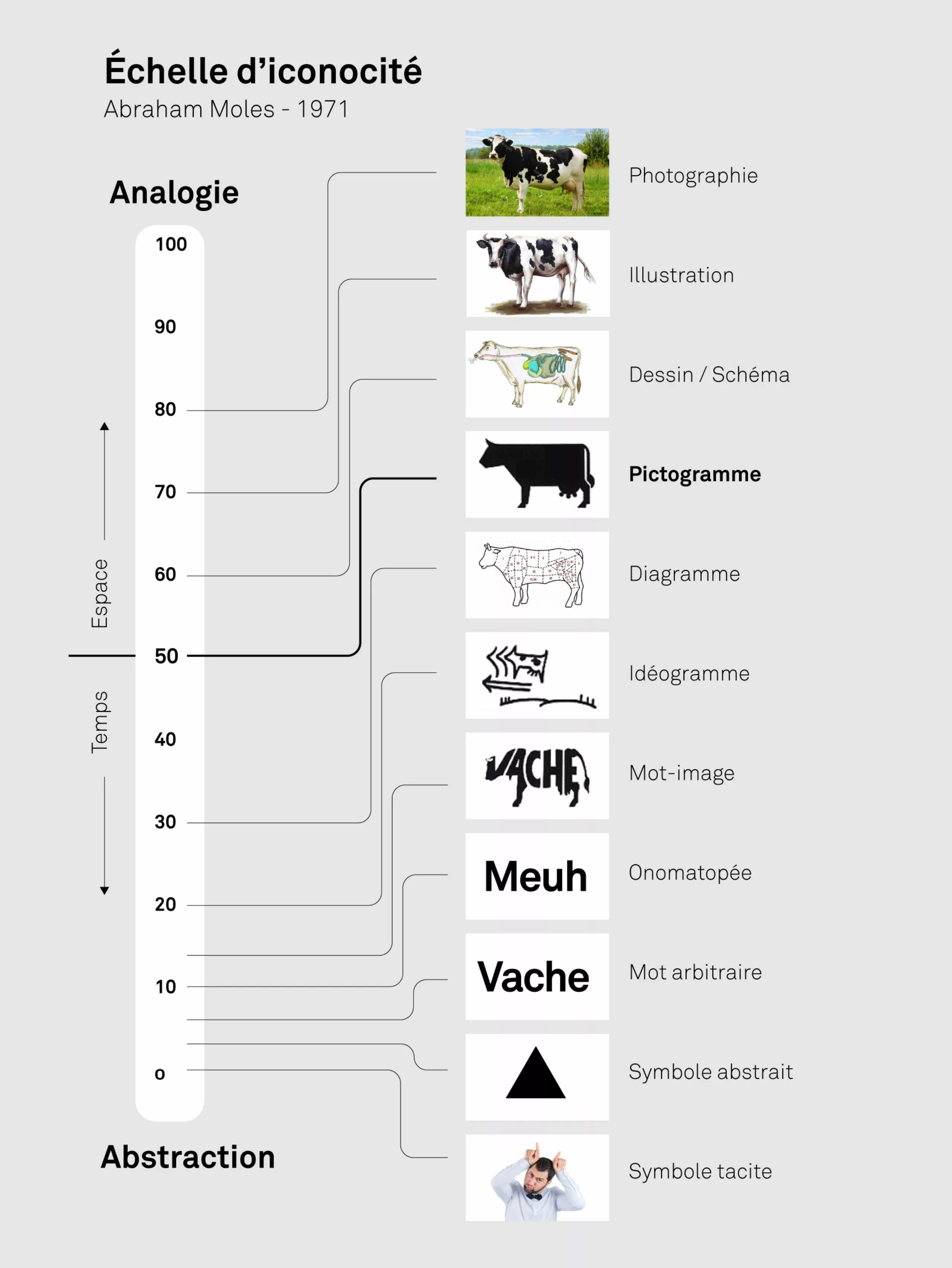
By the way, as an interlude and since we are talking about cows: did you know the letter A is nothing but a pictographic representation of the head of a cow (which is one of the most ancient deities)? This is what we see on page 127 of Adrian Frutiger’s Man and His Signs.

Where the pictogram gathers by a symbol as universal as possible (even if its features can be cultural) taking into account in its conception the analysis of the language, the social theories and even the optical games, the coat of arms is only a drawing of clan more or less illustrated or figurative, which belongs to its members only. We speak of a coat of arms for the members of the same army, of a family, of a given territory. Where the pictogram gathers, the coat of arms cloisonne and differentiates. Where the pictogram simplifies and addresses itself efficiently and quickly to all in an impulse of universalism, the coat of arms embroiders, illustrates and tells with many details the values of its clan.
The Olympic Games do not need to gather the fans behind the colors of their clans, they already do it. But they do need clear symbols to guide the crowds, and these crests certainly won’t do that. As a reminder, more than 60% of the world’s population does not read the Latin alphabet and 75% does not speak a word of English, let alone French, the pictograms are primarily aimed at these millions of visitors in order to facilitate their travel. In terms of public utility, it’s not easy. And for accessibility, we will avoid the RGAA tests.
The target shooter looks like a ship’s rudder, the surfing like a flower, the trampoline like a band-aid and the rugby 7s like two weightlifters pulling the same weight. As for the diving board looking like a speculum (that charming tool used to spread women’s vulvas and vaginas at the gynecologist’s), below, it looks like it says that it is forbidden to dive! If these pictos work in animated version and thus on digital media, they are almost unreadable in small format, and even more without a caption (which is absurd for a picto). We really have to see how the creative team of the Olympic Games will adapt to meet this need for legibility, but we can’t hide our (objective) astonishment at such a graphic choice.
Tony Estanguet, triple medalist in canoeing at the Olympic Games and director of the 2024 Games, says that as an athlete or even a supporter, we are proud to wear the colors of our favorite sport by collecting caps, t-shirts, key chains, etc. adorned with pictos. We have the disturbing feeling that these pictos have been thought more for their illustrative and therefore mercantile potential, as marketing support. What is even more disturbing is that, according to the press, the team is negotiating with the Olympic Committee to propose the use of these pictos in Los Angeles in 2028!
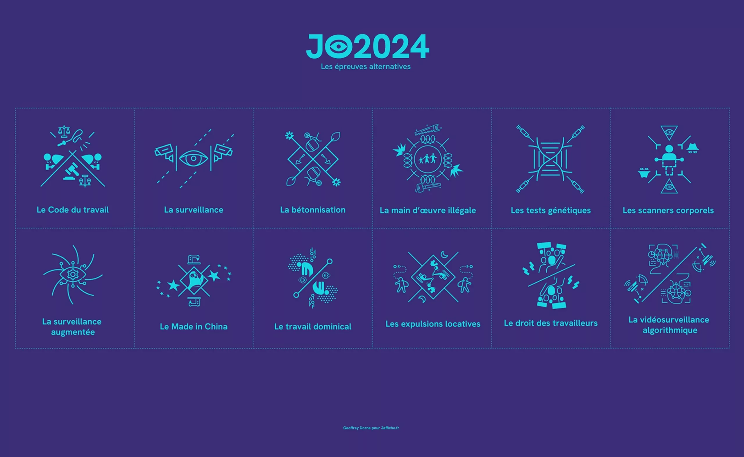
While waiting to see their application and a possible graphic solution, Geoffrey Dorne, militant designer, has already diverted the pictos to put forward the social drifts of the French Games… and we love it!
On the subject
-
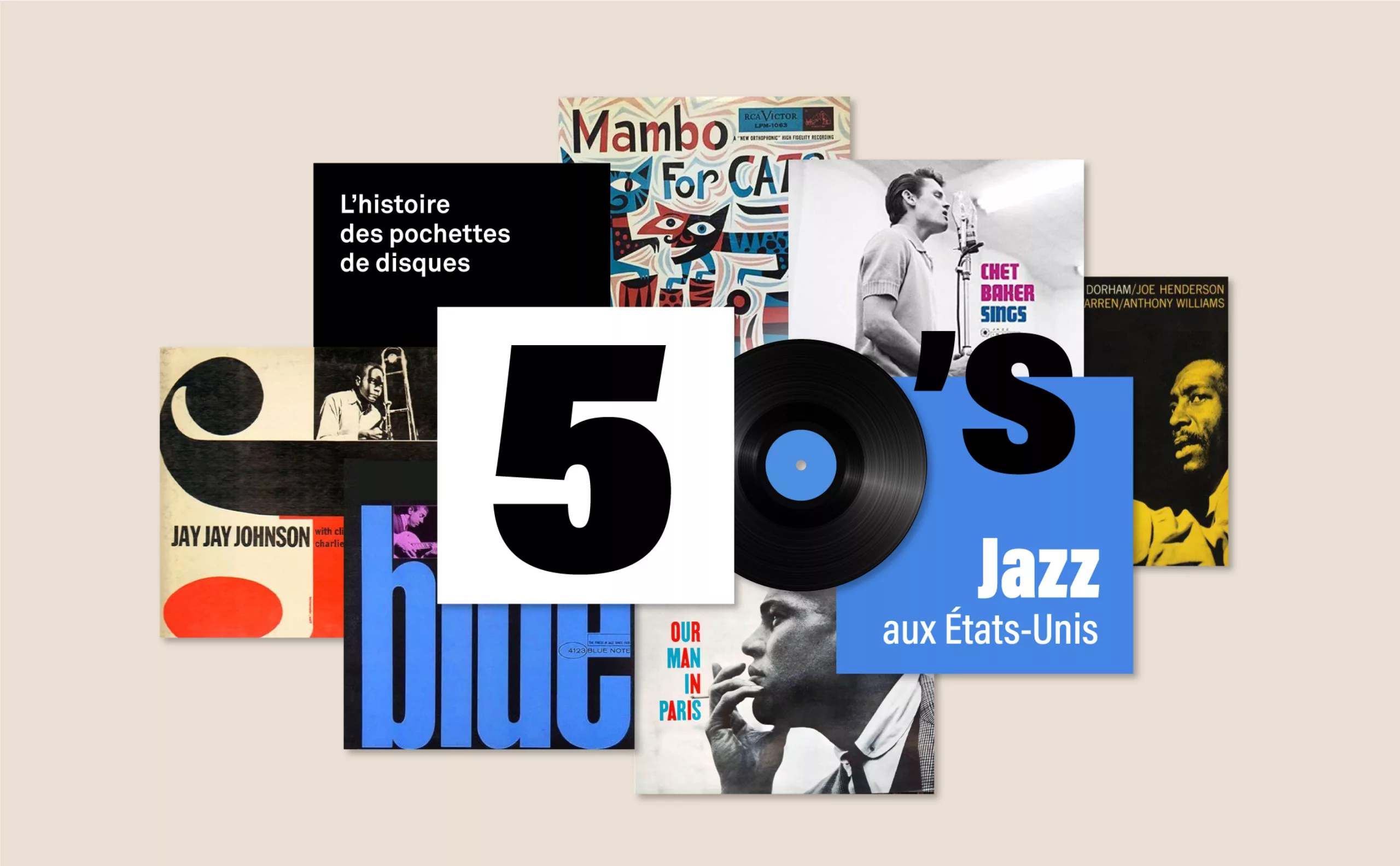
History of record covers: the face of 50s jazz
The vinyl sleeves come to life with jazz. It is a whole graphic universe that makes the music heard, through the illustration or the photo.
-
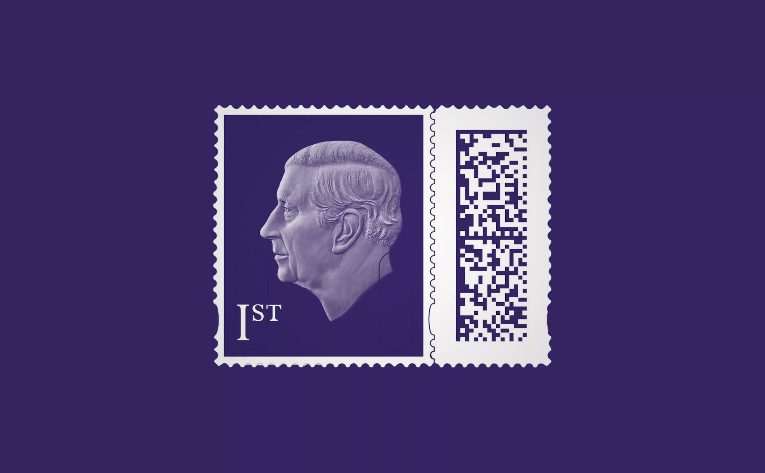
A king-size stamp for Charles III
The UK Postal Service presents the new stamp of King Charles III, a very sober portrait without a crown, a very symbolic first for the British crown!
-
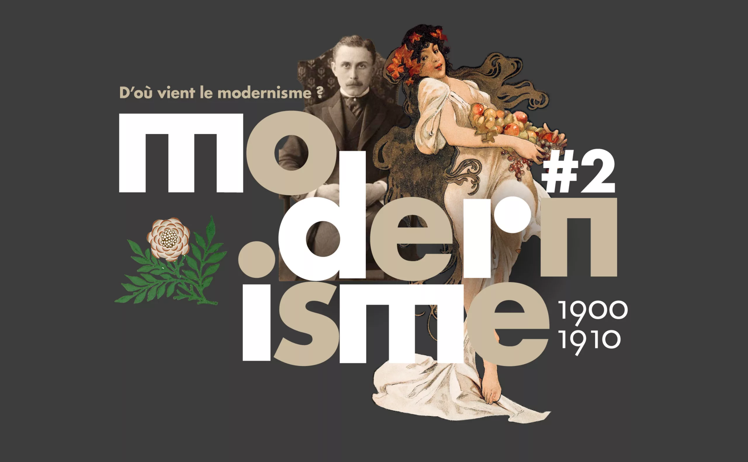
Where does modernism come from? 2 – The two faces of modernism and the social ideologies surrounding ornamentation
L’usage ou l’absence d’ornementations symbolise pour l’homme “moderne” deux visions utopiques et différentes pour changer la société.