Stereotypography: typical, even racist, typefaces
Some typefaces, such as Neuland or Chop Suey, are used today almost exclusively with a stereotypical connotation, to represent a country or culture. Yet their original meaning often has nothing to do with their current use. Used mechanically and out of context, they have acquired a new meaning linked to a cultural stereotype, to the point of being reduced to this sole use, which sometimes becomes racist. We call them “stereotypographies“. Do they arise by accident, or are they deliberately created? Here’s their story.
Stereotypographies in spite of themselves
Most of the time, typefaces become stereotypes because of the context in which they were created, rather than their original intent. Their connotations are built up over time, by being used and seen in a specific context, built on prejudice and repetition.
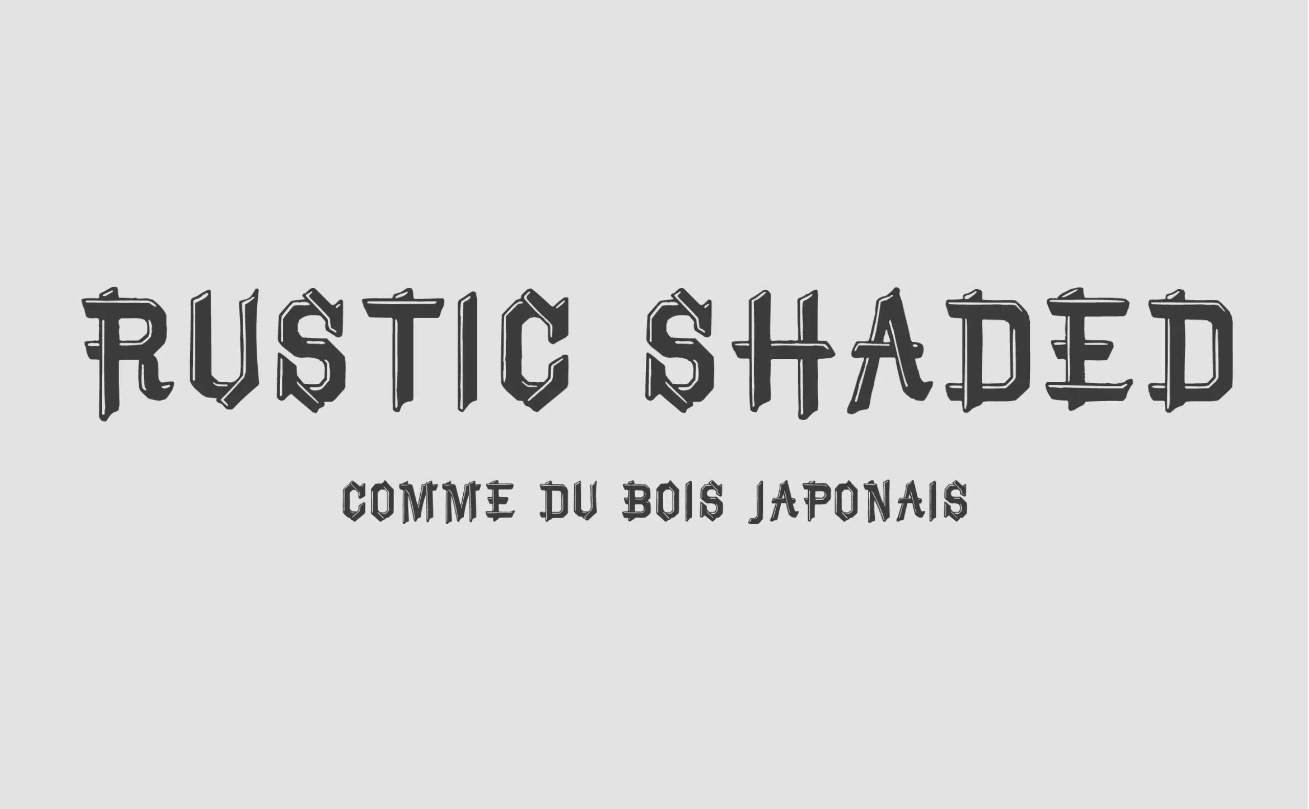
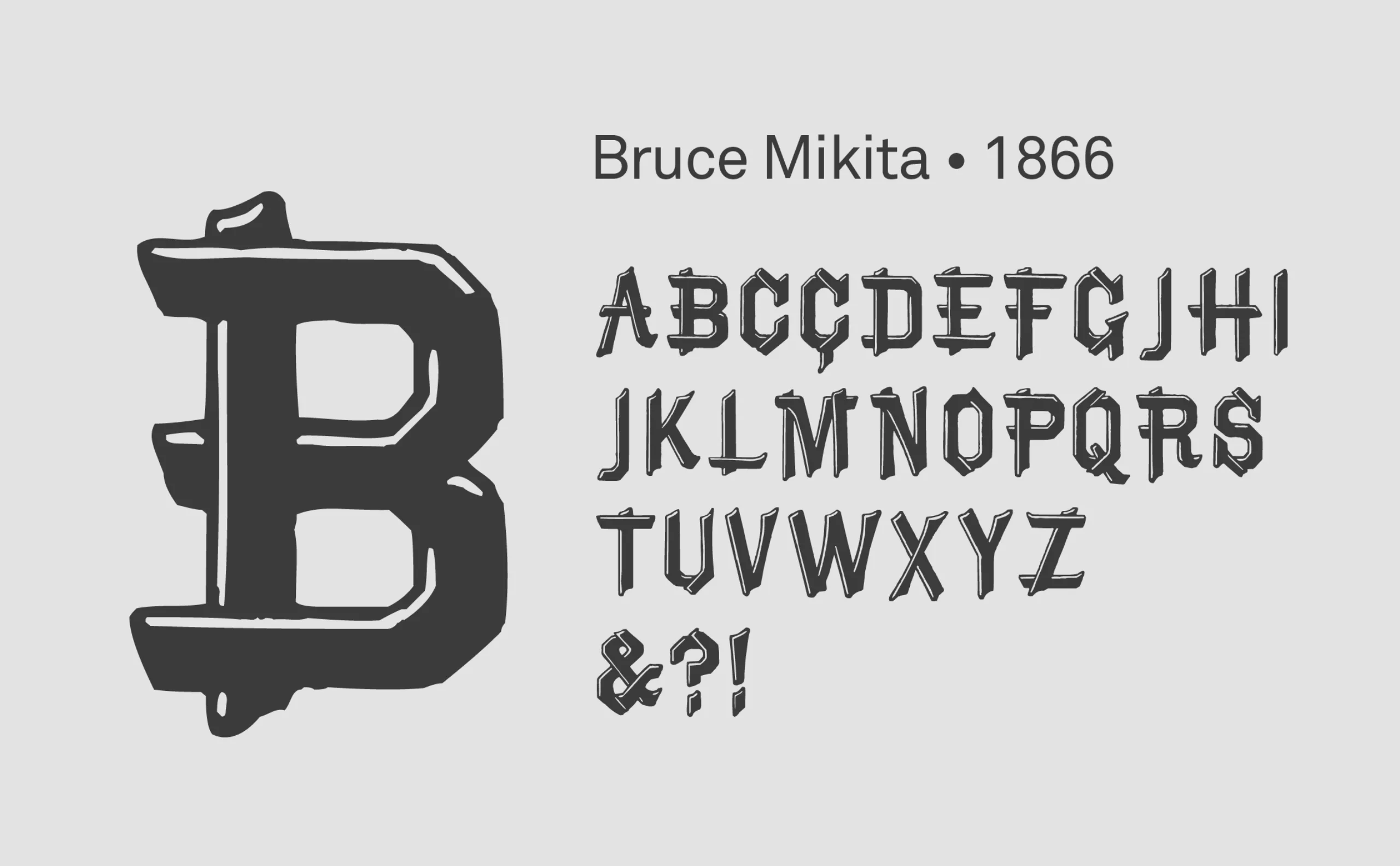
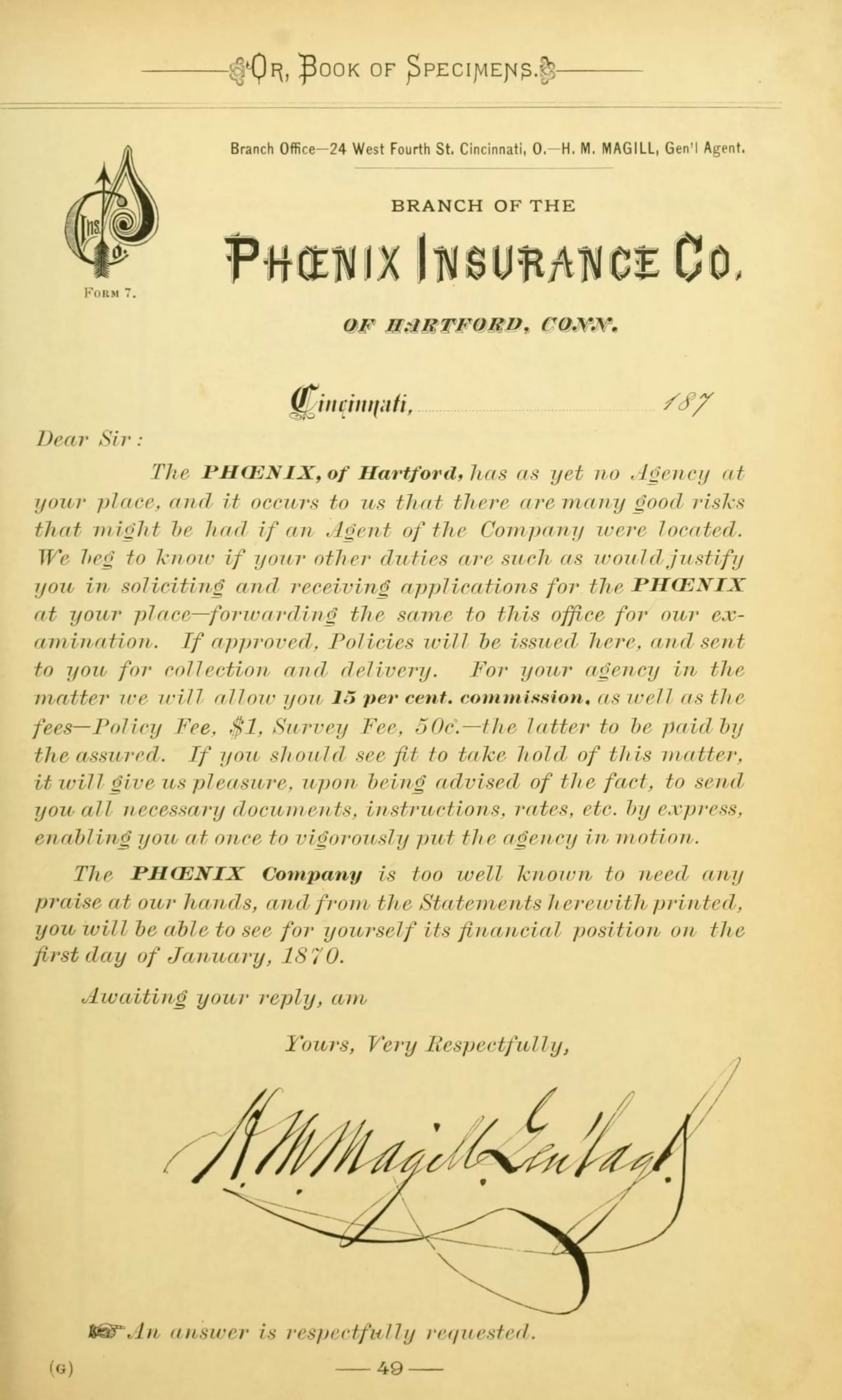
Such is the case with Rustic Ornamented Shaded, the first stereotypography known to date, drawn in 1866 at the Bruce Type Foundry. Depicting a superimposition of pieces of wood, it was first marketed under the name Novel Open, and used on official papers, as shown below on a Phoenix Company document dated January 1, 1870. It then became Rustic Shaded in reference to its rustic style. Conceived as a Victorian-inspired typeface, it changed its name again in the ’50s to Bruce Mikita, in reference to Japanese woodworking, in vogue at the time. From then on, the name was a reference to Japan.
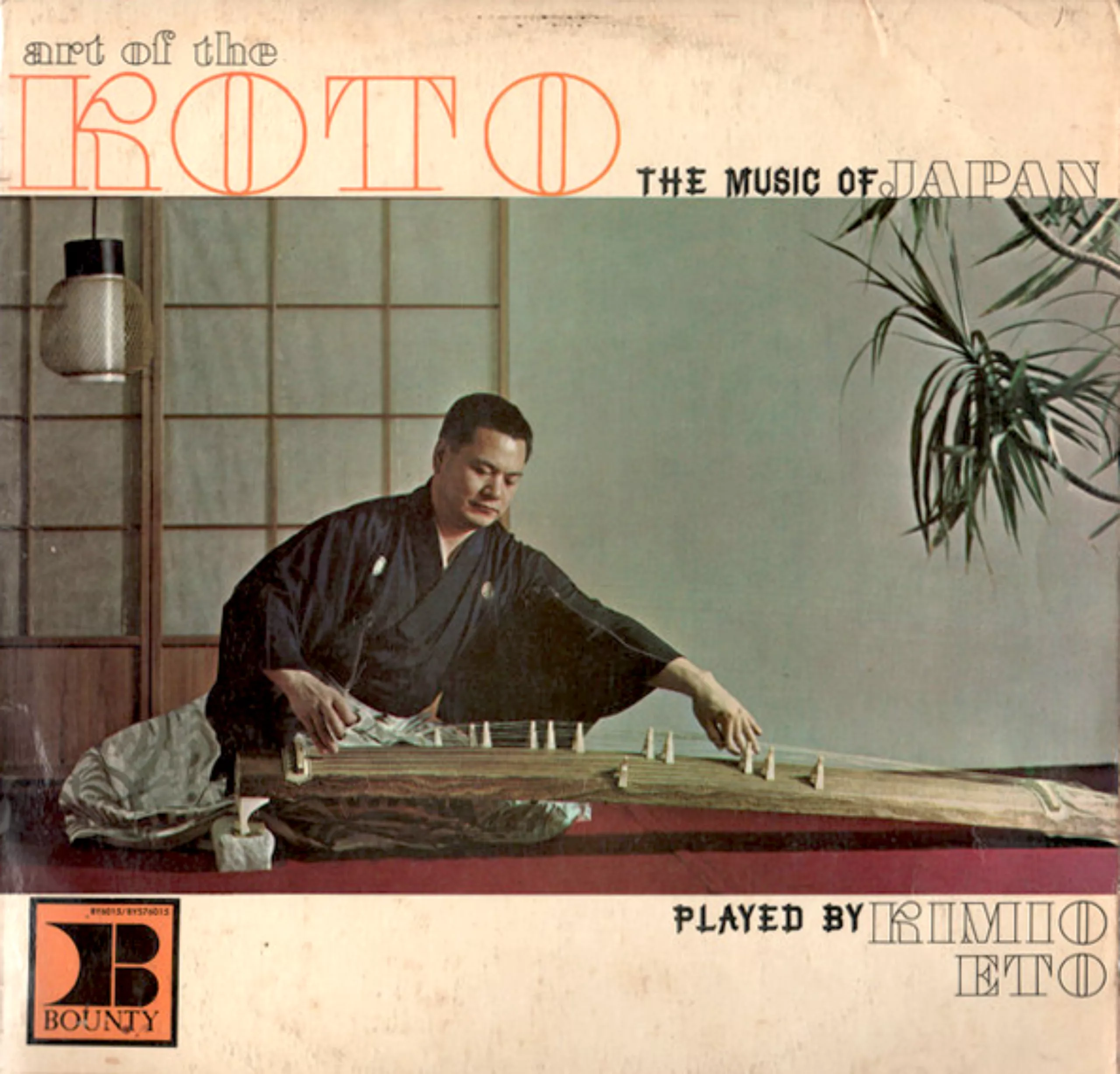
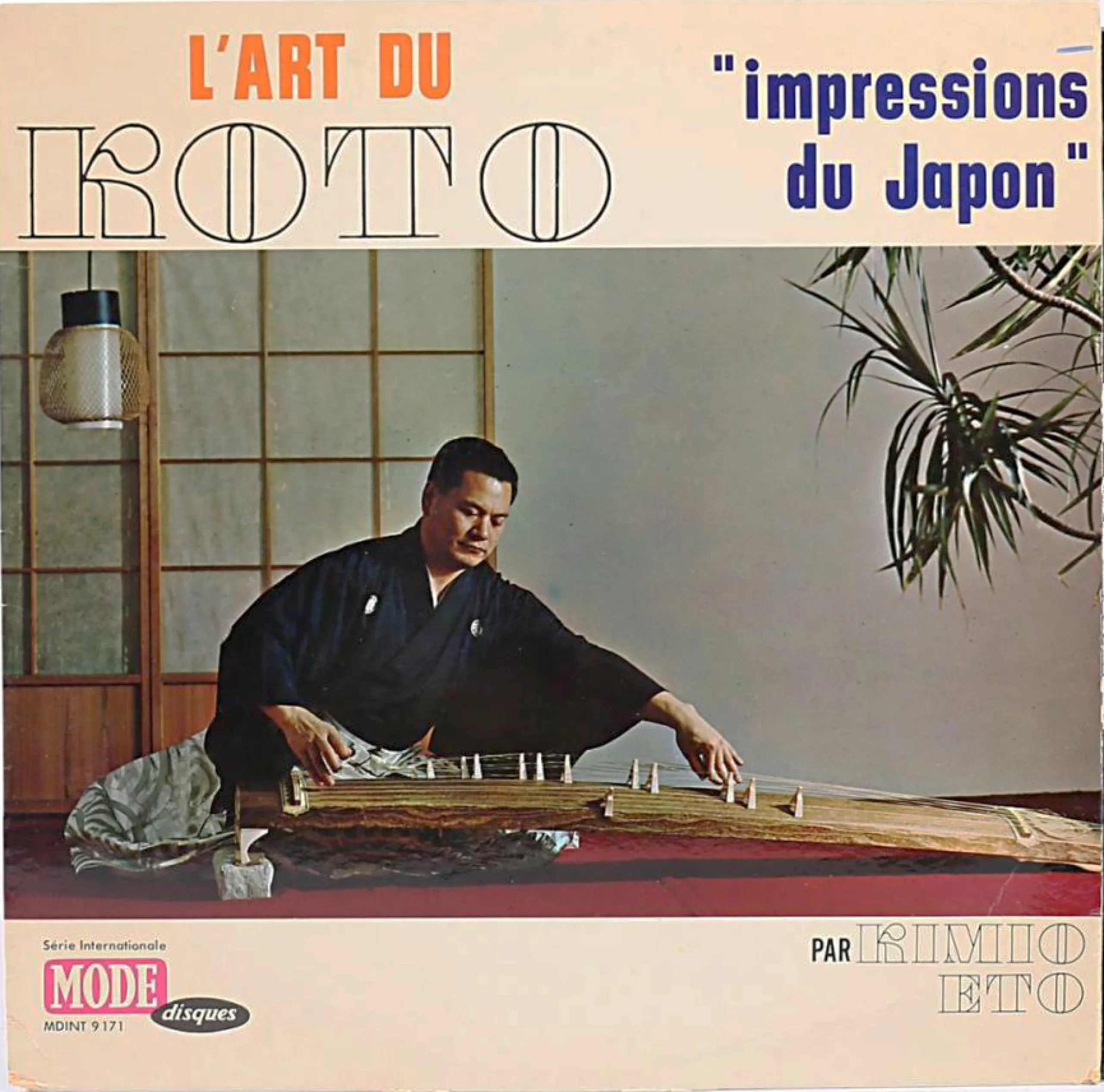
As a result, it was used on many Japanese-language media in the United States. It can be seen, for example, on this Japanese music album “The Art of Koto, music of Japan” released in 1963. It’s worth noting that Mikita typeface was only used on the US cover and not the French one, as if the need to justify a “Japanese typeface” was only necessary for the North American clientele, perhaps less familiar with it.
When it was digitized in 2000, the designer in charge of the project said it looked “rustic and handmade, reminiscent of East Asian calligraphy”. Its reputation is now established.
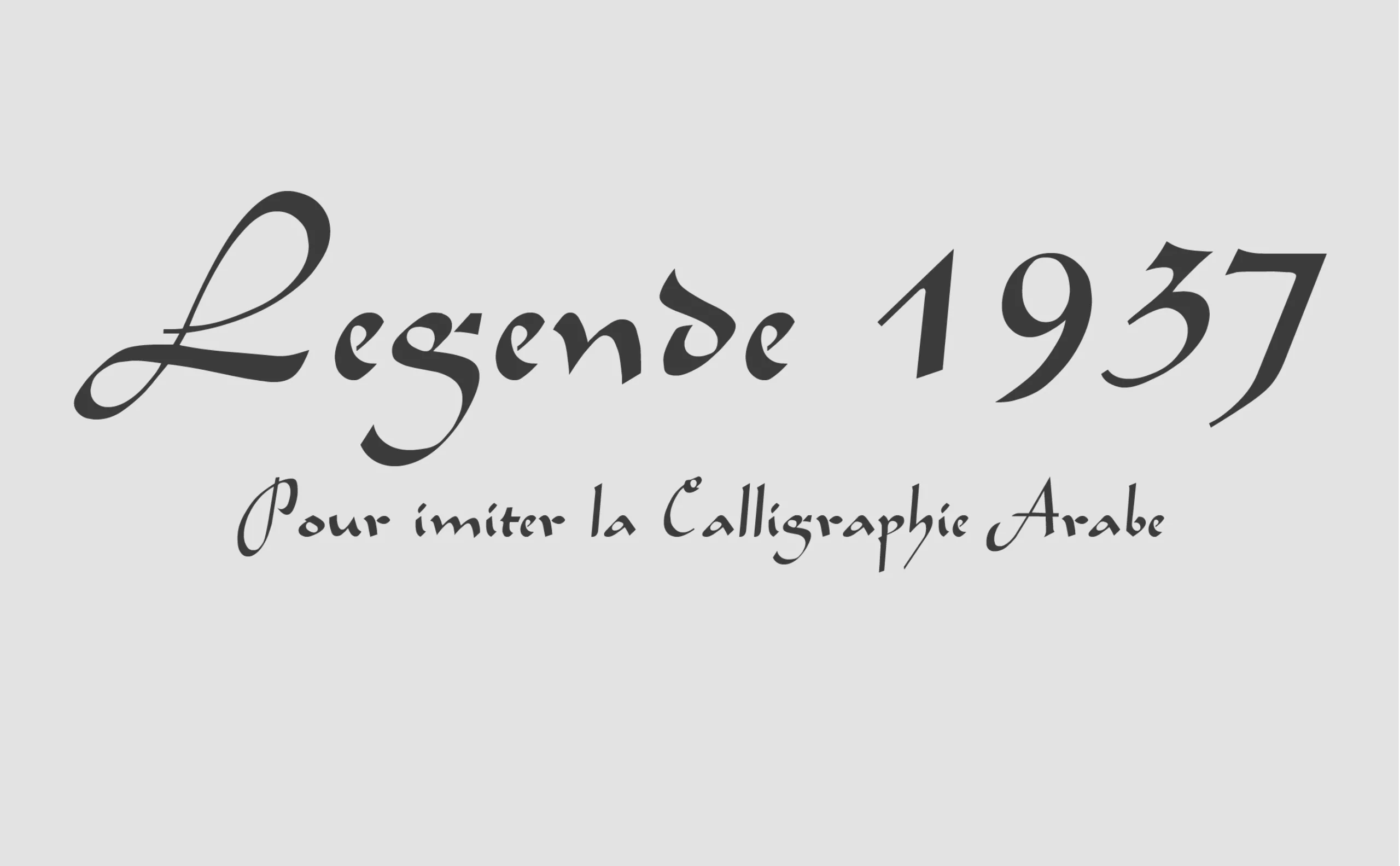
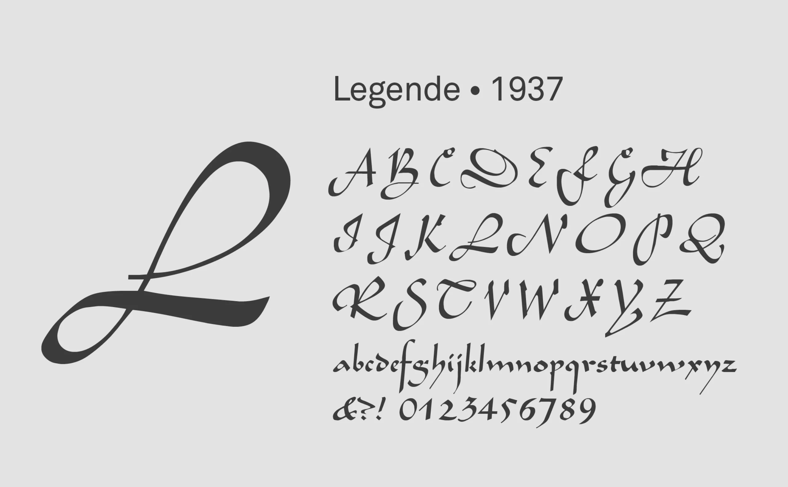
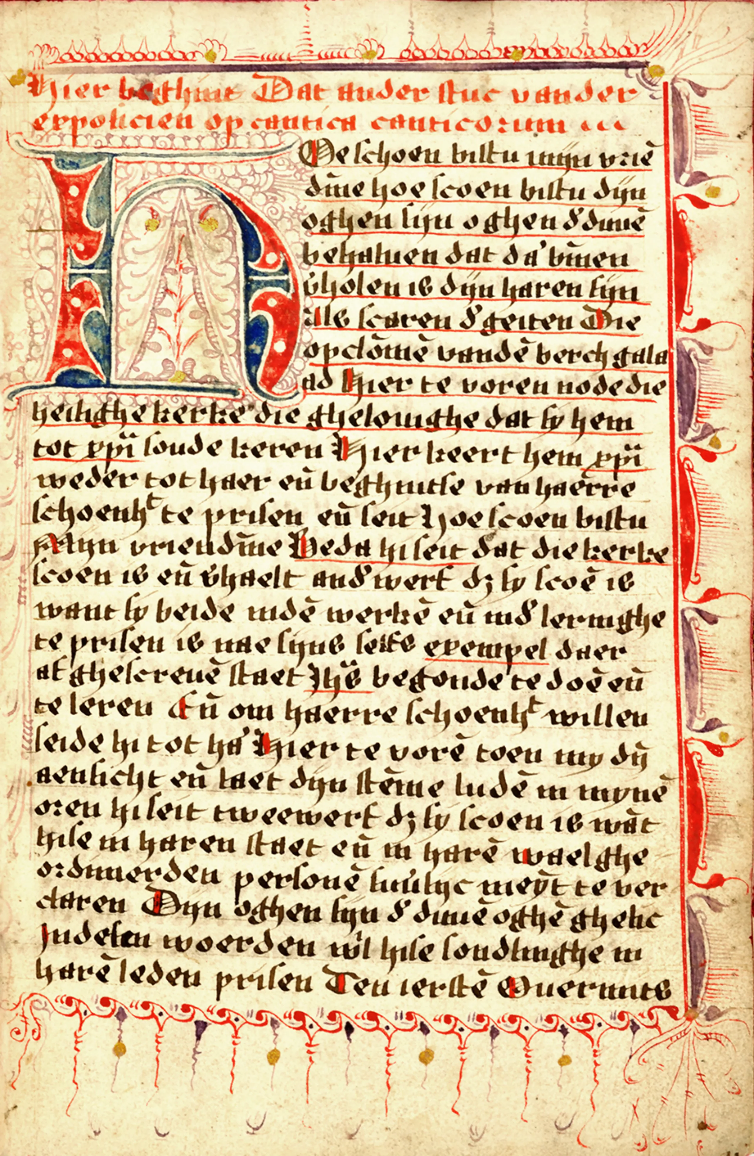
Other typefaces become stereotypes in spite of themselves, like Schneidler’s Legende (1937), which was originally inspired by 15th-century Burgundian and Flemish bastard script. Below is an example of a bastard script manuscript of the Song of Songs. Today, it’s used as typography in the… Arabic style. The fault lies in its calligraphy-like strokes!
The stereotype of Arabic or Oriental script as calligraphy is clearly evident here. We are forgetting here the sense of writing, the changing grip of the letters, the importance of the hand stroke… all elements that make it unique and that are forgotten here.
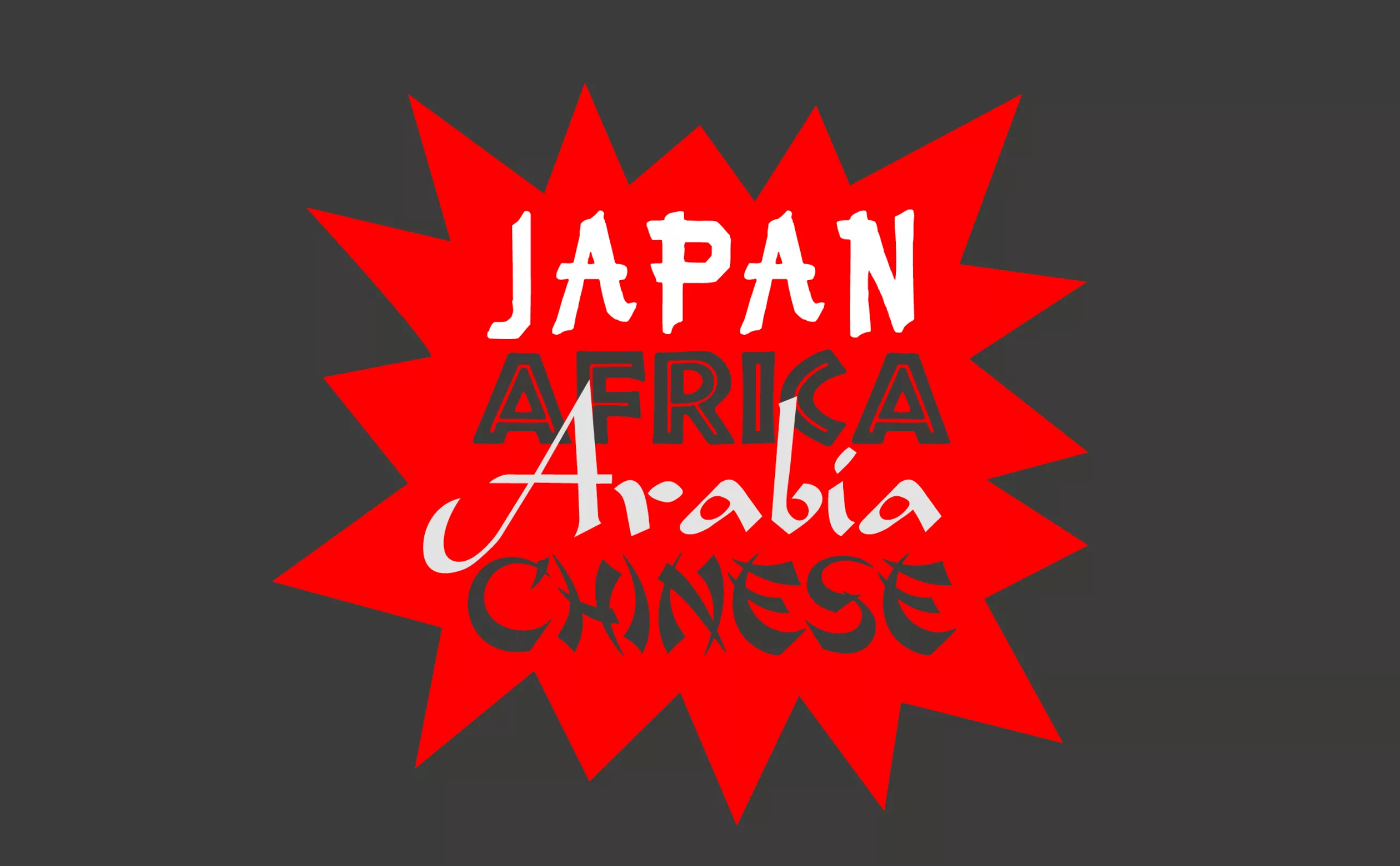
Africa, in 7 letters
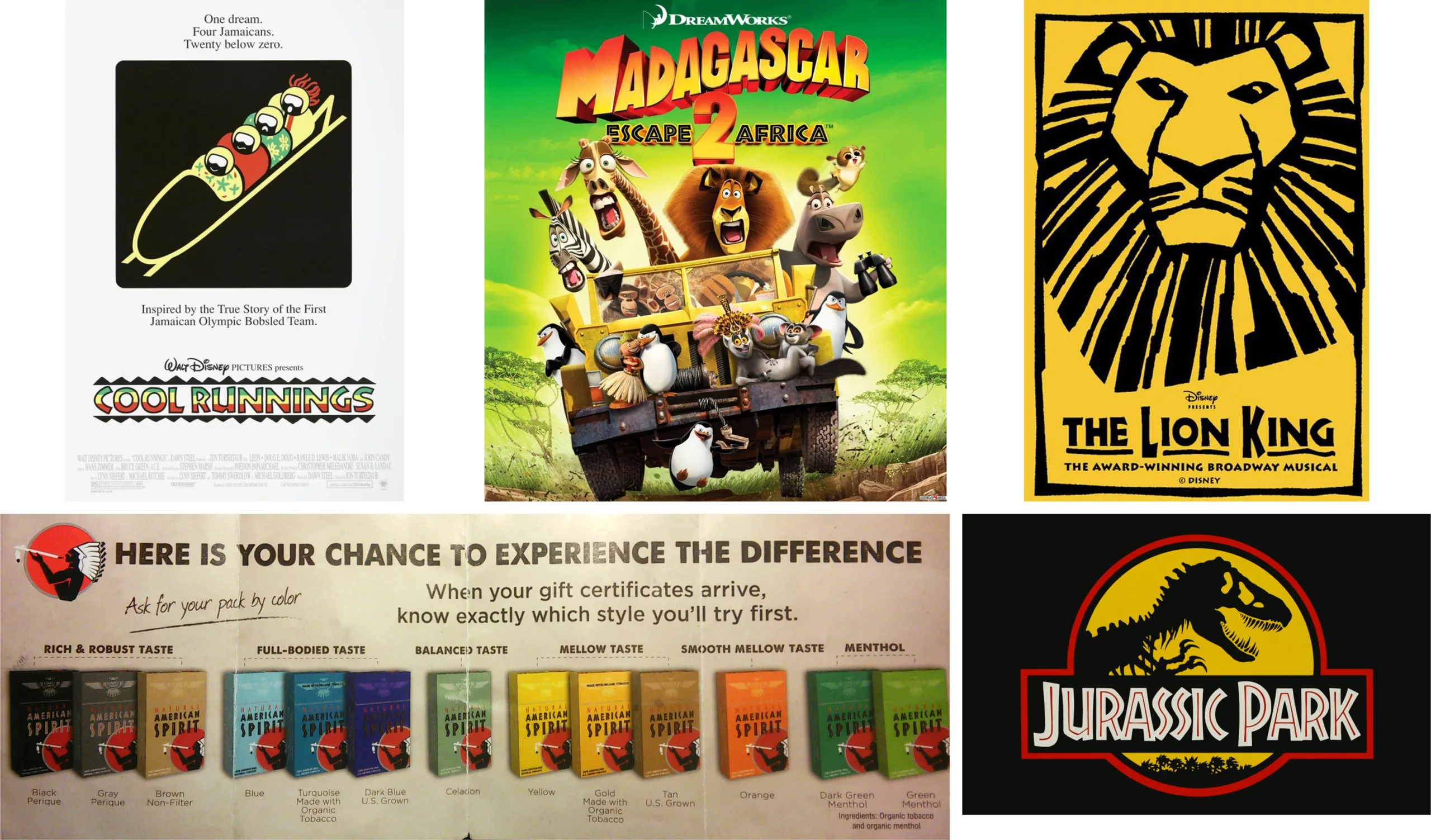
Neuland, created in 1923, is known today as the “African” typeface. It is the queen of stereotypes. Since its creation, it has been used on books and posters with exotic, adventure, jungle or ethnic imagery… that’s how many stereotypes it encompasses! Neuland nevertheless made its mark in Hollywood in the 90s – with varying degrees of variation – on posters for The Lion King, Jurassic Park, Madagascar or Rasta Rockett, and is still seen on American Spirit cigarette packs.

Yet Neuland typography has, originally, nothing to do with Africa.
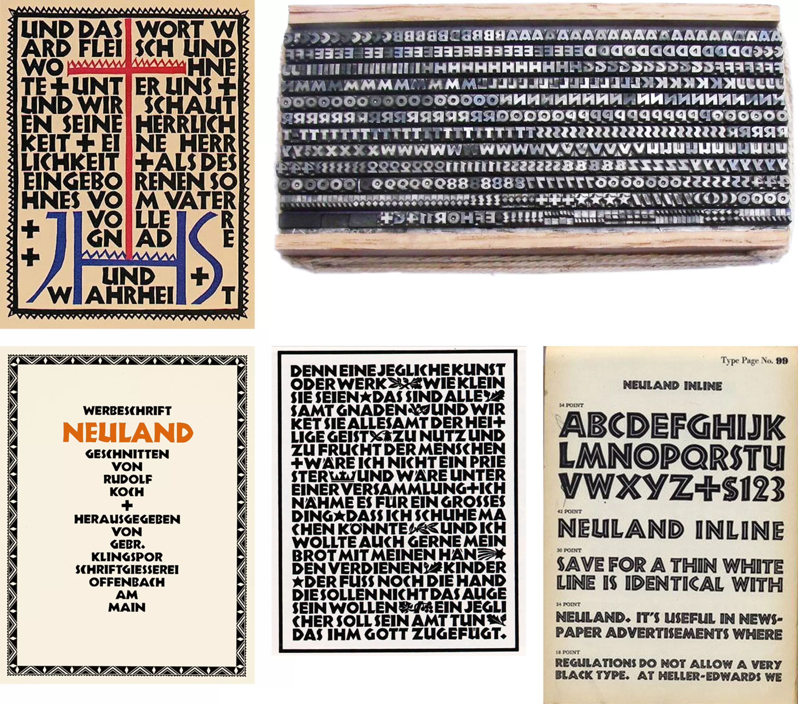
Its creator, Rudolf Koch, is German. Traumatized by his experiences as a soldier in the First World War, he found solace in religion. In 1923, he set out to create a large typeface that would clearly show other soldiers the way to redemption. Perfect as an advertising typeface, it could be displayed large enough to be read from a distance.
With Neuland, he created a modern version of traditional German typography, the Gothic Black Letter. It uses the bold style and reduced spacing of the Gothic style, but with the sans-serif of modern typefaces, and capital letters reminiscent of Roman letters. Four years later, still in Germany and still following the same desire for typographic modernization, the Futura was born at the hands of Paul Renner.
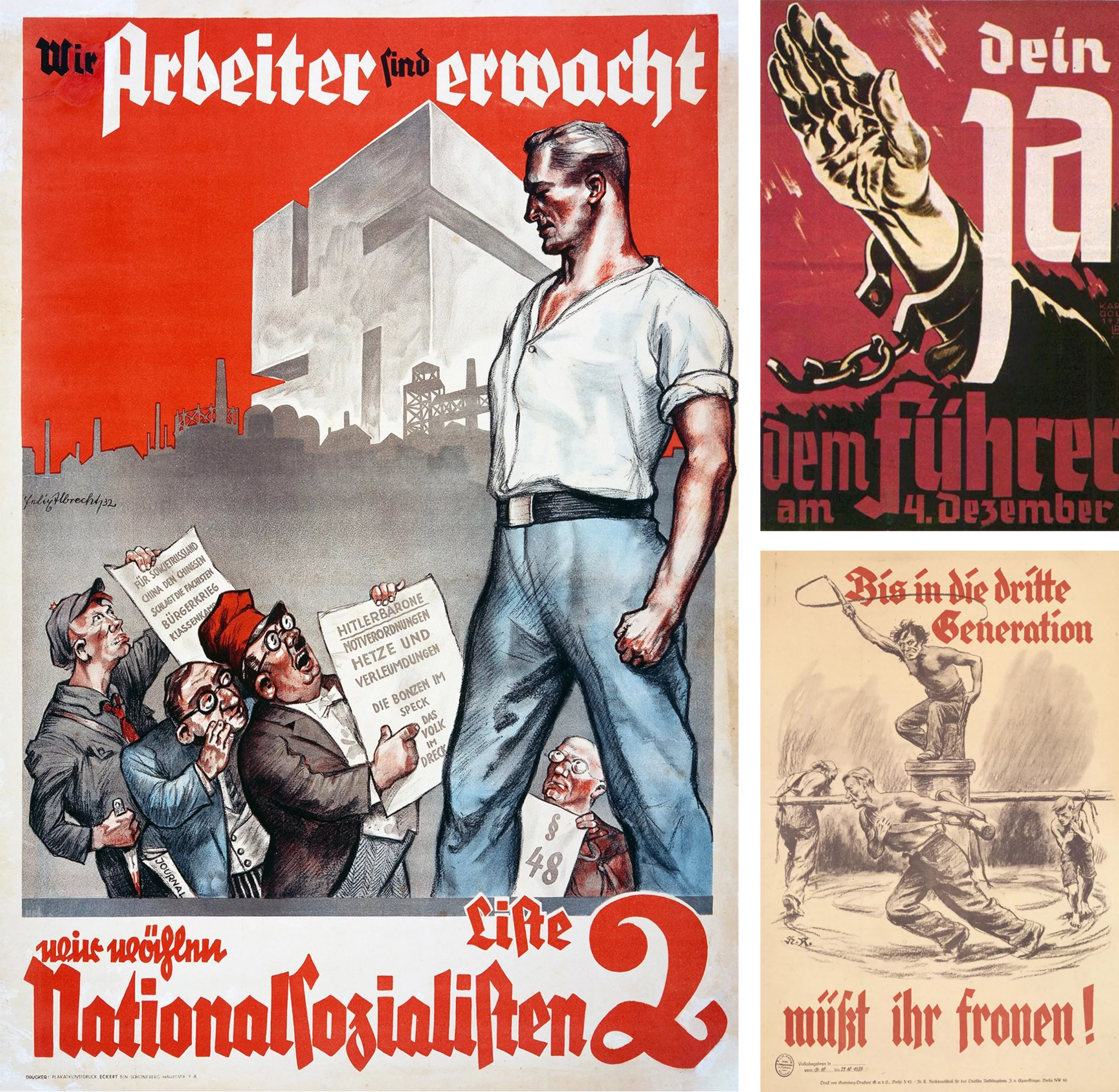
Finally, while we’re on the subject of Germany and gothic letters, they are rarely used today because of their use in Nazi propaganda. At the time, they were the distinctive Aryan sign. They are thus stereotyped today, as their use is immediately anchored as a reference to Nazism.
When it comes to typography, this regime is no stranger to inconsistency. In the 1930s, the press was reprimanded by the regime for its use of “Roman typefaces“, on the pretext that they were “of Jewish influence“. But from 1941 onwards, Hitler saw fit to abandon the Gothic Fraktur style (which was difficult to read outside Germany and in invaded countries) in favor of a more modern, universal typeface… Futura! In 1941, a decree was issued declaring Fraktur to be a “Jewish script“. Given the way Futura is used today, it’s a good thing we have forgotten its dark past.
Today, some calligraphers are trying to bring Gothic letters back into the limelight, and break away from these stereotypes.
The Neuland: primitivism and crappy typefaces
Most of these stereotypographies acquired their reputation at a time when Western civilization served as a benchmark. Sometimes in a racist context. The “other”, reduced to a mere cultural trait, was seen as different, fascinating, less civilized or second-class. So-called primitive cultures were in the spotlight at the turn of the century, with the so-called “primitivism” of imitating so-called primitive peoples. From Greece to Egypt, via Africa and Japan, artists were inspired by the other and by antiquity. Typography with Greek, Asian or Arabic accents was born. It was in this social context that Koch created Neuland.
When Neuland appeared in the United States, it (like the first pilgrims at the time) made a clean sweep of its past. No one on the new continent knew or used Gothic typefaces…
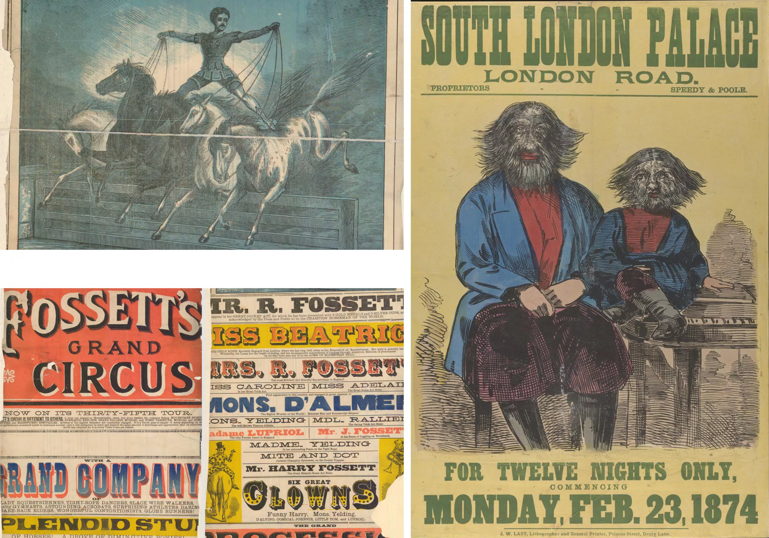
What’s more, large wooden typefaces had a rather bad press and were reputed to be “informal”, inept, ugly and difficult to handle. Like the “circus typefaces” on wood (used to advertise circuses), they were reputed to be low-end because they were poorly printed compared with the quality of metal type. They were even referred to as ” garbage font”, inelegant and printed on poor-quality paper. The story goes that printers even threw Neuland type in the garbage can, frustrated by the weight of the type and the space it took up in their small workshops.
Circus typography was used on ephemeral advertising paper to promote themed shows, which conveyed enormous cultural stereotypes. Tokyo, for example, was used to represent an Asian-themed circus. The very idea of the themed circus demonstrates the public’s fascination with this kind of show. The same curiosity that drove people to see freak shows, with elephant men, obese or bearded women, and Siamese twins.
Because it too was considered a waste typeface, and in this context of turn-of-the-century primitivism, Neuland gradually fed into extremely racist African-American visuals.
At the time, the black-American population had neither the means nor the social status to cultivate its own graphic universe. Blacks were only represented in circus media, as freaks, or in the promotion of products linked to slavery: tobacco and cotton. Illustrations are racist, using the effigy of grotesque characters.
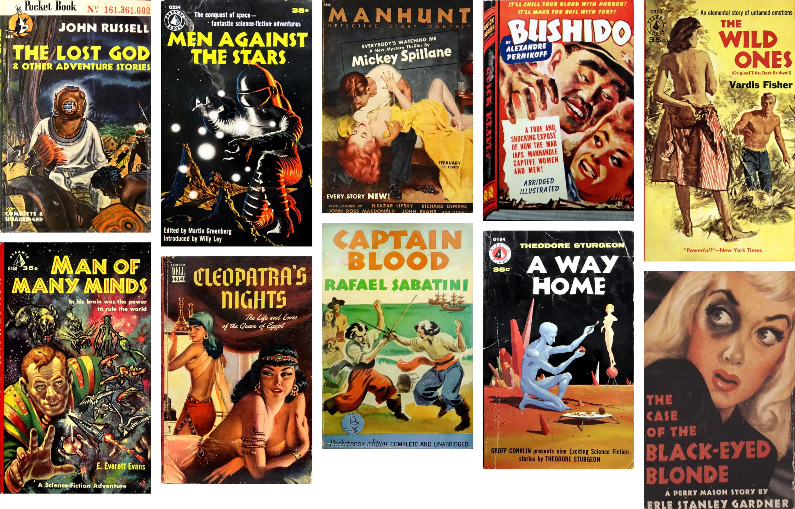
In this context, Neuland gradually took its place as a “primitive” typeface, in the wrong sense of the word. In the ’40s, it continued to be used in reference to black culture, with all the implications that implied at the time, but over time it lost its racist connotation in favor of stereotype. Well, there’s a fine line between the two!
Because they’re the typical book of fifties American mass culture, themselves stuffed full of stereotypes, we see quite a few paperback covers using this typeface (or a similar variant, like the Othello) for their content related to Africa, the jungle or any other prejudice. And sometimes even science fiction, “crazy Japanese” stories or thrillers! The typography must have pleased…
As an aside: proof of the lack of understanding of German culture in the USA in the 50s, we even found a paperback cover in Gothic letters to illustrate a story about Cleopatra (look for the intruder below).
Since the 90s, Neuland has been used “to illustrate content that echoes the “jungle”, “adventure” or “safari” (or more crudely, that reminds us of Africa…)” as we explain in our article on the history of the Jurassic Park logo (which, you guessed it, uses Neuland).
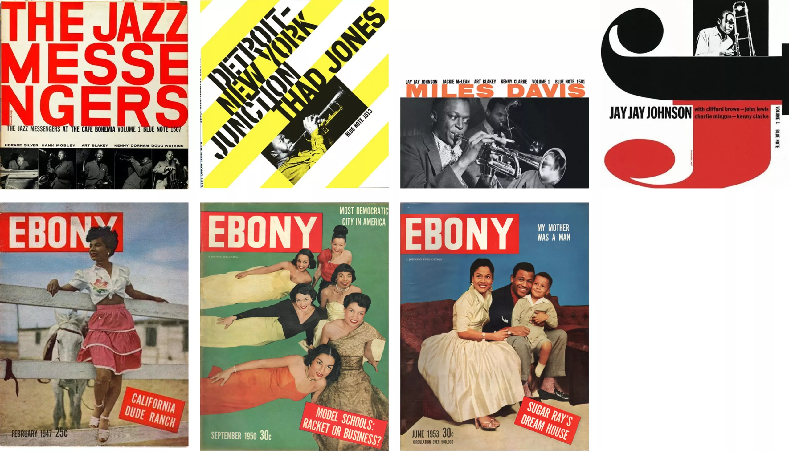
Finally, it’s interesting to note that nowhere in the expression of African graphic culture was Neuland used. On the contrary, modern typefaces such as Futura or Trade Gothic were used, for example in Ebony magazine, dedicated to black culture from 1945, or for the Blue Note record label.
Once again, stereotypes are used in reference to a culture – often Western – that reduces the other to a simplistic, stereotyped character trait.
Typographies that suit the style of…
You can’t talk about ethnic typography without a reference style. This style is Roman, the alphabet of Western civilization. Other alphabets then appear “exotic”, and it’s their often limited attempts at transcription that also create stereotypes. This is the case, for example, with so-called “Asian” typefaces, which rely on one or even two brushstrokes to form an alphabet that has nothing to do with the real nuances of the original, and loses all harmony.
Basically, these typefaces are more about blending two cultures, creating a Roman alphabet in the Asian, Arabic or Tuareg style… And while we are on the subject, let’s talk about Chop Suey!
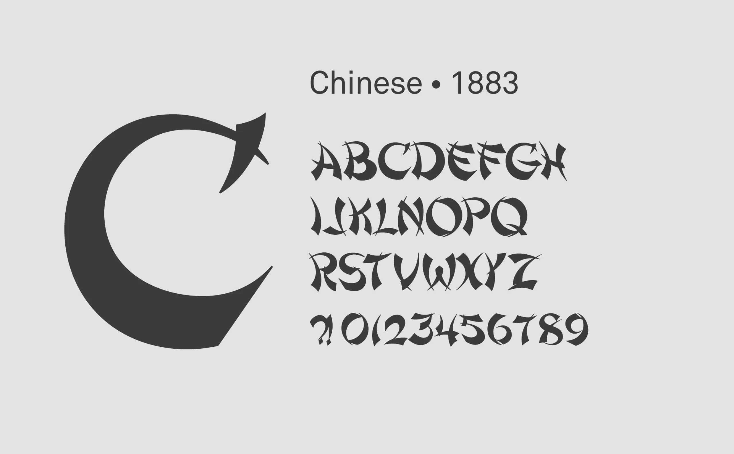
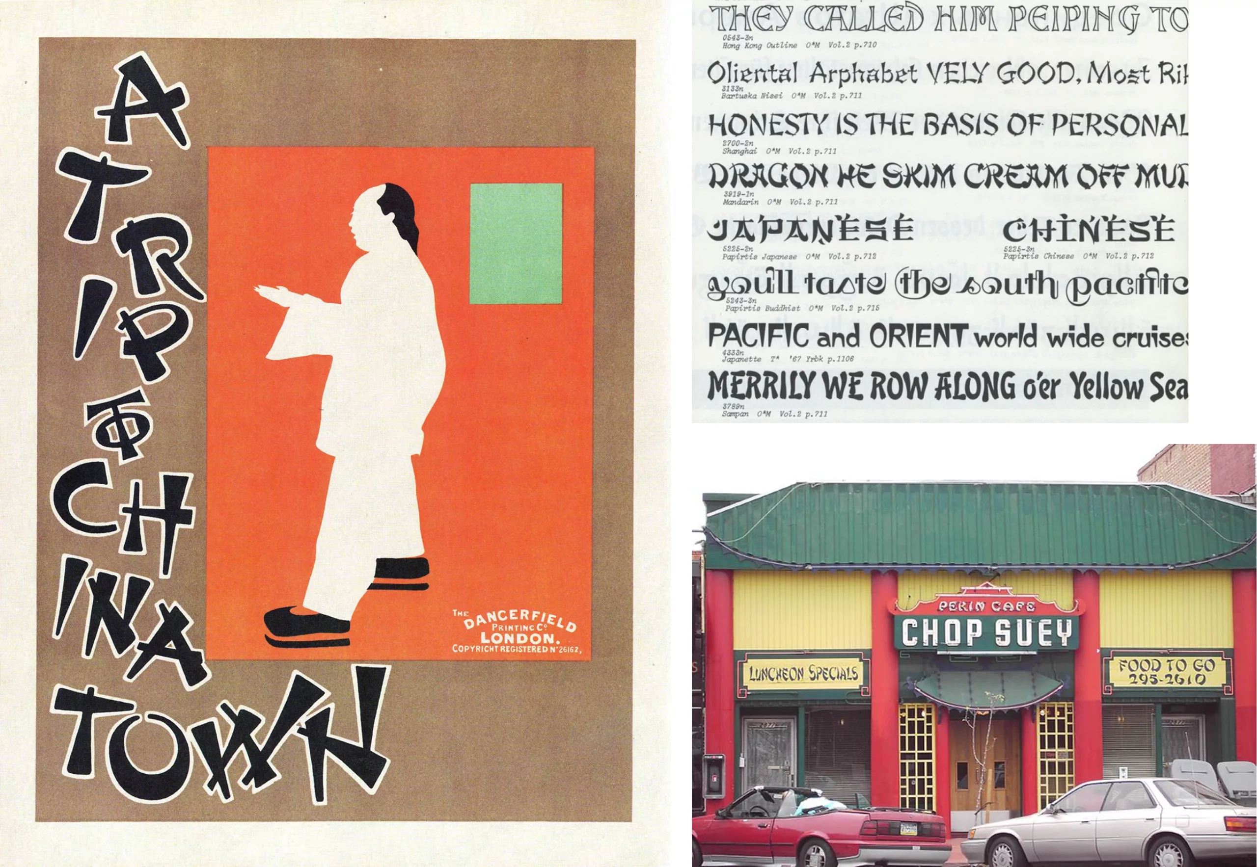
Deliberately suggestive and advertised as Asian, the “Chinese” typeface was created in 1883. It was renamed “Mandarin” in the ’50s and became the ancestor of the Chop Suey or Wanton style.
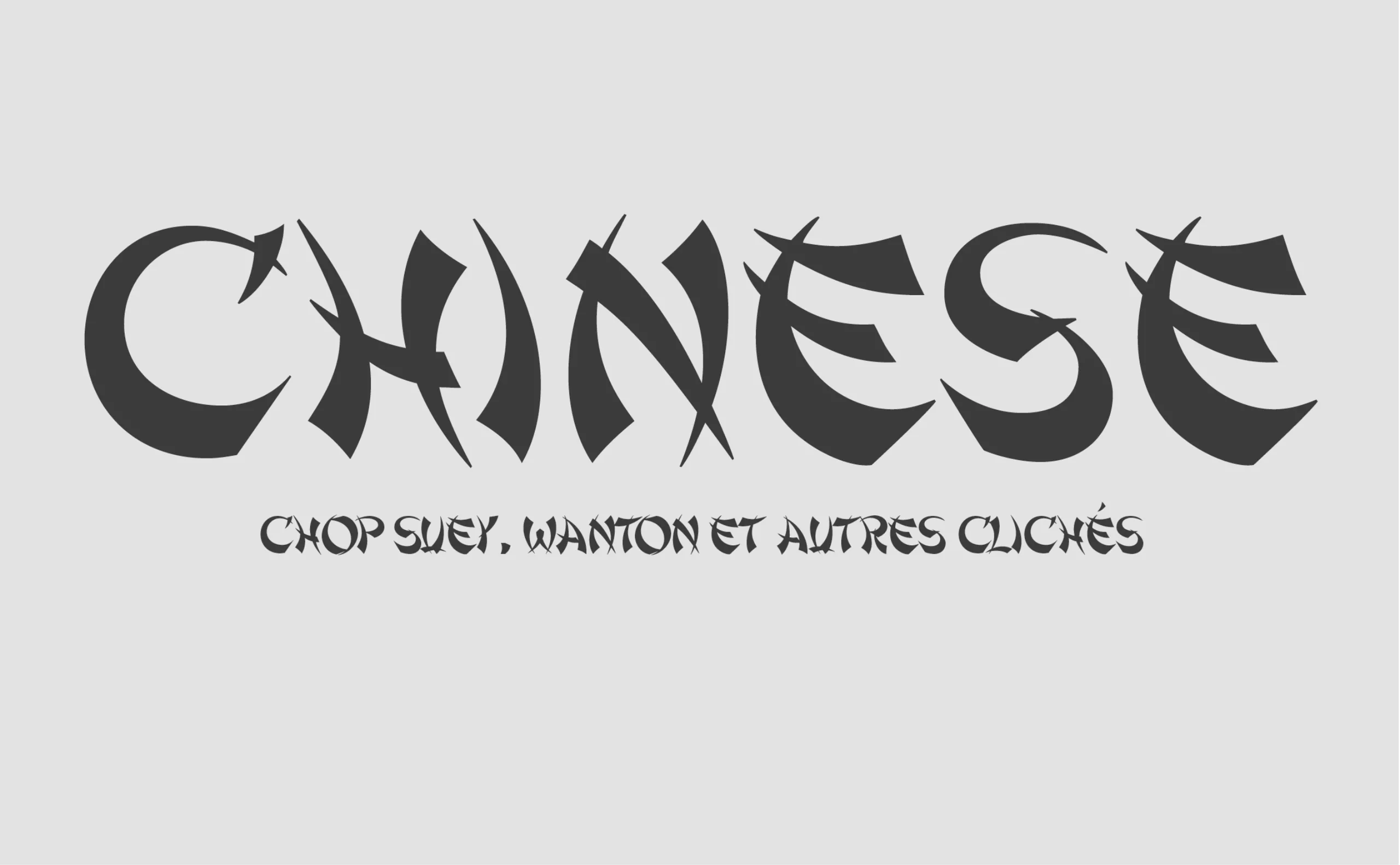
It was popularized in San Francisco thanks to the Chinatown district: the 1906 earthquake and a poster made the typeface famous. The district was theatrically rebuilt to attract tourists, and the Asian-style typeface was chosen to seduce the crowds on store fronts. It’s a deliberately Sino-American typeface, with Asian calligraphic codes but with a Western, Romanesque twist. The poster “a trip to Chinatown” by the Beggarstaff brothers in 1899 was published in Les Maîtres de l’Affiche magazine, boosting its popularity with readers.
The “Chop Suey” dish to which the typeface owes its name is also a purely American invention, with a Chinese twist. Since then, this typography has been found on the majority of Asian restaurants. Unlike African-American culture, which wanted to distance itself from reductive stereotypes, the Chinatown community saw an opportunity to appeal to a new audience.
The difference lay mainly in the fact that Chinese or Japanese alphabets – for example – were illegible to Westerners, and this kind of typography helped create a rapprochement between two cultures, albeit based on a stereotype. The style then erased the cultural nuances.
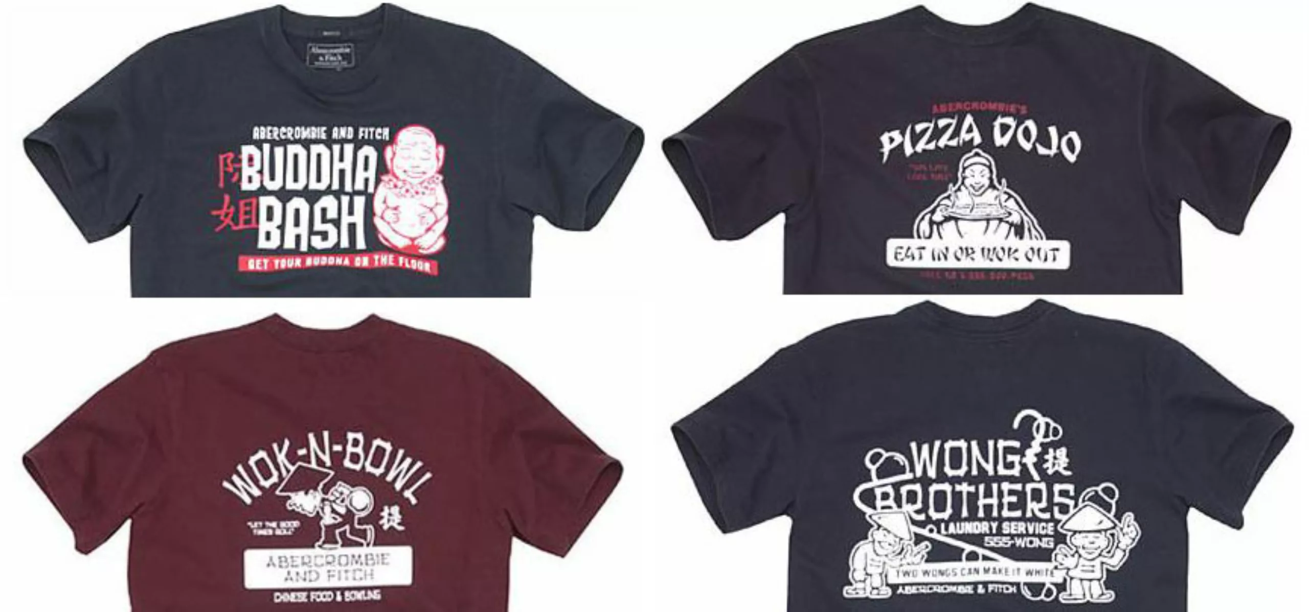
Today, these typefaces – or rather, the way designers (and amateur designers) use them – are often attacked by targeted minorities. Although not racist per se, their use can become so. We saw this recently in 2002, when Abercombie used Chop Suey on a series of T-Shirts depicting Chinese caricatures, which were subsequently withdrawn from the market.
Stereotypographies owes its survival to the fact that stereotypes sell. Even if they are reductive and conveyed by ignorant prejudice. They are unfortunately effective visual shortcuts that set the tone at a glance. Subtleties have no place in them. Asian-style typography, for example, is not there to praise Korean calligraphy, but to let passers-by know that this restaurant serves Asian food. A whole continent is thrown under one label: “Wanton“, “Chop Suey“. It’s standardization through typography.
Sources :
On the subject
-
Reza Abedini, father of iranian contemporary graphic design
Being a designer like Reza Abedini in a country such as Iran means juggling with an incredible artistic, visual and calligraphic heritage that is 3000 years old.
-
The genius of Iranian graphic design
To grasp the genius of Iranian graphic design one must understand its incredible heritage in the arts, and the current upheavals. A short journey from ancient Persia to the most contemporary graphic design.
-
Turkish graphics
Fortunately, as I turned down an alleyway, I came across the “Istanbul Design Center”. It’s a school of applied art, a venue for exhibitions, workshops and conferences, a publishing house… in short, just what I was looking for!
A few posters have piqued my curiosity!
Unfortunately, I had to drop in outside opening hours… not a single student, just a calligraphy teacher who suggested I drop in again the following week… sniff… So it’s back in France that I find out more about this place and discover an amazing communication made by the founder of this place: Faruk Akın ( with a “ı” without a dot ! like in our Graphéıne logo! 🙂 )