Typorama #05 : Times after time
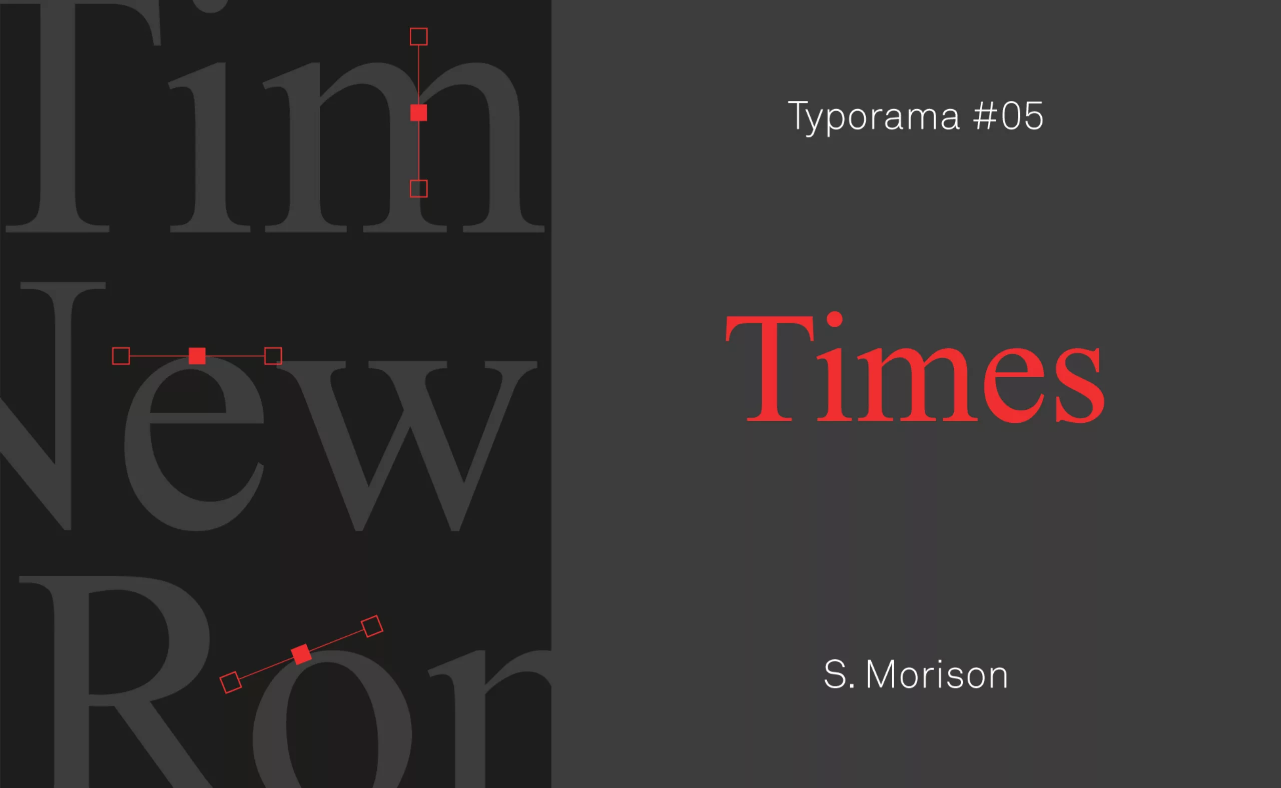
Just like the portraits of great designers, we continue our series on the typographies that have marked the world of graphic design. Here is Typorama #05, on the Times!
It was time to tell you about the Times
“The Lytton Report on Manchuria recognized Japan’s special interests and recommended the creation of an autonomous state, under Chinese sovereignty but controlled by Japan.”
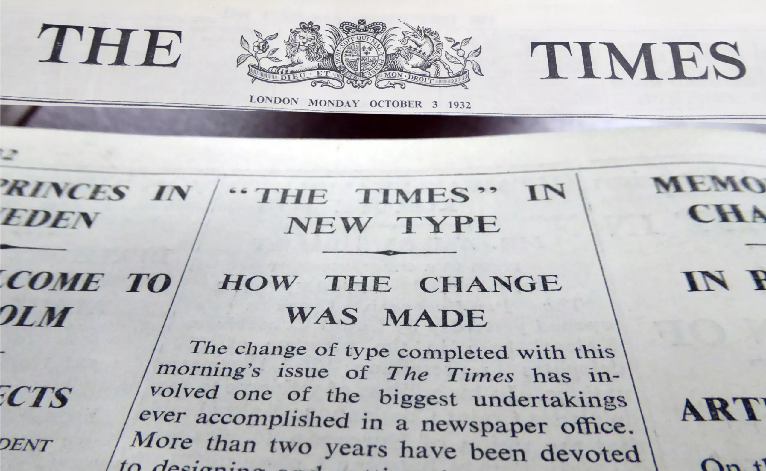
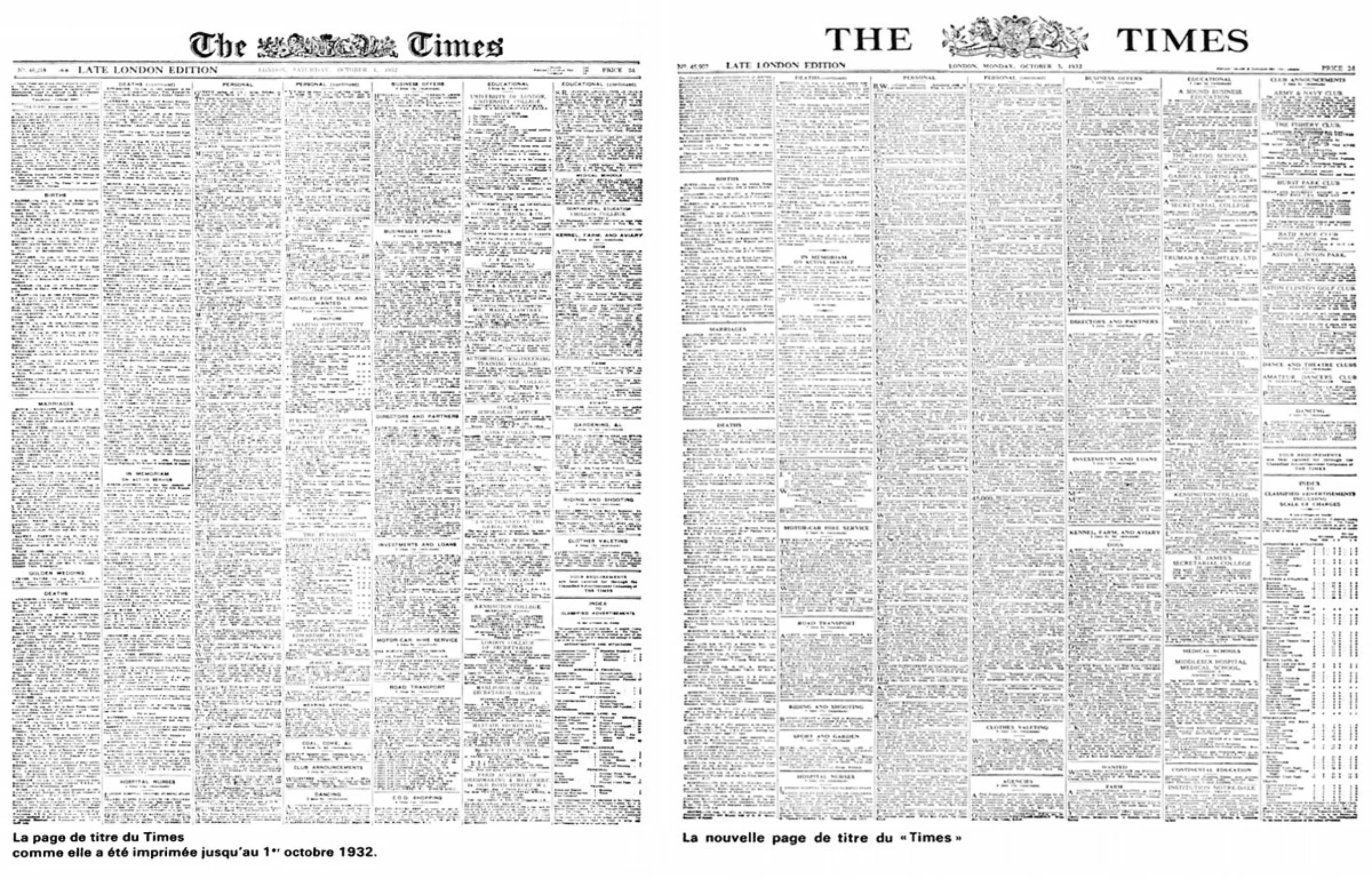
What could be the obscure connection between this most mysterious piece of information and our font of the day? Well, that’s what readers of the British newspaper The Times read on October 3, 1932, when it used its iconic Times New Roman typeface in its columns for the first time.
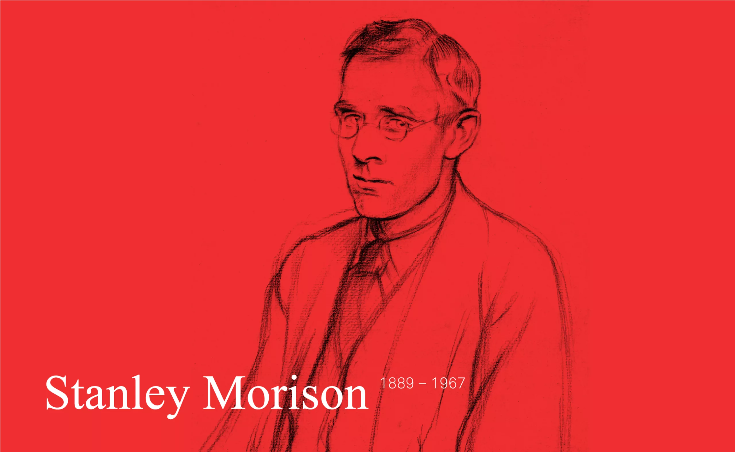
Stanley Morison, father of the Times
Born into a modest family, young Stanley went to boarding school at an early age where he received a rather primitive education. It was the kind of boarding school one might find in the novels of Charles Dickens. There was nothing in his environment that would foreshadow the interest he would have in letters and printing. He did not linger on the school benches!
Around 1905, he was employed by a firm of clerks. He is interested in theology, immerses himself with passion in old books, discovering the art of writing and calligraphy.
September 12, 1912. He buys by chance a copy of the Times which devoted a supplement to the world of printing. This reading plunges him into this extraordinary world. He is fascinated. It was probably on this day that he decided to devote himself to the study of typography and type design.
The beginnings of the First World War arrive, and he refuses to take up arms. He will first be a “conscientious objector” and will work for some time at the newspaper “The Imprint”, before being incarcerated during the rest of the conflict. It must be said that he had dared to found a small association with an evocative name, the Guild of Pope’s Peace. The army appreciated this initiative and invited him to appear before the court martial. It is true that men of letters are dangerous!
When the world conflict ended, he regained his freedom and worked in various publishing houses (Pelican Press, Cloister Press), he created the magazine The Fleuron (1923-1930). It was during this period that he joined Monotype as a typographic consultant. With this experience, the daily newspaper The Times entrusted him, in 1929, with the creation of a new typeface that would minimize the amount of ink, very expensive at the time. For the record, we are just after the crisis of 1929…
As the old typeface used by the newspaper was unofficially called “Times Old Roman“, the new version will logically be called “Times New Roman“.
New typeface, more space
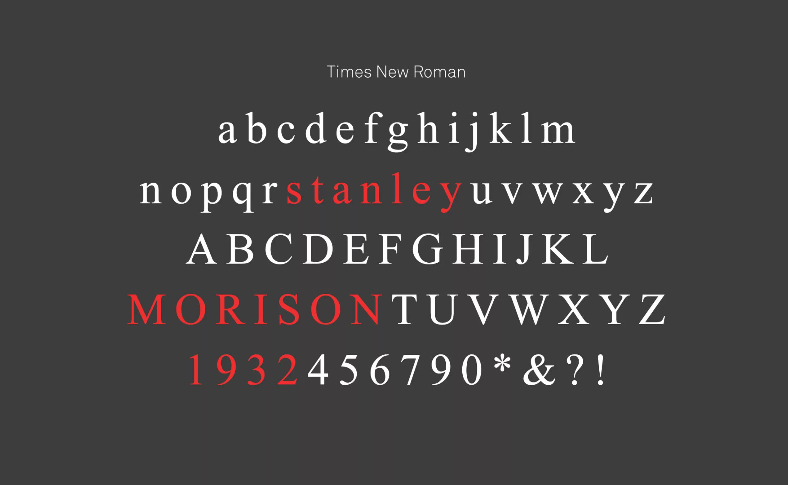
The Times is a London daily newspaper that is already 150 years old at the time of this update. In 1929, the newspaper decided to change its typeface under the guidance of its typographic advisor Stanley Morison. This was the beginning of the history of Times New Roman, which today enjoys worldwide popularity. Victor Lardent, under the direction of Stanley Morison, set about the task. They had to design a working typeface for the readers of the newspaper, which means very readable and at the service of the numerous articles often written in small sizes. For this purpose, they favored serifs and strong solid and unstructured strokes, which enhance legibility in typography.
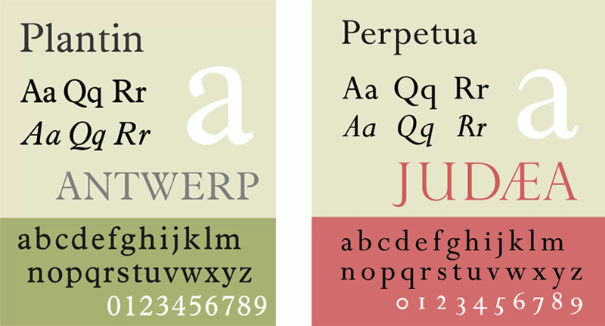
The two typographers base their work on the designs of Plantin and Perpetua. They accentuate the contrasts to gain in reading comfort and narrow the proportions of the characters to save space on the page. Less paper, more information and therefore more savings!
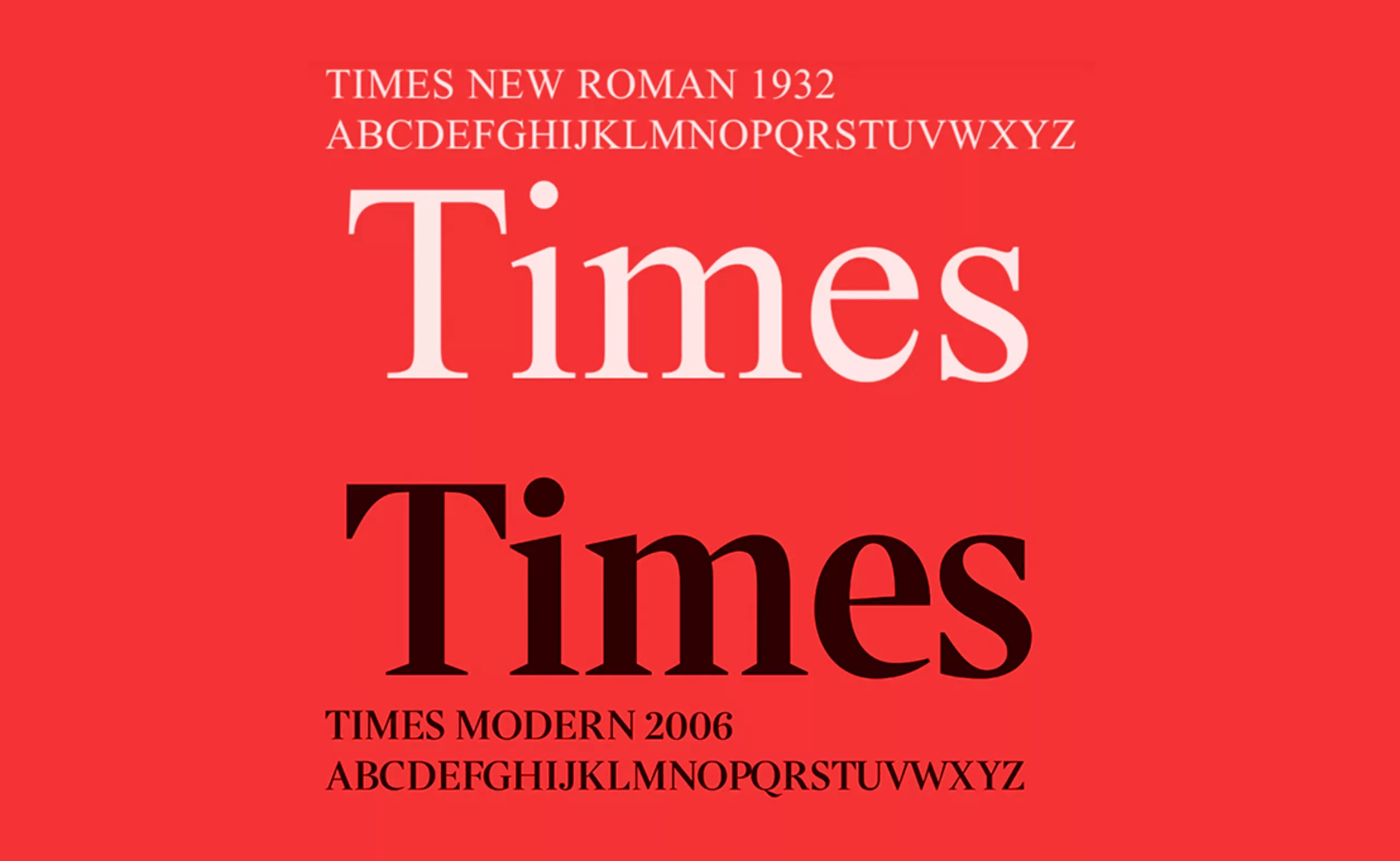
Le résultat fut un grand succès et le journal ne changea plus de police jusqu’en 1972 où elle fut remplacée par le Times Europa dessiné par Walter Tracy. C’est en 2006 que le Times New Roman eu de nouveau le droit à une seconde jeunesse. The Times commanda en effet à Research Studios, où officie Neville Brody, une refonte de leur police historique. Le contexte et les technologies n’étant plus les mêmes qu’en 1932, le quotidien voulait ainsi se replacer dans l’air du temps. De là est né le Times Modern.
A typography that cannot be ignored
But if this font is known today by everyone, it is not only for its legibility. It owes its popularity with the general public to the two famous competing brands, Microsoft and Apple, who included it in their catalogs of default typefaces, making it a must-have. It has thus gone beyond the context of its creation and taken on a scope that was not intended for it.
Today, it is no longer necessarily displayed on the front page of newspapers, but has been invited into the word processing software of all our computers. And this is what makes it so popular even today, 88 years after its creation. Just like the library of the two computer behemoths, it has become a default font for many people who use it for everything and everywhere. It can be found in the administrative documents of companies, schools, governments, small businesses and individuals.
In spite of its “default” side, its little “preppy” look makes it a typeface sometimes used by banks and some rare luxury brands (by the way, we won’t talk about the awful kerning in the title of Kendrick Lamar’s album DAMN.)
Times Island
Let’s continue to sail on the waves of typos with episode 7 of “l’Océan des Cent Typos” podcast (in French) which explores Times Island. A podcast in which we embark with the intrepid Malo Malo ! …whom we thank, by the way, for writing this article! 🙂