Europe and its regional visual identities
Since 2014, France’s administrative division has been reduced from 22 to 13 regions. It should be remembered that this administrative level only dates back to 1982. Today, the main aim of reducing the number of regions is to achieve a critical mass that will enable them to exercise their strategic responsibilities more effectively.
The division of Europe’s major regions, based on the German federal model, aims to achieve an ideal size that does not naturally exist, due to the lack of correlation between size, economic development and wealth. In France, for our graphic design eyes, this great upheaval is reflected in a flurry of new visual identities, more or less successful, more or less demagogic.
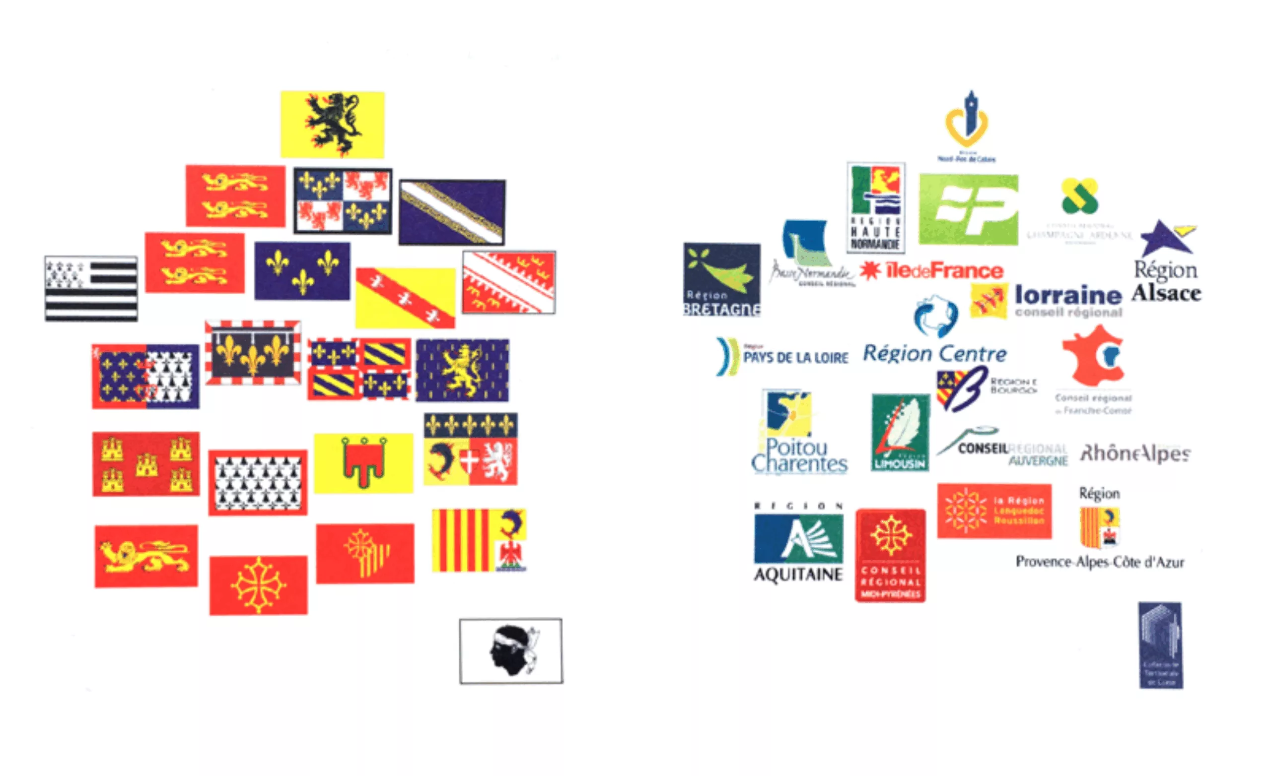
We wanted to take a step back and look at the European panorama of these regional visual identities. So we take a census, most exhaustively as possible, of the logos of Europe’s different regions. From the Balkans to the North Sea. A tour of Europe in 80 logos… (Click on the map above to zoom in).
First observation: two major graphic traditions
In Northern Europe, the Baltic states and the Balkans, coats-of-arms reign supreme. Western Europe, on the other hand, is totally converted to logos and other brand names. The further away you are from Brussels, the more coats-of-arms come back into fashion, as in southern Italy, for example.
Without claiming to be a scientific historical analysis, it’s hard not to see this as a symbolic division, akin to the “Yalta agreement” of 1945. The Americans reserved the Western European market for themselves, importing rock, chewing gum and branding! As if to confirm this hypothesis, Switzerland, with its neutral tradition, seems to be a small island of “coats of arms” in the heart of Western Europe.
Second observation: few remarkable visual identities
Nevertheless, a few regional graphic traditions stand out. In this respect, the prize for quality goes to Poland and Slovakia. A region with a great graphic tradition, beginning with the graphic designer Alfons Mucha, spearhead of the Art Nouveau movement in the early 20th century, and later strongly influenced by the German Bauhaus school, and continuing with a militant and committed tradition throughout the period of Communist occupation. Today, many internationally renowned graphic designers have emerged from this tradition. These include Henryk Tomaszewski, Eduard Ovčáček, Suzanna Licko, and Peter Bilak.
French regional identities
With the exception of the PACA region, and to a lesser extent Normandy, the use of a coat of arms as a logo is not de rigueur in France. It’s worth noting that some regions (Île de France, Bretagne, PACA, Pays de Loire, Corse…) did not need to change their logo. In the end, there will be 8 new logos.
The demagoguery of regional logos
To date, only the logo for the “Occitanie” region has not yet been established. It has been put out to public consultation, as have the Hauts-de-France and Nouvelle Aquitaine logos, and will be presented in January. This is the “crowdsourcing” method so decried by professional organizations such as the Alliance Française des Designers..
In the case of Occitanie, the www.laregion.fr/concours-logo competition mixes students and professionals, uncompensated projects, abnormally low prices… It sends a message with little educational value to the students in question. In addition to being an aberration in the visual identity design process, it is also an economic aberration for the design profession. Finally, it’s an aberration in the management of public expenditure, which testifies to a total lack of understanding of how to set up a high-quality public-interest design mission.
The profound demagogy of announcing that “no public money will be spent” on the design of these logos is unmistakable. When the logo is created in-house, it’s a lie by omission, since this work obviously represents additional salary costs. And in any case, the design cost represents only between 1 and 3% of the cost of changing the logo on mailings, facades, TERs, Buses… Finally, a logo on its own is often unusable; it needs to be accompanied by a graphic charter, examples of use, layout models… Now, it’s all very well to commission your logo from students, but who’s going to develop the graphic charter? You can bet it’ll be a design agency, for a price!
To our elected representatives’ credit, this is a very complicated subject to manage. For the taxpayer who hears that a logo “made in 3 strokes” has cost “such and such a sum of money”, corresponding to several months of his salary, this has a detestable effect. In this kind of situation, it’s a shame not to have the time to explain that the budget includes a strategic positioning study, a team of designers mobilized for several months, a graphic charter envisaging multiple uses, and so on. Explaining all this in detail seems difficult when you can sum it all up in less than 140 characters: “This sh*tty logo cost *** *** €! “.
Finally, we often forget to mention that a good visual identity, designed to last, will be the best source of savings for the community. Take, for example, the logo of the Ile-de-France region, which has remained virtually unchanged for over 16 years, resisting political change. The design was certainly well thought-out. When you consider that a logo change for a whole region costs millions of euros… Why don’t we hear that the designer of the Île-de-France region’s logo helped save his fellow citizens that money? In short, all this calls for us to continue sharing and explaining the role of design.
Western European logos
In our “logotype” journey, we’ve tried to sum up the graphic atmosphere of each country with a small selection of logos. Royal, colorful Spain stands out from the rigid German and Belgian logos.
Les logos d’Europe du Nord
Eastern European logos
This is where we find our good Slovak and Polish pupils! At a glance, you can see the originality and quality of these logos.
Faced with territorial branding
This article is reminiscent of Ruedi Baur’s “Face au brand territorial“, a harsh analysis and critique of the symbolic poverty of local government representations. Should we treat the visual identities of our territories in the same way as shoe brands? Should we turn our cities into products?
These are all questions that designers need to ask themselves.
Ruedi Baur explains that “there’s no longer any difference between corporate logos and public land logos. We sell our public territory as a market value. Branding is always about simplification, with one or two elements in a logo. The transposition of corporate representation strategies to territories, cities and nations means that there is no longer any political discourse, and that image replaces reality. This is democratically and civically very damaging. There’s no transparency anymore. We need to redesign graphic systems that show both common elements and differences”.
Comparison between a map of regional coats of arms and a map of logotypes for the same regions (at the time). The lack of overall coherence of the logotype map is obvious!
The logos of France’s regions have become formidable,” laments Ruedi Baur. I’m not nostalgic for coats-of-arms, but they used to tell stories. When I worked with German architect Finn Geipel’s team on the Grand Paris project, we asked ourselves how we could represent it. If you put the logos of the communes next to each other, there was no quality, no identity. With the crests, you could read waterways, monuments, customs.”
In the meantime, Ruedi Baur returned to Strasbourg University to write a thesis on the subject. It was entitled “Between identity and identification. Civic values in public representation systems”.
The university, strengthened by the presence of this key figure in the world of design, entrusted him with the task of overseeing a collective reflection on its identity. The evolution of the project can be followed on the university’s website: http://savoirs.unistra.fr/recherche/un-nouveau-langage-visuel-pour-luniversite-de-strasbourg/
And if we’re in the academic field, we can easily draw inspiration from this vision to build territorial visual identity systems that respond to this non-market citizen vision.
Some interesting examples in passing…
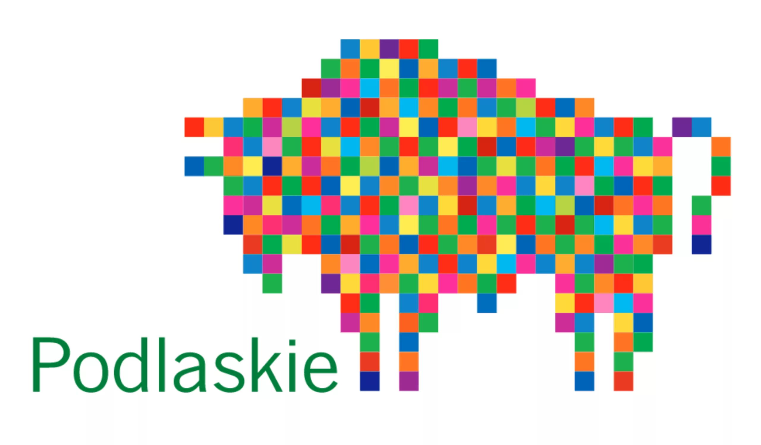
The visual identity of the “Voïvodie de Podlachie” region features the local star, the Polish bison, in a mosaic of colors.
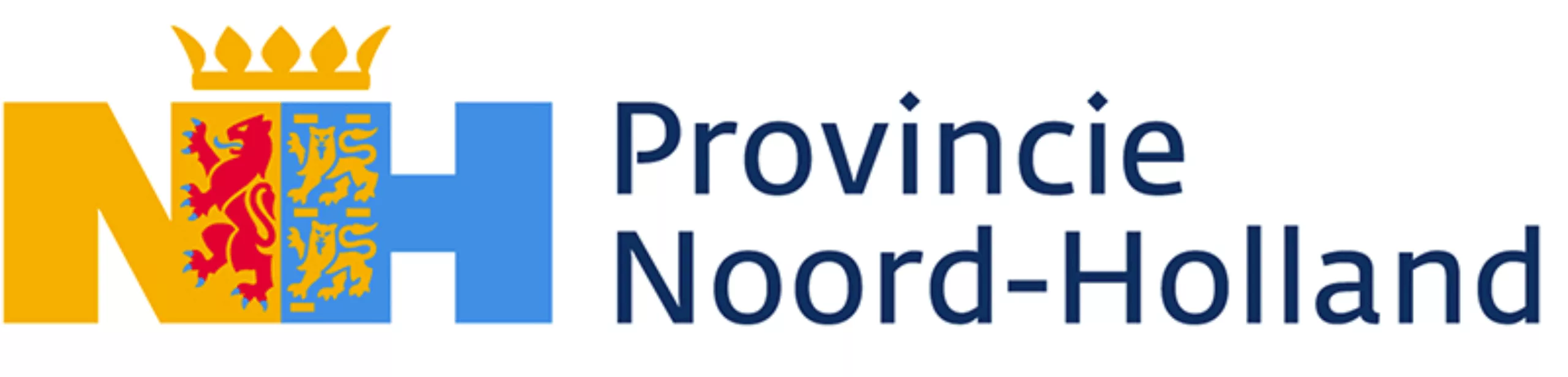
In the example of the visual identity of the province of Noord-Holland (below), we can see an interesting use of the historical coat of arms in a contemporary configuration.
But in the genre of ” rereading historical coat of arms”, we salute the identity of the state of Fribourg in Switzerland.
On the left, the historic coat of arms, and on the right, the logotype in the form of a smiling apostrophe.
Thanks : Many thanks to Antoine Lafitte for his fastidious iconographic research in preparation for this article!
On the subject
-

Groupama’s new visual identity, a logo in the open countryside
Groupama has just unveiled a new logo that updates its graphic design by abandoning its campaign in favor of a “startup” aesthetic.
-
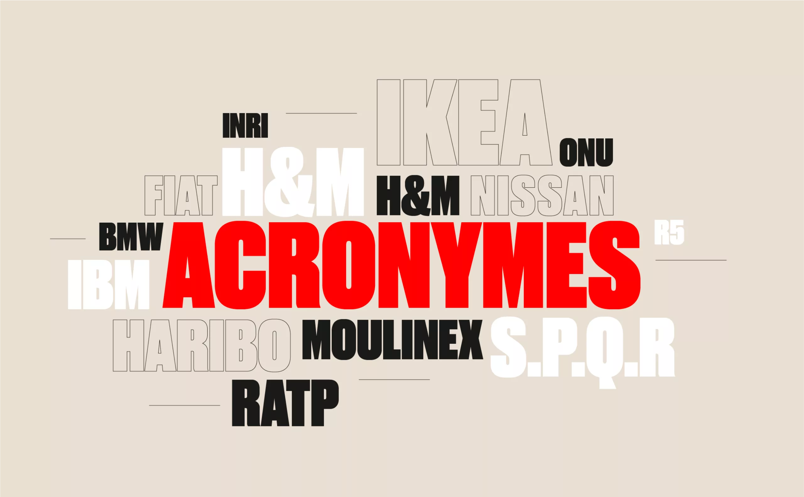
From surnames to acronyms: creating a brand name from letters
From founders’ surnames to initials and acronyms, brand names have always oscillated between abstraction and familiarity.
-

The UN logo takes on water during COP28
For COP28, two designers have come up with a new UN logo showing the rising sea levels and the future disappearance of much land and coastline.