Graphic and baroque research for the CMBV

16 January 2020  |   0 Comments   |    |  

We recently presented the visual identity we designed for the CMBV - Centre de Musique Baroque de Versailles.

This mission, which is still ongoing, began in 2017. During these three years, we have had two different directors, including a long period of vacancy. It is always delicate to lead a design project in such a changing context. We had therefore worked to propose different solutions to implement this new identity. Many tests were proposed. Some were used. Others remained in the boxes. In this article, we propose to present them to you.

Let's start with a brief analysis of the subject that will shed light on our thought process.

Baroque art in a few words...

art baroque

A more free and original art
If classical compositions are illustrated by a marked taste for rectilinear, ordered, rigorous organization, those of the baroque will be more imaginative, even whimsical, irregular, made of curves and counter-curves. The term "baroque" comes from the Portuguese and designates irregularly shaped rocks or pearls, then by extension, everything that is extravagant.

The art of contrast
In music, the baroque style also expresses a lot of contrasts and oppositions:
- held notes/short notes or low/high notes...
- dark/light (a major chord at the end of a minor piece)...
- Appearance of the concerto (from the Italian "concertar", "to dialogue" in French) which puts in opposition a soloist to the rest of the orchestra.
- the opposition between inventive pieces (prelude, toccata, fantasy) and constructed pieces (fugue)
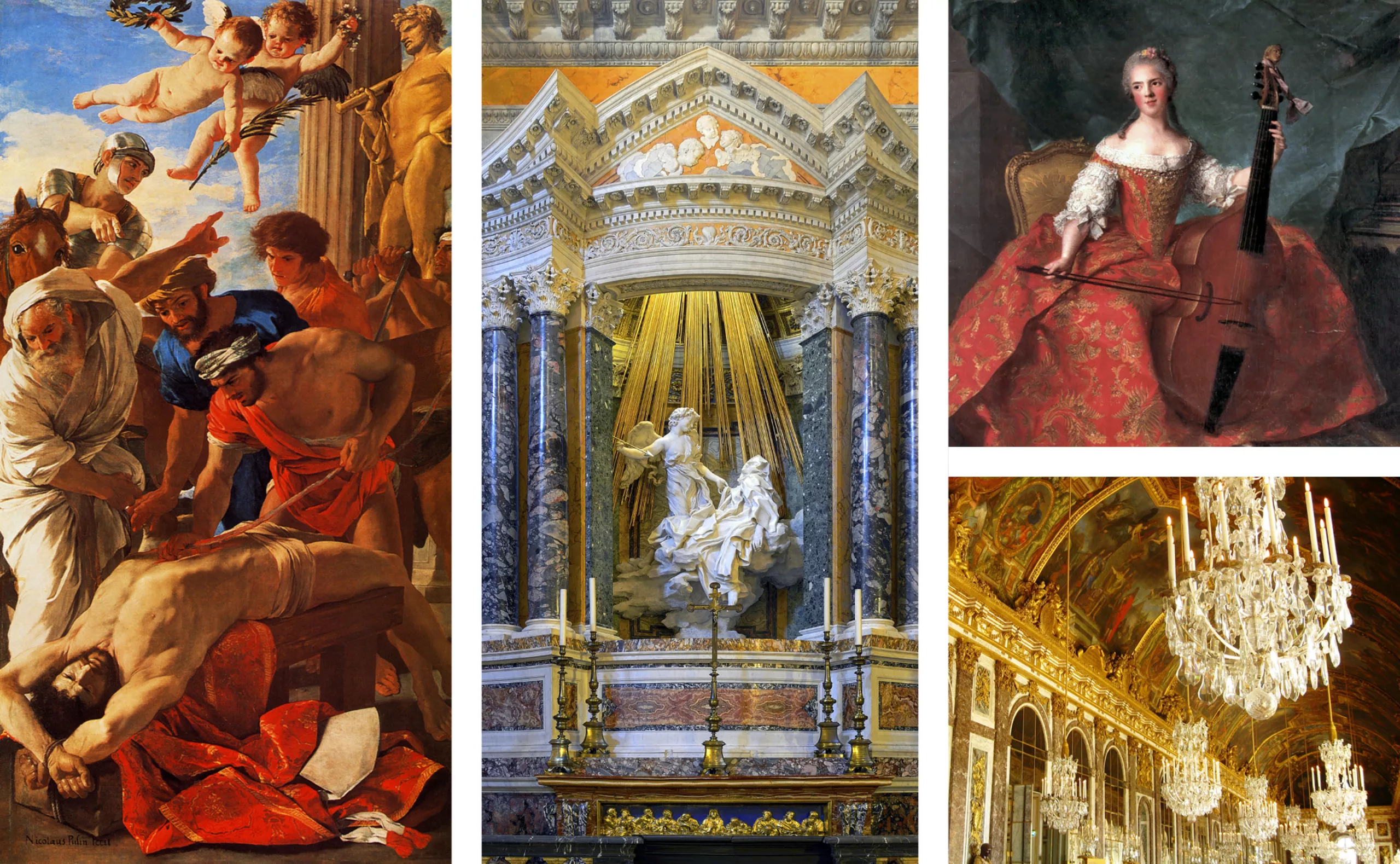
An obscure clarity
For the art historian Heinrich Wôlfflin, "the Baroque style seeks to round off everything that is flat, to gain everywhere in shape, light and shadow. By reinforcing the contrast of light and dark, one can enhance the impression created to the point of giving that of a true forward gush" (1888).

There is also a characterization a little more precise as an uneven and contrasted light. Giulio Carlo Argan thinks that the baroque period "exploits the accidents of the light and the luminous diversity of the different moments of the day" (1957).
The baroque light would be thus a light in chiaroscuro being opposed to that of the period which precedes it.

The central mission of the CMBV is the rediscovery and valorization of French musical heritage of the 17th and 18th centuries. Very quickly, we synthesized this mission in a more inspiring way: "To make the French music of the 17th and 18th centuries shine".

We ended up with this very simple logo made of "sound rays". We will not detail here the path that led to this sign, and we refer you to the reading of the case study.

rayonnement

Research 01
A radiance of colors

Our first proposals focused on a principle of colored radiation. A form of multicolored geometric abstraction replacing the traditional iconography. The color becomes light and comes to irradiate the composition of the posters. Set in motion, it unfolds in a hypnotic way, leading to establish an original and impactful visual system.

A somewhat radical concept. It is necessary to recognize it...

Affiche motion design CMBV
Lully poster motion design
motion design poster

Research 02
The radiant illustrations

In order to integrate a more varied iconography, which we were asked to do, we proposed a system of illustrations based on the principle of the logo's spokes. The spirit was to be both sober and lively like the logo.

Affiches CMBV classical music poster

Research 03
Play with contrasts

To graphically introduce the contrast inherent to Baroque art, defining the DNA of the institution, between a heritage mission and a dynamism that anchors the CMBV in the present and allows it to look to the future. 

brochure centre de musique baroque
Brochure CMBV
affiches CMBV musical

Research 04
Kinetic vibrations...

To illustrate the radiance through color, form, and in a contemporary and current way. To place the CMBV in its time, by means of strong graphic codes. To echo the logo and instill an energy, a vibration...

affiche psyché
affiche psychédélique musique baroque rayons

Research 05
A clear line...

An iconographic universe taking up the threadlike style of the logo was used for a time for the communication of certain scientific conferences. The style exercise consisted in drawing an illustration with a single line.

esquisses baroque
illustration stroke

Research 06
The kaleidoscope

This proposal is a direct visual echo of the logo. A set of photos and visuals treated as a kaleidoscope that intrigues, marks and attracts the eye. It is also an evocation of the forms and the overabundance of the baroque style.
Each visual is composed with image ingredients that evoke the activity or the pole concerned.
One can thus generate an infinite number of them, by modifying somewhat the choices and the placements.

recherches graphique centre de musique baroque

In the end, after months of work, the graphic charter will be oriented towards a more sober and uncluttered work, as we presented it to you in the project case study. Don't hesitate to discover this study and listen to the podcast (in French) which will tell you the story behind the scenes of the project:

https://www.grapheine.com/portfolio/centre-de-musique-baroque-de-versailles


Share this post:


Leave a Reply


Newsletter
Leave us your email and receive your monthly dose of Graphéine in your mailbox.