
Visual identity for Auditorium – National Orchestra of Lyon
![]()
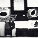
There are a few weeks, we were invited to submit proposals for the visual identity of the Auditorium Orchestre National de Lyon. For a brief introduction, this is both a National Symphony Orchestra 102 professional musicians and a bathroom, the Auditorium de Lyon, a huge shell St Jacques Concrete from 1975 built in the heart of the Part-Dieu. Both entities Auditorium and Orchestre National de Lyon are inseparable. The Orchestra is a permanent resident of the hall since 1975. The National Orchestra of Lyon Auditorium produced in this place most of his concerts and hosts invited formations. The arrival of a new conductor (Leonard Slatkin) and changes in the administrative structure is an opportunity to renew the visual identity of the institution. Unfortunately, this project will not be accepted.
![]()
2 : GOUT: Typographical wheelbase that evokes a certain classicism.
3 : CIRCLE: Make echoes the inner and outer shape of the room, it can also evoke a musical note. Can be extrapolated to see the musical waves that propagate
4 : TYPOGRAPHY: The Newut was designed by André Baldinger in 2000. It is a continuation of the universalistic character. He has the qualities: clear, precise lines, classic layout, balanced proportions, open forms (ensuring legibility at small sizes), adaptable to multiple media.
The Newut however, a feature that distinguishes: its capitals are reduced to the height of the lower case. This keeps their "monumental" drawing (because they come from the Roman stone inscriptions) while approaching what makes the major interest lowercase: readability. Mixing the two forms, the Newut reaches equilibrium which allows it to be used both for standard texts (wafer form) and as titration character (displays, covers).
A RHYTHM: Continuing the idea of letters cut, we give a rhythm to the words ... like some letters were faster or slower than others ... In addition to the mixed-tiny capitals, these vertical cuts make it immediately recognizable, fully consistent with the sign.
5 : MORE: Strengthens the idea of association a place + orchestra!

The logo is the central element of communication.

Visual concept taking the principle of the logo: two images confront in order to create meaning. "Sharing more than Music" become the slogan. We share moments of communion, exhilaration, discovery, joy...


In parallel with this work, we presented a version of this visual identity from typesetting.


Photo credit: Auditorium Orchestre National de Lyon, J. Blanchet et DR.
This article is translated with google translate.
Share this post:
 San Serriffe typographic Island
 Design, creativity and oblique strategies!
 Tote bag, a new social totem?
 Sister Corita Kent, the Pop Art nun
 Donald Trump, the martyr who makes history
 BTP Consultants – Visual identity and brand architecture
 MC2: Grenoble
 Hospital NOVO – Visual identity
 Plant art & land art: when nature puts itself to work
 From glam to filter-free, Glamour’s new look
 A visit to Basel’s printing museum
Leave a Reply