A new logo for “Quick” without a roof
The famous Belgian fast food Quick presents its new logo!
My first thoughts go immediately to the previous logo that has lived 22 years. We will return on his case in the end of this article.
Meanwhile, we quickly find the new logo on all packaging in the course of Q1 2015 and to restaurants pediments in the course of the year. It is a complete overhaul initiated by the new marketing department: new architectural concept, new advertising positioning and above all, what interests us, new logo. It is signed by the agency Carré Noir.
A simpler Q
It is designed to be simpler, more modern and more impacting. The figurative evocation of the house disappears to contain only the initial letter “Q” and the color red. It is in this sense to logos that are increasingly minimalist, where the icon is becoming the official logo.
Indeed, whether for mobile applications icons or icons of social networks, brands must adapt their logo on these new uses. If some use a particular sign of their logo (eg Twitter and bird), other naturally choose the first letter of their name (The “F” from Facebook).
To return to the logo, so you can enjoy the new design of the initial letter “Q” more fluid and balanced than the former, I’m less sensitive to oblique typography name below. In particular, the “Q” seems a bit “heavy”. The bar of the “Q” was she forced to go inside the round? not sure …
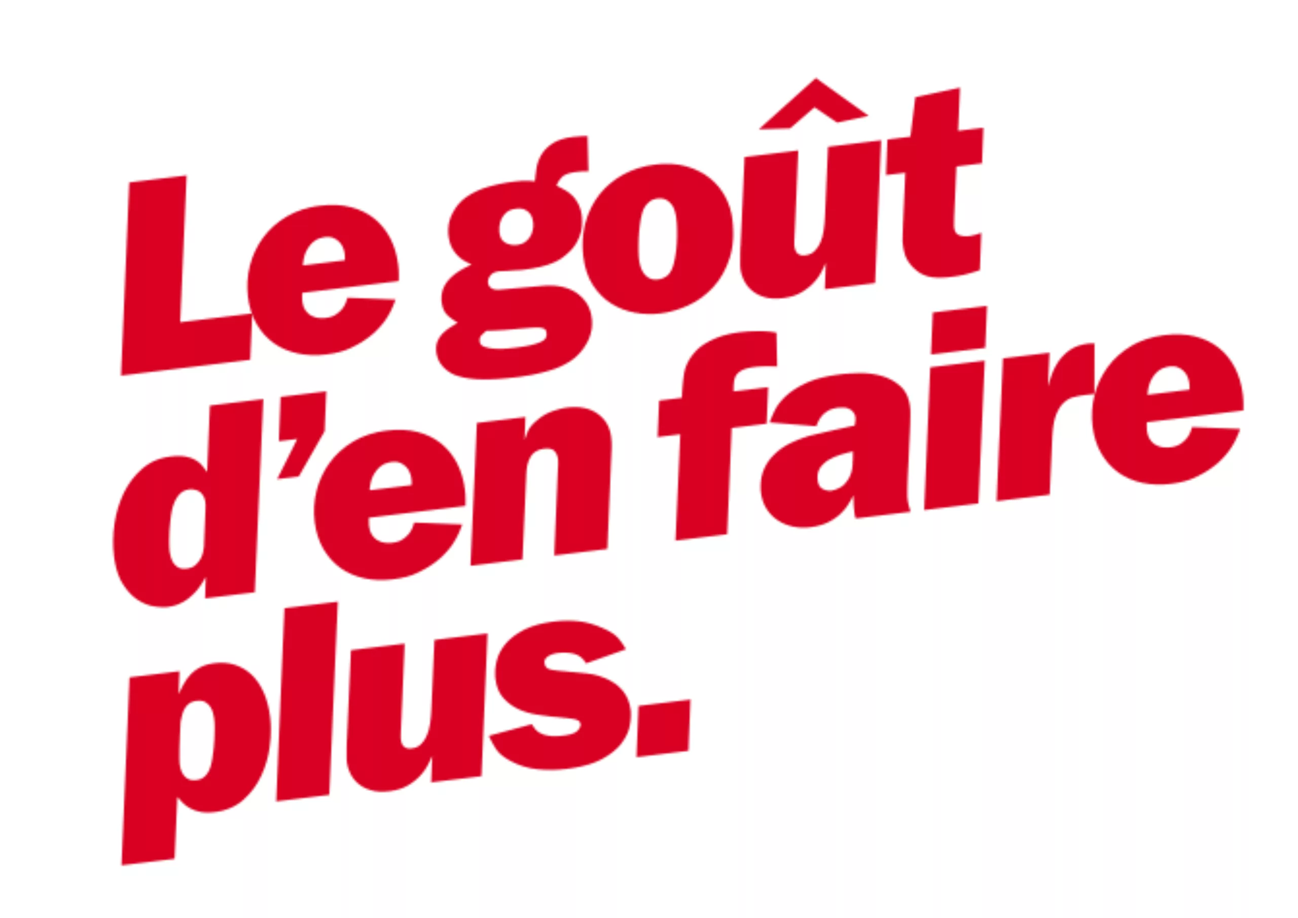
In passing, we note a new signature “le goût d’en faire plus” (“Taste to do more”) to replace the (pretentious?) “nous, c’est le goût” ( “We, its the taste”). Personally, I’ve always preferred “promises” to the “claims”. It’s probably a matter of taste!
History of Quick’s logo
In 1968, according to legend, when his plane was flying over the Grand Canyon during a study tour in the United States, Baron Vaxelaire, founder of the first Belgian retail group, GB INNO BM (GIB Group) , asked his right arm to study fast food concepts that grow successfully in the US.
A few months later, the idea has caught on and founded Baron Quick Belgium, a chain of hamburger restaurants, a first in Europe.
Ok, the legend does not tell the parachute jump of the intrepid Baron Vaxelaire right arm above the first MacDonalds of San Bernardino (California) and its forced landing in the Ronald playground and Quick spying operation that followed. This is where the Baron would have shouted “Quick! Quick!”.
This time, one can rediscover with joy the first logo of the Belgian firm.
A logo and a roof
In 1971, it is still not talking about logo at Quick. This is according to their site of use in a descriptive acronym. This identification symbol is designed to be visible and adapted to eat roof.
At that time, Quick, is only a secondary service of GB supermarkets. So it is mainly through the particular shape of the roof that visual identity is worked. This is also one of the lessons reported by the right arm of Baron its flyby of America.
In order to stand out in the immensity of US trade zones, retailers are betting on the architecture of their roof, recognizable from afar and specific enough to be immediately recognizable. At the time, the restaurant is a red-orange trapezium formed by 7 panels slightly spaced apart. The company therefore takes the shape of the roof, typography sticks to the 70s, all curvy, affiliation with GB is clearly claimed.
Here’s how this logo for 44 years has had the form of a roof!
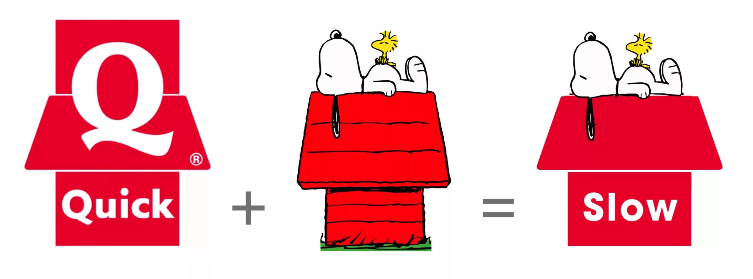
In fact, I had never dared to ask the question before this article, but since the time of shame passed quickly, and then especially now that I no longer risks of upsetting the Vaxelaire Baron (let alone his right arm) have you ever thought that the logo looked like the niche Snoopy?
A strange mishmash semiotic, with a likeness of shapes and colors, and antonymy between the concept of “fast” (“Quick”) and “slow” (“Snoopy”). Do not ask me why I associate Snoopy the slow … probably because it is the most often doing his nap. (Unless I confused him with his cousin Droopy!).
On the subject
-

Groupama’s new visual identity, a logo in the open countryside
Groupama has just unveiled a new logo that updates its graphic design by abandoning its campaign in favor of a “startup” aesthetic.
-
From surnames to acronyms: creating a brand name from letters
From founders’ surnames to initials and acronyms, brand names have always oscillated between abstraction and familiarity.
-

The UN logo takes on water during COP28
For COP28, two designers have come up with a new UN logo showing the rising sea levels and the future disappearance of much land and coastline.