
typographic creation metropolis Paris
![]()
A few weeks ago, we took part in a consultation launched by Paris Métropole (a group of local authorities working together to find solutions to the social, economic and environmental challenges facing their shared territory). The project involved reinforcing the visual identity we had created for them with a graphic charter that could be used for the communication and signage of an exhibition, the creation of its catalog, the execution of their brochures and annual reports, as well as the redesign of their website. Phew, just that!
It's not easy to launch into a (non-compensated) tender on this scale, especially with a client we thought we had already won. Given the short time we had to submit our project, we decided to propose a cross-functional tool, something that would respond to this multi-media visual identity issue, while at the same time ensuring a link with the work we had already done with the logotype, and reassuring the client of the relevance of our proposal. We really wanted to develop and manage the image we had created ourselves, but as you can imagine, it didn't turn out exactly as we had hoped.
Visualization of the new typographic design

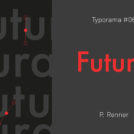
Paris Métropole" typeface
This is a unicase typeface with a pronounced boldness. It is designed for titles, intertitles, verbatims and signage (signposting, exhibitions, etc.).

So we created the typeface "Paris Métropole". It's based on the typeface we designed for the logo. We first worked on the logo we had designed for Paris Métropole to make a few corrections to the typographic block and improve the lettering design. It was necessary to slightly revise the integration of the lowercase with the capitals. We obtained a more demanding and accurate typographic design, which allowed us to produce a complete typeface.
In the end, we didn't win the contract as such, but we were able to convince our client of the relevance of having this typeface in his graphic charter.
See you soon to see how it will be used!
Use of metropolis typography to compose the title and themes of the exhibition.

Share this post:

 San Serriffe typographic Island
 Design, creativity and oblique strategies!
 Tote bag, a new social totem?
 Sister Corita Kent, the Pop Art nun
 Donald Trump, the martyr who makes history
 République – Grolée-Carnot – Street branding
 Khalvadjian Lawyers
 Smallicieux – Brand identity
 Abdou lawyers – Visual identity
 Edward Bawden, “Great illustrator from Great Britain”
 I just want to cry!
Leave a Reply