Visual identity project for Sup de com

04 November 2022  |   0 Comments   |    |  

A few years ago, we participated in a call for tenders to rethink the visual identity of the communication school Sup de Com. Here are the creative researches that we presented.

This is to present you a complete creative process. From the strategic diagnosis to the preliminary drafts.

Context of the school

SUP'DE COM's mission is to train and accompany future experts in global communication by developing their digital, creative and strategic skills for a successful integration in agencies or companies in a constantly evolving sector.

Through innovative teaching methods, which place the student at the heart of the training, the promise of these establishments is to give them the ability to be an actor in their professional and personal development. The result is this baseline "Reveal yourself!"

logotype école communication

Analysis of the existing logo

The current logo does not seem to be in phase with contemporary communication issues. First, its format is complex to adapt to social networks.

In the identity ingredients, we note the yellow apostrophe referring to orality. It is the sparkling ingredient of the logo. We find this signifier in the red speech bubble. For the rest of the ingredients, we wonder about the role and the presence of the blue zone.

The whole seems to us rather wise, without real strong and singular visual marker.

The question of the name...

A trademark must be distinctive. It is even the main legal condition. The name "Sup de Com" as a diminutive of "École Supérieur de Communication" is therefore descriptive, and the risk of confusion hovers over this trademark.

There is a plethora of higher education trademarks built on the same model: Sup de Pub, Sup de Co, Sup de Mod, Sup de web...

Therefore, if it is complicated to consider changing the name, the visual identity will have to counterbalance this weakness by bringing a strong singularity.

The question of the mascot...

The school has long used a giraffe as a mascot. It has even become the central object of the school's communication. A strong emotional bond has developed between this giraffe and the students.

Initially, the giraffe referred to this animal that takes the height, in a posture of strategist. Its originality refers to a certain vision of creativity.

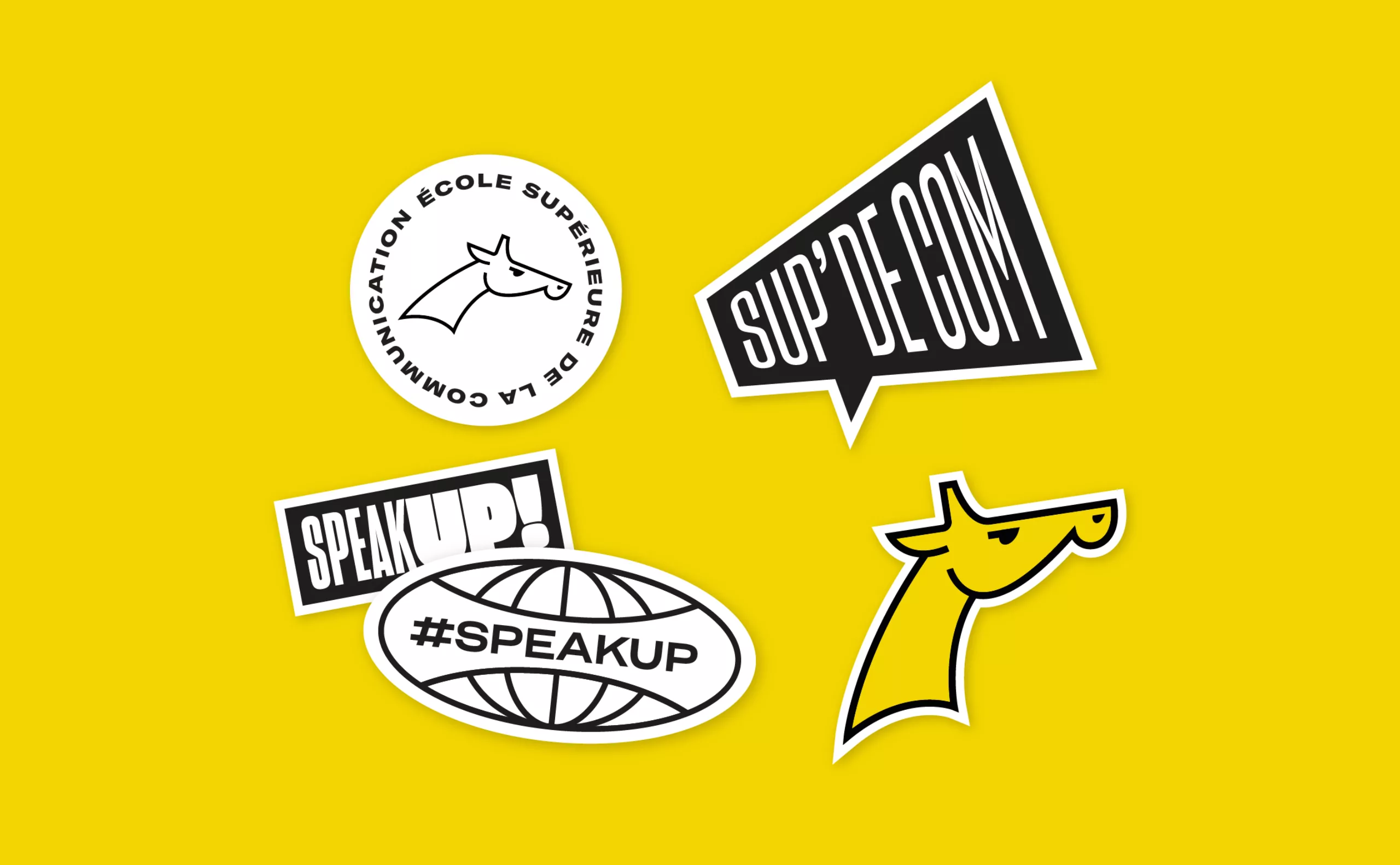
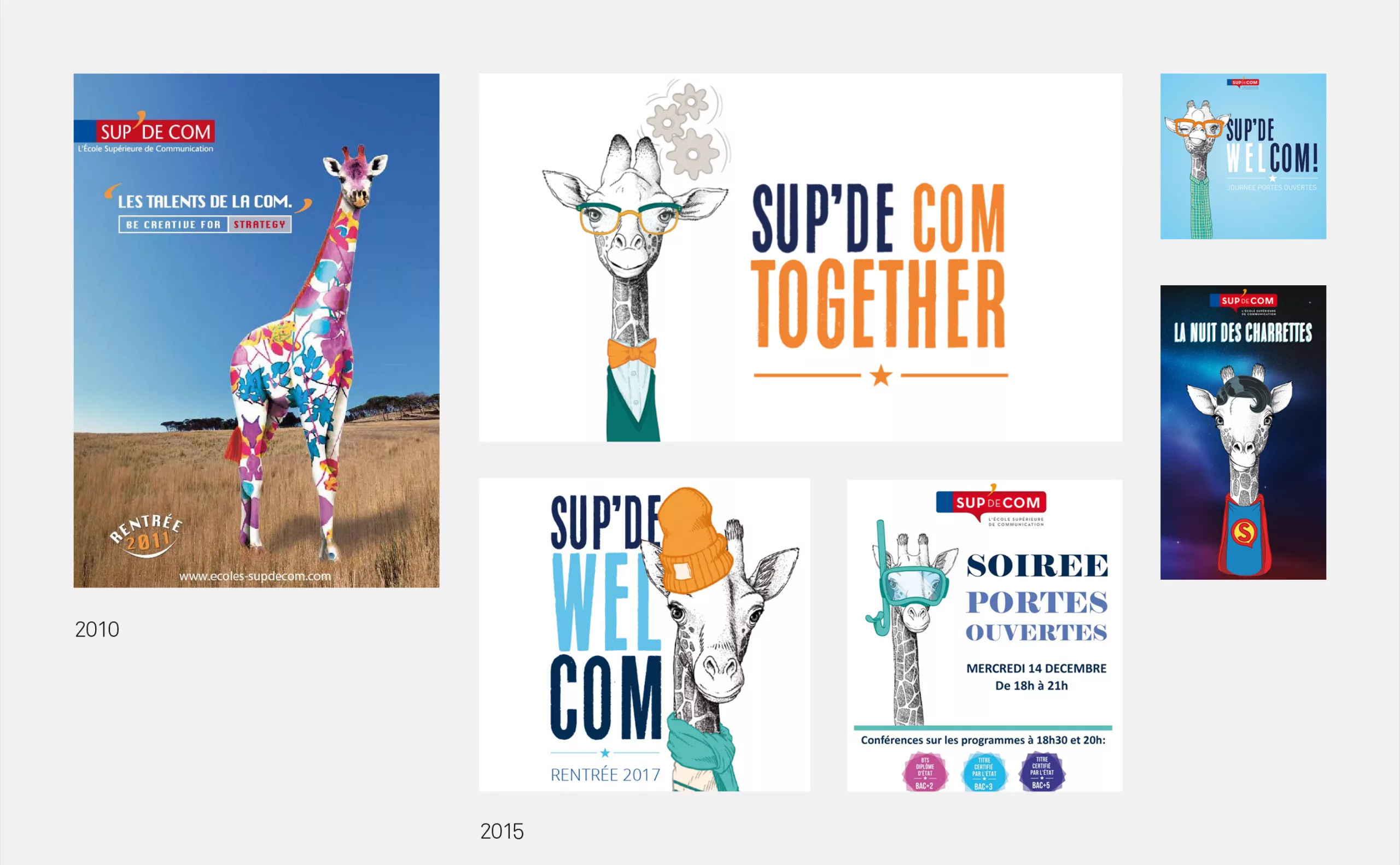
In the collective imagination, the giraffe refers to childhood (e.g. Sophie the giraffe) and will be associated with a nice and passive animal.

We think that this mascot is too much associated with "passive" values. To communicate is to speak, to transmit, to be in action, to react, to interact, to participate, to dialogue.

Our conviction is that a communicator must be in action, on the move, agile, in tune with the times. They must be committed and convincing. In short, "active" values

We have to admit that commitment is not a value that fits well with the giraffe character

On the other hand, there is nothing to prevent the giraffe from being used for certain secondary purposes. Either as an ingredient of the brand's language, for example for internal communication, for student associations or for alumni.
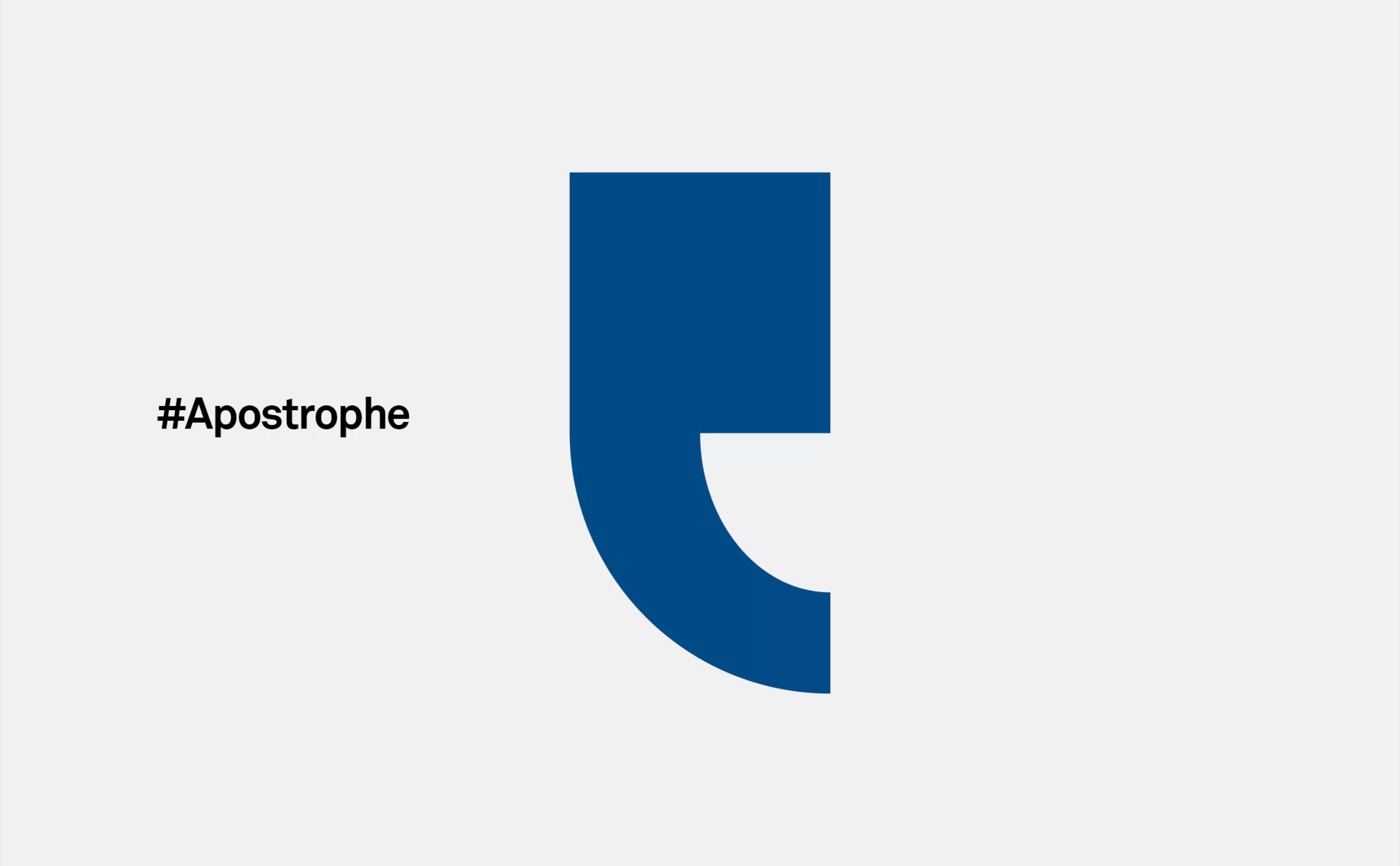
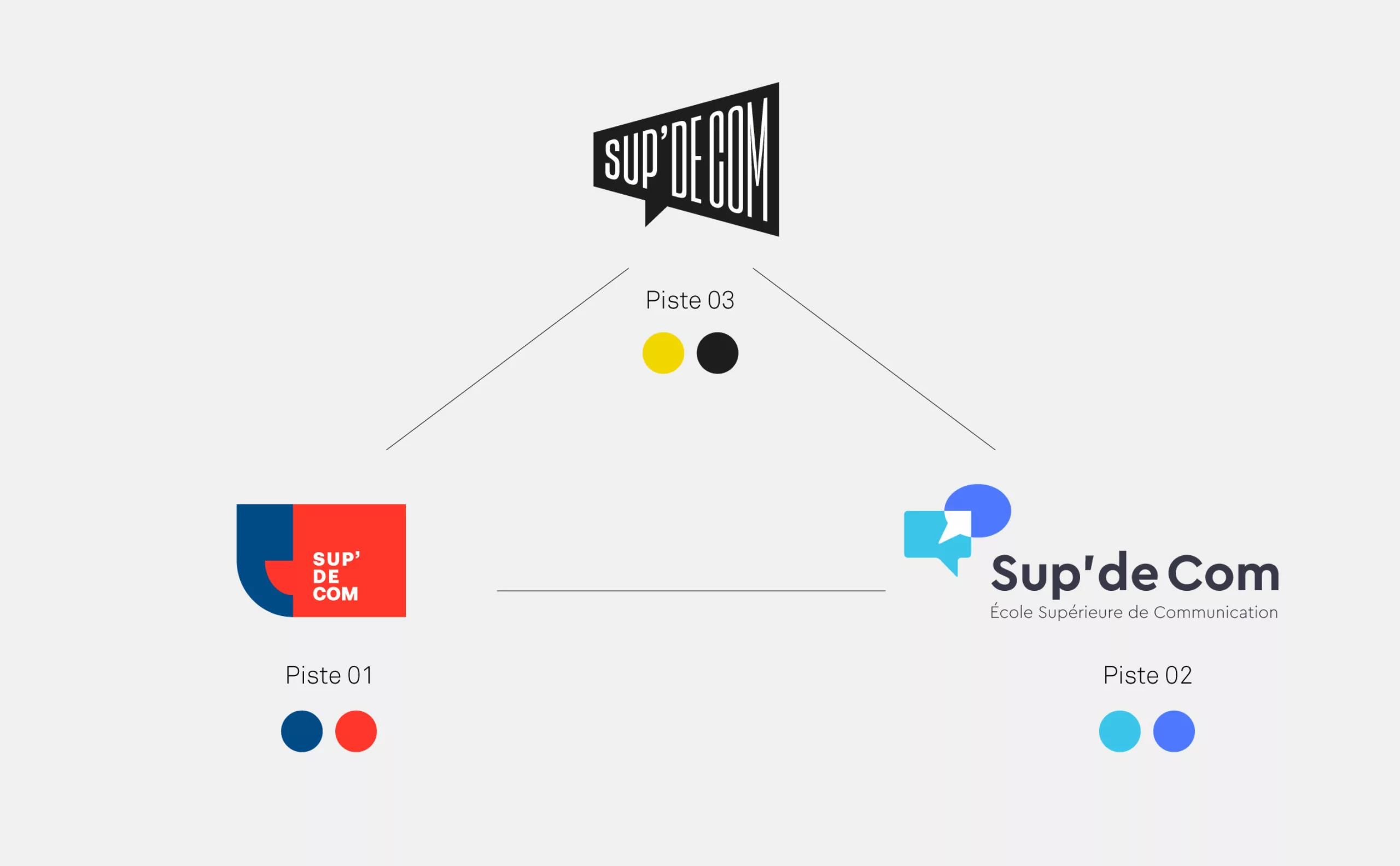
Research 01 - Evolution

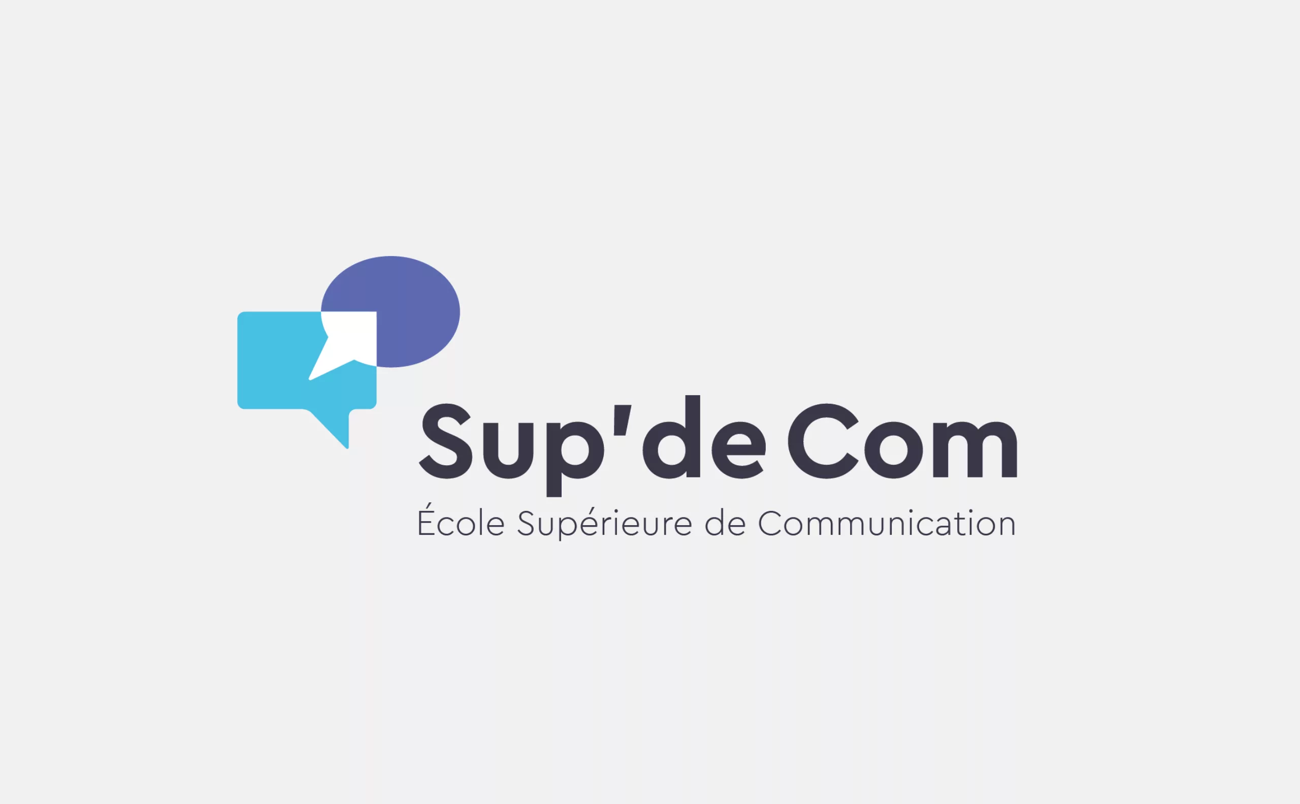
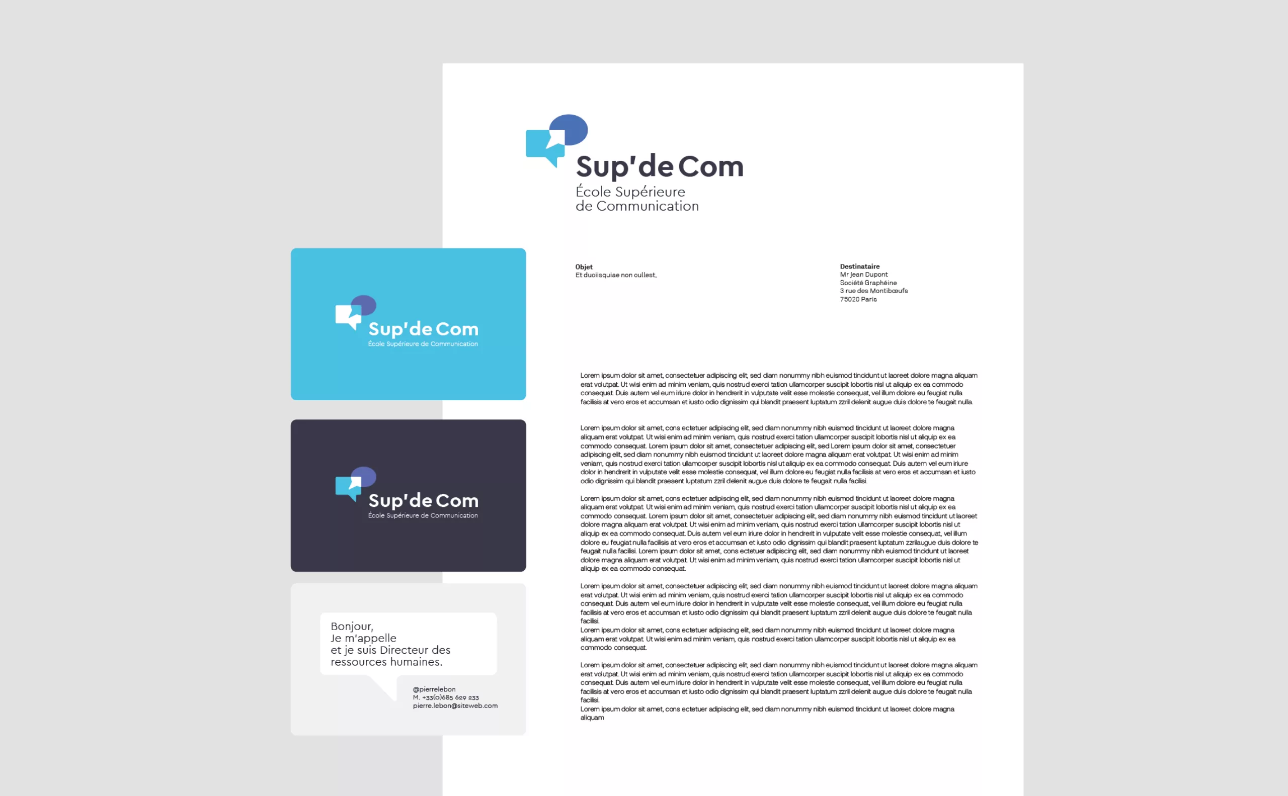
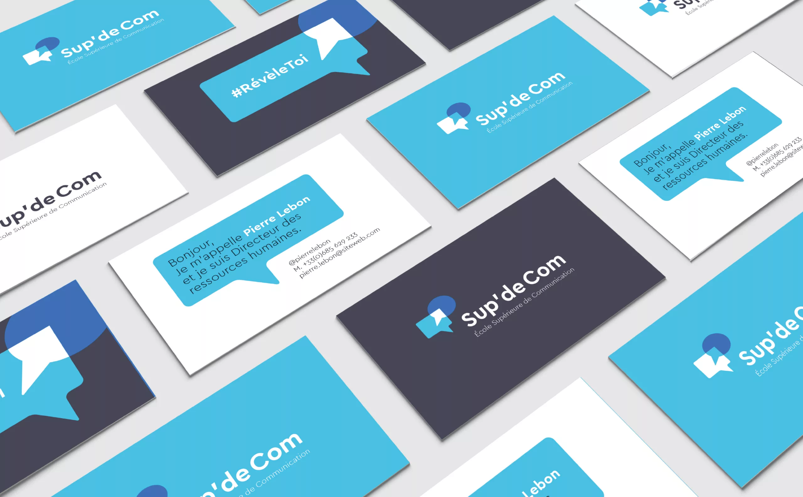
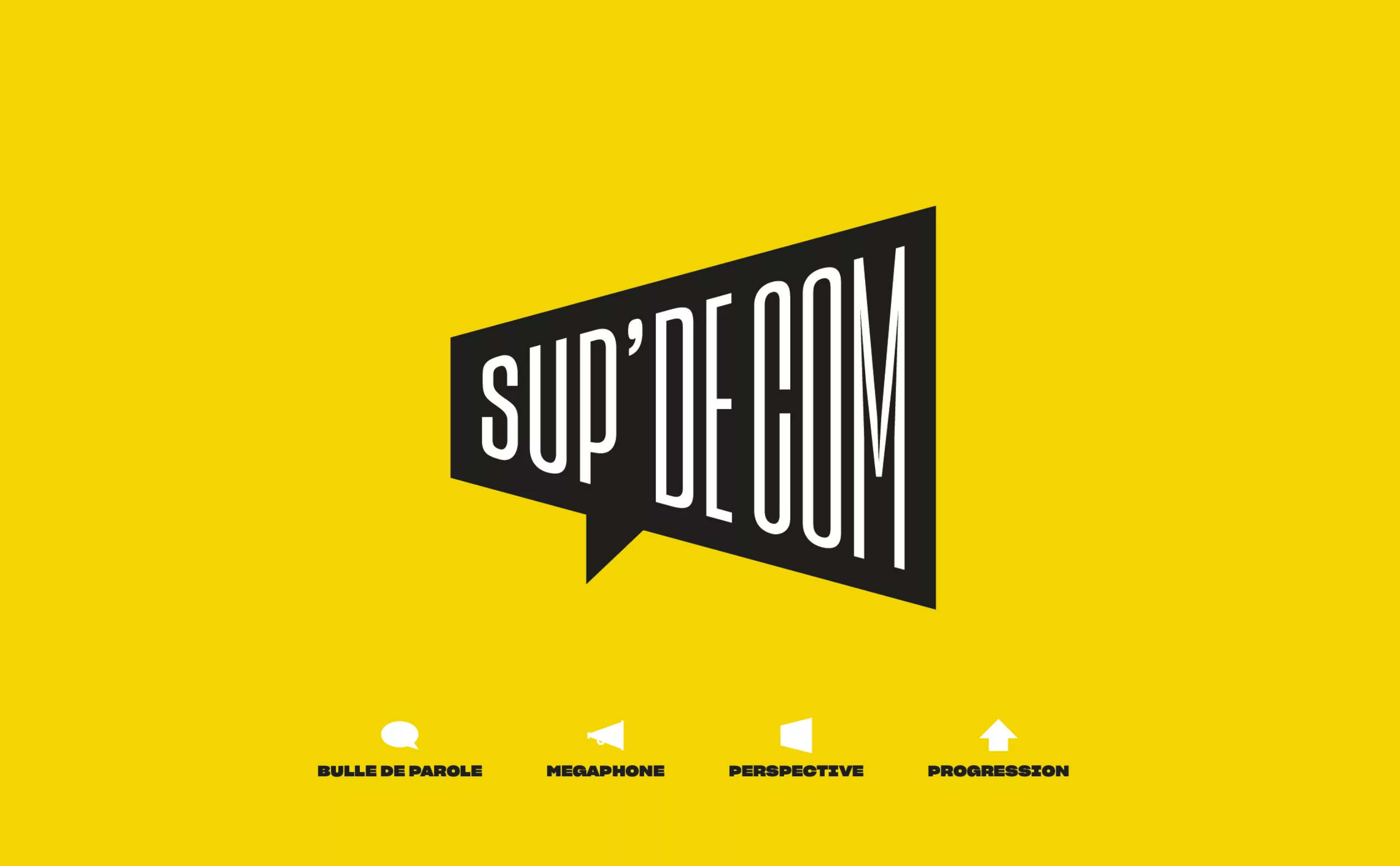
In this first research, we sought to evolve the existing brand codes, namely the symbolism of the apostrophe.

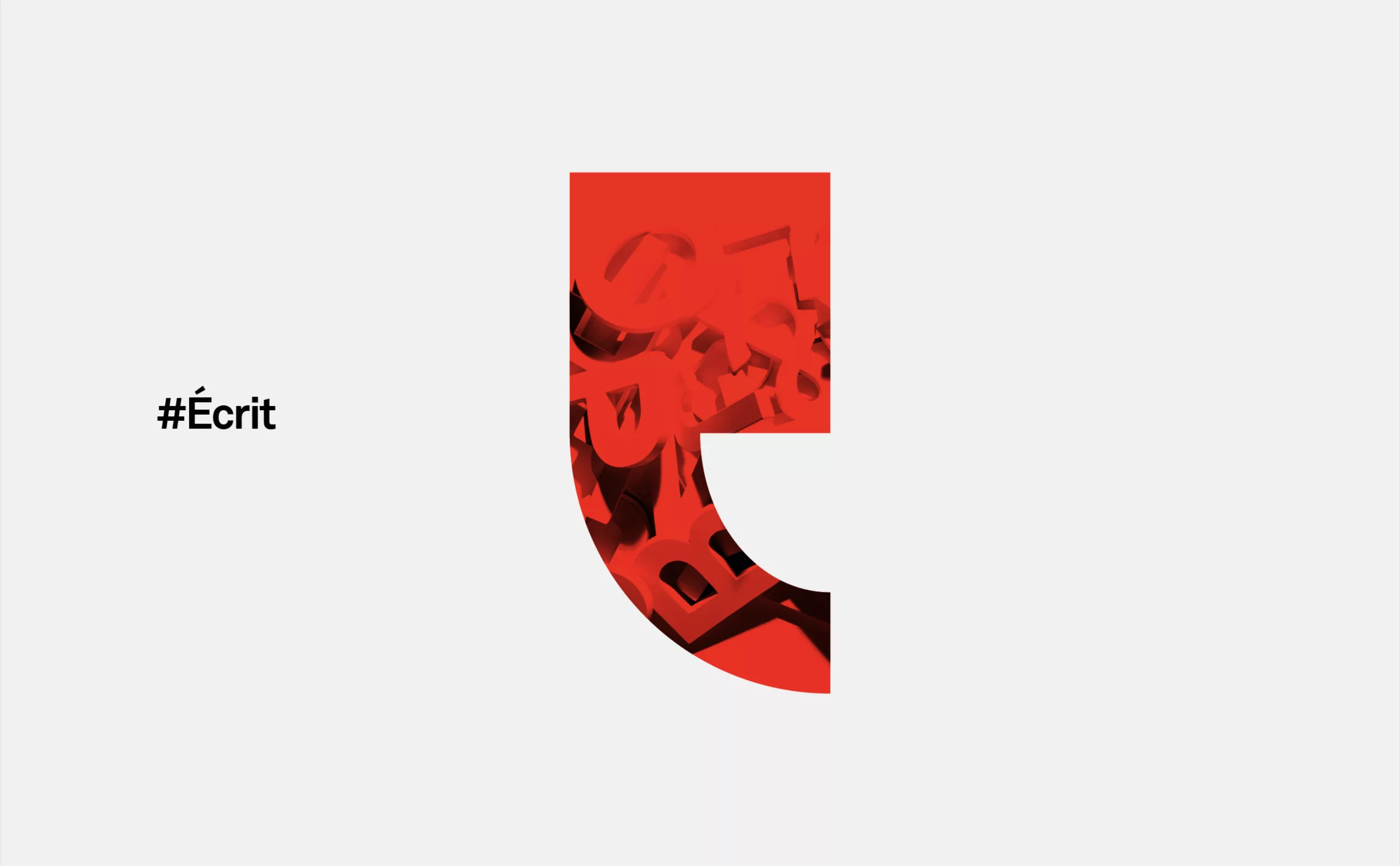
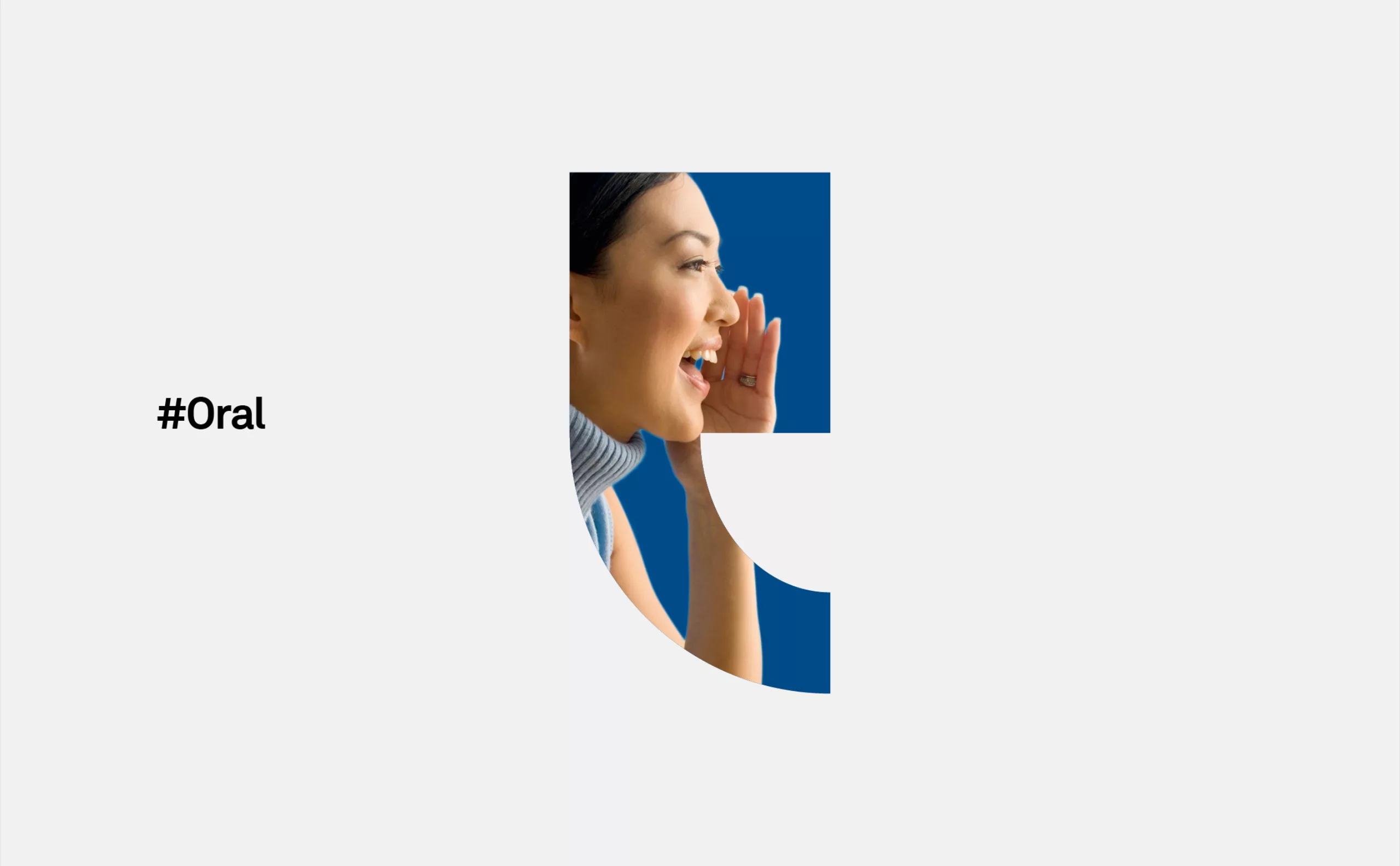
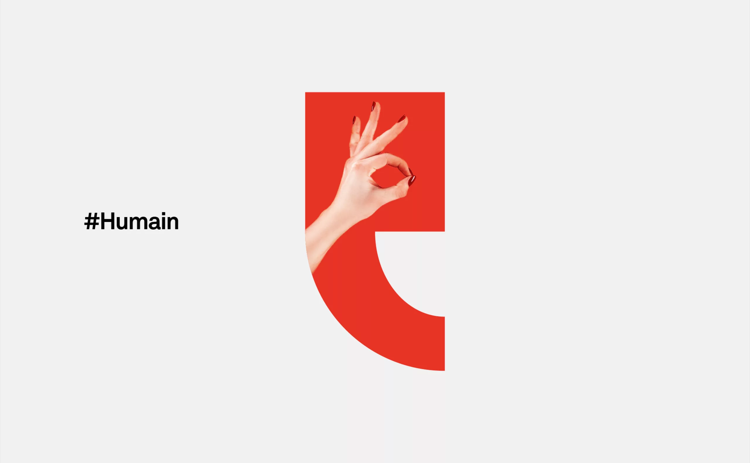
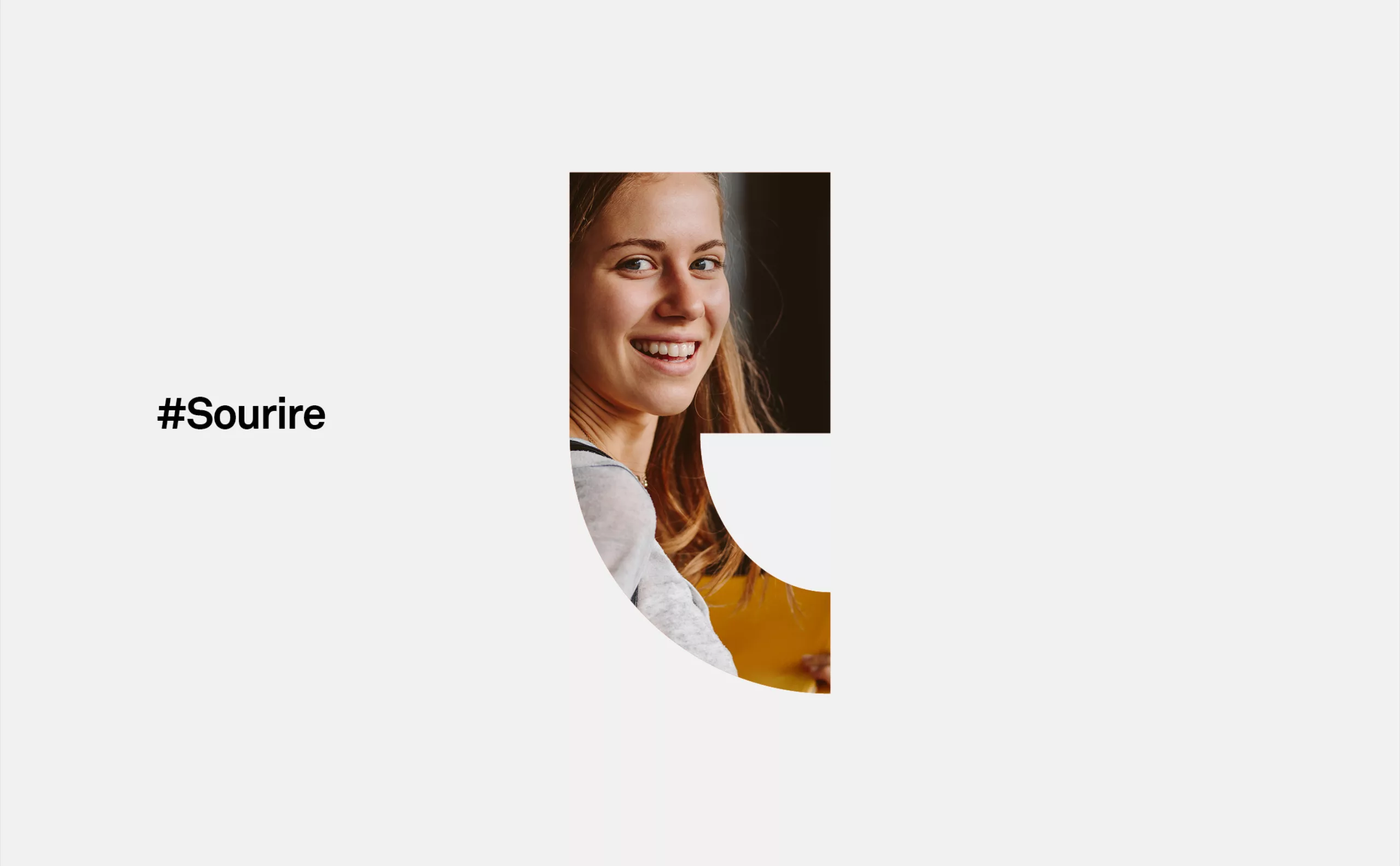
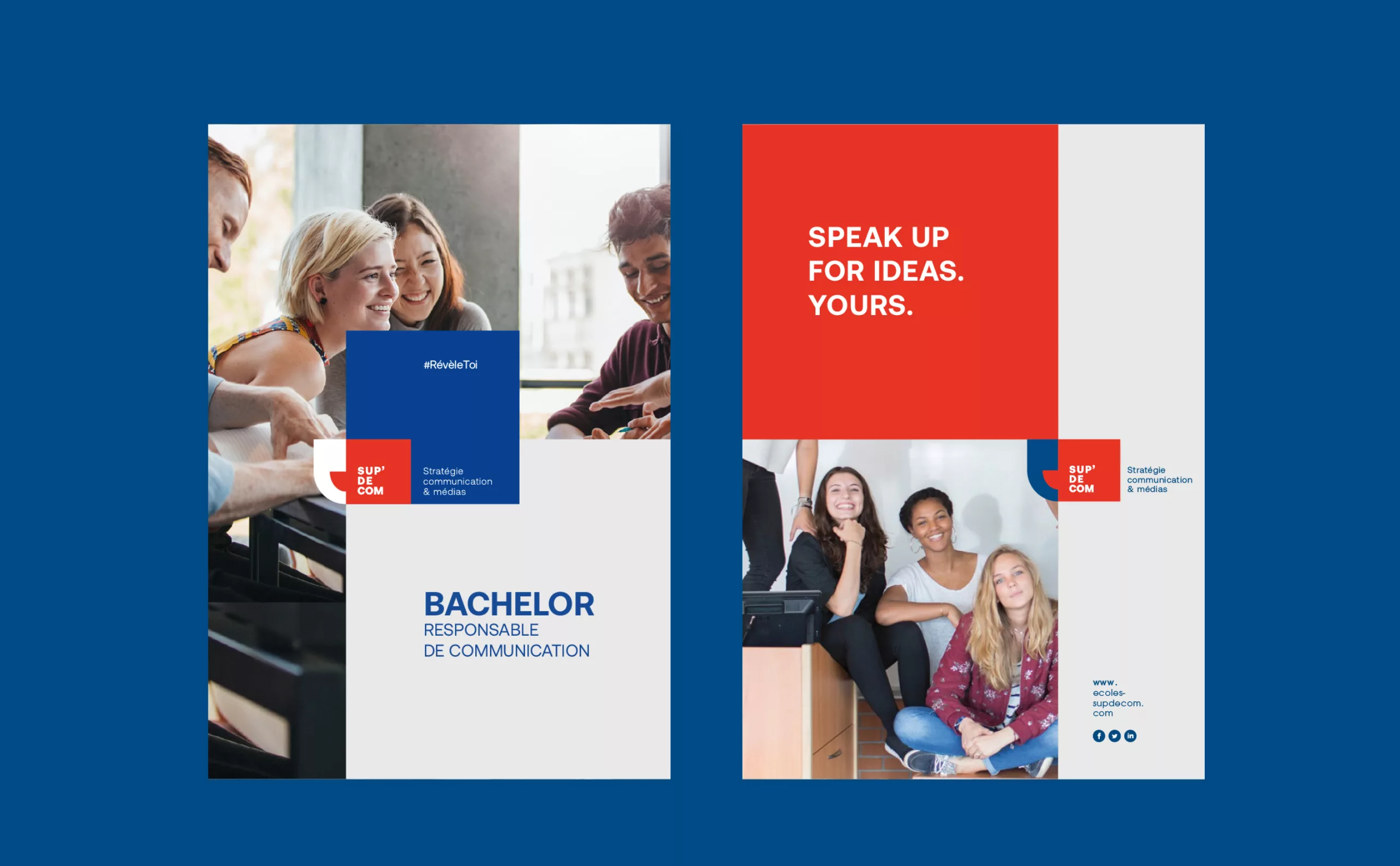
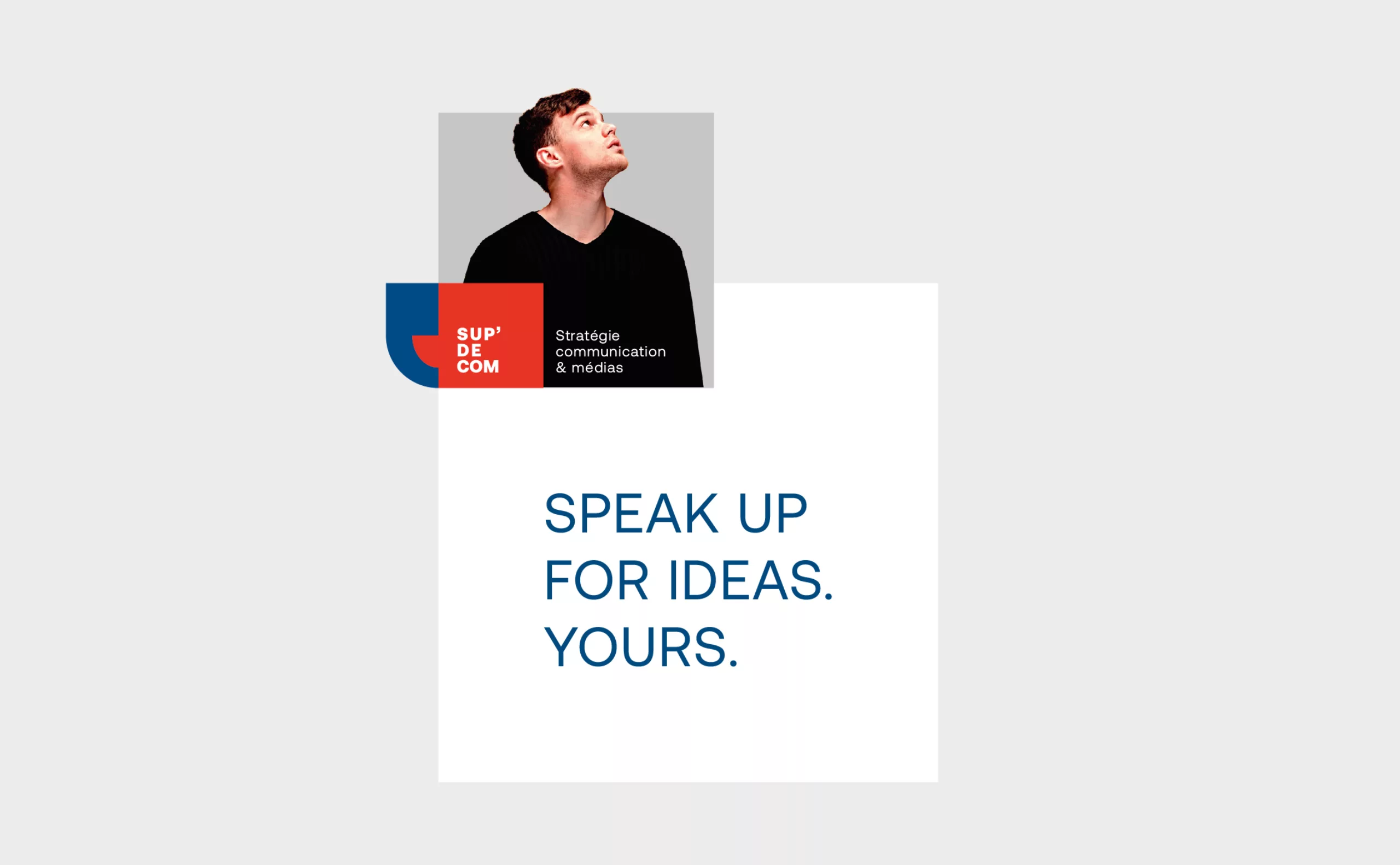
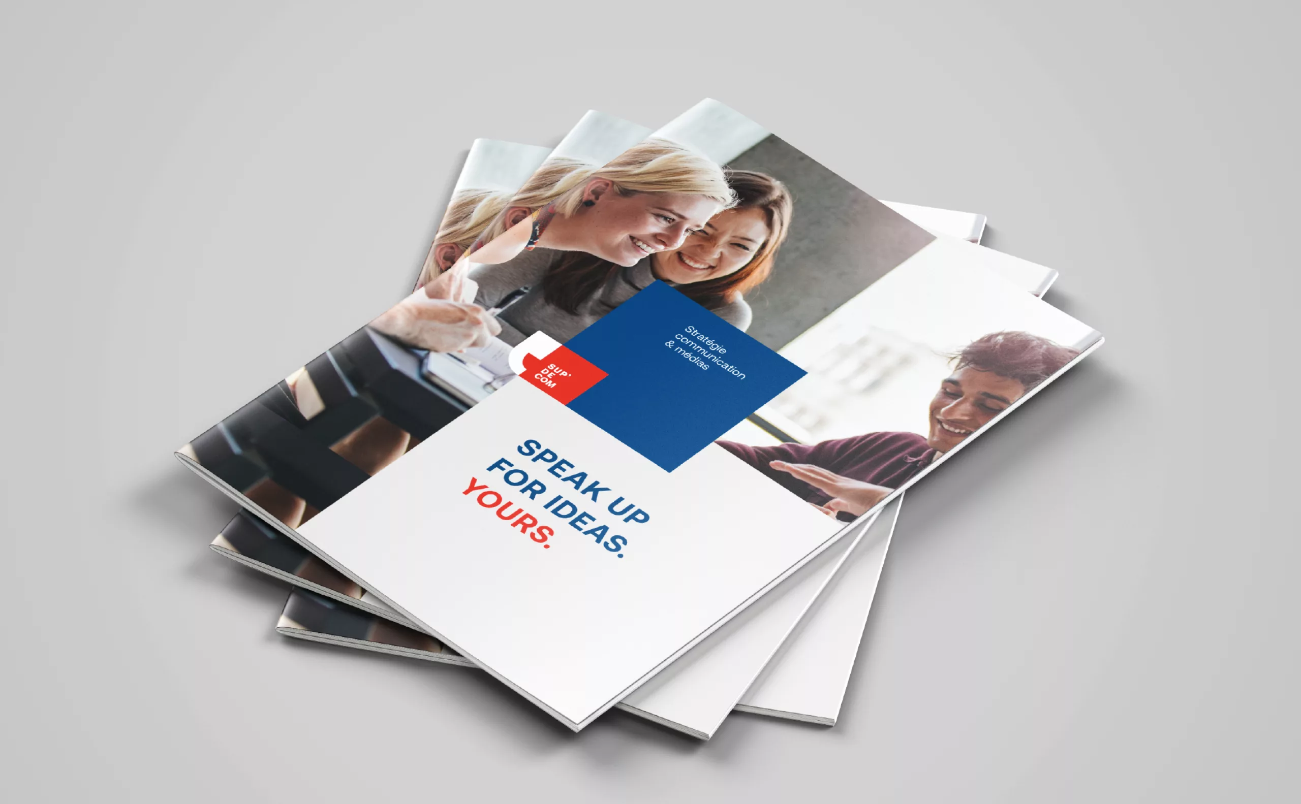
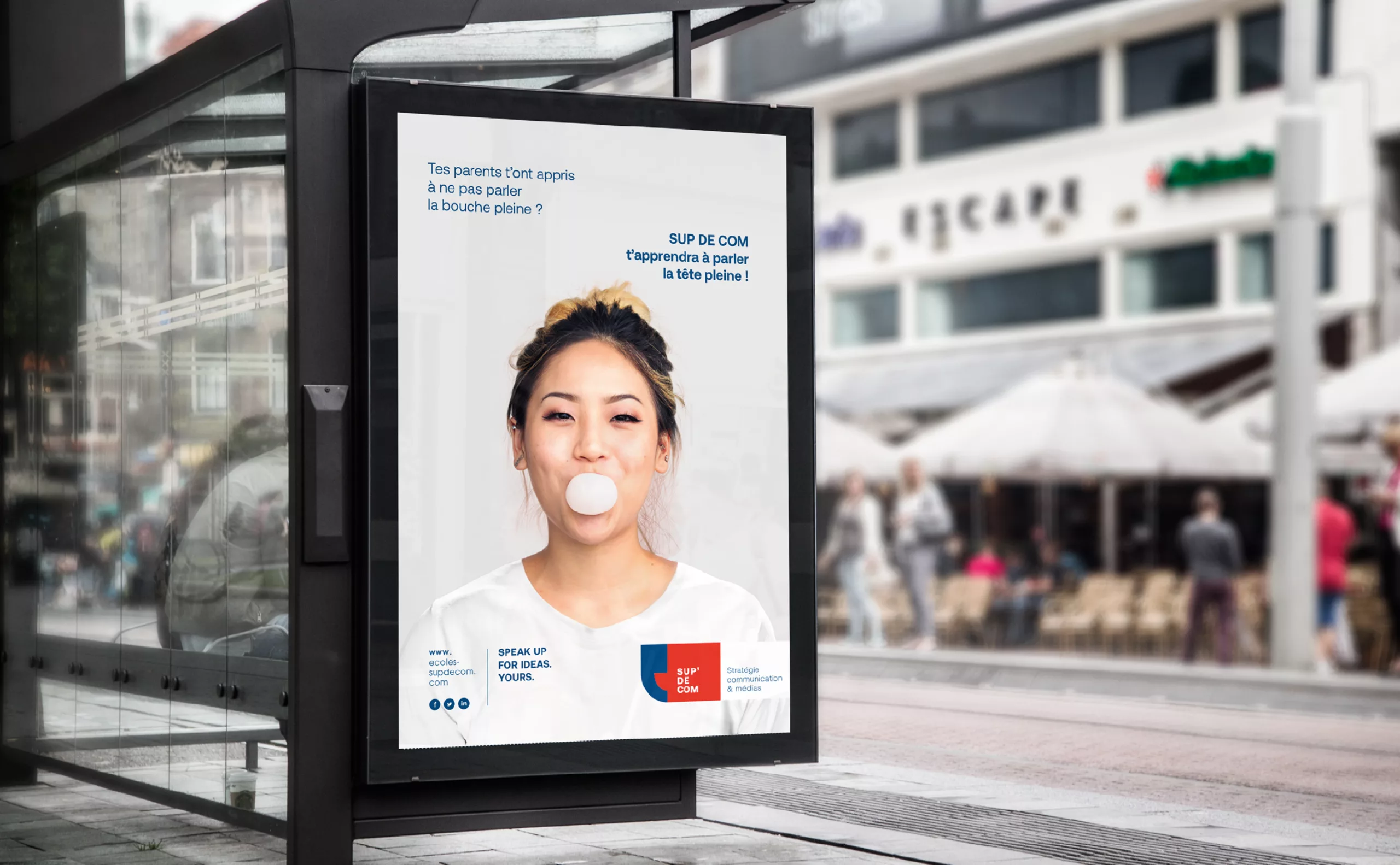
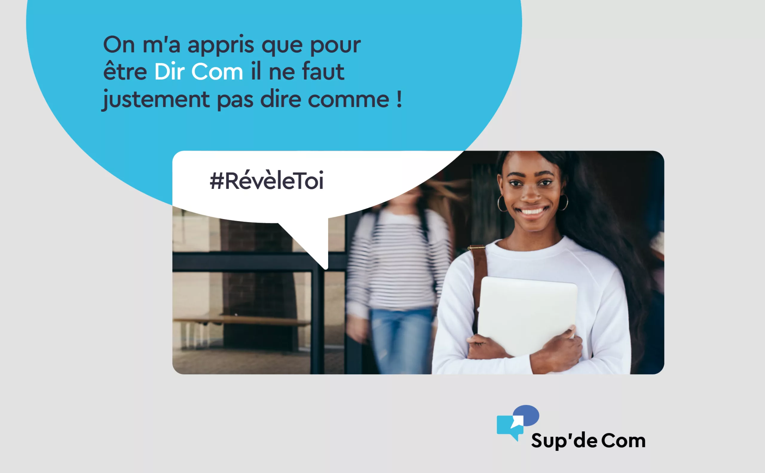
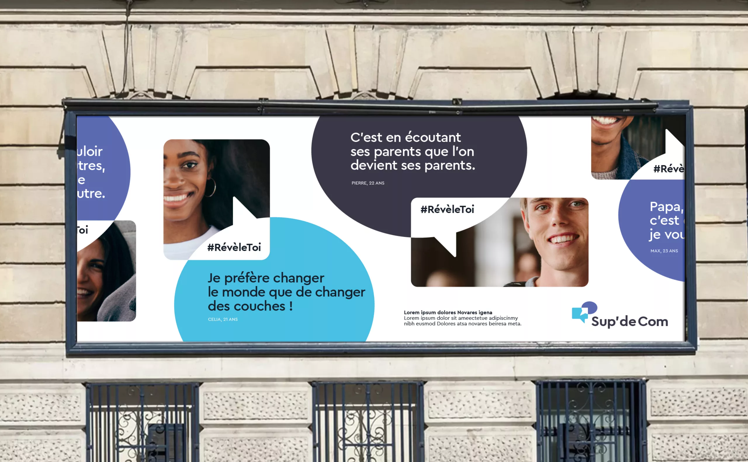
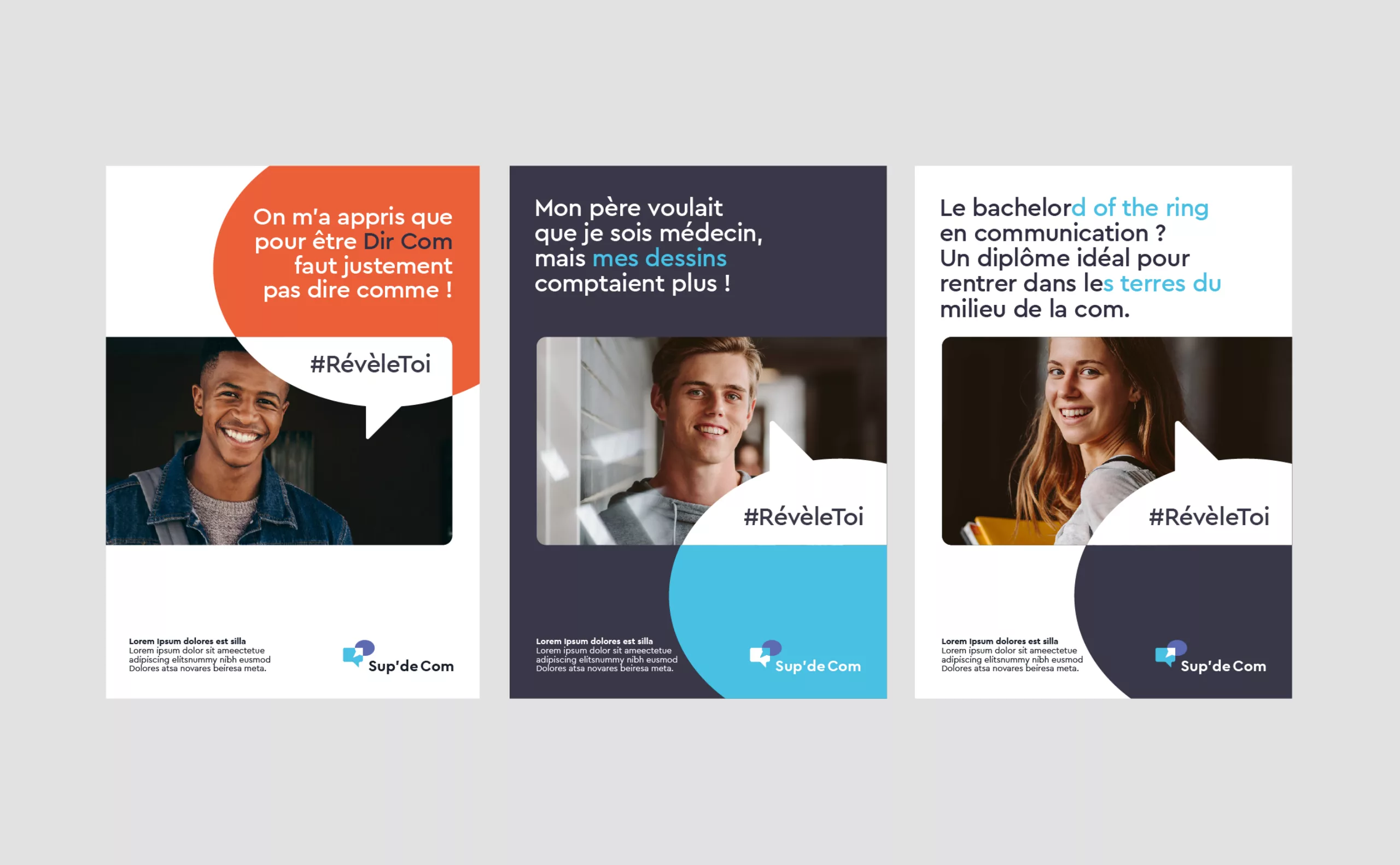
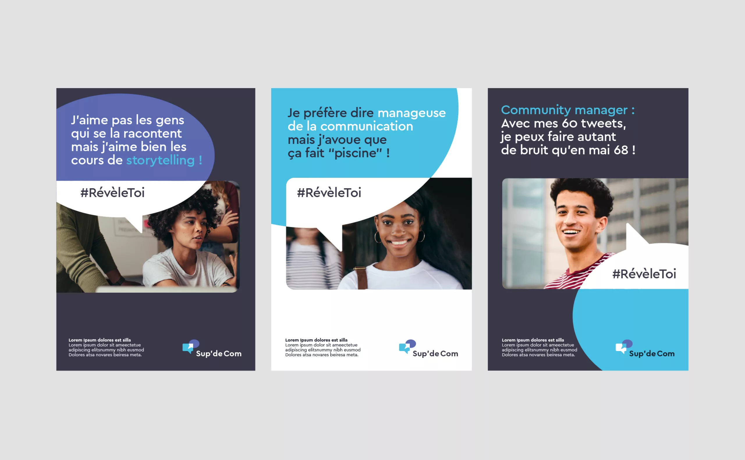
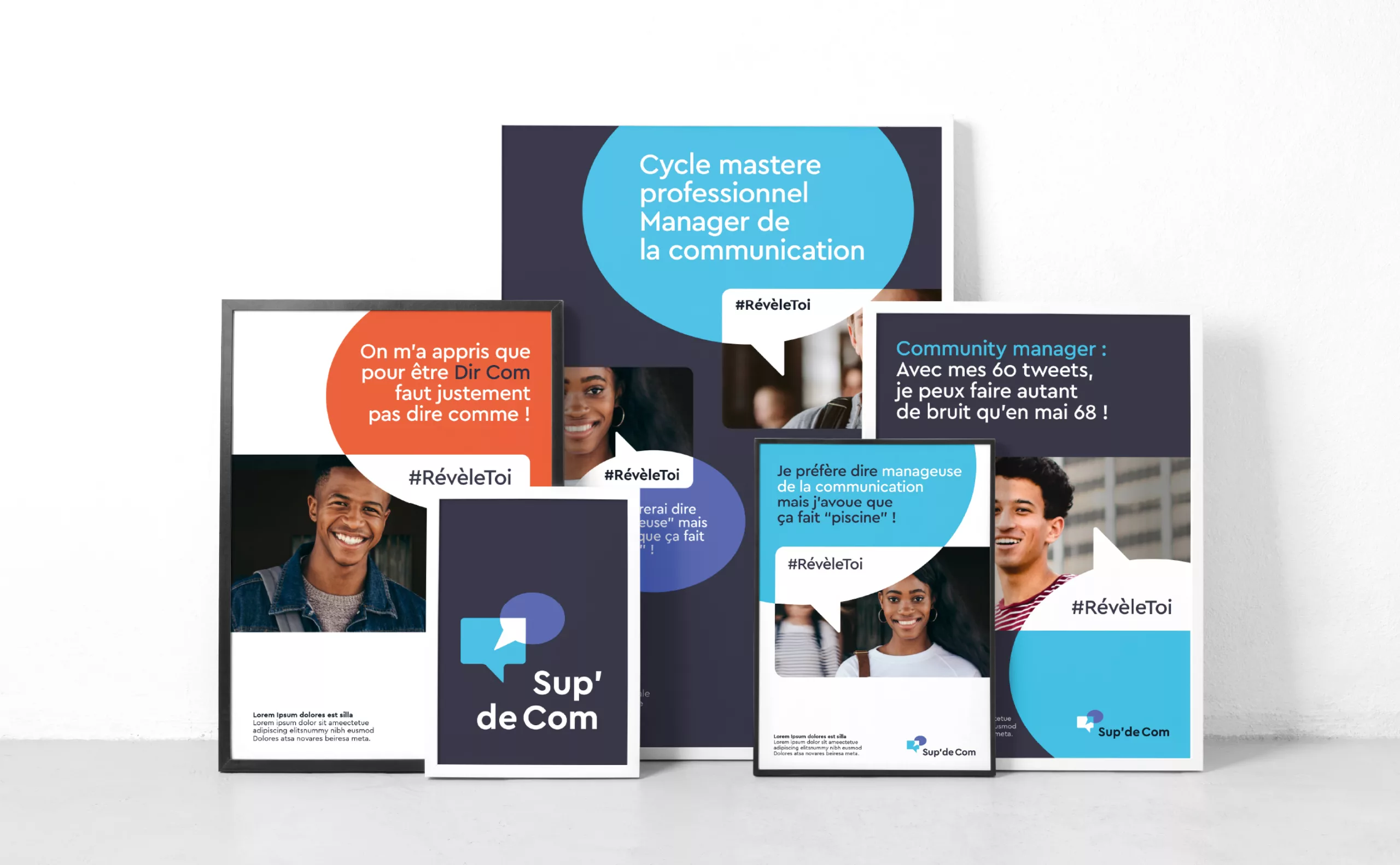
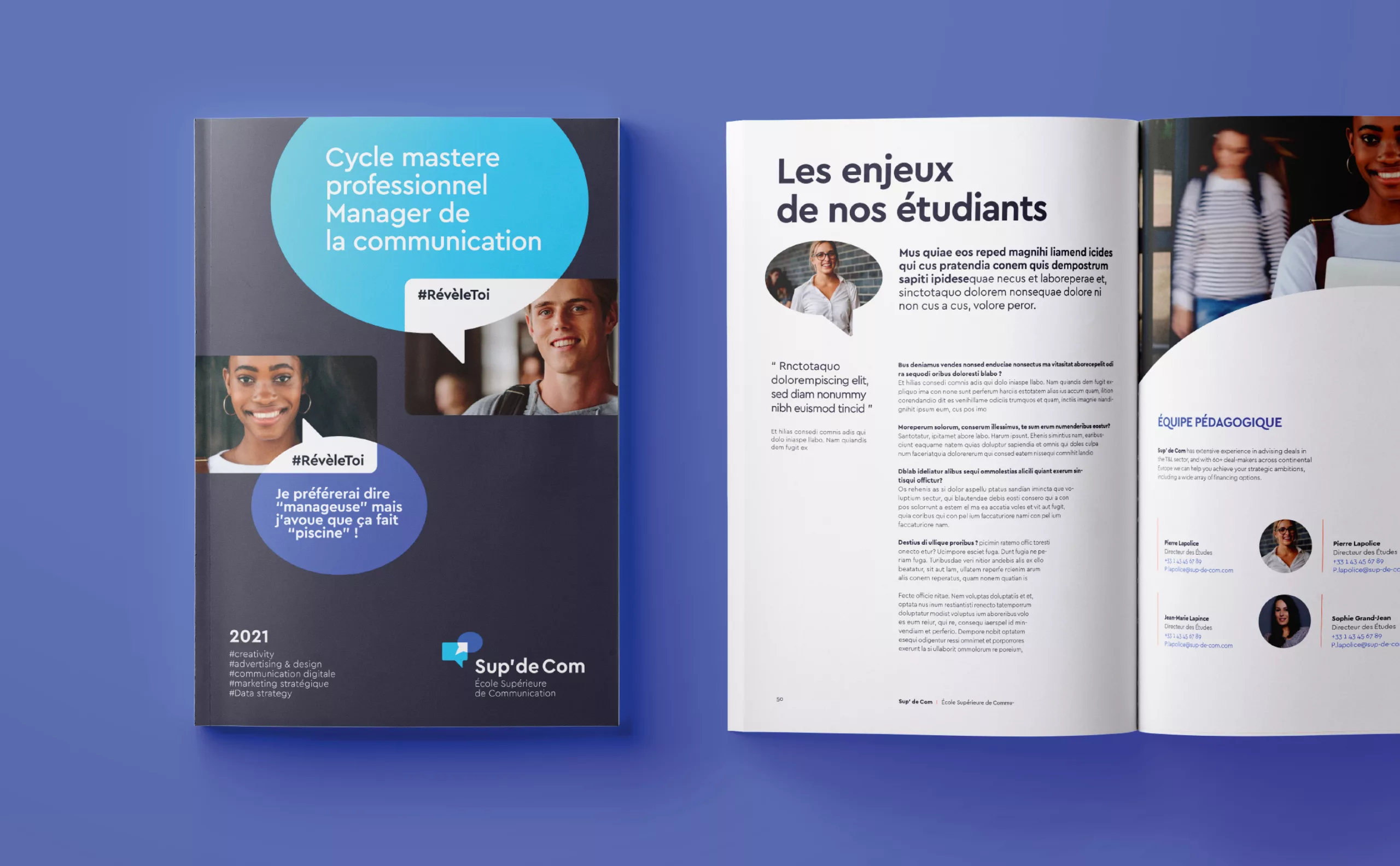
Written and oral communication: The apostrophe is, in turn, a punctuation mark referring to the written word and indicating a change of modality in the text. It is also the opening of a speech.

Express yourself! Visually, we can find a human face, mouth open, which seems to express itself.

The name "SUP' DE COM" seems to come out of his mouth, as in "a speech bubble". It is a logo that calls out!

Open and optimistic: The geometric construction is based on the square and the semicircle. The counter shape of the mouth seems like an open door. The whole evokes a smile and refers to positive notions.

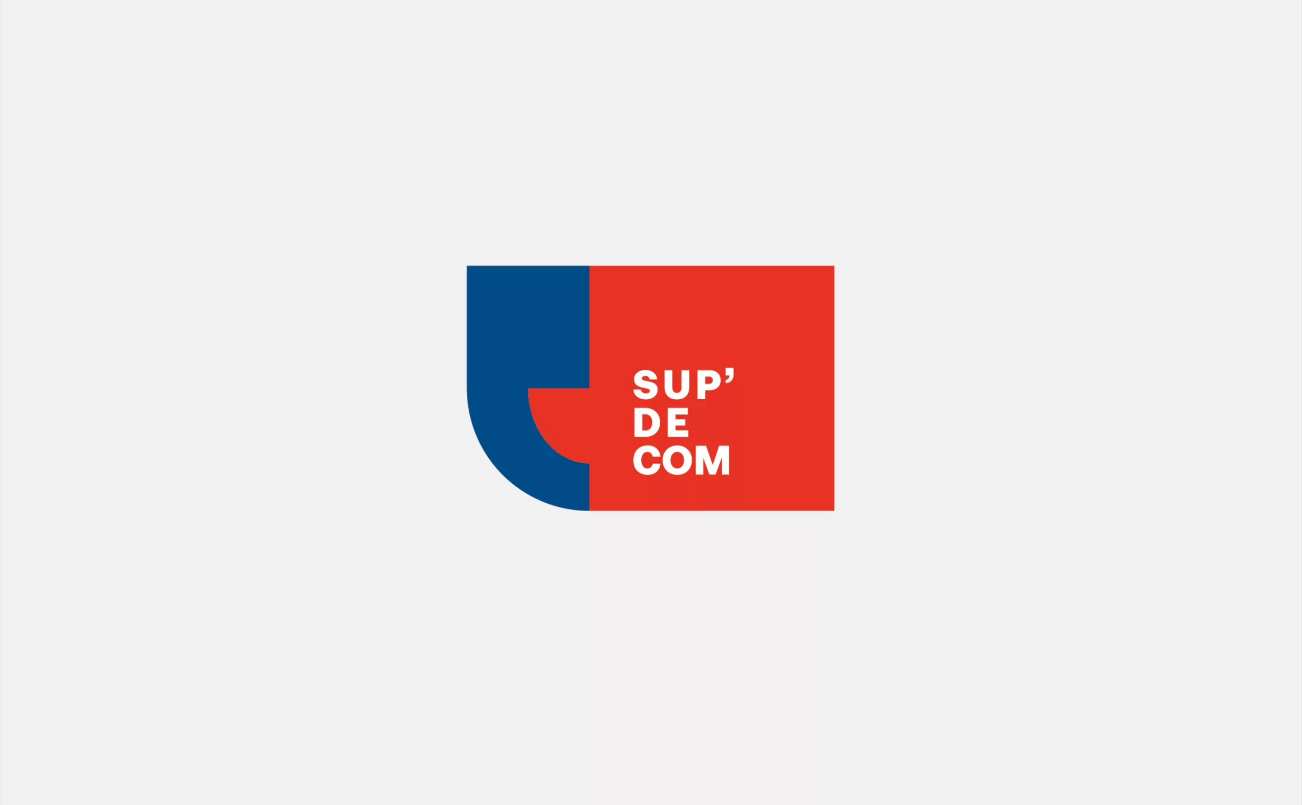
Positioning: This is clearly the most corporate research. Its reassuring tone will particularly appeal to parents who are going to finance their children's studies.

Research 02 - Reveal yourself!

The era of conversations: Today, brands must start conversions.  They need to establish a dialogue with their customers, their public. The value is in the quality of the exchange. This logo is totally in line with these new challenges.

Educate yourself! By crossing these two speech bubbles, a white arrow appears, like a promise of progress, of elevation. This arrow also symbolizes the idea of strategy, like the arrow of the compass that will guide choices.

Reveal Yourself! The play of colors, with this superimposed effect, reinforces the baseline "Reveal Yourself". Indeed, the arrow seems to reveal itself to our eyes under the effect of this meeting. It is the jobs of "communication" that will allow you to reveal yourself!

Positioning: This track is much more digital. We like to imagine it in movement, with these shapes that cross each other and reveal messages. It will be aimed more at students and future employers.

Reveal yourself! 

Through the words of students, we propose to reveal what makes their talent and personality. The tone is young, relaxed and offbeat. It uses the vocabulary of the profession in a humorous and relaxed way. The brand promise "Reveal Yourself" is at heart of the message.

Search 03 - Speak up!

Action! Let's roll! Commitment was in the school's values!  We took it literally. Their banner will be a megaphone! Megaphone of the director who guides his actors, megaphone of the activist who harangues the crowd. Watch out, there's going to be some action!

Speak up for ideas. Yours. This is the message that this logo could carry. It's an invitation to speak up!

Revolutionary: No half tones, no half measures, the commitment is total. There is Rodchenko who would have sniffed a rail of vitamin C! Send in the cavalry! This is not going to be a joke!

Signage: The yellow color could be from the giraffe, but comes more from the bee. When it stings, it must be seen!

Positioning: Here we are addressing students. The impactful typography and the use of stickers refer to a younger and urban communication.

Identité visuelle sup-de-com

A successful creative process

One of the main challenges of a creative approach is to offer choices. To do this, it is necessary to propose very different tracks, each track occupying a singular communication territory and voluntarily distanced from the other tracks.

It is simply a principle of triangulation, to allow the client to position himself. Choosing between two tracks is a bit like choosing between "black" and "white", it's a bit brutal!

With three leads, we can enter the "nuances"... we can compare A vs B, A vs C and C vs B, then establish an order of preference. And it doesn't matter if there is not yet "the right answer", a real discussion will be able to take place, and make the project progress.

In reality, it is very complicated for a single designer to propose 3 qualitative and really different tracks. Often he will iterate on a few ideas, then focus on the one that seems the most relevant, which he will then put forward. On the other hand, in an agency, as at Graphéine, team collaboration offers the guarantee of a wide creative spectrum, allowing the client to have a real choice.

This is where the client usually asks to mix the tracks. While this kind of idea usually seems prohibitive to creatives, it's not totally idiotic from a triangulation perspective. You just shouldn't take this willingness to mix ideas literally, but retain the client's willingness to locate elsewhere in the triangle. It's up to the creative to determine this positioning more precisely, even if it means revising his ideas in depth.

Make your choice!

Although none of these leads were chosen by the client, we are curious to know your opinion. Please feel free to comment on which of the reasearch you think is the most relevant. :-)


Share this post:


Leave a Reply


Newsletter
Leave us your email and receive your monthly dose of Graphéine in your mailbox.