Chaumont festival goes bazooka
Update 28/04/2014 : LouLou Picasso interview at the end of the article.
Soon the 25th Festival International de l'Affiche et du Graphisme will begin in Chaumont. Like every year, it's time to discover the festival's official poster. We remember the controversial posters of previous years, such as the one for the Salmon Festival.
Le sport et les bazookas
This year's poster takes a committed, offbeat look at the theme of the competition. As you know, the Chaumont Festival is structured around an internationally renowned poster competition, and a student competition.
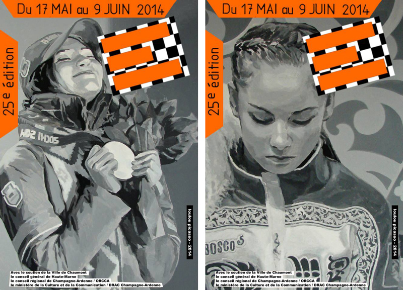
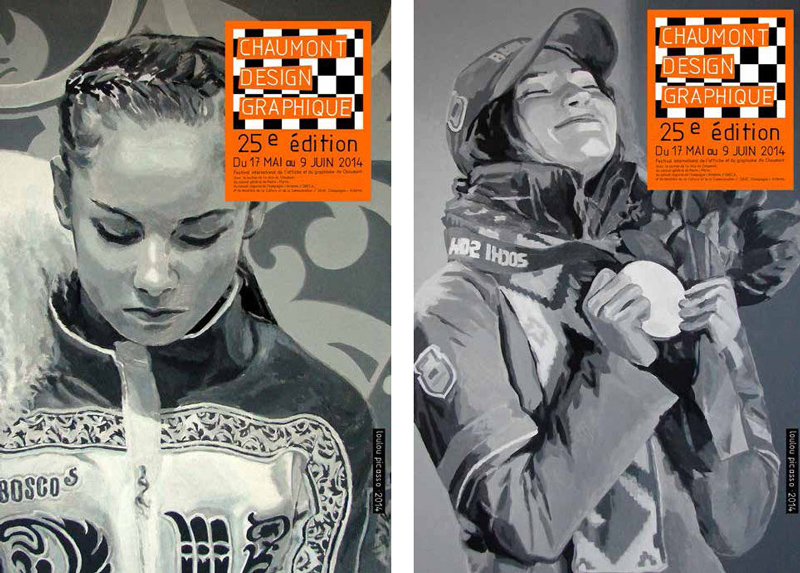
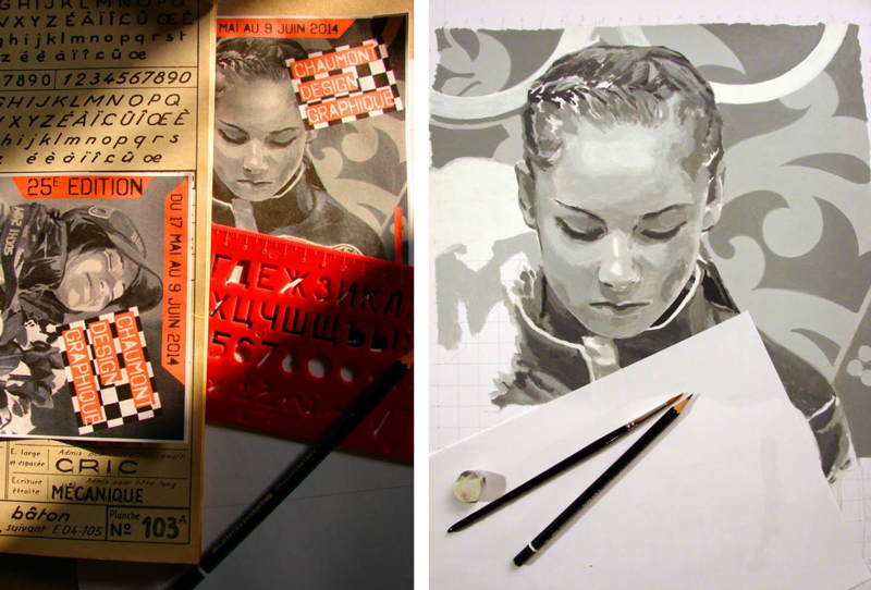
The artist-graphic designer, Loulou Picasso (ex-bazooka), therefore chose to recover and rework two images from the Sochi Olympics (so cheap ? ). A losing Russian athlete and a winning Belarusian one. This year's festival will feature two posters.
Perhaps it's a biased reading to see this as a symbolic revenge of the former satellites on Russia, erasing the defeat of the Russia-Georgia match in 2008, or even a sign of better things to come for Ukraine. With Loulou Picasso, bazookas are never far away.
We can also focus on the shifting gaze, the ironic metaphor of the competitive spirit, the finish line with its winners and losers.
We can also be taken in by the kitsch irony of this quasi-photographic look. Yet this poster is entirely hand-painted, as in the days of Lautrec.
By asserting the essential character of acting images versus witnessing images, and the responsibility of those who create or manipulate them, Lou Lou Picasso offers us a wonderful opportunity to astonish our eyes and question our minds!
We can only applaud.
Bravo !
Interview with Loulou Picasso
How did you come up with the idea ? These two portraits seem to be part of a personal artistic process, so how do you make the transition from personal work to commissioned work ?
When Etienne Hervy (Festival Director) asked me to do the poster for the festival, I first thought about what I could do that was more personal. What could I do differently from what had been done in other years ? Giving back a place to images seemed obvious to me. Reducing the role of typography too. I didn't want to use a provocative or seductive image, but one that showed an interiority. Provocative : this was expected for a former Bazooka. Seductive : it would have been a smiling, limpid "modern" look. Interiorized : it's a posture in relation to the rest of society, and victory and defeat lend themselves to it. And what image says a lot about us and the state of our society ? The sporting image, which is certainly the most fabricated, the most pampered, the most adored of all images. the most technically perfect, the most monitored and the most manipulated. This is where I find my taste for propaganda images. An image of the Olympic Games in Sochi came to mind.
For all the political ambiguities, the schizophrenia of the moment.
The image of a triumphant Belarus and a beaten Russian hopeful.
How did the client receive your work ? Did you have to argue and defend it ?
I immediately suggested the two images. There was an exchange of e-mails and telephone calls, and also an exchange of insomnia :-). (I'm always very involved in my work).
I showed the progress of my work in images.
Is the work on the series, the fact of not proposing a single viewpoint, the fruit of a reflection on the role of the poster and advertising ? Or is it just a game ?
I didn't want to show victory without showing defeat. (I really like this internalized, graphically saturated defeat).
It's a game where the victor and the vanquished are treated as equals. It's also a punk ampathy for posing.
With regard to the choice of title, from "Chaumont International Poster and Graphic Design Festival" to "Chaumont graphic design", is this a choice on your part ? Or is it a direction taken by the festival team?
I was not involved in this change of title. For me, Chaumont Design Graphique is just one element in the various technical constraints of this poster.
Is your relationship with this customer exemplary, both economically and professionally ?
This was a firm order and relations with the client were friendly and sincere, professionally and economically exemplary :)
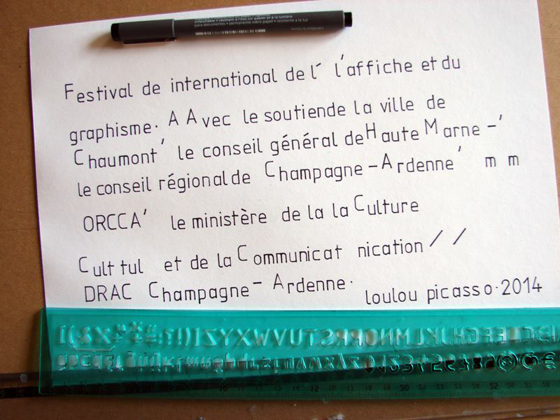
Below are a few sketches posted on Loulou Picasso's Facebook page.
Picasso, with a bazooka!
A founding member of the provocative Bazooka collective, Loulou Picasso, whose real name is Jean-Louis Dupré (so nothing to do with cars), is, along with his acolytes Kiki Picasso (nothing to do with perfume) and Olivia Clavel, a major figure in avant-garde and underground graphic design.
With their collective, they dynamited the press in the late 70s, Libération, Actuel, Métal Hurlant...
Trained at the academy of artists and painters, the group quickly moved its work out of the academic realm and into public and media spaces.
"We were at art school, fascinated by communication and the media. We wanted to get into newspapers to show our painting, to make them a field of experimentation. We wanted it to be prettier. We had to be cunning !"
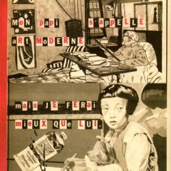
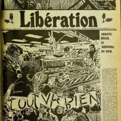
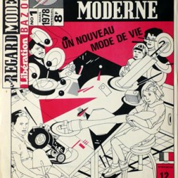
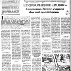
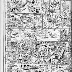
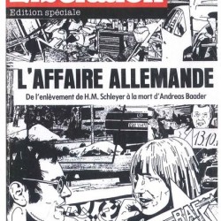
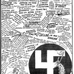
At the height of the counter-culture, in the vein of the subversive punk movement, they joined the editorial staff of Libération in 1977. "We stayed six months. We wanted to replace all the photos with graphics, revisit the layouts. We revisited the images, which we photocopied, looking for drawing tricks. It was a kind of topical painting. After six months, Serge July offered us a monthly supplement, "un regard moderne" . We sold 8,000 copies; we should have sold 12,000. We stopped after six issues...".
Here are a few examples of their work at Libération.
Graphic activism
The Bazookas continued their work in various areas of the press, followed by comics and music publishing, for which they produced numerous record sleeves and posters, before, for some of them, infiltrating television, cinema and galleries. The collective came to an end in 1980.
It wasn't until 2001 that "un regard moderne" was reborn on the Internet, still intent on seizing the news by hijacking press agency images. AFP even sued them for piracy in 2003.
"We were Donald's nephews getting into history painting... It made the Picasso family laugh, until Paloma Picasso cosmetics thought it wasn't so funny".
I understand that from 2006 onwards, "un regard moderne" will once again be a more personal blog. Today, Un regard moderne presents both the eponymous bookshop (see this Gonzaï article) and the work of LouLou and Kiki (and others...). Don't ask me why the site is in Japanese, I'll tell you it's out of a "desire to p#ss people off".
Correction: Loulou Picasso sheds some light on the history of the site in japanese in the comments to this article.
In 2009, to mark the release of a joint work by Kiki and Loulou Picasso, Artnet produced the short video below.
It's a good introduction to their work. It is an opportunity to put a voice and a face to two great figures in graphic design !
To find out more about Bazooka : http://www.le-terrier.net/albums/bazooka/
PS: Remind me to add "Bazooka" to our "big names in graphic design" section !
Share this post:


 San Serriffe typographic Island
 Design, creativity and oblique strategies!
 Tote bag, a new social totem?
 Sister Corita Kent, the Pop Art nun
 Donald Trump, the martyr who makes history
 Paris 20th district City Hall – Visual identity
 Carbone4 – Visual identity
 City of Ferney-Voltaire – Visual identity
 UNAF, National Union of Family Associations – Visual identity
 Museum-Memorial of Terrorism – Visual identity
 Typorama #05 : Times after time
 ebay’s new identity ebayit nobody!
 Uncle Bens’, Aunt Jemima… racist packaging rises up
 Vectorial illustrations for the World Economic Forum (WEF)
 Turkish graphics
Leave a Reply