C’est Noël ! Le Parti Communiste change de logo !
It’s Christmas at the French Communist Party!
On the occasion of its annual congress, the French Communist Party (PCF) has just given itself a little present: “A new logo!”
This is an event, since the previous logo dated from 1990. At the time the graphic revolution had consisted in the abandonment of the sickle and hammer.
Welcome to 2018. The ecology invites itself to the program, and a small leaf (red?) comes to top the head of the small star.
Decoding the logo
Well, then it’s simple, take a red star and cross it with an apple, red of course, you will get this logo. The process is simple and classic, the result ditto. To tell the truth, graphically, this logo has nothing transcendent, without being condemnable. Well… yes. We would like to be transcended precisely!
The short film of presentation will explain you all that this logo is supposed to summarize. The human, the commitment, the ecology, the time of cherries, the progress, the star, the open France… Let’s note some clumsiness, like this arrow illustrating the idea of progress that points to the past!
The fact remains that, apart from ecology and the communist star, we can’t say that we see much else. Nothing that echoes the PCF’s promise “people first”.
As for typography, we can’t say that the choice is striking either. A “Gotham”-like linear. Zero risk. Nothing else to say.
As for the color… the new red is brighter. Unless it’s a bit like putting water in your wine?
A logo made in-house
It is the communication team, led by Julia Castanier, who designed this logo. For this, they “questioned outside (the) walls” of the PCF on what is lacking in the image of the party. “The PCF does not suffer from a lack of notoriety, but where it becomes more complex is when we ask about our image. They say we are not strong enough, not identifiable enough, not visible enough and especially not modern enough,” said Fabien Gay, senator of Seine-Saint-Denis. We are all convinced of the modernity of our fight, of the modernity of communism, of its urgency even in front of this crisis which crushes the human and destroys our planet then it is up to us to make the demonstration of it“, he continues.
In summary, “our image is associated with the twentieth century, we must move …” !
Merry Christmas ?
As surprising as it may seem, Santa Claus does not dress in red because of Coca Cola! Santa Claus was a communist! And yes, you have to know that! Besides, he distributes his gifts to everyone, in a perfectly equitable way, and without borders.
Let’s stay in the analysis of the logo. Without any far-fetched digression please !
When you see this logo, you think of the kind of little star that you hang on the Christmas tree. With this small golden wire loop. It’s a cute image… However, we are far from the urgency of the mobilization in front of the social and environmental crises…
In fact, it’s like Christmas, we are often disappointed by the gifts.
How to turn red green?
– “Well, dear comrades, we have a problem, the “greens” are beating us at every election. What do we do?”
– “Let’s do like Mac Donalds, let’s add some green in our red logo!”
– “Uh… won’t that make it goose poop brown?”
– “Then let’s put a leaf! Like the Montreuil logo!”
– “Good idea! It will be a bit Apple! The Apple logo is modern!”
We will have understood it, the question of ecology will have caught up with all the political parties. We are in 2018. The causes of global warming have been identified for over a quarter of a century. Everything is fine.
In fact, the main criticism of this logo is that it is 20 years out of date, instead of 20 years ahead of its time. If it were a logo for a Christmas party, it would be fine. But here, damn! It’s the communist party after all! 100 years old, two world wars, and ideals that still resonate fiercely. These notions of common goods, creative commons, sharing society, universal income… don’t they all derive from communist (and socialist) ideals?
A left-handed graphic…
We were waiting for a visual identity that was worthy. A project that sends a strong message. Something that makes you dream, that draws an imaginary to all these left-wing ideas. And not a nice little logo.
The strength of a sign is not in what it tells immediately, but in all that it can reveal… We will speak of a “fertile” sign, of a sign that opens up possibilities, that makes people dream, that builds around itself an imaginary world that is greater than itself.
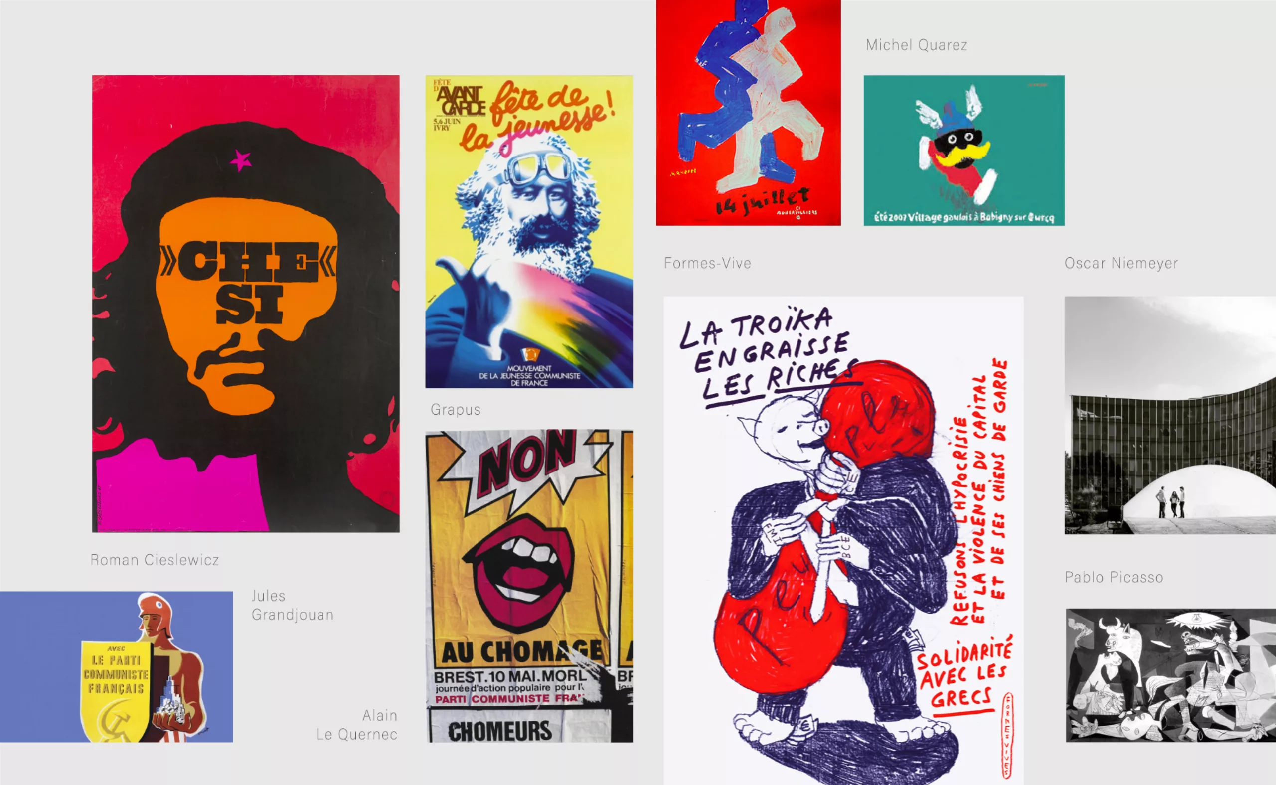
There was a time when the communist party had a real graphic vision. A time when the greatest artists, architects and designers were called upon to put their ideas into images. Guernica was commissioned by the Communist Party from Picasso. Oscar Niemeyer, the PCF commissioned him to draw the plans for its headquarters. Roman Cieslewicz, he was entrusted with the artistic direction of a newspaper. Grapus will be posters. Michel Quarez, never leaves the red belt of Seine-Saint-Denis. And more contemporary, the collective Formes Vives which accompanies the movement “Black Thursday” …
So, yes, next to this long graphic history, this little star logo seems quite pale!
If we disregard all that, then it’s not a bad logo!
At least as inspired as the PCF candidate’s posters for the European elections.
The sickle and the hammer
A little history…
It goes without saying that the sickle and hammer are legacies of the Russian revolution of 1918. But the history of the creation of this symbol is not well known.
It is 1918. It is winter. The Council of People’s Commissars is wondering about its emblem, there is no talk of a logo yet. At this stage of the revolution, many images are circulating. The artist Yevgeny Kamzolkin is chosen to work on this symbol. He proposed a first project, with a sickle, a hammer and a sword. Of course, every graphic designer knows that his client always has an opinion on the thing. Here, the client is Stalin. And he asks, in a rare pacific impulse, to remove the sword. Too warlike for his taste.
Sickle. Hammer. The symbolism is well known. The hammer for industry. The sickle for agriculture. The industrious people have their emblem. But we also forget that this symbol represents the alliance of man (hammer) and woman (sickle). Indeed, the sickle was the tool intended for the women, the men using the scythe. In short, gender equality was already taken seriously!
The icing on the coconut cake (edit of 11/29/18)
And since a visual identity can not be limited to a logotype, I suggest you discover the icing on the cake, ie the design of campaign posters of Ian Brossat, leader of the PCF for the European elections of 2018.
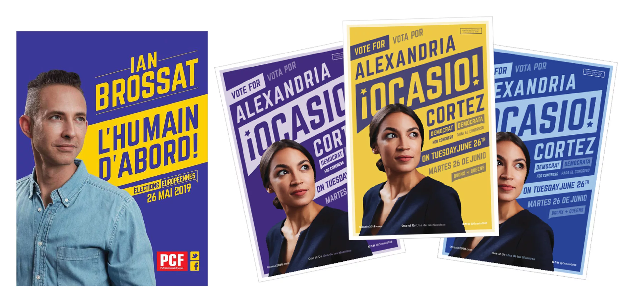
All the graphic codes of this communication – photo, typos, colors and layout, are a copy-paste of the midterms election campaign of the American Democrat Alexandria Ocasio-Cortez. For those who are curious, I invite you to read the excellent article of the BrandNew site on this subject.
Portrait cut out on flat areas of yellow and purple colors, typography inclined in a style “impacting” and expressive advertising. We are close to the plastic codes of constructivism (or wrestling matches?) and more particularly to the famous compositions of Rodchenko. It is interesting to note that these visuals share very little in common with the new logo of the French Communist Party. The absence of the color red is even very surprising. But then how can we claim a new visual identity if there is no conceptual and graphic connection between the logo and its graphic charter?
The most striking thing about this story is the admission of failure in copying what works elsewhere rather than creating its own visual territory, its own imagination. It’s a terrible proof of a lack of vision, and plagiarizing Americans when you’re a French communist, that’s the last straw!
On the subject
-
Pierre Bernard & Grapus, “Graphic design of public utility”, 1942/2015
Pierre Bernard & Grapus. Collective and individual itinerary of a committed graphic designer, tireless defender of the notion of public utility in graphic design.