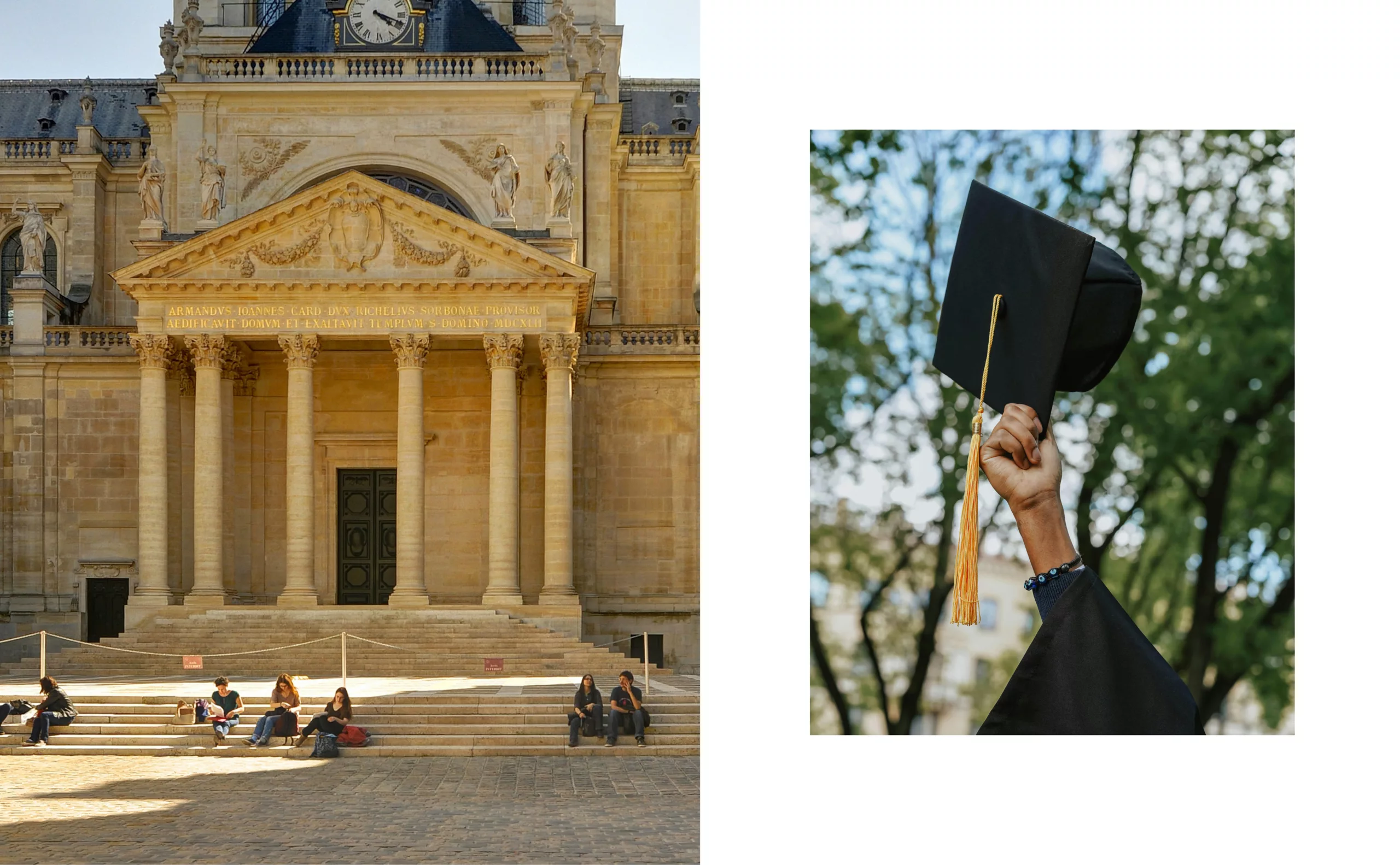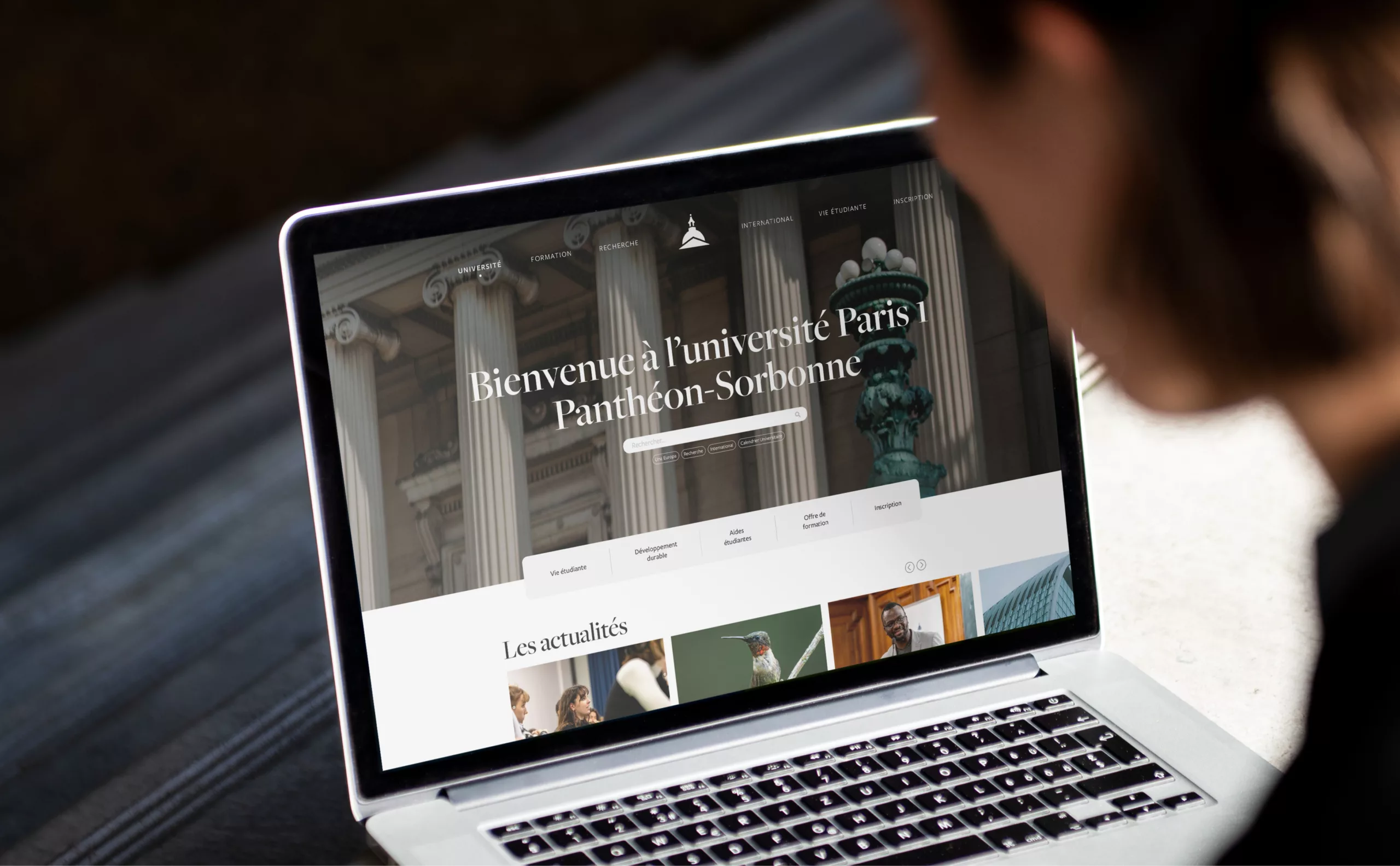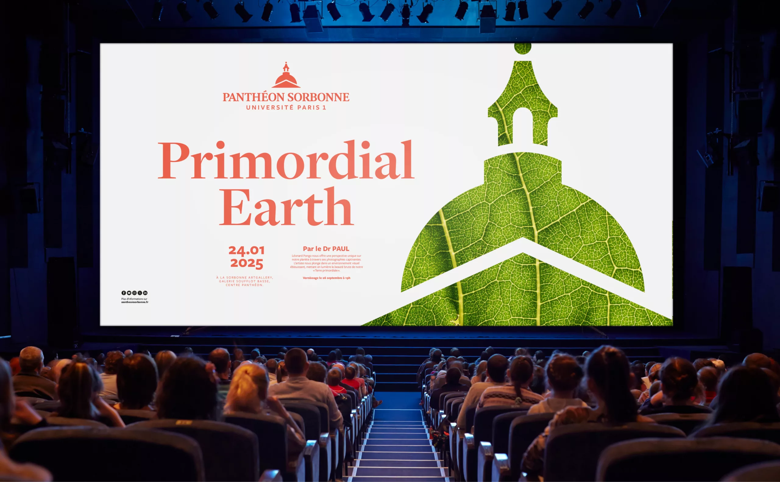
In 2024, Graphéine helped Université Paris 1 Panthéon-Sorbonne update its graphic guidelines. The design brief required a review of the logotype’s responsiveness. Université Paris 1 Panthéon-Sorbonne has a unique heritage, combining a classical, conservative past with an innovative, revolutionary spirit. Two characteristics that make up the university’s history.
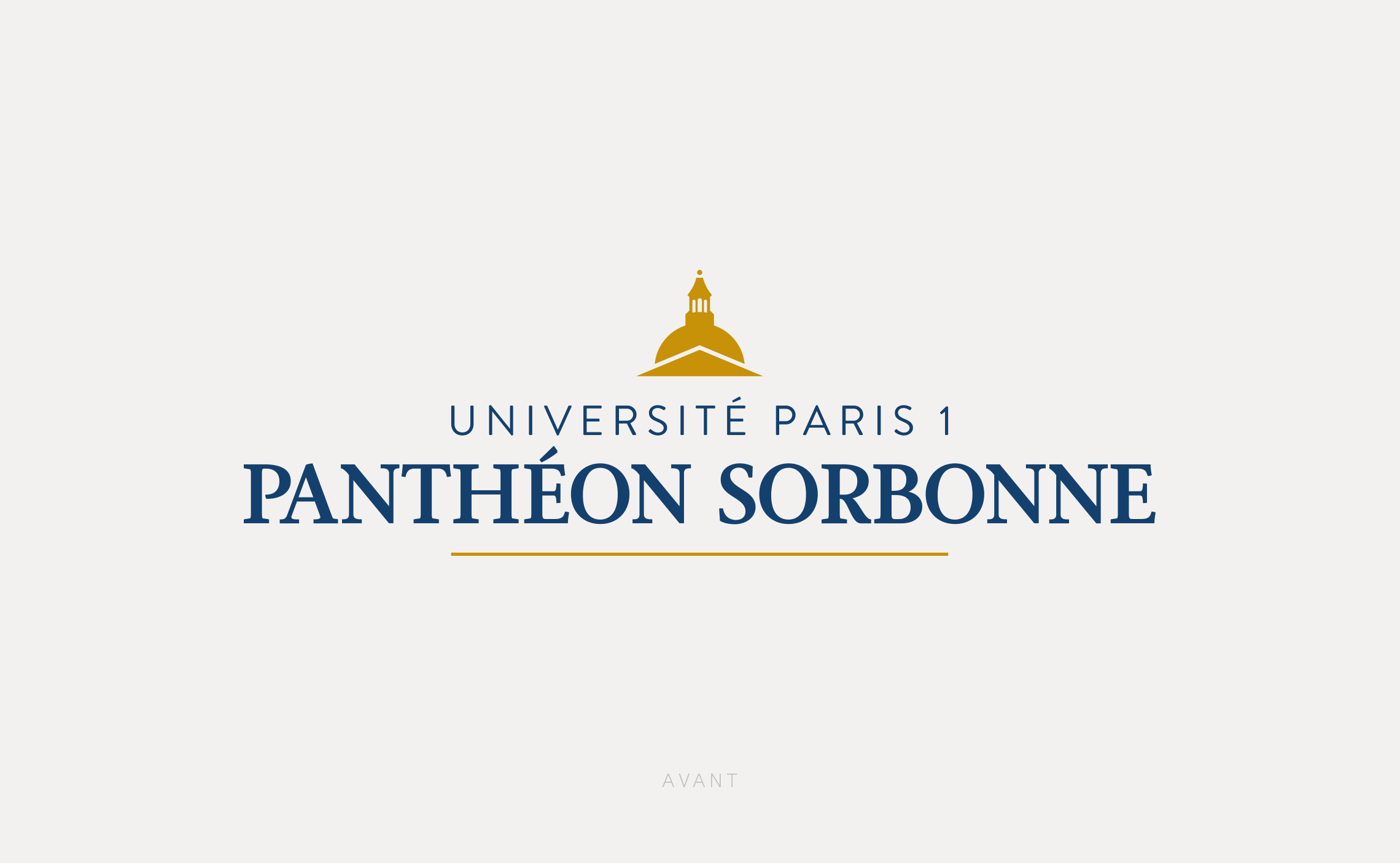
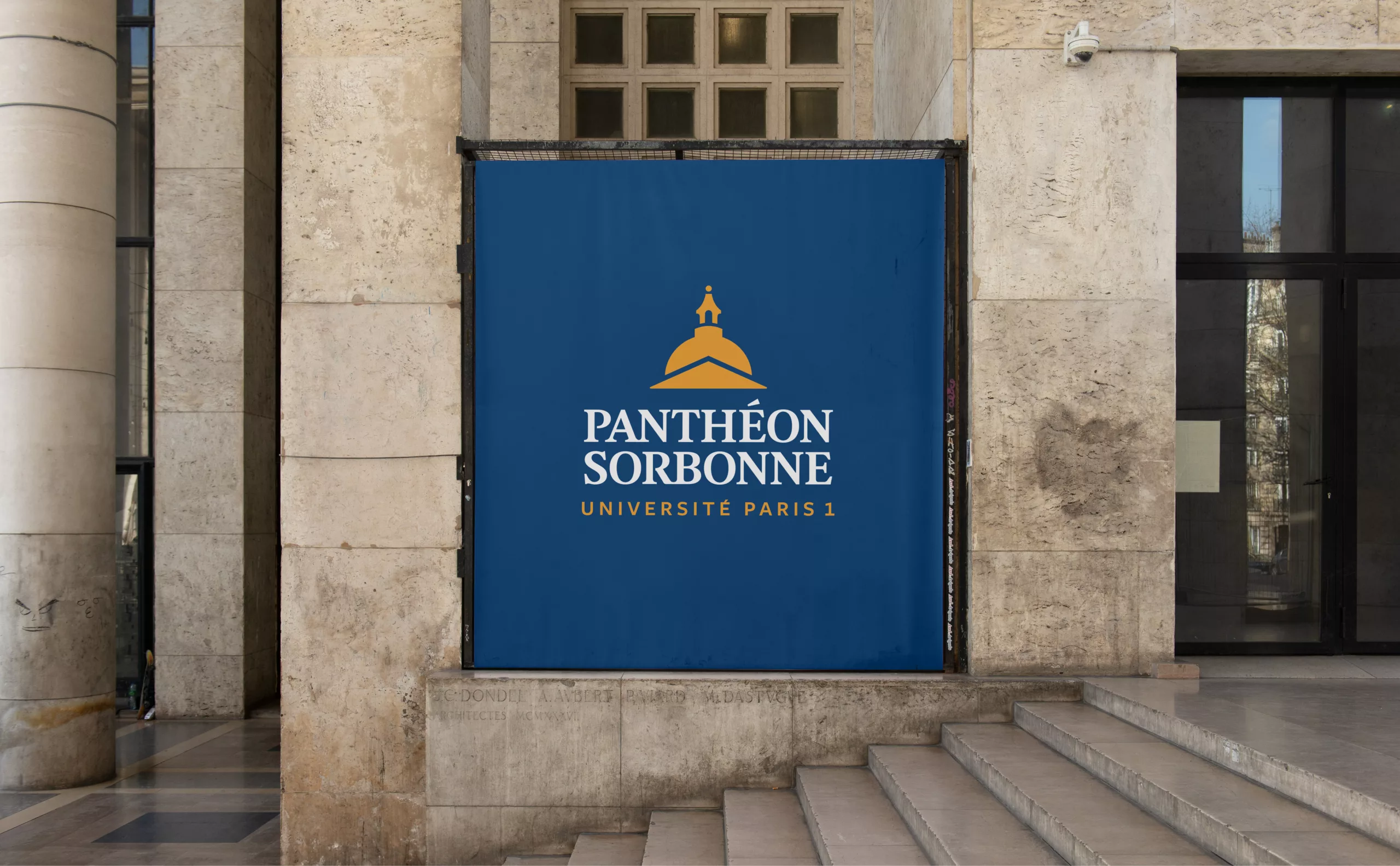
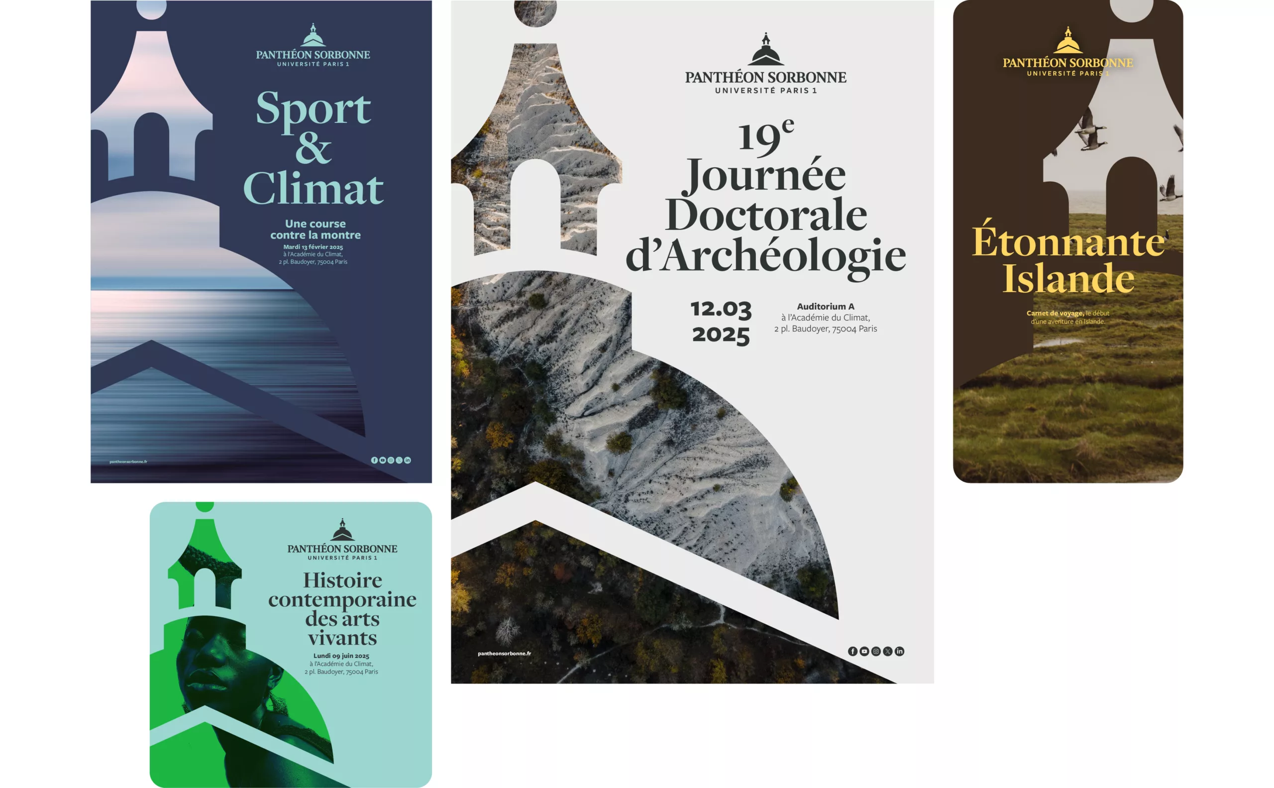
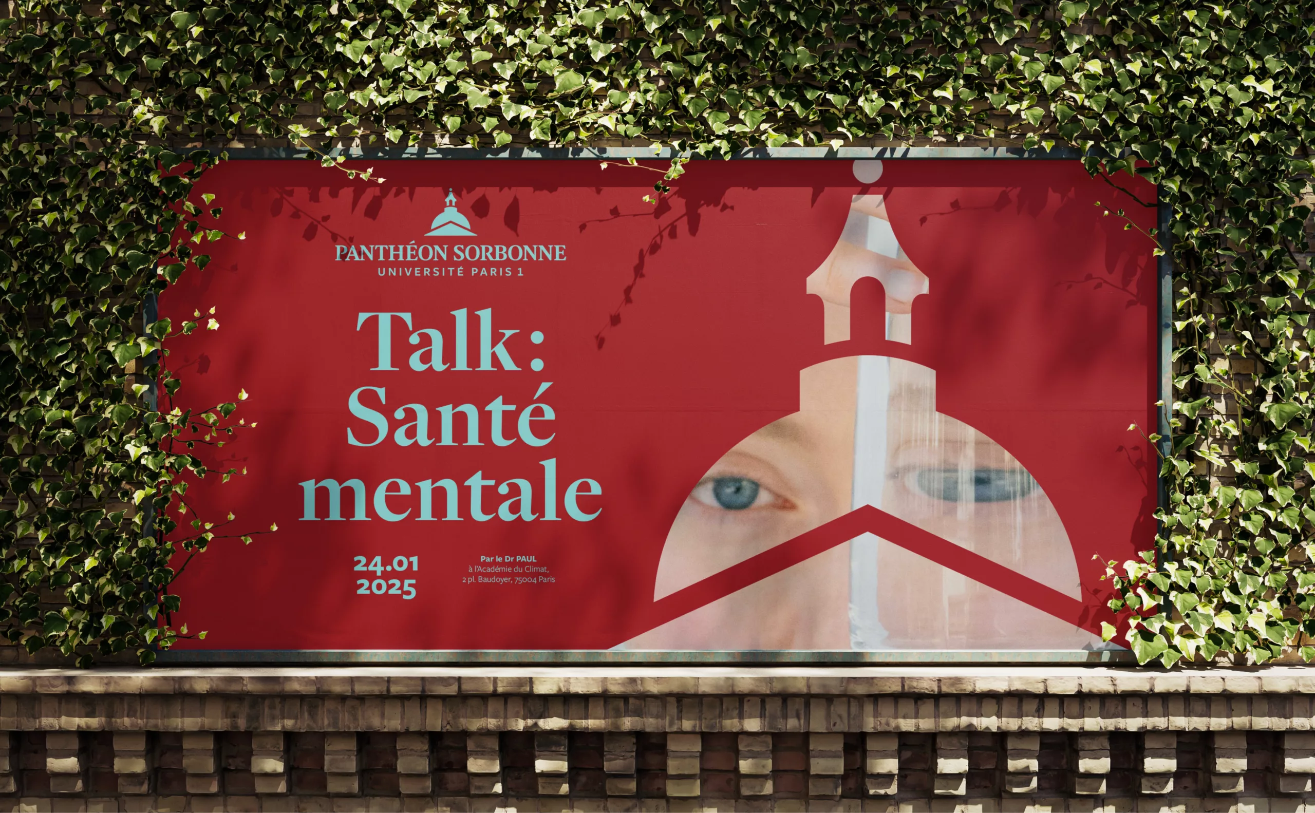
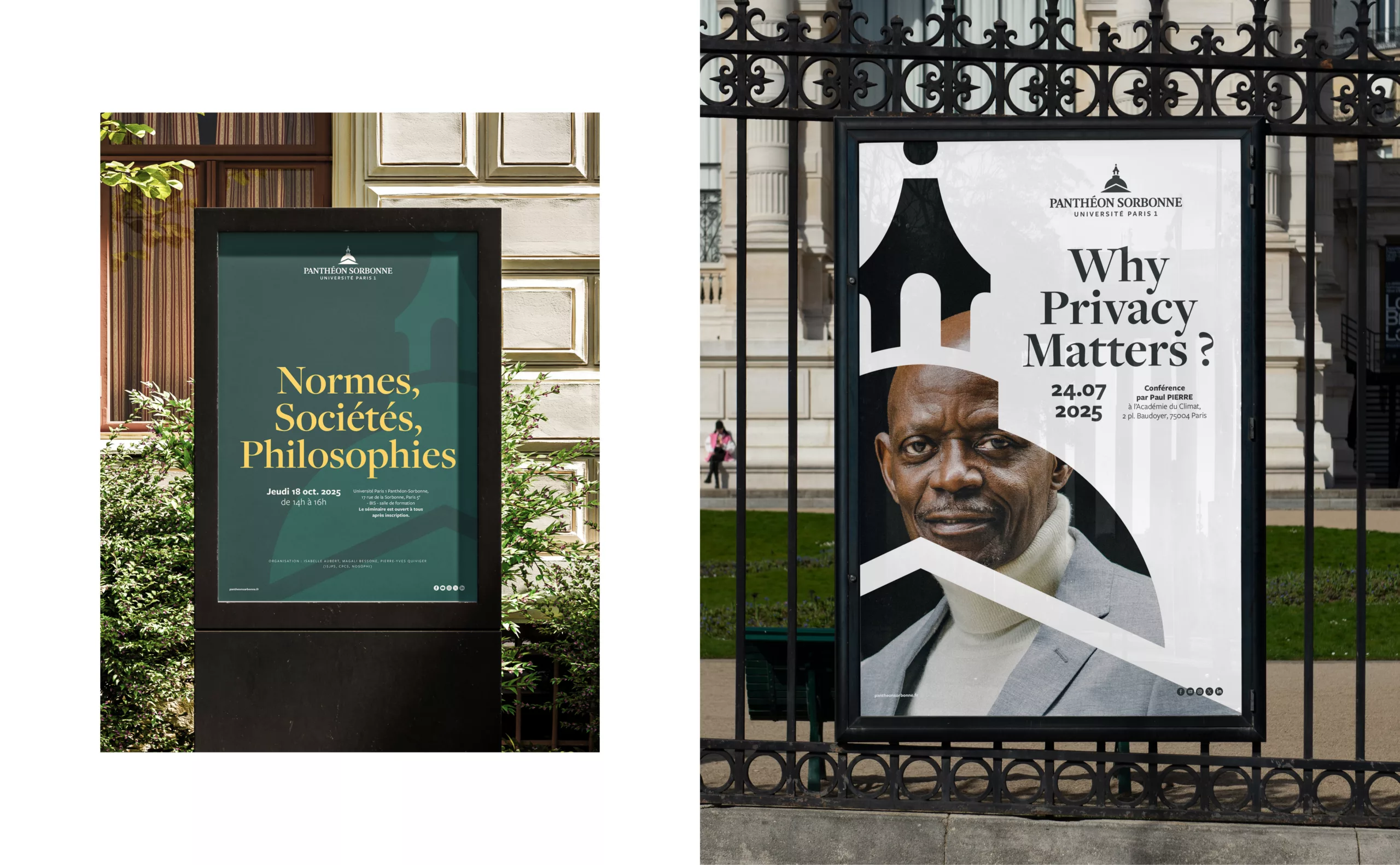
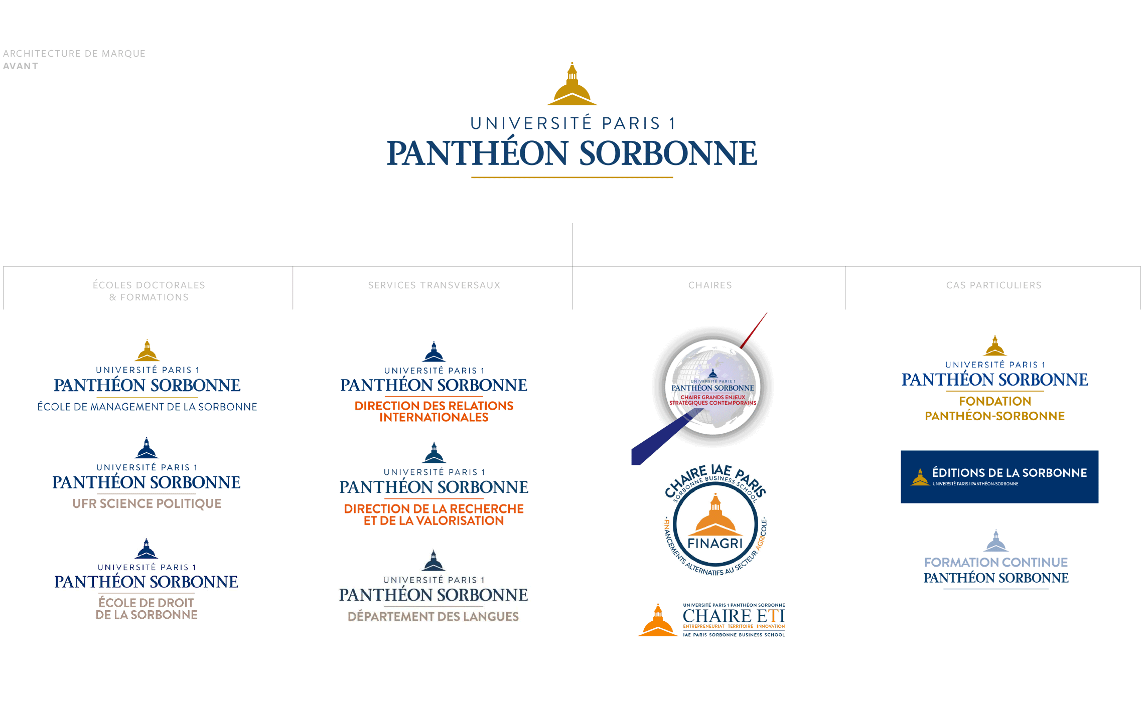
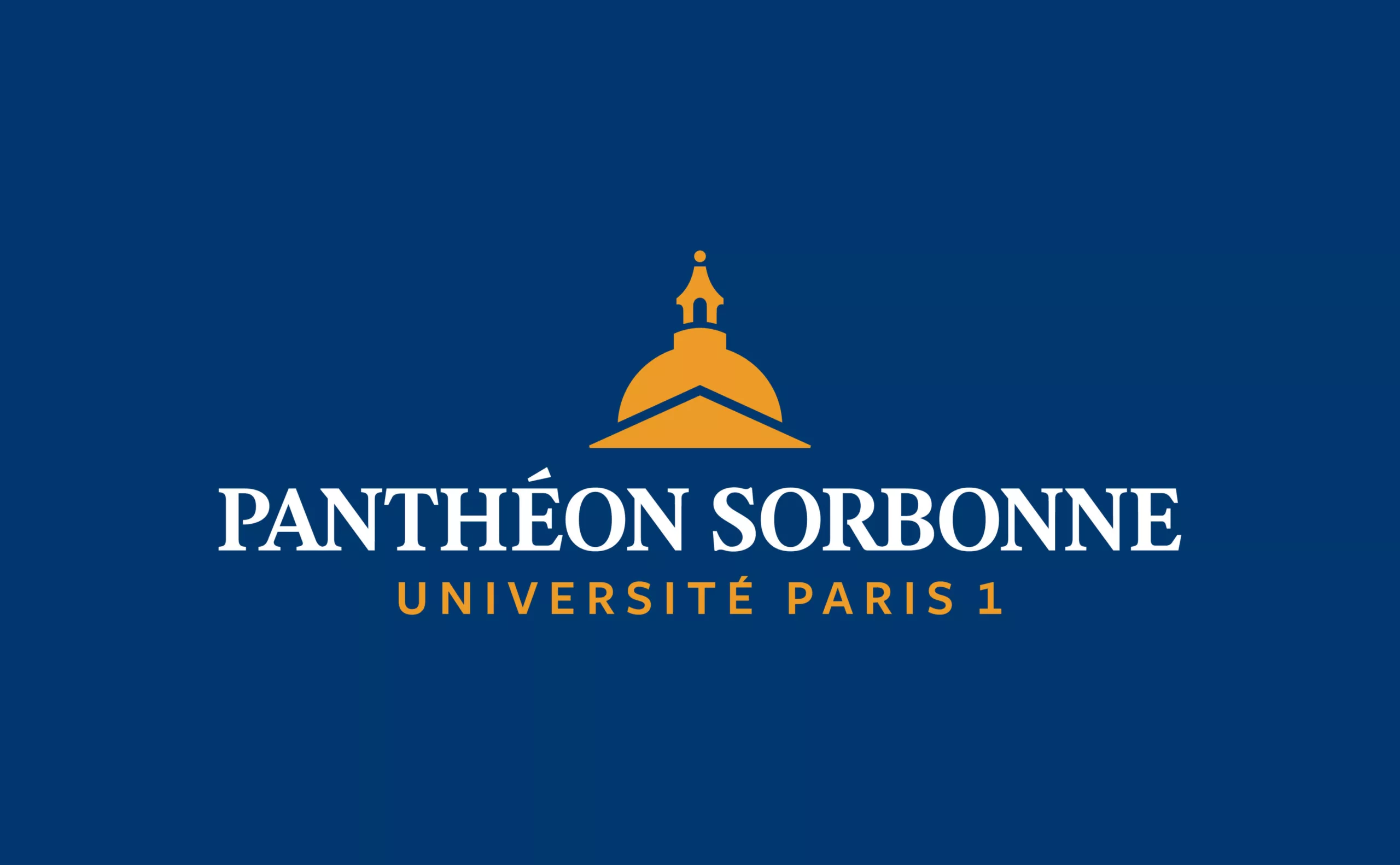
An initial audit of the existing identity revealed a severe cluttering of the university brand. Several versions of the wordmark and emblem were being used simultaneously, weakening the Panthéon-Sorbonne brand even internally. To optimize the size of the wordmark, we redrew a customised version of the lettering. The wordmark’s original academic and institutional style was retained. Each letter and all the ligatures were crafted to arrive at a legible and compact logo.