02_FRS-logo-identite-visuelle-branding-signe-design-strategy-thinktank

2024

FRS — Fondation pour la recherche stratégique
A forward-looking visual identity

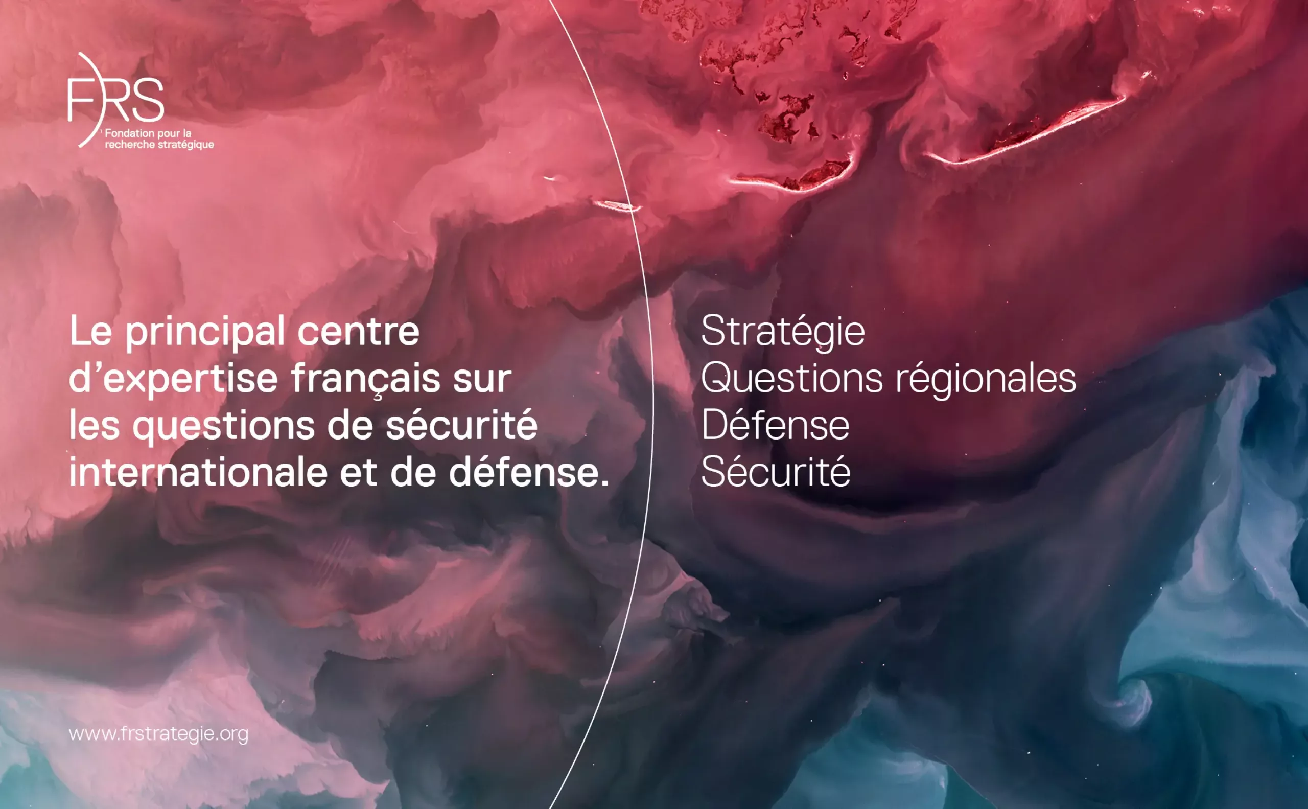
The Fondation pour la Recherche Stratégique (FRS) occupies a central and inescapable position in the global geopolitical landscape. Since its creation in 1992, it has been committed to the meticulous study of the complex issues of international strategy and security, with particular emphasis on the crucial questions of defense and military affairs.

As the only major independent French think-tank specializing exclusively in these specific fields, the FRS stands out in the French intellectual panorama. Its mission extends beyond national borders, helping to enrich international dialogue on issues crucial to global peace and stability.

Recognized as a non-profit organization, the Foundation stands out for its ideological impartiality, fostering an environment conducive to the exchange of diverse and varied ideas. It encourages a plurality of opinions, provided they are based on a rigorous scientific and intellectual approach. As a committed player, the FRS takes an active part in debates, conferences and broadcasts, sharing its expertise and helping to inform political and strategic decisions.

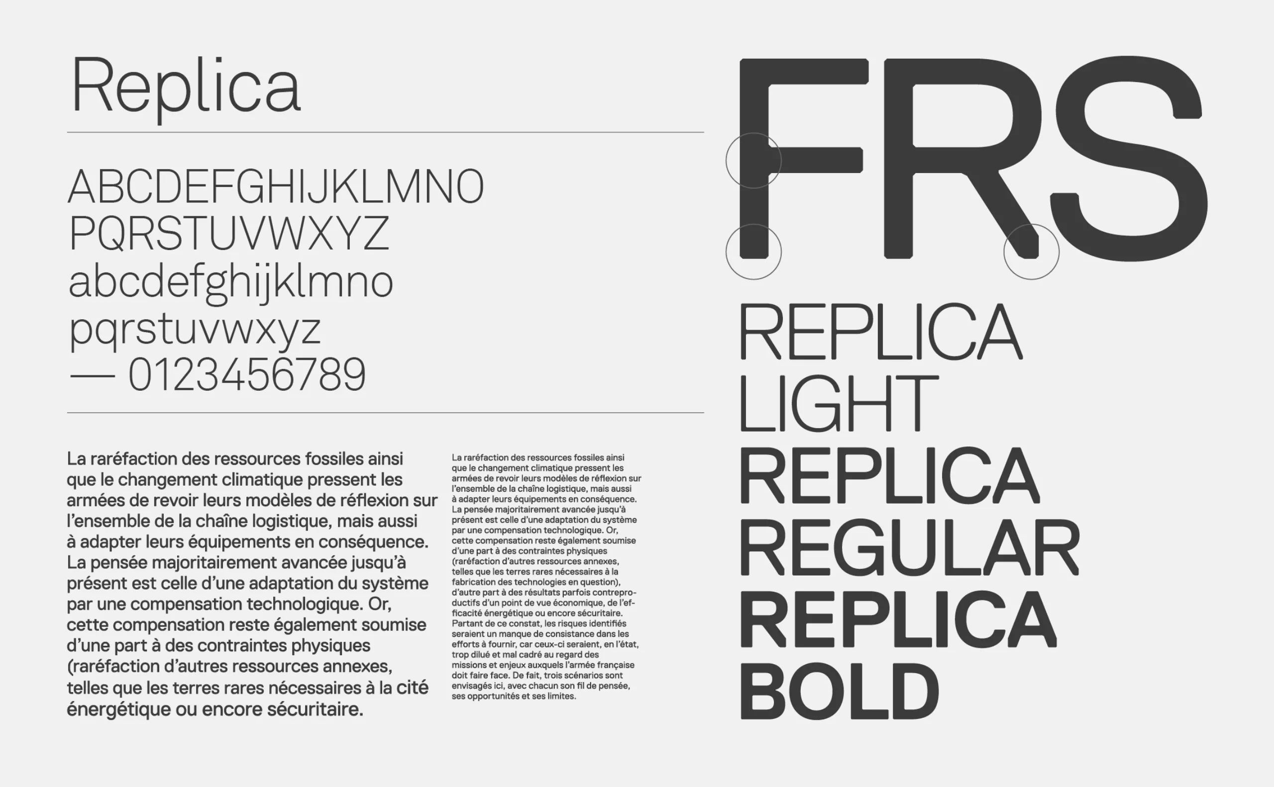
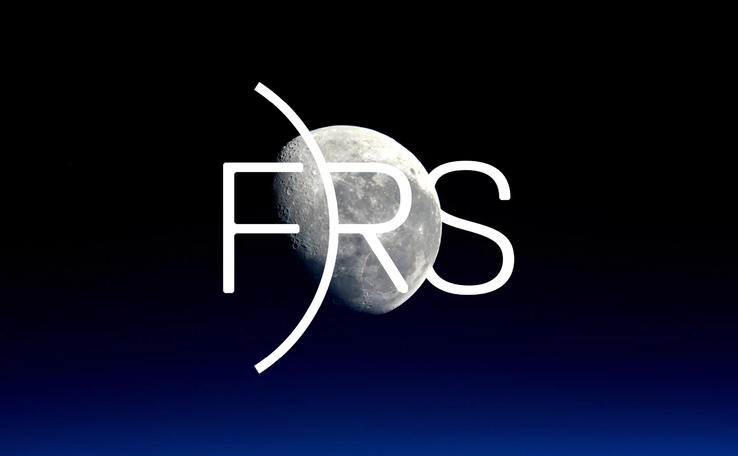
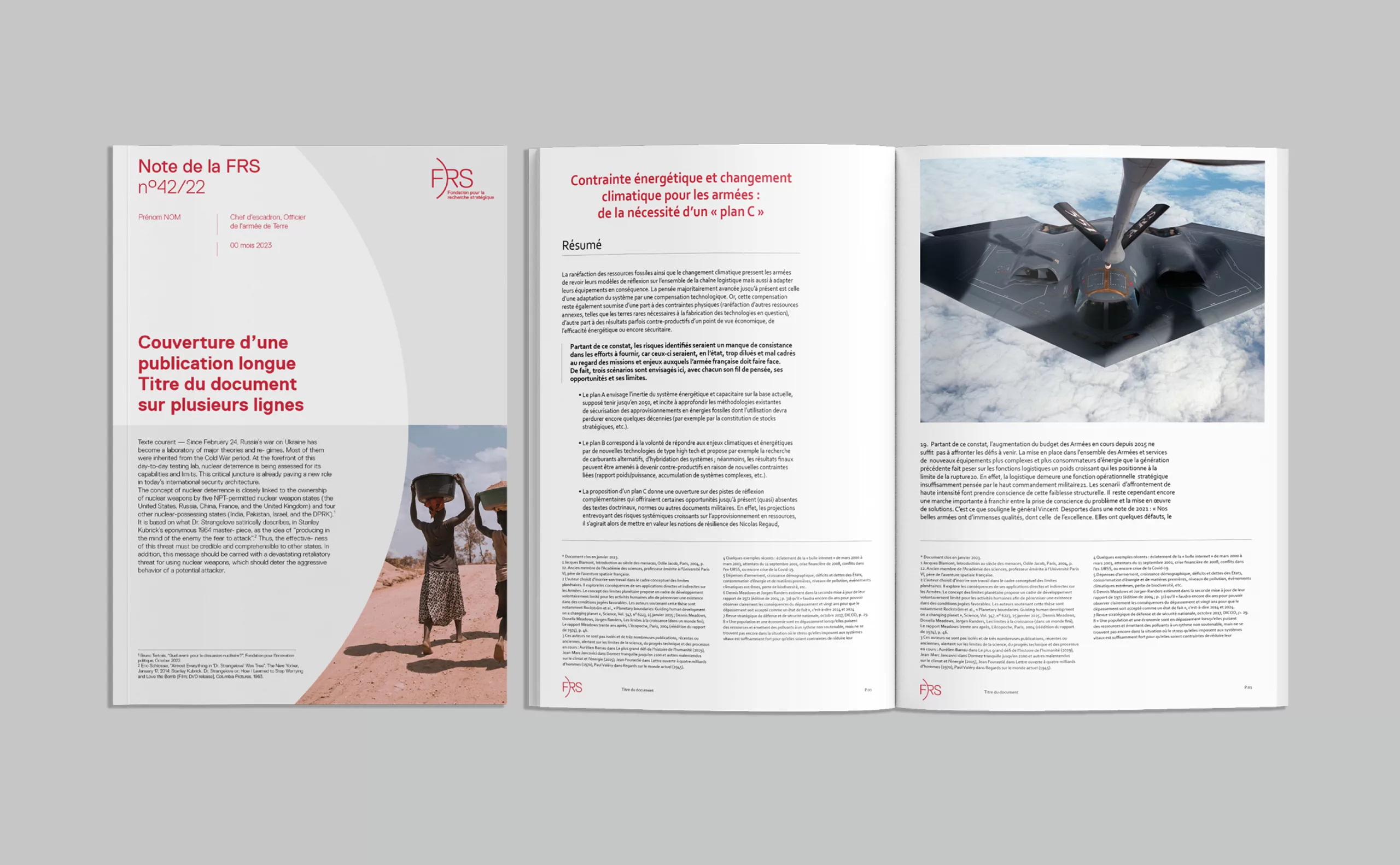
As part of its drive to strengthen its impact and influence, the FRS has collaborated with the Graphéine agency to redefine its positioning and develop a new visual identity. This approach aims to authentically reflect the values, expertise and current and future challenges facing the foundation. The new image reflects the FRS's ongoing commitment to remain at the forefront of strategic thinking and to promote international security and stability.

The visual identity of the Fondation pour la Recherche Stratégique (FRS) maintains its distinctive color, red, while the acronym "FRS" is brought to the fore to ensure clear identification of the issuer. In our design approach, we sought to give this symbol a deeper meaning. We drew a circular arc between the letters "F" and "RS", representing the international scope of the organization. This motif also evokes the notion of vision, symbolizing constantly evolving, forward-looking expertise.

The arc of the circle, together with the Replica typeface, form the key elements of a thoughtful communication system designed to structure a wide range of publications and other documentation media. This carefully designed visual identity aims to reinforce the FRS's coherence and recognition, while underlining its commitment to high-quality strategic research and its influence in international debates on security and geopolitics.

The visual identity of the Foundation for Strategic Research (FRS), designed by Graphéine, is deployed consistently across a multitude of communication media. Whether in our brochures, our website, our social networks or other channels, this visual identity conveys our essence and values in a uniform and recognizable way.

This visual consistency not only reinforces the recognition of the FRS, but also underlines our commitment to quality strategic research and our influence in international debates on security and geopolitics.No matter which medium you consult, our visual identity ensures an immersive and informative experience, inviting you to join our mission with confidence and clarity.


Share this project:
Project expertise:
Publishing design, creation of magazine and brochure layouts. Logo creation, visual identity and graphic guidelines.
Type of client:
Communication agency in the consulting and services sector. Strategy or management consulting, operational consulting, digital services companies (ESN) formerly SSII or SS2I, but also all services to companies, or "B to B services" (for business to business).

Related projects: