The new graphic charter of the Olympic Games
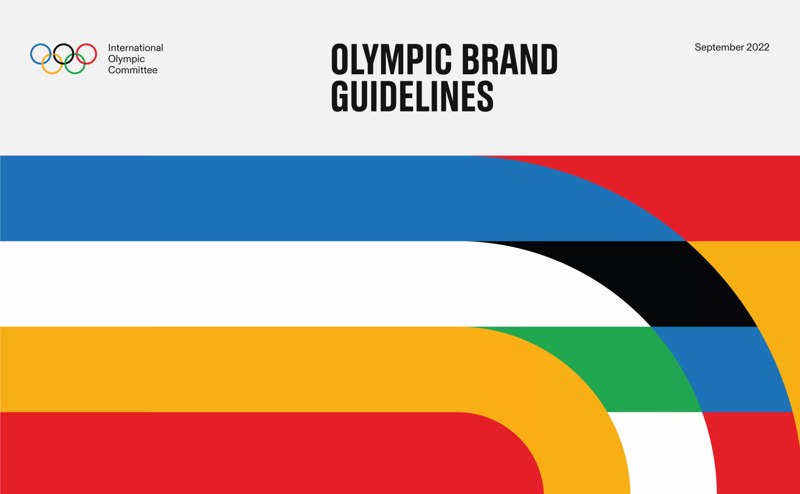
The International Olympic Committee has recently asked the Canadian agency Hulse & Durrell to design the global identity of the Olympic Games, in order to harmonize its visibility in all countries and on all communication media, to “build a better world through sport”. A work that had never been done since the creation of the modern games, in 1896! The five interlaced colored rings are however one of the most famous marks in the world: it is the proof of the strength of this symbol, simple and universal, today revalorized.
The inventor and history of the Olympic Games logo
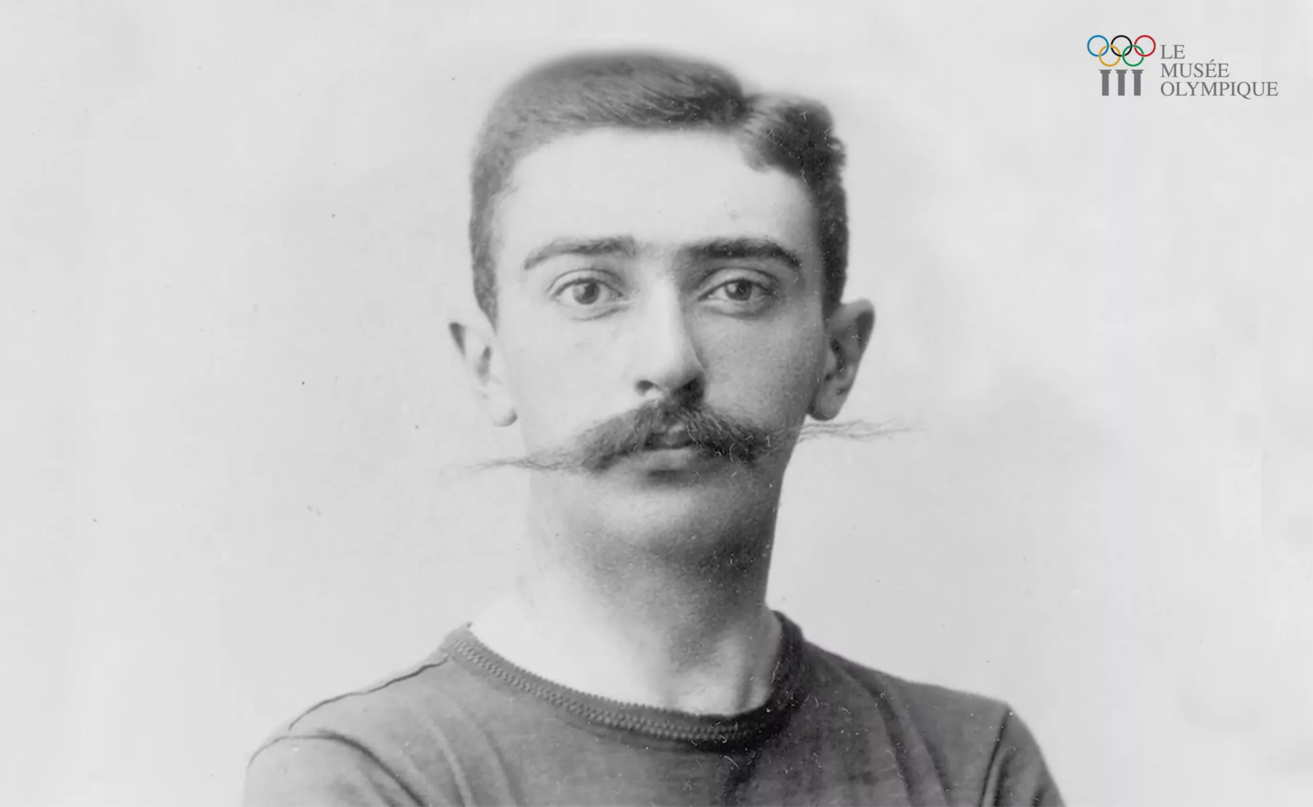
We owe the symbol of the rings of the Olympic Games to Baron Pierre de Coubertin who created it in 1913. Pierre de Coubertin was an aristocrat with a beautiful moustache, as straight as a foil, with a free spirit and a passion for sport and education. His wildest dream was to revive the Olympic Games, to engage the practice of sport for all men regardless of their profession and country of origin (but only men; he was opposed to the practice of women in high-level athletics until the end of his life) but also to ensure peace between nations through this sporting union that allows them to confront each other on the field and not on a battlefield. The Baron also participated in the introduction of sports in schools, to spread the Olympic values -respect, excellence and friendship- in society.
De Coubertin created the International Olympic Committee (IOC) in 1894 and two years later the first games were held in Athens, in homage to the country of origin of the ancient Games. It is moreover because the committee of creation is born in France that the official language of the Olympic Games is and will remain the French, associated with the English. In 1896 the Games do not have yet a logo. But Pierre de Courbetin is also general secretary of the Union of the French Societies of Athletic Sports, whose symbol, two interlaced and flat blue and red circles, will inspire him the famous logo of the Olympic Games that we know today. By spacing the two circles, he adds 3 others, on two rows, as explained in the video below.
Five rings and five colors to unite people
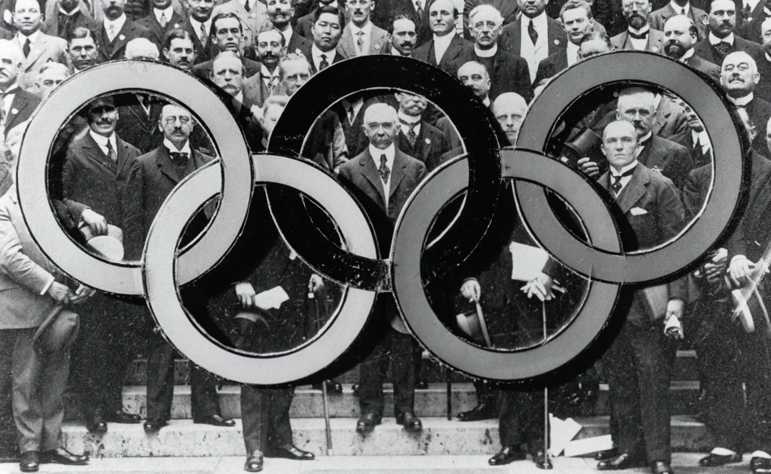
The flag with the five colored rings was designed by de Coubertin in 1913 and presented for the first time in 1914 in Alexandria for the 20th anniversary of the IOC. It will be hoisted during the Games of Antwerp in 1920, the first ones after the first world war. The 5 rings represent the meeting of the athletes of the 5 continents linked through the competition and the celebration. They form the graphic symbol of union, universality and unity. The circle is a highly symbolic shape because it is one of the oldest in the world : it is, like the circle, the symbol of completeness, union, perfection and balance. The rings here are interlocked like links in a chain, or medals. The colors refer to the colors used in the flags of the participating countries, so that they can find at least one color of their own country.
The symbol is taken again every 4 years by the countries of reception of the Games, and it knows some small variations, that the IOC normalizes from time to time. In 1957, the arrangement of the rings is officially revised to space them in a symmetrical way, and in 1986 their tangle lets appear a small space, which will disappear in 2010. In 2020, the IOC decided to create an official identity for the Olympic Games to ensure the universality of its image and a standardized use on all communication media.
A new universal identity for the Olympic Games
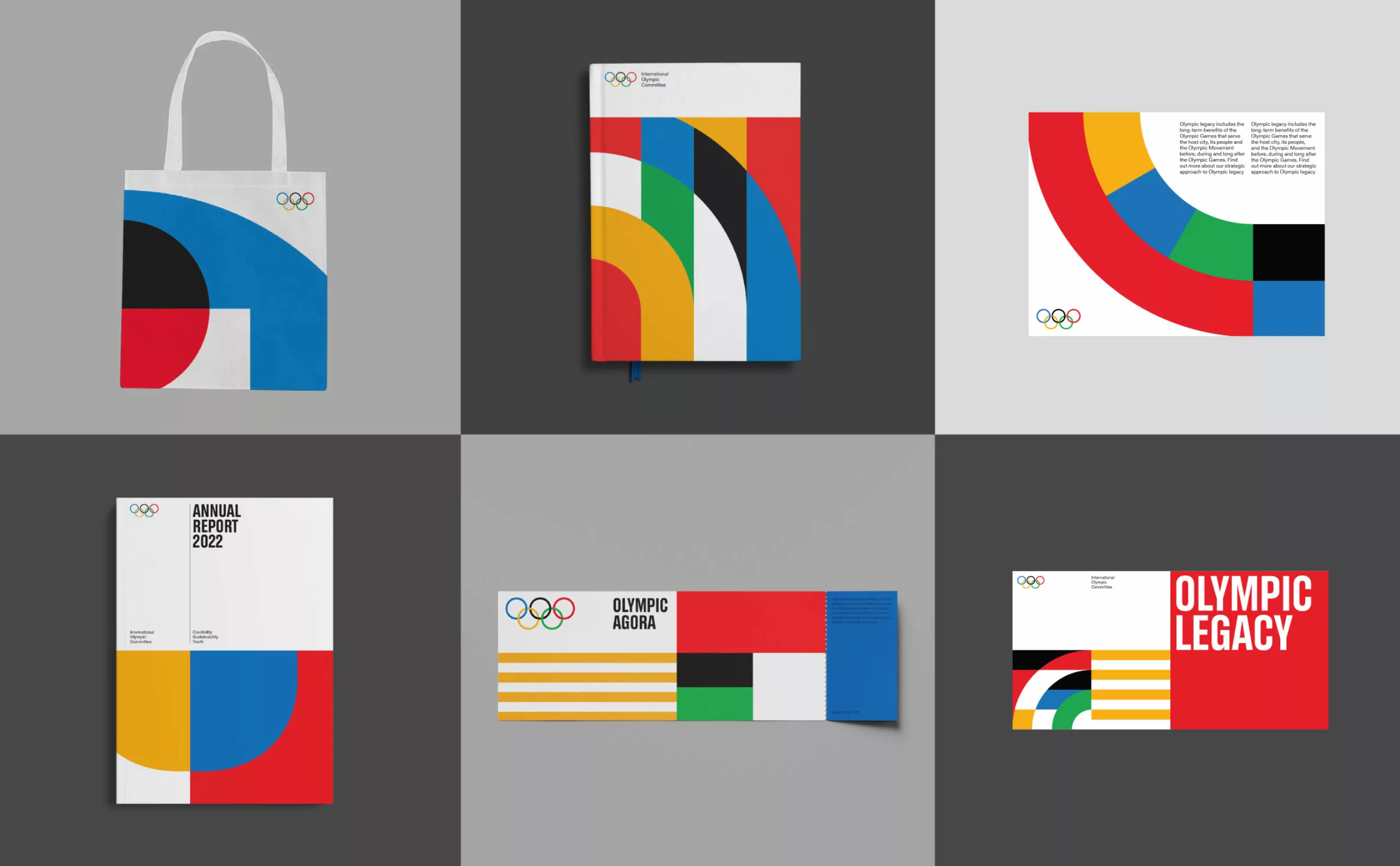
The new identity of the Olympic Games does not look so new, because everyone already knows the codes and colors, and has nothing revolutionary. But it finally makes its use universal, both by the people and on all communication channels. “For 125 years, the Olympic Games have carried a message of inclusion, universality and hope. It was time to bring these timeless values together in a comprehensive visual identity for the Olympic brand that is present not only during the Games, but also between editions,” said Marie Sallois, IOC Director of Brand Management.
The Canadian agency Hulse & Durrell worked on the creation of a universal identity “inspired by our heritage” based on the golden age of Swiss graphic design, with a “consistent and flexible” grid system, geometric shapes and pictograms, adding modern variations such as illustrations and three complementary typographies, which can be used on the Olympics website and mobile app.
A Swiss style
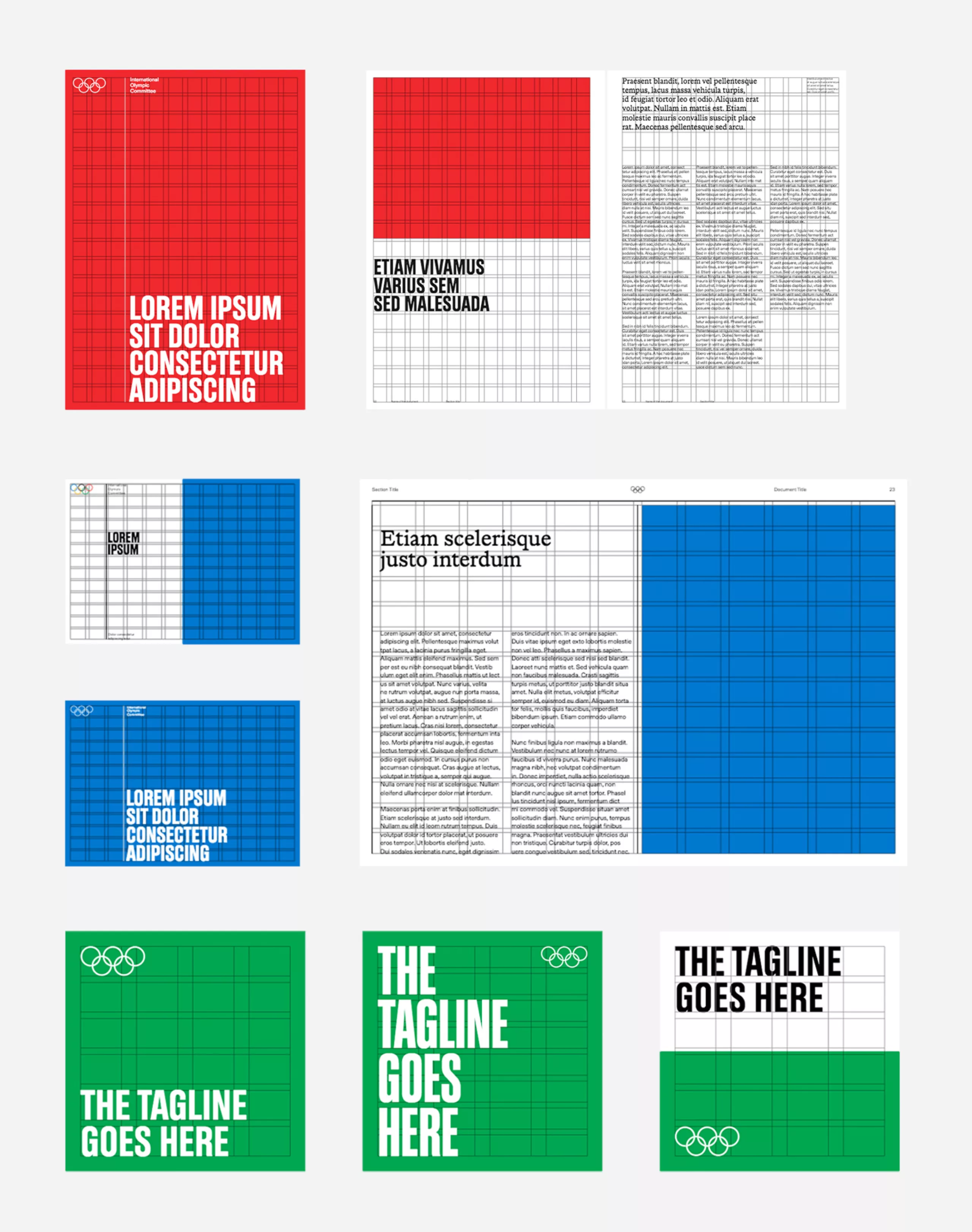
The grid of the new identity frames the elements and sets the limits of the action while leaving room for it, as on a sports field. This grid system is inspired by the work of German graphic designer Josef Müller-Brockmann and his contemporaries who founded the Swiss International Style, where the IOC is based. Inherited from the Russian or Dutch avant-gardists and the principles of the Bauhaus school and the divine measures of the 16th century, this leading movement of modernism in the 1950s seeks universalism through neutrality. The idea is to get rid of cultural or aesthetic signs, to be as universal as possible, following the writings of Adolf Loos. The Swiss International Style makes use of geometry, reputed to be universal and rational, by developing a modular grid system to delimit and construct the graphic space (as the painters of the De Stijl movement had done before them), or typographic characters with the creation of geometric linéales.
Typography plays an important role in the overall composition, as a visual element and in conjunction with the photomontage, while eliminating superfluous and ornamentation. As Müller-Brockmann explains, “Information will achieve maximum expression if the object or idea is presented aesthetically and efficiently, with a minimum of accompanying forms. (…) The graphic form must, if possible, become an anonymous vehicle of the message to be transmitted.” Applied to the charter of the Olympic Games, below, the grid allows to build the space and to juggle in a simple and rational way between colors, body text, titles, and illustrations.
A brief parenthesis on a point that raises questions. If the quest for universalism at the time involved neutrality and mathematical rigor, we can ask ourselves, as the great societal debates of today raise, if the representation of nations and diversities must necessarily involve its opposite, i.e. neutrality, or if we could be open today to a more humanistic, inclusive graphic design, welcoming differences instead of eliminating them. Is it necessary to have an “anonymous vehicle” to represent the crowds? We must remember that the modernist movement owes its foundations to the writings of Adolf Loos, a white supremacist who despised everything that was not aristocratic, male, Western or white. We talk about it at the end of our second article on modernism, if you want to go deeper into the subject and exchange with us on the subject, comment. Of course the method has proved itself, but could we invent another one today? Especially for a project like the Olympic Games…
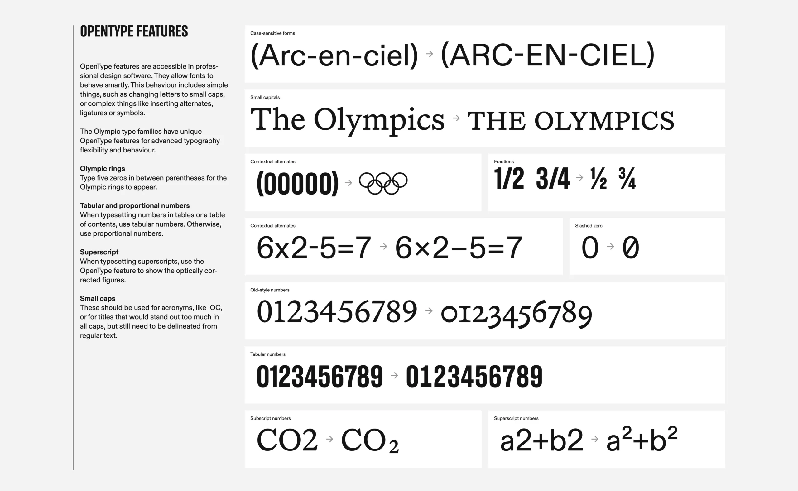
As for the typography, the agency proposed three families of typefaces that punctuate the charter. First, the Olympic Headline, created in 2020 by Canadian Julien Hébert. These are bold, striking typefaces, always in capital letters, and in bold. It is used for short titles, ceremonies, and inspired by the Tokyo Olympics in 1964 and Seoul in 1988. The second is the Olympic Sans, by Swiss Fabian Harb. This one is in the Swiss neo-grotesque style, that is to say linear, without serifs, used for the body of the text. It is a contemporary interpretation of the Akzidenz-Grotesk, created in 1896, the same year as the first Olympic Games. Akzidenz-Grotesk is the first popular sans-serif typeface, the mother of geometric linéales; it carries the heritage of this quest for universality. The third is the Olympic Serif of 2020, by the Englishman Seb McLauchlan. This one, the only one with serifs, brings tradition and elegance to the whole. It is used for elements to be highlighted, quotes or titles, as option 2. It breaks the rhythmic rigor of the other typefaces and brings a more human side to the whole. In terms of innovation, we also emphasize the fact that the charter provides alternatives in unicode and OpenType, standardized and universal fonts, which automatically offer typographical corrections.
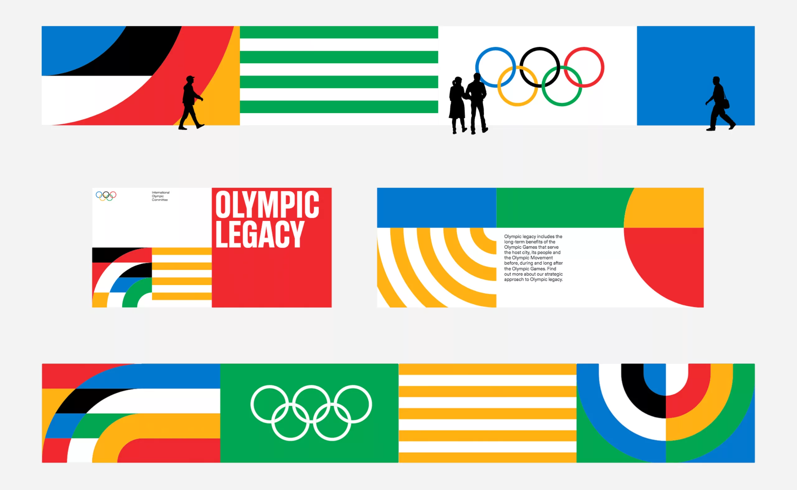
Official pictrograms were also developed to represent the different sports. The first graphic icons were proposed at the Tokyo Olympics in 1964 as a universal graphic language to guide crowds and communicate across languages and cultures. Each city appropriates them and makes them evolve. The charter proposes a version with pure geometry, “timeless”, built here too with geometric shapes.
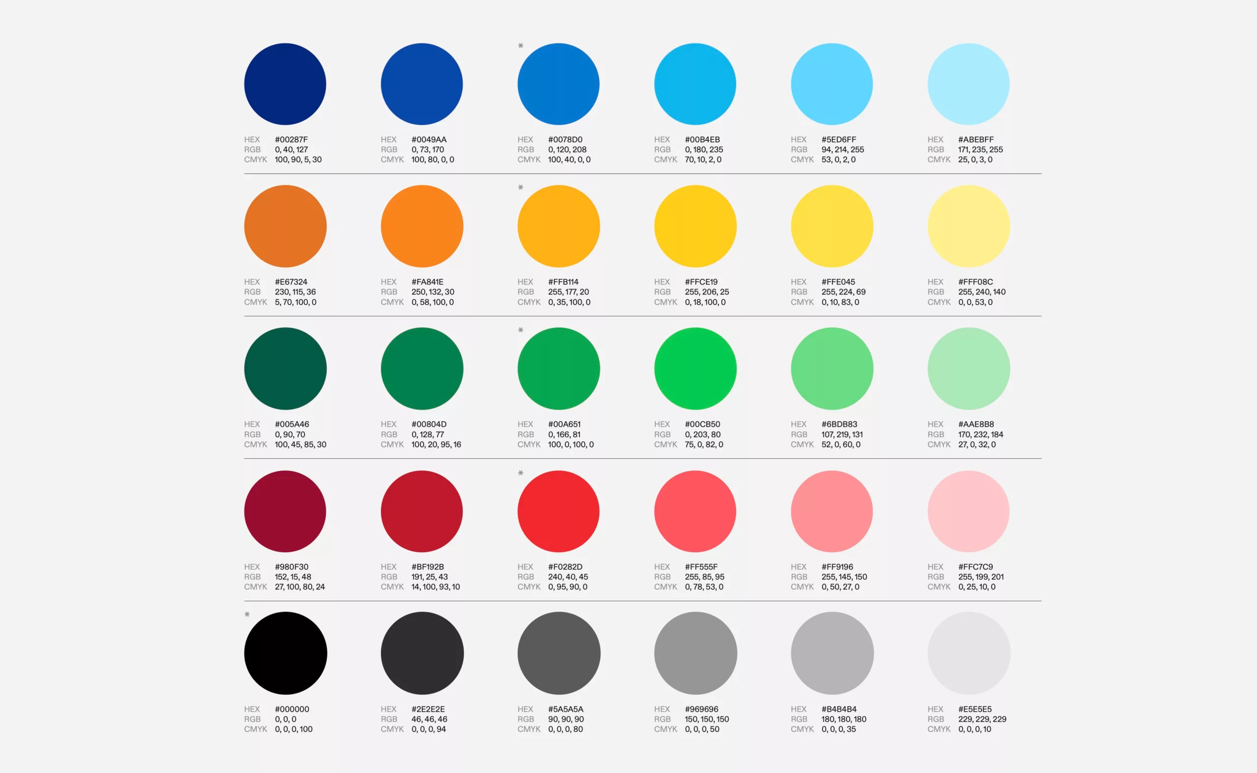
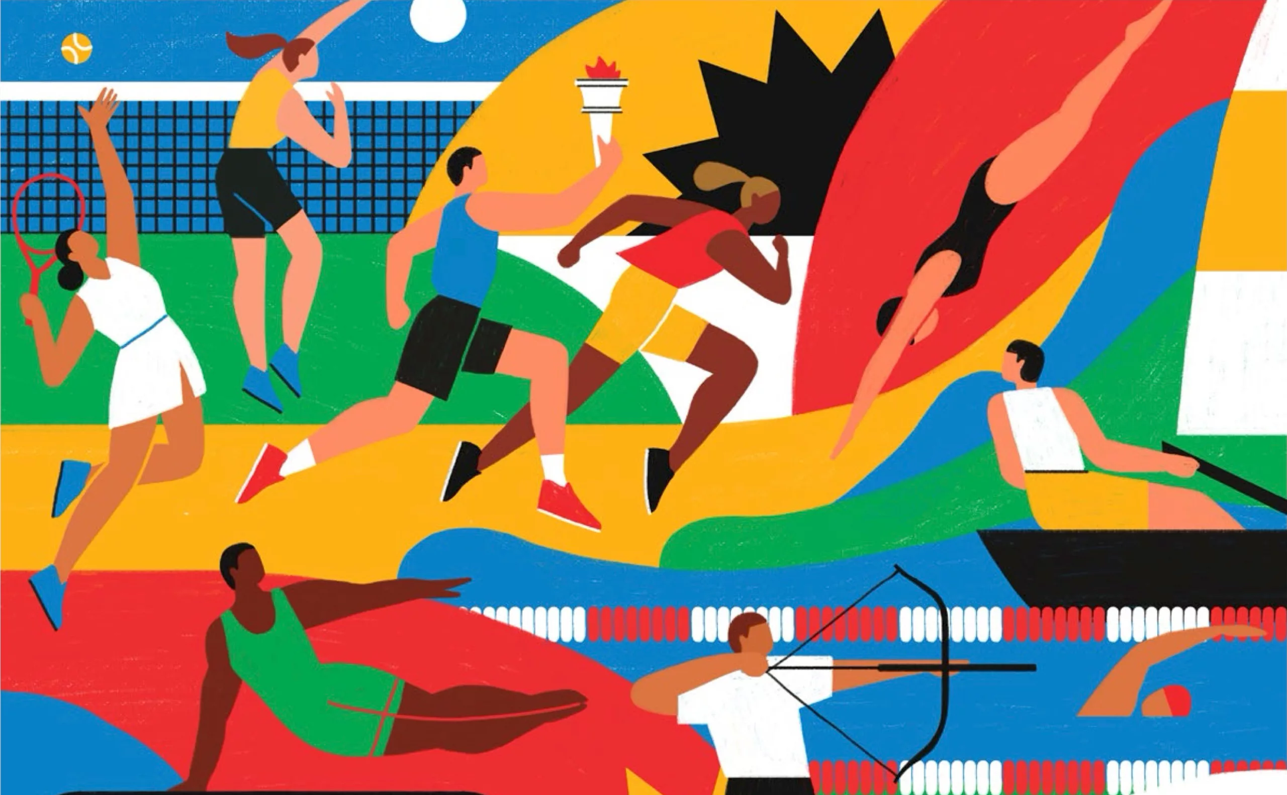
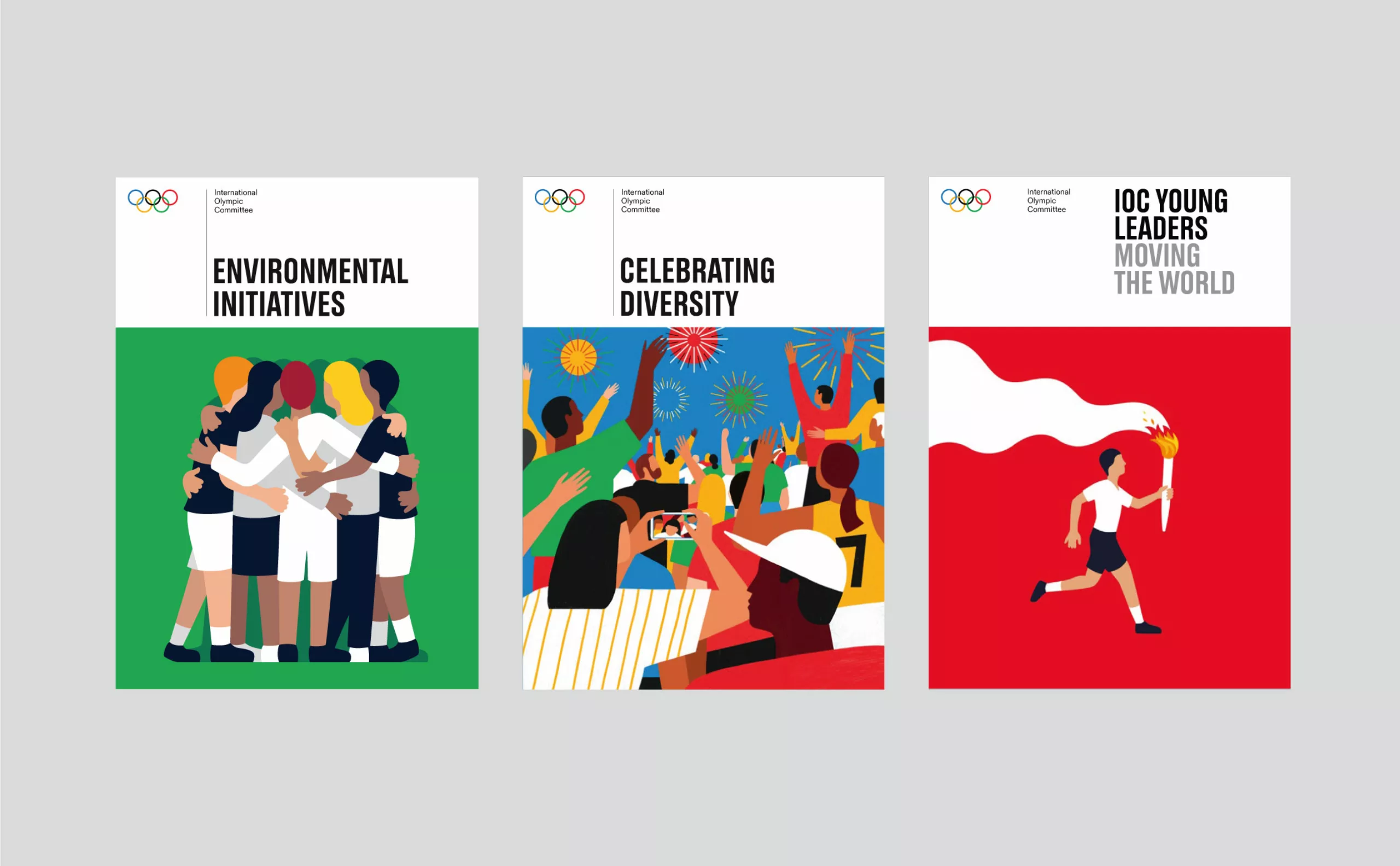
As for the colors of the five rings, registered as a combination of brand colors, they are here completed by variations of tones, adding the three colors of medals: gold, silver and bronze. These colors complement the illustrations that are making a comeback in the Olympic Games. It is indeed a tribute to the Olympic Games from 1912 to 1948, during which professionals of the image were also rewarded by medals, as poets, artists or architects. The flat illustrations, with their geometric shapes and “flat style”, bring art to the heart of the Olympic Games and highlight the creative talents of several countries.
The illustrations, which are not fixed like the rest of the charter, are used here to convey a message that is difficult to convey with photos. Illustrators are invited to play freely with colors to represent unity, emphasizing the balance between genders, cultures and sports. The lines and colors also allow the creation of colored patterns as graphic elements to represent the fields, cut in a modular and geometric grid system (reminiscent of Bauhaus patterns) to illustrate the nations united by the games. It can also be used in alternating lines in a solid color as a complementary decorative element.
For the curious or the graphic chart fanatics, here is a link to download the complete graphic chart in PDF format.
You can also find more information on the dedicated website: https://olympics.com/ioc/olympic-brand
We can only wish long life to this new identity. On the other hand, to rebound with the current events and the aberrant choice of the futuristic city of Trojena in the mountains of Neom to host the next village of the Asian Winter Games in the heart of the Saudi Arabian desert. An absurd, shocking and totally anachronistic choice, although the IOC does not intervene in such decisions. Maybe it’s time to do something about it!
On the subject
-
Toblerone’s new mountain: when packaging brands a territory
From Toblerone to Milka to feta cheese, brands mark their territory on their packaging and are sometimes caught up in the globalization game.
-

Helvetica brands, for those who are fond of typography
Helvetica, as an icon, has become a brand: you can now drink, wear or even smell Helvetica.
-
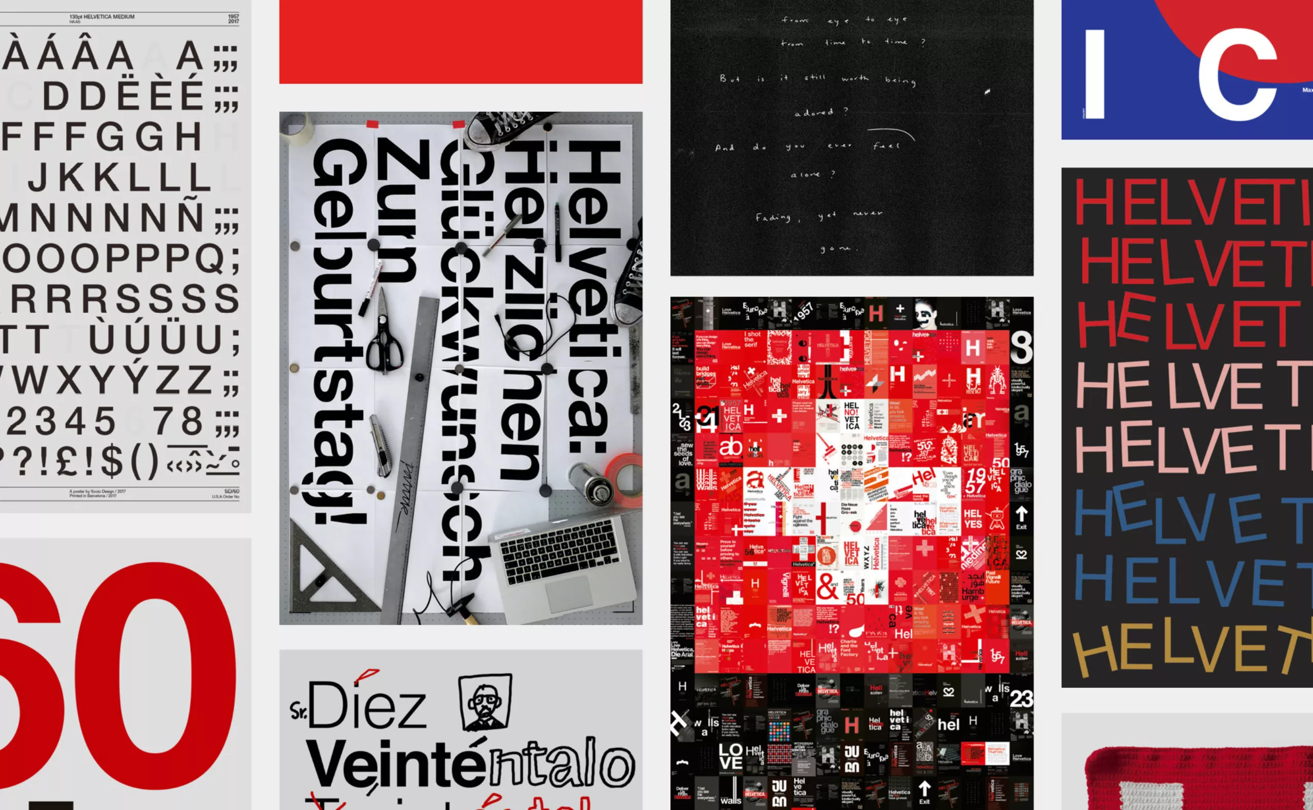
Happy Helvetica to you!
Happy birthday Helvetica! The spanish studio Husmee has invited a selection of international studios to create a tribute poster to celebrate the 60 years of the creation of the famous typography.