Color and brands are all about identity !

As Michel Pastoureau writes in his Dictionnaire des couleurs de notre temps, “a color that is not looked at is a color that does not exist”. If you have to look at it for it to exist, then several brands have succeeded in not only giving life to colors but especially in transforming them into symbols that convey their identity. So much so that today when we think of certain colors we associate them almost simultaneously with brands: red Louboutin or Ferrari, yellow Guy Cotten, orange Hermes … But can a brand really legally appropriate a color, in this world where everything is image?
The legal aspect of color deposit
Legally it is forbidden to patent a color, let alone one of the six colors of the rainbow, nor white or black! As we saw in a previous article on registered and exclusive colors, some artists have obtained the exclusive use of certain shades and materials but this creates notable tensions. It is nevertheless possible for a brand to register a shade or combination of shades, protected by the Intellectual Property Code as “arrangements, combinations or shades of colors” (Article L.711-1).
- By arrangement of colors, we mean the form given to these colors by their specific arrangement. For the graphéine logo, it is for example red and white in two squares forming a rectangle. For that of the Olympic Games, it is the assembly of the 5 monochrome rings. Each color as is is not necessarily registered but their specific arrangement is symbolically charged with the identity of the brand.
- The color combinations are the set of colors found on a logo, taken as a whole to identify the brand. For example, the colors of IKEA, Mastercard or Fanta. The colors are protected as a whole, but do not give the trademark the right to use any one color separately.
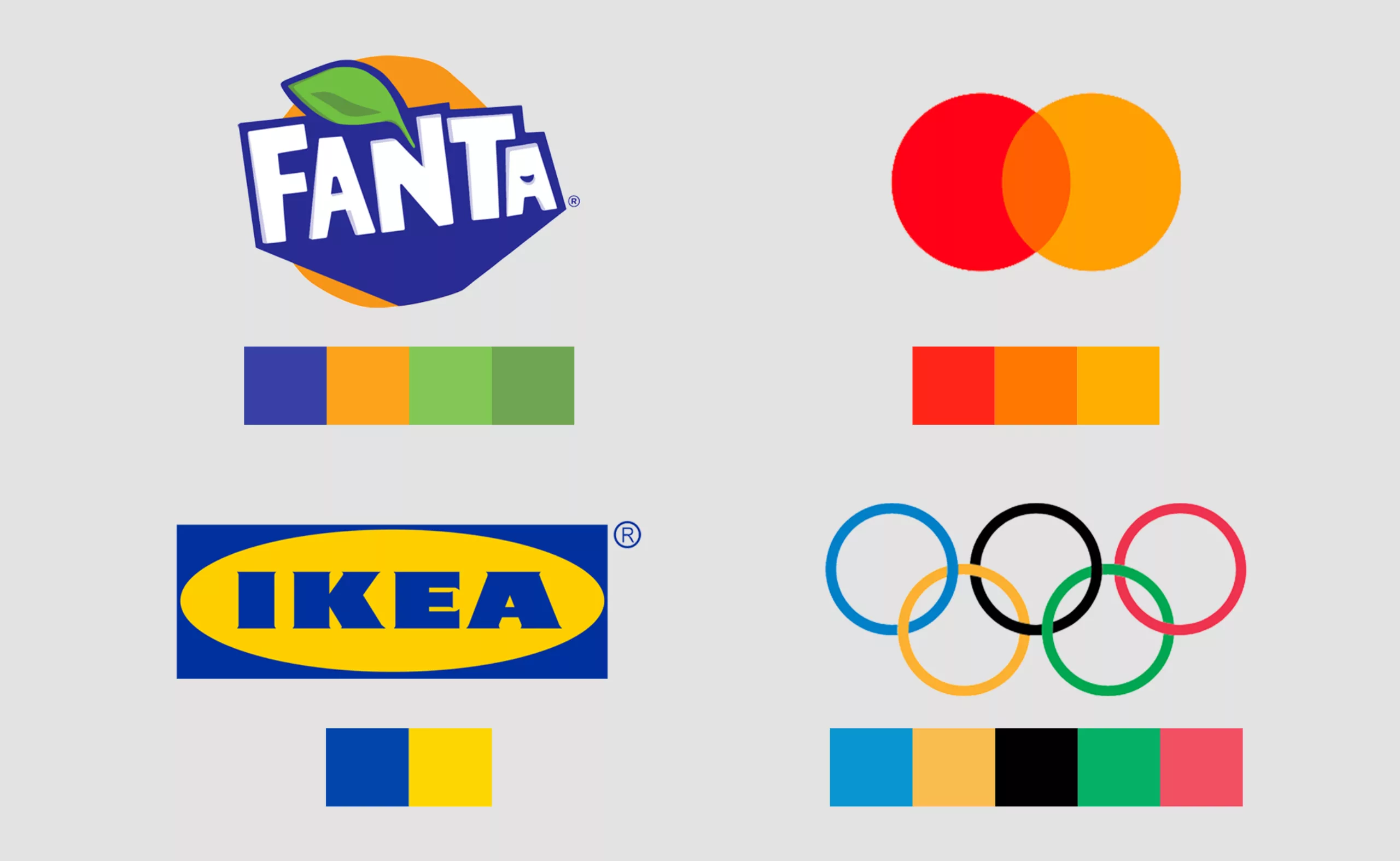
Here, the color references of the Olympic rings as found in the graphic charter to discover in our article on this subject.
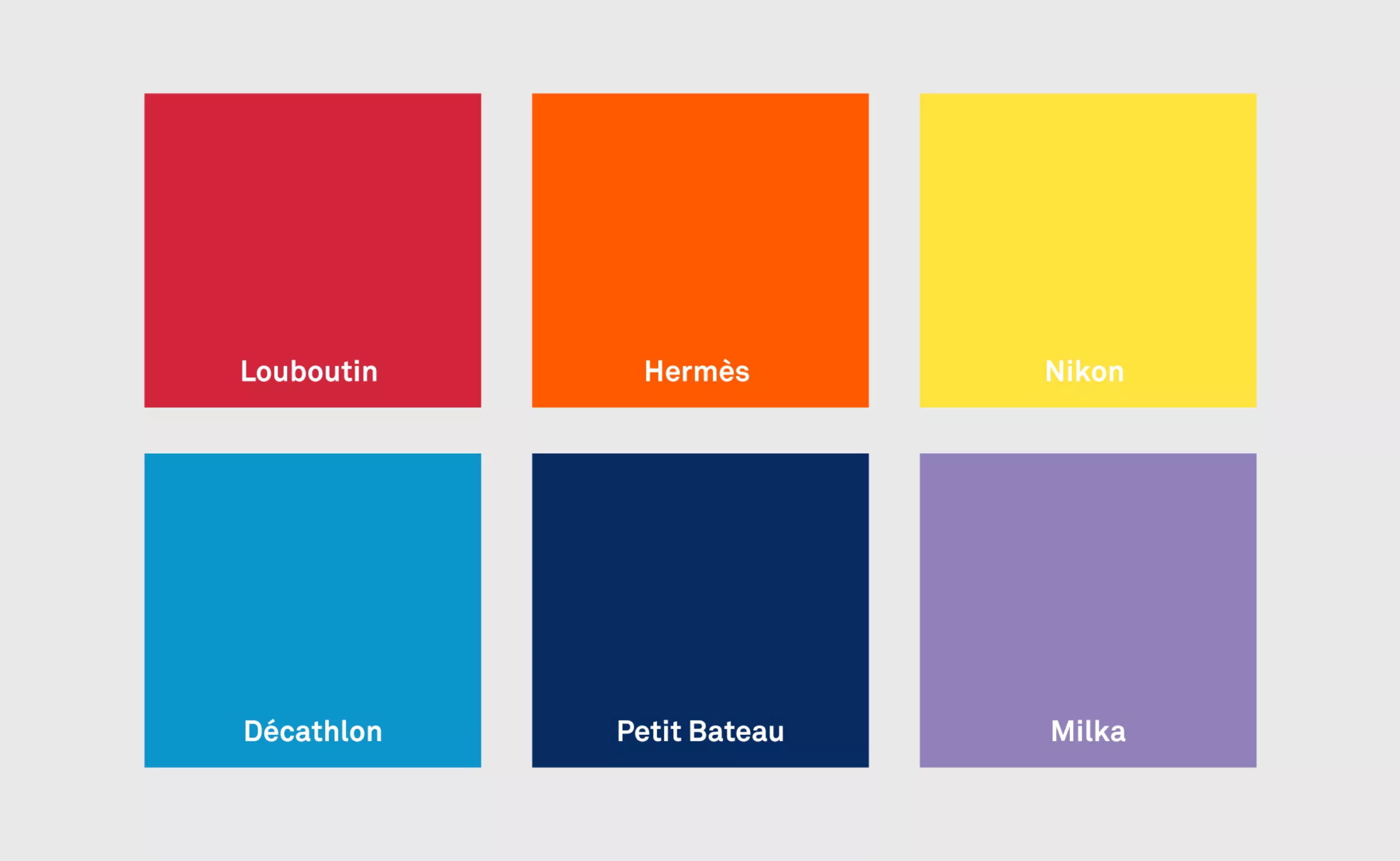
The shades of color are specific variations of a color, such as the purple Milka “Paisley Purple” 17-3730TP of Pantone”, or the red “Chinese Red” 18-1663 of Louboutin. We think of the yellow Pantone 109C of NIKON, the Pantone Process Cyan 100% of Decathlon or the blue Pantone 288 U of Petit Bateau.
Some nuances to register a brand color
Although the shade is registered, their legal protection extends to similar shades, arrangements or color combinations: you can’t appropriate the colors of a brand by changing them to a lighter tone for example. This is also the case for Louboutin’s red soles, discussed below. Another brand of shoes cannot use red, even if it is different, on its outsoles, because it creates a risk of confusion for the customers.
The registration of a color remains nevertheless fortunately difficult and complicated for new brands, it is necessary to give it a shape (or limits in space) and a specific and universally recognized shade, like a Pantone shade. The trademark must also be distinctive and specific, and not used for a product that is similar to this color; the color “orange” can not be registered alone, for example, because it is too vague, and even less for a brand of orange juice: it must specify the specific shade, as the company Orange did with the pantone 151 or Hermes with its specific orange.
A defined color applied to a part of a product is therefore protectable as a trademark provided it can be represented graphically and is distinct, recognizable (for Loutoutin the red is registered and delimited on the outer sole). This particularity, often applied in the field of fashion, is specific to what are called “position marks“; the mark is thus characterized by the precise place where this sign (an element of decoration on a frame of glasses or a seam on a pair of jeans for example) is affixed.
It is also important not to confuse the colors protected as a trademark, whose nuances create the signature of the brand and which can claim an attack for infringement, such as the red Louboutin, and those that are part of the visual identity of the company, which compose the logo, the charter or appear in the communication of the company, such as the new green color of the department store Printemps.
Louboutin, the red brand, owes its identity to a bottle of polish
We often associate the color red, in the luxury, the soles of the shoe Louboutin. In a report dedicated to him “Sur les pas de Christian Louboutin“, we learn that the red sole, the signature of the brand, “was not born of an idea but of a sketch“. As he observed one of his models of pumps with a still black sole, he realized that the drawing, made with many colors, pleased him more than the final shoe. His assistant, who was trying on the shoes, varnished her nails in red, and this made him want to add color to the model to get closer to the drawing. After negotiation he borrows her pot and empties the red varnish on the sole. He notes while discussing with a client who says she doesn’t like colors that she still wears red, to which she replies “red is different, it’s much more than a color“! His signature was born.
Red soles existed before Louboutin
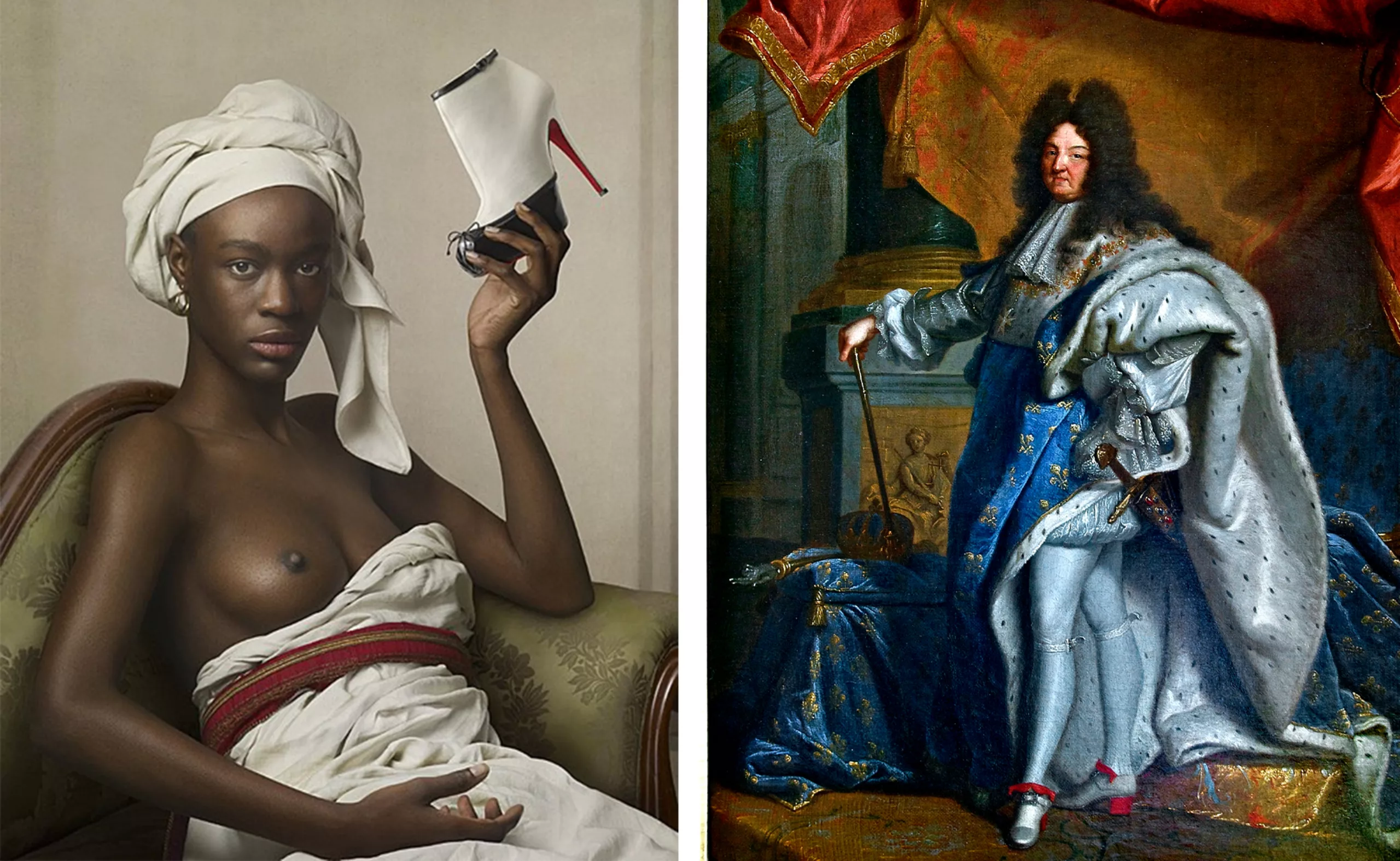
Surprisingly, the shoe with the red tinted sole already existed long before Christian Louboutin, but it is not this anecdote that inspired the designer. The first red soles were worn by a king of France: on the Portrait of Louis XIV in coronation costume by Hyacinthe Rigaud, in 1701 (below, right), we see that if the shoes are white, his heel soles and bows are red! This specificity comes from a meal at Les Halles de Paris, a giant market of the time, where the King’s shoes were bathed and dyed in ox blood, without getting dirty. The king will then launch this fashion of red-heeled shoes among aristocrats, which will then be called “red heels”.
It is a way to demarcate their “superiority” over the little people, who, not wearing heels, soaked their shoes in blood, unable to keep them immaculate; and symbolically to underline the fact that the aristocrats are above the others… One could also say that when one really has a legitimacy of status or power one does not need to prove it by symbols or marks… but one still needs to be able to detach oneself from these symbols. Kings and queens probably don’t have to prove anything to anyone (though) but they are living symbols in themselves, and symbols mean striking visual representations.
For a long time, heels were worn by men: either by horsemen, or by the rich of this world who did not have the need to walk and had the luxury of being worn or moved from one place to another, what’s more without getting dirty in the streets littered with filth. Women will then put them on, which forces their silhouette to specific canons of beauty as do the corsets of the time, then the revolution will put an end to the use of heels and other signs of wealth of the aristocracy. In the 90s, heels are for working women a way to symbolically rise to the same level as men or even above them (while still being an instrument of torture of the female body, because the comfort is not there). Today, Louboutin heels are an external sign of wealth, but they are mostly worn as an armor to destabilize men in two ways: by the height they give to the woman and by their chromatic symbolism.
The ambivalent symbolism of the color red
Michel Pastoureau explains that red is the most connoted of all colors, that its name is synonymous with “colored” in several languages, with “beautiful” or “rich”. Red is the supreme symbol of life, of blood, the original and carnal color by essence with which one covered the dead and the statuettes intended for the goddesses mothers. Red always has an ambivalence that makes it interesting: it is as much the color of life as of death, of aristocratic luxury and imperial power as of the lust of the red slums. We also talked about it in our (wonderful) article about the logo and the sexist ads of adopteunmec.
The red passion, it is also both that of prostitutes and brides (until the nineteenth dresses were red and still today in some countries like India). Red is erotic, desirable and dangerous, revered as the blood of Christ and dangerous as the red of the flames of hell. We can read on the website of the shoe manufacturer that “to walk in Louboutin is to walk with passion, sensuality, strength, love, self-confidence, and that irresistible carefree elegance à la française.” For the comfort, we will pass, but it is another matter.
Ferrari does not like that one plays with the red of its mark
When Ferrari launches a red car, it is not by choice -contrary to what one might think- but because this red was the official color of all Italian racing cars in the 1920s! The French were blue, the English green and the Germans grey. Ferrari but also Alfa Romeo or Maserati have cars tinted with “race red”, the famous “rosso corsa”. The first Ferrari will not be red but yellow, like the yellow of the badge with the prancing horse, color of the city of Modena! It is the success of the races which pushes Enzo Ferrari to launch red road cars, which will mark so much the spirits, for the symbolism of their color, and in contrast with the black cars of the time. Today, Ferrari declines its models in 6 nuances of red, which are those which sell best… but also in blue, black, gray or yellow.

The manufacturer nevertheless bans pink or so-called “Pokémon” variations, which “do not correspond to the character of the brand”, and does not hesitate to blacklist stars or public personalities for the purchase of limited edition cars, or to sue those who do not respect the values of Ferrari by diverting the color or accessories of the cars without going through professionals with a license for the brand.
In 2014 the DJ Deadmau5 repainted his car blue with the “nyan cat” motif, a popular meme, changing the Ferrari logo to Purrari, before putting it up for sale a year later on local leboncoin. Ferrari sued for copyright infringement related to the hijacking and logo change, and for failing to comply with the “right to refuse agreement” that buyers sign when they purchase a Ferrari – this agreement states that Ferrari has priority over the purchase of a Ferrari and can prevent a resale.


The DJ took care to restore the car to its original condition and resell it so as not to hear about it again…
Why are Guy Cotten raincoats yellow?
Le tissu utilisé pour réaliser les vestes et pantalons et créé en exclusivité pour la marque, mais dans des nuances de jaune un peu différentes, suivant la spécificité du tissu. Car ce n’est pas pour la symbolique du jaune ni pour son esthétisme que Guy Cotten a choisit cette couleur, mais pour la visibilité de sa valeur chromatique qui varie selon la technicité du tissu.
To continue on the subject of brands and their colors, you may have already asked yourself why the famous Guy Cotten raincoats are yellow? Here again, it is not for aesthetic reasons, but above all for safety reasons. Yellow is the most easily identifiable color, especially in contrast to the dark blue of the sea or in fog. And in the sea, it is necessary to be able to see and retrieve as quickly as possible the sailors and fishermen who have fallen overboard! When Guy Cotten and his wife Françoise created the first PVC sailor’s jacket with watertight flaps and seams, they revolutionized the maritime world by creating a robust and waterproof uniform, with a color that is recognizable among all others, and which quickly became synonymous with “the sailor’s shelter”.
The fabric used to make the jackets and pants was created exclusively for the brand, but in slightly different shades of yellow, depending on the specificity of the fabric. Because it is not for the symbolism of yellow nor for its aestheticism that Guy Cotten chose this color, but for the visibility of its chromatic value which varies according to the technicality of the fabric.
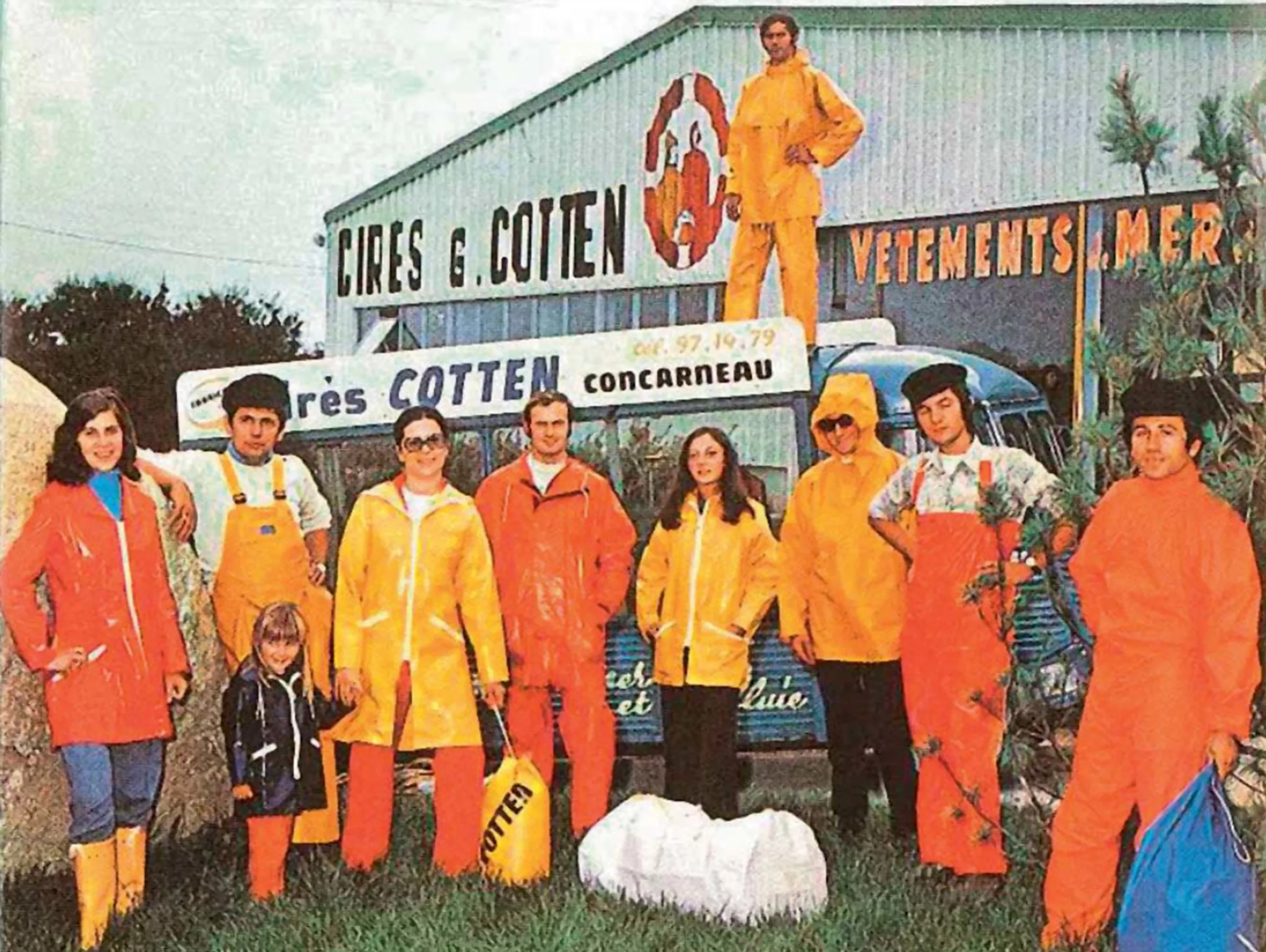
For the record (because we like it) Guy and Françoise opened a workshop in Concarneau in 1964 and started cutting and assembling jackets and pants themselves, about thirty a day. Guy spends weekends on the ports to present and test his products, which are quickly adopted. Passionate, Guy doesn’t hesitate to take the plunge to show their effectiveness and especially to ask for feedback from those who use them, to constantly improve them: orders are pouring in. Within a year, they grew to 10 employees and moved to a larger warehouse. The graphic designer Alain le Quernec creates the famous logo of the yellow man 10 years after the creation of the first jacket, to export the products: neither the logo nor the jacket have changed since, symbolizing the durability of the Breton brand!

Lawsuits for not respecting the exclusive use of a brand color: the Louboutin case
For Louboutin, Milka or even Guy Cotten, the color has become a distinctive sign of the brand and is associated with the product in the mind of the consumer. If Christian Louboutin’s red soles have earned him a good reputation since the creation of this distinctive sign in 1992, can we say that this color is part of his identity and that the use of this red color on a sole can be protected?
In fashion, the distinctive signs affixed to products (here, the red on the sole or the yellow of the wax) go beyond simple aesthetics to become distinctive signs of the brand and therefore major components of it. To ask the question of the protection of this sign is to ask the question of the identity of the mark with which it is confused.
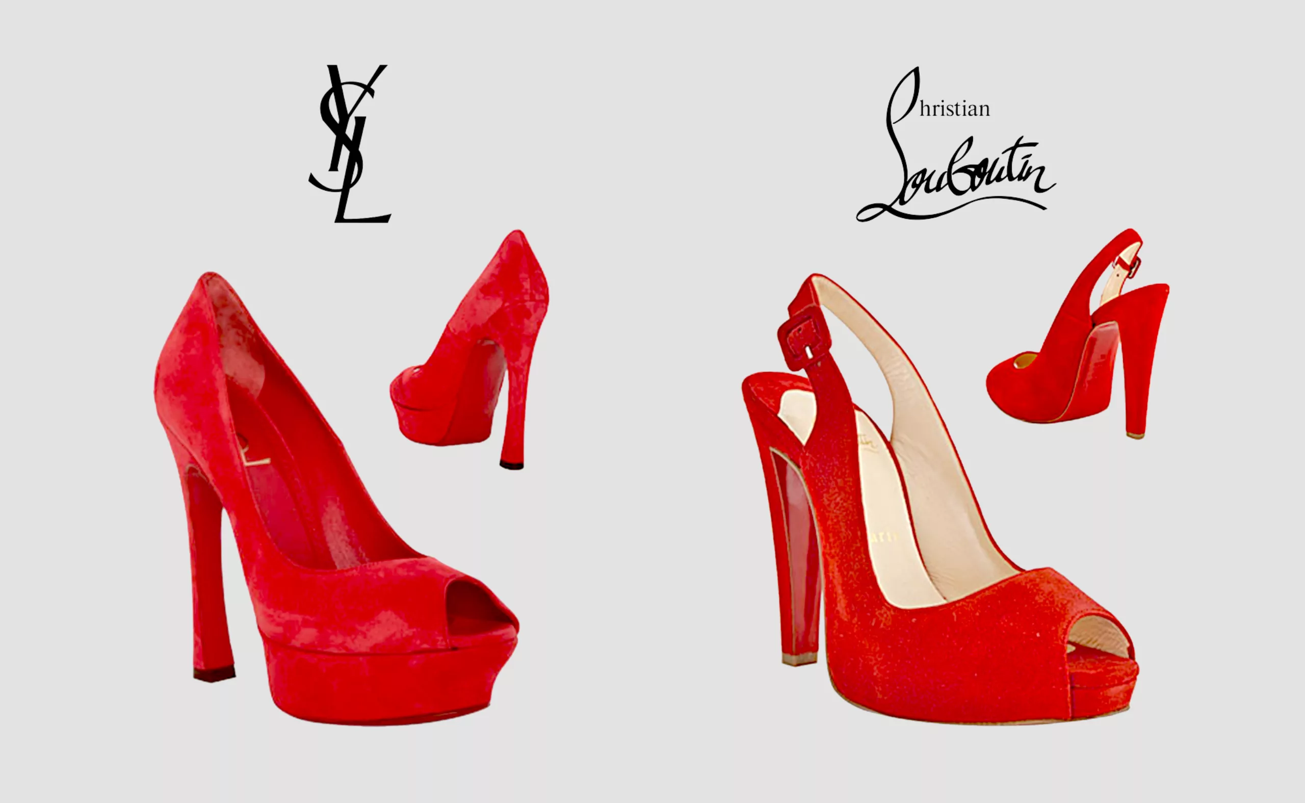
Louboutin did not hesitate to sue several brands in several countries because they had created pumps with red soles, like Zara, Van Haren or YSL. Legally speaking, the Court noted at the time that a color in itself, without delimitation in space, could not constitute a trademark. However, before 2012, during its trial with Zara, the Louboutin brand had filed the specificity of “a red sole” but neither the shape nor the red were defined: the Court of Appeal of Paris will affirm the invalidity of this mark for lack of precision and reference.
Louboutin then protected itself further by filing its trademark and its color as a position mark in 2014 in the following terms: “the color red (Pantone 18-1663) applied to the sole of a shoe as represented (the outline of the shoe is not part of the mark but is intended to highlight the location of the mark)” with the following illustration, which wins against the mark Van Haren

The U.S. court, during another trial of Louboutin against YSL, will affirm that “in the fashion industry, the color has aesthetic and ornamental functions decisive to fuel the competition” but that a color can be considered as a mark “unless (the rest of the shoe) is the same color”: Yves Saint Laurent’s shoe is a complete monochrome, the lawsuit is dropped after 18 months.
On the other hand, Guy Cotten did not register the color yellow as a distinctive sign of its brand, although it was the first to use it and is the reference of sailors’ clothes. That is why today many brands, such as Petit Bateau, use this emblematic yellow without running the risk of being sued. One could imagine that Cotten will nevertheless one day register its yellow, forcing other brands to abandon yellow oilskins. However, it must be emphasized that this color is used here to save lives, and that it is rather admirable that Cotten has not even thought of preventing other brands from using it. But, as we said earlier, is there really any point in claiming legitimacy through a symbol when you are already a reference?
On the subject
-
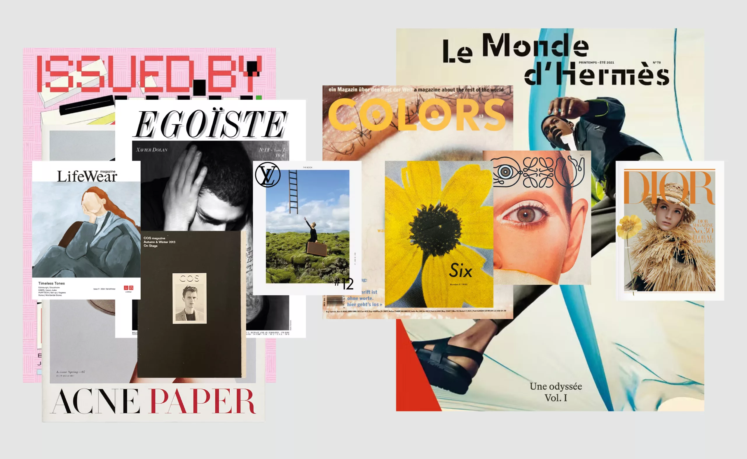
Luxury brand magazines are putting up a fight
An overview of luxury brand magazines seeking to stand out and resist the accelerating pace of current events.
-
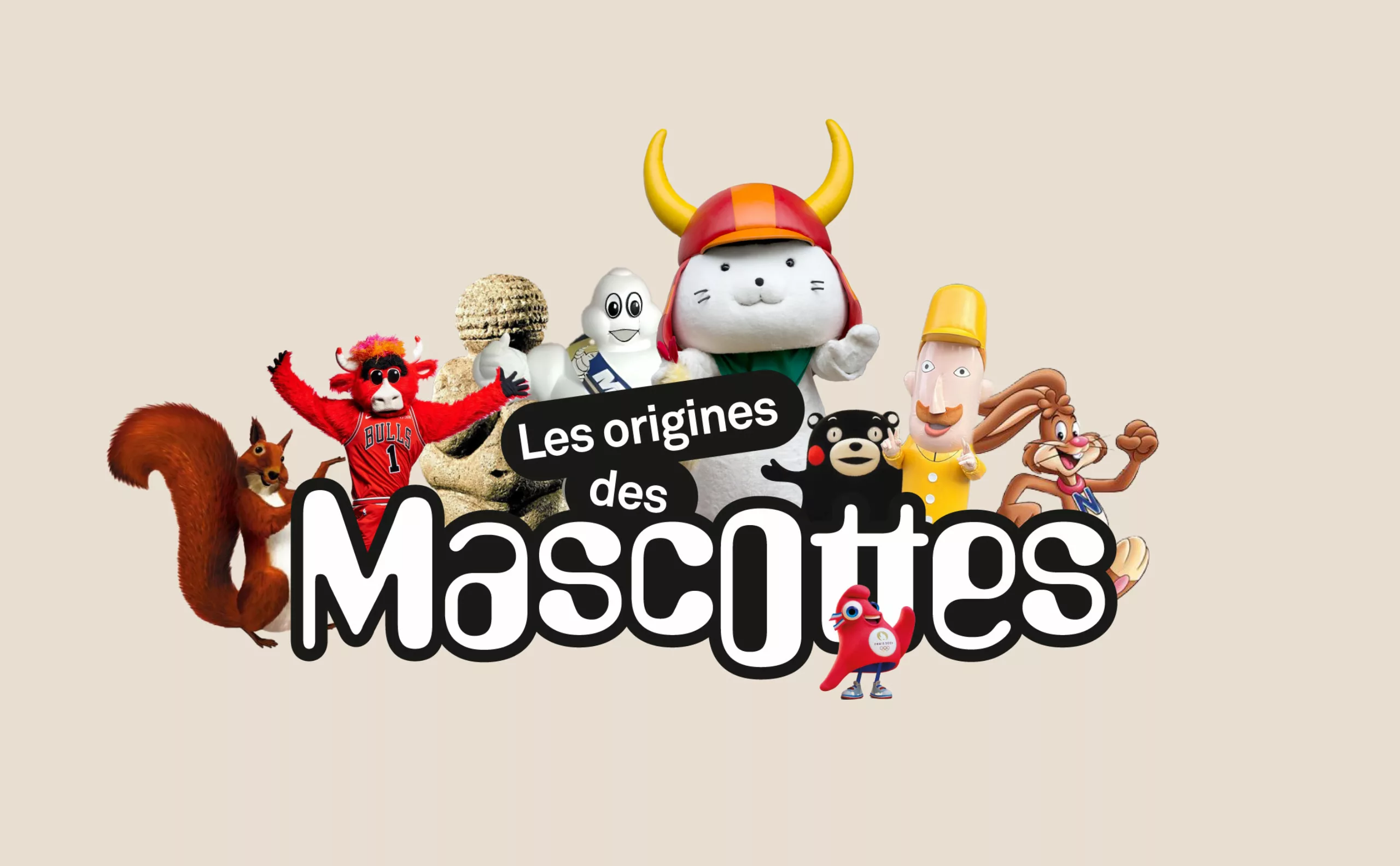
A history of mascots
Mascots, those soft, slightly silly characters, are nothing new. Here’s a look at their origins, from Antiquity to Japan.
-
There is no smoke without brands!
As there is no smoke without brands, see why the cowboy firm tries to pack of cigarettes without logo.