Branding and colorimetry: The “RGB First” strategy
In this article, it will be question of colorimetric chain, of RGB and CMYK. A technical subject, but strategic and whose evolutions of the last years must possibly lead us to review our traditional processes.
In the management of a brand’s assets, color could be the subject of an entire chapter. For some, it’s a sacred ingredient that must be protected or locked away; for others, it’s a delicacy to be played with. By delicacy, we envisage the RGB like a multicoloured and acidulous cake. Beside the CMYK would be stable and regular as a spelt bread.
To continue the metaphor, a pastry craftsman will always know how to make good bread, while a good baker will not know how to make good pastries.
Who can do more can do less.
RGB, CMYK and other Gamuts
We will not make a complete course on the differences RGB / CMYK. We are just going to review the basics not to lose the colorimetric apprentices.
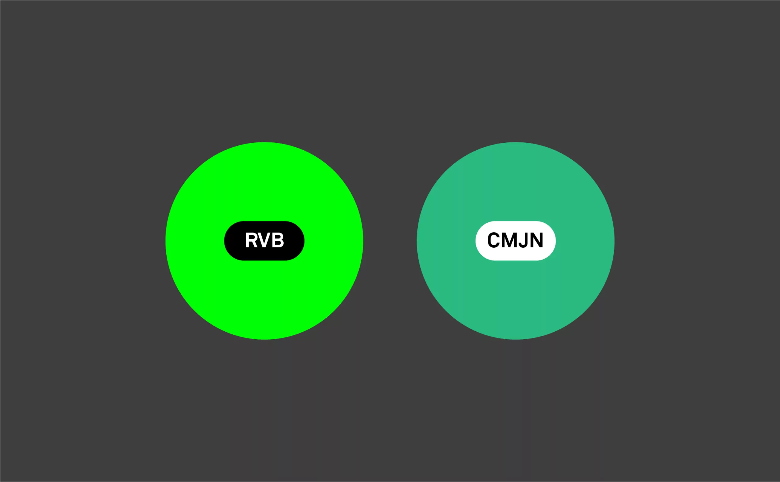
The RGB (red-green-blue) is for the screens. The color is bright and luminous.
The CMYK (cyan-magenta-yellow-key) it is for the impression. The color is less bright.
To visualize the differences between these colorimetric modes, one will look at the “gamut“, i.e. the whole of the colors which a colorimetric mode will make it possible to reproduce. This funny word comes from the medieval musical vocabulary: the musical notes were noted by letters (and are still in the Anglo-Saxon notation), then were noted by names in the Italian notation; the Greek letter gamma (Γ) designated the lowest G, and C the highest C. “gamma-ut” was thus the range of playable notes, which gave “gamut”.
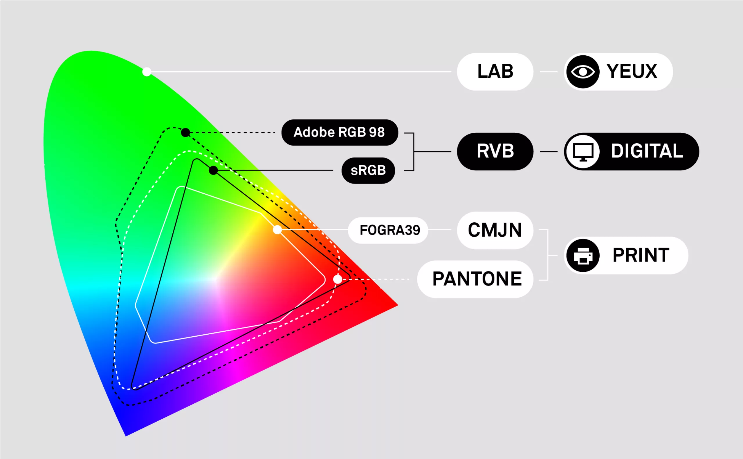
The diagram above represents the various gamuts, according to the various colorimetric modes. The largest gamut corresponds to what a human eye (LAB) can see, and we note that the RGB offers a spectrum much broader than the CMYK.
In itself, the RGB or the CMYK do not have a particular gamut, they are just systems of coding of the colors. On the other hand, according to the space of color (Adobe RGB 98, sRGB, FOGRA39…) their gamut will change. For example an RGB image in “Adobe RGB 98” will offer a very broad spectrum of colors, but will require a screen compatible with this colorimetric mode. On the contrary, the CMYK gamut of “FOGRA 39” will be very restricted, but will guarantee a faithful offset printing. One will note the colorimetric space of the range “Pantone” which approaches “Adobe RGB 98”.
In the beginning was the RGB
As a branding agency, we initiate projects, define colors and try to deploy them as well as possible on all the expressions of the brand. These expressions are articulated around two main branches:
- digital (website, social networks, motion design…)
- print (brochure, posters, banners, signage…).
The creation being digital, we start in RGB, and our software is configured in sRGB. It is the most widely compatible standard with all the diversity of the screens. It will guarantee the optimal correspondence of the colors between the various screens.
At this stage, we are in the kitchen, developing the recipe that will result in the visual identity project. During this phase, we iterate creatively, going back and forth with our client until the project is approved. Remember, RGB is a delicacy, and it would be foolish to deprive ourselves of it. These are colors that are flattering to the eye.
Once the project is validated in RGB, we will finalize the graphic charter and convert the colors in CMYK for print use. It is usually at this stage that the surprises come: “Why is my logo so bland?”
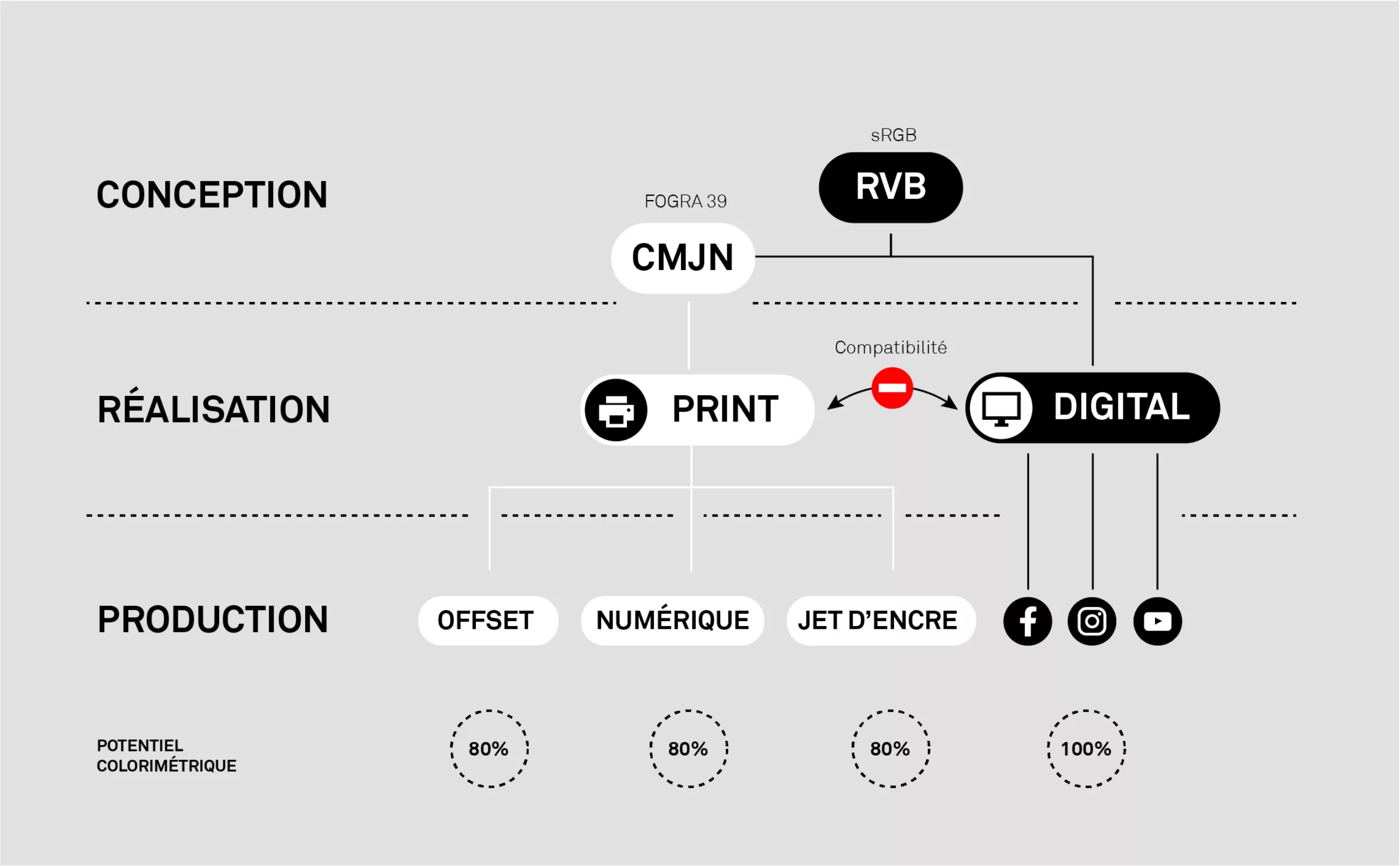
Which workflow should I choose?
If one considers that the RGB (sRGB) offers the maximum colorimetric potential (100%) then, let us say that the CMYK (FROGRA39) will offer only 80% of the potential. This figure of 80% does not result from any scientific calculation, it is just to give you an order of idea.
We could start the workflow in CMYK to make sure that the color is perfectly identical between print and digital. But in a world where digital has become the primary distribution channel for brands, depriving ourselves of 20% of the most attractive colors will seem very foolish. What brand would accept not to play on equal terms with its competitors with eye-catching colors? It is thus advisable to start in RGB to reserve the conversion in CMYK to the print.
However, it is not as simple as that, and this chronology is not always easy to respect. Let’s take the example of a poster campaign, the file for printing will be set in CMYK and once the proof is signed by the client, this same document will be used as a “master” to be distributed on the web or on social networks. The conversion CMYK to RGB is not magic. Impossible to find the saturation. In this example, the colorimetric potential is thus under-exploited in digital.
In a workflow split between CMYK and RGB, the files are hardly interoperable between these two worlds. If one seeks to optimize the colorimetric potential of each world, that will require a complex gymnastics, and many duplications of files.
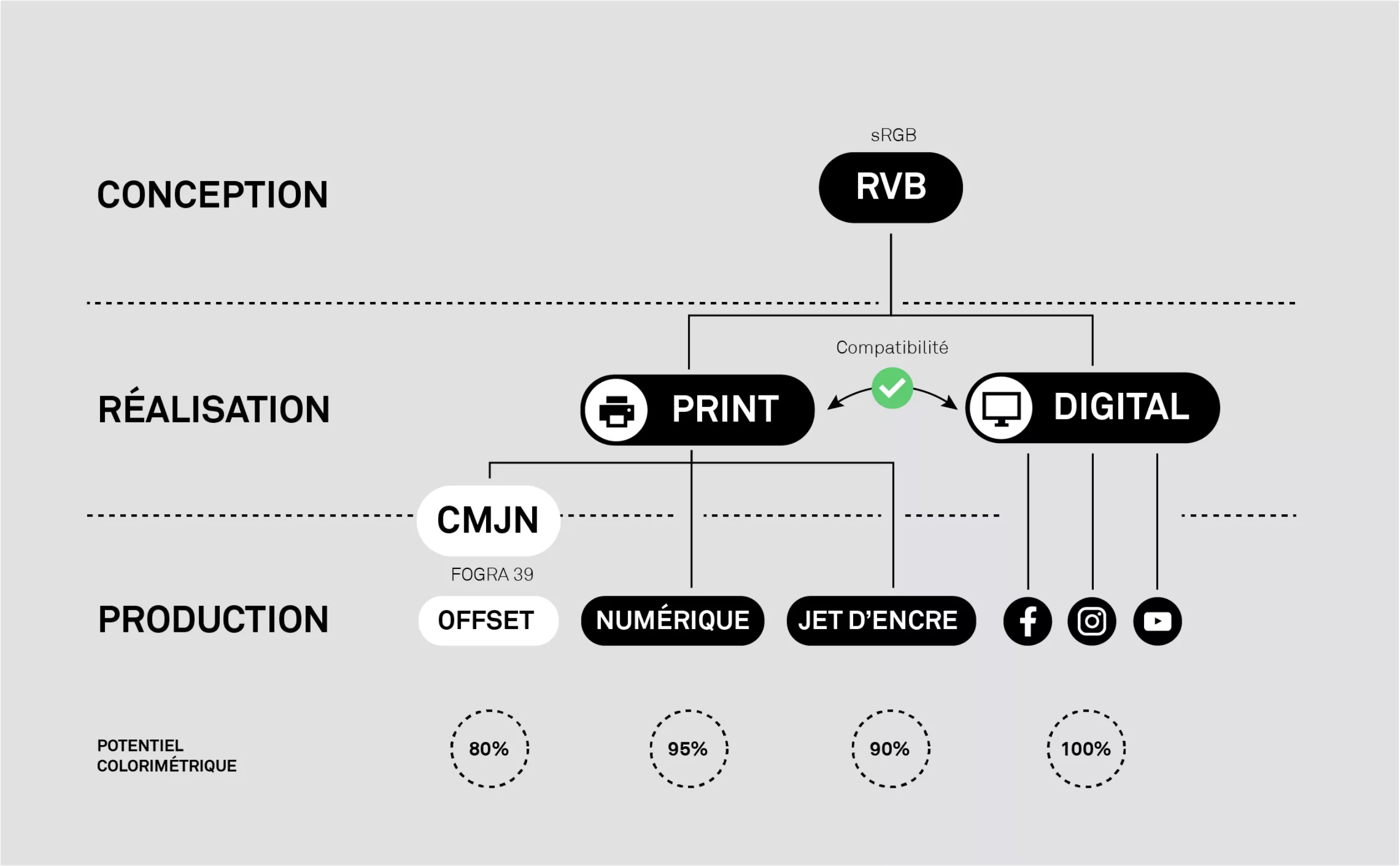
The RGB First strategy!
So our question is “how far can I stay in RGB?”
In reality, the constraint of CMYK is not as strong as in the past. Historically, the presses were all of type Offset. There was not too much choice and the files had to be obligatorily in CMYK (FOGRA39), and the printers were unable to print since a file RGB (ex: a Word). Then arrived the digital presses and the large format printers. A digital press it is a little like a giant color copier, you can give him a file RGB, it will convert it all alone in CMYK with the colorimetric profile specific to its machine.
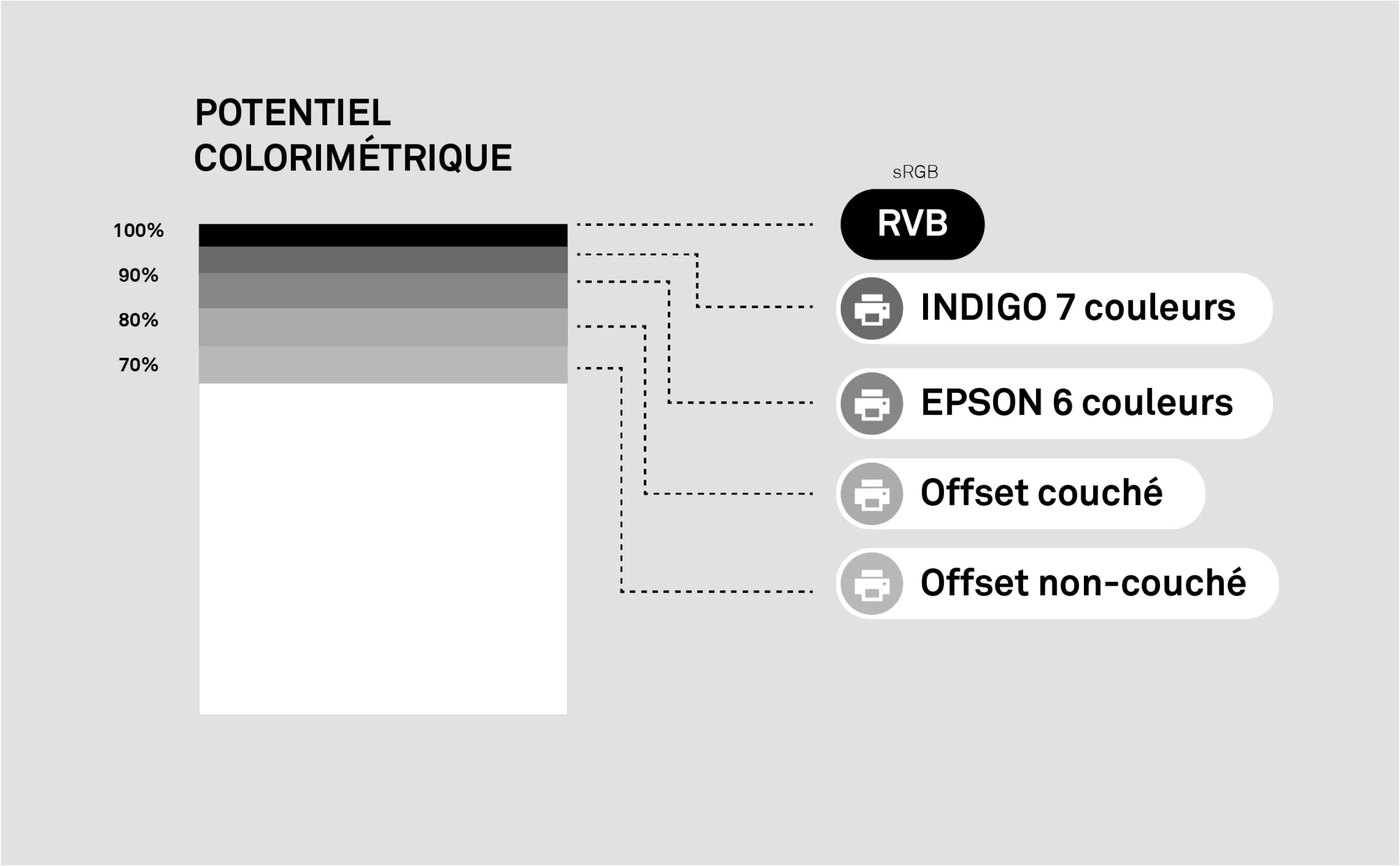
Moreover, these last years, these new modes of impression evolved much, for example in multichromy (vs quadrichromy). For example today the ink jet large format printers (for signage applications) or the digital presses have 6 or 7 cartridges of colors (ex: cyan, magenta, yellow, black, orange, purple and green) which enable them to print with a gamut which tends to approach the RGB (sRGB). Moreover the recent HP INDIGO digital presses are sold to print up to 97% of the Pantone colors. Another example, Konica claims to print 89% of the Pantone colors. Consequently, why give them CMYK in entry, whereas one can print true RGB pastries!
In the workflow, except some very technical publishing projects (ex: packaging, art book…), it is quite possible to use colors and RGB images in an Adobe InDesign document, then to export either an RGB file (sRGB) for a digital press or a CMYK file (FOGRA 39) for a traditional offset press.
Offset will always need to control the inking rates, to check the texts in 100% black in order to avoid the problems of wedging and will remain the most economic solution for the large print runs. But to print a few hundred brochures or business cards, digital printing is largely competitive and its colorimetric potential is 20 to 30% better than traditional offset.
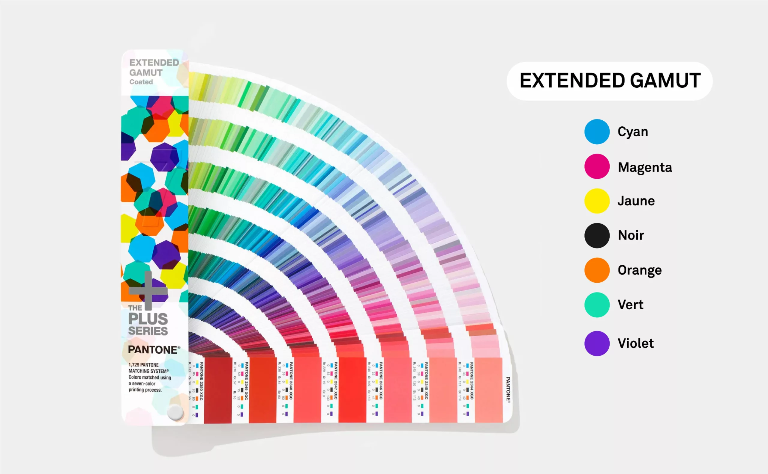
Multichromy and Extended Gamut Pantone
Multi-color technology is an innovative printing technique that extends the range of color reproduction offered by the traditional CMYK (cyan, magenta, yellow and key) in four-color process, this is accomplished by adding to the printing process three colors. In total we will have 7 inks, the traditional CMYK + Orange + Green + Violet, which are the result of the combination optimized for the Adobe RGB profile.
Pantone provides an “Extended Gamut” color chart where one will find the whole of the colorimetric references in 7 colors. One thus obtains a very vast space of color and one can affirm that the majority of the Pantone colors are in the space of color of the Multichromy with differences so fine small that one will not perceive them with the human eye.
The majority of the numerical machines will thus convert the Pantone value indicated in the PDF into multichromic value by being based on the spectral information and by minimizing its visual difference when this one is printed. Following this logic, you can thus send in digital printing a document with pantones (instead of an RGB or CMYK color). The machine will automatically treat the color to obtain the rendering closest to the Pantone wanted.
A word about the FOGRA 53 profile
In 2017, a new CMYK standard was published by the European Color Initiative. It is the FOGRA 53 which is supposed to replace the previous FOGRA 39 standard which dates back to 2003-2004. For those who are curious, you can discover all the details of this FOGRA 53 format on this page: https://www.normaprint.fr/blog/fogra-53-un-nouvel-espace-cmjm
Conclusion
The advantages of the “RGB First” strategy:
- Facilitation of the workflow: the same RGB file will be used indifferently in After Effects and InDesign.
- The colorimetric potential is exploited to its maximum.
Drawbacks:
- Find out about your printer’s equipment.
- Make a color proof on the digital or inkjet press to ensure conversion and final rendering.
And you, how do you see the subject?
We don’t claim that this color strategy is the optimal solution. We are trying to challenge our processes a bit, to find the optimal cross-platform workflow. In the graphic chain, the mantra “Print = CMYK” is still obviously hard to break, and it will be difficult to change 40 years of DTP tradition. But it’s worth the effort to think about this kind of subject.
And you, how do you see the subject? What other approaches do you think we should consider?
Feel free to share your ideas or best practices in comments.
____
For more information:
- https://typocentre.fr/la-gestion-des-couleurs
- http://cerig.pagora.grenoble-inp.fr/memoire/2008/hexachromie.htm
- https://www.groupetma.com/2016/09/13/importer-vos-images-rvg-convertir-cmjn-a-lexport/
- https://www.normaprint.fr/blog/espaces-colorimetriques-de-travail/
- https://www.aluplex-signaletique.fr/pdf/norme_iso_12647_as.pdf
- https://webkit.org/blog/6682/improving-color-on-the-web/
- https://www.icones.fr/public/actualites/categories/dl/Installation-PAO.pdf
- https://coloracademy.fr/technologie/nouvel-espace-couleur-dechange-cmjn-fogra-53-ecicmyk/

